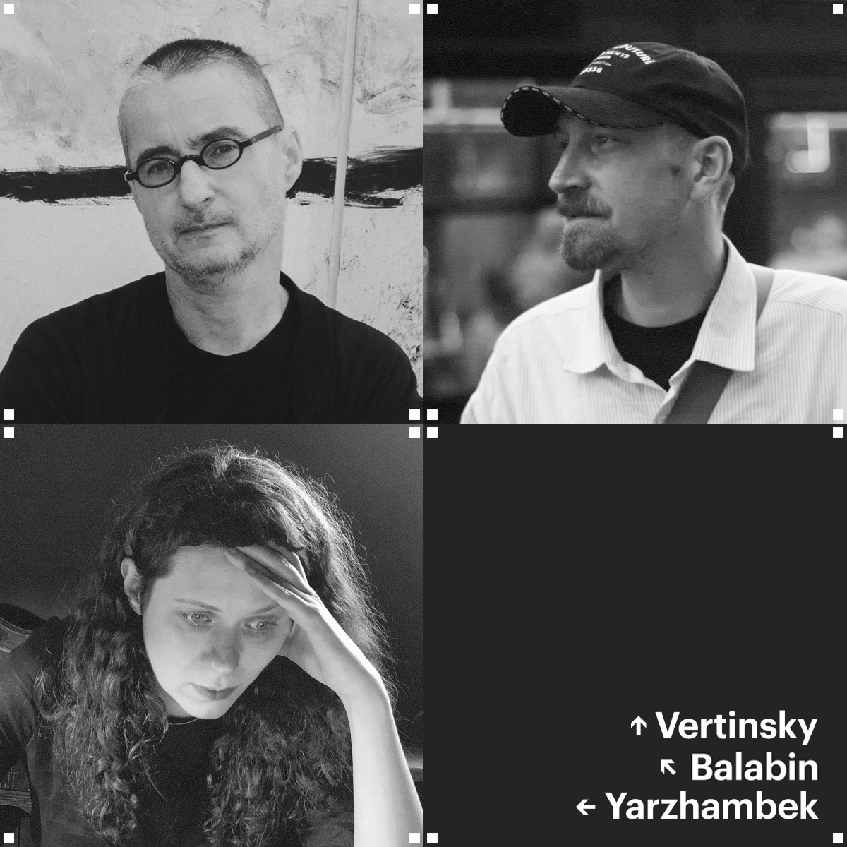
This April, type.today turns 10. We used that as an occasion to speak with those who have been using our typefaces throughout all this time. In this piece, book designers Daria Yarzhambek, Maxim Balabin, and Vladimir Vertinsky reflect on how attitudes toward their profession have changed, discuss trends in English-language fiction design, and share funny and heartwarming stories about dealing with printing houses.
- Daria Yarzhambek
- Book and Graphic Designer, Art Director; type.today Editor-in-Chief

- Maxim Balabin
- Book and Graphic Designer. Works with Individuum publishing house
- Vladimir Vertinsky
- Book and Graphic Designer. Co-founder of Pollen publishing house

Daria Yarzhambek While we were arranging the interview, Maxim texted me, ‘What can I even tell you? I live a hermetically sealed life.’ Which made me think, ‘Perhaps, I live such a life, too’. I’ve always associated book design with the feeling of isolation. So I wonder, Volodya, do you also live a hermetically sealed life in book design?
Vladimir Vertinsky I probably do. I don’t have any historical connection to book design; I ended up in the design field by accident. It all started with an image posted
I also consider myself somewhat isolated, ‘hermetically sealed’ in my profession, because I’m more of a practitioner than a theorist. I approach type in a rather intuitive manner. For me, it’s like painting. I look at how the typeface behaves on the page, what kind of harmony it brings…
Maxim Balabin We just meant to ask whether you’re friends with other book designers!
VV: Well, we recently met in St. Petersburg with a small group. Nikita Voznesensky brought together type and book designers. Of course, I was curious to see how differently people work, to realise that there’s this small community after
But once you get back to your layout, you’re still very much alone.
I normally discuss my layouts with the client I feel like that’s enough. Clearly, the customer is not an expert, but, apparently, I’ve been lucky all along. My customers were really responsive and made the choices I would have intuitively made myself.
DY: Do you think there are trends in book design?
MB: Yes, of course, there are. Everybody’s laughing about it, yet they still follow them, as it is a commercial thing. Someone does something, and everybody wants the same. But there are very few book designers. In the bubble that I follow, there are maybe twenty of them. So everybody copies certain moves and techniques from each other.
And then the trend spills over into regular books, mainstream
Different markets have different trends. There are the British, the Americans, the Europeans. I feel like they all exist rather in isolation, quite separately, each with their own book design tradition.
DY: I don’t follow it as closely as you do. Tell me about the current trends.
MB: For one
Or, for instance, when it comes to autofiction covers, there’s often an emotional photograph framed with white margins, with large lettering on top. There are many such moves that are popular within micro-genres.
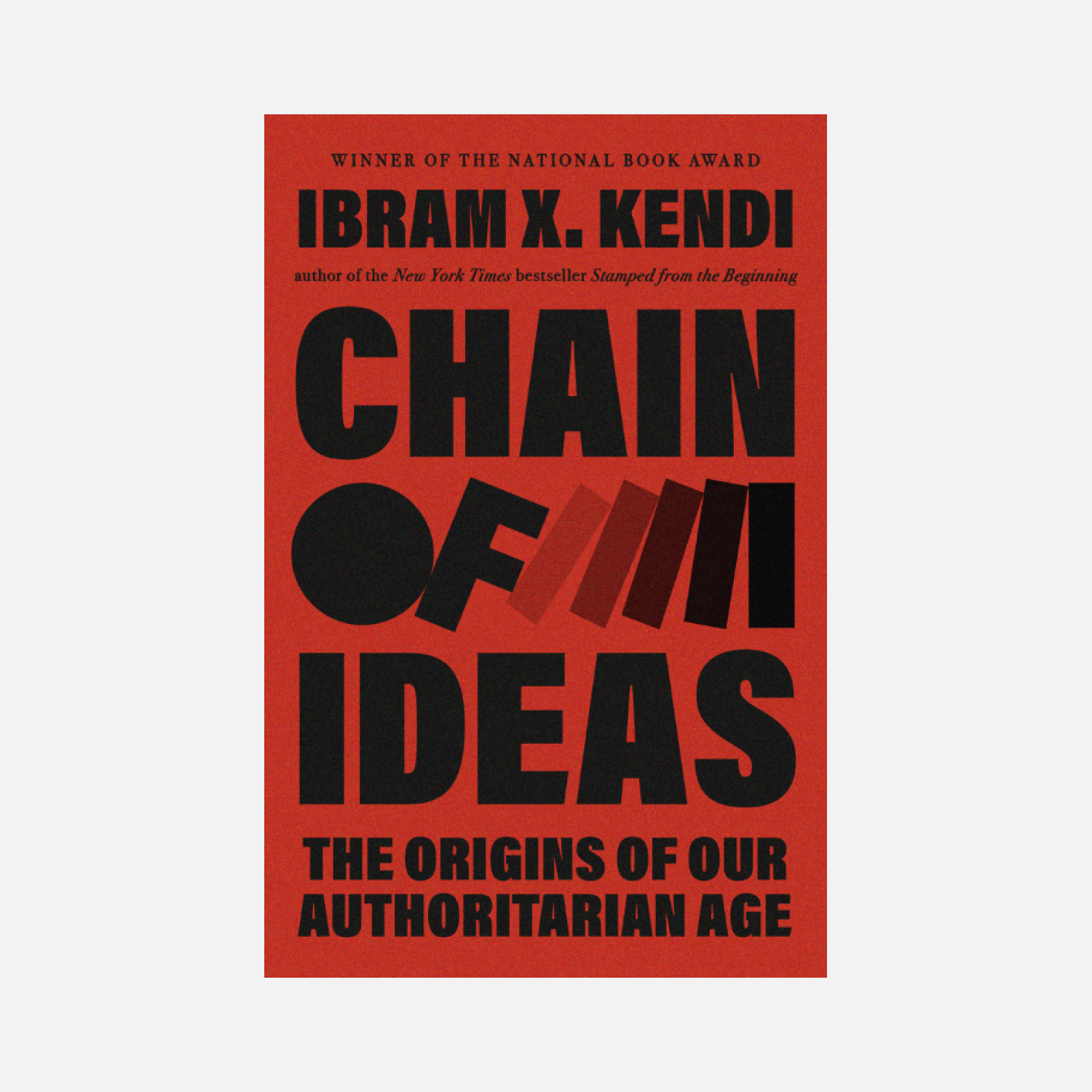 Ibram X. Kendi, Chain of Ideas. Random House, 2026
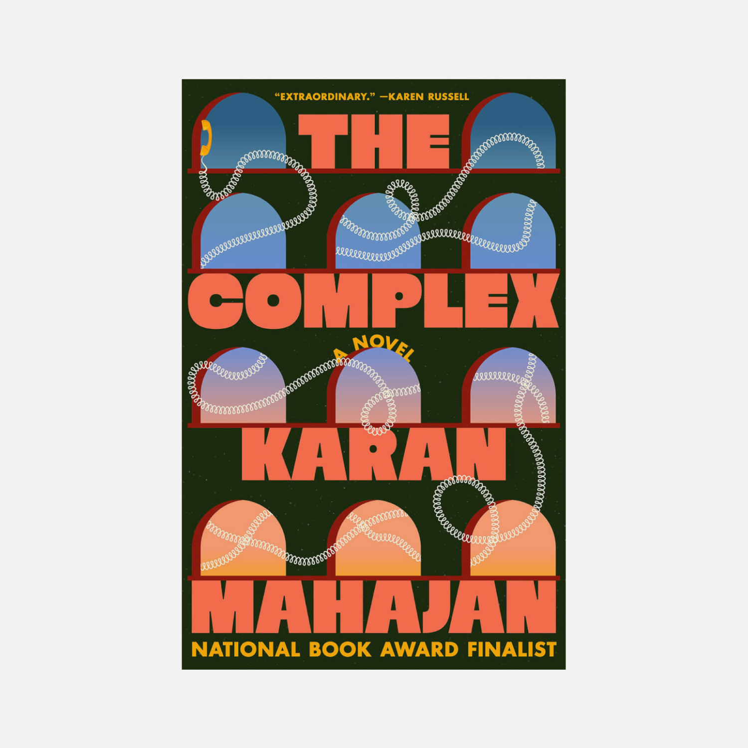 Karan Mahajan, The Complex. Viking, 2026
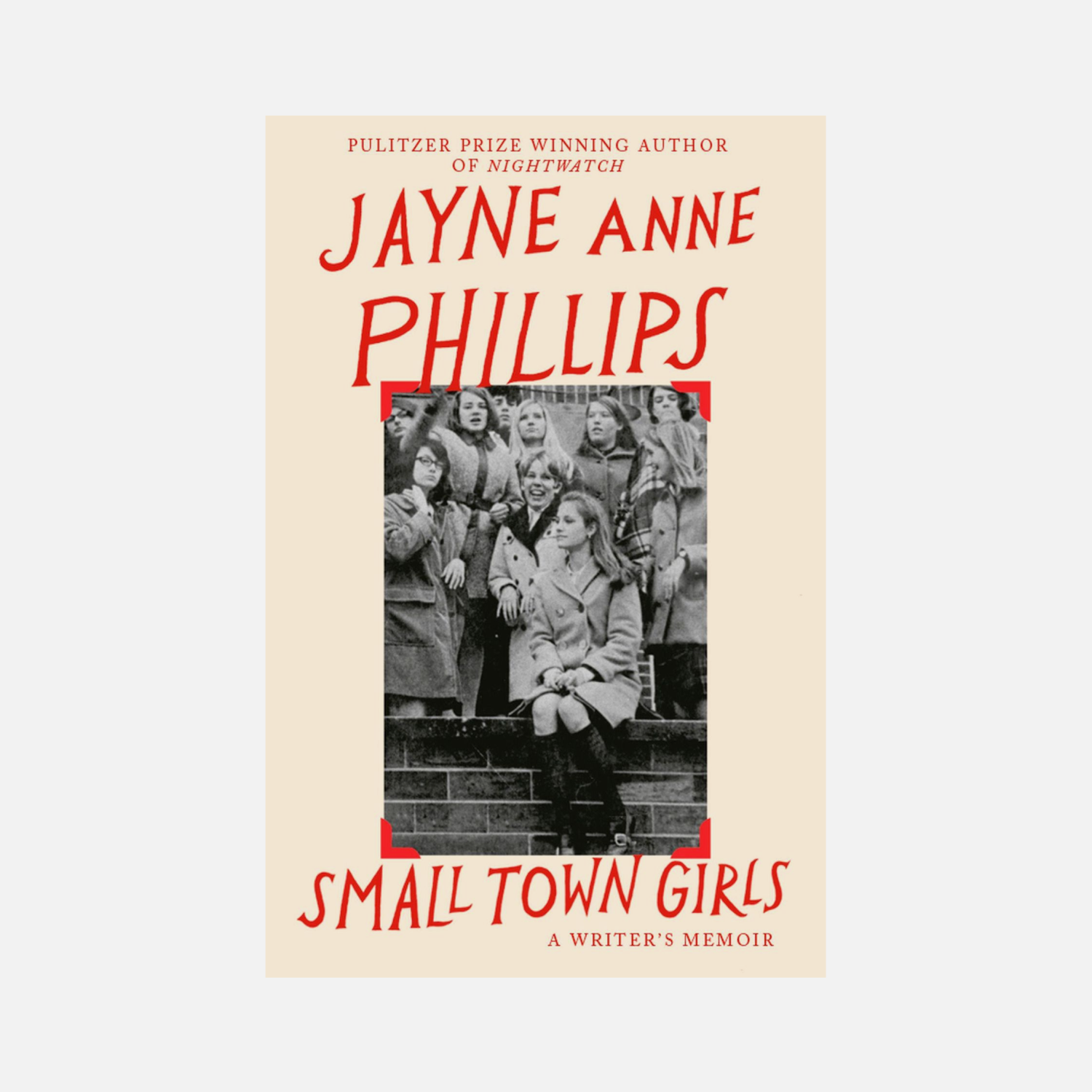 Jayne Anne Phillips, Small Town Girls. Knopf, 2026
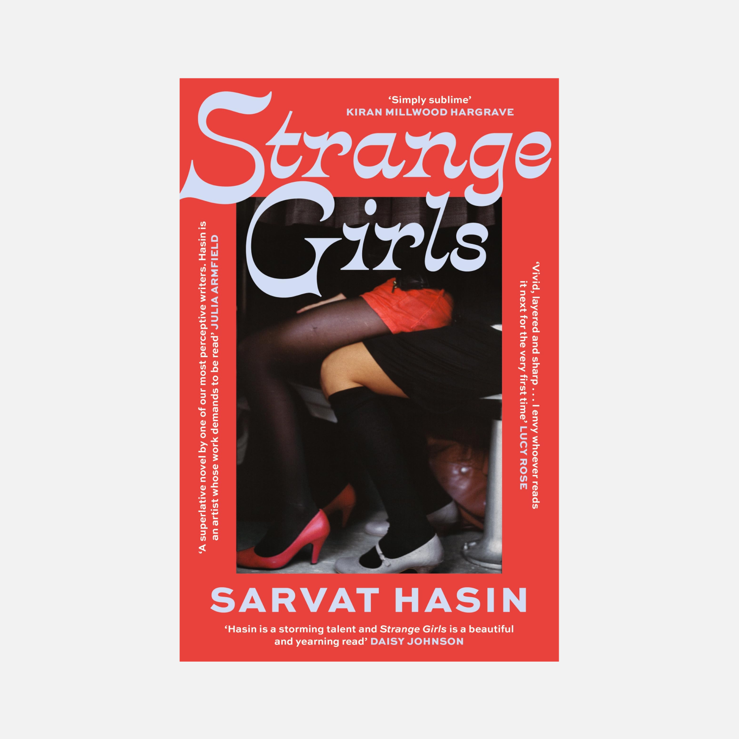 Sarvat Hasin, Strange Girls. Dialigue Publishing, 2026
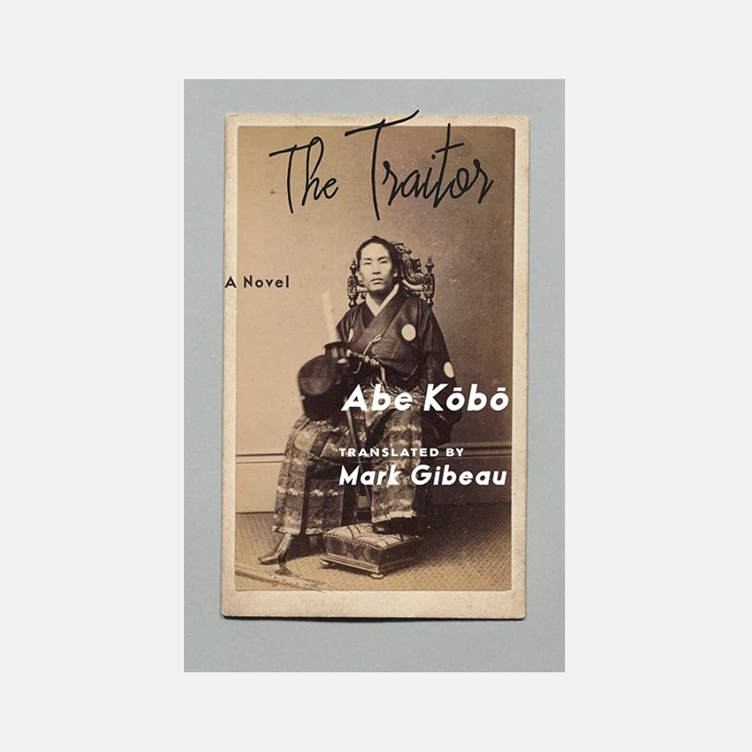 Kōbō Abe, The Traitor. Columbia University Press, 2026
DY: Volodya, do you have any thoughts on this?
VV: This made me think of the list of the best covers posted on Lithub, which they publish every year. There are 173 covers. If you scroll through them fast enough, you can see a certain pattern. It seems that the 2025 pattern is pastoral photography with very large text, or text that flows and somehow deforms. And then there’s also a lot of irony.
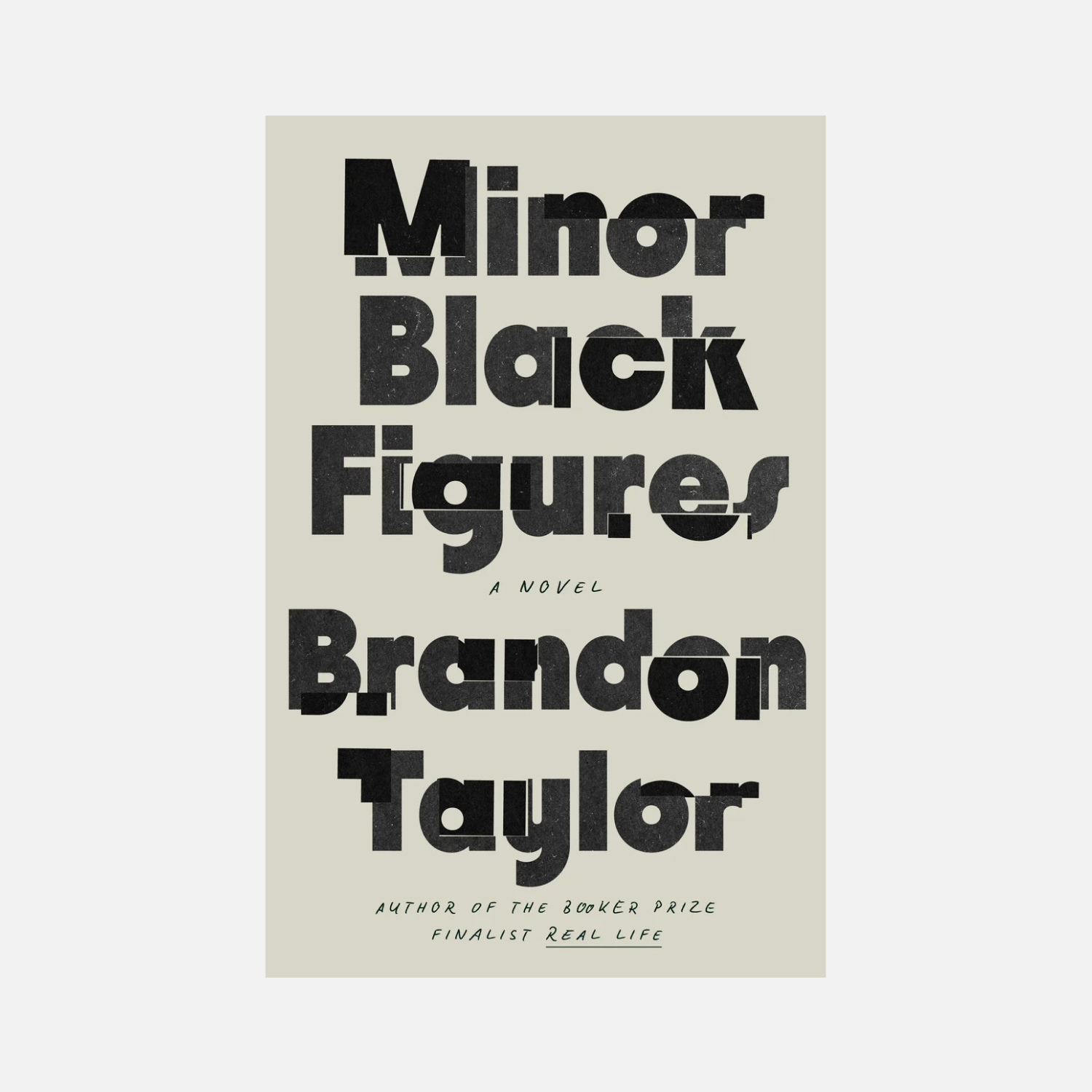 Brandon Taylor, Minor Black Figures. Design: Grace Han. Dialigue Publishing, 2025
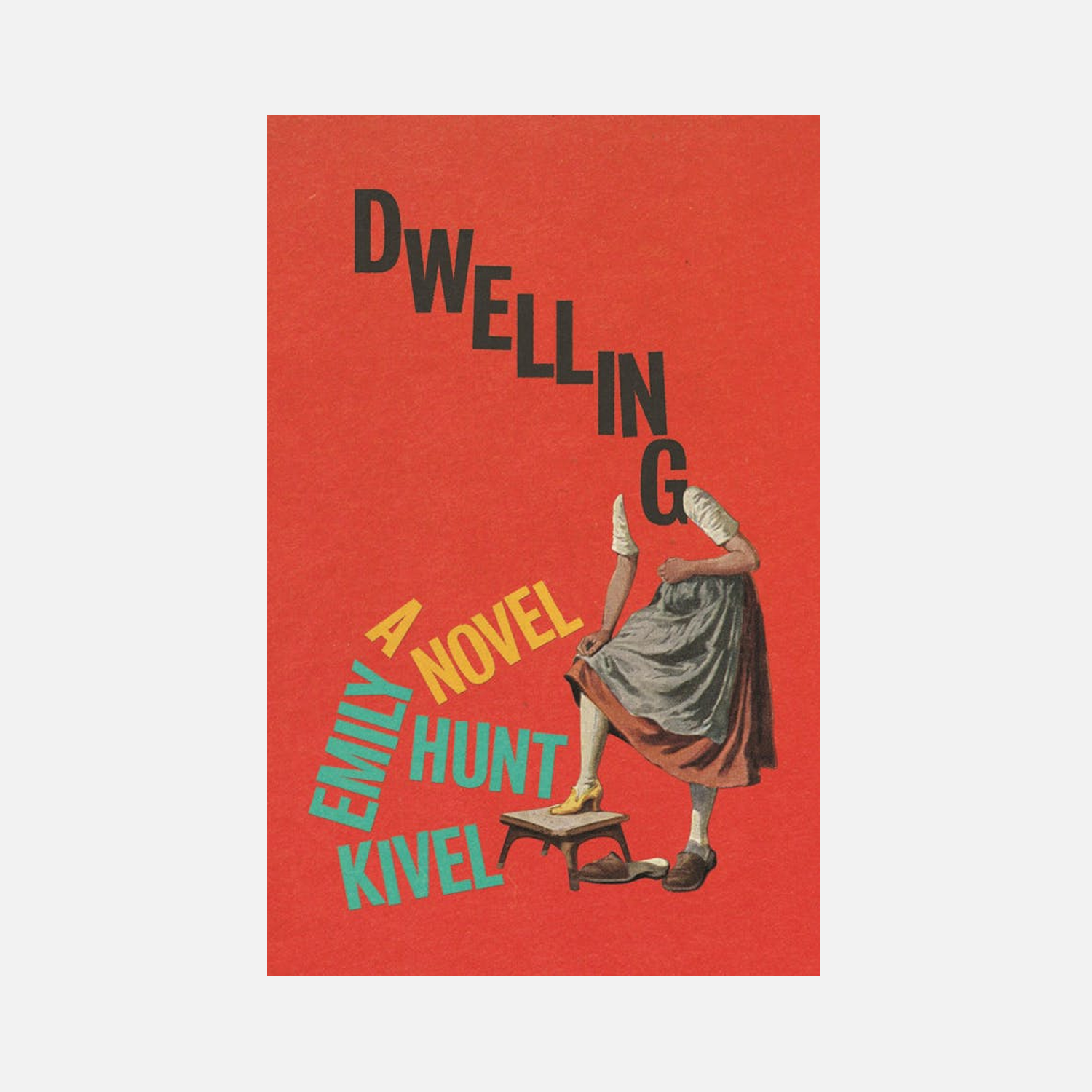 Emily Hunt Kivel, Dwelling. Design: Matt Dorfman. FSG, 2025
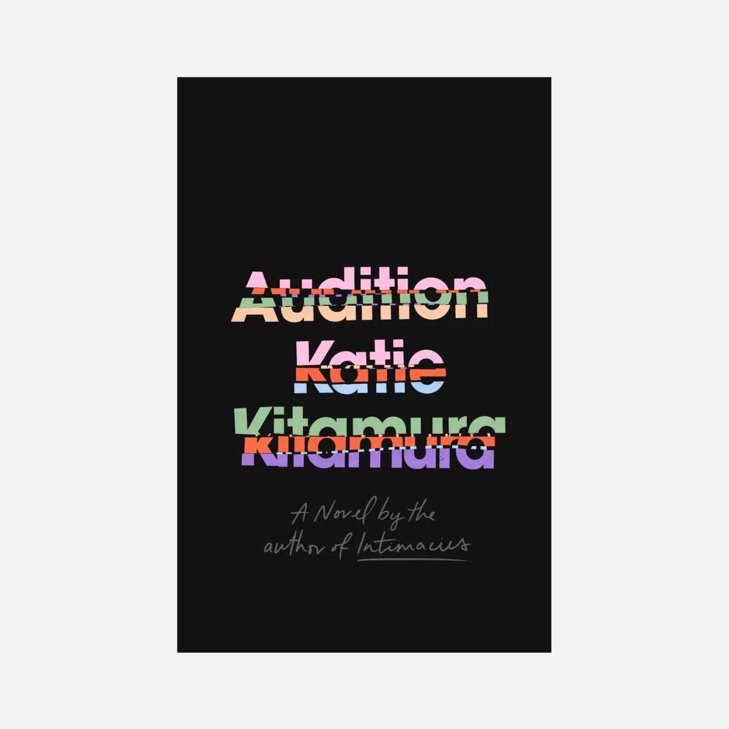 Katie Kitamura, Audition. Design: Lauren Peters-Collaer. Riverhead, 2025
MB: I think irony has always been there.
VV: There’s also design targeting zoomers. And what they want is not even ironic covers, but what I’d call post-ironic ones. For example, a cover featuring a dog’s butt sticking out of the corner.
Out of the 173 book covers, roughly half have some kind of joke like that. This would have been hard to imagine some five years
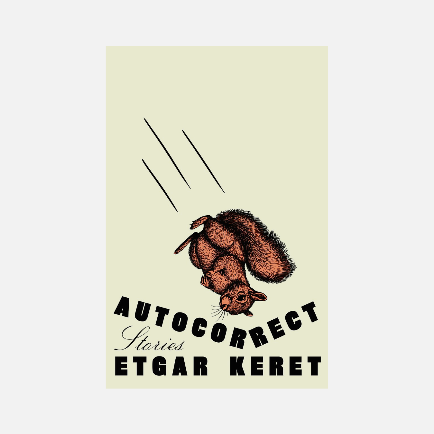 Etgar Keret, Autocorrect. Design: Lauren Peters-Collaer. Riverhead, 2025
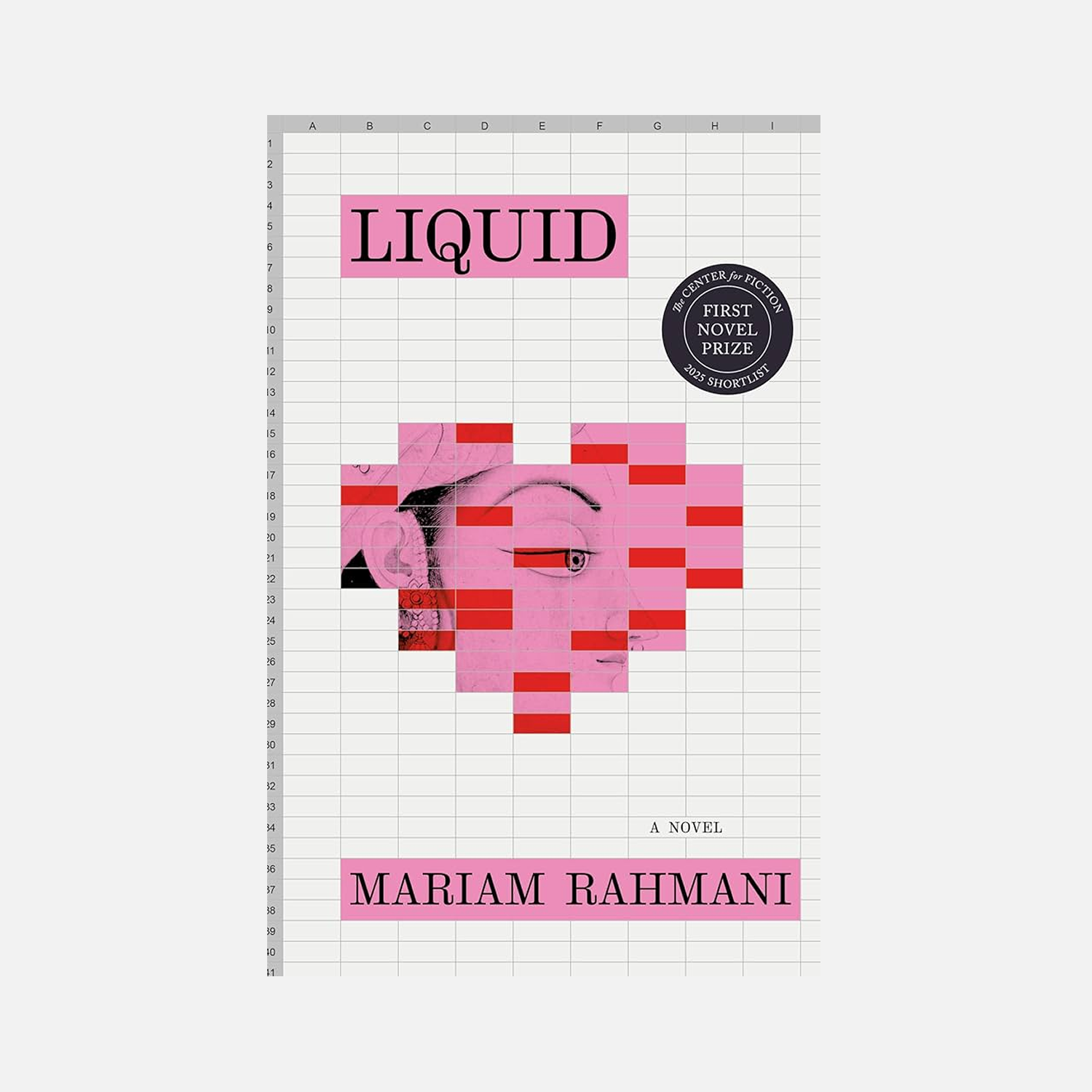 Mariam Rahmani, Liquid: A Love Story. Design: Sharanya Durvasala. Algonquin Books, 2025
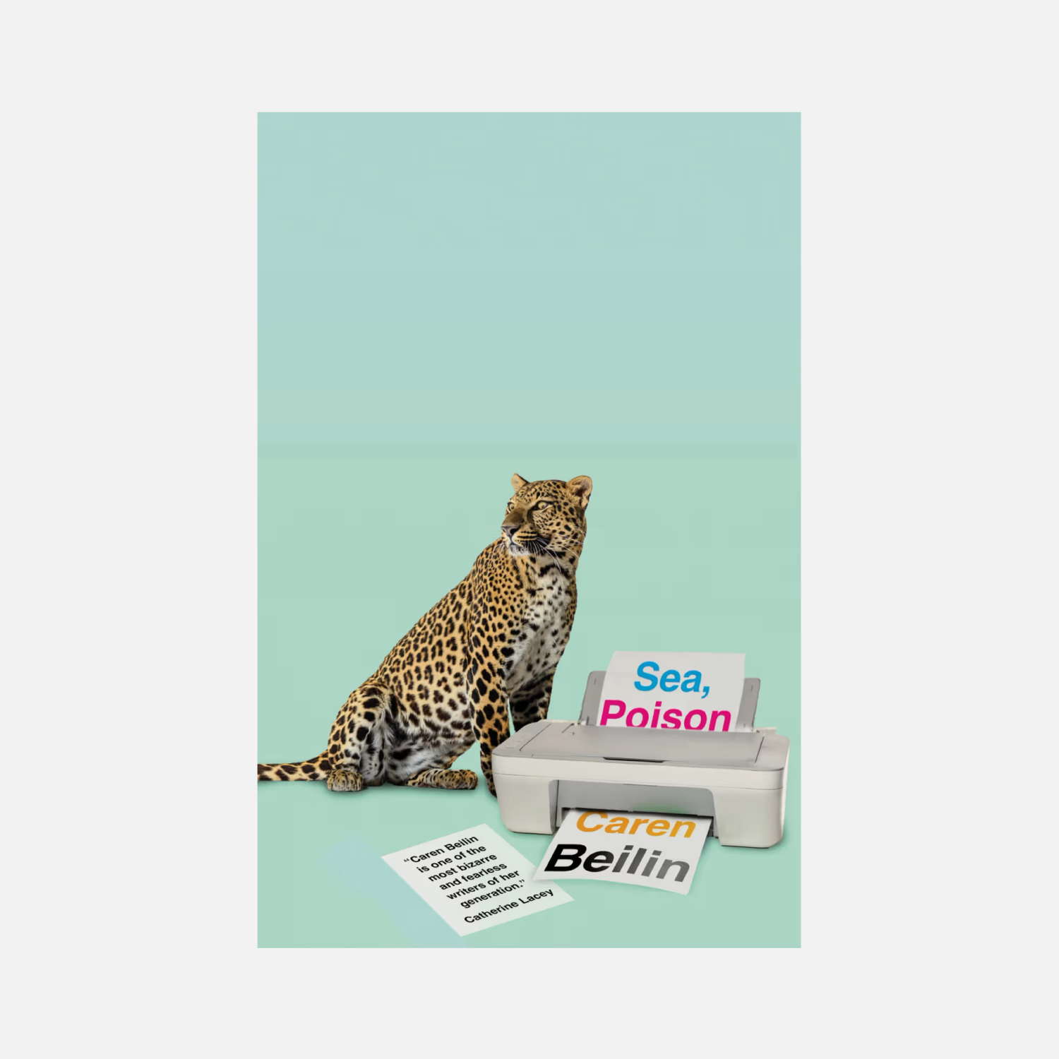 Caren Beilin, Sea, Poison. Design: Jamie Keenan. New Directions, 2025
MB: Emotion as a tool has been used a lot in recent years. Say, this might be just a green circle, but it would be irregularly
DY: I have a feeling that’s been like that for at least ten years now.
MB: It’s becoming more and more common. But generally, irony and book covers are inseparable. The key thing is always to introduce some kind of trick that will engage the
DY: Also, a book now has to be available on marketplaces, in e-readers, and
MB: In commercial book publishing, that’s actually quite important. The image needs to be appealing both at medium and smaller sizes. It’s kind of like branding, really.
DY: I thought that maybe we should now make covers that are easy to describe using words. A cover with a dinosaur, a cover with a mirror, a cover with a lighter…
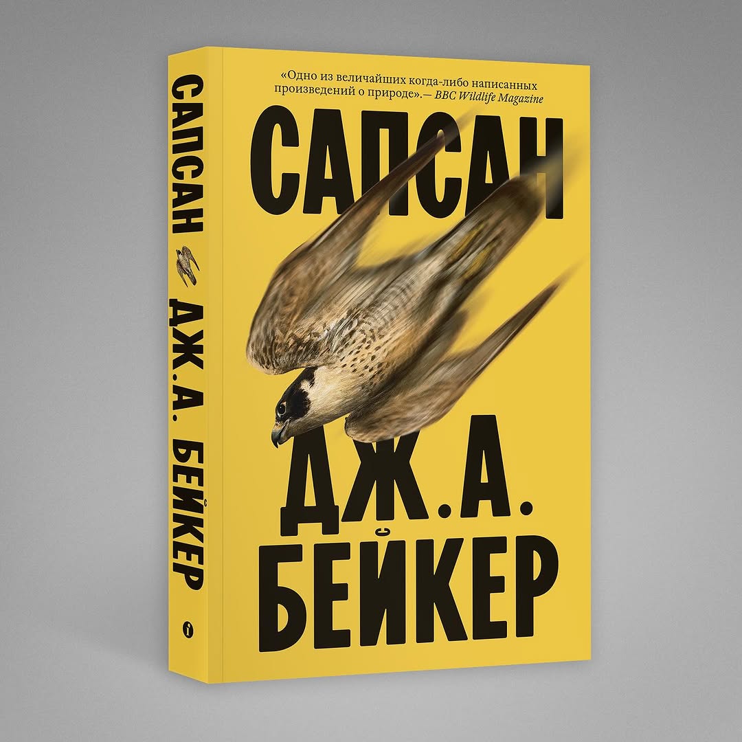 John Alec Baker, Peregrine (Russian edition). Design: Maxim Balabin. Individuum, 2025
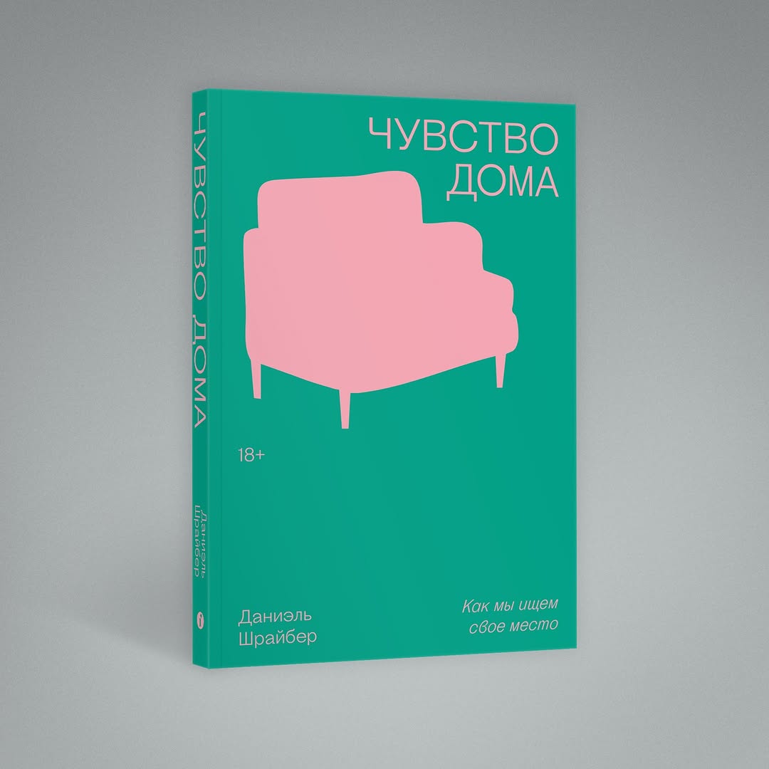 Daniel Schreiber, Home. On the Search for a Place Called Home (Russian edition). Design: Maxim Balabin. Individuum, 2026
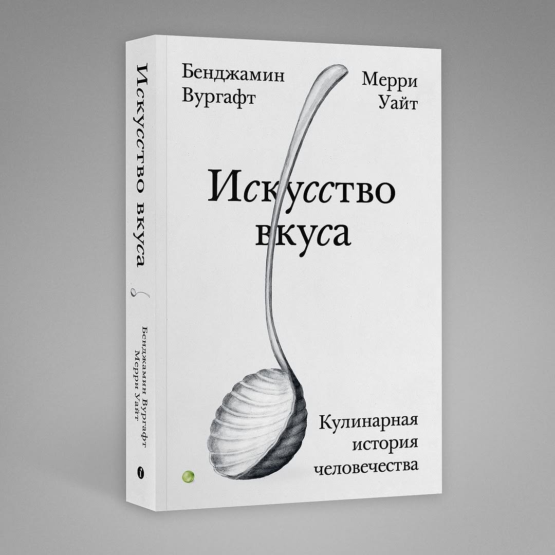 Benjamin Aldes Wurgaft, Merry White, Ways of Eating: Exploring Food Through History and Culture (Russian edition). Design: Maxim Balabin. Individuum, 2024
MB: Not exactly. Not necessarily. Both image-based designs for American fiction and scaled-down Swiss typography have to work in the modern world.
Before, when all the books existed on the bookstore’s display window, you didn’t have to think about how readable they would be in a different size. Now it’s more complicated. That if you do want the book to sell.
DY: On the other hand, I doubt that you go to a marketplace and decide on purchasing a book based just on a small image.
MB: No, that’s exactly what people do. That’s a harsh reality.
DY: Maybe it’s not the covers that are selling but the authors’ names and the good marketing around them?
MB: Of course, there’s a huge amount of marketing. And people come to a marketplace from somewhere and for someone. But that’s exactly where they make a final decision.
DY: Do you take this into account at Pollen?
VV: No, as we are not a commercial publishing house. With us, one book ensures the release of the next one. We don’t have the resources to produce more and do that more intensively.
MB: But this means you’re focused on making great books.
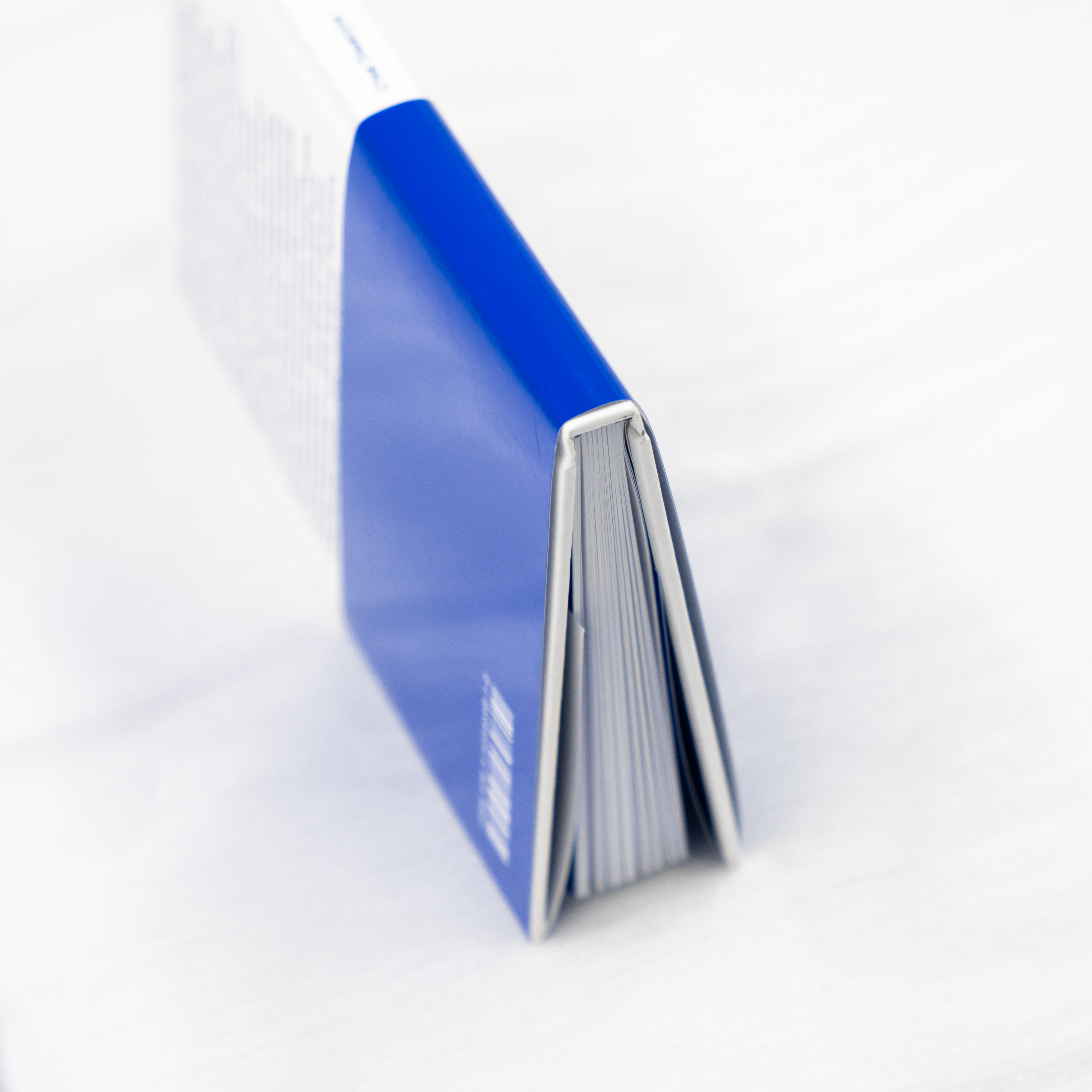
VV: Yes, we’re trying to come up with something every time. For instance, in the book that just came out, IN & OZ by Steve Tomasula, we spent a lot of time trying to achieve a very specific shade of blue on the dust jacket. Simply because the blue colour is essentially the core of this publication’s identity. The entire text in this book is printed in blue.
It was really important for us how exactly this colour would look. Luckily, the printing house was very cooperative, and they came
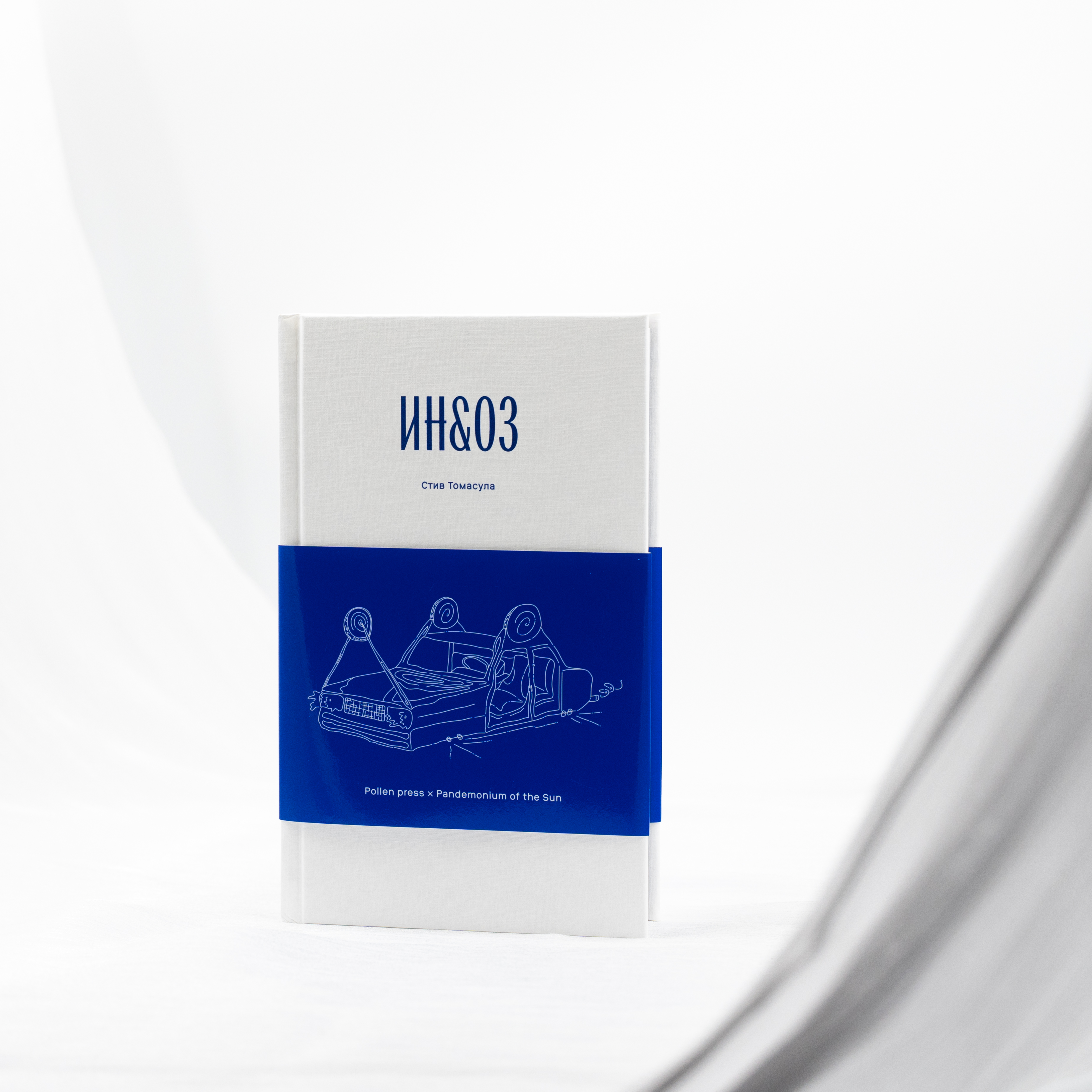
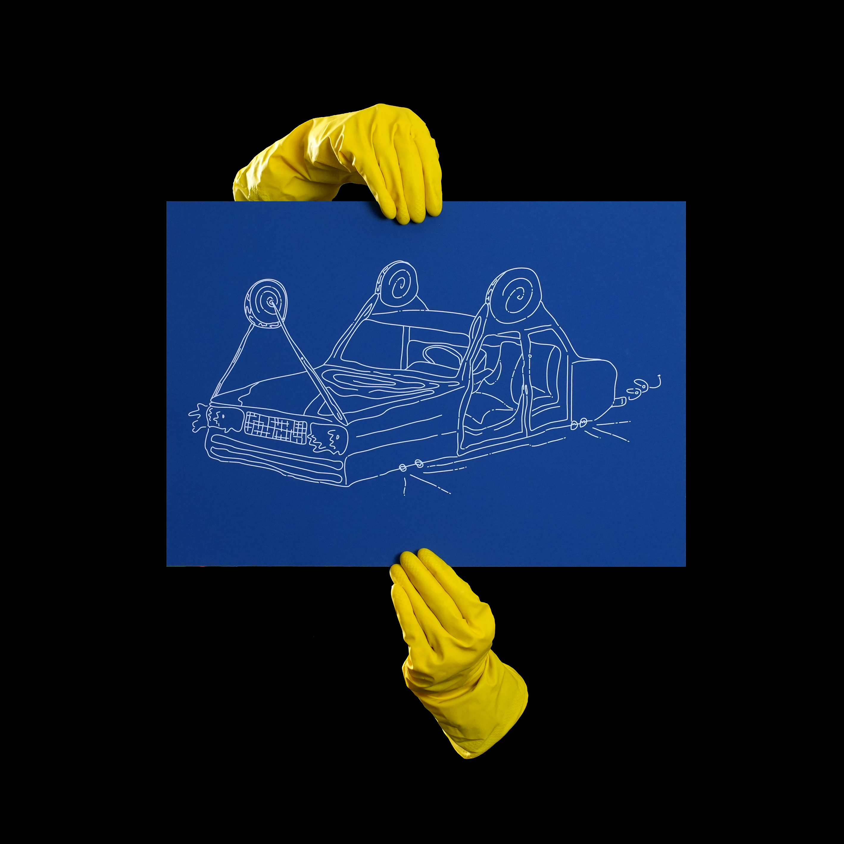
Steve Tomasula, IN & OZ. Design: Vladimir Vertinsky. Pollen, 2026
MB: A complex Pantone?
VV: Blue is generally a very difficult colour to print. Even selecting a specific number from a Pantone swatch book doesn’t guarantee colour accuracy.
There are also different kinds
We tend to work on each book for quite some time, publishing no more than three books a year; well, this year we’ll probably release four. We really get into them, constantly adding things, coming up with new ideas. We work by slightly different time rules. We don’t really exist within the market.
MB: Why not? You’re within the market, it’s just that you’re in your own little corner.
VV: Probably. But this blue book is a peculiar case for us. That’s contemporary young adult literature issued in collaboration with another project. While we normally publish 20th-century American literature
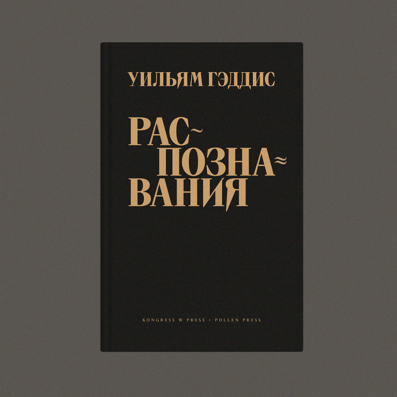 William Gaddis, The Recognitions (Russian edition). Design: Vladimir Vertinsky. Pollen, 2024
MB: Speaking of which, it overlaps with contemporary design. We often use type from that period now.
VV: Wood type, yes.
DY: You also have a project with wood type, Dispatches.
VV: Yes, the original edition also used wood type, but it was an imitation of wood, while we decided to make it authentic.
We always deal with translations, and we always have the original editions at our disposal. Often, it’s a number of different designs of the same book, as books get reissued. We identify a kind of design core common across various editions of the same work.
Take Dispatches, its cover often features wood type, simply because it’s about the war in Vietnam, with this obviously being a reference to lettering on supply crates and military mail. We do not come up with anything new, just reinterpreting things.
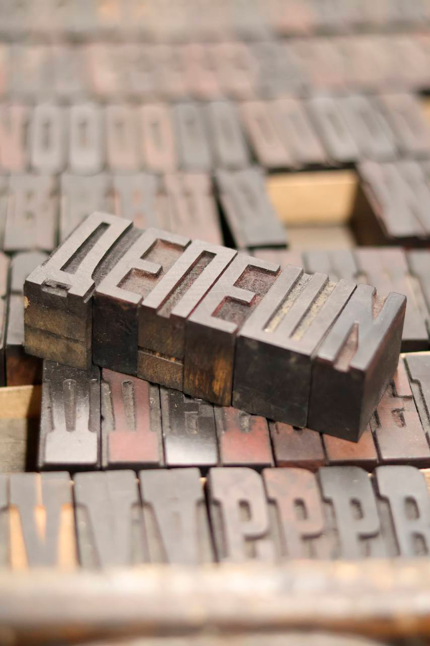
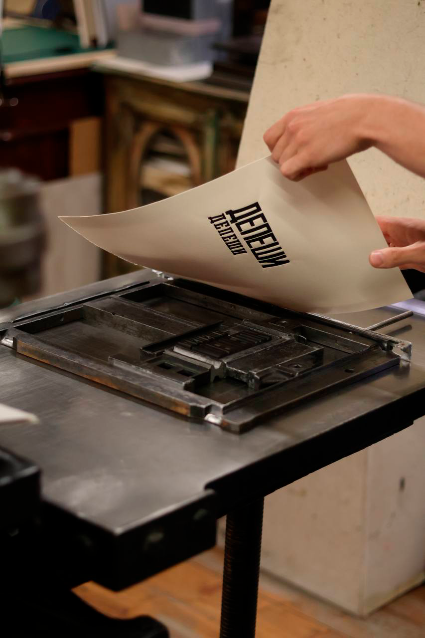
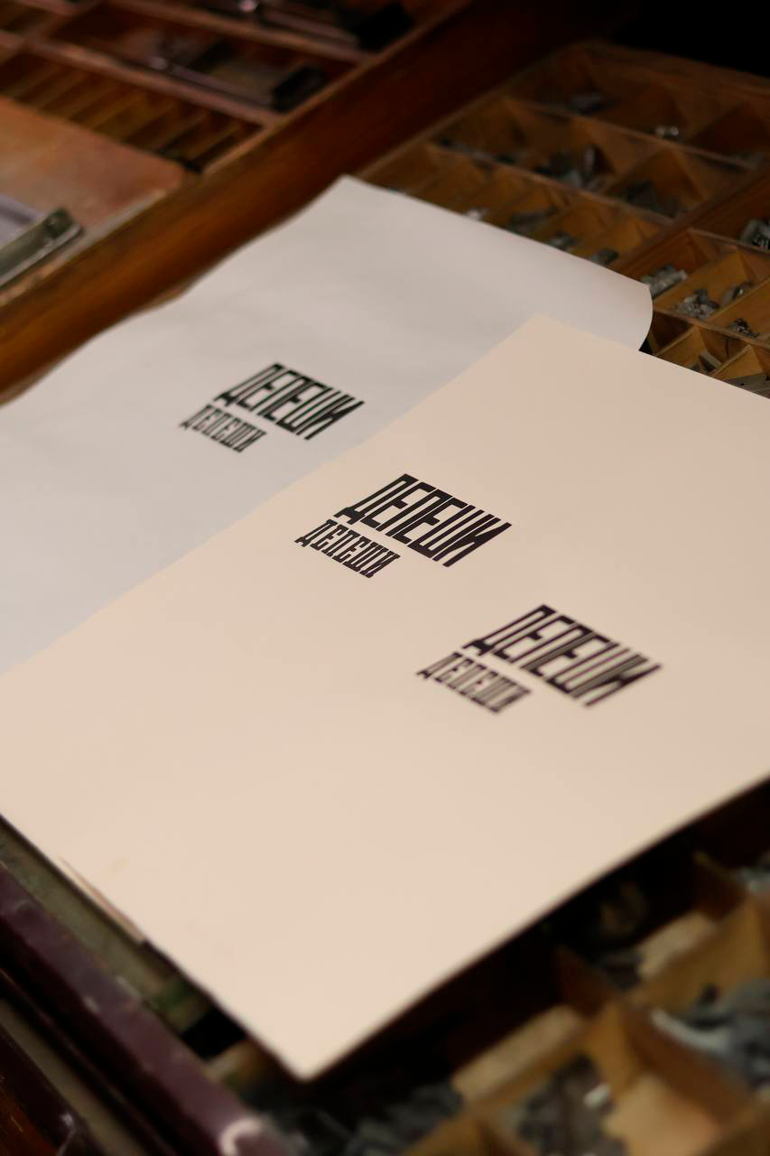
Wood type for the cover of Dispatches by Michael Herr. Design: Vladimir Vertinsky. Pollen, 2026
DY: I was just about to address this: how much of the book designer should there be in a book? When Yura and I were just starting in book design, we made a book for Novoye Izdatelstvo publishing house. The publisher received the mockup and said, ‘It’s beautiful, really great. But you know, this cover feels like it says in big letters, "I was designed by Yury Ostromentsky.‘’. We got really upset then, but remade
Since then, we’ve been having this discussion a lot: how much of the book designer should be present in a book.
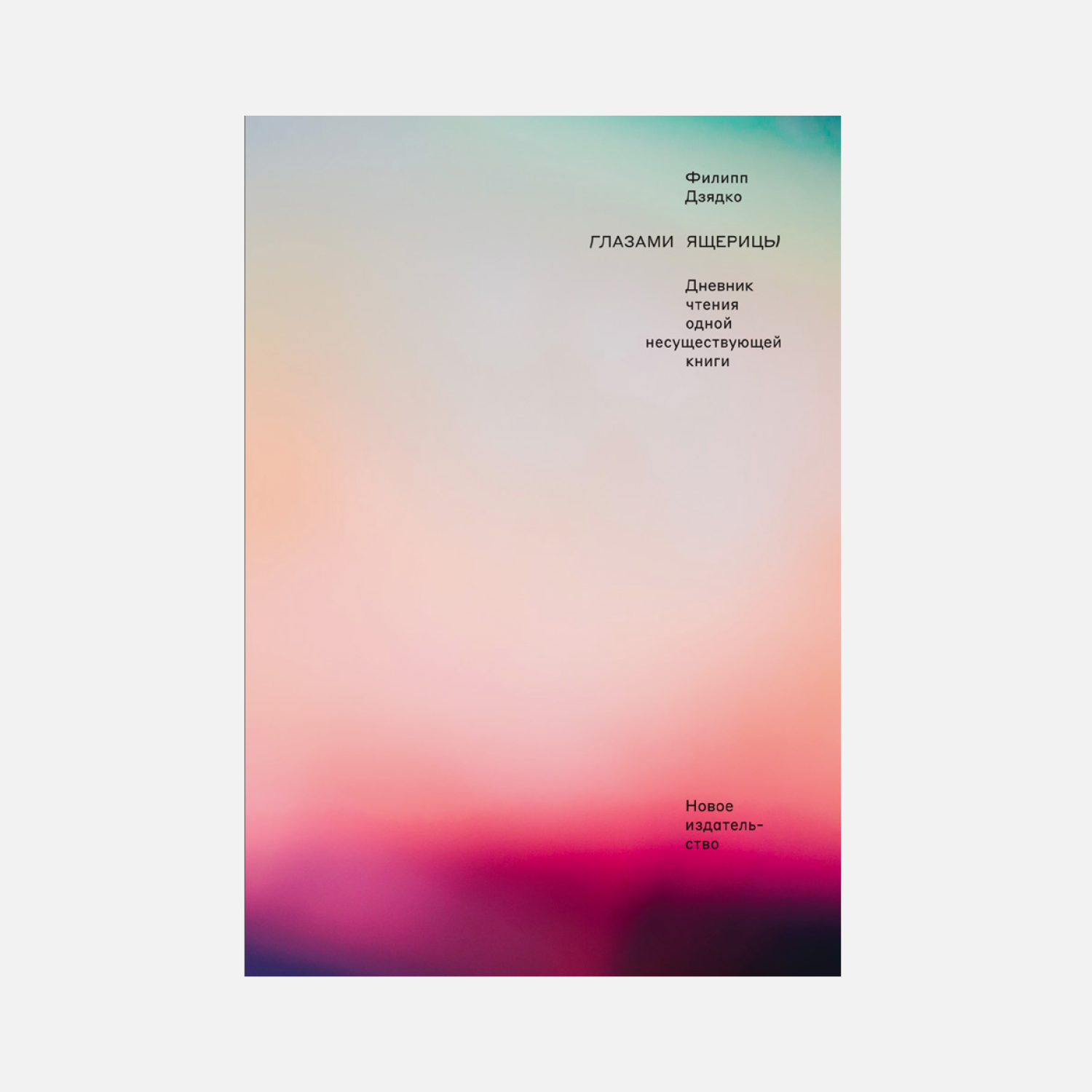 Filipp Dzyadko, Through the Eyes of a Lizard. A Reading Diary of One Non-Existent Book. Design: Yury Ostromentsky, Daria Yarzhambek. Novoe Izdatelstvo, 2021
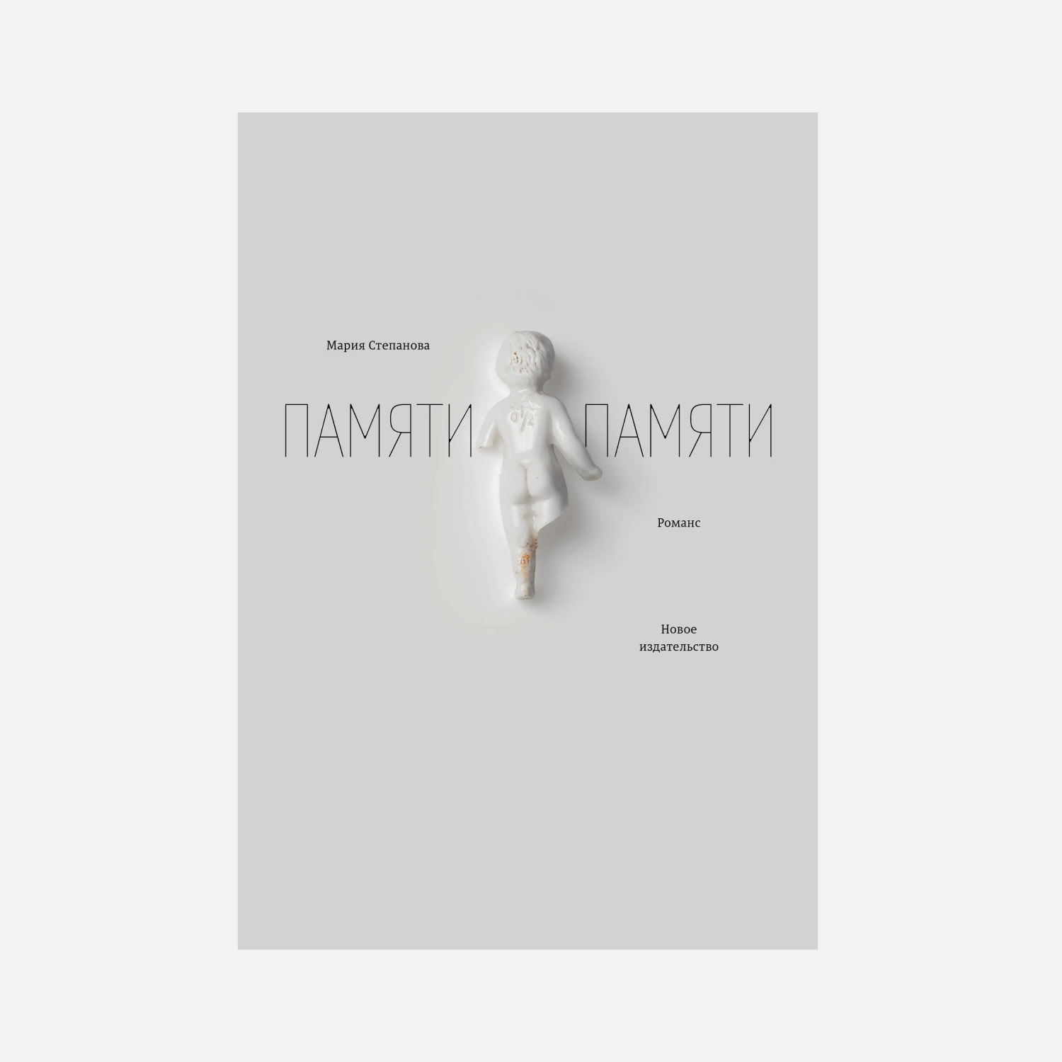 Maria Stepanova, In Memory of Memory (Russian edition). Design: Yury Ostromentsky, Daria Yarzhambek. Novoe Izdatelstvo, 2017. Object on the cover: from the collection of Maria Stepanova. Cover photograph: Sergei Leontyev
MB: I believe it depends on the publisher. Let’s talk fiction that’s meant to sell. You can manage your publishing house so that book design is part of the marketing strategy. But I always try to make sure I am not visible behind the book.
DY: And who should be visible then, the author?
MB: It’s for the author to decide. Designing books by living authors is incredibly difficult. The only thing that is more painful is doing branding for a company.
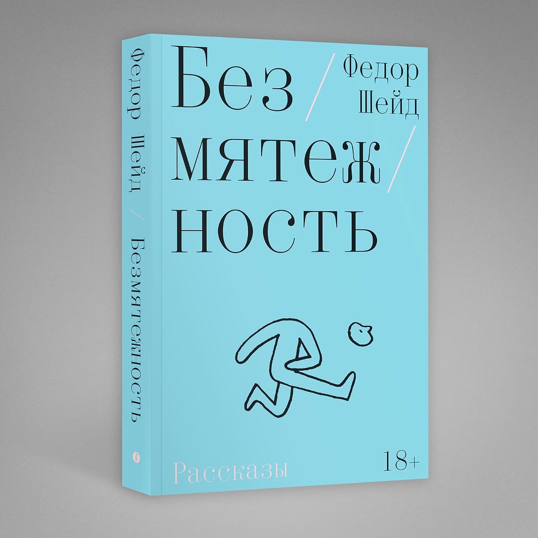 Fyodor Sheid, Bezmyatezhnost (Serenity). Design: Maxim Balabin. Individuum, 2025
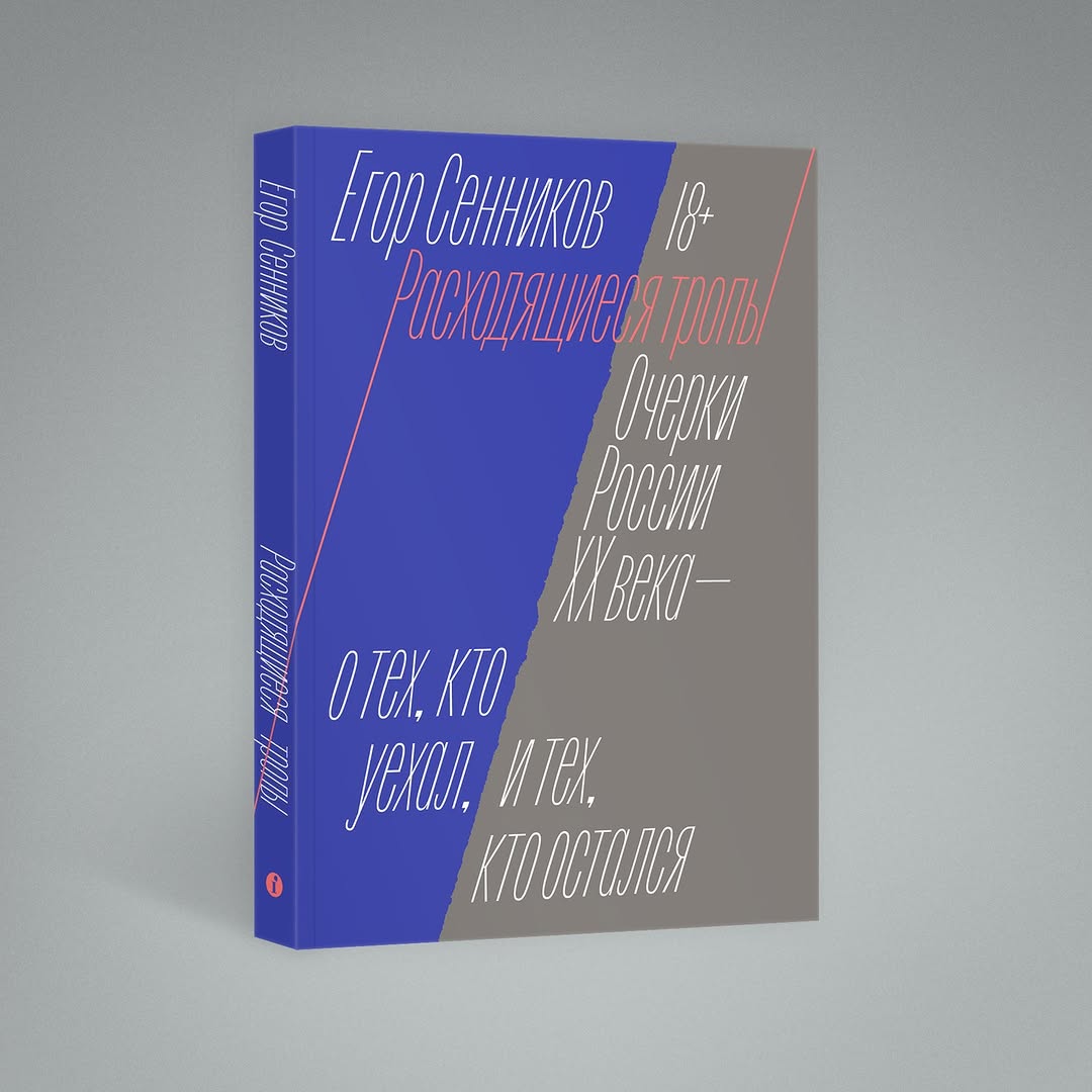 Egor Sennikov, Diverging Paths. Essays on Russia
DY: No, Shakespeare is also very difficult to handle, or The Odyssey.
MB: No, all those authors who are no longer with us are quite easy to work on. You can do whatever you want. But if you’re making an author’s first book… just imagine: it’s their first book, and they have their own particular idea of what it should be like. They feel like there should be a lot of them in it. And as a designer, I want the layout to be great and true to the book.
VV: I think it’s good when there’s some kind of synergy between a publisher and a designer. Like with Nick Teplov and the Ivan Limbach Publishing House. It’s practically a family-like connection.
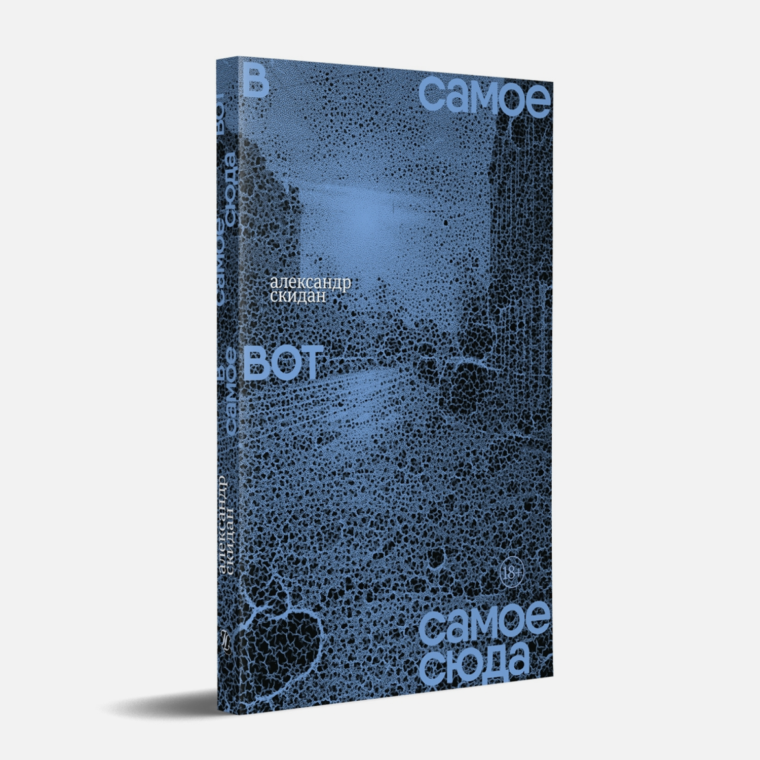 Alexander Skidan, Into the Very Here and Now. Design: Nick Teplov. Ivan Limbakh Publishing House, 2024
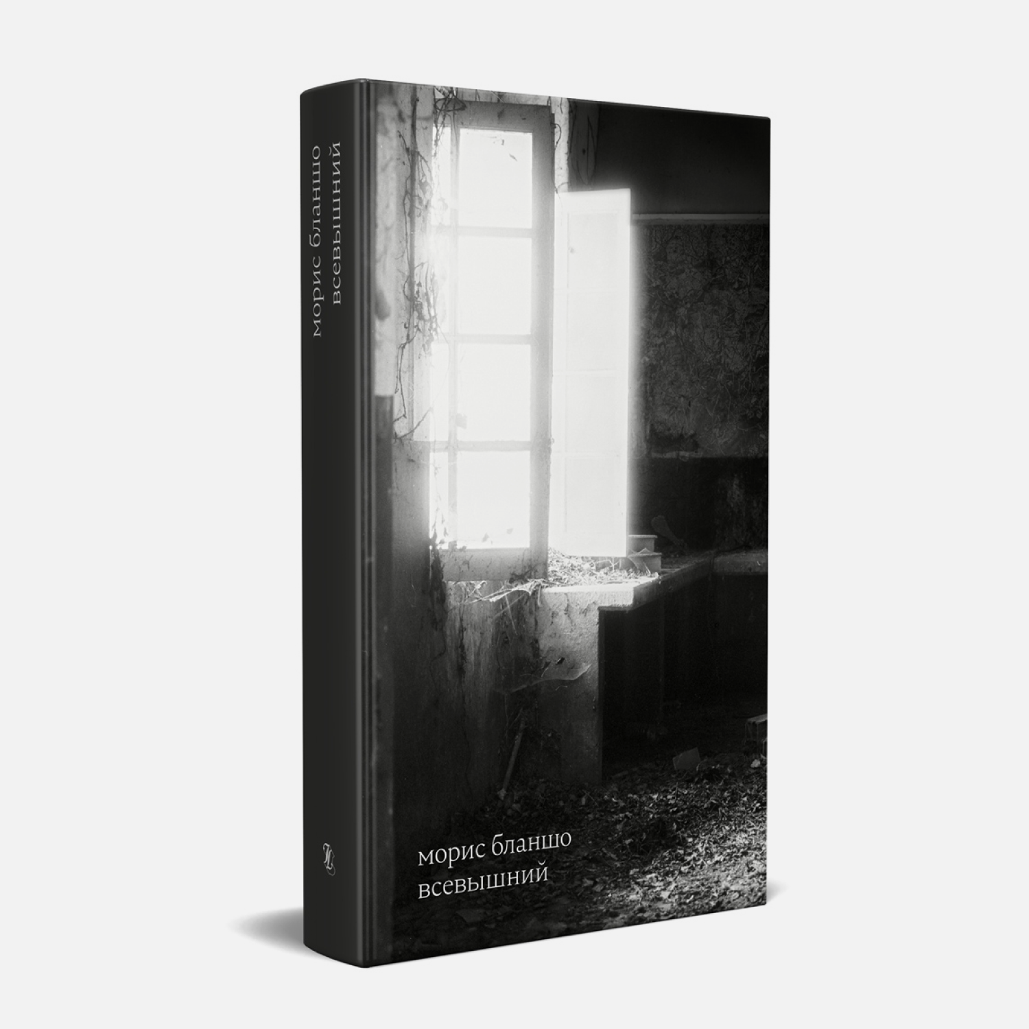 Maurice Blanchot, The Most High (Russian edition). Design: Nick Teplov. Ivan Limbakh Publishing House, 2024
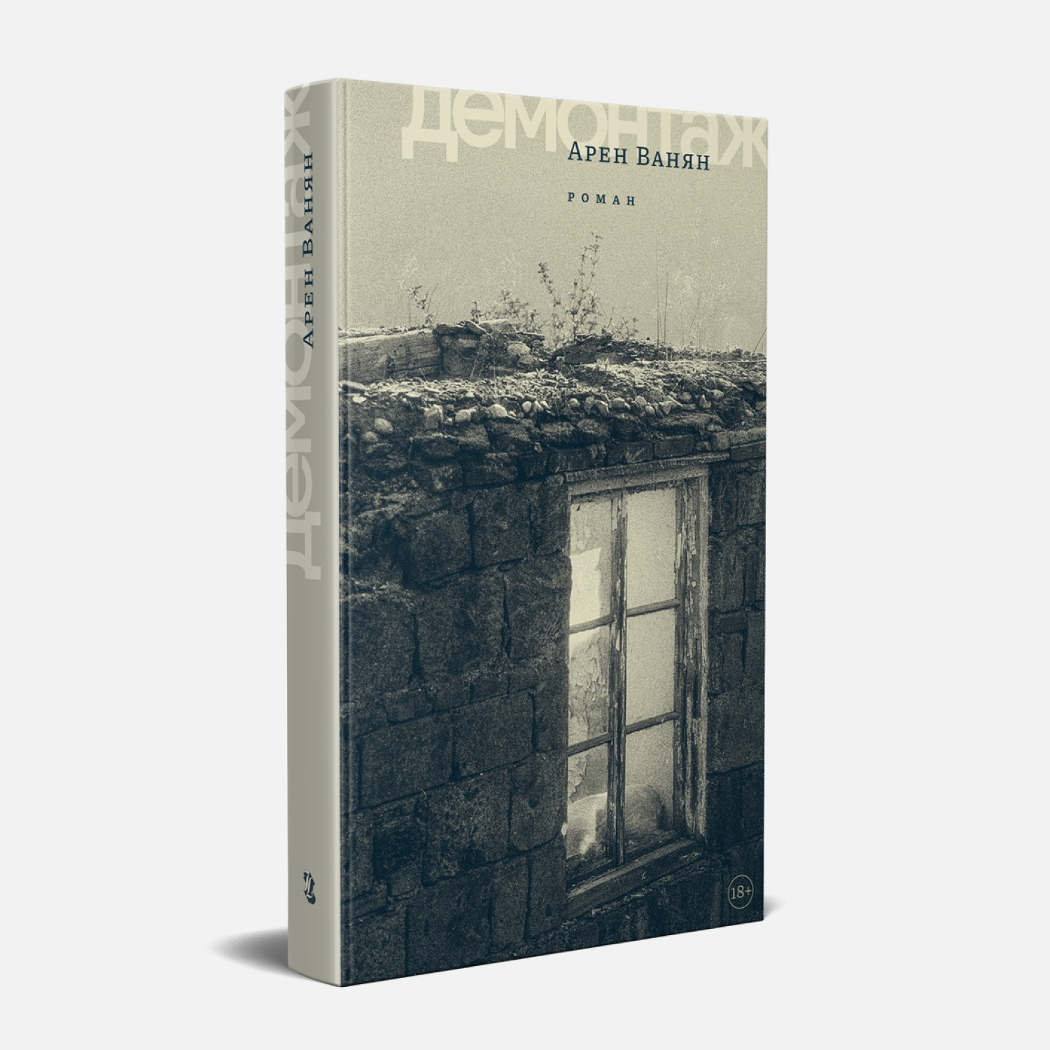 Aren Vanyan, Dismantling. Design: Nick Teplov. Ivan Limbakh Publishing House, 2023
MB: His design is already part of the publisher’s identity, I believe.
VV: He uses a lot of his own photographs, putting them on covers. I can also tell that’s his book from the way he handles type.
MB: I can identify quite a few designers by their covers, but this doesn’t mean they are present in them. We recognise them because we’re part of the industry.
VV: On Ozon Russian marketplace resembling amazon, you can filter books by, say, publishing house or the year of publication. Perhaps some people filter by designers, too.
MB: I think it’s overall great when the designer has been able to put themselves on the cover. It’s just that for me it’s far more important that more people read the book, that the book is a success.
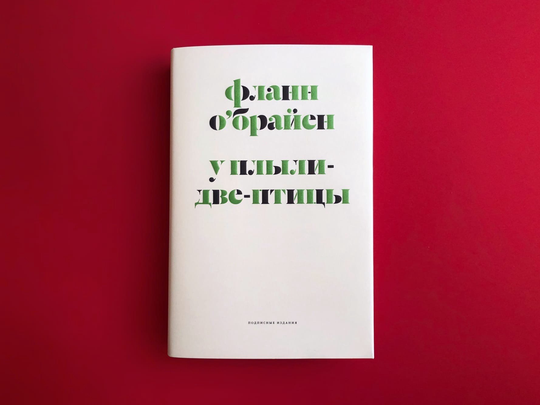
Flann O’Brien, At Swim-Two-Birds (Russian edition). Design: Vladimir Vertinsky. Podpisnie Izdaniya, 2022
DY: Once, in an interview with the band Krovostok, I heard an idea that for some reason I still can’t let go of. I wouldn’t vouch for the exact quote, but I take an interest precisely in my interpretation of it. They were talking about how there used to be big labels, and then the garage music was born, and everybody was free to express themselves the way they wanted to. And Krovostok said, ‘Technology became accessible to everyone, and everyone became the same. Labels had certain capacities, resources behind them that helped musicians find their own unique sound, since labels cared that the music would sell. And when the freedom arrived, that became less important for most people, and the music became uninteresting’.
For some reason, I would like to apply this observation to book publishing. Which is better, to be small or to be big? When you sell, you need to please the mass market, which means you have less freedom, or…
MB: But why do you have to please the mass market? On the contrary, if you have money, you may choose not to cater to it. Those who have money do things poorly, but that’s not because that’s what is expected from them. That’s a real problem, actually. In fact, it’s possible to produce great mass-market books. In the English-speaking world, by the way, books that sell hundreds of thousands of copies look good.
I think it’s great to be small. And it’s great to be big, too, I guess. I work with publishers that are somewhere
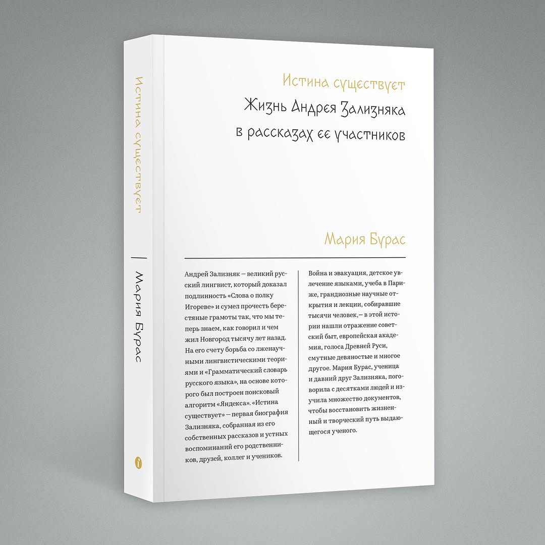 Maria Buras, Truth Exists. Design: Maxim Balabin. Individuum, 2019
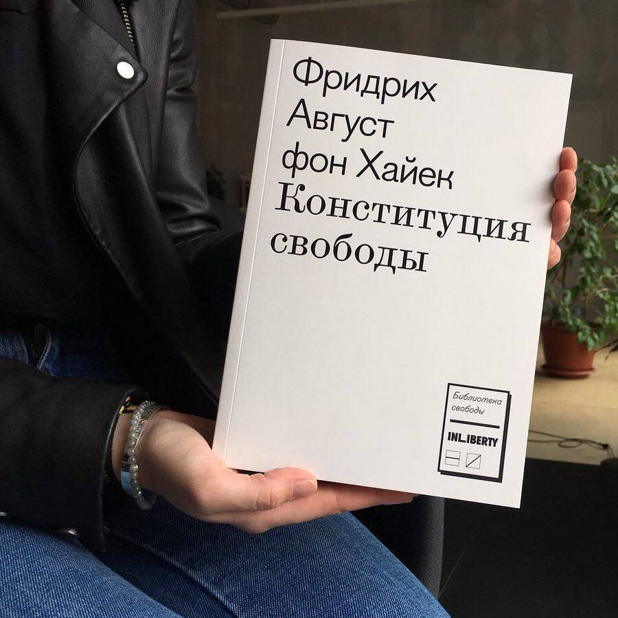 Friedrich August von Hayek, The Constitution of Liberty. Design: Yury Ostromentsky, Daria Yarzhambek. Novoe Izdatelstvo, 2018
DY: Frankly, I have no idea why I wanted to apply this thought to books.
MB: It’s more applicable to the internet, actually. It’s more about social media, about modern marketing in general. When everyone got access to extremely powerful tools, everyone, for some reason, started doing everything the same way.
VV: I can tell that authors are now much more likely to work with small publishers. They are willing to sacrifice total print runs as long as the copies actually get sold. We see this ourselves. Rick Moody, whom we spoke to not long ago, said to us, ‘Guys, if you’re independent, I will give you the rights’.
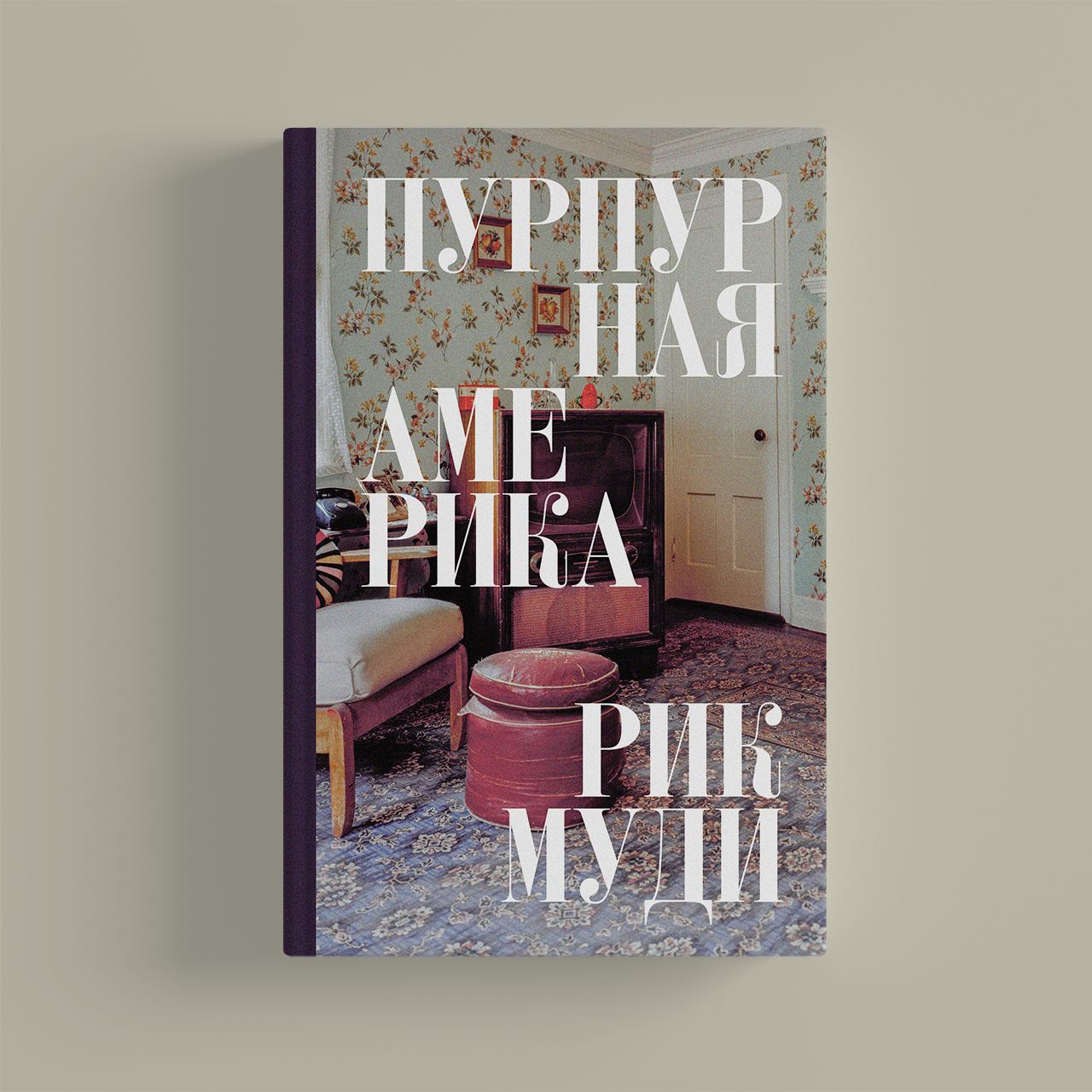 Rick Moody, Purple America (Russian edition). Design: Vladimir Vertinsky. Pollen, 2025
Because big publishers release books by major American authors, and then books by those big authors end up on marketplaces selling for something like 30 rubles. For publishers, it’s just another item in their catalogue.
MB: Big publishing houses are essentially investment businesses. They put money in everything
That’s the difference between indie and non-indie publishers. An independent publishing house invests in a book. They want it to reach the reader. That’s it.
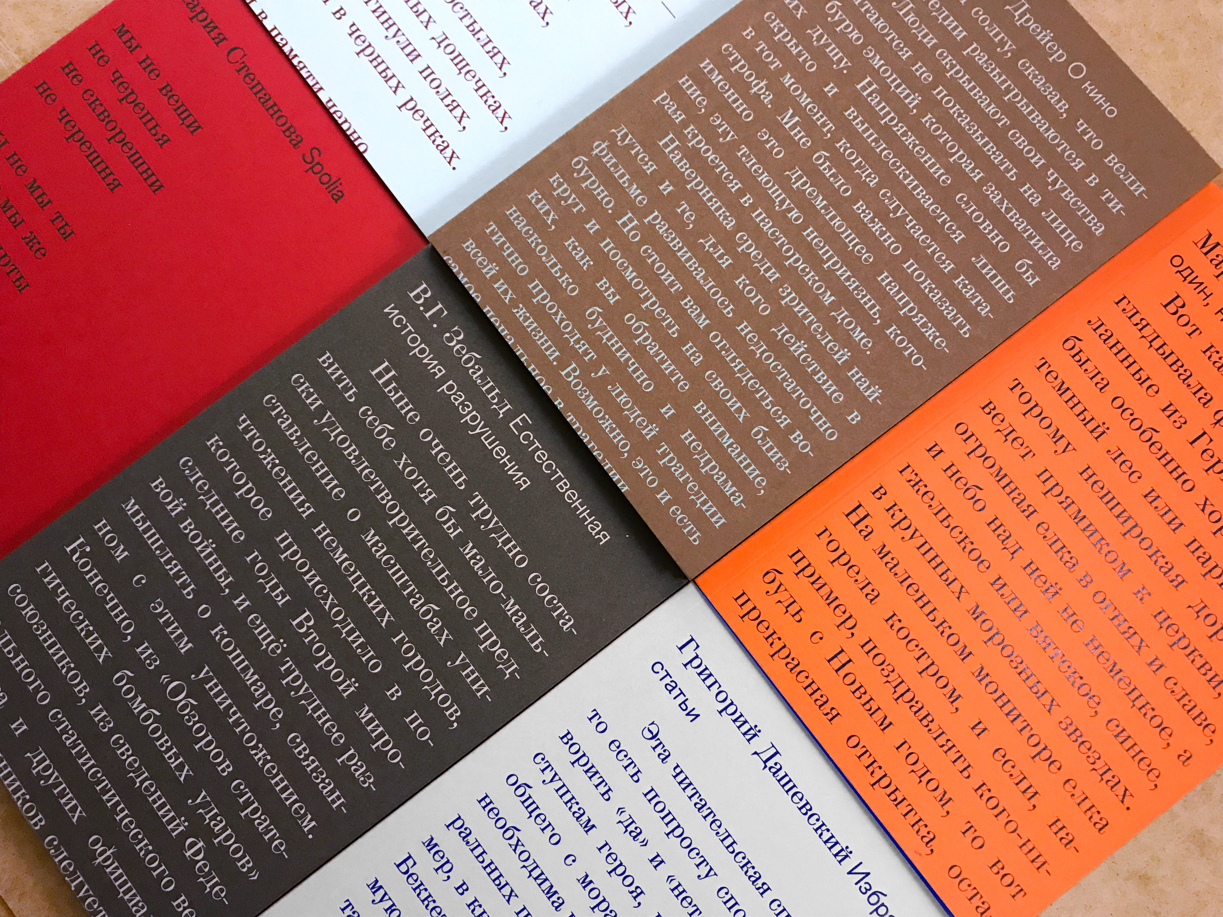 Book series by Novoe Izdatelstvo, 2019–2021. Design: Yury Ostromentsky, Daria Yarzhambek
VV: The quality of translation is also
DY: And now there are also AI translators, too, which means things are only going to get worse.
MB: It would be great if machines learned to translate like a good human translator. We would be able to publish a greater number of interesting books. Actually, they are already capable of translating some books quite well with no alternative available. But in most cases, a truly brilliant editor is needed afterwards. Language is a complex thing.
VV: Also, the lifespan of some books is really short. We are now working at the EUSP Press <European University Publishing House> on a book about neuro-poetry, on how AI writes poetry and what patterns it uses. At an editorial meeting, we actually discussed that we need to work on this book quickly. If we postpone its launch and release it later this year, it will already be half less relevant.
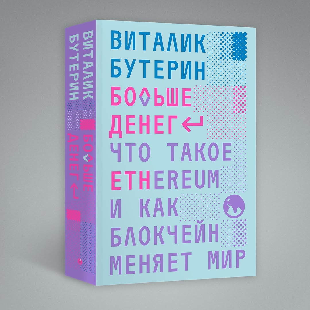 Vitalik Buterin, More Money: What Is Ethereum and How Blockchain Is Changing the Worl. Design: Maxim Balabin. Individuum, 2023
DY: I’ve also been thinking about something else. There is now some kind of particular respect towards those who work on books — that wasn’t there before. When we were just starting in the field, everybody else around us was doing startups, web projects, new technology. Wheras we spent ten years sitting in our nice dusty room, and then suddenly started noticing a tremendous amount of respect from people who had been doing all those fancy things all this time.
MB: I feel like for most people you’re some kind of an expert on classical antiquity. That makes them respect you.
DY: Isn’t it that everybody suddenly became interested in books again?
MB: I don’t think, no. This definitely happened with typography, though. Guys who do type are now some kind of rock stars. But with books, I don’t think so.
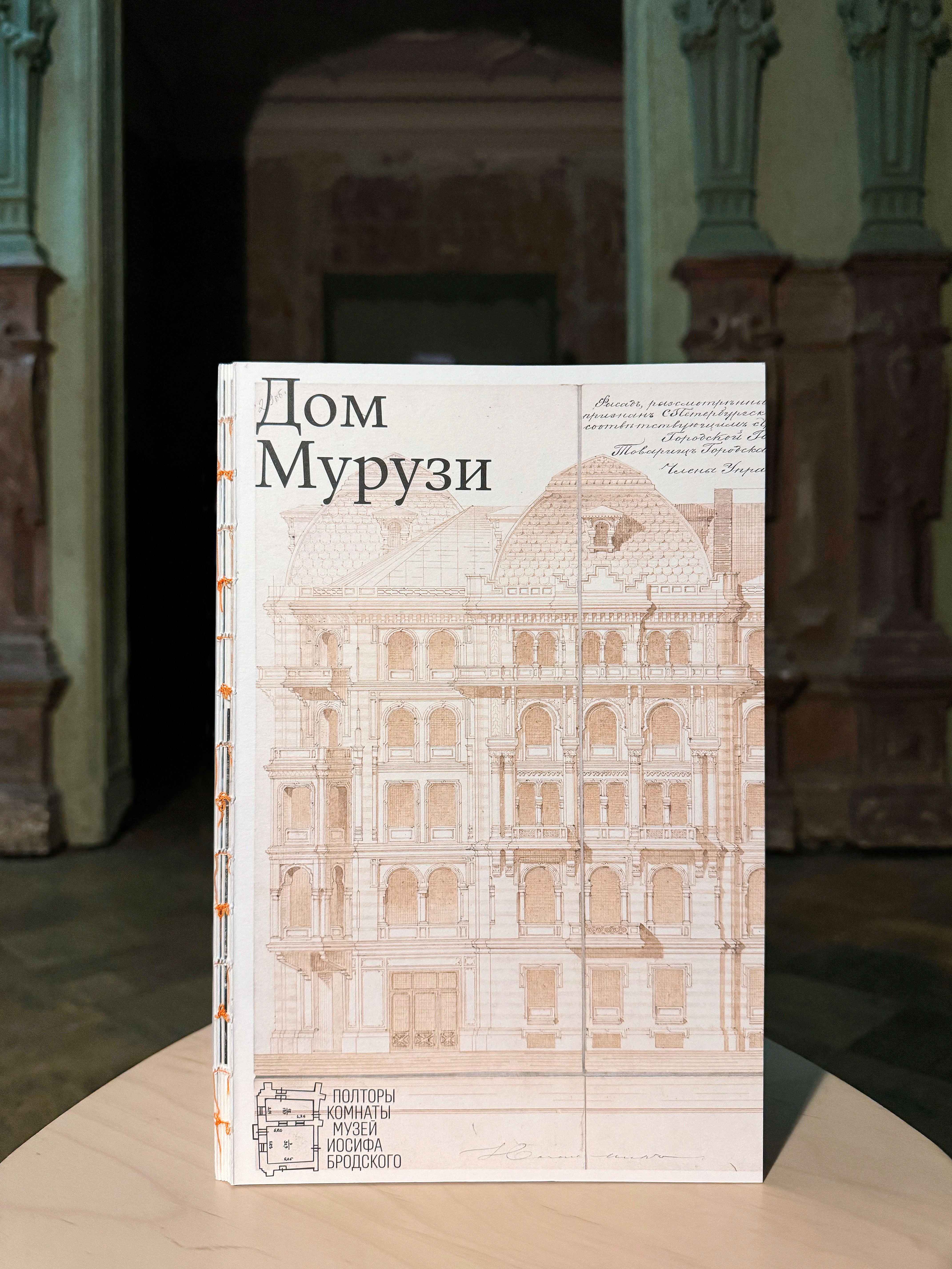 Lev Lurye, Alexander Kobak, Yulia Senina, Anton Alexevsky, The Muruzi House. Design: Daria Yarzhambekk, Yuri Ostromensky. A Room and a Half, The Joseph Brodsky Museum, 2024. Image: Anna Malenkova
DY: Perhaps, books are interesting because it’s an area where you can create a finished product. If the printing shop didn’t fail you, it won’t change. And there are not so many finished things in design.
MB: A stool is quite a finished item.
DY: If we aren’t talking industrial design. I mean graphic, web, product design. Things are fluid there. A website can be opened on any device, and an image can be cropped in different ways.
MB: I believe the thing is that the new generation just loves physical objects. Because they have too much AI in their lives. They like something
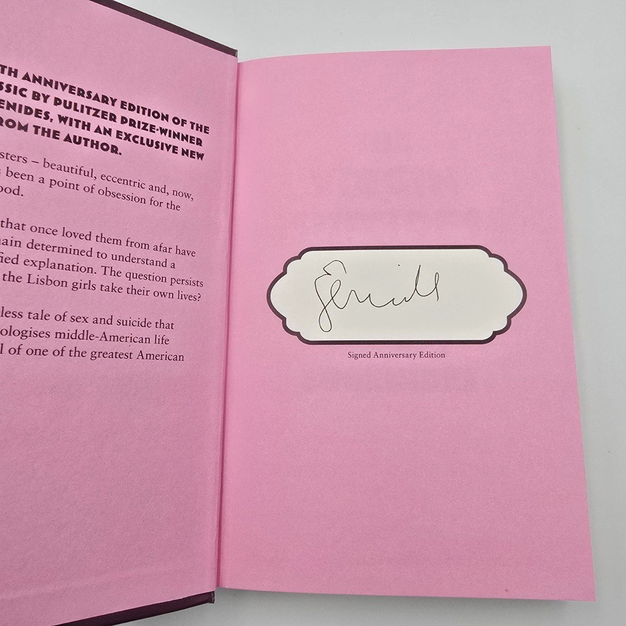
VV: Speaking of the book’s static nature. So-called rebinds are extremely popular in the West right now. It’s basically repackaging. For example, the book is published in a large print run. However, 100 copies are released in a different design, in a dust jacket or a slipcase, signed by the author. These are usually big authors with huge marketing budgets.
Recently, there was the anniversary of the release of Eugenides’ novel The Virgin Suicides, and I saw an awesome limited edition released for a TikTok book club. It’s like an entirely new entity within the very same text. Sometimes a publisher offers a bookstore to create their own rebind, and the store gets an exclusive product. There’s more and more of this now. So it’s no longer accurate to talk about the static nature of a printed publication right now.
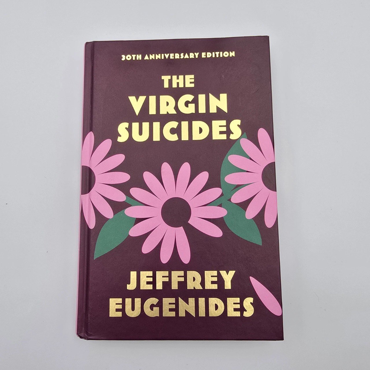
Jeffrey Eugenides, The Virgin Suicides. Fourth Estate, 2023
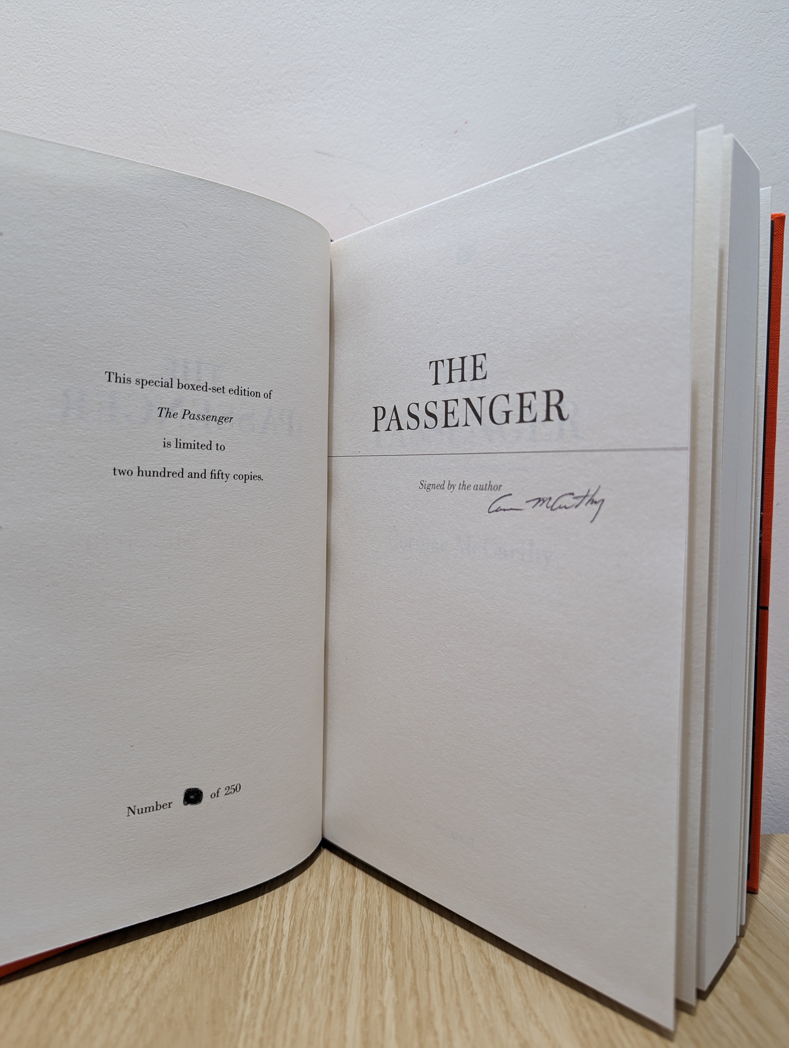
Cormac McCarthy, The Passenger, Stella Maris. Collector’s edition specially for the Waterstones bookshop, Picador, 2022
MB: It’s kind of book merch in the form of a book.
DY: There’s also the opposite situation, where at Fnac, for instance, you can order a personalised copy, print-on-demand.
MB: I’ve just visited the Frankfurt Book Fair and at some point found myself at a booth of people doing print-on-demand. They had decent digital printing on a pretty good paper. But they are
DY: I recently walked around bookstores in London. There was so much great stuff on covers! There’s embossing, varnish, many things. And I nearly fainted in the children’s section. There’s a huge amount of special effects in every edition.
MB: I think it’s just that the number of books that are being published in English is so huge that they have to compete with each other.
DY: Is it not because the technology has become more accessible?
MB: How is it more accessible? There are the very same German machines as before. It’s just that you have to apply special effects to fight for the audience’s attention.
VV: I myself like these special effects. I prefer low-key designs that somehow flirt a little with these tricks. Some publishers really overestimate the cost of these procedures. When you ask the price of a ribbon bookmark, they write to you that it will add some two rubles to the cost of the book. And you think, ‘wait, really, you can actually do that?’
Now I always ask the price for embossing or any other interesting options. Right now, I want to try making a plastic dust jacket. I realise this is going to be expensive, but I don’t really know how expensive yet.
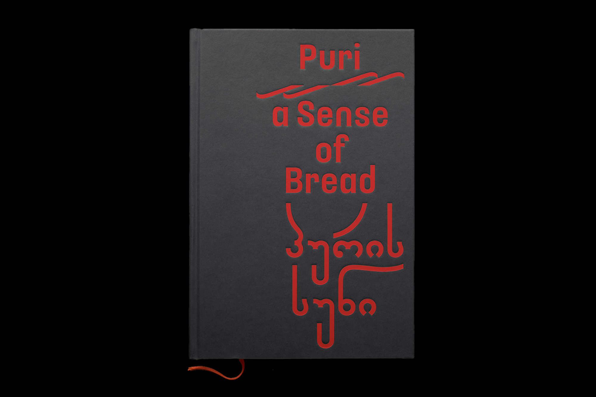
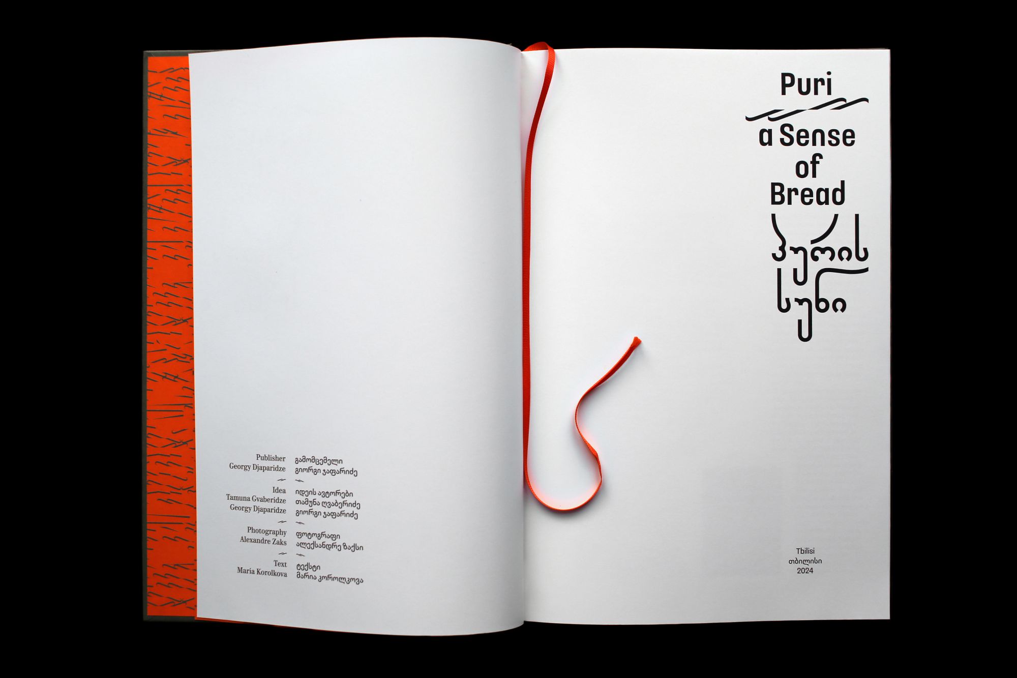
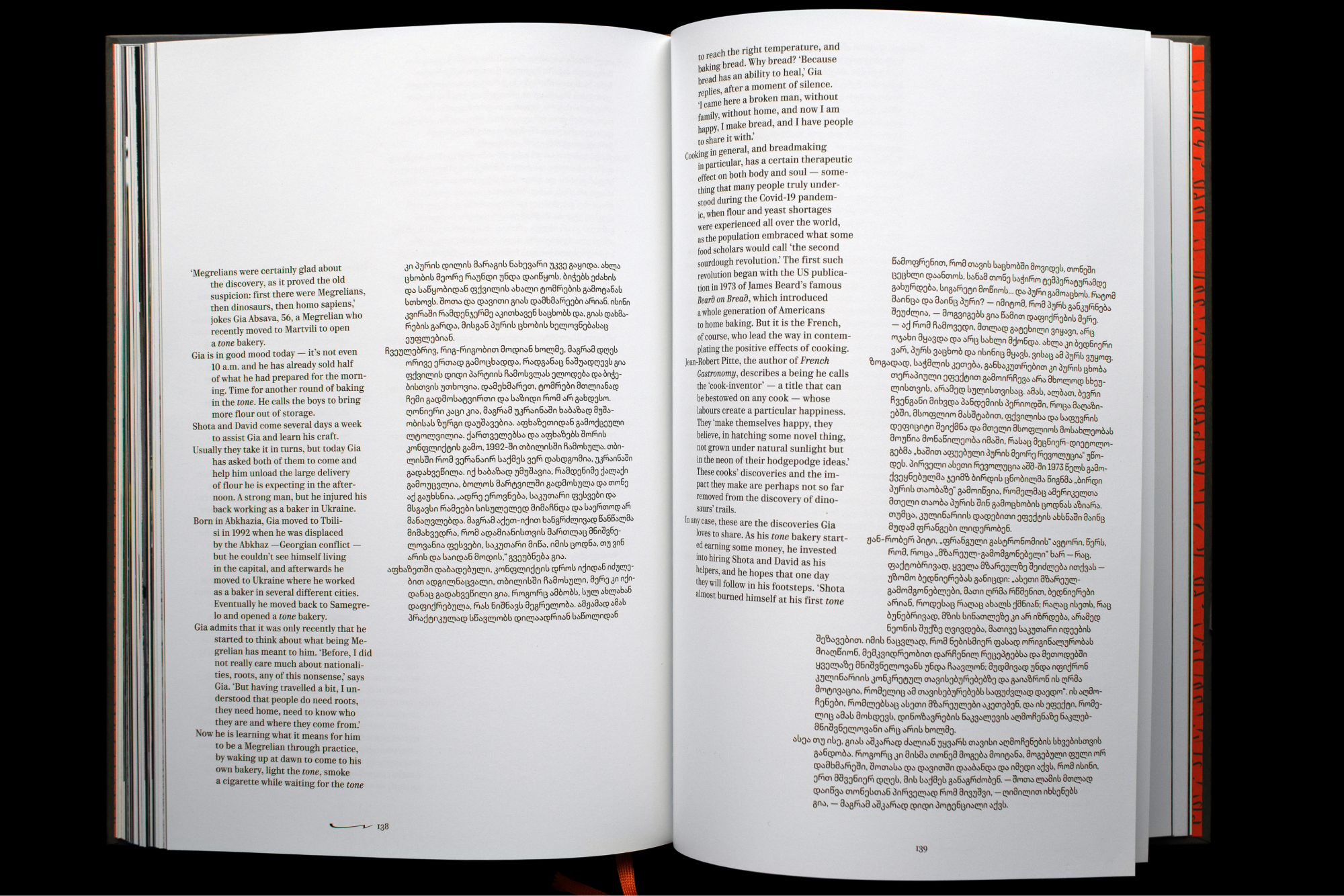
Giorgi Japaridze, Tamuna Gvaberidze, Alexander Zachs, Maria Korolkova, Irina Meglinskaya, Puri. Sense of Bread. Design: Yury Ostromentsky, Daria Yarzhambek, 2024
MB: I’ve seen some really well-made plastic jackets in Hong Kong. I was totally envious. If you find out how to make them, it’ll be interesting. It’s an expensive thing, clearly, but not insanely expensive.
VV: We’re starting to see some great solutions in our market, too. Such actors as Polyandria are constantly coming up with some die-cuts, cut-outs, open spines, and so on. It’s like they’re testing the waters.
We had to replace the printer for one of our series at the European University
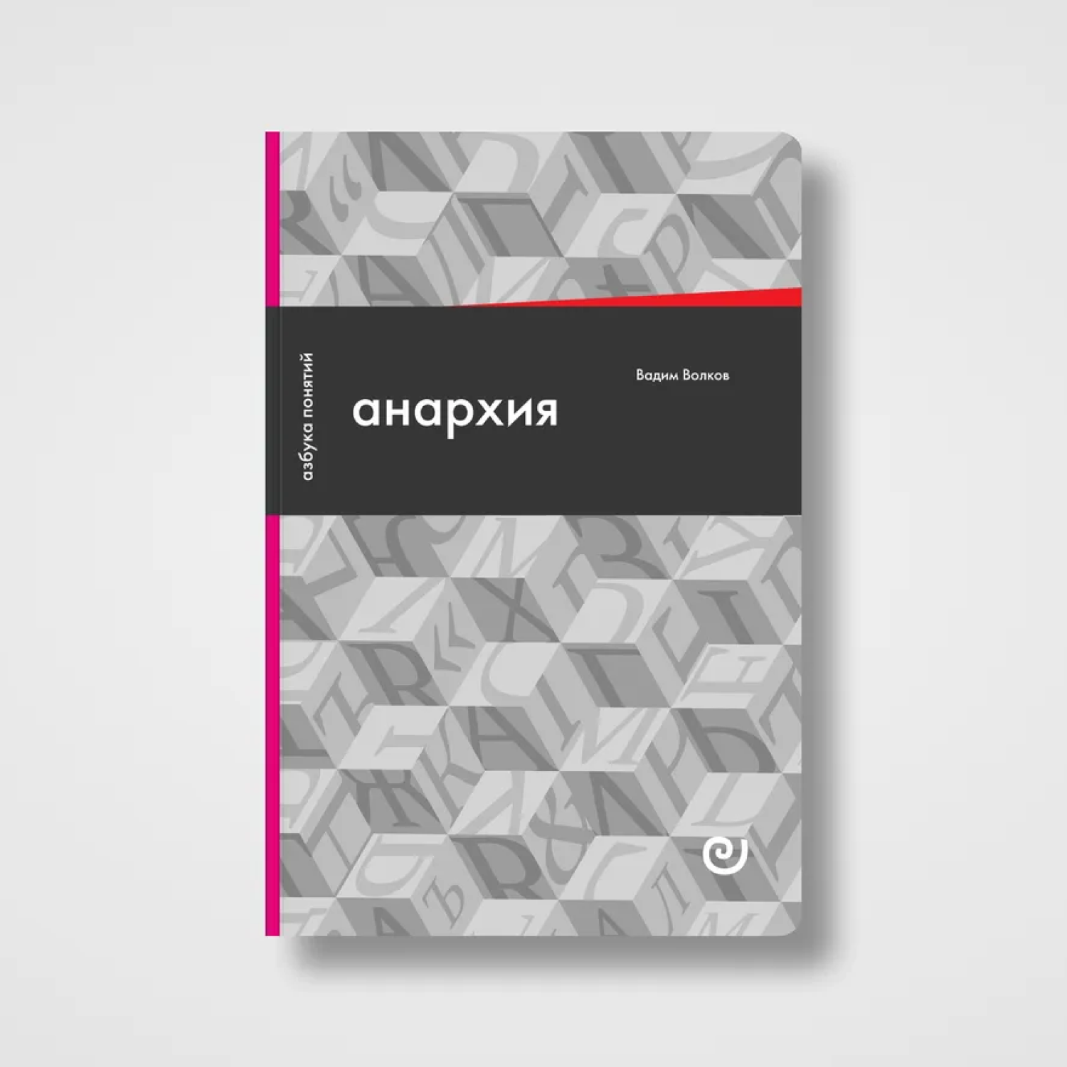 Vadim Volkov, Anarchy, or Life Without a Boss. Design: Vladimir Vertinsky. European University Press, 2026
DY: And I got a new experience in Georgia: making books remotely. You select materials from a distance, not being able to come to the printing house for the actual printing process…
VV: I am based in Russia, and we have material distributors
Largely because I tend to choose the same materials and trust the printing shop. I explain to them in simple terms, ‘This is what we want’. Once, I even brought the American edition of The Lord of the Rings to the printing office and said that they needed to produce something like that. And they figured out all the exact solutions themselves.
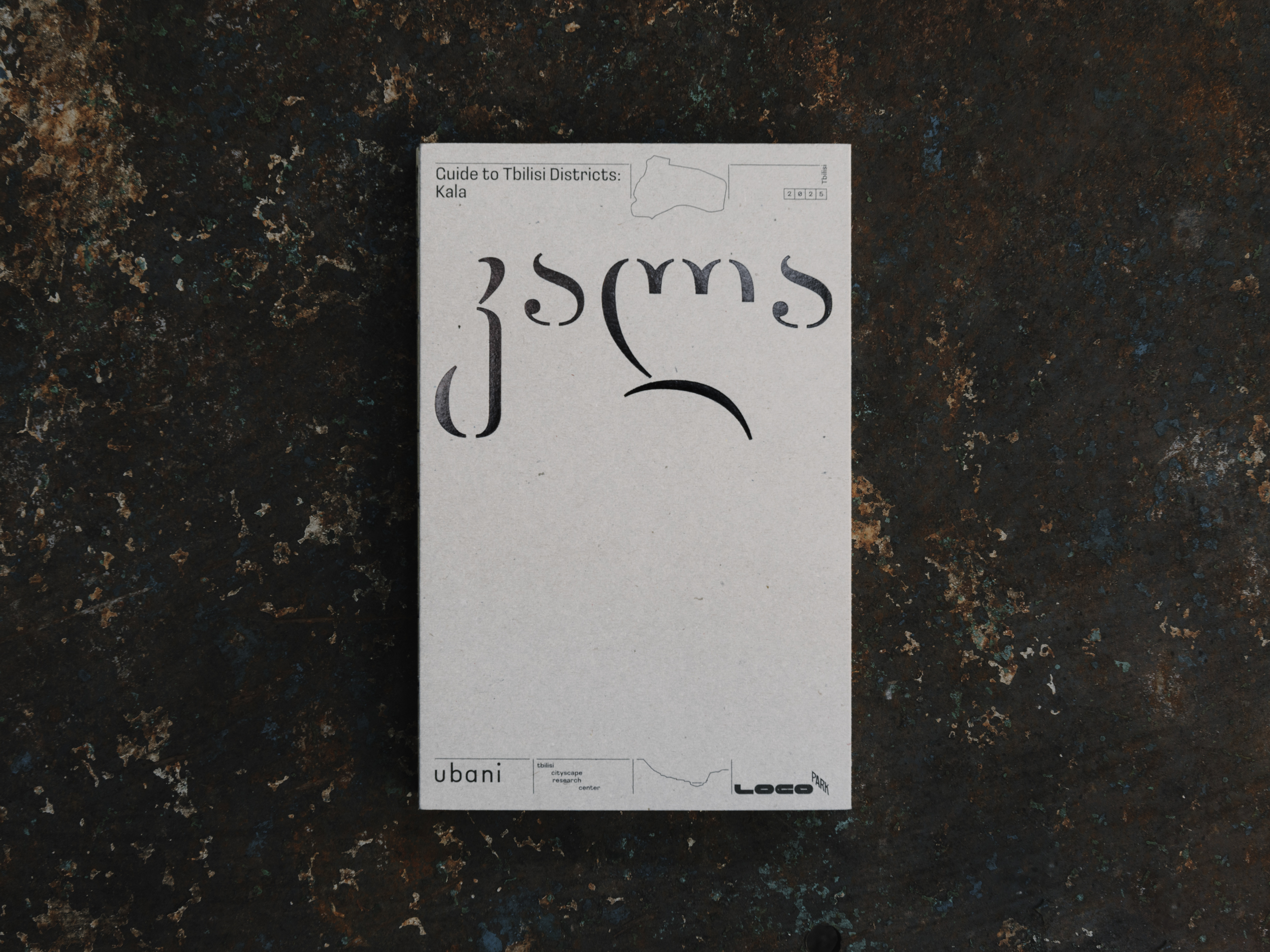
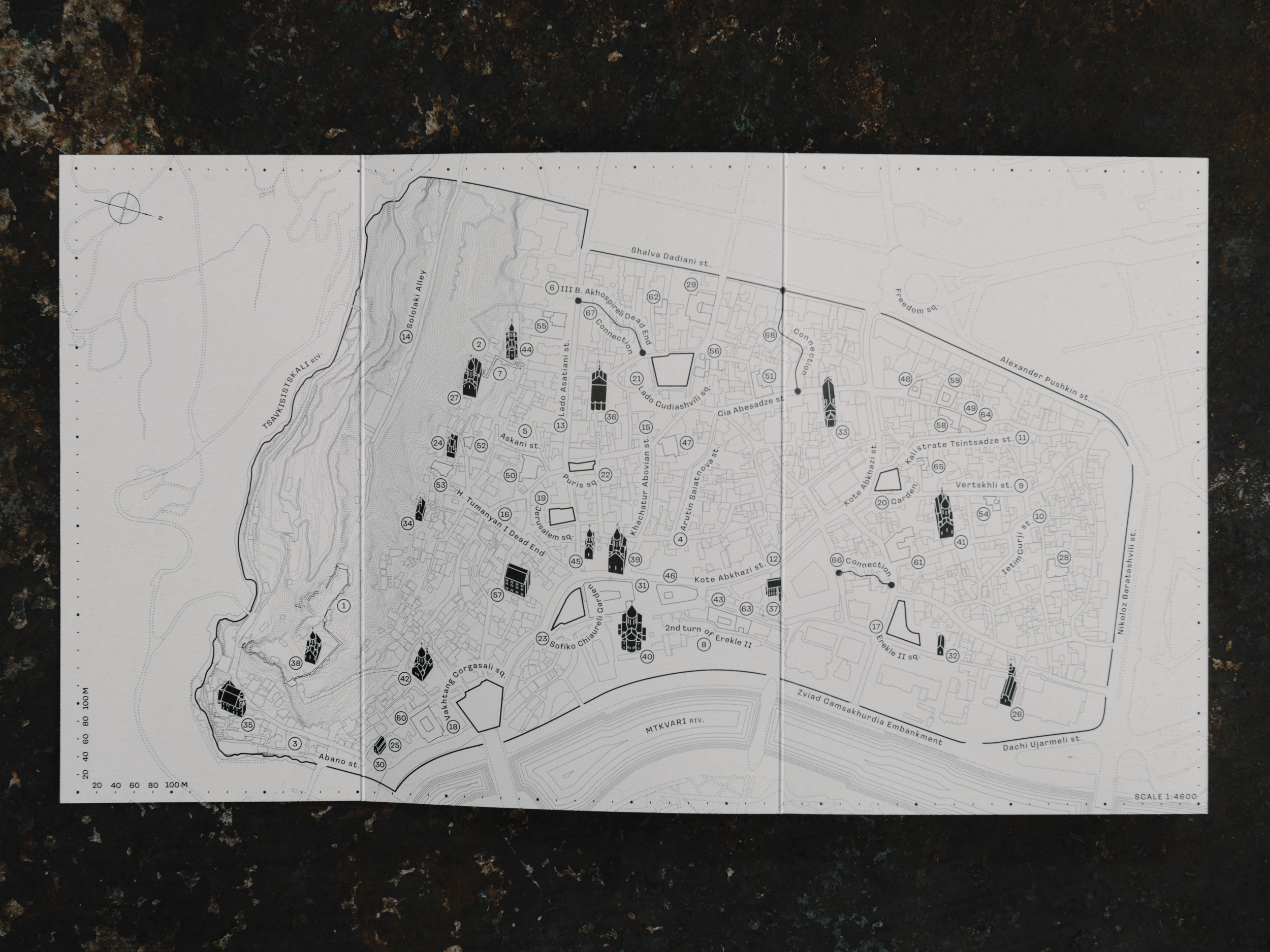
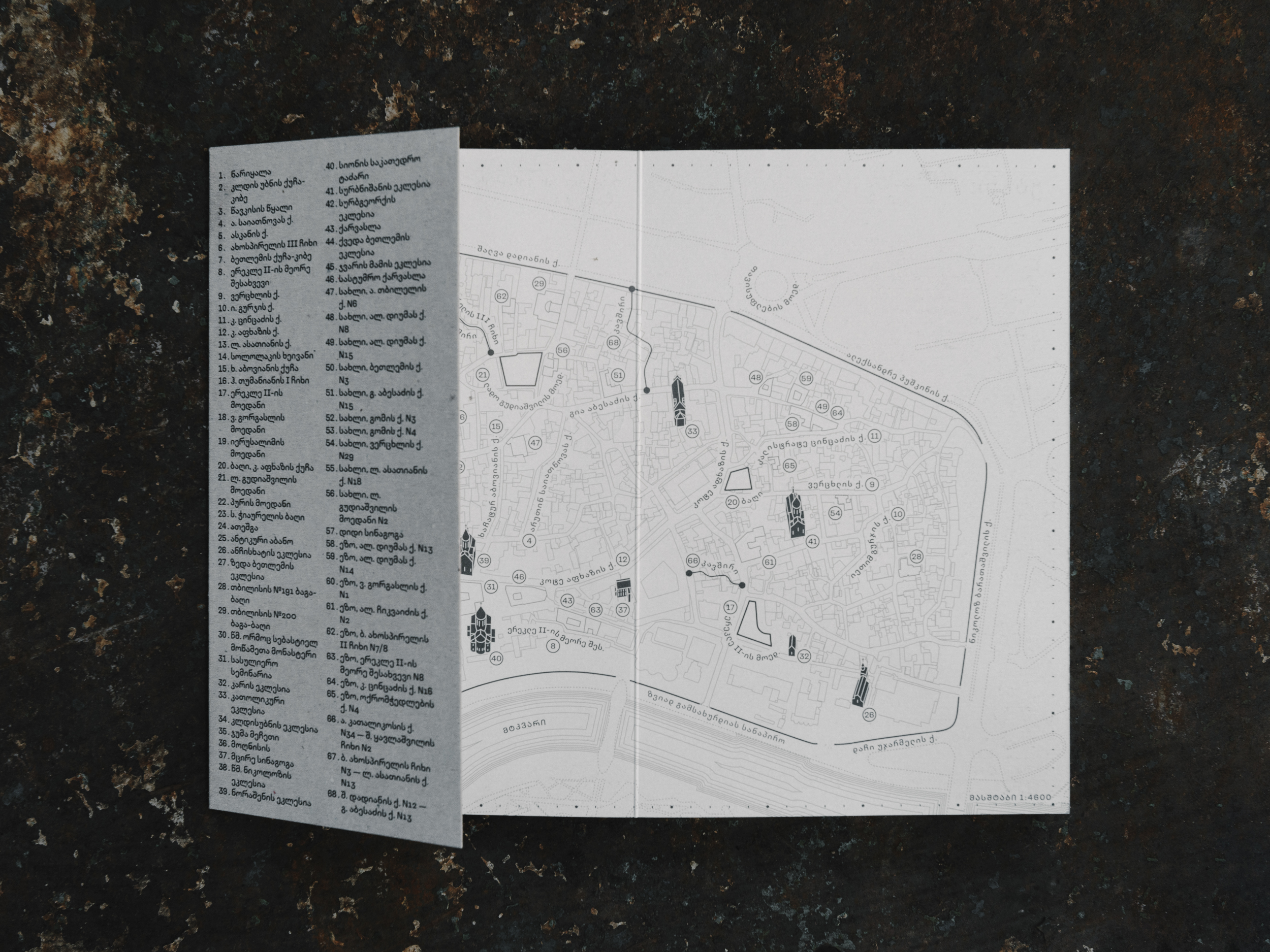
Kala guidebook. Design: Yury Ostromentsky, Daria Yarzhambek. Ubani, 2025
DY: We haven’t talked about type yet! type.today turns 10 now, and we’ve been working in book design for about the same amount of time. What has changed over the years?
MB: I believe things have changed a lot since then, to a large extent thanks to type.today.
DY: I still feel like sometimes there’s no type to set books in.
MB: Body text type is a long process. You don’t want a poor-quality text typeface after all. Perhaps now AI will help type designers speed things up a bit.
VV: I sometimes get tired of text faces. For instance, I’ve set a couple of books in Tesseract, and I now need a break from it. I probably work with Lava the
DY: Could you maybe say something to congratulate us on our anniversary? No need to sound overly optimistic if you’re not really in the mood to celebrate.
MB: Congratulations to type.today on its tenth anniversary. I’m happy type.today exists and has spent these ten years releasing great typefaces.
It happens that I use faces designed by people I don’t really trust. Then I am basically taking responsibility. Though it’s great when, in the process of your complex work, you can entrust part of it to people who are much better than you in this
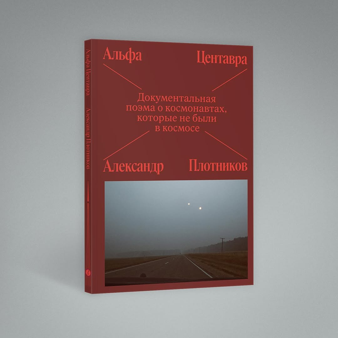
Alexander Plotnikov, Alpha Centauri. A Documentary Poem about Cosmonauts Who Were Never in Space. Design: Maxim Balabin. Individuum, 2025
DY: By the way, in Georgia we recently had to reprint an entire print
I am used to the situation where if you come to a Russian printer with a complaint, a nice girl who used to bring you coffee immediately turns into a real piranha. Then a special person shows up to explain that it’s all your imagination, not a defect. When we went to the printing house with our Georgian customer, I told him, ‘Get ready, they’re going to tell you that everything’s fine and it’s just all in your head’. The customer started pointing out the flaws. And the girl who was supposed to turn into a piranha just stared at all this, and her eyes kept getting bigger and bigger. And the person who was supposed to explain that it’s all our imagination just stayed silent and then suddenly started laughing. Eventually, they reprinted everything just perfectly.
VV: We recently received a print run with a really poorly glued spine. We called the print shop and asked, ‘Well, what happened?’ They said, ‘Oh, sorry, our bookbinder has been drinking for quite a while now. Since you were in a hurry to get the print run, we asked a person from another department to step in’. They said that with the best intentions, absolutely sincerely.
MB: That’s a good story.
VV: By the way, I haven’t congratulated you on your anniversary yet. What I am going to say will be really personal. I’ve been in the book design field for about eight years now, maybe. And the first license I ever purchased was from type.today. It was Graphik. I was buying it for setting body text, even though it might not seem the most obvious choice for that purpose. But conceptually, the typeface was just perfect. You could easily imagine it used on the side of a spacecraft. I was a really inexperienced layout designer back then, and I put my trust
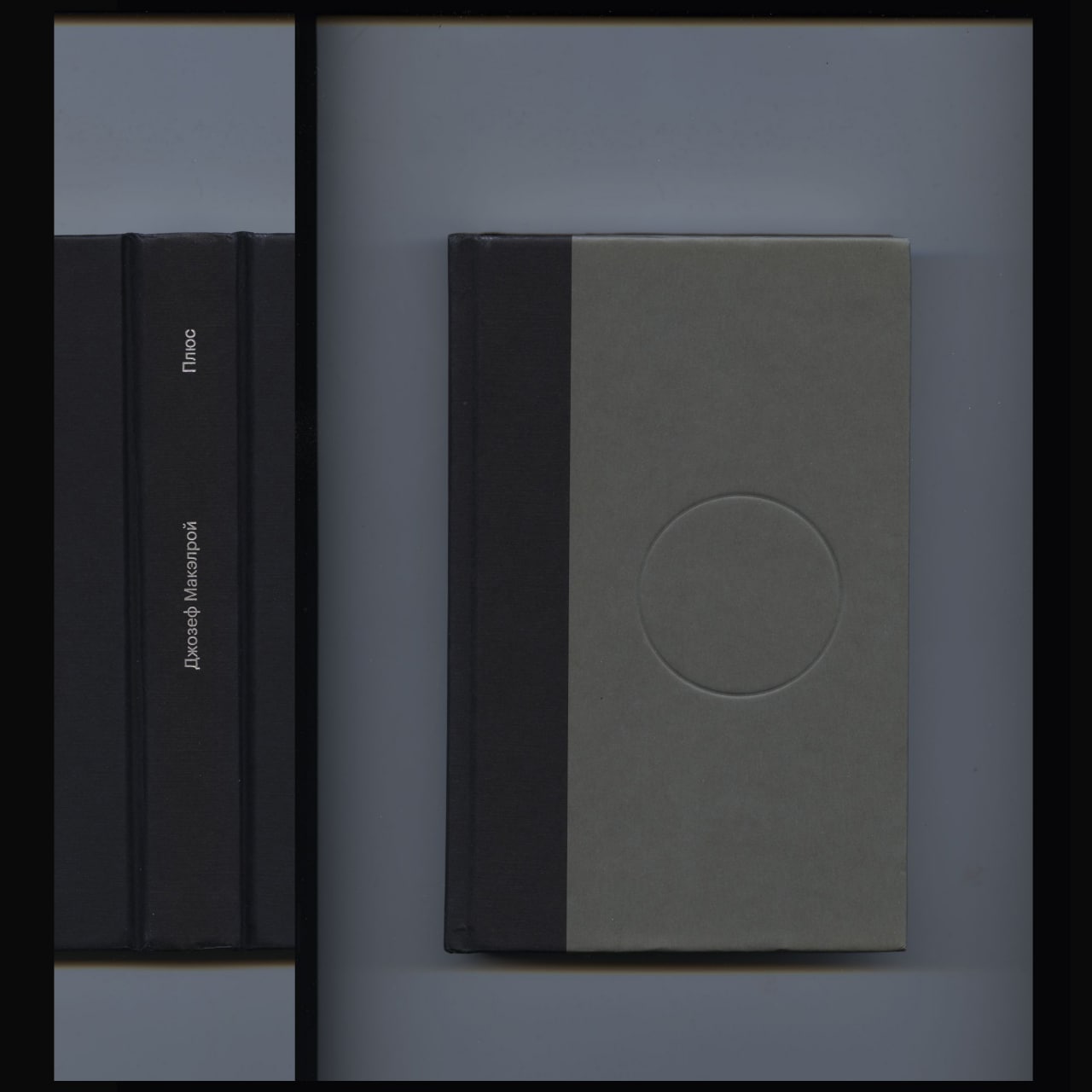
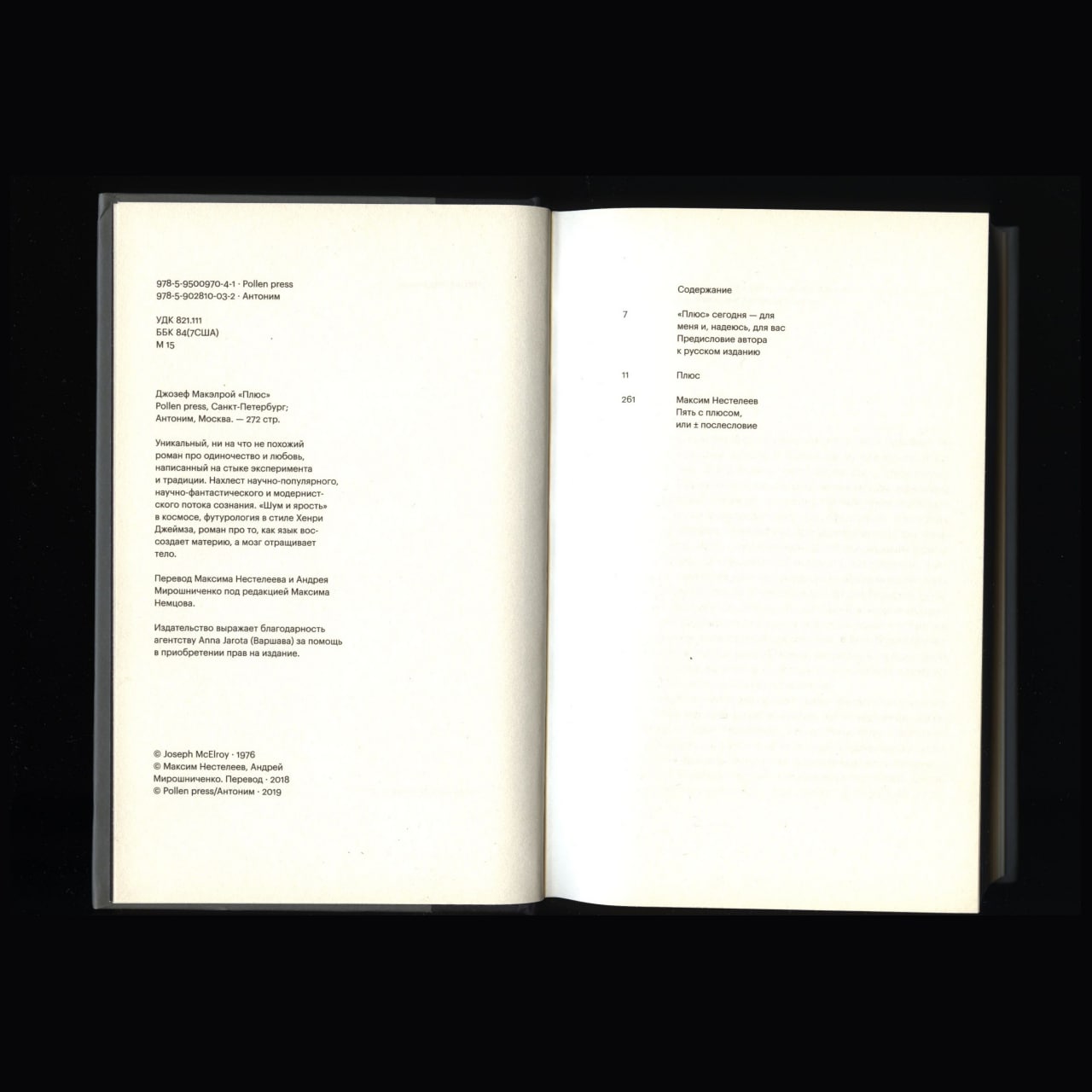
Joseph McElroy, Plus (Russian edition). Design: Vladimir Vertinsky. Pollen, 2019. Images: Guild community
In fact, your typefaces shaped me as a designer. If someone had told me eight years ago that our publishing house would have a logo designed by CSTM Fonts, I simply wouldn’t have believed it.
 Pollen logo by CSTM Fonts