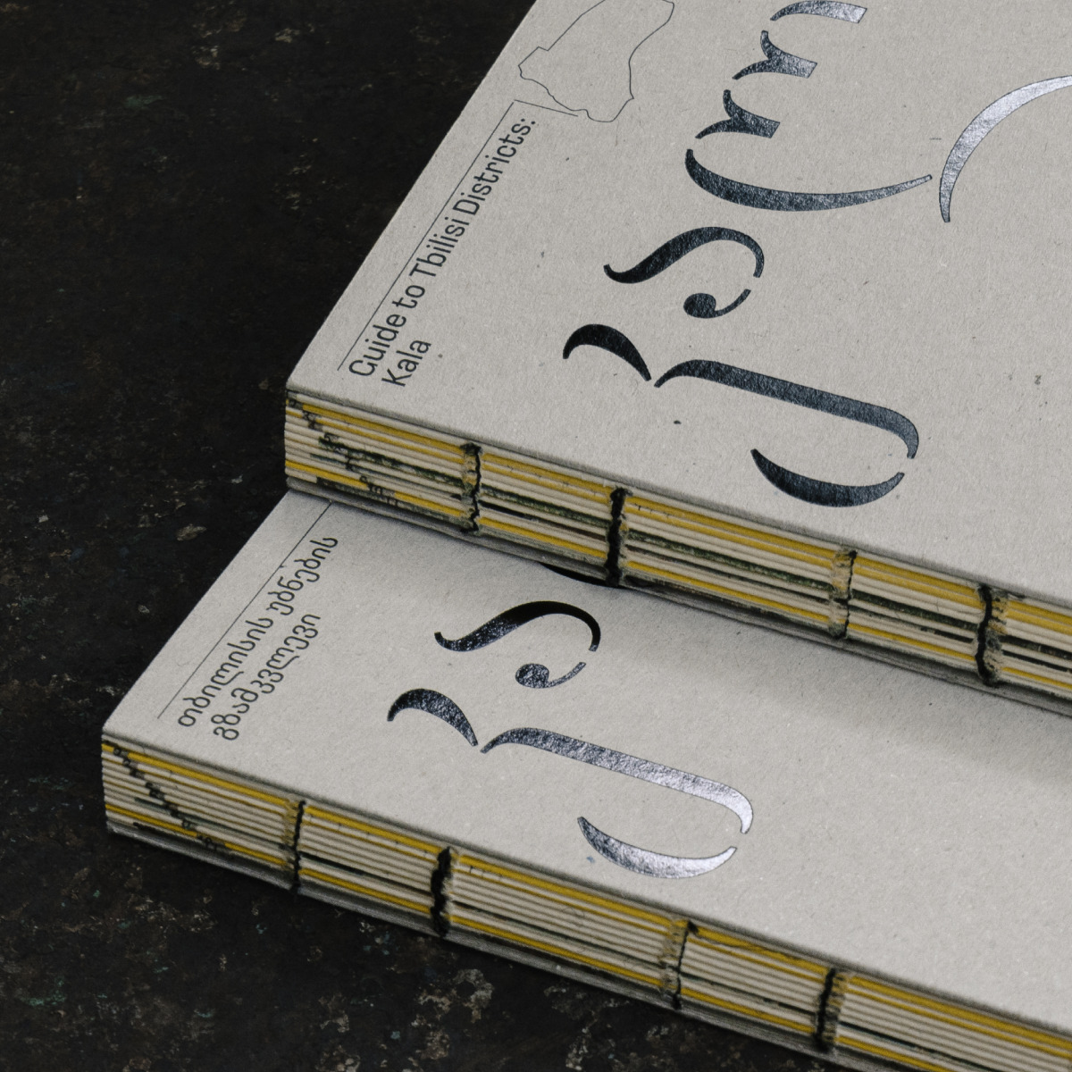
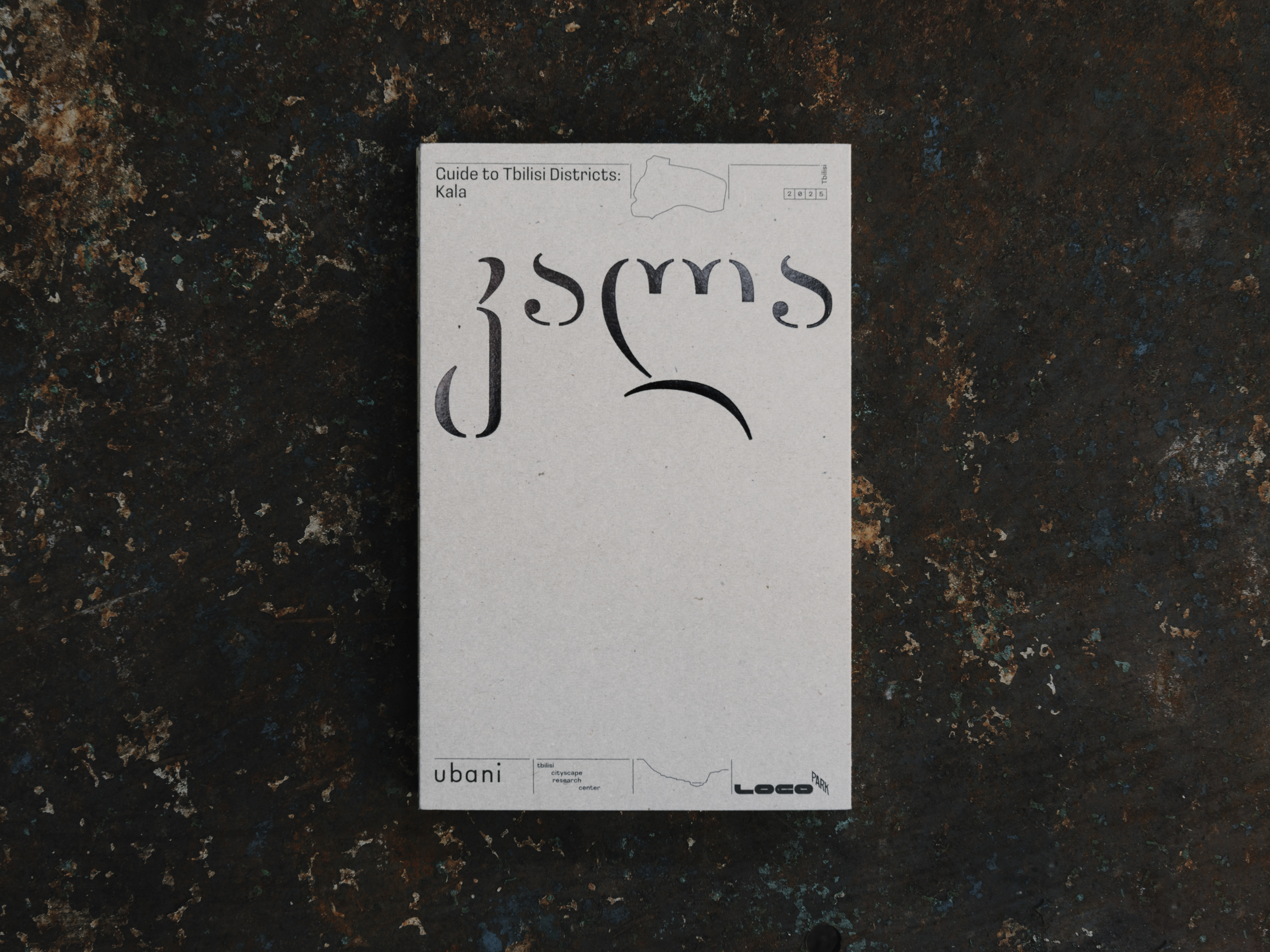
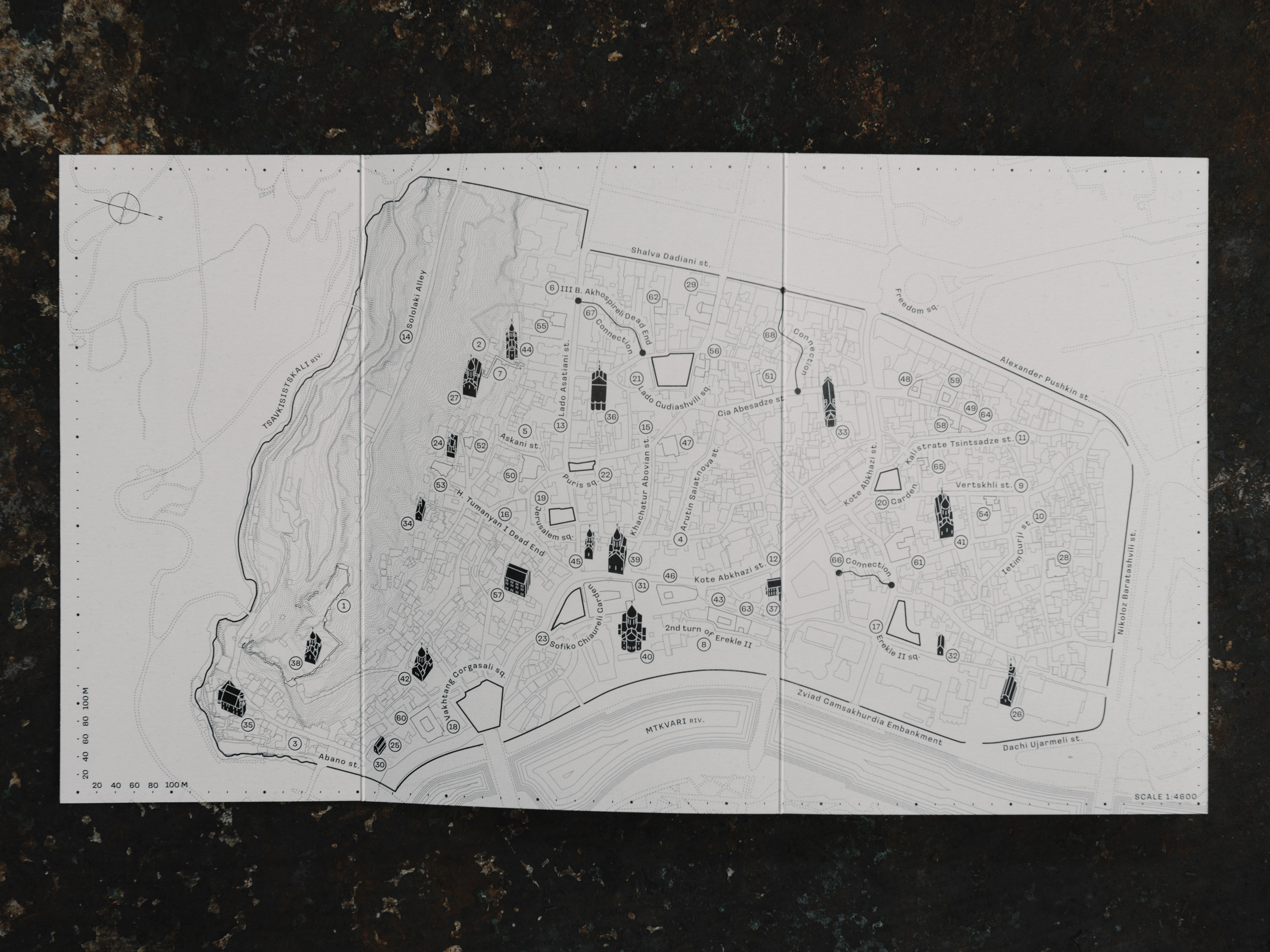
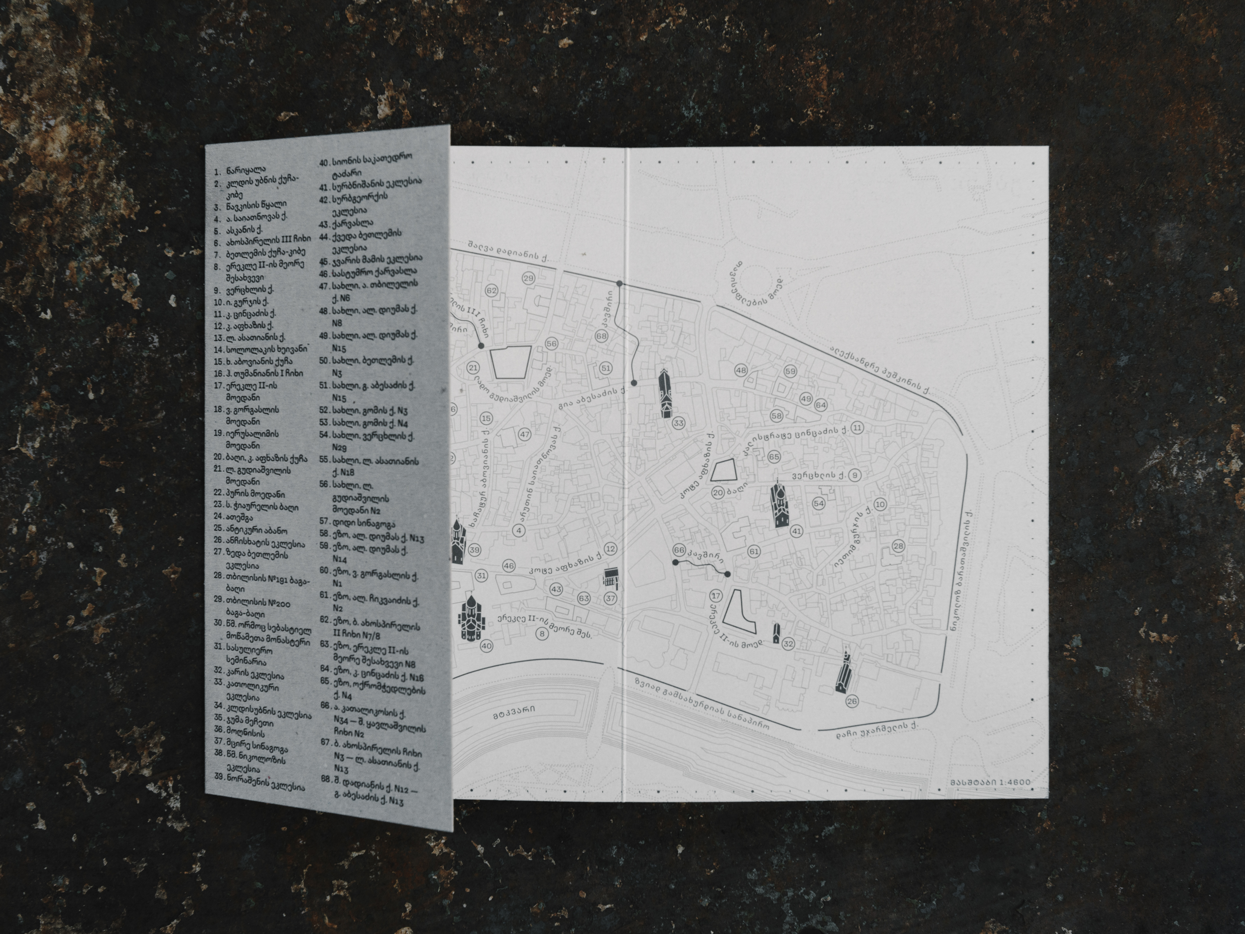
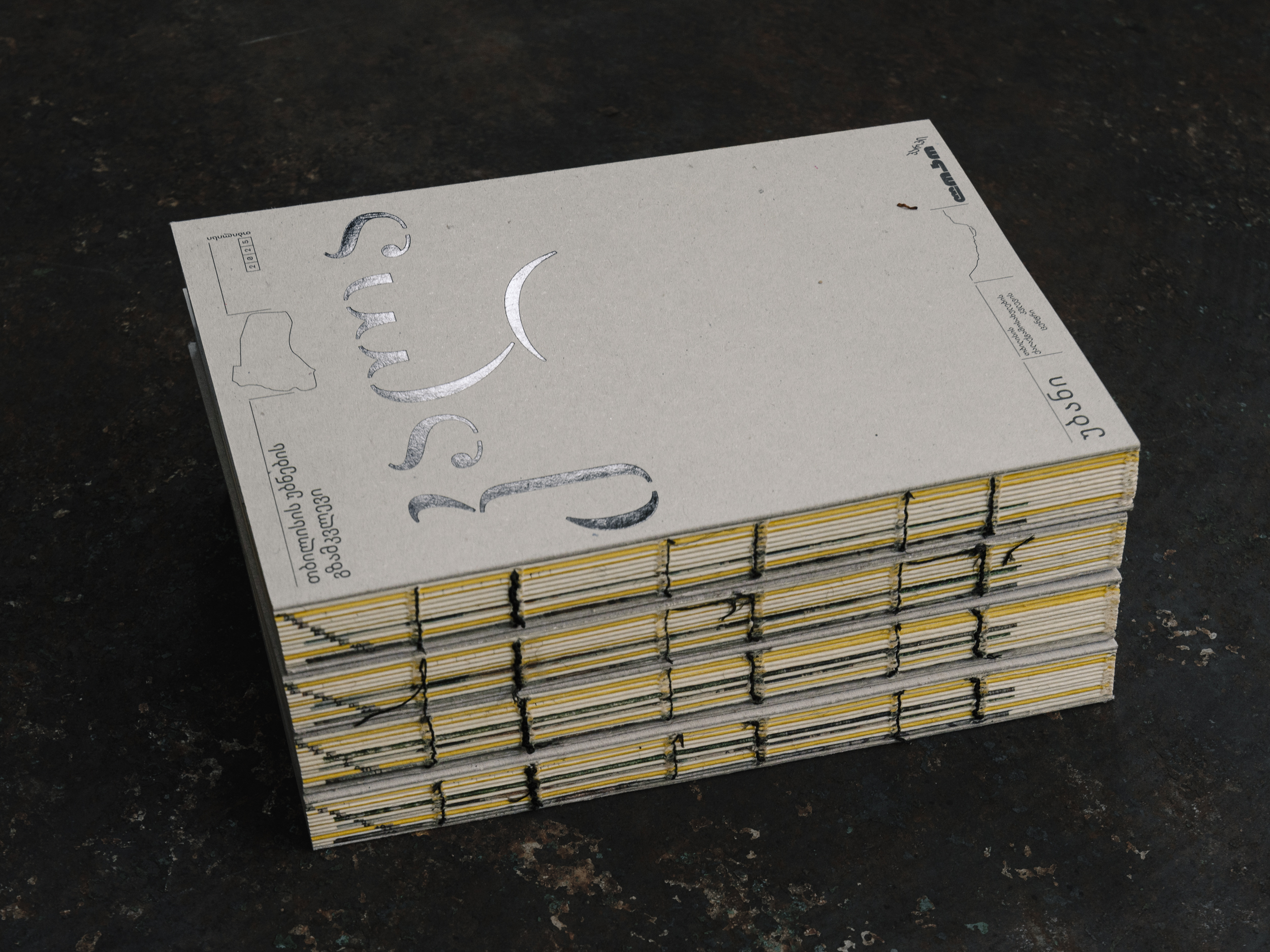
Ubani, an independent Tbilisi cityscape research centre, published a guidebook in English and Georgian addressing the architecture and history of Tbilisi’s Kala district (კალა). The guidebook is produced by an interdisciplinary team, it brings together the work of David Brodsky, Ana Chorgolashvili, and Nata Tatunashvili, with concept development by Brodsky and editorial direction by Chorgolashvili. Contributions include text by Nino Bughadze, graphics by Aleksandre Gaphrindashvili, Oleg Glebov, and Georgiy Gnilorybov. The publication was designed by Daria Yarzhambek and Yury Ostromentsky, with the lettering created as part of Tsartserebi, a project rethinking the historical Georgian typography.
Body text in both English and Georgian versions is set in Loos by CSTM Fonts, while the lettering on the guide’s cover is inspired by a partially faded inscription on a 1877 tombstone located in the Anchiskhati Basilica of St. Mary.
![]()

Loos is a closed-aperture sans serif that grew out of the lettering on the cover of Adolf Loos’ book ‘Why a Man Should Be Well-dressed: Appearance Can Be Revealing’. The typeface supports Latin, Cyrillic, and Georgian. The font license is available in four options: Latin and Cyrillic support, Latin and Georgian, just Georgian, or all three scripts.
If you used the fonts from our library in your project, please tell us about it! You can do that by sending us the links and images at info@type.today.