
- Dmitry Sulliwan
- Art director, founder of Sulliwan studio

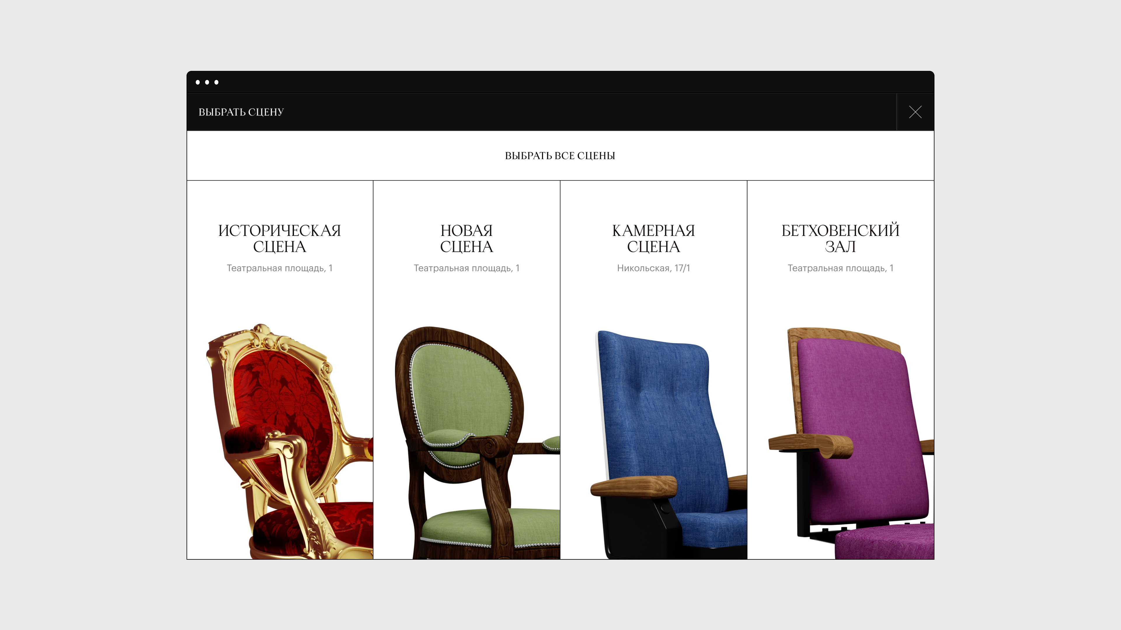
The task was fundamental: to come up with new visual aesthetics for the Bolshoi theatre online while making their website simple and clear for the general audience. We proceeded from architecture, since all of us have this image in mind when hearing the word ‘Bolshoy’: façade, quadriga, chandeliers in the halls of historic stage, lanterns on the square in front of the theatre, chairs and armchairs where theatre-goers sit. All those objects appeared on the website as certain accents, we wouldn’t want to make up something that would steal the architecture of the theatre’s thunder.
We were targeting a rather wide audience — both people over the age of 60 who go to the theatre regularly, and really young people who can get there through a nice, user-friendly website. Therefore we were willing to look at classics from a fresh perspective.
Apoc happened to be a perfect match, as it is serif — which is dictated by the Bolshoi’s


We consulted with Ilya Ruderman on what to pair Apoc with. Ilya said ‘What is there to think about? Take Graphik’. We agreed — it has a whole bunch of styles, while we have plenty of interface elements: captures, footnotes, quotes. In the final layout, Apoc stayed on the first and second level headlines, while the rest is set in Graphik. The theatre is planning to work for the young audience, attract young employees. So, of course, we would want some of our solutions to go offline, especially since we have already purchased Apoc’s maximum license.
Tomorrow license applies to all kinds of font
It was discussed with the client as well, but for now the main task is to launch the website and to teach the editorial team how to use it. That is the greatest pain for designers: it is not enough to design a cool


- Lyubim Koltakov
- Senior designer at Sulliwan Studio

Before stopping at Apoc, we considered lots of different options, including the ones from type.today’s library, but it all turned out too boring and overly academic. We wanted a certain academicity ourselves, for everything to be lined, mathematically precise, such as the theatre’s architecture: white shapes, black lines, Roman capital. But many serifs would look just depressive in such a layout. Yet since we are talking

We use alternative glyphs a lot. We really liked Б and ь, they are extremely elegant, and, as it seemed to me, very ‘Russian’ in terms of their form.
We also left Apoc on buttons, in the footer, and for links. Clearly, deploying serif typefaces in interface elements is always risky, but we assumed that nearly everyone now uses devices with high resolution. At small sizes, we use bolder style with wider spacing and without alternative


Apoc by a typographer Matthieu Salvaggio is a thin and sharp humanist serif with aggressive serifs, inspired by an ancient edition of the Book of Revelation (also known as Apocalypse of John). The line includes 16 styles: tranquil from Light to Dark, wild Revelations, and two sans serif styles, Light Sans and Light Sans Italic.