Apoc by a French type designer Matthieu Salvaggio is thin and sharp with aggressive serifs, almost as if they were cut by a knife. Originally, the author started the design process inspired by a lettrage on a cover of The Book of Revelation (“Apocalypse” in French, thus the name and the spirit of the typeface), the final book of the New Testament. Salvaggio built the typeface from the few characters he had originally — “APOCALYPSE”, uppercases only. The craziest style of the family, Apoc Revelations, is based on its expressive counter-forms.
The Light to Dark styles offer a more tranquil impression, with their simplified serifs and terminals, designed in a more angled way. The Dark styles have been additionally balanced with an extended x-height and angular, almost Egyptian-like, serifs.
The family also has two sans serif styles, Light Sans and Light Sans Italic. Overall, Apoc has sixteen styles, including italics, all of them equipped with ligatures and alternates. The Light to Dark styles are available as variable fonts as well: uprights and italics with weight axis, or all in one file with both weight and slope axes.
Matthieu Salvaggio is an art director, graphic and type designer, founder of the Lyon-based foundry Blaze Type (BLZT).
Buy Apoc
from 48 $ at tomorrow.type.today


 Self-branding by Futura creative studio (Mexico City), 2019

 Table Poems, a poetry collection. By Sophia Krayc, 2020


 Motif backpack. By Rimasùu x Ucon Acrobatics, 2019

 Wyrd, skincare brand, 2019

 ADC Awards 2019, call for entries. By Jessica Walsh, Matt Roop, Sarah Hopp


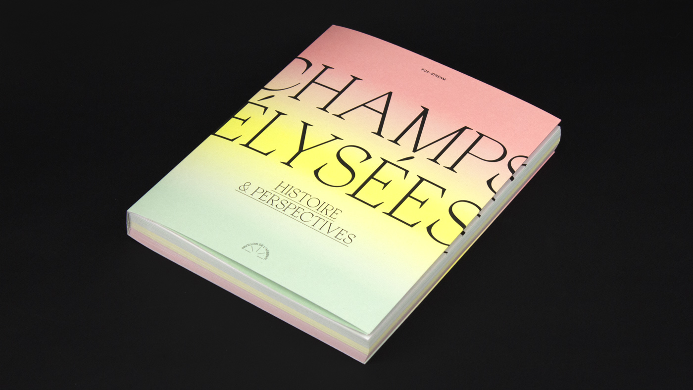
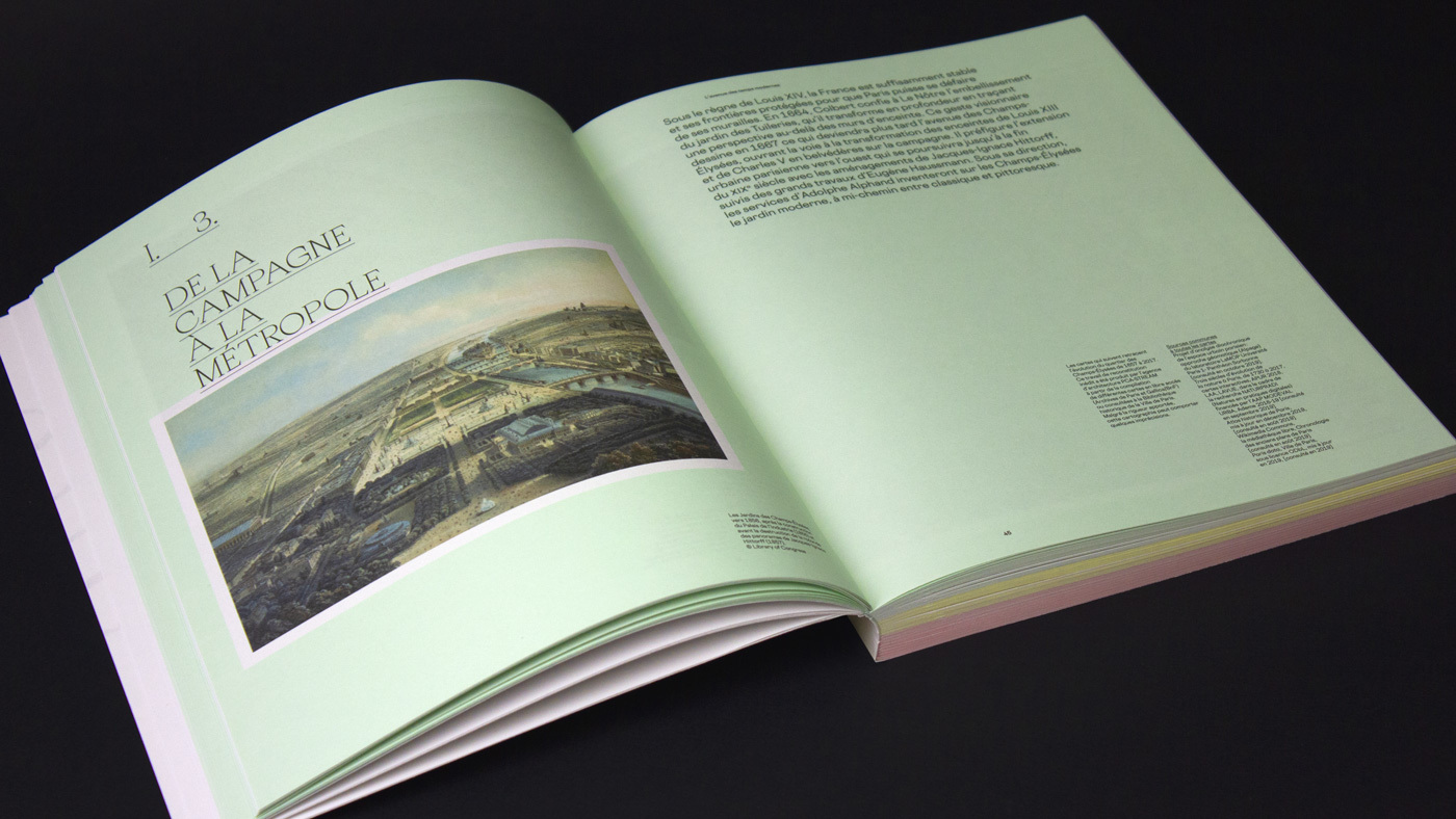
«Champs Élysées. Histoire & perspectives. By ABM Studio, 2019
Buy Apoc
from 48 $ at tomorrow.type.today

