
A font is not just symbols you have on your keyboard, but also a range of less obvious characters and their interaction algorithms, and the typesetting rules are much more than just spelling and punctuation.
An understanding of how type works helps designers properly deal with
Contents
| 1. | One can do both in Figma and CSS |
| 2. | Some basic typography rules |
| 3. | One can’t do in Figma, but can do on the Web |
| 4. | One can do Figma, but not on the Web |
One can do both in Figma and CSS
Monospace (tabular) figures
What’s that Pretty much any quality font supports monospace, or tabular, figures. These figures are inscribed in identical notional rectangles (referred to as the em squares or em boxes).
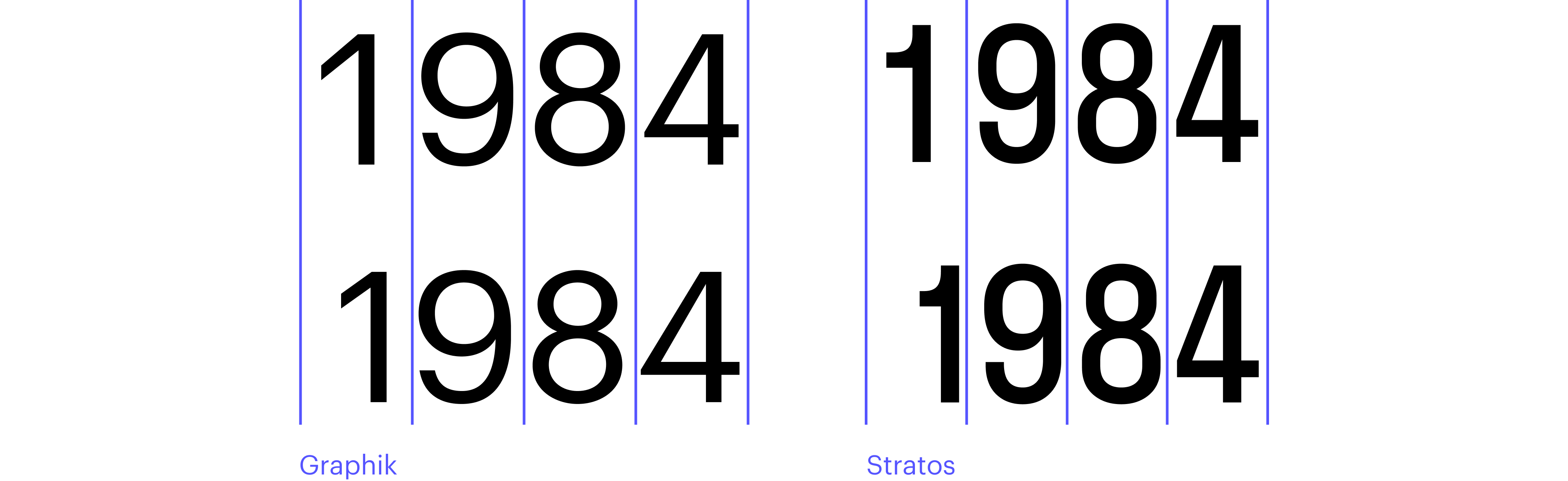
How to use this Tabular figures are used when numbers are placed vertically below each other (for instance, in a price list
Where to find in Figma Text → Type Settings → Details → Numbers → Style → Monospace Lining figures and old style figures
 Set in Graphik
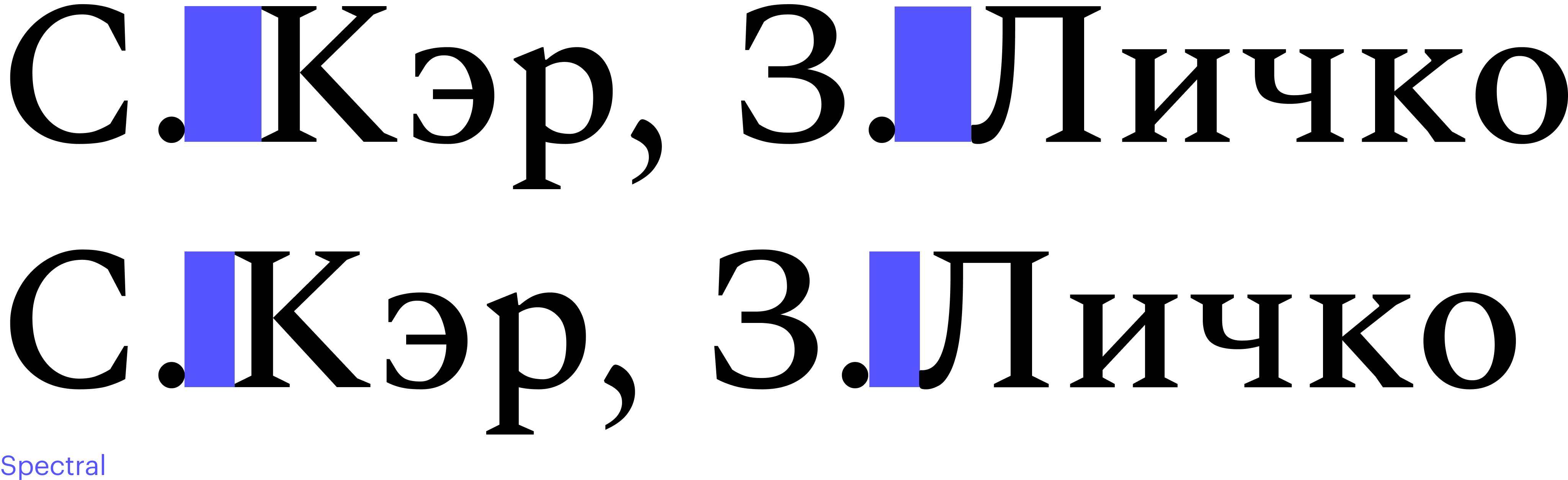
Lining figures and old style figures
What’s that The default figures which are typed from your keyboard and align with the cap height are referred to as ‘lining figures’ (uppercase figures). There are also old style (lowercase)

How to use this Lowercase figures can be good for long texts with numerous dates, where you don’t mean to highlight the numbers but rather want to make them an integral part of the text. A text box featuring old style figures would appear more uniform. But keep in mind: the use of this kind of figures is typical for the 17-18th centuries typography, which is why lowercase figures may look as a reference to that time.
Where to find in Figma Text → Type Settings → Details → Numbers → Style → Lowercase/Old Style
 Set in Spectral. On background: Beethoven mit dem Manuskript der Missa solemnis, Joseph Karl Stieler (Wikimedia Commons)
Case sensitive punctuation
What’s that Some symbols (—, -, ?, !, [ ], { }, ( ), < >, « », @, :, ;, ·) are aligned to the x height by default. However, if text is set in all caps (or, for example, a colon is located between two uppercase figures), punctuation appears visually lower with respect to the cap height. Case sensitive punctuation is here to avoid this. Case sensitive punctuation marks are automatically lifted up when surrounded by capitalised letters or figures.

How to use this Look into a font specimen or check the Settings panel in Figma to find out whether the font you use supports case sensitive punctuation and enable it if it does. Make sure that the characters are lifted only when you need them to and not just anywhere.
Please note: to enable case sensitive punctuation in the San Francisco font, you need to tick not just the Case-Sensitive Forms, but also Vertically Centered Colon.
Where to find in Figma Text → Type Settings → Details → Letter case → Case-sensitive forms or Text → Type Settings → Details → Stylistic sets, or Text → Type Settings → Details → Letter forms → Contextual alternates
 Set in Inter
Contextual alternates, ligatures, and stylistic sets
What’s that Contextual alternates, ligatures and stylistic sets are supplementary aesthetic features of a font (but not just that). Contextual alternates enable transforming the glyphs depending on their surrounding context (for instance, if a glyph sits at the beginning of a word, it gets a swash). Contextual alternates are rarely used in UI sans serif fonts, but sometimes applied in display or script fonts.

Ligatures, just like in the Middle Ages, are glyphs combining two or more

Stylistic sets are sets of alternates that could contain anything: one- and two-storey а, another set of arrows, or the Qs with different forms of the tail. A font can have no more than ten such sets. You can check a specimen or the Type Settings Panel in Figma to find out which particular stylistic sets a font you picked contains and offers.

How to use this Look into what kind of stylistic sets, ligatures and contextual alternates are offered in a font you chose and which of them may come in handy for you. Remember that those can be purely visual moves as well as functional features (for example, Bulgarian and Serbian Cyrillic support is realised through stylistic sets).
One should also consider a matter
Where to find in Figma Text → Type Settings → Details → Letter forms → Contextual alternates / Ligatures / Stylistic sets
 Set in Forma DJR. With the use of an image by @pikisuperstar (Freepik)
Turning off kerning
What’s that Particular letter spacing between certain pairs of characters is specified in a font

How to use this Apply this feature only when you create an interface for software that doesn’t support kerning. In any other case, you should definitely turn on kerning for all text styles, and make sure that a developer enabled kerning in CSS before launching a project.
Where to find in Figma Text → Type Settings → Details → Horizontal spacing → Kerning pairs
 Set in Graphik. With the use of photography by Christian Buehner, Shirish Suwal and
Vicky Hladynets (Unsplash)
Set in Graphik. With the use of photography by Christian Buehner, Shirish Suwal and
Vicky Hladynets (Unsplash)
Variable fonts
What’s that A regular font contains only fixed, hard-set styles (such as Light, Regular, Bold), whereas a variable font has an axis one can use to get any in-between styles (for example, between Light and Regular). A variability axis can address not just weight but any other parameter as well (slant, width, or even the amount of decorative elements).

How to use this In most cases, it is best to apply the existing styles, as they were chosen by the font’s author and represent the most appropriate option for these specific letterforms. Yet it can happen that those are not
Variable fonts make it possible to smoothly regulate the font parameters (such as weight)
Where to find in Figma Text → Type Settings → Variable
 Set in Loos
Auto Layout
What’s that In the advanced Auto Layout properties in Figma, it is possible to align text containers along the base line (Align text to baseline). This feature makes the typography in the layout cleaner and is supported by CSS.
How to use this This function is suitable for cases when you need to align two characters of different size standing next to each other. But you shouldn’t use this feature if such two characters are included in complex components.
Where to find in Figma Auto Layout → Align to baseline

Some basic typography rules
Now let’s shift a little bit away from Figma and address a number of basic rules of typography. Even the simplest characters, such as quotation marks or spaces, have different variations and various usage
Em dash, en dash, hyphen, minus sign
What’s that Hyphen, minus sign, en dash and em dash aren’t just the same old horizontal bar, but four different symbols. We addressed what is the actual difference between them and how to use them properly in this text.
How to use this First, make sure that a font that you’re using does contain these symbols (good news is that any quality font does have them, it’s just that they might be of the same size when it comes to monospaced fonts).
Before sharing your mock-up with a developer, check all the UI components: for example, a badge communicating a size of a discount shall have a minus sign, while a time range, or dates, should use an en dash.

Middle dot and bullet
What’s that A bullet introduces items in an unnumbered list, while a middle dot (aka interpunct, interpoint) divides words or symbols in a word. In a nutshell, both bullets and interpuncts are dots, most often vertically centred. Click here for more detail.
How to use this User interfaces often use both lists and lines where individual object properties are divided by dots. In both cases you should rather apply a symbol from the font than design your own geometric

Quotation marks
What’s that Quotation marks are most of all used for identifying direct speech and highlighting proper names and words used in their figurative meaning.
How to use this Almost any language (and any country) has their own traditions of quotation marks’ usage, and the variety of their forms is so wide that we have devoted a special article to the issue. Make sure that a font has all the types of quotation marks you need when you choose one (you might need a few pairs of quotation marks even for one project intended for one particular market).

Spaces
What’s that There is a number of spaces of various widths, and each of them is subject to its own application rules. Which
How to use this Look into the size of spaces both in text boxes and individual components containing text. For example, to space currency signs, figures in big numbers (in European tradition), and formula components (a × b), one should use a thin space.
Glyphs palette
What’s that A glyph is any character in a font. Beyond punctuation marks, a font can also contain currency signs, mathematical symbols, Copyright and Registered symbols, as well as any other symbols its author considered necessary to introduce.

How to use this At the stage of choosing a font, make sure to find out exactly what you will be supposed
Where to find All the glyphs of a typeface are available in its specimen, which is a special handbook introducing any given font.
If your computer runs on MacOS, you can use the FontBook app to take a look at all the glyphs and copy one of them. Figma doesn’t feature any built-in functionality for browsing all the font’s glyphs, and this cannot even be done with a plugin.
However, there are certain plugins that could help you find and copy any of the common glyphs (search by the word Glyphs). Yet Figma can’t check whether this glyph is supported by the font you’re using or it is not.
 Set in Graphik. On background: photography by Josh Nuttall (Unsplash)
One can’t do in Figma, but can on the Web
This section covers a number of moves that are sometimes applied in UI design but can’t be introduced using just Figma and nothing else.
Curved text
What’s that Normally, the baseline of a text box is the straight line. Though it sometimes happens that you need to curve text around
How to use this There are a variety of Figma plugins for inserting curved text as individual letters or a vector image. A plugin usually enables transforming text and its basic parameters, though it is less convenient than editing a regular text box.
You can also create curved text in Illustrator, save it as SVG and then import
Where to find Search for plugins by keywords Circular text and Arc text.
 Set in Forma DJR
Perspective text
What’s that Text existing in a 3D space is found not just in some complicated 3D interfaces. For example, Timer in iOS mimics reels with numbers using perspective text distortion (with all the other elements in this interface being two-dimensional).
How to use this Figma doesn’t support perspective distortion of objects, but you can introduce this feature through plugin software. Certain plugins allow editing elements even after distortion was applied, while the rest of them deliver the resulting text as a raster image.
In the web development process, any distortion is achieved and animated through the CSS transform property (for example, transform: skew/rotate/perspective). Therefore a designer just needs to specify in their layout how many degrees and which axis to rotate your object around.
Where to find Search for plugins by keywords: skew, transform, 3D
 Set in Inter
One can do in Figma, but not on the Web
Figma features a number of handy tools that are not found in CSS. Technically, virtually anything can be implemented through code, but if you choose to use them, it is better to bring it up with a web developer
Cap height to baseline
Cap height to baseline feature offers to crop the em square to align it with the cap height. This might be convenient if you use a really big-sized headline. Don’t use Vertical trim for body text boxes — this will make the development process more difficult and almost certainly cause errors.
CSS has been announcing a property for this for a long time already, however, now this kind of vertical trim is supported by Safari only, so it’s too early to use this feature.

Hanging punctuation
Hanging punctuation is a setting that allows you to move punctuation marks outside of a text frame. This is often a good solution for pull

CSS already has this property, however it is currently only supported
 Set in Normalidad
If you decide to apply one or a number of features presented in this piece, you should definitely talk it over with the developer.
Feel free to emphasise that you have to enable kerning or case sensitive punctuation and make sure that a developer is able to implement a certain solution.
And don’t be afraid to spend your time exploring technical specimens on foundries’ websites and in font licenses, so that you won’t have to replace a font with another one right in the middle of your project.
Follow the links down below to learn more about type features in CSS: