
A while ago, we asked our authors what music they listen to while designing their typefaces and created four playlists with the tracks they sent us. The first was music for sketching, the
After publishing the playlists, we felt there was still a lot to discuss about the connection between type design and music. So we met with Fer Cozzi, Kai Bernau, and Philipp Neumeyer to discuss the rhythm, use, and timelessness of both typefaces and music.
This is the transcript of the YouTube livestream. You can find the recording of the talk here.


Tomasa by Fer Cozzi

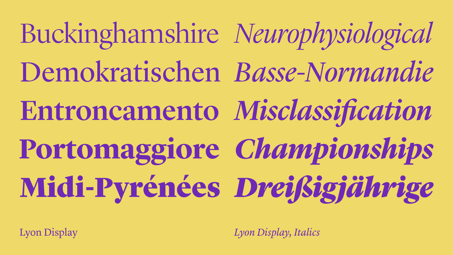

Lyon by Kai Bernau


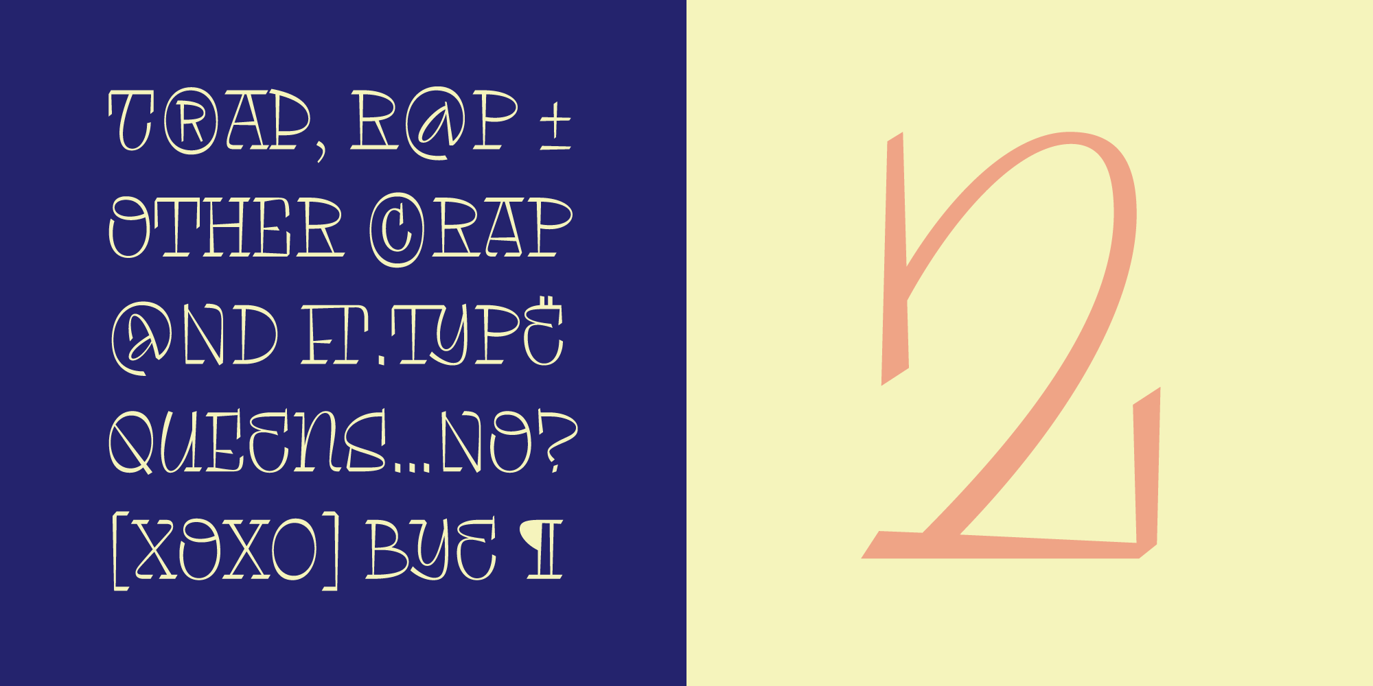
Yuni Slab by Philipp Neumeyer
Have you ever been curious about another designer’s taste in music? That’s why I did all this stuff with playlists because I was interested.
KB: I am always curious what other people listen to because it reveals so much about how a person operates, how they think, and what they are curious about. When you get music recommendations from someone, they can be very hit or miss, and I feel like the music recommendations we get from people we have more in common with can be much more interesting to us.
FC: I think it’s the same with music as it is with everything else. I like getting to know a person, so the best way is to understand what they like and what they’re curious about. I don’t ask directly, “What’s your taste in music? Tell me, do you like Britney? Yes or no? Britney or Justin?” But when people share music with me, I try to understand the personality behind the recommendation.
PN: In theory, I’m interested in other people’s taste in music, and I’m also constantly looking for new music because sometimes I get fed up with what I’m listening
Fer, you just mentioned that learning about someone’s music taste is a way for you to find out more about the person. So can you draw connections between the elements of a typeface that a person designs and the music they like?
FC: I don’t know about a direct connection between music and shape, but I’m always thinking about rhythm. I’m always listening to music, so I try to understand what kind of rhythm a person likes. I think that if you like a certain kind of music, I can relate the texture of your typeface to some of your ideas or at least to a state of mind.
It’s not a direct relationship between a glyph and the music you listen to, but I think the idea of rhythm is present in typefaces. So if you like experimental, techno, pop, or Italo-disco, your approach is more experimental in terms of rhythm or how different elements interact in the letters.
But it’s the same with
KB: Rhythm is really one of the foundational aspects of type design. You’re creating a rhythm of black and white shapes. What I often think about is that the best reading typefaces tend to have a very even rhythm, but I often ask myself: is there such a thing as a rhythm that’s too even? Does a typeface become too boring to read? At the moment, I’m interested in trying to find something with a little more swing, something a little offbeat.
I listened to an interview with the drummer Questlove, where he revealed that someone once told him: “You should play like you’re a bit drunk.” Like, slightly off. It keeps you engaged with the
PN: I agree with that. Also, I watched a video where someone described Josh Homme’s from Queens of the Stone Age guitar playing as “like a drunken stumble.” He has this very staccato style, and sometimes he places notes where you don’t expect them to be, which makes the music really interesting.
But the general idea of rhythm, I think,
To me, music
KB: This is a good distinction. When we listen to music in the studio and try to detect a beat that is slightly off, it makes us think about how we can create a different rhythm in type design. It’s like Philipp
FC: When I submitted my playlist, I didn’t divide it into five tracks for this and five tracks for that. I made a playlist where one song led to another and another, building a mood. I didn’t do the task exactly as asked, but that’s how it works for me. At some point, I end up singing in my chair while drawing. I start to feel like it’s a party in my studio. It could be Celine Dion, it could be cumbia, Mariah Carey, or Britney or Rihanna. I start mixing playlists, go to reggaeton, and my mind divides. One part is singing, and the other is drawing and moving nodes. But that’s just for the creative part.
KB: One of the things that I listen to for kerning is what my friend calls fake heavy metal; it’s shoegazy metal that is just a wall of drone sounds like Deafheaven.
PN: Do you know Sunn O)))?
KB: Yes, exactly, something like Sunn O))) and even more drone-y music also from other genres. Our friend Tânia Raposo introduced me to Kali Malone. She writes music for organs and string quartets and choirs; you turn it on and suddenly three hours are gone. Susana really hates it when I put this on.
Do you connect the genres of music to the typeface genres?
FC: I don’t think so because I don’t like type classifications. I don’t like to label different stuff. Even in music, you can say that something is pop, but there are many pop music bands and they are very different from each other.
KB: I also don’t think I could do that. I couldn’t even say one particular typeface is like one particular kind of music because most typefaces can be used in so many different ways. Like Bernd Kuchenbeiser, one of the greatest book designers alive, can make Arnhem look like Univers and vice versa. There is no sonic equivalent.
PN: I’m afraid I agree. I started teaching some time ago, and one of my classes had to draw a typeface for a piece of music. It’s very interesting, not only what kind of music they bring to the class but also what kind of letters they draw to it. It’s never what I’d expect.


Pinakothek der Moderne München exhibition catalogue. Design: Bernd Kuchenbeiser


50 60 70 Architektur aus drei Jahrzehnten. Design: Bernd Kuchenbeiser
Do you see the difference between how a historical context influences type design and musical composition?
KB: Maybe. Just like with musical composition before the 20th century, we had sort of one kind of paradigm for composition. In the same way, we had one dominant paradigm for what typefaces looked like. Didot didn’t make any Renaissance typefaces; that would have been really weird for him to do. Just like no romantic composer would have made Baroque music, because that was the old style.
And now, in both disciplines, we have a multi-paradigmatic view where we make all kinds of different music and all kinds of different typefaces, and we can choose from really different aspects of the respective histories of those two disciplines.
But there is something that fascinates me in music, and I wonder how there can be an equivalent in type design. Let me explain. This morning I brought the kids to school, and on the way to school, we were listening to the soundtrack of Ponyo on the Cliff by the Sea because the kids like to listen to it. On the way back, I was accidentally listening to 3 Feet High and Rising, and suddenly I noticed that The Magic Number by De La Soulis basically the same song as Brimful of Asha by Cornershop. De La Soul sings: “Everybody wants to be a DJ, everybody wants to be an MC,” and then, like ten years later, with a very similar rhythm and cadence, Cornershop sings: “Everybody needs a bosom for a pillow.” And you go like, wait, this is the same line! It was surprising to me because I had listened to both songs a million times and never noticed it. I wonder how it is possible to do those references in type design.
FC: I also think that music, type, anything that we can produce as human beings to put out there in the world to be used by someone else, always has a cultural component, a social component, and a context component. It’s hard to separate yourself from what’s happening around the world, analyse it, and accurately put a little bit of that in your work. Culture is a big dialogue between things. Everything has references between disciplines, and people living in different places can influence each other.
So might there be a musical revival?
FC: I feel like we use the word “revival” too often. We use it to describe the process of drawing the same letters once again without inventing anything. But I don’t think that the only way to refer to the past is by this kind of revival.
The typefaces referring to the past might be like cover versions of songs. You might love the song but hate the cover, or you hate the song, and the cover is the track you really like. But it’s basically the same thing; another artist just gave it an extra touch, a new vision.
KB: So, cover versions are basically revivals, right? I think we can learn something from that. Like the fact that you need to have a good idea and a good approach for how to interpret the material. It’s not about where you take it from, it’s where you take it to, as the saying goes. I happen to listen to a lot of revivals, in a way. A huge amount of the music we listen to in the studio is chamber music or solo piano music: Beethoven, Brahms, Schumann, Schubert, Bach. And we are very much into comparative listening.
Just like there are 25 different kinds of Garamond typefaces, there are also 30 different recordings of the Beethoven piano sonatas. And it is amazing to listen to different versions of the same piece of music. For example, first we listen to the version from Mitsuko Uchida, then from Clara Haskil, then the recording from András Schiff, and then maybe that from Fazıl Say. And they all play the same music so differently.
On a certain level, the way that they interpret the music becomes as important as the music itself. No music label would be interested in making a recording of such a well-known piece if it wasn’t clear that the musician had a really good idea about how to play it. The funniest thing is when somebody does the same thing twice. In 1999, Angela Hewitt, a fantastic pianist, made a complete recording of the Well-Tempered Clavier by Bach. She toured the world, and then she had a new piano built for her. And 10 years later, she came back to her label and said, “Now I know how to play it, let’s make a new recording.”
What makes a typeface and a musical piece timeless?
FC: It can be trendy for a moment, fade away for a while, and then come back. Hobo had that history, Cooper had it. And I wouldn’t say that these typefaces are associated with something timeless. I think the same applies to music. Each year, people say, “This is the album of the year.” Two years later, I don’t remember any songs. But if you play Backstreet Boys, I know all the lyrics, and they don’t feel timeless.
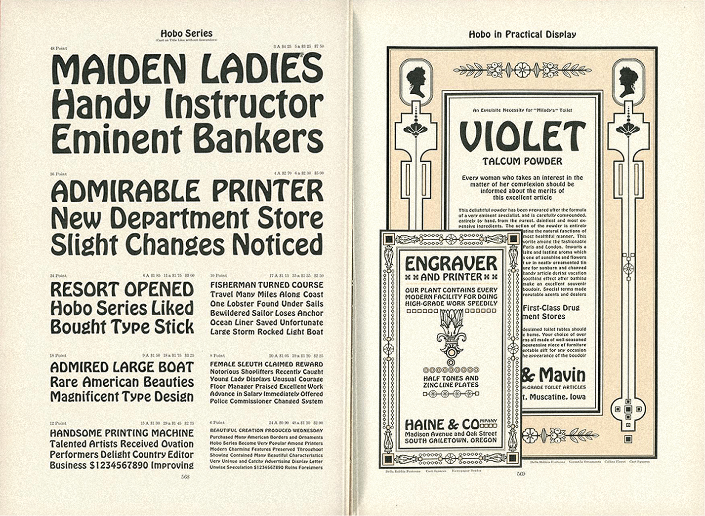 Hobo by American Type Foundry, 1912
 Hobeaux by OH no Type Co, 2015
I don’t think there’s one way to create something and say it’s timeless because it’s the world that decides if something is going to last. There are typefaces that are released, and nothing happens, then two years later, they become a hit. It’s not up to the type designers to decide what is good and what is bad this year. The world decides. But if someone releases a typeface that people keep relating to, it’s probably going to have a longer life.
KB: It’s difficult to compare music and type when it comes to longevity because typefaces have a strong functional component. They serve a clear purpose. Music is a finished product, whereas a typeface is raw material that someone else can use to create something.
I have no idea what makes a timeless
But I also don’t know what makes timeless music. I think they both have to be good. That probably helps. But beyond that, I have no idea.
PN: Maybe a timeless typeface has to be neutral, which I guess Kai has some experience with.
You say timelessness is decided by others. Something is timeless when many people agree on it. Pop music, for example, is something a lot of people can agree on because it has no rough edges. There’s a consensus that most people can listen to it, but that doesn’t necessarily make it good. And usually, I’d say, it doesn’t stand the test of time.
And even though you say type is a tool and music is a finished product, I’d argue that music also has a function. Like I said before, I use music to create a mood or support a feeling.
I hope this is the last time I ask you to compare music and type design. Is creating a typeface family similar to writing an album?
FC: I have no idea how to write an album. I don’t know how to sing and I don’t play an instrument, so I can’t speak for musicians.
PN: Maybe I can compare a type family to a concept album. There are concept albums where there’s a common thread running through all tracks, or they create a certain vibe. I could imagine that the same approach might work for type designers when they use or reuse a certain idea. Or maybe it’s comparable to how someone would build a library, where the designs in it aren’t necessarily connected to one another. Or maybe an album is more like a typeface itself.
KB: I think that’s actually true because
Kai, I’ve seen you trying to buy and sell concert tickets on typo.social. Do you find that many type designers share your taste in music?
KB: I don’t think my tastes are unusual. I was recently trying to sell two tickets for a Godspeed You! Black Emperor show in Porto. I was very excited when the tickets went on sale, so I bought more than I knew what to do with. And then I didn’t have three more people to go with me, so I was trying to unload the extra tickets.
And another time, one of my favourite pianists, Mitsuko Uchida from Japan, was playing some of my favourite music in Lisbon. And like in many big cities, tickets were all gone in five minutes. Susana shares my taste in music in some ways. But I actually don’t know much about other type designers’ music tastes.
Do you, Philipp and Fer, find many people in the type design community who share your taste in music?
FC: I don’t think so, or at least they’re not going to say it publicly. I once gave an entire lecture about the connection between Britney and type design. I also don’t think I’m the only pop-obsessed girl in the industry.
KB: For the record, I do think Britney Spears is pretty cool. I like Lover. That’s my favourite.
FC: That’s a good question for the next conference. I’ve already done
Before making the playlists, I felt like the type design community was full of snobs and that they’d send music I’d never heard of. But that didn’t happen, so now I’m not ashamed to put on Backstreet Boys.
PN: Am I a snob now?
KB: Everyone is a snob now!
FC: think everyone has different tastes in music for different moments in the day, different days in the week, different weeks in the month. I don’t separate the music I like from guilty pleasure music.
When I was a teenager, I was into punk but also listened to Backstreet Boys. And I didn’t
I don’t feel like I’m the only one listening to ‘90s pop
Do you think a type designer can ever become as famous as a rock star?
FC: No, definitely not. People don’t even realise we exist as a profession. They think letters just appear on the computer. So, no. I’d love to, but no.
KB: I think if one of us designed a typeface that could make someone scream with joy or break down crying, then maybe we’d have a right to become as famous as pop stars. I don’t think that’s going to happen anytime soon.
FC: I don’t think it works that way because, for example, everyone has an opinion on Comic Sans, but nobody knows who made
I have a question from the YouTube chat: Do you all divide the typeface development into stages, or do you prefer to handle the process as one long, single path?
KB: No, for us it often is circuitous and labyrinthine. I might say that the typeface is almost ready but then suddenly think: Should the T actually look like this? It’s very non-linear for us because we never stop questioning decisions we’ve already
FC: I never turn my music
PN: I think I’ll go with Kai on this one. Have you ever noticed that when someone is driving with loud music on, they turn it down when they need
It’s like that for me when I have to do mastering, or when a feature suddenly stops working, or I can’t export a file. I need silence to really focus.
Do you think cancel culture is harder on musicians than on typographers and type designers?
PN: Probably,
KB: Exactly! Basically, if the 17 people who know about Eric Gill’s crimes suddenly stop using Perpetua, nothing really happens. It’s not even about Gill, since he’s dead. It’s just a very different scale.
 Perpetua, 1929. Image: Faruk Garib, 2017
FC: We’re not public figures, so people don’t care. Even within the community, I often can’t tell if someone has done something. It might be gossip
Don’t you feel an emotional connection to typefaces like you do to music? Haven’t you ever screamed after seeing a typeface?
KB: Only
Would you like type designers to be more public figures?
PN: No, it’s awesome to work from the shadows.
FC: I feel the
KB: All of us teach, and in that way, we have the pleasure and privilege of making a difference in a lot of people’s lives. I don’t need to do that for everyone in the world. That would