
Michael Shishkin
Creative director of Shishki agency
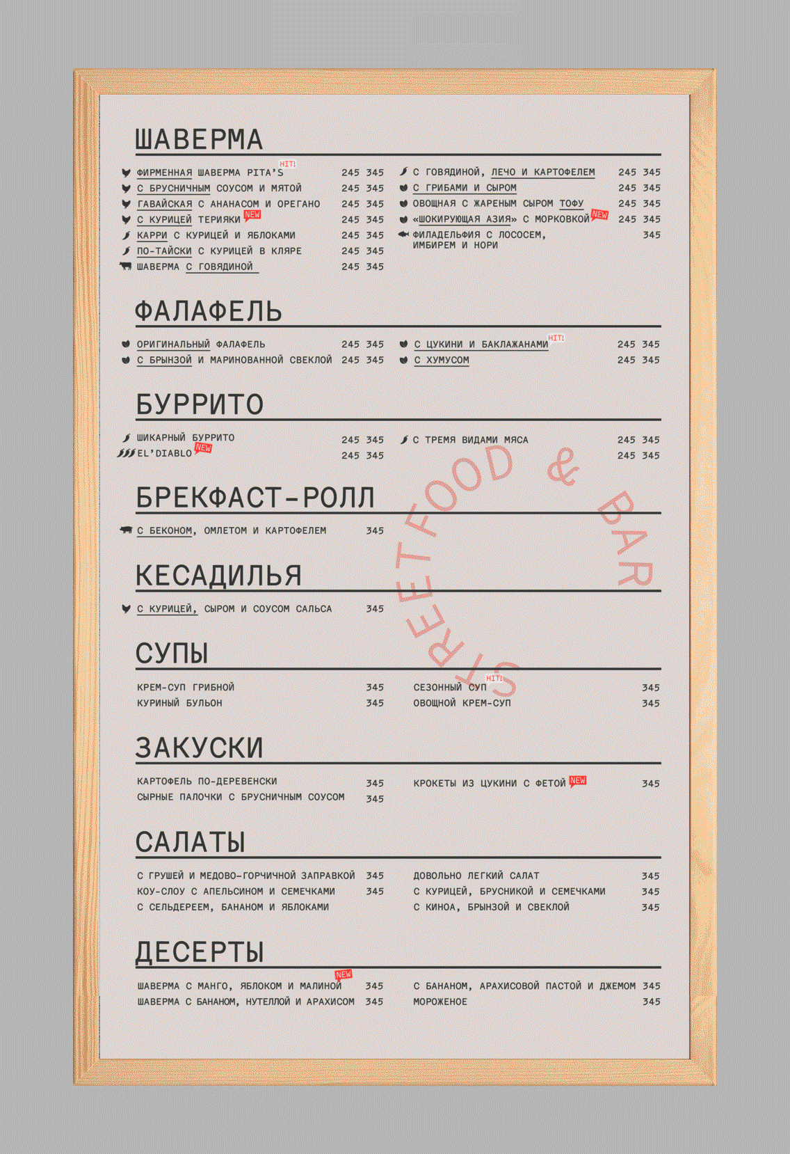
Five years ago, when all thing craft-brutal-hipster-bearded came into vogue, Pita’s opened their first small cafe. They took the simple pita and managed to sell it to impressive audience, thanks to design and easy-going atmosphere. When we met, Pita’s was already a six-venue-strong cafe chain, and we had the task to revamp their graphic identity, bringing it to a new level. Restaurants rarely commission an expensive and complex branding system — but Pita’s acknowledged how important it is, while planning on their expansion.

We needed to relaunch the idea of craft and toughness, while making it somehow contemporary, even a bit exquisite, so as to connect to the audience — which are romantic, if a bit depressed, young female Petersburgers. The key message, as we put it: neo-craft for post-hipsters. Neo-craft is a sort of reinvented craft approach, shabiness and the axe-and-plaid-shirt aside — but still with handcraft and attention to detail as core values. Post-hipsters are trendy and independent people, having outgrown their hipster phase — for them, even mentioning how uncool the hipster stuff is, is uncool itself. There are lots of postmodernism and irony to them.


The neo-craft approach is what we were looking for in type. In Menoe Grotesque, the monospaced is about the craft and toughness, and the robust shapes are about the new, refined approach. As long as Menoe is monospaced, the apostrophe is just as wide as the other glyphs — and in Pita’s it become a key, distinctive element. Of all fonts we’ve considered (Suisse Int’l, Stolzl, TTFirs) Menoe seemed the ideal, so we’ve made our decision quite soon. Although it is rarely the case of monospaced font, when it comes to refinement and elegance.
Our first version of the design was a bit different — a bit more flashy and glamorous, while the final is somehow more romantic and decadent. Many elements have changed, bu Menoe was an important constant. We use lots of typography: circle type setting, typography-vs-image illustrations — all a bit chic, a bit rowdy, with some sort of strain romance. There are lots of double meaning to it, all communicated by means of typography. The whole identity is based on illustrations and typography. At the new Pita’s, in Moscow, there will be circle type stickers on the window, so as to set the mood right away and not to blindfold the interior.
 Pita’s restaurant in Moscow
Initially, we bought Menoe Grotesque from Adam Katyi’s Hungarumlaut, although it was type.today where we found it. Some time ago we had bought Katyi’s Mohol and discovered that the logo license is 30% pricier. Fair enough: if you take ready-made letters for your logo, then you don’t have to spend time on them. Before buying Menoe we haven’t checked out the license at type.today (Using Menoe in logos is covered by our desktop license — t.t). This wasn’t a real problem, but now we check logo licensing conditions everytime. For example, Paratype have a fixed price (To use Paratype’s fonts in logos, you have to extend the desktop license for about thrice the price — t.t), but you can use it for an unlimited number of projects.
We used to use monospaced type in our designs for IT market. Having worked with Pita’s, we realised that monospaced type can work without putting its monospacedness in the first place. Menoe doesn’t communicate tech-ness right away, yet it’s just as good for setting text blocks. We used it in uppercase, and its lowercase, in this project, was the potential unused — we might return to it later, though. Menoe was such a discovery for us, it unfolded in the process.
Yury Ostromentsky
Co-founder type.today & CSTM Fonts
Monospaced type was invented not only, and not quite, for people. Rougly speaking, it was made for machines. Subsequently, it became a style statement, which is an off-label use — but clearly, a racy one. Ten years after, monospaced typography still looked trendy. So it did ten years after that. And ten years later — it did too. It seems, it’s about time to admit — our ideas of what is trendy in type are somehow irrelevant to wider public.