Experts
- Mikhail Strukov
- Type designer, graduate of Ilya Ruderman’s course at BHSAD (Moscow) and Plantin Institute of Typography (Antwerp).
Works with CSTM Fonts and Samarskaya & Partners

- Yury Ostromentsky
- Type designer, partner at CSTM Fonts and type.today

- Ilya Ruderman
- Type designer, partner at CSTM Fonts and type.today

Disclaimer
Today, a free font doesn’t necessarily mean a bad one. Sadly, things are much worse with free Cyrillic than with Latin; but there is also some good news. Our critique and our advice do not have a monopoly on the
Another disclaimer
We’re making this series primarily to help graphic designers choose a typeface with decent, high-quality Cyrillic support. But sometimes the font authors themselves read our pieces or comments posted on GitHub and correct mistakes pointed out by us or other experts. However, since we do not always manage to edit our article right away, telling that the error in question was fixed, if you’re opting for a typeface based on a ‘Cyrillic on Google Fonts’ episode which hasn’t been updated in a while, we recommend checking whether the mentioned errors are still there.
You can help us keep our reviews up-to-date. If you notice that a bug we mentioned has been fixed, please reach out to us at inuse@type.today.
Previously on Google Fonts series
Old-Style Serifs
Geometric Sans
Humanist Sans
Neo-Grotesques
Transitional Serifs
Didones
Scripts
Display typefaces (Part 1)
Display typefaces (Part 2)
Contents
| 1 |  |
| 2 |  |
| 3 |  |
| 4 |  |
| 5 |  |
| 6 |  |
Geologica
Monokrom, Sindre Bremnes, Frode Helland
Geologica has the features and personality of a humanist sans, yet relies on a geometric approach in its letterforms, which makes it feel solid and stable.

Hands-on
The typeface’s designers present Geologica as a serious text

The glyphs are open and wide, with corresponding letter
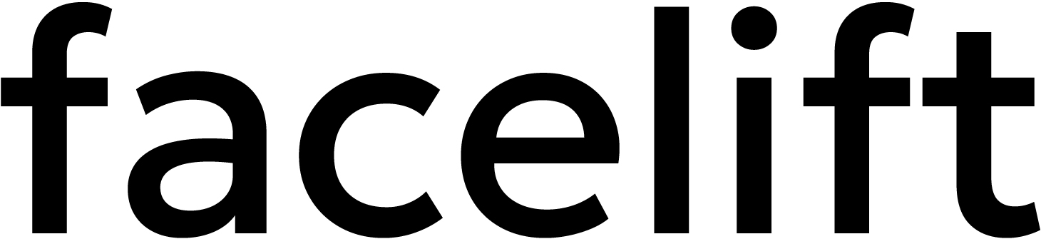
Large apertures, two-storey g and a, and slight variation in character width ensure Geologica’s humanist character. The terminals are cut perpendicular to the strokes.
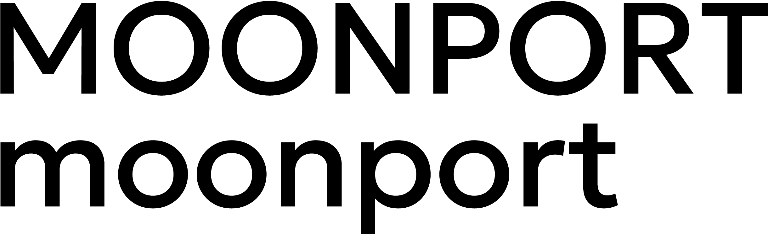
The sidebearings of curved uppercase letters are excessive, which makes their rhythm considerably different from that of their lowercase counterparts.
The typeface supports Latin, Cyrillic (including local-specific variants), and Greek.
Proportional figures are used by default. The typeface contains a set of tabular numerals, a basic selection of prebuilt fractions, mathematical symbols, arrows, ligatures, and common currency signs.

Styles
The typeface comes in nine static weights from Thin to Black; in the variable font, the weight can be adjusted using the same-named axis.
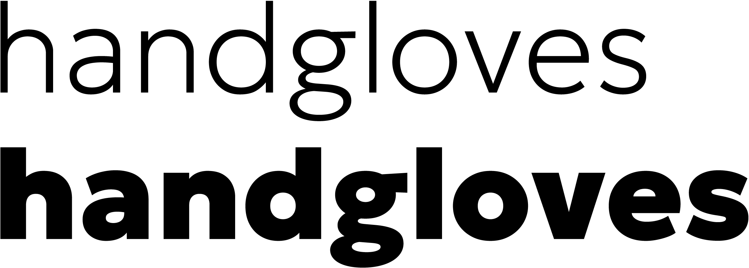
The Slant axis controls the degree of slant (even though the font doesn’t have any slanted static styles); the Cursive axis changes the double-storey a and g to single-storey forms; while the Sharpness axis adds sharp calligraphic terminals to stroke endings.

Cyrillic
The diagonal strokes in Кк, Жж, and Ии — same as in the Latin Кк — seem undercompensated, creating an impression of reverse contrast.

The lowercase straight letters (such as н, п, and и) look too wide next to curved letters. The bowls in ф are vertically compressed.
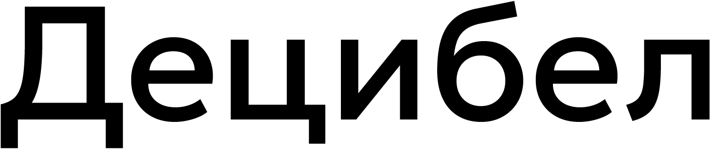
The shoulder of the descender in Дд, Цц, and Щщ are too long. The left corner of this Дд is messy and dark.

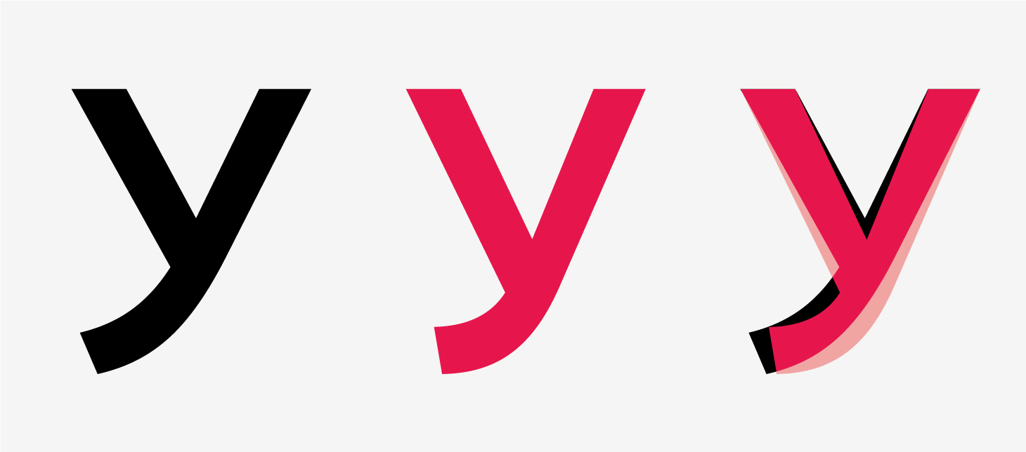
Шш and Щщ are overly wide. The Ю also appears excessively wide due to its long crossbar and uncompensated bowl. The У, on the contrary, looks small because its triangle part lacks volume and counter space; the lower stroke’s ending appears indistinct and insecure, with the diagonal strokes exhibiting reverse contrast.
Our advice
Geologica is a usable typeface with an interesting personality and typographic potential, but an imperfect Cyrillic set. The typeface is to be used with great caution.
Google Sans
It’s Google’s corporate typeface, building upon the concept of Product

Since May 19, 2026, the

Hands-on
Google Sans’s letterforms echo the concept behind Product Sans: it’s a geometric sans featuring simple letterforms. The typeface was inspired by early geometric sans faces, such as Futura, Avenir, and Tempo.

However, unlike the above-mentioned typefaces, Product Sans and Google Sans use a default double-storey а — to provide contrast with other curved characters, and a single-storey glyph is available as an alternate. The terminals are cut perpendicular to the stroke. In curved characters, the terminals are cut diagonally at a 45-degree angle.
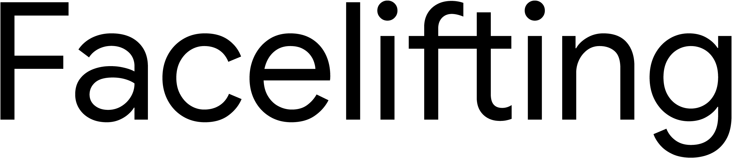
The characters are fairly closed and sit tightly next to each other; the vertical metrics are also compact. Compared to Product Sans, Google Sans has wider glyphs, and x-height is also larger than in its predecessor.

The typeface boasts an extensive character set. The list of supported scripts and languages includes Cyrillic, Greek, Hebrew, Armenian, Georgian, Bengali, Devanagari, and Thai.
The proportional lining figures are used by default.

The font also contains tabular figures, as well as multiple prebuilt fractions, sets of numerators and denominators, subscripts and superscripts, and Roman numerals.
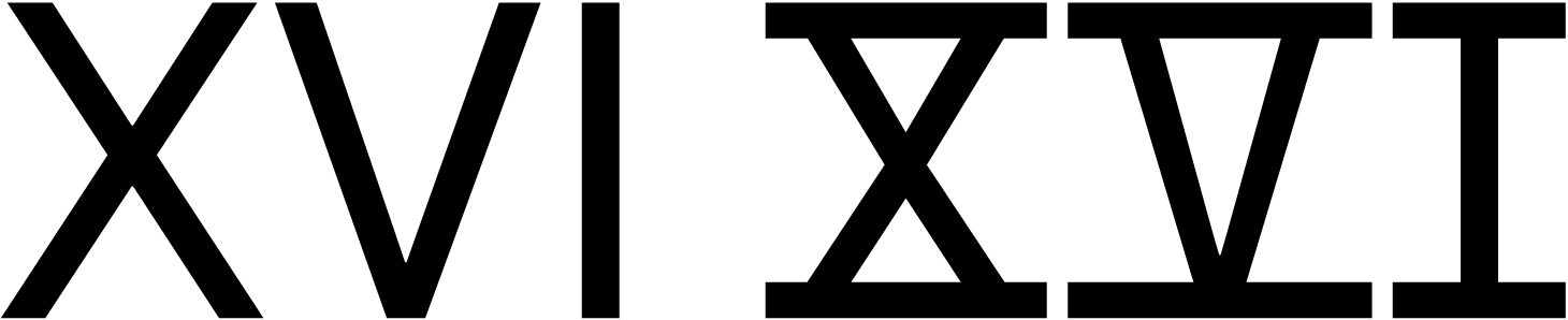
The glyph set includes mathematical symbols, icons, arrows, and numerous currency signs.
Styles
The typeface is available in four static weights in upright and slanted styles.
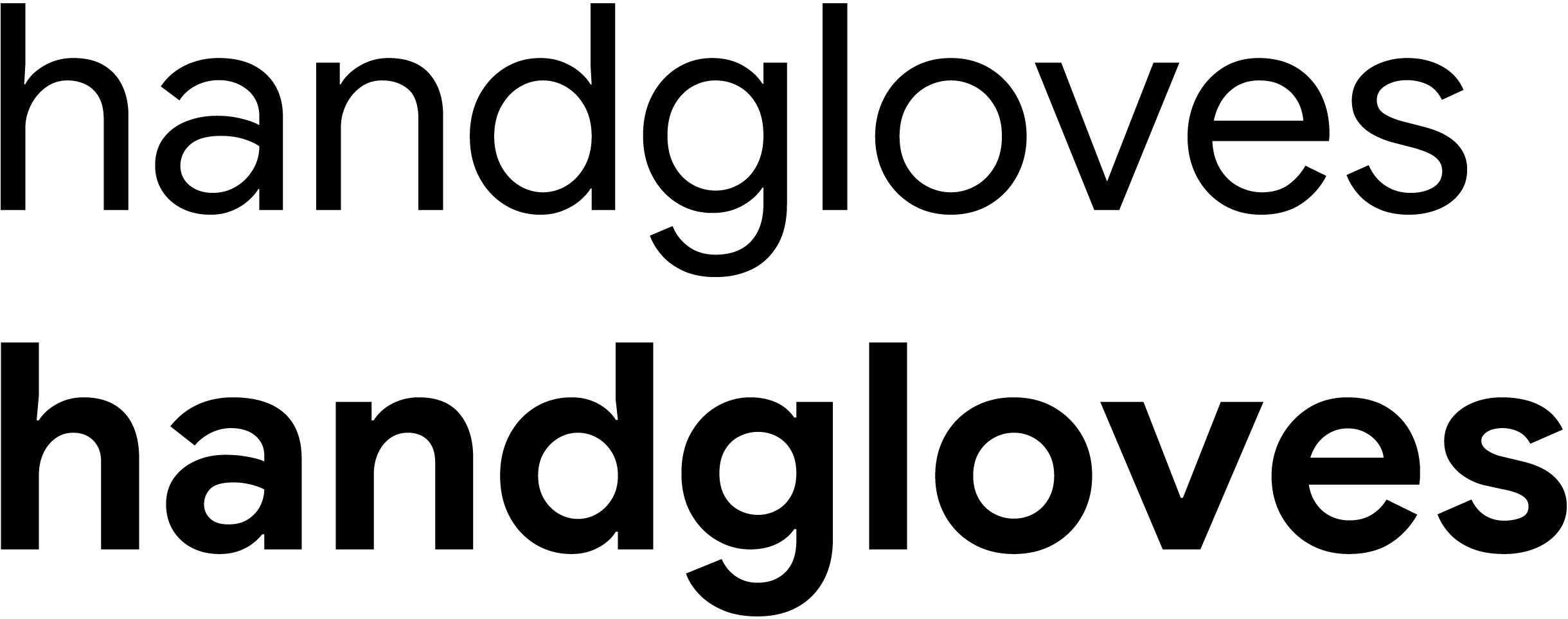
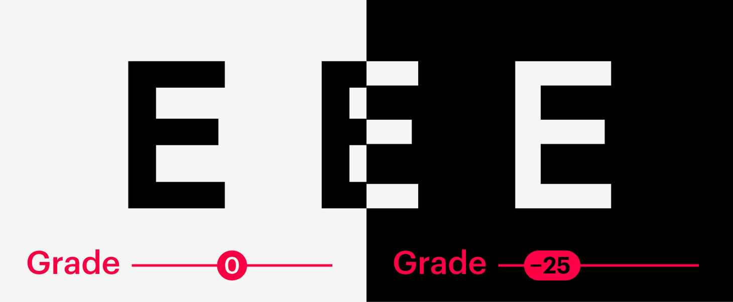
The variable version has both the conventional Weight axis and a Grade axis, which adjusts weight without altering the font’s metrics. It can, for instance, be used to ensure that light characters on a dark background don’t look heavier than dark characters on a light background.
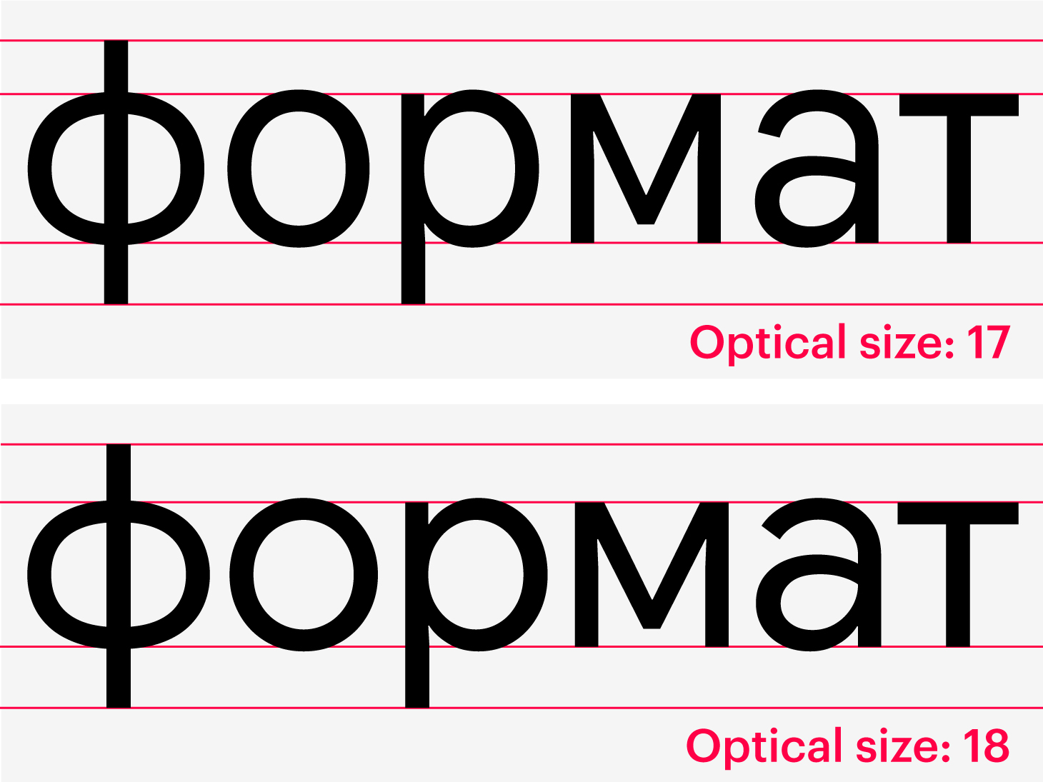
The variable font also has an optical size axis that adjusts font parameters based on its size. Previously, there were two separate typefaces for this purpose: Google Sans for larger sizes (18 pt+) and Google Sans Text for smaller ones.
Cyrillic
Personality-wise, the Cyrillic extension is consistent with the Latin glyph set.

The designs of characters are generally

The diagonal strokes in Кк, Ии, and Уу create the impression of a subtle reverse contrast. The Cyrillic breve also reveals reverse contrast.
Our advice
Google Sans is a neutral, high-quality typeface that allows for fine-tuning of its parameters. The Cyrillic glyph set is quite decent and usable.
LINE Seed
LY Corporation, RixFonts, Fontworks
LINE Seed JP is a corporate typeface of the Japanese tech company LY Corporation. It is meant to convey the corporation’s values: convenience and friendliness.

Hands-on
A geometric sans face with simple letterforms, LINE Seed JP is heavily influenced by the neo-grotesque type. Its loose horizontal and vertical metrics, combined with minimalist shapes, ensure good legibility at smaller sizes. The rounded terminals make the typeface feel nice and friendly.

There are issues when it comes to the quality of designs, as well as the consistency of details and parameters. In a, d, g, and q, the strokes of bowls in a place where they’re nearing the stem are different: the lower, rising stroke is heavier. In p and b, it’s the opposite. The nature of these connections is different from that in letters with arcs (h, m, n, and u). The characters with diagonal strokes — Vv and Yy — exhibit reverse contrast. The stroke terminals vary in weight: for example, the stroke ending in g is considerably lighter than the ending in е, whereas it would make more sense to make it heavier.
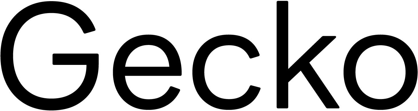
The apertures are quite

The upper part of the ligature fi feels cramped, with the elements almost touching each

There are regular proportions both in the lowercase and uppercase glyphs.
The Latin set is also available as a monospaced typeface and a typeface with characters rotated 90 degrees.
LINE Seed offers broad language support: Latin, Cyrillic, Greek, Japanese, and Chinese.
The font contains default proportional lining figures, tabular figures, and a minimal set of ready-to-use fractions.

The stroke weights in the numerals seem
The typeface also includes mathematical symbols, circled and bracketed numerals, ligatures, icons, arrows, frames, and a dozen basic currency signs.
Styles
Available in four static weights ranging from Thin to ExtraBold.
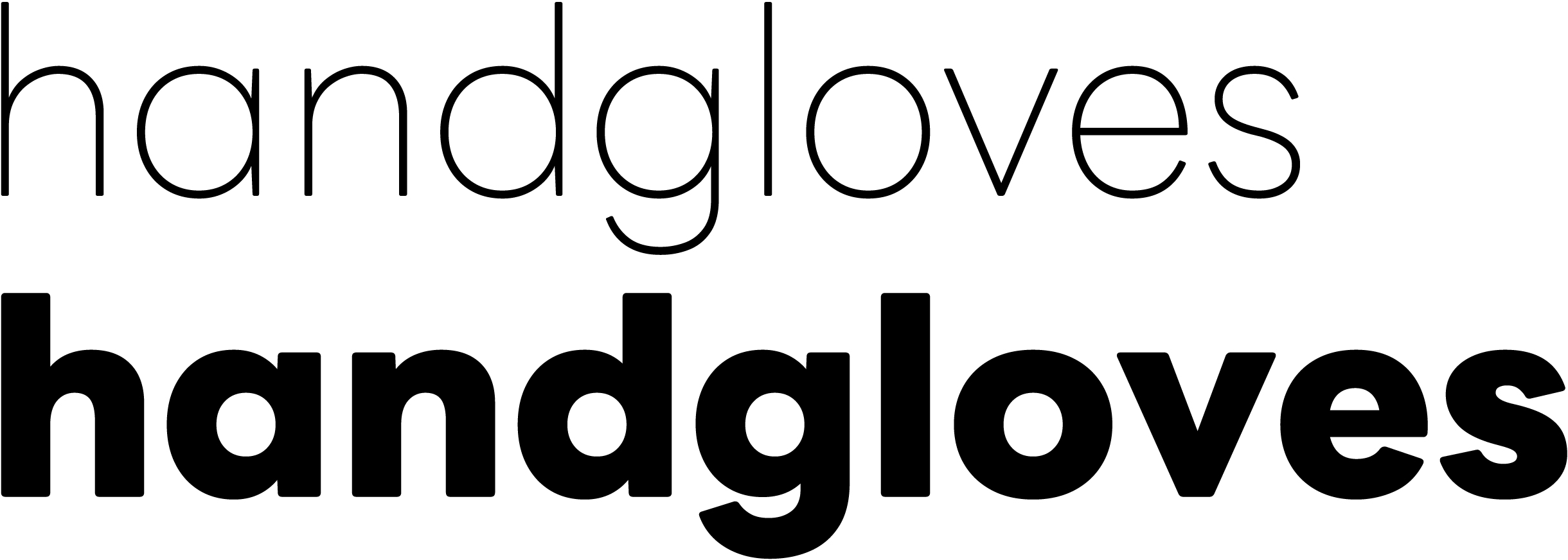
Cyrillic
The Cyrillic extension is of poor quality.

The design of Кк is identical to that of its Latin counterpart. Although this is an eligible choice, here it doesn’t appear to be really informed. The tail in this б looks broken, and the letter leans to the right. Despite the announced focus on the simplicity of letterforms, the ф reveals a complicated and old-fashioned structure. The texture is uneven: the н sits asymmetrically between two curved characters. The Cyrillic set’s metrics lack
Other parameters are inconsistent, too: for instance, the cap
As with the Latin set, there’s a significant variation in weight: for example, the strokes in ШЩ are thinner than in other straight characters. All characters sit below the baseline.

The design of Жж looks out

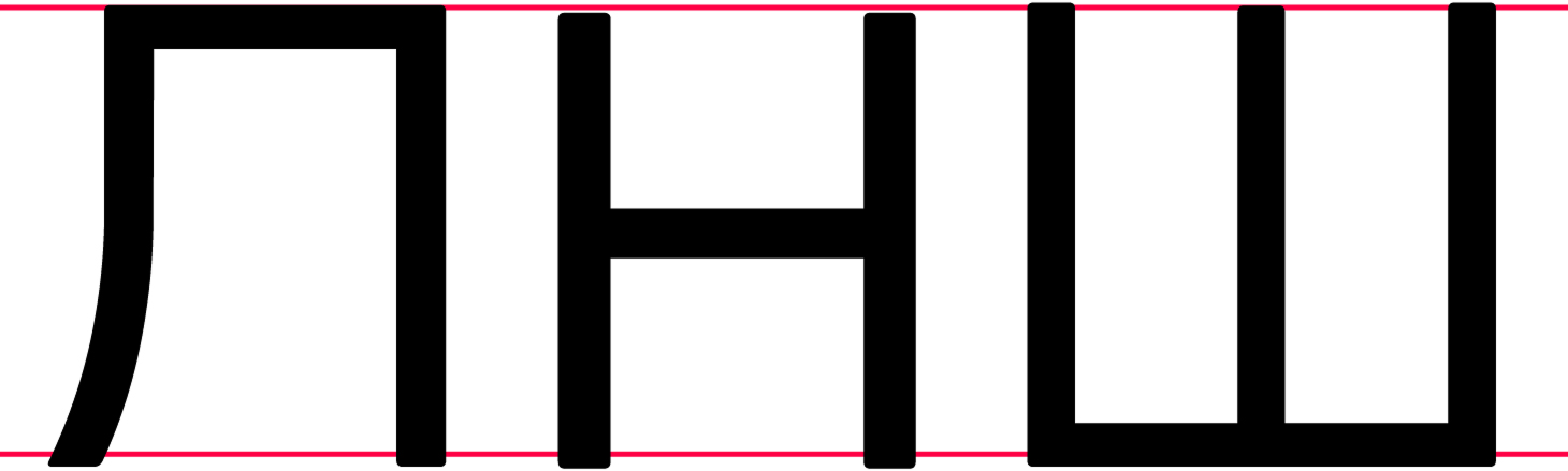
The shoulder of descenders in Дд, Цц, and Щщ is too short, and its length varies across different letters. The wide Лл features an insufficiently curved right

Then there’s ИЙ with reverse contrast. The horizontal bar in Ъъ is excessively long, and the bowls in these characters are too
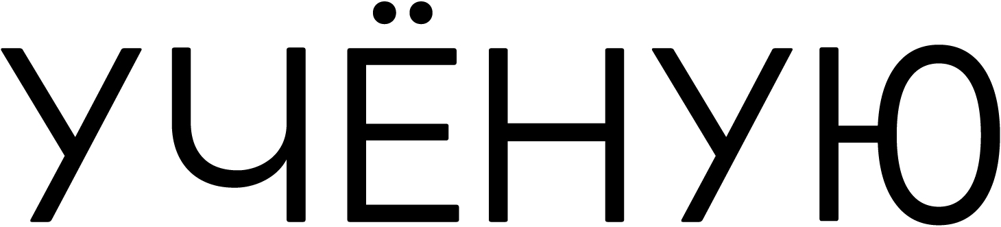
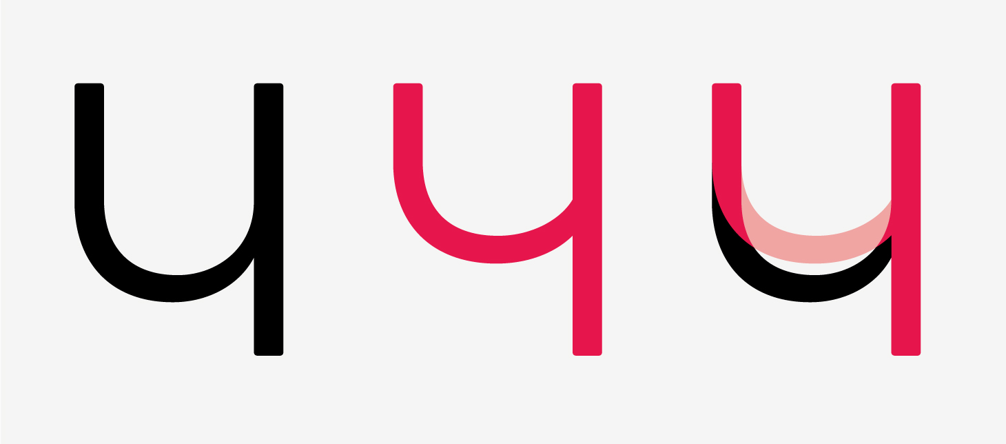
This Юю is overly narrow, overcompensated, and non-geometric. The upper part of Чч is too large and excessively rounded.
The У has a small upper triangle and exhibits reverse contrast in its diagonal strokes.
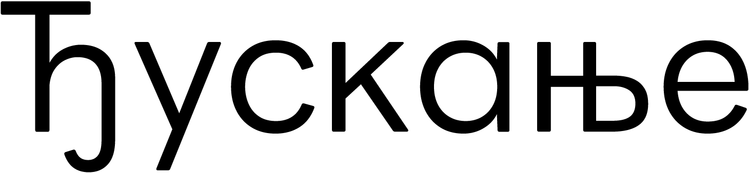
The arc of the Serbian Ђ is built incorrectly, based on the lowercase ђ. Normally, the arc of this element would resemble an uppercase Ч rotated 180 degrees. The н-part in Њњ is too narrow.

There are issues with Ukrainian diacritics.
Our advice
LINE Seed is a typeface with a distinctive personality and broad language support, but of poor quality. Its Cyrillic glyph set is of extremely poor quality and best avoided.
JetBrains Mono
JetBrains, Philipp Nurullin, Konstantin Bulenkov
A monospaced typeface built on a geometric framework, it was designed to cater to the specific needs of developers: fonts with parameters like these are used in code editors.

Hands-on
Working with code requires monospaced fonts specifically, as indentation and character positioning are
The glyphs in JetBrains Mono are relatively narrow, with a large x-height, and generous counters ensured by squared bowls and arcs.

The designs are simple. Perhaps an alternative single-storey а would also be appropriate here.

The letters are closed and similar to the oval

The uppercase characters are constructed using the same approach.
The typeface supports Latin, Cyrillic, and Greek.

In addition to basic figures, the font offers a minimal range of prebuilt fractions, sets of numerators and denominators, mathematical symbols, icons, arrows and frames, and common currency signs.
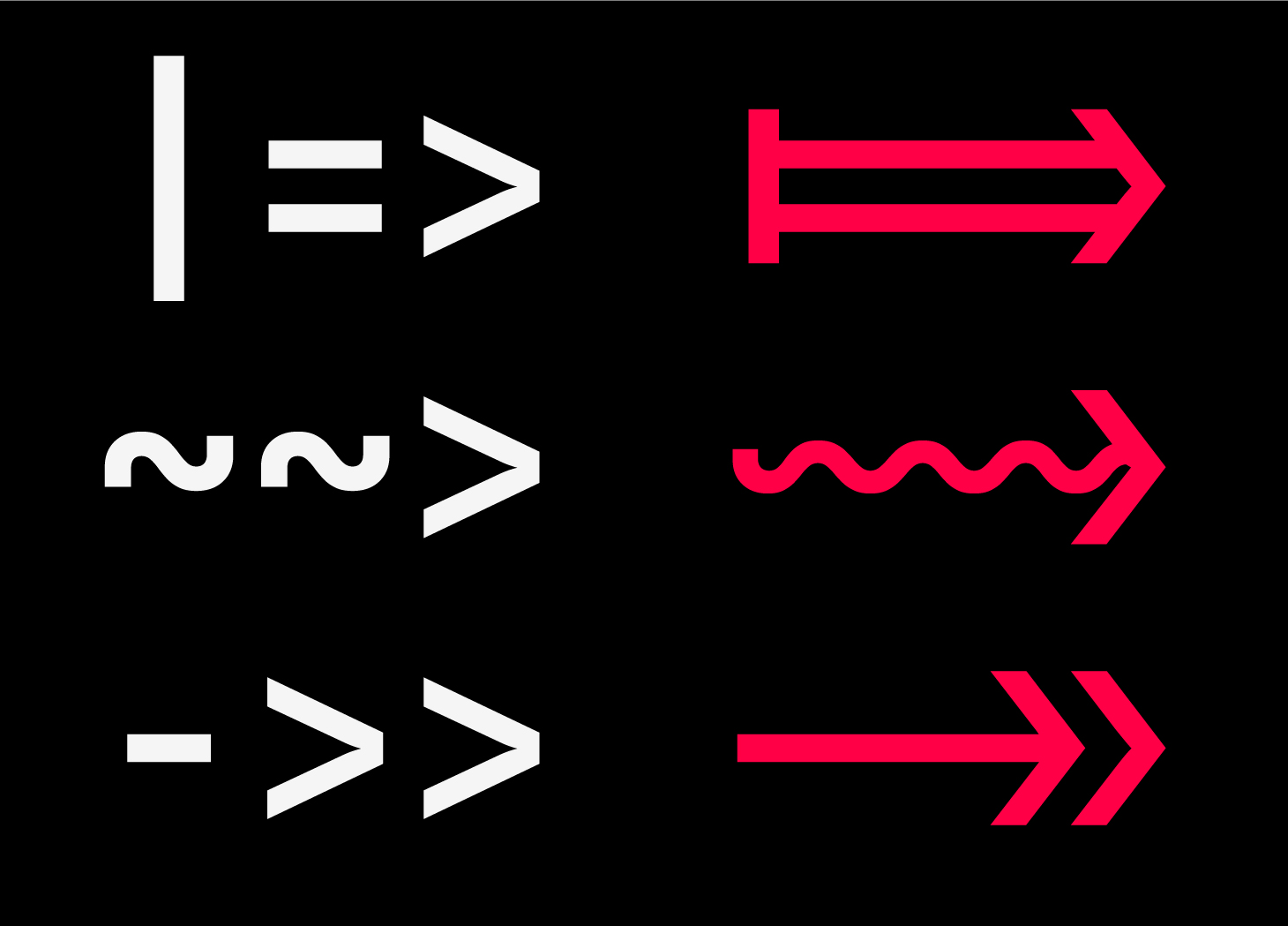
Ligatures are used for operators in the code. This reduces visual noise and helps distribute whitespace evenly along the line.
Styles
The typeface is available in eight weights and as a variable font with Weight and Italic axes.
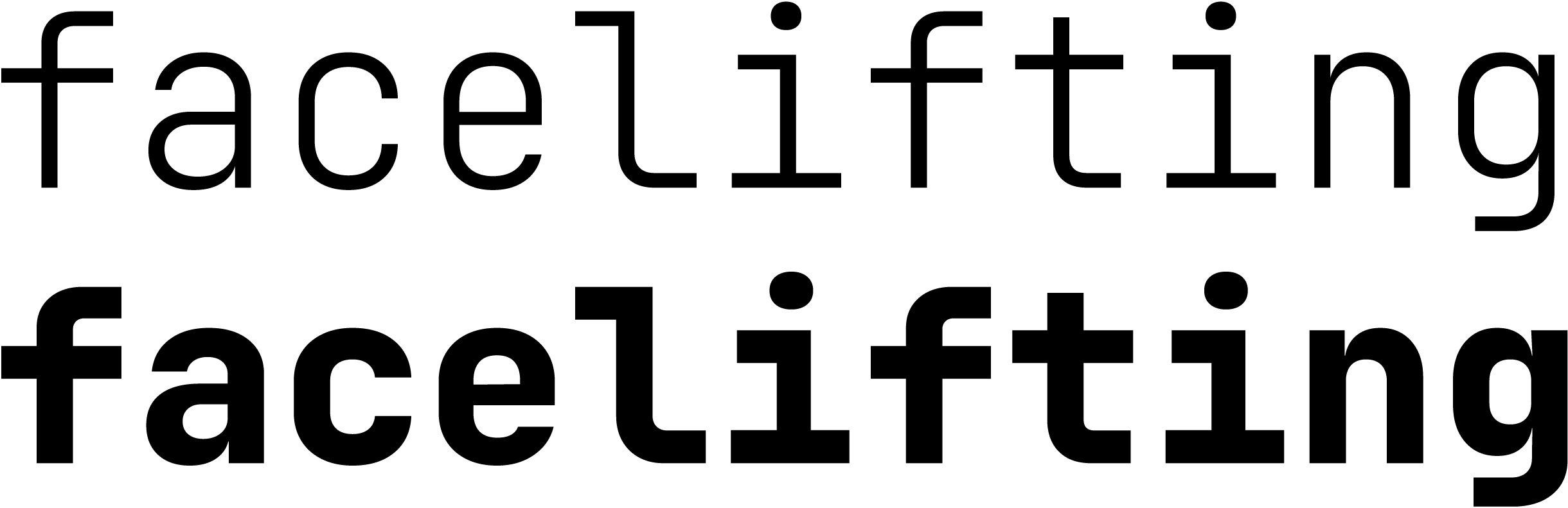
The italic — a true italic, in this

Cyrillic
The Cyrillic set feels natural, and its nature is consistent with the Latin set.

The ascender in this б is too thick; the у also looks heavy, with its diagonal strokes giving an impression of reverse contrast.

In heavier weights, the diagonal strokes of А and К also exhibit reverse contrast. The bowl in Ь and Б appears too small.

Although a monospaced font always requires optical compensation for stroke weight, the difference in weight is sometimes too pronounced here. In some cases, it could have been avoided: for example, the crossbar in д looks too heavy, while the bowl in ы lacks some weight.
Our advice
JetBrains Mono is a typeface designed for niche applications, though its distinctive character may also make it an aesthetic choice. The Cyrillic extension is quite solid and perfectly usable.
Comfortaa
Jojan Aakerlund
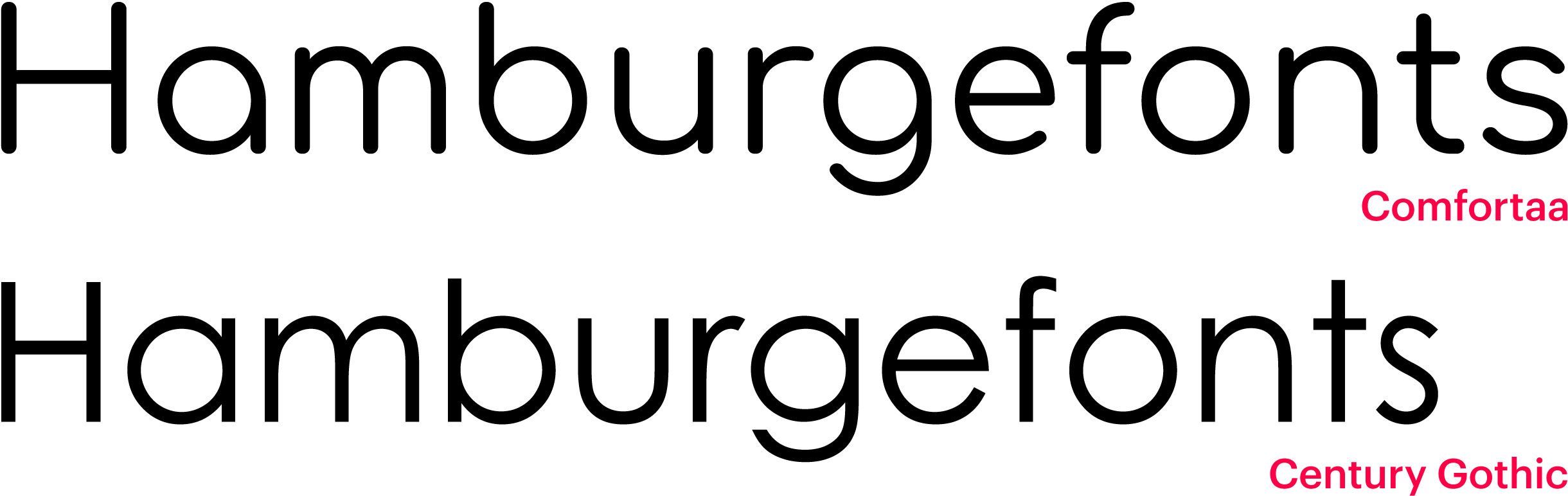
Comfortaa is a display geometric sans with rounded terminals. The designer drew inspiration from Century Gothic but wanted Comfortaa to reveal a softer, friendlier personality.
Hands-on
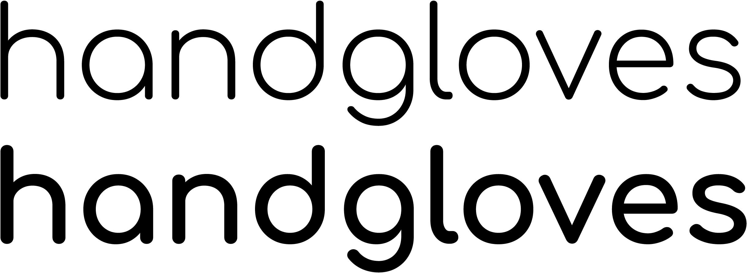
On its Google Fonts page, the typeface is presented as intended for large sizes, yet its parameters are inconsistent with the description: the wide glyphs are loosely spaced, and the long ascenders and descenders require generous line spacing.

The specific shapes of the curved characters a, d, and g evoke associations with Art Nouveau, Constructivist, and Bauhaus type.

However, Art Nouveau typefaces are characterised by pronounced variation in width, whereas Comfortaa’s characters have relatively similar proportions, creating a certain visual dissonance. The basic parameters are unbalanced: the straight letters appear too wide next to the curved letters.

The typeset text is patchy, with excessive letter spacing around curved letters: for instance, con sit really loosely, while an feels cramped.

There are similar issues in the uppercase characters: there’s too much space between OU, FL, whereas UF appear stuck together. The G looks excessively narrow next to other curved letters.
The typeface supports Latin, Cyrillic, and Greek.
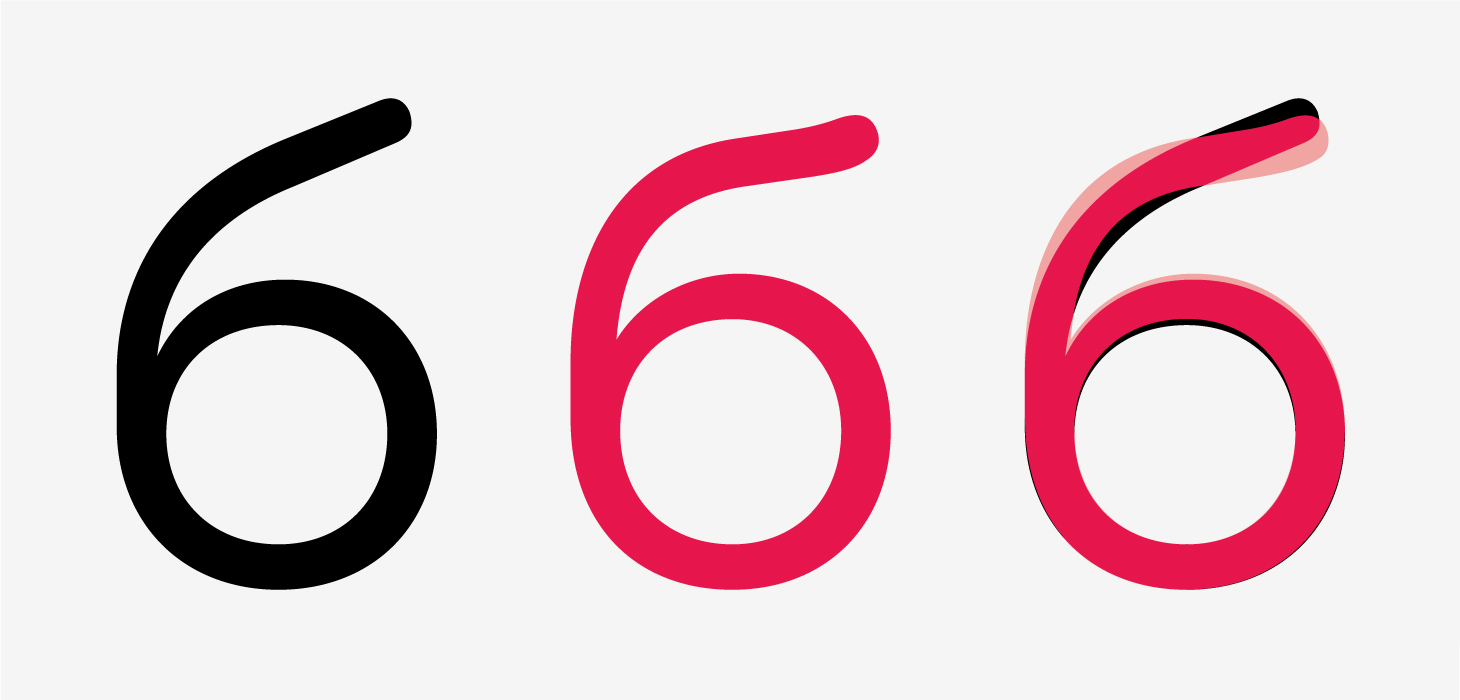
There’s just one set of figures, proportional ones. They appear inconsistent in terms of weight and proportions: 6, for instance, looks small and light next to 5, and its diagonal stroke is heavier than its bowl. The same is true for 9. The diagonal strokes in 4 and 7 seem heavy. The height in curved characters is optically undercompensated: 8 appears shorter than 7.

The font includes several prebuilt fractions, mathematical symbols, currency signs, and ligatures. The designs of the latter raise some questions: the fi, for instance, exhibits a level of contrast which feels unnatural for the typeface.

Styles
The typeface is available in five upright styles with a subtle increment in weight. The weight can also be adjusted using the corresponding variable axis.
Cyrillic
The Cyrillic set inherited all the issues related to the basic parameters of Latin, but also has a number of its own.

The ascender’s shape in this б
The Cyrillic у is different from the Latin y — and both feature reverse contrast, same as Vv.

The design chosen for Кк is rather conventional for Cyrillic, yet multiple characters in upright styles copy their Latin

The diagonal strokes are not compensated in terms of weight, showing reverse contrast.

The typeset text is also uneven: иж and ну look stuck together.

The crossbars in Serbian Њњ sit on different levels, while it would make more sense to execute them as a single shared stroke.
Our advice
Comfortaa is a distinctive typeface with a friendly character. However, it is also a poor-quality typeface, with issues in its fundamental parameters. The Cyrillic extension is highly questionable and best avoided.
Wix Madefor Display и Text
Dalton Maag
It’s two separate families, initially designed for Wix. The characters are geometrically constructed, but the typeface has neo-grotesque features.
Hands-on
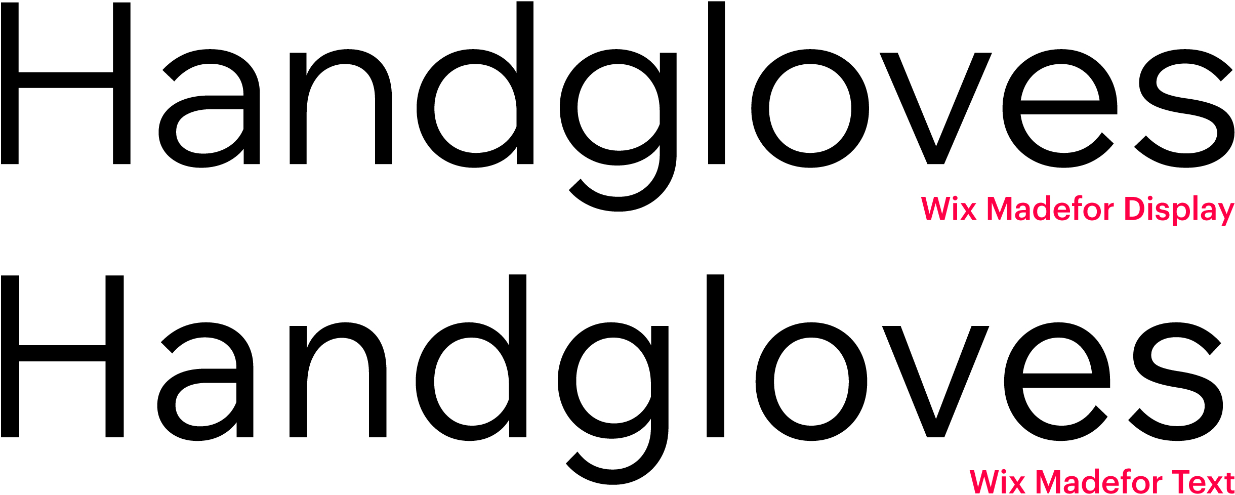
A geometric approach is more pronounced in the display family, with optically round characters and right-angled curves in f, j, and t. There are slight flares of stroke

The two families share a common underlying structure, but the geometric nature is less pronounced in the text version. The characters are darker due to increased weight and concise proportions, yet the overall setting is looser.

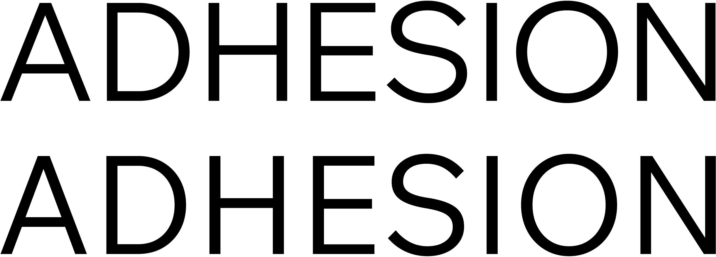
The uppercase characters are built using the same logic.
Wix Madefor comes in a rather limited glyph set: basic Latin and Cyrillic (the Bulgarian variant included), proportional lining figures, a basic selection of prebuilt fractions, sets of numerators and denominators, mathematical symbols, arrows, and common currency signs.

Styles
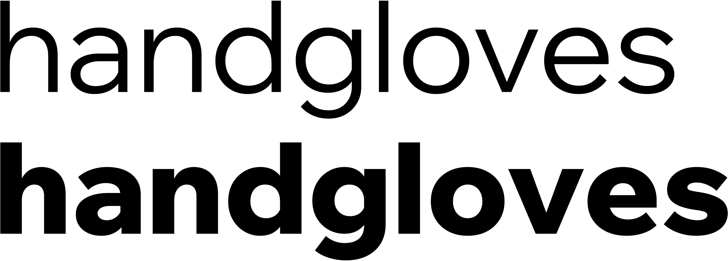
Wix Madefor Display is available in five upright static weights from Regular to ExtraBold and as a variable font with the weight axis.
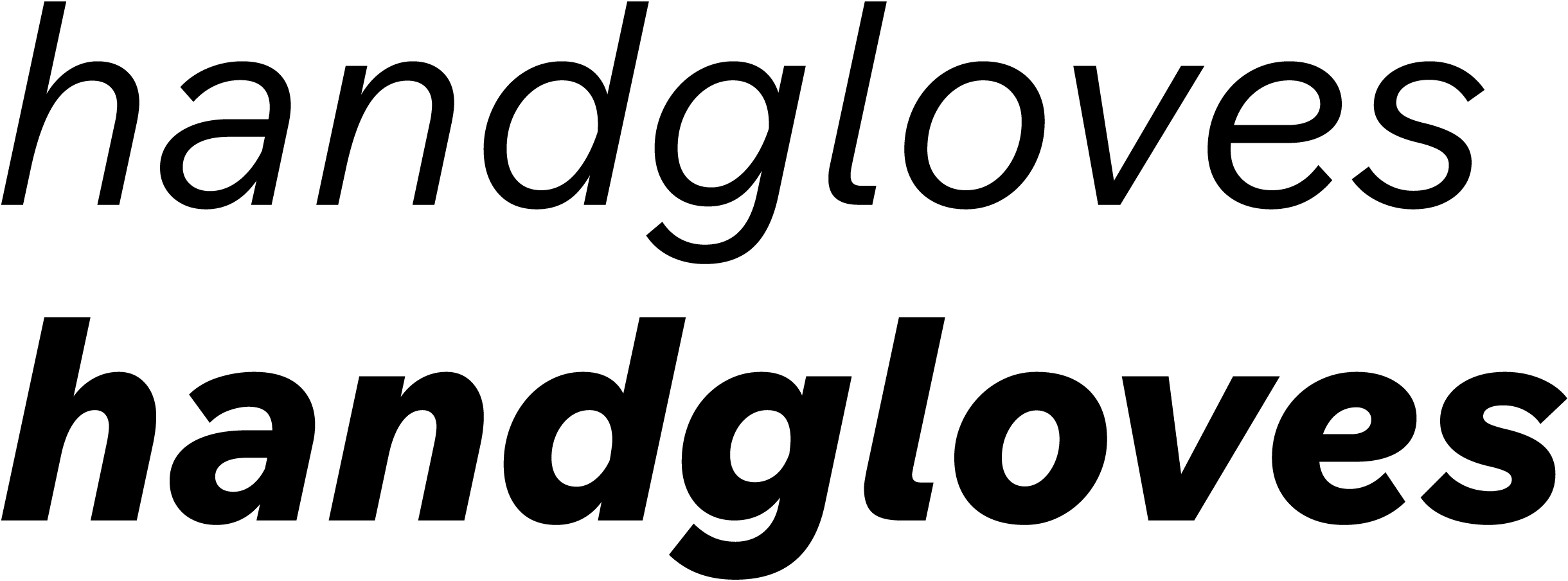
The family includes italics, in which several letters change their
Cyrillic
The Cyrillic set adopts the logic used by the Latin one.

The б’s ascender is somewhat

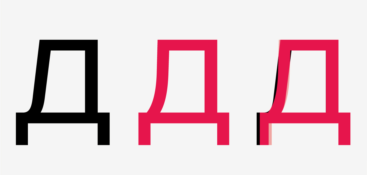
The left leg in Дд and Лл is too straight, with an abrupt, light ending.
The horizontal stroke in Ъъ is too short, and the bowls are positioned too low. The diagonal strokes in к reveal reverse contrast.

The shoulder in Дд, Цц, and Щщ is too short, while the bowls in Зз seem crumpled.

The crossbars in the Serbian Њњ are located on different levels. The length of Ђ’s crossbar appears overcompensated.
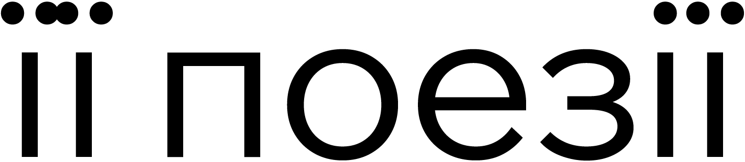
There are issues with Ukrainian diacritics.
Our advice
Wix Madefor Display is a functional typeface with details that are unconventional for a geometric sans serif, but its Cyrillic set is imperfect and feels unnatural. It’s best avoided.