
Experts
- Mikhail Strukov
- Type designer, graduate of Ilya Ruderman’s course at BHSAD (Moscow) and Plantin Institute of Typography (Antwerp).
Works with CSTM Fonts and Samarskaya & Partners

- Yury Ostromentsky
- Type designer, partner at CSTM Fonts and type.today

- Ilya Ruderman
- Type designer, partner at CSTM Fonts and type.today

Disclaimer
Today, a free font doesn’t necessarily mean that it’s bad. Sadly, browsing Cyrillic fonts is still like walking in a minefield; but there is also some good news. Our critique and our advice do not have a monopoly on the truth — that’s just an expert review by three professionals sharing the same values. Plus, you always have to remember that there is no such thing as forbidden means and tools in design. Any bug can be turned into a feature in the hands of a daring, confident typographer, — only before taking risks, you should figure out what this bug actually is.
What is a neo-grotesque?
Neo-grotesque typefaces are closed-aperture monospaced sans serifs, heirs of the old grotesques — first ever typefaces without serifs. They have vertical axis, near-zero contrast, and oblique letterforms used as italics.
Contents
| 1 |  |
| 2 |  |
| 3 |  |
| 4 |  |
| 5 |  |
| 6 |  |
| 7 |  |
| 8 |  |
| 9 |  |
| 10 |  |
Roboto
Christian Robertson
The font was developed for Google. According to its description, Roboto has a mechanical skeleton, but with friendly and open curves. In practice, it is a semi-open-aperture, neutral, neo-grotesque typeface with a number of humanist details. Obviously, Roboto’s author has examined other popular fonts and decided to combine certain solutions. This adds points to the font’s neutrality: it feels familiar rights away, but does not always look consistent.

The claimed mechanical character (most pronounced when it comes to uppercase) reflects in the rhythmic design and narrowed metrics, which is somehow inconsistent with the author’s comment: “While some grotesks distort their letterforms to force a rigid rhythm, Roboto doesn’t compromise, allowing letters to be settled into their natural width. This makes for a more natural reading rhythm more commonly found in humanist and serif types.”
Hands-on Roboto’s curves raise no questions, and it is well legible at pretty small sizes. Then again, today’s screen resolutions have turned a technical issue of legibility at small sizes into a one of type design, making it about metrics; here it is ensured by large x-height.
Roboto is equipped with a set of tabular figures, a minimum set fractions, mathematical symbols, monetary signs and ligatures.
Styles Six weights from Thin to Black, with corresponding oblique styles.

The oblique style is fully dictated by the roman, inheriting all the specifics and weaknesses — yet it is much more dense.

An additional family titled Roboto Condensed differs in even narrower metrics.

Cyrillic Roboto’s Cyrillic personality is largely consistent with its Latin version: rather neutral, fairly rigid, with no visible stylistic discrepancies.

However, the quality of this Cyrillic is questionable, therefore it is little suitable for application.

Lowercase and uppercase Д in Thin and Light styles (apart from the excessive dynamics of its left stroke) are marked by a very narrow platform; the same problem occurs with Цц and Щщ. There are problems with Уу, Кк, Ии: the diagonals are way too heavy, resulting in unwanted reverse contrast. Ill-balanced is я, with its flattened bowl and the too-far-aside leg.

It gets a bit better in heavier weights — however, the shoulders in Дд, Цц, and Щщ grow wider or narrower without any articulated reason, each of the glyphs does it in its own way. Д has the widest shoulder in Light, while in Black it is the narrowest. The overall form of Д is also too narrow, with a far too heavy left stroke.

There is more problematic glyphs. Starting as early as from Medium (getting worse in Bold and Black), the tail of б (being badly curved already) looks lighter and shorter next to the bowl (they are also stuck too close together). This glyph fails in every font style. In ч, the arm has a weird dynamic: unduly thin at the bend, it gets wider at the joint. Ы is excessively wide in all styles; Я seems to lack volume in its bowl.

In both Thin and Light, Ъ has too wide an ear, the bowl lacks volume, and there is too much spacing on the right.

In the lighter styles, the bowl in ю is way too far off, while in heavier styles it gets too close to the vertical.

In nearly every weight, the horizontal proportions of ю are far from being perfect.

The diagonals in Мм reveal unwanted reverse contrast, and that problem does not limit to Cyrillic.

The ф hasn’t managed to choose one of the conventional forms, and therefore looks insecure.

The Narrow Cyrillic inherits the same problems: distorted tail in б; ы is too wide; м with reverse contrast; narrow and unconfident ф showing signs of two different forms. Plus, the breve in the й is uncompensated in terms of width.

The accents are unfit for Ukrainian typeset, the non-accented glyphs are also problematic: for one, the middle horizontal in є should get a compensated vertical position.
Our advice
If you really have to use Roboto, you’d better be choosing styles from the middle of its weight range — where the mentioned problems are not that visible. The mistakes interfere with the typeface’s neutrality, which is an important thing in UI. If possible, we recommend using something else.
Oswald
Vernon Adams
Oswald reworks a classic typeface called Alternate Gothic by Morris Fuller Benton, a narrow variant of Franklin Gothic, released in 1903.

Preserving closed apertures and dense metrics, Oswald simplifies the details and basically smoothens the bright personality of Alternate Gothic. Less radical form of the arcs in n, m, u; the same solutions applied to bowls, which became rounder, with a less pronounced vertical accent.
You have to admit that Alternate Gothic looks more balanced, integral, decisive and rhythmic as a typeface, an honest reflection of the industrial age it comes from — and this is what Oswald will never have.
Hands-on There is an issue of over-compensation in the glyphs which tend to look too dark — like m or g. In Oswald, those are unnecessarily light, it strikes the eye in Regular and Light weights: for instance, m, apart from its clearly thinner strokes, is marked by overly large counters.
The typeface is equipped with plenty of currency symbols and math characters, but has only one set of figures (proportional) and minimum fractions. The entire glyph set, both Cyrillic and Latin, is rather rich.
Styles This family has 6 upright styles (plus the variable-weight file), all with identical vertical metrics — thus, the ascenders and descenders are way too long in heavier styles.

Cyrillic Oswald’s Cyrillic appears more vibrant — thanks to a number of peculiar letterforms, as well as different approach to proportions.


The lowercase н and its relatives are a far cry from the proportions exercised in Latin — way too wide, which disrupts the rhythm and the relations between upright and rounded glyphs.

The heaviest and the lightest of weights employ unrelated forms of б — because of this, in the mid-weight styles, this glyph turns out unbalanced and illogical.

The Cyrillic breve copies the form of its Latin counterpart. The lowercase з looks dangerously similiar to a three, the glyph falls into two vertical parts, which seem reflected.

Lowercase д and л, way too dynamic, with an unwanted diagonal stroke movement.
The lowercase м and ю are way too light and narrow, with overcompensated stroke widths. Also too light is ф, with its vertically distorted bowl.

Same problems with uppercase Д and Л. З looks like a large-headed three. The breve over Й (again, too light) also has reverse contrast. Very narrow, small, and light bowls in Ь, Ы, Ъ, Б. The problems only get worse as the weight increases.

Once again, the overcompensated М catches the eye — not only really light, but also with reverse contrast in its diagonal strokes. Bowls in Ф are of almost square shape, something you won’t see anywhere else in the typeface. Peculiar, very unexpected form of У, which goes below the baseline (that would be logical, if the same happened to J). Ю’s bowl seems too light and too wide next to the rest of the glyph.

In Ukrainian typeset, the problems with accented glyphs become absolutely obvious.

Sadly, there are even a number of purely technical errors.
Our advice
Despite the strong historical prototype and the popular type genre, the Cyrillic of Oswald has way too many problems to ignore. Sadly, it’s not worth using.
Nunito
Vernon Adams
Nunito has open-aperture, rounded shapes, and soft terminals with thickness modulations. This non-mechanical behaviour is not very typical for static sans serifs.

That said, Nunito has symmetric arcs and bowls, with symmetric joints to vertical strokes. Oblique style in the place of italic.

Hands-on Two sets of tabular figures, regular and old-style ones; fractions with a set of numerators and denominators, at least two dozen monetary signs, basic math symbols.
Styles Total of 7 styles with italics; thanks to the rounded terminals, the personality of the font changes with the weight.

The oblique has by a very small slant angle, which makes it virtually indistinguishable from upright styles. Unfit for highlighting parts of text, it becomes a stylistically autonomous tool — it might work independently of upright style, or even instead of it.
Cyrillic Of a sufficient quality and its personality is in compliance to Latin — although not without some inaccuracies and questionable forms.


On the one hand, the shape of Кк and Жж seems like a logical answer to soft diagonals in Яя and R.

On the other hand, this form seems unnatural for Cyrillic. The font would look more concise and relevant with its Cyrillic Кк and Жж repeating the design of the Latin Kk.

Зз and Ээ seem slightly skewed and imbalanced: Ээ tends to lean leftward, Зз leans rightward. This becomes less obvious in the slanted styles.

The same з and э look too light in the heavier weights: their thick spots seem overcompensated, and so does the spacing on the left. The breve over й is too light.

Also in the heavier styles, the Дд (which is quite narrow) looks squarish, the bend of the left stroke becomes nearly invisible. The actively diagonal tail makes б look like a six. Obvious problems with spacing: see the cavities in ге and дб.

The accents are not Ukrainian-ready.
Our advice
Nunito cannot boast a unique design, nor an exceptional quality of Cyrillic. The font might work in the oblique styles, in which the design flaws are less visible.
IBM Plex Sans
Mike Abbink, Bold Monday,
Aleksandra Samulenkova (Cyrillic)
IBM Plex Sans replaced Helvetica which was used as a house font of IBM for half a century. The design task was to stay in the genre of static, modernist sans serifs — with their intrinsic mechanical spirit, and a nod to the corporation’s formative years.

This design invokes IBM’s history and cites its graphic artefacts, illustrating “the unique relationship between mankind and machine — a principal theme for IBM”. This fusion of rational and emotional, is reflected in the design with its contrasting angular-geometric and rounded elements — note the terminals of a, g, f, t. More subtle are the vertical segments within bowls, the distinctive joints between arcs, bowls and verticals. These components .
Hands-on The glyph set includes only regular tabular figures with alternates, super- and subscripts, lots of currency symbols, essential math signs.
Styles Plex Sans boasts true italics, in which the contrast between rigid and roundish elements is even more pronounced. The family has 7 weights, from Thin to Bold, with corresponding italic styles.


The same set of styles is also available for Plex Sans Condensed (no Cyrillic yet).

Plex Sans Mono is the monospaced subfamily with Cyrillic. Here, the angular geometric elements are pronounced most visibly (thanks to the nature of the subfamily).

Plex Sans Mono Italic originates in the IBM Selectric typewriter’s Italic 12, and is noticeably different from Plex Sans Italic.
Cyrillic The typeface features a proper and balanced Cyrillic version, with well-applied forms and structures.


The one thing to worry about is the accented glyphs — the double їs happen to overlap in a Ukrainian typeset.
Our advice
IBM Plex Sans is a high-quality typeface, it can be used for a wide range of purposes.
Arimo
Steve Matteson
A sans serif metrically compatible with Arial, but with improved on-screen readability. Designed to solve the needs of developers looking for width-compatible fonts across platforms.

Hands-on Greater legibility is achieved through larger x-height and squarish bowls, and a more open aperture, which all allowed for more white space — those are reasonable, working solutions. Rather high curve quality — yet, somewhat imperfect forms and metrics, mainly because of following Arial’s metrics.
Arimo has an impressive glyph set and extensive language support — Latin, Cyrillic, Greek, Hebrew. Only tabular figures; fractions; sets of super- and subscripts.
Styles Just like Arial, Animo has only two weights with corresponding obliques.

Cyrillic Also trying to be a better and more relevant version of Arial; yet it didn’t manage to avoid lots of problems, primarily because of keeping the original metrics.
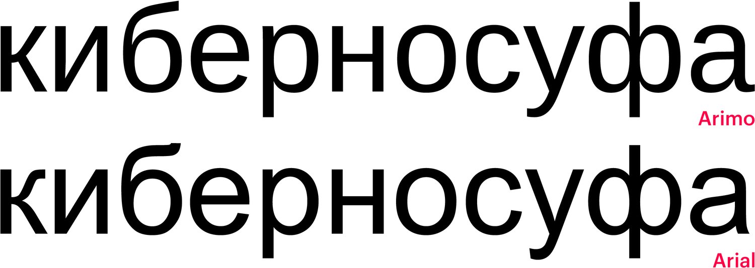
That explains a way too narrow к, which is also of a questionable shape. Ф has to keep the Arial structure — even though it could benefit from some simplification.

The descenders in Дд, Цц, Щщ are excessively long. Their shoulders look short, although the overall shoulder situation is slightly better than it is with Arial. З is marked by an unfortunate bowl joint, which makes it look like a three.

Unnecessarily dynamic stroke and incorrect contrast distribution in д and л.

И takes after Arial in its reverse contrast. У’s gotten worse — insatiable, with a little white triangle atop. Ч changes for the worse, too — the arch curve is distorted. The bowl in Ь appears somewhat flattened.

The accented glyphs are unfit for Ukrainian.

In Tajik typeset, ҷ and ҳ have visibly different descender lengths.
Our advice
You may very well use latin Arimo as a replacement for Arial Latin — but it is not the case if you need Cyrillic.
Manrope
Mikhail Sharanda
A semi-closed-aperture typeface, falling into several classification categories — partially it is rather neo-grotesque, partially a geometric sans. Generally, it feels more like a neo-grotesque (mainly, because of its bowl shapes).

Manrope is marketed as a widely applicable font ‘for everyone’. To address this task, the author tried encompass every possible approach — thus failing to achieve any distinct image.
Hands-on The glyphs are diverse, non-uniform: like, the n is more geometric than the о which affects the whole majority of n-related symbols.
The curves are quite imperfect. The transitions from straight to rounded segments look distorted, and the bowl contrast distribution doesn’t seem right. The uppercase look too light because of uncompensated stroke thickness: in some cases, the uppercase strokes are even lighter than the lowercase ones.

This eclectic picture is further reinforced by the geometric figures, which are fundamentally different from the alphabet.

The glyph set covers most languages using Latin, Cyrillic, and Greek scripts.
There are case sensitives alternates, ligatures, non-alphabet glyphs, currency signs, proportional and tabular figures, basic fractions.
Styles 7 upright weights, from ExtraLight to ExtraBold, plus the variable-weight file.

The letterforms are most questionable in the lighter of styles: the arc-to-vertical joints are either too heavy (r, m, n), or the opposite, are getting too thin shifting to vertical segments (n, u).
Cyrillic Corresponds to the Latin — also trying to represent an average of various solutions, too.

The uppercase Ф is way too narrow in every weight. Shape-wise, both lowercase and uppercase ф are an insecure interim option between the two established letterforms. Кк, И, Уу, each of them has reverse contrast, with ascending diagonals heavier than descending ones. Too short and too light a tail in б.

Quite different character and level of openness in lowercase and uppercase Зз, and they both have a heavy spot in the bowl joint. Мм, again, reverse contrast. The leg of Лл is poorly-shaped — too straight, set aside, abruptly broken on the end.

Дд has a left stroke of the same unfortunate form, the platform lacks width on the right. In ц, au contraire, the shoulder is too wide and the descender is too short.


In every weight, Ъъ has a tiniest horizontal, while lowercase щ and ц have different shoulder widths.

In all styles, except the heaviest ones, Э has a very short horizontal.

The accents are unaware of common Ukrainian letter combinations: see the partly overlapping double їs and the accent spacing problem in iї.
Our advice
Manrope is unconvincing conceptually and of poor
Inter
Rasmus Andersson
This neutral sans serif was designed for screen interfaces, primarily for setting at small sizes, with good legibility having been one of priorities. According to the typeface’ author, it ranks along with Roboto, San Francisco, Lucida Grande, and other functional sans serifs, popular with UI/UX designers.

Hands-on Good readability and legibility at smaller sizes are achieved through relatively open glyphs, a tall x-height, the use of inktraps (quite moderate ones — yet the author warns us that it may interfere with how a font works at larger sizes), proper hinting, and embracing OpenType features: for instance, contextual alternates help tell between similarly shaped characters.

Inter supports Latin, Cyrillic, and Greek, with an extensive character set for each script. The typeface contains tabular and proportional figures with a number of alternates, as well as sets of Roman numerals. Then there are fractions, super- and subscripts, plenty of currency symbols, icons, arrows, and other UI-relevant symbols.
In 2023, Inter was updated We cover only the updates released in the Google Fonts library. [Inter stored on GitHub](https://github.com/rsms/inter/){:target=”_blank”} has been modified (and extended) way more than that — several characters in Latin and Cyrillic, currency signs, case-sensitive punctuation and math symbols were introduced. A number of slight changes were made to diacritics, certain details in glyphs and kerning, but overall design and metrics are still the same.

Styles 9 weights ranging from Thin to Black and a variable

In 2023, the collection welcomed a new family named Inter

Cyrillic Although most Cyrillic characters are in line with the Latin set in terms of their personality and structures, the overall picture is completely spoiled by a number of mistakes, particularly pronounced in extreme weights.

Overly fat diagonal strokes in Ии and ascending strokes in Уу and к introduce a slight reverse contrast. This mistake is shared across all the styles.

This б is unfortunate: its tail terminal seems fractured, light, excessively sharp.

The shape and size of descenders, as well as the shoulder’s width in lowercase and uppercase ДЦЩ дцщ vary in a random

There are certain technical issues in how descenders are implemented.

Numerous problems make both light and heavy weights unusable. Besides, the left stroke in Дд and Лл is too fat, of an inappropriate shape. As the weight increases, the curve in Чч gets distorted and awkward, joining the stem horizontally.

Flattened, contrast bowls in the uppercase Э result in the letter being too different from other curved characters in terms of personality and proportion. This К has a weird

Certain changes were also introduced when it comes to kerning, yet this did not make the typeface better. Excessive negative kerning (ЮЯ) was replaced by excessive positive one.

Insufficient attention was paid to the Ukrainian characters, which resulted in letter spacing issues, the wrong position of the crossbar in є, overlapping accent marks in ї.

In Kazakh, these лғ are stuck together, while there’s an obvious hole in the қт pair.
Our advice
Inter is a typeface with a number of advantages, fit for wide application in interface design, but its Cyrillic extension lacks attention to details for achieving an acceptable standard, so it should not be used. The font update covered only a limited amount of Cyrillic
Golos Text
Alexandra Korolkova, Vitaly Kuzmin
Golos Text is a closed neutral sans serif meant for continuous reading on screen. The typeface was designed for complicated projects such as state and social service websites.

Hands-on Golos Text is a typeface for a broad audience, meant to be easily read on screens, which largely defined its design solutions. The task is solved through a tall x-height, loose letter spacing, and simple designs of glyphs (such as a single-storey g.) That said, the aperture of curved characters is quite a closed one.

These bowls have a complex shape with vertical elements (for them to be better rendered on a pixel grid) and squarish diagonal curves meant to increase counters.
The typeface comes in an extensive character set, covering most languages using the Cyrillic script (Abkhaz, Itelmen,and Khanty languages are among rare exceptions.) There are lining and oldstyle numerals, both proportional and tabular. A minimum amount of fractions, mathematical symbols, and currency signs.
Styles Golos Text features 6 upright styles ranging from Regular to Black and a variable font with a weight axis.

Cyrillic Cyrillic extension is decent, with designs and details that look natural and concise


One of the flaws is that the descenders in Дд и Ңң are a bit shorter than those in ЦЩҶ.


Cyrillic support for other languages is (largely) correctly executed.

However, Serbian ћђ are too low, with their crossbars placed on the x-height level. Normally, these characters have a standard height of ascenders and the crossbar is located much higher.
Our advice
Golos Text is a functional typeface, well-suited for reading on screens and fitted with a decent Cyrillic extension. However, its application range might be limited by Serbian language support.
Alumni Sans
Robert Leuschke
Alumni Sans was originally inspired by Impact, a narrow blackface industrial grotesque typeface. However, Alumni Sans’ style palette is much broader than the one offered

Hands-on The lightest and heaviest weights of Alumni Sans are designed for display contexts, while its in-between styles can well be used for body text.

Impact’s motto is this: As Much Ink In Print As Possible. Each character tends to take the form of a rectangle with an even distribution of weight, without any holes, which is achieved through the smallest amount of diagonal strokes, a closed aperture, short terminals, a large x-height, and narrow proportions.

The typeface appears hefty and heavy, yet this feeling would be hard to preserve in lighter weights.
The horizontal compactness is echoed by a vertical one. Very short ascending and descending elements enable setting text with tight line spacing, matching the tightest counters.

Alumni Sans lags behind Impact when it comes to the overall experience of dealing with the heaviest weight: its texture is more loose and irregular than it is the case with Impact, and some open terminal solutions (such as in g) are discordant with the closest possible ones (such as the one in е.)

In lighter weights, with large counters, these short descenders and ascenders look less logical in terms of optics. Letter spacing appears insufficient in lowercase, whereas it seems too loose in uppercase.
Alumni Sans supports Latin script for Western and Central European languages as well as Vietnamese, and Cyrillic with a rather poor character set: for instance, the typeface cannot be used to typeset in Ukrainian due to the lack of Ґґ characters.
Latin support features small caps. The Bulgarian Cyrillic extension is only nominal, as it is graphically identical to regular Cyrillic.
There are proportional and tabular figures, a bare minimum of fractions, arrows, math

The typeface comes with quite a lot of currency symbols, including the ruble

Styles 9 weights from Thin to Black with italics.

Alumni Sans contains true italics. Even though most characters are oblique, several of them change their structure and shape to the italic ones, for example, a, e, r, v.
The super-thin Alumni Sans Pinstripe is a stand alone family consisting of two styles, regular and italics designed to be used at larger sizes, above 32pt (72px.)

The display Alumni Sans Collegiate One with Cyrillic is another decorative family of upright and italic outlined styles.

Alumni Sans Inline One has ‘cracks’ in its vertical strokes and is also equipped with italics, yet no Cyrillic extension.

Cyrillic Cyrillic is of poor quality, with lots of mistakes, ranging from basic proportions to improper structures and wrong letter spacing.

Straight-line lowercase characters in the Cyrillic set are too wide compared to its curved characters and straight-line Latin characters. This causes the broken rhythm, inconsistent with the rhythm in the Latin set. Besides, Cyrillic п is wider than н in all

The upper stroke in к is of an unnatural shape, while its leg is heavy and gets thicker as it approaches the centre of the glyph, creating a dark stain. The uppercase К looks better, yet a solution reproducing the design of Latin Kk would also seem quite appropriate. This б’s tail is too light, with an inexplicably calligraphic terminal. As the weight increases, the bowls in ф lose their shape, with their connection to the vertical stroke getting too heavy.

A wide, awkward з with large side bearings and an overly long crossbar connecting the two bowls. Дд have a fat left diagonal stroke; this shape with a sharp bend is a failure and the position of upper and lower parts is not ideal. The arc in Чч is too low, and its shape is also questionable due to an excessively smooth joint with a stem. The right stroke in this ы sits too far. Reverse contrast, obvious in the breve over Йй, turns it into a Latin breve.

The bowl in Б is too tall (same with ЬЪЫ.) The leg in Лл has improper contrast, making it look too fat with a light, dramatically curved terminal. The crossbar in Юю is too long. Beyond its letterform issues, Д has a hole on each side. The descender’s shoulder descender in Цц (same as Щщ) is too short, with an overly light horizontal stroke, which does not match the similar element in Дд.

There’s no kerning in Alumni Cyrillic extension: uneven setting tightness and holes between characters are obvious.

The same set of problems is here in the display version of Collegiate One.

Crossbars in the Serbian Њњ are placed on different
Our advice
Alumni Sans is seeking to expand the range of capabilities of a popular sans serif, but it rather wins in a game of quantity when it comes to its styles, sacrificing their quality. Cyrillic extension contains numerous
Overpass
Delve Withrington, Dave Bailey, Thomas Jockin
Overpass is an interpretation of Highway Gothic, a typeface used in the US for road signage. The authors modified the prototype’s graphics and attitude to make it usable for both smaller sizes on-screen and display sizes.

Hands-on Overpass is intended for broad application: in long copy (in print and on screens) as well as for UI design, display formats and wayfinding signage.
The solutions making the typeface work as a body text font are its open forms, generous letter spacing, simple structures, and good legibility (all this has been inherited from the prototype which is supposed to be easy to read quickly and from a long distance on the road.)

A bright engineering character, characterised by diagonal terminal cuts, makes the typeface a good fit for display purposes. A really loose

Overpass offers a large character set for Latin-based languages (including Vietnamese support), then there is a certain amount of super- and subscripts. The typeface covers most Cyrillic alphabets (Khanty, Mansi, Itelmen, Abkhaz, and Evenki languages are among exceptions.) There are Bulgarian and Serbian versions of Cyrillic.
Overpass features lots of icons, arrows, and nearly four dozen currency signs.

Default proportional numerals and a set of tabular ones. A large number of ready-made fractions, sets of numerators and denominators, superiors and inferiors.
Styles 9 weights from Thin to Black with corresponding italics. Available as a variable font with a weight axis and an Italic switch.

Overpass Mono is a stand alone monospaced family equipped with a Cyrillic.

Cyrillic The problems in Cyrillic start from basic proportions and get worse as the weight increases: straight-line Cyrillic characters are excessively wide as compared to the curved ones and their Latin straight-line counterparts.

This Cyrillic graphics opted for a mechanical implementation of moves used in the Latin

This б is a failure, as its ascender appears alien and small due to its sharp cut. The bowl is joining the vertical stroke

A latinised design of к, which is not a mistake per se, but the glyph is different from k in terms of its execution. It is unclear what defines this solution, which actually affects all the derivatives from the Кк. That said, Ҝҝ use a different letterform.

Юю’s crossbar is way too long. Using Latin’s K logic in Жж is a too bright solution for a body text typeface.

Bowls in Зз look rumpled, flattened; this crossbar appears too long. The right vertical stroke of Ыы sits too far, while the bowl in the left part (same with Ьь and Ъъ) lacks counter space, it is flattened (which is particularly obvious in heavier weights.) A very wide breve over й with an improper weight distribution. The form of Чч’s arc copies the logic of the Latin u and joins the stem


A wide Дд with a disappointing diagonal

Typical issues with accent marks in Ukrainian.

The Serbian Ђ’s bar is really wide, much wider than the one in Т, and then there’s no location compensation provided, which causes light stains in text. The bowl’s contour in the Ђ looks fractured.
Our advice
Overpass is a typeface built around an interesting graphic concept of road signage, however the moves specific to its prototype are implemented without regard for cultural context and with plenty of mistakes in its Cyrillic