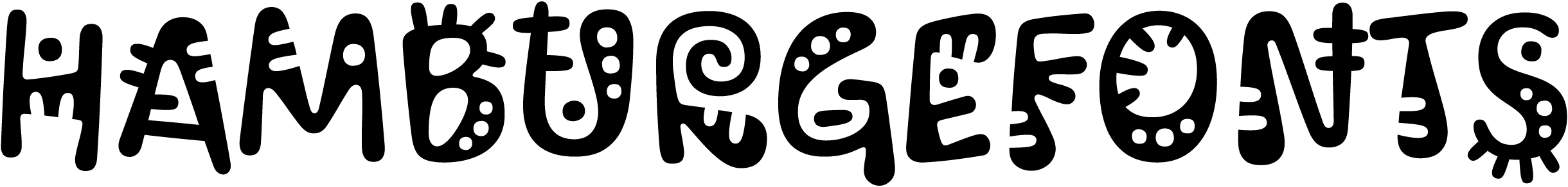
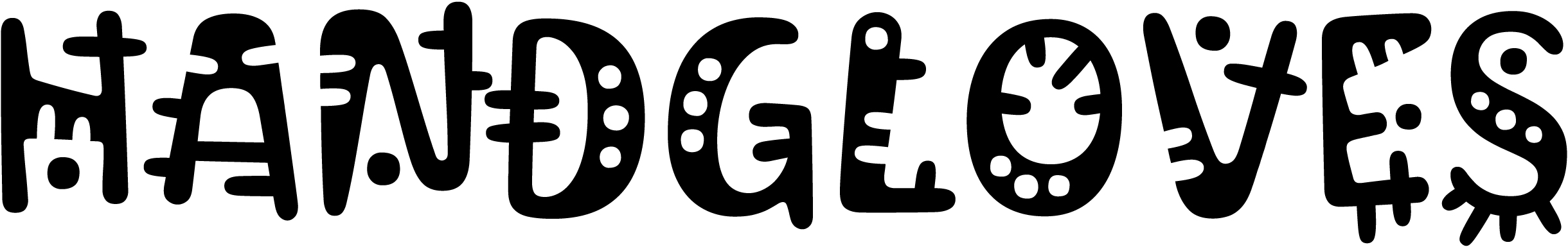
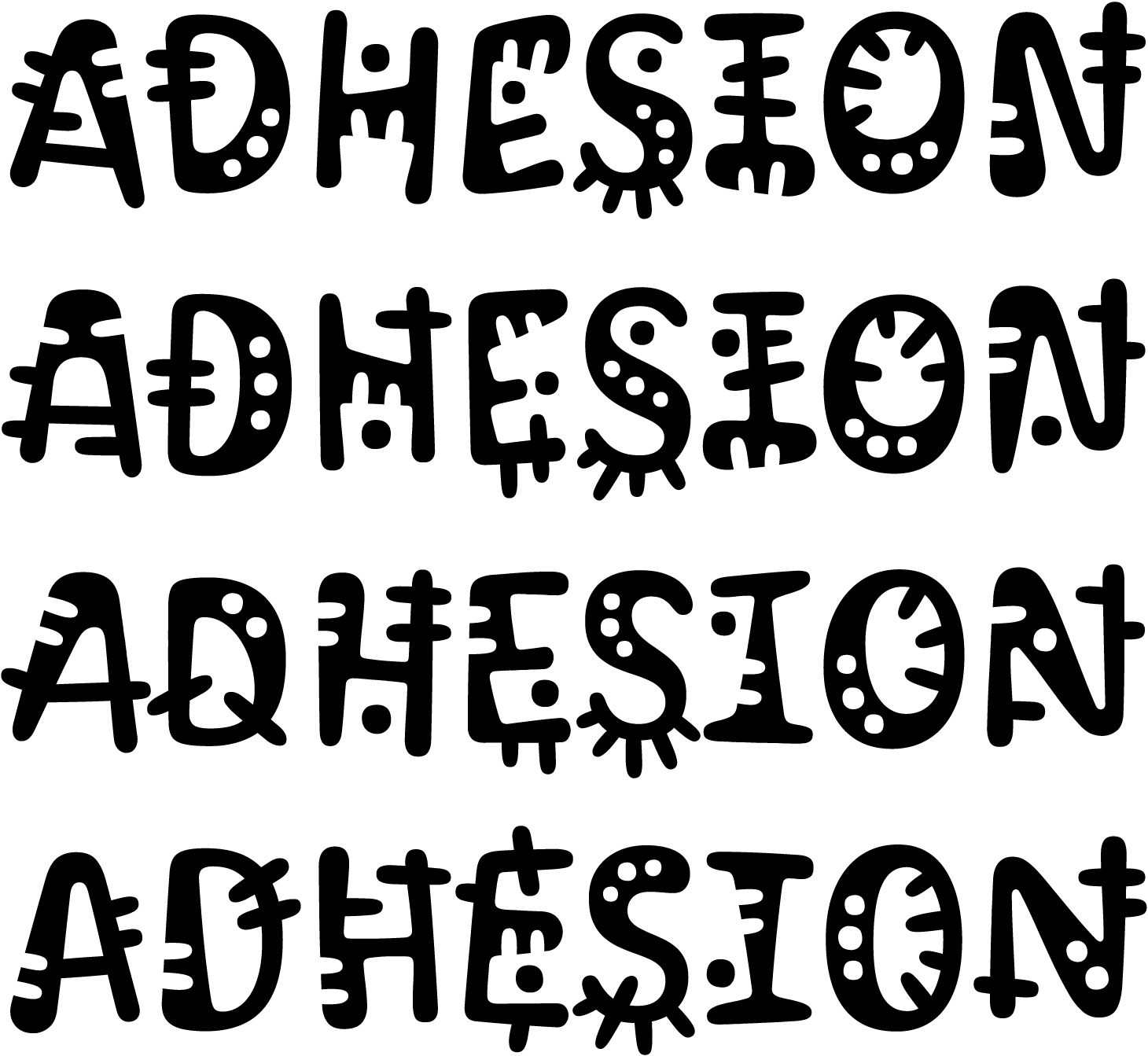
Experts
- Mikhail Strukov
- Type designer, graduate of Ilya Ruderman’s course at BHSAD (Moscow) and Plantin Institute of Typography (Antwerp).
Works with CSTM Fonts and Samarskaya & Partners

- Yury Ostromentsky
- Type designer, partner at CSTM Fonts and type.today

- Ilya Ruderman
- Type designer, partner at CSTM Fonts and type.today

Disclaimer
Today, a free font doesn’t necessarily mean a bad one. Sadly, things are much worse with free Cyrillic than with Latin; but there is also some good news. Our critique and our advice do not have a monopoly on the truth — that’s just an expert review by three professionals sharing the same values. Plus, you always have to remember that there is no such thing as forbidden means and tools in design. Any bug can be turned into a feature in the hands of a daring, confident typographer, — only before taking risks, you should figure out what this bug actually is.
Another disclaimer
We’re making this series primarily to help graphic designers choose a typeface with decent, high-quality Cyrillic support. But sometimes the font authors themselves read our pieces or comments posted on GitHub and correct mistakes pointed out by us or other experts. However, since we do not always manage to edit our article right away, telling that the error in question was fixed, if you’re opting for a typeface based on a ‘Cyrillic on Google Fonts’ episode which hasn’t been updated in a while, we recommend checking whether the mentioned errors are still there.
You can help us keep our reviews up-to-date. If you notice that a bug we mentioned has been fixed, please reach out to us at info@type.today.
Previously on Google Fonts series
Old-Style Serifs
Geometric Sans
Humanist Sans
Neo-Grotesques
Transitional Serifs
Didones
Scripts
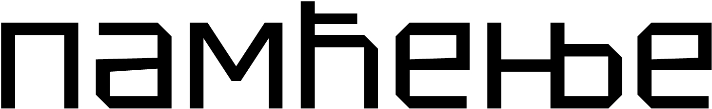
What fonts are classified as display fonts?
In this piece, we’ll address typefaces that are inherently decorative rather than those that qualify as display due to extreme values of certain parameters such as contrast and proportions.
Contents
| 1 |  |
| 2 |  |
| 3 |  |
| 4 |  |
| 5 |  |
| 6 |  |
| 7 |  |
| 8 |  |
| 9 |  |
| 10 |  |
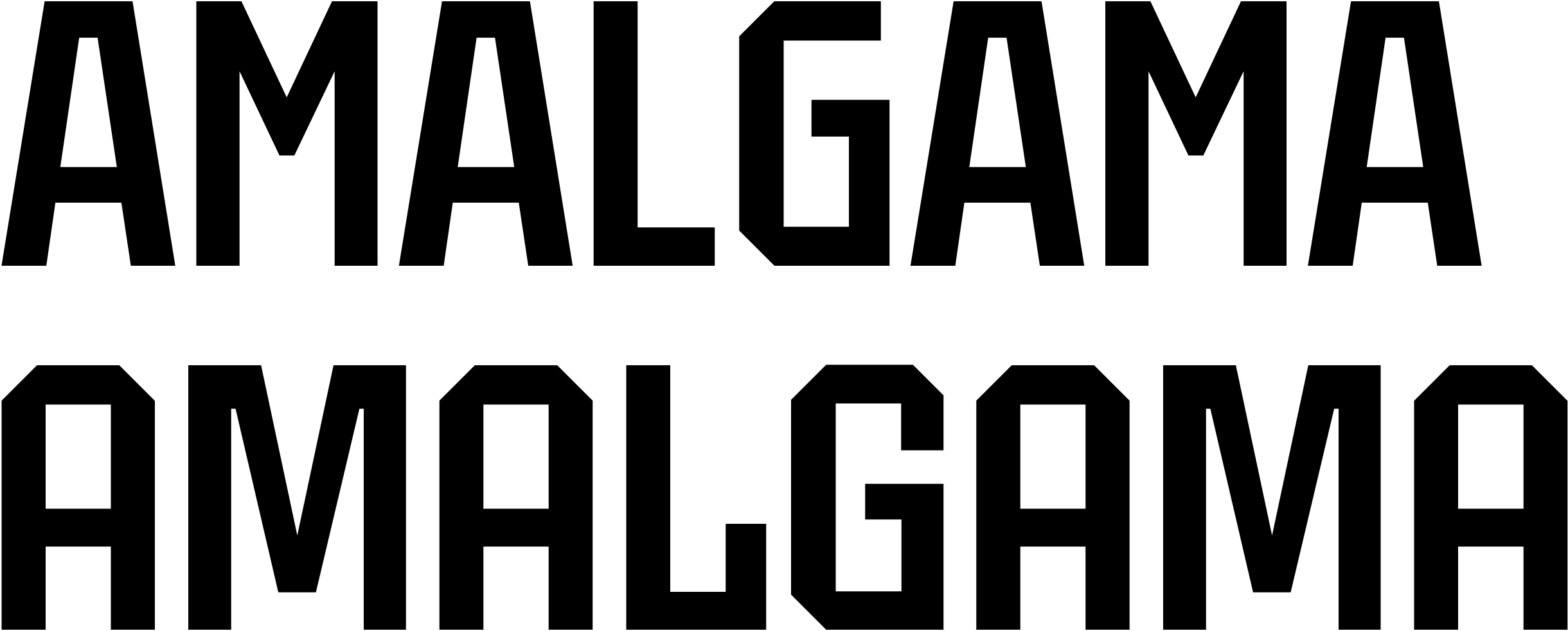
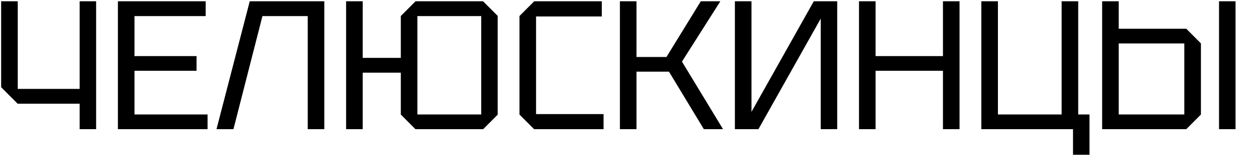
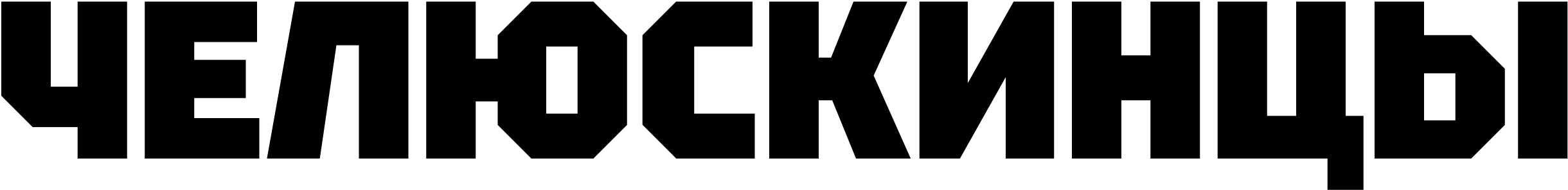
Dela Gothic One
Artakana
A wide display sans serif face, heavy and muscled, is intended for use in both larger
Hands-on
Technically, Dela Gothic One should be classified as a neo-grotesque typeface: it has a vertical axis, symmetrical bowls and arcs (lacking any humanist dynamism) that connect smoothly to the stems.
At the same time, the typeface’s parameters are typical for a display
The level of detail is in line with the font’s intended application. It features a great deal of subtleties: entasis, stroke thickness modulation, thinner strokes in the central parts of а, е, and s.
Plus closed — in some cases
The uppercase characters are quite wide, with plenty of detail.
Dela Gothic One offers extensive language support, covering Latin, Cyrillic, Greek, Japanese (hiragana and katakana), and Chinese.
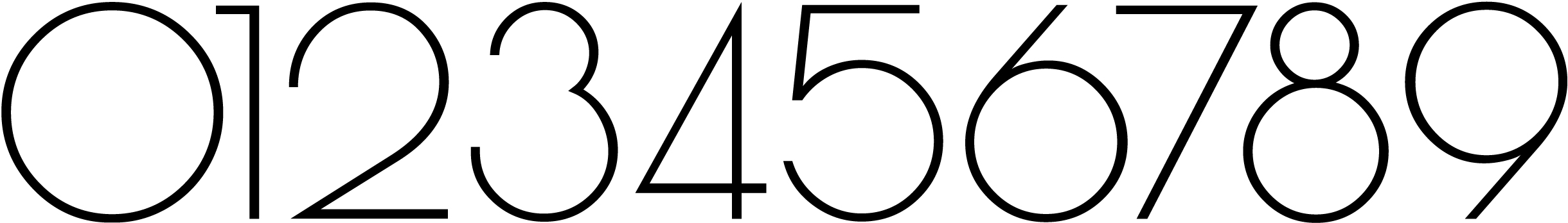
By default, regular proportional figures are used. The typeface also includes tabular figures, old-style figures,
The character set also contains mathematical symbols, icons, arrows, and a dozen basic currency signs.
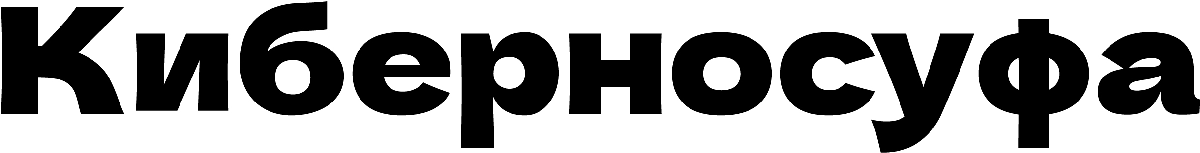
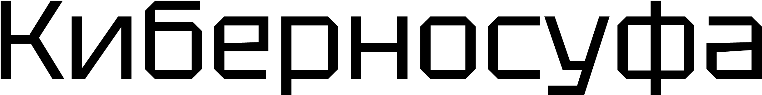
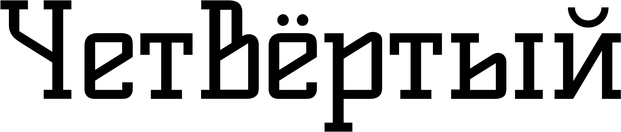
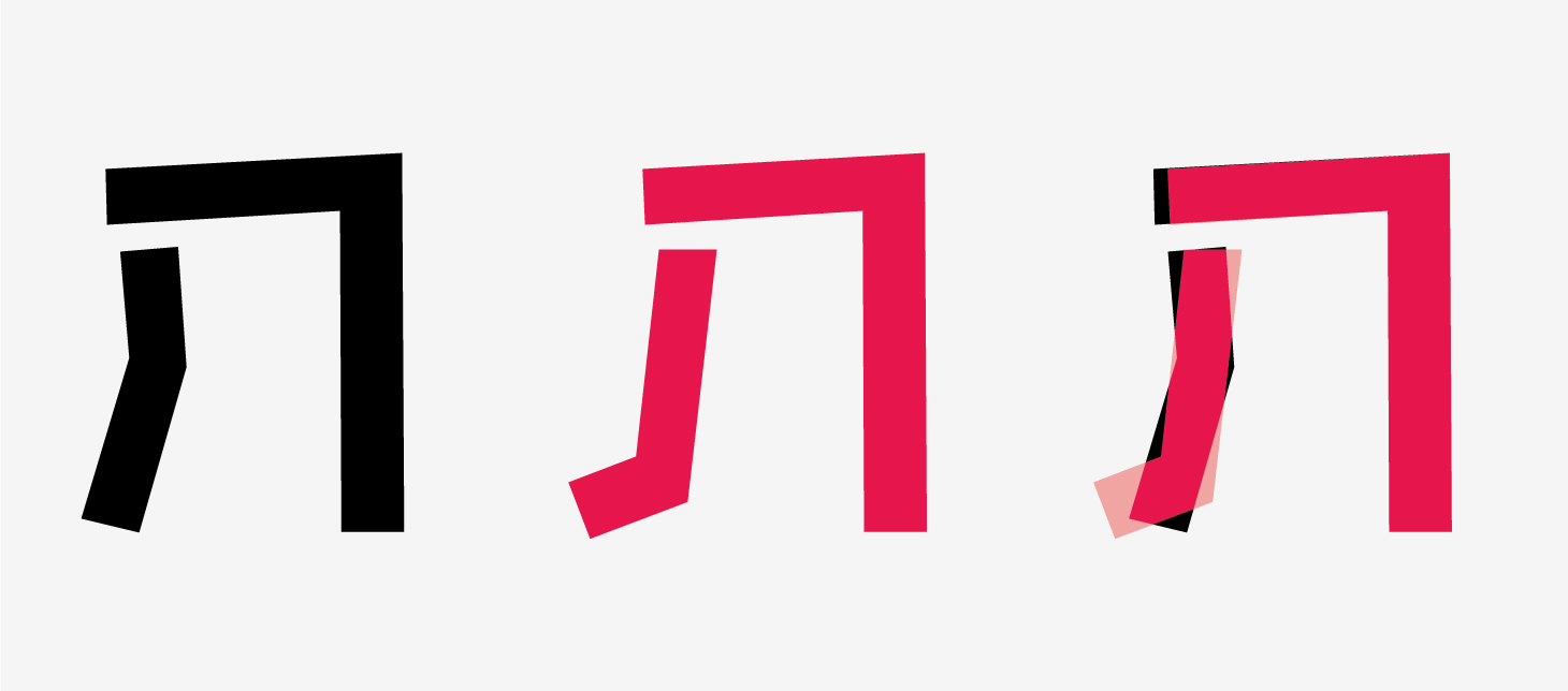
Cyrillic
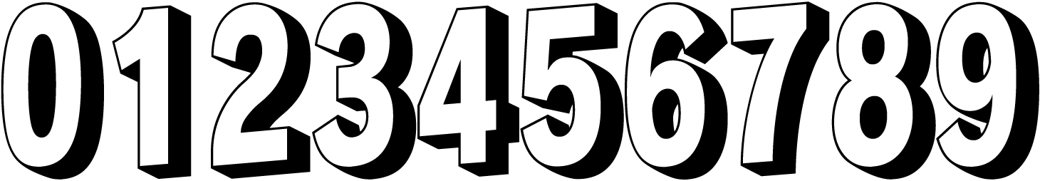
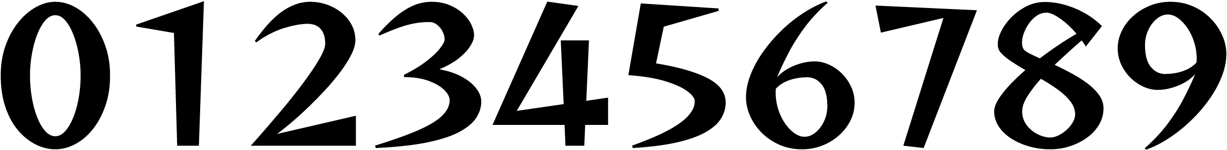
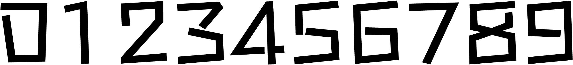
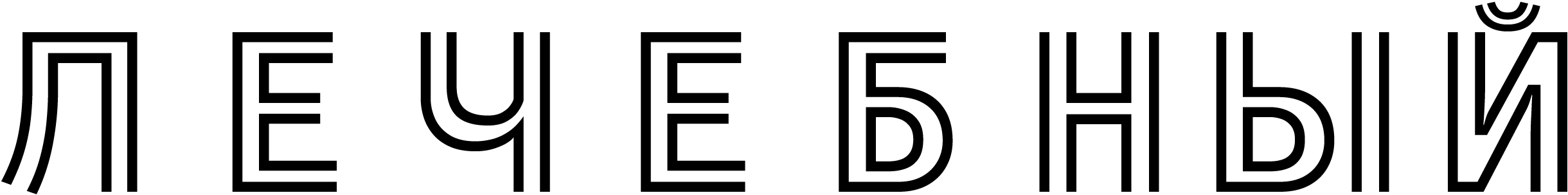
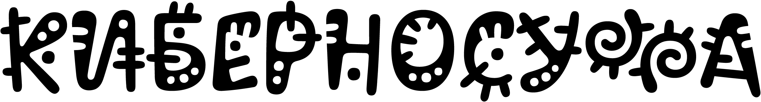
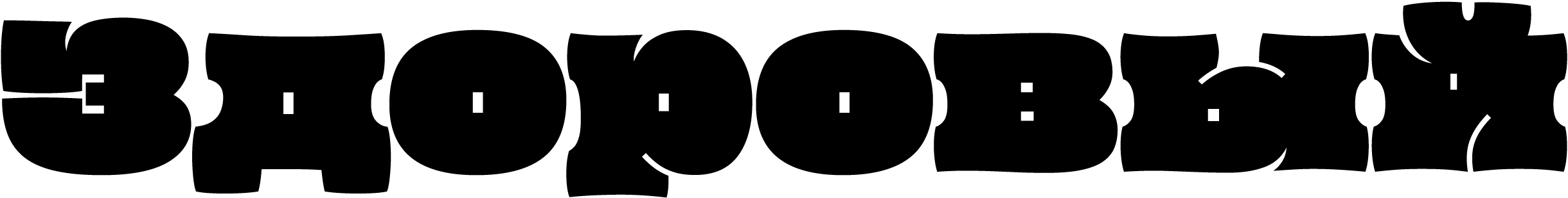
The Cyrillic support is of low quality, with a large number of errors.
With its curved arm and leg, Кк look rather
The и has jumped above the baseline (as have its derivatives). This technical issue, even though less noticeable, is also found in other characters. The ascender in ф is also too short.
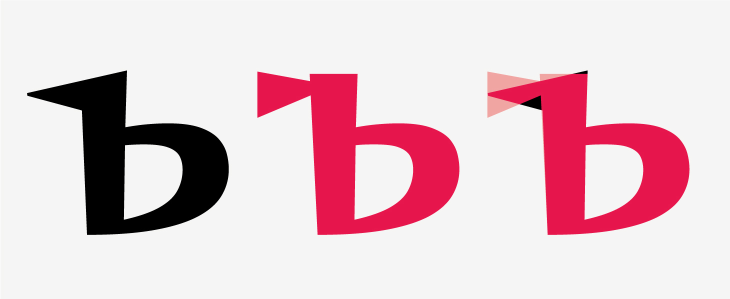
The б’s tail is too short, and its joint with the bowl looks somehow crumpled.
The shoulder in Дд, Цц, and Щщ’ descenders is overly short, while these elements themselves are of different lengths. In the Чч, the upper part is oversized and bulky.
The narrow Жж have an improper distribution of contrast: the stem is too thin, and the arms and legs don’t balance it. The Лл has an incorrect weight
The horizontal stroke in Ъъ is too short. In Йй, instead of the Cyrillic breve, there is a Latin breve. The wide Ыы are unbalanced. There is also a problem with basic
Accent marks are mostly concise and light, which helps prevent them from overlapping in some cases. The tittle over the i, on the other hand, is quite heavy.
The crossbars in the Serbian Њњ sit at different levels, whereas it would be more logical to design them as a shared stroke.
Our advice
Dela Gothic One is a typeface with broad language support, yet its Cyrillic extension is of poor quality and best avoided.
Poiret One
Denis Masharov
A decorative geometric sans with elements borrowed from Constructivist and Art Deco type, Poiret One was designed to be well-suited for signage and posters as well as titles and web typography.
Hands-on
Poiret One’s parameters are good for larger
Poiret One is indeed influenced by the Art Deco style, not least due to its articulated variation in width, particularly noticeable in the uppercase characters. According to the description, it is a great choice for all-caps use.
The details and glyph structures further reveal the Art Deco influence.
Poiret One supports Latin and Cyrillic, with basic language coverage for the latter: it can be used to set text in Russian, Belarusian, Ukrainian, and Serbian.
The font contains only proportional figures, without fractions or superscripts/subscripts, a bare minimum of mathematical symbols and currency signs, and a number of ligatures.
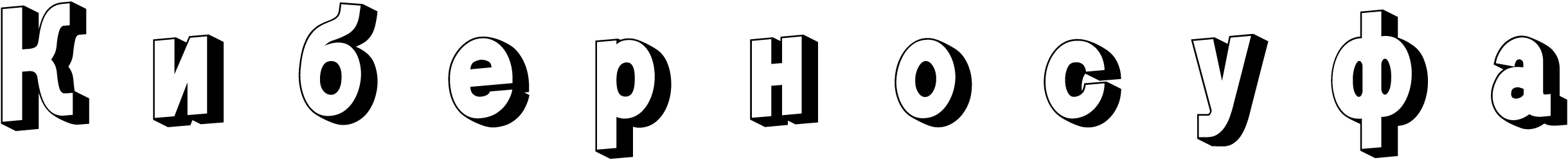
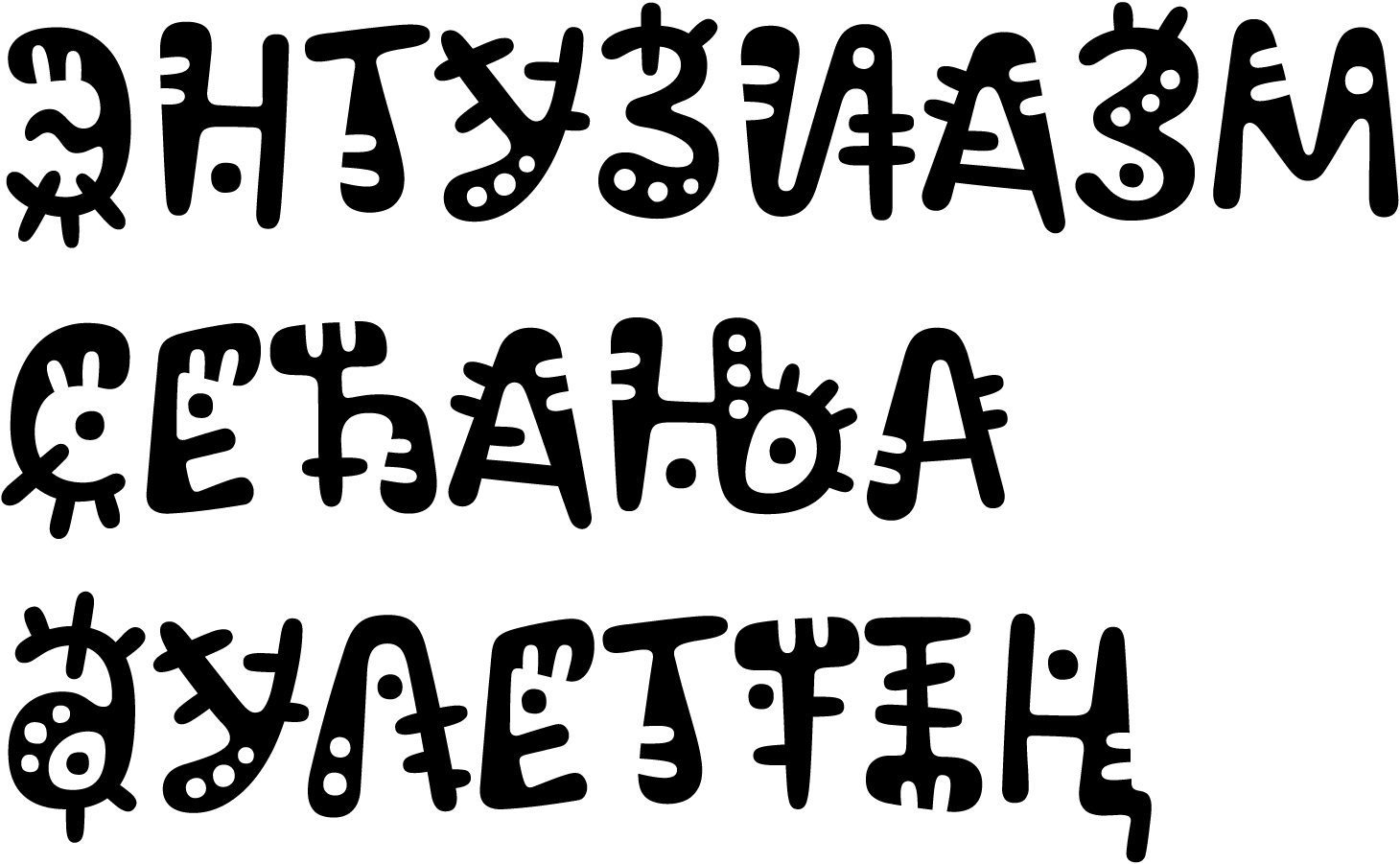
Cyrillic
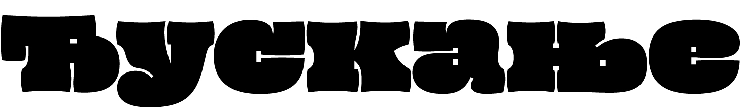
The diagonal stroke in е and Ии is too heavy, which results in reverse contrast. The б’s shoulder is too straight, with an excessively heavy stroke in the bend.
The stroke joints in Кк and Жж are very dark.

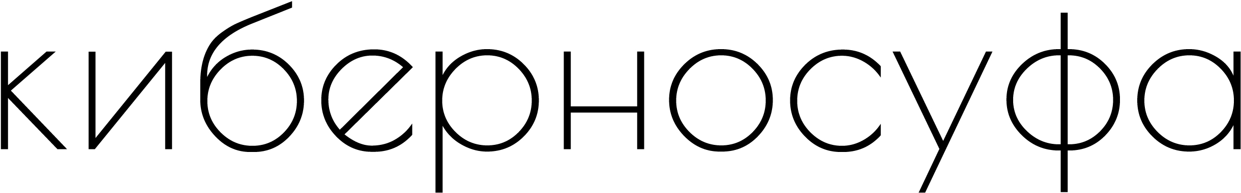
Any text set in this typeface generally appears uneven: some segments are tighter (су), while others are looser (же, уф). Its pronounced proportional nature, appropriate in the uppercase, adds to this patchiness when it comes to the lowercase.
Cyrillic and Latin use different approaches to letter spacing; they differ even for characters with identical shapes: in Cyrillic, both the ovals and especially the straight letters have more generous spacing.
The geometry of Чч’s arc is too
The left leg in the Serbian Љљ is unfortunate, overly mechanistic, with an excessively long tail at its end, and too much counter space on the left. This glyph might have perhaps benefited from a triangular shape, like the one used in Лл.
Our advice
Poiret One is a typeface with a clear concept but imperfect execution. It should be used with caution, and only when a hint of Art Deco is needed.
Tektur
Adam Jagosz
Tektur is an industrial display sans whose outlines consist entirely of straight segments. The typeface is quite versatile, thanks to its wide range of widths and weights, and has a highly flexible character.
Hands-on
At first glance, Tektur looks like a simple modular font, but on closer examination, it proves to be more complex and interesting because of its approach to shape and detail.
The face features octagonal outlines and rectangular counters. Where more conventional typefaces would have rounded spots, this one has diagonal cuts on its outlines. This makes the characters well recognisable and easily legible. The large and open lowercase characters with generous counters further enhance Tektur’s readability.
The typeface is available in six weights ranging from Normal to Black.
It also comes in three
The typeface includes a set of alternates.
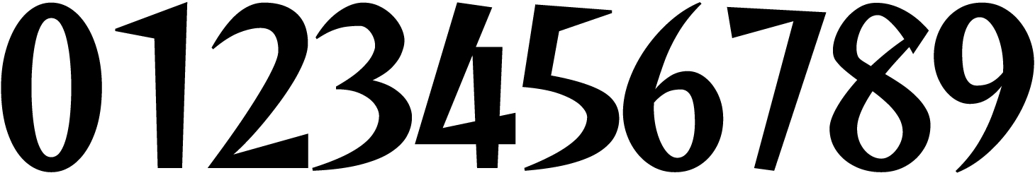
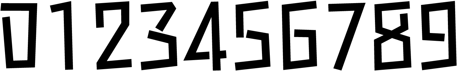
Default figures are proportional, complemented by tabular ones, several fractions with sets of numerators and denominators, and a slashed zero. The font also contains basic mathematical symbols and currency signs.
The typeface supports Latin, Cyrillic (including Bulgarian), and Greek.
Cyrillic
Cyrillic is generally of high quality, with an appropriate choice of letterforms. It stylistically matches the Latin set. A few glyphs are questionable, though.
The upper part of Чч is slightly oversized, as are the bowls in Ы, Ь, and Ъ. These characters require stylistic alternatives with more traditional proportions. The crossbar in the uppercase Ю is excessively long. The shoulders in Щ, Ц, and Д appear too short in the lighter weights.
In the heavier weights, there are no issues with the mentioned characters, except for the Ю’s crossbar, which still seems too long. The descender in Цц is too light
The design of д is unconventional (this glyph variant in upright styles is typical for Bulgarian Cyrillic). These Л and л are actually built differently. In а and е, the horizontal stroke in the central part of the letter narrows, a decision not found in any other characters.
Potential issues with Ukrainian diacritics have been taken care of.
The crossbars in the Serbian Њњ sit at different heights, while it would make more sense to opt for a single shared stroke.
Our advice
Tektur is a high-quality typeface with an interesting, well-considered approach to graphic solutions. However, its Cyrillic is not perfect and should be applied with caution.
Rampart One
Fontworks Inc.
Rampart One is a decorative, outlined and shadowed, font. The authors believe it can be used for added impact or to demonstrate strength and stability.
Hands-on
The typeface makes you think of comic books. The slanted nature of its
Rampart One is a dynamic modification of a neo-grotesque typeface. The characters are quite loosely
The font contains only tabular figures, basic fractions, a minimal set of currency signs, arrows, and icons. It also offers narrower alternates, as well as 90-degree rotated glyph variants.

Rampart One supports Latin, Cyrillic (covering a really limited number of languages, which excludes, for instance, Belarusian and Ukrainian), Greek, Japanese (hiragana and katakana), and Chinese.
Cyrillic
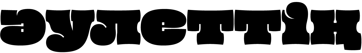
The Cyrillic character set is monospaced, with hugely loose letter spacing. This makes any proper use of it impossible.
The Cyrillic is systematically inconsistent with the

Proportions are also different. One gets the impression that the Cyrillic was based on a different typeface or simply designed without any regard for the Latin set.
There are also some design issues: branchy Кк, Жж, and Яя that interfere with the reading experience, a crumpled shoulder in the б.
The Лл’s leg looks somewhat broken, while Дд are too narrow.

The joint between the arc and the stem in Ч is too abrupt. The horizontal stroke in З is excessively heavy and long. The breve feels overly light, with reverse contrast.
Our advice
Rampart One is a decorative typeface that might be suitable for specific applications. Its Cyrillic extension is no good at all, though.
Kelly Slab
Denis Masharov
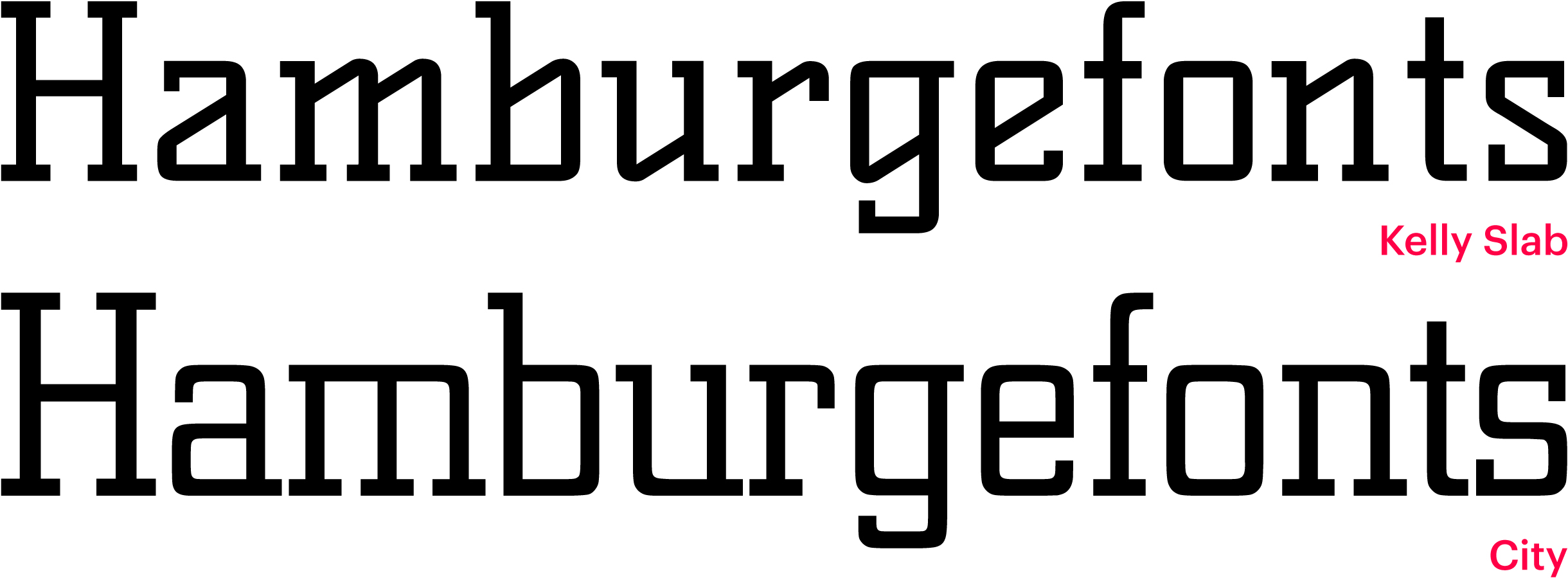
Kelly Slab is a geometric slab serif inspired by 1930s type, such as City by Georg Trump. The typeface is intended for headings, logotypes, and advertising banners.
Hands-on
Kelly Slab really does look like a reinvented City with systemically modified shapes of arcs and bowls. The letters have an almost italic dynamic that evokes broad-nib writing. Even if the diagonal solution is purely decorative, it’s hard to shake this italic feel when dealing with such a rhythmic modular typeface.
However, this approach to form shaping is not always applied consistently: for example, а has been left out. It would make more sense to design it if not as a single-storey character, then at least with a differently shaped bowl.

The lowercase с lacks
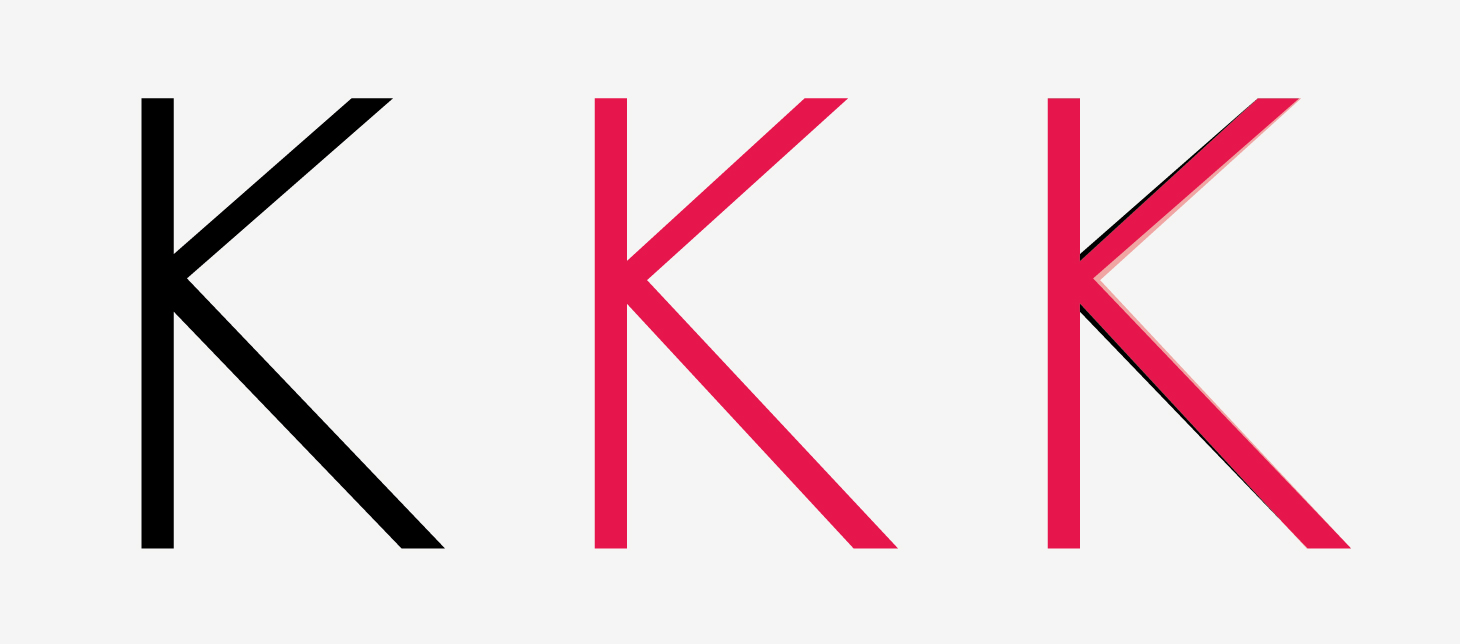
Another extreme solution is this unjustified, counterintuitive use of diagonals, as seen in B (which is excessively narrow) and G. Reversed contrast in K.
Kelly Slab has a small x-height, and its characters are fairly
The character set is quite modest: basic Latin and Cyrillic, proportional figures, punctuation, and a minimal amount of currency signs.
Cyrillic
In the Cyrillic support, the imbalance of letterforms only gets
This б’s shoulder is almost merged with the bowl, and ф would probably have benefited from the form-shaping logic applied to р (the upper right serif in it looks unnecessary).
The diagonal stroke in Ч looks
There are also spacing issues: вё looks fused, while there is a gap between т and в.
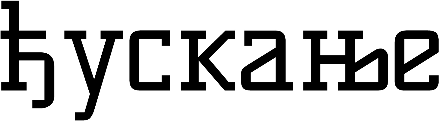
There is an error in the design of the Serbian ћђ — the arch is low, and the crossbar is at the height of the lowercase letters. Normally, this character corresponds to h in vertical proportions, with the horizontal stroke positioned much higher. There is a gap to the right of ђ.
It would be more logical to have both parts of Њњ connected by a shared horizontal stroke; there’s also a gap on the left side of the character.
Our advice
Kelly Slab is an attempt to reimagine the Modernist slab serifs of the 1930s, yet it lacks a clear concept. Its consistency and execution are poor, and these issues are even more pronounced in Cyrillic. It’s best avoided.
Reggae One
Fontworks Inc.
Reggae One is a decorative typeface often used in Japanese boys’ magazines. It has a distinctive design with sharpened, wedge-like stroke terminals.
Hands-on
The typeface is dynamic and has a somewhat script-font
The distribution of contrast within the glyphs, dynamic axes, and asymmetry also add to this effect. Despite their informal nature, the characters are highly legible, with familiar open shapes and moderate contrast.
Only tabular figures are available. The typeface includes basic fractions, a minimal number of currency signs, arrows, and icons.
The font offers a set of narrower alternates, as well as glyph variants rotated 90 degrees.

Reggae One supports Latin, Cyrillic (with a quite limited number
Cyrillic
As in Rampart One, Fontworks’ previous typeface, the Cyrillic is monospaced with extremely wide letter spacing. This prevents its effective use.

The graphic character of glyphs mostly matches the Latin set. However, some details raise questions.
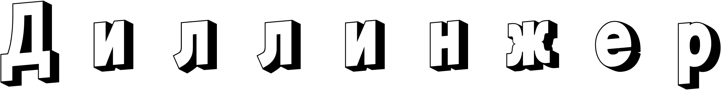
This б features an oddly straight, bobtailed upper stroke. Дд have a very broken shape with lots of contrasting areas. The joint between two bowls in Зз, on the contrary, virtually lacks contrast. Лл are overly wide, split in half, with a heavy left leg that ends in a light terminal though (the correct way to execute it would be the other way around). The breve over Йй is too light and also shows reverse contrast.
м is really narrow. The descenders in Цц and Щщ are
Our advice
Reggae One has a dynamic, expressive personality in its Latin set, as well as an extensive range of characters. The Cyrillic, however, is technically flawed, graphically imperfect, and limited in its character set — not recommended for use.
Stick
Fontworks Inc.
The characters in Stick are built of straight
Hands-on
Despite its structural features, Stick doesn’t feel
The shapes of characters are peculiar. However, the glyphs are well-balanced and work well together.
The glyphs are generally well-legible, although sometimes only context can help identify a character: for instance, с can easily be mistaken for е.
The only available figures are tabular. There are basic fractions, a minimal set of currency signs, arrows, and icons.
The font includes narrower alternates, as well as 90-degree rotated glyphs.

Stick supports Latin, Cyrillic (with a very limited language
Cyrillic
As in other previously mentioned typefaces designed by Fontwork, the Cyrillic support is monospaced with extremely wide letter spacing, which makes its proper use impossible.

Straight lowercase characters in Cyrillic are too wide compared to both the bowls and their Latin counterparts.
The descender of the Cyrillic у is shorter than the same element in the Latin letter. The branches in Кк и Жж are unnecessarily
Лл can be easily confused with Пп — there is a curve missing in the leg’s terminal.
The bowl of Яя is undersized — a mirrored R was applied, which is not an appropriate solution in this case. The lowercase м replicates its Latin counterpart, which rather makes it resemble a cursive т in Cyrillic.

The uppercase М also looks
Our advice
Stick has a distinctive nature and a comprehensive character set when it comes to Latin. Its Cyrillic extension, however, is technically deficient, graphically imperfect, and limited
Train One
Fontworks Inc.
Train One is a typeface with outer and inner lining that makes you think of railway
Hands-on
The graphic basis of Train One is an open-aperture sans serif with loose proportions. It appears stencil-like, even though it actually isn’t.
As the typeface is light, the characters are loosely spaced, and ascending and descending elements are fairly long, suggesting generous line spacing.
The strokes (the space between rails) are thicker in the uppercase characters, while the weight of the lining stays the same, making the uppercase appear lighter than the lowercase.
The font contains only tabular figures, basic fractions, a bare minimum of currency signs, arrows, and icons.
There are narrower alternates, as well as glyph variants rotated 90 degrees.

Train One supports Latin, Cyrillic (with a limited number of languages
Cyrillic
As with the other typefaces by this studio mentioned above, the Cyrillic is monospaced, with enormous letter spacing.

The upper stroke in б
Лл can be easily mistaken for Пп — there’s no curve in the leg’s terminal. The Й’s breve is too small and dark compared to other characters. The top bar in Б is too long. Ы is too wide, and its left part is unbalanced.
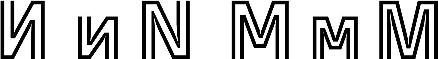
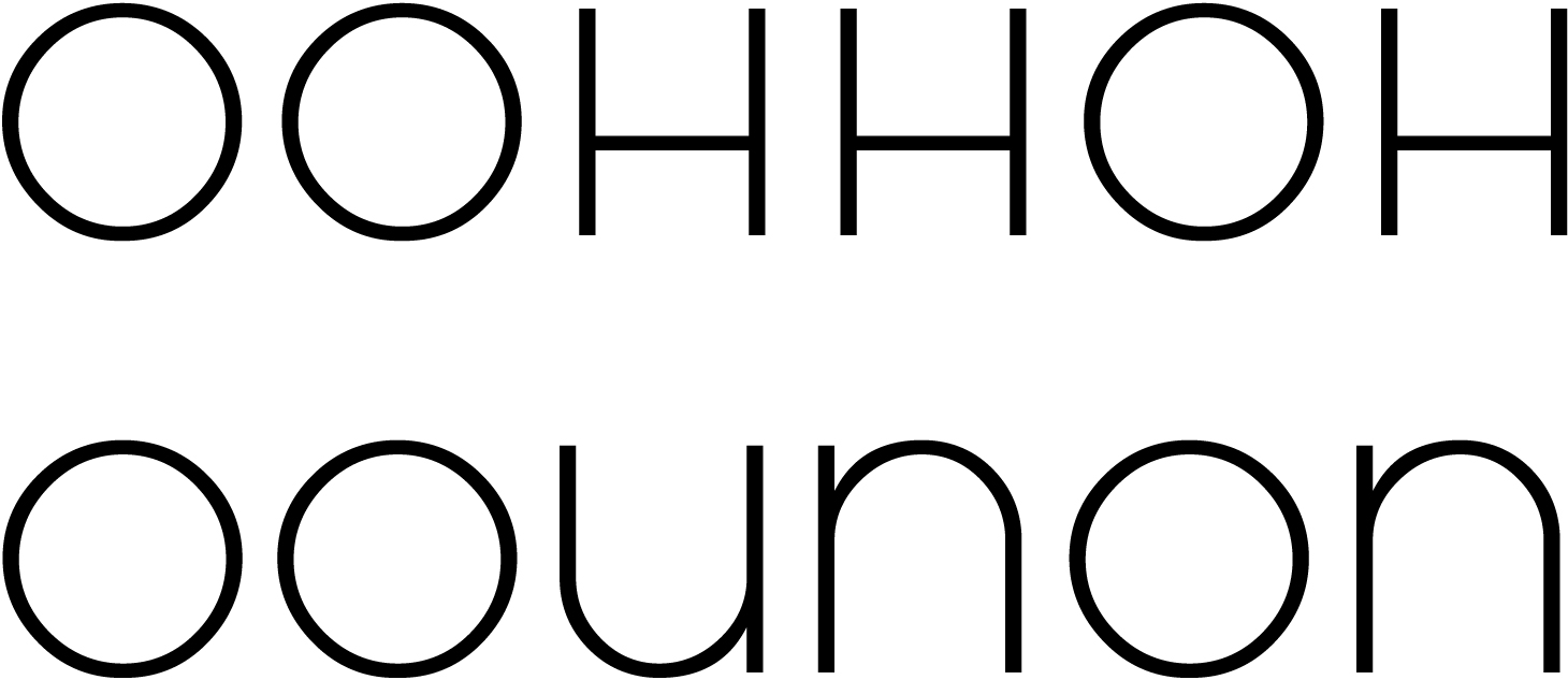
The corners in Йй and Ии are awkward, with too much space between the lines. In N, they are handled better. A similar situation occurs in the Cyrillic and Latin M.
Ч and ч are shaped differently, with the lowercase character appearing somewhat broken. The descender’s shoulder in Цц, Щщ, and Дд is too short.
Our advice
Train One is a decorative typeface with a clear graphic concept, an extensive character set, and broad typographic potential. The Cyrillic extension, however, is technically problematic, graphically imperfect, and limited in scope — best avoided.
Kablammo
Vectro Type Foundry, Travis Kochel, Lizy Gershenzon, Daria Cohen, Ethan Cohen
Kablammo is an experimental variable font, taking inspiration from maximalist curly doodad designs from the ’90s, the Memphis Design movement, as well as cartoons and toys from those eras.
Hands-on
The shapes and positioning of the characters are free and lively. The glyphs are adorned with extra elements, giving Kablammo a somewhat ethnic vibe.
The characters are uppercase, each available in four basic states, accessible as separate styles: Zoink, Bloop, Splat, and Eek. The glyphs from one style can serve as contextual alternates in another.
Using a variable axis, Morph, you can move between these four states: shapes change, details
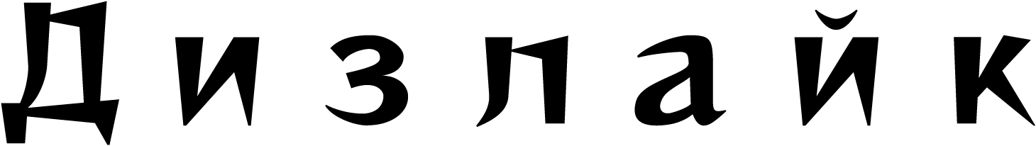
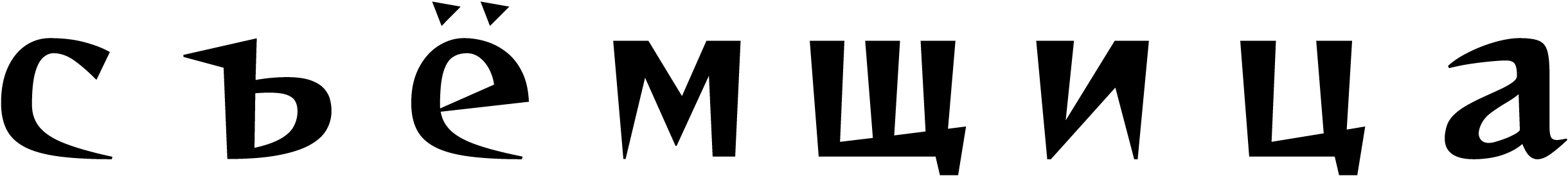
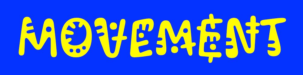 Image: Vectro Type Foundry, GitHub
There are proportional figures, subscripts and superscripts, fractions with sets of numerators and denominators, a wide range of currency signs, mathematical symbols, and, of course,

The typeface features an extensive character set in both Latin and Cyrillic, with the latter supporting most languages that use the script.
Cyrillic
The Cyrillic in Kablammo is high-quality and inventive, fully consistent with the Latin set stylistically.
The glyph set lacks the lowercase ә, which may make it difficult to use Kablammo for typesetting in Tatar, Bashkir, and Kazakh Cyrillic.
Our advice
Kablammo is a lively, interesting project with imaginative graphics and a variable mechanism for its use. The Cyrillic set is high-quality and fully functional. It is perfectly usable.
Oi
Kostas Bartsokas
Oi is an ultra-bold display typeface, a kind of take on 19th-century slab serifs. The author describes it as ‘a clarendonesque on steroids’. Its goal is to grab attention, and the

The typeface began as a sketch made during a lecture delivered by Gerard Unger at the University of Reading. While developing the idea, the author turned to historical specimens, with Caslon’s Ionic (1844) and Clarendon by Fann Street Foundry (1845) serving as distant sources of inspiration.
In 2018, Oi received the TDC Award.
Hands-on

Oi’s tall lowercase characters (nearly matching the uppercase) and ultra-short ascenders/descenders allow for tight line spacing, which makes sense given the minimal internal white space. The counterforms in the bowls are strict rectangles, contrasting with the plump outer contours.
Diacritics embrace the principle of maximum compactness, with basic characters merged with their accent marks into single glyphs.
Contextual alternates help minimise the spacing between characters.
There is another style,

The font offers broad language support: Cyrillic, Latin, Greek, Arabic, and Tamil.
The typeface includes default proportional old-style figures (although lining figures are also available), a minimal set of prebuilt fractions, mathematical symbols, currency signs, and ligatures.
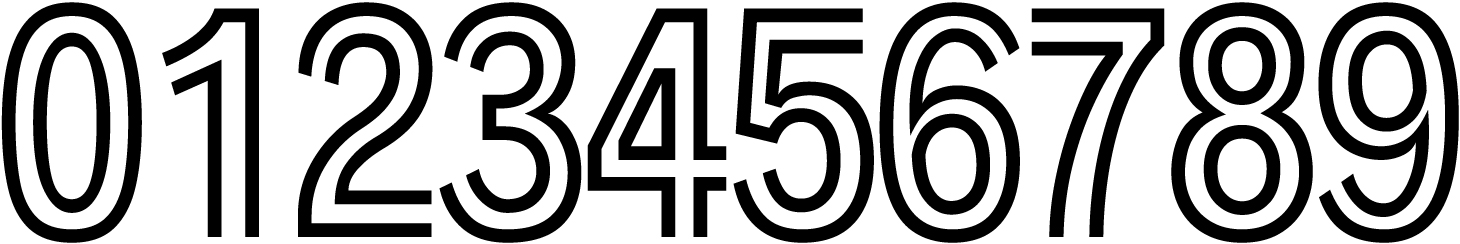
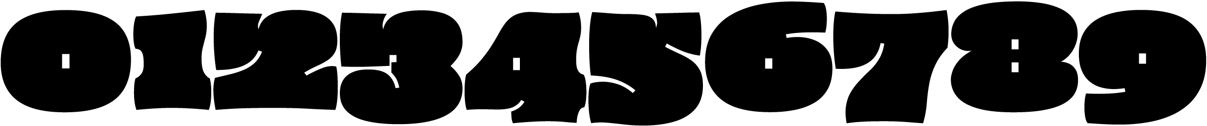
To ensure compactness and keep the counters in the numerals as small as possible, the author had to get creative. For example, the terminals of the lower strokes in 3 and 5 — normally
Cyrillic
The Cyrillic is of high quality, with a well-considered choice of structures. It looks natural and is stylistically consistent with the Latin set.
Cyrillic support is properly implemented across multiple languages.
Our advice
Oi is a display typeface with an impressive graphic idea and competent implementation. The Cyrillic extension is high-quality and natural — you can confidently use it.