
Experts
- Mikhail Strukov
- Type designer, graduate of Ilya Ruderman’s course at BHSAD (Moscow) and Plantin Institute of Typography (Antwerp).
Works with CSTM Fonts and Samarskaya & Partners

- Yury Ostromentsky
- Type designer, partner at CSTM Fonts and type.today

- Ilya Ruderman
- Type designer, partner at CSTM Fonts and type.today

Disclaimer
Today, a free font doesn’t necessarily mean a bad one. Sadly, browsing Cyrillic fonts is still like walking in a minefield; but there is also some good news. Our critique and our advice do not have a monopoly on the truth — that’s just an expert review by three professionals sharing the same values. Plus, you always have to remember that there is no such thing as forbidden means and tools in design. Any bug can be turned into a feature in the hands of a daring, confident typographer, — only before taking risks, you should figure out what this bug actually is.
Previously on Google Fonts series
Old-Style Serifs
Geometric Sans
Humanist Sans
Neo-Grotesques
What is a transitional serif?
Those are typefaces combining the features of old-style serifs (like forms influenced by broad nib writing) with the elements of didones (drawn forms, including those adapted for engraving). Baroque, Neoclassical serifs and certain more liberal modern interpretations of those could be listed under this category. Transitional serifs are characterised by moderate aperture, stronger relation between italics and roman styles (than that in old-style serifs), and variable stress when it comes to round axes (possibly vertical).
Contents
| 1 |  |
| 2 |  |
| 3 |  |
| 4 |  |
| 5 |  |
| 6 |  |
| 7 |  |
| 8 |  |
| 9 |  |
| 10 |  |
| 11 |  |
Merriweather
Eben Sorkin (Sorkin Type)
Merriweather was designed to be a text typeface that is pleasant to read on screens. According to its description, the typeface combines the Renaissance warmth with

It was designed to pair the humanist Merriweather Sans with a similar style nomenclature (yet no Cyrillic).

Hands-on Merriweather has large x-height, simple graphics, and open forms — all of which is good for readability. The typeface is dense: sturdy, but short serifs, the characters are concise, with short ascending and descending elements. Because of its terse details and a modern approach to proportions (widths of linear and round glyphs are close to each other), Merriweather doesn’t look historical.
The typeface supports 145 Latin- and Cyrillic-based languages (Cyrillic fitted with Bulgarian, Serbian, Chuvash and Bashkir versions).
Merriweather has a large character set: proportional lowercase and uppercase figures, ready-cut fractions, sets of super- and subscripts, numerators and denominators, currency signs, math and other service characters.
Styles 4 weights from Light to Black, with corresponding italics.

Cyrillic Forms are quite natural.

Basic proportions differ from Latin — linear letters are very wide: they have more inner and outer white, their serifs are longer.

The balance of linear and oval glyphs in Cyrillic is ruined, the rhythmic structure seems inconsistent — and that is the main issue with this typeface.

As for particular features, the right part of Ы is placed too far away. Left stroke terminals in Л and У are normally designed to be the same — and they are in the lowercase, but not in the uppercase.
The б is falling slightly to its left, its tail looks too light.


It gets worse in heavier styles: not enough weight in У, Лл, б terminals. М is way too wide.

In italics, the lower serif of ф appears illogical when set next to р. The shoulders in ц and щ have no length at all. Я — both in italics and roman styles — is a bit clumsy.

There are certain issues with Ukrainian accents.
Our advice
Merriweather is simple and handy, it is well fit for screens and space-efficient. Sadly, its Cyrillic is considerably worse than Latin in terms of structures — if you still want to use it, pick lighter styles and only uppercase characters.
STIX Two Text
Ross Mills, John Hudson, Paul Hanslow (Tiro Typeworks)
STIX (Scientific and Technical Information eXchange), a family for scientific and technical publications, was born thanks to the joint efforts of a number of American institutes, founders of the STI Pub consortium. The family consists of a Math font and a Text font — with only the latter available on Google Fonts. Math font can be downloaded on the project’s Github.

Hands-on The text typeface design is based on Times New Roman, yet the approach to details and parameters was revisited.

The original Times was intended for high-quality paper and printing process, hence high contrast and thin serifs. Most modern variations are based on headline versions of the original — which is quite light and fine-detailed, thus not really fit for text settings.
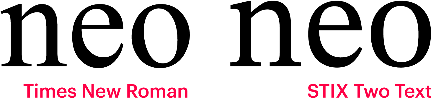
STIX Two Text is built upon text styles and optimised for sizes like 10-12 pt. It has large x-height, reduced contrast, slightly larger apertures, its weights are much more in harmony with each other than in most of contemporary Times Romans.

STIX set has everything for publishing scientific and mathematical information: lowercase and uppercase figures, both in proportional and tabular variants, fractions, sets of numerators and denominators, super- and subscripts, math symbols. Stix Two Math (which is available on GitHub) offers an even wider tool set.
Besides Latin, the typeface supports Cyrillic and Greek. All three scripts are equipped with small caps.
Styles The typeface comes in four weights from Regular to Bold with italics, plus a variable font with weight axis.

Cyrillic Is similar to Times in terms of forms (which makes it appear usual and neutral), yet this time it is better executed.


However, proportions of linear glyphs in the lowercase are overcompensated, and those look overly wide compared to round ones.
Overall rhythm and character in Cyrillic are quite different from those in Latin.

The bowl in Я is somewhat small, it is visibly larger in the similiar R. The curvature above descenders in Цц Щщ Дд was really unnecessary.
Our advice
STIX Two Text is a capable typeface that could be of use when handling scientific information. It beats Times in terms of graphics and character set, yet we would not explicitly recommend it as a replacement — mainly, because of questionable basic proportions in Cyrillic.
Playfair Display
Claus Eggers Sørensen
Playfair Display was influenced by Baskerville, works of William Martin, and Scotch serifs in general, yet it is not a direct revival of any particular historic design.

Hands-on A high-contrast typeface for headline and display purposes. Sørensen suggests pairing it with Georgia, a text Scotch serif by Matthew Carter.
Tall lowercase glyphs, short ascenders and descenders create a dense headline setting with minimum line spacing. When combining lower- and uppercase symbols, typographic ‘colour’ is even, uniform.
Playfair Display comes with ligatures, proportional lowercase and uppercase figures, ready-fitted fractions, sets of super- and subscripts, denominators and numerators, currency signs, mathematical and service characters.
Styles 6 weights from Regular to Black with corresponding italics + variable font.

Italics has a steep slope angle and ornate uppercase glyphs with ball terminals and swashes.

Small caps are available as a separate family — Playfair Display SC — as well as a part of the regular Playfair Display font.

Cyrillic Shows no downright failures, yet certain glyphs are questionable.

A light and somewhat broken tail in б, uncertain bowl shapes in ф (feels like the thin segments should be longer).

The form of к is a slightly archaic one, but it seems in place, yet its branches could use some shape refinement.

The Ъъ have an unnecessarily long shoulder. Shoulders in ц and щ should be the same length and do not need the curvature on top.

As the weight becomes heavier, the bowl design changes, their weight hides certain issues, but you see new ones appear: not enough room for the tongue in э, я is overly thin on the right, and the tail terminal in б is visibly too light.

З is unstable — its lower curl lacks dynamics, while its bowls are disbalanced and look distorted. The loop between those is small, non-articulated. Э and З could use the same lower stroke terminal, this would make the design more consistent.

Lowercase and uppercase Кк are very different — in Latin, the forms are synchronised. Arcs in Ч and ч have different dynamics. Cyrillic suffers from a certain inconsistency of solutions.

A clumsy left stroke in the very wide У, next to which Д looks narrow. There is a hole in the middle of the word — which is a real problem for a headline typeface.
Our advice
This display family could serve as a headline typeface to pair Georgia, but its Cyrillic is far from perfect and therefore should be used with caution.
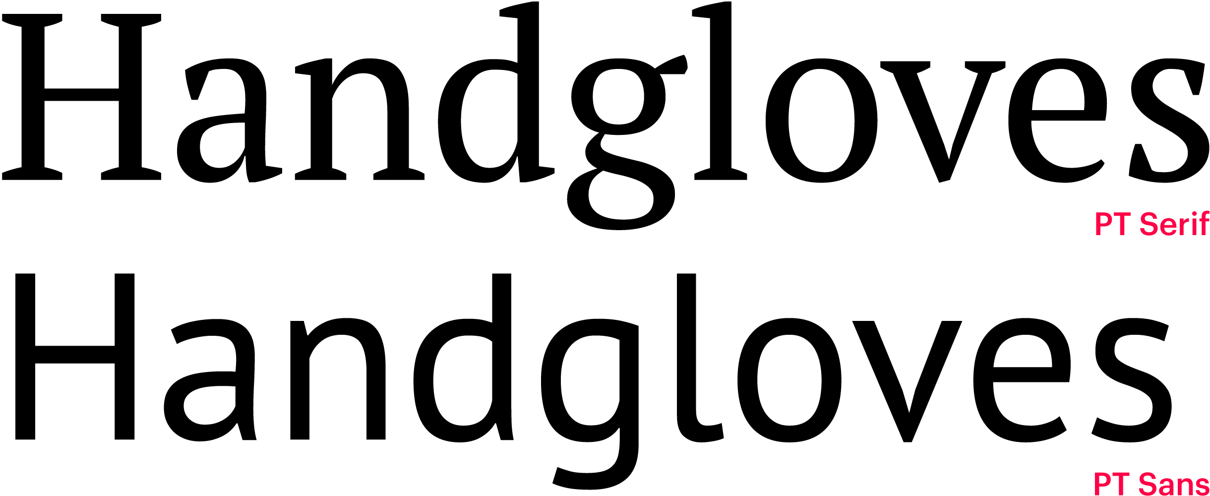
PT Serif
Alexandra Korolkova, Olga Umpeleva, Vladimir Yefimov
PT Serif is a part of Public Type, a system of free-to-use fonts designed at Paratype. It supports Cyrilic for more than 70 languages. The system also includes PT Sans and PT Serif Caption, for use in small point sizes.

Hands-on PT Serif has large x-height, open lowercase characters, low contrast — the typeface is harmonised across design and metrics. Heavy, wedge-shaped serifs and optical compensators are here for good readability. Triangular stroke terminals rhyme with the serifs and work for the typeface’s concise personality.
PT Serif Caption’s metrics are optimised for small sizes: higher and wider lowercase characters, heavy strokes, simplified details and reduced contrast.


The typeface includes one set of tabular figures, several ready-cut fractions and a basic minimum of math symbols.
Styles 2 weights, Regular and Bold, with corresponding italics.

PT Serif Caption comes only in Regular and italics.

Cyrillic Of decent quality, corresponding to Latin in terms of letterforms and character.

As compared to PT Sans, Cyrillic PT Serif is more successful — better proportions of linear and oval glyphs in italics.

Our advice
PT Serif is a high-quality and efficient typeface for body text purposes, good to read on screens and works well even at the smallest sizes. It would keep a perfect company to PT Sans — it is rather light, too, and additional air will be good for setting.
Noto Serif
The serif part of Google’s omniscript typeface project. The plan is to cover the entire Unicode so that all the glyphs work with each other in harmony.

In addition to text Noto Serif, Google released Noto Serif Display with same forms, but higher contrast.

Hands-on Noto Serif is a handy, concise typeface with dense proportions, it won’t take too much space in setting. The x-height is large, lowercase characters are moderately open, serifs are hefty, bowls are squared to increase the inner white — such a typeface must be good to read at small sizes.
Given a certain rationality in design — vertical stress and angular bowls, its stroke terminals are humanist, as if formed by a writing tool.

Noto Serif comes with one set of standard tabular figures, fractions, mathematical symbols, currency signs. There are icons, arrows, borders, ornaments, and patterns.
Styles Google Fonts offers Regular and Bold with italics.

Noto Serif Display comes in 9 weights, from Thin to Black.

Cyrillic Is bad, starting from basic proportions — Noto Serif jumps on a trend on very wide linear uppercase characters in Cyrillic.


п is obviously too wide compared to both Latin linear n and bowls in Cyrillic; it is true for all linear characters — the rhythm of lowercase Cyrillic is ruined.

There is a hole in the pair ул — the typeface has issues in letter spacing. л has an extremely sweeping, too dynamic left stroke with a calligraphic terminal. у — despite the fact that it was copied from the Latin character — is also questionable because of the thin descender terminal. Archaic, wide, branchy жк also don’t seem relevant in a text typeface. Я is unbalanced — a large head with a pulled up leg.

In heavy styles, drop terminals lack weight — there is no such problem in Latin. There are holes in two pairs (юч/ца). Issues with basic proportions — ю is too wide on its left side and too narrow on its right side. The arc in ч goes up too drastically — the dynamic is much smoother in the uppercase glyph.

The curvature above descenders in цдщ is unnecessary.

Words set in Noto Serif have different densities, with lighter and darker parts. A weird light terminal in У. Д has a broken left stroke, unnecessary curvature above the right descender. The bowl in Ь is small and narrow.
We named just a few of the problems and oddities that exist in all Noto Serif weights and styles.
Our advice
Cyrillic Noto Serif is not usable — sadly, the quality of this typeface is inconsistent with the ambitiousness of the project.
Source Serif Pro
Frank Grießhammer
A text serif typeface for screens and paper. Source Serif Pro was loosely based on the typefaces by Pierre Simon Fournier, but is not a revival and doesn’t look historical. It was developed to pair Source Sans, but feels confident on its own and can easily work alone.

Hands-on Source Serif Pro is made for screens, and its concise details make it highly readable. The typeface is compact and pretty light (that’s why one should avoid dense line spacing) — it matches Source Sans in proportions and typographic colour.

Characteristic details refer to the works of Fournier — such as serifs in b or w — with the overall neutrality, basing on historic materials introduces the personality to the typeface.
Extended character set in Latin, Greek and Cyrillic (the later offers Bulgarian and Serbian glyph variants), equipped with small caps for all the three scripts, plus superscripts in Latin. There are also sets of tabular and proportional figures, both lowercase and uppercase, regular and old style, fractions, sets of numerators and denominators, super- and subscripts, math symbols, ligatures, currency signs, arrows and icons.
Hands-on 6 weights from Extra Light to Black with corresponding italics.

Cyrillic Is high-quality and natural, raising little questions.


The left stroke in д is too diagonal, especially in thinner styles.

The tail of б in light and medium weights looks a bit fractured, while in heavy styles it gets a bit too heavy.
Our advice
A versatile text typeface with viable Cyrillic. It is even better than in its pair, Source Sans. The typeface is light and has spacious ascenders and descenders — which is why dense line spacing is not a good option.
Literata
Vera Evstafieva, Veronika Burian, Irene Vlachou, José Scaglione (Type Together)
The typeface was initially designed for Google Play Books and initially intended for use on readers, but later was revised into a typeface for wider application, from print to mobile apps.

Hands-on Projected use on readers and the task of ensuring high readability at various sizes and in limited resolution defined the typeface parameters: low contrast (in text optical sizes), sturdy serifs, loose proportions and moderate aperture.

In spite of its usability and neutrality, Literata doesn’t look impersonal — it’s friendly and cosy, with the steady rhythm facilitating long reading.
A distinctive trait of Literata is vertical italics (2 degrees slope) which is well-suited for pixel grid on screens and e-readers. As a result, it’s the expressive letterforms here which are responsible for highlighting: design of italics is much different from the upright style.

Literata has a large character set, the typeface supports extended Latin (+ Pinyin Chinese and Vietnamese), Greek and Cyrillic, all fitted with small caps. There are ligatures, service characters, lots of currency signs.
Figures, by default, are proportional and uppercase, there are also tabular and lowercase variants, ready-cut fractions, sets of nominators and enumerators, super- and subscripts, mathematical symbols.
Styles 8 weights from Extra Light to Black with corresponding italics.

There is also a variable font with weight and optical size axes.
Each static weight variant is available in a range of optical sizes, from 18 to 60 pt.

Cyrillic Was designed by Vera Evstafieva, author of the Amalta typeface from our library. She designed a quality and natural typeface — no questions to structures, design, rhythm.

Ukrainian accents is one thing that could be improved.

Our advice
Well-conceived, elaborate type family with quality Cyrillic which is not only a great fit for e-books, but will work seamlessly in printed long texts.
Tinos
Steve Matteson
A serif typeface metrically compatible with Times New Roman and with a concept similar to the sans typeface called Arimo by the same author. Tinos is easy to read on screen and could be of use to developers who need metrically compatible fonts for cross-platform products.

Hands-on On the one hand, the design of characters was driven by the need to work with pixel grids in limited resolution: strokes are trying to be orthogonal, with minimum of curves and diagonal lines — one can see it in a particular form of arcs, bowls, stroke terminals. Small slope angle in italics serves the same purpose.

That said, openness, squared form of bowls and arcs (besides their technical function) positively impact readability, letting more air in the characters.
All these details affect the personality of the typeface — it is very peculiar, unlike Times New Roman that is perceived neutral as a result of its massive use, — which means Tinos is not that versatile.
The typeface has an extended character set and language support — Latin, Cyrillic, Greek, Hebrew. Figures are only tabular, but there are fractions, sets of super- and subscripts, arrows, frames and icons.
Styles Just as Times New Roman, Tinos has 2 weights, Regular and Bold, both with italics.

Cyrillic Is of poor quality. Starting with proportions: compared to Latin, linear characters look too wide next to round ones.

Кк’s structure, atypical for Cyrillic, is not a taboo by itself, but there has to be an underlying reason for this design. A simpler structure of ф might have been better compliant with technical requirements to the typeface’ design, too.

The descenders in дцщ are a bit too long, and their shoulders are too short. The л has too straight a leg, which is also set too far aside and its terminal is too light. The breve above й is overly wide — same as in uppercase. The bowl in ьыъ is squeezed vertically and looks small.

Narrow Б, its bowl is lacking volume. A small triangle with highly placed stroke joint in У. Ч is vertically unbalanced: its upper part looks too large. In Ю, the left side with the crossbar looks too wide.

Fundamentally different forms of ъ and ь — those often differ in italics, but not that radically. The left stroke in л is a failure, with a very light, rudimentary terminal.

There are issues in letter spacing — probably, caused by the need to comply with the metrics of Times New Roman (given the different design).
Our advice
Because of its distinctive personality, Tinos can replace Times New Roman only in certain cases, and and only in Latin. Cyrillic, unfortunately, is quite unfit for the job.
Vollkorn
Friedrich Althausen
This text typeface is designed for use on screens in print. The name Vollkorn is German for ‘wholemeal’ and refers to the old term ‘Brotschrift’ (Bread type) — it stood for the fonts for everyday use in hand setting times.

Hands-on That is a heavy typeface with thick strokes and meaty serifs — because of this relative darkness, it resembles letterpress print with a characteristic ink spread. Design and metrics bring in a historic vibe, too. Alongside the openness of characters, loose letter spacing and inktraps, this ensures good legibility and readability at small sizes.
The design is saturated with details, with complicated shapes of serifs and terminals — author also encourages to use Vollkorn for headlines and titles.Another tool for display setting are stylistic alternates.

Uppercase characters also have a decorative variant.

Extended character set in Latin, Greek, Cyrillic (with local versions of glyphs); there are small caps for each script. Lowercase (by default) and uppercase figures — both tabular and proportionals, with stylistic variants. Fractions, super- and subscripts, math symbols, currency signs, frames, arrows and icons.
There is a number of unmerged paths in static styles (both Latin and Cyrillic).

Styles 6 weights from Regular to Black with corresponding italics plus a variable font. As it gets heavier, Vollkorn becomes wider, too: strokes get thicker, almost without affecting counter volume.

Cyrillic Is just as archaic as Latin: Кк with curved branches might well have copied the Latin structure with straight strokes; the unconfident ф is somewhere inbetween one- and two-bowl forms. The bowl in б looks small — there was no need for such a powerful compensation.


Strokes in the uppercase and lowercase Чч are different. The breve about й is way too wide — same as in the uppercase.

Я has a broken leg, looks narrow, its head lacks volume.

Squeezed small bowls in ЬЫЪ. Too many unnecessary curvatures between main strokes and crossbars: within Пп (also with ДдЛдШш and others), in the shoulder above descenders in Цц and related characters.
Our advice
Cyrillic Vollkorn should be used only at small sizes — where its problems are barely visible. Again, its parameters are better suited for this kind of setting.
Alice
Ksenia Erulevich (Cyreal)
The typeface was inspired by Lewis Carroll’s novel, hence its personality — old-fashioned (in a good sense), quaint and friendly. Author suggests using it for long text typesetting and headlines.

Styles Alice has one style, parameters are typical for a text typeface: large and open lowercase characters, widened proportions, loose letter spacing.

Some letterforms and calligraphic terminals are quite original — and those limit body text use of the typeface; it is hardly suitable for setting long texts at small sizes. In larger sizes, the outlines are somewhat broken — but in the case of Alice, this lack of sterility and smoothness is even a strength.
The typeface comes with a basic set of ligatures, currency signs, punctuation and one set of proportional figures.
Cyrillic Is quite high-quality, although peculiar: it intentionally carries those constructive eccentricities that define the personality of this typeface.

Technical quality is sometimes rather poor.

The descender in lowercase џ is visibly off-centered. The outline above the descender in Ӌ is obviously broken.
Our advice
The typeface is good for display purposes and large sizes — where its whimsical character might be of great use. Use caution when dealing with extended Cyrillic: there are technical errors.
Lora
Olga Karpushina (Cyreal)
Lora is a contemporary serif typeface with calligraphic roots. Its overall typographic voice, according to the author, conveys the mood of a modern-day story, or an art essay.

Hands-on Lora’s parameters — moderate contrast and openness,typical for a text font, — combine with calligraphic details, most notably serifs based on broad-nib writing. As for structures and weight distribution, the typeface seeks to be versatile, yet calligraphic elements ensure its personality and make it a more specialised tool.
Lora has distinctive italics with a small slope angle which is good when it comes to screens. The typeface is optimised for screen appearance, but works equally well in print.

Lora comes in Latin and Cyrillic (including Bulgarian variant) and is equipped with proportional and tabular figures, math symbols, currency signs, minimum of fractions and superscripts.
Styles 4 weights from Regular to Bold with italics plus a variable font with weight axis.

Cyrillic Of high quality, appropriate forms — and a logical calligraphic design of the details.

Our advice
Lora is a text typeface for screens and print, expressive and with proper Cyrillic. It is safe to use Lora wherever its calligraphic roots would seem relevant and appropriate.