Experts
- Mikhail Strukov
- Type designer, graduate of Ilya Ruderman’s course at BHSAD (Moscow) and Plantin Institute of Typography (Antwerp).
Works with CSTM Fonts and Samarskaya & Partners

- Yury Ostromentsky
- Type designer, partner at CSTM Fonts and type.today

- Ilya Ruderman
- Type designer, partner at CSTM Fonts and type.today

Disclaimer
Today, a free font doesn’t necessarily mean a bad one. Sadly, things are much worse with free Cyrillic than with Latin; but there is also some good news. Our critique and our advice do not have a monopoly on the
Another disclaimer
We’re making this series primarily to help graphic designers choose a typeface with decent, high-quality Cyrillic support. But sometimes the font authors themselves read our pieces or comments posted on GitHub and correct mistakes pointed out by us or other experts. However, since we do not always manage to edit our article right away, telling that the error in question was fixed, if you’re opting for a typeface based on a ‘Cyrillic on Google Fonts’ episode which hasn’t been updated in a while, we recommend checking whether the mentioned errors are still there.
You can help us keep our reviews up-to-date. If you notice that a bug we mentioned has been fixed, please reach out to us at info@type.today.
Previously on Google Fonts series
Old-Style Serifs
Geometric Sans
Humanist Sans
Neo-Grotesques
Transitional Serifs
Didones
Scripts
Display typefaces (Part 1)
What fonts are classified as display fonts?
In this piece, we address typefaces that are inherently decorative rather than those that qualify as display due to extreme values of certain parameters, such as contrast and proportions.
This is the second article in a series covering display type. We published the first in November 2025.
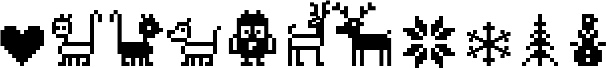
Contents
| 1 |  |
| 2 |  |
| 3 |  |
| 4 |  |
| 5 |  |
| 6 |  |
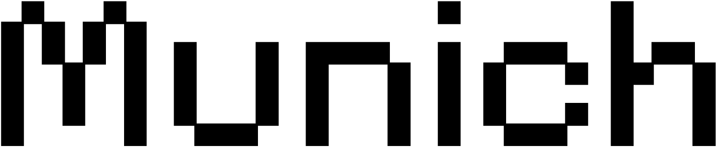
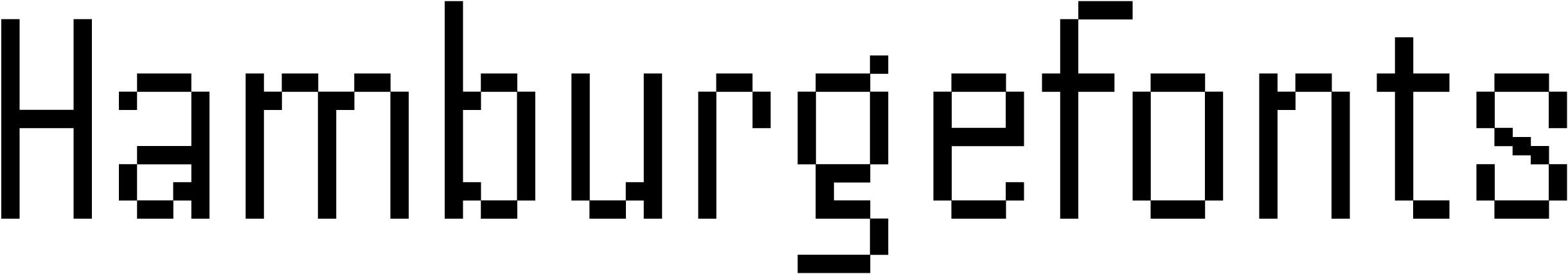
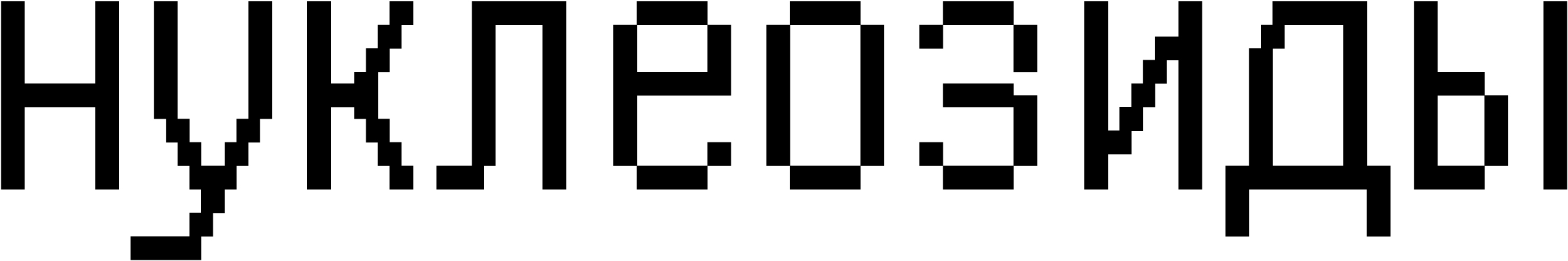
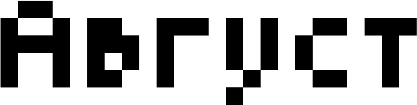
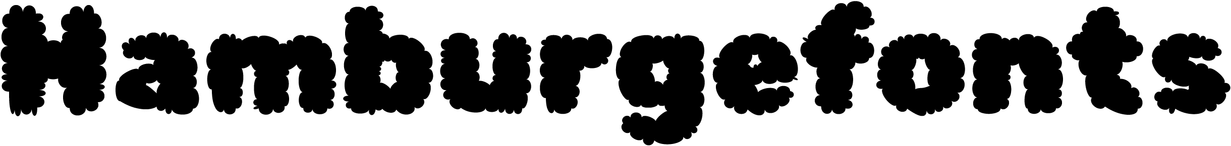
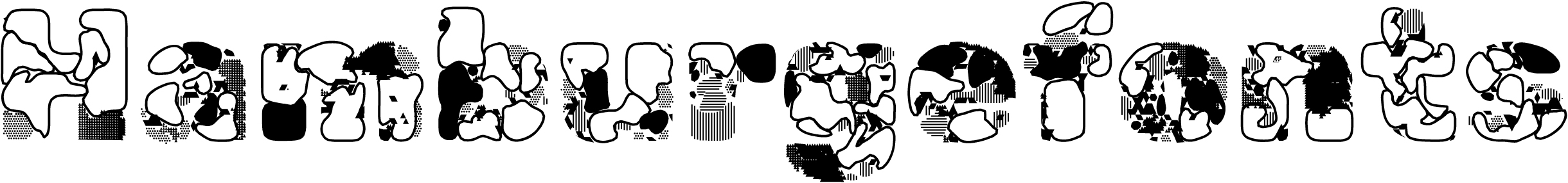
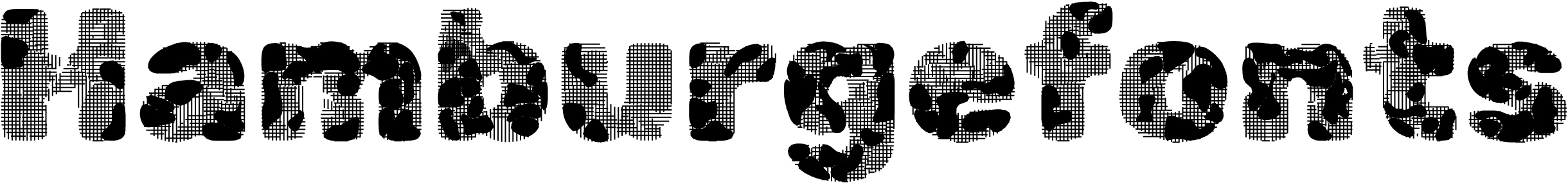
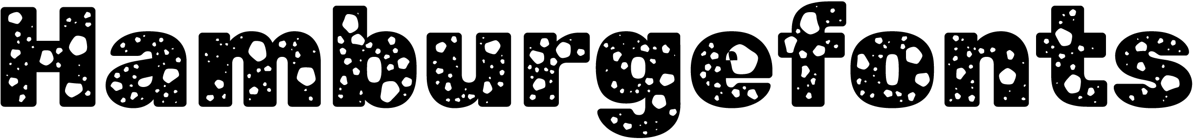
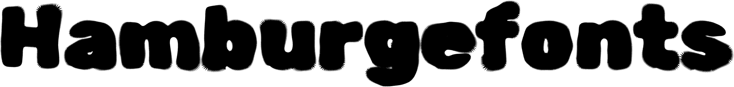
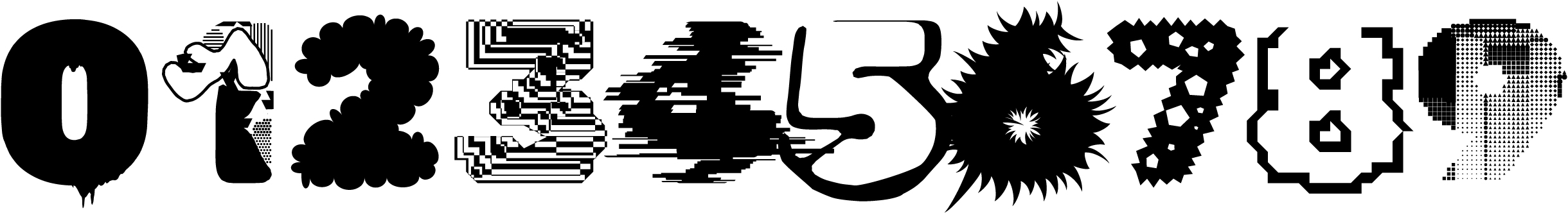
Press Start 2P
CodeMan38
Press Start 2P mimics pixel fonts from Namco video games dating back to the 1980s. The uppercase characters and numerals in the typeface are based on the typography of Sprint, created by Atari Games in 1977, while the typography of The Return on Ishtar (1986) is used as a reference for its lowercase characters.

Hands-on
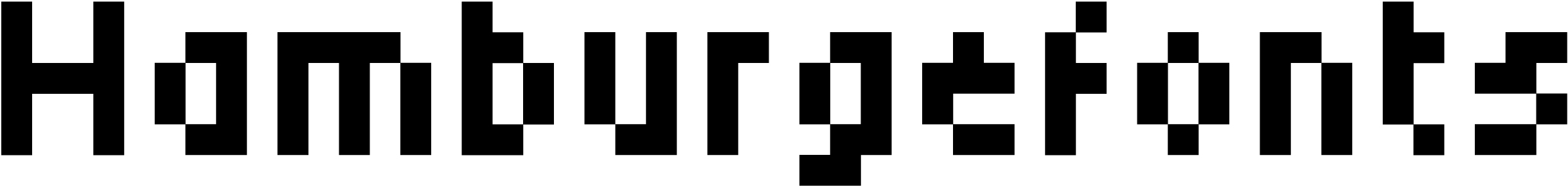
Press Start 2P is a monospaced modular typeface with pronounced contrast. The glyph designs are virtually identical to those in video game prototypes. This stylisation is good for introducing a certain vibe or reproducing retro game interfaces. Each character is set within an 8×8 module grid, with the side bearings and diacritics also fit into this grid.

Drawing from two different references, the uppercase and lowercase glyphs differ in personality, detail, and a general approach to letterform shaping.

Press Start 2P’s close resemblance to its prototypes makes it, to a great extent, a technical product that preserves both the limitations of older screen technology and the artistic imperfections of its graphics. This compromises the quality of the typeface: the text is uneven, and the balance of white space within and between letters is ruined.

There are obvious gaps in the pairs ef, at, ti. The uneven thickness of vertical strokes in m jumps out

With diacritics in place, the uppercase characters are vertically compressed to the x-height.

Press Start 2P contains tabular figures, several prebuilt fractions, mathematical symbols, basic superscripts, a bare minimum of currency signs, and a set of ASCII symbols.
The typeface supports Latin, Cyrillic, and Greek.
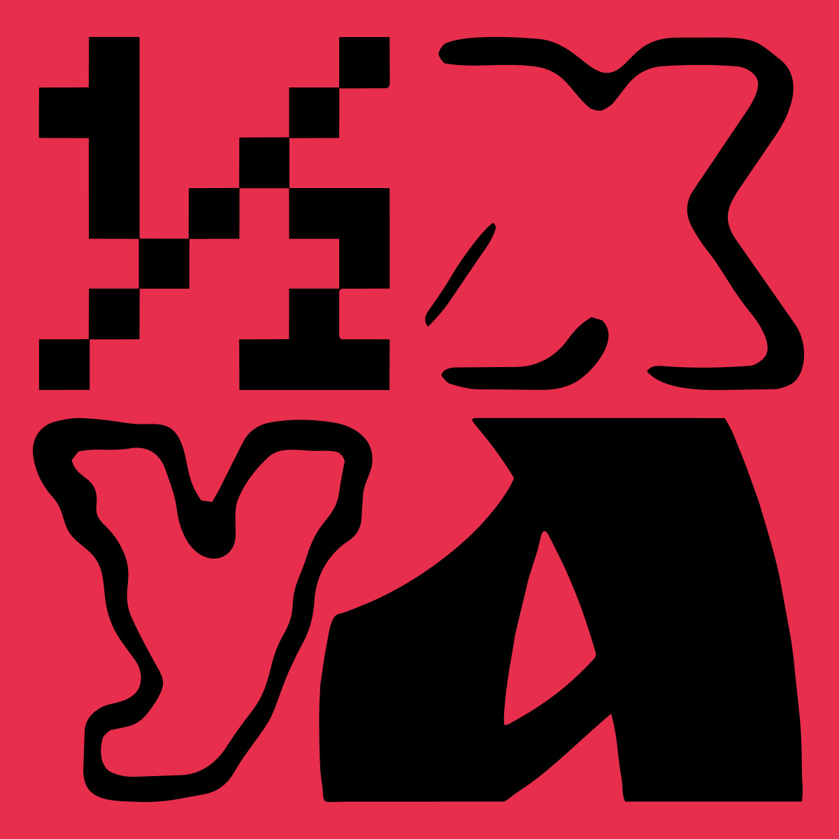
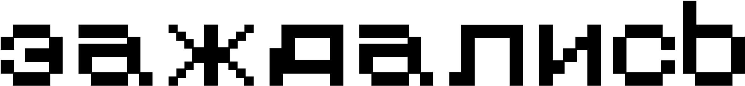
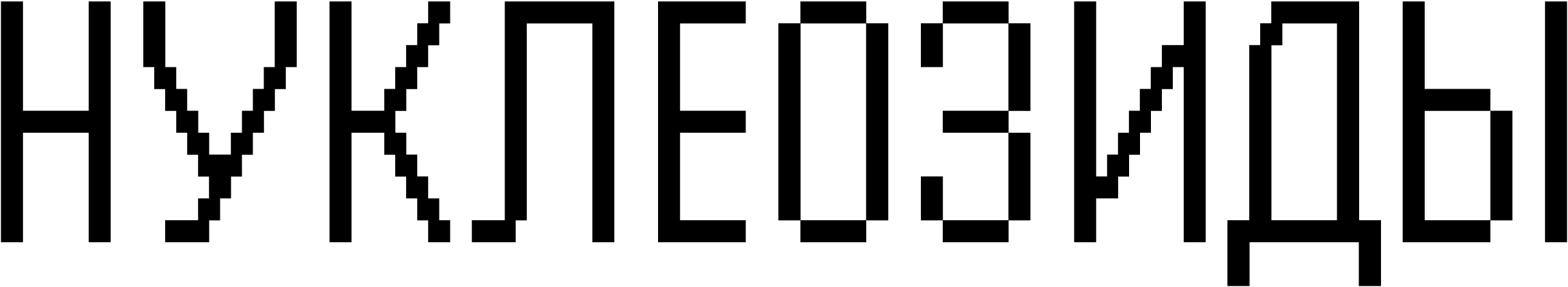
Cyrillic
Some glyphs in the Cyrillic set differ from their Latin counterparts.

The authors likely used a different reference for the Cyrillic character set, one that does not entirely align with the Latin in terms of the actual graphics.

The counters (с, з, э) get less open, which makes the glyphs closer in shape to the uppercase characters, while the bowls in б and р become more dynamic and asymmetrical.
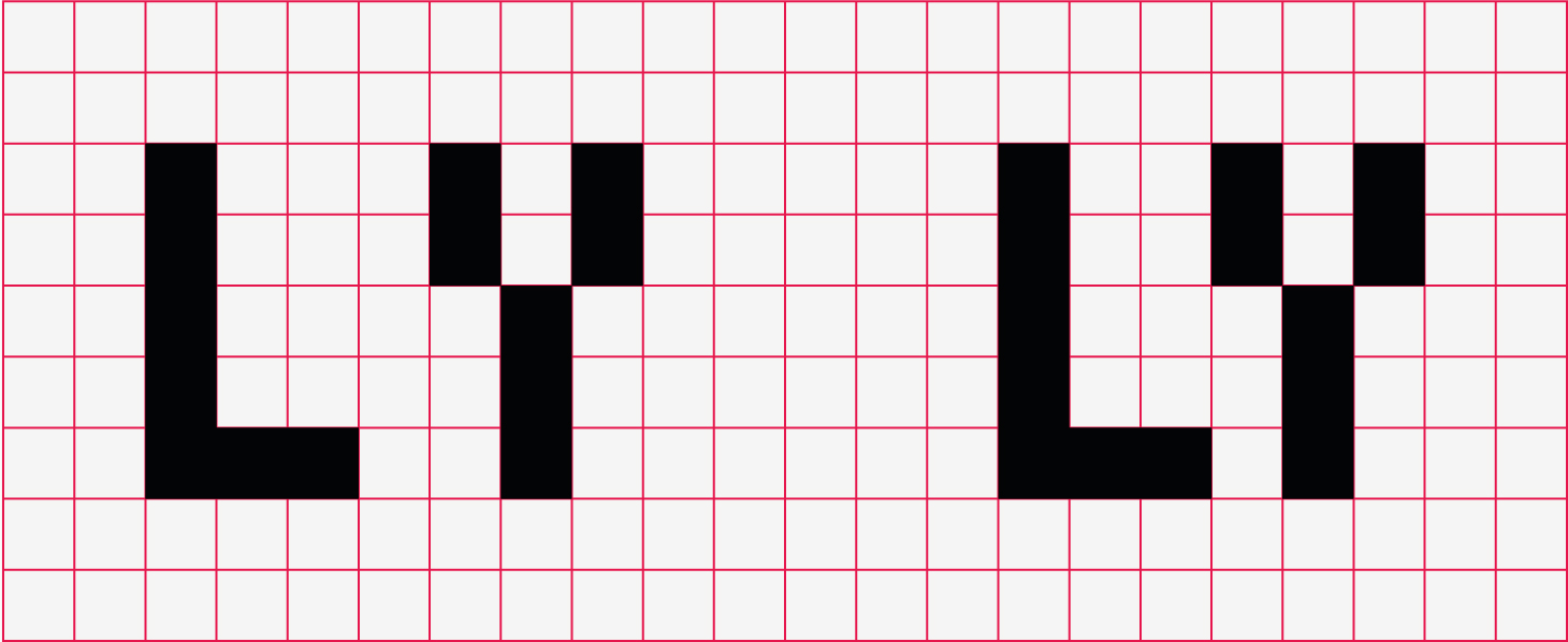
There is a dark spot at the end of this Лл’s leg; д merges with the next character; ы’s bowl is too small.

The shape of Я’s leg
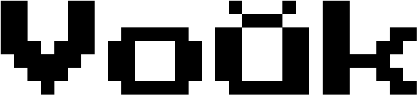
The Latin breve, however, looks
Our advice
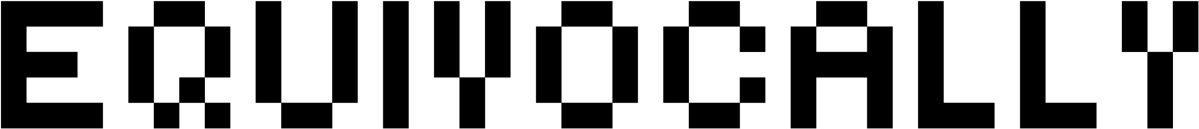
Press Start 2P is a stylisation that, when it comes to its Latin set, can be used as intended: to set a certain mood or reproduce retro game interfaces. It’s hard to find another use for the typeface, though (especially its Cyrillic
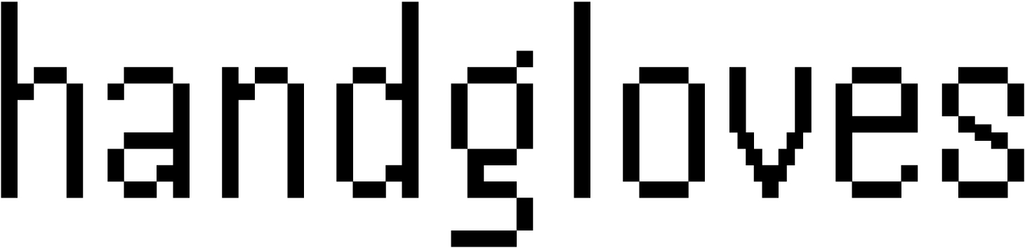
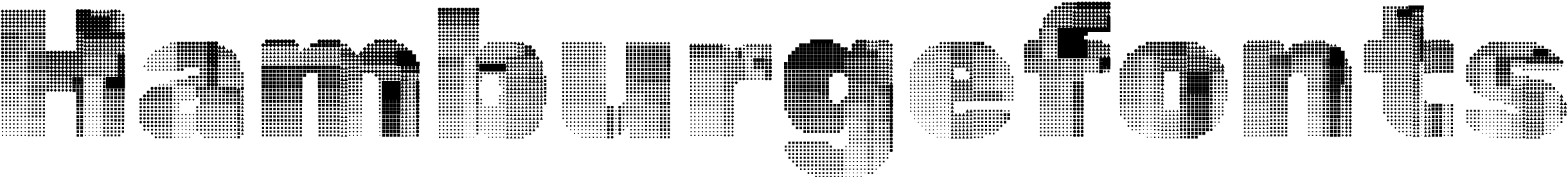
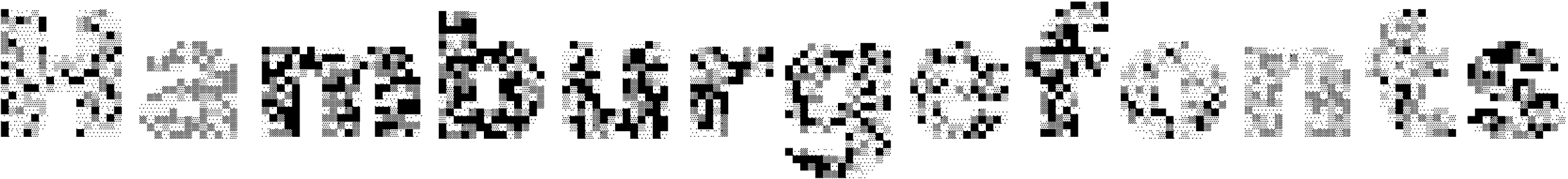
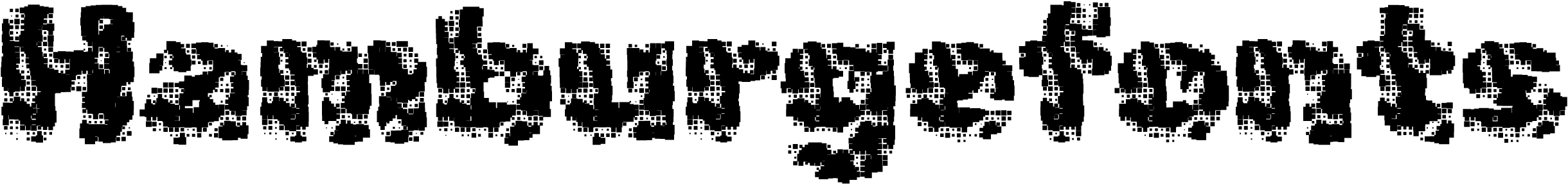
Pixelify Sans
Stefie Justprince
Pixelify Sans is a pseudo-pixel font inspired by the graphics of 1980s video games. The author intended it to be used in media, applications, and video games.
Hands-on
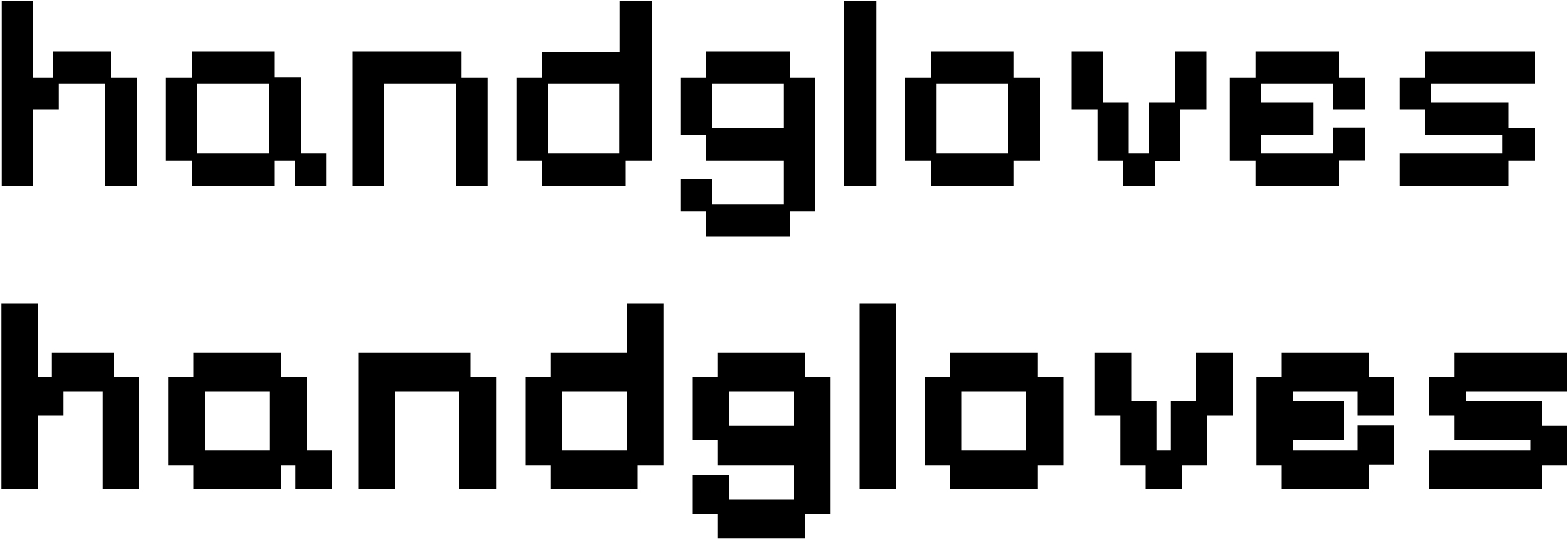
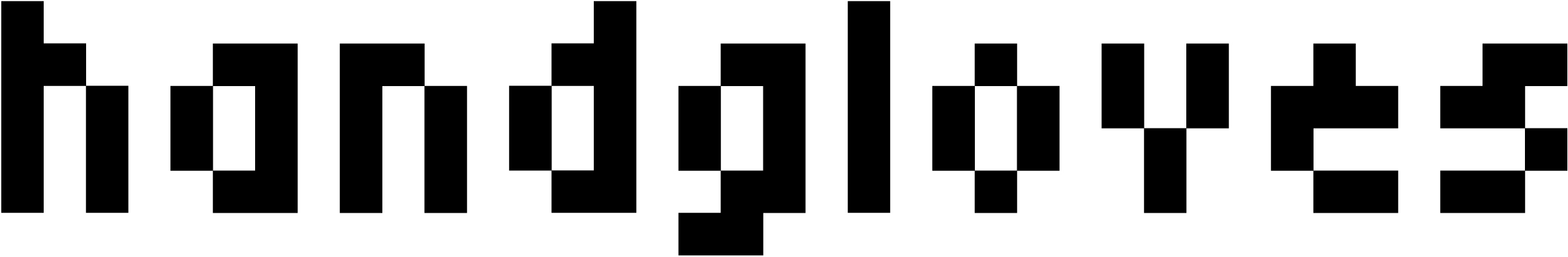
Pixelify Sans is a monolinear typeface with a single-module stroke width. The font comes in several character widths, which both preserves the mechanical feel, typical of video game pixel fonts, and ensures a fairly even text texture, without any obvious gaps or dark spots.
The author touts the typeface as well-legible at smaller sizes.
Despite its general minimalism, Pixelify Sans features some unconventional design decisions: an irregular е; a rounded tail in a single-storey g; and an а with a tail that evokes the Greek α. Most glyphs are closed, although open shapes, such as in s, generally enhance legibility at smaller sizes.
The uppercase characters appear decorative, initial-like. They feature plenty of details and modifications to the glyphs’ design.
The lowercase letters show a certain degree of variability. The arcs in u, n, and h are built differently. This undermines the font’s consistency and the repeatability of its letterforms.

The figures are tabular, yet the advance width of the digit 1 differs from that of the other digits. The font includes a sufficient amount of prebuilt fractions, as well as sets of numerators and denominators, mathematical symbols, and currency signs. The numeral design is creative, yet this does not always benefit legibility. For instance, the digit 5 can be identified only through the context.
Small elements and signs (such as numerators and accents) are made up of smaller modules, and this makes them appear significantly lighter than other symbols.
The font supports Latin, Cyrillic, and Greek.
Styles
The typeface comes in four weights, ranging from Regular to Bold.
The weight increases not by filling the grid with additional pixels, but through enlarging the modules themselves. As the modules increase in size, they start overlapping with neighbouring ones.
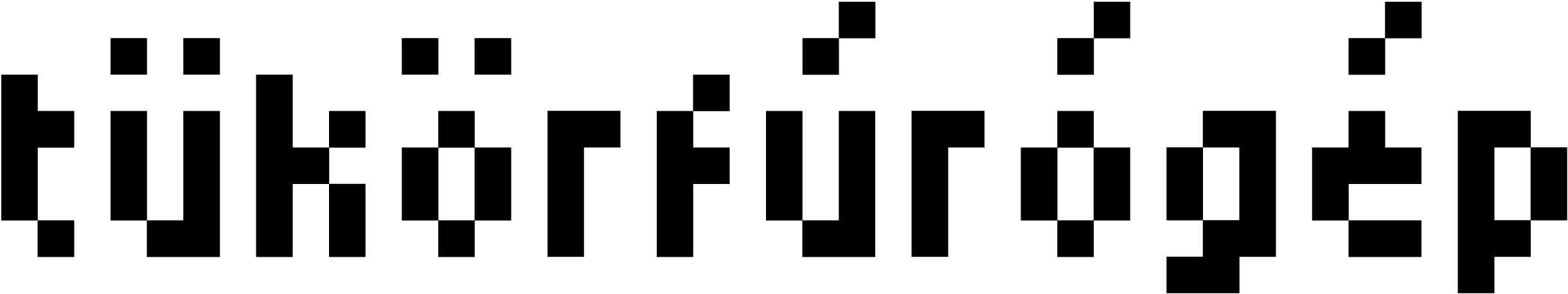
Cyrillic
Pixelify Sans Cyrillic character set raises numerous questions.
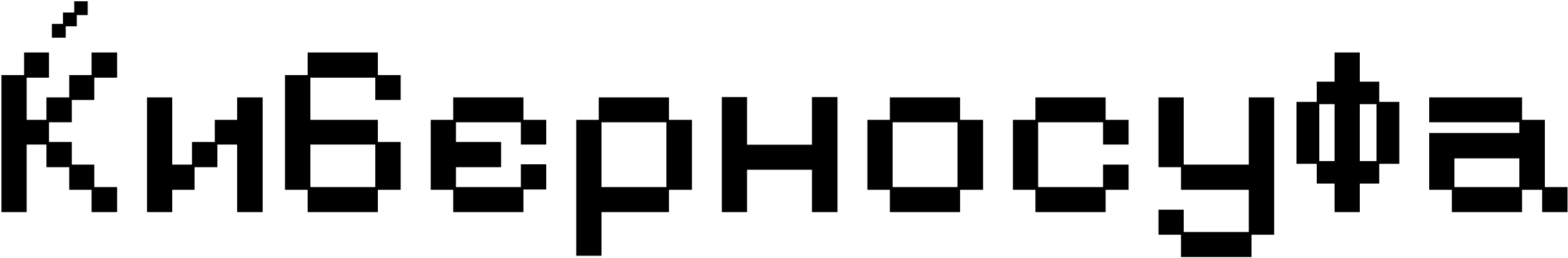
The unicodes for К и Ќ are mixed
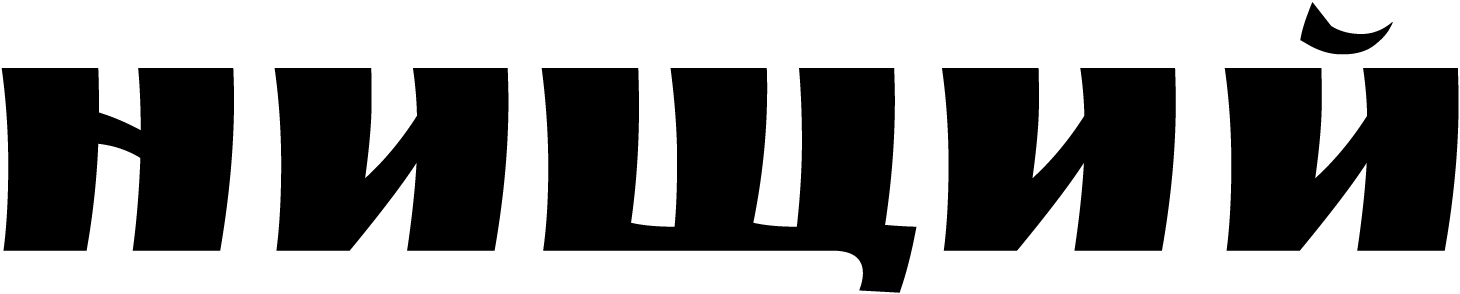
Lowercase з mimicks э (in the uppercase characters, it’s the opposite: Э mimicks З). In Жж’s diagonal strokes, the pixels are too small. Дд has no shoulder on its right side and features a dark, shapeless spot on its left. Лл, with its right angles, same as Дд, looks like an outsider among other characters. ь, ы, and ъ show the design and size of the uppercase glyphs.
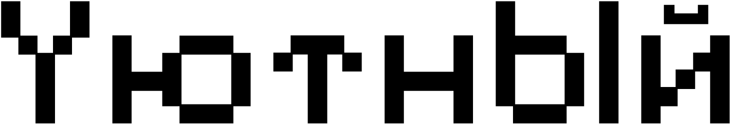
There is a Y instead of a proper У. The horizontal stroke in ю is overly long; the й’ breve is too light and weirdly shaped. The upper stroke in Тт is curved (this shape is also used in Latin).
There is no uppercase О and П in the character set.
There is a W instead of a Ш, which also serves as a basis for Щ, with a curtailed descender made up of small
Б features a curved horizontal stroke. The accents in Ёё и Йй are too light. The Cyrillic Ее can be easily mistaken for Єє. The right stroke in Ы is too short.
Our advice
Pixelify Sans is a distinctive project with numerous eccentricities, which may be an advantage for a display typeface. However, in this case, they do not always seem appropriate or reasonable. The Cyrillic is of poor quality, with errors in both design and technical
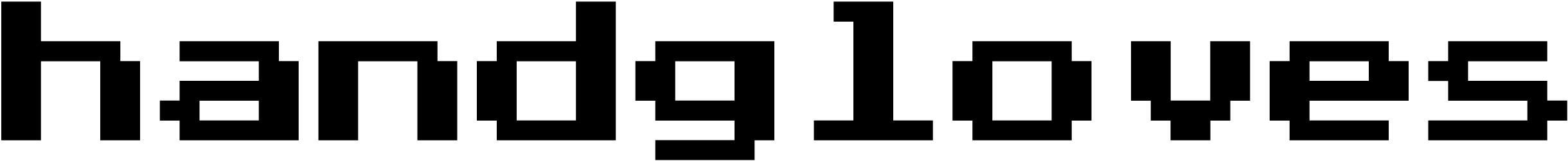
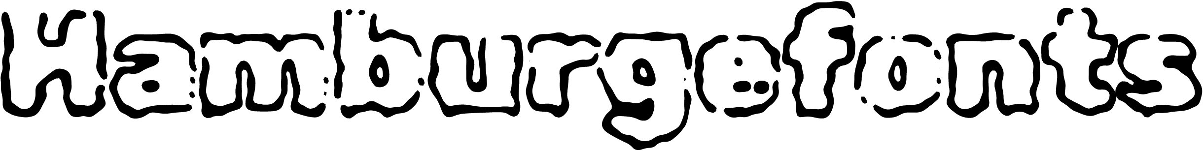
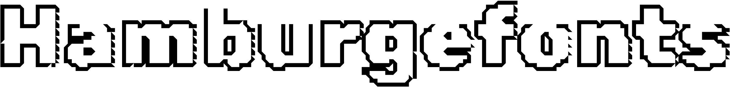
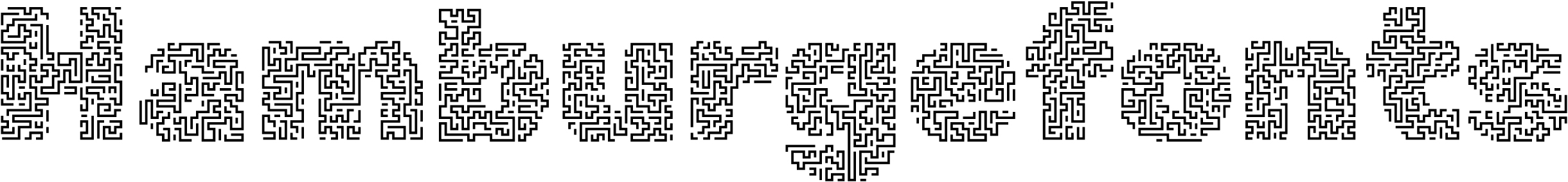
Handjet
Rosetta Type Foundry, David Březina
A modular font composed of repeating elements, Handjet started as a class assignment in which students designed a typeface for a handheld printer.
Hands-on
The printer used a 32-pixel grid, while Handjet uses a grid of 19. The elements are square by default, yet each pixel can take one of 23 shapes (such as a diamond or a heart).
A group of four elements can replace one pixel.
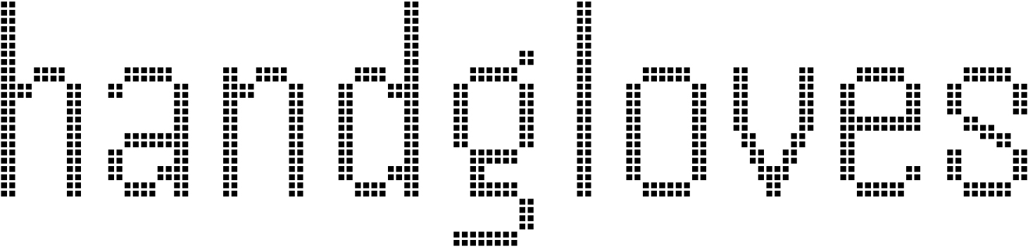
This relatively fine grid allows for fairly accurate rendering
Handjet includes tabular figures, an extensive range of prebuilt vertically designed fractions with sets of numerators and denominators, mathematical symbols, numerous currency signs and icons.
The typeface supports Latin, Cyrillic, Hebrew, Greek, Arabic, and Armenian.
Styles
Handjet is available in nine weights. The weight grows due to the increase in size of each module. The variable Handjet has two axes: Element Shape, which changes the shape of modules that make up the glyphs, and Element Grid, which controls the number of elements within a single cell of the pixel grid.
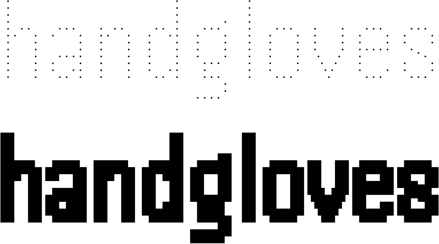
Cyrillic
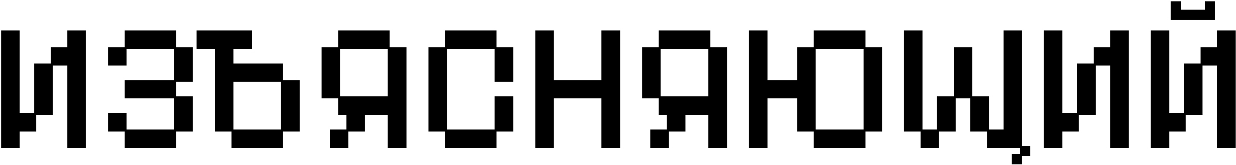
The Cyrillic looks natural and is stylistically consistent with the Latin set.
The letter Лл appears somewhat mechanical, with its straight leg ending with a sharp bend. The usually similar diagonal strokes in л and д look completely different, with the latter having a weird curve at the top.
The proportions of the glyphs raise some questions. For instance, к and л seem too narrow compared to н, while з, on the contrary, looks wide.
The uppercase Л, У, and Ы also appear too wide. In the lowercase glyphs, the left part of ы is compensated in width compared to ь — there’s no such adjustment in the uppercase letterforms.
Our advice
Handjet is a project with an interesting idea, fully revealing itself in a variable version of the typeface. Its details follow the concept and technical features of the device for which the typeface was designed, which makes some of them appear weird. This should be taken into consideration when choosing the font. The Cyrillic extension requires careful use.
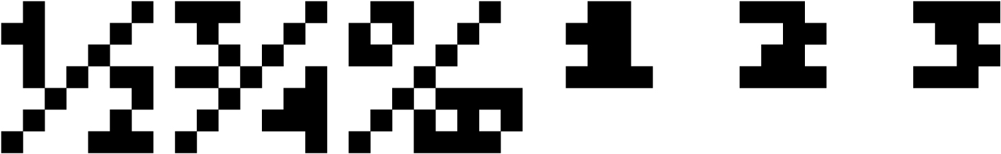
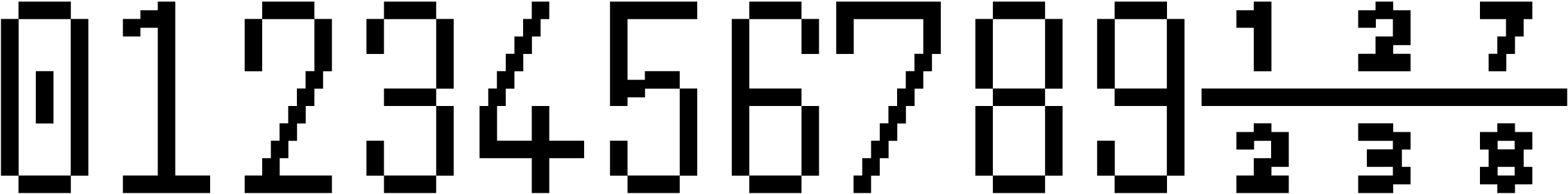
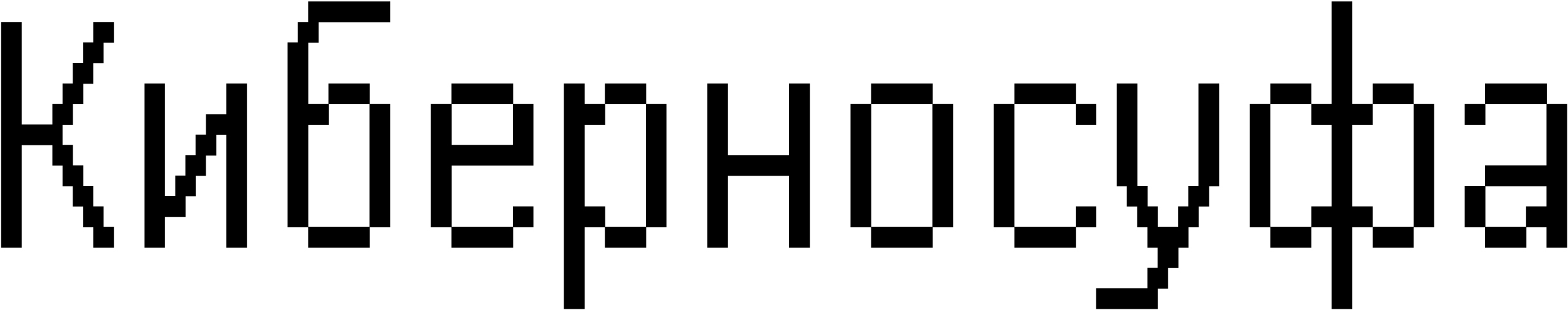
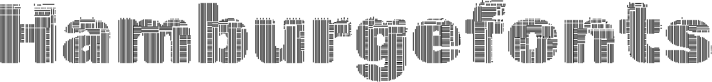
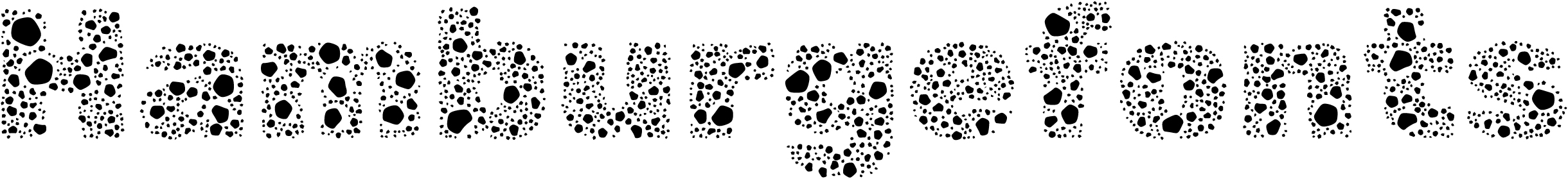
Tiny5
Stefan Schmidt
Tiny5 is a 5-pixel font wannabe, inspired by the interfaces of graphic calculators from the 1980s and the 1990s. The author intends the typeface to be used not only for stylisation purposes, but also for displaying text on low-resolution screens.
The Google Fonts collection includes only one style, but the project also offers other options that simulate font rendering on an LCD, a CRT monitor, and a dot-matrix printer. Tiny5 is also available as a variable font.
Hands-on
A challenge of fitting as much graphical detail as possible into a height of five pixels (with lowercase letters only four pixels tall!) calls for concise and expressive solutions.
The typeface features vibrant and inventive graphics that remain interesting even at larger sizes. Despite the large modular grid (with most symbols just 2-3 pixels wide), the glyphs are easily recognisable, with no legibility issues.
The uppercase characters are generally wider, but V looks narrow and can be easily mistaken for Y. The bowl in Q appears somehow distorted because of its tail being raised above the baseline, even though the space below the baseline is effectively used in other characters with descenders.
The lack of kerning in the font is noticeable, though it could have been added without interfering with the constraints of the modular grid.
A decision not to try to fit accents into a five-pixel grid and to allocate a separate space for them appears reasonable.

The font contains tabular figures, ready-made fractions (without separate numerator and denominator sets), mathematical symbols, currency signs, and arrows.
The typeface supports Latin (including Vietnamese and African languages), Cyrillic, and Greek.
Cyrillic
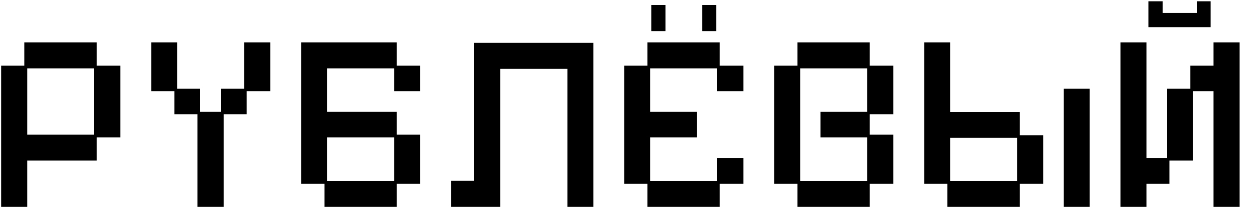
The Cyrillic is stylistically consistent with the Latin, but some designs raise
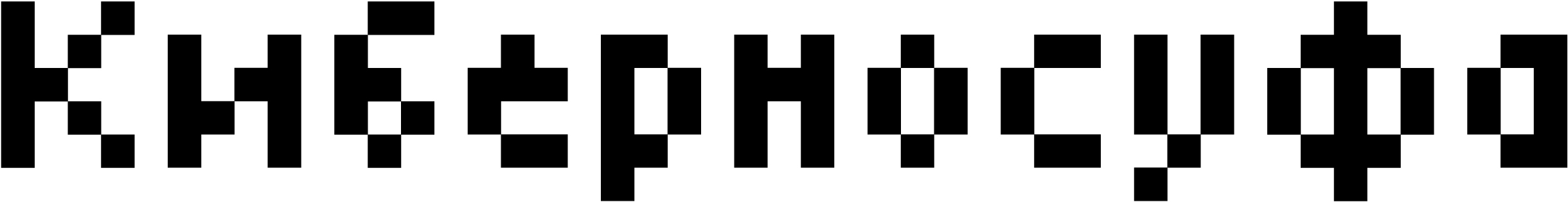
The central part of ж is too dark. This could be avoided by using two mirrored к.

Дд looks a bit out of place, as the glyphs lack this chessboard pixel pattern found in other glyphs.
Only context makes it possible to tell whether we’re dealing with з or э. The descender in Цц and Щщ lacks the shoulder (while Дд has one). The lowercase ы is split into two parts. The letters м and й, as well as the breve, look too wide.
The upper bowl in в is fused, while the author somehow managed to avoid similar solutions in the Latin character set. The lowercase г is overly wide.
Our advice
Tiny5 is a typeface with a distinctive concept in which the design is driven by technical constraints. In its Cyrillic set, these limitations have only been partially addressed, so the font should be used with caution.
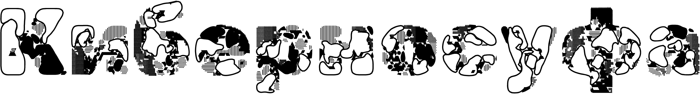
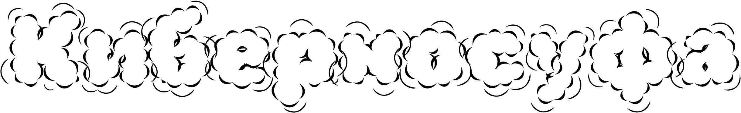
Rubik Generative Fonts
NaN, Luke Prowse
Generative Fonts is a collection of decorative fonts based on the skeleton of the Rubik. typeface.
Hands-on
Rubik, which we addressed in the series covering geometric sans serif typefaces, is used here in its heaviest weight (Black). Its contours have been modified using scripts, sometimes to the point of being unrecognisable. The nature of these transformations could be guessed from the name of each style.
Styles
Google Fonts features 26 out of 28 styles, excluding Goo and Sea Camouflage.
The character set and metrics of these decorative typefaces correspond to the basic Rubik Black.
Cyrillic
Our comments about Rubik in its heaviest weight also apply to this font’s Cyrillic, as well as its Latin set; however, this degree of contour transformation can conceal potential flaws in the design and detail.
Our advice
Rubik Generative Fonts is a huge collection. The typefaces included can be used for setting text in both Latin and Cyrillic. However, we would recommend reading our Rubik review before opting for one of the fonts generated based on its skeleton for your project.
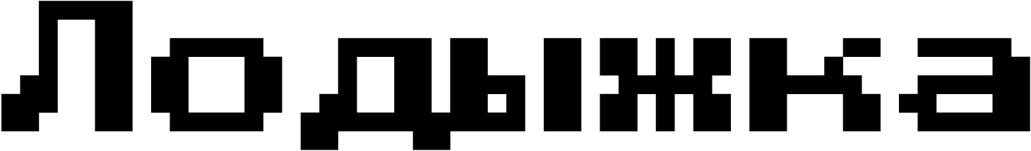
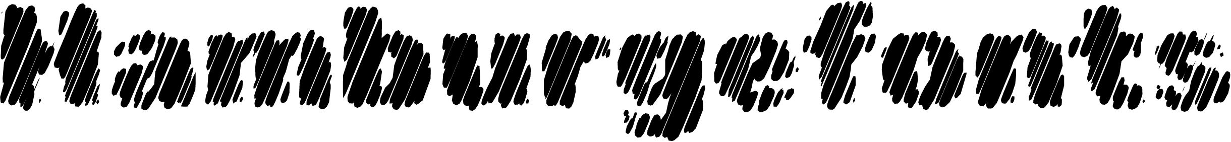
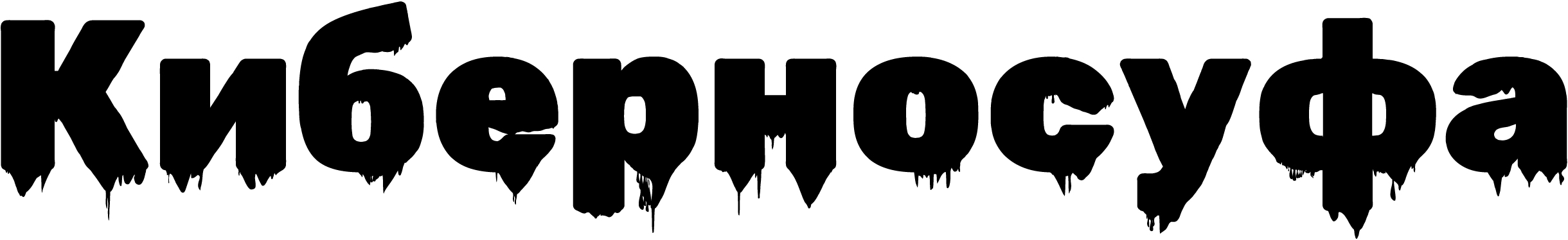
Ruslan Display
Oleg Snarsky, Denis Masharov, Vladimir Rabdu
Ruslan Display is a remake of a 1970s typeface by Oleg Snarsky, inspired by the semi-ustav writing style.

The original typeface by Snarsky was used in the signage of Kyiv’s Teremki underground station and is also featured in the 1979 book Typefaces-Alphabets for Advertising and Decorative Design Works.
Hands-on
This typeface rather represents a collective image of the 16th-century semi-ustav letterforms than replicates a specific historical writing style.

All Ruslan Display characters are single-case. The pronounced ductus logic and contrast, typical of a broad-nib pen, are appropriate for a typeface based on handwriting. However, Ruslan Display can hardly be called a true script font, as its handwritten letterforms have been reworked and generalised.
The glyphs are wide and

The letter spacing appears excessive, as if the text were set with positive

The typeface includes proportional figures, fractions (which look too light compared to basic numerals), a minimal set of currency signs and mathematical symbols.
Cyrillic
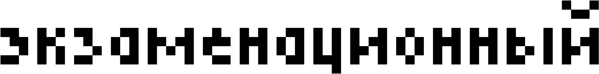
The Cyrillic set was designed based on Snarsky’s typeface, but his project didn’t cover Latin, and it was added by Denis Masharov and Vladimir Rabdu.
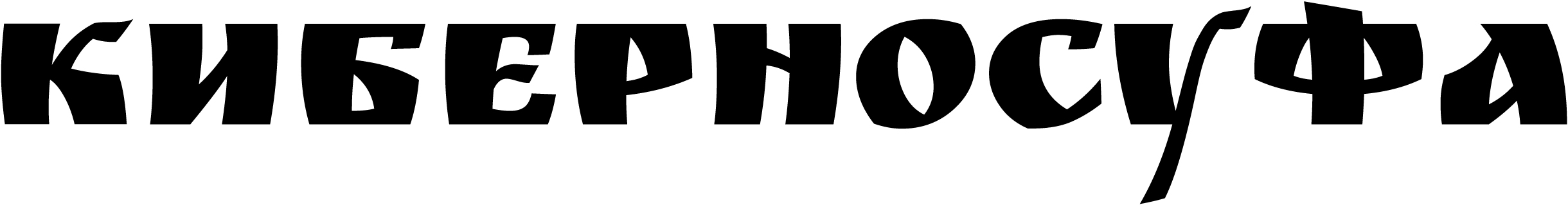
The setting is spongy and uneven: су sit close, while there is a gap between у and ф, ф and а.
Х is too light, with gaps on its sides. There is too much space between р and д. In Snarsky’s original typeface, Д is more distinctive and
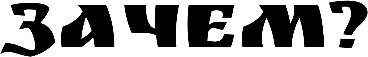
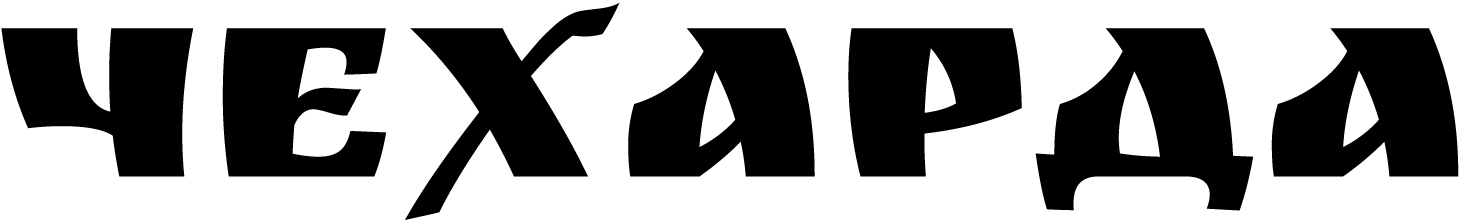
З is too light, as is the question mark. There is a noticeable gap between а and ч.
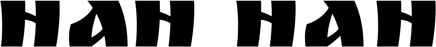
The sidebearings in а are clearly excessive. The sidebearing sizes in the Latin and Cyrillic glyphs are different.
The overall inconsistency of metrics and the significant differences in glyphs with similar details are a major flaw of the
Our advice
Ruslan Display is a second life given to a historical typeface. The prototype is a solid example of Soviet typography, while the digital version has its flaws. Therefore, the typeface requires careful use. When choosing Ruslan Display for your project, keep in mind that letter spacing in a headline typeset in this font may require some adjusting.