
Dasha, please tell us how you ended up in type design.
I am a designer by my main education. I studied at BHSAD while it was still located on Baumanskaya (Moscow metro station — translator’s note). There was an Ilya Ruderman’s course carried out next to me, where there was always something interesting happening. I remember how Yomar Augusto came with his workshop and he allowed them to add a couple of students from our group. I was one of those people. It was great. And I got very into all that. I realised that sooner or later I will definitely study type, and eventually I did. Though, before that there was calligraphy and other preparational steps which I invented for myself.
So, after design you studied from Ruderman?
Yes, and that was Ilya’s last course — we were the last ones who got it, we studied for one year instead of two. There just weren’t enough people willing to continue for the second year. It was very frustrating.
Had you somehow gone on with your education?
No, I hadn’t when it comes to type, and I don’t plan to. Now it is more interesting to me to do something in practice: you just do something, that’s way cooler. Whereas all the knowledge in this field is now available through YouTube and online lectures which there are plenty of right now.
Are you now working more as a type designer or a graphic designer?
Unfortunately, more as a graphic designer. At the same time, now I like working as a graphic designer, because I spend a lot of my time dealing with type, one way or another. After being around type environment long enough and learning to see important things about type, I started feeling myself differently as a graphic designer.
Would you recommend graphic designers to go through an additional course in type?
Probably not. I don’t think that any graphic designer needs to deeply immerse into all the details. But as for looking at type on any available social media more — that is definitely a thing you need to do.
Where do you work now?
At Strelka KB. Doing mostly presentations and books. But I came there not so long ago, about six months.
Do you often face the issue of choosing a typeface in your work?
At Strelka, rather no than yes. When I do something as a freelancer — clearly, yes. While KB has a quite cool library of fonts which are used, including those from the type.today’s collection. Plus, I do various sorts of things on Readymag, and I am quite enjoying that you can try lots of things.
Do you have any favourite fonts on type.today?
Stratos. Kazimir, obviously. Sometimes I enjoy using Dala Floda. Graphik is a workhorse. I have for many years been working with the Centre for Institutional Research of the Higher School of Economics; we visualise of large amounts of statistical data once every couple of months. My working tool in these tasks is Readymag, therefore I have an opportunity to use often and in different ways the typefaces from the type.today’s library.
Researching the distant learning experience at HSE, Moscow. Set in Nekst and Proto Grotesk
Researching postgraduated of HSE, Moscow. Set in Proto Grotesk
Visualising the history of HSE, Moscow. Set in Navigo and Spektra
At Strelka, I work a lot with Atlas, which is the main corporate typeface. We gradually moved from Univers.
Whom do you follow in the world’s industry?
I am trying to monitor nearly everything that is happening. After the most recent Typomania, I realised that I really like the guys working in France — they had their own separate corner there.
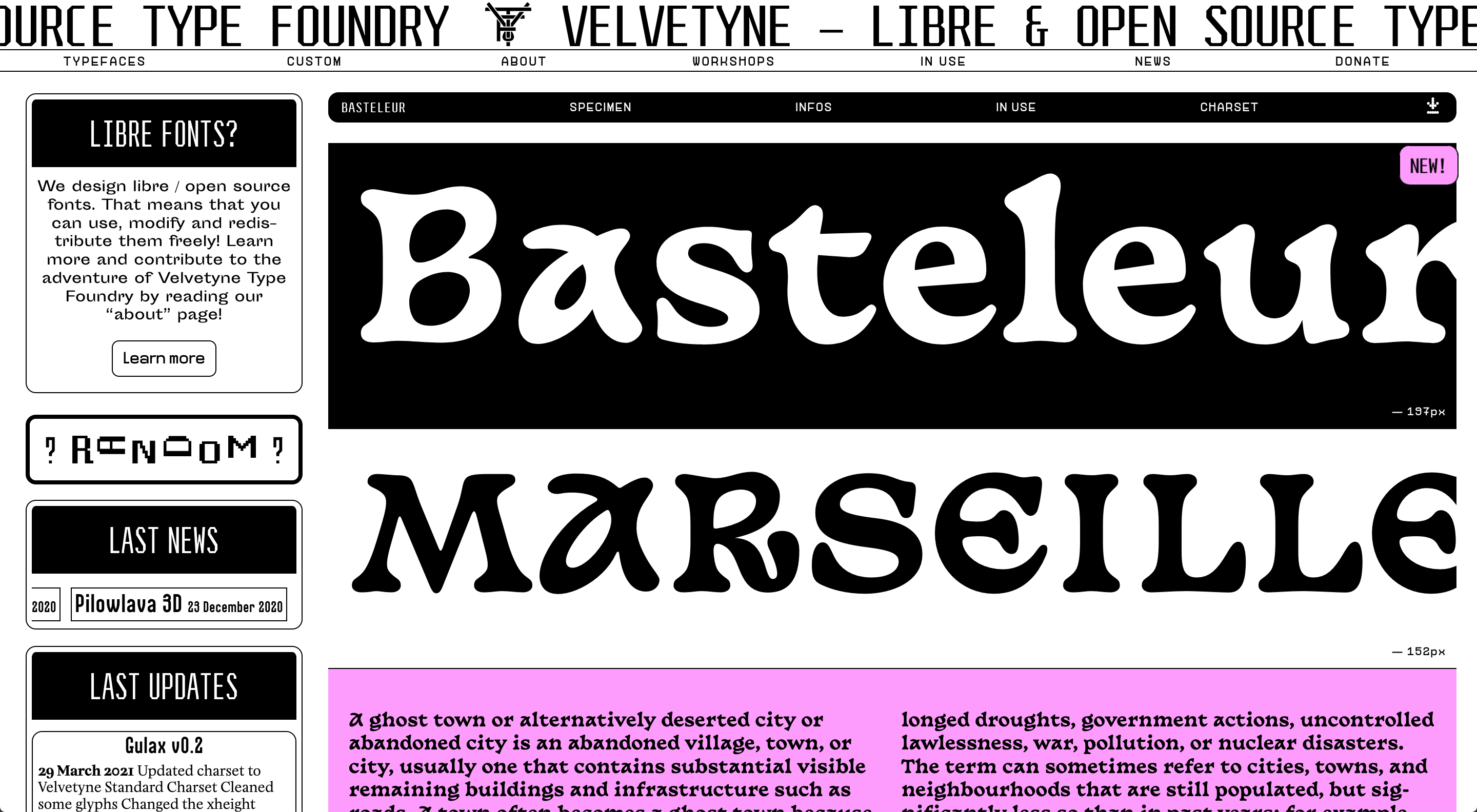
Velvetyne, a platform for weird type with free license


VJ Type foundry

bb-bureau, the studio of Benoît Bodhuin (the Journal did an interview with him)

Even without looking at specific labels, you immediately understand what they are about. They have great serifs, and I generally like serifs. I also like what is happening in Czech Republic: not only their type design is great, but graphic and industrial design as well. I came to Prague as a tourist, to look at a gingerbread town, and was totally unprepared for the fact that they have something other than that. It came to me out of nowhere: you slightly step outside of the touristic centre and run into great postmodernist architecture in rather large amounts. That is awfully inspiring. My separate love is the Kubista gallery that makes replicas of significant Czech industrial design objects.
And where do you tend to draw inspiration in general?
I wouldn’t say that I am inspired by something specific. It all starts from one graphic solution that I somehow find in the process of scribbles: for me, everything comes from lettering, it doesn’t work any other way. There is a certain mood that I want to convey, or a certain solution — for example, certain bizarre compensators, — I draw short lettering, and then develop this idea up to the typeface.
Is that how you came up with Flicker?
Yes, that is exactly how it was. Oddly enough, there is lots of my calligraphic experience at the heart of it: that is an understanding of how a tool works when you’re writing a letter, in those inktraps, where they should appear, and where they should not (we were having an argument on the subject with Yura Ostromentsky). Eventually it is a rather constructed typeface, but at the same time with a calligraphic understanding of the process. It all began from a regular style, I started developing it, the guys suggested finalising and releasing, and then I got an idea to make a second wild axis for a variable. I had for some time been looking for what there could be done, suggested options, but all of them were rejected. The waves appeared by an absolute accident. I kidded around and recorded a video with this variability and weight axis just to make fun, posted on Instagram and didn’t even show it to the guys. But Yura said ‘why not make it this way, what do you think?’ And that’s exactly what we did.
Is this all coding or manual work?
Manual. I took a straight letter and added extra anchor points to it which are not needed in the regular variant.
Have you seen the book about Letov by Maxim Semelyak? There is Flicker deployed on its cover.
I haven’t yet held it in my hands, but I saw the cover.

And So, It’s Hurricane. A ‘lyrical research’ of Yegor Letov, a key figure of Russian punk and counter-culture. Photo by Individuum publishing house
And what does it feel like?
Each time I see my typeface used, especially in a serious cool project, it feels great. It is particularly nice when it is not that someone you know is using it, but when your font was not chosen on purpose, but by accident. I once visited Strelka’s account on Readymag, because I needed to do something, and among unpublished projects there was a landing page with a huge Flicker-set text. I even decided to find out who did it. The most recent was a landing designed by Pavel Kedich about standard architecture in Minsk. That was such a case where everything is in its right place, everything fits — a designer whose works you often see and really respect, a favourite and interesting theme, and your typeface. What a delight!
M-464, The Indistinguishable Individuality, a webzine about a series of apartment buildings in Minsk, Belarus. Set in Flicker, SchoolBook, Suisse Intl. Designed by Pavel Kedich
Flicker has Greek…
Yes, it is not available on type.today, but it actually does have it.


Flicker Greek is available at request
Do you speak Greek?
I do. I’ve always been studying certain weird languages. I had for several years been studying Arabic, now I am learning Greek for the fourth year already.
Why?
Just for myself. I just like it. Each language is a system. I like system. You start to sort it out and understand how it works. Then you apply it in practice, and you are understood, and you understand others. You could never get used to that.
Some say that Cyrillic and Latin can be taught, while proper Greek letters can only be drawn by Greeks themselves. Is it a myth or reality?
I believe that’s a myth. You can learn anything. I don’t see the problem. Although, Greek is considerably different in terms of its plasticity. It has very smooth graphics — it is more handwritten and more gentle. It is hard enough to cyrillise Latin while preserving the spirit of the initial typeface, but with Greek this task gets ten times more difficult, because it brings in this smoothness and this softness. While I was designing Greek, I looked at a lot of different stuff from various other foundries. In the process I even talked to the type designer Vassilis Georgiou, he helped me a lot, and I thanked him with my typeface. I hope someday I will see it in use in Greek.
Is their situation similar to the one with Cyrillic, or Georgian, or is it better?
It’s probably worse than with Cyrillic, but better than with Georgian. I don’t dive deep into the subject — I follow at most four or five guys. There aren’t many type designers, less than we have. Yet they still have some action, and in the pre-COVID era there even were regular conferences held. But I follow at most four of five guys: Gerry Leonidas, Irene Vlachou, Kostas Bartsokas, Vassilis Georgiou, and Panos Haratzopoulos, who designed Greek for Commercial Type. Besides, there are design studios that work truly great with typography — for example, Beetroot Design, Saint of Athens, Semiotik Design Agency. Note for tourists: the city of Chania on the island of Crete has an entire Museum of Typography where there is a lot to see. Also, Cyprus hosts various kinds of small events organised by the local designers community: it is quite appealing that the line-up of their speakers is international — they invite designers from Turkey, the Balkans, the Middle East.

Irene Vlachou (iːriːniː vlaxuː) designed the Greek set of Stratos — it is with the version of the typeface on sale at type.today
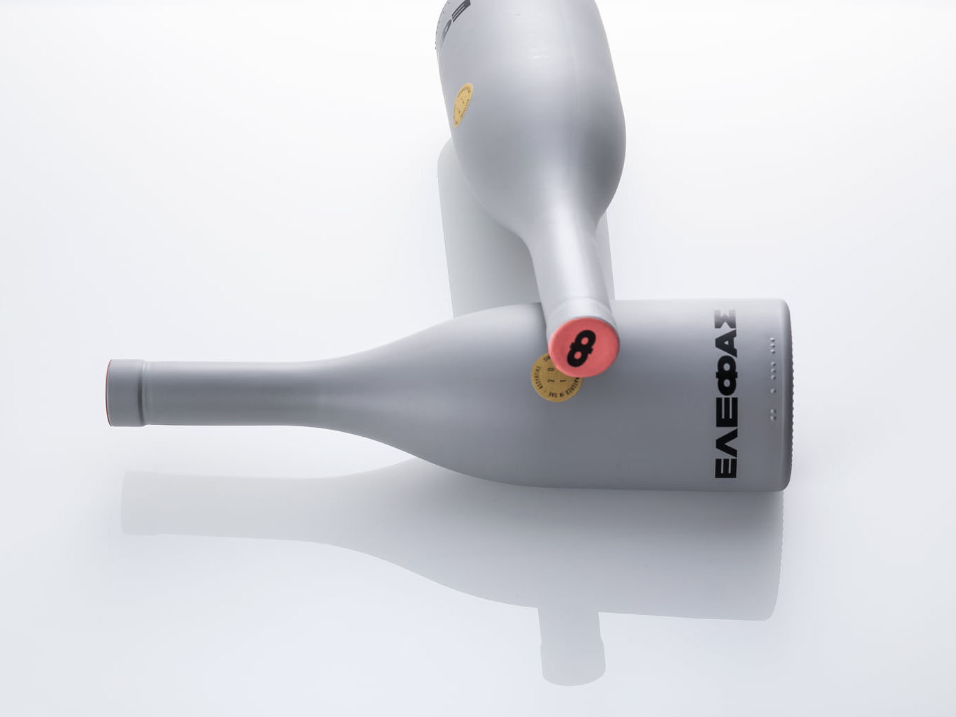


Packaging of Elephantos wine, designed by Saints of Athens
Does the fact that you tried designing Greek affect you as a type designer in other languages?
It rather doesn’t than it does. Anyway, it all begins from Latin, and you attach everything else to it. I sometimes draw lettering in Greek. It is quite difficult to understand how to supplement it with something else, you move the other way, backwards. It has rather binding graphics.
Do you do lettering for yourself?
Mostly for myself and, frankly, lately it happens not very often. I get commissions, too, — logos, other things.
Are you working on a typeface right now?
There is nothing that I regularly work on, but I have a million drafts lying around and waiting, or not waiting anymore. They just need to lie up for some time. I don’t have time for everything. How can I manage to do everything? I have a piece of a typeface that I began designing. There was a wonderful Museum of Industrial Culture in Moscow, in Kuzminki district, — a certain metal warehouse made of profile sheets that was stuffed with various kinds of Soviet junk, lots of things, including industrial design. They even had a light aircraft hanging under the roof. I went there about ten times, wandering around, endlessly examining those typewriters, old copymakers, phones — the whole package, all sorts of things. I took a lot of pictures there, among them was an old printing device from the 80s, with a cool logo. I started developing it, so now I have a draft for a typeface.


Wordmark on the printer, and drafts for a typeface based on it
Another typeface that I put aside, but will definitely complete, it all consists of strokes-pieces overlapping with each other, like you paint with a broad brush and constantly twist it. It is tubby and friendly. Another draft put aside is a calligraphic wide typeface based on flat brush writing. It was born because me and my friend and colleague Lyuda Sorokina had a lot of craft paper sheets in our workshop that we felt sorry to throw away. I wrote by brush on those, having just turned my mind off, — listening to where the tool will lead me. It turned out as this thing as if someone extended a minuscule in Photoshop and added a slight oriental feel to it.
All of those are still untitled. It is actually hard for me to come up with names: I come up with those, if needed, at the last minute, and they are probably not always good.
Flicker would have had no name, if you weren’t forced to introduce a variable effect?
Certainly. I simply had it stored in my New or Last folder.
Speaking of my unfinished projects, I would also like to mention Velvetta typeface — that is not an entire typeface but just figures. I always couldn’t stop thinking of how to use variability not in an obvious way of weights and slant, but functionally and differently. Velvetta is a reflection on the subject: I designed very pretentious uppercase figures and painted them from inside with stripes, a certain hatching with a variable axis applied to it. This hatching varies from a total absence (when curves in a glyph accurately stick into one another) to a wide ornament. The font file can be downloaded and used for free.
Are you planning to actively get back to type design, or do you like it this way — doing one thing by one hand, and another thing with another?
Yes, I like it everywhere, and I always get really carried away. I spent a lot of time thinking of the subject — meaning, I have to get myself together and do just one thing, — but then I relaxed. If that’s OK to me, that’s OK. I am also learning a little bit of coding. I started learning Python after having done training with Yura (Dasha took part in designing Loos Collection — editor’s note). I said to myself ‘Damn, that is a useful skill for automatising things and understanding what RoboFont tells you when everything goes wrong’.
Kerning Georgian glyphs in Loos
Is it open source?
Yes, you can specify your add-ons and extensions. But I’m simply interested in the process. I sit and try to figure out its logic. That is like a natural language, but coding. It is also quite systemic. Actually, a font is a system as well — one move applied many times.
You’ve prepared a large piece on NWT Bodoni for our journal, and you had to seriously dive deep into it in the process. Have you started noticing something new about it that you had not seen before? Have you changed your attitude towards it?
Sure. It was quite interesting. It was a great pleasure to do all this work. It is great that the work itself assumed different things. On the one hand, you go through archives and read analytic articles and reviews written before you. On the other hand, you do interviews, albeit short ones. On the third hand, you create illustrations using Illustrator and Figma. And then one thing overlaps with another. You answer certain questions for yourself and see how other designers, including large-scale ones, such as Zuzana Licko from Emigre, have answered the very same questions differently. This really helps you relax: you want this way — you do this way.
How would you characterise typography today?
That is plenty of things, depending on what perspective we look from. There is this relevant, modern, brisk, trendy — that’s what we see on Instagram, what our colleagues and small brands do. However, globally, if we look at large corporate giants, everything is still rather conservative. I don’t judge whether it is good or bad. Different sorts of typography are for different needs. And today it is quite diverse.
Do we really need such diversity?
We do. It is always a good thing to have a choice.
Some even start to criticise, like ‘why do we even need so many fonts?’
We have to relax a little bit. There are many fonts — OK. Actually, relaxation in type is a rather good practice.
Daria Zorkina
tomorrow.type.today/en/designer/zorkina/
instagram.com/inversiya/
behance.net/inversion/