
Typefaces of October, as chosen by TypeCache
Every day Shohei Itoh, Taro Yumiba, Akira Yoshino of TypeCache.com inform their followers of new typefaces released all over the world. Here’s their list of essential font releases this October:
 Astronef Super, published by Typofonderie. Pick by Akira Yoshino
 HW Atlantic, published by Heavyweight Digital Type Foundry. Pick by Akira Yoshino
 Feneon, published by
Teeline Fonts. Pick by Akira Yoshino
Feneon, published by
Teeline Fonts. Pick by Akira Yoshino
 Genath, published by Optimo. Pick by Taro Yumiba
 Higumin, published by Adobe. Pick by Taro Yumiba
 Orleans published by Commercial Type. Pick by Taro Yumiba
 Pleinair, published by Teeline Fonts. Pick by Akira Yoshino
 Right Gothic, published by Pangram Pangram Foundry. Pick by Taro Yumiba
 Roman Grotesque, published by Bureau Brut. Pick by Shohei Itoh
 Romek, published by The Designers Foundry. Pick by Shohei Itoh
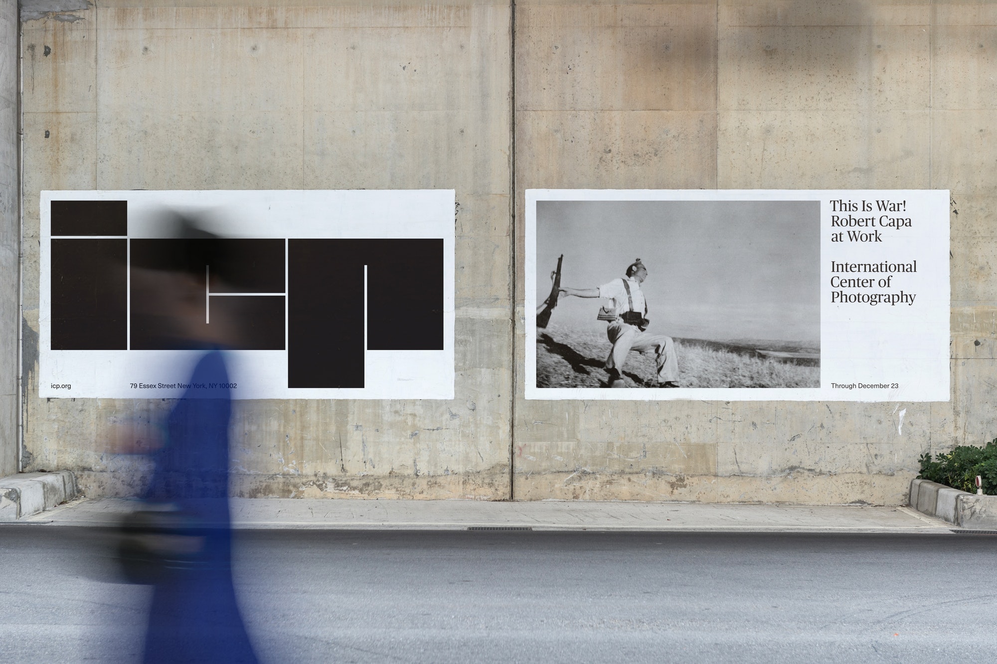
International Center of Photography
pentagram.com/work/international-center-of-photography-icp/
Pentagram designed an identity for the International Center of Photography based in New York. The new logo and corporate style are strict, super-black and highly variable; there is also a special software to generate different logo versions (similar to what SF Symphony have). Serif Publico, initially designed by Commercial Type for a Portuguese media of the same name, pairs Neue Haas Unica for body text setting.

Manual of Diacritics
Latin script is the best explored area in typography, yet it still has certain less untapped segments. Many European languages use diacritical signs, also known as accents, — and it is quite difficult for a non-speaker to master those, which is why in many typefaces these signs are designed incorrectly. Radek Sidun, co-founder of the Czech Briefcase Type Foundry, authored the Manual of Diacritics where he explores and systematises diacritic design experience in various type styles. A very useful and interesting read for those who don’t speak Turkish, Czech, or Norwegian, but want their typefaces to be utilised in those countries.

17 things you should know about stone carving
typeroom.eu/nicholas-benson-17-things-you-should-know-about-stone-carving/
Bad carving cannot ruin a great design, but good carving won’t save a bad one; perfectionism is relative; lighting is important; carving is not about brute force — and a few more revelations from Nicholas Benson, American stone carver with 30 years of experience.

Reversing Into the Future
eyeondesign.aiga.org/why-new-wave-graphics-are-the-most-influential-designs-youve-probably-ignored/
New wave is a music inspired by punk and David Bowie that emerged in the late 1970s and turned mainstream in the early 1980s. Graphic design (as well as the overall visual style) of the New Wave has always been provoking, mostly glamorous, but also very diverse and eclectic — influenced by Pop Art, International Style, punk, 1960s psychedelia, and lots of other things. In his new book and accompanying exhibition, Reversing Into the Future, Andrew Krivine presents hundreds of new wave designs ranging from Devo to Duran Duran, from Blondie to Heaven 17, from Peter Saville to Barney Bubbles.

We unlearn writing — what comes next?
eyeondesign.aiga.org/handwriting-is-dying-what-does-that-mean-for-design/
Humankind is forgetting how to write and to read handwritten letters, as there is barely any practical value in it today. A regular person uses someone else’s letters and tends the sense of a letterform. What these changes mean for typography and culture in general — as perceived by two design teachers, one philologist, and one lettering specialist.

Free fonts from the most educated designers
Atelier National de Recherche Typographique is not a type design school, but rather a type and typography research institute. Still, almost every research project at ANRT includes includes designing a typeface — some of those typefaces have now been made available for free. The most interesting one is Chaumont Script based on the lettering work by Chantal Jacquet, a sign painter from Chaumont in France.

Mic.com, redesigned
American political and cultural publication Mic (currently owned by Bustle Media Group) initially specialised in short videos for social media, but a few years ago made texts on the website their priority. In October, Mic carried out a redesign — now the website comes in a complicated, fancy layout, with lots of colour and loud typography (serif Sainte Colombe by Production Type, sans serif Obviously by OHno). A rare and interesting example of an online media that doesn’t seek to be reduced to black sans type on white background (as lots of media do).

Beeline, with a lower-cased b
facebook.com/contrastfoundry/posts/4852300158185546/
facebook.com/yuri.gordon/posts/4691964004171008/
facebook.com/groups/typeandtypography/posts/4386557814726651/
Beeline, a major Russian cellular network, is rebranding: a striped trademark turned sideways, the name is now written all lower-cased, and two bespoke typefaces designed at Contrast Foundry have replaced that weird, narrow slab serif. Beeline Sans, the main typeface, is a geometric sans serif with reverse contrast that gets particularly visible in heavier styles. The new informal and unexpected typeface now distinguishes Beeline from its competitors (at least when it comes to visual tone) — and clearly triggers lots of discussion, critique and hate.

Our new releases: Taler and four typefaces from DJR
type.today/en/journal/taler
type.today/en/journal/djr
type.today catalogue now features several works by David Johnathan Ross: Italian neogrotesque Forma DJR, futuristic Megazoid, monospaced (and pseudo-monospaced) Input and super-display, block-ish Fit. Besides, we released a new typeface by Denis Serebryakov, his steampunk serif Taler.
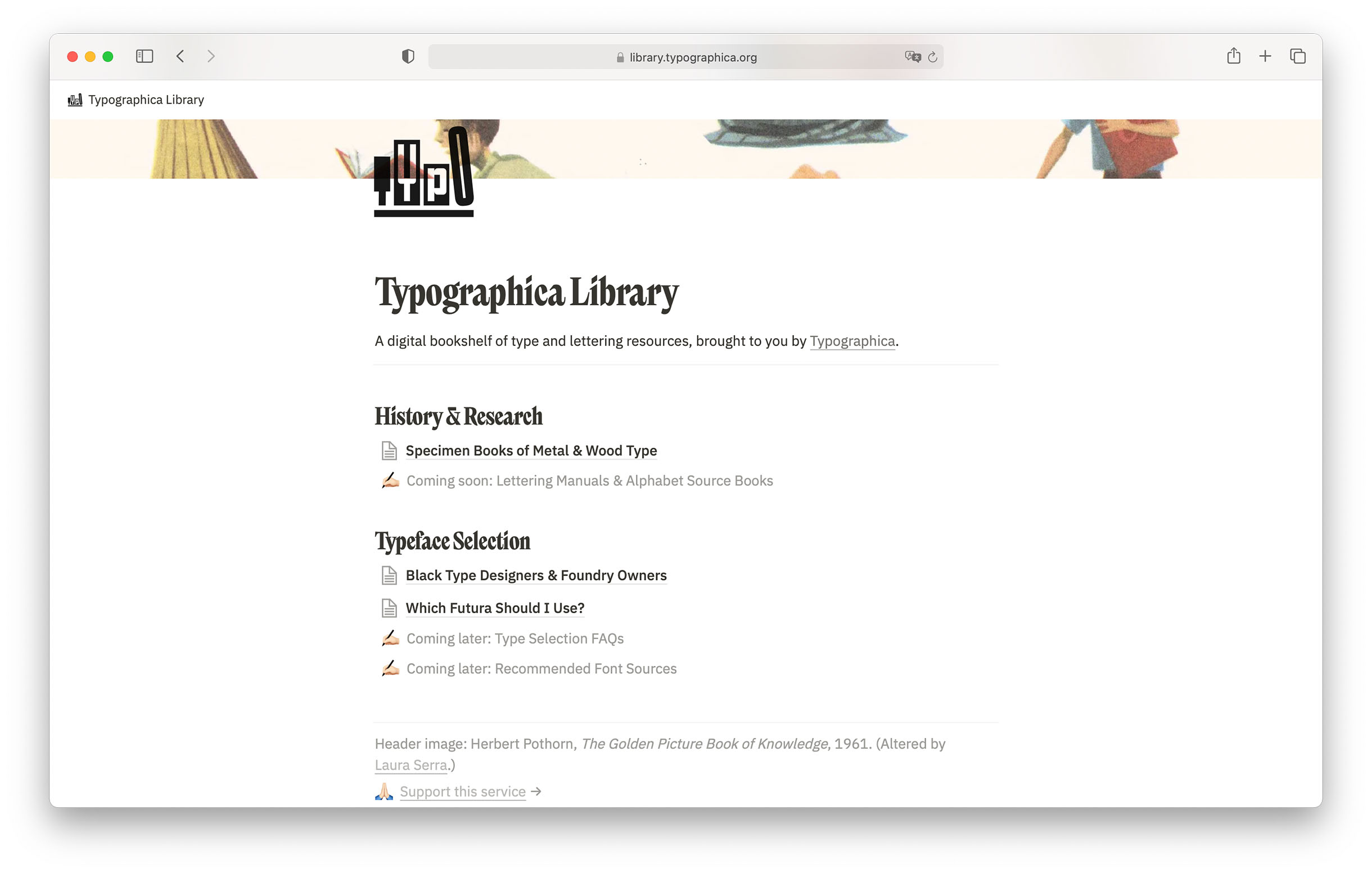
Typographica Library
Typographica is an annual publication of reviews on the most interesting type releases edited by Stephen Coles. In October, Typographica launched a library of educational type and lettering resources: it already offers a manual on which Futura to use, the list of black type designers and a huge collection of ancient type specimens. If you are interested in Cyrillic ancient specimens, authors of the Telegram channel ‘DIN who digested Helvetica’ brought together a number of links with those.

DeepVecFont
yizhiwang96.github.io/deepvecfont_homepage/
Yizhi Wang and Zhouhui Lian from Peking University developed a model for generating the whole alphabet based on several glyphs — authors claim that their product is the first to convincingly solve the task.
 Photo via projector.media
Vladimir Chaika, 1955–2021
youtube.com/watch?v=1brTS7orsDw/
Vladimir Chaika — graphic designer, poster artist, multiple winner of the Golden Bee (Biennale of Graphic Design), excellent teacher, — passed away. Sergey Rasskazov posted a video of one of Chaika’s talks that he filmed a few years ago.

Things you need to know about Monotype — as seen by independent designers
qz.com/2068310/what-monotypes-purchase-of-hoeflerco-means-to-font-designers/
What is Monotype, why this company acquires major type foundries, why it doesn’t produce anything fundamentally new (and why it is bad for the entire industry) — in a large and detailed article in Quartz (following the recent acquisition of Hoefler&Co).

ATypI, online and offline
atypi.org/home/atypi-all-over-2021/
An offline conference of the Association Typographique Internationale in Paris, initially planned for 2020, is now postponed for May 2023. The 2021 conference will be held online, from 2 to 4 December, the cheapest tickets cost $60.

CityMobil Sans
facebook.com/contrastfoundry/posts/4872635486152013/
Contrast Foundry designed a type system for CityMobil; this Russian brand offers taxi, courier and car sharing services and is owned by VK (former Mail.ru Group). The family comes in many widths, with the typefaces being sharp and technological, yet friendly.

‘Lepota’ (old Russian for ‘beauty’)
bangbangeducation.ru/movie/lepota/
A new film by Bang Bang Education has been shown in several Russian cities in October; the movie named Lepota explores Russian visual culture from the ancient to the present times. The film features 39 Russian designers and design studios — and has a beautiful website.
In October, our Instagram was ruled by Pavel Kedich
See all images of the month at #typetoday102021. In November, the account is taken over by Maxim Balabin.