
February in type, the TypeCache selection
Shohei Itoh, Akira Yoshino, Taro Yumiba keep daily track of world’s notable font releases at TypeCache.com. Here’s 10 most exciting typefaces released in February — in their knowledgeable opinion.
 Basel, published by Optimo. Pick by Akira Yoshino
 Dolph, published by Joona Louhi. Pick by Shohei Itoh
 Euclid Mono Vanguard, published by Swiss Typefaces. Pick by Taro Yumiba
 Kaligari, published by Franziska Weitgruber. Pick by Akira Yoshino
 Nysé, published by General Type Studio. Pick by Akira Yoshino
 Resonay, published by TypeMates. Pick by Shohei Itoh
 Sagittarius, published by Hoefler & Co. Pick by Akira Yoshino
 Sunset Gothic, published by Colophon Foundry. Pick by Taro Yumiba
 Widescreen, published by Dalton Maag. Pick by Taro Yumiba
 Yink, published by Eclectotype. Pick by Taro Yumiba

Audi, now the lord of variable rings
LucasFonts made a variable font for Audi, based on static styles, designed at Bold Monday in 2009. The use of the typeface is regulated by a brandbook, however not very strictly: designers are invited to get to know several key points and then play it by ear, without consulting a chart for each value. The rings in the Audi logo also became variable — their weight should change depending on size and parameters of the typeface next to it.
twitter.com/LucasFontsNews/status/1364945102486073349
audi.com/ci/en/intro/basics/typography.html

New toys in the Gimme toyshop
TypeArture updated their multi-chromatic Gimme — a state-of-the-art continuation of the display tradition of the 19th century — with two more crazy styles. Typeface made of playing cards, typeface made of marbles, typeface made of toy train are now complete with a typeface made of gamepads and a 3D construction kit typeface. Gimme is hard to describe and even harder to work with — the technology of multi-chromatic (let alone variable multi-chromatic) typefaces is still new and is not widely supported.
futurefonts.xyz/typearture/gimme/

How would you look at that?
A Swiss designer Julia Schäfer in collaboration with Yale’s Haskins Lab investigated eye movement while reading letters and produced a zine with resulting images. The team based their research on the work of the pioneer of eye-tracking Alfred Yarbus — this Soviet scientist came out with the technique of tracking eye movement and revealed that the pupils are rarely stationary and constantly jump around from point to point, primarily focusing on the interesting details. Schäfer set up three experiments. In the first ome, she closely examined each glyph of Helvetica. In the second experiment, components of each letter were subtracted so only certain parts of each letter remained visible. In the final experiment, the letters were drawn with eyes on a dot grid. The first two experiments resulted in registering eye movements, while the third produced a heat map. Besides, Julia developed a typeface out of the points on which our eye fixates the most in each letter.
typeroom.eu/can-you-design-a-typeface-with-your-very-own-eyes-julia-schafer-explains

SF Symphony: forte-piano
Collins agency presented new identity for the San Francisco Symphony orchestra. The center of the system is the variable typography designed and developed at Dinamo. Jumpy, stretching letters refer to the dynamic range of the sound (check their demo page) and make you think of Dadaists — hundred years later, their fooling around, once perceived provocative, now appears somewhat respectable. As shown on the project’s webpage, the typeface doesn’t get lost and effectively defines the brand in various graphic environments. For serial production of spectacular compositions, Dinamo developed a handy graphic interface.
wearecollins.com/work/sf-symphony/

Squaring the round, rounding the square
Yet another ultimatistic typeface from Bureau Brut — this time with extremely full circles, which makes the texture restless and bubbling.
bureaubrut.com/en/product/round/

Bruce Blackburn (1938 — 2021)
Bruce Blackburn, who created the famous ‘worm’ NASA’s logotype, died on February 1st. His design firm Danne & Blackburn was approached to rebrand NASA’s classic logo when it was barely a year old — the new logo was introduced by NASA a year later and was dropped only in 1992, a few years after the Challenger explosion. Blackburn was offended by the decision to get back to the original round, ‘meatball’ logo — and was happy to find out that his design would appear on a SpaceX rocket — this happened last year. The designer’s another big federal commission was creating the symbol for the American Revolution Bicentennial celebration that was used everywhere across the country in 1976.
nytimes.com/2021/02/18/us/bruce-blackburn-dead.html
![]()
The history of fat
Bold and fat typefaces appeared as a result of economic and political revolutions of the 18th century, which coincided with the arrival of printed posters, — before that there was no massive demand for loud display styles. Increasingly bold, contrast and fanciful typefaces were trendy until the middle of the 19th century — then came the age of slab and sans-serifs, and for a while fat faces had even been considered a mauvais ton. More details on the subject to be found in the illustrated lecture of Sébastien Morlighem on Type@Cooper’s Vimeo.
Fonte Brasil
Brasil-based Plau designed a super-eclectic variable font for the cable TV channel Canal Brasil. Each glyph is available in three widths and two styles: the font’s regular version is an old-school squared sans serif, while in its ‘expressive’ variant the typeface is — well, you name it, from Cooper Bold to art déco, NASA-like geometry, ‘Italian’ reverse contrast, or the above-mentioned fat faces.
behance.net/gallery/112708379/Canal-Brasil-Custom-Font

Gutenberg’s Demon
The novel Gutenberg’s Apprentice, turning the invention of European movable-type printing press into a fascinating, nearly detective, story, is now available in Russian. The book was published by Moscow-based Demon Press; in an interview to TypeJournal, Sergey Besov, who heads the print shop, tells how he embarked on the inaugural publishing project, why they needed an exclusive typeface — and how complicated and beautiful books will always stay relevant.
typejournal.ru/articles/demon-press
Geometric sans on Google Fonts, our review
The new episode of our series reviewing Cyrillic on Google Fonts: this time we’re discovering bizarre, wild, unrefined, and acceptable geometric sans.

Reading MATD 2020
12 projects of the University of Reading’s MA Type Design graduates. Most designers worked with several writing systems — here Cyrillic, Hebrew, Devanagari, Limbu, Arabic, Ethiopic, Greek are not only compliant with Latin, but in some cases even take the lead.

Hurry up to take part in Olivetti contest
The Italian brand Olivetti (which once produced iconic typewriters) announced a type design contest for students. Technically speaking, it is a contest of type ideas — in theory you can submit only five symbols accompanied by a short presentation of your concept. Entry is free of charge, the three best participants will be awarded a cash prize and an internship at a type design studio. An application should be submitted on behalf of your academic curator — better to address them right now, as tomorrow, 5 February, is the last day of accepting applications. The graphic materials are to be submitted till 16 April.
olivetti.com/it/corporate/olivetti-design-contest/2020/bando

Work of font engineers, explained by Monotype
Typefaces are more than just graphic design — it is delivered to users as a small but complex font file that should work error-free. And this is the responsibility of font engineers: they take over work from designers, sort everything out, test, adjust, test again, and try to refine and perfect the tool. Read about the hard work of font engineers in Monotype’s article.
monotype.com/resources/expertise/font-engineering-explained

The new old tomorrow.type.today
As soon as Tomorrow has launched a new Instagram, the service restored its old account (no explanation concerning the months-long ban was provided). Follow us on @tomorrow.type.today — we hope this time it will last.
instagram.com/tomorrow.type.today/
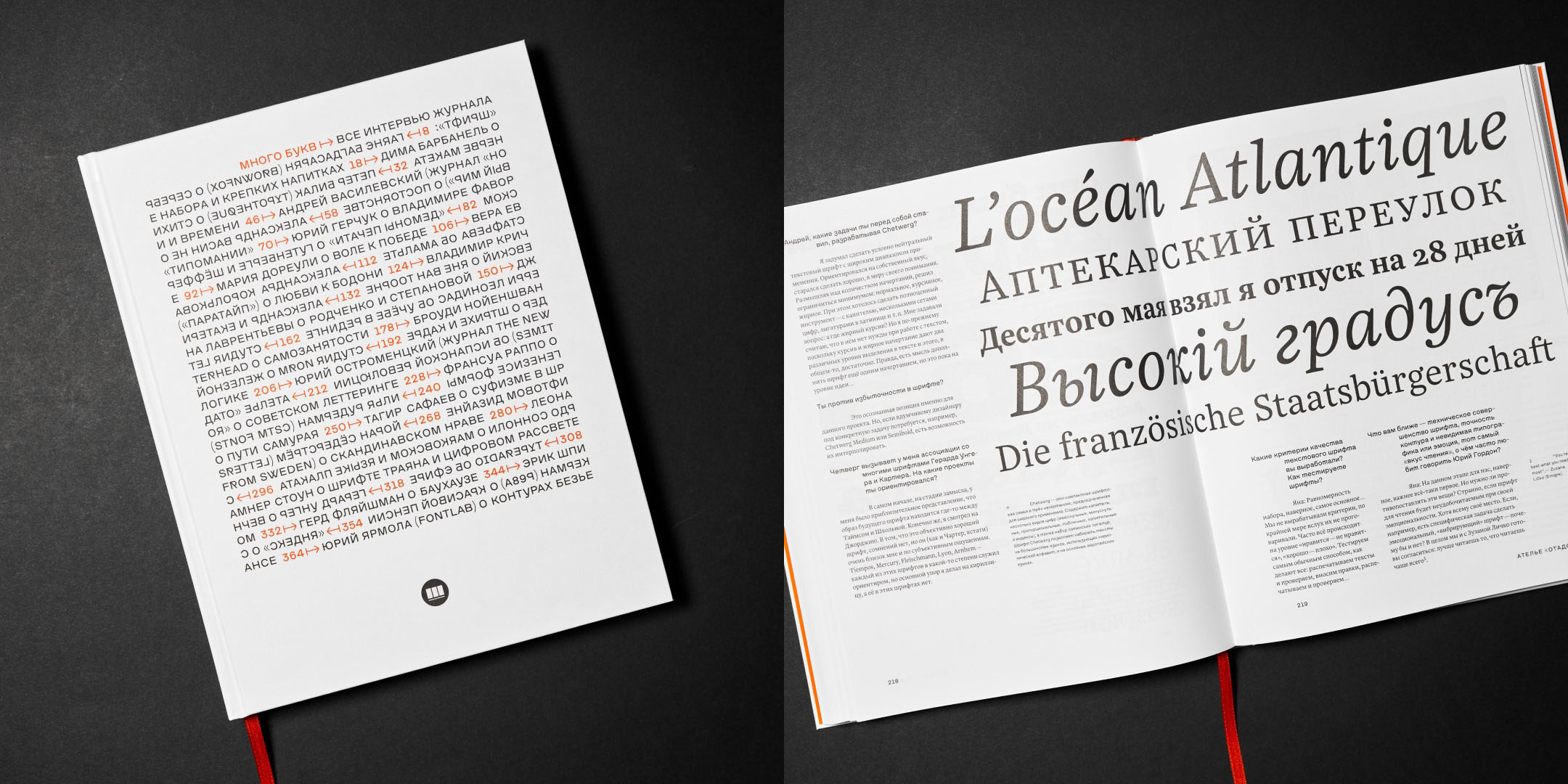
Lots of letters
Schrift publishers printed a book Mnogo Bukv (Lots of Letters): 25 conversations with type designers, earlier published at TypeJournal. It is a large edition with tons of typographic illustration — first copies have already been sent to the crowdfunders (who managed to raise some $7000 for the project). The book will be soon available in the Schrift webstore.

Early Cyrillic script, today
The annual exhibition called Russian Writing: Tradition and Experiment closed in Moscow. The event reminds us that the early, pre-18th-century Cyrillic forms are still alive and continue to evolve — alongside the typography that we call and consider modern. If you have missed the Moscow exhibition, there’s a chance to catch up by visiting Tula — there, the event opens on 5 March, and on 6 March it will host a workshop on ligature script and a lecture on the current state of the Russian writing. The next stops are Ryazan and St. Petersburg. Speaking of Russian letterforms, pre-Petrine writing is the theme of a new project at CSTM Fonts, check our Telegram for more details (in Russian).
- Yury Ostromentsky
- type.today
My first wow: that’s pretty cool that, after a long period of stagnation, we once again started experimenting with early Cyrillic letterforms. It really needs it. Time to get it out of the closet! My second wow: We witnessed that early Cyrillic forms are no worse than the very same European blackletter, and in some ways even clearer, sharper, trendier. At the risk of sounding naive, I believe that this writing has a big and great future. All we need is to stop feeling embarrassed about it.

In February Ira Bykova designed 28 great logos using our typefaces. Just wow!
You can check all Ira’s works using hashtag #typetoday022021. In March, our Instagram will be run by Roma Belyakov, please welcome.