
Ilya Ruderman: Until now, we have entrusted our Instagram either to our friends or to those whose work we’ve been following for a long time. As for you, we barely knew anything about you; in fact, this is our first proper conversation. It would be great if you could say a few words about yourself. How do you see yourself? What is the most important experience for you as a professional? What fascinates you?
Kirill Martianov: Our acquaintance and my participation in your Instagram was a matter of chance. I’ve been closely following Yury’s projects and yours for a long time – I think it’s a must for any professional graphic or type designer in Russia. When I saw your call to charge type.today Instagram I wrote to Yury that I can’t wait to take part in this project, even though I didn’t realize the scope of responsibility… or anything at all. I simply wrote to him because I wanted to collaborate with you on something… Because I admire you so much, and I think you’ve done so much for the industry, both in type design and graphic design.
I’ll have been working in this field for eight years. At the moment I’m the art director at BBDO Branding. This is my day job, as they say. Apart from that, I work with Eugene Yukechev (Editor’s note: editor-in-chief of Shrift, an online journal on type design), collaborating on various projects for the Shrift journal. I designed their website. In addition to graphic design, I do web and motion design sometimes, as well as lettering. That is, anything and everything related to graphic design.
IR: Where did you study?
KM: I did not get a proper education. I’m from St. Petersburg originally.
IR: Do you live in Moscow now?
KM: Yes, I’ve been here for about seven years. Once I started working in design, I moved to Moscow almost immediately.
IR: One of our mutual acquaintances mentioned that you took a course at Barbanel’s school, Campus.
KM: I did. I met Dima [Barbanel] when Campus was just about to launch; they were finalizing its concept. I lived in St. Petersburg back then, and that was where we met. I made a small contribution to his Russian language textbook project, which is now available at Masterskaya’s website. After that, we became friends, and I came to work with him in Moscow. Eventually, I enrolled on the Campus program and completed it. We were quite close for a while. When it comes to professional skills, Campus can be regarded as a full-fledged design school. Apart from that, I’m an autodidact.
IR: All right, I think I get the picture. Let’s get closer to the point now. We gave you some time to prepare, and then the project took off. Could you describe how that made you feel? What kind of emotions did you experience? Aside from the fact that you had to start off on January 1, which was closely followed by post-holiday pressing deadlines…
KM: That’s right.
I remember our email communication early in December, and my first reaction was “Wow, how cool is that? I finally get to show what I can do!” But we all know that December is the most trying month for every designer – for everyone in the industry – so I might have overestimated my resources when I thought I would be able to prepare some of the pictures in advance. I only had time to come up with two pictures over the rest of December and had to work on other items in January, one picture per day. I had been following your Instagram earlier and had seen Esh Gruppa guys in charge, so I had a general idea of what was expected but without the slightest clue how to go about it. Starting from the very first, introductory picture, “Hello,” the format was a mystery to me – and so it remained until the very last day.

I don’t know if it was apparent, but I treated each picture as an experiment. At some point, I came to realize that I lacked preparation, but the absence of a consistent plan was in fact a good thing. The core idea of my work revolved around type as the protagonist, so I was trying to show it in as much detail as possible – how it worked in a large or in a small size. However, the primary focus of my experiments was the format itself – an Instagram account. Besides, after this experience, I revived my own Instagram account and started updating it again – my previous update had been four years ago. I didn’t regard Instagram as a communication channel; however, I now feel it has something special to offer. I kept testing, analyzing how long it took me to process a picture, to come up with feedback; I asked my friends how much time they normally spent on a designer image. From this perspective, I was thrilled with the idea of experimenting with fonts in Instagram. That is, I varied the scope of information and tried to make images easier to understand.
There are several pictures (e.g. Toothbrush and Yellow Roller) that are self-explanatory, and the audience’s reaction to them is quite predictable too. I liked adding a Banksy-esque touch to some of my works. They are easy to understand; as could be expected, they got more likes than other works.
 Toothbrush (Щётка).
 Yellow Roller
I’m probably getting ahead of things, because likes are a whole other story. I wanted to analyze the number of likes. To be more exact, I was after people’s reaction to what I did and whether I could forecast it – and likes provided this kind of feedback. Whenever I posted more complex works that required a more thorough approach, I could see they were not getting this kind of feedback, so I could forecast that too. It was with the medium that I experimented most of all. It was at the heart of my work. Apart from the medium, I was interested in showcasing some of my techniques, demonstrating what I’m capable of.
IR: Design techniques?
KM: Yes. Above all, I wanted to make each picture as interesting for myself – and potentially, for the audience – as possible. However, I also enjoyed trying out new techniques, something I’m not yet accustomed to, like 3D. Something I can do, technically, but have yet to master. Unfortunately, I did not have much luck with video. I had no time to experiment with it, for instance, the way DIA Studio designers do it, if you know who they are…
IR: Sure.
KM: They are completely out of this world. And I hoped to do something similar as well – without the augmented reality component, just things they render in videos. But then January came, and it was a nightmare. I work at BBDO and normally run three or four projects of my own in the background. However, I always remembered to update your Instagram every day.
IR: How labor-consuming was an average picture? How difficult were they to create? How much time did you dedicate to them?
KM: It varied. The ones that got the most likes had taken the least time to create (it was quite natural). That is, the entire process – the emergence of the idea, the development of technical means, and its realization – took me about 20 minutes at the most. As examples of such works, I can give you Toothbrush or Red Earphones.
By contrast, other pictures took an entire day to complete, for instance, Not an Old Lady’s Apartment, which I’m really fond of, because that was when I was looking for an apartment myself.
 Ne babushkin variant (not an old lady’s apartment) – a common phrase used by Russian realtors to indicate non-Soviet-style interior design.
IR: Let’s move on to typefaces. I presume that, working on an image, you kept hesitating, weighing different typefaces of the collection to find the one that suits best – the one that matches your idea and the image. Could you say a few words about your general impression of the collection or any particular typefaces? Naturally, I’m not after your opinion on each and every typeface, but I was wondering if you might have found any favorites. Or, by contrast, if there was a typeface you thought of using multiple times, but it never worked out in the end. It can go either way. A typeface is a tool; so how did you try one out?
KM: There are two approaches. The first approach is starting off with an idea in your head and looking for a typeface to match it. Alternatively, you start off with a blank mind, open the folder, and study the typeface’s plasticity and imagery, trying to distill an idea from it. This is how I arrived at my favorite Socrates’ quote about the youth… At some point, my eyes fell on CSTM Xprmntl 01, and I thought: “Oh my god, this is it! This is a perfect match!”
 The quote, although often attributed to Socrates, is nowhere to be found in any classical Greek text.
When working on a layout – when selecting a typeface – a graphic designer has a serious objective: they need to get a truly profound feel of the image and then select a typeface according to the image. It is a momentous technique; a crucial skill. In other words, it’s not about juggling typefaces, opting for Graphik now and for Stratos another time. What you need to do is shape the image, understand its context, and then proceed to selecting the typeface. Of course, that was not the case with this project. The reason why I say “of course” is that I quickly realized: Instagram is a medium where such nuances are irrelevant… I tried this approach a couple of times but, for some reason, had the impression that Instagram required a different one. For instance, when working on the Marlene Grande post, I took two striped surfaces – with vertical and horizontal lines – and focused on the stark contrast between the soft curves of letter K, inherent to this typeface, and this absolutely geometric plasticity. The plasticity of this image is very exquisite, very fluid and sublime. For me, it was the highest level of typeface analysis in these terms.

I had a lot of fun transforming Pilar into a Soviet-style wall storage unit. It was in “Not an Old Lady’s Apartment,” where I rendered it in gold. The color was an allusion to various glittery things you can find in such storage units. Gilded handles and knobs – this kind of aesthetic. I thought sticking Pilar into it would be a great idea because it looks like it doesn’t belong. I felt a great urge to use it in that picture.
Naturally, I was very tempted to overuse Dala Floda, for instance. It had just been released back then, and it was a milestone for me, a sensation. Cyrillization, especially when done right, with those bold italics, is a fantastic sight. This was the typeface I started with in “The Toothbrush,” because Dala Floda totally captivated me. In good times, I tried to disengage from the nature of the typeface. I focused on connecting to my Instagram audience and getting more likes rather than on the typeface itself. I realize it’s not the best way of treating and perceiving type design, but that’s what worked for me in this medium. I work with your typefaces all the time; at BBDO, we use them on a regular basis. I say: “Look, we need to buy this one too,” and it appears that we’ll end up buying your entire library. However, my objective within this project was to provide entertainment. As I was working on a picture with Valery Golyzhenkov’s First Prize, as I was spreading out those letters, it occurred to me, “What on earth am I doing? Who am I to take these vertical strokes and distort them and then take those wonderful alternate glyphs and distort them as well?” But then I came to a conclusion that Instagram is a different paradigm, so I treated this typeface as a picture, a graphic image.

For instance, whenever I found myself without an idea, I would take the shape of letters as a starting point rather than the general feel of the typeface. I would open a typeface and browse its entire range of alternate glyphs, paying attention to their shapes and looking for ideas.
IR: What other posts or pictures, apart from the ones you named, do you consider to be a success?
KM: I’m very fond of “Cash Rules Everything Around Me.” This item is completely devoid of meaning, but from the visual perspective, this slender Giorgio Sans and the random fragments of gold… It was one of the pictures that did not take long to make, but I find it very beautiful.


IR: I’d also like to mention Kazimir with oriental patterns…
KM: I was expecting it, yes. Sure.
IR: I think it was severely underappreciated. In fact, I’m convinced it only happened because you posted it around 10 or 11 pm, when no one was around to see it. It is gorgeous.

KM: I have a few archives of old type foundries. Right now I can’t remember how I came across them. I love the 1920s’ and 1930s’ typefaces. I have an entire collection of French and Dutch faces cataloged by year. So when I looked at them, I thought Kazimir would work perfectly in such an environment; it would have done well in an old Dutch foundry.
IR: Our followers gave a warm reception to the picture with earphones, but you haven’t even mentioned it.

KM: I was going to say a few words about it later. I’m not really sure why you say it was well-received. From where I’m standing, it wasn’t received well enough.
IR: Were you hoping for more?
KM: Much more. I have a good friend, Sasha Bankin; we’re colleagues at BBDO. He knew I was making pictures for your Instagram. One evening at work, as I was working on the picture, he was passing by and saw me add the final touch. So he comes up to me and says: “Look at that! It’s easily the best thing you have ever done! It’s out of this world!”
IR: I also liked your greeting post with Karloff. And the video with Trola – it kept me hooked for a long time.
KM: The Trola video was born back when I’d just got in contact with Yury and he wanted me to come up with a few trial items. I had a couple ideas at the time, so I got down to it… And it took me about three days, with the assistance of the guy who is teaching me 3D skills. Initially, I thought of using both motion typography and Processing, which I’ve been trying to master for some time. In hindsight, I realize that DrawBot is a better option than Processing. It was another major experiment for me. When you’re experimenting in your sketchbook, it’s one thing; but when you get the floor and take the liberty to experiment in this environment, it’s a whole other story. I think it was a fantastic experience. That is, you just let yourself go and try out things you aren’t entirely sure of.
Another thing this experiment made me realize is the importance of noises. I’m obsessed with various noises. All that month, I kept playing around with all sorts of them. I always felt like adding a noisy texture to every level, to attain contrast by adding smaller or larger grain. It was one of my ongoing experiments starting from the very first picture, “Hello.” Another favorite of mine is “XYZ”; I believe it got quite a few likes as well.


IR: It was Amalta, a fantastic typeface. I sincerely think it is the best typeface that has been created by a Russian type designer for decades on end. Its plasticity and graphics are pure genius. No matter where we use Amalta, it never falls short of our expectations. At the very least, our Instagram followers have been giving it a perfect reception.
KM: It was one of the first typefaces that I bought as soon as it was released – which was about five years ago, I believe.
IR: Earlier. It came out in 2010.
KM: In 2010, I started buying typefaces systematically instead of trying to find them somewhere. I remember purchasing Amalta, and I also bought a number of Gordon’s typefaces. Amalta is the typeface that made me realize I was ready to pay any money for something this good, so I finally became a conscious typeface user.
IR: As you may guess, being a type designer, I hardly ever buy typefaces. It’s often easier for me to create a new typeface or to select one from my own collection. And yet, ever since Vera started releasing her own typefaces, I have bought every single one of her creations. I haven’t been doing it for practical purposes. It is akin to collecting beautiful books or any other objects of aesthetic value. There is a fine typeface called Dulcinea – a vertical italic face, even slanted a bit backwards. When Vera released Dulcinea, I think I was among the first ones to buy it. I purchased it as soon as I saw it.
KM: It was similar for me with Amalta. Since I bought it seven years ago, I haven’t used it in a single project. But whenever I have a project that requires display typefaces and typographic expression, I never miss a chance to try and use Amalta.
A while ago, I read an interview with Vanya Velichko. He was talking about a cover for Prime Russian Magazine, for an issue dedicated to stupidity. He presented a draft cover to the editor – a section of a typical Soviet concrete fence and a unicorn stuck in it. The editor says: “Vanya, what is it?” He answers: “Are we doing an issue on stupidity?” “That’s right.” “So here’s the cover for you – a unicorn stuck in a fence.” When speaking about that cover, Vanya made a very salient point – he said that the unicorn stuck in a concrete fence had been a true act of creation for him.
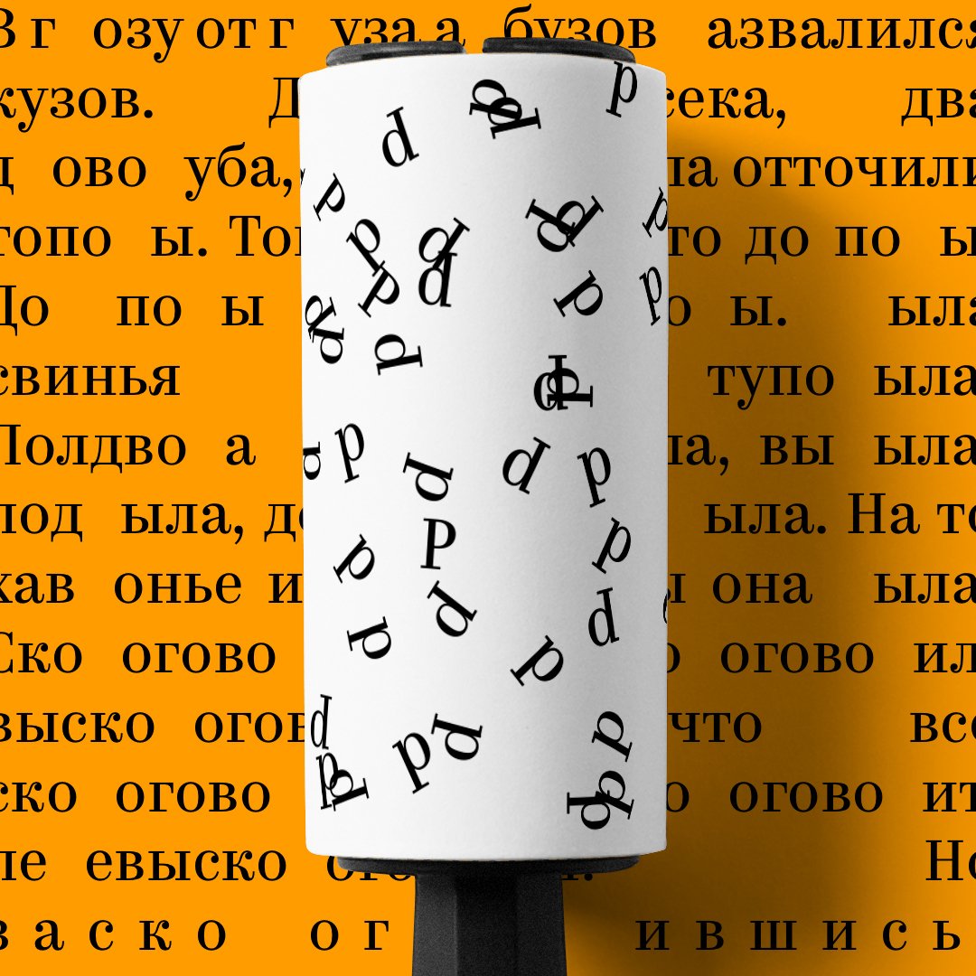
Besides, I’m not sure anyone realized what I was trying to say in “The Yellow Roller.” The roller is removing Russian letters R from the background text, which is in fact a tongue twister for people who cannot pronounce this sound correctly.
I really appreciated what you said in the very beginning: we might dislike certain things, but we won’t interfere unless the situation is critical. Giving complete freedom to your collaborators is great. However, this freedom comes with a big responsibility, because type.today has a certain weight in the industry. You cannot afford to post any half-baked items. And when this combination of freedom and inner responsibility gave birth to a few instances of pure creativity, it was breathtaking. I’m infinitely grateful for this opportunity because it was a truly extraordinary experience.
IR: I’m going to share my own conclusion too. According to you, only a few pictures were a success. But a month is not a long time, and you managed to create a dozen and a half of stunning works. It is quite an accomplishment, especially considering the pressure you were under. So if you managed to benefit from this experiment and enjoy it, we could not be happier. We could take a break now and return next year with a new experiment.
KM: It would be my pleasure.
P.S. Later on we asked Kirill for feedback about CSTM Xprmntl 01, which was the key part of a campaign BBDO created for MTS Russia.
IR: Why would you use our, indeed rather experimental, font face in a campaign for MTS – a large company with little taste for experiment?
KM: There is a large company MTS and then there are their youth-oriented products–a subscription plan called Hype etc. We had to develop a style for that. We researched into what young people watch, what is their visual environment–it was sort of a metamodern one. And then Sergei Yurkevich came up with this wild idea to use Xprmntl.
We presented it with a slideshow, which quoted Husky (russian hip-hop artist), among other things. Unfortunately, the thing is now under NDA.
IR: How would you convince MTS into using it?
Sergei Yurkevich: It was accepted as a possible option right away, although we’d had our argument about using contextual alternates and their readability. That is why we offered Gilroy as a pair for longer texts. We even had to change the typeface in MTS logo with one based on Klvika which was designed ten years ago or so. The usual logo didn’t look too well with Xprmntl.
KM: In fact, it was Xprmntl which made MTS change their logo! Which I find rather cool.
IR: In the end, how do the designers and the client feel about the result?
SY: All quite glad! The client is being adressed comments about how cool the pictures are, as apart from usual ‘Where is my money, you scam!’ Designers have this simple, yet efficient instrument. You can now take any picture, drop a red overlay, add Xprmntl, your layout ready.


