
Mila, Yulia, Yana, Holystick studio — what is it?
Mila: We are three graphic designers with different backgrounds who realised that it felt comfortable for the three of us to work together.
Yana: Me and Mila, we met at BHSAD in a class on short videos, where we got from different programmes: I was studying in the British BA programme, Mila was a student with the Russian further education programme. We had spent a long time beating around the bush before we launched a studio together; when we finally got together, we started doing pretty well.
Mila: I got enrolled at the British Higher School of Design in 2013, before that I worked in finance (according to my first degree, I’m a lawyer). After having completed Boris Trofimov’s workshop, I was engaged as a freelancer in a number of various, both big and small, projects.
Yana: I hold a bachelor’s degree twice: the first one was in economics, while the second is graphic design. Now I teach graphic design at BHSAD’s British programme.
And Yulia, too, used to be a finance guy, or a lawyer?
No, after high school I enrolled at Polygraph, and was assigned to Alexander Vasin as my main teacher. For six years I studied at Polygraph; in parallel, Vasin brought together the best girls within the Groza studio, and we were doing some real projects. Then I worked at KB Strelka for two years, after
For how long have you been working together?
Mila: We got together in 2019, but it was in January 2020 that we announced to the world that we were a thing now and that it’s called Holystick.
All the projects displayed on Behance and your website, were those mounted in a year?
Yana: No, two years.
Why is the name?
We came up with this word, ‘holystick’, after starting working with Yana. We found it hilarious — at the same time both a ‘magic wand’ (only written the wrong way) and ‘holistic’, as in Dirk Gently’s detective agency. After Yulia joined us, we decided we needed to re-invent the name and immediately initiated a brainstorm — drafted up a list of 94 options…
Yana: There were more, 150. First we selected 94 out of them, then 20, then 10. It went on until we finally realised that each one of these ten that had made to our top list, we didn’t like those. We decided to pick the name randomly, and that’s how we got Holystick!
Mila: A random number generator chose the exact same name we were intending to get rid of. We thought it was funny. In our work, we regularly deploy this canvas of chances which are not incidental as well as the elements connected to each other in an unclear (to us) manner. That’s why December on type.today has become a month of giving away random gifts to strangers — we believe it to be a brilliant discovery.
Working versions of the studio’s logo
You have many works with Meyerhold Center. Is this some sort of permanent collaboration?
Mila: Yes, it is. Meyerhold Center are huge friends of ours. The center has an amazingly sweet marketing team, excellent fantasists who let us deliver naughtiness of virtually any kind. Last autumn, we proposed to slightly freshen their visual language, and, among other things, replaced Pragmatica (which they had been using) with Atlas, and it did greatly. On the one hand, it remained strict and concise, on the other — it made the whole thing way more modern.


Atlas on Meyerhold Center’s posters
Meyerhold Center is a theatre without a company, a cross-disciplinary platform that is capable of agreeing on any project. Absolutely anything is possible there, any genre on the verge of experimentation. In a theatre, there is a common issue of a production’s creators — knowing their project quite well, eager to dictate how that bill should look and what image this production should transmit. Whereas we, as designers, have to bring together, through a shared visual language — a certain ‘voice of the stage’, — various different productions. So, we came up with an idea of oracle, a mechanism that generates visual images for their stage plays as if it was not on our behalf. We created a circle divided into sectors, with each sector having a letter and a specific action linked to it. The action indicates what is to happen with the image: distortion, transformation, deflection, colour. We pick these images in a random manner — either we are provided with something from the production team, or we open Google, find a picture and transform it beyond recognition. We started playing and fooling around with this oracle, taking orders from it. For example, for the stage play named Hell Is Me (a twist on Sartre’s famous phrase) it offered us ‘mirror’, ‘deflection’, ‘reflection’. We were shocked.

The Meyerhold Center’s Oracle


Hell Is Me
And the companies, don’t they mind?
Mila: All the teams at Meyerhold Center are trying and doing their best to treat each other’s competencies with great respect. We had this really funny episode when a production’s director said ‘You know, that’s just great, but… can we have a different bill?’ The marketing team replied ‘The decisions are being made by the oracle’. And the director did accept it, like, ‘Well, OK then’. The dialogue eventually ended up on Meyerhold Center’s TikTok and gathered tons of likes.
In your other project, you’ve used our Menoe typeface…
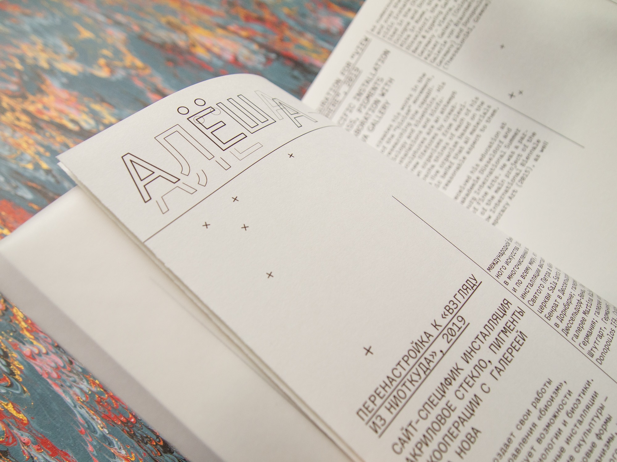
Yana: Constructed Situations is a dream project — and we like dreaming very much. At the end of 2019, we were jokingly discussing the criteria of success for a design studio and came to a conclusion that a successful studio needs to be design-involved at the Venice Biennale. A week later, we were suddenly approached by a project going to the Biennale.
Mila: A curator, Masha Sergeeva, brought together a team of artists who have each made an art project. They presented their work at the 58th Venice Biennale, supported by the city of Moscow. The artists gathered together at this exhibition all had their different styles, opted for different expressive means, but they do have a common purpose — investigating the process of human separation from nature, an attempt to determine our palace in the global ecosystem. We were supposed to develop a visual language uniting them — to give them some shared voice. We opted for Menoe to deliver on this task. On the one hand, it is great in staying neutral, while on the other — it helps systematize all of it.


Menoe Grotesque in Constructed Situations exhibition catalogue
Yana: Working with artists has always been difficult yet interesting. The difficulty of this project was that as our artists were preparing their objects for the show, we didn’t know what they would do exactly. — That said, the design had to be submitted well in advance! Everything was extremely unclear: starting from the exhibition’s name, Constructed Situations, that wasn’t announced promptly, which is why we had to figure out everything in the process of working.
Yulia: We drafted three concepts that used various typefaces and different visual languages. One was rather dry; another was more festive; and the third concept was this depictive-spectacular, namely with Menoe.
The reason you came up with three concepts is because there are three of you?
Mila: Not always, but it happens that way. If each of our group has her own vision of a given task, we prefer not to bully each other at our studio for the sake of arriving at a single variant, — we simply submit several options. One of which gets implemented, others don’t.
And since we’re dancing around the number three, please tell of some other project of yours…
Yulia: We are working with Boslen publishing house — wonderful guys who make books themselves from scratch, looking for authors and designers to eventually deliver a unique product. They collaborate with Anna Naumova, Kirill Blagodatskykh, Alexander Vasin, Boris Trofimov, and many others. Among our inputs is a series of books on the Russian traditional national costume where we’re deploying Graphik. The layout is being slightly changed from book to book — getting better, more well-developed and elaborate. The last book in the series, Kosovorotka (a traditional peasant shirt; in the West also known as Zhivago, or Tolstoy shirt — translator’s note), turned out super-fancy: and its author, managing editor, publisher, and museum curators finally brought themselves to print it on offset paper.
Which museum?
Yana: Those are our joint publications together with the Russian Museum of Ethnography that utilises these books to gradually catalogise their collection of Russian costumes. First, Mila designed Ponyovas (which are homespun skirts), then together we created Shushpan, Dushegreya, Corset (female outer garments). Now they have published a book on kosovorotkas; the next one will be about kokoshniks (traditional Russian hairdress for women — translator’s note). We work rather closely with the series editor as well as think through the structure of each book in its very first stages, when people only begin photographing objects to collect materials. We even can have a slight impact on which of those actually will make it to the book. For a long time now, we’ve been asking to put greater focus on every object, so kosovorotkas are now equipped with technical and practical descriptions to better explain our displayed objects.
Mila: We are permanently engaged in some sort of negotiating processes: the editor is eager to insert into this book as much illustration as possible, whereas we are seeking to introduce as many complex structural elements as we can, such as a table of contents with small illustrations.
Yulia: In the last two books, we insisted on a visual index at the end: we suggested listing all kinds of collars and all types of sarafan straps. That is precisely this kind of pleasure we are working and striving for — we feel very happy about the fact that everything is slowly going along this very way.


Graphik in Shushpan, Dushegreya, Corset album
Yana: We always try to get as close as we can to a decision-maker and then work in direct contact with them — so that there will be as little links between us and them as possible. It is often the case that a customer is ready for balder solutions, but when there is no direct contact and dialogue, those are more difficult to pursue and to implement. Even though, actually, everyone loves lively and playful stuff, and are willing to do them.
How do you approach typography? How do you choose fonts for your projects?
Mila: We are looking at the context of a project in the first place, and deciding whether we want to use typography for being in tune or being in conflict with it. I mean, we can mock the task through our typographic solutions or somehow get to the level of counterpoints, and we also can speak one, apprehensible language. Then we choose what voice we need — a quiet one that will only emphasize other elements of the styles, or a loud one, capable, in the absence of any other elements, of pulling off the entire project. And here we must admit that working with type.todays’ Instagram has changed our preferences: before, we treated display type with caution, and tried to control ourselves. But during this month we understood that, for example, Pilar — so daring, so vivid, slightly cartoonish — can make a great partner to tell a perky story. We also liked Halvar in use: it offered an opportunity to create, in a few images, such an environment that would immediately become amazingly big and substantial — adjusting a stencil in Stencil styles has been a great help.
Pilar
Halvar
Yulia: We mostly try to solve our tasks with typographic means. The exception were posters for Meyerhold Centre where a visual image was of importance, as you had to reveal the production. In other projects, we first work with the text — looking for a voice, a tone — and only then, if we’re missing something, elaborate a graphic layer. We don’t know how to make todayish fancy
And you never check, refer to something to make sure it would be modern and relevant?
Yana: And how do you do that? Using a fashion-ometer?
Yulia: Last summer we went to Izhevsk, and suddenly were asked ‘How do you understand that your design is normal?’ And we replied that we had enough competence to do ok. It is clear that we are affected by the environment — there’s nothing you can do about that. Clearly, when a client comes and asks to solve his tasks, we do it for them in the context in which they and we are located.
Mila: What we do is relevant, if it solves a real topical task. What we do is modern, because our surrounding reality inevitably affects us.
Do you have any favourite typeface or type foundry?
Mila: We are fans of type.today, naturally. The very same Izhevsk, we came here to hold a workshop for young design students as part of the Reforma project, and within its framework we designed a new identity for the Udmurt Museum of Fine Arts with the use of Factor А.


Factor A in Udmurt Museum of Fine Arts graphic identity
Yulia: It was officially accepted, by the way, and it has been implemented. We also created an identity for the A2M architecture studio using Graphik. They were thrilled.
Yana: There, the entire identity is built around the idea to set everything in a lowercase and in one size. Such a simple solution, and they immediately agreed on it. They were like ‘Wow!’ It turned out great: it’s both that the typeface sounds vocal and the impression is quite modernist.


A2M is an architecture bureau of Andrei Adamovich and Dana Matkovskaya
Mila: We are also fans of Roma Gornitsky. We use Panama in our internal studio tasks and last year carried out a big project using Steinbeck for the Raum Space international festival.


Raum Space is festival of contemporary art in Kaliningrad, Russia (formerly Königsberg, East Prussia), introducing Russian and German artists, curators, and managers to each other
Yulia: Also, we are very much fond of young type designers, and when there’s an opportunity to make something special, we approach them, ‘Let’s create something special together’. For example, Nikita Sapozhkov provided us with his graduation project typeface for a mushroom festival. And for another project we’re doing right now, he designed a custom typeface together with Egor Golovyrin — we will publish it soon.
Other than display type, were there during this month any other fonts that you’ve discovered and now want to deploy?
Yulia: We liked Halvar. And the variable Normalidad. The Schrift journal (aka TypeJournal — translator’s note) has recently posted their annual selection of best typefaces, and it had Tarbeev’s Gauge in it, and they showcased it the way that we immediately started wanting to purchase it.
Normalidad
And how should a typeface be displayed for us to want it to buy?
Yulia: There is a longread with a very detailed display of letters. First few specific letters. Then one large letter, and you see that it has these most masterfully chopped shapes. Then come all the ligatures, one after another, and you realise what a crazy work it is and how much time Tarbeev spent to draw it all. This is exactly the complexity shown in such an unwrapped manner that gives value to this work. Otherwise you just type ‘The quick brown fox’, and don’t see those details.

On our Instagram, you’ve been shining positively the entire month, giving away gifts for our followers chosen by the random number generator, and in general creating the festive mood. Didn’t you start to feel dizzy yourself?
Yana: There are three of us, so it was ok. I also had a lot of teaching to do at BHSAD this semester.
And at the same time you’ve managed to hold a workshop in Kaliningrad…
Mila: We also have attached the navigation there by ourselves…
How did you manage to do all that?
Yulia: That was not easy. As a result, we’ve all got haircuts and dyed our hair.
Where did you get the ideas for presents?
Mila: We wrote them down in a special table and then got in touch with our kind sponsors. Those were all our friends whom we are simply friends with, or we do some projects for them, which is why they were glad to give it to us for free.

The curriculum
Can you share some funny stories?
Yana: The funniest one, perhaps, is about our video with a dance. That was one of the prizes — we’re sent a song, and we have to dance to it…
Mila: We were in Kaliningrad and decided to go to an ice skating rink. We had a great time, and the moment we were leaving the rink, Yana asked ‘By the way, what song should we play to dance to, what do you think?’ I go and see ‘A Sporting Family’ by the band Primus. We turn it on, and the song goes that they go to an ice rink. What a coincidence! That is a true holistic event. We mounted a video filming our ice skating, which was, probably, not so fair…
Yana: In our world that was super-fair, as we capture those coincidences and use them. And since all of it happened at the same time, it does matter.
How did you come up with images to present these gifts?
Mila: We always had a certain object we’re giving away. And we tried to not only design pretty images, but to interact with this object, in one way or another — support it, justify, represent. Therefore we chose either a certain design that resonated with our object, or another one that could push it forward in its contrast. There were times when it was easy to come up with images: one of us sat down and created an image, while the rest of us just said ‘ah’ and exclaimed that it was a masterpiece (that’s what we normally do). But sometimes we had a rough time with those pictures, too. Because, after all, we have set a super task for ourselves: in order to tell about each object properly and in detail, we designed a whole series of images to put up a carousel…
Yana: That was also a bit of an unconscious decision. It wasn’t until our second week that we realised that each time we used carousel format actually, and apparently we were going to have to go on like that. Though, I believe that eventually we have pulled this thing off.
Mila: We addressed this work iteration-wise, because the iteration approach is the most fair and the most unpredictable. Someone started to design a picture, then it was passed on to the next person, the third one finalised the thing. If the last person was not very sure about the result, we further passed it round the team. Each post was our team effort, created collectively, and it turned out great.
Isn’t this process like three times longer?
Yana: It is not. That is like our favourite joke — that three of us make one good designer.
Did you have a division of responsibilities of some sort?
Yana: Every other time the image was started by a new person. We not only had to think up how to fit it, but think through what to put in there, write a text, begin to combine and configure it, then figure out that you just couldn’t do this anymore and pass it to someone else. This is actually exactly the way we work: when you get to the point where you’ve become too close to the project (sooner or later this happens to everyone), you can pass on your task to your neighbour and do something different. And then your neighbour will gladly finish it, and everyone will be happy. That is why we tend to share most of our competences — it is not hard for us to pick up after one another, and we work rather fast this way… You don’t need to count in extra time — for it to rest and you to look at it from a fresh perspective.
Mila: Funny story with a gift from Esh Print — we were drawing a colour chart. Yana came up with a triptych with multicolour letters on the black background, while I re-made it beyond recognition.
Yana: I have slightly adjusted it — she shows me, and it’s a completely different thing. We’d laughed a lot.
Do you often disagree with each other?
Yana: Designers always have to defend their ideas in front of somebody, therefore differences (if there are any) get resolved by an external party. But actually those things rarely happen.
Yulia: We appreciate each other’s opinion too much. When someone speaks up, we rather perceive it as friendly advice than criticism. Any unexpected and questionable thing becomes a subject of a thorough discussion, and we arrive at a decision, one way or another. We all have our different experiences, and the combination of various things makes the very same project more powerful.
Mila: We believe that if you have plenty of people who speak the same language as you around you, you get more opportunities to create something good. Any co-creation is a kind of challenge that you could use to better see your reflection in the approach of other people. We are currently helping Svyat and Nastya Vishnyakovs design The Golden Mask (Russian theatre festival — translator’s note), and that is also an extremely interesting union, as such a big project is only possible to implement when there’s many of you and everyone has their own voice. We have shared our studio with Artem Matyushkin, too. He is a quite melancholic person, and together we came up with a certain playful design association, MelanHolystiсk (that is how we sign our weird little projects taking only one night — such as this drink label for Chernyi Cooperative coffee house and roaster company).

So, you manage to scale your three-parties approach to a larger number of participants?
Yana: Almost, there is a certain limit. A teacher inside me tells me that the number is 7-8 people, after you exceed this number the dynamics of a small group gets ruined: the dialogue breaks down, and you have a situation where one person talks while the others are listening to them.
Are you all interchangeable, or every one of your group has her own particular specifics?
Mila: All of us are similar and pretty, different yet pretty. We divide everything in a fair manner — there is such a level of super-horizontality within our team that it enables this environment of full confidence. Any kind of toxic remarks are out of the question. We were able to build such a communication system in which we talk to each other the way we would want others to talk to you. That is a very honest and transparent communication.
Yana: As for our responsibilities (competencies), there are actually quite a lot of overlapping. Each of us considers herself a book designer in the first place, and the book is a perfect project for us. If only we could design only books, we would definitely design just books. We are pursuing that, but we are also capable of doing other stuff.
What does the book represent today, in the 21st century?
Yulia: When in 2010 I got enrolled at PolyGraph, we had this course The History of the Book, where Natalya Nikolayevna Rozanova was saying to us that now the book is about to die right now, in literally five minutes, ‘Why are you here? Proceed to lay out your little electronic booklets’. And yet nothing has changed since then. Apparently, there will be less fiction and cheap literature, with a poor layout, as it will get electronic — everyone reads from their phones. Yet I believe that the book as a media will become a highly valuable and important information carrier, where an artist, designer, author and publisher work together on creating a certain chest of knowledge — integral and elaborate and therefore much precious. I see it in the European book and hope that we’re almost there.
But such formats as sound and moving images are turning into one of communicating norms…
Yana: If we look at the evolution of electronic media that those video images inhabit, they have significantly changed lately. Today, clearly, everyone lives on the Internet, but once you cut the power — that’s it, over. Sound and video are non-material, whereas a book is still a physical object. We exist in the physical world, and nothing could replace our interaction with a physical object. This tangible side of the book is highly attractive for us.
Mila: We love and enjoy books to the extent that we have our own library — right here, in our studio where we’re based. Yulia founded the Placeholder Library together with Sasha Bereznikova and Zhenya Nechaeva (another hostess of our Instagram of this year). Back when there was no COVID19 yet, we had students come here, and Yulia held workshops and invited various speakers.
Zhenya told us about it in detail. Your Insta has once mentioned a certain Holystiсk Press. What project is that?
Yulia: We want to publish books.
Yana: Such a samizdat-style, punk publishing project…
Mila: We are planning to make two books this year. The first one is a summary catalogue of the Raum Space fest in Kaliningrad, where we carried out a workshop for design students. Each of them created their own small guide on the festival, and we are going to assemble this two-piece edition: the first part is a formal catalogue, listing all the curators and objects of the fest, and the second part is planned as a ‘student’ one, with mad collages and wild fantasies. Every student figured out their own route variation: someone chose to count the amount of steps made along the road, while the other one addressed how many times they yawned… The second book is about women in design, by Alyona Sokolnikova. We are now only dreaming about that one, summing up our courage to approach the author.
You not only just run our Instagram, but also took part in the Esh Print calendar that was designed together with tomorrow.type.today. Can you tell us how it felt?
Yana: We worked on the calendar using our beloved holistic approach. The task arrived at the end of the year, the time when everybody sums up and assesses the results and makes plans for the future, so our calendar is about dreaming. We asked ourselves ten questions, and deciphered all the answers — sometimes there were three different answers, but mostly they were matching for us, — as images. That is this funny puzzle which you can explore for a long time, trying to guess what we were really dreaming about, as the right answer is not always clear by looking at the image.
 Holystick designed the March page for our 2021 calendar
Mila: We like our working process to be interesting and funny. When our solution to the task in some project is being commented as ‘That’s funny’, then it was a good solution. It means that it has an idea and a plot, that it is interesting to tell about, — and everybody loves stories. For a designer, telling a story about a project you’ve done is the greatest possible joy.
Holystick
holystick.design
behance.net/holystickdesign/
instagram.com/holystick_design/