
Angle brackets and <> are not the same thing; brackets happen to be caps — though they are never italic (but don’t quote us on that!). Please welcome the second part of our Manual.
Author: Anya Danilova
Typography Consultant: Alexey Murashko
Brackets are used for isolating some information in the text from its surroundings.
Several alphabetic characters are notorious for poor design and should always be inspected when assessing a new font. These problem characters include square brackets [ ], which are often too dark; parentheses ( ), which are often too symmetrical and skinny … Fonts equipped with good versions of these characters mist often lend them to those without. But not just any good version will do. Robert Bringhurst The Elements of Typographic Style
Parentheses
Parentheses are used in texts, mathematical formulae, and coding. In mathematical notation and coding, parentheses directly affect the signification of formulae or commands, whereas in editing these glyphs are most commonly utilized for emphasizing and clarifying.
Parentheses are also used for numbering in listings, marking side notes in dramatic texts or interviews, and, in some languages (such as German), for omissions.
Authors often deploy parentheses instead of dashes for inserting phrases or full sentences.
Inserted sentences (i.e, sentences containing various kinds of added side notes or associated references which explain the whole sentence or some separate words, sometimes drastically dropping out of the overall syntactic structure) are marked by parentheses or dashes (the former being more disengaging glyph than the latter). For example:
a) Vladimir Sergeyich (that was the name of a young man in a coat) looked at his man, puzzled, and said with a hasty whisper… (Ivan Turgenev); After passing some Austrian troops he noticed that the next part of the line (the Guards) was already in action. (Leo Tolstoy);
b) Even the master and mistress — if they happened to be home — opened the windows, listened to the musician and praised him. (Maxim Gorky).
Dietmar Rosenthal
Handbook of Spelling and Style
There are also editors who, on the contrary, tend to avoid parentheses in their texts.
Parentheses suggest that the enclosed text is a low priority information. If you have something important put in brackets, pull it out into the sentence. … Parentheses are needed in two cases:
1. For referring to the source of quotation (Ilyakhov, 2016).
2. For making a joke, or inserting an emotional remark (ba dum tss!)
As for the second ambition, you need to know how to make good jokes — so, it should be applied with caution. There are no other cases where you might need to use parentheses.
Maxim Ilyakhov’s blog
Design
In the Renaissance age, most brackets had no contrast and looked significantly thinner than other characters. In some digital reconstructions of this age typefaces we can still find the non-contrast parentheses. Such parentheses shall be deployed carefully: non-contrast punctuation marks tend to draw too much attention to themselves in a typeset.
 Non-contrast parentheses in Garamond Premier Pro Regular
In most modern-day fonts, parentheses are characterized by symmetric distribution of contrast, with a swelling in the apparent center. Depending on the design of a typeface, its stroke endings can be more closed and symmetric — or open, dynamic.
The size of a parenthesis usually results from the height of capitals and descenders. That is why, depending on context and size, the parentheses can stand out — or, on the contrary, exist as a very organic element of the typeset.
 Gauge is based on writing with a broad nib, so its stroke endings are diagonal and its parentheses are open and dynamic. NWT Bodoni, by contrast, is a static classical serif, which is why it is equipped with straight and symmetric parentheses with 90 degrees endings. Check out sizes of parentheses: Gauge’s has a large x-height so the parentheses look relatively small. NWT Bodoni’s parentheses look larger because of large cap height
In display typefaces, the punctuation marks can be intentionally designed too thin as compared to letters. Parentheses could appear different within one family: in a text style they can look more contrast — but in a display style they would appear thinner and less contrast.
 Austin, a display typeface, has thin and low-contrast parentheses
 Parentheses in William Type Family. The more display is the style, the thinner are its parentheses, and the higher they are placed with respect to lowercase letters
The extent of roundness of parentheses depends on the typeface’s design and its historical background (if there is one). There are typefaces in which parentheses were deliberately created to be very round — this adds a certain personality. The parentheses are generally more rounded in monospaced typefaces, because it is important to preserve the uniformity of typeset despite the uniform width of all glyphs. One should also be careful with excessively straight parentheses, because in the text such a glyph could be mistaken for a straight line — rather than read as a bracket.
 In Serapion, parentheses are intentionally rounded
 Parentheses in the type.today collection
 Parentheses in popular typefaces
Square Brackets
Outside of math and coding, the square brackets are used for transcriptions, editor’s notes and explanations in quotations — as well as inside the regular brackets. In some languages the square brackets are also utilized for indicating omissions.
The most common shape of square brackets is a vertical stroke with two horizontals as its endings. Still, there are other distinctive shapes to be found in some historical, and present-day display typefaces.
 Various designs of square brackets
Braces
Braces are rarely applied in texts, but they can be useful for indicating particular groups of words or notions in linguistics — as well as in cases where other types of brackets have already been used in the text.
 In linguistics, braces can be used for indicating an unordered pair of objects
 Excerpt from Typography Papers magazine. Department of Typography & Graphic Communications, University of Reading, Hyphen Press
The age of metal typesetting was marked by the use of large braces, known as accolade in English. They were employed in tree structures and typeset from composite units, depending on the size of combined elements.
 Big and small braces. Excerpt from the book Encyclopédie, ou Dictionnaire raisonné des sciences, des arts et des métiers, 1751–1780
 Bureauserif is equipped with large composite braces: the elements are typeset on a new line and merged automatically in case the leading is set to auto
Braces in tables and derivations shall fully encompass all lines they relate to, with a spike center of the brace positioned in the type size center. Pinkhus Gilenson Handbook for Technical and Art Editors
Pointy/Angle Brackets, or Chevrons
Pointy brackets are most commonly used in mathematics. In Russian language, they are also deployed for marking omissions in a quotation, or for recovering lacunae in a quoted text. Angle brackets are not greater-than and less-than symbols — these glyphs differ in height and proportions.

Angle brackets are used to reconstruct contracted words in a cited text. For ex., the author who is citing or publishing Anna Akhmatova, restores the part of words she had abbreviated:
The copy of Harvest wh<ich> you gave me, I passed it on, as you asked me to, to Shcheglov, bec<ause> on the very same day I was presented with my own
(A. Akhmatova. Letter to G. Chulkov).
Rules of Russian Spelling and Punctuation
Comprehensive Academic Guide edited by Vladimir Lopatin
Other brackets
There are many various kinds of parentheses, square brackets, braces and chevrons. Still, such examples are rarely found in texts, being more of mathematical symbols. Although we can assume that in some situations the use of unconventional brackets could definitely diversify and enrich typography in texts.
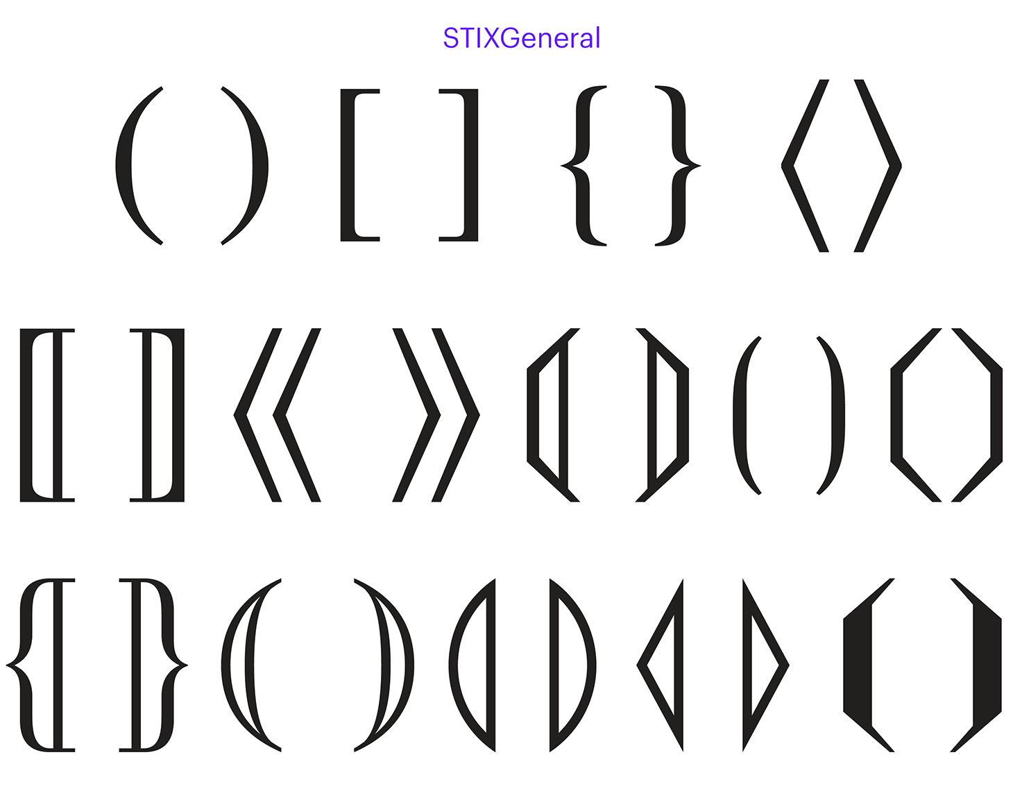
Examples of different brackets in STIX typeface that was created specifically for mathematicians, engineers, and scientists
Brackets in Omissions
The omissions mean cuts in a quotation — they make it shorter, while preserving the overall meaning. In most cases the omissions are marked by ellipses, enveloped in some sort of brackets or without any brackets at all. The logics of indicating omissions is different in different languages. For example, in Latvian, insignificant in size omissions are denoted by two dots .., while large omissions are marked by two dots in square brackets [..]. Ellipsis in parentheses (…) is the most common way when it comes to German language, whereas French and Czech traditions expect you to enclose ellipsis in square brackets […]. In English, the ellipsis is normally deployed without brackets — but often spaced out, or marked with spaсes from both sides.
The code of Russian language rules stipulates that you have to put ellipses, and that’s it:
§ 187. Ellipsis is used in quotations:
1. For indicating that the beginning or the end of a quotation (which is a separate sentence in relation to the surrounding text) doesn’t correspond to the beginning or the end of the same sentence in quoted text, for example:
In his estimates of all predecessors, Pushkin wrote: “…Some odes of Derzhavin, despite his incorrect language and irregularities in his style, are driven by some genius inspiration…”
But:
Pushkin wrote that “some odes of Derzhavin, despite his incorrect language and irregularities in his style, are driven by some genius inspiration.”
2. For marking an omission within a quotation, for example:
Marx wrote that “language… is practical, real consciousness that exists for other men as well, and only therefore does it also exist for me.”
Rules of Russian Spelling and Punctuation, 1956
Some handbooks instruct to use ellipsis, or ellipsis enclosed in angle brackets.
It is allowable to omit one or several words and even sentences, if the meaning of the cited author is preserved and the reader would be notified on this omission with the use of ellipses in the place of omitted words or phrases — or ellipses in angle brackets in the place of omitted sentences. Arkady Milchin and Lyudmila Cheltsova The Publisher’s and Author’s Handbook
When quoting documents, angle brackets are usually utilized for indicating a deleted text; square brackets — for indicating contracted words which are explicated by the citing author. Arkady Milchin and Lyudmila Cheltsova The Publisher’s and Author’s Handbook
Ellipsis enclosed in angle, or mathematical, brackets for marking omissions and lacunae is a purely Russian tradition. The problem is that such brackets are rarely found in typefaces: for example, only two or three Mac OS system fonts have those, and such brackets are non-existent in Arial or Helvetica, the most widespread fonts. For this reason, editors — in an attempt to respect the tradition, — employ greater-than and less-than symbols instead of chevrons, which is an induced and unfortunate compromise: in most cases, their proportions and placement make them dramatically stand out as compared to the overall text.
In the majority of typefaces, greater-than and less-than symbols look too wide, since they are designed in relation to +, −, = and other signs. As for angle brackets, their proportions are similar to parentheses’, so they don’t attract undue attention — and don’t ruin the rhythm of the text.
 Chevrons in Kazimir Text are of the same height and position as its parentheses. Greater-than and less-than signs are placed at the visual center of figures
 Left: omission is indicated with the use of greater-than and less-than symbols. Right: angle brackets
 Much depends on how greater-than and less-than signs were designed in any given typeface. In Times New Roman, these glyphs are unduly wide and light, therefore being too visible in the text. In Brioni Text Pro, these symbols are rather narrow, with their density corresponding to the one of the dash — that is why those are far better looking.
If it is namely the angle brackets which you need — but the typeface you’ve picked doesn’t have it, you shall contact developers or distributors of this particular font. Many authors respond to requests like that, and it is highly possible that you would arrange for adding such symbols, quite important for Russian typography.
Another possible option is to search for angle brackets in some other typeface which would fit in terms of density and proportions. However, this tactiс should be resorted to with extreme caution.
Spacing and Kerning
In most languages’ typography, there are no spaces used to separate the content from brackets.
Quotation marks and brackets are not spaced from the words enclosed inside them. Punctuation symbols shall never be spaced from brackets and quotation marks. One shall apply quotation marks of the same face as the text put inside those marks. Brackets shall correspond to the faces in the main text. Brackets inside a highlighted text shall correspond to the typeface applied to this highlighted text. Pinkhus Gilenson Handbook for Technical and Art Editors
There are glyphs that could pose some problems for a typographer in case they are located next to brackets: capital letters or characters with ascenders and/or descenders, full points (period), commas, question marks and exclamation marks, superscripts, etc.
One should pay attention to how these symbols look next to brackets, since there could be no
On the other hand, there are glyphs that can bump into the brackets in case there is no kerning and sidebearings are too small. In most cases, it is the letters with ascenders or descenders, such as b, d, p, q in Latin alphabet. When an exclamation mark or a question mark is enclosed in brackets with small sidebearings, they can also merge with one another. In case these symbols challenge the rhythm, or draw too much attention, a considerate typographer should track such two or three glyphs by hand.
 In Times New Roman, letters with ascenders and descenders merge with brackets. The exclamation mark, on the contrary, is positioned too far from the bracket
There are very few typefaces where brackets are too close to text, in which case you should always deploy a hair space: . Depending on the task, hair spaces can also be applied to a typeface where sidebearings of brackets are of adequate size.
 Hair spaces can be useful if a phrase inside brackets needs more air
Brackets and Italics
One of the most controversial issues in typography when it comes to brackets is whether or not they should be put in italics if the word inside is italicized, but surrounded by plain text.
Some authors are categorical in their judgement, and these judgements often happen to be the exact opposites of one another:
Parentheses and brackets are not letters, and it makes little sense to speak of them as roman or italic. There are vertical parentheses and sloped ones, and the parentheses on italic fonts are almost always sloped, but vertical parentheses are generally to be preferred. That means they must come from the roman font, and may need extra spacing when used with italic letterforms. Robert Bringhurst The Elements of Typographic Style
You shouldn’t use italics if the brackets apply to both italicized and plain text, (preceding and succeeding). For ex.:
…identifying features (dates of birth and death, field of activity, words son, father, elder, younger) shall be enclosed in parentheses.
In this case, the closing bracket is not put in italics, since it applies to the plain text in brackets as well, and also because the opening bracket is not italicized either (since those are matching symbols).
Arkady Milchin and Lyudmila Cheltsova
The Publisher’s and Author’s Handbook
In just about any case, a punctuation mark is to be formatted in the same way as the word it accompanies. Artemy Lebedev Kovodstvo
Still, this problem (like many other issues in the world of typography) doesn’t have one clear-cut, definitive solution: you should always rely on the common sense — and decide on a case-by-case basis.
In a situation where brackets are roman while the inside text is italic, you have to be extra careful in terms of kerning.


In books, a typographer often has to apply italics to the names, or even separate letters, enclosed in brackets. Please note that in this example some collisions of signs are compensated by kerning, while other ones are solved with raising or lowering down of the brackets. These examples were provided by Alexey Murashko. Andra Neiburga: valoda‚ dzimte‚ stāstījums‚ attēls. Rīga, 2018
Positioning
In some typefaces, the brackets (as well as dashes and other punctuation marks) can be raised to a level of capital glyphs or uppercase figures. But brackets are paired symbols — so you should always pay attention to their interactions in any given text. When brackets isolate one word, starting of a capital letter, the raising of opening bracket could offend the eye. And, vice versa, if brackets enclose a long sentence inside a straight text, you can raise the bracket next to some high glyph — so that it doesn’t feel like it is sinking.
 Left: regular parentheses. Right: opening bracket was raised, and it catches the eye
 Left: regular parentheses. Right: opening parentheses are raised beside uppercase glyphs
It always depends on the situation, so if it seems that any particular positioning of bracket (or both brackets) ruins the overall rhythm, it probably makes sense to compensate it by hand. Now and then you might have to raise or lower down a bracket, to avoid an adjacent glyph tapping into it.
Some typefaces are equipped with brackets designed especially for small caps.
 Trola parentheses for lowercase letters, uppercase letters, and small caps
Convert the punctuation to uppercase in Adobe CS
Shift to uppercase (All Caps icon)
Mac OS software: Keynote, Pages
Format → Font → Show Fonts → Click on gear icon → Typography → Case-sensitive Layout → Capital Forms
CSS
font-feature-settings: ’case’ on;
***
Such seemingly insignificant symbols as brackets can be an obstacle in reading — or, on the contrary, they can facilitate the reading process, both in terms of typography and language. It is not the brackets as such that are important, but rather their interaction with other glyphs — and you shall always pay regard for their design, positioning, and relevancy in texts.
Bibliography
Robert Bringhurst, The Elements of Typographic Style
Pinkhus Gilenson, Handbook for Technical and Art Editors
(Пинхус Гиленсон, Справочник технического и художественного редакторов)
Artemy Lebedev, Kovodstvo
(Артемий Лебедев, «Ководство»)
Arkady Milchin and Lyudmila Cheltsova, The Publisher’s and Author’s Handbook
(Аркадий Мильчин и Людмила Чельцова, «Справочник издателя и автора»)
Dietmar Rosenthal, Handbook of Spelling and Style (Дитмар Розенталь, «Справочник по правописанию и стилистике»)
Rules of Russian Spelling and Punctuation, 1956
Правила русской орфографии и пунктуации
Rules of Russian Spelling and Punctuation. Comprehensive Academic Guide edited by Vladimir Lopatin
(Правила русской орфографии и пунктуации. Полный академический справочник)
Phil Garnham, Punctuation Series: Brackets (fontsmith.com)
More in Manual:
Dashes: which to choose and how to space them out