Adelina Shaidullina: Please, introduce yourselves to our readers first!
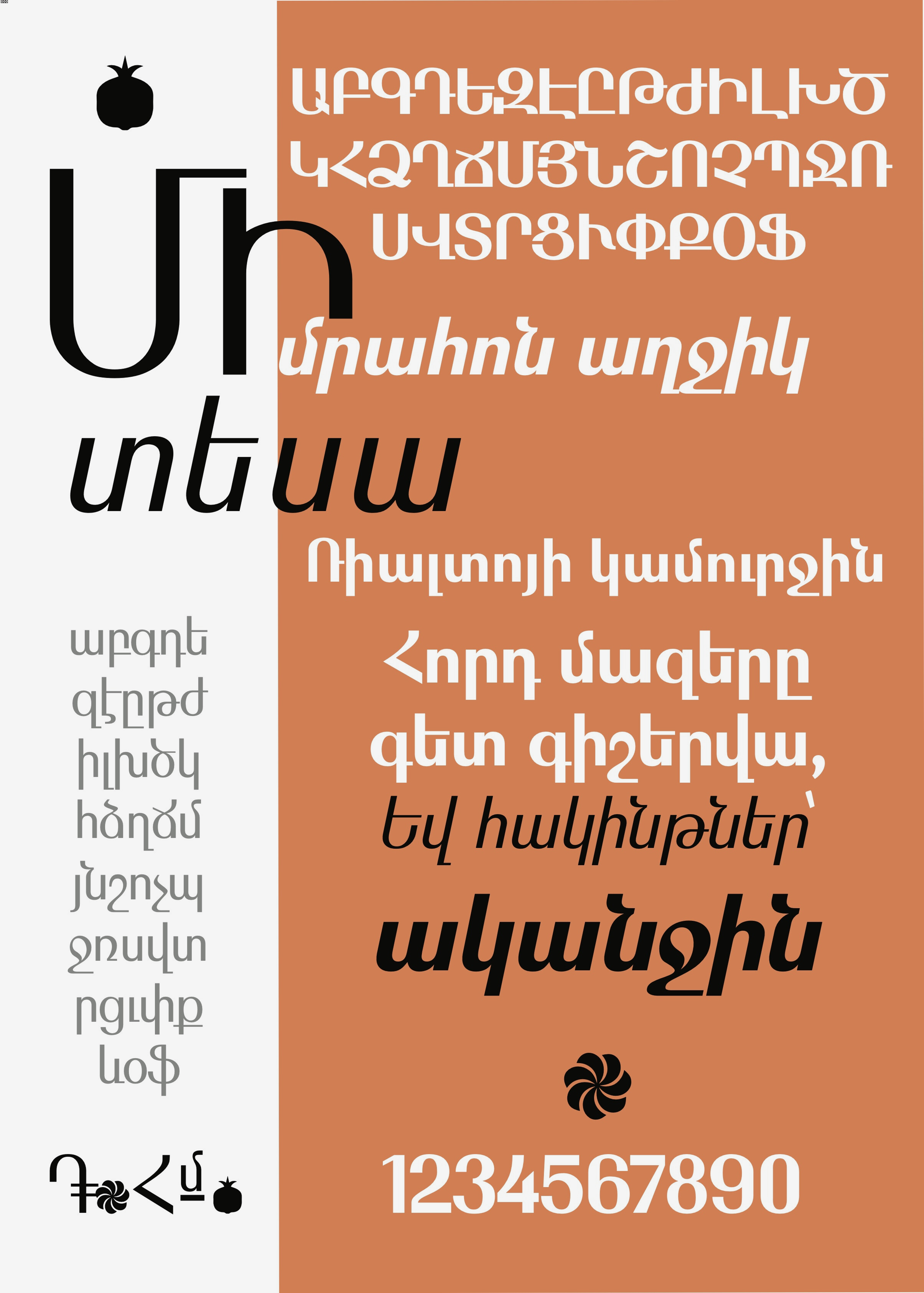
Araz Bogharian: A graphic designer at TUMO Center for Creative Technologies, living in Yerevan. Studied at the National University of Architecture and Construction. I’ve also attended TUMO center where I actively participated in many workshops and learning labs, which expanded my horizons and opportunities. I enjoy working and experimenting with lettering and calligraphy.
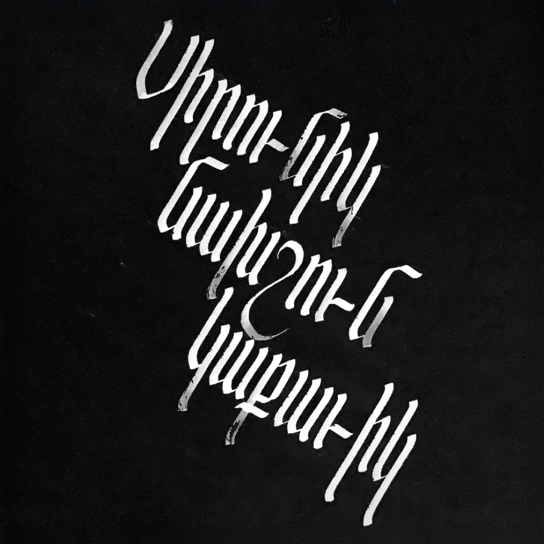
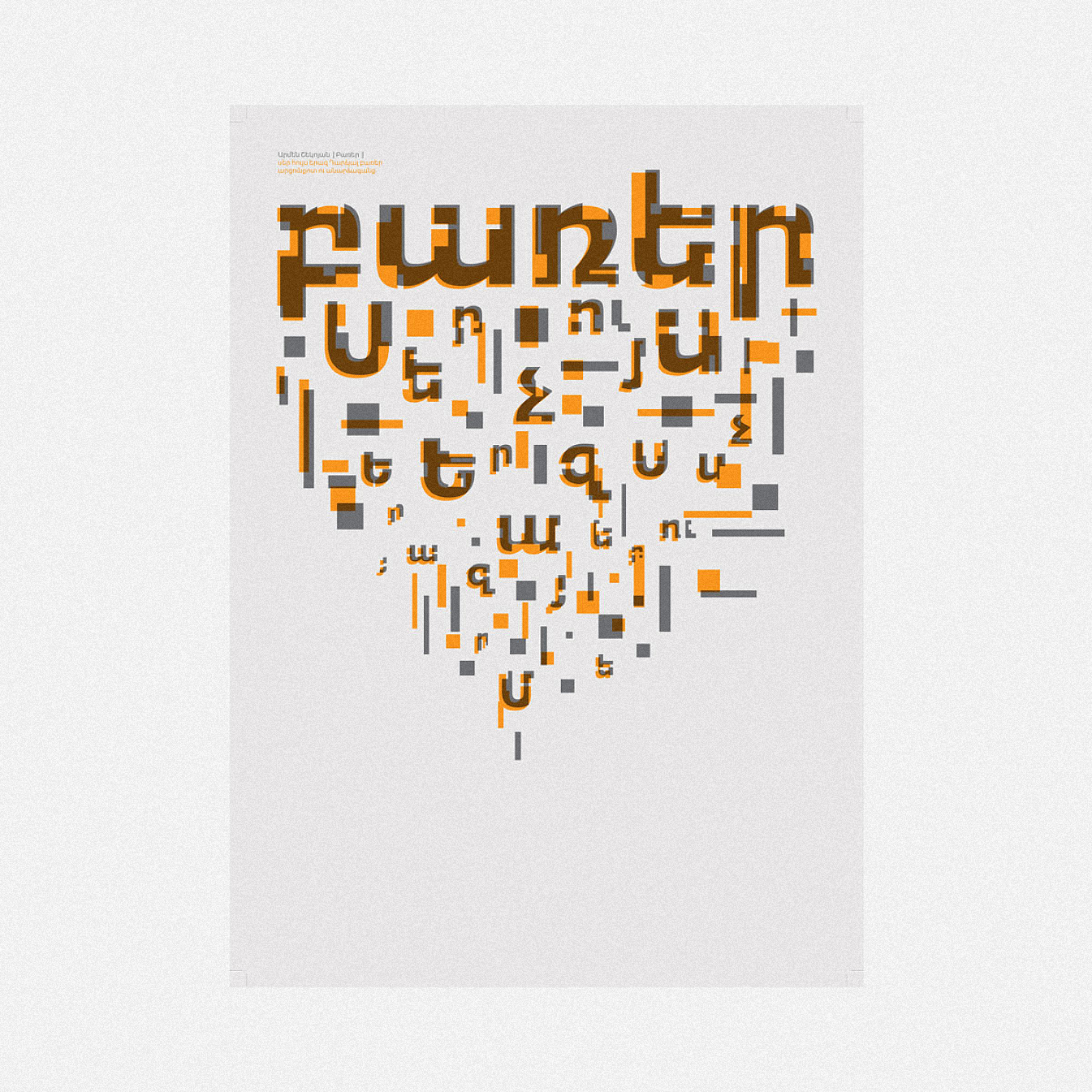
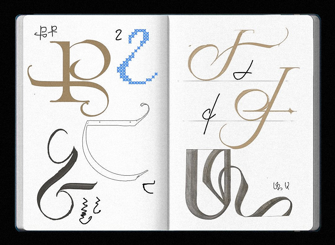
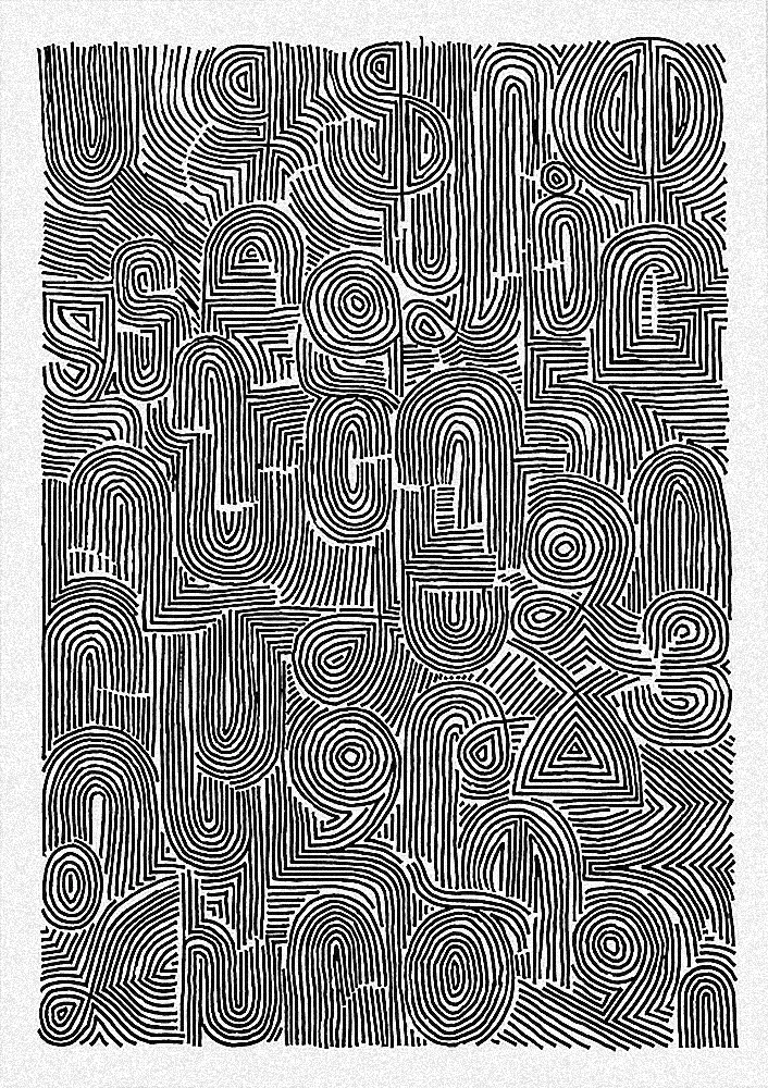
 A piece from the live calligraphy performance, created on a 10-meter-long surface. By Araz Bogharian
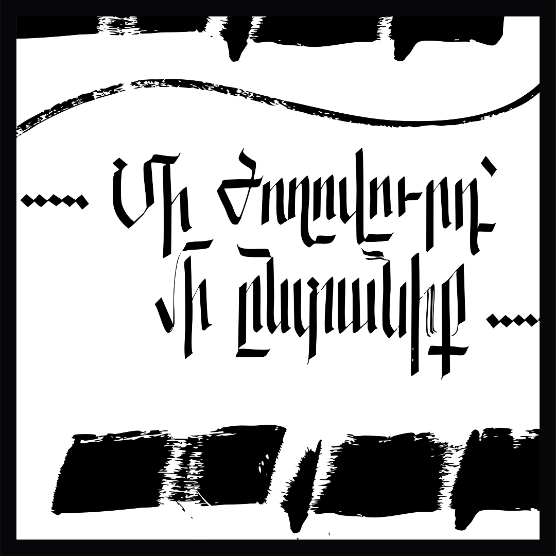
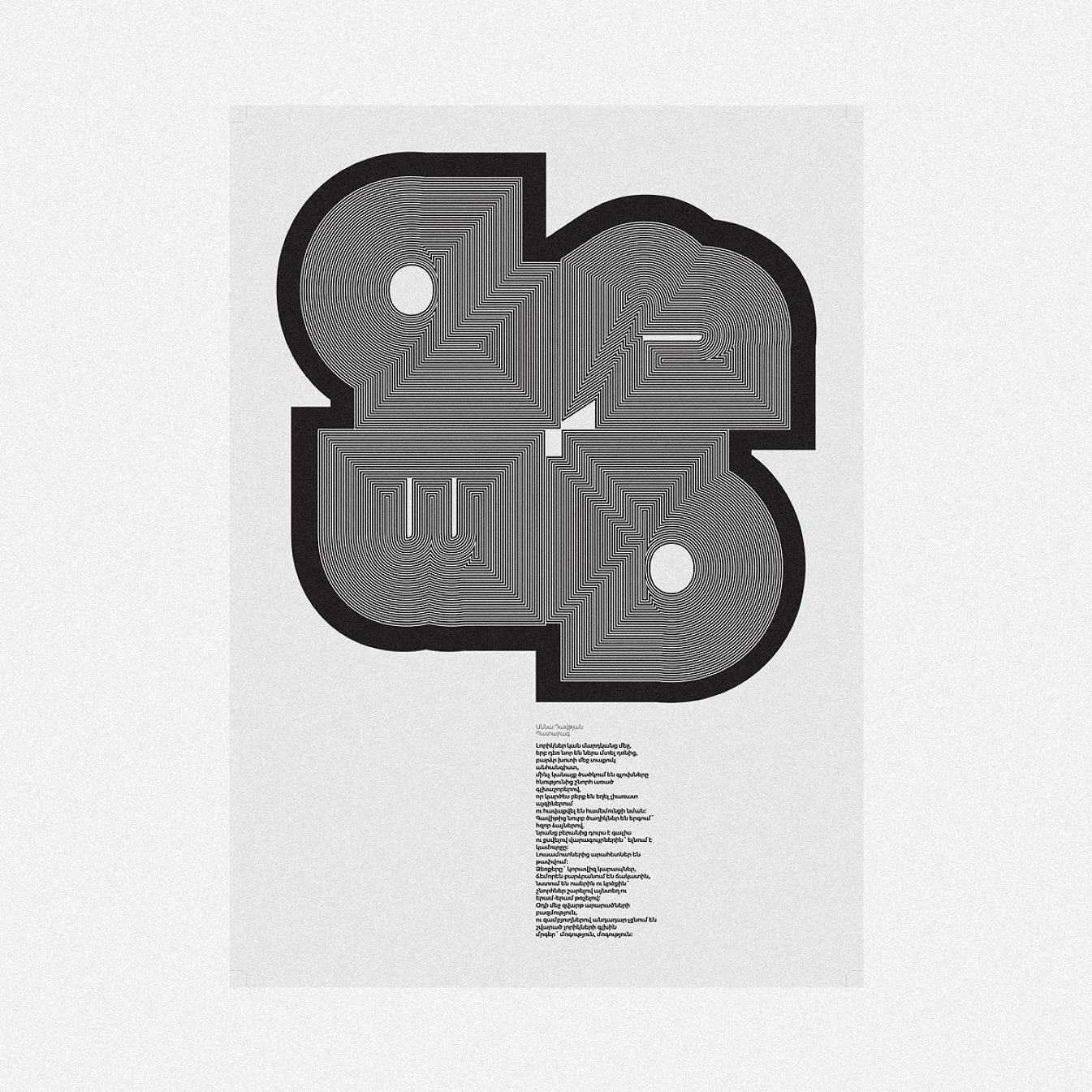
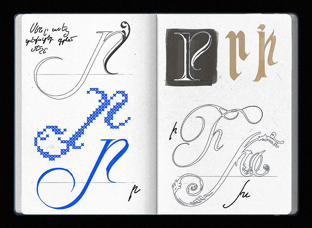
 A line from a song by Armenian composer Komitas. Calligraphy by Araz Bogharian
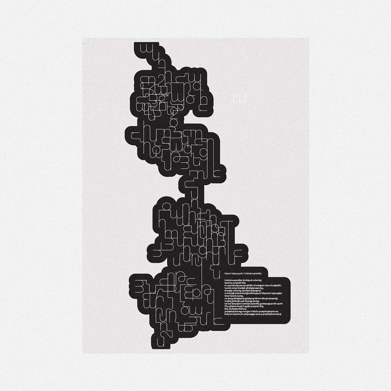
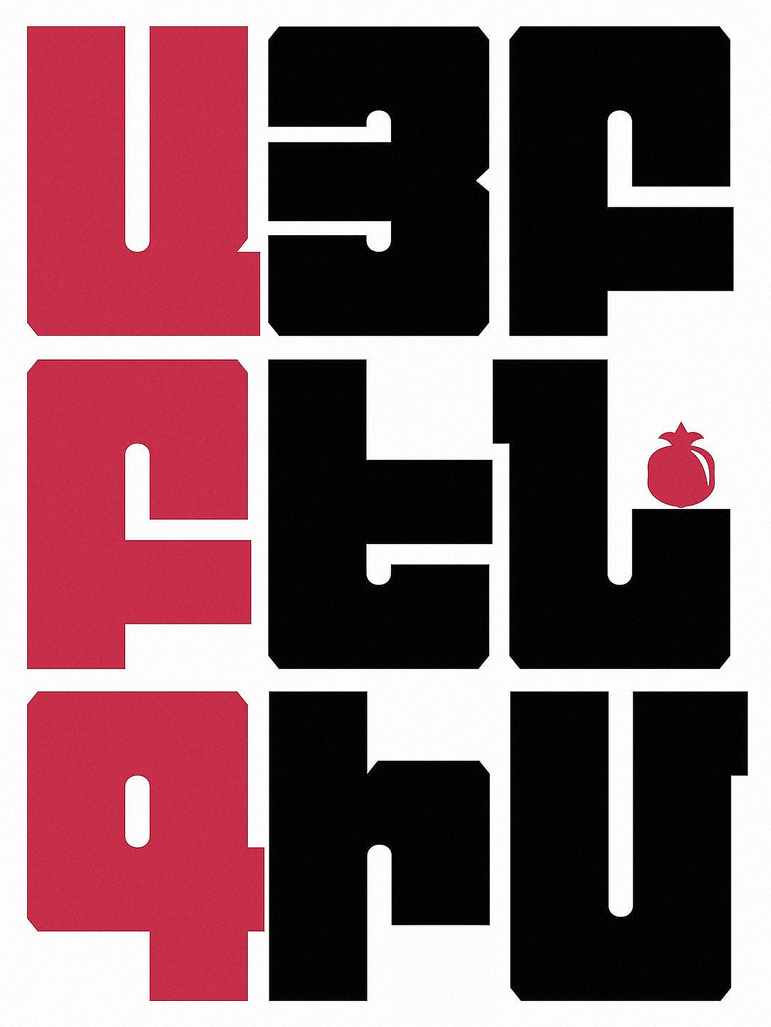
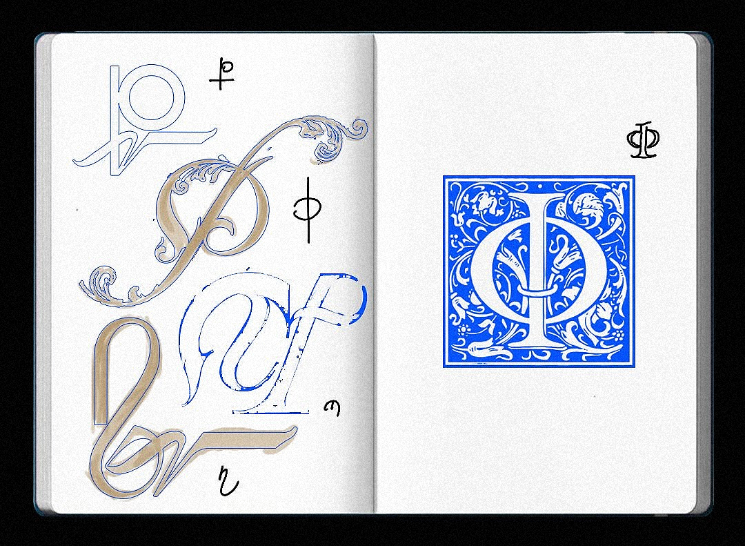
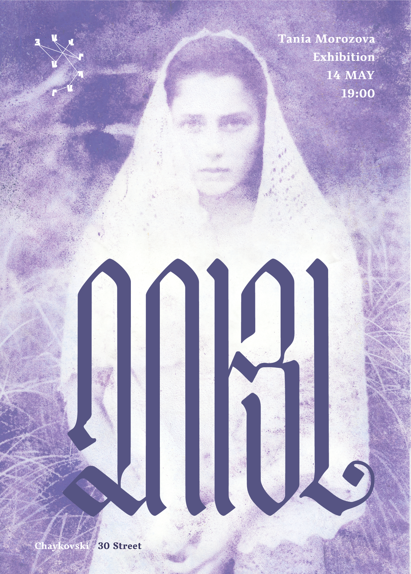 Poster for Tania Morozova’s monotype-printed photographs exhibition by Araz Bogharian
Arman Harutyunyan: I studied graphic design and typography at the State Academy of Fine Arts of Armenia, where I got my bachelor’s and master’s. I also had the opportunity to visit the Basel School of Art and Design and attend workshops together with their students.
I’m also an ex-student of TUMO. Now I work as a graphic designer at Digitain, an iGaming company, but besides my job, I continue to participate in international projects and type design competitions as an independent designer.
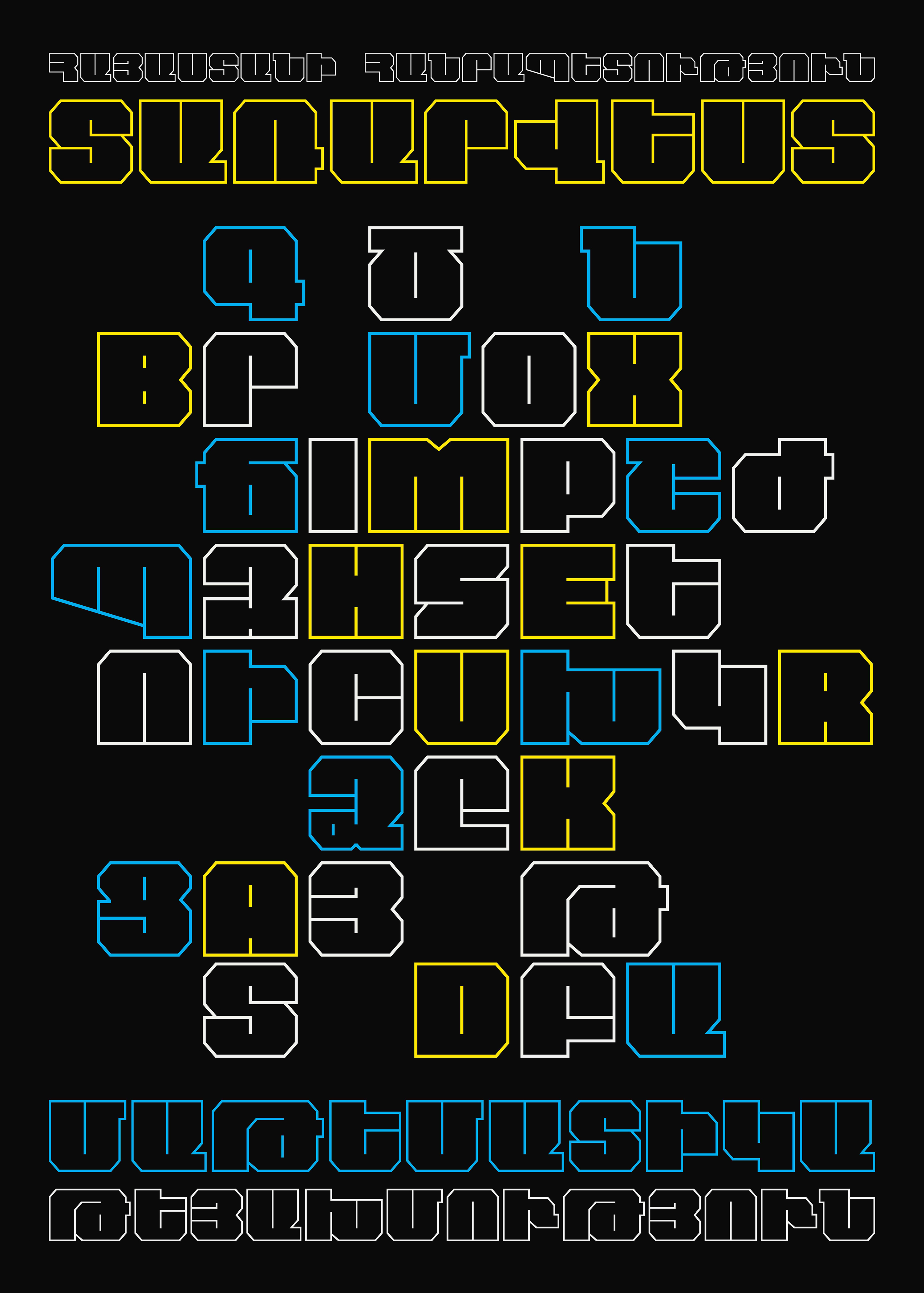 AVH Chess by Arman Harutyunyan. 3rd Prize at Granshan
 AVH Modernism by Arman Harutyunyan. 2nd Prize at Granshan
AS: TUMO is clearly an important place for graphic designers, but how important is it for type designers specifically?
AH: I first became familiar with the Granshan competition when it was held at the TUMO Center in 2017!
Last September, TUMO hosted an event where three type designers — Boris Kochan, Veronika Burian, and Johannes Küster — shared their unique journeys in type design and spoke about the current state of typography in Europe and around the world. After the presentations, Boris and Veronika invited me into a conversation about the challenges of Armenian type design.
AB: It’s also important that the program and the labs are taught at TUMO in an engaging and fun way. They are usually led by worldwide professionals who lead for two weeks to a month, working with teens through real-world projects. In fact, a type design lab is currently underway.
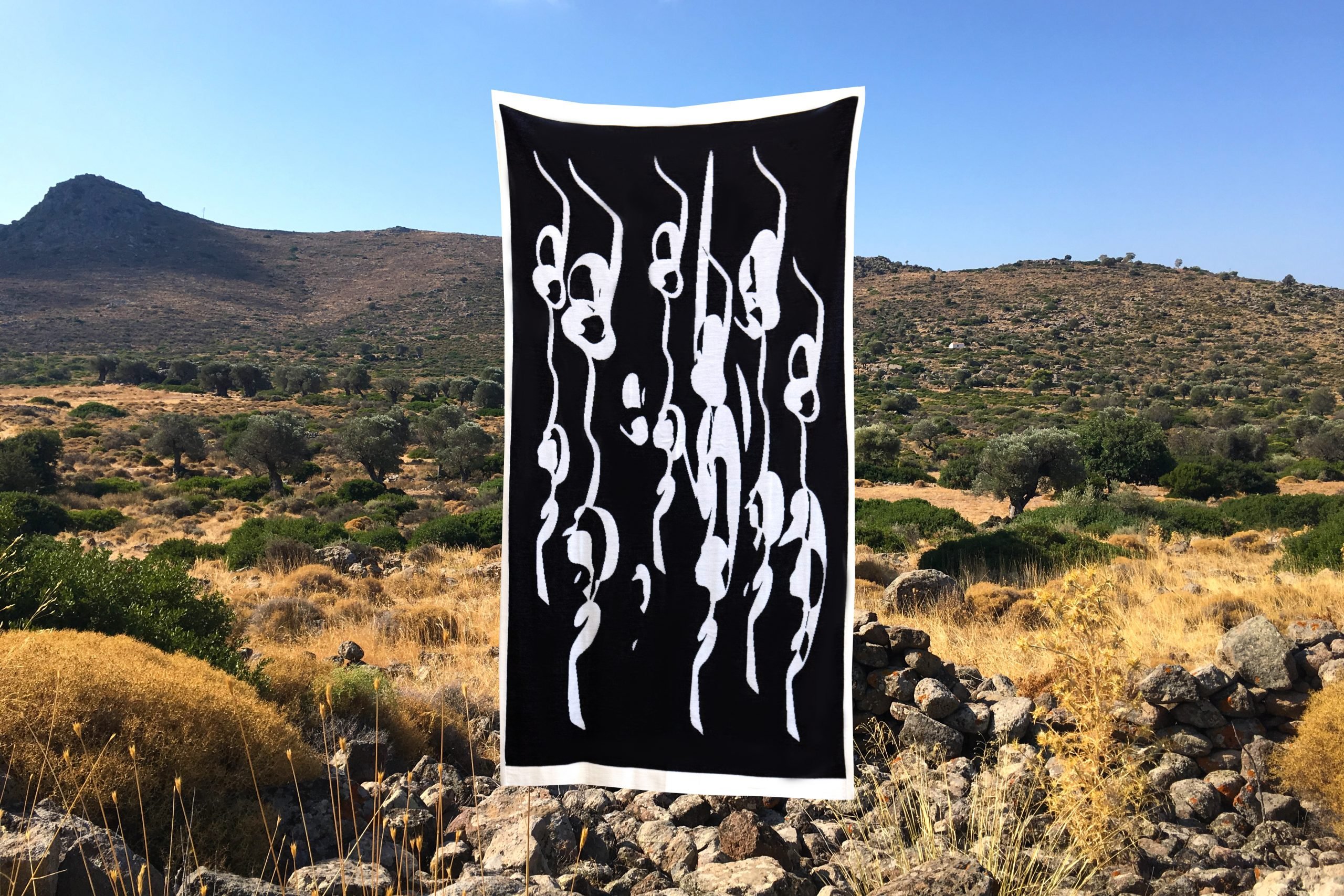
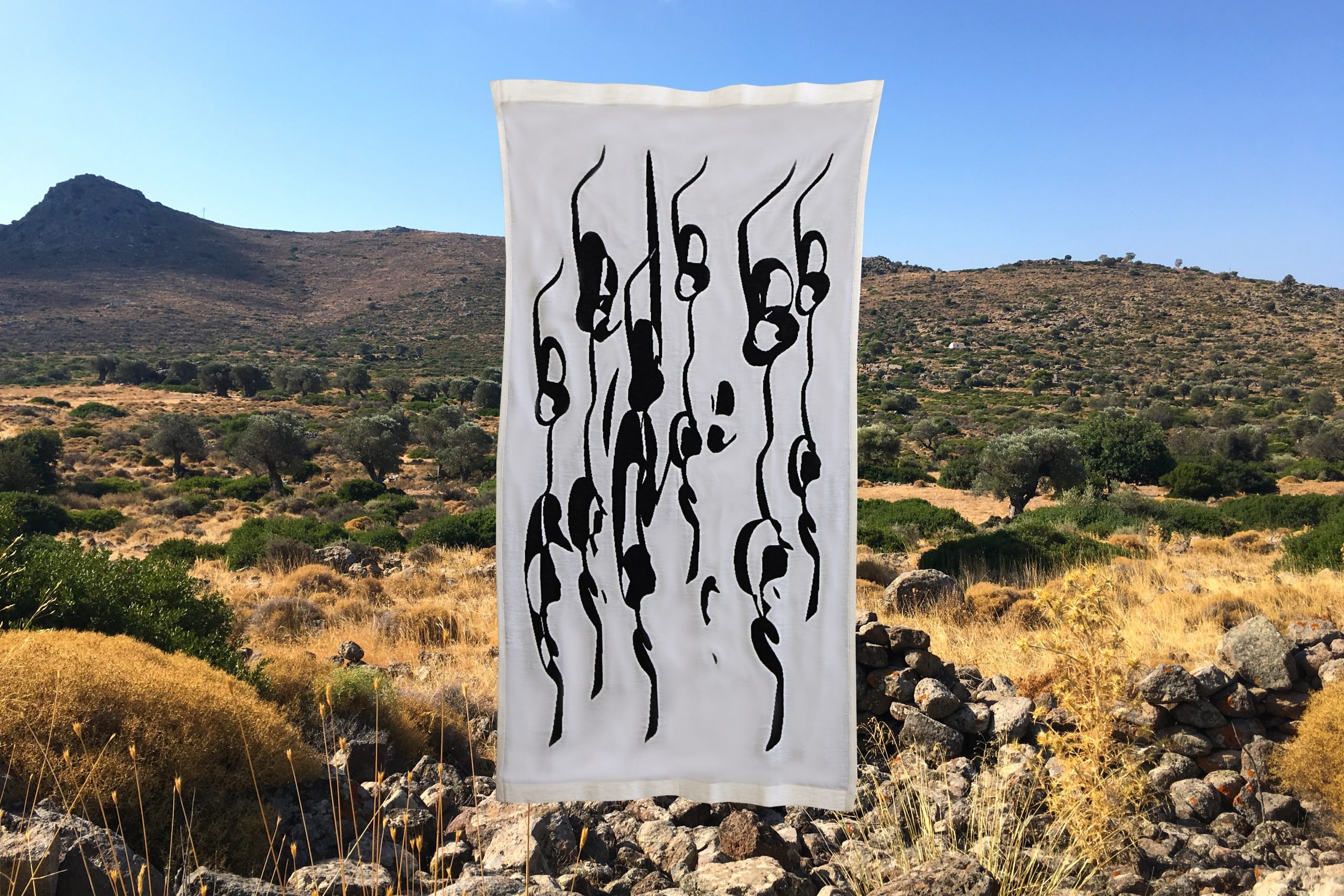
A wool blanket designed by Silva Stepanyan, during an atelier led by Lenka Kokhoutova
Typoem posters created by TUMO Studios students in an atelier led by Reza Abedini and Diana Bou Dakka
AS: Do you feel that your approach to your profession differs from that of the visiting designers?
AH: I don’t think the differences are that big. Of course, there are some variations in the education process and in the opportunities available to type designers later on. But in terms of professionalism, I don’t think there are major differences.
AB: I feel that the progress here is slow, which differs a bit. There is a need for a fresh approach, updated systems, and renewed motivation here, especially in universities. Design is a creative field, and it should reflect that energy and innovation.
AS: Are there any other places, communities,
AB: If this question had been asked a few years ago, I would have mentioned Type Thursday meet-ups. I started organizing the events in Yerevan, and it became a great platform where both beginners and professionals could share their work in progress. We held 15 successful events and built a community.
Currently, we don’t have a physical space to meet regularly. There’s a small online group at the moment, which is very new, so we haven’t done anything yet. But I’m optimistic.
 A poster by Nuara Markaryan presented on one of the Type Thursdays
 Lettering by Vahan Tonelyan presented on one of the Type Thursdays
 Lettering by Agatha Hovhannisyan presented on one of the Type Thursdays
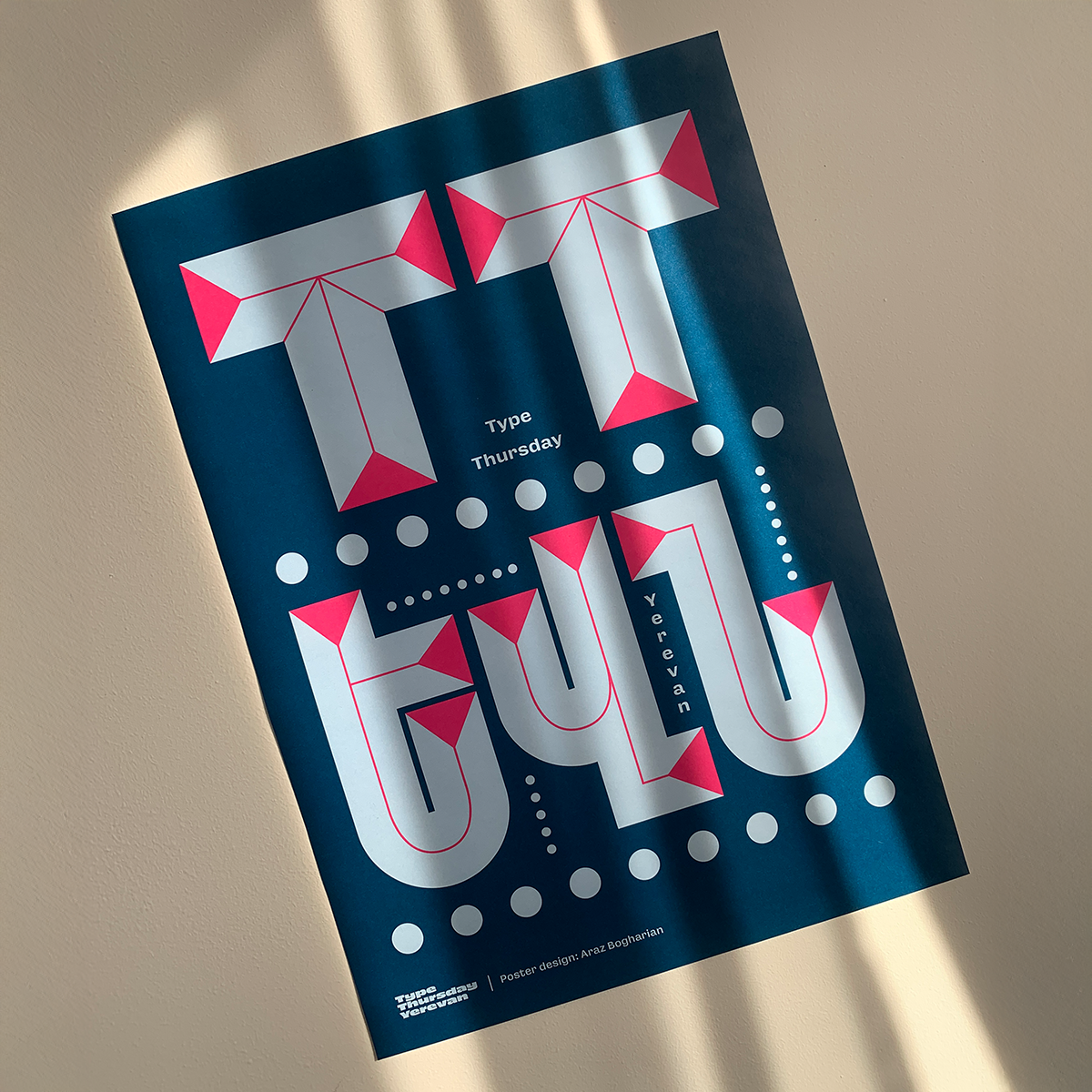 Type Thursday Yerevan’s 1st anniversary poster by Araz Bogharian
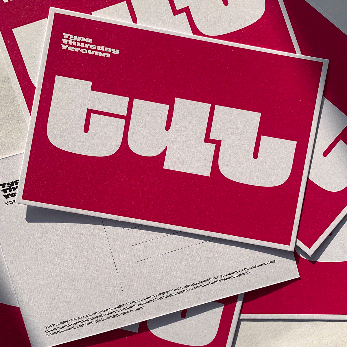 Type Thursdays’ postcard. Set in Obviously Armenian designed by Type Thursday team
AS: If I am not mistaken, Edik Ghabuzyan, the founder of Granshan, is running a typography course at the university? There should be a community around it!
AH: Yes, the State Academy has an amazing course. During the first year, students start using brushes and do lettering exercises. From the second year, they move to the digital space and start creating their own fonts, using FontLab. And only after that, they move to display fonts. I think that results speak for themselves, because our students, students who studied at the State Academy of Fine Arts of Armenia, won awards in both Granshan and Pangram competitions.
 AHH Anna by Anna Hovhannisyan. Special mention at Granshan
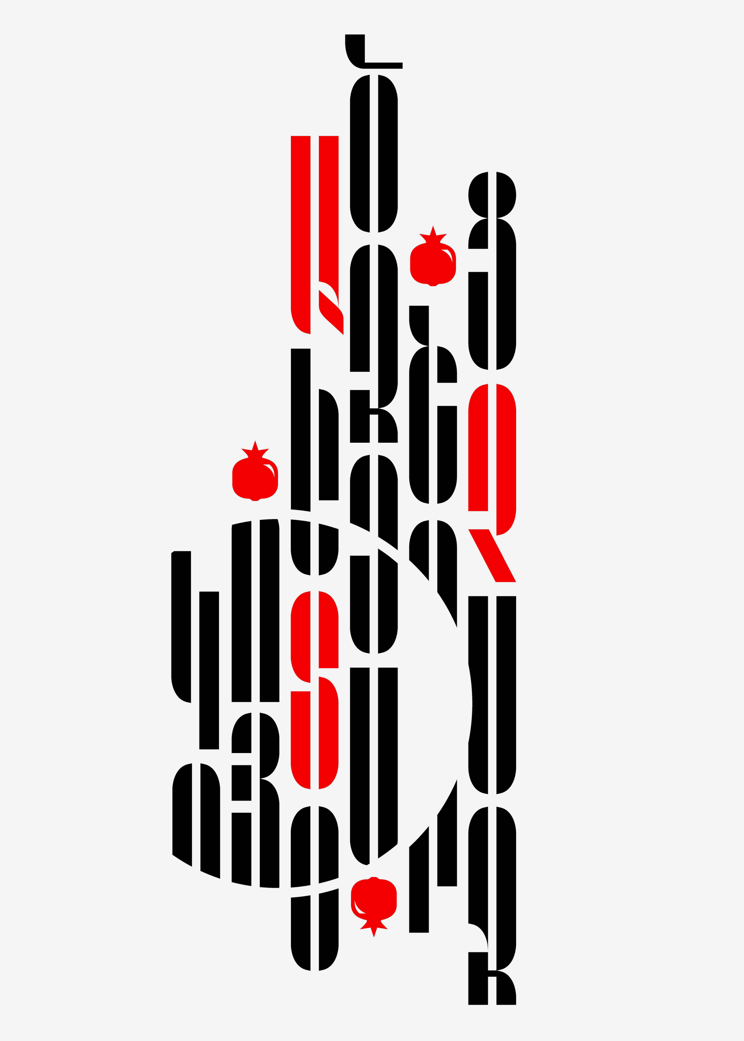
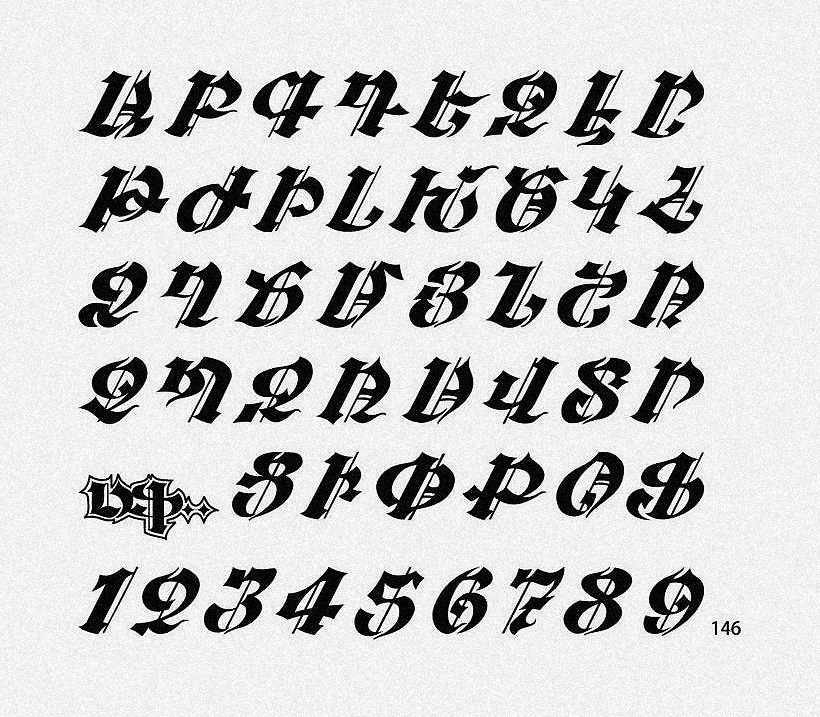
 MGHA Meri by Meri Gharibyan. 1st Prize at Granshan
AS: Have these achievements in type design competitions made the Armenian type scene more visible internationally?
AH: I think Granshan plays a major role, and the contribution of its
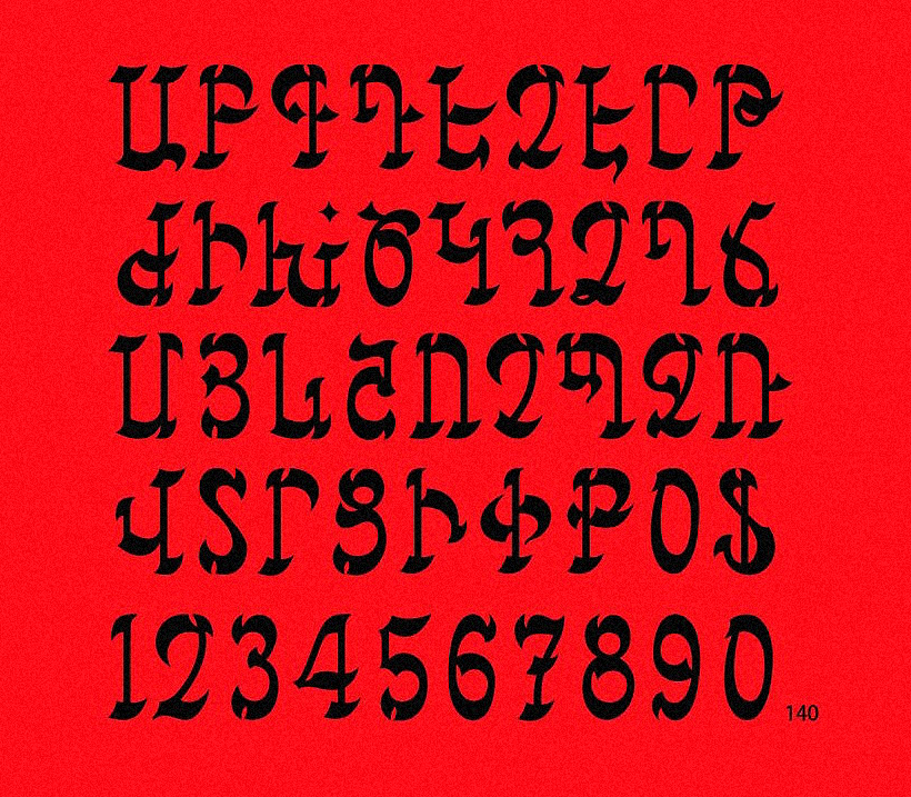
 GHEA Zvart by Edik Ghabuzyan
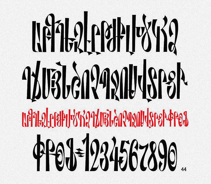
 GHEA DecoLine by Edik Ghabuzyan
 GHEA Parquet by Edik Ghabuzyan
AS: What does the type design scene look like in Armenia? What does the market look like?
AB: Actually, there aren’t many designers, nor is there significant demand, I’d say. But of course, there are independent type designers who continue working on their personal projects or collaborations with foundries.
Also, I think we need to establish a culture of purchasing
AH: I completely agree. I think the interest is growing, the demand is growing, but it’s still not as strong as it should be. So many designers now prefer to use free fonts or create their own. But at some point, because of a lack of professionalism or proper knowledge in the field, the results are often poorly constructed fonts. Some design studios are addressing this by including professional type designers in their teams.
AS: Do you think there are a lot of emerging young type designers now?
AB: I think most graphic designers are doing both, so they haven’t fully dived into type design. At the moment, I can’t name an Armenian graphic designer who has fully transitioned into type design.
AH: I think the problem is that the Armenian type design field isn’t financially sustainable. And there are also issues with intellectual property. It’s very hard for Armenian type designers to protect their rights when their fonts are used without permission, for example.
AS: Can you name some studios or designers who create bold typographic
AH: I’ll name one person from the past. I think his name should be remembered for bold Armenian typographic experiments — Fred Afrikyan. Among younger designers, I’d say Gayane Yerkanyan, Garik Ghazaryan, also Sona Mkrtchyan. And why not myself?
Works by Fred Afrikyan, 1980s
Typographic sketches by Garik Ghazaryan, 2025
Typographic posters by Gayane Yerkanyan, 2025
AB: I will add Khajag Apelian, Edik Boghosian and Garegin Martirosyan (TarPunk).
 Arek Armenian by Khajag Apelian, 2012
AS: Wow! Are there as many designers working on revivals of old Armenian typefaces?
AB: Yeah, I think it’s about 50/50. There are just as many people who want to experiment as those who want to study historical material. There are historical Armenian styles, and most revivals are based on those.
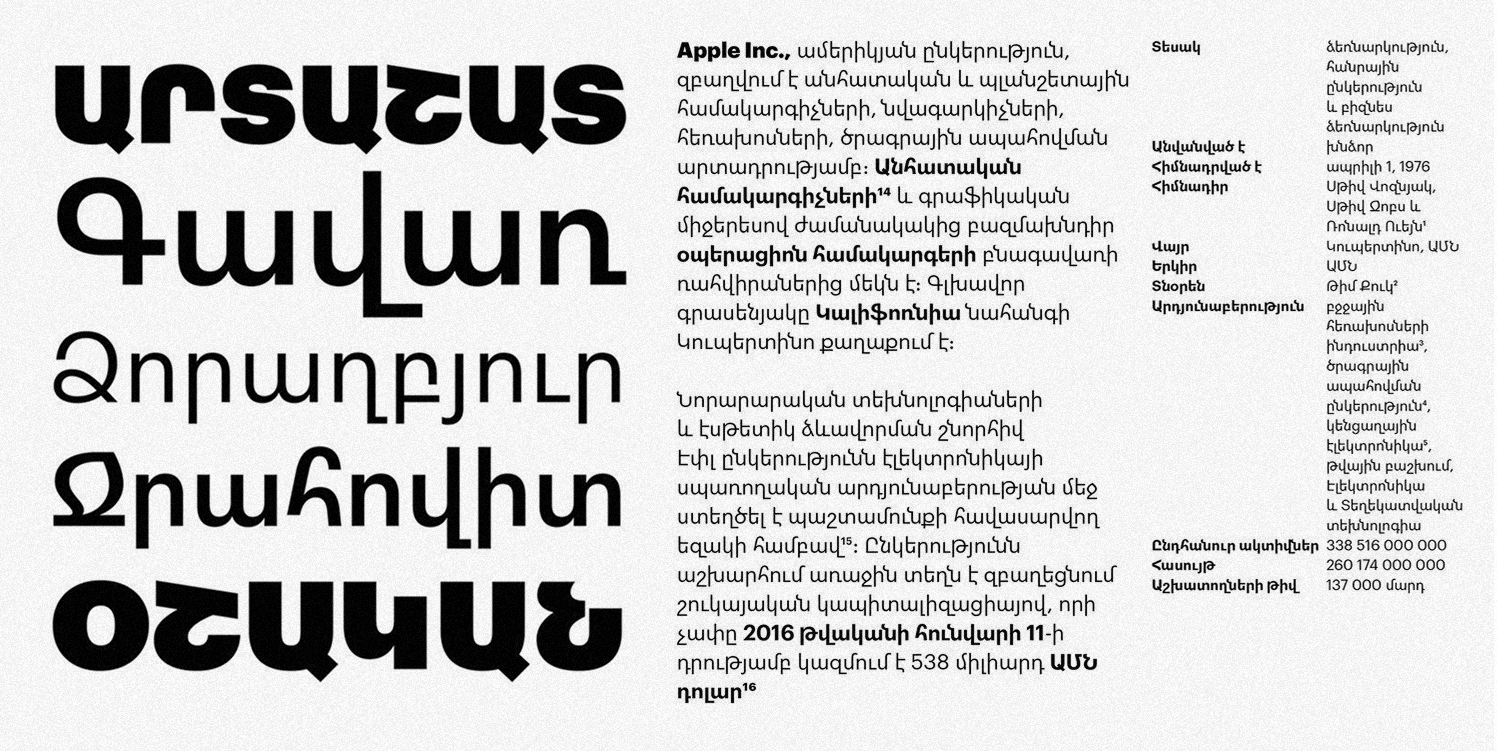
The four principal historical letterforms of Armenian writing are Erkat’agir, Bolorgir, Notrgir, and Shghagir. Erkat‘agir was written on stone with iron stylus, from where it got its
 Armenian letter “E” drawn in notragir style and ornaments
AH: I think the interest is growing, but the main work in this area is still being delivered by experienced professionals. Again, I have to mention Edik Ghabuzyan. Another key figure is Ruben Tarumian, who made a huge contribution to Armenian type design, especially with display fonts that have a strong connection to Armenian history. And there’s also Tigran Sosoyan, whose work is also deeply inspired by historical forms.
 SOS Valayelch by Tigran Sosoyan, 2024
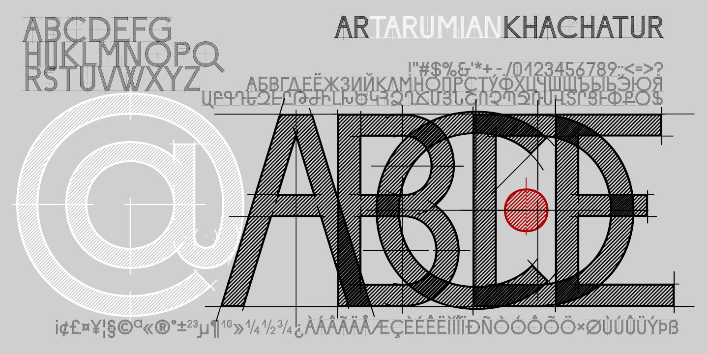
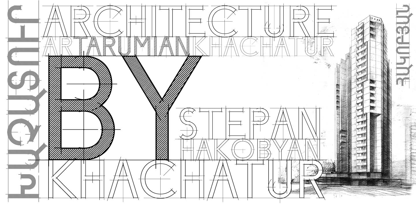
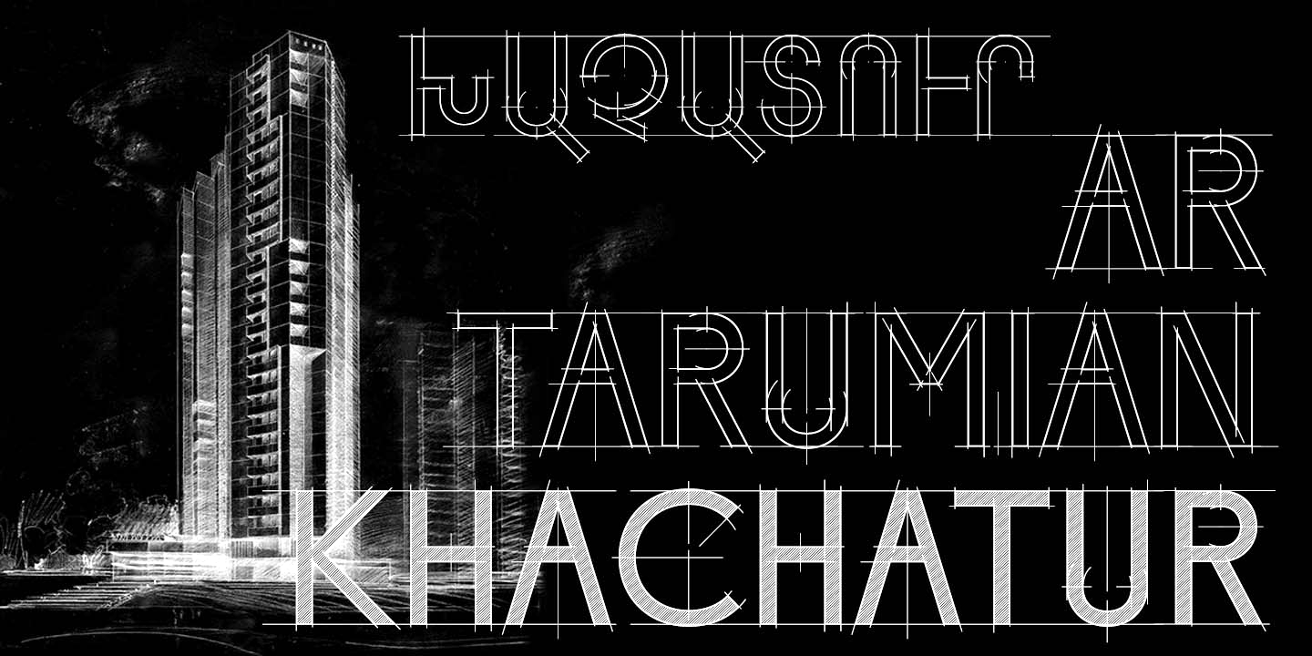
Khachatur by Ruben Tarumian, 2019
AS: Is there a generational conflict about type design practices, with younger designers wanting to treat the Armenian shapes more freely?
AB: I see it more as a calm transition than a conflict. Because of my personal experience, I had a lot of support. Also, during the TypeThursday events, we were very positive and supportive toward beginners. Of course, the new generation seeks the freedom to draw and create without restrictions. But I think that’s an essential ingredient for creative growth.
AH: When we talk about generational conflict, it always makes me think of a famous story. When Josef Müller-Brockmann was asked what he thought about David Carson, he said, “I don’t surf, I dive.” Müller-Brockmann meant to say that his and Carson’s approaches differ. Carson’s approach is surfing, since David Carson is also known as a surfing culture evangelist
It’s a bit similar in Armenian type design. There are two approaches, but neither is wrong. I don’t think it’s a generational
One is a more foreign-influenced approach, where Armenian designers start changing letterforms under the influence of Eastern or Western styles. The other is more evolutionary, more careful, and has proven its long-term value. Some of the strongest critics of the experimental
For the younger generation, it’s important to bring in fresh ideas and experiment a lot. But I don’t think readability should ever become a second priority.
 Goga by Angela Poghosova, 2009
AS: How do you tell a quality Armenian font from a poorly made one? For example, in Cyrillic we make sure that 6 is different from б, check that д is properly balanced…
AB: I think we have too many ascenders and descenders, plus a lot
AH: We have some really tricky letters to draw, both lowercase and uppercase. Also, it’s hard to strike a balance between Armenian, Latin, and numerals, because all three come from different historical regions.
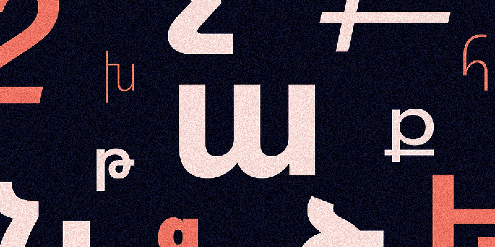
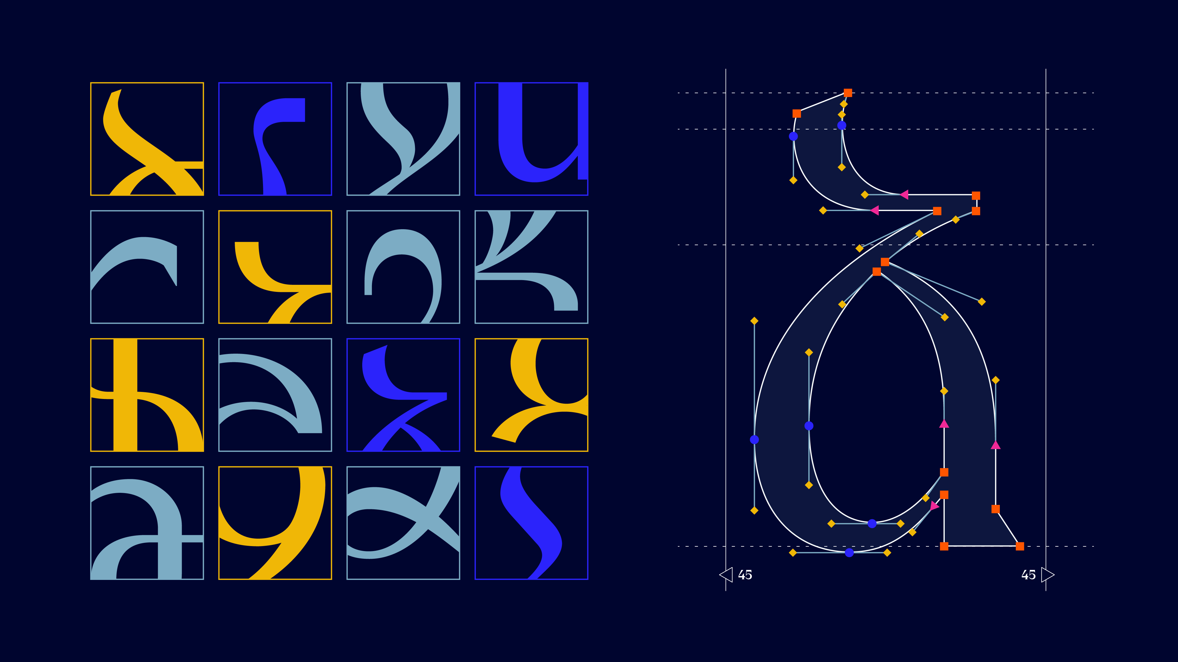 Tricky elements of Armenian letters. Image by Arman Harutyunyan
AS: Is type terminology a challenge for Armenian type designers and graphic designers? Is there a case where not all English terms can be properly translated into Armenian?
AB: There are definitely some translations and specific terminologies, but we often still use other languages for the missing ones. I usually use English terms, but if I know the Armenian equivalent, I’ll definitely use that instead.
AH: We use both English and Armenian terms. For example, in Armenian, we have the word կցագիր (ktsagir), which literally means “connected letters.” We use it as a term, but we can also just say ligature.
AS: What kind of Armenian typefaces are missing right now?
AB: Superfamilies with a wide range of weights. Of course, there are
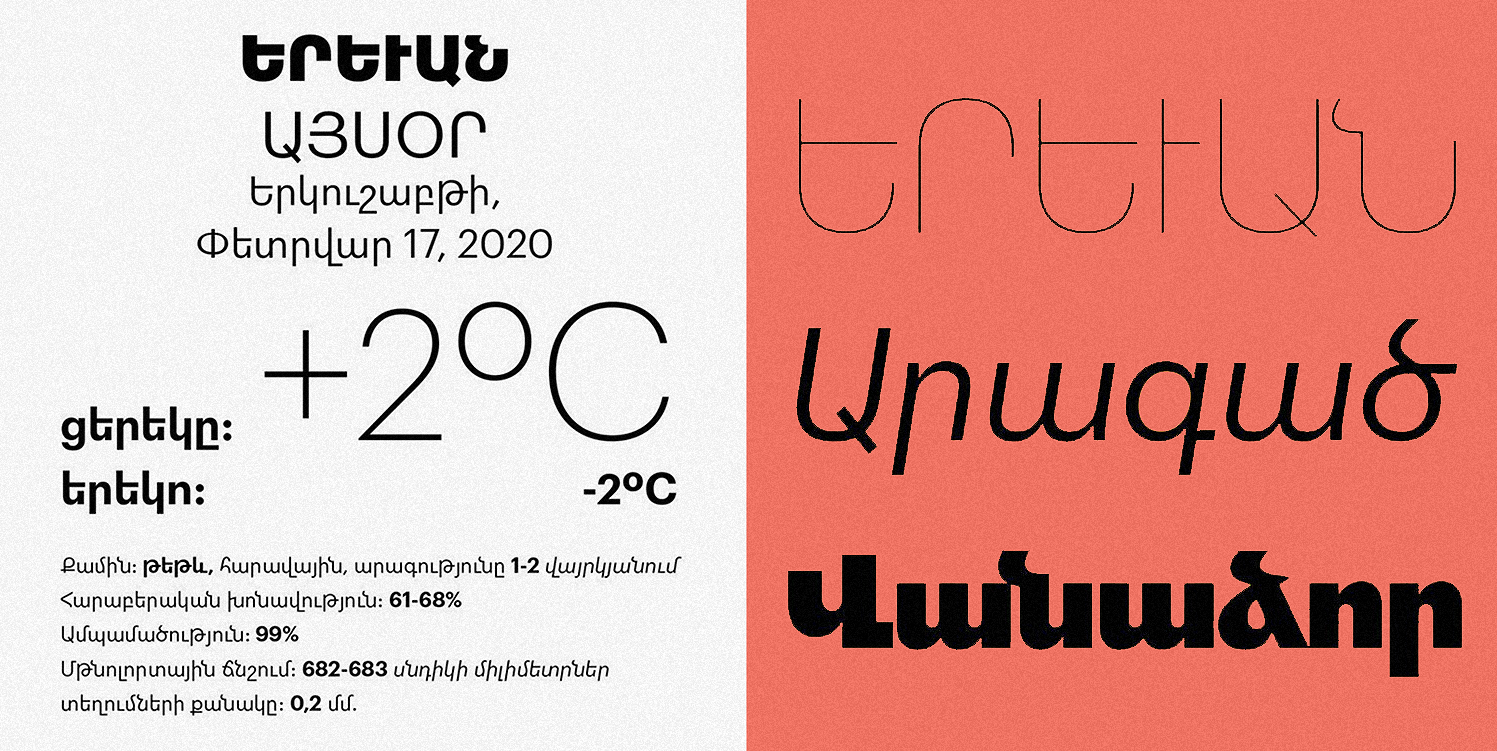
AH: One of my typefaces — AVH Mountain — actually has 20 weights!
But in general, it’s easier to list the typefaces that aren’t missing. We’re missing fonts for web and mobile interfaces, for video games… and we definitely need more multiscript superfamilies that support Armenian.
Aktiv Grotesk by Dalton Maag
Graphik Armenian by Khajag Apelian
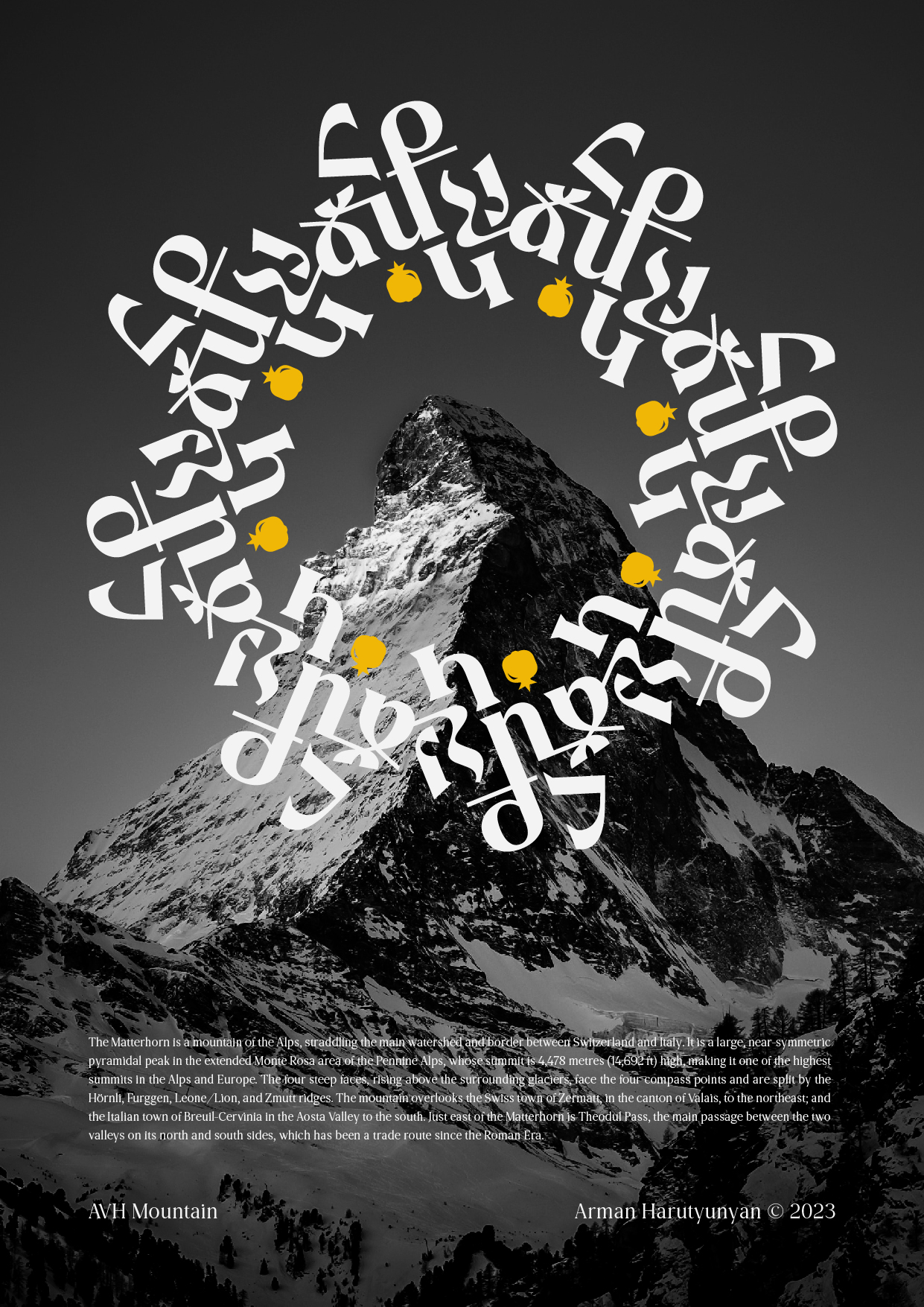
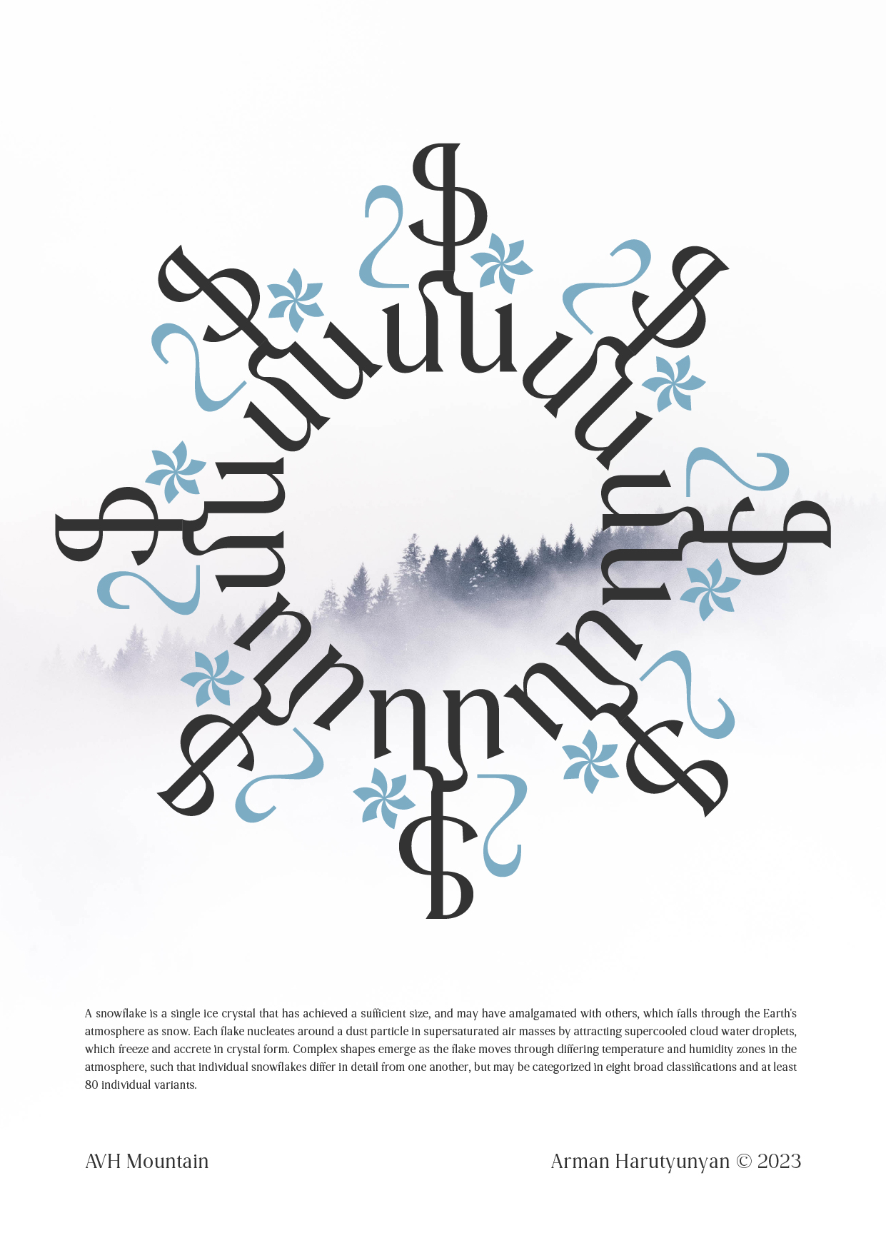
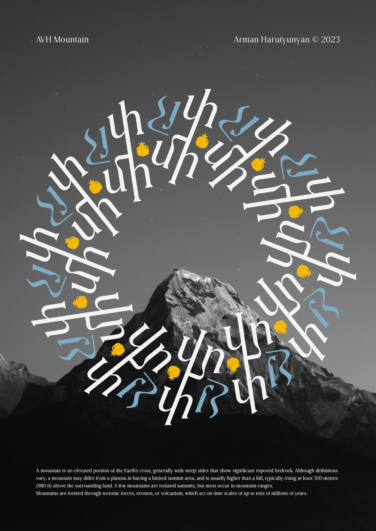
AVH Mountain by Arman Harutyunyan. 1st Prize at Granshan
AS: Can you give a tip or trick for combining Armenian and Latin fonts?
AH: It’s hard to give a strict rule,
AB: There was an issue with some fonts where Armenian at the same point size looked bigger than Latin. So to make them match visually, for example you’d have to use Armenian at 10.6 pt something and Latin at 12 pt. I think new fonts have mostly solved this, but maybe it’s still something to watch out for.
AH: With Armenian, it’s important not to skip ligatures like they sometimes do in Latin. They really
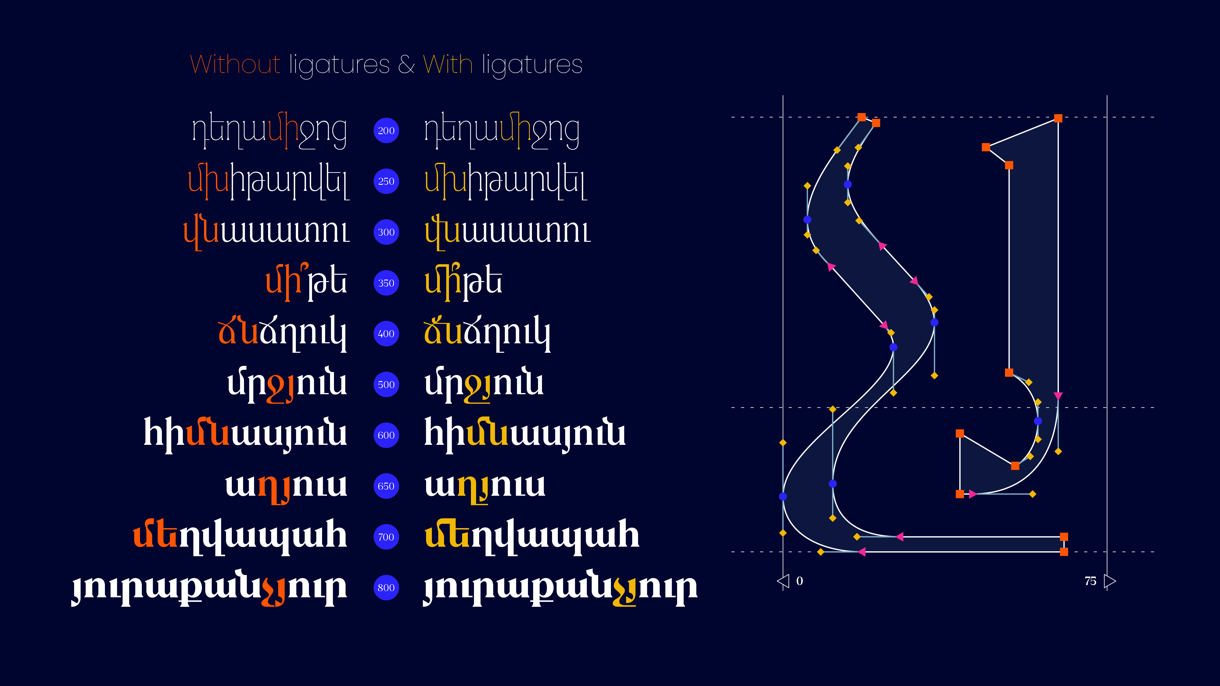 Armenian ligatures. Image by Arman Harutyunyan
AS: In 2022, a lot of people immigrated to Armenia. Do you think that’s influenced the design scene?
AB: Moving to a new country brings a fresh perspective. I think they see our everyday life with different eyes. I can think of a few
AH: I totally agree. One of my colleagues, Ilya Zakharov, moved to Armenia after 2022. He’s brought lots of new ideas to the
AS: Don’t you feel like there’s more Cyrillic around Yerevan now?
AB: We’ve always had Cyrillic
AS: If you could collaborate with any designer, Armenian or international, who would it be?
AB: I’d mention Hrant Papazian, he has deep knowledge of Armenian type design, its principles and rules. And since I love working by hand and enjoy calligraphy, I’d also say High on Type.
And actually, Zetafonts — met one of the founders lately, which led to a better engagement with the foundry and its work.
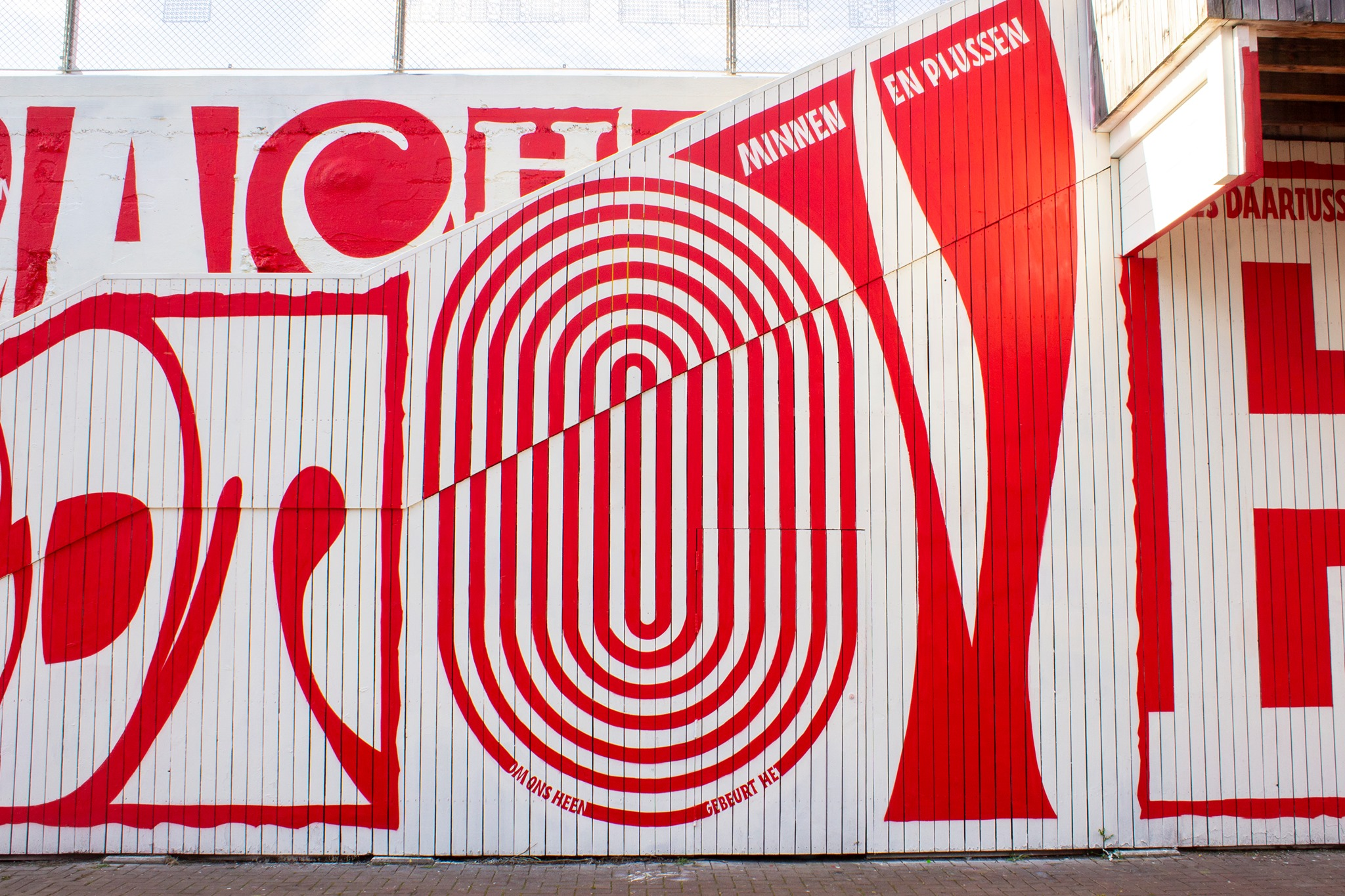
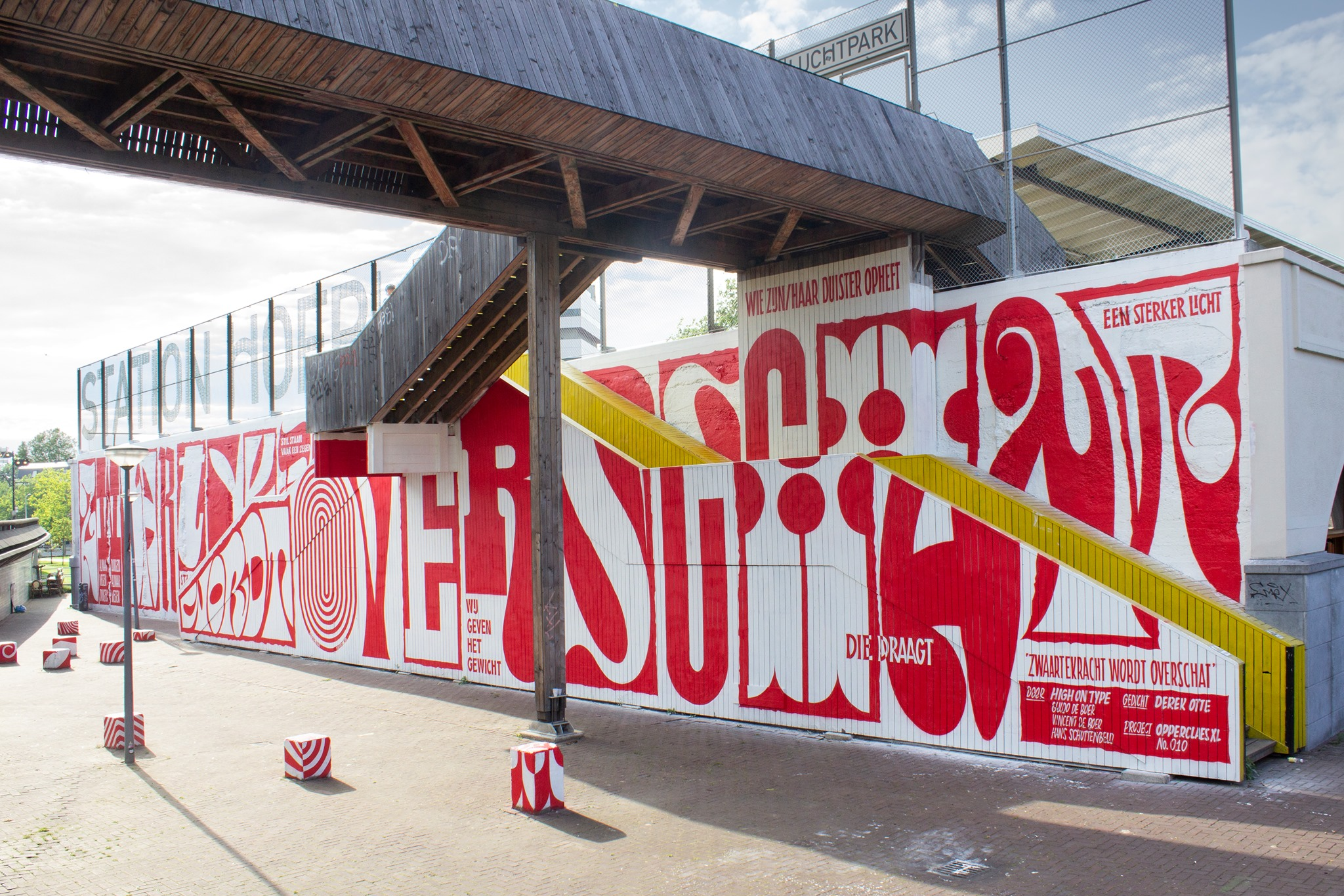
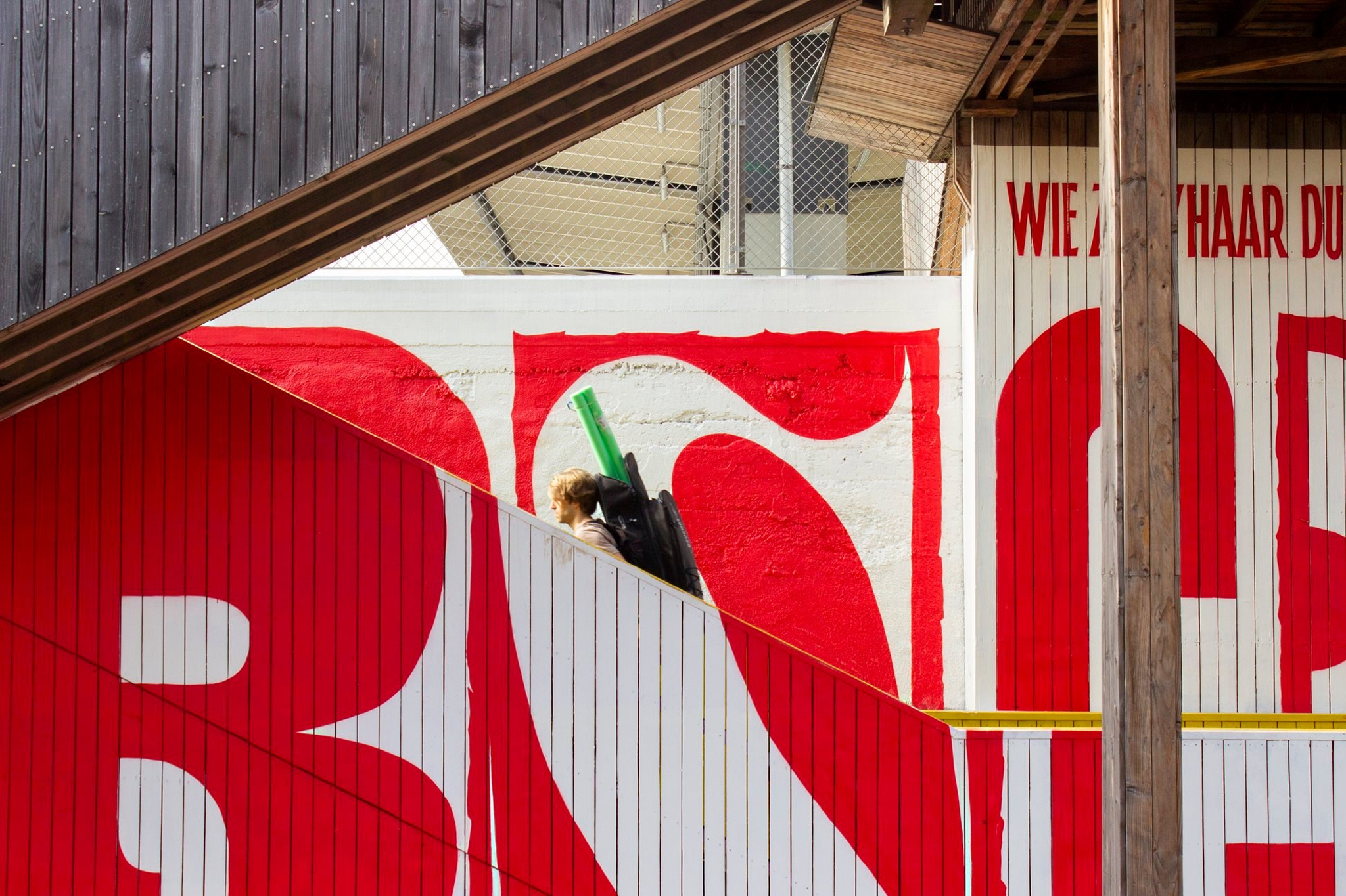
A mural by High on Type in Rotterdam
AH: I would say Tina Touli because she creates really experimental typography, and blends the digital and analogue worlds in a great way. Also, I’d love to collaborate with big names like Monotype or agencies like Pentagram.
Typographic experiments by Tina Touli
That’s not about designers, but one of my dreams was to collaborate with one of the Beatles. A few months ago, they launched the Beatles Lyric Art challenge on Instagram, where designers create artworks based on their lyrics. I joined in, and one of my pieces was featured on their social media and website. The dream is still to work on a big project with them someday.
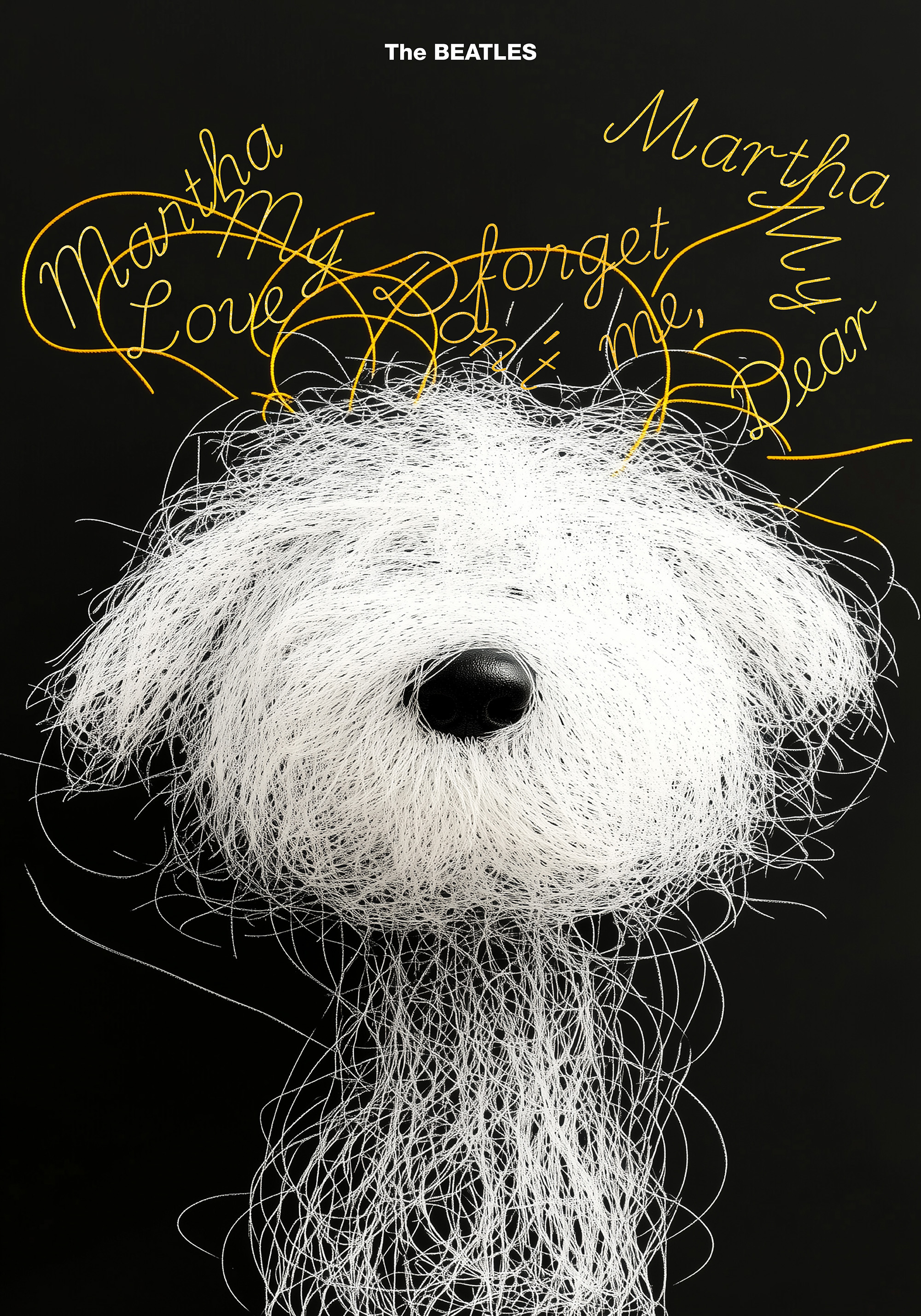 The Beatles poster by Arman Harutyunyan
AS: How would you like to see Armenian typography in the future?
AB: Improved. Also, we need a stronger sense of community and more events.
AH: I’d also love to see type design become a more sustainable profession in Armenia.
It would help bring in new designers, not just those doing type on the side while working as graphic designers, but people fully focused on this field.
And I totally agree with