
Please, tell us about yourself. How did it happen that you became a graphic designer?
I always painted or drew something, since childhood, attended local art school and always wanted to become a designer — one day it was clothes design, another day interior design. After my ninth grade, I enrolled at VGIK’s college (the high school of Gerasimov Institute of Cinematography) to study advertising, although I aspired to do animation, but at that moment, I had no my own works to show. And that’s why for four years I studied advertising. Then I worked at a bookstore for some time, found out about the design department at the Higher School of Economics, passed the exams and enrolled at this school. Last year I graduated from Elena Kitaeva’s course on multimedia design. My field was more about animation and motion design, there wasn’t much typography and so I had to deal with it myself.
Why did you choose multimedia design?
I did mostly illustration and got into animation and illustration, which then had to be divided into multimedia, 3D, and classic animation. I chose multimedia, because by the of the first year I realized that it was design that interested me more. At first I thought that illustration and animation would be a fun thing to do, while communication design is something boring. But later I became involved and my attitude changed. It must have been in my second year when I saw works of foreign designers like David Rudnick, Alexey Ryumin showed them to us. I liked this kind of graphic design and started trying to do something like that, looking for things, watching what other people do. I started to use resources like Tumblr a long time ago. Actually, I was there in 2010 already, when it wasn’t popular yet. Always found some artists. I constantly do a deep research on the Internet.
And how did you “deal with” typography? Where did you get information, also online?
I have to admit that nowhere, if we talk specifics and details. Generally, large viewer experience works just fine, together with reviewing and examining different typefaces, both classic and new ones that are being released, — and then try out in practice how it all fits together and where it could be applied.
Where do you go for new typefaces?
I have a selection of certain major foundries and foreign websites where they regularly publish new typefaces, and those are available for free. Once in a while I go there. But mostly I follow people or studios on Instagram. I enjoy the French type foundry Velvetyne, Dutch designer Jacob Jan Wise, French designer Loris Pernoux. Vivien Hoffmann, Eliott Grunewald, Daria Petrova — actually, there are many of them, young and great at what they do.
And your graduation project, was it type?
It was. I made two display typefaces, and it was my first ever typographic experience. Although I wasn’t getting any help from HSE, as we had no professors teaching typography there. The only typographer we had was Denis Masharov, but for the most part he was teaching us theory. So, my advisers were slightly opposed to the idea. They were wondering why I wanted to make a typeface given that there was no one to give me advice on it. But eventually they said “okay, do what you want to do”, and I decided to produce all by myself. For my work, I opted for the most complicated program, FontLab, — there was a simpler one, Glyphs, but I couldn’t download it for some reason. It was pretty difficult to master FontLab. At first, I made some sketches, drew letters in Illustrator and then moved it into FontLab where I tried to edit things, and then save everything as a font.
And you didn’t get any advice from typographers, no consultations?
Yes, only with one of my student peers, a classmate who also chose typography for his graduation project. He helped me master the software a little bit. Other than that, no advice.


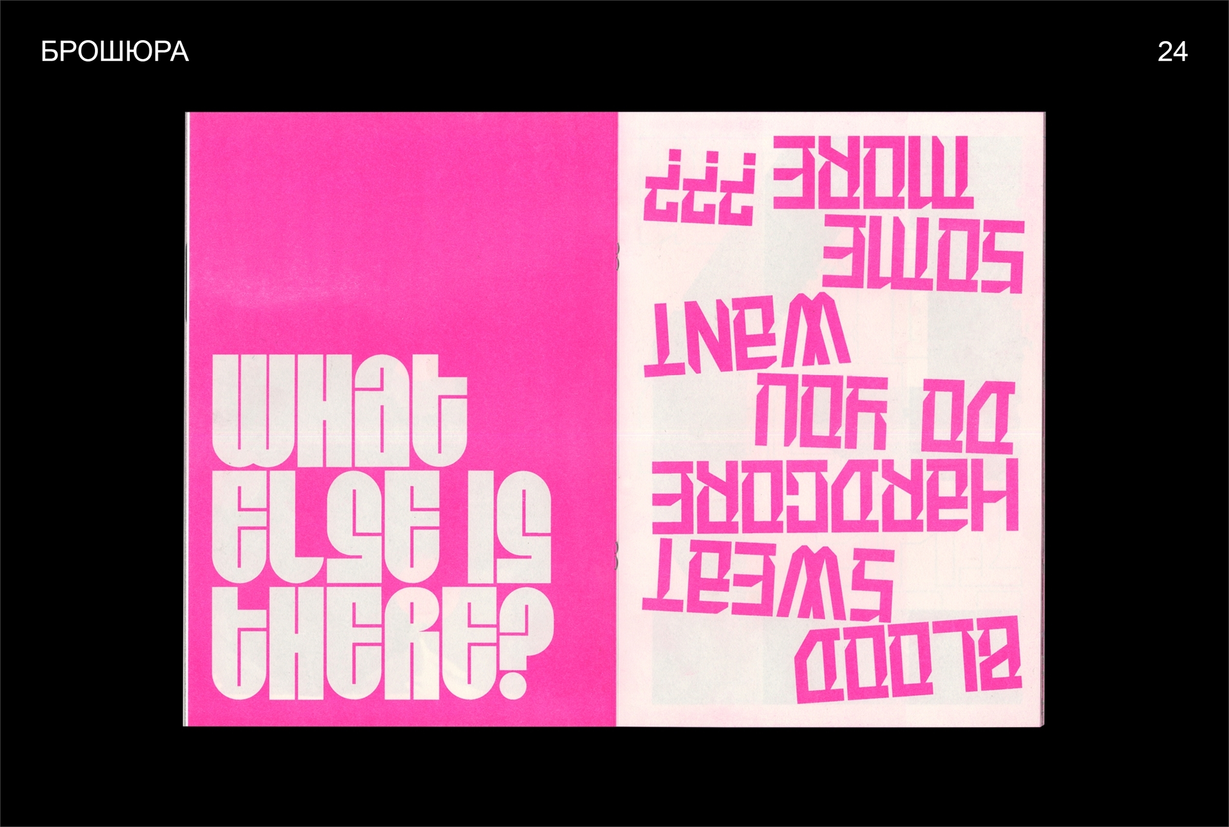


Promotional brochure and scarves for the graduation type design project
You have a number of typefaces designed, not just one, plus merchandise and promotion elements. Was it your idea to present this way, and it was the school’s requirement?
It was the requirement of the school, for the project to be big, extensive. And two typefaces because one was not enough. As a matter of fact, all our graduation projects had to include videos, presentations and some tangible media — real products, no mockups.
It is amazing that one typeface was not enough: designers often spend decades developing a single font release. Did you use your graduation typefaces somewhere?
I didn’t, but I haven’t been able to create my own stuff yet at all. Although, there was this artist who asked to use Plastic Love, the round one, for his comic strip. I wonder where he lands with that. Actually, I am not even sure that these typefaces might be used in reality. Now I even have some thoughts on how they should be re-done, but it is really hard getting back to old things.
And do you feel like designing new typefaces?
Not yet. I am more involved in some lettering, maybe logos, something quick, than in typefaces. After all, developing a typeface is a time-taking, demanding process, currently I don’t have enough energy and time for this.
Don’t you have plans to further educate yourself in this area?
Probably, yes, but maybe later. I also would like to go deeper into 3D, for this end I am now doing a course in motion typography with Dima Rodionov… (In February 2020, Dima Rodionov was put in charge of our Instagram, — editor’s note).
How do you like it?
I just started, but this is fun, very interesting. The field is very popular and it is not that easy to come up with something new, — although there is ample room for experimentation. Only for now it only works on Instagram, whereas very few things end up in real projects.


Another student project of Karina, a visual research of utility typography
What did you do after graduation?
After finishing my studies at the Institute, I worked at the Illuzion movie theatre for some time, and for two months at Ziq & Yoni clothes brand after that. Now I’m with ONY.
What is your role there, exactly?
I do branding, mostly for digital brands.
How did it feel to contribute to our Instagram on a daily basis?
I liked it, it was a great experience. It has somehow gotten me into line with the field. Some of my peers have already been engaged in type.today’s Instagram and I was willing to put myself through this challenge, too. At the beginning, I spent too much of my time on every image. There were even moments when I did everything at once. Drew a sketch with many pictures, to see how they fit together, and then completed all of them. But later, after two weeks, I embraced the opposite way of working and created the image at one go, from scratch. And, for the record, it was the pictures that took less time to produce, that people liked the most.
How often did you have to make pictures on the day of publication?
For my first days, I prepared a number of pictures, for a week maybe, but then I ran out and started to make them right along the way — on the same day, sometimes, or a bit earlier, on the night before. It might be tough when you want to create something exciting, investing more of my time to it, but your brain just refuses to generate more ideas. Though, I even have some groundwork left after the project which I never used.
Did you have some sort of common vision behind this, poster-record style?
I did. Initially my idea was to make everything as album covers, or something in the esthetics of the 1980s, — I like this period, both in music and design, plus I generally very much enjoy cover art. But then I decided to mix it with different kinds of pictures.
Say, you are presented with a huge pile of typefaces. How did you proceed?
I have to confess, I already had certain typefaces I preferred.
Which, exactly?
Well, it was Druk, certainly. May I pronounce it Drook and not Drahk? Graphik was also easy to use in different pictures. And RIA Display Sans, I applied it in my type.today World Tour post. I prefer typefaces slightly old-fashioned, and this one certainly is, in a way. From the 1960s, probably, — or precisely from the very 1980s. So, at the start I produced pictures using my favourites, then typeset the alphabet in all the typefaces and began to work with the rest of them. My ambition was for every picture to be about a new typeface. And yet I haven’t been able to use all of them.
That’s right, our collection is now too big to keep you within the 30 days deadline. Don’t you have a new crush after finishing our project?
My new crush is Austin that I was unfamiliar with before. I also like Proto Grotesk, Parmigiano Caption Pro.
Could you please tell us how you got the ideas for your pictures.
I liked my images to carry certain references. Which is why, for one, I came up with the poster of Sonic Youth and the Russian band called NEP. There really was such a poster, in fact, when Sonic Youth visited the Soviet Union back in 1989. This was a legendary tour, and they constantly spelled the name of the band differently, switching between “Соник Юф”, “Соник Юс”, and even “Соник Ют”. And the phrase “if you like honey then do like cold” (Russian equivalent of “When you play, you have to pay”, “After dinner comes reckoning”, etc.), it is actually a quote, and one of the commentators made the right guess, it was a line from the movie Brother (an iconic 1997 Russian film by Aleksei Balabanov — translator’s note). There were some references to music albums as well. I think that Forum band received that many likes because there are people who still remember this band. Or, take the picture with mountains, it appears to be a clothing label. One can find jackets with similar tags at a thrift store selling second-hand clothes.
“Leningrad Palace of Youth / April 10 and 11 / the band Sonic Youth (USA) / the band NEP (Leningrad) / doors 7:30 pm”
“If you like honey then do like cold”
“Forum – Belaya Noch (1987)”
So it means you saw some label which made you decide that you would make the same one?
Well, it was rather a trop of such clothing tags. I constantly view many images, thus accumulating pieces of reference for my work.
You must have quite a collection of labels and covers.
Yes, I am putting it together at Are.na, a moodboard platform like Pinterest. Although, I wouldn’t give you a link, I keep it hidden there.
How does this collection work? You get to know how the things are done, you copy, take it to pieces, and attempt to repeat?
I wouldn’t call it copying. I try not to build on what the designer has made, but rather to find out what he built his work on, analyzing it and getting an idea of how it inspired the author. This makes me dig into various kinds of old references, and translate it into something new. I might take a little bit from different sources, borrow some things and then bring them all together. This is how most of my type.today posts were born.
Were you watching the stats?
I was. For example, there was this picture with a calendar on 5th November that got many likes, which surprised me. In fact, there were other posts where I was struck by the number of likes. Another fun fact: the menu image got a number of comments on how repellent it was, unreadable, hardly visible and all, — yet it still got many likes.
Did you have this one typeface which you wanted to deploy, but just couldn’t find a place for it in your posts?
Yes, it was this letterpress one, a serif, — Gauge Letterpress. I made an effort to do something with it and failed. Then there were other serifs, such as Trola. But those didn’t seem truly distinctive to me, neither here nor there. I couldn’t find the way to make them shine, you know.
Tt: How exactly did your ideas run across our typefaces? It must have been the ideas that gave rise to the images, I guess?
Mostly, yes, everything started with an idea. Although with Druk, for example, I felt that it would fit in with the Soviet style. As for the menu picture (it was Karloff), this one was, in contrast, built upon the typeface, same with Flower Power and Pilar, Lemon Juice and Amalta. The typeface reminded me of hand-written labels, the reason why I did it this way. So, it can happen both ways: in some cases I chose the typeface based on the initial picture, while in others the choice of image was defined by a certain typeface.
You constantly refer to the past, yet the stuff you create is very contemporary and relevant. Do you understand how to make something old become a thing again? Is there a recipe?
I have no exact recipe, I think. I believe I act on a hunch. You could bring in new elements in terms of composition, perhaps. Certain things result from colour — those more up-to-date schemes, digital, vivid, a bit acid colours.
You keep saying the eighties is your source of inspiration. Please, explain, why you love this period?
The 1980s is this weird nostalgia that I missed. I like the music from back then. I enjoy visual techniques, those neon tricks, aerography. They say that fashion repeats each thirty years, it means that now it has to be trendy again. However, now we see the arrival of the 2000s. In design, we already see it, witnessing the return of futurism of ancient interfaces, silver and all silvered…
We skipped the 1990s?
The nineties were pretty weird, actually. Speaking of the eighties, it is very clear to me what was graphic design about back then. If you ask me about the design in the nineties, it’s only raver flyers and some music album covers popping into my head, but they all are very different, eclectic.
What about the 2000s?
For me, this decade is synonymous with the magazines, as I used to read girls’ glossy magazines like Elle Girl. I think of these album covers, like Britney Spears’ In The Zone with the blue overlay effect.
**Could you actually tell at which moment this “today” began in design, exactly? The 2000s are history now, or are we still chewing over this style? **
I believe we have moved on now. And today started in 2012-2013, when the Internet became available everywhere.
Do you have any idea of where design and typography are headed?
Currently, we see quite a lot of unthinkable, funny, strange typefaces. Perhaps it was cool that they all were so unusual, but now, I think, we are in fact experiencing some sort of oversaturation of these weird typefaces. So I believe this trend is soon to be over, and everything will just head to some other place. I’m not quite sure which place it could be. Somehow concise again, possibly. Or the opposite, it becomes even more intense.
Thank you very much. What a nice month, beautiful pictures.