
- Alexei Kritsuk
- graphik designer, V–A–C Foundation

On V–A–C Foundation and V–A–C Press
The V–A–C Foundation exists for more than 10 years and its activities are primarily aimed at promoting contemporary art. Developing it in different capacities — introducing contemporary art to the Russian audience as well as introducing Russian artists to the international audience. We work with such artists as Arseny Zhilyaev, Kirill Savchenkov, Sara Kulman, Taus Makhacheva, Mikhail Tolmachev. The foundation is a non-profit organisation which allows us, within our publications programme, not to care that much about profits or splashy titles but to print books that we consider important to be published or republished. We have an opportunity to spend a lot of time on texts which sometimes may seem bizarre and difficult to understand to the lay reader. We can reissue Tolstoy’s essays with commentaries, or print the anthology of Russian science fiction of the 19th century.
When I joined V–A–C, I basically became the first designer in the foundation. All previous projects — both exhibitions and books — were designed by people from outside. I still consider myself just an inhouse graphic designer. Except that the design team of the foundation has grown to seven people, and now I’m also in charge of administrative work. But bringing together seven people was not a one-time event — for a long time I was considering and choosing with whom from outside it would be interesting to work on our books programme. We prepared the edition of Michael Baxandall together with Dima Gusev and Misha Filatov. Roma Gornitsky designed a series on the theory of contemporary art for us. We also have a series with Artguide, a Russian web publication, which is designed by Natasha Agapova. Sometimes after such collaboration these designers join our team. We put Stepan Lipatov in charge of a children’s series, and Katya Lupanova — in charge of a book by Andrea Long Chu, now both of them are hired by the foundation.


Alice’s Adventures in Wonderland, illustrated by Pavel Pepperstein, 2020


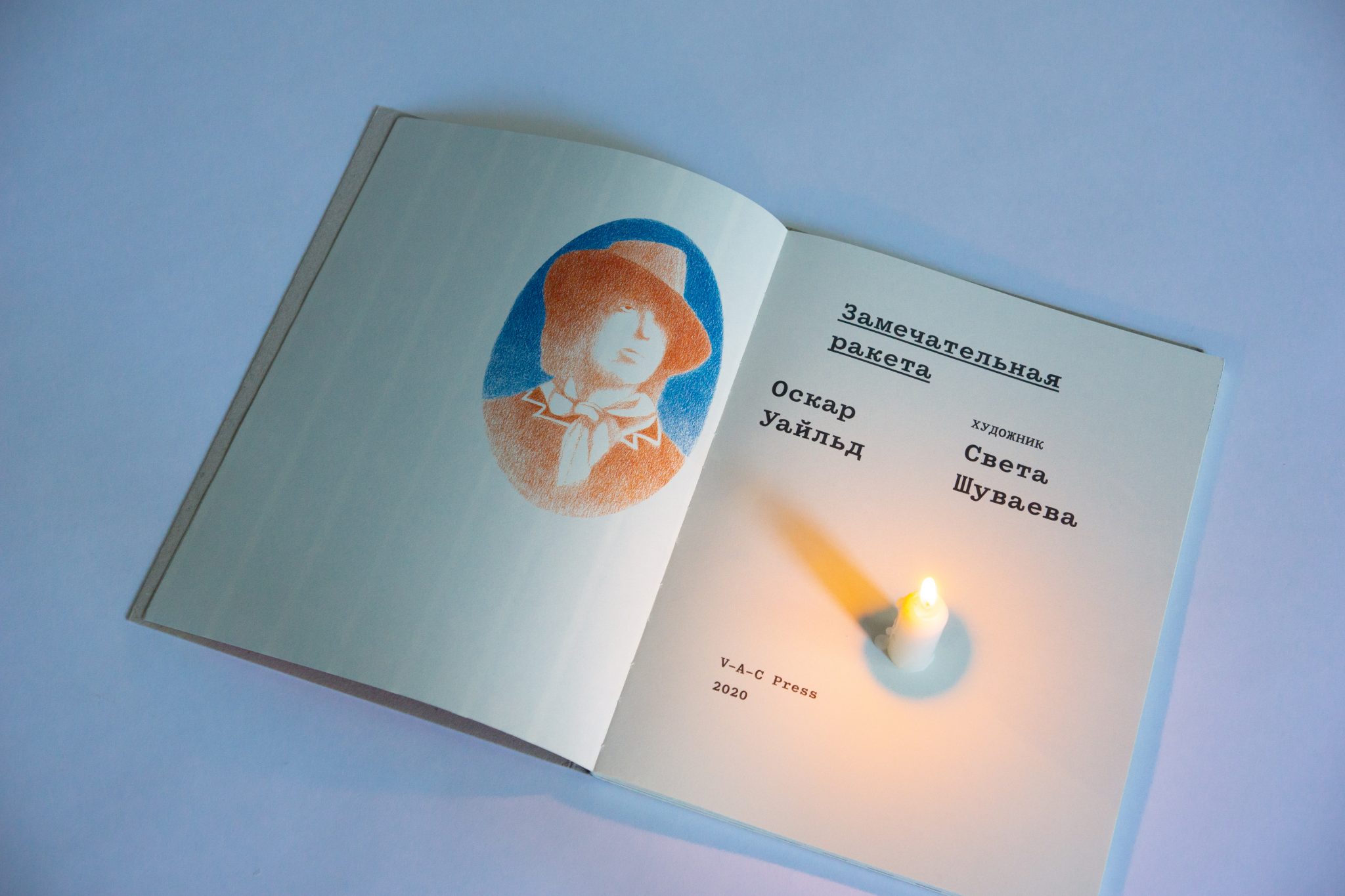


Oscar Wilde, The Remarkable Rocket. Illustrated by Sveta Shuvayeva, 2020
On choosing a typeface
For me, picking a typeface is pretty much like choosing a paper. Together those things become a material. I mean, the paper is material even without a typeface, but it’s only together with a typeface and folded in a special way that it becomes an object. After that in each case you have a different task, and any particular solution depends on specific text — on the time it was written, on its structure, and other conditions.
It is my belief that there’s no crucial difference in terms of what face you use to set. Things like easier reading in serif or sans-serif typefaces are a matter of habit. Our kids won’t probably read in paper at all. E-books let anyone set any text in any type — and this is a death of an object. Except that talk of death of the book has been going for a long time now, but it won’t die, not yet.
Lately our foundation started developing its own identity style that we call ‘diagrammatic language’ — it’s built around connections, and every image becomes a diagram. This is a joint effort with Experimental Jetset studio and Roma Gornitsky who has already designed for us a special typeface — DiagramatikaA version of this typeface has been released by Gornitsky under the name Gramatika, a new take on Pragmatica. In the future we’ll have more books set in this typeface, perhaps. But for now I’m inclined to using it primarily for the publications directly linked to exhibition programmes — in catalogues, basically. As for our publications programme in general, I still would want to produce very different books — depending on topic and content.


Promo materials for ГЭС-2, the historical Moscow power station and the new home of V–A–C
I regularly look through catalogues of various type foundries, yet historically I have an extremely clear understanding with Roma Gornitsky: I easily see what he is doing and how to manage it. I also worked a couple of times with typefaces by Radim Peško — his story is very close to me as well. I liked using GT America. Once again, this was an incredibly apprehensible typeface. Do I need to explain what I mean when I say ‘apprehensible’? This is not about clarity of typesetting, but about the clarity of an idea behind these typefaces — it’s when I get what a person was thinking, creating this typeface. Although, it also happens otherwise: for example, with all due respect, I don’t get typefaces of Gayaneh Bagdasaryan and I wouldn’t know how to apply them. Occasionally I prefer to work with old typefaces. At some point I fell in love with Akzidenz Grotesk, seeking to use it more and more. Frankly, I also like Kazimir, though I’m still not certain if I found the right approach to it.


Scotch Modern in the catalogue for the Generalnaya Repetitsiya performative exhibition
Kazimir Text, Centre for Experimental Museology
Centre for Experimental Museology is an initiative within V–A–C foundation. Its stated aim is to ‘promote and support projects that deal with experiments in art institutions’ form as well as with exhibition and museum as specific artistic media’, which is why all texts in this series share the same topic of museology. It is both museum critique and efforts to figure out what a museum is, how it works, and how it can work. While we were discussing this story, we agreed that CEM would basically be a certain research institute within the foundation, and decided that the style should definitely be modernist. And then it was much like a click in my mind: we had to use the first attempt to cyrillize Helvetica which took place at the PolygraphMoscow University of Printing Arts, formerly known as Polygraphic Institute in the 1960s. After this experiment took place, it was used for some time, but was not further developed. It was not even digitized. A work that has been stagnating for years, which, decades later, first served as a base for creating the Encyclopaedia 4 typeface, and then — Pragmatica. For me it is a certain missing element in the history, a dialogue that never happened. Roma Gornitsky and I, we said to ourselves ‘why not simply digitize this typeface?’ But eventually we brought in some changes: corrected the forms of letters к and ж, rounded periods and commas, added text figures. Our typeface — Roma called it Aesthetica — uses a quite weird and unusual approach to many letters, but when such a Cyrillic is put next to Latin, it looks just awesome. I won’t be able to give your right away a name of any other typeface where the interrelationship between forms would work so well. Then Roma went further, plunged into an experiment and later released the typeface as Soyuz Grotesk.


Aesthetica on the covers of the CEM book series
I had a clear understanding that Aesthetica definitely was not a typeface for setting texts. I needed it for other purposes. I spent plenty of time looking for a right pair for it. There was a moment where I tried to set it in Schoolbook, but it didn’t seem fresh enough. But Kazimir Text worked just fine, and this is how it ended in the book series of CEM. I believe they are great neighbours. Kazimir integrated into the larger system of the entire style of CEM: we used it both in the exhibition organised within this initiative and on its own blog redmuseum.church (such a weird address is a reference to the X-Files television series). Any time our text is larger than minimum size, we introduce Kazimir. It is highly important that a person who has already held in their hands a CEM book, and then ends up on its website or at its exhibition, sees all elements fitting into one shared perspective.


Aesthetica, Kazimir Text in the CEM book series, and on the website


Kazimir Text in the CEM Almanac #1
Yet I don’t have a feeling that I 100% get Kazimir. I see a lot of works that use it only for its wide range of styles, and people mix those. That’s weird. My guess is that it was conceived as a book typeface and needs a very careful approach, without this magazine-like piling of various weights. There are certain details that appear confusing to me. Such as, the width of its dash seems insufficient to me — and I make it slightly wider in my typesets. Sometimes it happens with the whole series in general that I want to change the layout a little bit. The line might have been a bit longer — a couple of symbols, really; otherwise the edge is too jagged. But then I start to feel sorry: it is a series after all, and changing the layout will ruin it. I’m trying to take it easy, errors like that. Although, I did make one adjustment after all: in the latest volumes we decided to slightly tint the page, and we have a little moire there — a certain reference to flawed print in Soviet catalogues.
Spectral, Post-Humanitarian Studies
In the series which among ourselves we call ‘the anthropocentrism critique’ we publish post-humanitarian research and studies, all sorts of metaphysics of AI and new technology. When I heard the term ‘non-anthropocentrism’, I realised that rather than design covers manually, we should build a neural network that will generate them all by itself. Especially since at Britanka I had a student who was into this area and even did his graduate project on the subject. He helped us. Together with our editors, we decided that they were to give a certain amount of key words for each book, which we will then use to search images. We feed those images to the neuronet after. It generates new images, and we pick one image out of ten, the one to become our book cover. Initially we define only colours for the machine, as we want to have a series with different colours of its covers.


Spectral in Metaphysics Today, by Armen Avanesian
How did it end up with Spectral? It has to do with the origins of the typeface. Its description, I believe, says that the typeface was specifically designed for better readability on-screen and initially was not intended for print. After reading the description on type.today, I went to Google Fonts where they have a separate article on Spectral. I examined it for a long time. It seemed interesting to me to use this thoroughly well-thought-out machine typeface in print. Especially given that it has lots of styles, and you could have fun in many different ways: I really like this combination of setting body text in Light and using Extrabold for footnotes.
Proto Grotesk, Leo Tolstoy
When we began to discuss this book with our editor, for some reason we both agreed that it should be somewhat acid. At the same time we immediately decided on the magazine-like shape: we wanted this edition to have a magazine vibe. Technically, What Is Art? is an article, and its text was rather avant-garde in itself. I had already taken a closer look at Proto Grotesk earlier. I liked this slight dope in the forms, especially in large sizes. I use the word, dope, nicely — meaning this sort of cool weirdness: those awesome thin strokes in lowercase е, stroke width modulation in р, an unusual tail in а. I felt that all this would fit Tolstoy’s text. Plus, I like the name of the typeface. It feels nice when the stars align the way that both the typeface’s design suits you, and the name is ideologically relevant: Proto, Tolstoy, Grotesk… I like that.


Proto Grotesk on the cover of What Is Art?
When I was choosing paper, I already knew what exactly I wanted on the cover: this enhanced pantone brightness and this tender grey in photography, with no white whatsoever. And inside the book, we needed to achieve a slight contrast between the grey text and grey-ish paper. There are two additional articles laid out in two columns — and that adds this magazine flavour. Though, I really needed differences in the layout, certain largeness. Yet it was clear that if we set all this in some relatively large size which I strived for, it would be totally inhuman to the reader. Therefore I decided that each chapter will begin with a page of text set in larger size. The idea was born from the design of the typeface. Because the larger is Proto Grotesk, the more evident the oddities become in the setting. In small sizes this distinctiveness somehow vanishes, but I decided not to put anything to pair it. It was important to keep only one typeface so that it reveals itself in various sizes.
Proto Grotesk has no italic styles, so in order to avoid using a separate typeface for highlights, I applied shadowing. It took me lots of effort, as you can’t simply apply shadowing to a selection of text. I had to copy the fragment in question to a separate box, apply shadowing effect, and put it below. That said, when I received the first iteration of the text, there were way more italics! Back then I thought, ‘wow, this is gonna be great!’ But eventually editors decided to comply with the first edition which had no italics for phrases in French and German. That’s a shame. However the fact that the publication’s design is compliant with the book’s first edition, makes the whole story even more beautiful.


 ]
]
Proto Grotesk as body text font in What Is Art?