
Recently, we decided to ask our authors several questions about their work and type design in general. Designers whose fonts are not on our storefront heard about this and asked to participate as well. This is how our small, (un)representative survey came about, exploring what the font community is thinking about and what it looks like today.
We asked designers to respond to 20 questions, none of which were mandatory. All the questions were open, but the responses to many of them were so unanimous that we were able to turn the collected answers into charts, which (along with some of the most interesting answers) we are sharing in this series.
Could you name a typeface that has not served as a basis for a revival yet, though it definitely should have?

- John Hudson
- Tiro Typeworks, co-founder

I am currently looking at a lot of early Indian typefaces from the 18th and 19th centuries. These have inspired later types in various ways, but not a lot of ‘revivals’ of specific historic types of South Asia have been created. I am also interested in other technologies of text production that preceded or exist alongside typography and new types that could be derived from those.
 Northern India Sanskrit Manuscript, 18th Century
- Hugues Gentile
- Production Type, senior type designer
Author of Qommodore. Co-author of Signal, Proto Grotesk

There are some crazy designs from the 70–80’s during the dry transfer period that haven’t got the chance to go digital.
 Advertisers Gothic by Robert Wiebking
adopted by Letraset (1976)
Advertisers Gothic by Robert Wiebking
adopted by Letraset (1976)
- Matthijs Sluiter
- Fonts In Use, editor
Graphic designer

Not so old: Trinité, Lexikon. Older: the early renaissance typefaces from Basel had funky italics.
 Lexikon by Bram de Does (1992)
- Paul Eslage
- Type and communication designer
Co-author of Halvar

Off the top of my head, I can think of Friz Quadrata, which I’ve always liked. I’d be interested to see what a modern interpretation of it would look like.
 Poster by Herb Lubalin set in Friz Quadrata by Ernst Friz (1965)
How long does it take to design a typeface of three styles?


You can access a Latin-only almost finished font within a month. But to let ideas grow, a time span of half a year is necessary (especially for personal-driven retail fonts).

That depends on a plethora of variables. Sans or serif or script, connected or not connected, upright or italic, all in one style or different styles, the size of the character set… Do I have a client and the boss’s partner wants to have a say on the design as well? You name it.
- Tom Holloway
- AKQA, senior experience designer
Type and graphic designer

Depends on the number of glyphs and the number of masters. Just Light, Regular, and Bold would take from 3 to 6 months. Include an italics in that and it’ll be notably longer.
- Vera Evstafieva
- Type designer, calligrapher
Author of Amalta

All projects are different and time depends on how established the chosen style is, how much research it needs, how challenging and innovative it is. Most often I spend at least one month designing each main style, Basic Latin and Cyrillic set, because a new design has to ripen, it’s essential. I aim for quality fonts.
How can type education or training help a graphic designer?

- Jean-Baptiste Levée
- Production Type, founder
Co-author of Tesseract, Spectral, Proto Grotesk

If non-type designers understand what type designers do, they’re more likely to use the right font for the right project. They can make a better choice by knowing what they purchase. They can advocate for more virtuous choices.
- Vera Evstafieva
- Type designer, calligrapher
Author of Amalta
Fonts are bricks and trowels of typography and graphic design, no doubt they work the best in skilful hands and with trained eyes. Learning the kitchen of type design gives a deeper understanding and a close look at fonts as a tool, one can see macro and micro levels better, feel the emotional and stylistic resonance each typeface creates.
- Tom Holloway
- AKQA, senior experience designer
Type and graphic designer
It can allow designer to untether themselves from trends and start to define their personal styles better.
- Mona Franz
- Just Your Type, co-founder
Co-author of Grato и Gratimo

I teach students to develop an eye for type. The best way to achieve this is by designing type themselves not only working with typefaces.
- Hugues Gentile
- Production Type, senior type designer
Author of Qommodore. Co-author of Signal, Proto Grotesk
The more you know, the better you design. Words are at the foundation of communication so you can design any message by choosing the right typeface.
What was the last typeface created by another designer that you purchased?


Spektra by Type Salon. Purchased by Nikita Kanarev, the author of Archaism


Louche by Domicile Foundry. Purchased by Philipp Neumeyer


Metric by Klim Type Foundry. Purchased by Toshi Omagari, the author of Codelia


Siche Text by Caterina Santullo. Purchased by David Jonathan Ross, the author of Fit, Forma DJR, Input, Megazoid and Roslindale


Atlas by Commercial Type. Purchased by Jakob Runge


Octavia by Flavia Zimbardi. Purchased by type and graphic designer Kyle Read
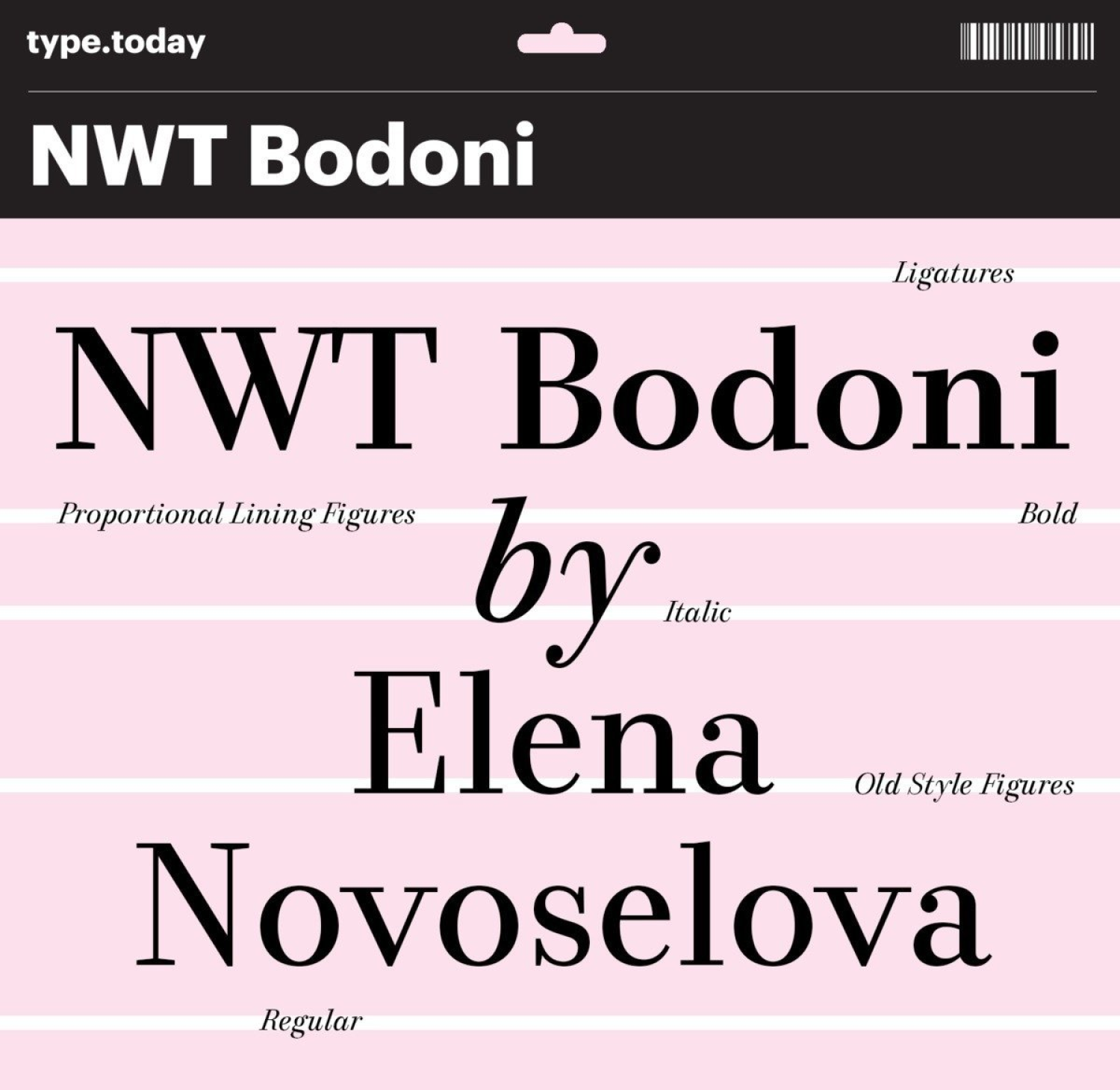

NWT Bodoni by Elena Novoselova. Purchased by Olga Pankova, the author of Curbe


Queens by Kilotype. Purchased by Alja Herlah, the co-author of Spektra