This April, type.today turns 10. So we decided to talk to those who have been using our typefaces all this time. In this piece, we spoke with graphic designer Tonya Baydina about how she chooses typefaces for her projects.
How do you choose typefaces for your projects?
There is actually an ideal scenario. In this scenario, I choose the typeface that perfectly matches my personality. I set the text, look at it, and feel: this is exactly what I need.
In some cases, I assume in advance that I need something narrow and high-contrast, or something heavy and bold, but most often I just try many things until I get the right image. When I say right, I mean feeling-wise. Not for rational considerations, but rather irrationally. Of course, anything irrational can be broken down into rational elements, but I don’t really do that.
Sometimes I use typefaces I already have, since they’ve grown
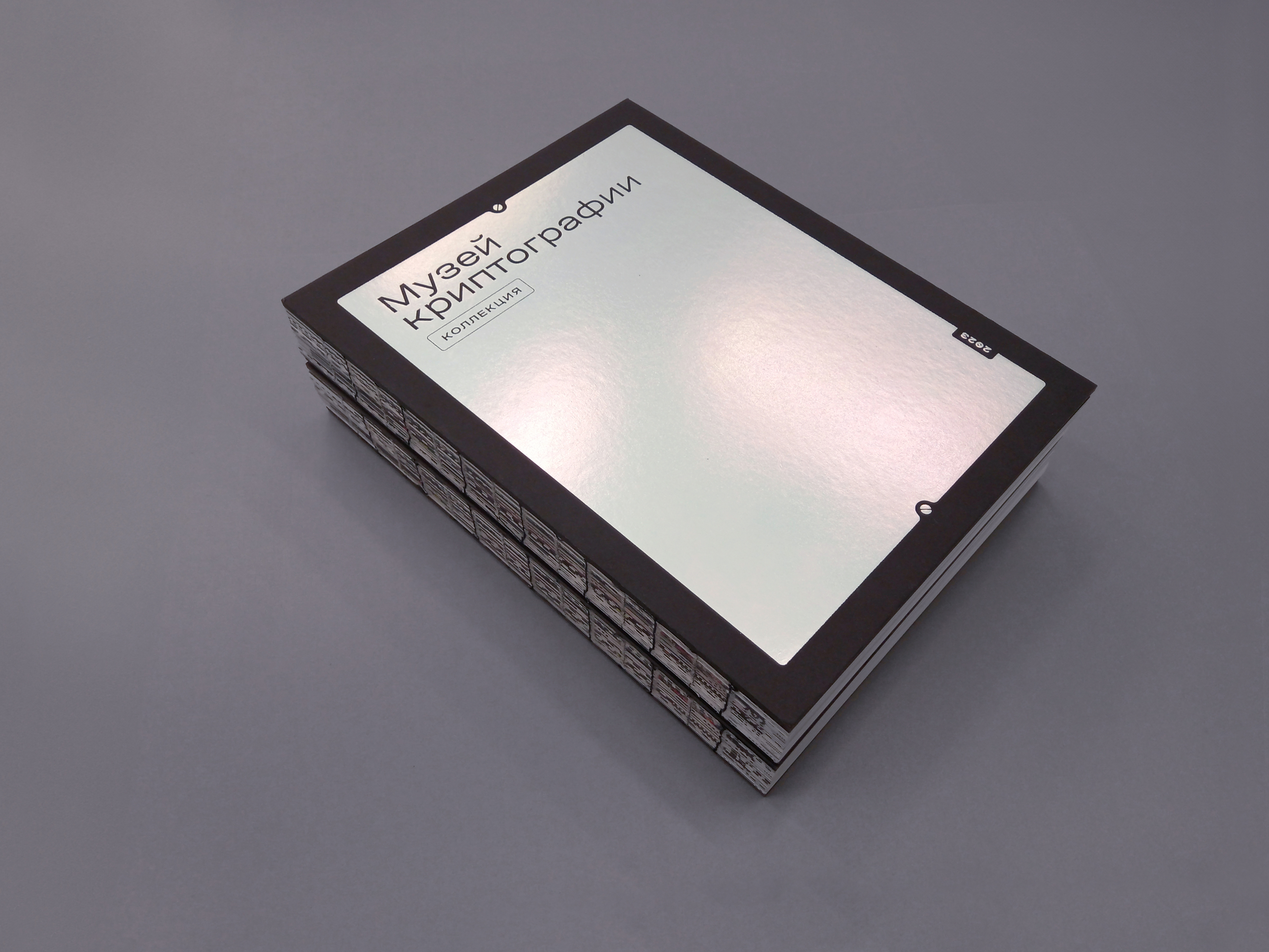
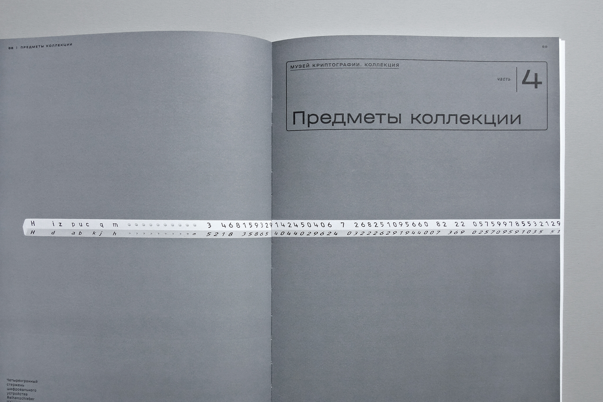
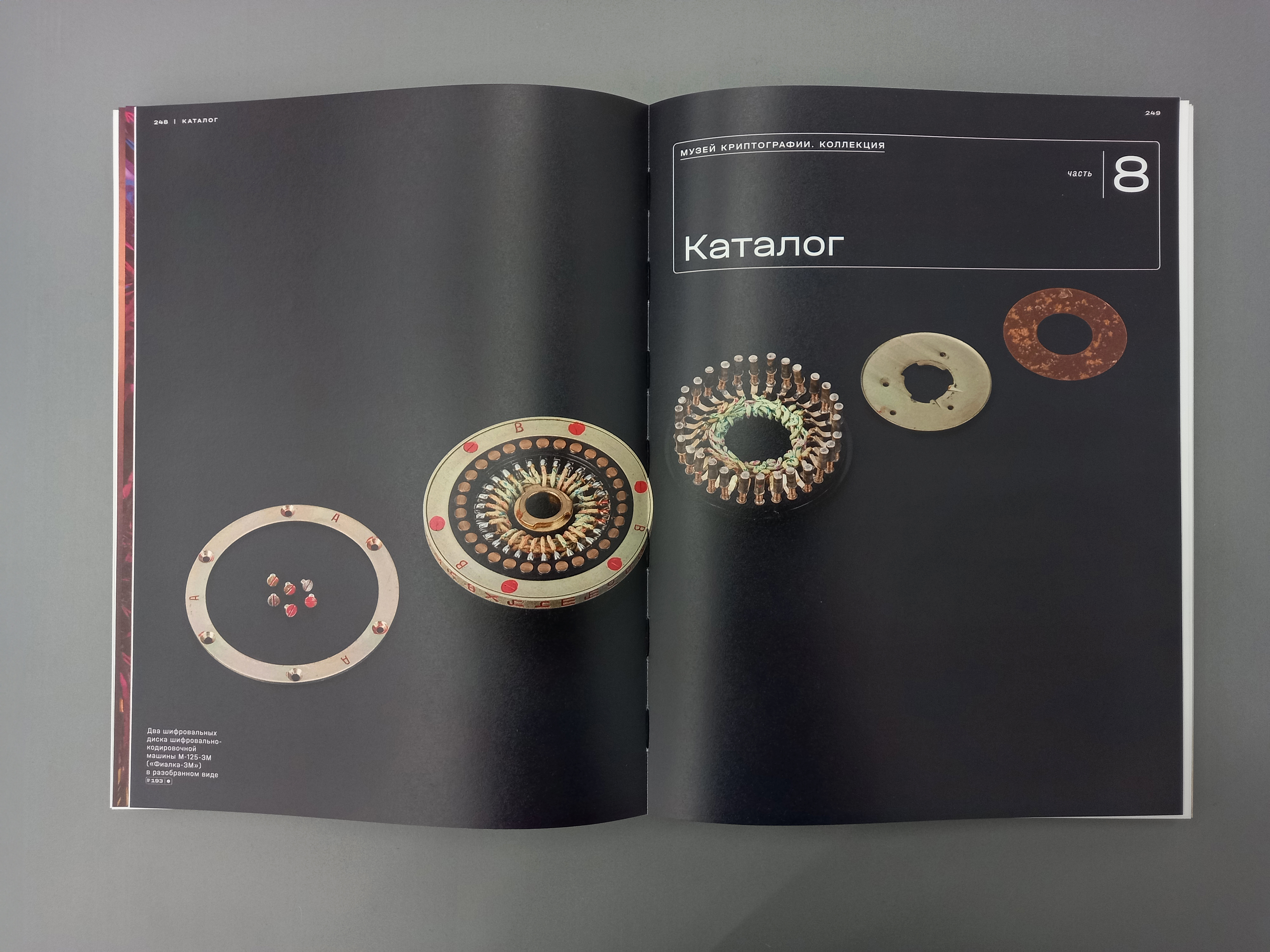
Museum of Cryptography, an exhibition catalogue. Set in Halvar
What does a less ideal scenario look like?
There is a number of them. For example, when the project doesn’t have a budget, I have to navigate free fonts.
Or you do have a certain image in your head, but no typeface matches this image. Then you have to make compromises, pick something more or less close, something that at least doesn’t frustrate you. In situations like that, badass designers learn to draw type and design their own typefaces. But most of the time, you just don’t have the time for that after all.
It can also be challenging when working on books that are strongly tied to a particular historical period. For instance, if I’m designing a book on 19th-century poetry, I can play with the historical context by picking a typeface that references that time. But I am always thinking about how to address it in a less obvious way. If the type choice is primitive, the layout needs
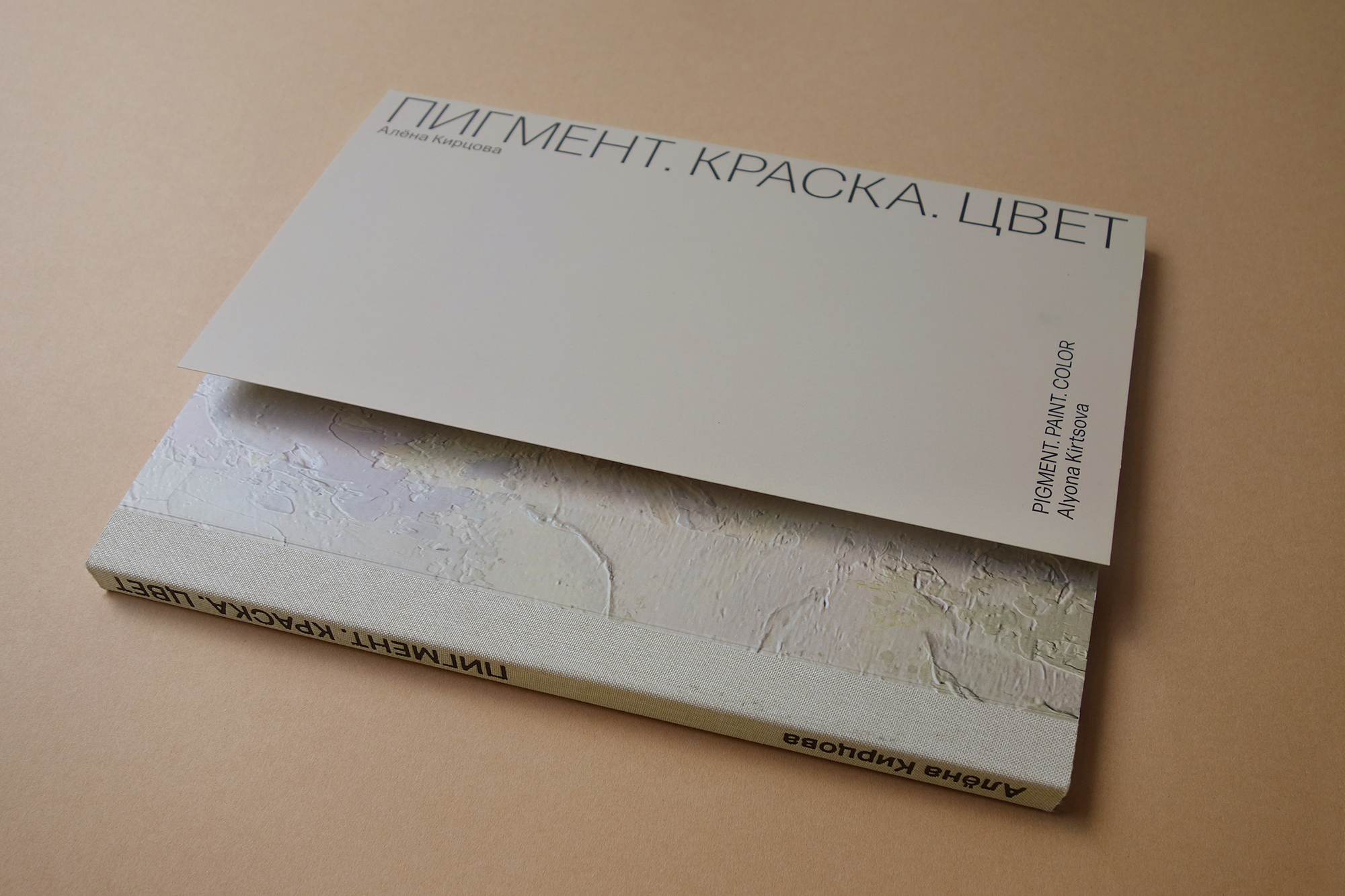
Alyona Kirtsova, exhibition catalogue. Set in Forma DJR
Has choosing Cyrillic become easier over the last five years?
There’s simply more type with Cyrillic support. On the one hand, it is now easier to choose. On the other hand, it’s a bit frustrating. Nowadays, before deciding on a typeface, I have to look through everything there is. Sometimes it makes
At the same time, I’ve become less picky. I used to say that if a typeface has one terribly drawn Cyrillic character, it shouldn’t be used. I am now more okay with it.
How do you monitor type novelties?
I occasionally look through curated
Could you tell us about any typefaces you carried with you from project to project?
I really liked Elma Trio. I did two children’s projects, and it fit perfectly into them, but it works equally well for an adult audience. It’s
I liked Stratos for quite a while, even though I hardly used it. The same goes for Graphik. And Kazimir — wherever you apply it, it looks great.
I am also a big fan of Eugene Yukechev’s fonts. I’ve only used them a couple of times, but they are just perfect. I wish he designed more typefaces.
I Need to Tell You Something, exhibition. Set in Elma Trio
Was there a typeface that was, on the contrary, difficult to get used to?
I worked at the Museum of Cryptography for a long time, and we used Halvar for quite a while. I kind of started loving it. But then I realised that no, it was not that I started loving it. I just got used to it.
It is a good typeface; you can use it to design whatever you want. But it is a little intimidating when a font has too many styles. You look at the list and you think, ‘I wish there were fewer of you!’
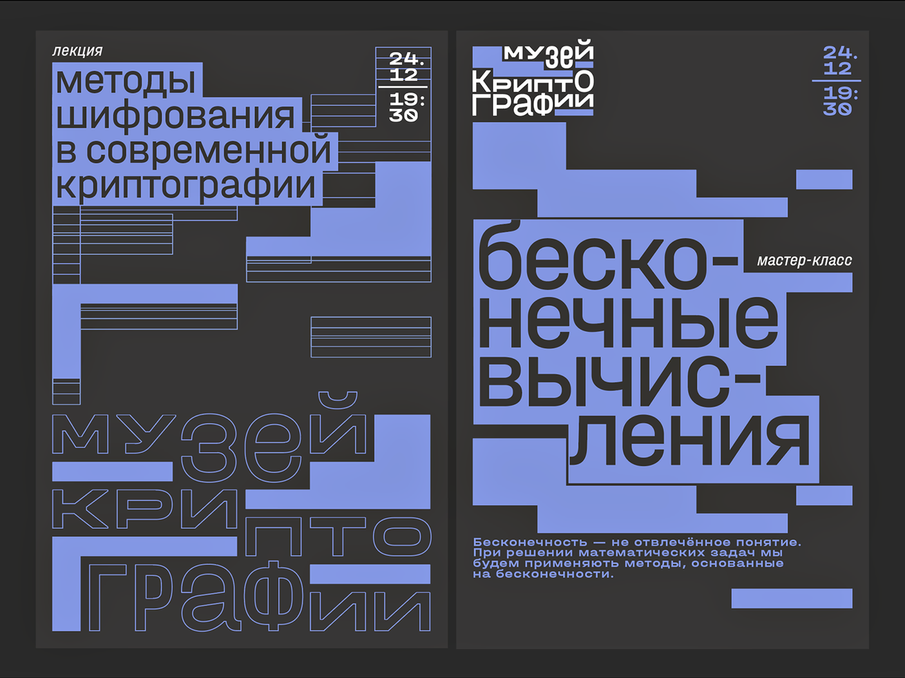
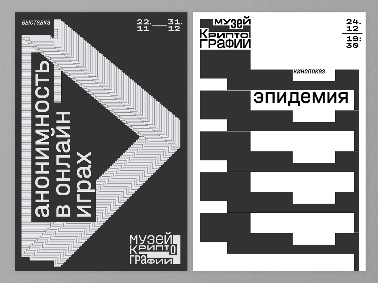
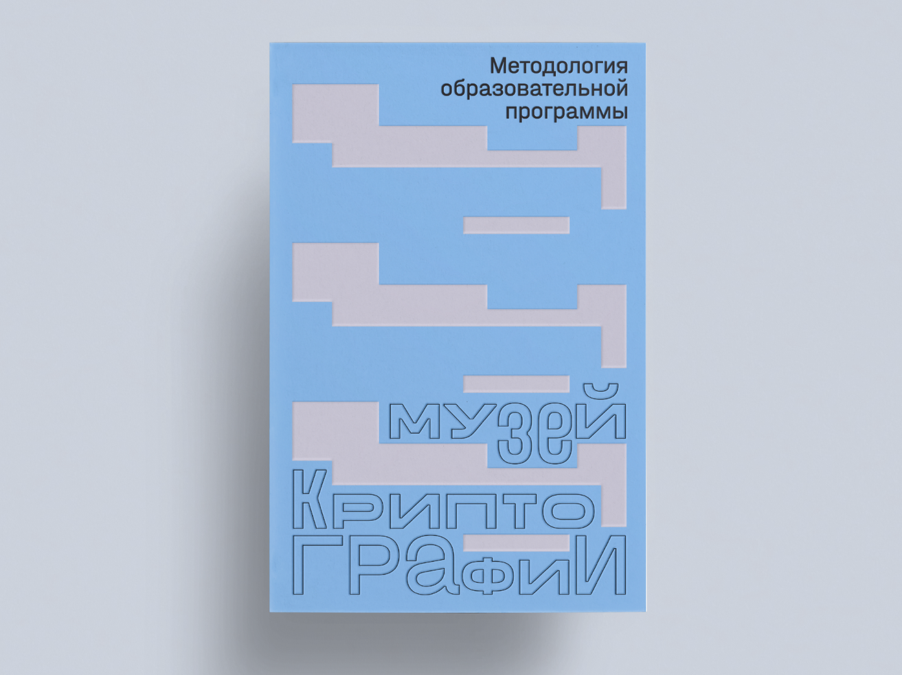
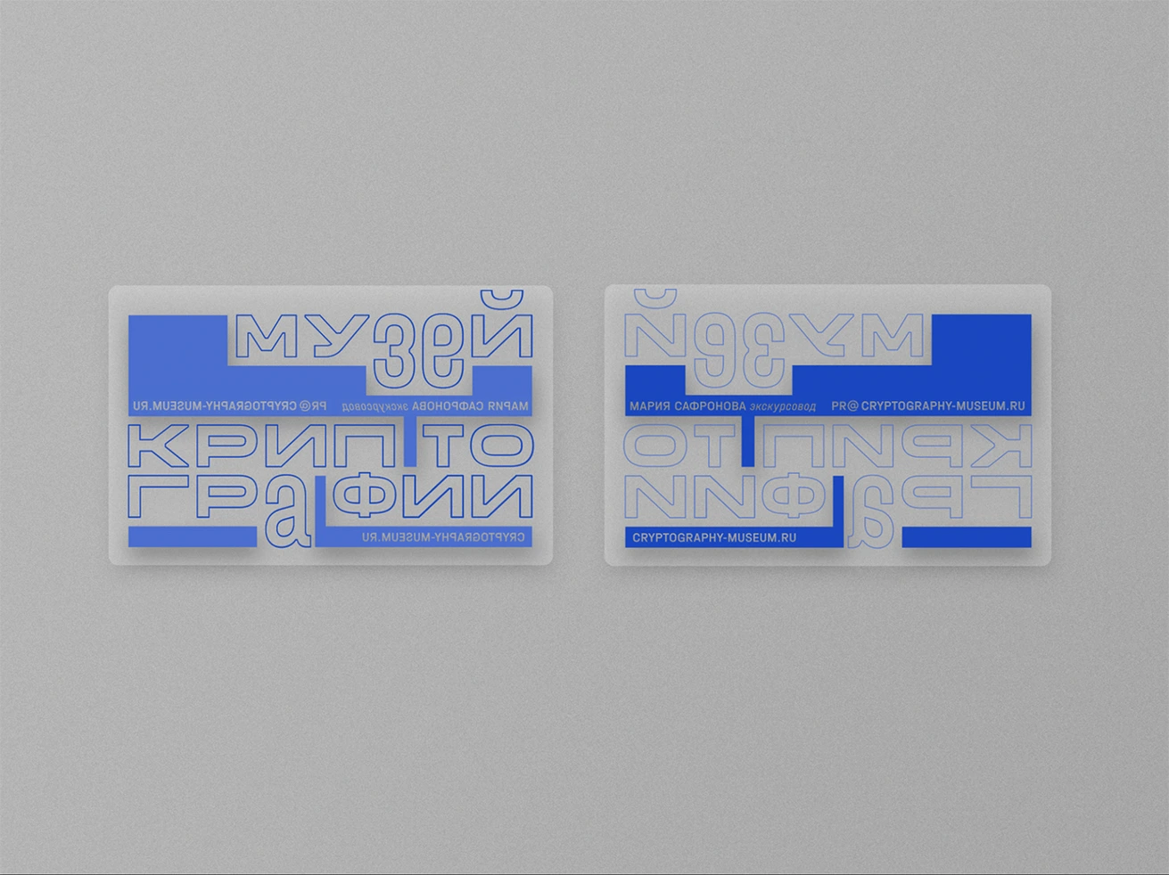
Identity for the Museum of Cryptography. Set in Halvar
Has it ever happened that you wanted to use a particular typeface but for some reason
I believe that I’m good at choosing type, and customers mostly like my choices. But sometimes the customer isn’t ready to deal with the fact that they need to purchase licenses for both web and social media. So they ask to find a pair, a free font and a paid one.
Or it may happen that they create visuals for social media themselves, using tools like Canva. And to upload your own typeface into such software, you need a premium, paid version of the tool, while they’re using the free one. This is most certainly a weird situation, but it’s something you have to deal with.
Is it possible to tell what message the type designer was trying to plant just by looking at the typeface?
There are different kinds of fonts. I mean, with impulsive, display typefaces, you could probably tell something. But if it’s a revival we’re talking, what could you really see in it other than interest in and love for the prototype? The designer’s patience?!
It seems way more interesting to look at the author’s entire library. Take CSTM Fonts. There are two people behind it, they both care about everything looking nice, beautiful, and well-balanced, yet they are a bit different from each other. I don’t want to play therapist, but judging by their graphics, it feels like Yury is more of an experimenting type, while Ilya rather strives for perfection.
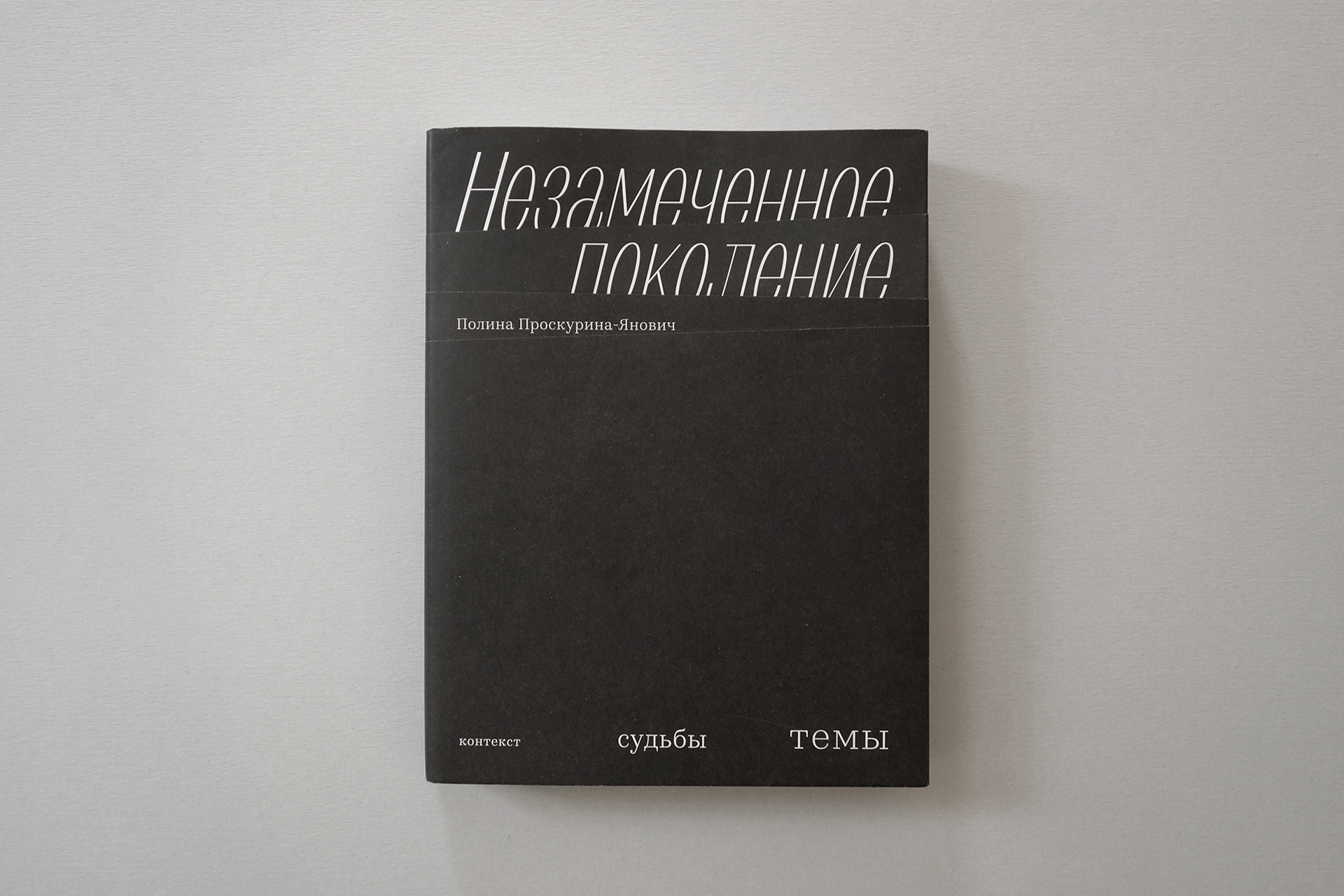
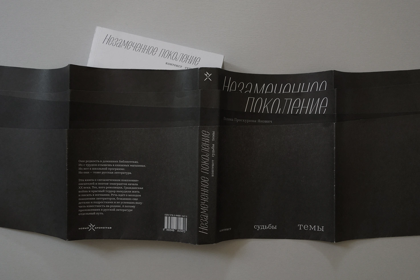
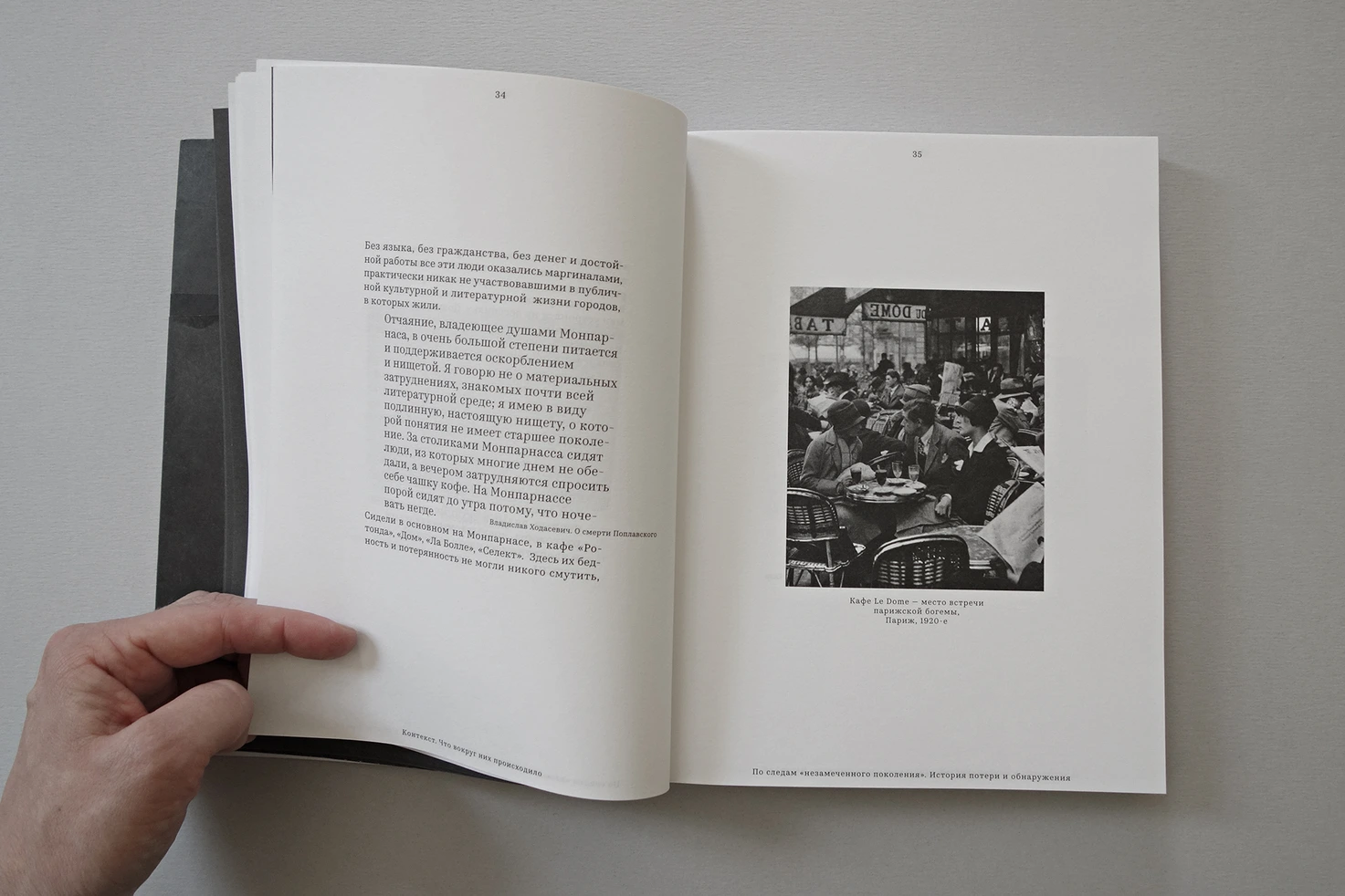
The Overlooked Generation book. Set in Graphik, Kazimir