Adelina Shaidullina: How did you discover that a font expert could be useful in a legal context?
Thomas Phinney: It was in 1999, when I was working at Adobe. Somebody had just reached out, and the request was referred to the type department, because a lawyer was looking for someone to examine a will and determine whether the font involved actually existed at the time.
I looked at it, and I thought: well, that’s Times, and Times has been around for a very long time, and certainly was around as of the date on this will. But the printing looked awfully good, too good for 1983. So I asked to look at the original, and once I saw it, I could tell that it was printed on a high-res inkjet
And you could really tell exactly what it was, because in the early inkjets, the ink was still coming out pretty liquid, and in spots you could see tiny hairline bits of ink wicking along the fibers of the paper, and I could see that in the original will. That case actually went to court, and I got to actually testify in court. In retrospect, this is surprising because that hardly ever happens. Cases usually resolve sooner than that.
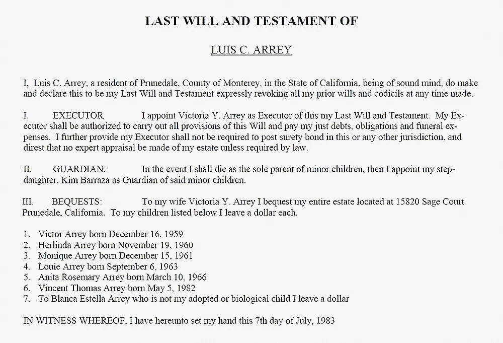 The will, dated 1983. Image: Tomas Phinney
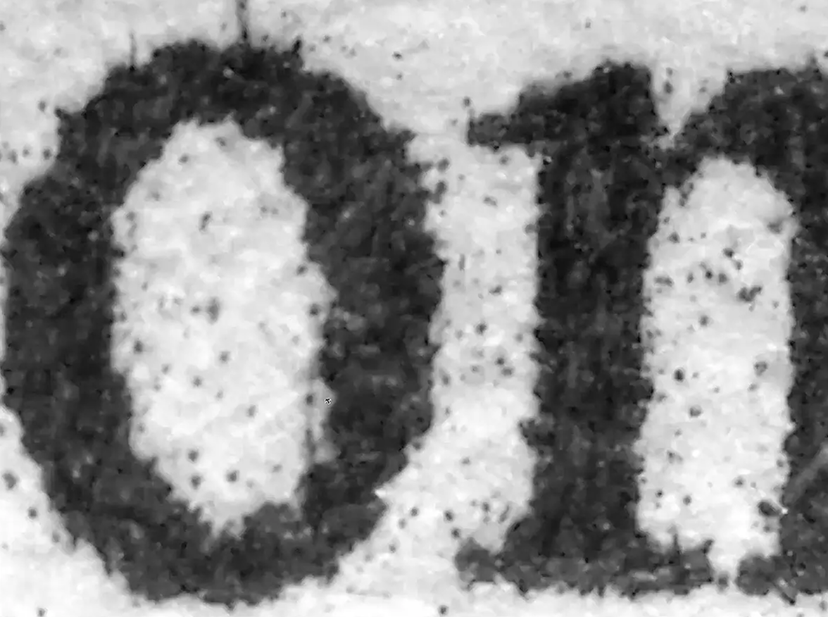 Hairline bits of ink wicking along the fibers of the paper. Image: Tomas Phinney
AS: How do people usually find out about you?
TP: It varies. People have either heard of me, or they do a web search and find out about me. If it’s a lawyer, they might have read other cases where the judge’s decision referenced my opinion. Just a couple of years ago, a lawyer reached out because he was a recent law school graduate, and one of his professors had taught about one of my cases and my role in it. That really blew my mind!
For a long time, I didn’t have anything formally promoting my font detective services. But around 2018, after wrapping up a particularly high-paying case, I thought I really should promote this work and create a website, so now that is a main resource.
AS: How did you come up with the Sherlock
TP: Well, I will admit that if I were doing it over again, I might make a different decision for how I promote my services and what label I use, but originally it was just a somewhat lighthearted label. I’d only had a couple of cases and I had no idea that I was going to try and, as one says, «make a thing of it».
Also, there was a T-shirt to promote a typeface by Carol Twombly called Nueva. It had a character on it, named Nick Nueva, with the tagline: “type detective extra bold.” And I thought, well, the average person doesn’t really know what to make of the word “type,” so I’ll say “font detective” instead.
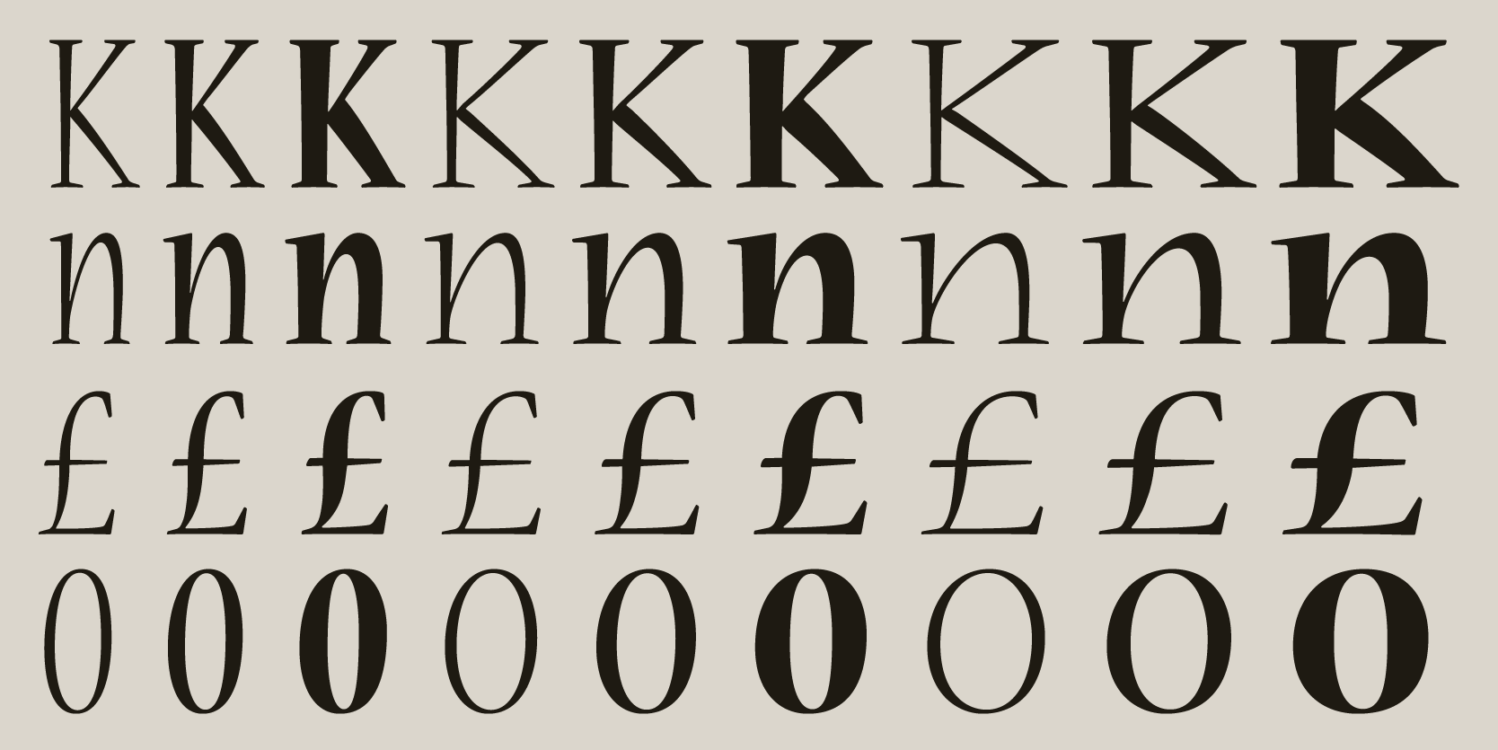

Neuva by Carol Twombly. Images: Adobe
AS: Does your work also require a strong knowledge of software history, for example, understanding how Microsoft Office functioned in the 2000s?
TP: It can, for sure. For instance, one helpful thing is knowing that kerning wasn’t on by default in Microsoft Word until very recently. If you know a document was created in Word, and you inspect it carefully enough, you may, in some cases, be able to tell whether kerning is on in that document. That is not a «smoking gun» that proves things beyond any doubt, but turning on kerning is not something the average user does.
AS: Did this affect the Microsoft fonts created back then?
TP: Absolutely. The old versions of Times New Roman and Arial commissioned for Word didn’t have that much kerning back in the day. But in newer fonts, even from Microsoft, there tends to be more kerning.
AS: What does the typical workflow of a font detective’s investigation look like? What happens after someone approaches you?
TP: It really depends. Usually, there’s a fair bit of back and forth initially, as I like to know what I’m getting into. I’ll ask to see the document or documents in question. I may not fully investigate them up front, but I want enough knowledge to figure out whether it’s worth doing an investigation. If it is, I’ll do a retainer agreement with the client that specifies what I’m going to deliver to them, what I am going to analyze specifically, and the associated dollar amount.
AS: How do you charge for font detective services, like by the hour or do you have a standard fee for the case?
TP: I charge by the hour, but for any given case, I will normally make an estimate and stick to that unless something very surprising happens, which is pretty rare.
AS: How do you decide whether to take a case or not?
TP: It’s a combination of factors. It depends on whether I have the time and whether there’s actually something worth investigating. Just because someone is suspicious doesn’t mean there’s anything to look into. I don’t really want to charge someone for hours and hours of time and write a report if it’s not going to be useful to them.
AS: How often does it happen to you that someone comes with a case that isn’t worth investigating?
TP: It’s not unusual, probably a third of the time.
AS: If you decide to take a case, do you usually sign an NDA preventing you from publicly discussing recent cases?
TP: Occasionally, sometimes. My reports generally get filed with the court, so in most cases, the matter becomes public at some point. So that’s not too much of a problem. I do usually wait until the case is fully resolved before commenting.
For example, a week ago, there was a decision in a major case that I’ve been involved in. I just read the judge’s decision yesterday, but I’m not going to be talking about it until I am sure that there’s not going to be any appeal.
AS: You have said that to be present in court is pretty unusual. How do you decide whether a font expert has to take the stand?
TP: It’s complicated. If I submit a report and it is submitted to the court, the other party can ask to depose me. Interestingly, in the U.S., opposing counsel can ask whatever they want in the deposition; the lawyers for my side can object, but I still have to answer the questions because there’s no judge to rule on whether the question is inappropriate. A deposition is not in the courtroom, but it’s similar, in that I’m being interrogated by opposing counsel. And if the case actually goes to trial, then it’s primarily up to the lawyers, if they want to call me as a witness, or just rely on my report. I’ve had probably only three cases that have gone to court, and probably six or eight additional ones where I’ve done depositions with opposing counsel.
AS: Have you been asked very basic questions about type by the opposing counsel, like “What is a font file?”
TP: Not quite that bad. But a good chunk of my cases are about point size, and the way point size actually works for fonts is not at all intuitive. If you have a 12-point font, there isn’t a specific thing you can measure in the output that is exactly 12 points. 12 points is just the height of an imaginary box that the letters and characters are drawn in. That’s pretty odd, and trying to explain exactly how it works can take a while.
AS: I read an article from 2012 about a whole case that was just about the point size on a petition ballot, where the Michigan Supreme Court debated whether text in 14-point Calibri counted as the required 14-point boldface, since the rule was made back in the hot-metal days, when the metal block had to be exactly 14/72 of an inch high.
TP: I remember that one, and it’s a perfectly reasonable assumption that the font size should be defined by something you can measure directly. But you can’t. Even in metal type, that metal block was used to do the printing, but was not something you could normally see.
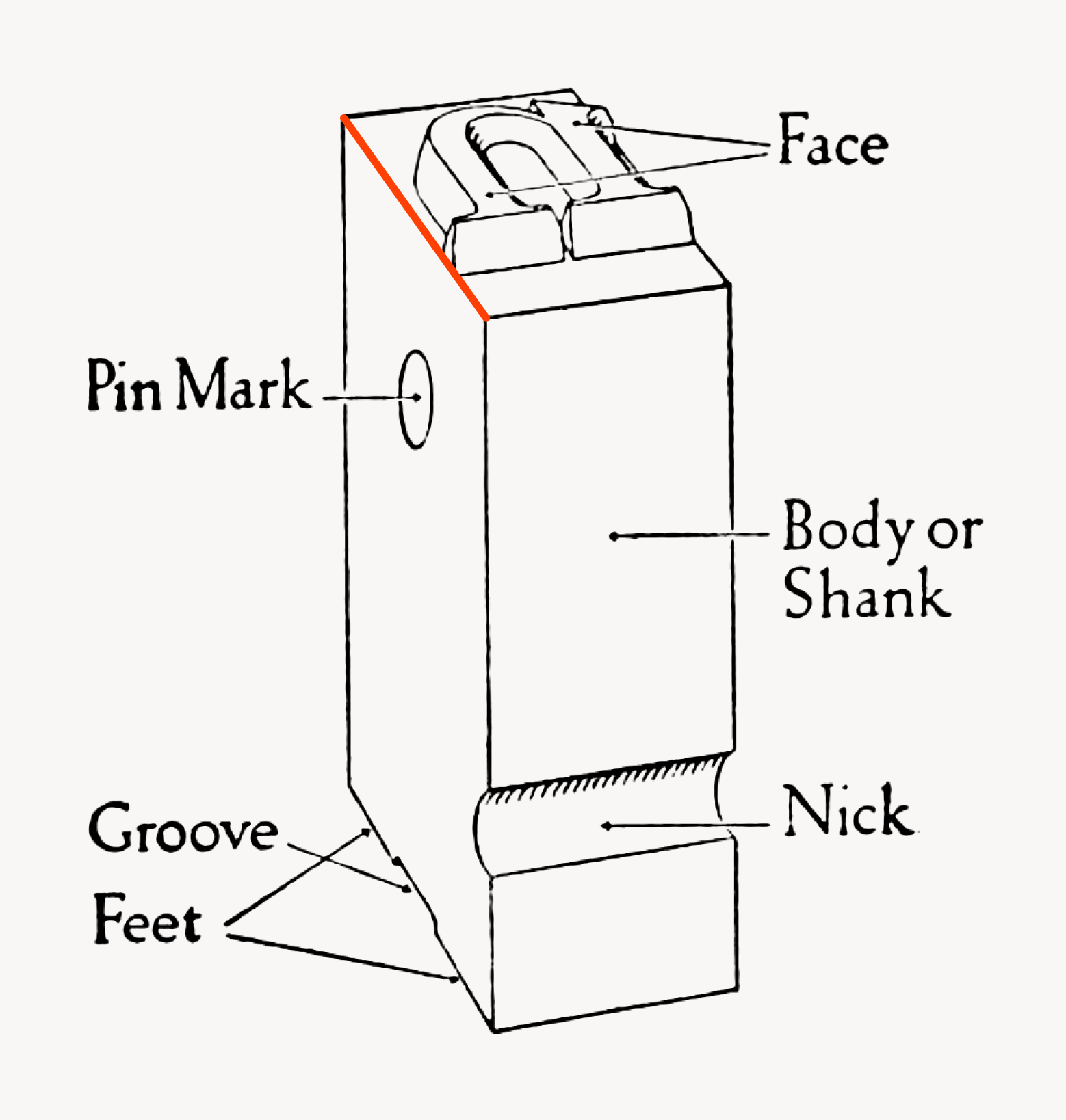 A piece of metal type. The added orange line shows the body height, which is used to determine the type size. Image: Daniel Berkeley Updike’s “Printing Types: Their History, Forms, and Use”
AS: According to the cases on your website, you mostly work with text typefaces. Have you encountered any interesting cases involving experimental or display fonts?
TP: Oh, sure. One case that I talk about fairly often involves a backdated, or at least manipulated rabbinical school certificate. It was dated 1968, but the person’s the name on the certificate was set in Monotype Corsiva, which was only released in 1995. Although of course in Monotype Corsiva, every letter has the same spacing as in Zapf Chancery Medium Italic, released much earlier, in the 70s. But still not available in 1968.
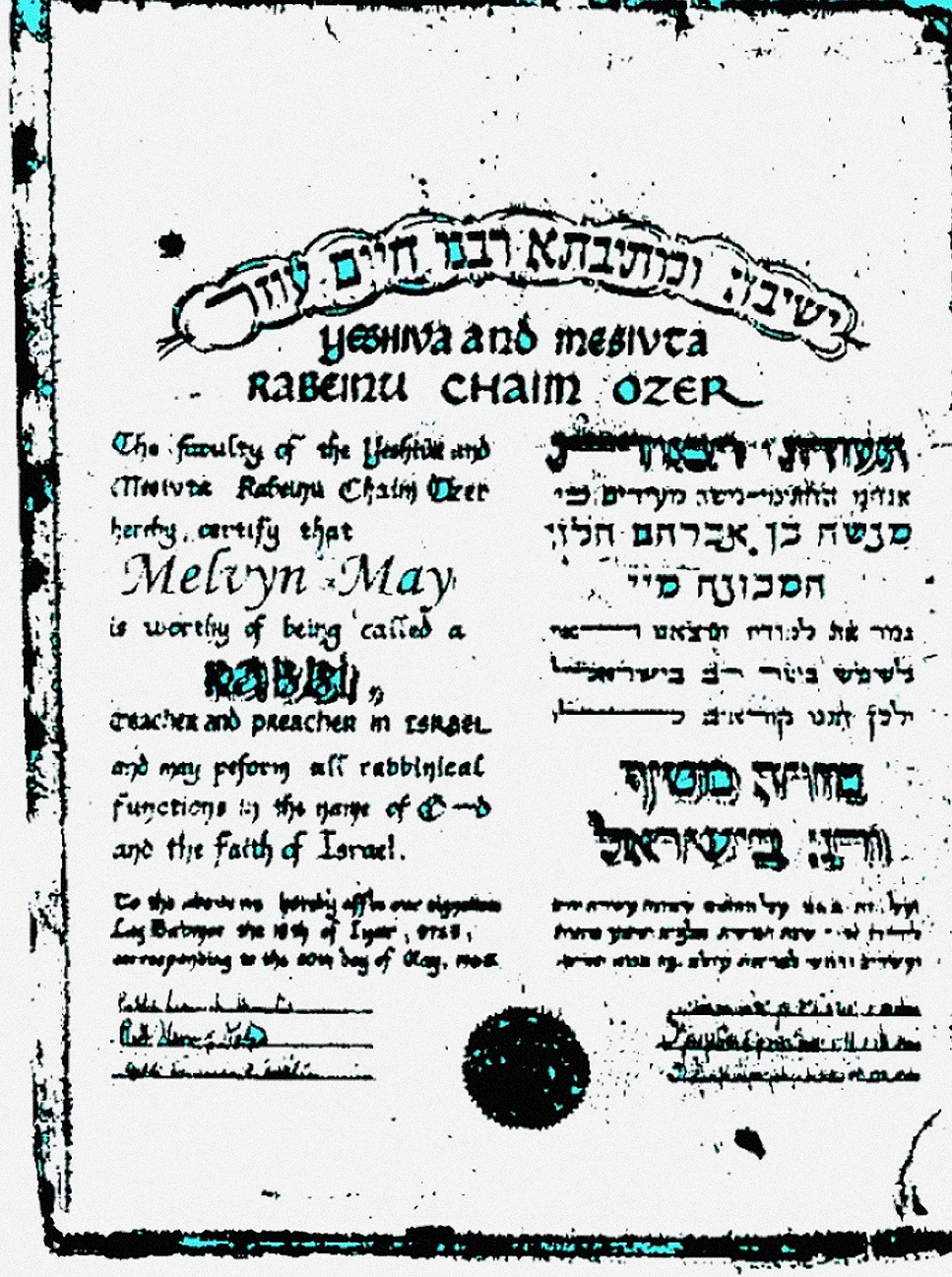 Rabbinical school certificate, dated 1968. Image: Tomas Phinney
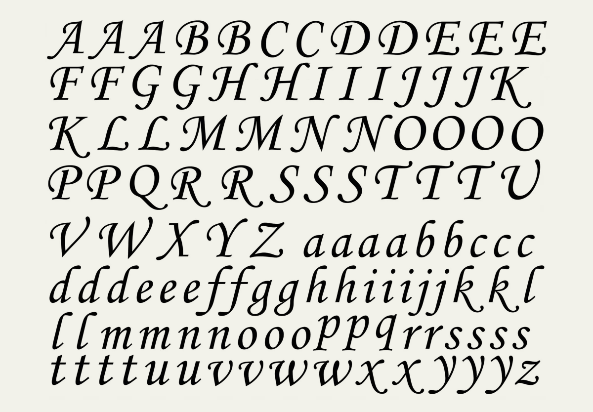 Monotype Corsiva. Image: Wikipedia
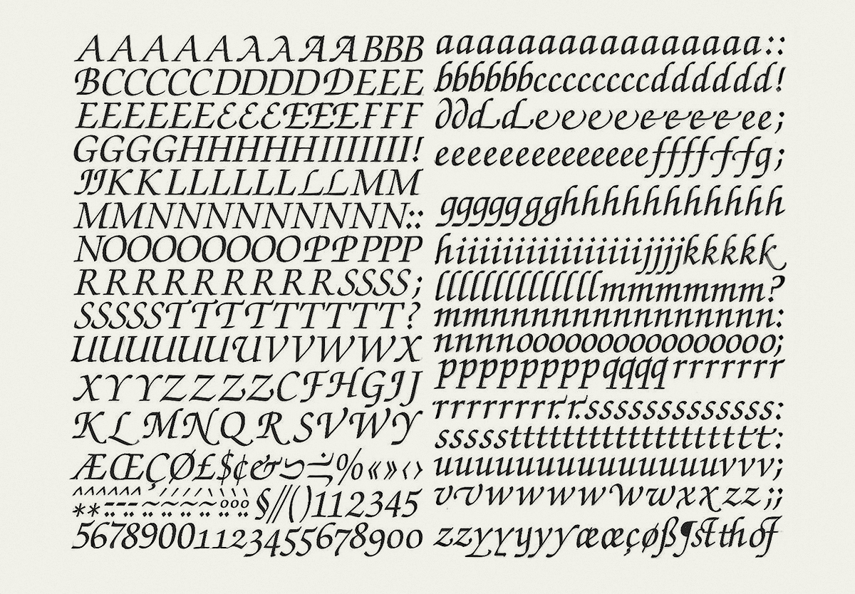 Zapf Chancery Medium Italic on Mecanorma sheets. Image: Ebay
AS: Have you worked on cases concerning readability issues?
TP: Yes. In fact, I have a case I’ll be working on today that’s about readability issues and whether the text in a particular website dialog is readable.
AS: How does the typical case concerning readability look? What is the most common problem with that?
TP: The most common thing is just making stuff small. In some cases, there may be a requirement that the text be a particular point size. In other cases, the legal requirement may be more vague and simply state that it needs to be legible or something to that effect, and of course, that’s a more subjective analysis. You can apply objective principles to it, but some people might still disagree with you. Even experts might disagree with each other in some cases about whether something is legible. And of course, when you’re talking about legal agreements, one of the problems is not just whether the text is legible enough for someone to physically read it, but whether it’s being made so small that a normal person won’t read it.
AS: How does one define what a normal person will read? How does one define a normal person…
TP: That’s a great question. You also have to consider who the audience is, what conditions they’ll be reading under, and sometimes the same document might be more or less legible depending on those conditions.
I had one odd case where a company, instead of presenting Terms and Conditions as live text, used a screenshot of an entire page from Microsoft
AS: I actually wanted to tell you a story. Once, the Russian government said that anyone considered to be an ‘agent of foreign
TP: I will say that there are people, companies, or governments that I might choose not to work for. I haven’t turned down a case for that reason yet, that I can think of.

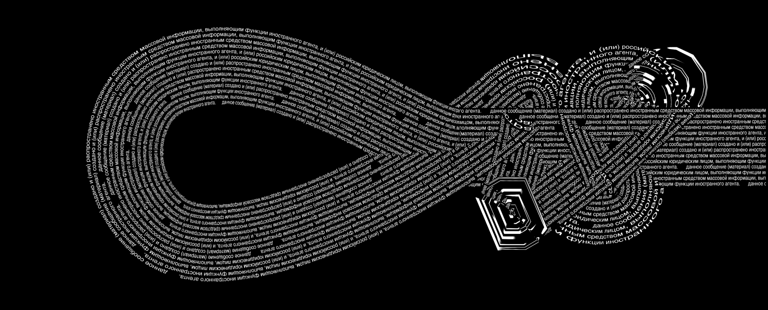
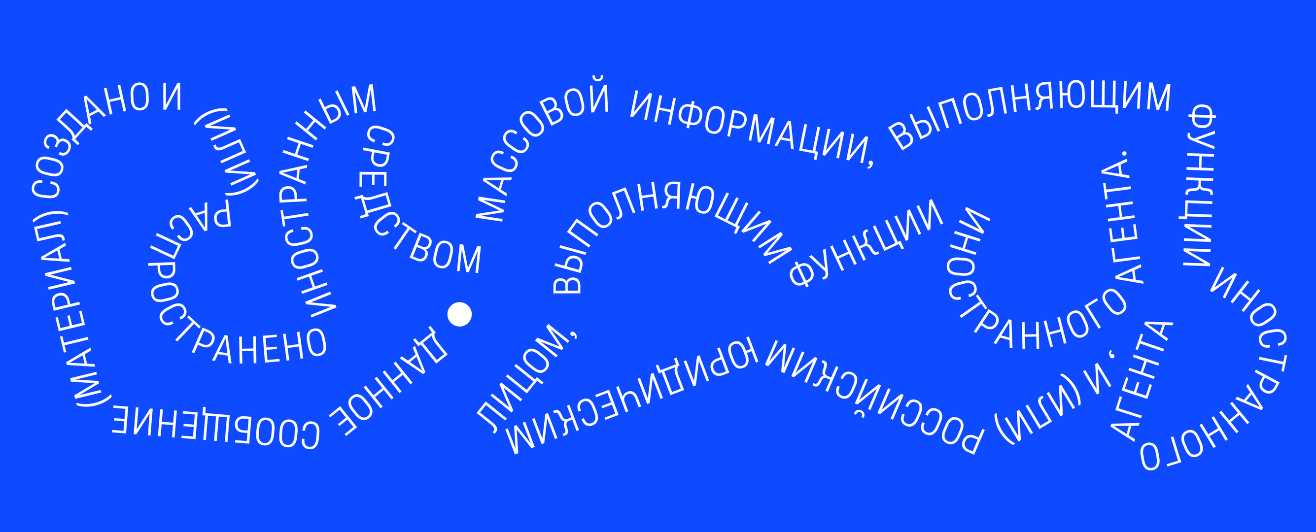
Images created during the flashmob
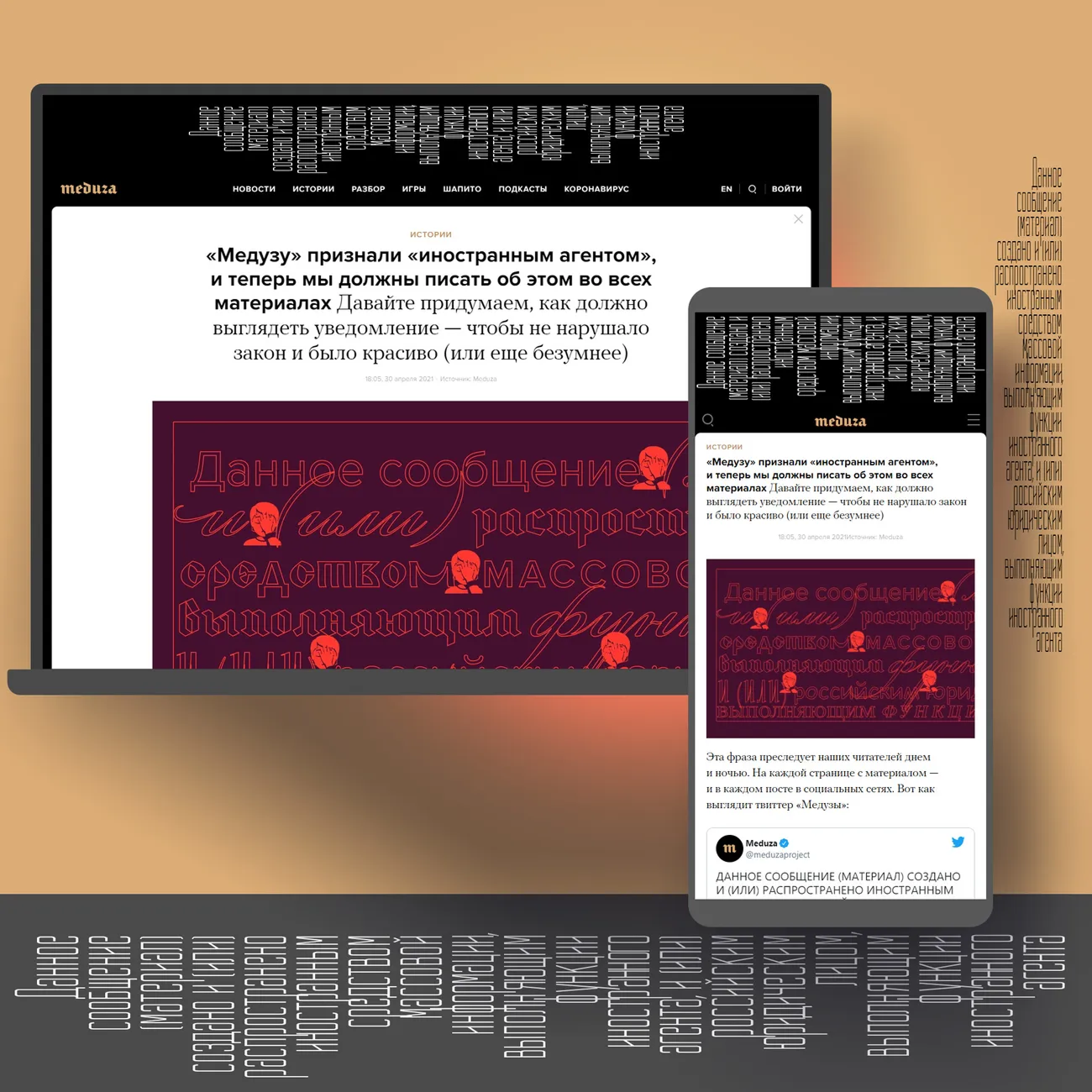

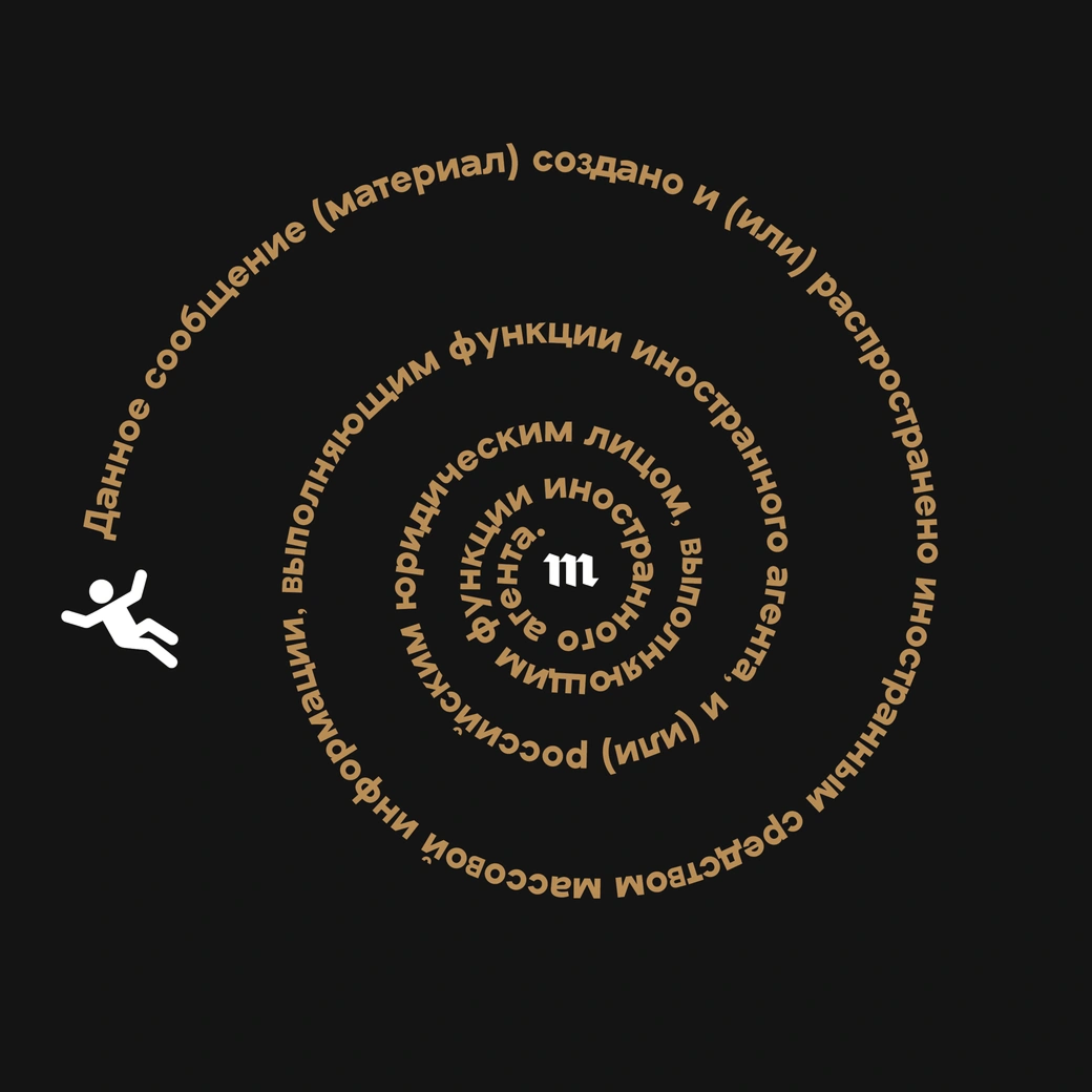
Images created during the flashmob
AS: In your case involving the CBS documents, you mentioned having to extensively test typewriters. What did that involve? Did you have to get 10 typewriter models and then use them with paper from that era?
TP: I didn’t go that far, but I did a couple of categories of things. But before we get into this, I need to provide a bit of context for people who are not familiar with the case. In 2004, shortly before the U.S. presidential election, a big news story broke. It suggested that President Bush, who was running for re-election, had pulled strings to get out of military service. The allegations were backed up by some memos supposedly written by his commanding officer in the Texas Air National Guard. The catch was that the font in the memos looked like Times, but they were allegedly printed in 1973, and people expected them to be typed with typewriter fonts of the period.
They were obviously proportional, A proportional font is a typeface in which each character occupies a different amount of space and some people said: Oh, typewriters couldn’t do proportional fonts back then. Actually, some typewriters could, but their proportionality wasn’t the same as what we see in Times, and in the memos.
I didn’t have access to the machines, but I could review what fonts they did have and what their width systems were. One problem was that the widest letters it had were significantly less wide than in modern computer proportional fonts. For example, a capital W in a fully proportional font today, where you can make it as wide as you want, would be wider than in any font the Selectric Composer had, where the W looked really squished. That was a difference between the memos and what the desktop typewriters of the day could do. Also, the Selectric Composer wasn’t normally used for office memos; it was a low-end typesetting device that cost as much as a new car.
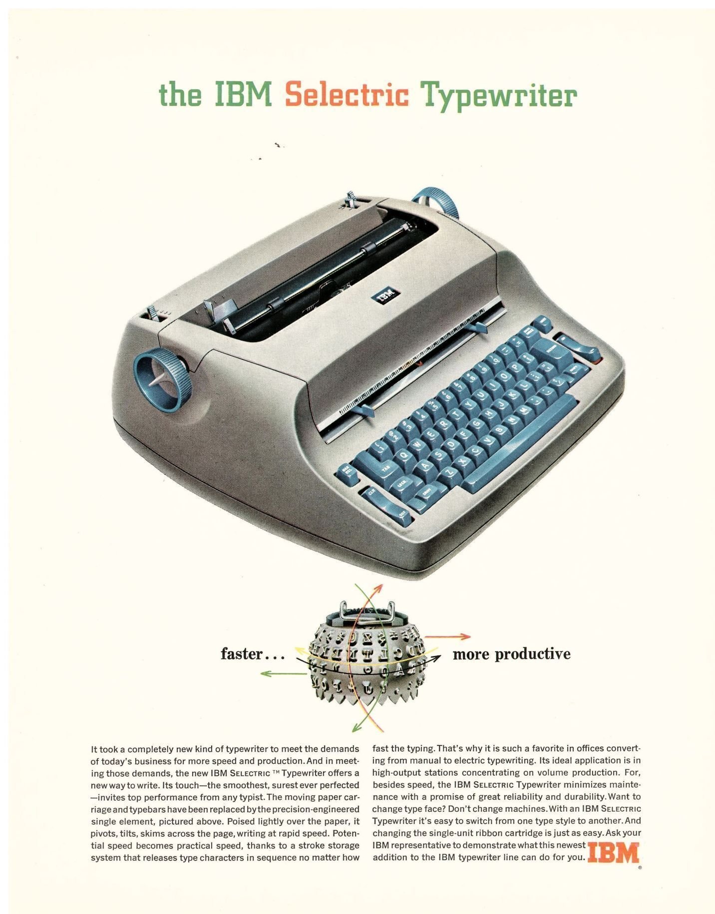
ПеIBM Selectric. Imagе: IBM. Such a typewriter was used, for example, at the Ardis publishing house, whose founder we spoke with in April
Even so, all the fonts on the Selectric Composer had the same spacing, meaning they all had the same units of space for any given letter. I made a digital font that mimicked those predefined widths, and found that you just couldn’t duplicate the setting of the memos. On the other hand, Times, with its much finer unit system and bigger maximum width, could duplicate the memos perfectly.
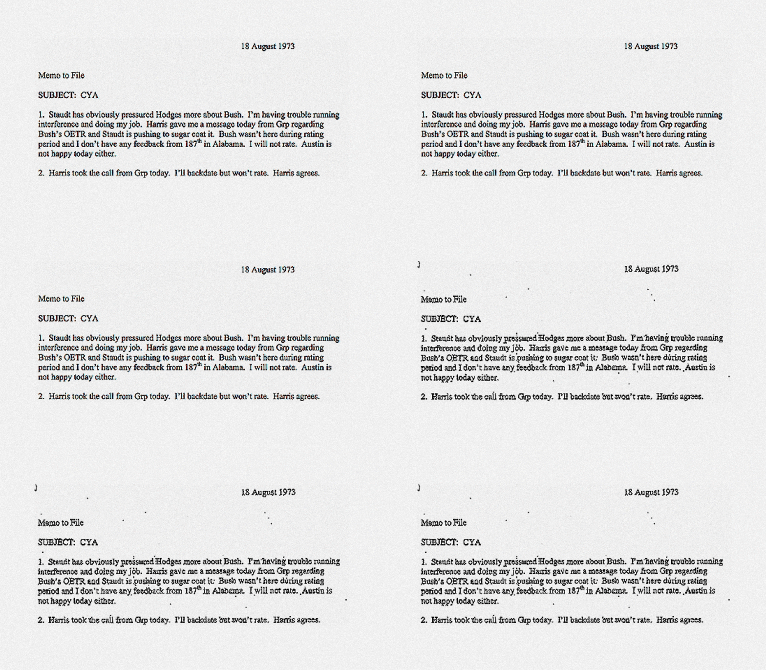
Comparison between what CBS claimed was a 1973-era typewritten memo and a 2004-era Microsoft Word document created with default settings
AS: That’s a lot of research! Does this kind of research resemble the research you do for a typeface revival?
TP: Well, I guess if I had been interested in doing a typeface revival of Press Roman, which is a typeface that IBM had in the 1970s, then yes, it would be the same research.
But usually when you’re doing a type revival, you are more focused on the letter forms. Not that I totally ignored the letterforms in this case, but the letterforms in the document were so degraded that you could not really figure out whether the serifs were even flat, or were slightly cupped. So I wasn’t looking so much at the exact shapes. But when the quality of the reproduction is good, then one can focus on the letterforms.
And when we’re talking about digital fonts, my work becomes closer to the revival research. In my type design work I have done revivals. But generally, my forensic work is more about font ID.
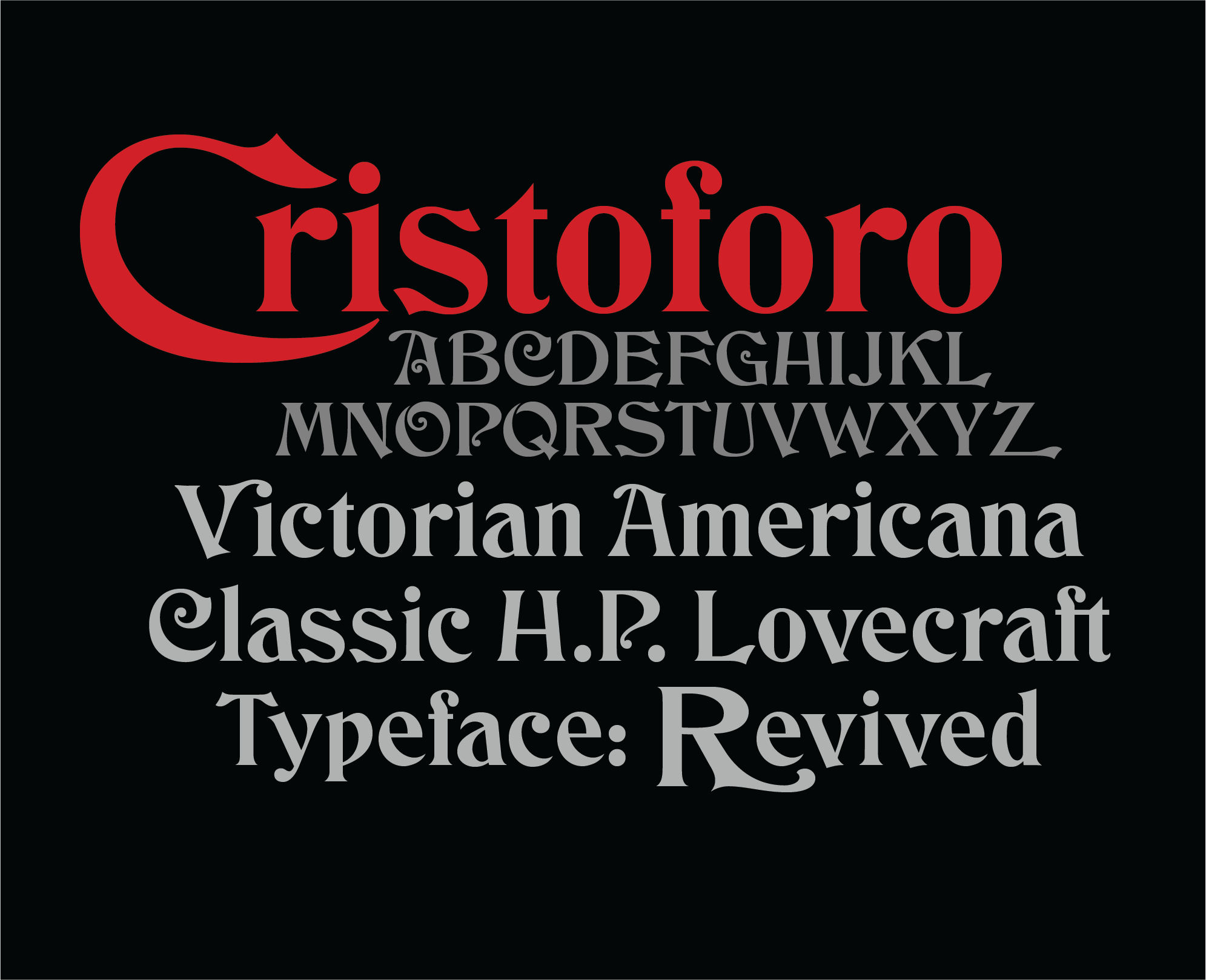
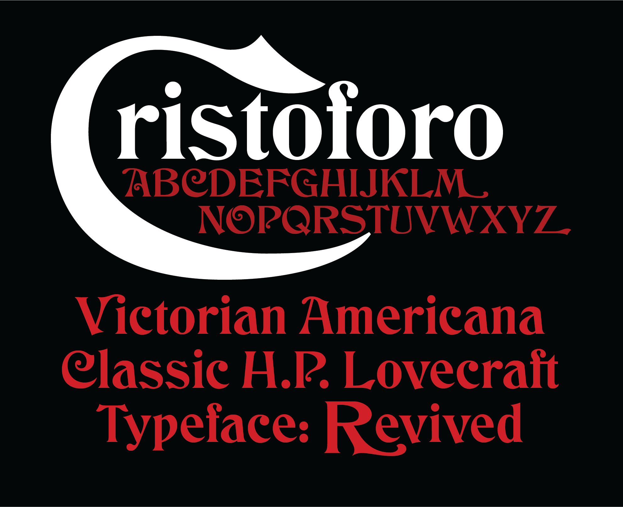
Cristoforo: Victorian Cthulhu fonts revival, a typeface collection by Thomas Phinney
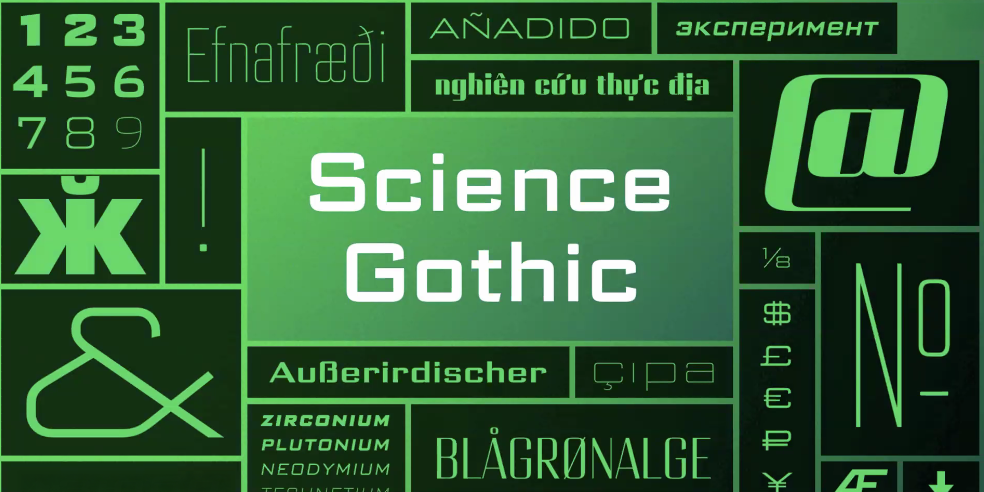 Science Gothic by Thomas Phinney, inspired by Bank Gothic
AS: Do you use automatic or AI-based font finders in your work?
TP: Most of the time, I already know what the font is. And if I can’t figure it out right away, I occasionally will use such a tool. But often, it may be something that’s so obscure that it’s not even in any of those finders’ databases. For instance, there was a case where I had to identify Tudor Black.
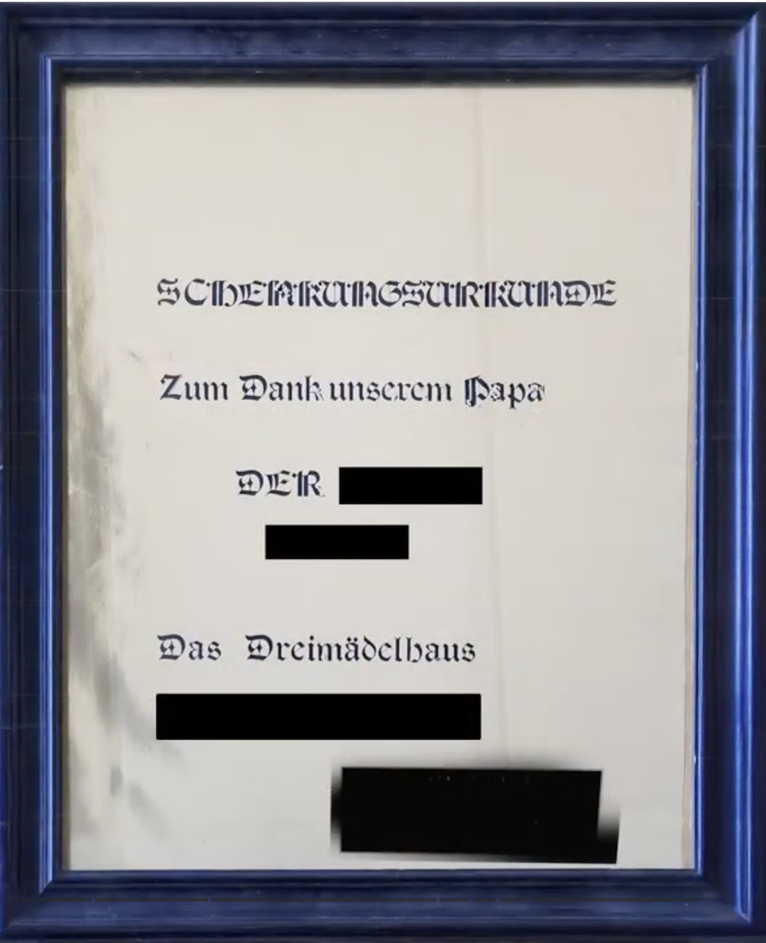 The certificate at the center of the case required identifying Tudor Black (1979–1980), set in the dry-transfer revival of Tudor Black, Gothic RN
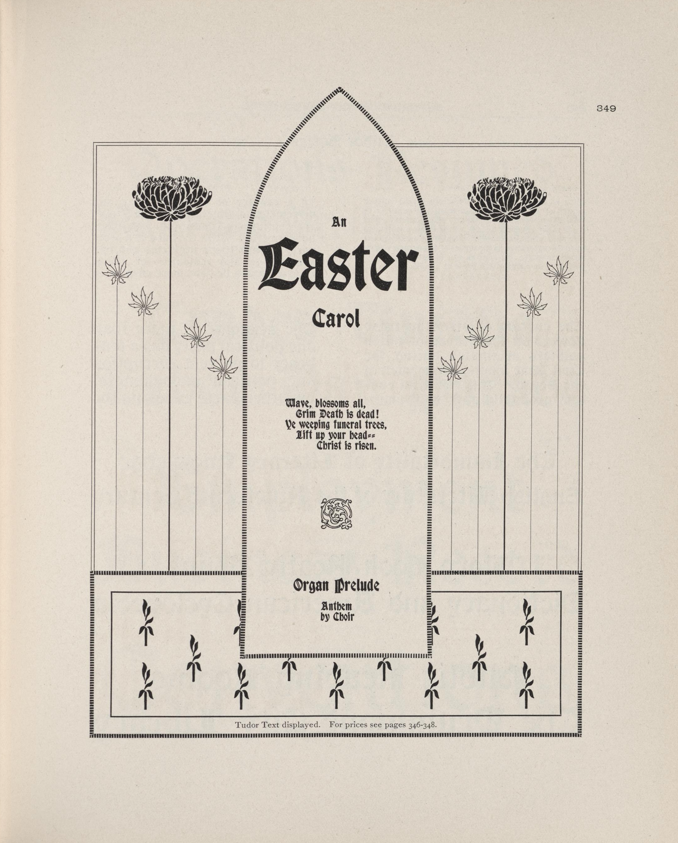
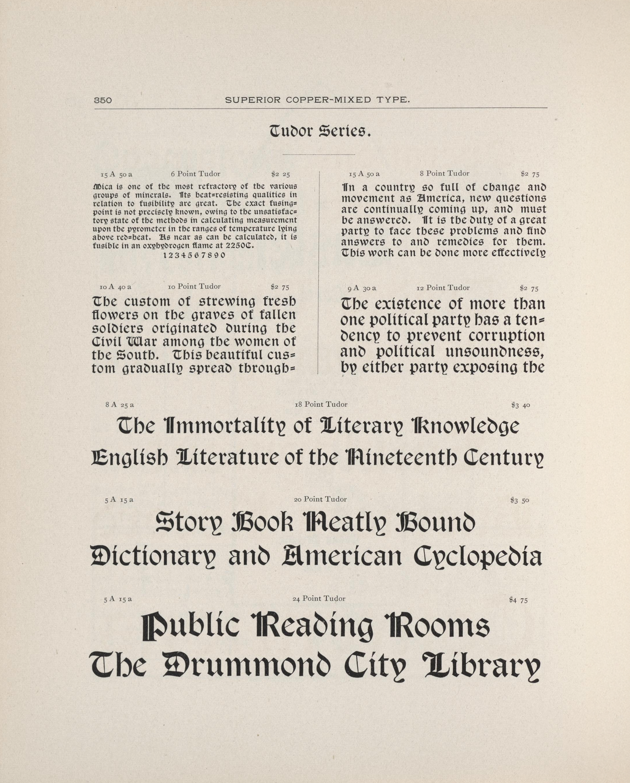
Tudor Family in the Barnhart Brothers & Spindler specimen. Image: University of Wisconsin–Madison
AS: Do you consult other type designers for font ID?
TP: If I am not immediately figuring out what something is, and I do some research and still can’t figure it out, once in a while.
The people I am asking aren’t interested in writing up big legal reports or going to court, but are happy to help me. Florian Hardwig and Stephen Coles are two main people I consult with. But it depends on the particular case.
There’s some people who are well-known for their love of a particular category of fonts. So if I’m looking at a blackletter, then I’ll talk to Dan Reynolds.
And I should be clear that I’m not relying on them to assert that the identification is correct. It’s essentially to help point me in the right direction to start with.
AS: Do font detectives need some legal knowledge, or is having deep typographic knowledge enough?
TP: Knowing laws can be pretty helpful.
So, for instance, the state of New York has a law that says that the type size requirement shall be deemed met if the x-height of the type is a minimum of forty-five percent of the specified point size, regardless of what the actual point size is. That’s a pretty important law to know about.
AS: You’ve mentioned that you’ve attended document forensic conferences. Is there a community of font detectives? Do you know other professionals in their niche?
TP: As far as I am aware, I am the only person who has this specialization. I am not a document examiner, but I’ve been to document forensics conferences of all the different document examiner organizations in the U.S. and Canada, also one in Australasia, and I just submitted a talk recently for the general forensics conference, and I’ve been to that one before and did a poster presentation.
I have never encountered anyone who provides font detective services on a regular basis. Certainly, there are typographers and type designers who have been asked to render an opinion on something or testify in court, but it’s usually a one-off.
AS: Where do document forensics normally come from, law schools?
TP: No, Forensics in general is a separate thing one studies. But for document forensics, I think, people mostly tend to apprentice under other document forensics folks, and then get certification by a professional organization. There’s also a standard textbook by Jan Seaman Kelly that I gather is read by specialists in document forensics.
Once at a conference dinner, I asked the room how often they see point-size-related cases. It turns out the average solo examiner encounters maybe one in their entire career, while for me, it’s a separate category of cases. Most document forensics experts focus on handwriting, with fonts only at the edges of their work, so there’s little reason for them to study type deeply.
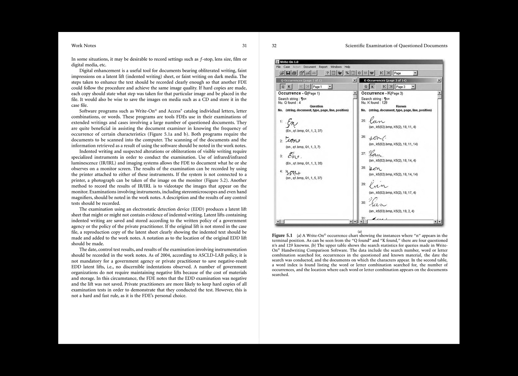
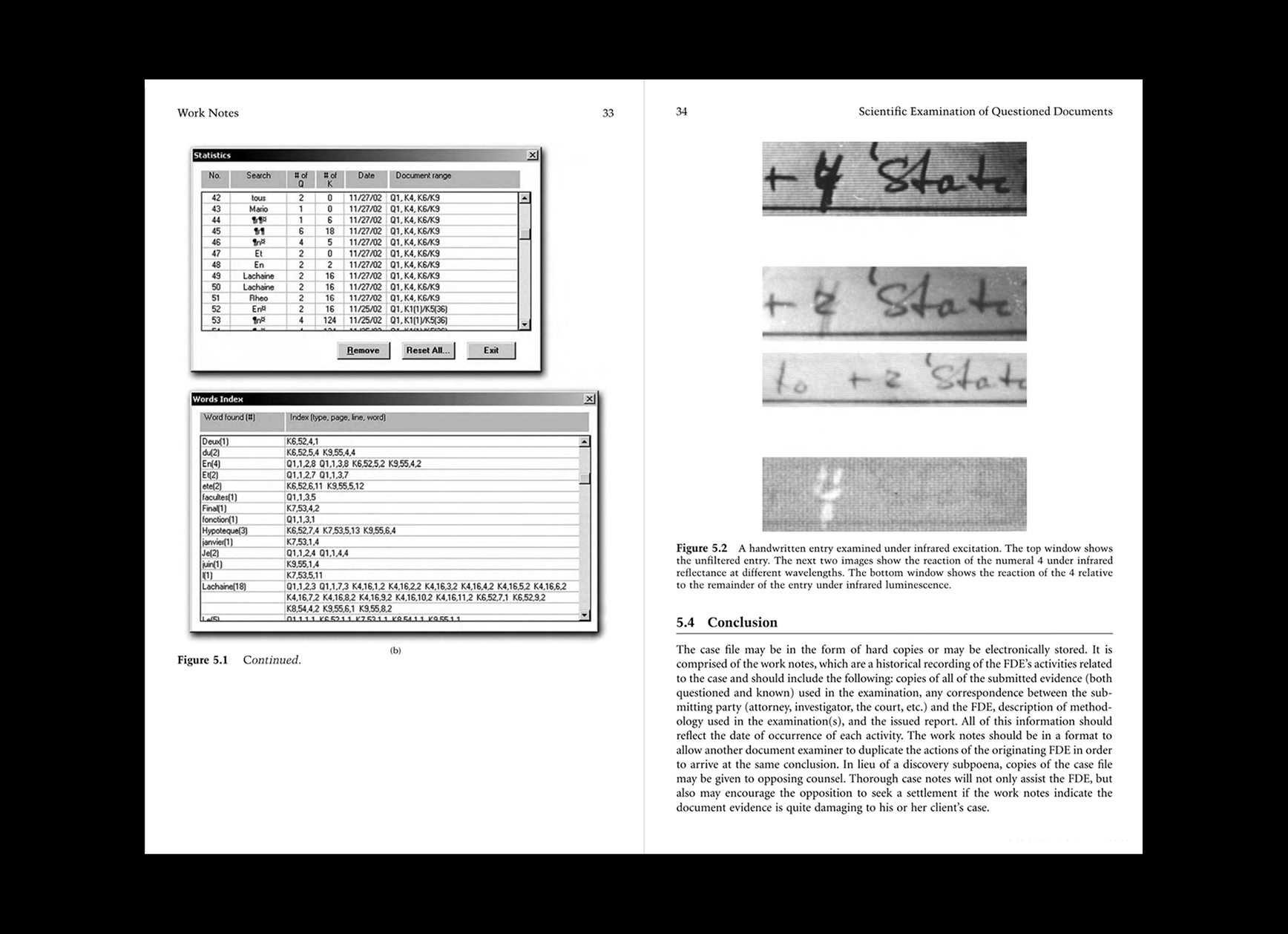
Document forensics textbook by Jan Seaman Kelly. Images: Google Books
AS: Which is, which cases do you prefer to work on, the more dramatic ones or the ones that just require quiet problem solving?
TP: I like the ones that are technically interesting. If there’s something unusual or new about quiet problem solving, then that’s great. I also enjoy the cases that are interesting because of the facts and details surrounding the case.
AS: Do you think you will get some cases in the future concerning AI and fonts altogether?/
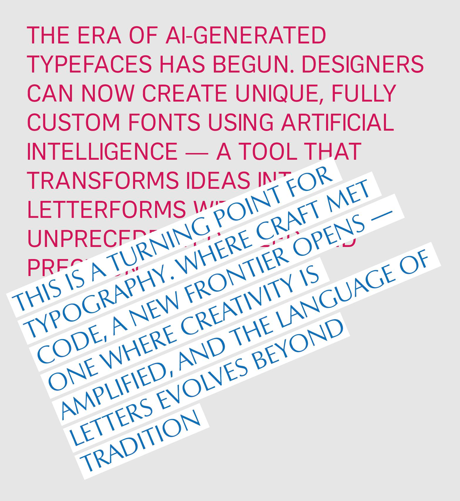
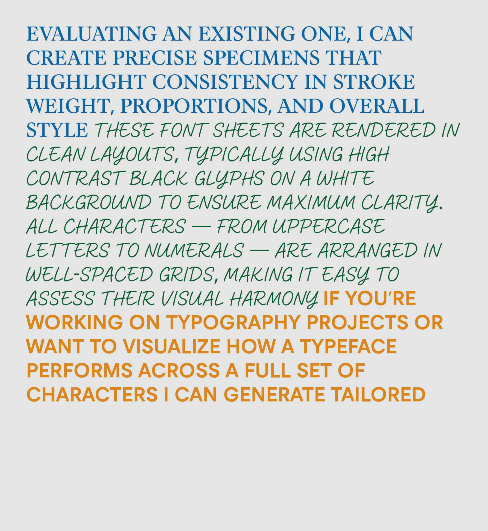
AI-generated typefaces by Yury Yarmola
TP: No doubt. Those may be challenging because one of the things that makes the existing cases more manageable is that there is a certain number of fonts and someone made them. Eventually, we’re going to get to a point where AI can create fonts that are almost indistinguishable from human-created fonts, at least good enough. And if we get to the point where there is an infinite number of AI fonts and we can’t tell those apart from human-made ones, it may sometimes be very hard to know when a given font entered use. And that will be challenging.
Eventually,
I’m sure there are other implications of AI for my work that I’m not even thinking of yet, but that one’s obvious, and it’s going to be an issue eventually. Probably within this decade. That’s an easy prediction. The hard part is, will it be an issue this year? Probably not. Next year? Maybe.
