
In 1971, in Ann Arbor, Ellendea Proffer Teasley co-founded Ardis Publishers with her husband, Carl R. Proffer. Ardis published works by Soviet authors like Joseph Brodsky, who were banned in the Soviet Union. Many of Ardis’ books were smuggled back into the USSR, making censored literature accessible to Soviet readers.
In 1989, Daria Yarzhambek, our journal’s Editor-in-Chief, travelled to London with her family. The owners of a local Russian bookstore gifted them a suitcase full
Lately, censorship has intensified in several countries. Many literary works could no longer be published in the very countries whose readers they were intended for, once again highlighting the need for independent publishing houses based abroad — a practice known as tamizdat Tamizdat refers to Soviet literature published abroad, as it could not be published in the USSR. The term itself contains two roots — tam, meaning there, and izdat, a shortening of izdatelstvo, meaning publishing house in Russian.
We spoke with Ellendea Proffer Teasley about tamizdat past and present, her experience of dealing with censorship in Soviet Russia, the design process at Ardis, and her advice for those working with tamizdat today.
 Ardis Publishing logo
Daria Yarzhambek: The first question is about the Ardis logo itself. We know it’s a Favorsky’s drawing, but how did you find it?
Ellendea Proffer Teasley: I was in Russia doing my dissertation. Carl was writing a book and I knew that Soviet books had terribly reproduced illustrations. So they had a need to do graphic covers in order to print adequately. There were book designers, but in general, the books were terrible, the paper was awful. I was interested in photographs of the writers. So people began to give me photographs because you couldn’t find a photograph of Tsvetayeva or Mandelstam in a Soviet book. The photographs that were there were retouched to the point where you couldn’t recognise the person. At the same time, I was collecting books about Russian type and about Russian art. One of those books was Favorsky and I bought it myself in Moscow.
When it came time to start Ardis, I looked through Favorsky and saw an illustration and in the middle of it was an old-fashioned carriage from the 19th century. By that time we had already understood we were going to do a lot of translations from Russian, and Pushkin, who is a major figure for anybody who studies Russian literature, said: “Translators are the post horses of Enlightenment.” So I saw this carriage and told Carl: “This is going to be our logo.”
 Vladimir Favorsky, Type, Its Types, and the Relationship Between Illustration and Type, 1925. Designed by Vladimir Favorsky. Image: Type Journal
 Art magazine, 1925. Designed by Vladimir Favorsky. Image: Type Journal
Adelina Shaidullina: Did you have some kind of design training before starting Ardis?
EPT: I was no kind of designer. I did not have a gift for it, I had no training for it.
But we were poor as a publishing house, so I had to do most of the covers out of necessity. I gradually got a little better, but the first couple of books were pretty bad unless I was copying somebody very good, which happened in the case of Nabokov.
For Mandelstam’s Voronezh notebooks I cut out each of Favorsky’s letters separately and glued them down separately. Later, for Brodsky, I got transfer type made from that alphabet and I would transfer. This was before computers. You’re not going to understand how we did these


Vladimir Favorsky, The Russian Alphabet, 1948. Images: Type Journal
 Osip Mandelstam, Voronezh notebooks, Ardis, 1980. Image: “A Room and a Half” the Joseph Brodsky Museum
It was a torturous way because you’re cutting your fingers, you’re getting blood on the cover and then you’re gluing it down.
With Nabokov it was different. Harper and Row, the publishing house that did Nabokov in English, had a design. They never said who the designer was. I looked at that design, and it was very simple: bright colour, and then just the type. I said: “That’s how we’re going to do Nabokov.” And we just did different colours each time.
AS: There are some Nabokov’s books where the type is outlined and somewhere it is not…
EPT: I don’t really remember and I don’t have these books now, I sold my Ardis Russian library in the 90s. But we changed typesetting a lot until computers really came. We had what was called a Varityper, which was a machine that could do a number of different fonts. And in Cyrillic, it could do maybe five, and then I would glue it down for the cover.

IBM Selectric Typewriter advertising poster. The IBM Typewriter was used at Ardis. Image: IBM
DY: By the way, did Nabokov say something about the design of his series?
EPT: He liked it. He was happy.
 Vladimir Nabokov, Spring in Fialta, Ardis, 1978. Image: Hermitage Fine Art Monaco
 Vladimir Nabokov, Lolita, Ardis, 1976. Image: Hermitage Fine Art Monaco
 Vladimir Nabokov, Other Shores, Ardis, 1978. Image: Litfund Auction House
DY: It’s really interesting how you worked with Brodsky. How did he choose this font and the Augusta blue
Brodsky named the colour himself after the first book it was used
 Joseph Brodsky, New Stanzas to Augusta, Ardis, 1983. Image: Litfund Auction House
EPT: He did not choose any of those, I chose. I would show him what I was doing, and he would approve. But for the first editions of Часть Речи (A Part of Speech) and Конец прекрасной эпохи (The End of a Beautiful Era), he chose everything, and it was terrible, and he hated it then, and we hated it. Then when he saw the Voronezh Notebooks or something else, I’m not sure it was that, he said: “Do my books this way.”
 The first edition of A Part of Speech by Joseph Brodsky, Ardis, 1977. Image: “A Room and a Half” the Joseph Brodsky Museum


“A Room and a Half” the Joseph Brodsky Museum merch


Autographs left by Joseph Brodsky for Mikhail Baryshnikov. Images: “A Room and a Half” the Joseph Brodsky Museum
DY: Did you collaborate with some external designers?
EPT: We very rarely had money for a designer, but we asked Paul Shaw to make the cover for Aksyonov’s Ожог (Burn). Paul Shaw lived down the street from us and he came to us one day and as he had done things in Russian before. I said, do you want to do a book cover? So he did Aksyonov’s book and it turned out very beautiful.
 Vasily Aksyonov, The Burn, Ardis, 1980. Designed by Paul Shaw
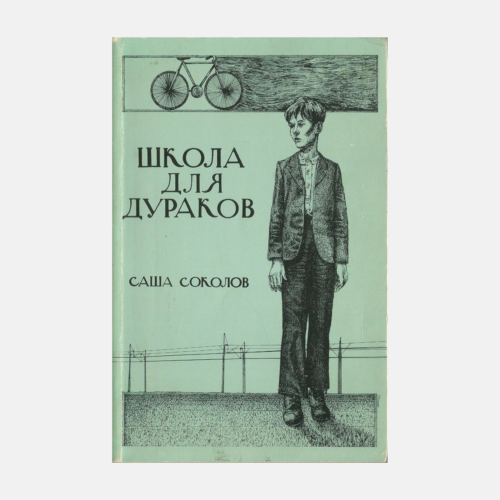
I would guess five to ten books were done by other people, usually better than me. For example, the drawing for Школа для дураков, Sasha Sokolov’s School for Fools was done by Frank Mayo, who designed for us a couple of times, but only once for Russian.
AS: There were two editions of School for Fools with the same illustration on the cover. One with Favorsky’s typeface and one with the title set in a script. Which came first?
EPT: I think the script came first.
AS: Where did you get the script?
EPT: There was a typesetting machine that had a script for Cyrillic, and I got it from that.
 Sasha Sokolov, School for Fools, Ardis, 1983. Image: Ebay
 Sasha Sokolov, School for Fools, Ardis, 1976. Image: Ebay
DY: Can you describe the feeling of making this choice? Even if it’s choosing from only five typefaces. Maybe you did have a favourite one?
EPT: My favourite was always Favorsky, of course. But in general, there wasn’t a lot of choice.
DY: What were your favourite Ardis books, design-wise?
EPT: I liked the cover of Russian Literature of the Twenties: An Anthology, one of our English-language bestsellers for students. I thought that was fun. Later, we did Akhmatova’s prose, My Half Century, and you can see we put money into colour reproduction.
 Russian Literature of the Twenties: An Anthology, Ardis, 1987. Image: Internet Archive
 Anna Akhmatova, My Half Century, Ardis, 1991. Image: Amazon
But I guess my favourite is a book that Russians don’t see much. It’s Nabokov’s pictorial biography, and it’s in English, so they don’t know about it. I’ve given it to Russians, they’ve been shocked. My current husband Ross and I did the layout, and it’s designed much better than a lot of our books.
I went to Montreux, Vladimir had died, but Vera and Dmitri were my hosts. We knew the family, and they let me work in the archive. In the archive, I found film that had not been developed. I sent it to be developed, and it was pictures of them in Utah. I was very excited to have pictures nobody had seen at all.


Vladimir Nabokov. A pictorial biography, Ardis, 1991. Images: Internet Archive
And then I did a whole series of photobiographies, Tsvetaeva’s photobiography, Nappelbaum’s photos of writers, and a couple others. I was not spending money on great reproduction, but these photobiographies were just much better than the Soviet ones. The quality wasn’t the best America could do, but I couldn’t afford the best America could do.


Tsvetaeva. A pictorial biography, Ardis, 1989. Images: Litfund Auction House
AS: After you have designed the book, you have to reproduce it. What did you give to the printing house to reproduce the books?
EPT: I gave the printer the final copy with blue pencils In offset printing, blue lines or marks were invisible to the camera and were used for layout positioning that marked the boundaries of the page.
 Layout with blue pencils. Still from the Graphic Means film
In the beginning, we didn’t understand very well what we were doing, so the early books are not great, except when we were reproducing the Silver Age’s tiny books like Tristia by Mandelstam. For these books we did a facsimile reproduction, the layout is exactly the same, only on better paper. They just took the book, cut up the pages, and photo-offset it. Photo-offset is when a camera takes a picture of your page, and then it’s burnt onto a metal cylinder, then the metal rolls in ink, and then with the ink they produce the entire book, it’s all automated.
 Osip Mandelstam, Tristia, 1922
AS: How did you fix typos back then?
EPT: When we had to do corrections it was the worst. We would proofread, and there would still be mistakes in the final copy, the page we’re going to give the printer.
So we would have to take a razor, cut out the mistake, and tape in the correction.
And those corrections were not always even. We tried with rulers and stuff, but we didn’t have grid paper in the beginning. It was a very difficult process in both Russian and English, because we didn’t have computers till I got my first Apple II in the 80s.
 Fixing typos with a razor. Still from the Graphic Means film
And I used a program called Gutenberg, which could print any alphabet, including Georgian, by the way. So we created some kind of font in this program, but it was so complicated to use.
And then Ross came, my current husband, he knows Russian, and he’s also a computer guy, so we got better computers. When the Macs came, that world became different. We could actually do pages on the computer. We could correct without razor blades, without blood, because we kept cutting ourselves. Our number one rule in Ardis before that was: “No blood on the final copy.”
AS: Was it difficult to find a printer in Ann Arbor?
EPT: We didn’t even know this, but Ann Arbor turned out to be the short-run printing capital of the country. So a short-run is anything less than 10,000 copies, and it was the cheapest place to print, say, a run of 2,000. Our English books would be 2,000 or 5,000 copies. 5,000 would be something that sold well. We did the translation of The Master and Margarita, for example, and that sold a lot. So Ann Arbor turned out to be good, and the printers were wonderful to us. They understood we didn’t know what we were doing. They gave us a lot of advice, and that worked out.
AS: Did they also give you design advice?
EPT: No, they didn’t. They knew what they liked, though. They liked some things more than others.
AS: How did you know that?
EPT: They told me. We were friends with our printers. We always owed them money. We were always slow paying, and they were actually wonderful as a group. We worked with three or four different ones. We liked them all.
AS: Ronald Meyer once mentioned that Dovlatov designed his own covers. Did he draw illustrations, or did he come up with typography solutions as well?
EPT: Yeah, Dovlatov had his own designs. I think he did some drawings. Maybe I got type for him, I can’t remember. But if you see something very handmade with him, he did it.
 Sergei Dovlatov, Craft, Ardis, 1985. Image: Litfund Auction House
 Sergei Dovlatov, The Invisible Book, Ardis, 1977. Image: Abel Books
 Sergei Dovlatov, Ours, Ardis, 1983. Image: Litfund Auction House
AS: Could the writers not agree with the design solution you offered?
EPT: Yes, they could not. But as we went on, they knew my covers. A lot of people didn’t know I was doing the covers because I’m a writer, I’m a scholar, and they didn’t think that I would do covers. I think that people found out very recently that I did the covers. You’re the first people that have interviewed me about it.
As it went on, they started to trust me. They saw the Nabokov, they saw the Brodsky, they saw the Sokolov, and they trusted me to do something.
 Sasha Sokolov, Palisandria, Ardis, 1985. Image: “A Room and a Half” the Joseph Brodsky Museum
AS: Did you ever have a chance to talk to Favorsky’s heirs?
EPT: No. I’m not even sure they know that we used him. But in every interview we ever gave, we mentioned Favorsky. That’s a Soviet era graphic artist, and a lot of people your age, well, even older than you, they don’t know him at all.
We were young when we went to the Soviet Union, and a lot of our friends were much, much older, so we accessed older culture.
AS: Did you teach some of the people, younger workers and artists, to design books?
EPT: No. They watched me, and they did not want to do it, because it was a very tortured process. And no, they weren’t, they were not artistic either. My daughter, who was very young at the time, became an artist. She became an artist, and she could have done covers, but it was not in time.
We had a couple of artists who would come from the University of Michigan. And I would say, okay, do a cover for the Nabokov Pictorial. They would do something, and it would be terrible. And I thought, as bad as I am, as amateurish as I am, I’m better than this guy, so we will not pay him $500. That was a lot of money then. For a small press, it was a lot of money to go outside for a cover.
DY: I have to confess that once I put just a photo of your book at the cover of Dolinin’s Comments on Nabokov’s The Gift. My publisher said: “Look what I have! This is Ardis!” I said: “Great, this will be our cover!” We photographed the book in a studio and used this photograph as a base for the design.
 Alexander Dolinin, Comments on Nabokov’s The Gift, 2019. Designed by Daria Yarzhambek
EPT: That’s fine with me!
But once somebody from St. Petersburg wrote to me and said: “We’re doing Brodsky, and we want your covers.” They were going to steal everything, they were never going to pay me. So I said: “Do your own covers. Have a little self-respect.”
AS: That’s piracy.
EPT: You’ve seen a lot of pirating in Russia too, I’m sure. When the wall fell, Russians pirated all our Nabokov. I went to Russia, and said: “You can’t do this, you’re going to go to court!” Then they made a deal with the family, but they pirated everything we did in Russian. So there was no reason to continue, so I stopped publishing in Russian.
Also one day, in 1989, my husband, Ross, was walking in the metro and saw a stand saying “Ardis books,” and they were not our books. He said: “You are not Ardis, because I am from the real Ardis.”
DY: You once said that Ardis’s books should stand out from other books published in Russian. How exactly?
EPT: The main thing was not to do it in the Soviet way. In the Soviet way, it’s gray and without a photo. For example, we had a bilingual edition of Tsvetaeva, and it was important that she was on the cover every time, Akhmatova too.
AS: Aside from photographs, were there any design principles or design guidelines?
EPT: No, no, I didn’t have any design principles. I just wanted to get as many photographs as I could. And sometimes I did a good layout and sometimes I didn’t, it would depend.
We were interested in bright colours because Soviet books were so dull. Bright colours and photographs, if we could. And
 Vladimir Voinovich, Ivankiada, Ardis, 1976. Image: Vtoraya Literatura
 Yuz Aleshkovsky, Kangaroo, Ardis, 1981. Image: Russian Emigrant Blog
 Vladimir Maramzin, A Blond of Both Colours, Ardis, 1975. Image: Google Books
AS: I would like to move to our first question and ask, you mentioned that you collected Russian Soviet art books. What else did you have except Favorsky?
EPT: Oh, everything. Every book with Filonov reproductions, every book of the Hermitage collections, and sometimes it was a very bad reproduction, but I didn’t care. Even books like The Art of Armenia, just everything. These books were not expensive. We would go to Russia every year until we were banned Ellendea and Carl were banned from entering the Soviet Union in 1979, and I would just get anything. We actually did an English book of Armenian poetry, so all of these things were useful in the end.
One of my favourites was a beautifully produced Soviet book, which was miniature portraits in color. I think it was for export, because they spent a lot of money on printing. They never printed properly for the Soviet people, it was to get валюта, the foreign currency.
AS: Do you still have those books?
EPT: Yes. We moved from Ann Arbor to California, and then from California to Washington. When we made this last move two years ago, I had to give away a lot of books, including some art books, but I kept the core library for sentimental reasons.
AS: What did you prefer working with, Latin or Cyrillic?
EPT: As a designer, it doesn’t matter, but I have more options in English. The options in Cyrillic… Well, there would probably be enough. Now you could get anything, and it wouldn’t be hard. But in English then you could get a lot more.
I would ask you, what do you think of the design now in Russia? Are there beautifully designed books?
DY: There are plenty of well-designed books in Russia. But I’d say, if you come to Russia now, you will feel a little déjà vu, because there is no more good paper in Russia now.
EPT: Oh, my God, I didn’t know that.
AS: I have one more question, the final one. As you have already understood, we are now facing a situation where we have to produce tamizdat. Censorship practices intensified in many countries…
EPT: I just came back from Duke University, where I lectured on totalitarianism, and the best questions came from Vietnamese and Chinese students. They are very worried about it.
AS: So what advice would you give to people designing tamizdat publications today?
EPT: I think that when you’re designing for the internet, which is probably what you mean, the design has to be even clearer, because people are going to be reading on their phone and it’s tiny. But I’m sure all the designers are taking that into consideration. So I would say, just make sure that you care about the books that you’re doing the design for. That’s all.