
Dima, do you like plastic?
This is a tricky question, because plastic is everyone’s guilty pleasure, — beautiful and usable, but harmful. Our civilization is now kind of trapped, since plenty of cool things are made of very cheap plastic materials. Pretty cool, but scary at the same time.
As far as I can tell, we are now witnessing this: while the ‘civilized’ part of the world is moving towards all sorts of green, sustainable stuff, graphics design in terms of its aesthetic, in contrast, is embracing all things plastic and chemical.
I agree. Ten years ago, when the trend was crafts, designers had enough of green and sustainable; so now we have a little setback. But it’s only temporary, I suppose. At some point, everyone will have enough of playing with transparent materials and multicolour foil, and it will go away, too.
Do you do a lot of kinetic typography?
Actually I do. I am teaching a course of kinetic typography on Bang Bang Education, however I don’t do kinetic typography in its conventional sense. It is no longer at all that interesting to watch a typeface rotating over and over again. Even the eminent guys like Nikita Iziev are now moving towards something visually richer. Take, for example, Mitch Paone who did promo images of Söhne typeface for Klim Type Foundry. He was just taking physical objects, some paper letters, and burned them, or painted, spraying it with solvent after that. I mean, they are actively heading for something else, willing to absolutely add or include something. I, for one, employ chromatic aberrations in one of my current projects.
There is now a lot of motion in design. Does it affect type design?
It is difficult to imagine how it can change type, — other than, let’s say, in terms of the much hyped variability, which, as soon as it was introduced, caught on in anything that has to do with animation. Any variable font is an animated font. All variable fonts have the same demo animation when they change weight in a wave move. Whereas the letterforms are now affected by everything. Actually, we are now witnessing type boom on all fronts and in all aspects; there is a quest for both new shapes and a new overall vision. The trends in type design are so different, that we can’t say it’s only about the influence of motion design.
Do you explain something special about type to your students when you teach kinetic typography?
Well, in fact, there are a couple of ready techniques. Like, if you take a very bold and heavy typeface (it doesn’t even matter whether it’s serif or sans serif), such a typeface gains weight and works well with shape. But, generally, there can be different sorts of typefaces in kinetic typography, — and it’s good if they are this way. Personally, I try to promote serif type among my students. Because if you go and see what kinetic typography other guys are doing, it’s always some blank, neutral sans serifs. It bothers me that people never think when they choose typefaces. After all, it is a nice chance to make another creative step and think how typeface works with your concept. As a matter of fact, in any of my work I try to give significant consideration to the issue of compliance with the concept. At first I assign a project topic, and they have to tell me their vision: how does a choice of typeface, or motion specifics, easing, all those things that come together to form the overall picture, relate to the subject.
Please, tell us about your students. Who are they and where do they come from?
My students are very different, with very different backgrounds. There are freelancers, guys from Yandex, others from small studios. Some are better prepared, some are worse. But in general my course is about mastering Cinema 4D as a main tool, and almost none of them know how to use it. So, it’s a beginner level, and their results are also very different. However, I like to think that my students make significant progress during the course.
You mean progress in mastering Cinema 4D, or in typography as well?
In typography, too. But here I mean typography, not the understanding of type as such, since unfortunately, you can’t teach such a complicated subject as type within one short course. Type, it’s practically both science and religion; there are so many different things and themes. I say if you know nothing about type, you won’t be able to choose it yourself by simply visiting MyFonts or other similar platforms. When you have zero experience, it helps to look at some other personalities and studios that can later constitute your credible sources.
Do designers with average typographic knowledge have some sort of common procedure for picking a typeface? How do they look for it?
If we are not talking about some beginning designer early in his career, if they already can do something nice, they often look towards some fun platforms, like FutureFonts and ECAL Typefaces. Speaking of which, type.today is known to pretty much everyone.
Dima Rodionov showreel
Dima Rodionov’s course showreel
And how do you do it?
I am actually a bit of collector freak. I have a tab in my browser where I added 40-50 foundries which for some reason I like and keep an eye on, either by following them on Instagram or simply visiting their websites. In type design, the author figure plays a major role — that’s why for me it is the easiest way to keep an eye on what’s happening in the field. While platforms with various authors such as Future Fonts or type.today are convenient, I use those things rather as an exception.
Could you name some of your favourite authors?
If you ask about Russian type designers, that would be Gayaneh Bagdasaryan from Brownfox and Maria Doreuli from Contrast Foundry. They both apply a very meticulous, perfectionist approach in their work process and when it comes to quality of a final typeface: the results are really, really cool. They don’t work fast, obviously, and in this regard Bagdasaryan and Doreuli yield to Roman Gornitsky, Temporary State. He has great letterforms and a fresh perspective, but you can see that his typefaces took less time to create than it takes with the ones produced by Doreuli, for instance. It took Maria a long time to design William, but it’s gorgeous. As for foreign designers, there are Klim, for example, — guys are really great; then there is Sharp Type, a nice studio, I bought a couple of their typefaces; or take Black Foundry, I admire their Grtsk — it is so cool, very beautiful. Pangram Pangram are fun, too. Commercial Type, undeniably, also very good. I truly liked their Commercial Classics project for widening the palette that we have. There is currently a situation where everyone produced a ‘blank’ typeface — plenty of geometric sans serifs, a whole lot of modern serifs. And everyone is like, ‘OK, now we can design something display’. A really active trend right now, development vector. Speaking of which. It seems to me another trending thing — those sans serifs à la American gothic typefaces of the early 20th century. Designers search and find letterforms for modern type in their detail and imperfections.
So, you’re saying there is a trend towards diversifying display typefaces and American gothic typefaces?
Right now there is, yes. And a more global trend are serifs, perhaps. Number of those in the works of designers is increasingly growing. For one, we see way more people start applying serifs online than they did, like, five years ago.
How did you develop such great interest and close attention to type? Where did you study?
At first, I studied at Polygraph (Moscow State University of Printing Arts — translator’s note) — although, actually, majoring in the wrong field, ‘Information Technologies in Design’. So I did learn some things there, but not much. Then I realized that I knew nothing about type, and I came to Ilya Ruderman at British Higher School of Art & Design. Completed my studies there, even designed some typefaces, but at that moment I had rather poor understanding of how it all works. Now, with my experience of working at proper design studios, I have somewhat different perspective and vision in terms of how typefaces work in branding, in layouts in general. Now, I believe, I have developed an understanding of what has to be utilized and what is convenient for use.
You are currently with ONY agency, aren’t you?
Yes, I am mostly in charge of computer graphics. Then there is Andrey Zhandarov, also an art director. A great deal of what has been happening at ONY in terms of computer graphics for the last two years, that’s us two.
How does it work? A brand comes to you and you come up with an idea of how to revive this brand?
It depends. We are a full-service, full cycle agency; normally, a client comes to us for the whole branding thing. We are trying to sell them a strategy, so that we have something to base on when we discuss the results. In the branding process, we seek to apply as much motion, CG and things like that as we can — although not with the aim to impress the client. Today this is a story integrated into the development process: modern branding doesn’t exist without motion. It was before when there was no such thing as websites that you could print a logo and it worked just fine. But now sites are in motion. And the question arises, how should a way of living for the brand in motion look like? Plus, it is often the case that we base our very concept on 3D and motion. Like, we have a kind of metaphor of rotating cards. We rotated them in 3D in a certain way, then it all gets translated into the illustrator level, certain flat formats. I mean, clearly we’re adapting it somehow, but it is exactly in 3D that the idea itself is often born.
I feel like wanting to get your inner workings. What team do you have? What is your way of working on a project? How many people you have, and in what roles?
Well, now there are actually about 60 people at the agency, but they work in a number of various divisions. A rather large team is in charge of strategies. Initially, our projects go through strategy, then they are passed either to digital, or branding teams. If it’s about designing a website, the most work would be done by members of our digital team. There are some 10 members. If the assignment is branding, that’s us. Currently, the branding team includes about 15 designers, among them several interns. So, Andrey and I are in charge of CG, but in fact many of us can do animation and rendering; two people design typefaces (started last year). Getting back to the process, when a commission gets to the branding team, we are responsible for the concept development stage of the project. Later the client gets back with his feedback and his choice, we work on it and elaborate it.
How do you get our ideas? Do you arrange some kind of brainstorms, or is there a head person for each project?
Normally we have teams: it’s not that 15 people work on the same project. They get divided into various project teams; each team includes more experienced and less experienced designers specializing in different areas. Depending on specifics of any given project, you can add members to those teams — us, for example, or type designers.
What is your routine way of working with type?
We pick typefaces based on the task. Any branding has its_ core_ values, features and values that shall be reflected. According to them, we begin to think of what typefaces could be utilized. If it’s a tech firm, the choice would definitely be tech typefaces: simpler in terms of structure, less sophisticated, bearing no historical touch. If our client is a museum, we can put a mere neo grotesque, or a highly neat serif — still adding certain historical zest to it. We seek to avoid using the same things. Lately we’ve actually been trying to design typefaces specifically for projects. This way, it turns out even more accurate than if you would have picked them. Yet we are not seeking to create versatile, all-purpose stuff, which can, for example, be used for typesetting a book or developing a gazillion of identities. It’s not like we attempt to invent a new Helvetica that then will be used by the whole world. We rather make things we need here and now. A fast, but very targeted typeface. Or, for example, we have this one typeface made only of punctuation marks: we were designing thin linear punctuation to pair Druk for Otkrytiye bank.
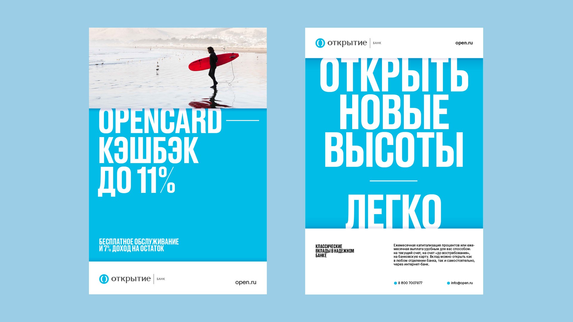 Druk with a custom-made thin punctuation used by Otkrytiye
Are your clients willing to commission typefaces?
It depends on the client. It is often economically viable. A client with a big business has to pay too much for certain typefaces. It often happens that it’s simpler to create something of your own — although, probably, not faster.
Could you please tell me about a team that does type?
In its most part, our type work is being done by Kostya Lukyanov, with the help of advisors from outside or within the team. Plus, recently we’ve hired Katya Abramova to help him. However, quite a lot of our designers are into type, actually. For example, Linda Kosichkina even took Maria Doreuli’s Type Workshop. Everyone is trying to stay in shape, to look and to learn.
And you, you also run your own jewellery brand, am I right?
You are. It’s called Bélki. Me and my girlfriend Marina have been doing this since 2016. All our jewellery is square-shaped.
Do you invent and produce these shapes by yourself?
We do. This project is completely different from what I normally do. It’s very haptic and tactual, very real. A nice chance to escape from the world of displays into a real environment. Our first work was a square-shaped ring, a gift, we produced it using a 3D printer. We presented the gift and then printed the same thing for ourselves. Everyone loved it, and we began selling it on_ Lambada Market_ and through other events of this kind. At some point we launched production of silver jewellery. The process was more complicated, but the results now were ageless. That’s great how you can test your weird, dimensional ideas on materials; see how it lives and interacts, whether people need it or not. All our things are minimalistic and geometrical. Although lately we’ve been trying to move away from expressiveness, to create experimental stuff, for not to compete with the cheap mass market where pretty much everyone now offers simple and geometrical products.
Let’s now talk about our Instagram. You most certainly should have had your favourite typefaces when you laid your hands on the type.today collection. Is that right?
It is. I had no plan to try on everything. Or I’d rather say, to post everything. I wanted to use typefaces you’d want to touch, to work with: Druk, Graphik, NWT Bоdoni, Austin. I often looked for the most contrasting pair to a sans serif, therefore my choice was clear and obvious. Then there were Styrene (great typeface!) and Halvar, as an alternative to the very same Druk. This helped me diversify, and I did well. And Amalta, yes. It is very beautiful, but can’t be applied too often, — too distinctive. I believe I have listed all, or nearly all the typefaces I used during the month.
Druk, Graphik
Halvar, NWT Bodoni
Austin
Amalta
You’ve had one single concept for the whole month. Why garbage?
It is very beautiful. And easy to render. I mean, from the technical perspective, you knew right away what could be done. Besides, this is a very time-relevant topic. The one you’d want to attract attention to. I often have lunch at Strelka Bar, our office is based next to it, and when I order a dessert to go, they always put my tiny dessert thing into a huge plastic container: I am walking with it for, like, 100 meters and then throw it away. Absolutely ridiculous.
Is this your first sustainability-themed, green project?
It is. Yet, we have to raise these issues. For example, for DEMO Festival in Amsterdam, I did this kinetic typography project about the fact that Russians have a thing for fences. This is also a sensitive subject: our people just love to close everything, to hide, — to build some ugly fence to that end.
Getting back to sustainability, I started by thinking of a list of objects, plastic and beautiful, which can be well shown. Then I thought about what can be exposed within this topic. Various sorts of plastic. Production, some molding shapes, where plastic is being sprayed into, for it to take the shape of the product. They are in fact very pretty. Then I produced a number of weird things such as a plastic chair in a plastic packaging, — the ones that showcase the absurdity of this plastic’s situation. Or this soldier crab, living in a plastic cup.
What was this month like for you? Did you really produce an image a day?
As many of us did, I made an effort to prepare some stuff in advance, but it didn’t work out. So I had to sit down in the night drawing something. It turned out an exciting challenge — where you have to quickly come up with a finished result that would be interesting to someone besides myself. There is this line where you have to work fast, create beautiful things — which at the same time would be theme-relevant. It gave me a great experience. I had no idea how all this would work out, but ipso facto I realized that this was in fact a nice enterprise.
And a feedback you received, was it something you’d expect to get? Did it relate to how you felt?
Not always. Frankly, almost never. I’ve understood that there are two types of things that more often work than not: sophisticated 3D stuff, where people see how complicated it is and they don’t get how you made it, yet it’s interesting; and then it’s the most simple graphics. I had this image with arrows: just those arrows and ten letters, but your followers really enjoyed it. Not much shown; very clear; a little thingy in the form of arrows. People tend to like it, if the graphic idea is complete.
What you personally like the most?
I guess the last one. I was told that garbage forms a suprematist art composition. A pile of trash which, from a certain perspective, looks like a finished art object in itself. All while being, in fact, a pile of trash. Funny story.