
We made several attempts to make up a list of books to read for type designers and typographers, but we could not decide how many books the list should include and on what basis we should choose them. This is why we decided to ask our authors to do that for us. In early spring, we sent them a questionnaire where (among other things) we suggested recommending a book published within the last 20 years which might be useful for type designers and typographers.
Dutch Type
Jan Middendorp (2004)
Recommended by Olga Pankova
This is a history of Dutch type design from the 15th to 20th century told through interviews, historical documents, and sketches stored in the archives. The book was last reprinted in 2018.


From the Dutch Type book reprint, 2018. Images: Druk Editions
Printer’s type in the twentieth century
Richard Southall (2005)
Recommended by Jean-Baptiste Levée
Printer’s Type in the Twentieth Century is a book on how

Printer’s type in the twentieth century book cover. Image: AbeBooks
Size-specific adjustments to type designs
Tim Ahrens, Shoko Mugikura (2007)
Recommended by Hugues Gentile and Jean-baptiste Levée
The book addresses optical sizes, revealing how they work and why one needs them. In addition to a guide for designers, the book features the results of readability studies and interviews with type designers such as Christian Schwarz and Akira Kobayashi. It was last published in 2014.


From the Size-specific adjustments to type designs book. Images: Typographica
Dynamic Identities: How to Create a Living Brand
Irene van Nes (2012)
Recommended by Mona Franz
This publication is a collection of writings looking into dynamic identities and logos such as brand identities of MTV and Pantone Color Institute.


From the Dynamic Identities… book. Images: Iren Ontwerp
Please Make This Look Nice
Peter Ahlberg (2012)
Recommended by Christian Schwarz
Please Make This Look Nice combines interviews and articles as well as shares a number of concepts not agreed on by the client, which can help you get the idea of how (probably) the most famous designers alive think and
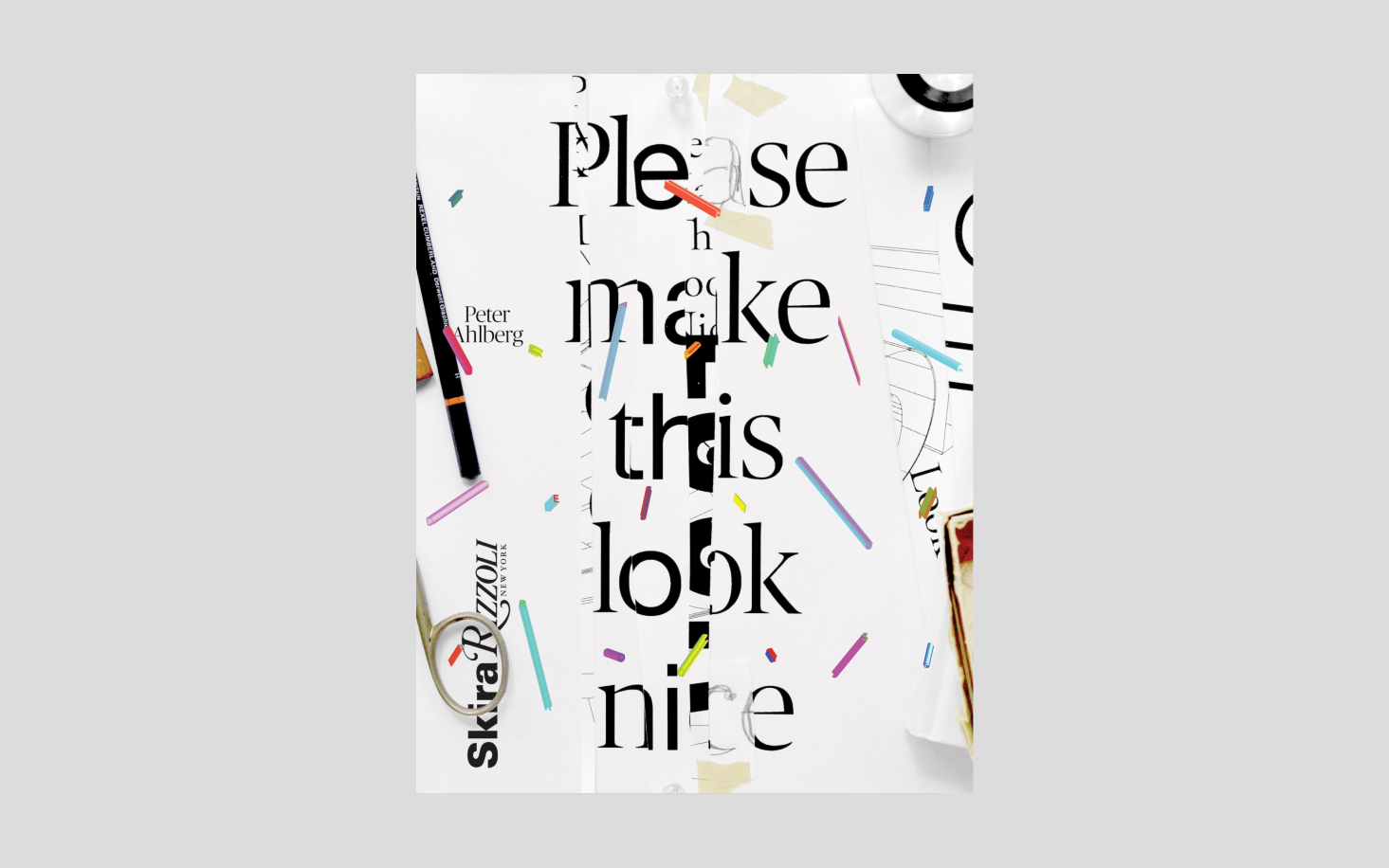


From the Please Make This Look Nice book. Images: Papercut
The anatomy of type
Stephen Coles (2012)
Recommended by Olga Pankova
Stephen Coles (who launched Typographica and co-founded Fonts In Use) gets into the details of the hundred best-known typefaces (for example, the list includes Bodoni, Helvetica, Gill Sans, and Garamond). The UK edition of the book is titled The Geometry of Type.


From the The Geometry of Type book. Images: Tony Seddon
Reading Letters: Designing for Legibility
Sofie Beier (2012)
Recommended by Jacob Runge и Philipp Neumeyer
Sofie Beier has spent many years exploring and researching how typography affects the accessibility of documents, websites, and environments. Her book Reading Letters… is a collection of tips to help type designers create the most legible text typeface possible as well as help graphic designers choose a font so that it is not only easy to read but also won’t cause any discomfort to neurodivergent people.


From the Reading Letters: Designing for Legibility book. Images: Sofie Beier
Notes on the Design of DTL Valiance
Hanna Hakala (2013)
Recommended by Philipp Neumeyer
For this book, Hanna Hakala brought together all the notes she made while designing Cyrillic support for DTL Valiance. This is one of the very few English-language books on designing Cyrillic.


From the Notes on the Design of DTL Valiance book. Images: Бон Мин
The Insects Project
Agnieszka Małecka, Zofia Oslislo (2016)
Recommended by Philipp Neumeyer
This book focuses on what diacritics should look like for Central European languages: Hungarian, Polish, Czech, and Clovak. All the most common diacritics design issues are illustrated using font samples from young Czech, Polish, and Slovak type designers.


From the The Insects Project book. Images: The Insects Project
How to Create Typefaces: From Sketch to Screen
Cristóbal Henestrosa, Laura Meseguer, José Scaglione (2017)
Recommended by Alja Herlah
How to Create Typefaces is a step-by-step guide for those who are about to design their first typeface. The first section shares what one needs to think about before embarking on drawing sketches, whereas the last one addresses how to sell a font. Anything in between is six more sections that specifically cover type design


From the How to Create Typefaces… book. Images: Type Together
Bi-Scriptual
Studio Eps51 (2018)
Recommended by Adrien Midzic
Experts on eight scripts (Arabic, Devanagari, Hebrew, Kanji, Cyrillic, Latin, Hangul, and Hiragana) share their thoughts on how one should and should not handle multiscript design layouts. A piece on Cyrillic in this book is authored by Eugene Yukechev, co-founder of the Type Journal and Shrift Publishers.


From the Bi-Scriptual book. Images: Niggli
Reviving Type
Céline Hurka, Nóra Békés (2019)
Recommended by Mona Franz
Reviving Type invites you to observe the type design process of creating Granjon and Kis revivals. In this publication, Nóra Békés and Céline Hurka constantly compare their approaches, sharing what theoretical research they resort to and how they make decisions.


Из книги «Reviving Type». Изображения: Typography Guru
The Natural Enemies of Books: A Messy History of Women in Printing and Typography
Maryam Fanni, Matilda Flodmark, Sara Kaaman (2020)
Recommended by Alja Herla
Members of the MMS group suggest applying feminist optics to the history of printing and typography and address some projects by female book and graphic designers of the 20th century whose names didn’t make it to the textbooks. The book’s latest edition includes a number of essays by contemporary feminist authors, designers, and researchers.


From The Natural Enemies of Books book. Images: Occasional Papers
Designing Type
Caren Cheng (2020)
Recommended by Hugues Gentile
This textbook appears to cover all


From the Designing Type book. Images: Yale University Press
Italic — What Gives Typography Its Emphasis
Hendrik Weber (2021)
Recommended by Mona Franz
One of Neue DIN authors wrote a book where he reveals what true italics are and how type designers should (and should not) design it.


From the Italic — What Gives Typography Its Emphasis book. Images: Thames and Hudson
Flexible Visual Systems
Martin Lorenz (2021)
Recommended by Paul Eslage
It took Martin Lorenz more than ten years to come up with a formula of the most flexible and scalable brand identity and he eventually determined that this formula consists of five elements. Such an identity should be divisible into semantic modular components, save the user’s time, be equally efficient across various environments, provide the designer with enough creative freedom, and the customer of such an identity should communicate with its author on equal terms rather than treat them as a subordinate. On the website about his research, Martin says that Flexible Visual Systems (FVS) is a theory and if you’re more into case studies that fit the FVS identity definition, read the Dynamic Identities: How to Create a Living Brand book.


From the Flexible Visual Systems book. Images: Design Reviewed
Some Tips on Drawing Type from A to Z
James Edmontson (2021)
Recommended by Nikita Kanarev
This publication is a small collection of practical tips that the founder of OH no Type Co James Edmondson gave to his type design students.


From the Some Tips on Drawing Type from A to Z book. Images: OH no Type Co
On Letters
Prem Krishnamurthy (2022)
Recommended by Christian Schwarz
Technically, On Letters is thirteen letters to the Japanese conceptual artist On Kawara who died in 2014, yet it is in fact a long and truly visual essay embracing such topics as typography, design, racism, mindfulness, storytelling techniques, and the solitude of an artist.


From the On Letters book. Images: Domain
Heated Words: Searching for a Mysterious Typeface
Charlie Morgan, Rory McCartney (2023)
Recommended by Anna Seslavinskaya
This is a research on New York street culture of the 1970s through the lens of typography, namely the varieties of blackletter iron-on lettering across various subcultures back then.


From the Heated Words… book. Images: World Famous Original
P.S. Despite the fact that we asked our authors to recommend only those books that have been published in the last 20 years, many of them still listed The Stroke: Theory of Writing by Gerrit Noordzij, which was first published in 1985 and last reissued in English in 2019.
Gerrit Noordzij was running a type course at the Royal Academy of Art in the Hague from 1960 till 1990. These lectures served as a basis for The Stroke.
The publication addresses how black and white interact with each other, how writing tools and writing in general work, and how a human eye perceives letters. We believe that this is an extremely important book and so we join in with our authors
 The Stroke: Theory of Writing book cover. Image: Katherine Small Gallery