Zhivov is named after the philologist Victor Zhivov, whose family the typeface’s author, Yury Ostromentsky, and type.today’s editor-in-chief, Daria Yarzhambek, had the privilege of knowing personally. In many ways, Zhivov was born out of Victor Markovich’s reflections on the lack of a comprehensive and versatile tool for scholars studying Old Russian language and literature.
Before releasing the typeface, we spoke with Victor Zhivov’s daughter, Margarita Zhivova, Professor of Philology at Roma Tre University, and Artemij Keidan, Professor of Linguistics at Sapienza University of Rome, about typographic issues, both past and present, faced by researchers dealing with the Old Church Slavonic language.
Daria Yarzhambek: Which typefaces with Old Church Slavonic support do you typically use in your work?
Artemij Keidan: I don’t specialise in Old Church Slavonic, but I occasionally help my peers. For instance, I typeset Old Church Slavonic Grammar by Anna Polivanova. Everything was done in a rather makeshift way, as there were no suitable typefaces available. I took some materials developed back in the 1990s and added new glyphs and new OpenType features. But I am an amateur rather than a real type designer.
Margarita Zhivova: Sometimes we even have to add letters that aren’t in Unicode!
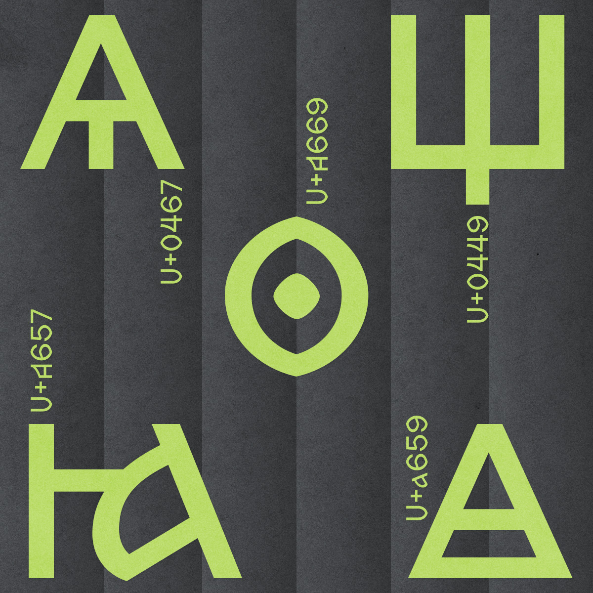
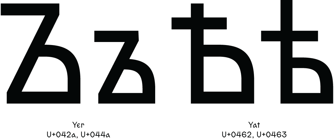
AK: Yes. For example, there are these house-shaped triangular symbols, three of them. One is the standard little yus, it looks like an А with a vertical stroke in the middle. The second has only a horizontal stroke inside, and the third one has both a horizontal and a vertical stroke. Fonts normally include only the standard yus, while all three are found in the actual manuscripts.
 Yus letters not included in Unicode, Sava’s book, 10th century. Image: Wikipedia
MZh: The third
DYa: You are aware that you can submit a proposal to have a character added to Unicode, aren’t you?
AK: I am, but it is a really, really slow process. Plus, the proposal has to be thoroughly justified, in great detail.
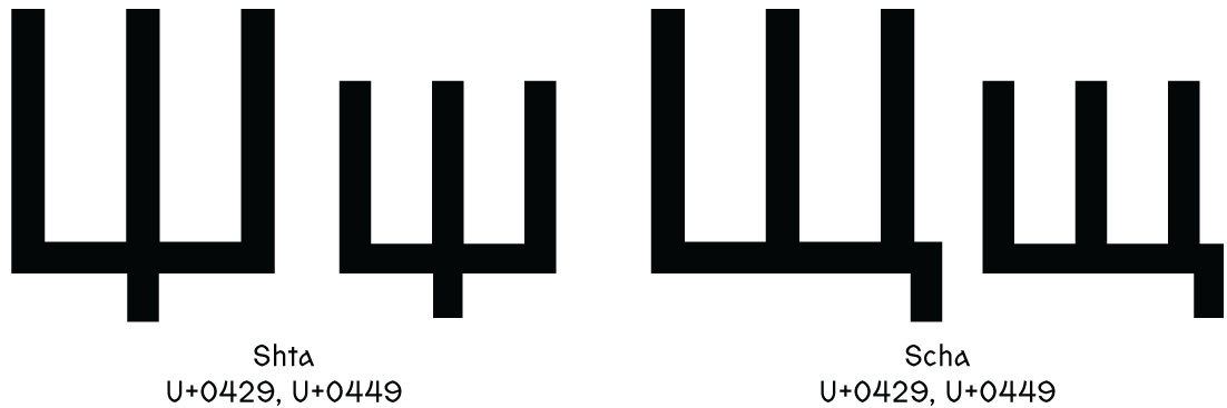
When it comes to this house-shaped character, it probably makes sense to submit a proposal. But, for example, Polivanova’s Grammar basically introduces a new letter, a combination of ж (zhe) and д (de). The combination can actually be considered a single letter, because if we treat shta (which later became scha) as a single letter, why not treat the combination of ж and д as a separate letter, as it is essentially just the voiced pair to shta.
What we see in manuscripts doesn’t contradict this hypothesis in any way, but this is the only example of the character’s use. Unicode probably wouldn’t have added it. By the way, I have a request. For the next Zhivov release, it would be nice of you to include Glagolitic support.
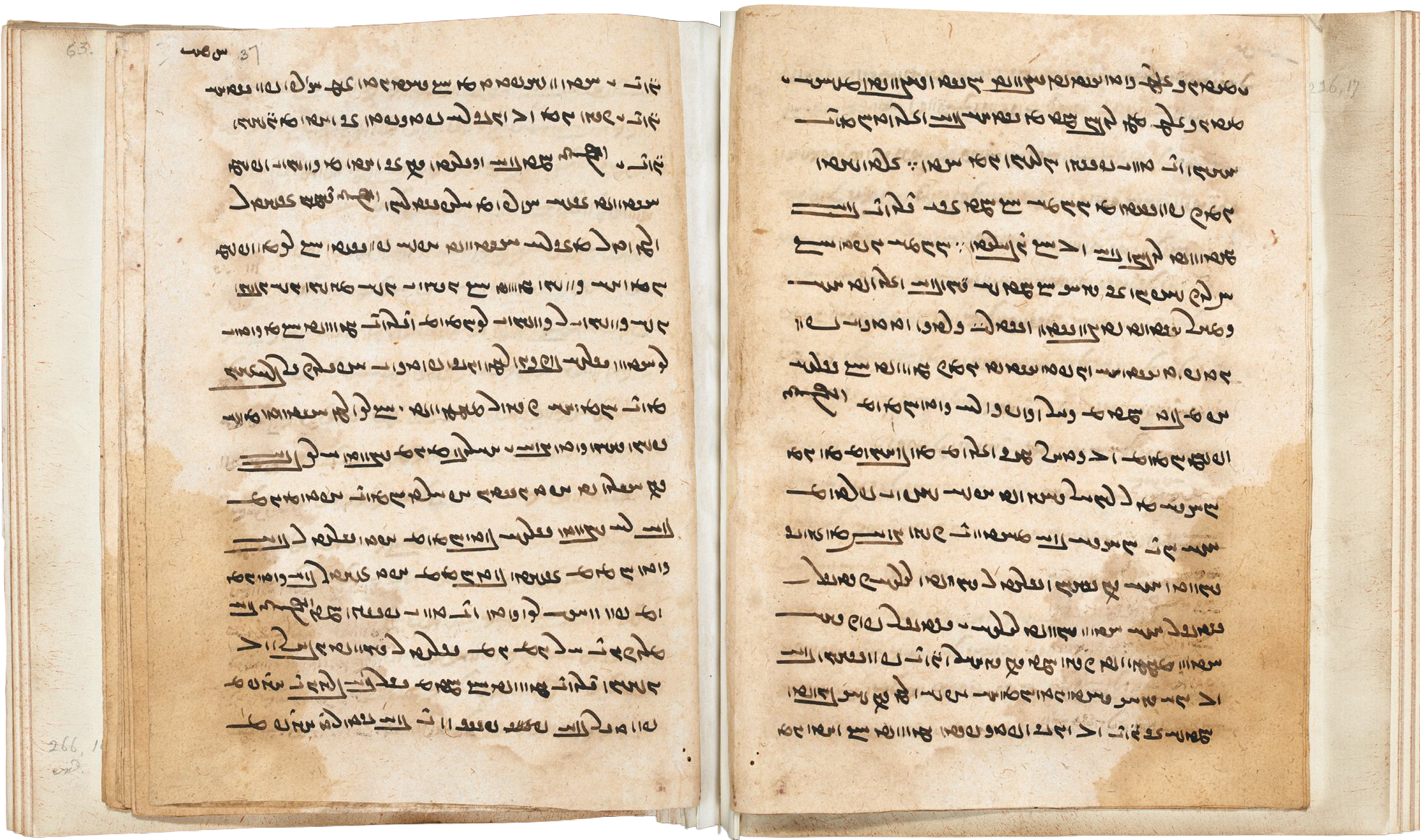
 The Kyiv Glagolitic Folios, 10th century. Image: Wikipedia
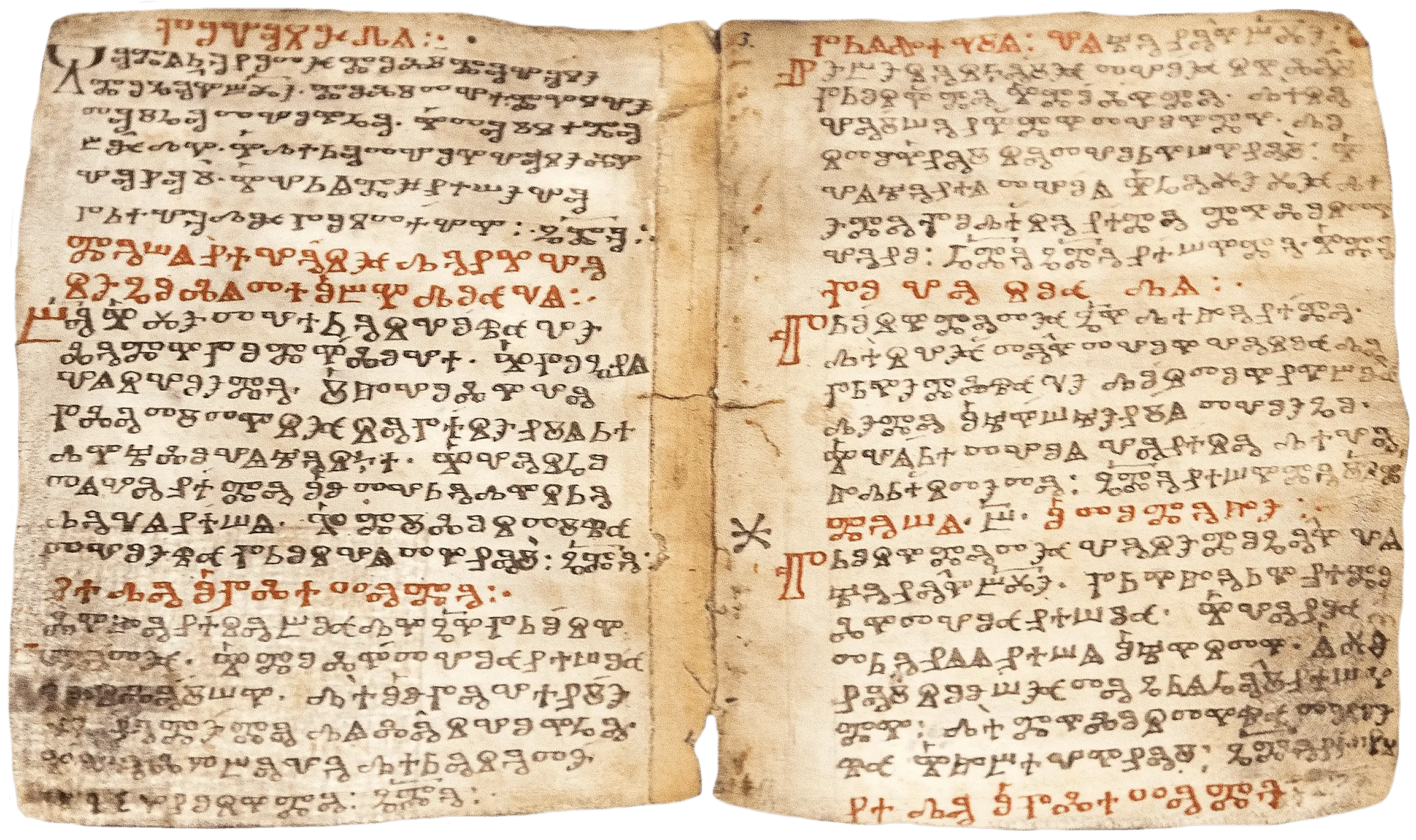
MZh: Yeah, sometimes we do need Glagolitic. A perfect support for this script, it seems, is still nowhere to be found. However, the needs of a philologist or a linguist very much depend on the specific area they work on. For example, we more or less know our way around Old Church Slavonic, and it is unlikely we’ll encounter anything unexpected there. But when it comes to manuscripts from the 15th-16th centuries, you can find all sorts of things.
It also depends on what exactly needs to be done with a given text. I’ve had papers where I had to simply present a text, and in those cases, I could just omit some of the symbols. This way, it is not very pretty, but these are conventions we agree with.
For example, when there are too many superscript letters placed over
AK: But, on the other hand, if these letter combinations are properly implemented in a font, why not typeset all these superscript letters?
MZh: Well, yes, but there’s also the issue of typesetting convenience.
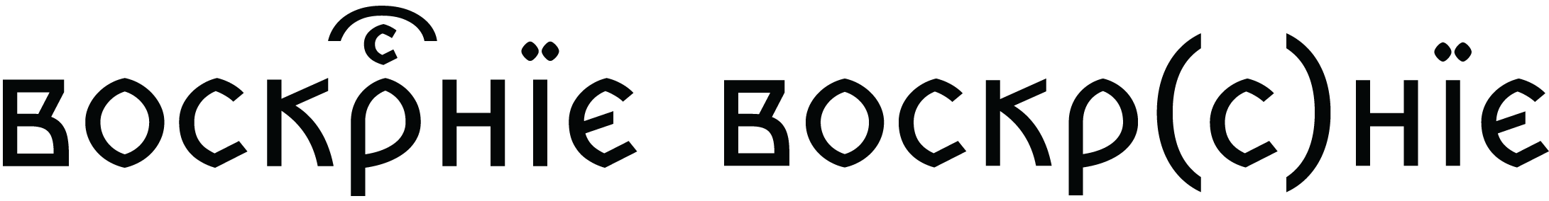
Another major problem is that the very same letters can be written differently, and it can be really meaningful in some manuscripts. For example, there’s an о with a little dot in the middle, and for certain manuscripts, this dot may be really important.
Then there are accents. It happens that several scribes would write diacritics differently in the same manuscript, and this may also be important.
Typing accents isn’t always convenient. You would want it to land precisely on the letter, which, sadly, doesn’t always happen. It is often the case that diacritics shift somewhere else or end up colliding with the character.
Or — sometimes you need the diacritical mark to be placed not directly above a letter, but between letters.
AK: But at the same time, nobody expects a typeface to be able to reproduce all the details
MZh: Certainly. Yet it is essential that the reader can tell whether the symbols are different in any given spot or if they’re the same.
I would also say that, on the one hand, you’d want everything to look nice and beautiful. On the other hand, when it looks too pretty, it becomes a bit too much. Looking at the fonts used today to set Old Church Slavonic liturgical texts, it is clear that type designers tried really hard to make them look beautiful. Though in fact those are difficult to read, and linguists have no need for fonts like that at all.
DYa: Victor Markovich
AK: There is a typeface based on the Ostromir Gospels. That is a beautiful manuscript with a very distinctive typeface. It cannot be used to set other texts in Old Church Slavonic, because any reader would immediately say, ‘Something’s not
That’s why many of us end up using some neutral fonts, such as BukyVede. It is not the most convenient one, but fairly neutral, and it actually doesn’t look much like an ancient manuscript.
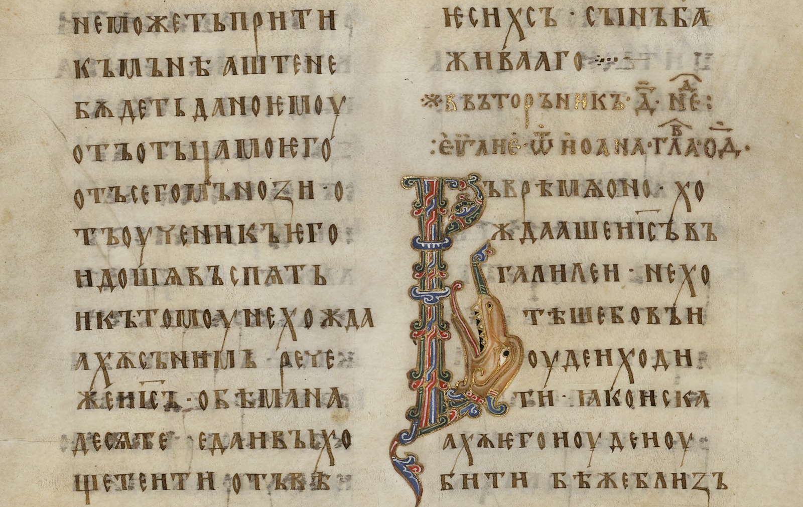 Ostromir Gospels. Image: National Electronic Library
MZh: It is important for a typeface not to be associated with any particular time period. After all, all
AK: Imagine if we all of a sudden decided to set a modern Russian book in an 18th-century typeface with tall yers. It would look weirdly ornate and pretentious.
MZh: Just like this street signage where people mix up the letters yat and yer at the end of a word and write ‘Трактирѣ’! Russian for ‘Pub’
DYa: And what fonts do you work with?
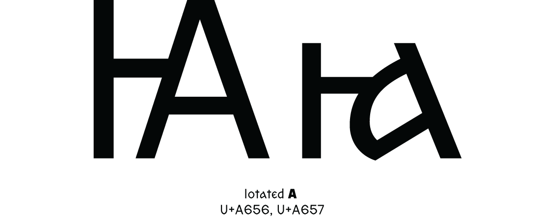
MZh: I mainly use a typeface called Method Std. It’s missing some letters, so I constantly have to borrow them from somewhere else. For instance, it lacks the unfortunate iotated а, since this character was only recently added to Unicode. There’s no such character in Times New Roman either, while most publishers require a text to be set in this typeface.
 Iotated a in the Apostle book, 1564. Image: Wikipedia
AK: Publishing requirements typically date back to the 1990s, when it still made sense to specify a font.
I set everything in Cambria. It’s the default font, and no one should have any issues with it.
DYa: Could you tell us a bit more about what it was like before the digital fonts arrived?
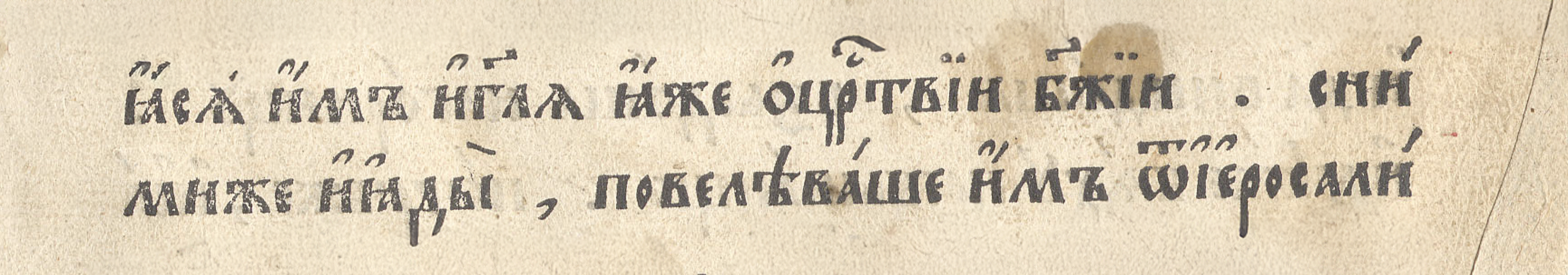
MZh: In the 1970s and 1980s, people would just leave some space so that later they could insert characters such as ѣ by hand.
AK: The philologist Boris Uspensky once told how he would be specially invited to the print shop to squeeze a piece of type with pliers to turn it into the letter they needed. Meaning, philologists had to literally cut out printing type themselves to meet their particular typographic needs.
MZh: I have heard that Andrey Zaliznyak managed to do something like that with his personal typewriter: filed something down here, attached something
And then in the 1980s, the word processor ChiWriter was released. It lets you draw letters using dots. You’re missing a character, so you draw yourself
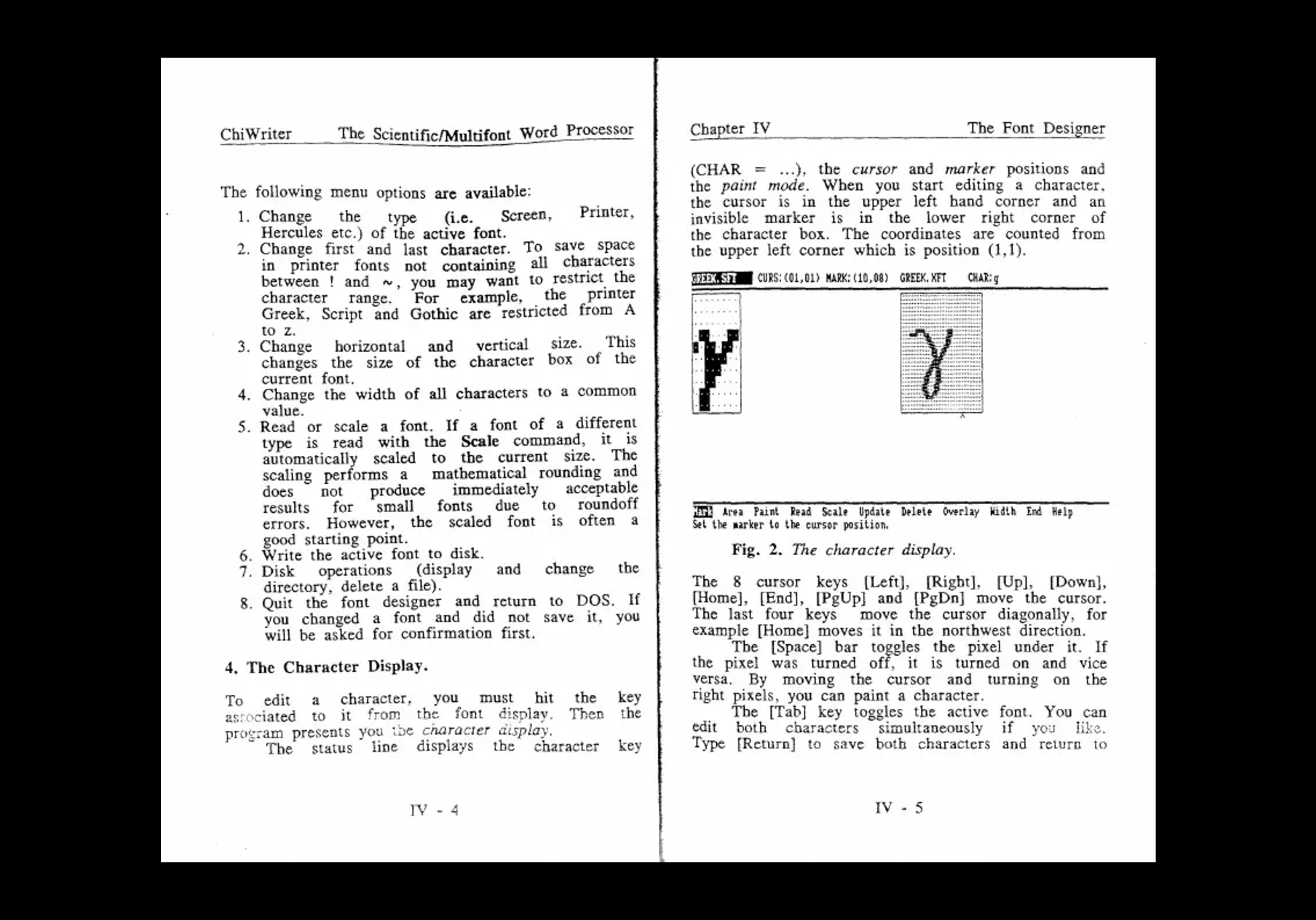 Type design in ChiWriter, instruction manual. Image: Scribd
I remember how my dad and I would sit with this ChiWriter, drawing letters, having fun, showing them to each other. We were really into this tool.
Academician Vladimir Dybo typeset many things using ChiWriter software. It was not so much Old Church Slavonic letters as various phonetic symbols. As he worked on dialects, he needed all kinds of subscript and superscript letters. His daughter, Anya Dybo, later worked on converting all this into a proper Unicode font, and she succeeded, I believe. But it is an insane kind of work.
Other than that, everything that had been done with ChiWriter was lost because it was impossible to convert it.
AK: Anything that is not on paper disappears faster than we think. For instance, I recently needed to quote a book. I remembered that it was available on the author’s website. But the author had died, and the website no longer exists. The Internet Archive doesn’t keep any
Luckily, I found the book in a 20-year-old backup. Anyway, anything digital, unlike paper books, is extremely ephemeral. All the information stored on media that are no longer readable is simply lost.
MZh: True. I still keep a number of paper sheets that my dad made for his students. Those aren’t even
Kondakary (a liturgical chant book) text re-written by Viktor Zhivov for his students. Images: Margarita Zhivova
Zaliznyak also wrote perfectly by hand. He drew grammar tables himself. I got one from him when I was a second-year student. Marina Bobrik recently collected these tables and published them.
Grammar tables drawn by Andrey Zaliznyak. Images: Marina Bobrik
DYa: That is, he wrote several copies by hand?
MZh: Yes, he did. But today we work at a completely different pace. That’s why it would be nice not to have to go looking for letters and symbols in other
DYa: Do you experience any keyboard issues?
AK: That’s actually the easiest part. There’s special software that lets you create any layout you need.
DYa: I remember once looking at the typesetting of Zaliznyak’s book and realising that we cannot, for instance, just replace the font the book was typeset in with Zhivov. The Old Church Slavonic characters it featured weren’t in the Unicode code points they are supposed to be in.
AK: The Old Church Slavonic Cyrillic was added to Unicode relatively late, so there was a huge amount of fonts that people handcrafted themselves. They placed letters wherever they felt it was convenient, typing-wise. Things are different today, but some people still work with poorly designed fonts, out of the old habit. Though I think they are now in a minority.
MZh: Recently, I needed to work with a text set in one of the Flavius versions. In theory, Flavius and Method Std are supposed
We end up spending a great deal of time handling font
AK: And we’re not even talking about those who study languages that are not supported by Unicode.
DYa: And how do they work, really?
AK: They’re just making some one-off, single-use fonts. There is a really well-known
Book Pahlavi. Image: Iwsfutcmd is in Seattle, x.com
MZh: Then, we mostly handle digital documents, and we need an encoding that makes it possible to search through a file.
DYa: Makes sense. If the letters aren’t in the right places, you won’t be able to find anything.
AK: In Old Church Slavonic, different graphic variants of ѣ should probably be encoded as alternative glyph forms. They are not to have their own separate Unicode code points so that when you search for ѣ, you get all the words with that letter.
MZ: And I would probably want to extract all the variants of tall ѣ from some edition.
AK: You’ll have to do that manually, sorry about that.
MZh: After all, there should be a balance. On the one hand, we don’t want this to grow into some kind of unwieldy system, while on the other, it has to address all our needs, and we have all kinds of needs.
AK: I don’t quite agree with you on this one. If we’re going to do this, let’s
That is, at the very least, the file should feature all Unicode glyphs. If we’re going to create some kind of global Cyrillic, it should be one that covers all needs.
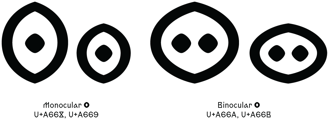
The Zhivov typeface supports all Old Church Slavonic characters added to Unicode, including the titlo, alternative glyph forms (such as the lowercase rounded в and the tall yer), components for writing down Old Church Slavonic numerals, ligatures for imitating vyaz’ (ancient Cyrillic ligatured writing), and 15 graphic variants of the letter О (two of which are variants of the multiocular о).
The typeface is free of charge for scholars working with Old Church Slavonic language and literature. If you’re looking to use Zhivov in your work, please contact us at yury@type.today, and we will send you the font files.