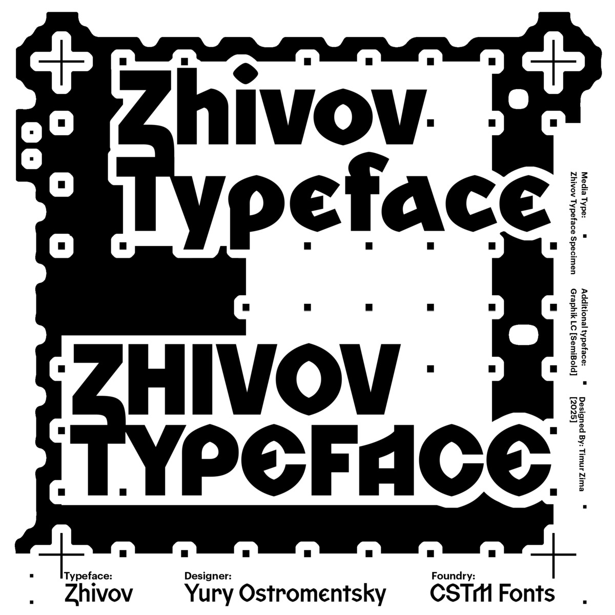
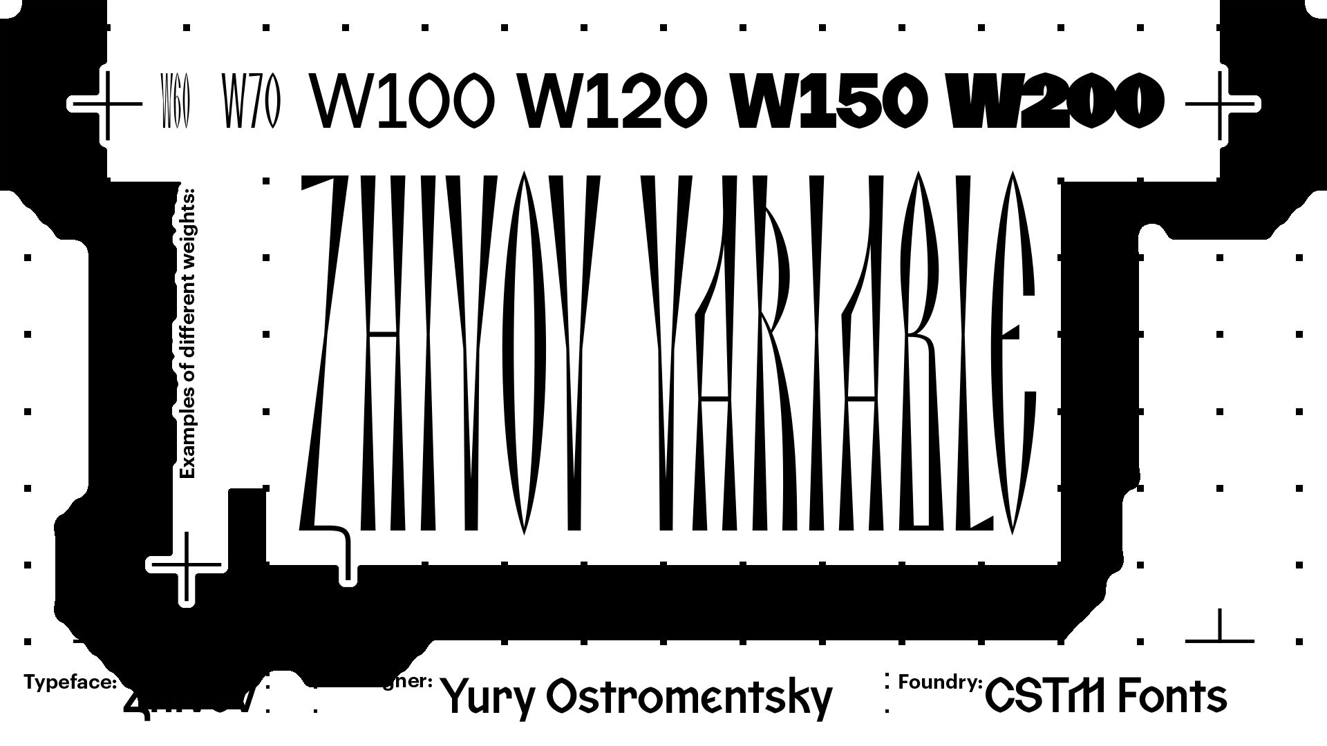
Zhivov is a reflection on what the Cyrillic script might have looked like if it hadn’t been reformed by Peter the Great in the early 18th
Get Zhivov
from $50 ₽ on type.today
The typeface is named after the philologist Victor Zhivov, with whom Yury Ostromentsky once had the pleasure of discussing Old Russian writing and, in particular, the critical lack of a universal and comprehensive typographic tool for scholars studying Old Russian (Old East Slavic) language and literature.
There is not a single font [with Old Church Slavonic support] that meets all the needs of linguists and philologists while also being convenient typesetting-wise.
Margarita Zhivova
Professor of Philology at Roma Tre University, daughter of Victor Zhivov
Zhivov’s glyphs are stripped of contrast, decorative elements, and stylistic features tied to a specific time period or any particular scribe. That is why the typeface would be equally appropriate for setting both books on the Ostromir Gospels and content addressing birchbark manuscripts.
Striving to reproduce 100% of what we see in a specific manuscript [in a typeface] is more likely to hamper the work than benefit it.
Dmitry Dobrovolsky
Associate Professor at the School of Historical Sciences, Faculty of Humanities, HSE
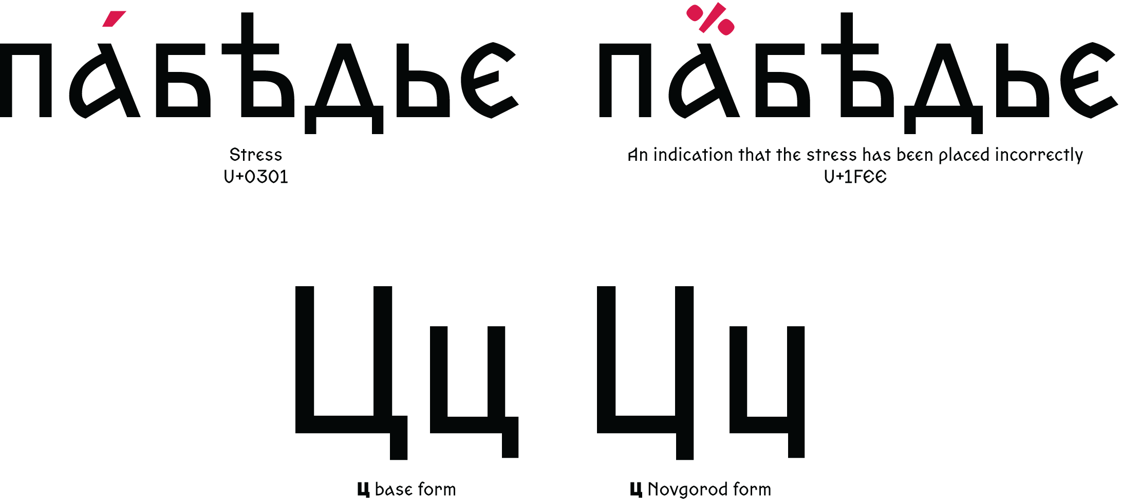
Zhivov supports the entire Old Church Slavonic part of Unicode: alternative glyph forms for certain characters, superscript symbols, ligatures, Old Church Slavonic numerals, as well as a number of characters not covered by the Cyrillic block of Unicode but found in manuscripts. These include, for instance, the Цц without a shoulder that appeared in Novgorod back in the 15th century, and a symbol borrowed from Ancient Greek that had been used to indicate an incorrect diacritical mark.
Alternate glyph forms
In 2013, following a proposal submitted by the Ponomar Project, eight alternative forms for Old Church Slavonic letters were added to Unicode, including, for example, the rounded lowercase в, the tall ъ, and the lowercase long-legged д.
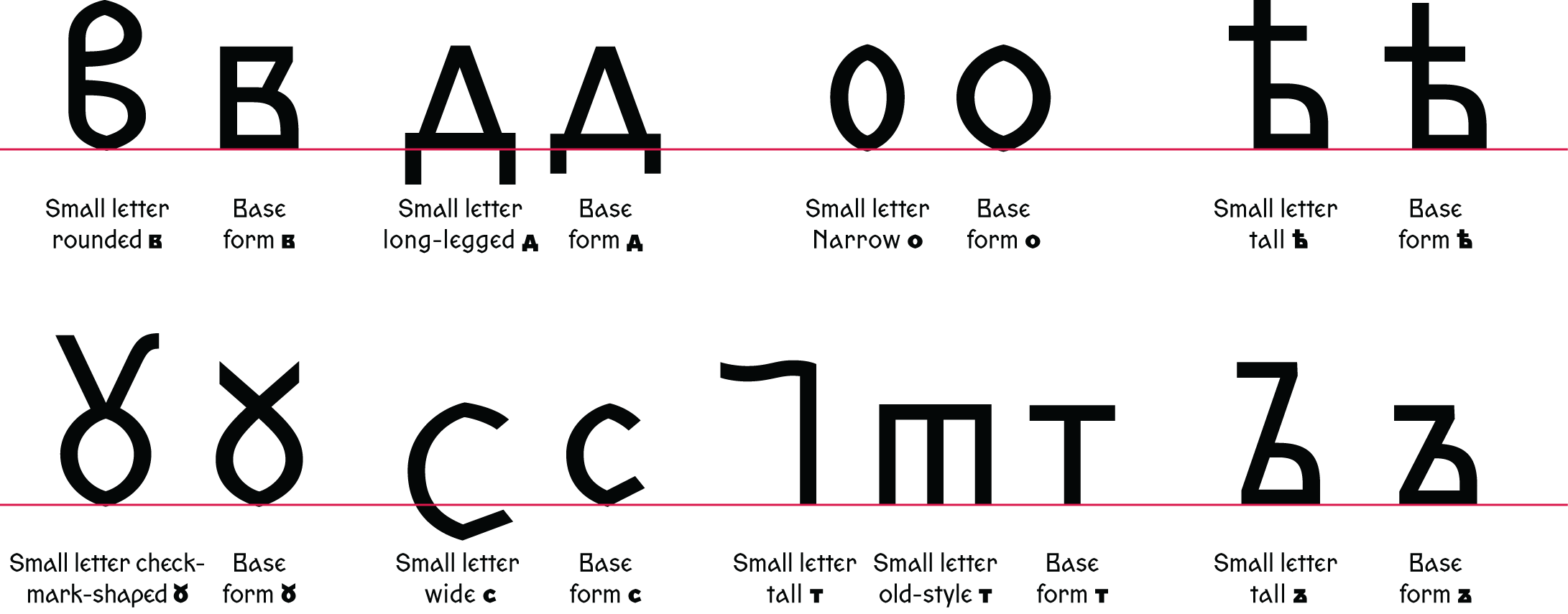
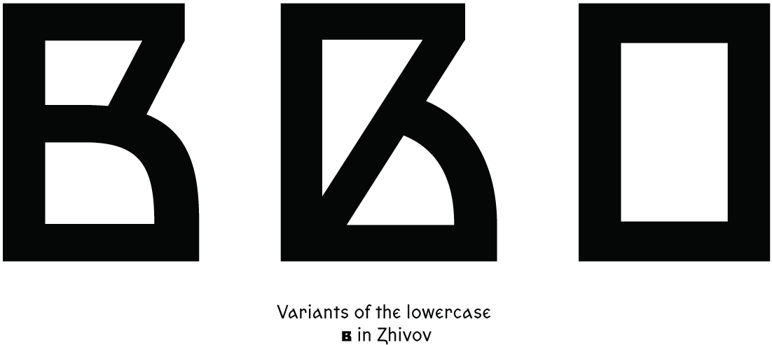
Besides the alternative glyph forms already added to Unicode, Zhivov also contains symbols that are yet to become part of the standard, such as the rectangular в.
All kinds of О
Zhivov features fifteen graphic variants of the letter О, including monocular, binocular, crossed о, and two versions of multiocular о, with seven and ten eyes. The latter was found in a 15th-century
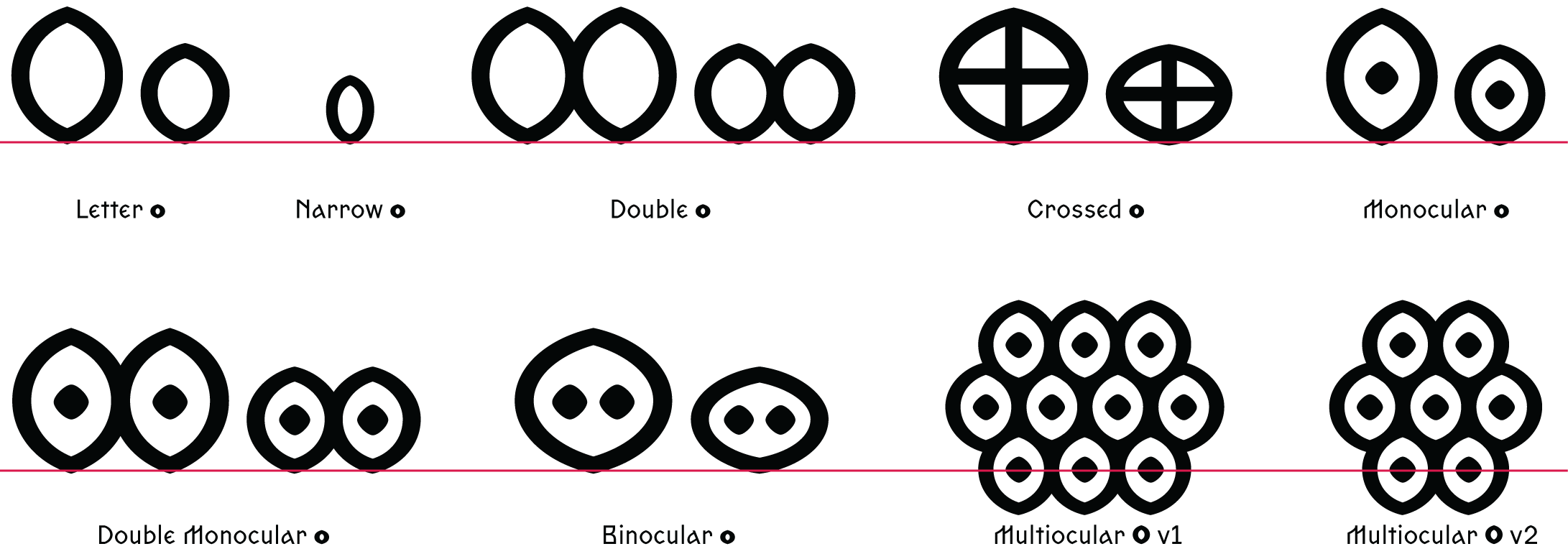
 The Buslaev Psalter, 15th century. The only manuscript featuring the ten-eyed multiocular о. Image: National Electronic Library
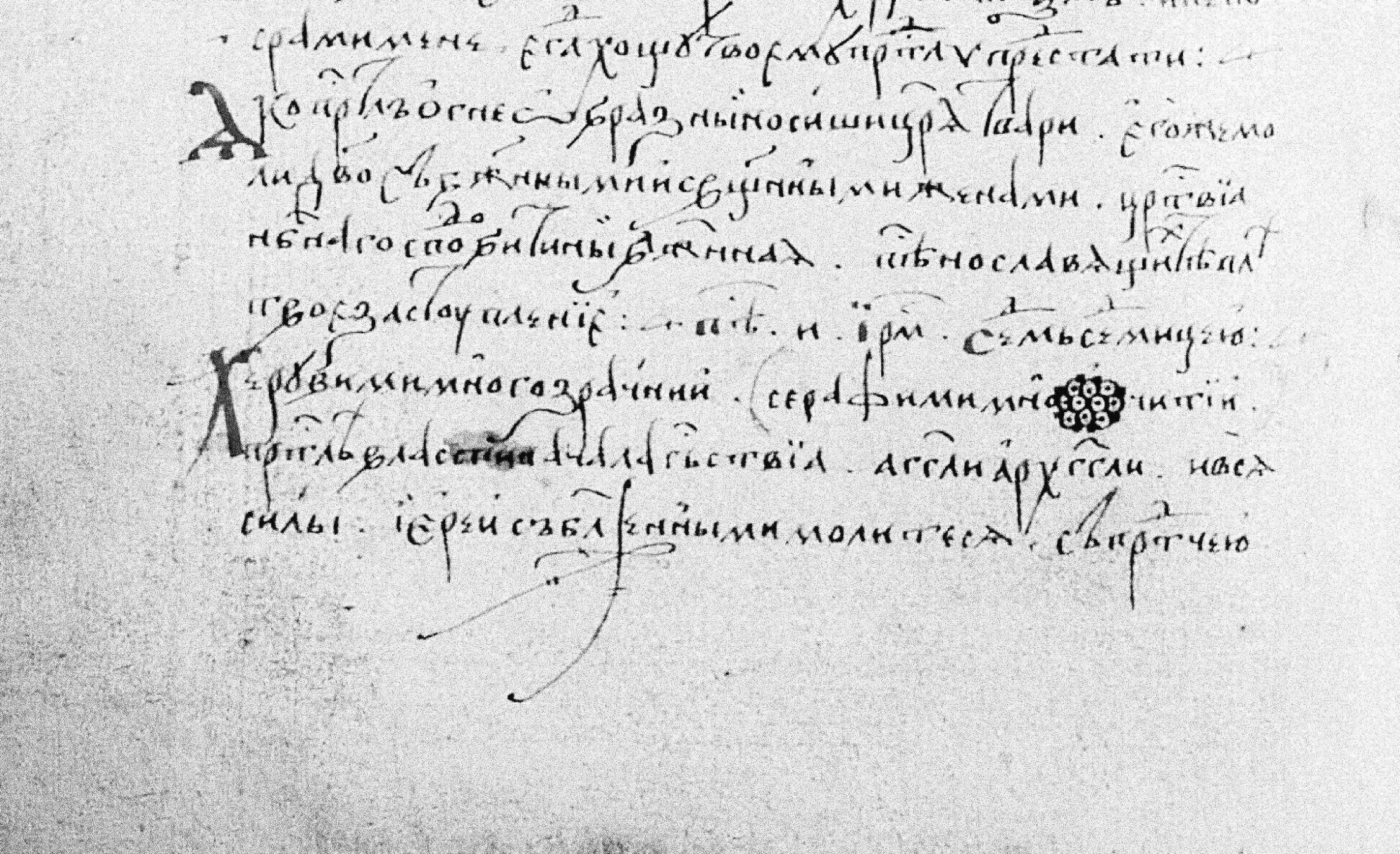
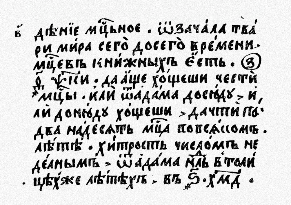
Titlo
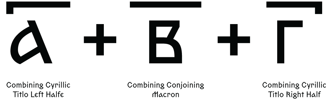
The titlo is a symbol used as an abbreviation mark or to distinguish a lowercase letter from an Old Church Slavonic numeral. There are two types of this character: the general titlo and the letter titlo. The general titlo is a wavy, zigzagged line, while the letter titlo is an arc placed above a superscript letter,
The general titlo can apply not only to one letter, but also to multiple letters. A titlo applied to two letters is a single glyph, Combining Double Tildе. Unlike the regular titlo that is typed after the letter, the double titlo is typed between the letters. A titlo for several characters is made up of three elements: Combining Cyrillic Titlo Left Half, Combining Conjoining Macron, and Combining Cyrillic Titlo Right Half.
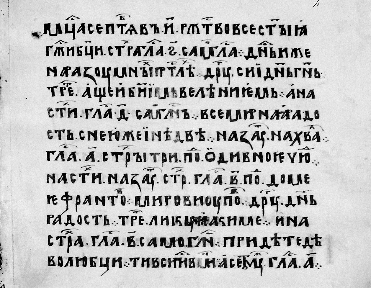 Sticherarion, 1380. Image: The collection of manuscripts and early printed books of the Holy Trinity Lavra
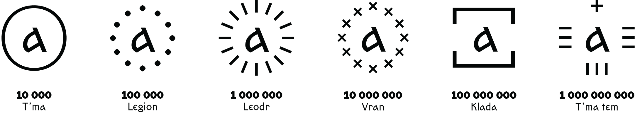
Numerals
Old Church Slavonic used lowercase letters for writing down numbers. To distinguish a numeral from a letter,
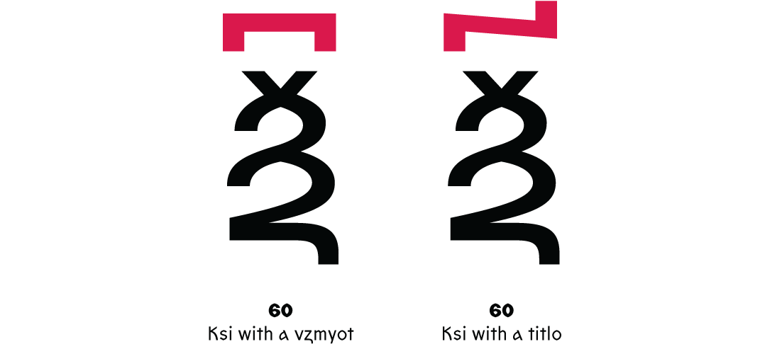
There was a special character for a thousand. It’s placed before the letter indicating the number of thousands. To denote a million, the thousand sign is placed twice.
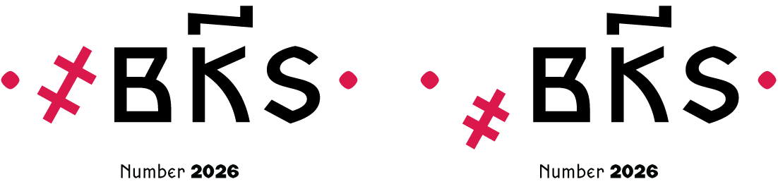
The thousand sign exists in two variants. The first is the same height as lowercase letters and sits on the baseline (U+ 6926), while the second is smaller and typically positioned below the baseline (U+4927). To separate numbers from words in a text, the numeral was often enclosed in dots placed in the middle of the line
A separate system was used for larger
 The number 70,000 in the Teaching on Numbers by Kirik the Novgorodian, 1136. Image: Wikipedia
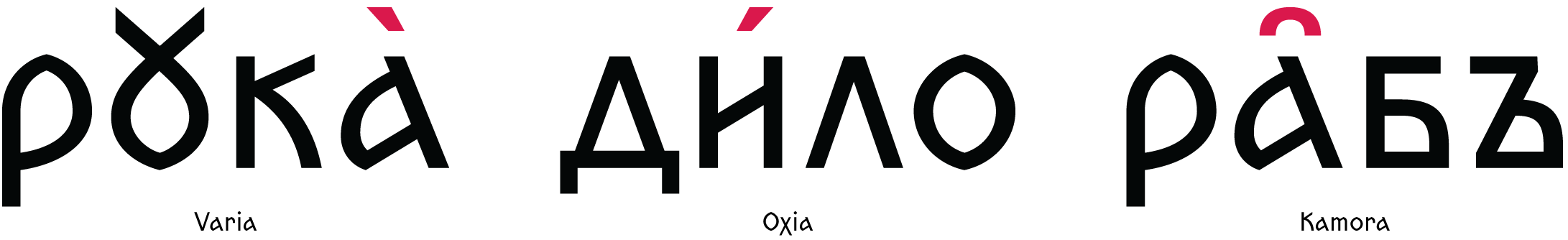
Other diacritics
The titlo and the characters used to write numbers with many zeroes are classified as diacritical marks. Besides them, Old Church Slavonic employed several kinds of stress marks: an acute accent, or an oxia (analogous to the modern stress mark); the grave accent, or varia (used when the stressed vowel is the last letter in a word); and the kamora (which helped distinguish words that were identical in sound and spelling but actually represented different grammatical forms).
In Old Church Slavonic, an aspiration mark, or breathing
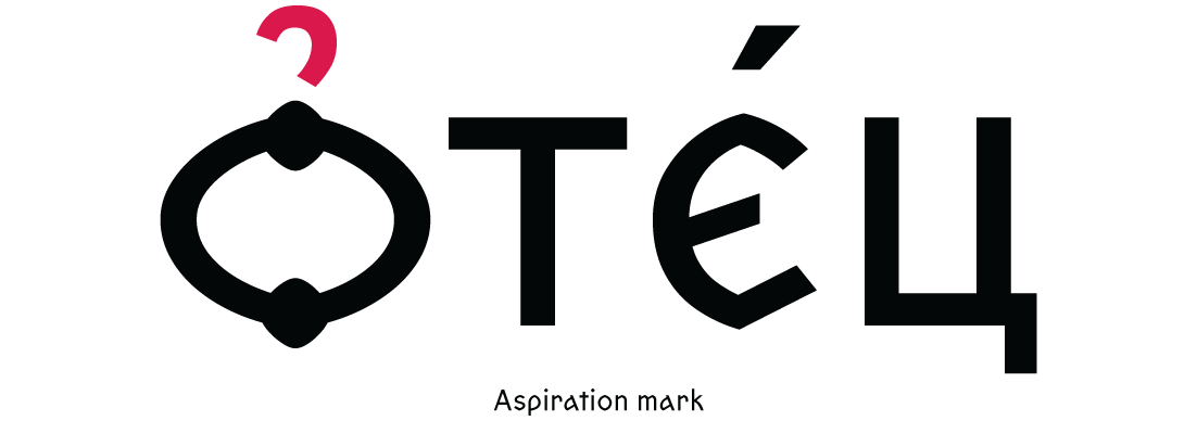
 The aspiration mark and the acute accent in the Horologion, 1808. Image: National Electronic Library
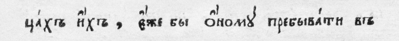
Another diacritical mark, the paerok, was sometimes used to indicate that the letter yer was omitted.
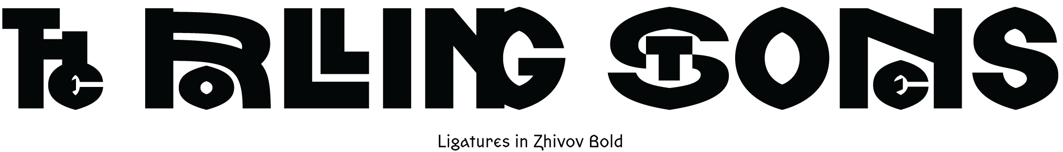
Ligatures
Zhivov contains multiple ligatures referring to vyaz’ (a term referring to Old Church Slavonic ligatured writing).
Even though Zhivov is a typeface based on pre-Petrine letterforms, it would work great not only in projects that, in one way or another, deal with ancient Russian manuscripts. In addition to the
Get Zhivov
from $50 ₽ on type.today
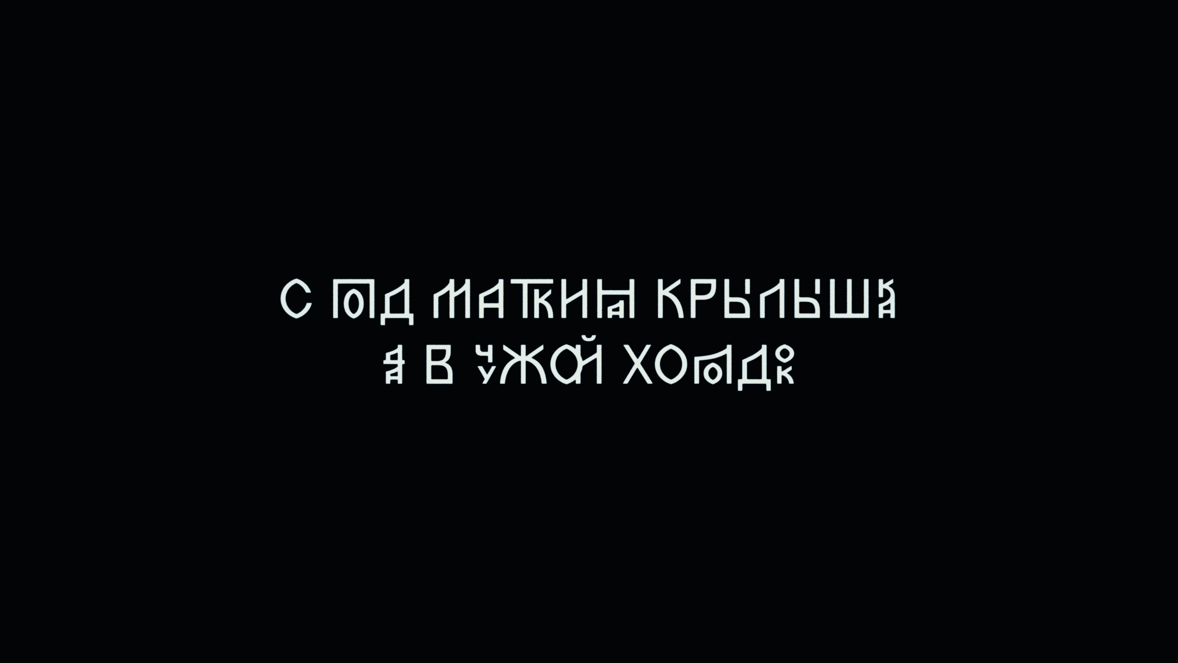
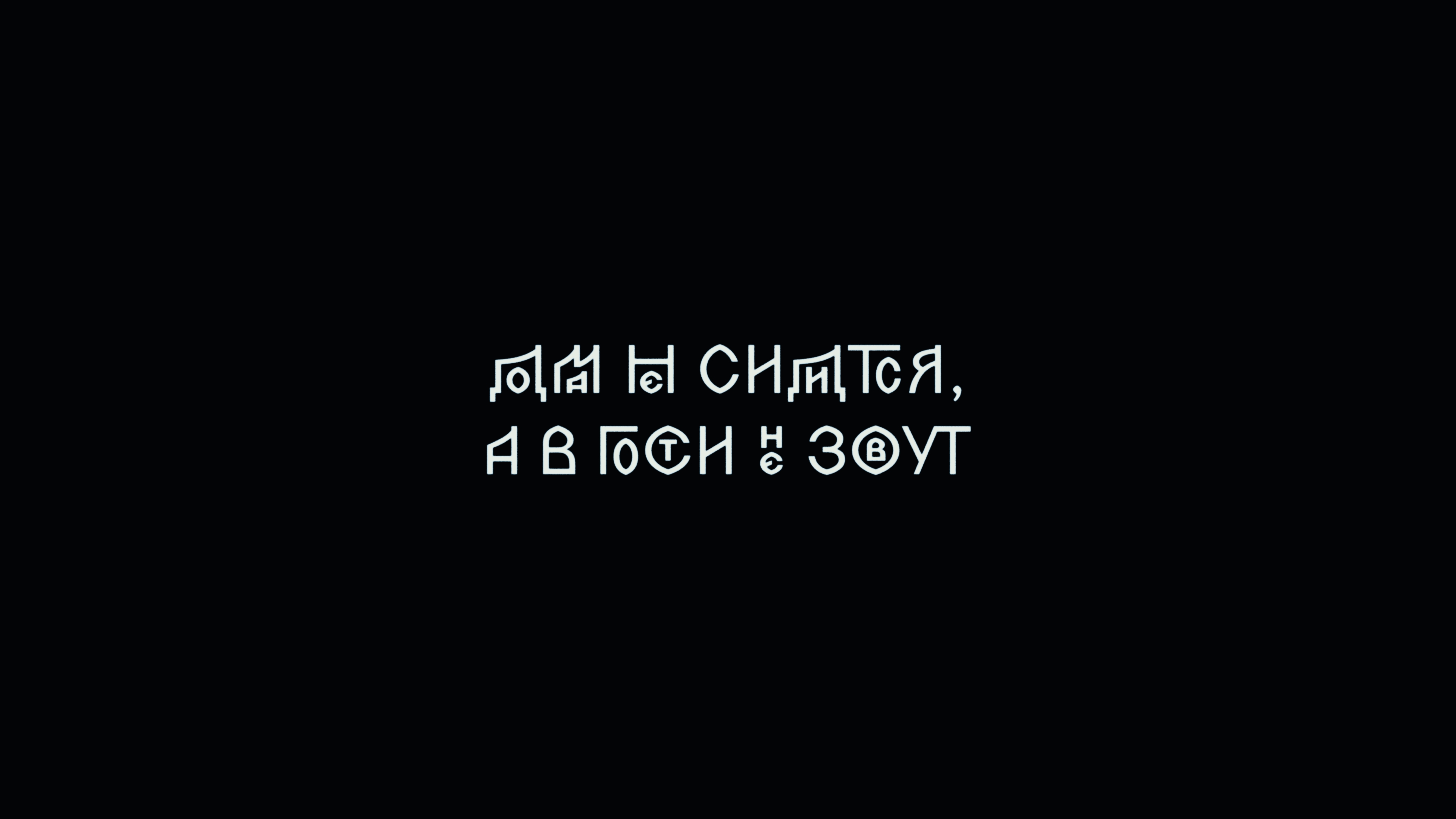
Since its first release on Future Fonts, Zhivov has already been used, for example, on the cover of a magical-pessimist novel and in the credits of a short film about searching for a home.
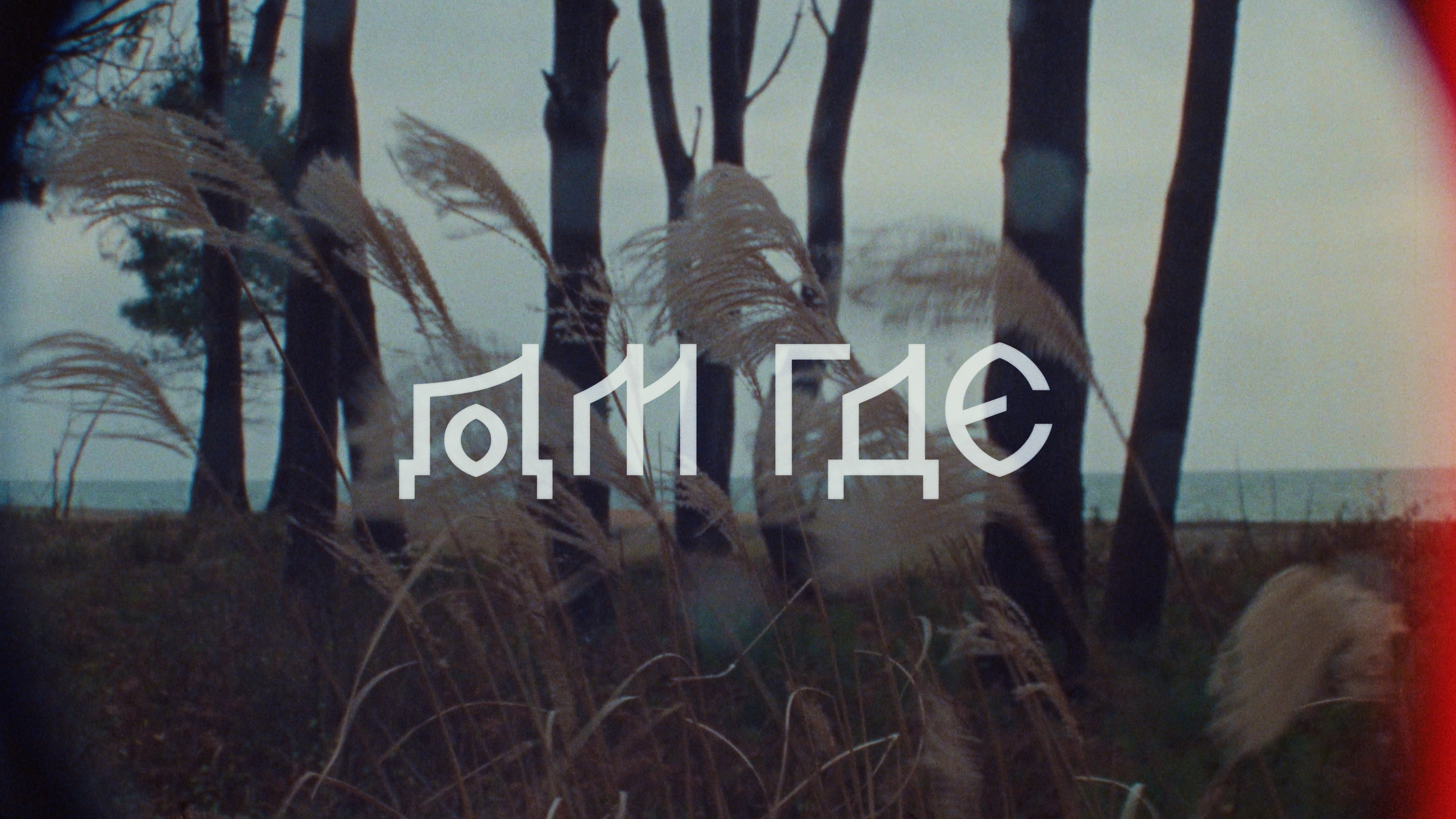
Home where film title sequence. Director: Vitaly Selin. Design: Varya Goncharova
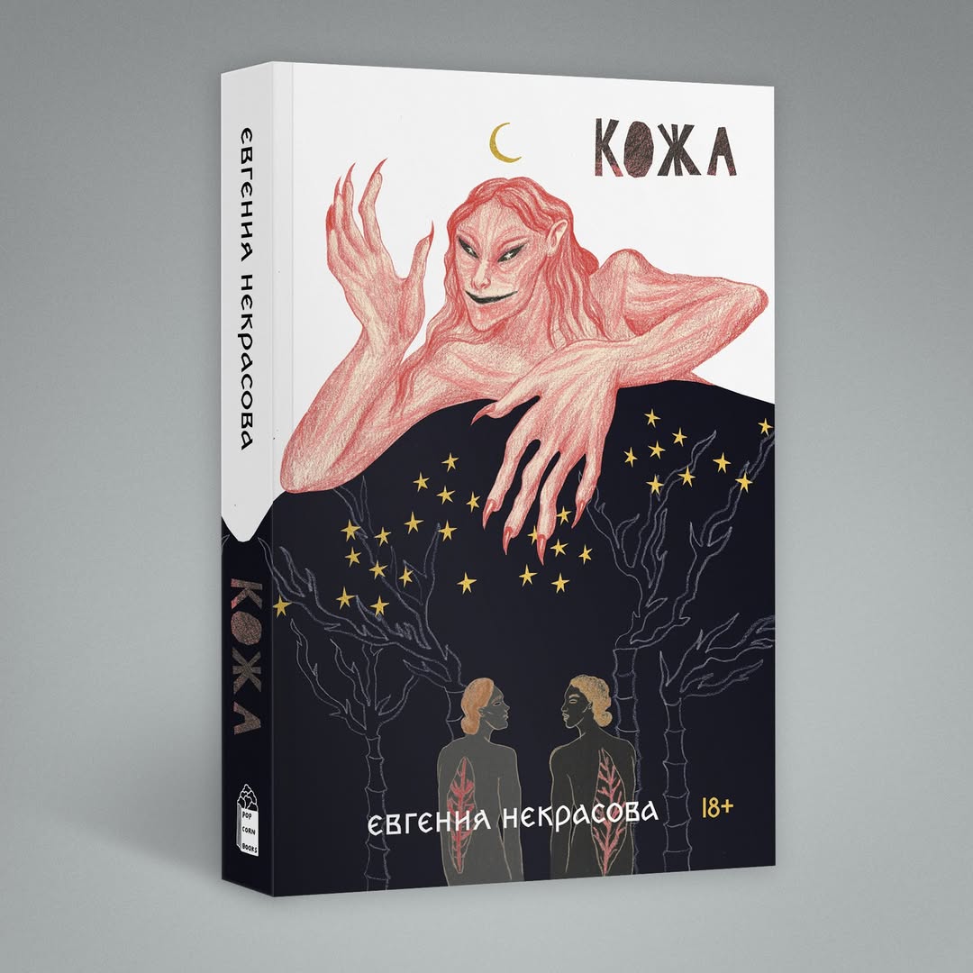 Cover of the novel Skin. Design: Maxim Balabin
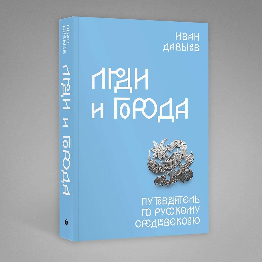
Book People and Cities. Design: Maxim Balabin
The typeface is free of charge for scholars working with Old Church Slavonic language and literature. If you’re looking to use Zhivov in your work, please contact us at yury@type.today, and we will send you the font files.