


Graphic style for Allez!, international seminar on mobile artefacts
Barcelona’s Ara Estudio and Todojunto Graphics joined forces working on a graphic identity for Allez! — a four-day seminar about education on the move. The logo is set in Beatrice Display Extra Bold (Sharp Type, NYC), texts are set in Traulha Regulara (ExtraBrut, Paris).


Canada’s new national tourism branding
Canada’s national marketing agency, has unveiled a new graphic identity for the nation — it will now be used for promoting Canada among abroad visitors. The main element is the heart-shaped lettering.
Ilya Ruderman: Canada is a fantastic nation, which has a decades-long history of design systems. During research for my wayfinding design projects, I had discovered Canadian design documents from the 1970s — the level of detail is unmatched by most contemporary Russian projects in the same field. Guidelines for signpost design, guidelines for using national symbols — even in the wayfinding system, there were a lot of national identity elements.
The tourism branding of Canada is a bit different story, since it is addressed overseas. The two typefaces really do work together: Separat by Iceland’s Or Type and, the more steady and functional Suiisse Int’l by our friends Swiss Type. The pairing is very contemporary, very today.
The branding also matches what now happens in Canada’s politics — we all know the young PM and the very progressive young cabinet. As for me, this identity system is authentic, it is about Canada, as it is today.
Canada’s been given a loved-up new logo — It’s Nice That

Custom Typefaces: are they worth the hype?
It’s Nice That published an opinion article about custom typefaces, written by Nayoung Kim, a designer at branding agency Superunion. Kim describes why brands commission their own custom typefaces and what job custom typefaces do.
Type is there for a clear purpose: to deliver a message. … For a company like Google, that billions of people interact with on all different kinds of devices daily, it gets more complicated to design a custom brand typeface because you have to make sure the type works well across everything. It’s like cooking one perfect dish that’ll satisfy your 80-year-old grandma, vegan friends and teenage boys.
Ilya Ruderman: The author precisely explains the corporate type boom, which we have witnessed over the last decade. She seems to think the exact same way that we do.
Custom Typefaces: are they worth the hype? — It’s Nice That


 ![am5]
Variable logo for Amsteldok
Fontsmith were commissioned a variable logo for Amsteldok, a new Amsterdam campus for advertising giant WPP. On some media, it’s not only variable, but also interactive — on the screen at the Amsteldok reception, the colours in the logo change with the time of day, and the letterforms motion match those of people around (thanks for motion capture technologies). The many variants of the logo are also used on static media all around Amsteldok.
Yury Ostromentsky: In 2019, a two-dimensional, motionless, stiff logo would be an unbearable bore. Let the logo be variable, 3D, sounding, scented — anything, but immobile. Secondly: today, the whys and hows of variable graphics are still unclear to most designers. In this project, they demonstrate not only the impressive transition effects, but the idea that the graphics can be interactive.
Fontsmith and VBAT create the world’s first variable font logo

Soviet typography on Twitter
Pavel Samsonov, product designer at Bloomberg, took inspiration from Chernobyl series and conducted a small Twitter-thread lecture about what Soviet typography was like. If you want to know about the small variety of Cyrillic letterforms, allowed by Soviet standards — please proceed.
Pavel Samsonov — Twitter — Threader


Legacy of Edward Johnston
Farringdon Station of the Tube hosted a permanent memorial for Edward Johnston — the designer and typographer, responsible for the famous London Underground sign. Typeroom ran through Johnston’s vast legacy: for one, Johnston Sans (Underground), _which was a prototype for _Gill Sans. In words of Hermann Zapf paved the way for all lettering artists of the twentieth century and ultimately they owe their success to him.
Edward Johnston: London Underground unveils memorial for the iconic designer — Typeroom

New site for Milieu Grotesque
Portugal’s Milieu Grotesque foundry have a new website, with great typography and eye-catching 3D mockups flying over the text.

Safari Riot
Safari Riot, a USA sound design studio, launched their web portfolio, built on striking interactive typography — just look at scroll and hover animations.


Injurial
205TF released Sandrine Nugue’s Injurial, which was initially designed for a book by Le Tripode publishing house. It is a rowdy interpretation of the Roman square capitals.
Yury Ostromentsky: A typeface with a historical prototype can look contemporary and actual as ever — in case the designer is not too prudent about interpreting the history. Sometimes, you just have to break some eggs to make the omelet, and Injurial is a good example of that. It is still capitalis quadrata, but the letterforms are way sharper, way thinner, way more precise — even in the letterforms that might seem erratic. In S, the designer took the crookedness of shape for a feature, and took pleasure in polishing it. This might not be the only way to work with historical designs, but it is the loveliest one — that’s for sure.


Altiplano
The Swiss studio Altiplano launched their web shop. For now, there are just three typefaces for sale — Millionaire, based on historical round hand calligraphy, Dominicale a revival of 20th century old-style serifs, and Monaako, taking inspiration from logo of Saint-Raphaël, a famous French aperitif.


Lyyra
Schick-Toikka, a Berlin-Helsinki-based studio, released Lyyra — a sans of both humanist and mechanical nature. The typeface is somehow similiar to Typotheque’s_ Ping_ — but Lyyra is racier and comes in three widths (Standard, Extended, Expanded).


Typomania 2019
In June, Moscow was once again home for Typomania — one of the main type events in Russia and the only type festival for broad audience, nationwide. We love to see Typomania present a great panel of speakers and a great exhibition of typography posters, year after year. Type.today was a partner of the festival, and CSTM Xprmntl 03 by Yury Ostromentsky was the key part of Typomania’19 graphic identity (the font is not completed, but you already can grab it at FutureFonts).


I/We Ivan Golunov
This June, a font from type.today was an element of nationwide campaign in support of Ivan Golunov, a prominent Russia journalist wrongfully detained on drug charges. I/WE IVAN GOLUNOV, set in Giorgio Sans, appeared on frontpages of Kommersant, Vedomosti, and RBK — the main three national business papers. The banner, designed by Svyat and Anastasiya Vishnyakovs, has quickly become iconic, and has been in use even after the dismissal of all charges against Golunov.
Yury Ostromentsky: Congratulations, Svyat and Nastya, with an iconic design. A protest graphics rarely becomes that popular. In Russia, there hasn’t been such a visual icon since the protests of 2011. There has been a lot of slogans, but I cannot remember any popular image.
It seems to me, the typeface choice contributed a lot to the success of the image. Giorgio Sans is designed to be set densely — the small leading Vishnyakovs set proves Giorgio was a conscious choice. The sentence becomes a crisp, clear block, you can put any word into it — it stays just as recognizable. That is the reason you spot the bootleg versions right aways — same words set in a wrong type just don’t look as convincing.

TypeMedia 2018
Students of TypeMedia course (KABK, The Hague) published their course projects: among them, a Cyrillic typeface — a serif called Dalma by Zrinka Buljubašić. Don’t forget to check out the previous years of TypeMedia, too.

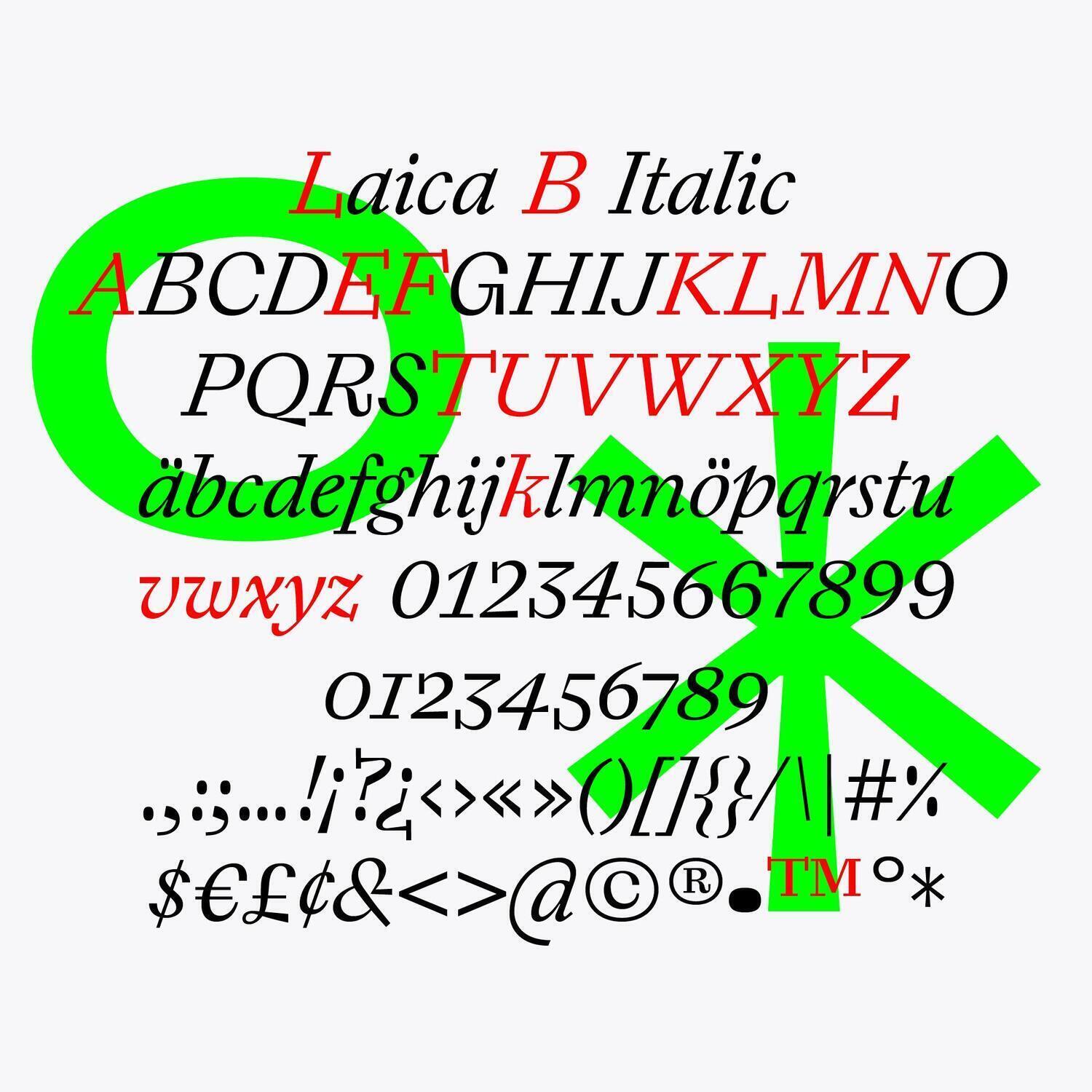
Laica
Basel-based type agency Dinamo released Laica, a TypeMedia’17 student project by Alessio D’Ellena. The typeface has already been awarded by Type Directors Club and European Design Awards. Laica’s peculiar letterforms are the result of combining the broad nib and the pointed nib pen script.


Signal
Our friends Production Type released Signal, which is the first proper digital version of Caractères, the French traffic sign typeface since 1946. Signal also has great Cyrillic glyphs — designed with a little help from Ilya Ruderman and Yury Ostromentsky (CSTM Fonts).


Halvar
Both TypeMates and type.today released Halvar — an industrial grotesk with tens width and weight variants. The Halvar Stencil is also notable for multiple stencil sizes.
https://type.today/en/collection/halvar


New book by Yuri Gordon
Yuri Gordon, our dear friend and one half of Letterhead Studio, turned 61 this June. As usually, on his birthday Yuri announced a new project — this year, it is the Book Of My Letters, which would be about typefaces of his own design. The book is crowdfunded, you can become a subscriber and get a copy for a fraction of its retail price.
Подписка на “Книгу про мои буквы” — Юрий Гордон


Galien
Frenchmen Black Foundry released Galien, interpreting the Renaissance French type (Janson, Garamond, Granjon, Haultin) from 21st century perspective.
Previously on Type Digest:
May 2019 Custom fonts for women’s basketball league and Brazilian online clothing retailer, new type shops by Russian and Dutch designers.
April 2019 A new Helvetica, a trend for 70s serif type, a talk by DIA Studio co-founder, the Cyrillic Type Travel Guide.
March 2019 A typeface for 5 billion people, a nearly illegible logo for Galeries Lafayette, and variable emoji.
Did we miss something important? Do you have something to suggest?
Please contact Mikhail Berezin at misha.berezin@type.today.
See you in a month!