

Custom typeface for Alexandra Palace, London
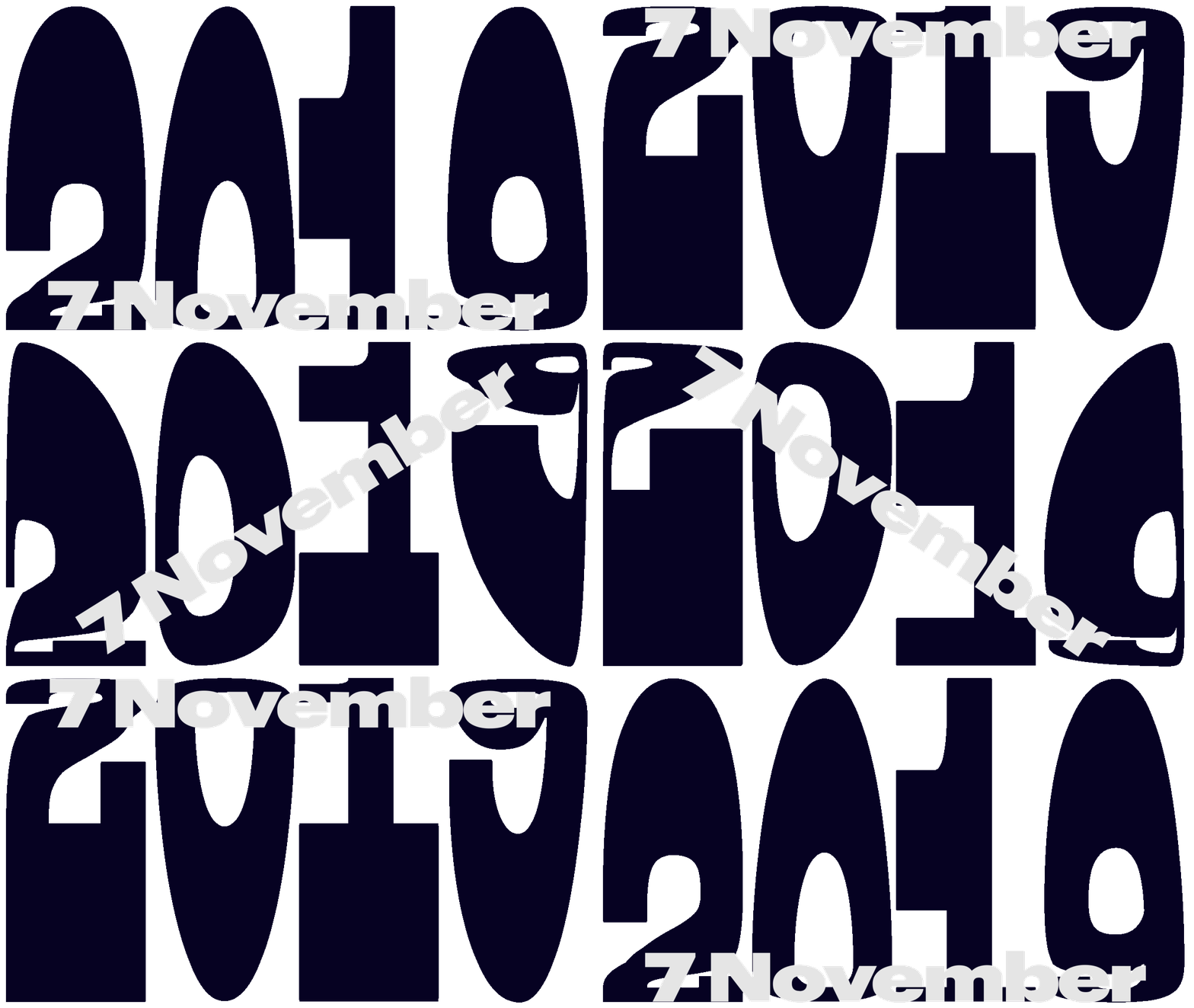
Lovers Studio designed a custom typeface for Alexandra Palace — a renowned north London entertainment venue. Palace Display is a serif heavyweight to be used on posters and other sorts of promotional materials.
Ilya Ruderman, type.today: “The project seems to have everything trendy in today’s type — it is heavy-weight, it is high-contrast, it has some pretty peculiar shapes. That is why it might not stand out from the crowd of thousands alike. Still, it works well and Ally Pally can easily replace it in a couple seasons”.
“Naughty Curves” that Breathe New Life into Classic English Victoriana — AIGA Eye on Design
DIA Studio co-founder talks kinetics in nature and culture
Mitch Paone, creative director at the influential DIA Studio, spoke at Nicer Tuesdays by It’s Nice That. Paone cited studying choreography, animals, and mechanics, which, among other things, helps DIA create kinetic typography.
New York’s DIA Studio on creating kinetic type inspired by jazz, physics and caterpillars — It’s Nice That


Helvetica Now
Monotype produced a new version of everyone’s favourite — at least until recently — typeface. Helvetica Now addresses the legibility problems of original Helvetica Neue with three optical sizes — Micro, Text, and Display. A month after its release, Helvetica Now is leading the charts on MyFonts. No cyrillics yet.
Yury Ostromentsky, type.today: “This might be a very punk perspective, but to me it is more about making money than about new typography. It is definitely a righteous (good?) project, since the original Helvetica is just very dated and single-master. The Now is made with today’s hands and eyes, keeping in mind retina and other stuff, there are optical sizes and alternates. In that sense — yeah, it is pretty good. But. In five or six years to come we could see the release of Cyrillic, Arabic, Armenian, Georgian, Asian language sets — which would obviously be too long and very expensive. The efforts would be better off put into something new, an idea for the future, not the mid-20th century letter shapes”.
Helvetica Now — Monotype


DEMO Festival
Amsterdam’s Studio Dumbar has designed the vibrant and eye-catching identity for DEMO Festival, based on the super-display lettering.
Yury Ostromentsky: “Motion typography and variable fonts are in very much vogue at the moment. And even if you don’t have a genuine variable OTF (Dumbar use CSS for this one), you might as well pretend that you do. They also set the pages in Graphik Wide — no Cyrillic for it yet, but still this is a big hello to Monotype with their new Helvetica”.


70s serif typefaces are very trendy
The craze about neutral neogrotesks seems to be over and the design community is looking for a new — universal, yet expressive — type language. Notably, 70-s style serif typefaces are popular, with their soft, rounded shapes — this April even Vox published a feature about the trend.
Ilya Ruderman: “The article is illustrated by a custom typeface designed for Chobani by our friends from Commercial Type: Berton Haseb (you should know his Druk) and Christian Schwartz (Graphik)”.
Why funky ’70s-style fonts are popping up on brands like Chobani and Glossier — Vox


Sväng
Letters from Sweden designed a new font based on drawings made in 1976 by the industrial designer, painter, and inventor Claes Nordenstam. Sväng is a stencil display sans with dynamic, sometimes surprising letterforms — feels a lot like 70s, which makes it looks relevant as ever.
Sväng — Letters from Sweden


Street navigation for Chelyabinsk, a project
Chelyabinsk natives Ilya Birman and Igor Shtang designed a street navigation concept for the city. For the project, they created a custom typeface.
Yury Ostromentsky: “Three things to say about this one. 1) Finally, a white-on-black city navigation. Hurrah. 2) Not the most obvious, but nevertheless a great idea to show the block plan on the plate. 3) A bit clumsy, modest and classy a typeface”.
Адресные таблички Челябинска — Илья Бирман


Rotor
An experimental sans serif with pseudo-3D effect: all glyphs can be rotated around vertical axis, thanks to variability. Initial release is sold at FutureFonts for $20.
Rotor by Jan Šindler — Future Fonts


Redaction
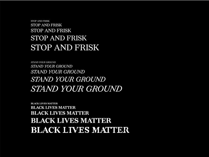
LA-based MCKL Type released Redaction typeface, designed for the eponymous exhibition at MoMA. The Redaction highlights abuse in the US judicial system, an integral part of the project is a collection of legal papers degrading from faxing and photocopying.
Redaction typeface is a hybrid of Times New Roman and New Century Schoolbook, with remarkable inktraps, and letterforms both sharp and soft, — a metaphor for cruelty and mercy of the justice. Redaction is free to download, and has seven alternate stylistic sets, based on different degrees of bitmap degradation.
Ilya Ruderman: “I am pretty excited with not the typeface itself, but the web presentation — it conveys the history and logic of the design, easy and swift”.


Theodor
Berliner Philipp Neuemeyer presents his third release on FutureFonts — again, with Cyrillic. Theodor is an extra-condensed sans with a 20° slant, the font includes the alternative set with short descenders.
Yury Ostromentsky: “Normally, Cyrillic type designers are hostile to Latin-natives’ approach to the subject. Yet, Philipp’s designs are a great fresh infusion to Cyrillic. Big thanks to Phillip — I think we lack a quality view from aside”.
Theodor by Rüdiger — FutureFonts


Nostra
Lucas Descroix released the final version of Nostra — a family of two dramatically different super-display fonts. The heaviest-weight Sett and the thin, fanciful Stream are both very wide and monospace, and work well in pattern-like layouts. Plus — yay! — it has cyrillics.
Ilya Ruderman: “Me and Yury, we helped Lucas tame the cyrillics. He had so many restrictions, because of the monospace, ornamental concept: diacritics, ascenders, descenders all are very restrained — just look at Д, Ц, Щ. The best thing is the contrast between Sett and Stream, they make a great tandem and look really unique together”.
Nostra by Lucas Descroix — FutureFonts


All Cyrillic fonts of 2018 and Cyrillic Type Travel Guide
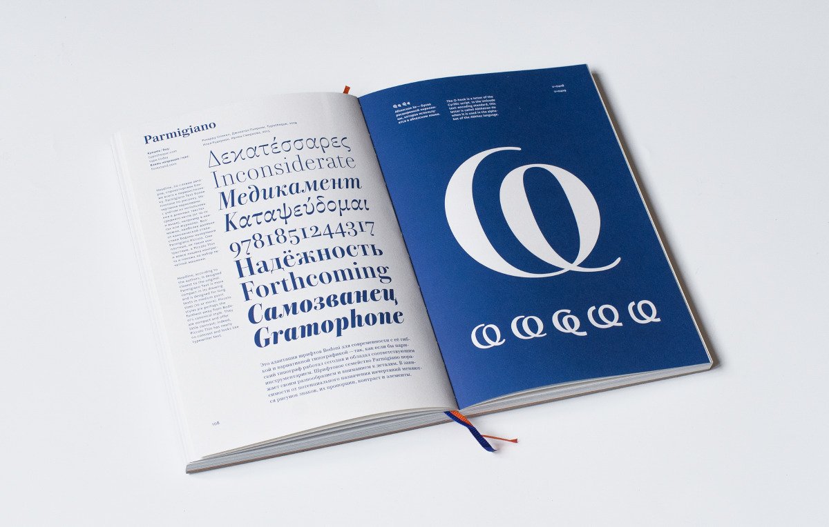
In April we published our annual review of Cyrillic fonts, compiled in cooperation with our friends from Type Journal. This year we decided to review a limited number of fonts, — selection of what we have found interesting, — because there were so many releases.
Apart from that, Type Journal published the Cyrillic Type Travel Guide — an in-detail review of the best 50 fonts, released in recent years. You can order the book on Type Journal Shop — but hurry up, 1000 pcs are soon to be sold out.
Ilya Ruderman: “Third year in a row (2016, 2017, 2018), we publish our review of all Cyrillic releases. This wouldn’t had been possible without our friends from Type Journal — it’s them who helped us to see the whole picture. The Type focuses on the best, whereas we review anything there is. This year the guys went further and embarked on the great project of Cyrillic Type Travel Guide — which is 50 best fonts of last five years. We sponsored the edition — not just because we are friends, but because the concept is great. Finally, we are honoured to be included into Type Journal’s review of the best fonts — again, based on objective criteria only”.
Путеводитель по кириллице, выпуск I — Издательство «Шрифт»


Viksjø
Oslo’s Monokrom Skriftforlag released the final version of Viksjø, a geometric sans translating principles of Brutalist architecture into type (you can find the info on the style in this short article). The typeface is a tribute to the iconic Y-building in Oslo, set to be demolished after terrorist attacks in 2011. All proceeds from the sales are donated to the initiative to save the building.
Viksjø — Monokrom Skriftforlag

Public Sans, the official typeface of the US government
Washington’s General Services Administration released a new free font to be used in the US Web Design System. Public Sans is based on Franklin Gothic with its ‘traditional American’ letterforms (e.g. double-story g).
www.public-sans.digital.gov Typography — United States Web Design System


Commercial Classics
Commercial Type presented Commercial Classics: a new type foundry specializing in historical typefaces — the new digital versions are literal and authentic, yet intended for wide use. The first releases would be typefaces of William Caslon’s foundry: the Didone serif Brunel, the grotesque Caslon Doric, the reverse-contrast Caslon Italian, the display Caslon Round. The online shop is to be launched shortly.
Commercial Classics — Twitter


Tanya Egoshina on our Instagram
Muscovite Tanya Egoshina took charge of our Instagram this month — you should see her works for Strelka Bar, Afisha Picnic, or Theater of Nations. Cheers, Tanya!
Previously on Type Digest:
March 2019 A typeface for 5 billion people, a nearly illegible logo for Galeries Lafayette, and variable emoji.
Did we miss something important? Do you have something to suggest?
Please contact Mikhail Berezin at misha.berezin@type.today.
See you in a month!
