


Emigre in Readymag Stories
The new issue of Readymag Stories is about Emigre — a pioneering digital type design studio, a design duo, who defined the typographic style of the 1990s. You can read about how Zuzana Licko and Rudy VanderLans began their partnership, why digital fonts used to be the last resort for a southpaw, and which typefaces inspired the saying “We read best what we read most”. You can contemplate spreads from the iconic Emigre magazine, and remarkable typefaces by Ms. Licko.
Emigre — Readymag Stories

TDC started an editorial platform to “tells the stories of the letters that give form to the narratives of our time”
Type Directors Club — the renowned international association of typographers — started Typegeist, an online periodical about type and time. Issue no. 1 is titled Decentralizing Type, it is about non-European scripts. One article is a talk about the future of Chinese type — from which we can learn that a single Chinese font is about 7000 glyphs large, mainland China only has two type foundries, and there might be no such thing as Chinese typography whatsoever.
Future of Chinese Type — Typegeist
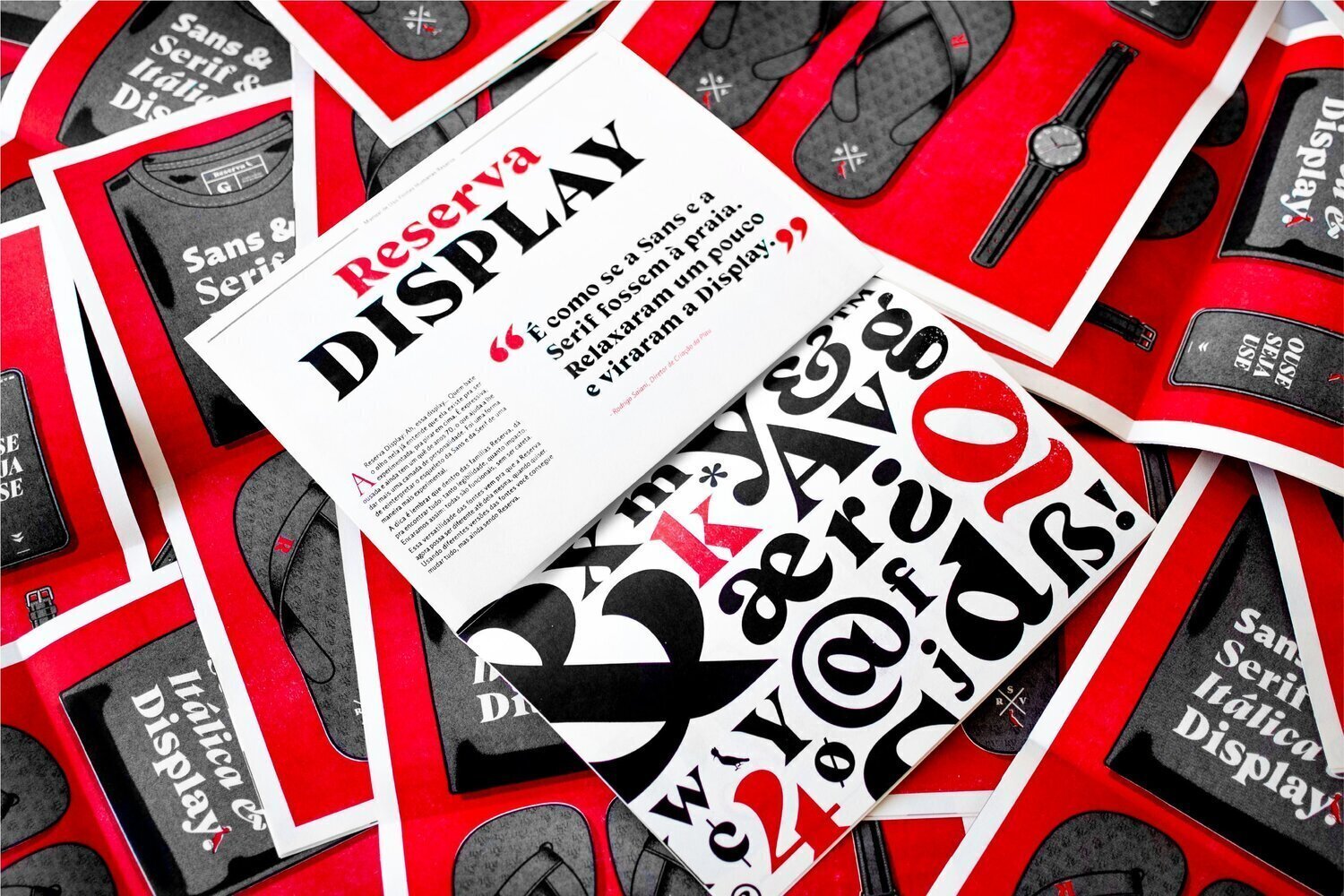


Custom font for Brazilian online clothing retailer
“Typography is the stem-cell of communication. If done properly, their curves and nodes carry the genetic code of a brand. And because Reserva’s brand is done with a purpose in mind, to know the ins and outs of their typeface helps the creative team use if on purpose. Without further ado, here’s how they shape the brand identity.”
Cariocae Plau have designed custom type system for Reserva, a Brazilian online clothing retailer. The suite is: the humanist Reserva Sans, the expressive Reserva Serif, and the even more expressive Reserva Display. In the article, Plau report on their initial ideas for Reserva, and how they evolved. Great read, if you want to know why and how custom fonts are made.
Humane Fonts: the making of Reserva’s new typefaces — Medium
 Custodia, Fred Smeijers
 Cobertura, Thomas Thiemich
 Lirico, Hendrik Weber
 Stan, Maurice Göldner
 Greco, Pierre Pané-Farré
Type By
Fred Smeijers — the author of Counterpunch, the professional in both metal and digital type — has co-founded a new font shop Type By. Apart from Smeijers’ own works, there are fonts by Thomas Thiemich, Hendrik Weber, Merel Wagner, Maurice Göldner, and Pierre Pané-Farré — all in all, more than 50 titles.
One of the is Haultin, which interprets works of Pierre Haultin, a renowned French punch-cutter of 16th century. Prints by Jérôme Haultin, another member of the dynasty, were base for Gauge Letterpress by Alexander Tarbeev, which we happen to sell.
Yury Ostromentsky, type.today: Many years ago Smeijers had the fanciest font shop called ourtype.be. It already had all the type testing options, everything was interactive, and looked like the future — and so did the typefaces of Smeijers and his gang. At some moment, ourtype.be came to a halt, but now Smeijers is back with a new shop.
What I love about Smeijers: he digs deep into typographic archives, spends weeks observing punches and counterpunches. Still, his eyes are young and his brain is sharp and vivid as ever — he is able to make exciting discoveries in places deemed completely non-relevant and uninspiring. When Smeijers gives a talk, he lights up an audience, people spend two hours just standing and listening — and then they want more.
There is some new stuff in the shop: Ludwig Outline, which looks like a revival project, and Ludwig Shaded in which a slight shadow is dropped. It all might seem nothing special, but it feels excitingly relevant. Noöne knows how he does it.


Letterhead Store
Moscow’s Letterhead Studio launched an online store — now you can purchase many fonts by Yuri Gordon and Valery Golyzhenkov without being their acquaintance. The prices are very low, the fonts are quality and peculiar — if you make display typography in cyrillics, this has to become your go-to destination.


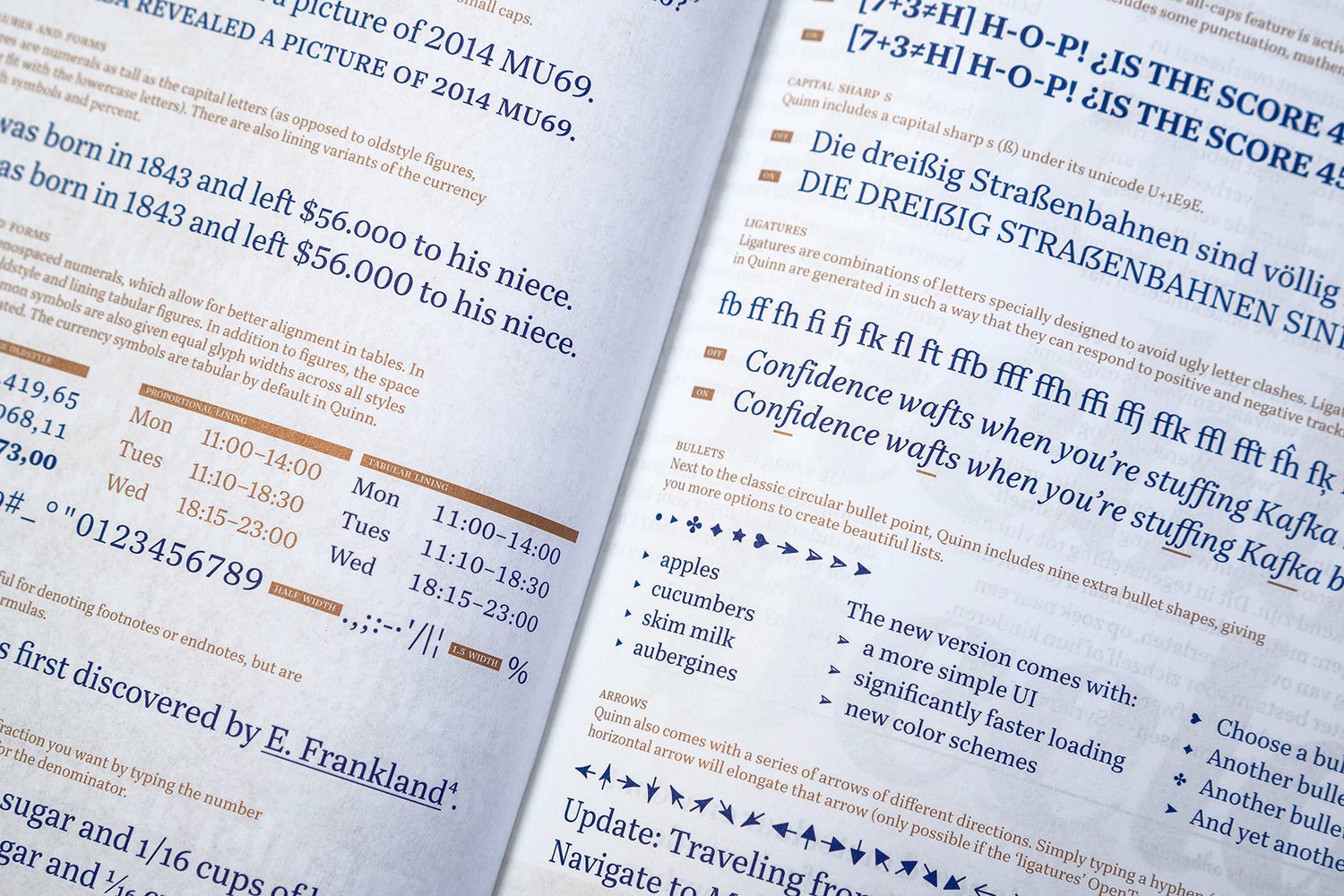

Quinn
Bold Monday released Quinn, a serif family suitable for both editorial design, and branding and advertising. Quinn has both realist and modern serif features, which makes it sharp and soulful at the same time.
Ilya Ruderman, type.today: Quinn was designed by Diana Ovezea, who gratuated from Type&Media in 2013. The typeface is — sadly! — the rare case of a diploma project surviving graduation and making it to its commercial release.
Quinn — Bold Monday


Antonia
Austria’s TypeJockeys have released a huge Antonia type family — it is 46 fonts of four optical sizes. There is the variable version, too/
Michael Hochleitner, TypeJockeys: Antonia was a co-work between me and Franziska Weitgruber, it took about three years to develop. The project started as a custom phonetic font called Teutonista, made for Tyrolean Dialect Archive. For me, Antonia is all about the optical sizes! Those make it quite functional for producing complex typographic hierarchies. Adjustments were made regarding proportion and contrast. One might not notice at first glance, that the actual width proportions, other than being narrow overall, vary quite a bit in the display styles. The rhythm of the text fonts is way more monotonous in comparison.
Ilya Ruderman: I like many things about this project — just look at how brilliant is the dynamism of counter contrast, despite the narrow proportions. And the naming idea is great too: H1, H2, H3.
I also admire the phonetic part of the project — it is quite a task in itself, there are very few fonts supporting phonetic typography, since the system is so complicated and there are so many glyphs. Antonia is a great example of how to make it.
Antonia — TypeJockeys


Ciao, a conceptual phonetic typeface
Massimiliano Audretsch presented Ciao (Comprendere Istruzioni di Accentuazione vocale a Occhio nudo), a project for a Latin font that would communicate intonations. In Ciao, each letter of basic Latin set has 27 alternative styles, based on three variables of three speech parameters — duration, dynamism and melody. The graphic idea behing the typeface is based on sketched renders of typewriter head — not yet a letter, but “something being the instruction for something else”.
Typeface Ciao communicates auditive intonations of the spoken word — It’s Nice That


Ayer
Our friends Commercial Type released Ayer, a vast display font family, originally designed for W Magazine. Some of the fonts are calm, nearly text, some are very display — there is an elegant Cursive, a bold Poster, and a kitschy, yet stylish Blackletter.
Miguel Reyes, Commercial Type: Ayer is one of the projects that was a dream to work, because I was able to experiment a different approach from how type designers normally design typefaces. The brief was kind of simple and straightforward: they needed a new typeface for W Magazine, they wanted to be in the world of luxury and fashion, but not feeling like they were derivative or ubiquitous. The idea was to have a very customizable headline typeface, and something that can continuously feel fresh and new. Cian Browne, the design director, remarked at some point: “A level of polish and ‘chicness’ needs to be achieved, but it has to come with a healthy dose of quirk and screwed-up-ness”.
Ayer — Commercial Type


General Grotesque
General Type Studio (founded last year by The Outline design director Stéphane Elbaz) released General Grotesque. Although a neo-grotesque, it is nothing like Helvetica: the crossbars are rather high, the glyphs are quite narrow, many shapes are a shout-out to early 20th century sans serifs (see the numerals and r, t, f, y). Apart from many weights and italics, there is a back-slanted Reclined and Mono subfamilies. No cyrillics yet, which is a pity — we need typefaces like this, badly.
General Grotesque — General Type Studio


Custom font for women’s basketball league
Production Type released a custom type family for WNBA, USA top women’s basketball league. The narrowest — the boxy WNBA Varsity — is meant to be on T-shirts. The rest of widths — Condensed, Normal, Extended — have three weights, visible inktraps и high-contrast strokes.
WNBA — Production Type


Kostya Frolov on our Instagram
May saw Kostya Frolov take charge of our Instagram — he has designed and printed (!) thirty-one poster with fonts from our collection. All posters are monochrome, yet very vivid, expressive, and varied. A big shout out to you, Kostya, we are more than impressed.
behance.net/gallery/81053895/typetoday-posters

Fontstand conference
On May 25, 2019, Fontstand brought its second conference to Porto. Fontstand is a service that allows you to instantly test fonts and rent them. The conference gathers mostly designers from small independent studios. Ilya Ruderman spoke about the release of Alexander Tarbeev’s Gauge font family.
Fontstand — photo report
Previously on Type Digest:
April 2019 A new Helvetica, a trend for 70s serif type, a talk by DIA Studio co-founder, the Cyrillic Type Travel Guide.
March 2019 A typeface for 5 billion people, a nearly illegible logo for Galeries Lafayette, and variable emoji.
Did we miss something important? Do you have something to suggest?
Please contact Mikhail Berezin at misha.berezin@type.today.
See you in a month!