Typefaces of the Month, Matthijs Sluiter’s Picks
Fonts In Use editor and Type Specimens curator Matthijs Sluiter has selected the most notable typeface
Releases
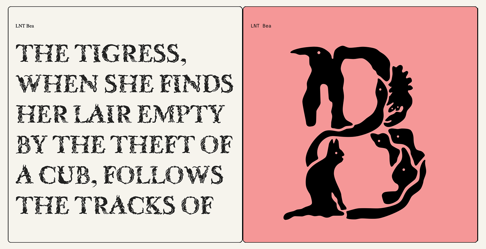 Bea, Nóra Békés
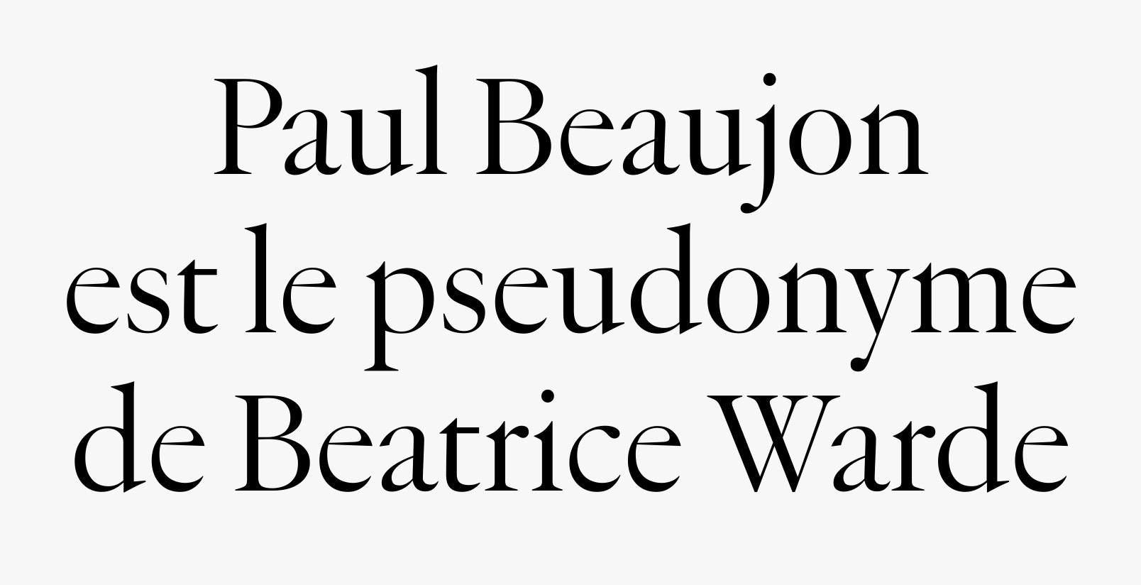 Beaujon, Connor Davenport, Luke Charsley, Léa Bruneau
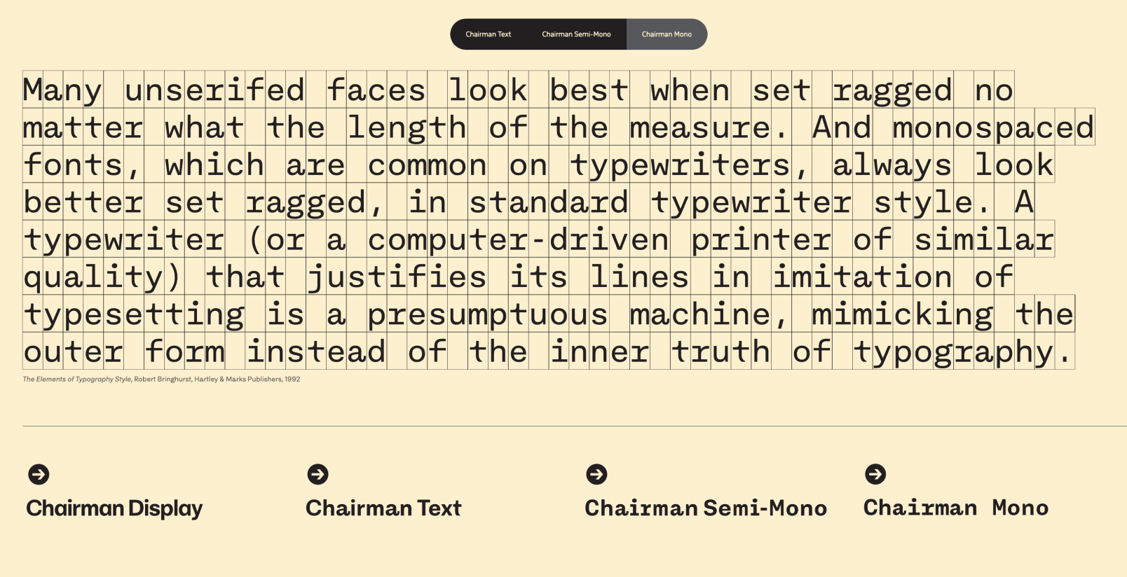 Chairman, Nikola Djurek
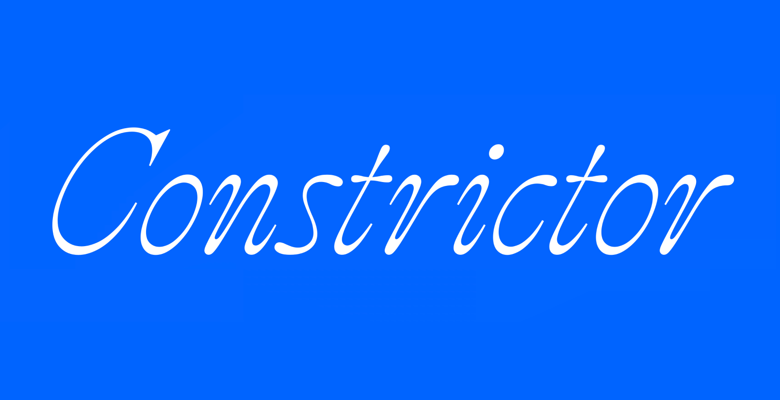 Constrictor, Frere-Jones Type
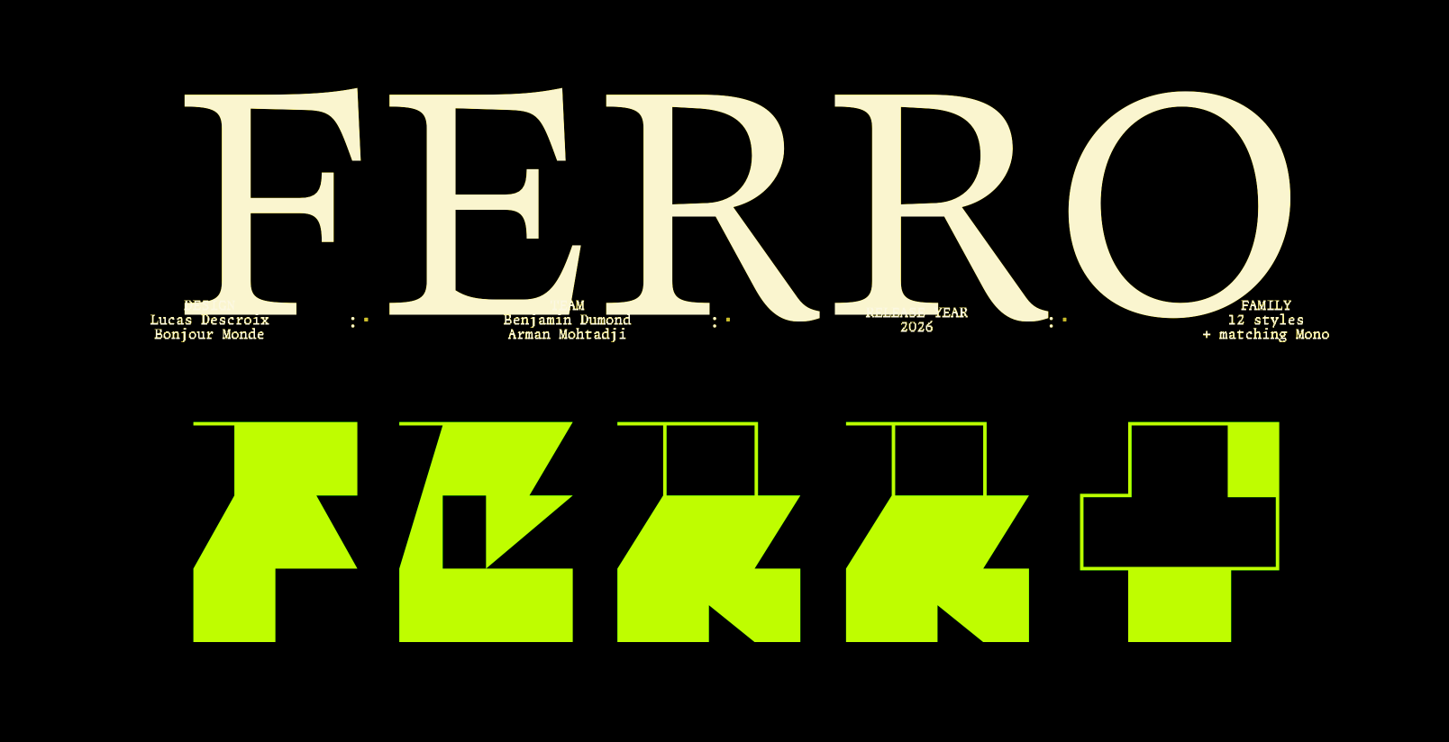 Ferro, Plain Form
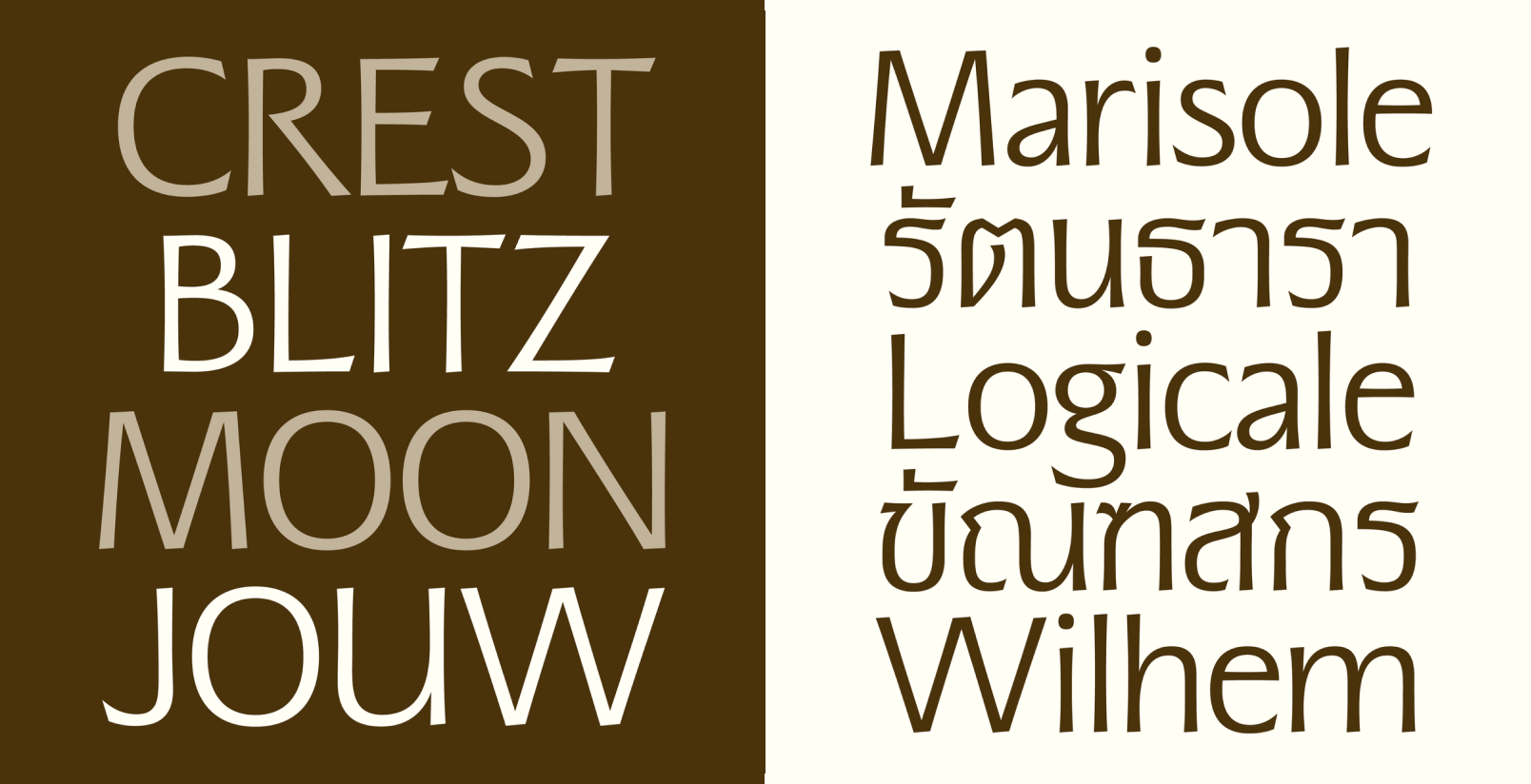 Nida Thai, Vee Ratchanon
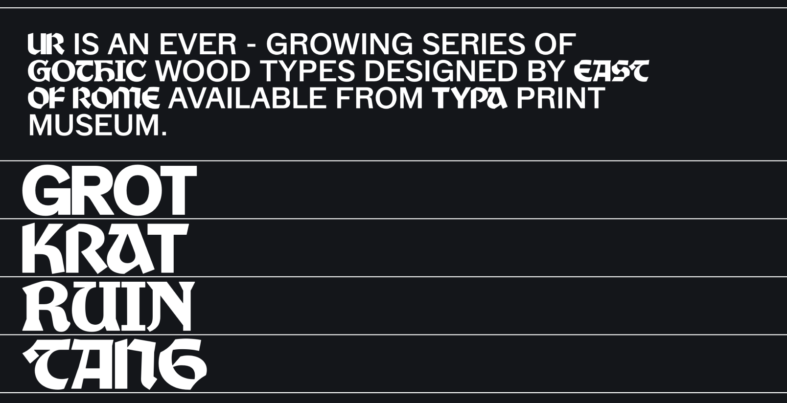 Ur, East of Rome
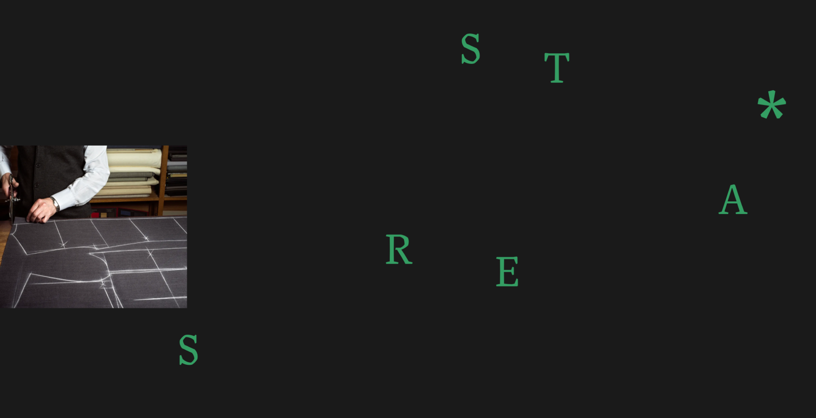 Sastre, María Ramos Silva
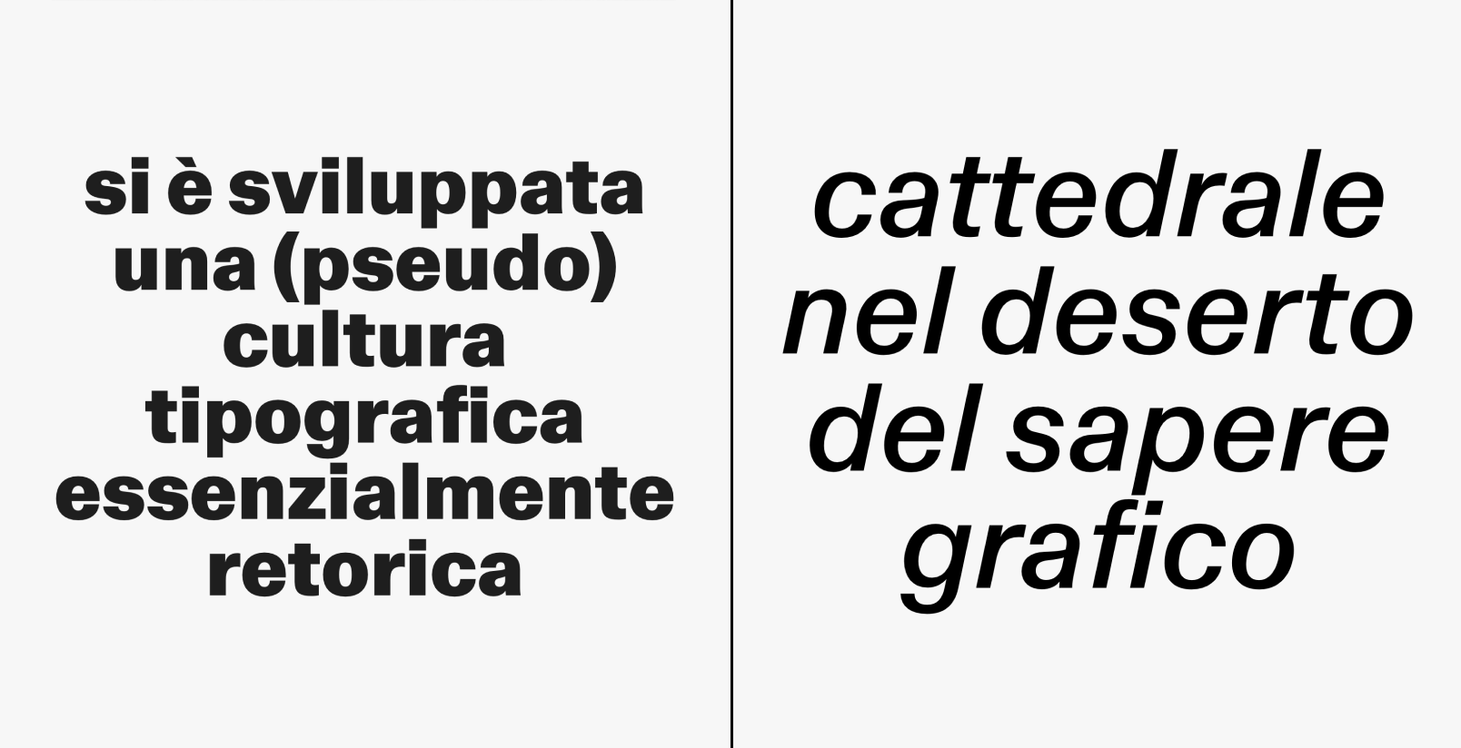 LL Schema, Alberto Malossi
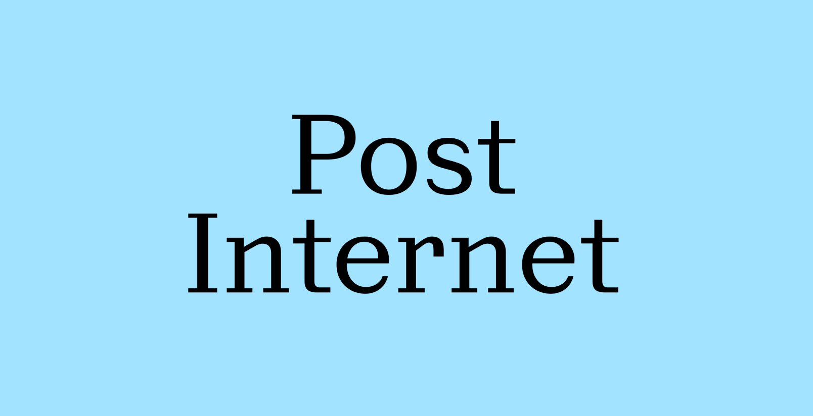 Post, Displaay
Updates and family extensions
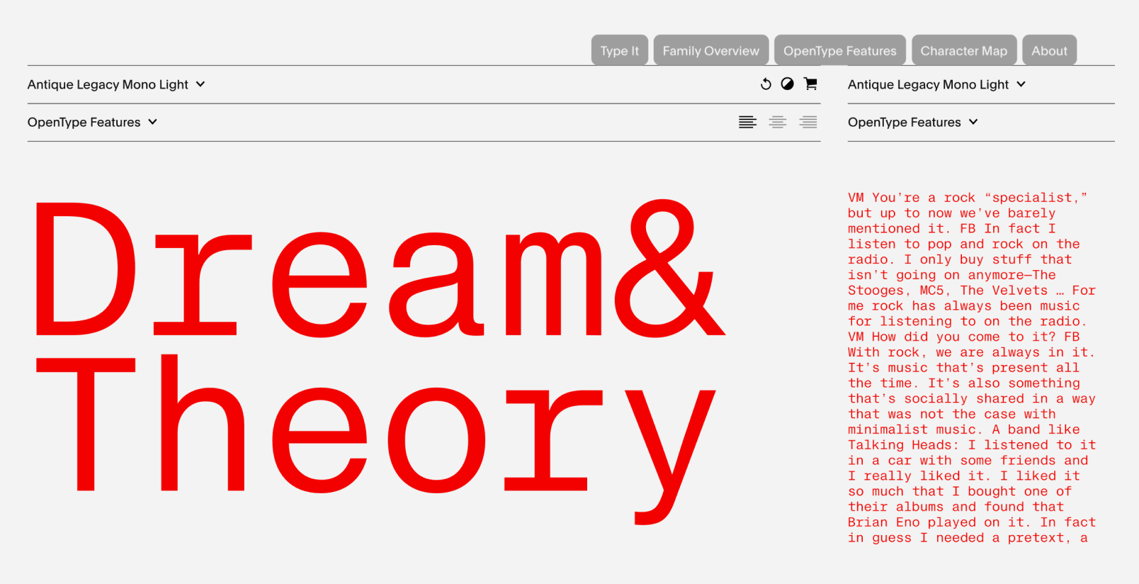 Optimo added a monospace subfamily to Antique Legacy
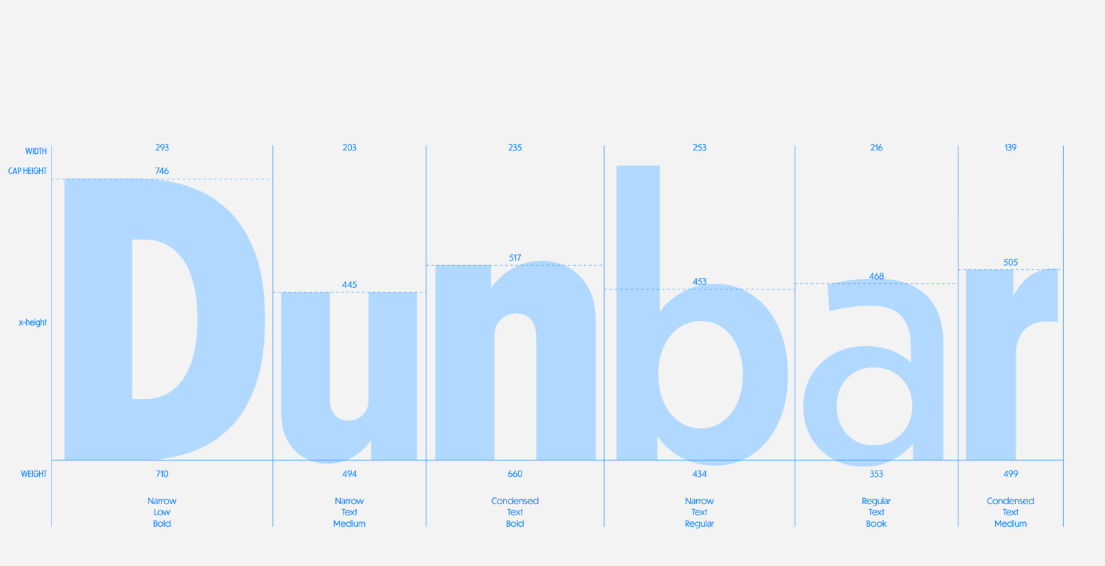 CJ Dunn added three new widths to his Dunbar family
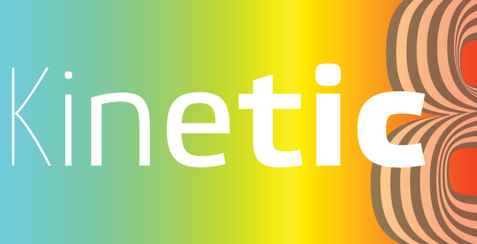 Etelka was completely redrawn by Storm Type Foundry. Etelka Neo dropped the monospaced styles
but added more widths and weights, nearly doubling its styles from 38 to 70
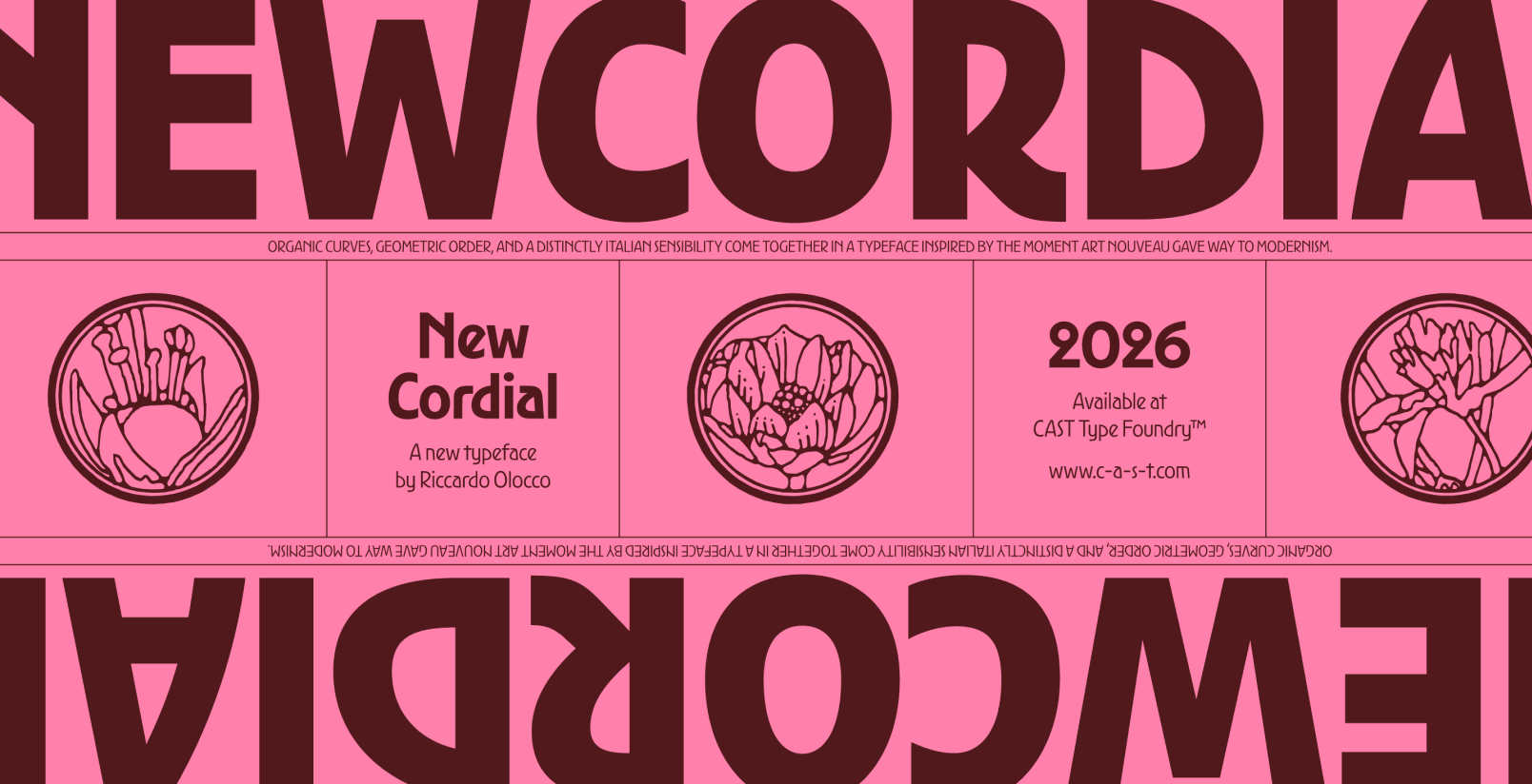 Ricardo Olocco redrew his Cordial font, rereleased as New Cordial
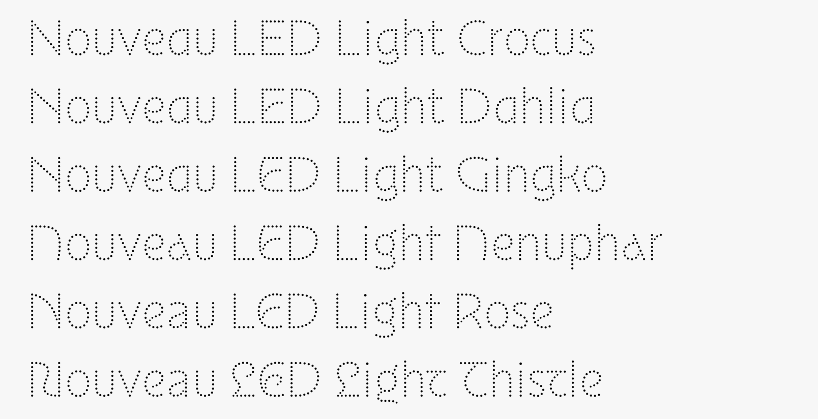 Poem Editions added a third subfamily to their Nouveau collection: Nouveau LED
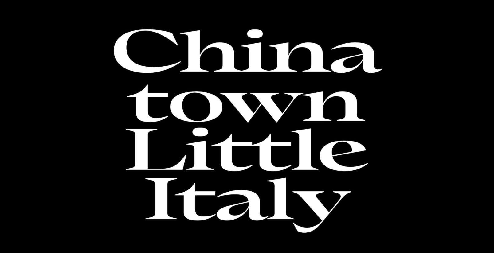 Place Display is a sharper version of Place by Julien Priez, released by Commercial Type in a single weight in four styles
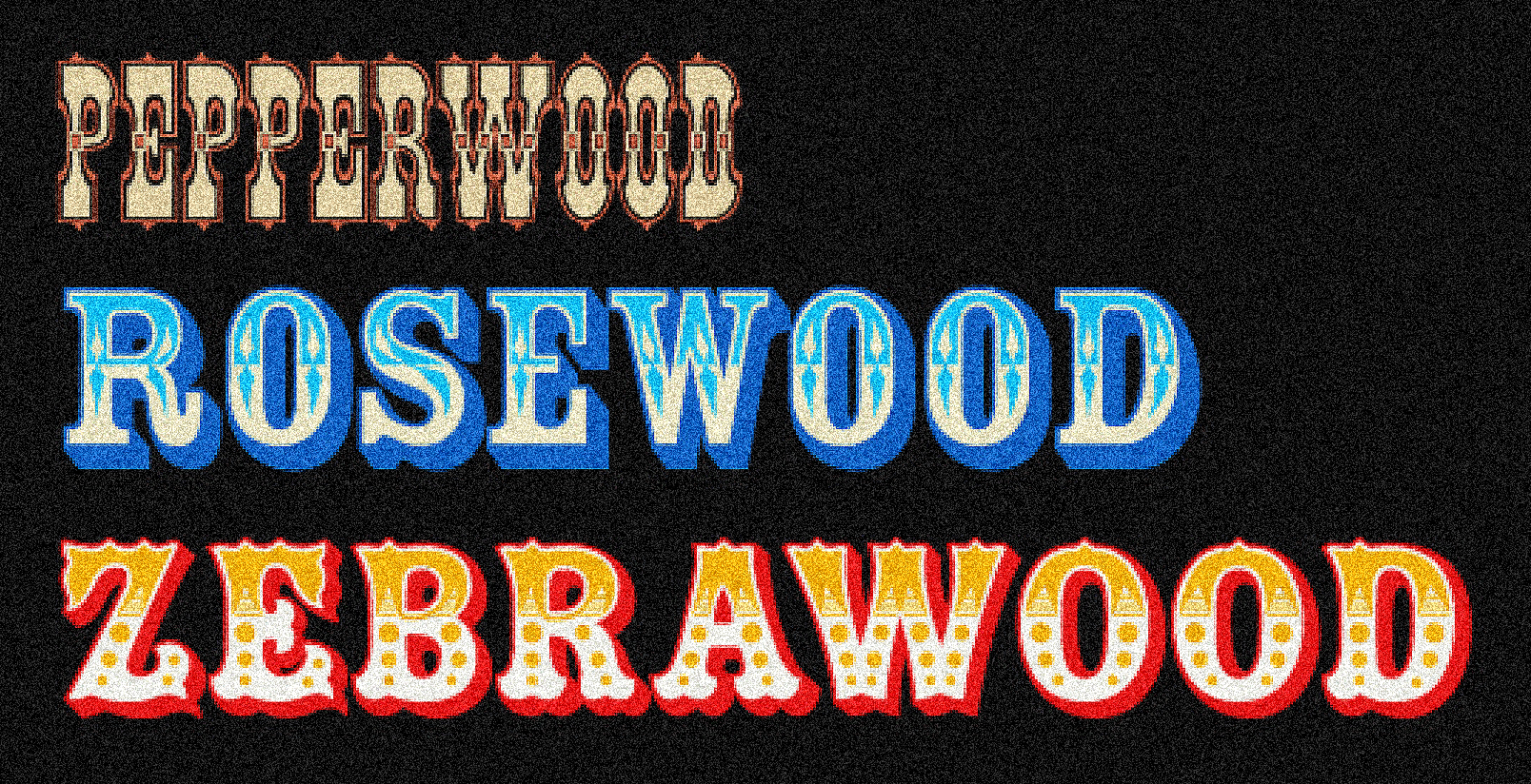 Adobe updated Zebrawood, Rosewood, and Pepperwood with color font versions
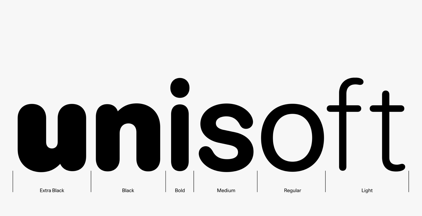 LL Unisoft 77 is a rounded version of LL Haas Unica 77
Readability is a Сonstruct
designregression.com/essay/what-is-a-universal-script-grammar
Rosetta’s Design Regression published an essay by David Březina where he reflects on what he’s referring to as ‘script grammar’. In the piece, Březina attempts to formulate universal design principles applicable to all writing systems, describes readability as a social construct, and suggests applying James Joyce’s
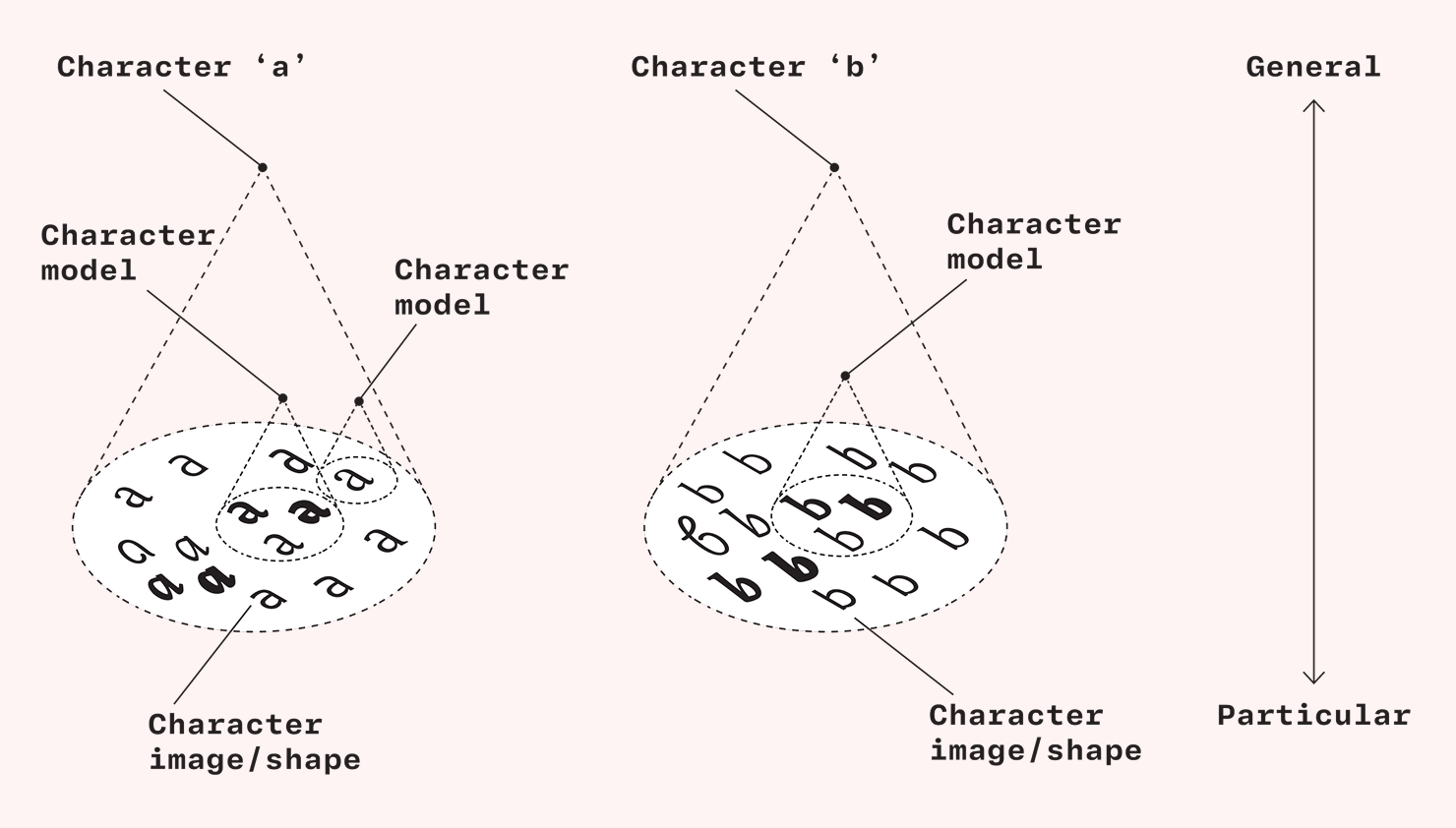 A diagram showing that characters can be modelled at different levels from specific material instances to more general descriptions. From the article by David Březina
Eye Magazine #110
eyemagazine.com/blog/post/eye-110-is-here
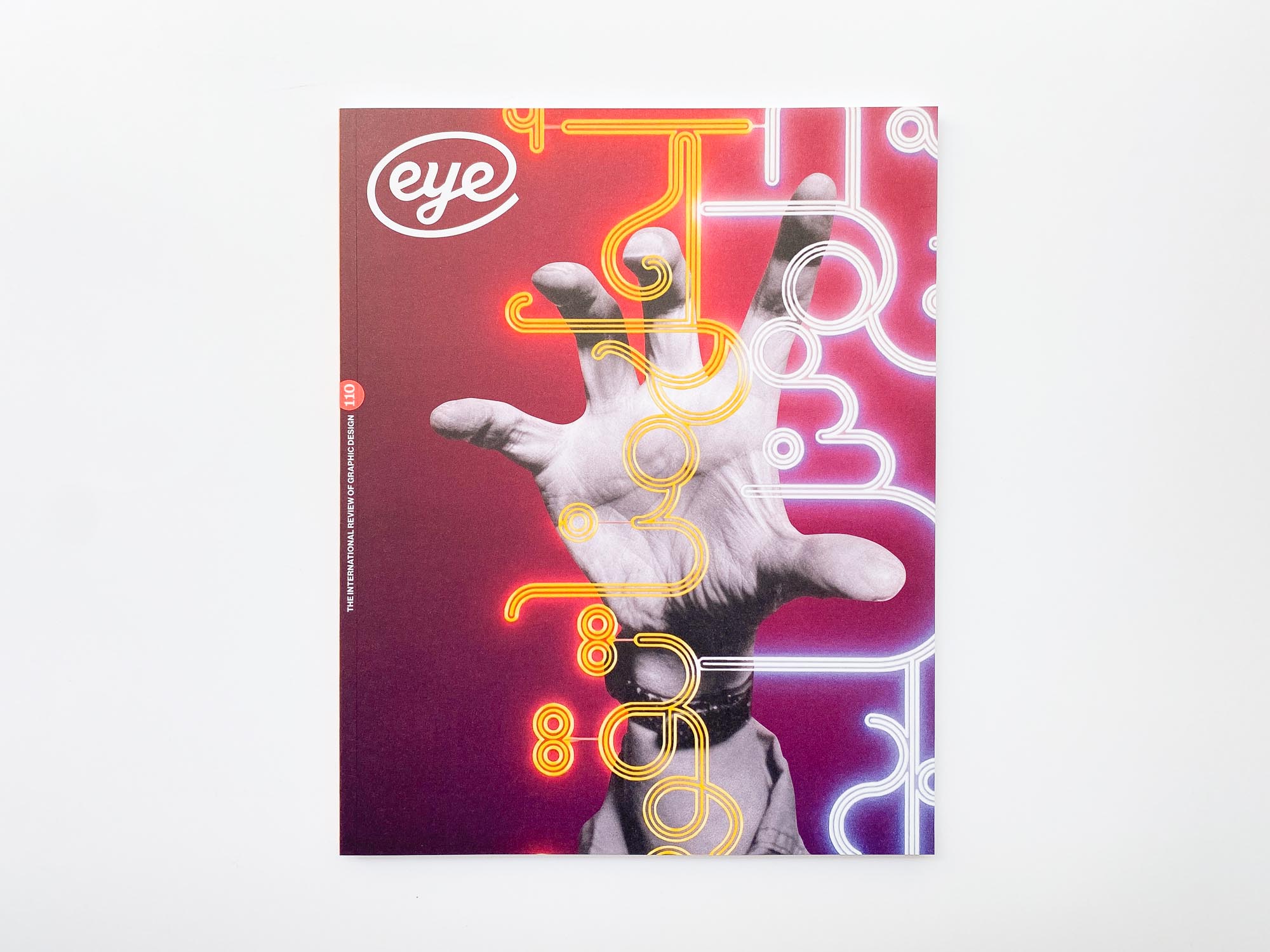
The 110th issue of Eye Magazine is out. Among other things, it features long profiles on Pentagram partner Samar Maakaroun and designer Tadanori Yokoo, as well as a piece addressing The Beatles’ relationship with typography.
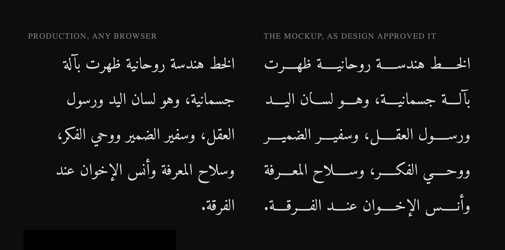
Why is Arabic Text Rendered Incorrectly?
One day, frontend developer Sergey Paradzhanov got a ticket: a block of Arabic prose on the website was rendering with a ragged left edge while the team specified justified text. While dealing with the error, Sergey figured out that the root cause dated as far back as the 10th century, learned that the Arabic phrase ‘In the name of Allah, Gracious and Merciful’ is actually one single glyph, and uncovered many other reasons why Arabic is still extremely difficult to work with in European versions of Adobe software.
Adobe Glyph Finder
labs.fonts.adobe.com/projects/glyph-finder
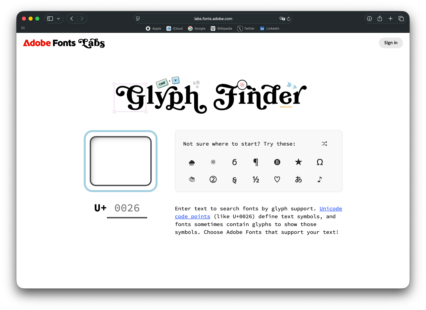
Adobe Fonts has introduced a new tool, Glyph Finder. It allows you to search Adobe typefaces by glyph
Plattner Type by James Plattner
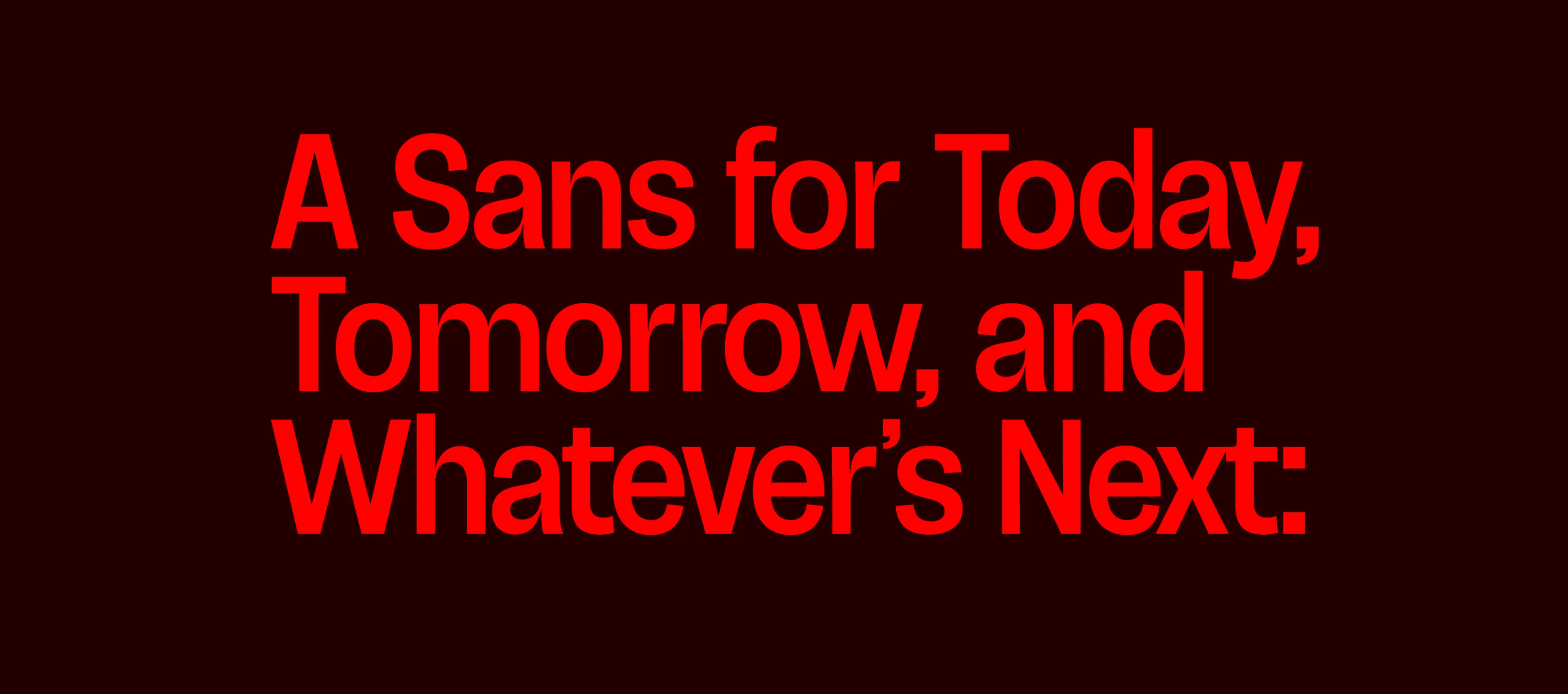
Type designer James Plattner has launched a type shop. The collection currently features four typefaces: Falutin, an homage to fat face designs of the 1960s; Motley, a distant descendant of early 20th century humanist sans serifs; Asoma, nostalgic for the 1970s; and Cognate Grotesk, which reflects on the Swiss typographic style.
 Cognate Grotesk
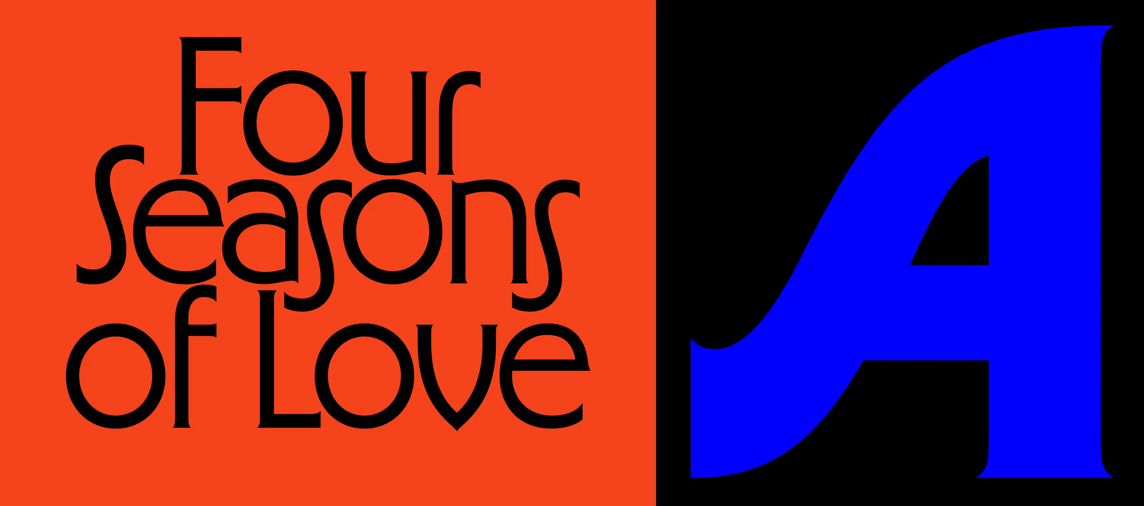 Asoma
Asoma
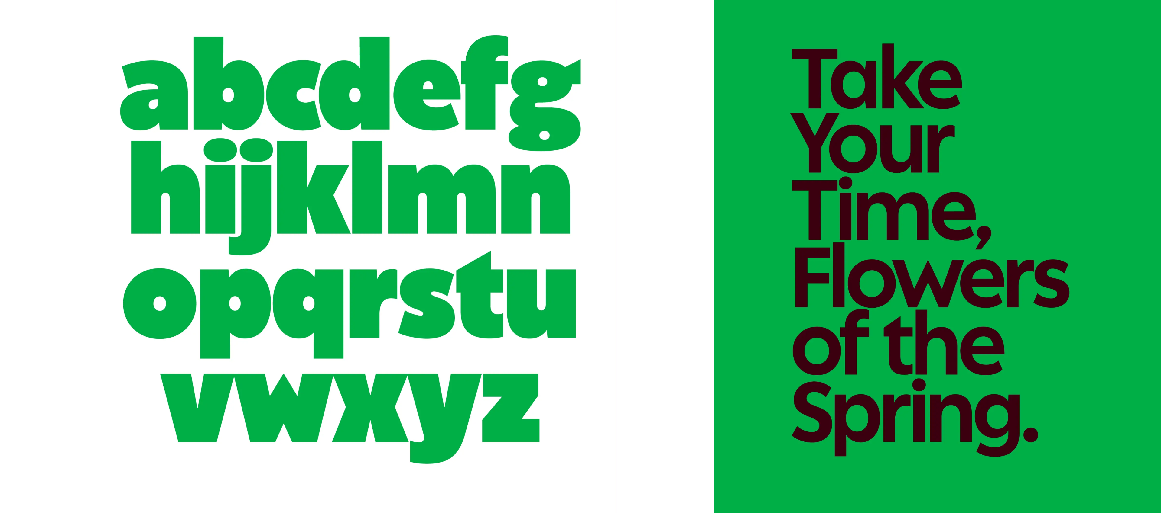 Motley
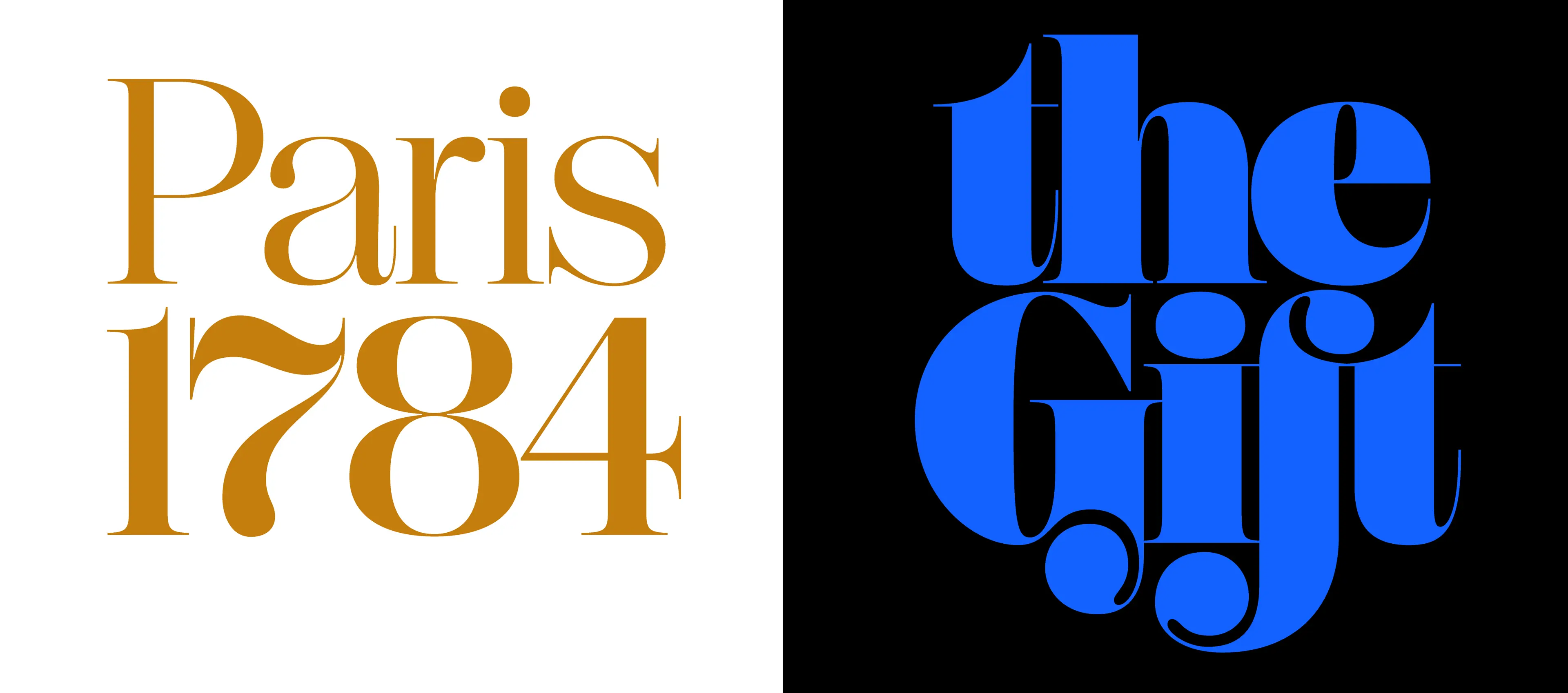 Falutin
Plain Text 4
typedrawers.com/discussion/5615/plain-text-a-semi-annual-publication-for-exploratory-type-design
Benjamin Dumond wrote an extensive piece about the zine he produces with his partner at the Plain Form foundry, Nostra’s author Lucas Decroix. Dumond shares why they decided to launch the
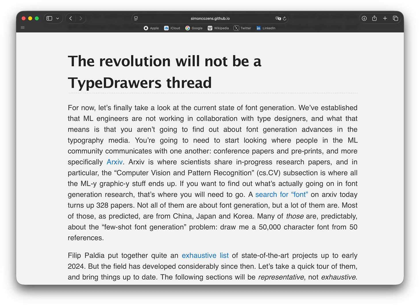
When Will AI Be Able to Do Type Design?
simoncozens.github.io/state-of-ai-font-generation
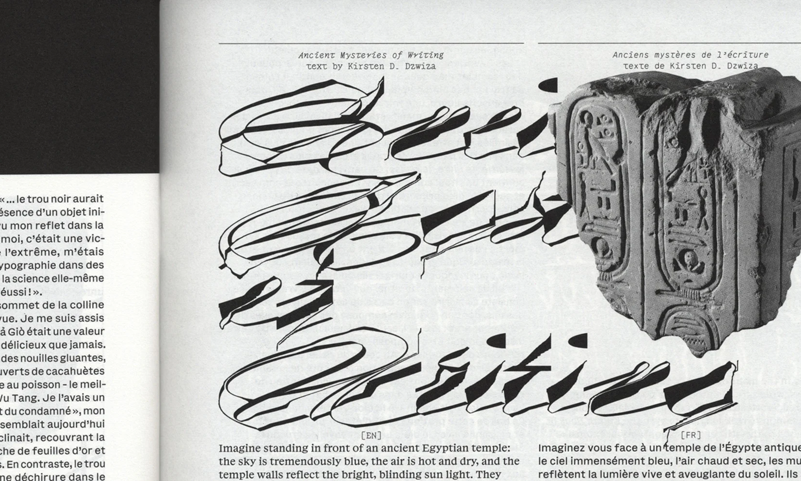
Simon Cozens has posted an article speculating on when AI will learn
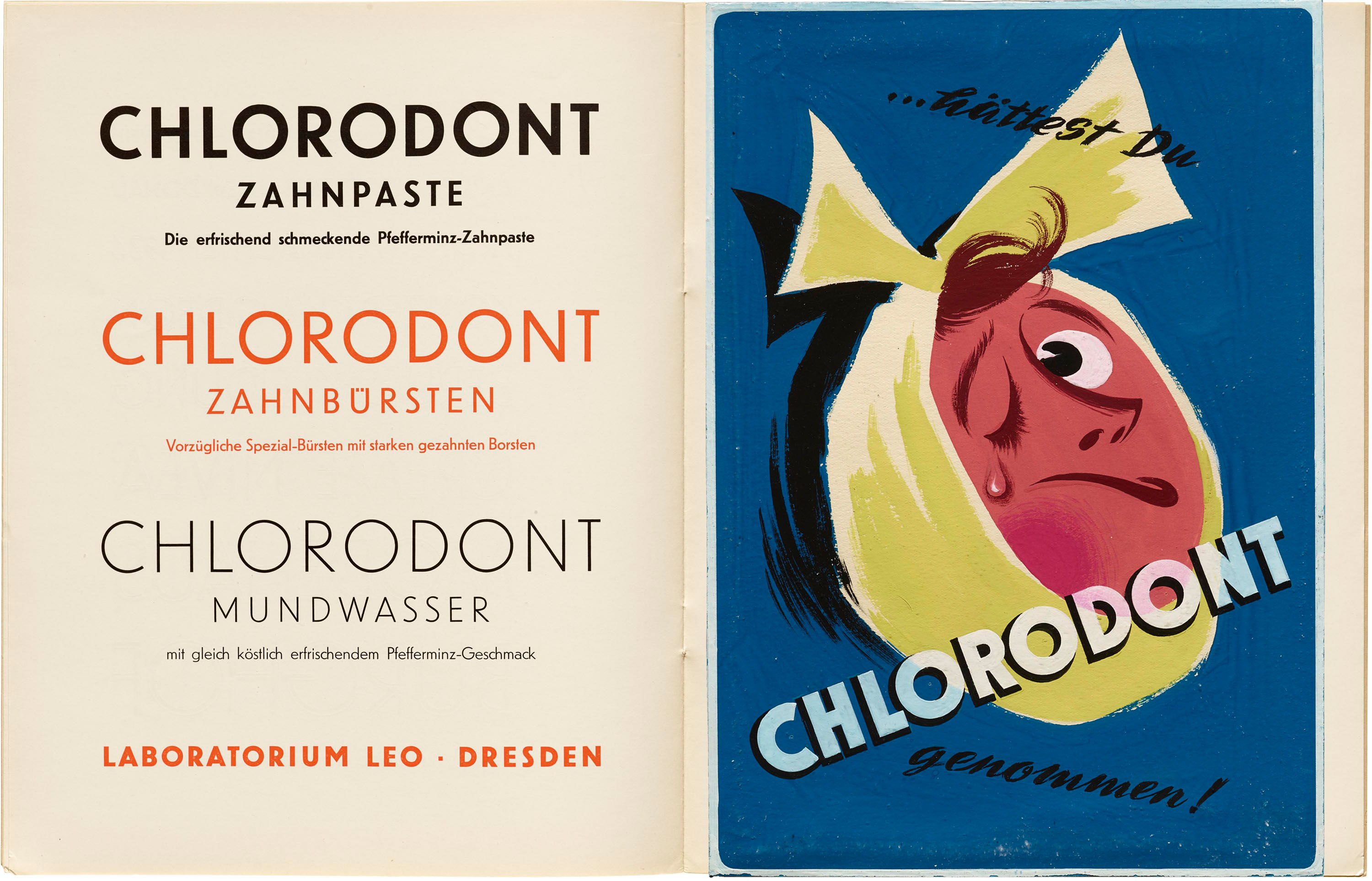
Seen Together by Letterform Archive
letterformarchive.org/news/seen-together-chlorodont
The Letterform Archive blog has launched a new series in which staff members explore unexpected connections between objects from different times and places. In the first episode, Tanya George tells how a German oral care brand connected the 1930s Ludwig & Mayer Type specimen with a student’s assignment from the 1950s.
Infonta Update
Vera Evstafieva — type designer and calligrapher behind Amalta — now has a new website. In addition to her typefaces and calligraphic work, it features physical objects, such as a revival of a 14th-century Nottingham alphabet tile in the form of a gingerbread.
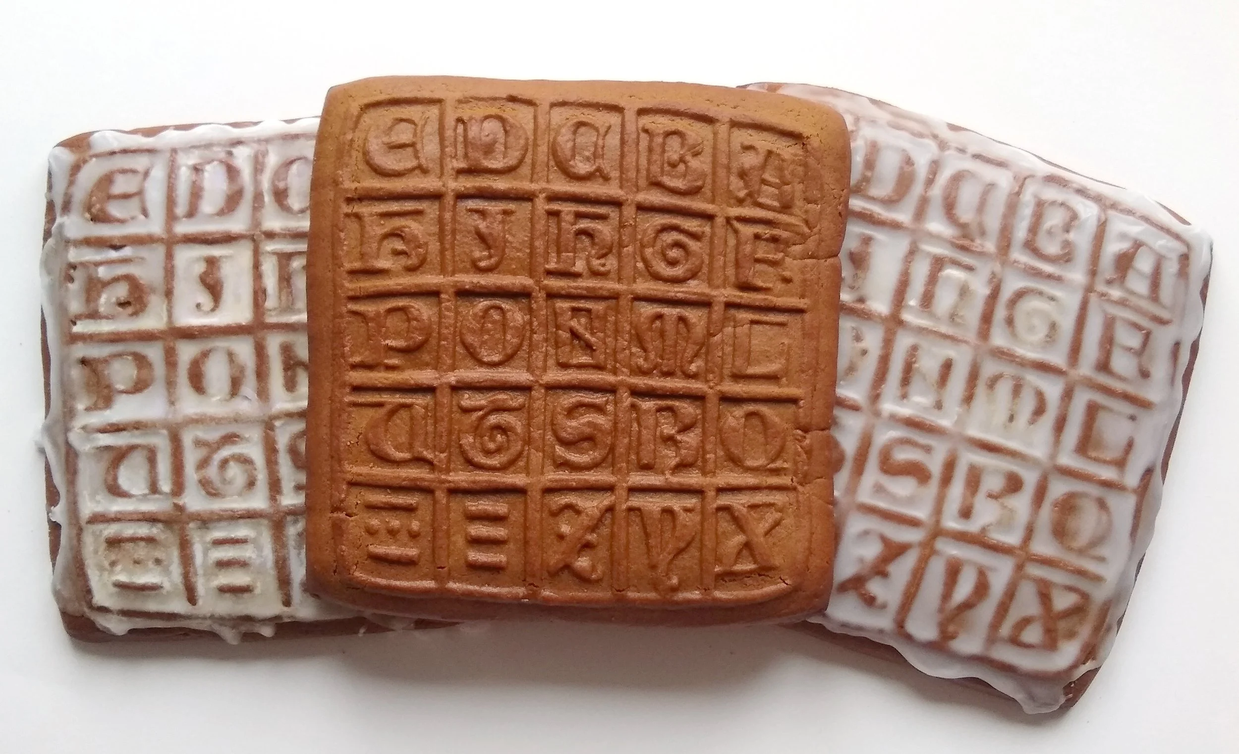 Gingerbread revival of the Nottingham alphabet tile
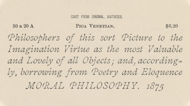
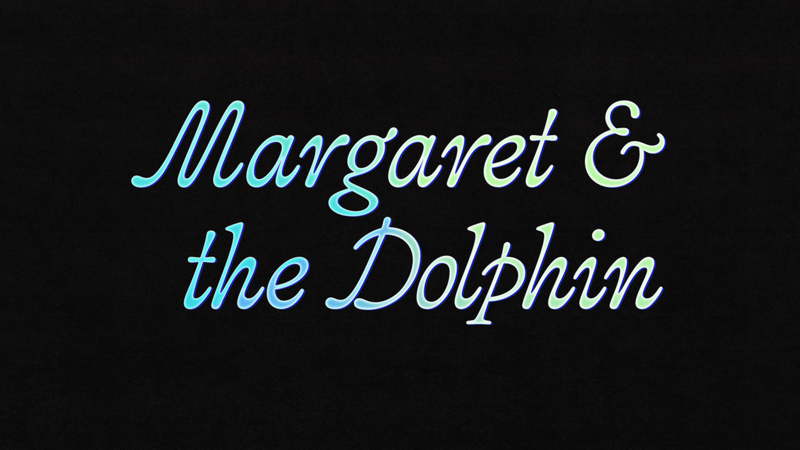
Venetian and a Dolphin
frerejones.com/blog/designing-constrictor
Frere-Jones Type published an account of how their new typeface was
Fontdue Update
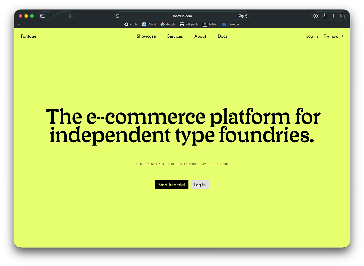
The service helping independent foundries handle backend and payment processing has updated their website. It now includes a comprehensive FAQ section, a page with documentation, a showcase featuring websites of foundries that use Fontdue services… and the name of the project’s founder.
Reading Manuscripts Without Actually Opening Them
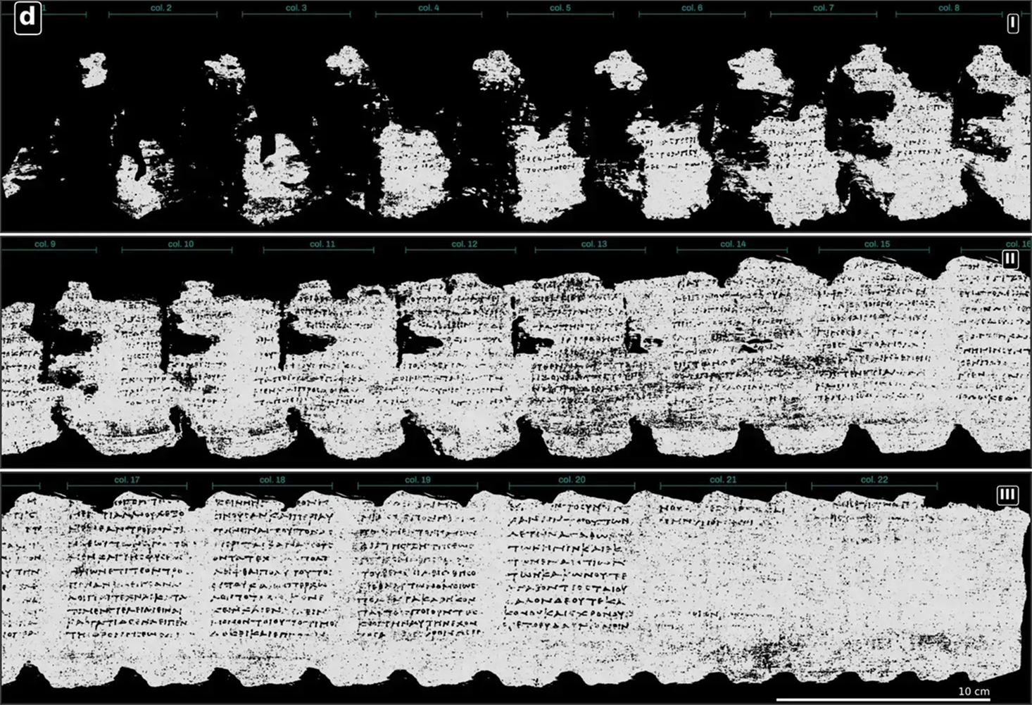
Vesuvius Challenge is a project aiming to read manuscripts that lived through the eruption of Mount Vesuvius and are too fragile to be opened. This year, Vesuvius Challenge has been able to virtually unwrap and read in full one scroll of the Herculaneum papyri created in the 1st century.
Glyphs 4
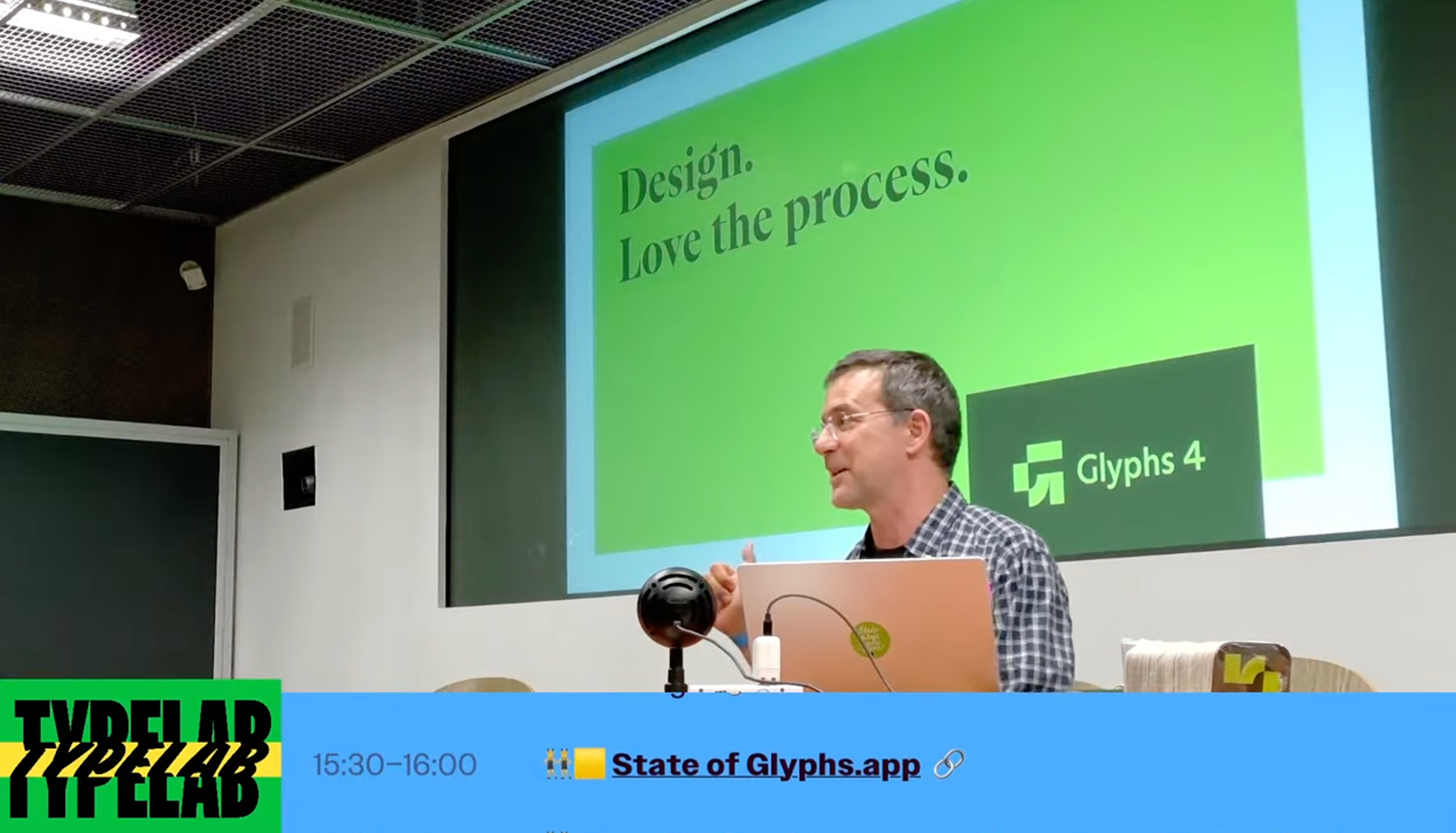
Glyphs 4 has been presented The presentation begins at 5:32:30 at the Typographics conference taking place in New York. The application may now be useful not only for type designers but also for those who design icons. For instance, you can apply a single change to all master styles in a variable font at the same time, or click ‘balance handles’ to balance all the handles without altering the shape of the glyph.
While Rainer Erich Scheichelbauer was presenting a new version of the font editor, Toshi Omagari published a new set of GlyphsApp plugins for kerning.
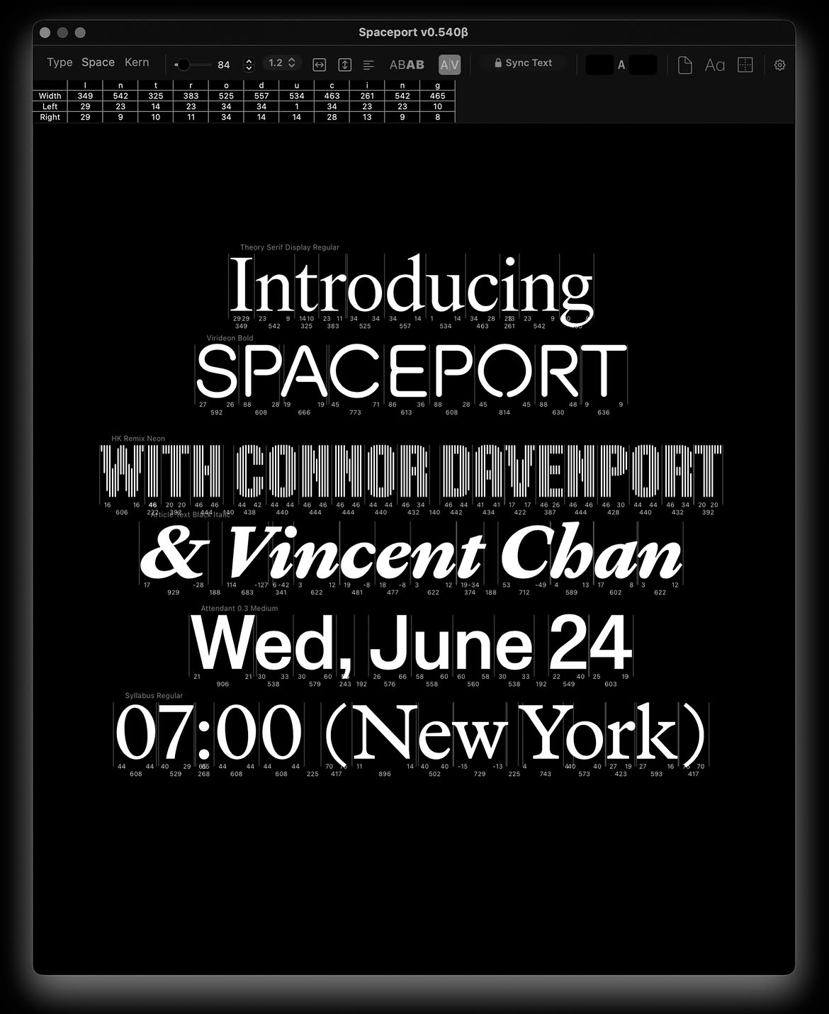
Spaceport for RoboFont
There is some good news for Robofont fans, too! Vincent Chan and Connor Davenport have launched an open source extension for the font editor. With Spaceport, you can simultaneously kern and interpolate multiple unrelated UFOs.
TypeLab on YouTube
Day 1: youtube.com/watch?v=UR4zw3VOWwU
Day 2: youtube.com/watch?v=hwENpN6W8qM
Running alongside the Typographics event was the online conference TypeLab. On the first day, designer Céline Hurka talked The presentation starts at 3:55:00 about her research into floral ornaments in print, while Frederik Berlaen spoke The presentation starts at 4:30:30 about his new typeface inspired by stained glass.
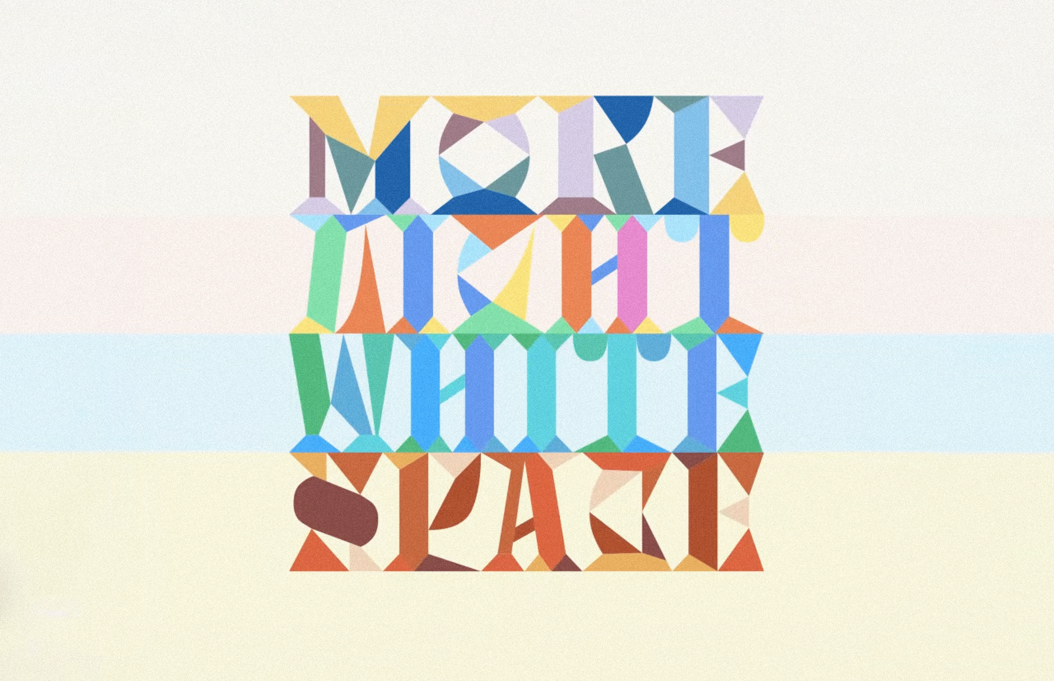 From Frederik’s presentation
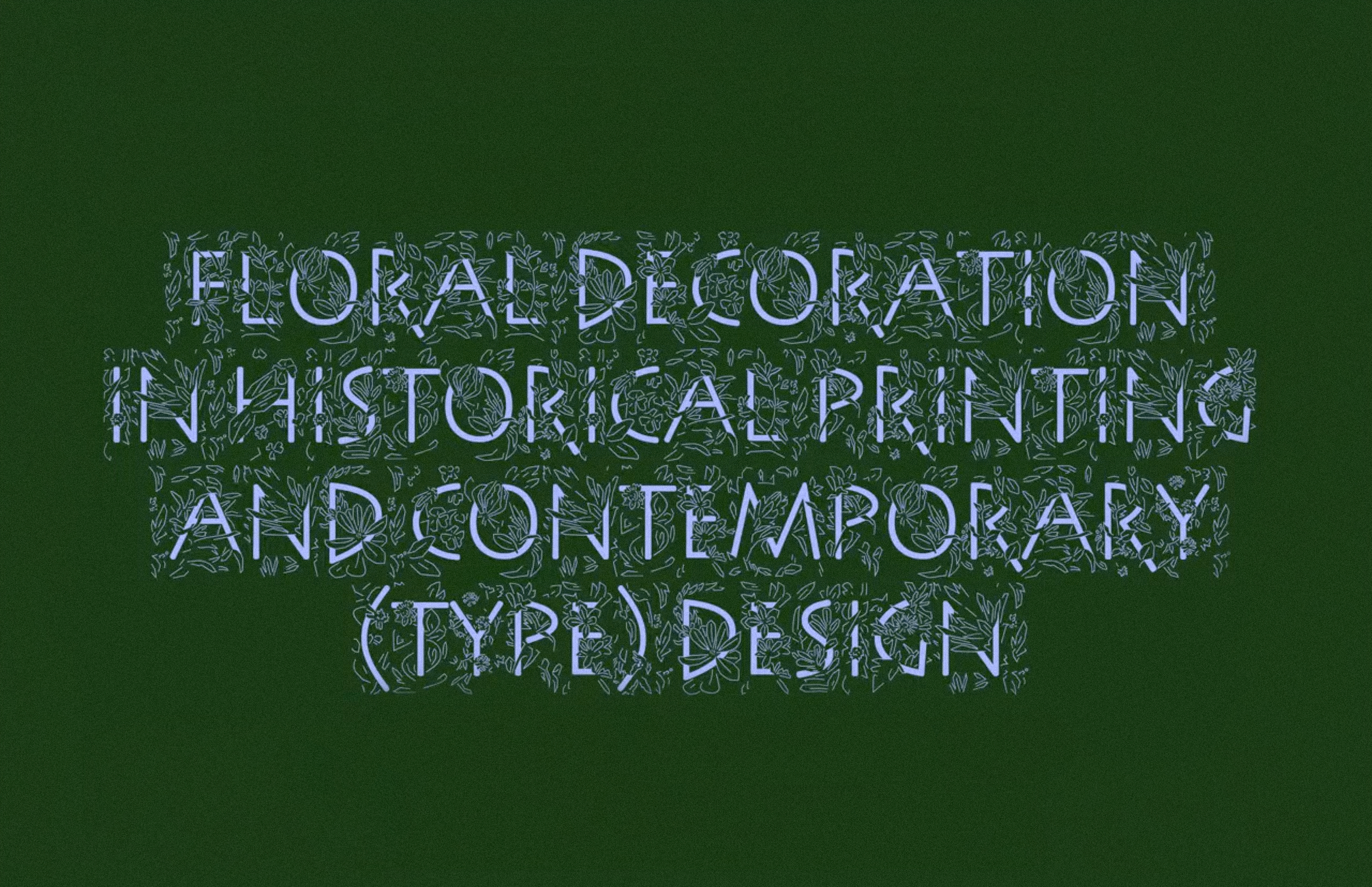 From Céline’s presentation
On the second day, Anya Danilova presented The presentation starts at 2:30:10 a project she and Yury Ostromensky have been working on for the past year: a study of the first Georgian metal typeface, created in Rome, and how it influenced the way the Georgian script developed in Europe during the 17-19th centuries. In the YouTube recording, you will see a Georgian typeface created by Giambattista Bodoni and hear a detective story behind the discovery of the punches for the first Georgian typeface in France.
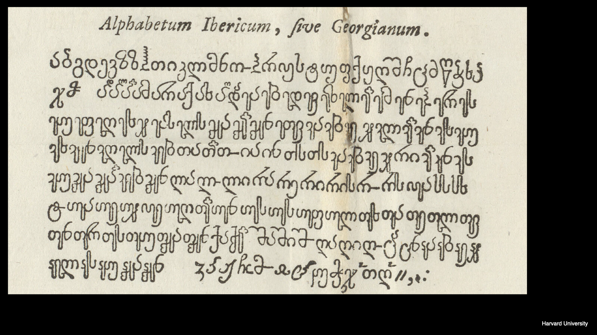 The first books featuring Georgian script. From Anya’s presentation
Ligatures in the first Georgian typeface. From Anya’s presentation
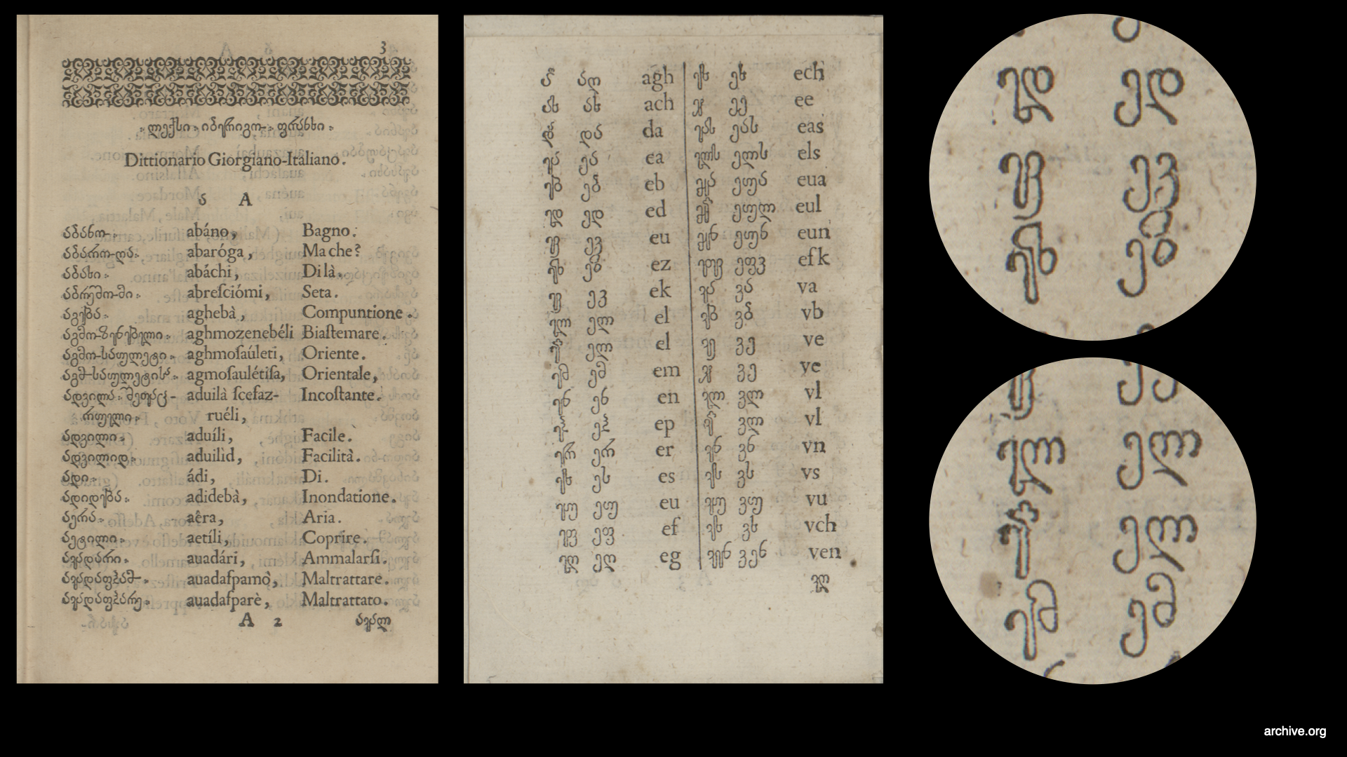 One of the first books featuring Georgian script. From Anya’s presentation
The Typography of whitehouse.gov
fontsinuse.com/uses/78453/the-typography-of-whitehouse-gov-2000-2026
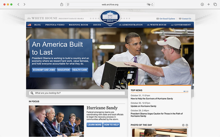
Ari Zetkin analysed the evolution of the White House website and the fonts used in its design over the past 25 years. The study reveals, for instance, that the quintessential American Franklin Gothic appeared on it only during George W. Bush’s first term, that the update under Obama introduced a ‘juvenile version of what would later become known as skeuomorphism’, and that the team of designers working on the website often drew inspiration from Apple releases.
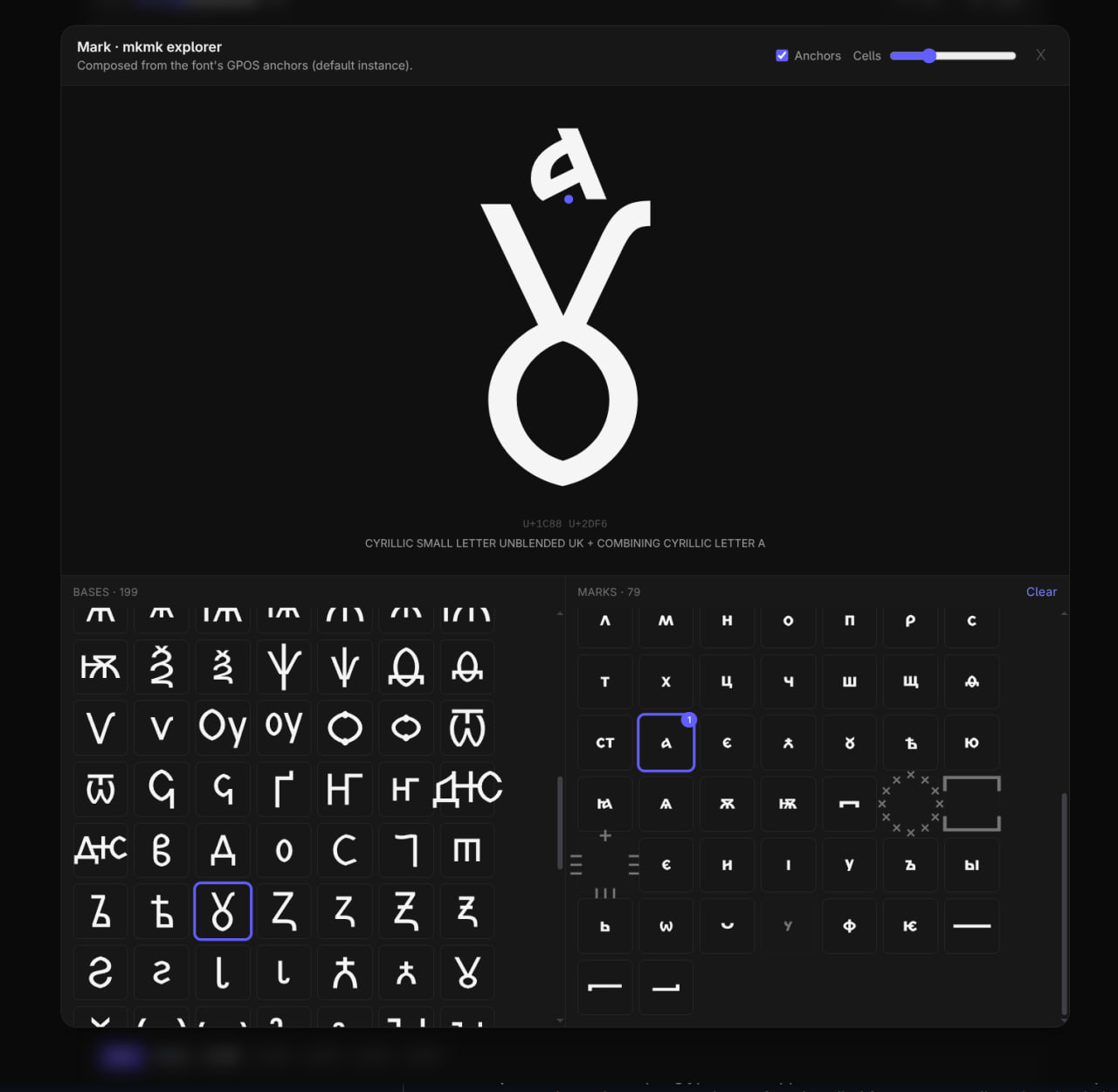
Features Proof
Web engineer Alexander Lubovenko has released a tool that lets you identify which glyphs are referenced by a font’s OpenType features and which diacritical marks can be combined with a selected glyph.
Mitch Paone, 1982-2026
linkedin.com/pulse/memoriam-mitch-paone-19822026-roosje-klap-pftpe
Mitch Paone passed away on June 23, 2026. He co-founded DIA Studio and MNKY Type, taught at KABK and ÉCAL, and coined the concept of kinetic identity.
June on type.today
This month, we spoke with Commercial Type co-founder Christian Schwarz and The Type Founders co-founder Sam Berlow, together with TypeMates released a monospaced Halvar, shared the results of our poster
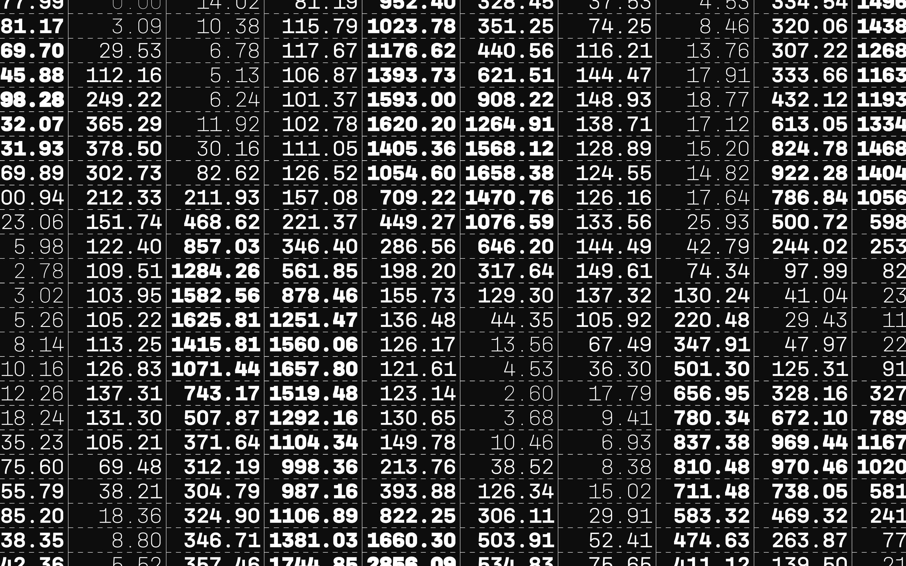 Halvar Mono
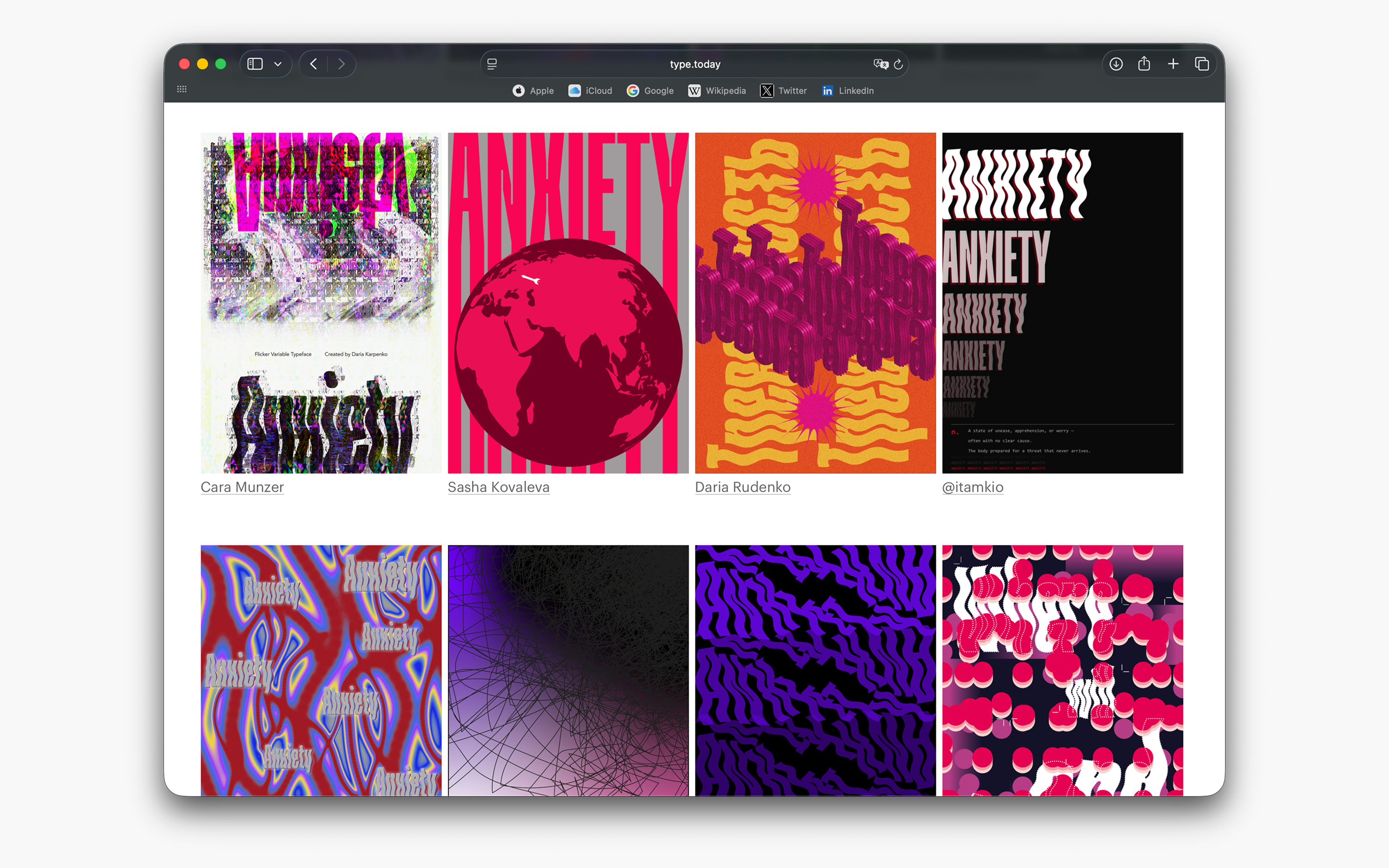 Results of our third open call