Ilya Ruderman: I came
Christian Schwartz: I should have done that, too. I forget what I say.
IR: It was a completely different life back then. 10 years ago, we spoke about todayness in type design. We just opened type.today, and we were looking for ways to describe the todayness. But if I ask you to describe it now, would you still define it through the design language or more through the context around design?
CS: I feel like 10 years ago, it was easier to think of design in a self-contained way. And now, the world just creeps into everything. These are anxious times. Design now is messy in an interesting way. 10 years ago, design was much more polished, much more put together, if we overgeneralize. And that was the reflection of the world that we lived in. And now things are messy, and design is responding to it.
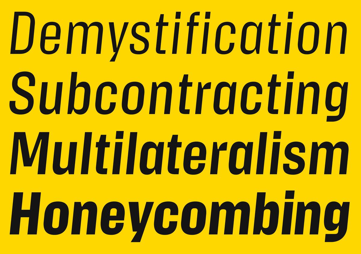
Action Text by Erik van Blokland. Released by Commercial Type in 2016. Images: Commercial Type
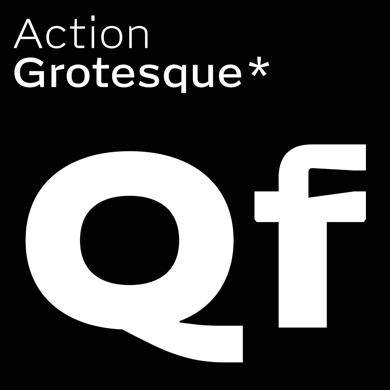
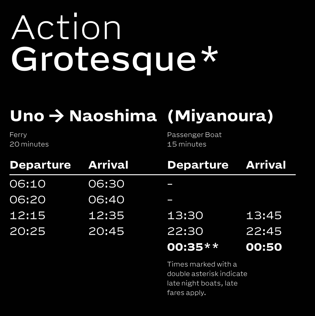
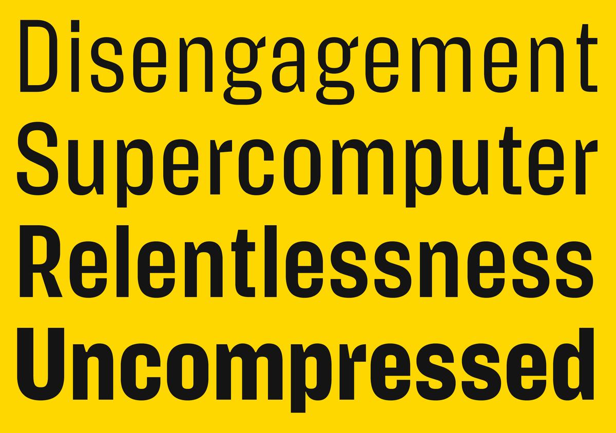
Action Grotesque by Erik van Blokland. Released by Commercial Type in 2026. Images: Commercial Type
IR: It’s interesting because in 2016, fragmentation seemed like one of the defining features of the contemporary type. The tendencies and the typefaces themselves were becoming more specific. Do you believe that this fragmentation somehow continued over the last decade? Or did it transform into something else?
CS: I don’t know if it’s accelerated, but I think it has continued. But I believe it’s related to the question of fragmentation of the audience. When the media was more centralised, it knew who the audience was, and now, what you see on Instagram and what someone else sees on Instagram are completely different things. So the algorithms have led to even more fragmentation.
Canela by Miguel Reyes. Released by Commercial Type in 2016. Images: Commercial Type
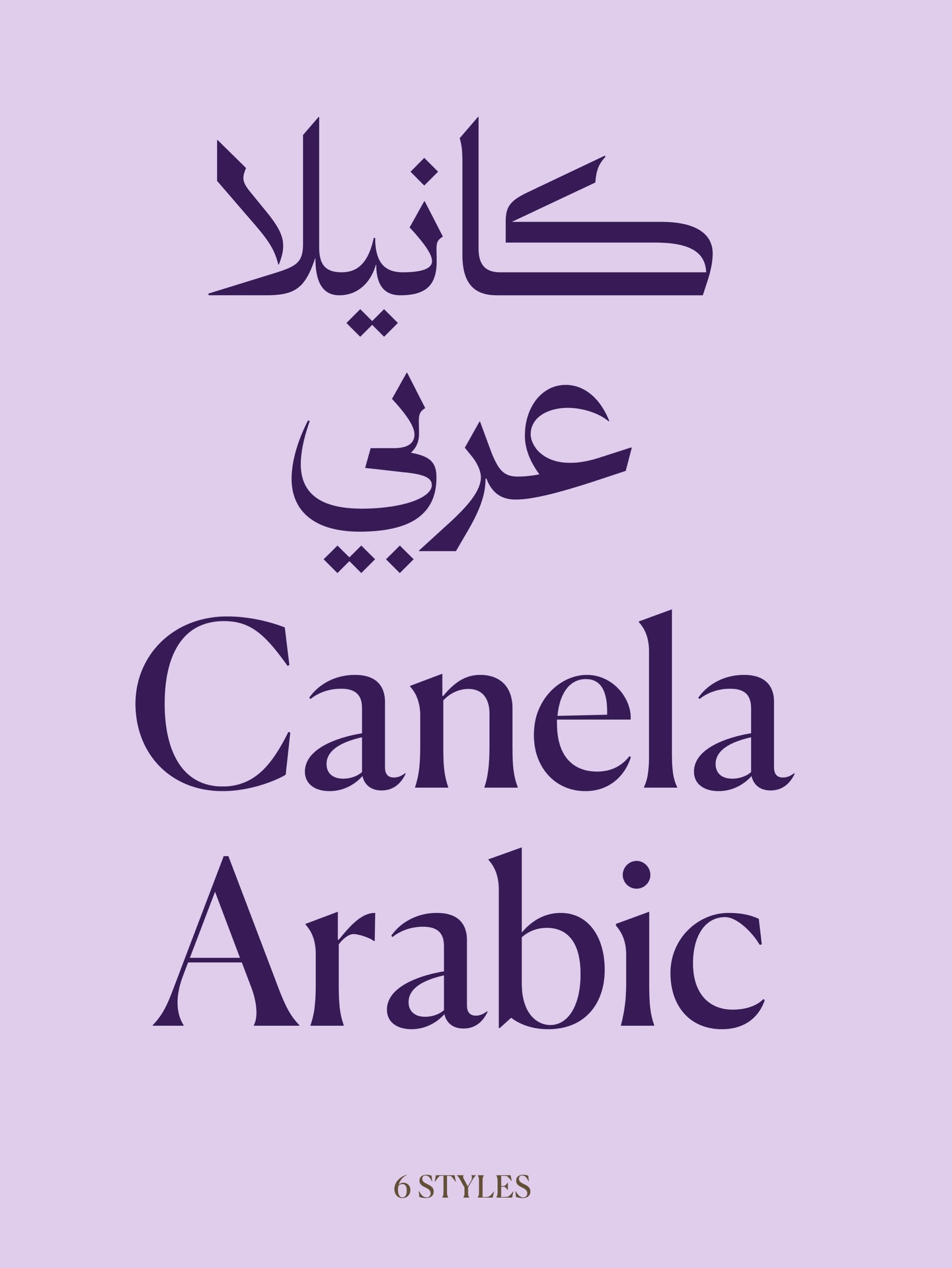
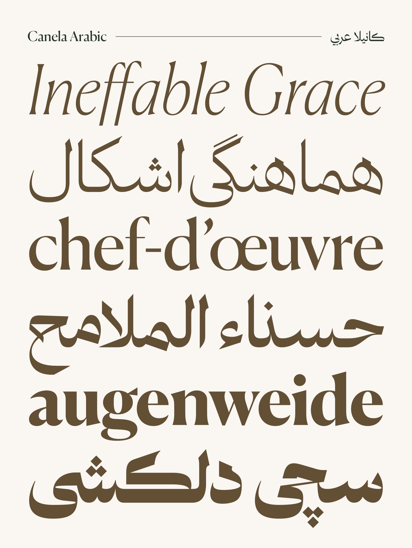
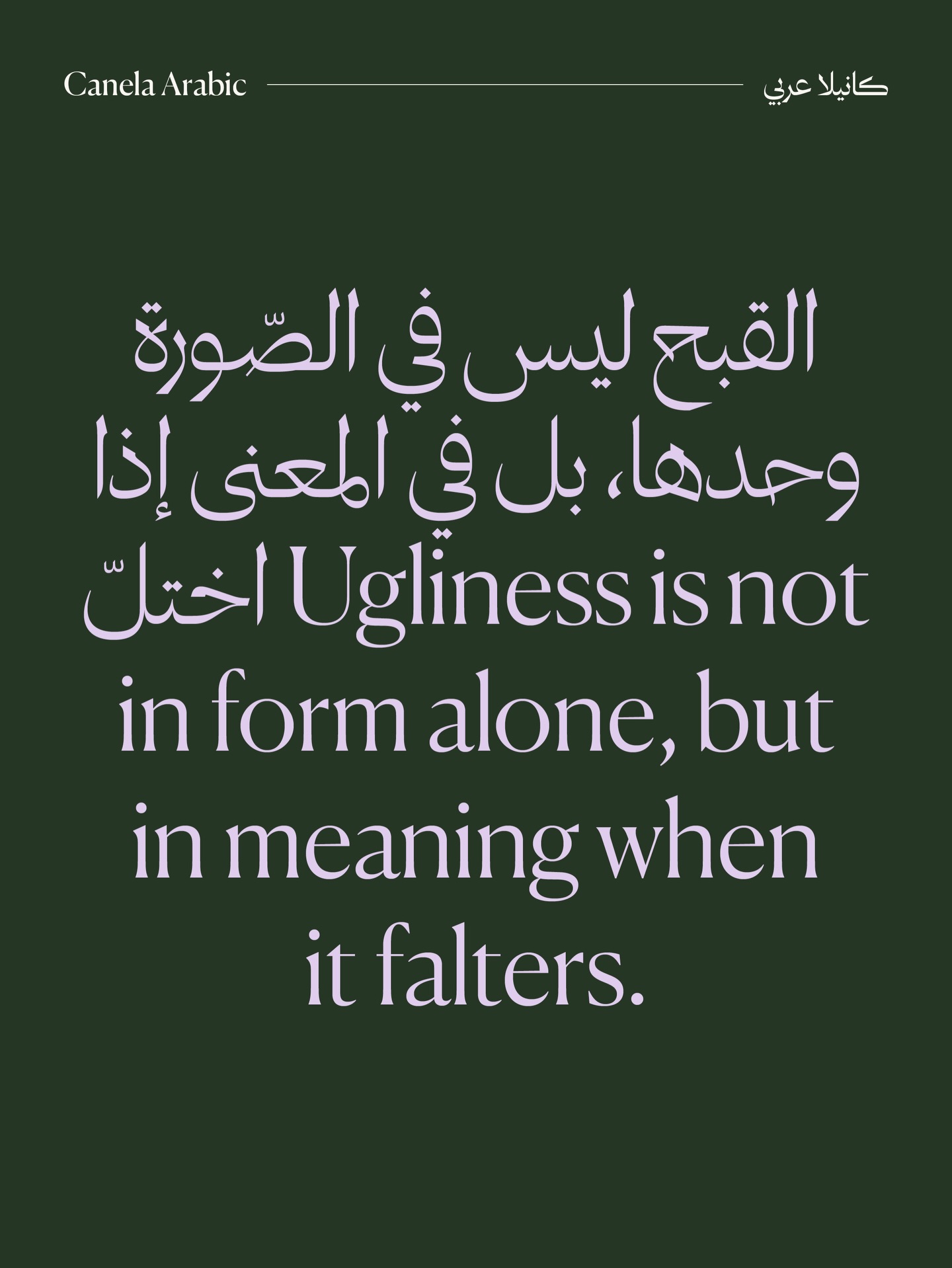
Canela Arabic by Khajag Apelian and Wael Morcos. Released by Commercial Type in 2026. Images: Commercial Type
IR: Do you think the type industry is currently in crisis, in transition, or simply adjusting to a new reality?
CS: I think saying it’s in crisis is an overstatement. But the other two are essentially the same
Now you’ve got the consolidation of private equity trying to buy up small foundries, which, at least in the US, is happening in a lot of industries. I think even our veterinarian has been bought up by private equity.
But I think that’s having a smaller effect on the overall atmosphere of the industry than the wide availability of free and de facto free access to large libraries. Google Fonts, combined with a lot of companies moving over to using Google’s suite of tools, where there’s no way to set everything in the font that you’ve licensed for your corporate identity.
So now companies have to decide: do they bifurcate their identity by using one set of typefaces for external communications and another for internal use
I think that’s squeezing small foundries from both ends. We lose a lot of big corporate licenses that foundries used to depend on for a big portion of revenue. There are still independent graphic designers who are really into type, and they’re still going to license the typeface that they absolutely need. But budgets are tighter now, and if you’re doing something that you don’t have a super important typographic idea for, there’s probably something on Adobe Fonts that’s going to be fine.
Yet we’ve got big companies who don’t want to deal with having to standardise around Adobe. They don’t want to have to settle for what’s accessible in Google Fonts. And they don’t want to deal with ongoing subscription-based font licenses. So they’ll spend a big chunk of money to commission something. And there’s a bunch of independent foundries like ours that are benefiting from this right now. I don’t know how long this is going to go on for. But right now, this is the moment we’re in. So we’re doing our best to ride this wave and stay alive until the next thing happens.
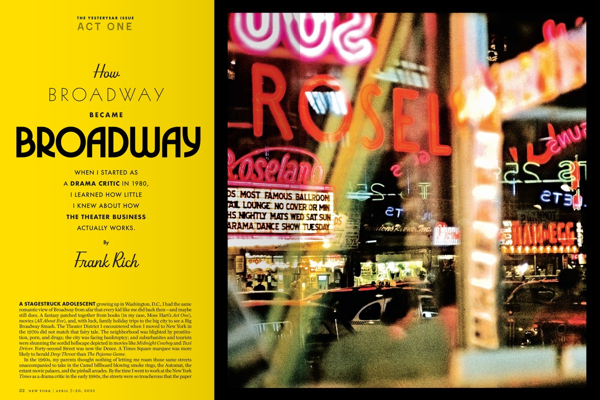
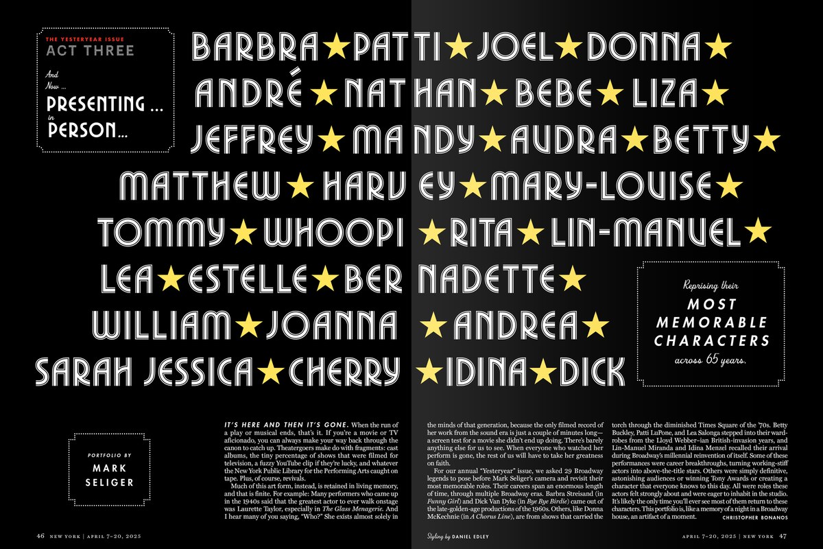
Lettering for New York Magazine. Commercial Type, 2025. Images: Commercial Type
IR: But this is not the first time we’ve been in this position. If you remember the days when computers were very limited in terms of the number of installed fonts, and we had to adapt to the way Microsoft handled
CS: Right. We started Commercial Type before web font licensing was even a thing. It’s funny talking to people who started foundries in the last ten
It’s also interesting that in corporate design right now, there’s this
IR: We’ve spent so much time educating our clients that typography is the voice of their identity. And there was a period when people invested heavily in promoting the idea that a new identity means a new custom font. It might be worth investing some time now in promoting the idea that a company can have different
CS: I totally agree. It might be interesting.
IR: Many people in the industry
CS: If there’s one thing that’s not coming back, it’s magazines. Every time we get a job for a newspaper or a magazine, we’re
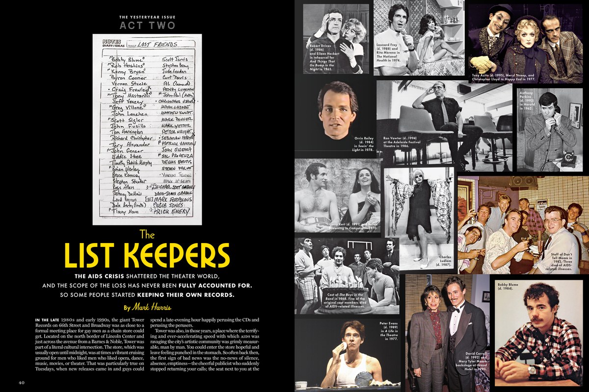
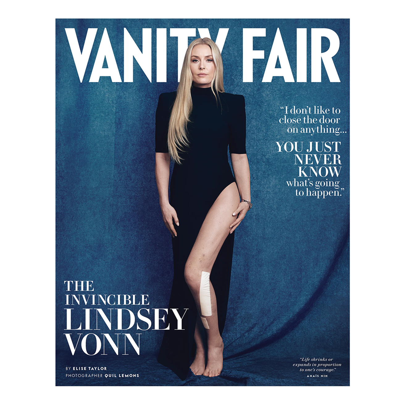
We just did some work for Vanity Fair — the third time we’ve drawn their logo. Before that, we did their redesign in 2012 with Chris Dixon. Back then, I would go up for meetings, and the magazine had a whole floor of the building. Everybody was dressed up. Walking into Condé Nast headquarters, I always felt underdressed, no matter what I was wearing. Now they’re down in the new World Trade Center, and Vanity Fair shares a floor with other magazines. People dress a lot more casually than they used to. It’s just a very different atmosphere.
I really like what the new editor is doing with the
 Vanity Fair, 2026. Logo and typefaces by Commercial Type. Image: Commercial Type
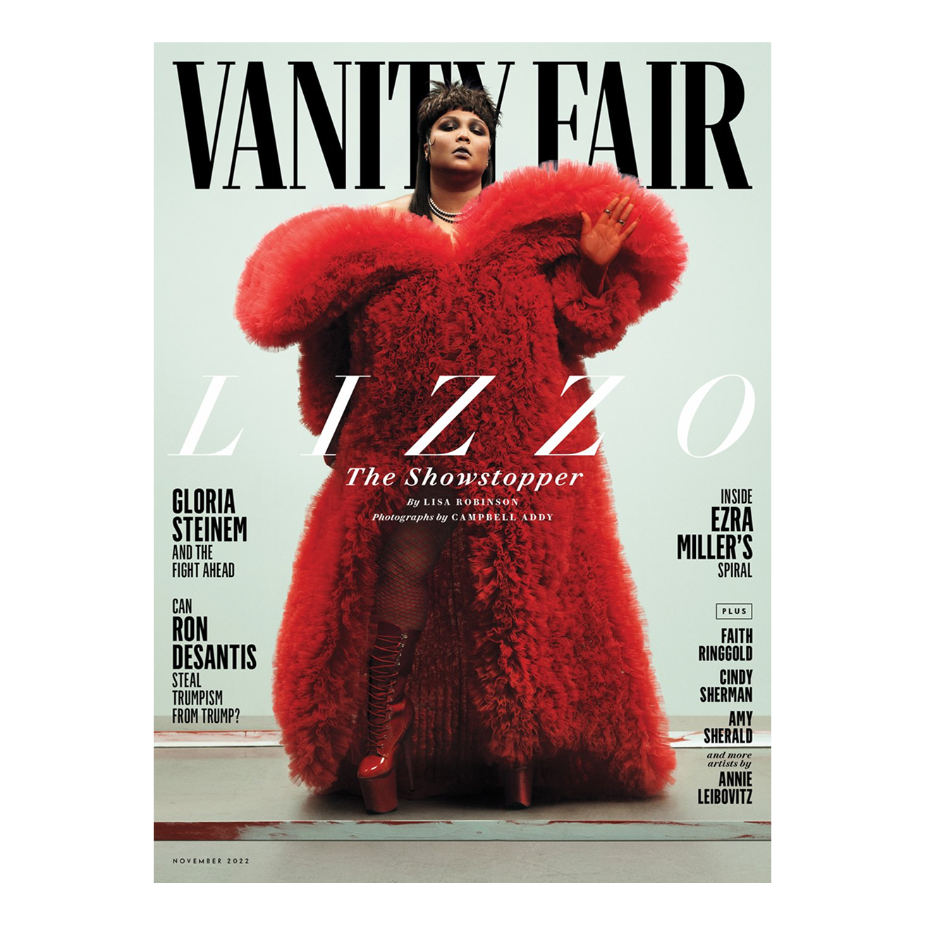 Vanity Fair, 2022. Logo and typefaces by Commercial Type. Image: Commercial Type
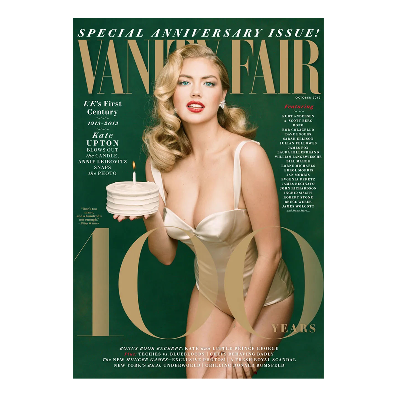 Vanity Fair, 2013. Logo and typefaces by Commercial Type. Image: Commercial Type
IR: Of course, our clients have changed over the decade, which was to be expected. But yes, I miss print. Print clients are struggling. But do you feel that something else is coming to replace magazines and posters? Remember, there was a time when poster designers were the most prominent designers on the planet! I mean, posters are still alive, but their significance has changed.
CS: Although it’s
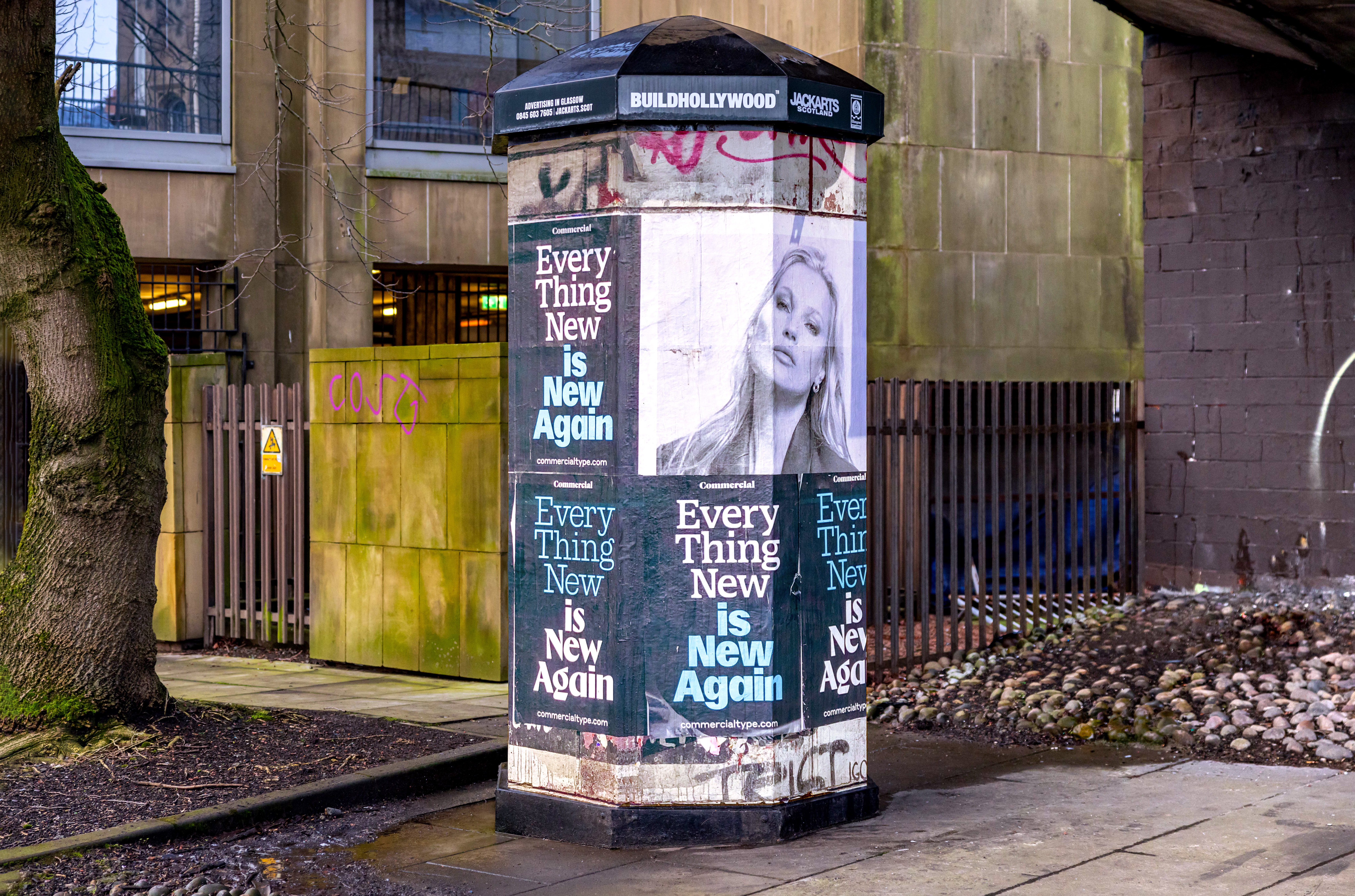
Wheatpaste posters promoting Commercial Type’s new website, 2023. Image: Commercial Type
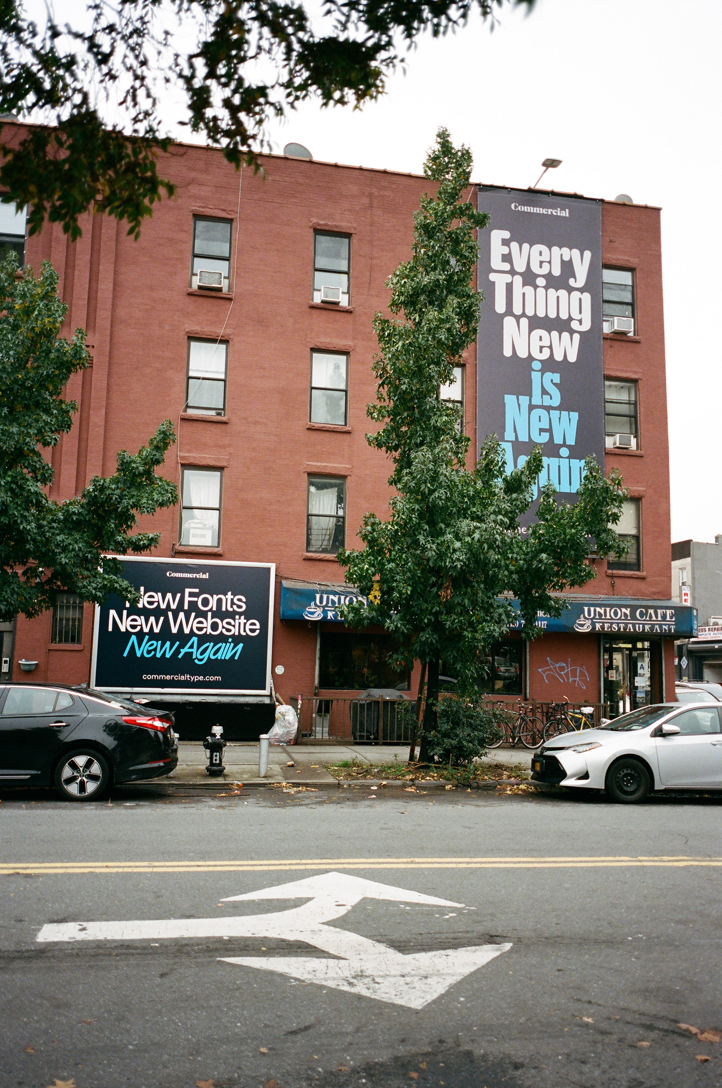 Banners promoting Commercial Type’s new website, 2023. Image: Commercial Type
IR: I’ve always been a huge fan of your Metro advertising campaign. It’s ironic in a way, and it was unexpected.
CS: It’s ironic, but we put a lot of thought into where we placed them and which stations we chose. It was a neighborhood with a high concentration of graphic designers. I see ads all the time that aren’t targeting me, but there must be enough people passing by who they do appeal to.
So we didn’t do this campaign just for the
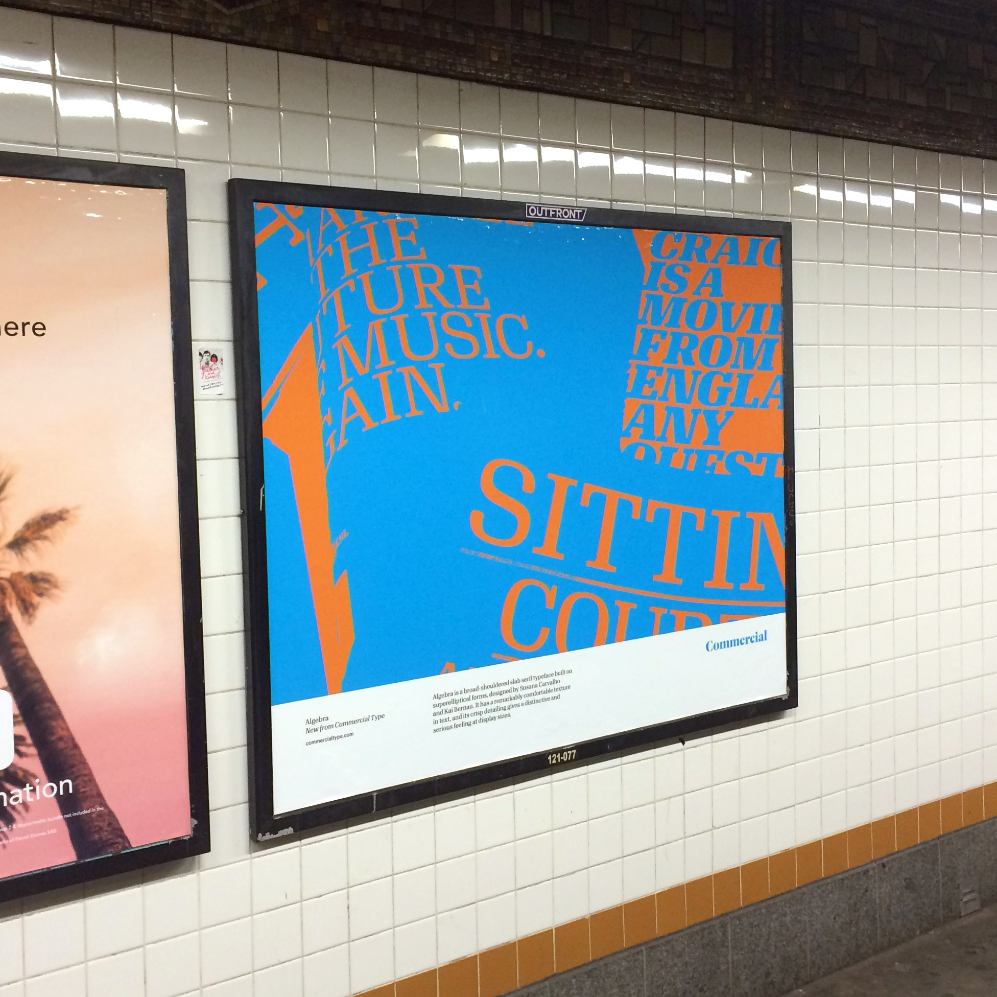
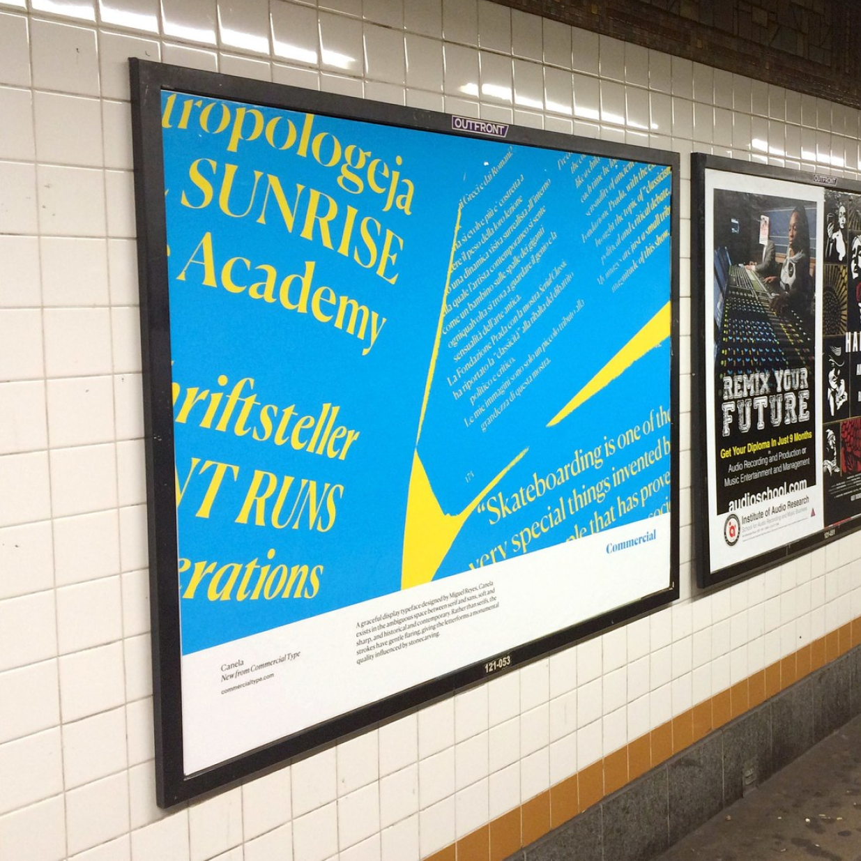
Commercial Type advertising in the New York City subway, 2016. Images: Commercial Type
IR: What do you think is the biggest challenge for independent foundries today? Is it competition, pricing pressure, free alternatives, platform dependency?
CS: I think it’s all of the above. But it’s also harder now, in general. If you’re a new foundry, there are a lot of barriers to entry, unless you want to throw in with one of the distributors.
That’s a big decision any new foundry has to make. Do you deal with all those challenges, or do you build a whole site of your own and try to find your audience? Fontdue has made it a lot easier to set up an independent foundry, which is a good thing. But none of the alternatives to MyFonts have quite caught on. And MyFonts itself has so much stuff, and I think the discounting doesn’t appeal to people the way it used to.
Honestly, my connection to the MyFonts audience is so distant at this point that I’m not sure I really know what I’m talking
IR: It’s a huge audience. It’s super hard to compete with that.
CS: But I think even MyFonts is now struggling to compete with Adobe Fonts.
And it’s also harder for new foundries with social media being a much less effective way to promote new typefaces. I don’t know what replaces that, because if I go on Instagram now, I have to scroll a long way to see anything I’ve intentionally followed. It’s just a mix of ads. The Commercial Type account has 50,000+ followers, but if we post something, we’re lucky to get 200
IR: We’re facing the same, more or less.
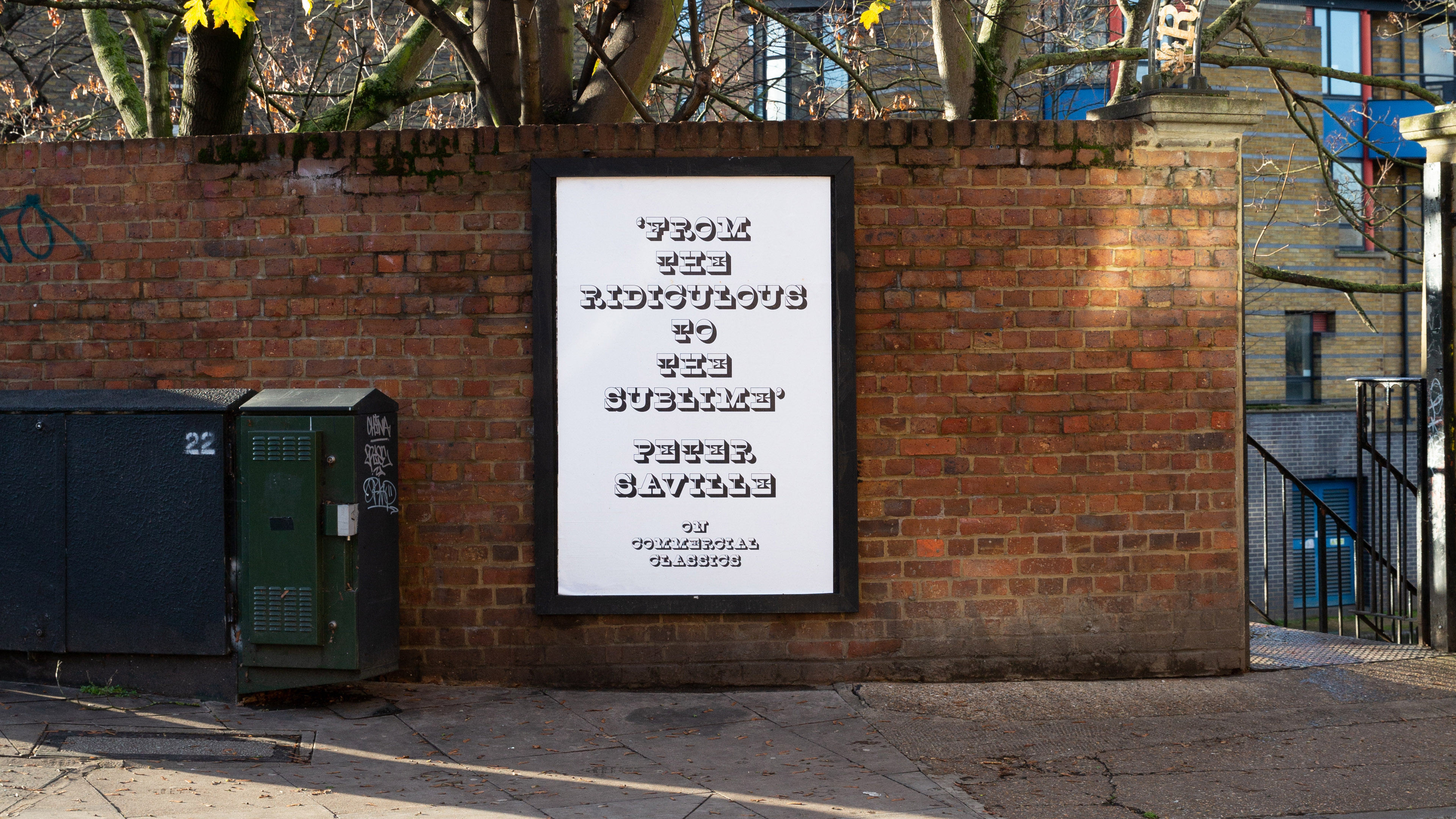
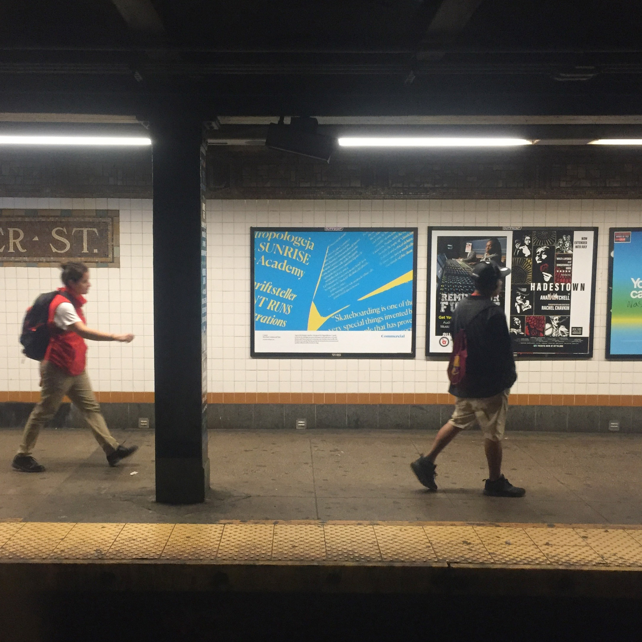
Commercial Classics poster campaign in London, 2021. Image: Commercial Type
CS: And there are no real design publications to advertise in anymore. You can sponsor events and conferences, but we’re finding that the best response to our promotions comes from the oldest thing we’ve done since the very
IR: We still might send specimens by post!
CS: We’re still printing stuff. We had a great time making the Double Acts in Pop book. My only regret in retrospect is that we made it really difficult for independent booksellers to know where to shelve it. Is it a design book? Yes. Is it a music book? Yes, definitely. Which shelf do you put it on?
IR: But it’s an awesome book.
CS: The content is really funny and interesting, and the design is incredible. But maybe we made it a little too much of the book we wanted to see, without thinking enough about getting it into the hands of a wider audience.
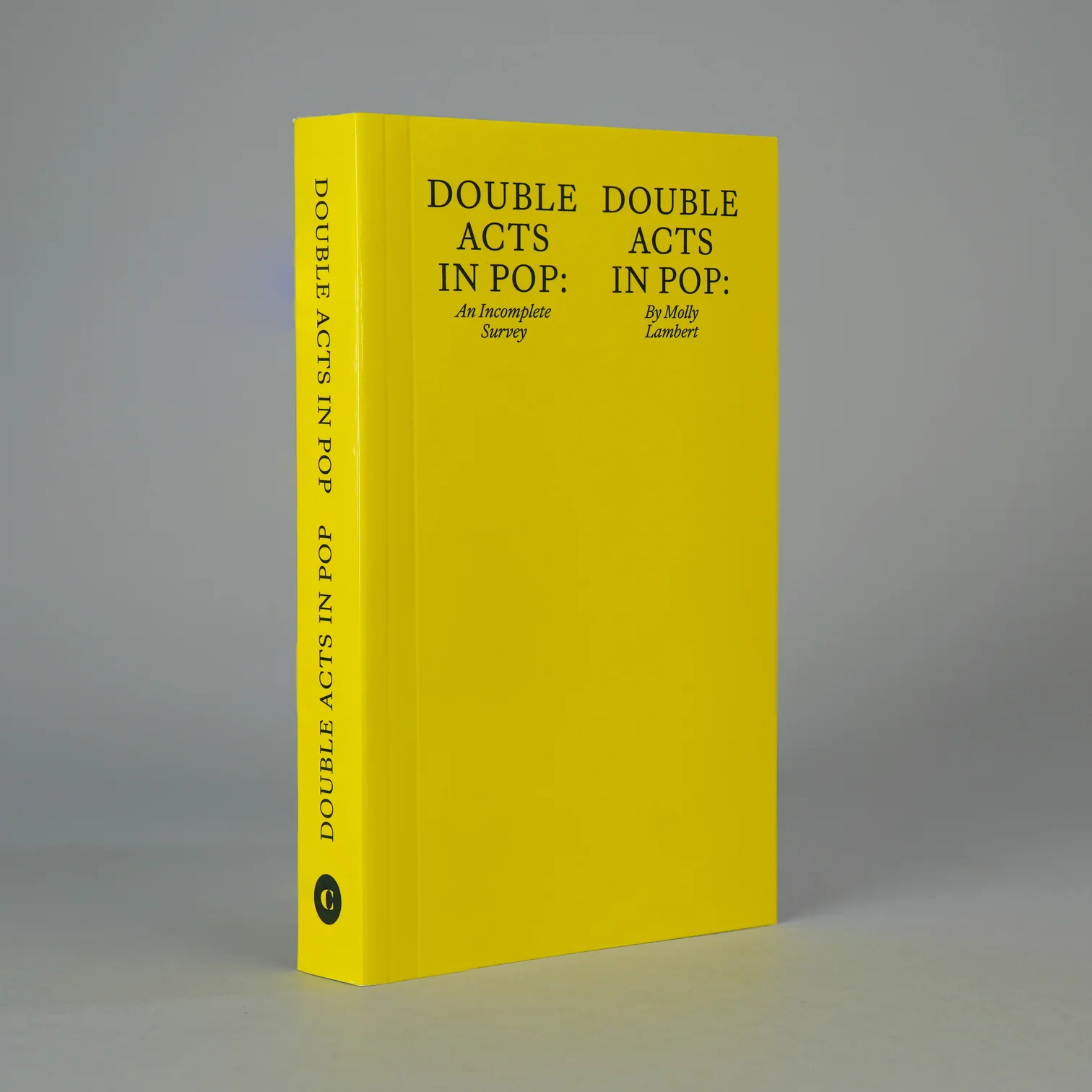
Double Acts in Pop: An Incomplete Survey by Commercial Type, 2024. Images: Draw Down Books
IR: Let’s talk a bit more about custom projects. Where does the most interesting work lie for you these days? In the brief and design process, in negotiation and implementation, or in the constraints?
CS: Type
But the thing I miss most about working with magazines is that editorial designers, and the writers they work with, tend to be really smart, engaged clients eager to be your dance partners.
IR: That’s something we can’t always say about clients from other industries.
CS: But we just did a project
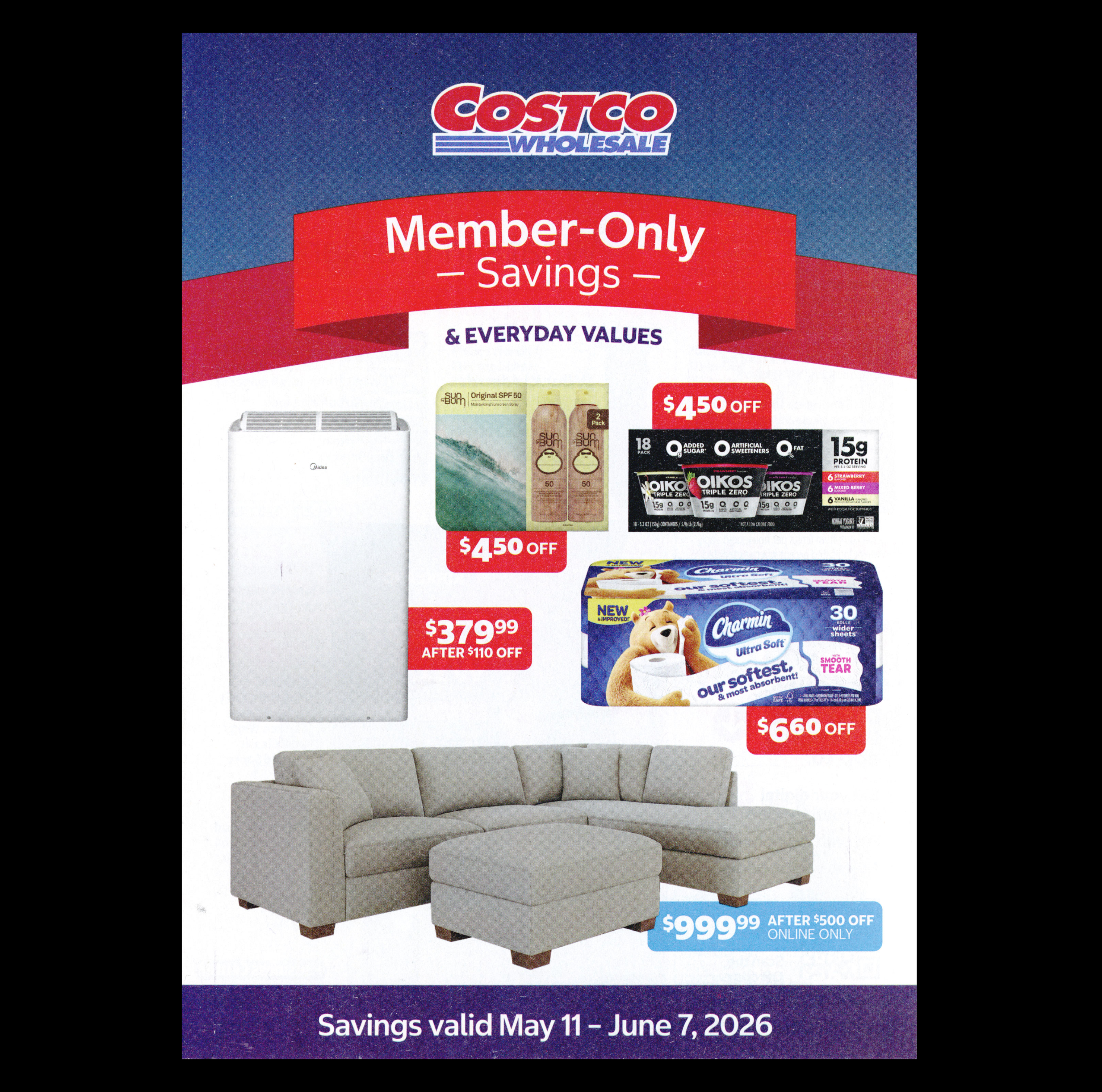
Costco leaflet, May – June 2026. Typefaces by Commercial Type. Image: Commercial Type
IR: From the technological point of view?
CS: The three things you always want from a client are that they understand the brief, that they can have a real conversation with you, and that they give clear, actionable feedback. With this client, we had all three.
Costco has eight different internal design teams, and they had a great manager to help us navigate all of this. These teams had historically been pretty separate, so this project was a way to get everyone on the same page and bring a little more coordination to how they present their visual design to the world.
Of course, we’re designers, and we care about concepts and the cultural side
For example, they have small superscripts for the cents: $450, $660, $779. The way they were handling these on the web before was a tortured process of different spans. We were able to replace that with a single OpenType feature. They were really happy. And the person in charge of the templates for the coupon book
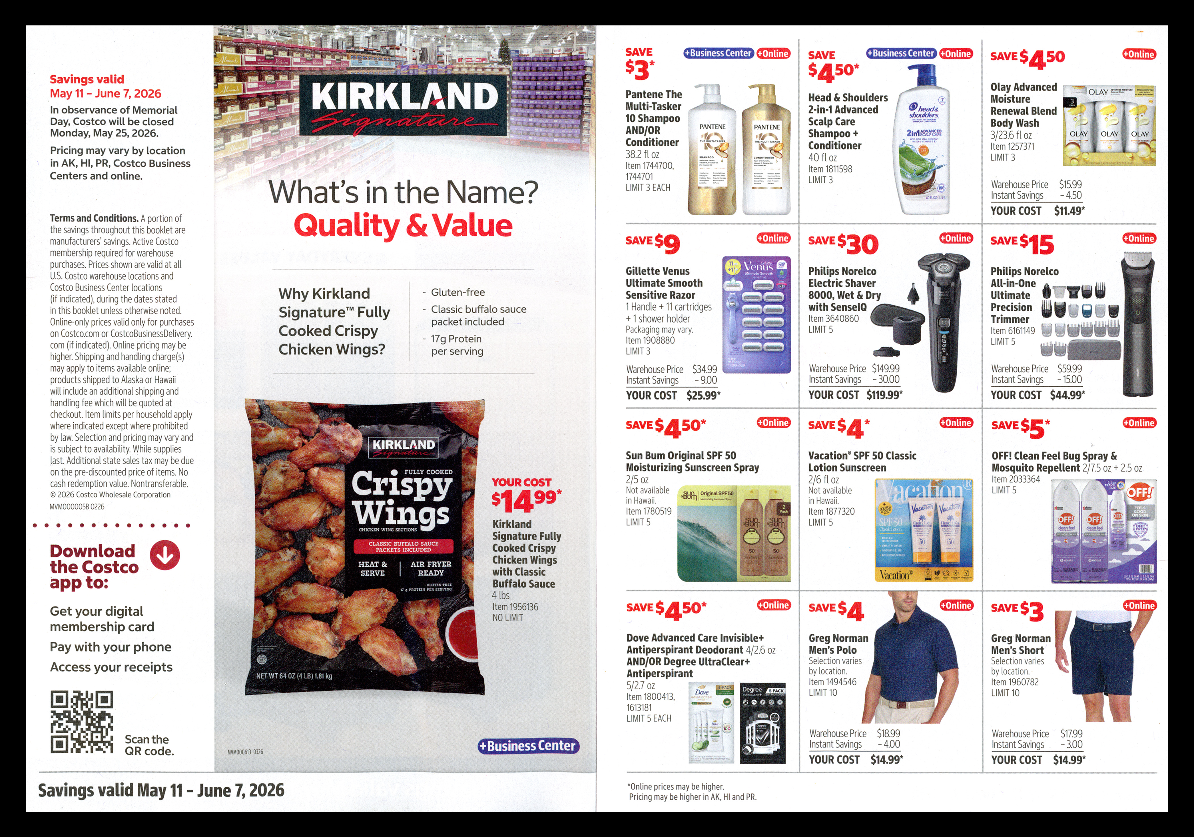
Costco leaflet, May – June 2026. Typefaces by Commercial Type. Image: Commercial Type
IR: We’ve talked about the shifts in distribution and how they can be a bit scary
CS: Monotype is the biggest player in our industry. We can’t pretend that it’s not there, and conversely, we can’t blame it for all the problems of the industry as a whole. It’s owned by private equity, and so all the decisions that they make are colored by that. How this quarter went compared to the previous quarter affects what they do in the next quarter. Independent companies don’t have to think like that. We’re operating on a very different timescale and in a less reactive way. But we don’t have shareholders screaming at us: ‘What are you doing about AI?’ And we’re kind of sitting back and waiting for the crash, maybe.
A lot of parents from my kids’ school, those who know what I do, ask me: ‘Are you concerned about AI? Do you think AI is going to erase your industry?’ I don’t see a real threat from generative AI being able to make fonts that anybody who’s interested in paying for font licensing would consider acceptable.
IR: I agree.
CS: The other side of that is that so many things are now lumped in with AI that weren’t considered AI before. Machine translation, many kinds of automation, even things you write a little macro
IR: People will be so used to seeing AI components in everything, so that they would say: ‘Guys, you are not a part of the new AI environment, so you’re probably outdated’.
CS: Maybe. But as long as there’s still enough people interested in what we’re doing, we can survive to the next stage, survive long enough to see whatever comes next.
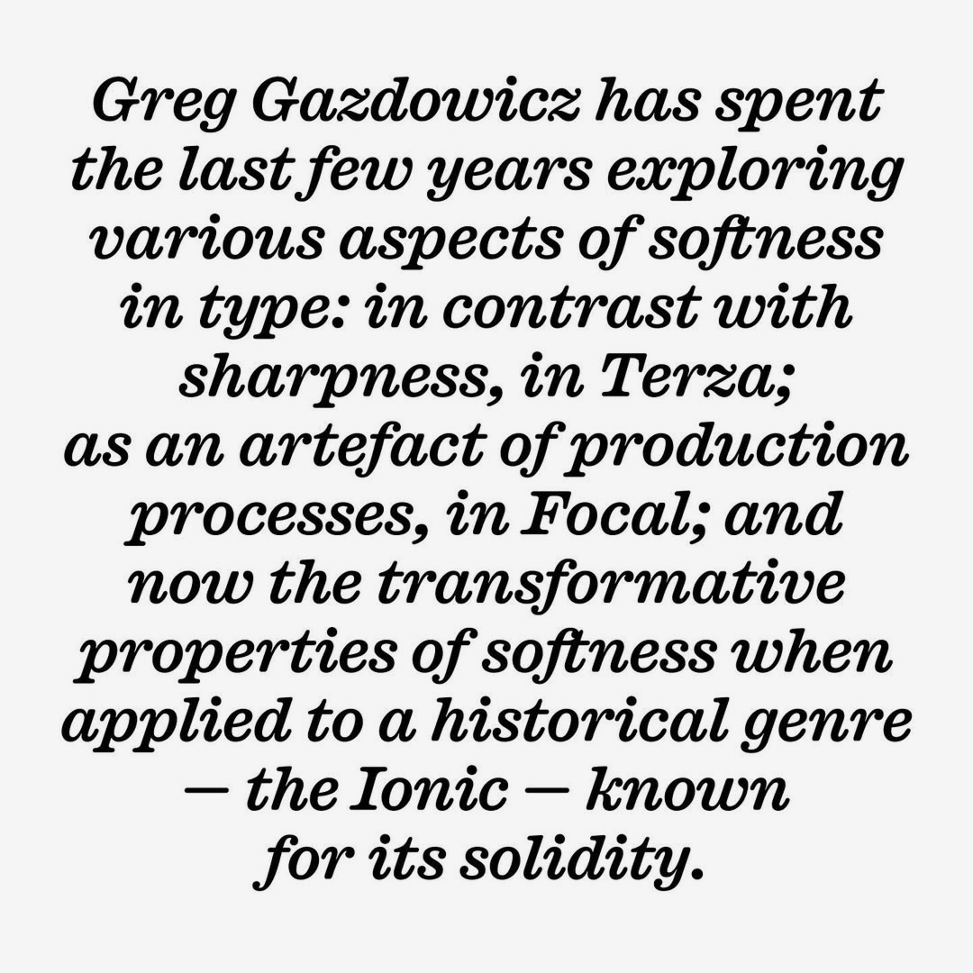
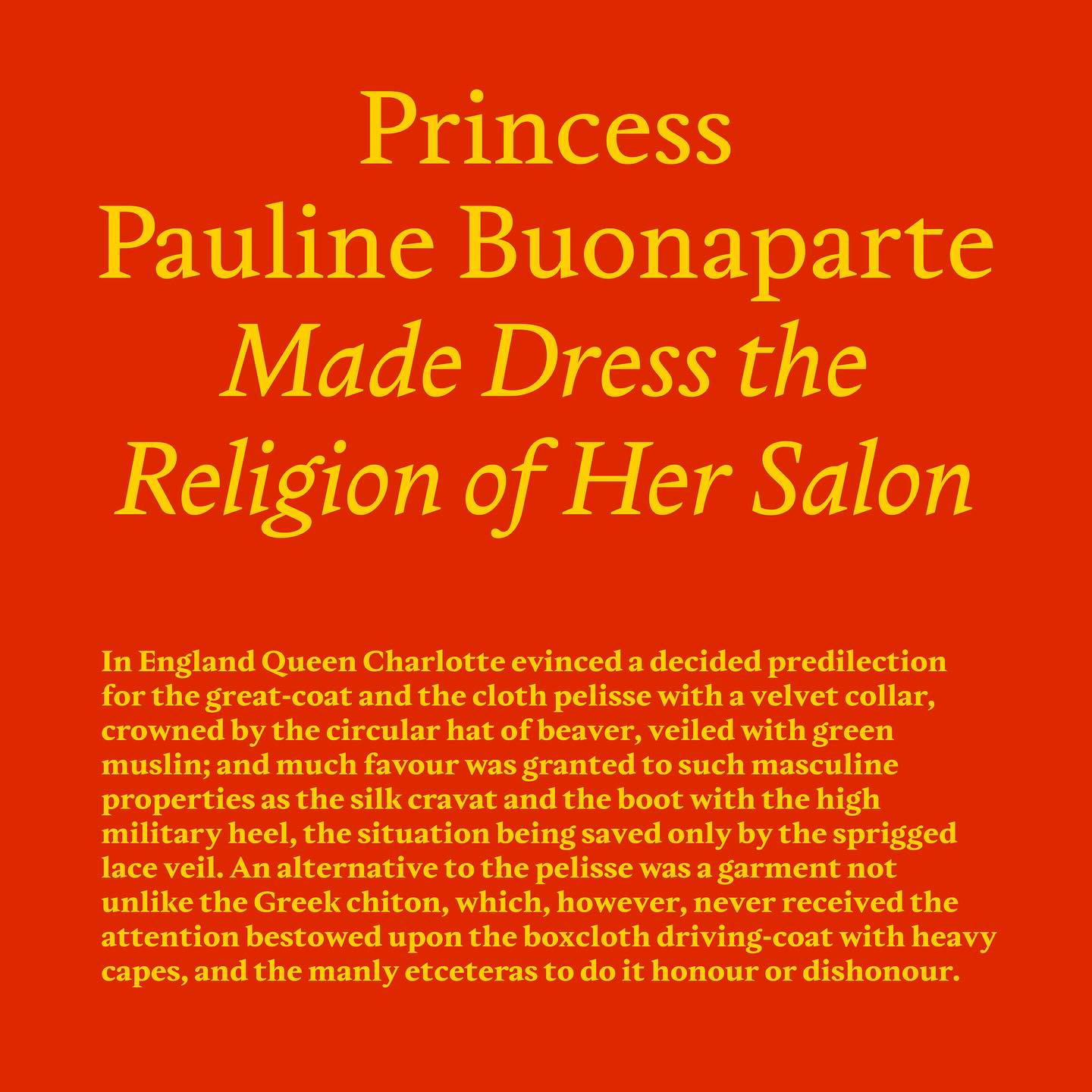
Caslon Ionic Rounded, adapted from Caslon Ionic by Greg Gazdowicz. Released by Commercial Type in 2025. Images: Commercial Type
IR: What makes you
CS: I’m old enough to have been there for TrueType GX, which came and went. And for multiple masters, which also came and went. Each of those put a lot of really interesting tools in the hands of users. But I’ll say one thing about variable fonts: Adobe’s implementation of them in Illustrator and InDesign has been
Costco wanted their font to be variable. But when we gave them the beta, the variable font ended up being 100+ lines in the style menu, and they had a really hard time with that. For most real-world applications, they needed four styles. A separate family for each width was much easier for them to manage. So for corporate design, especially guideline-heavy corporate design, variable fonts aren’t really practical: they’re too flexible, and that flexibility isn’t what these clients want. They want rules.
But for prototyping, they’re incredible. Variable fonts are the best prototyping tool I’ve ever had the chance to work with. They’ve also been useful for reducing file size on the web for certain family sizes.
So I’m not saying I told you it wouldn’t
IR: So there will be no mass adoption, you mean?
CS: I mean, I’m glad we didn’t spend a huge amount of time and money converting our whole library to variable fonts.
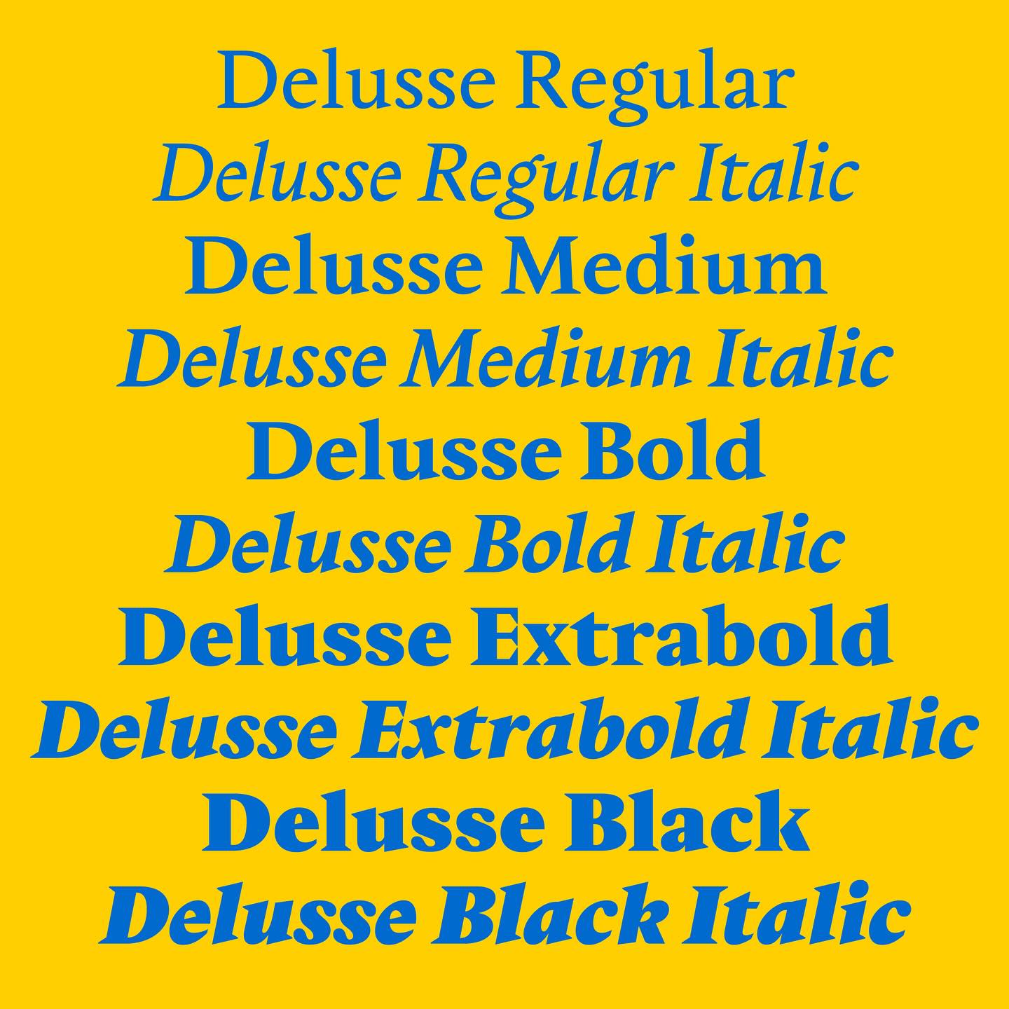
Delusse by Sandrine Nugue. Released by Commercial Type, 2025. Images: Commercial Type
IR: Coming back to my original question: what makes you optimistic or curious about the future of the profession?
CS: More typefaces are coming out than
Our designers and I had a conversation during COVID, when we were all remote, about whether things would go back to whatever normal looked
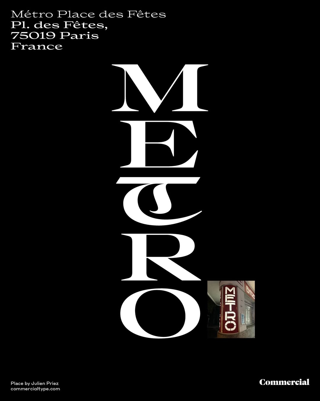
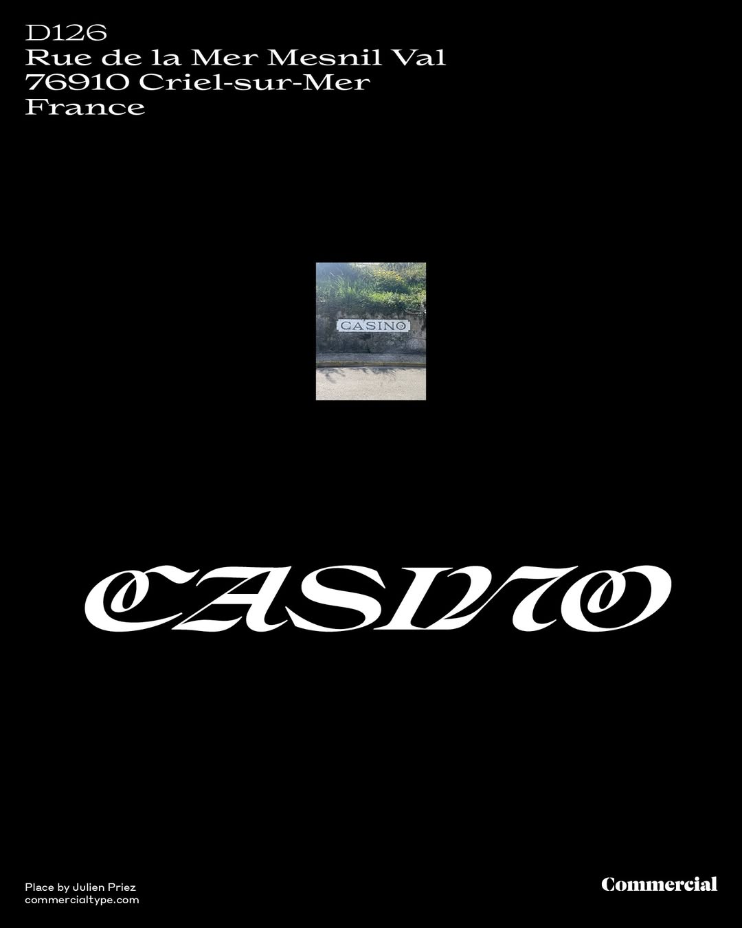

Place Display by Julien Priez. Released by Commercial Type, 2025. Images: Commercial Type
IR: If we look back from 2036, what do you think will seem most characteristic of this moment in type design?
CS: It’s unbelievable that we’re all still so interested in Helvetica’s grandchildren. So that will probably be the defining look: ‘Wow, those guys were still looking at the grandchildren of Helvetica.’
IR: It’s
CS: It’s almost like a rite of passage now: ‘You haven’t drawn
IR: Or maybe not. We’ve recently been discussing how to make the humanist sans-serif feel fresh
 Myriad by Robert Slimbach, Carol Twombly. Image: Adobe
 Fedra Sans by Peter Biľak. Image: Typotheque
CS: Fedra, Thesis, and Gill Sans never really caught on in the US. But Myriad and Frutiger came back, and Scala did break through. I think that might have been almost single-handedly down to Abbott Miller and Ellen Lupton — they loved it, used it for a number of really influential projects, and it showed. And of course, there was Meta.
It’s funny that all of that went away. Microsoft still uses Segoe, but when I’ve seen it lately, it looked more geometric. So I wonder if the humanist sans-serif is missing from the landscape right now. Maybe it will come back.
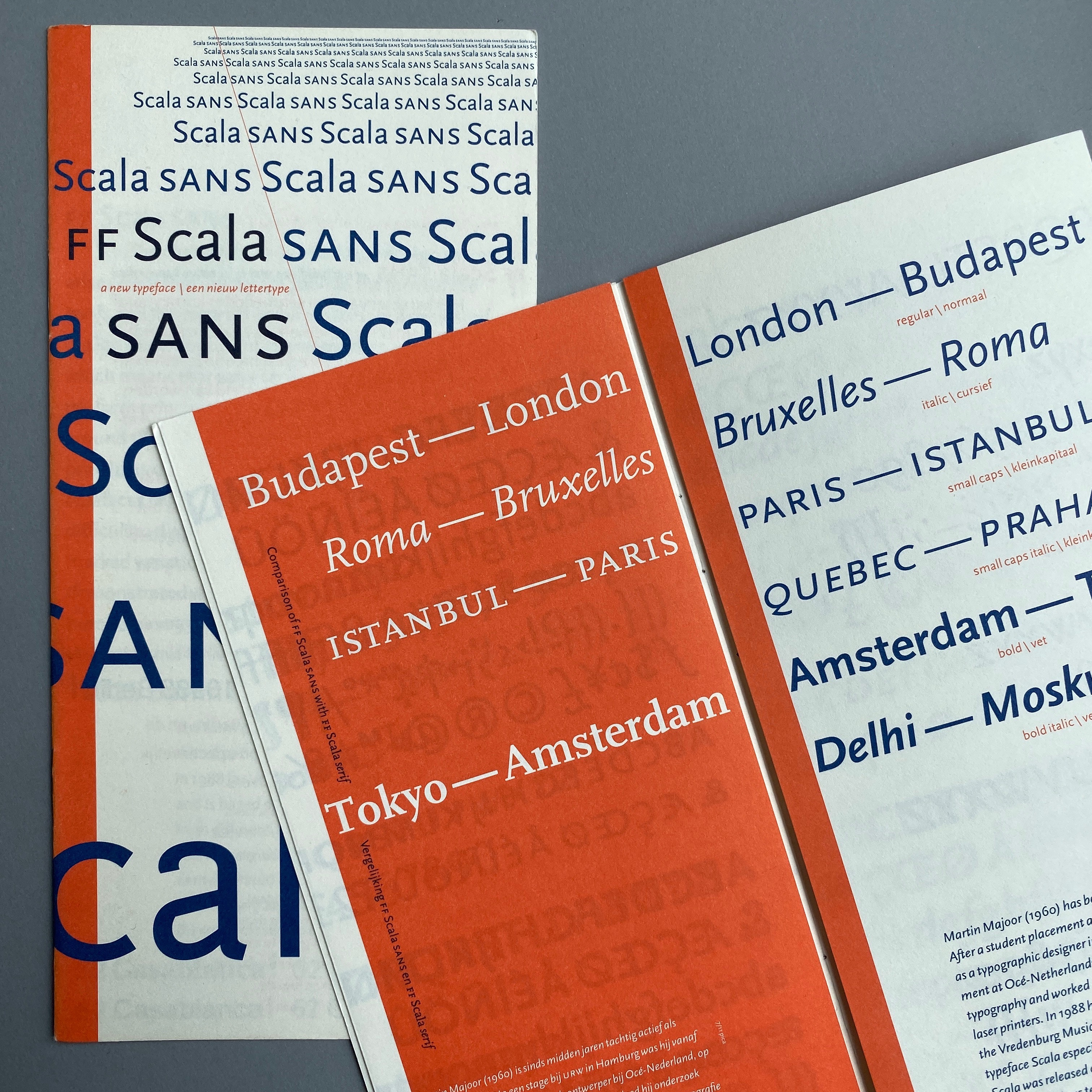 Scala by Martin Majoor. Specimen design by Jaap van Triest. Image: Martin Majoor
IR: It will. I’m sure it’s coming.
CS: I think it might be slower to come back because all neo-grotesques are in some way in conversation with Helvetica. So I feel like the new humanist sans serifs are going to be in conversation with Gill Sans, Meta, or Frutiger. That may be a little less digestible for type designers to latch onto.