Typefaces of the Month, Matthijs Sluiter’s Picks
Fonts In Use editor and Type Specimens curator Matthijs Sluiter has selected the most notable typeface
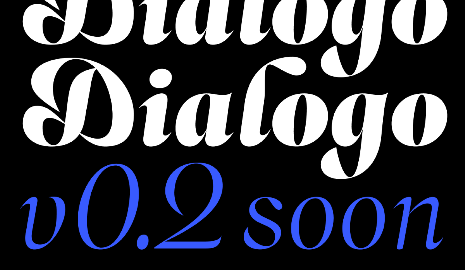 Dialogo, Zhenya Spizhovy and Felix Bamforth
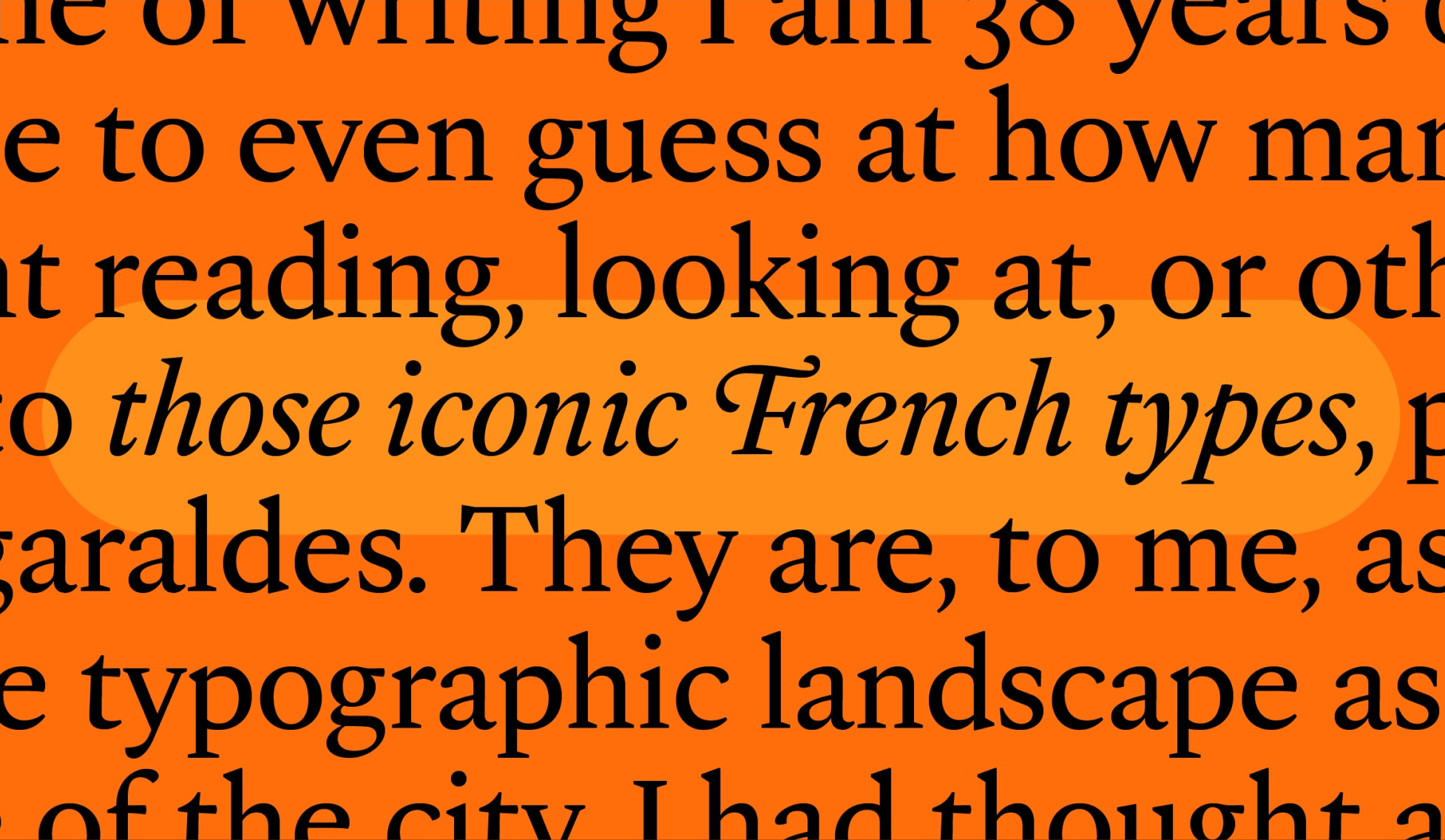 Gagneur, Tiny Type Co.
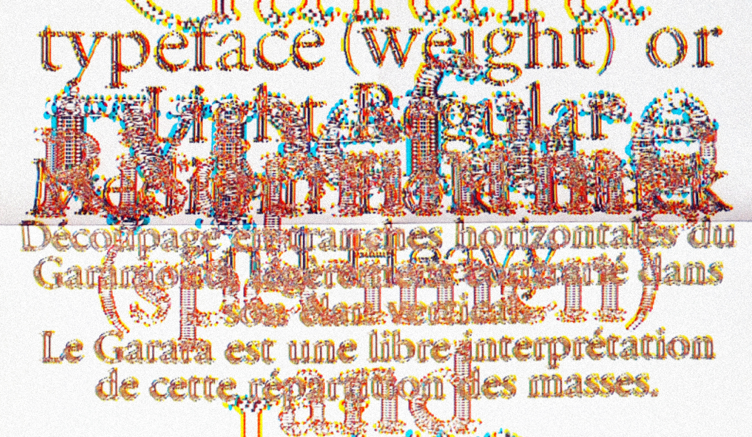 Garara_alt, Benoît Bodhuin
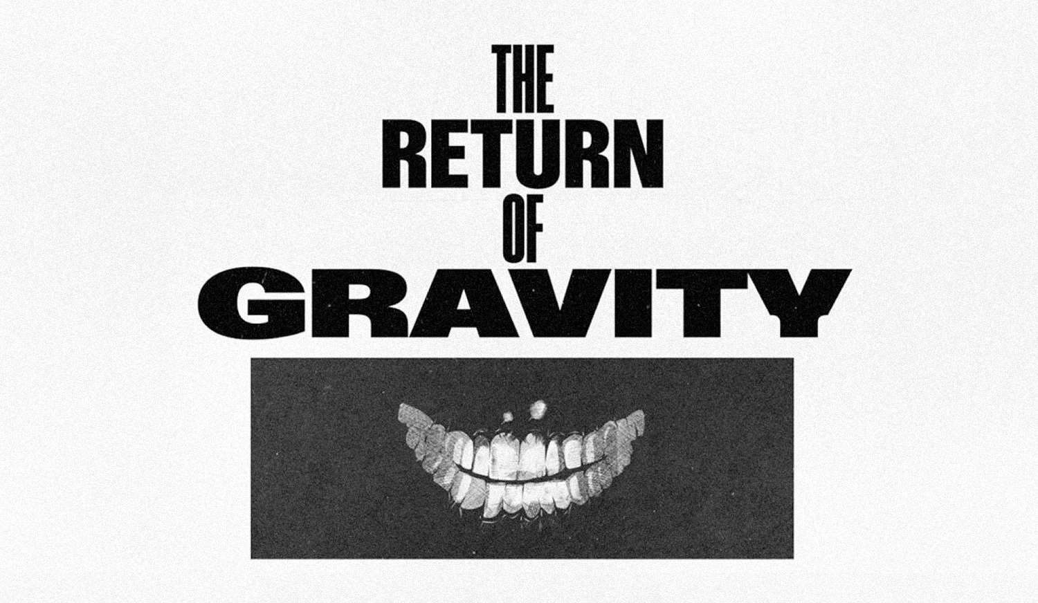 Gravity 2.0, ABC Dinamo
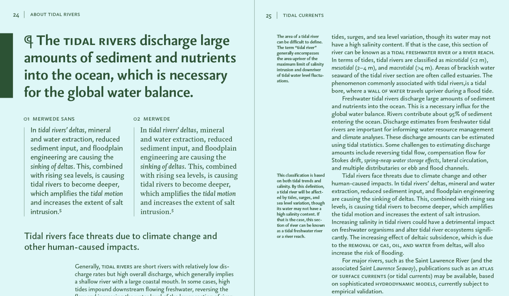 Merwede Sans, Bold Monday
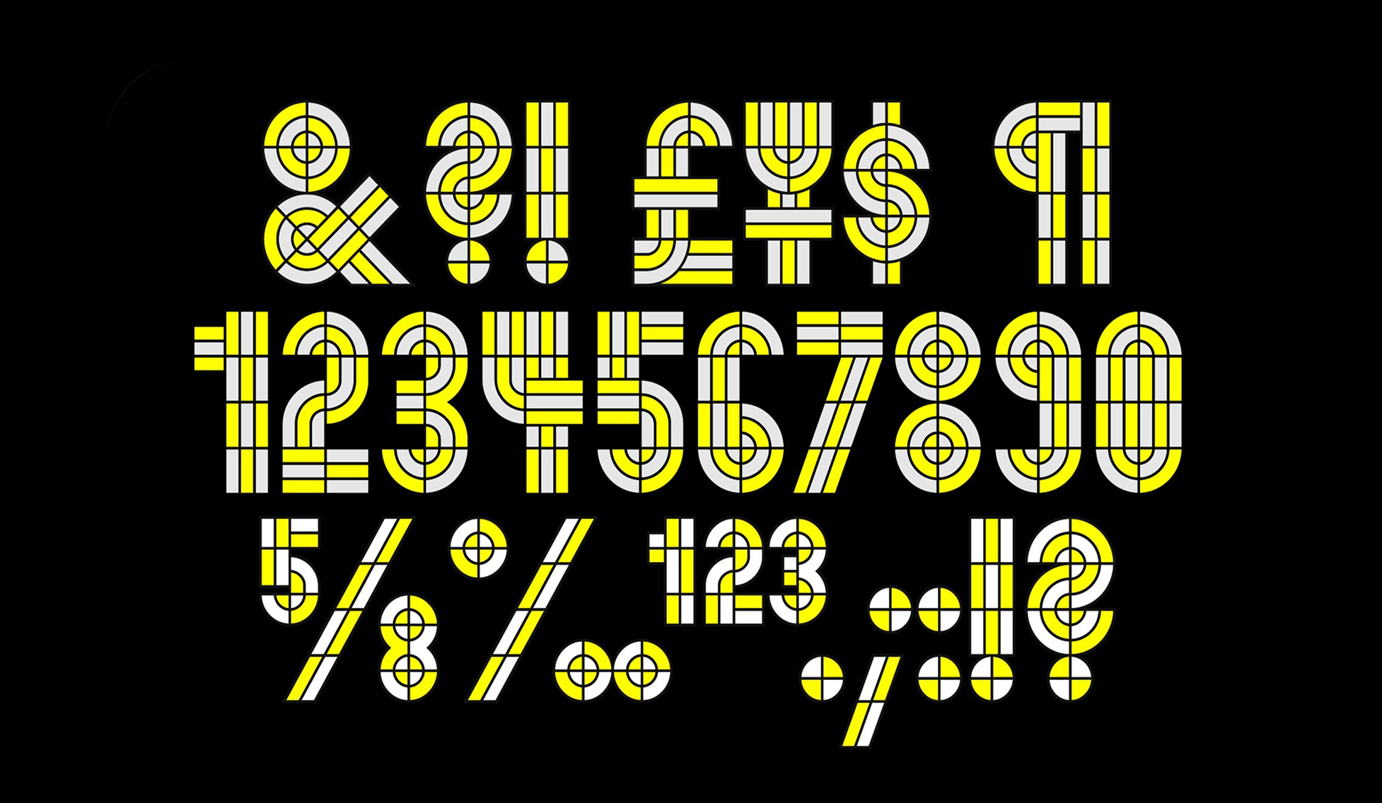 Monoform, Out of the Dark
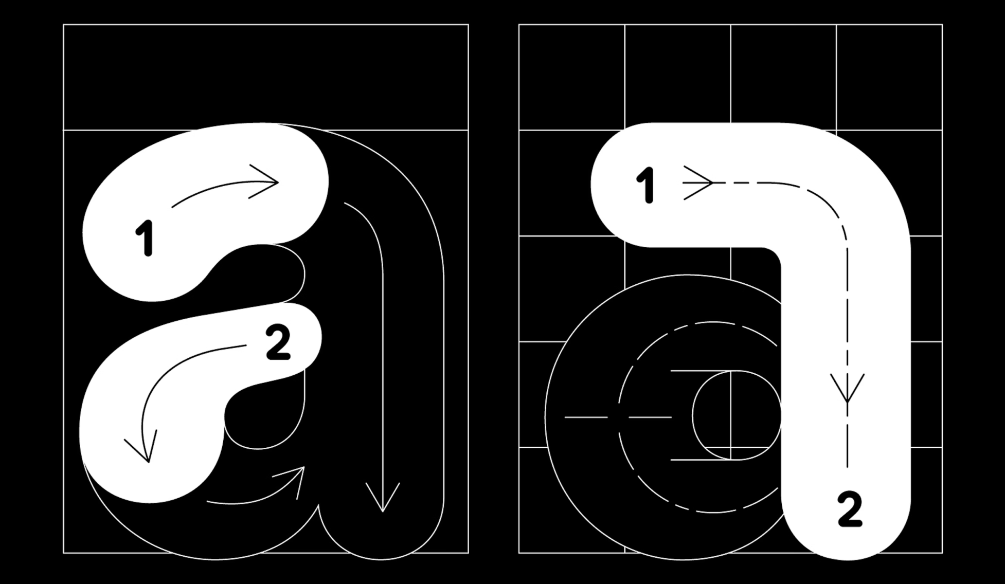 Plastik, AllCaps
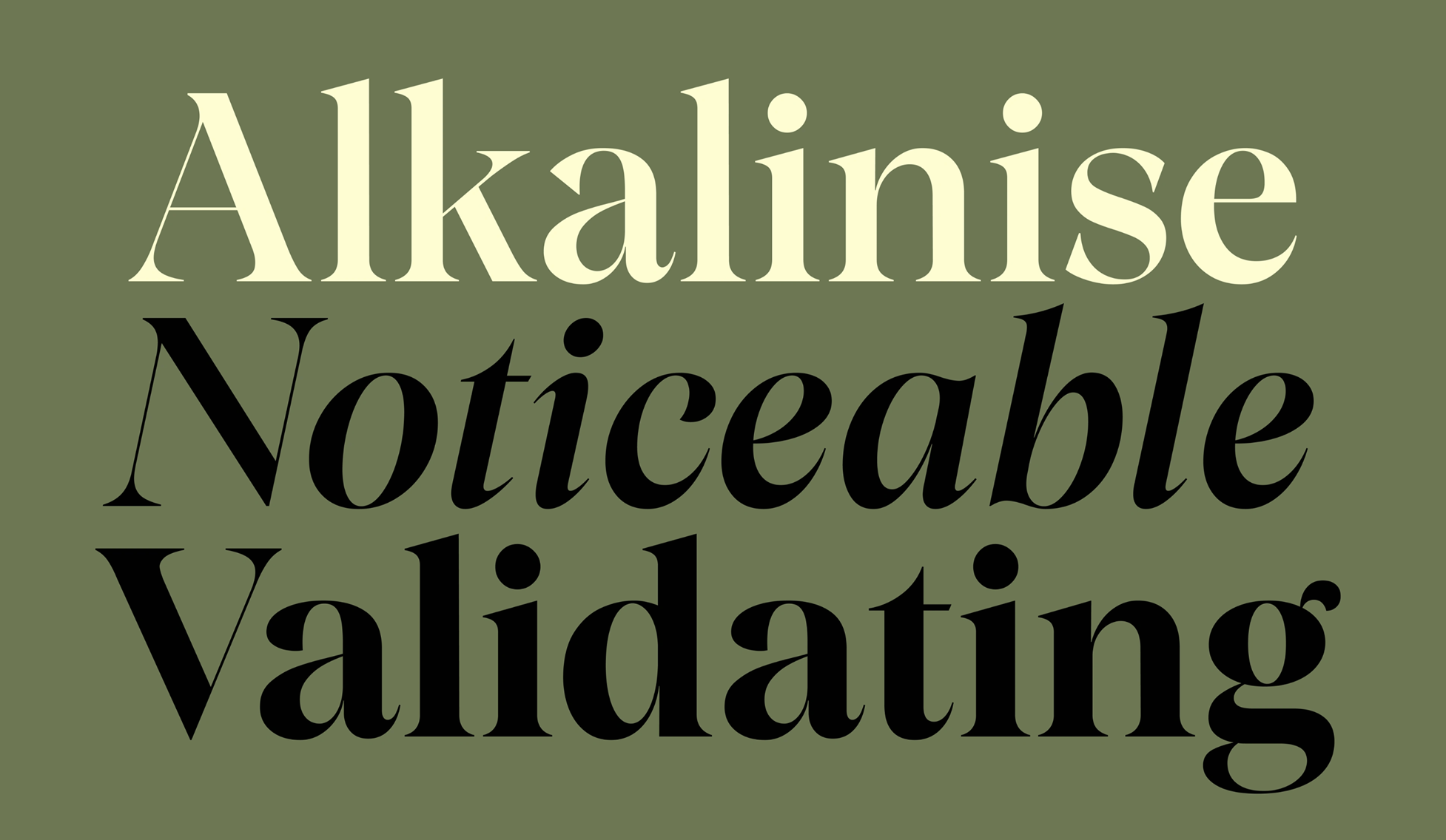 Resan, The Designers Foundry
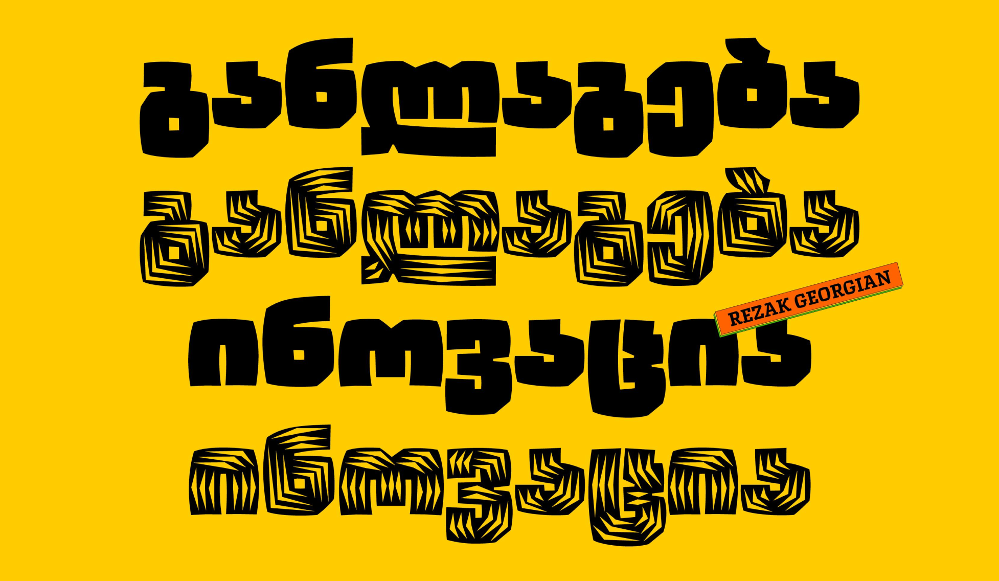 Rezak Georgian + Rezak Armenian, Anya Danilova
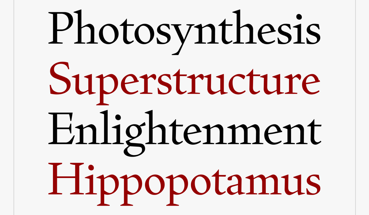 Fern Display Roman, David Jonathan Ross
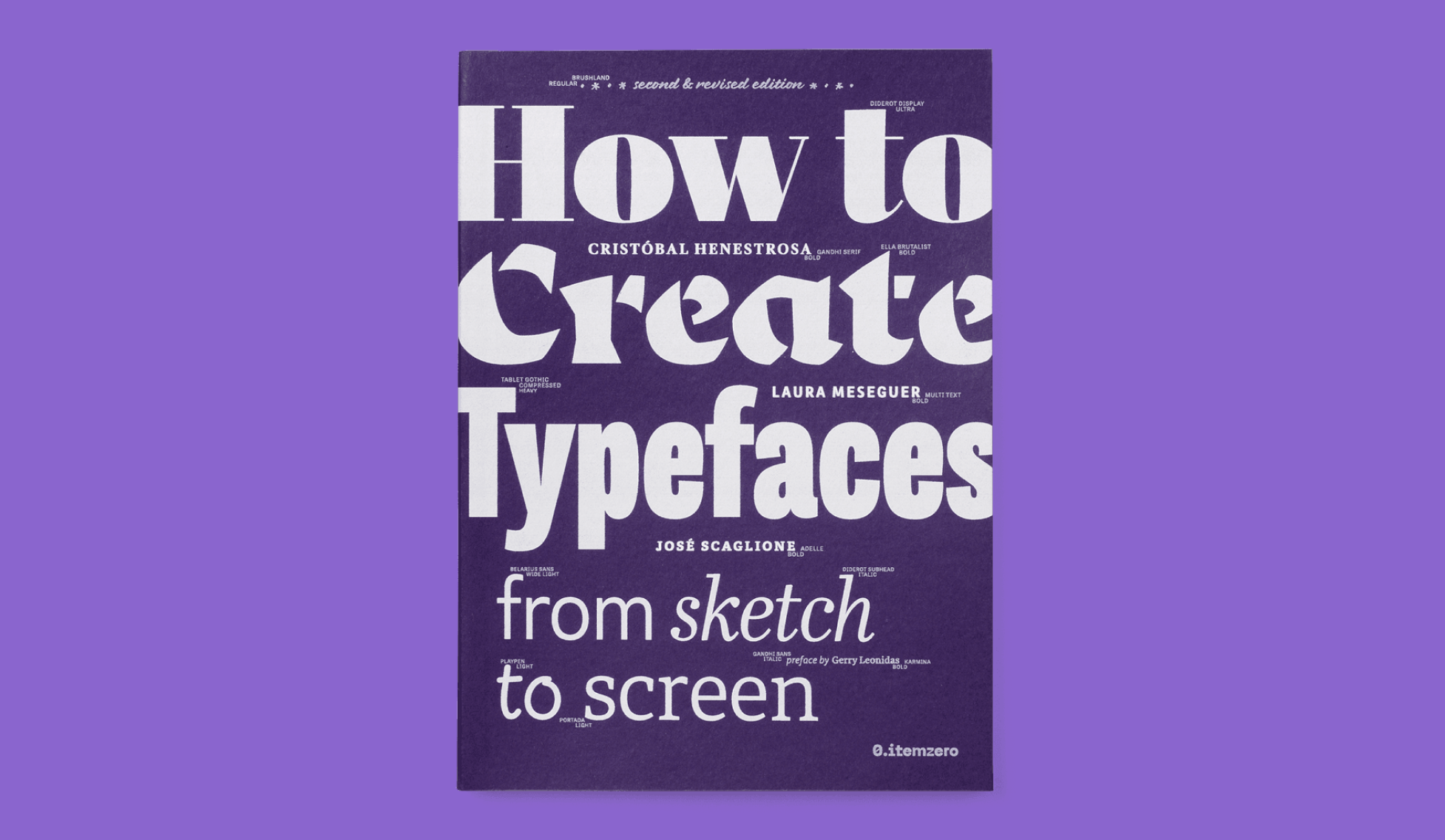
How to Create Typefaces, from Sketch to Screen 2.0
shop.itemzero.com/products/how-to-create-typefaces
The second edition of the book by Cristóbal Henestrosa, Laura Meseguer, and José Scaglione is out. It explores how to handle optical compensation, digitize sketches, and preserve a typeface’s personality while extending its character set. A free sample excerpt is available to download on the book’s webpage.
Alchetype by Ando
Type designer, educator, Gerard Unger Scholarship recipient Anne-Dauphine Borione has launched a newsletter. In the first letter, she tells about the female video game characters that inspired her as well as gives some tips on how to recover from burnout. Further down the line, Borione promises to teach her readers to do kerning using a gaming joystick.
TypeMedia 2025–2026
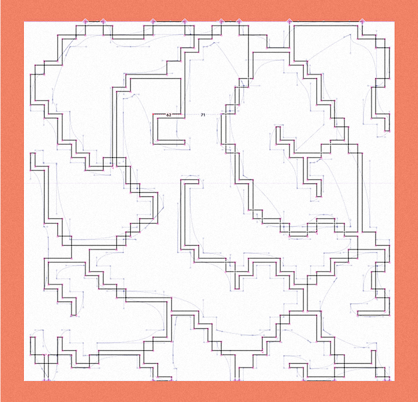
The TypeMedia class of 2025–2026 presented their graduation projects. The list includes a typeface inspired by Lithuanian wood-carving techniques, an attempt to create a font family as a rock-punk-K-Pop-band, and an exploration of what happens if you start designing a multi-script typeface with Arabic rather than Latin.
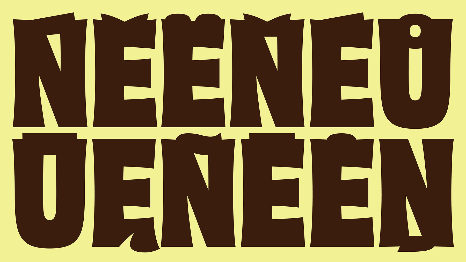 Ladder by Gintarė Razmaitė
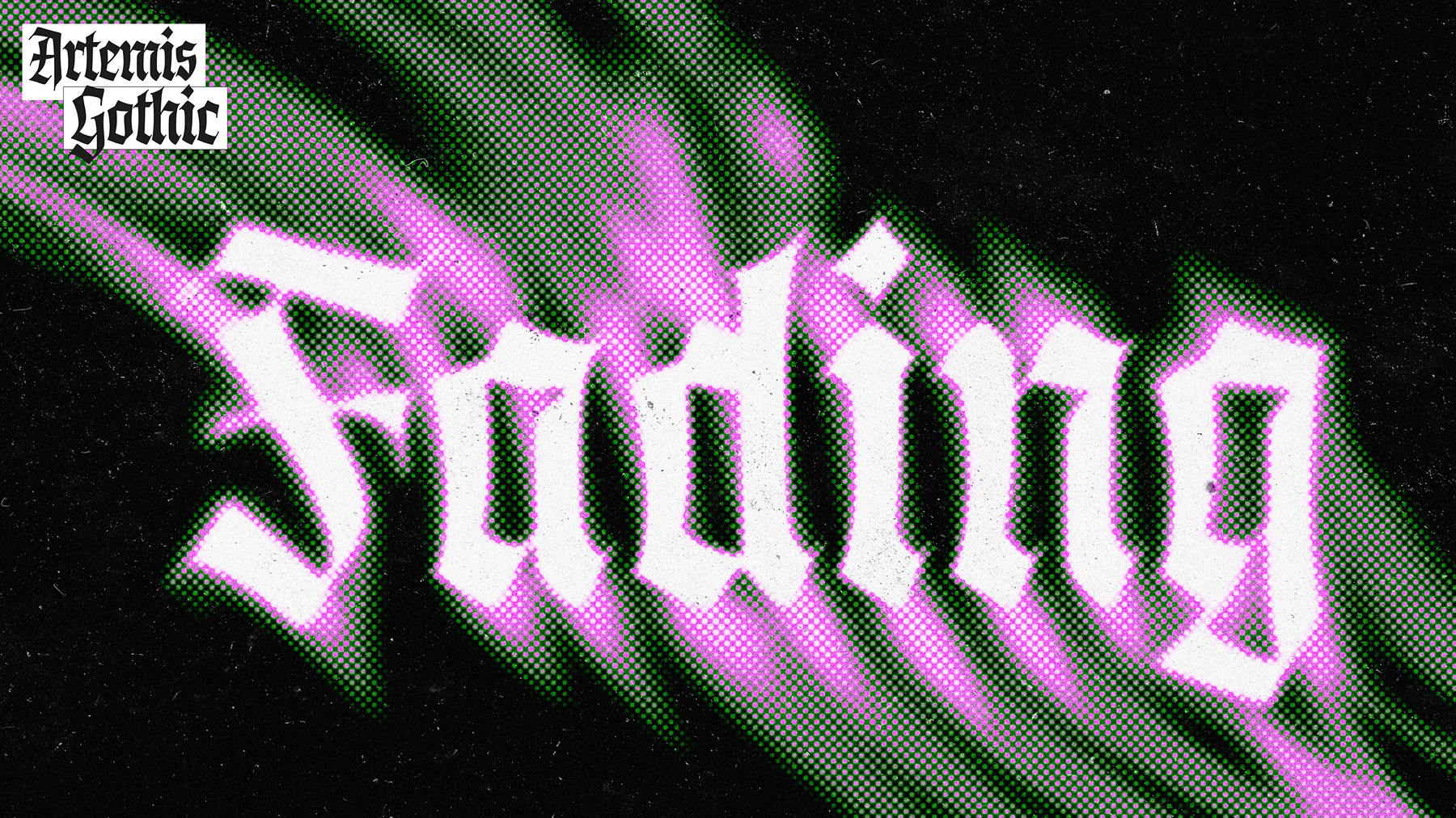 Artemis by Adriana Garcidueñas Villalobos
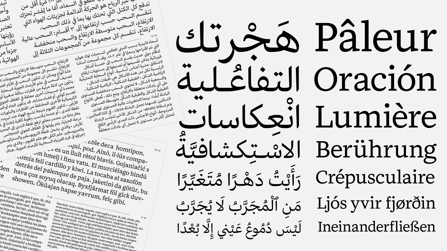 Triolet by Maryam Golpayegani
Tal Leming on Cartographic Typefaces
The Cooper Union YouTube channel posted a talk by Tal Leming: he shares how he designed a cartographic typeface for the National Geographic
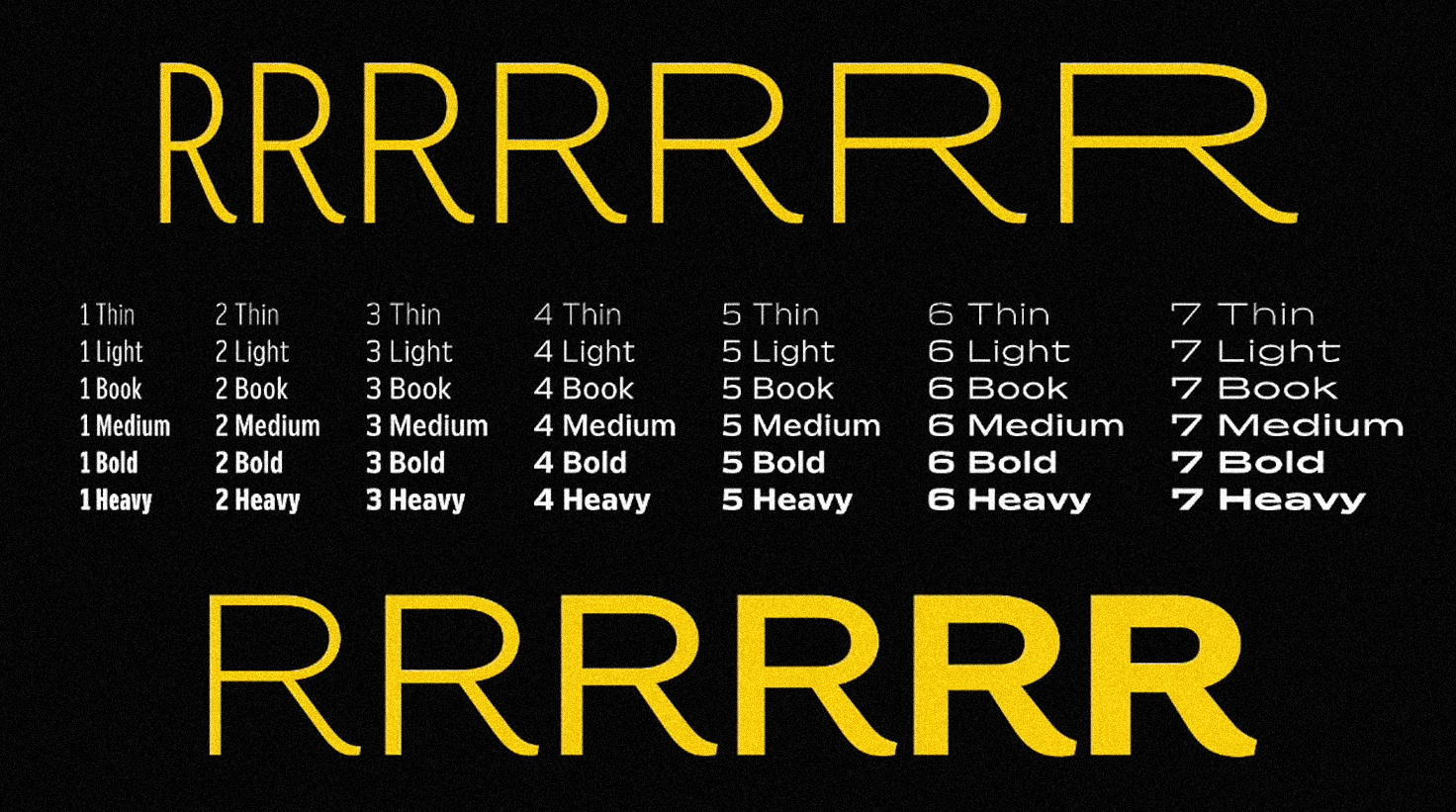 Gibbons Sans. Tal Leming’s Typeface for the National Geographic Society
Mass-Driver against AI
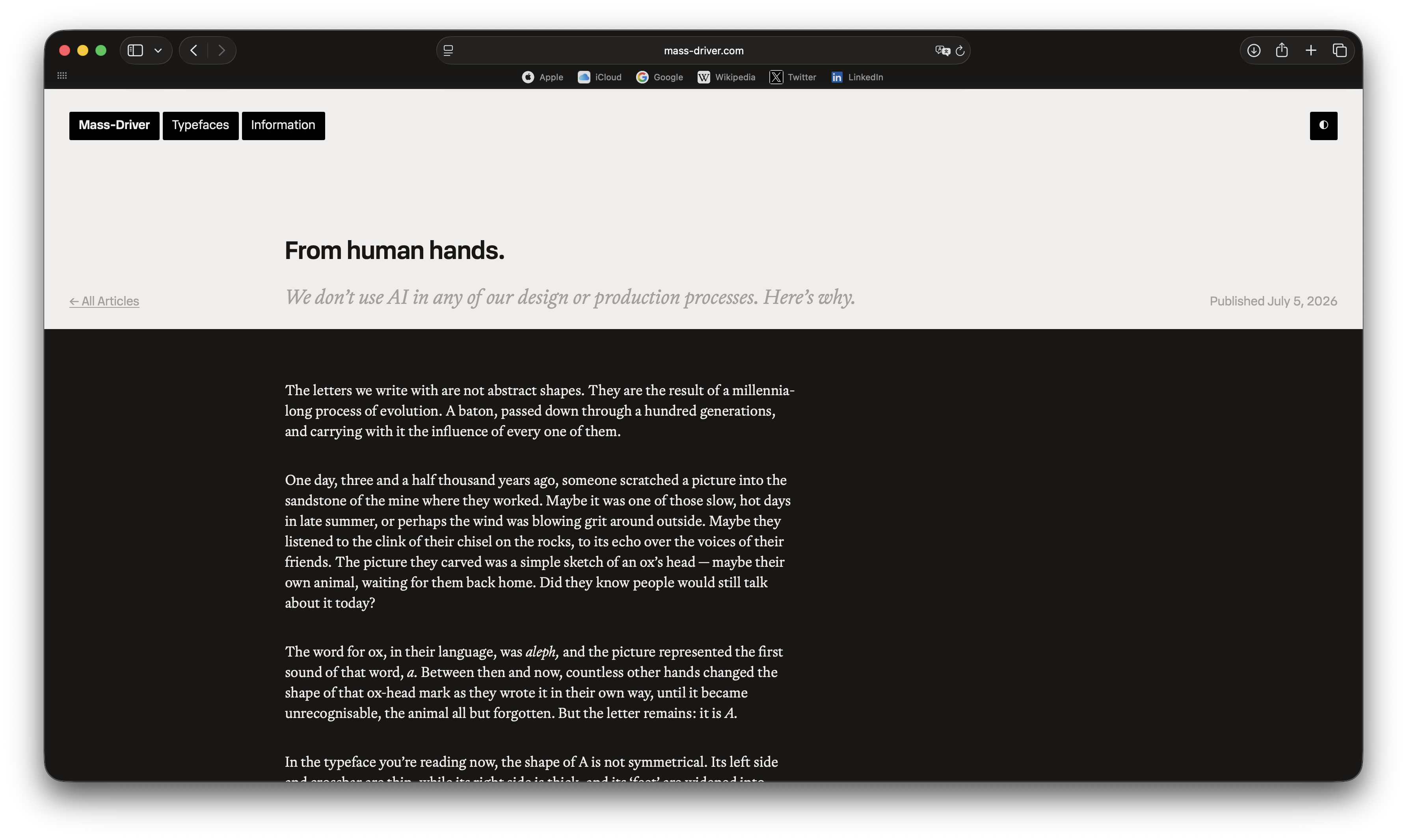
mass-driver.com/article/from-human-hands
Rutherford Craze, founder of Mass-Driver foundry, wrote a romantic article on why he’ll never use AI in his projects. In the piece, he reflects on how a person who first scratched an ox’s head on a cave wall (or painted the first-ever serif with their flat brush) might have felt. Craze reminds us that none of these emotions are known to a machine that perceives history as a set of data.
Type and Anxiety at Type Electives
typeelectives.substack.com/p/introducing-our-new-fall-lecture
Type Electives introduced the topic and curator of their fall lecture series. The lectures of the new season will focus on a ‘shared anxiety’: how to design type and build a font business in turbulent times like these. Type designer Flavia Zimbardi is responsible for the choice of speakers.

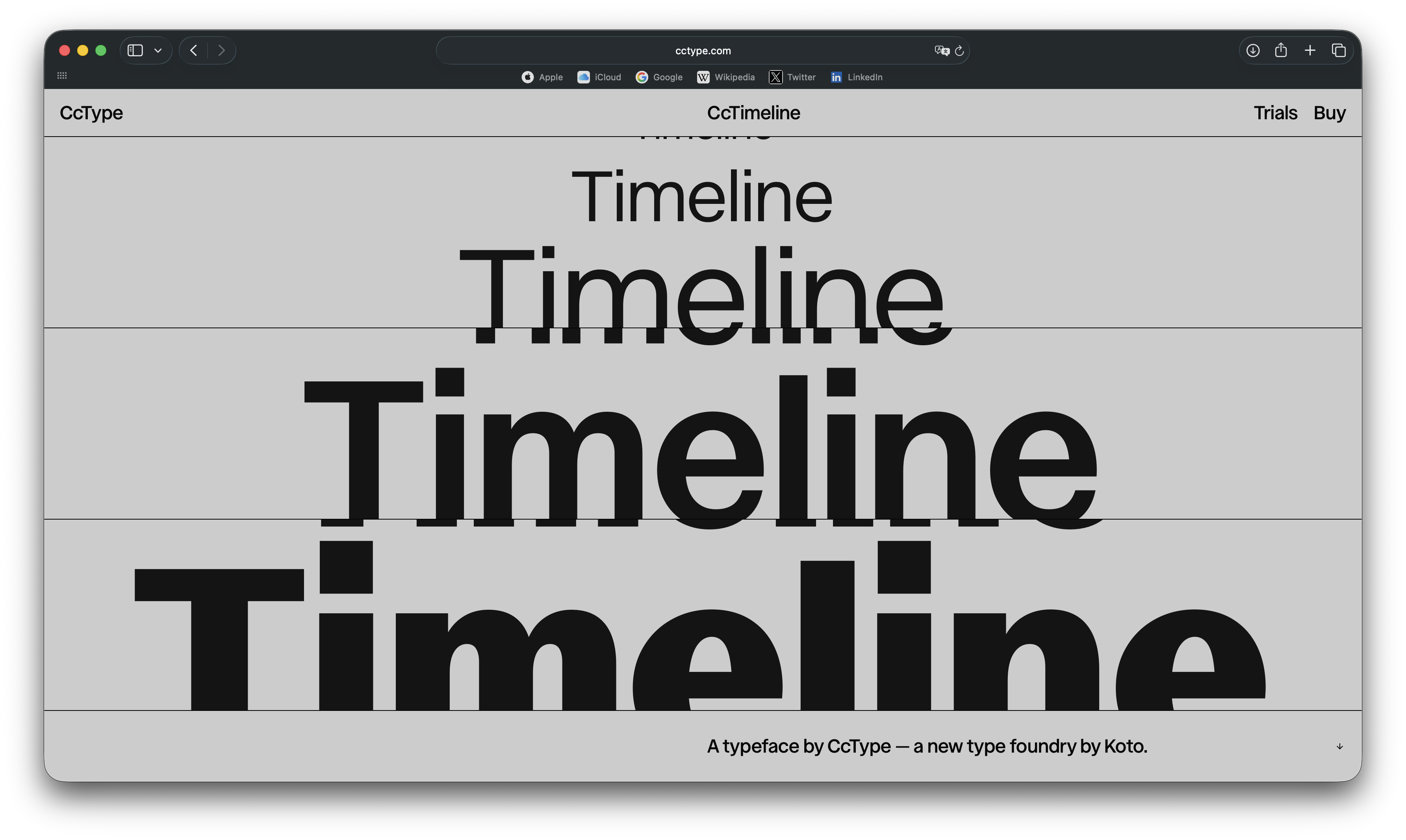
CcType by Koto
The design studio Koto — the ones who did rebranding for Amazon and
As of now, it offers only one typeface: CCTimeline, a versatile sans serif available in 18 styles. The type community got mad at the studio for copying — up to every word — a joke by Kris Sowersby in the font’s technical specifications and the first paragraph of Rutherford Craze’s license text. However, both elements were removed from the site once designers confronted them.
ATypI in Sharjah
atypi.org/conferences-events/atypi-2026-sharjah/program
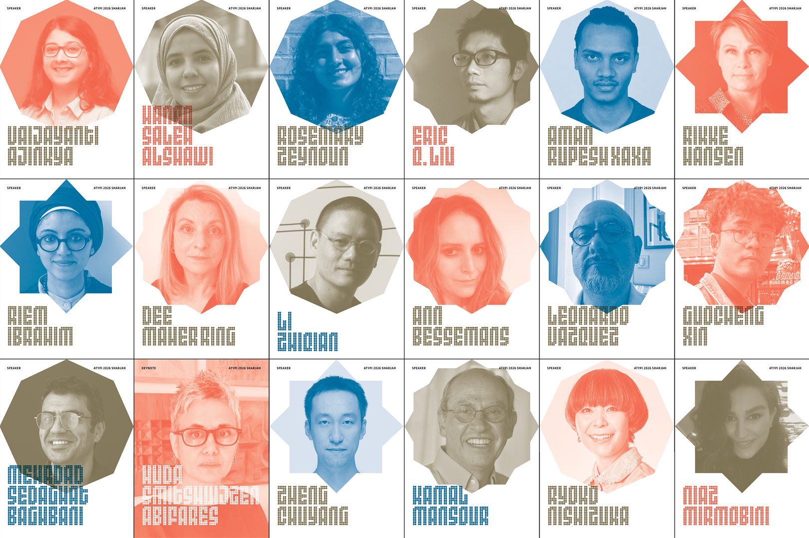
This year, the ATypI conference is split into two parts. The first has already been held in Stanford, while the second is set to take place in the UAE in late October. The event will focus on democratic fonts, typefaces for license plates, and type that is here to influence reading practices in Latin-based languages.
WTF Is Grade?
adobe.design/ideas/keeping-type-consistent-in-changing-conditions
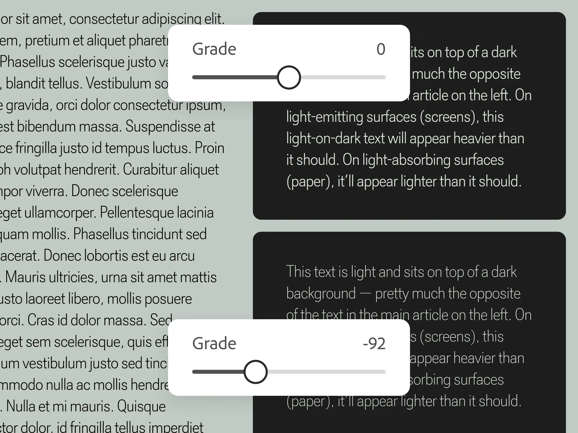
Adobe Design published an article by Elliot Jay Stocks explaining why type needs the grade
TypeCon 2026
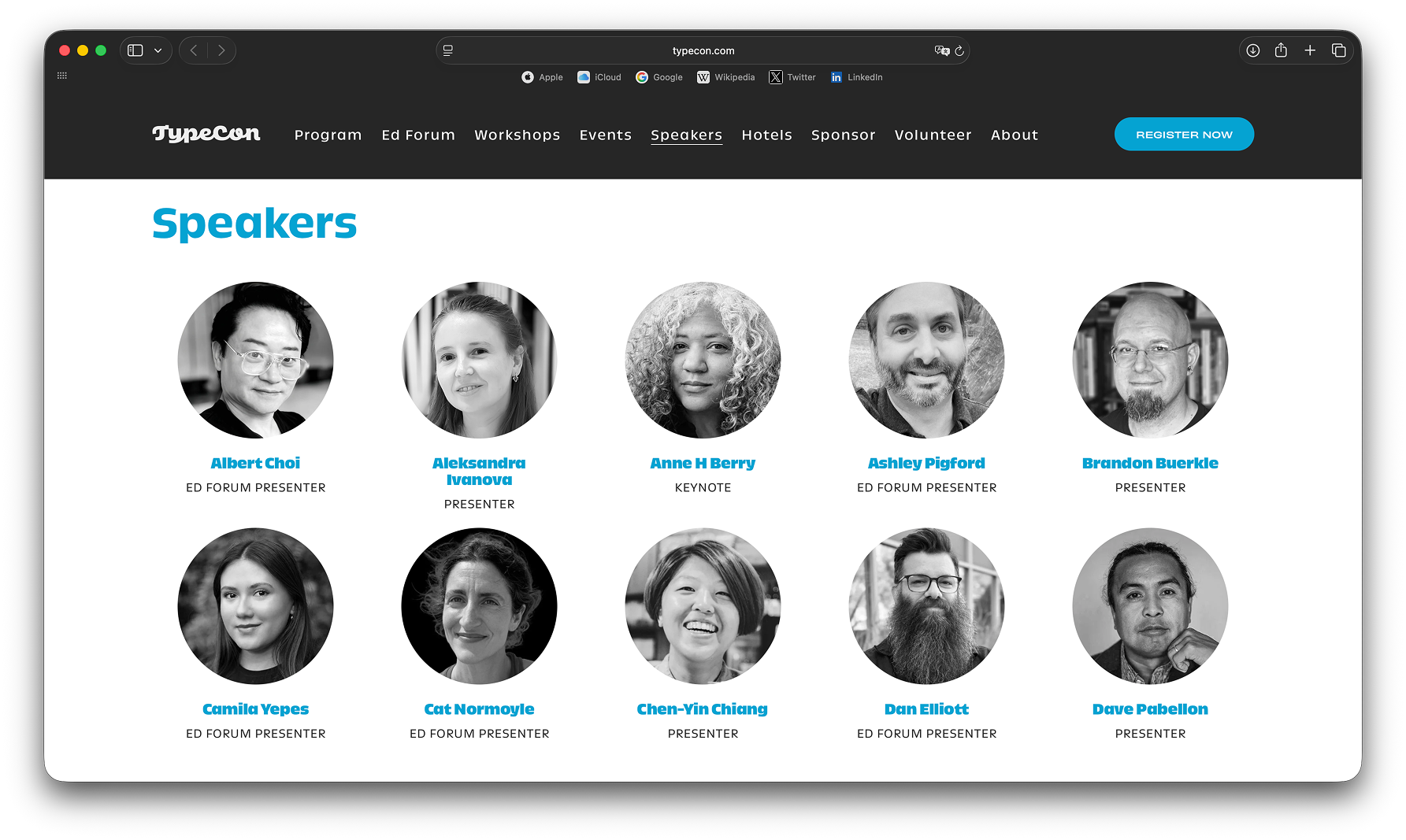
TypeCon, the annual conference held in Portland, has announced this year’s speakers. The list includes TypeTogether co-founder José Scaglione, type designer Mark Simonson, and Type Thursday founder Thomas Jockin.
New Design for Euro Banknote?
ecb.europa.eu/euro/banknotes/future_banknotes/html/design-proposals
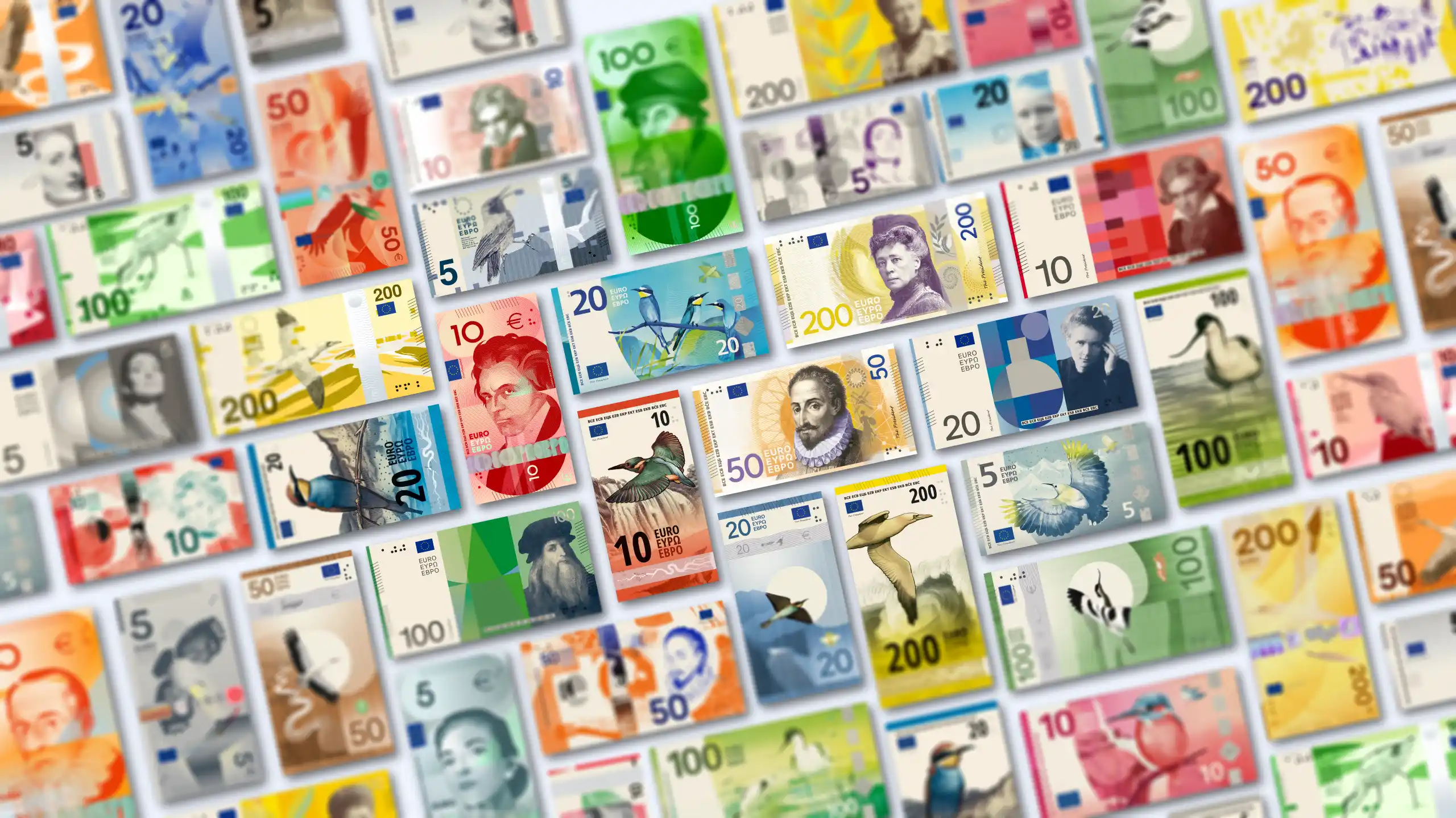
The European Central Bank is inviting people from around the world to vote for a new design for euro banknotes. The bank website features a shortlist of ten designs created by ten Europe-based designers: five of them propose replacing bridges with birds, while the others suggest using the faces of cultural figures instead.
The ECB states that it provided some guidelines and a set of required elements, but doesn’t reveal what exactly those guidelines implied.
Khajag Apelian at Words of Type
The Words of Type educational platform has announced a lecture on contemporary Armenian type by Khajag Apelian. On October 23, Apelian will talk about how designers work with the Armenian script and the possibilities of the Armenian type community.
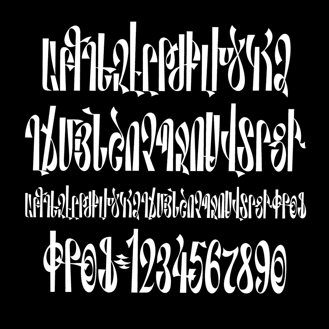 Lettering from Hajak Apelian’s collection. From the announcement of the lecture on Words of Type’s social media
Coca-Cola Updated
brody-associates.com/work/tccc-better-with
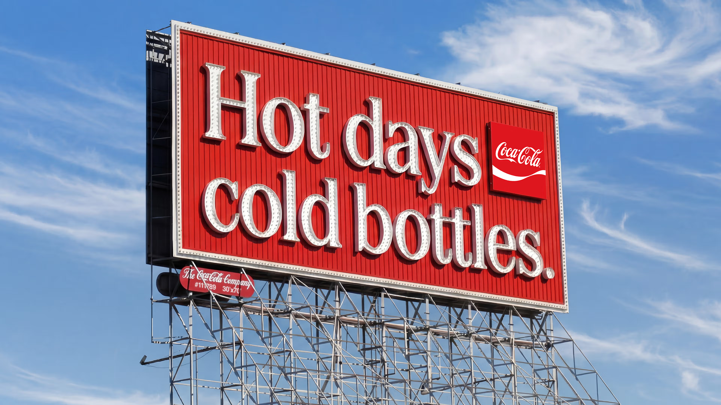
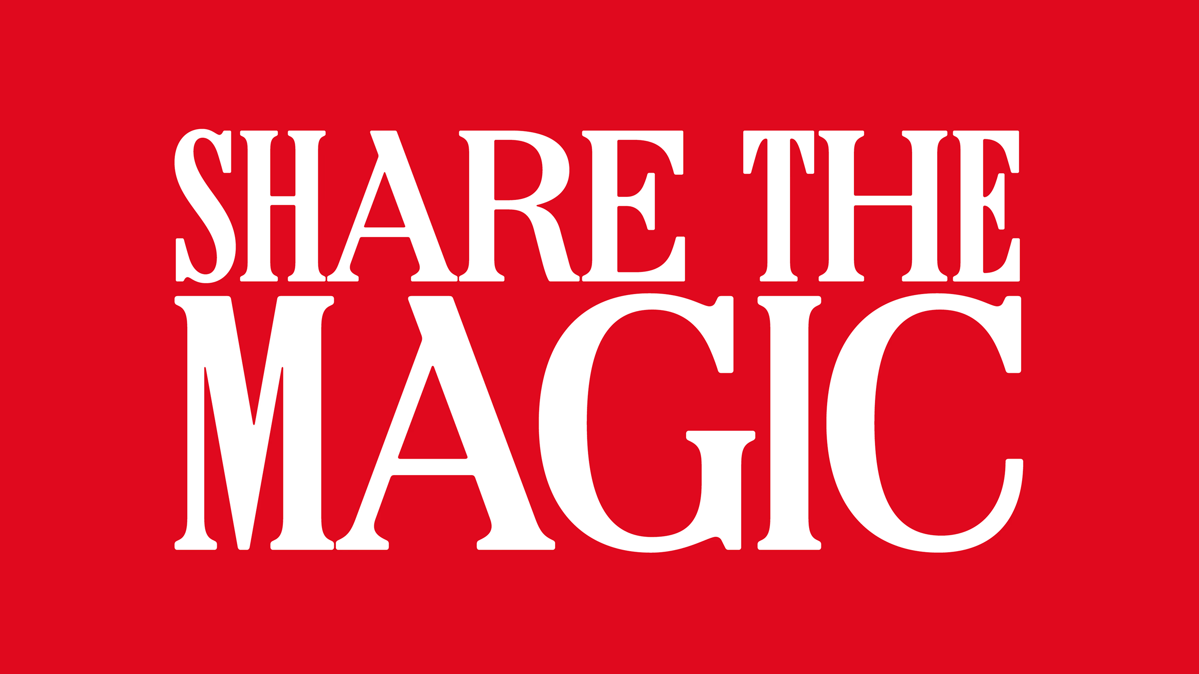
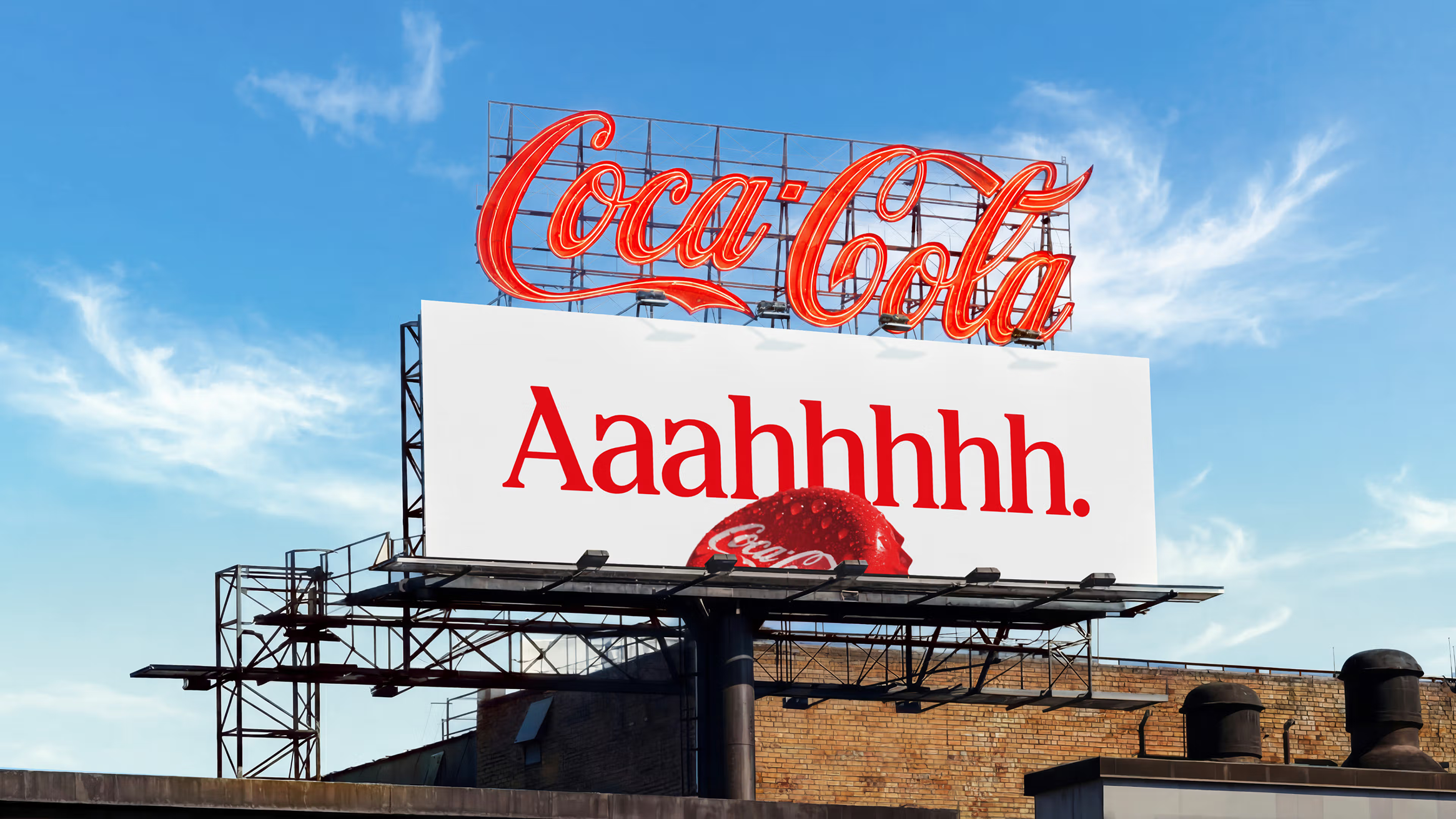
Coca-Cola has updated their typeface and visual identity. A bespoke typeface, created by Brody Associates for the brand’s Christmas campaign, has been reworked and expanded and will now become a permanent part of the brand’s identity. The studio Jones Knowles Ritchie has redesigned the can, bringing back the nostalgic swash while dropping the familiar black lettering from Zero Sugar cans.
The new visual identity will be gradually implemented across Europe, Asia, and the Middle East. However, as of now, the typeface only supports Latin, Cyrillic, and Greek.
World of Type by The Type Founders
thetypefounders.com/world-of-type
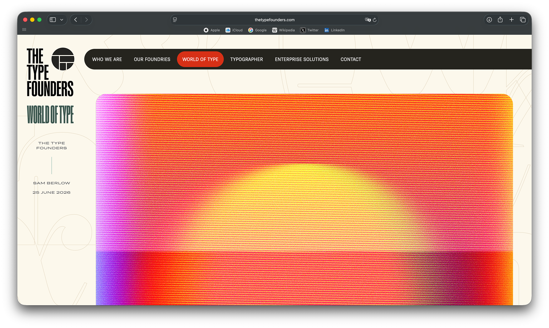
The Type Founders have launched a magazine. It already features short video interviews with designers they represent, as well as pieces on how to create a type foundry marketing strategy or how to handle typography in a complicated design system. While presenting the magazine, the Type Founders shared that they also plan to address how AI is transforming the type industry.
The Designers Republic — 40
youtube.com/watch?v=G0elAs_Sbi0
This year, The Designers
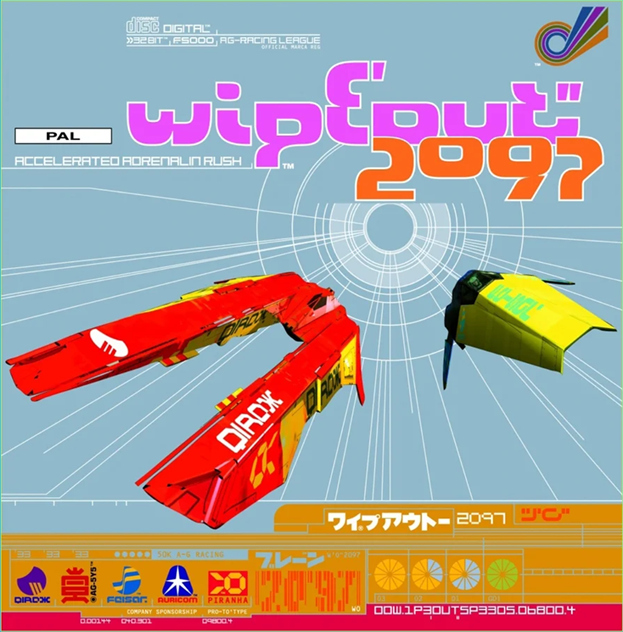 Wipeout. Design: The Designers Republic
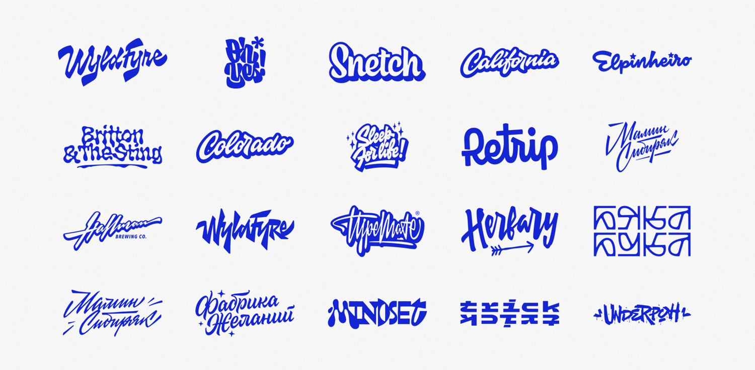
Egoshin Typefaces
Vova Egoshin — a type and graphic designer who collaborated with Disney and
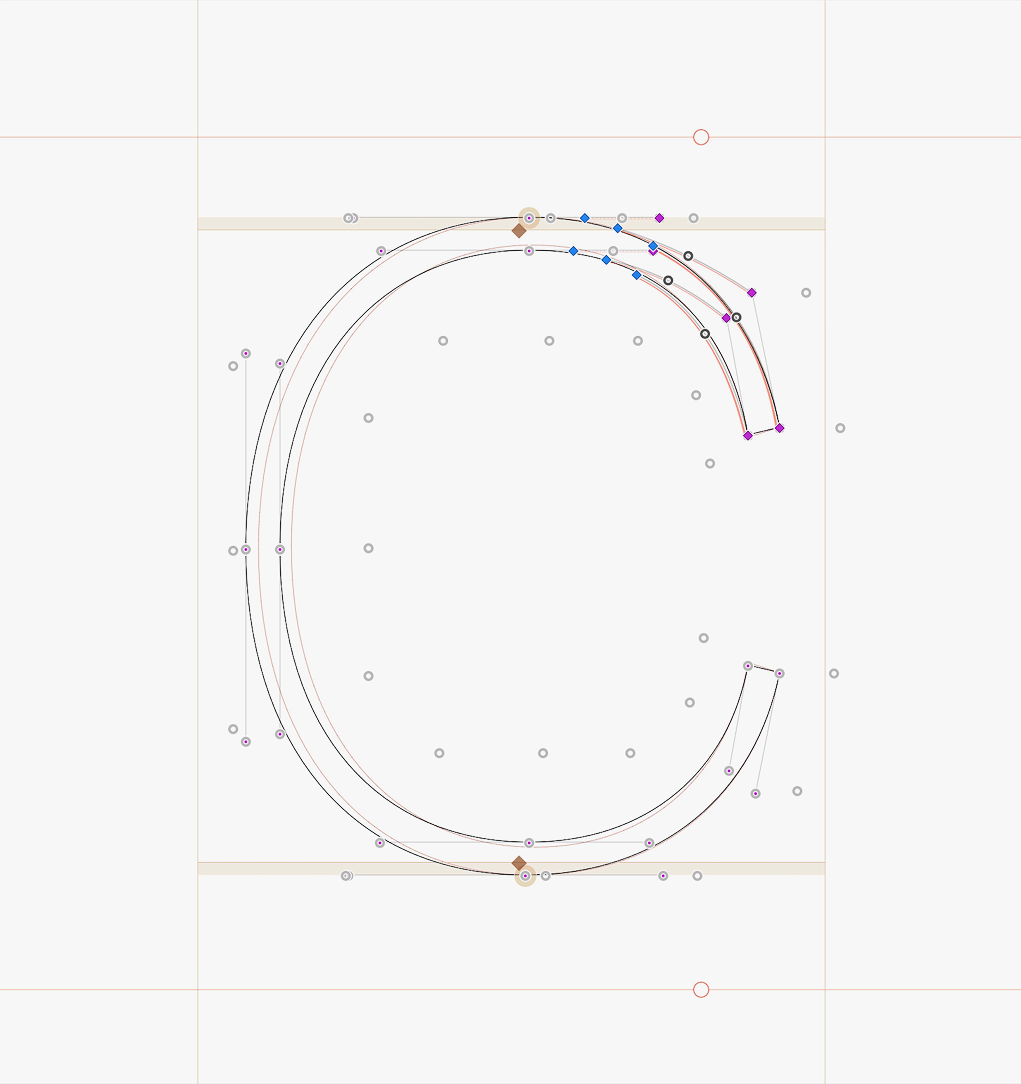
HOI in Glyphs
typo.social/@florian/117003180272256831
Glyphs now has a new tool, HOI Tool. It enables higher-order interpolation with a curved variation axis, allowing for greater precision in the intermediate styles between two masters.
July on type.today
In July, we launched a new open call inviting people to create posters on the theme ‘Routine’ using a typeface from the Algorytm collection, published a conversation between two tomorrow’s curators — Nikita Nelikhov and Timur Zima — on how to properly use Instagram, released Crimp by Font Club Belgica, reimagined our newsletter, and bottled over 40 jars of tkemali sauce.
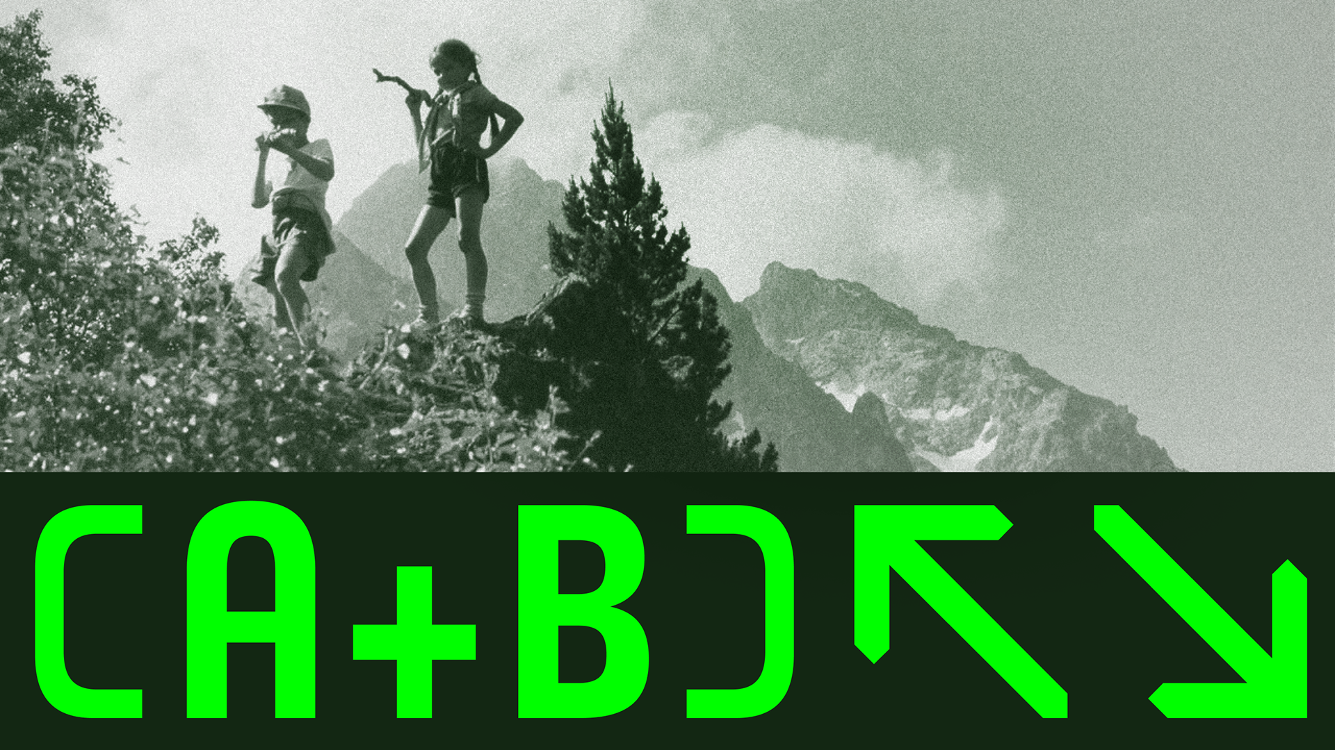 Crimp by Font Club Belgica
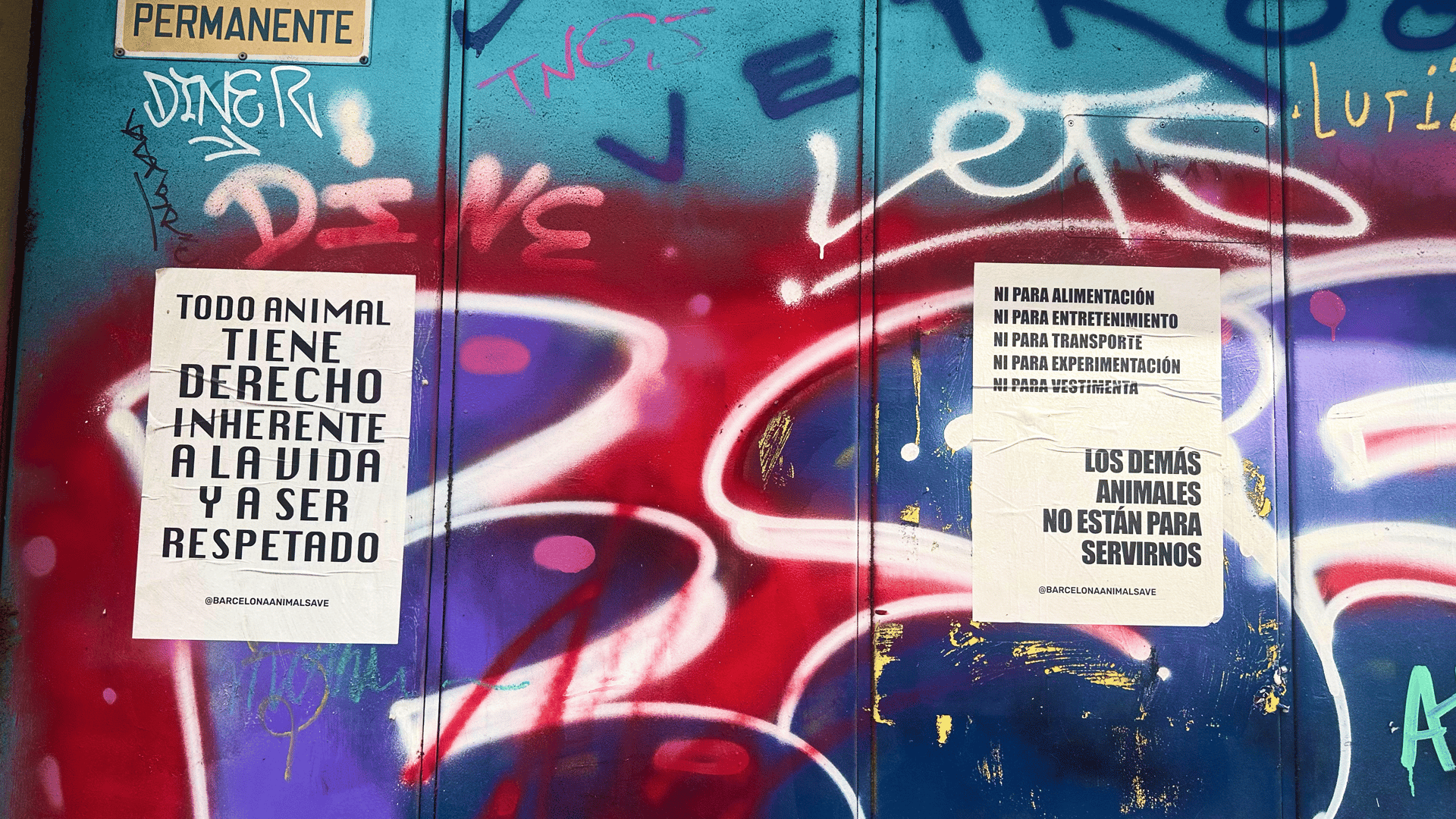 Posters whose typography is the subject of the first issue of our updated newsletter