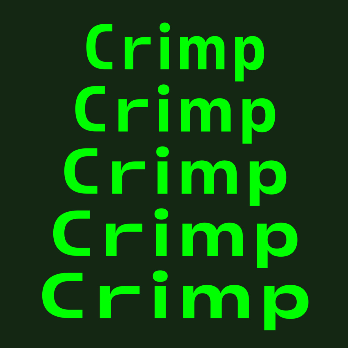
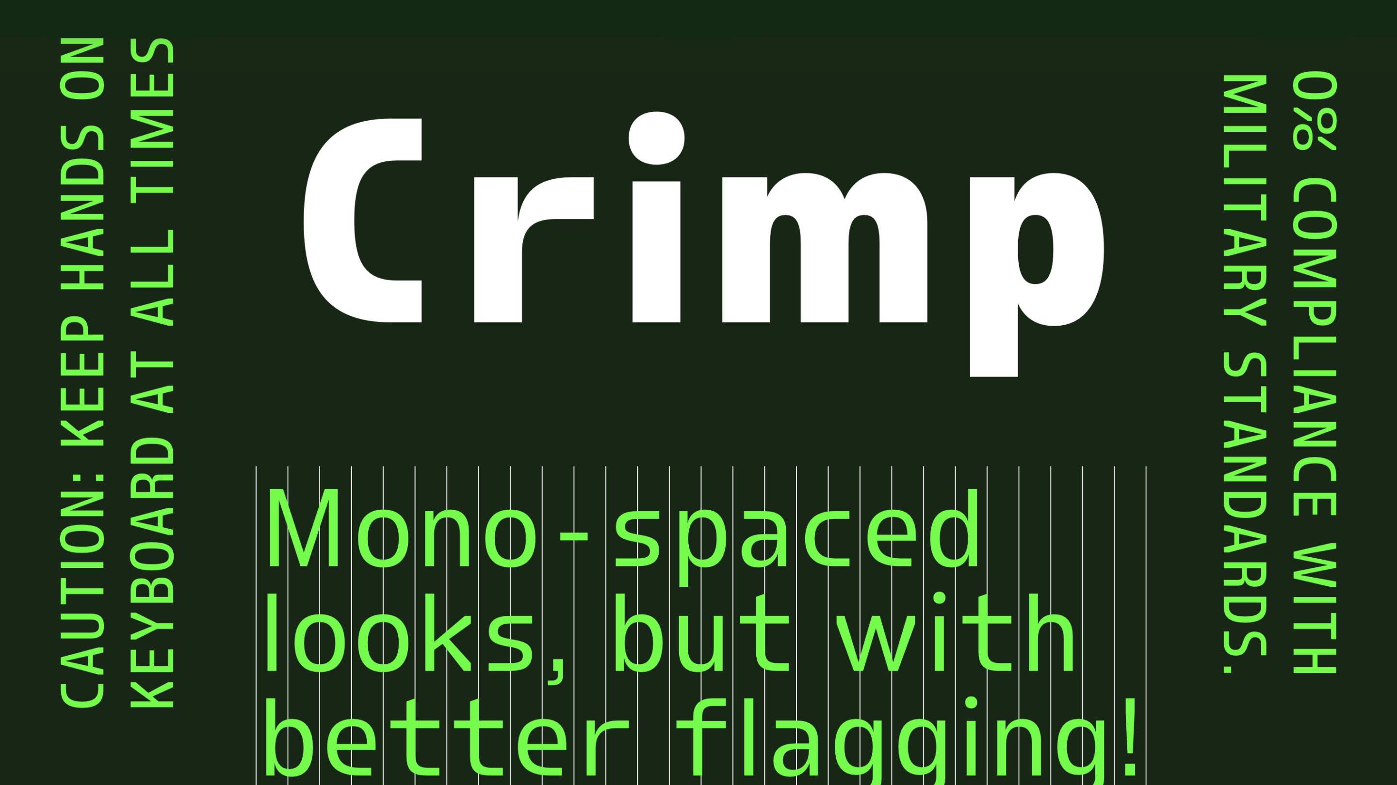
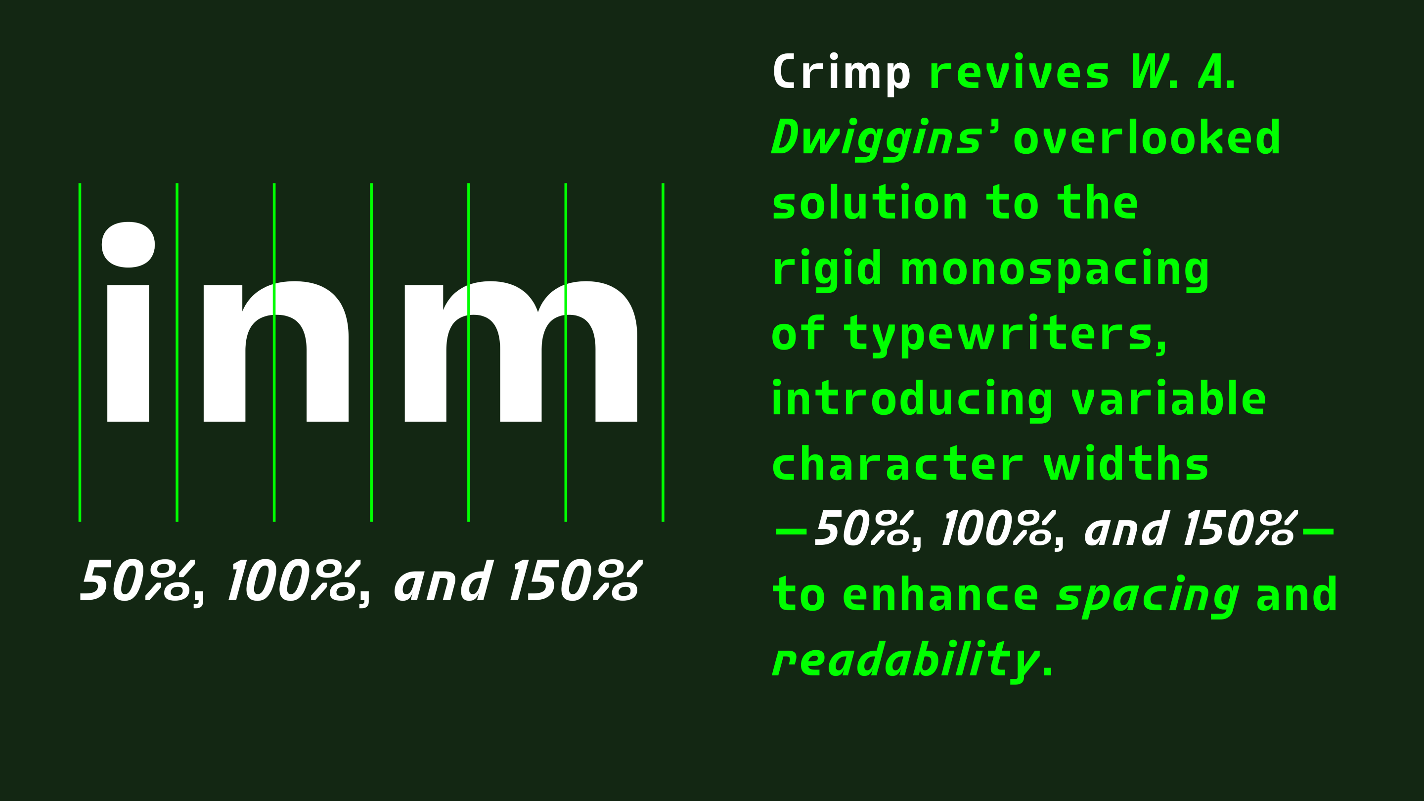
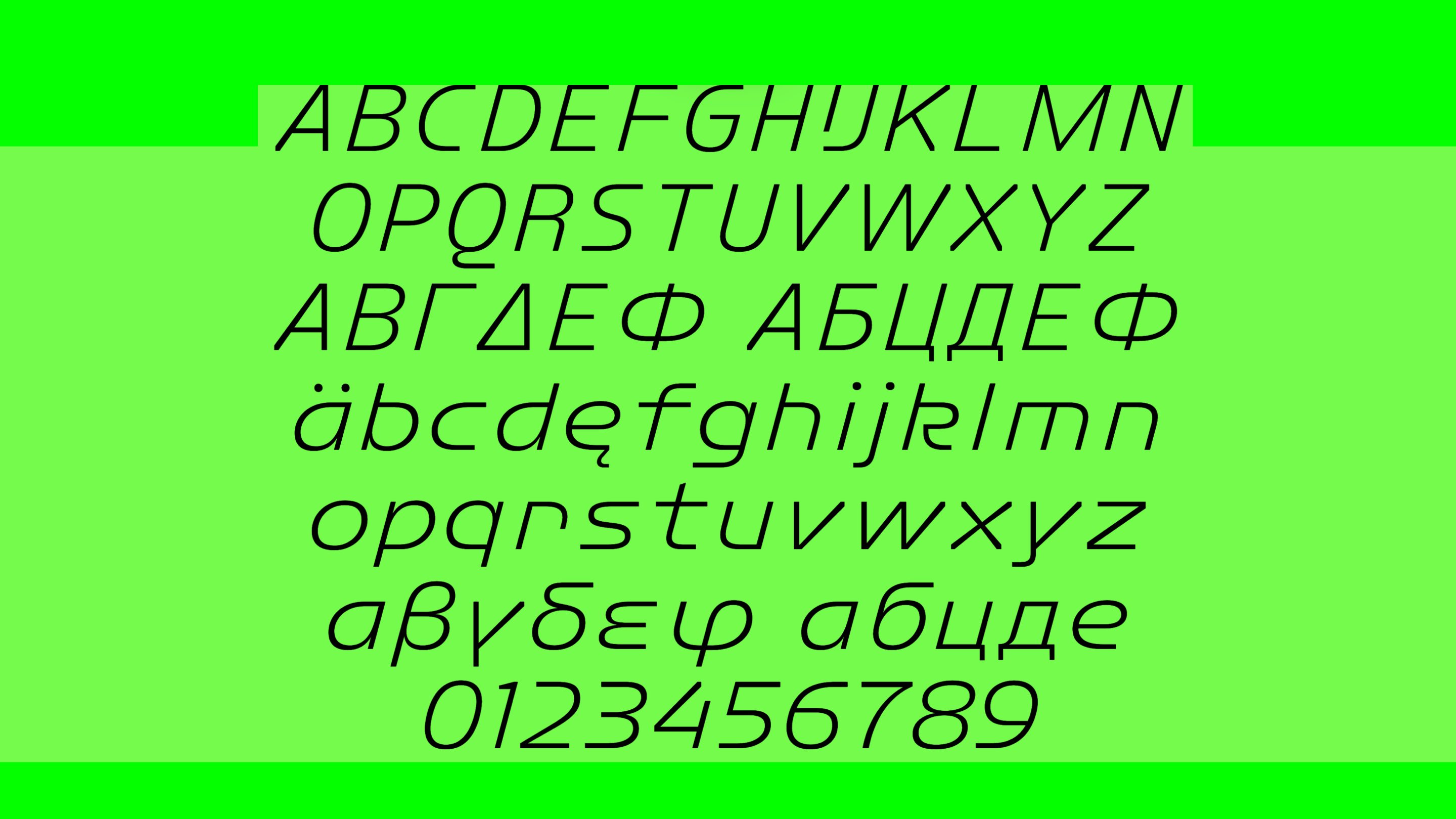
Crimp by Font Club Belgica is a modern revival of a brilliant yet overlooked idea from type history, blending technical precision with contemporary design. Inspired by W.A. Dwiggins’ concept of variable-width characters to improve fixed-width typewriters, Crimp features 50% and 150% glyphs for refined spacing.
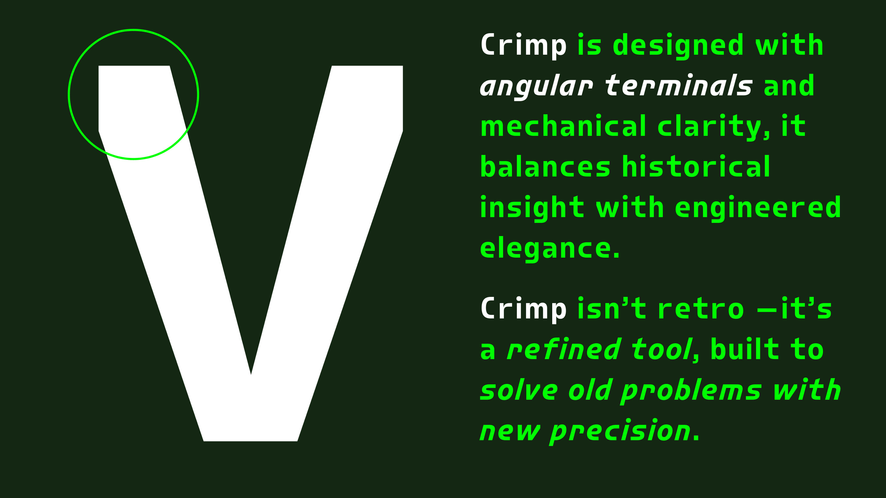
Historically, engineering and technical industries relied on rigid, monospaced typefaces like Courier and OCR-A, designed for clarity and machine readability, but these came with visual constraints. Crimp transcends these limitations by incorporating angled, stubbed terminals and half-width spaces, adding a distinctive mechanical flair while enhancing legibility and efficiency.
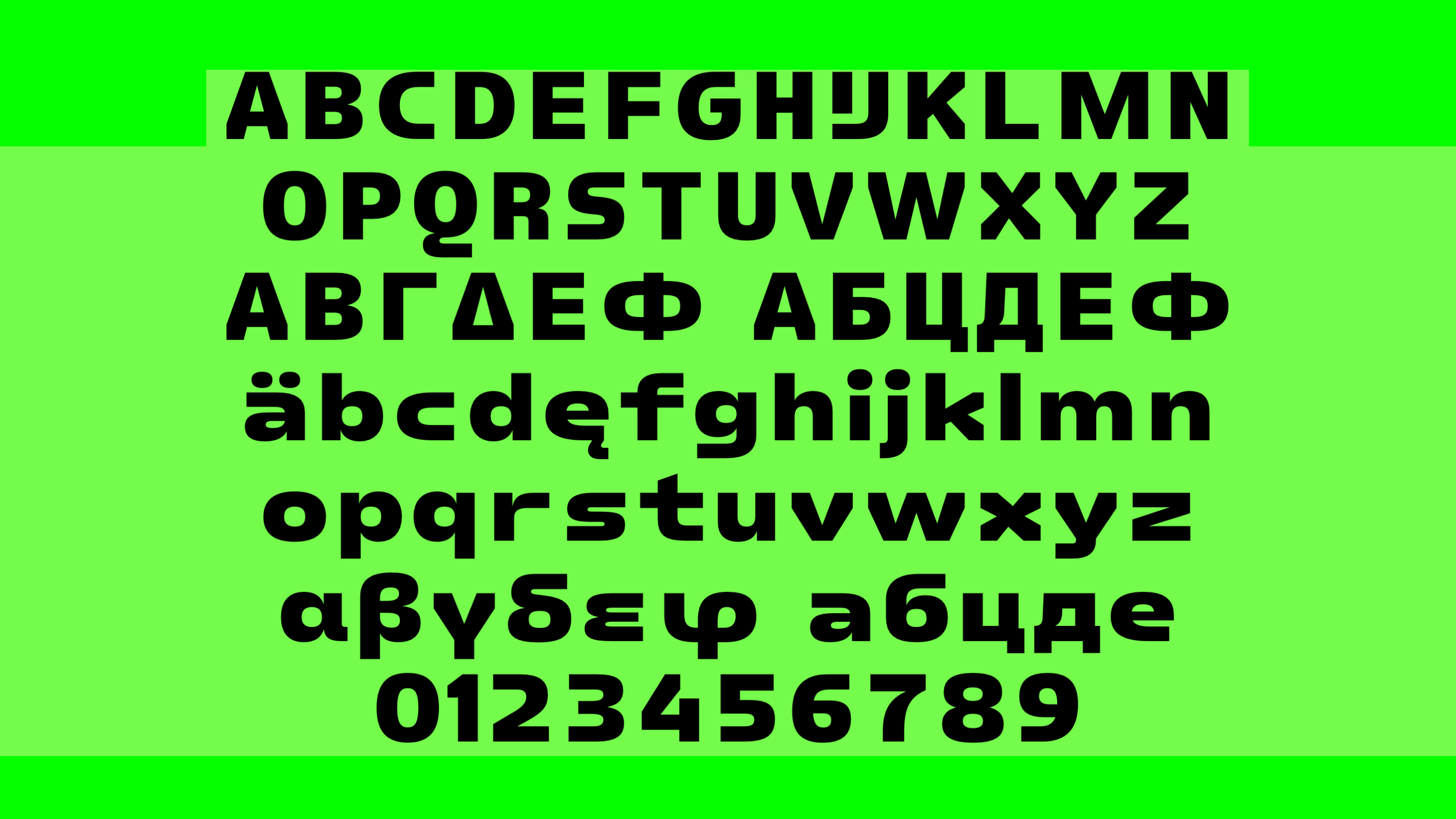
Crimp is available as five width-based font families, each comprising six weights with matching
Get Crimp
from $60 at type.today









Crimp was designed by Dries Wiewauters, type designer, educator, mountain runner, and the cofounder of Font Club Belgica, an outlet to promote the Belgian type scene.