
Adelina Shaidullina: I’ve been uploading our open call poster submissions for half a day
Nikita Nelikhov: My whole life is built around images. I wouldn’t say I ever get tired of them. I can get tired of staring at the screen, though. But it’s never happened that I’ve seen too many images and, like, said to myself, ‘Oh, my eyes hurt’. It feels nice to scroll through a beautiful feed.
Timur Zima: I do get tired. I burned out more than once while working on tomorrow. At some point, you see so many identical moves that you’re getting a little exhausted. In moments like this, I take a break and look at nothing at all for a while.
AS: And when you’re taking a break, do you work on your personal projects or go watch the sunset?
TZ: I usually go see a friend and whine to them.
AS: Is it important for a designer to be friends with other designers?
TZ: Friendship is a complex notion. I don’t think you choose your friends. Friendships just happen. There are plenty of artists and musicians among my friends. We belong to the same social circles, share similar interests, and we all have a fairly high degree of visual awareness. All of us enjoy discussing all sorts of things. So, I guess, you don’t necessarily need to be friends with designers specifically.
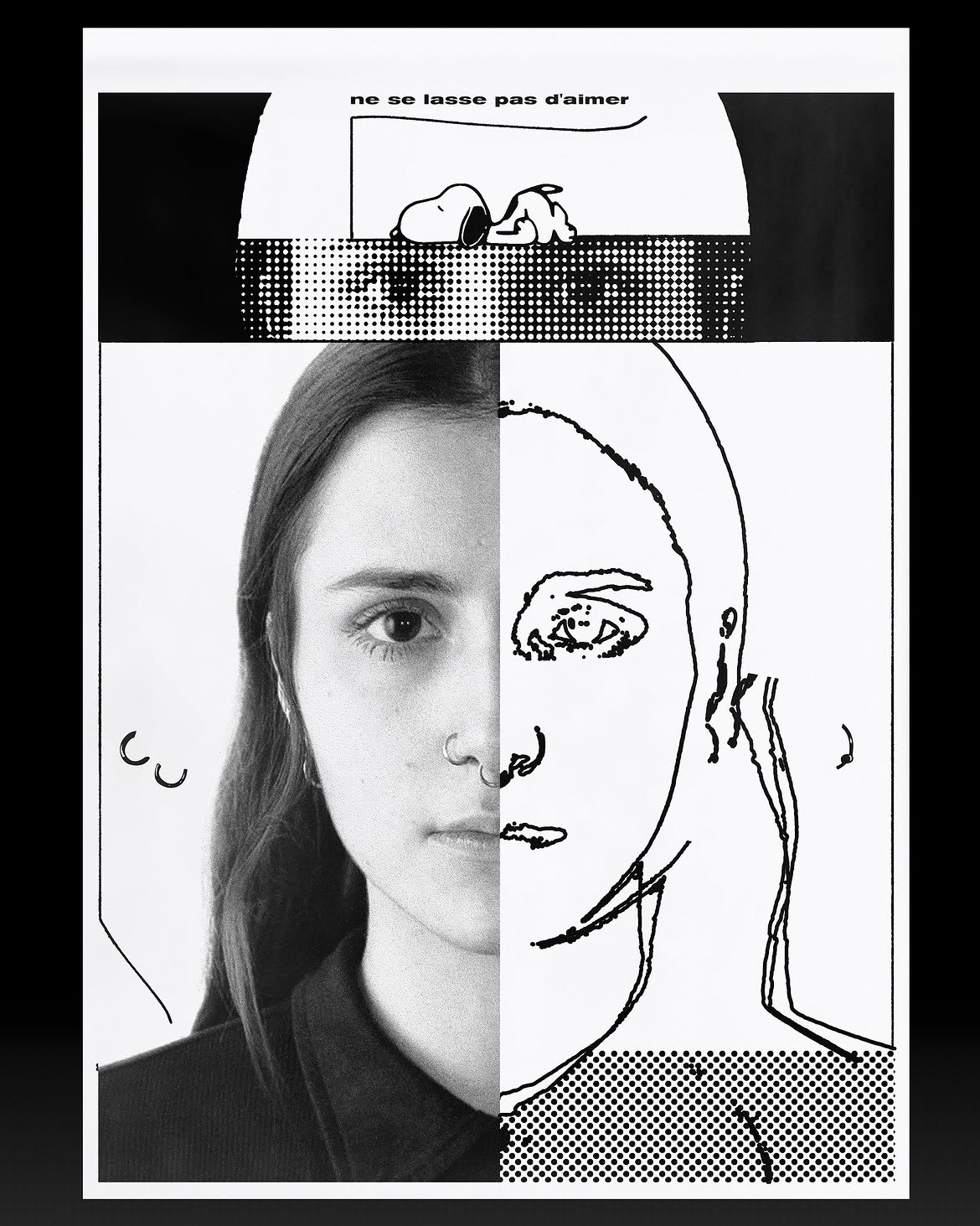 Artist and illustrator Yulia Mrachnenko in Timur’s project ‘Followers and I’
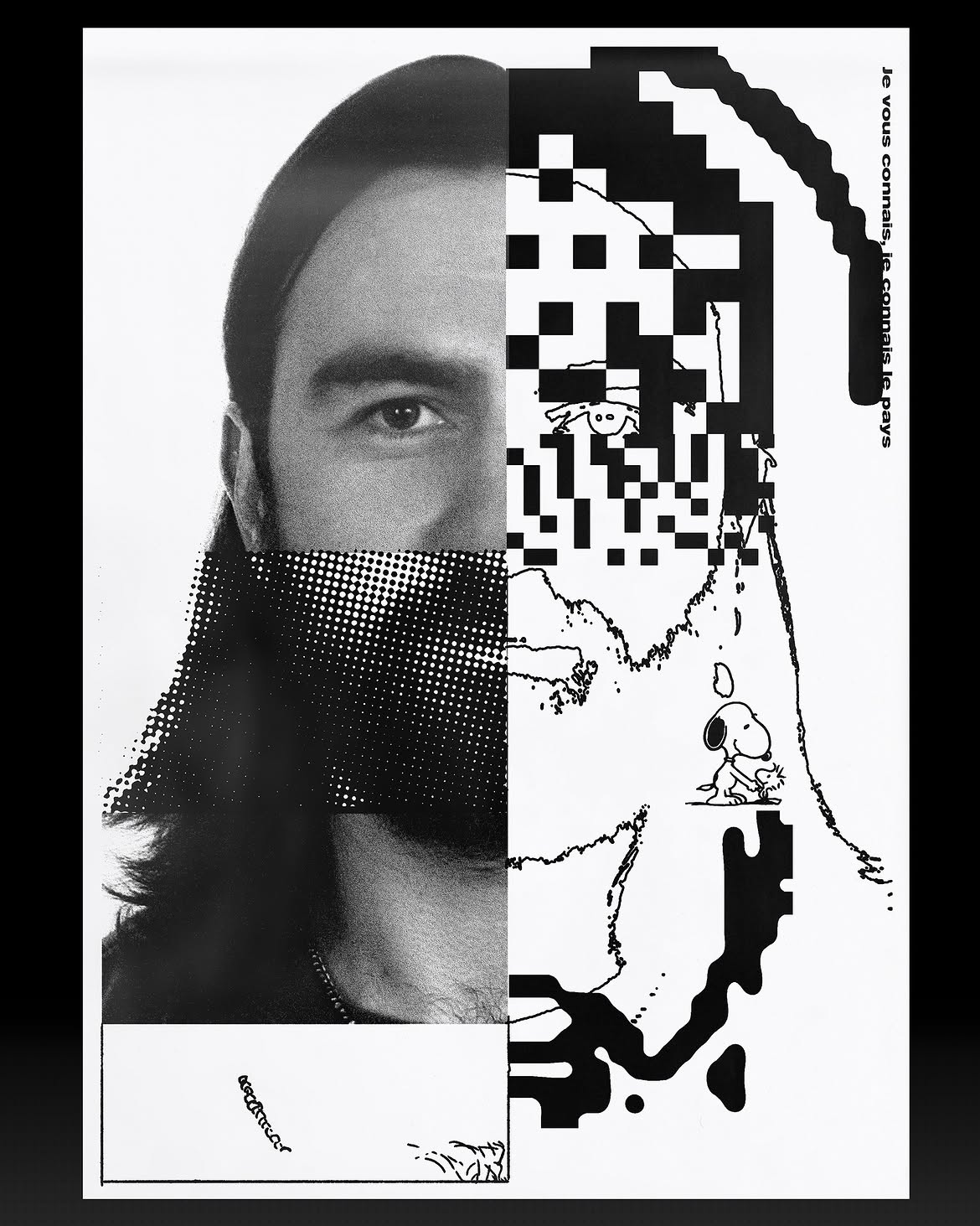 Artist, designer and art director Pavel Ripley in Timur’s project ‘Followers and I’
NN: I’m in a similar situation. It’s as if I exist in a certain social bubble and there’s no reason to really go far beyond this bubble. My friends are designers, musicians, and creatives of all kinds; we all live in the same world, and we’re all more or less aware of what’s going on in this world.
At first, I actually thought that your question was about social networking and making useful connections. I do not do that. I even kind of envy designers who, say, sit down and write cold emails to their dream
But if you feel like someone is doing a lot of great things, that they are some kind of rising star, I’d say it’s definitely worth it to start following them, keep an eye on them. But when it comes to making
AS: Timur, do you reach out to your dream clients?
TZ: Only if I have a clear vision of what I want to offer. So I rarely do that. But I’m a really lucky
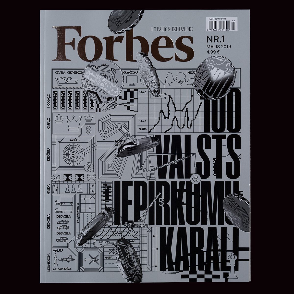 Forbes Latvia cover. Design: Timur Zima
AS: Are there any typographic trends emerging within Instagram that don’t spread beyond it?
NN: I feel like sooner or later, Instagram-born things appear everywhere. The platform is a kind of first-order entity: everything gets published there first, then images spill into places like are.na, then they make their way to Pinterest, and eventually start popping up wherever you look. The question is how long it will take from the moment a work is posted on Instagram to the moment it appears on are.na.
TZ: I agree. There is a couple of, say, trendy design ecosystems. Those are Instagram and are.na. Typically, designers involved in trendy design post their images on both
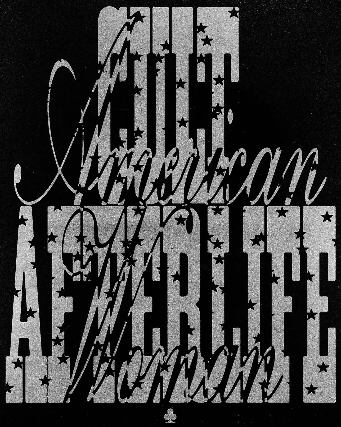
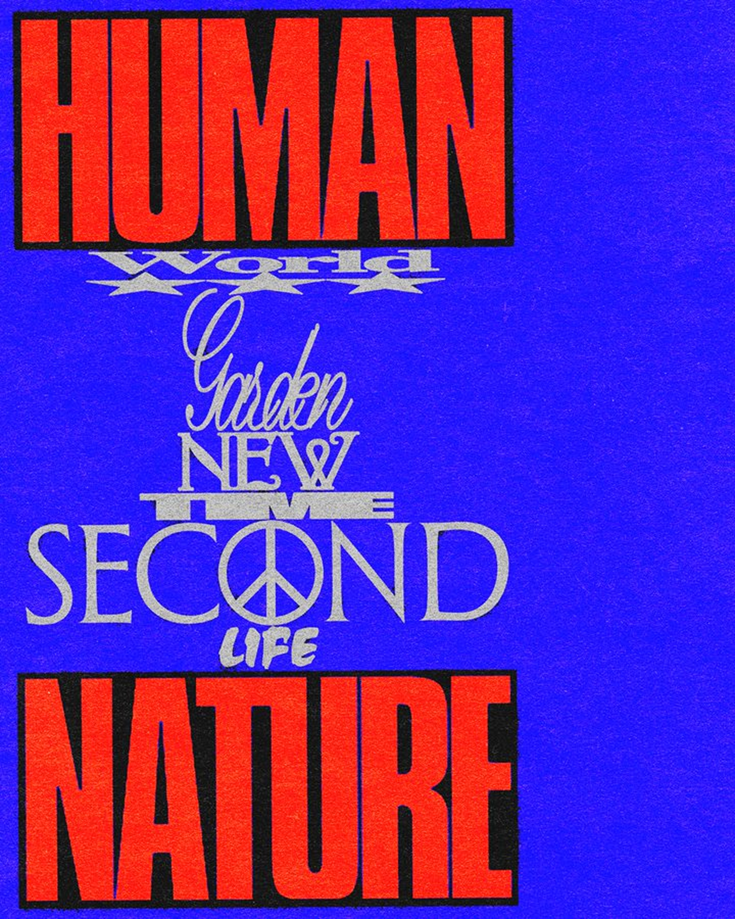
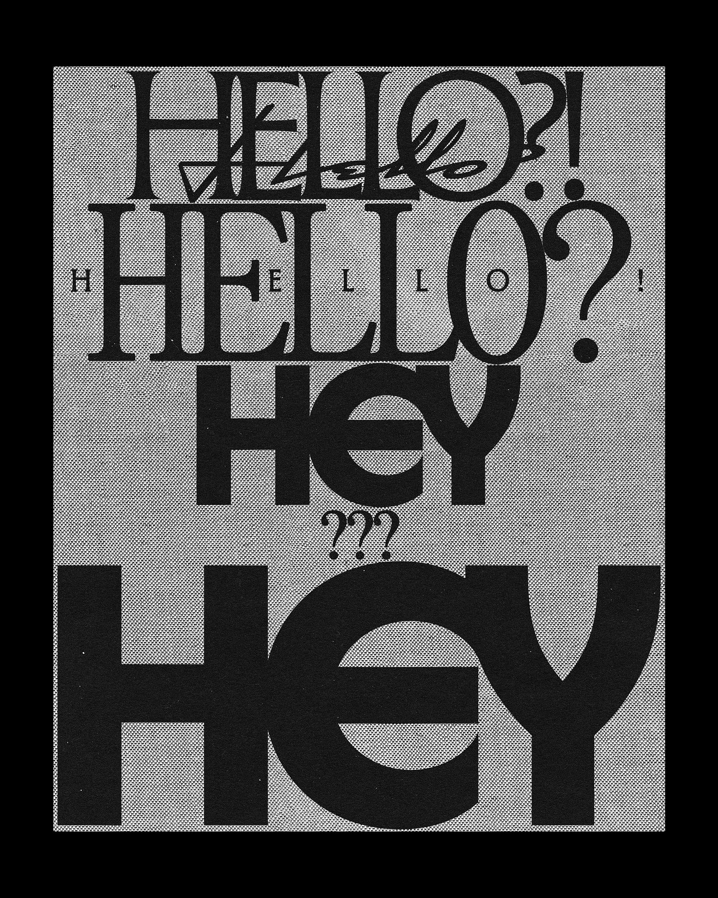
Designs by Mira Joyce
NN: But I think I would still prefer Instagram, since are.na is less of a social network. Designers kind of land their work
AS: Is it even possible to keep up with design trends if you’re not on Instagram?
NN: That’s a hardcore mode. It is possible, but it’s really difficult. I don’t think I’d be able to do it. Well, perhaps, you could be active on are.na, bookmark 10 design media and 30 design studios, and stay up to date. But Instagram is a very natural way of consuming this kind of visual news. So I’d say it only makes sense to leave Instagram behind if you have a serious conflict of values with the platform itself.
TZ: I think the only thing better than being on Instagram is being geographically tied to the places where the trends are originating
NN: I feel like it doesn’t even matter anymore whether you are based in Berlin or Syzran you’re gonna need Instagram, since anything more or less interesting and important is happening in the digital environment rather than anywhere else.
In big cities, where there’s their own
AS: Is there even still such a thing as national design schools, or has everything gone global?
TZ: Things have become much more globalised. I would, however, single out the Korean school, probably. Its rise has been driven by both economic growth and cultural
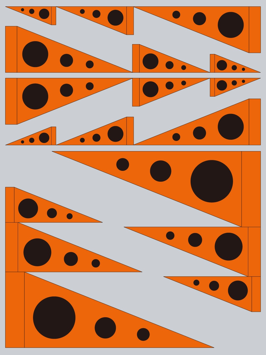
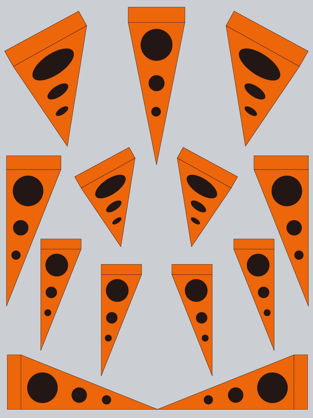

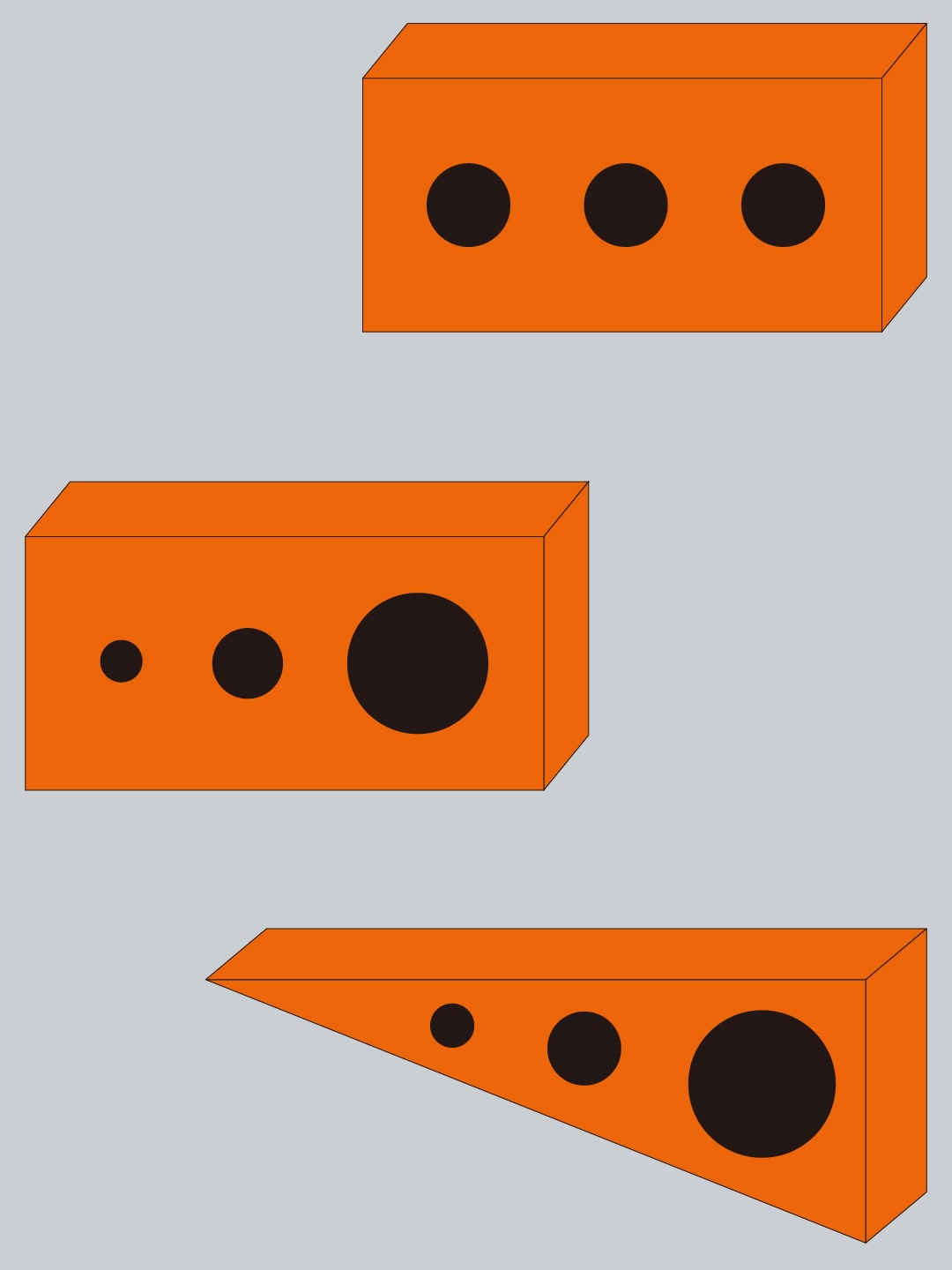
Designs by Seo-Young Kim, a designer featured by @tomorrow.type.today
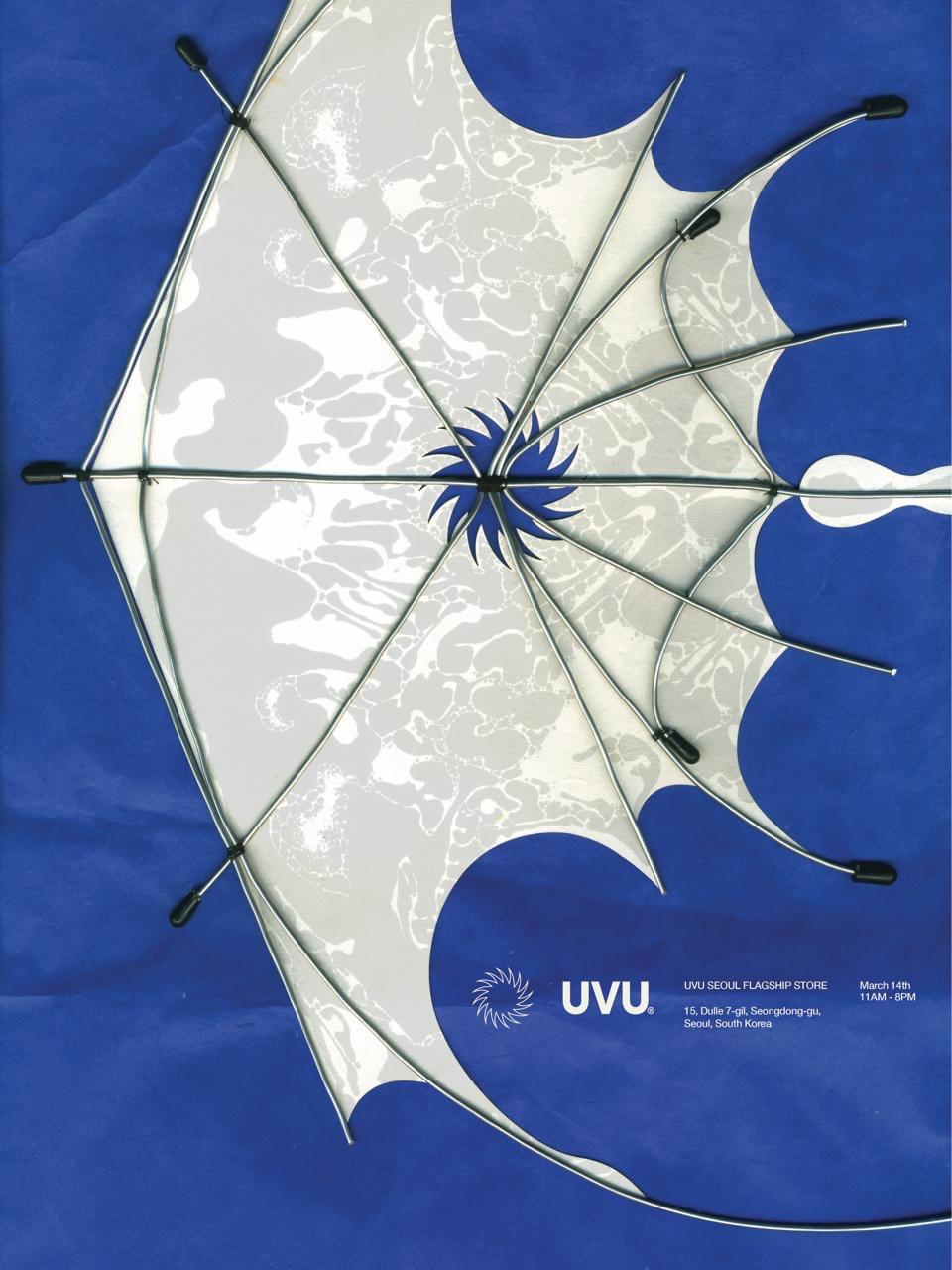 Poster for Uvu store, a project featured by @tomorrow.type.today. Design: @chokangbin
NN: Well, of course, there is a huge number of identical images originating from different parts of the globe, but I can still, just by looking at the image, usually roughly tell Asia from Eastern Europe anyway. Because I still think there are some regional trends at work. For example, oddly, I almost always recognise the French visual language. The French produce such wild digital experiments that you can’t help but wonder: why do they actually enjoy pushing things so far?
AS: And does a designer still need a specific education, what do you think?
NN: Oh, that’s where you put ‘laughs’ between two asterisks! Seriously, though, I’m probably not the right person to answer
I don’t complain about not getting a specialised degree. If it’s a good education, it won’t hurt, but it stopped being an essential element probably a long time ago. For instance, I know a girl who studied to be a chemist but recently started doing design and feels great.
TZ: It all really boils down to your goals. If you want to work for a corporation in Canada or the US, a college degree is something you need on a level of bureaucracy. But I haven’t been able to think of a reason why I personally might need this.
The story of the film Backrooms is a great example, I guess. It made a huge amount of money at the box
AS: How many posts with the same move does it take to know that it’s a trend?
NN: Like, a dozen, maybe?
TZ: One single post could be a game-changer, make all the difference. A single work by someone like Jonathan Castro can define the direction design takes for quite a period of time. If someone comes up with a powerful visual move, everyone starts exploiting their idea right away.
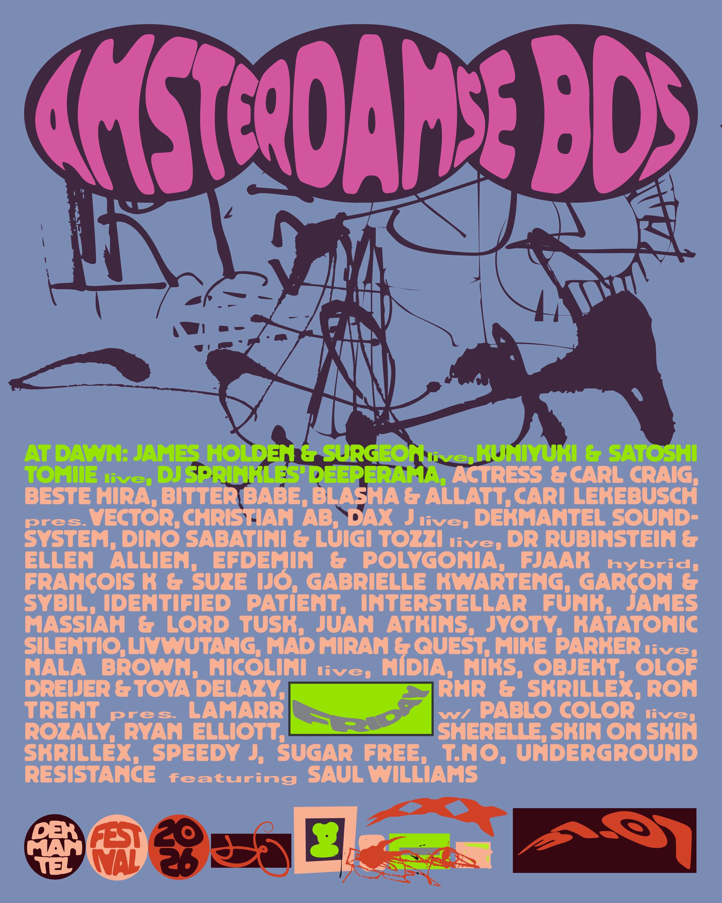
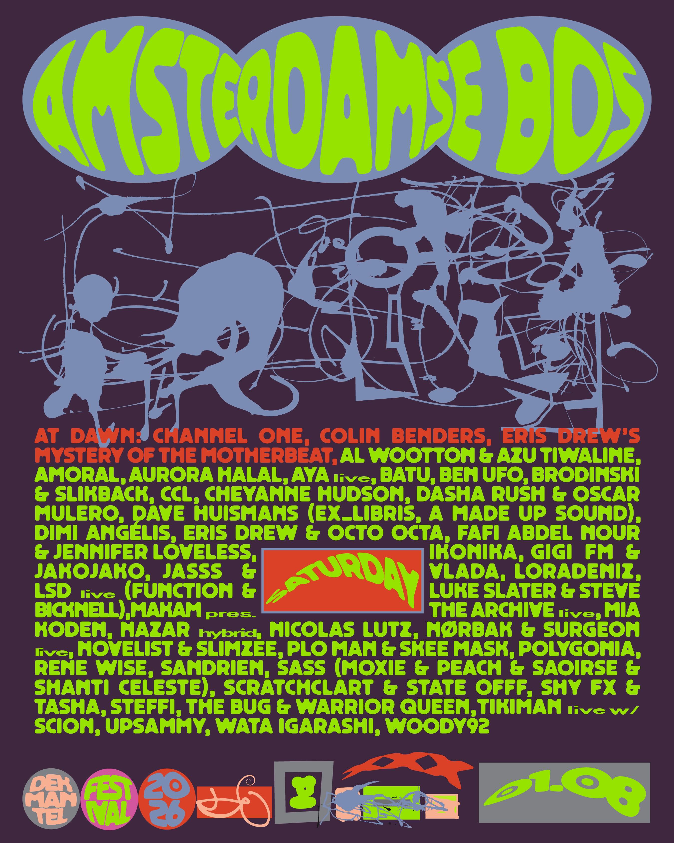
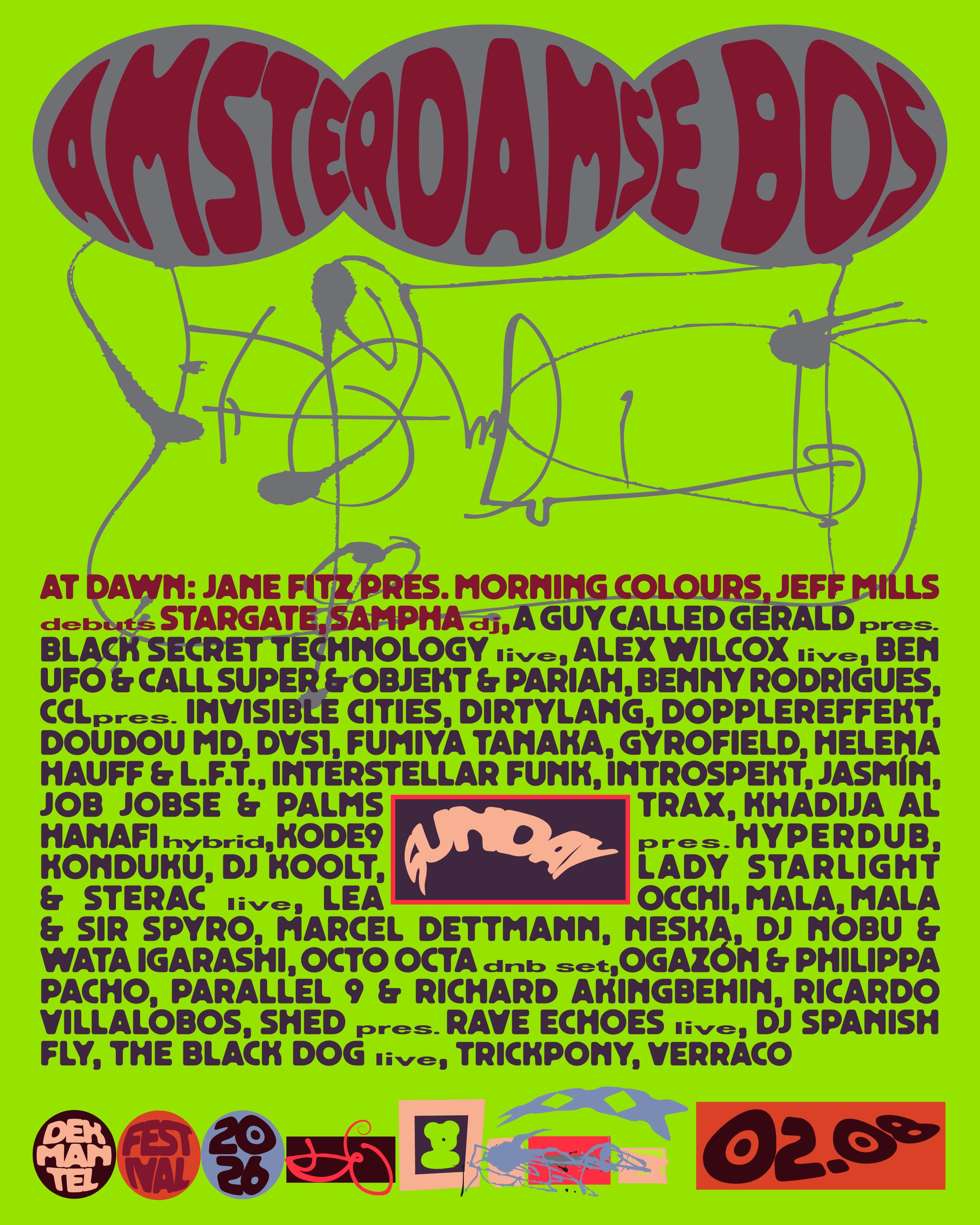
Dekmantel Festival 2026 Program. Design: Jonathan Castro
AS: Do you think when designers create a trendy piece, they realise that they try to be part of the trend?
TZ: There’s this noble, classy variety of trendiness, when a person, building on the trend, invents something new, something complex, something we haven’t seen before. And then there’s exploitative
AS: Don’t you get the feeling that what we see on Instagram is, like, 70% trend exploitation?
TZ: That’s exactly what it is. A lot has already been written about this. It’s Nice That even published quite a long piece on the exploitative nature of trend-driven design.
NN: The entire Instagram is built around exploitative design. For example, the platform made all content creators switch to the Reels format because Reels is what most people consume on Instagram. There are tons of memes about it: ‘What would Kurt Cobain and Egor Letov A legendary Soviet and Russian punk and psychedelic rock musician who died at a relatively young age do if they had to make 15-second vertical videos?’
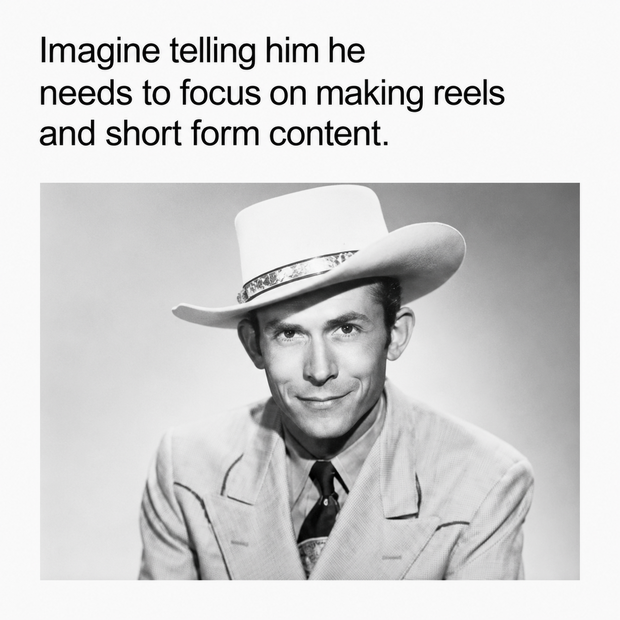
But if you want to be visible, you need to play by the platform’s
And whether a trend is classy or not, I think that depends on what stage it is at. At first, when the trend is niche and innovative, it is classy. Everyone says, ‘Oh wow, this is really something! That’s a breath of fresh air!’ But once it reaches its peak, everyone is like, ‘Oh my gosh, this thing is literally everywhere!’
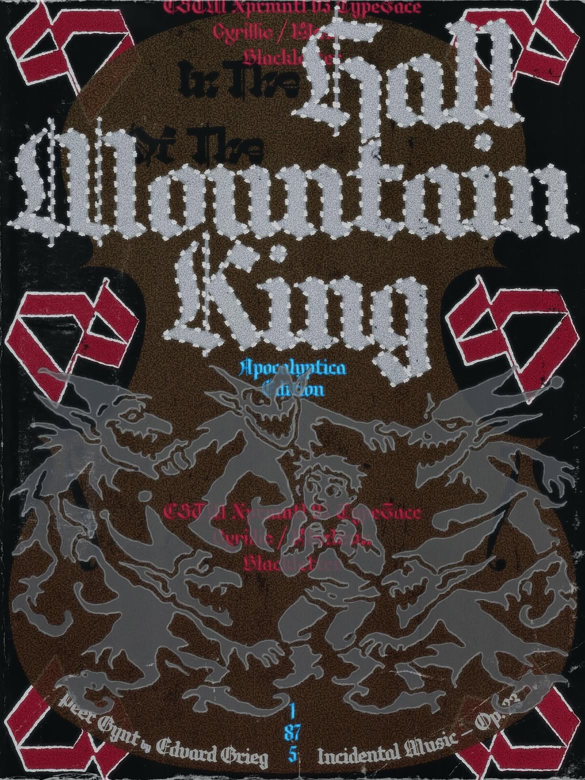
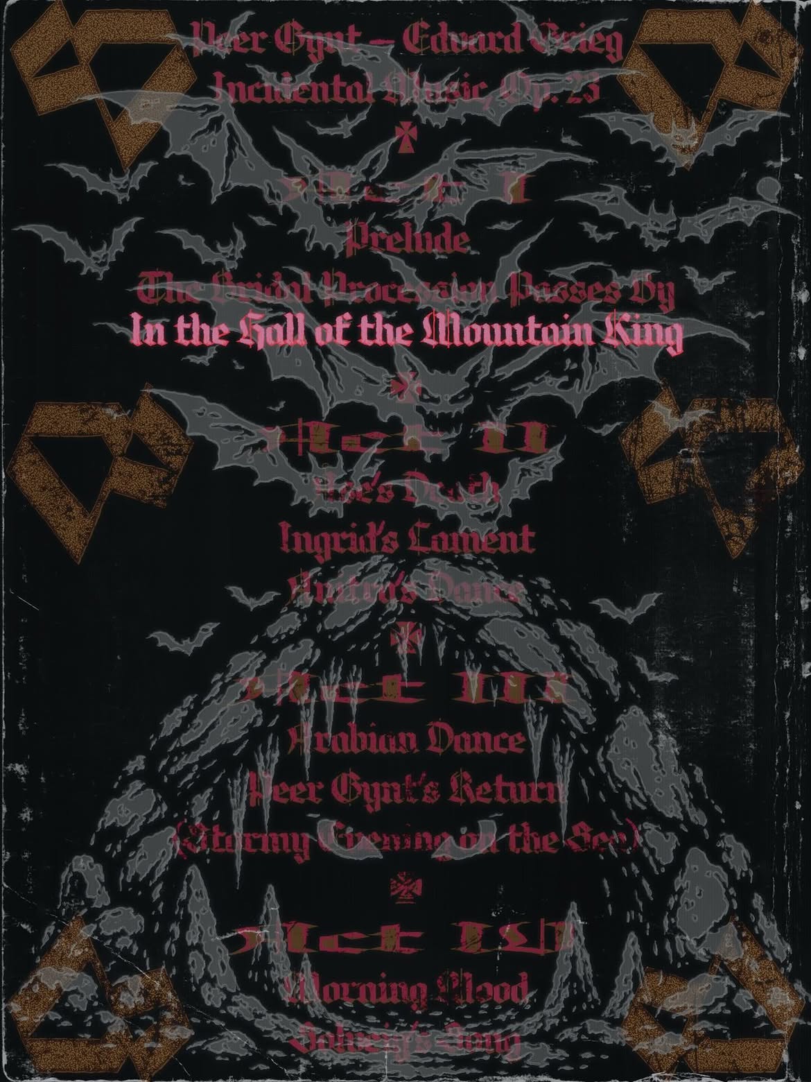
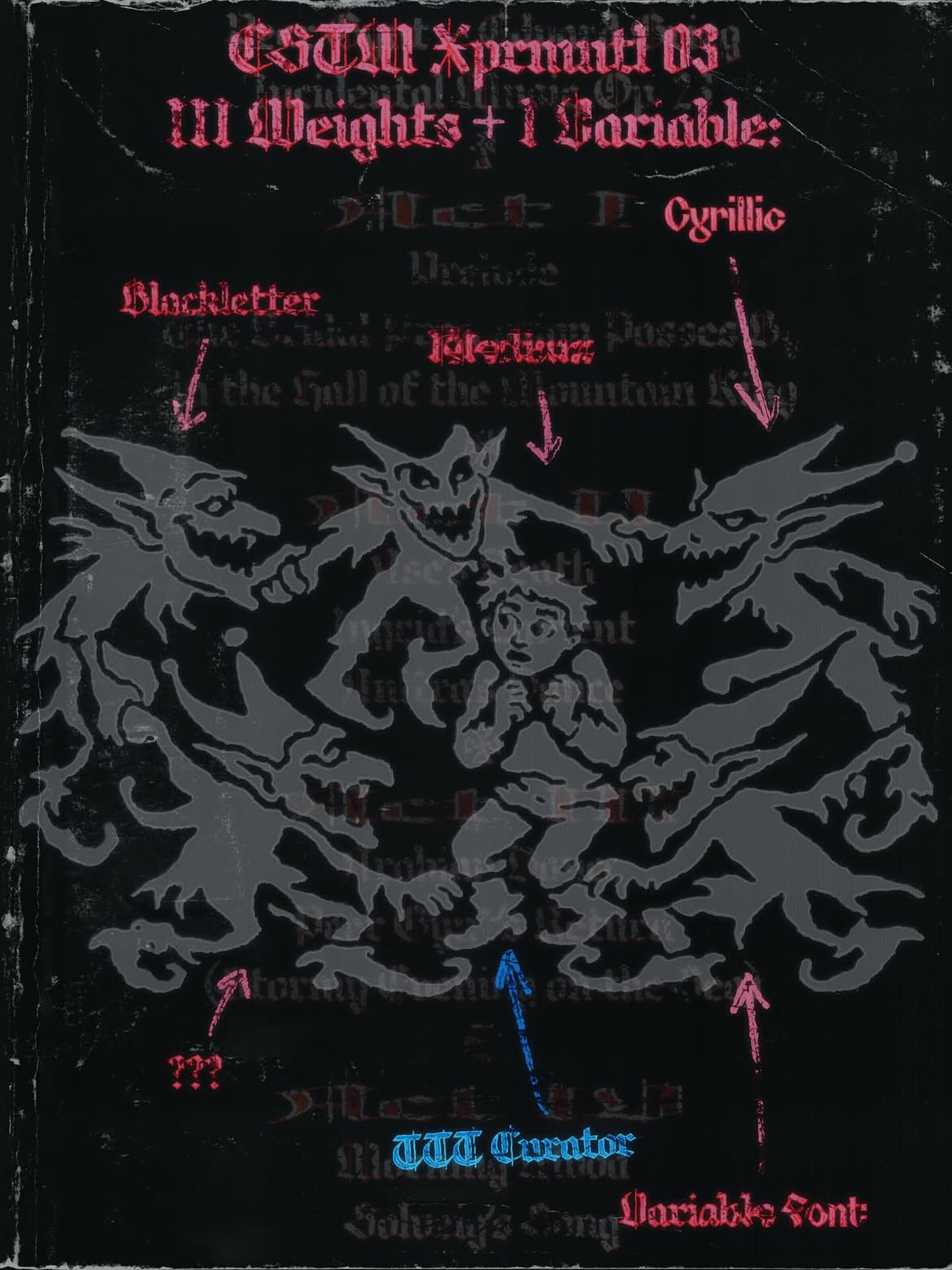
Nikita’s post for @tomorrow.type.today. Set in: CSTM Xprmntl 03
AS: Do you see a direct correlation between how trendy a visual move you’re using is and the number of likes it gets?
NN: I don’t see that correlation with the content I create. I don’t want to get on a high horse, but I’m trying to strike a balance between my own interests, trends, and inventing something new. When I look at my feed, I see that direct correlation. Clearly, I occasionally come across something interesting with one hundred likes and zero comments. But most of the time when I go to the
AS: How do I train my Instagram algorithm so that my recommendations show good design and never disappoint me?
NN: You need to like more design-related content. Like the content you enjoy, follow accounts you find interesting, maybe turn off Suggested Posts for a month or two. Your feed is full of things that the algorithm suggests you like, but it often feels generic, if you ask me. I prefer discovering things myself.
I am not in a position to give advice, as I don’t do SMM. Just be active on Instagram, and when it suggests something you don’t like, click ‘I’m not interested’ and be happy.
TZ: It’s all very simple, really. This entire ecosystem was designed to make your life easier. I recently created a new
NN: Oh, those moments you lose an image on Instagram! You see something for
TZ: Yes. Instagram can be a super
AS: Has vibe coding changed what you see in your feeds, in any way?
TZ: A lot has changed. I see that a designer is no longer limited by the software developed by the engineers of the magical Adobe corporation. I see that designers are freeing themselves, starting to develop software for themselves, and isn’t that what we’ve all been waiting for so long? When I say ‘we’, I mean designers with some experience and their own wants and wishes, but without a background in development.
Yesterday I couldn’t sleep because I got an idea for a web-based node Photoshop; I was at it until five in the morning and made a working prototype. Isn’t that amazing? Guys, we’re free now.
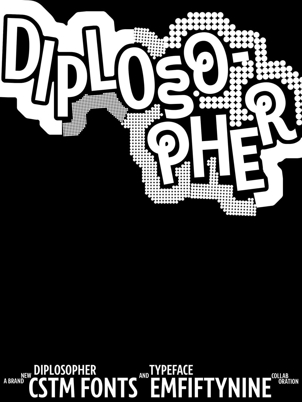
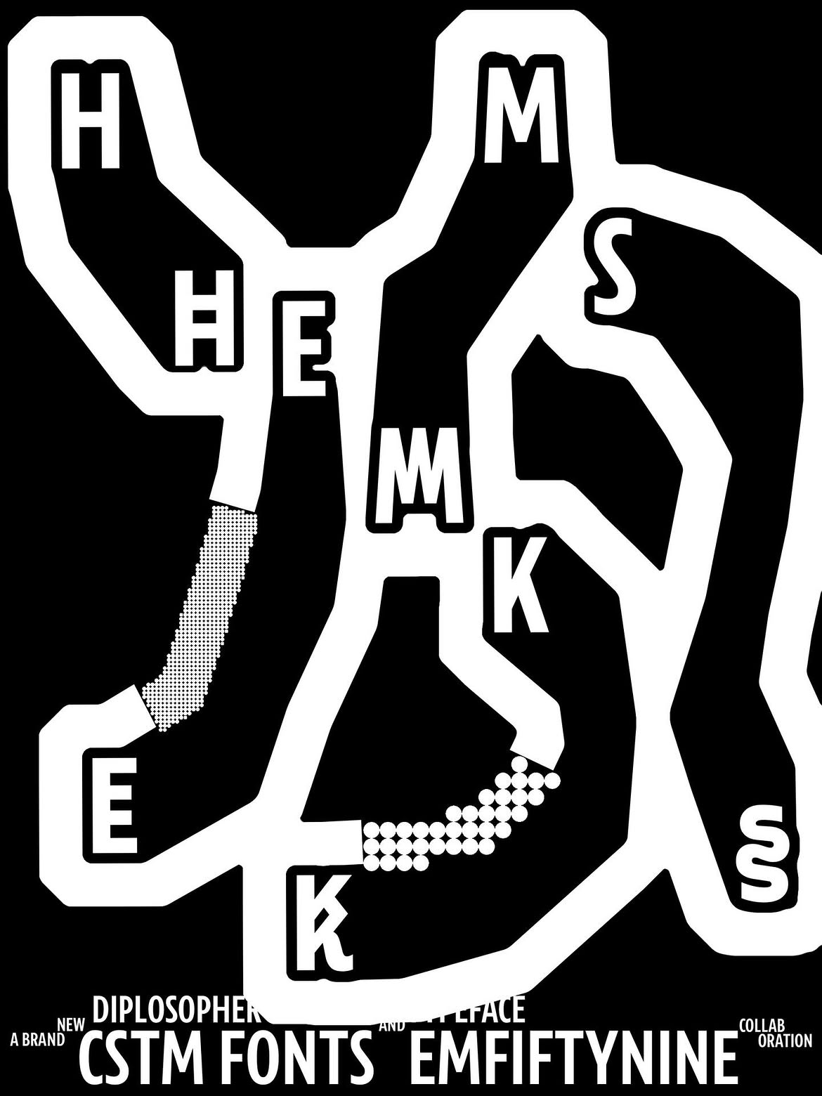
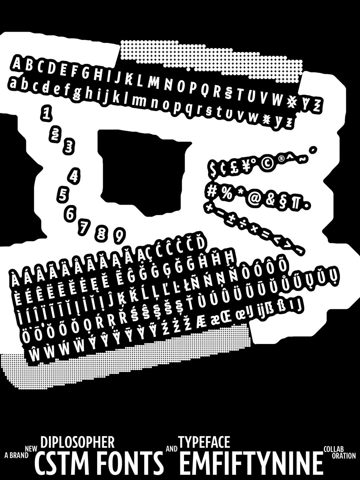
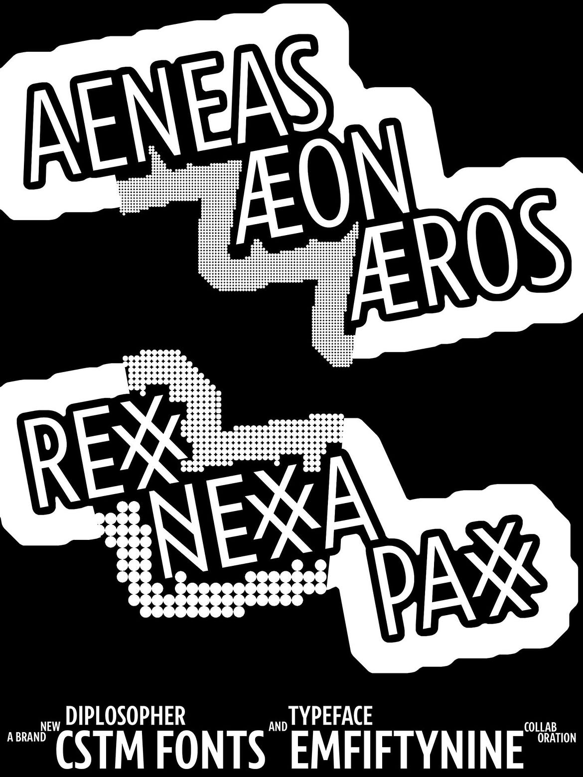
Diplosopher release. Graphics designed with the Type Physics vibe coded at Timur’s studio
NN: I don’t know if I’m ready to talk about liberation, since I generally don’t have any serious issues with Adobe. My major complaint is that everything is rather slow, but
But vibe coding does free up your
I had a problem: I didn’t know how to make beautiful images where you can actually see anchor points and Bézier handles. I mean, I knew there were some plugins, but I thought, ‘Oh no, that’s too complicated’. But
I run nearly any design idea through my internal filter: could it be turned into a generative tool? The thing is that I took an interest in generative graphics even before the age of AI. It’s just that back then, I would just open After Effects and, say, generate some kind of a pattern from a cat picture. Whereas vibe coding has sped up my process of creating weird stuff tenfold. So, no AI-hate today, sorry.
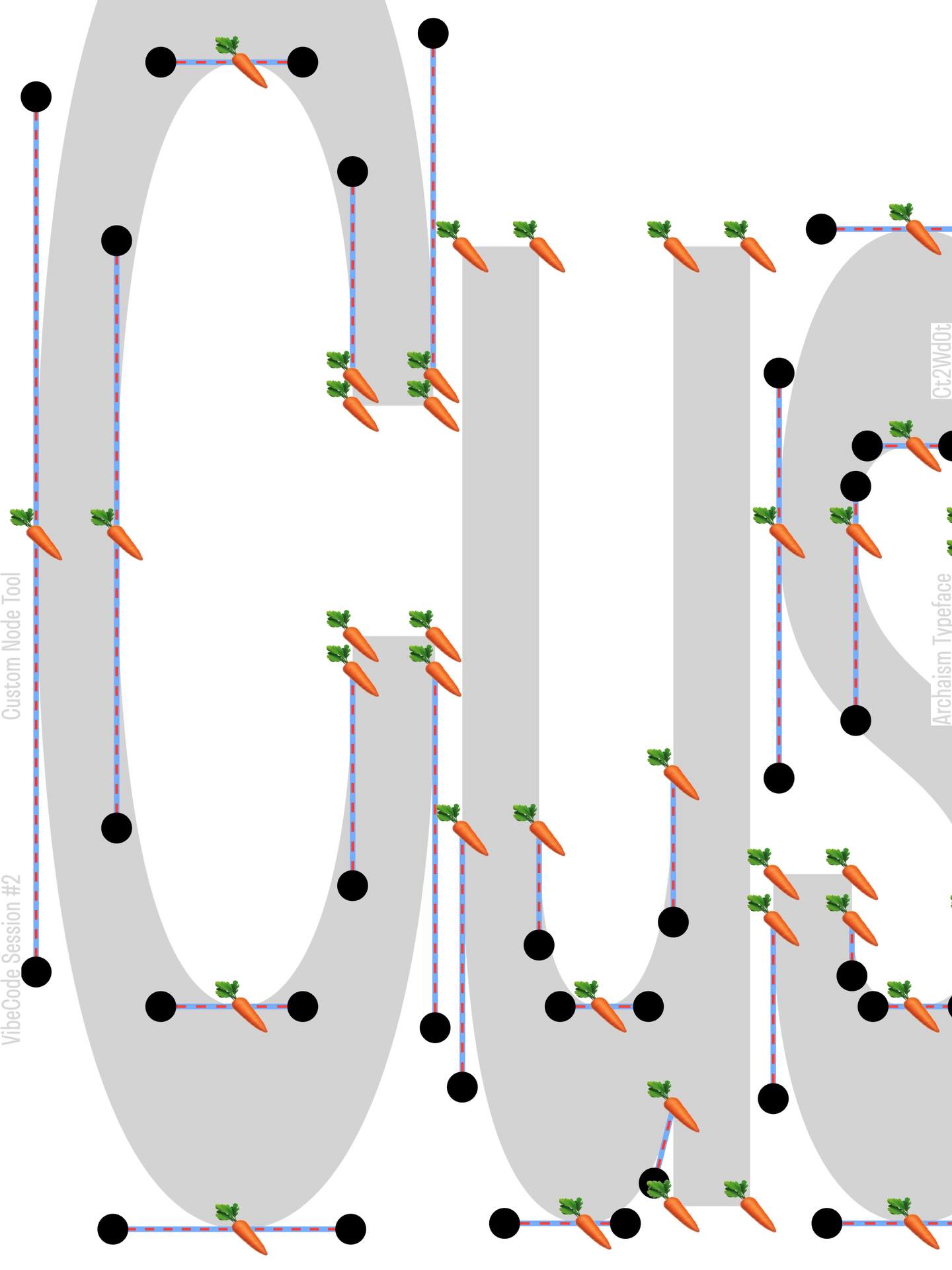
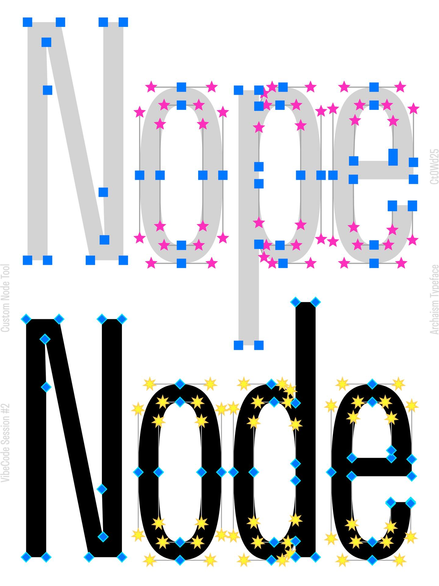
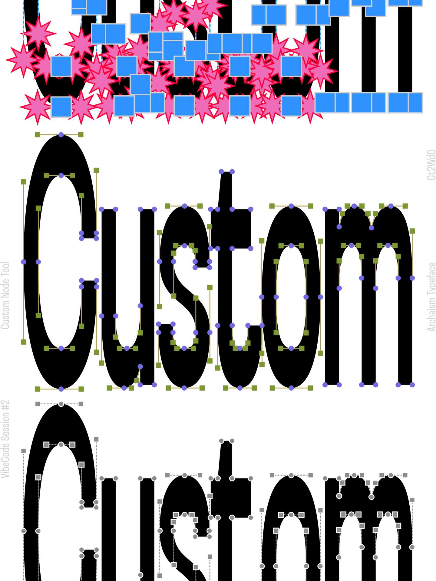
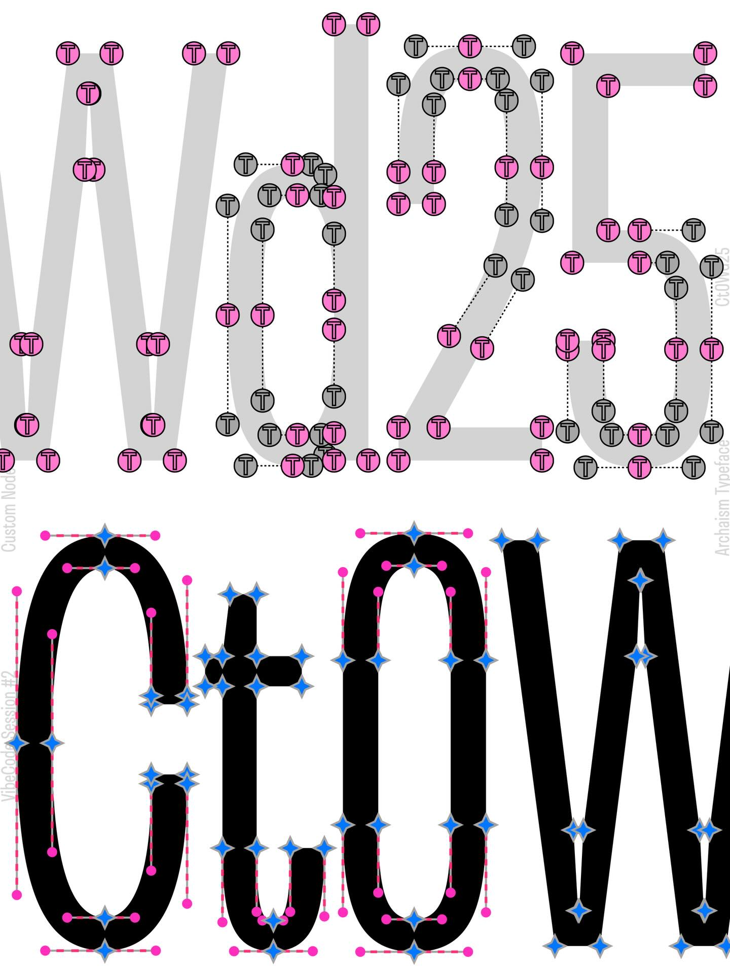
Nikita’s tool allowing to change the shape of anchor points and Bézier handles
AS: Hasn’t the availability of vibe coding resulted in more low-quality designs from less experienced people?
NN: I don’t see much difference between what a first-year student designs using vibe coding and what a first-year student draws themselves. Both pen and code are
As for concerns about AI replacing creative professions, I am more worried by things like Higgsfield. You could feed them, say, the Stüssy logo, ask to write ‘Ramenskoye’
A small town in Russia in the same
I think those who’re used to consider themselves good designers weren’t concerned about this because their style was too unique for AI to copy it. But sooner or later, it will likely learn how to do that. And there’s probably only one
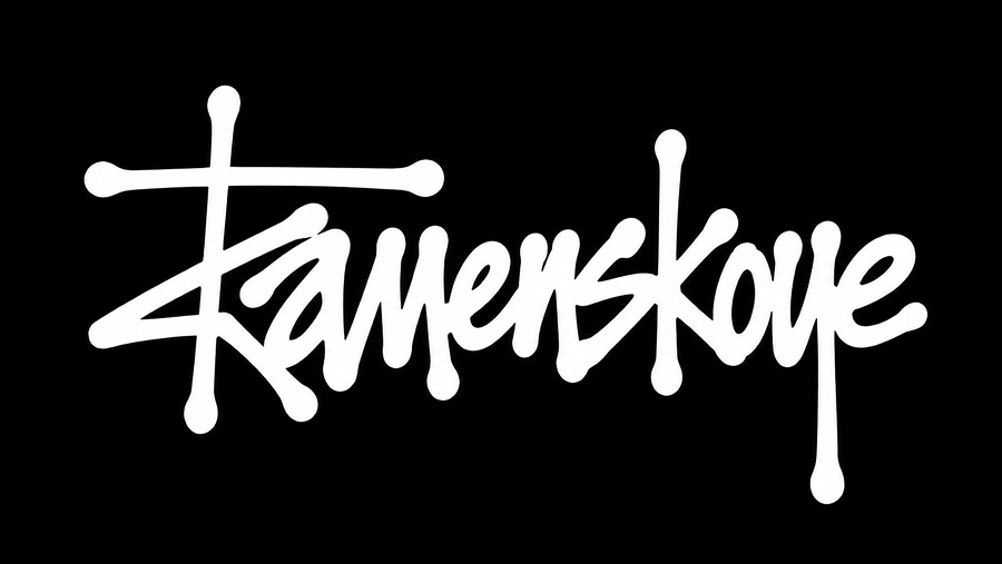 ‘Ramenskoye’ styled like the Stüssy logo
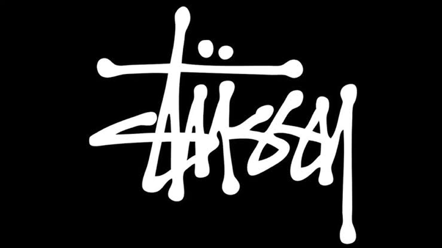 The Stüssy logo
TZ: Yeah, I agree. I talked with David Rudnick about this back in 2020. He was saying that your keystroke is reproducible, so the key lies in collaboration and direct relationship with a customer, a human touch. And it doesn’t matter how the problem gets solved
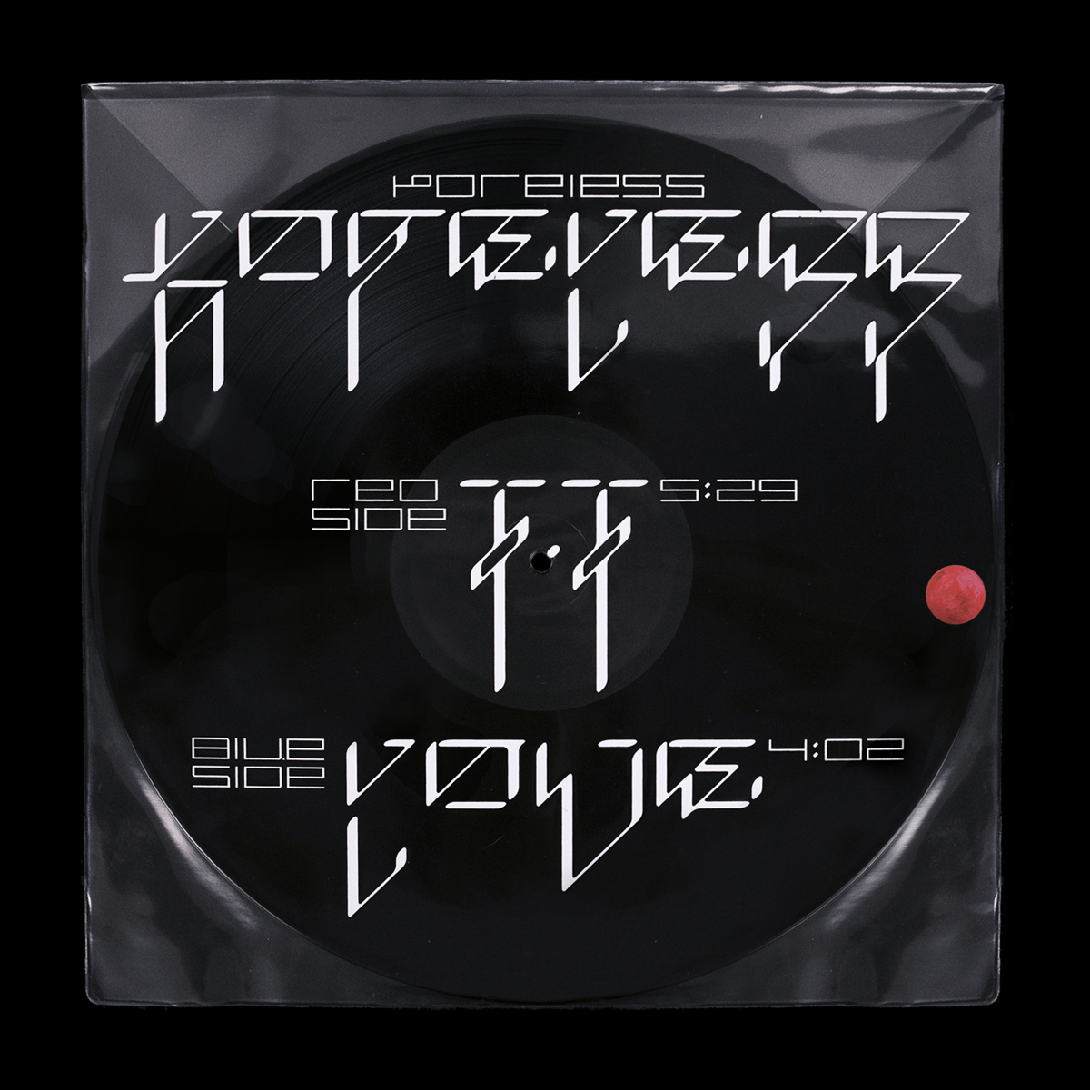
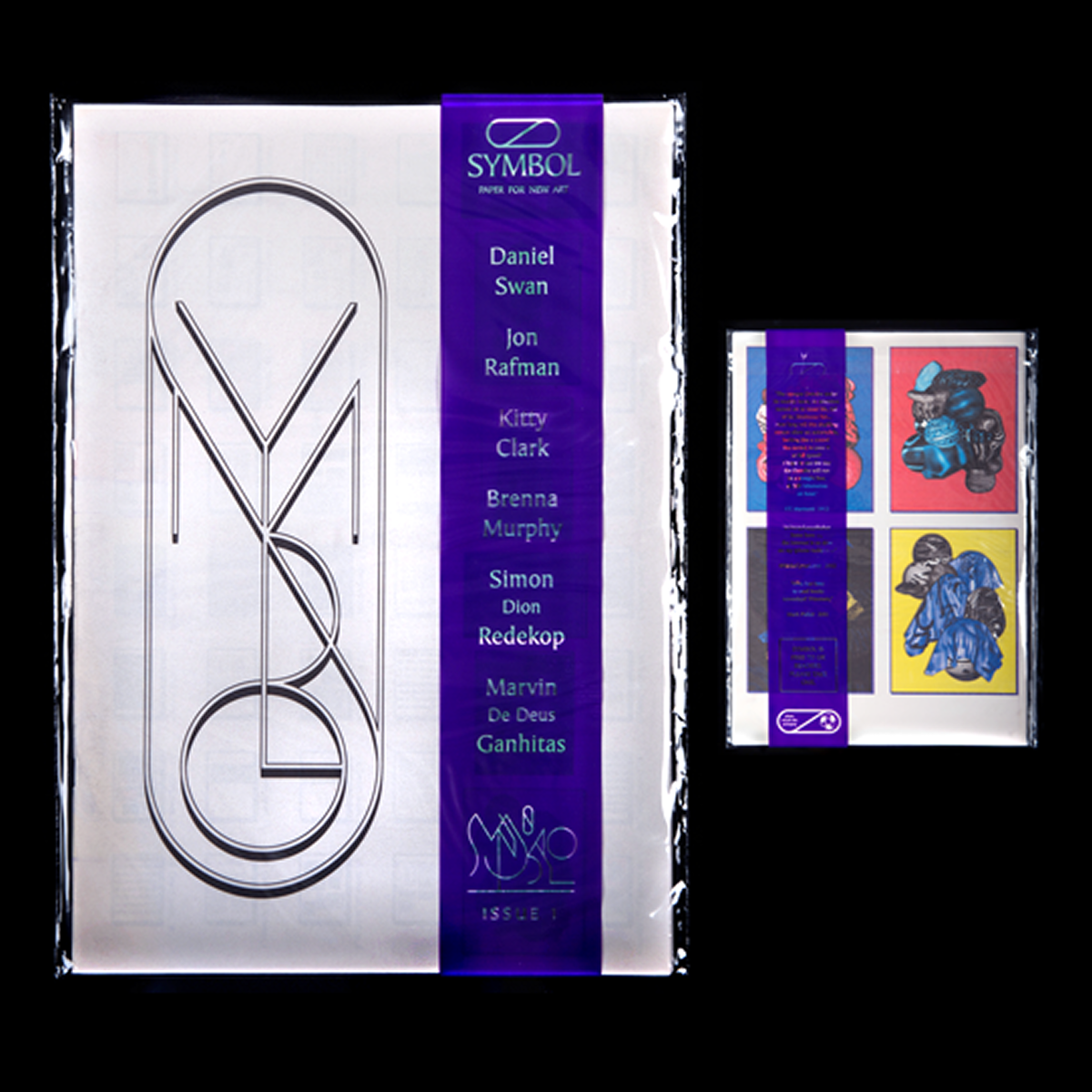
Designs by David Rudnick
NN: By the way, speaking of trends, the human touch is 100% a trend right now. There are lots of handmade
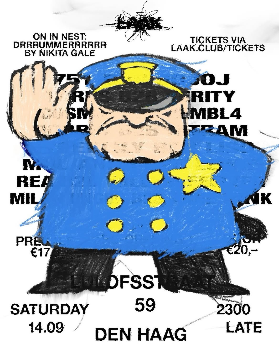 Poster by @laak.club featured by @tomorrow.type.today
AS: Timur, you opened your own studio. Why did you decide to launch it together with a sound artist?
TZ: There’s a lot of sound and motion in the world and on social media right now. I usually prefer static stuff, and all things sound in my own work is a track attached through Instagram’s interface. It’s not a complex thing at all, whereas I want to go deeper, understand how music works. So my partner, sound-artist Geo Kotanov helps me with that. And I help him to delve deeper into the visual world. Because he also takes an interest in the synthesis of image and sound.
But it’s still a design studio, and it has to solve specific tasks. That’s why we’re now actively working on vibe coding tools. It’s extremely interesting for us, and we know that you can make money on this.
AS: Has your experience curating tomorrow’s account changed the way you perceive your own designs?
NN: I would probably say it hasn’t. Although, of course, in the process of work you always reflect on and learn something new about your own approaches, develop new practices.
I feel like what you’re asking is whether dealing with other people’s designs every day has had any effect on us. In my case, probably not. I have my own ideas of beauty, which I’m more or less confident in.
And I trust those ideas. Well, sometimes, clearly, I have doubts. Like, when I make a beautiful image and it gets only 100 likes. I’m confused, ‘Why this number?’ And I rarely have an answer to that question.
And yet, of course, my style is evolving as I work on tomorrow. Yet it’s not because I am constantly sharing other people’s work, but simply because I come up with new solutions in the process of work. And I start using them.
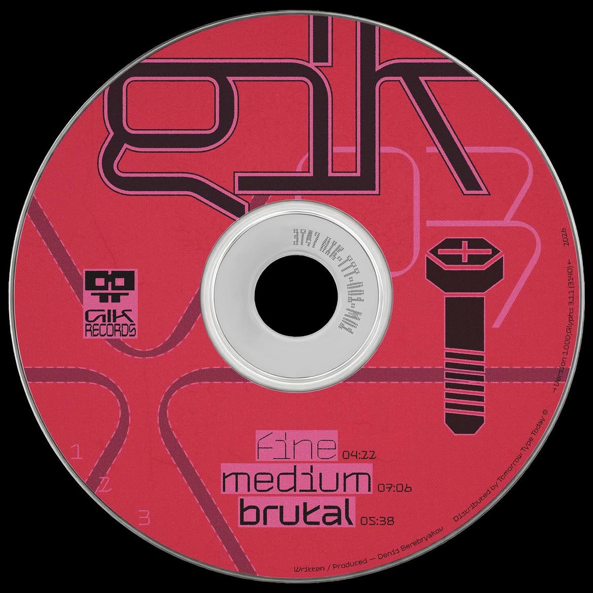
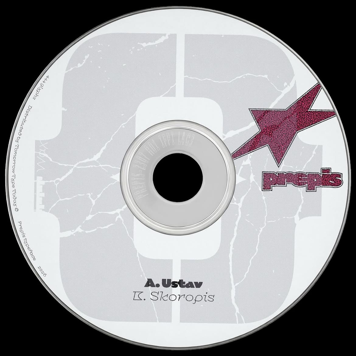
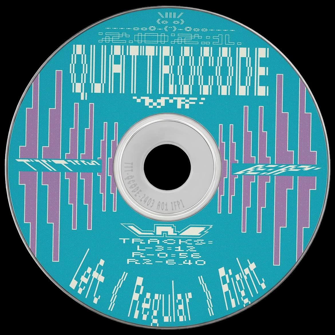

Nikita’s post for @tomorrow.type.today. Set in: Gik, Prepis, Quattrocode, CSTM Xprmntl 02
TZ: The way you perceive your own work is constantly changing. That’s
I have this global folder in my brain, ‘Visual experience’. And everything I posted on tomorrow has been saved in this folder. And one way or another, I always access that folder when I create my new works.
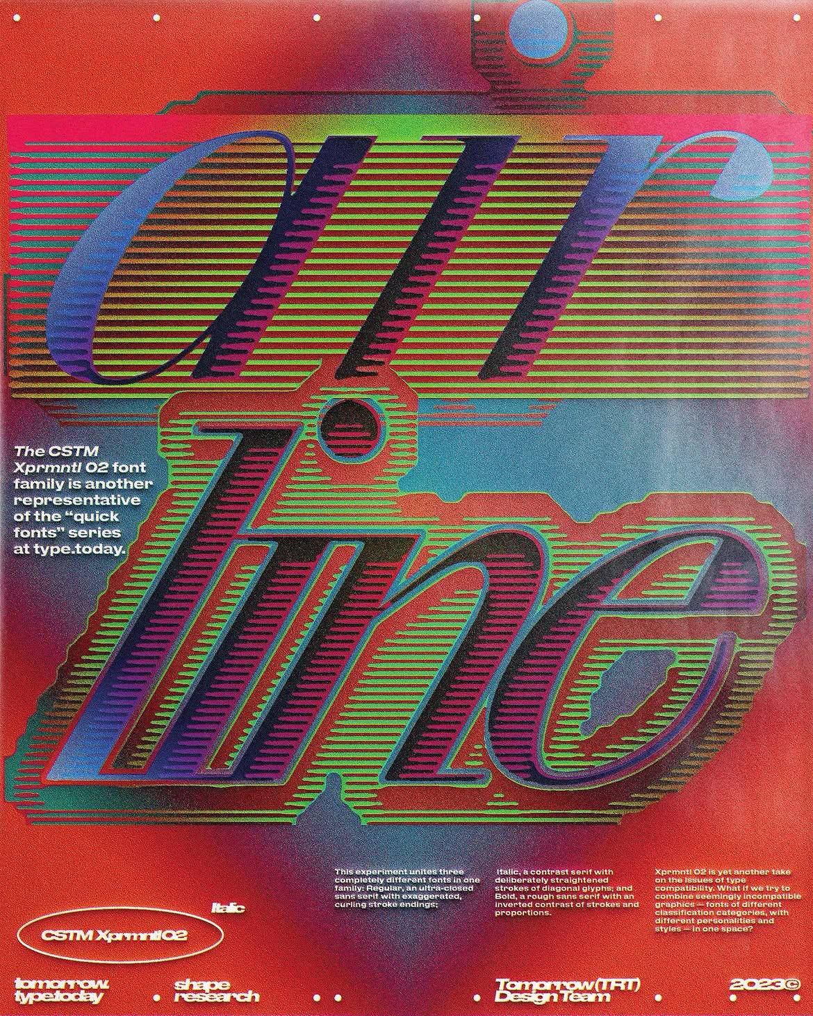 Timur’s post for @tomorrow.type.today. Set in: CSTM Xprmntl 02 Italic
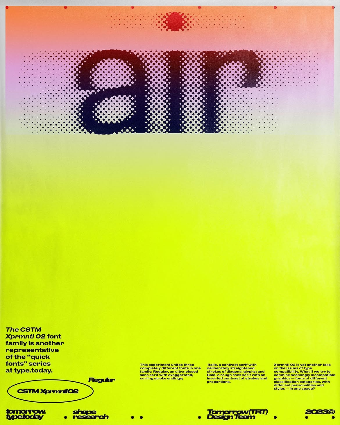 Timur’s post for @tomorrow.type.today. Set in: CSTM Xprmntl 02 Regular
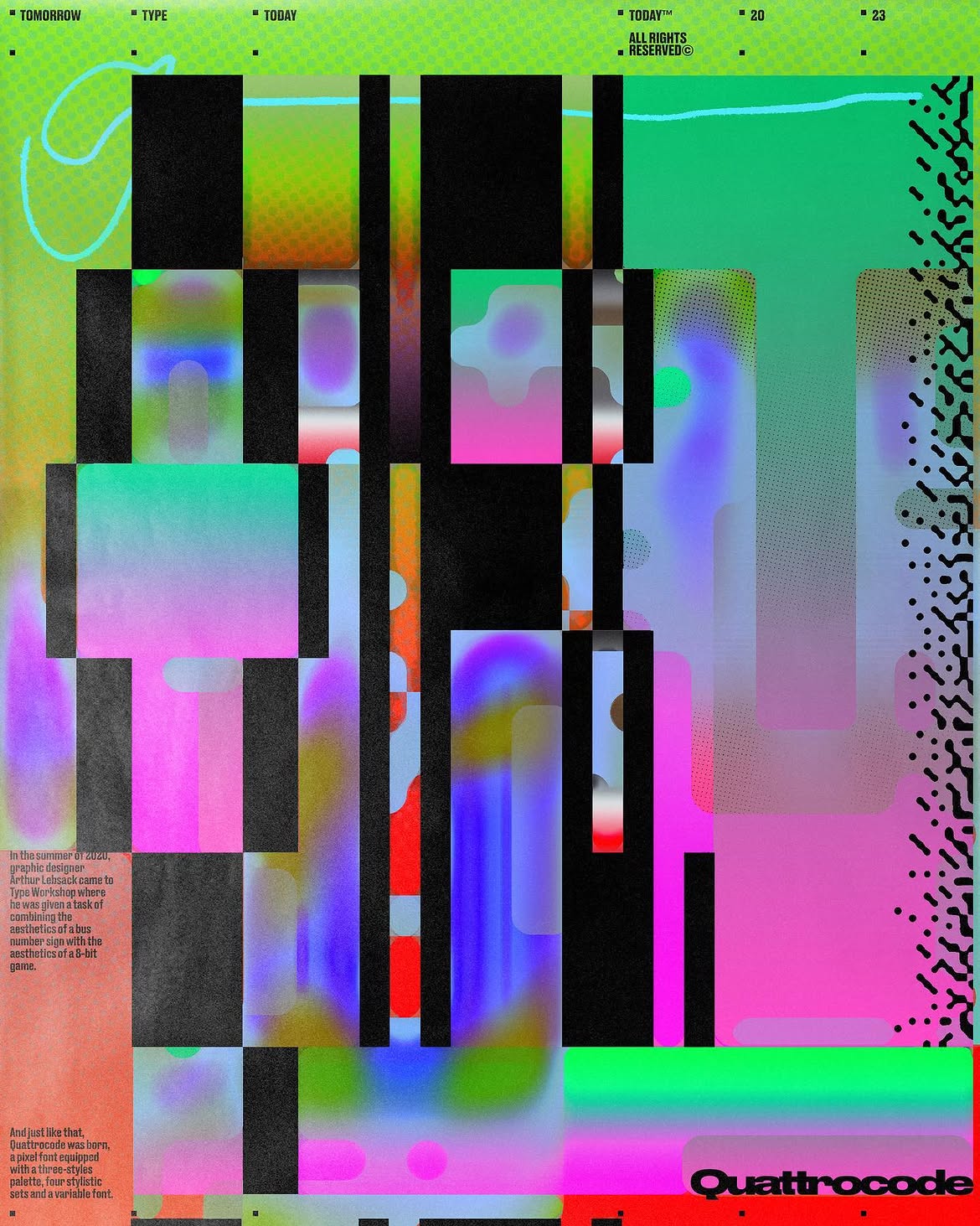 Timur’s post for @tomorrow.type.today. Set in: Quattrocode
AS: Do you think the two of you have different approaches to design and curatorial practice?
TZ: A friend of mine recently texted me, ‘Great work! How are things going at tomorrow?’ Then he added a link to Nikita’s work. And I said, ‘I left a year ago’.
NN: I had this a couple of times, too. But Timur is a legend of tomorrow, so I’m OK with that. To a certain degree, my style evolved under Timur’s influence.
Plus, I feel like I’ve drifted away quite a bit from him now. Well, we definitely still share certain patterns, but I see plenty of differences as well. For example, I use colour way more. Both the work I make and other people’s designs that I choose to feature have made the feed more colourful. A few times people have even said, ‘Oh, we can tell the account is changing. There are new things now’.
So it’s 50/50. There are differences; there are similarities. It happens that I create an image and think, ‘I’m literally carrying on Timur’s legacy with this one!’
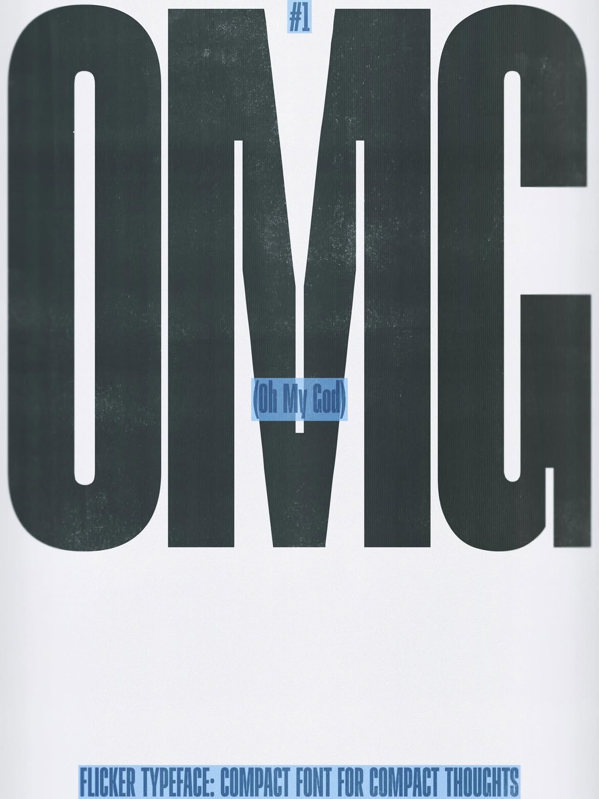
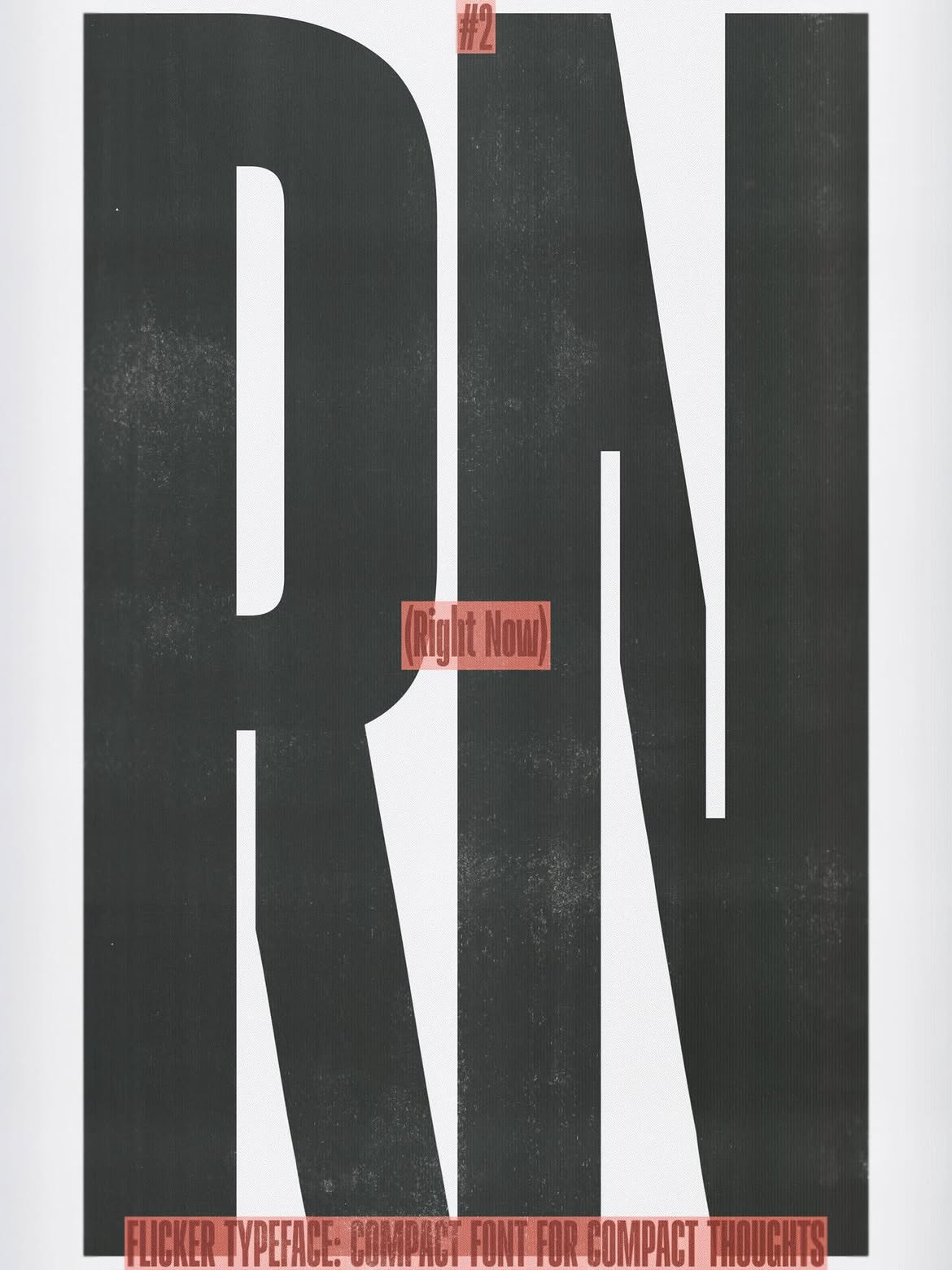
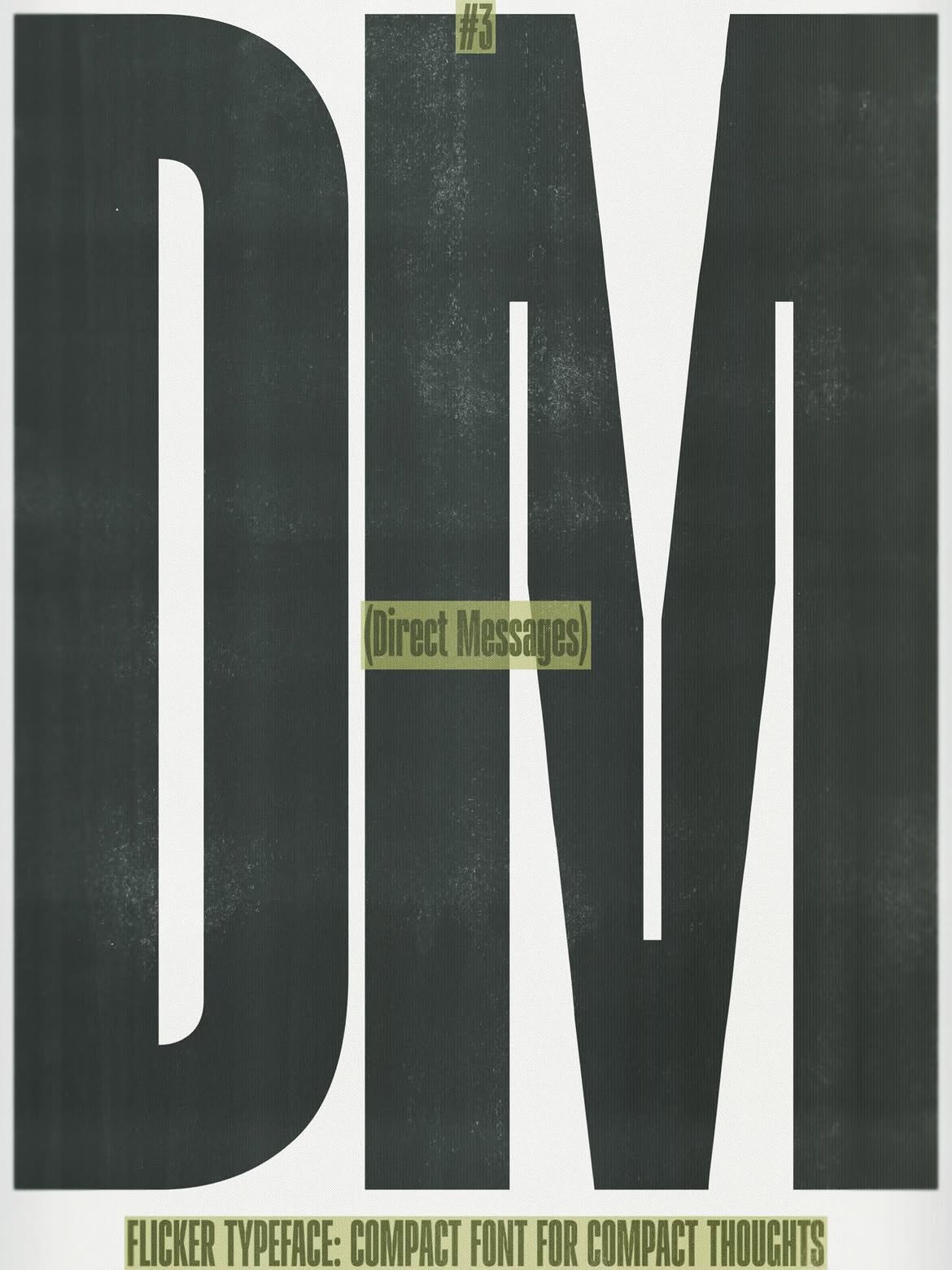
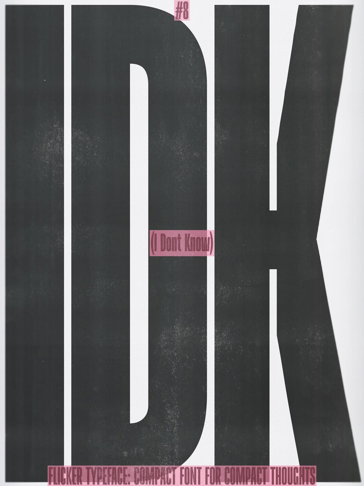
Nikita’s post for @tomorrow.type.today. Set in Flicker
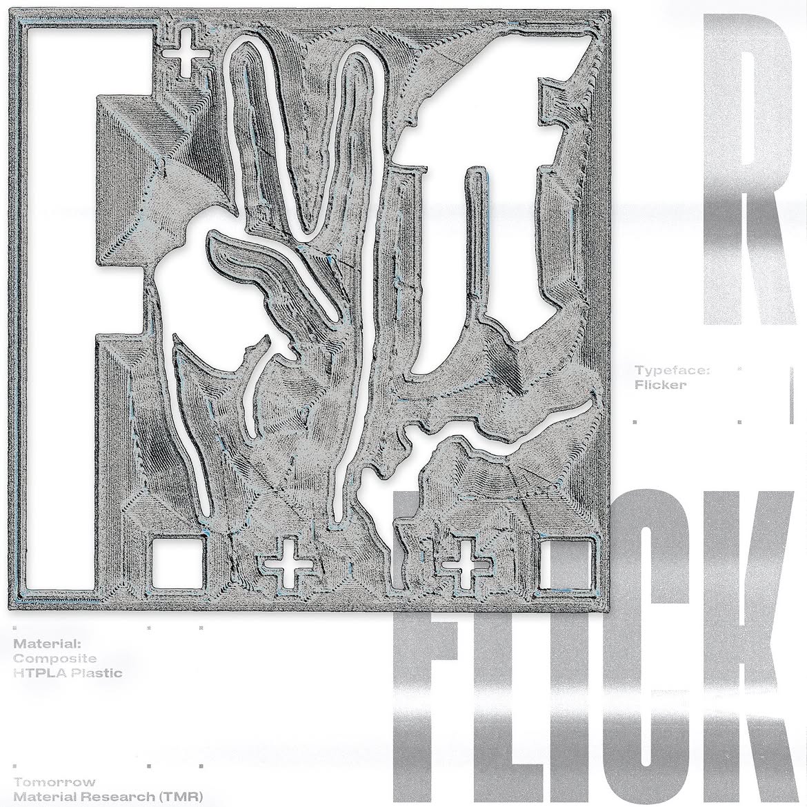
Timur’s post for @tomorrow.type.today. Set in Flicker
AS: Which typeface from our collection is the most difficult to work
NN: If I am not allowed to go with Maregraphe Mega, I really don’t know what to answer. I feel like the hardest thing is to step away from my own aesthetic preferences. Though there are typefaces I use less because I have a hard time finding the right context for them.
TZ: I’ve walked into a trap of personal preferences more than once. I mean, I used to pick my favourites, obviously. But then I realised that it wasn’t fair to other authors. So I decided to take a new typeface every day so that no one would be left out.


Maregraphe Mega release. Graphics: Timur Zima
AS: Tell me about your favourites!
NN: It’s Lufta. I was so happy when it was released. I am a huge fan of this typeface. I’m about to publish several posts with this font in a row because I couldn’t stop and made a number of images for a number of posts.
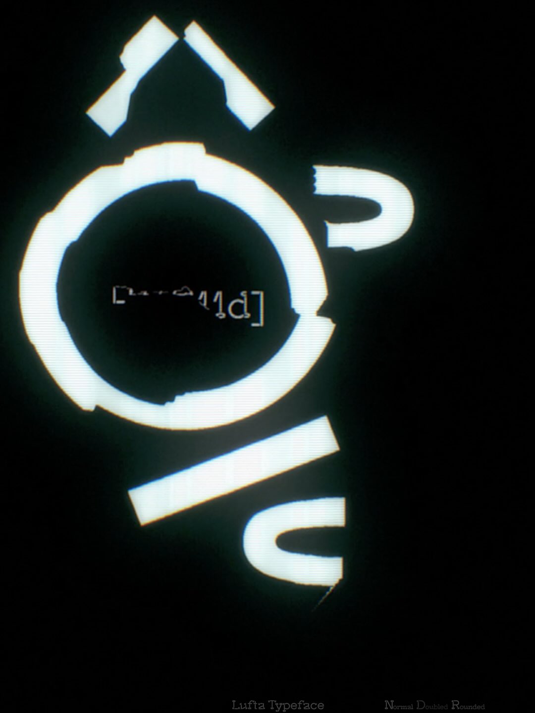
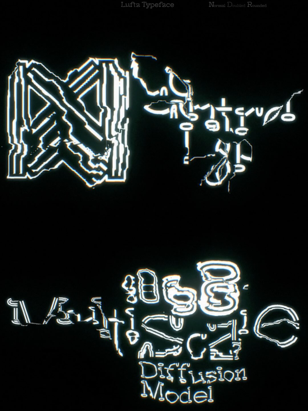
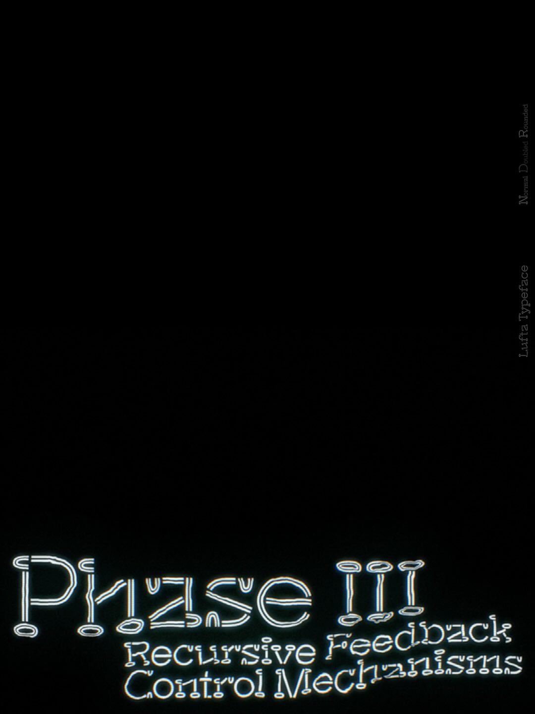
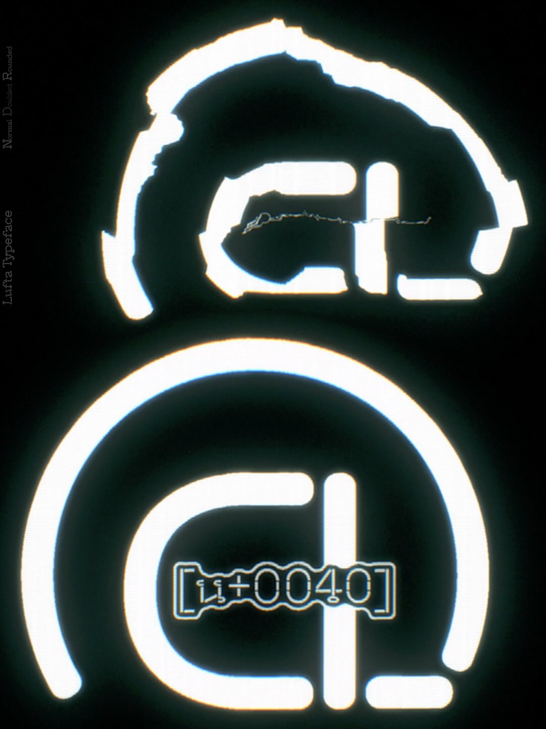
Nikita’s post for @tomorrow.type.today. Set in: Lufta
But I’m also constantly checking which typefaces were used long ago and which were used
But Lufta — I am literally in love with it. I am now waiting for the right context to suggest it to a client.
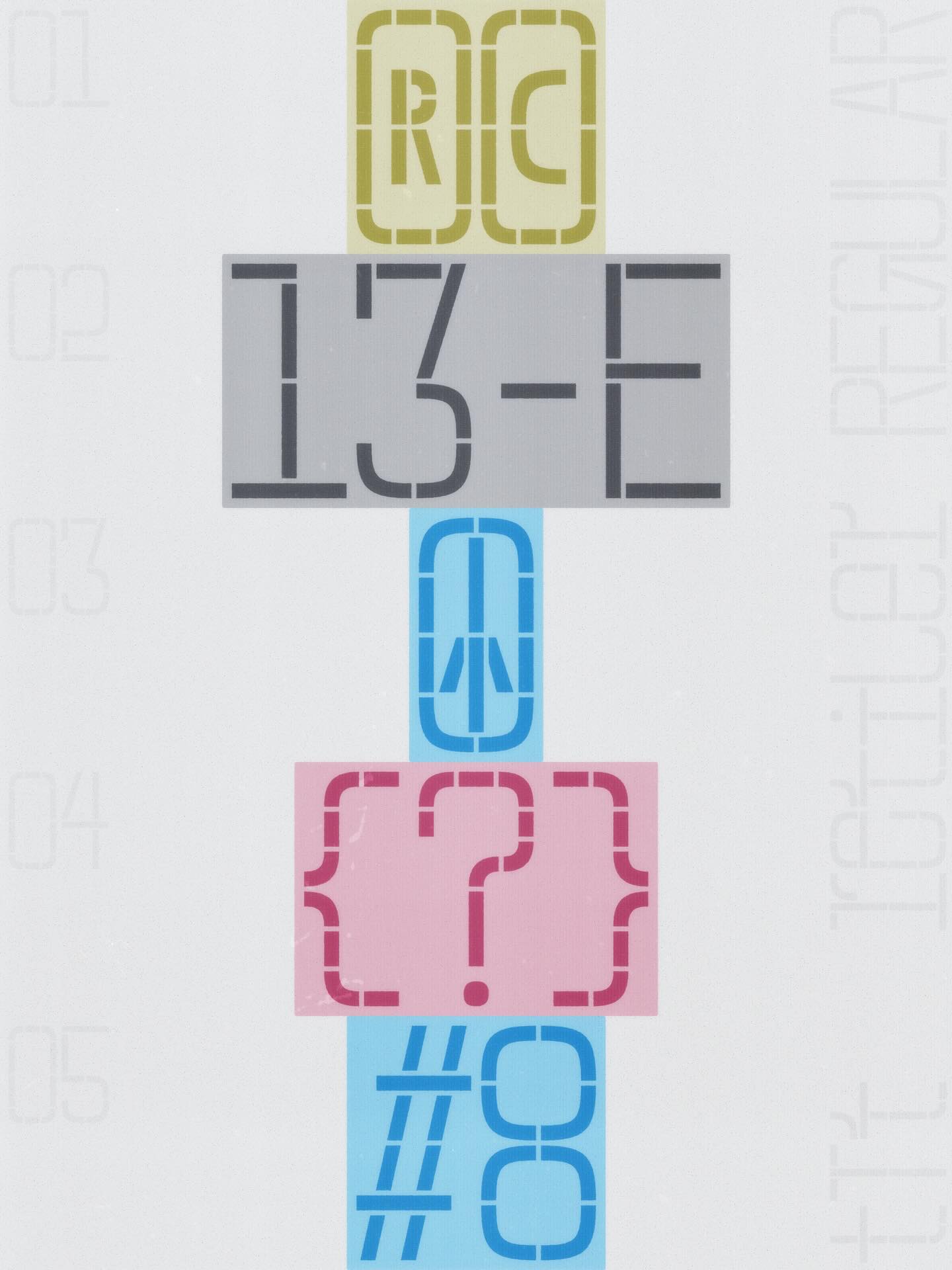
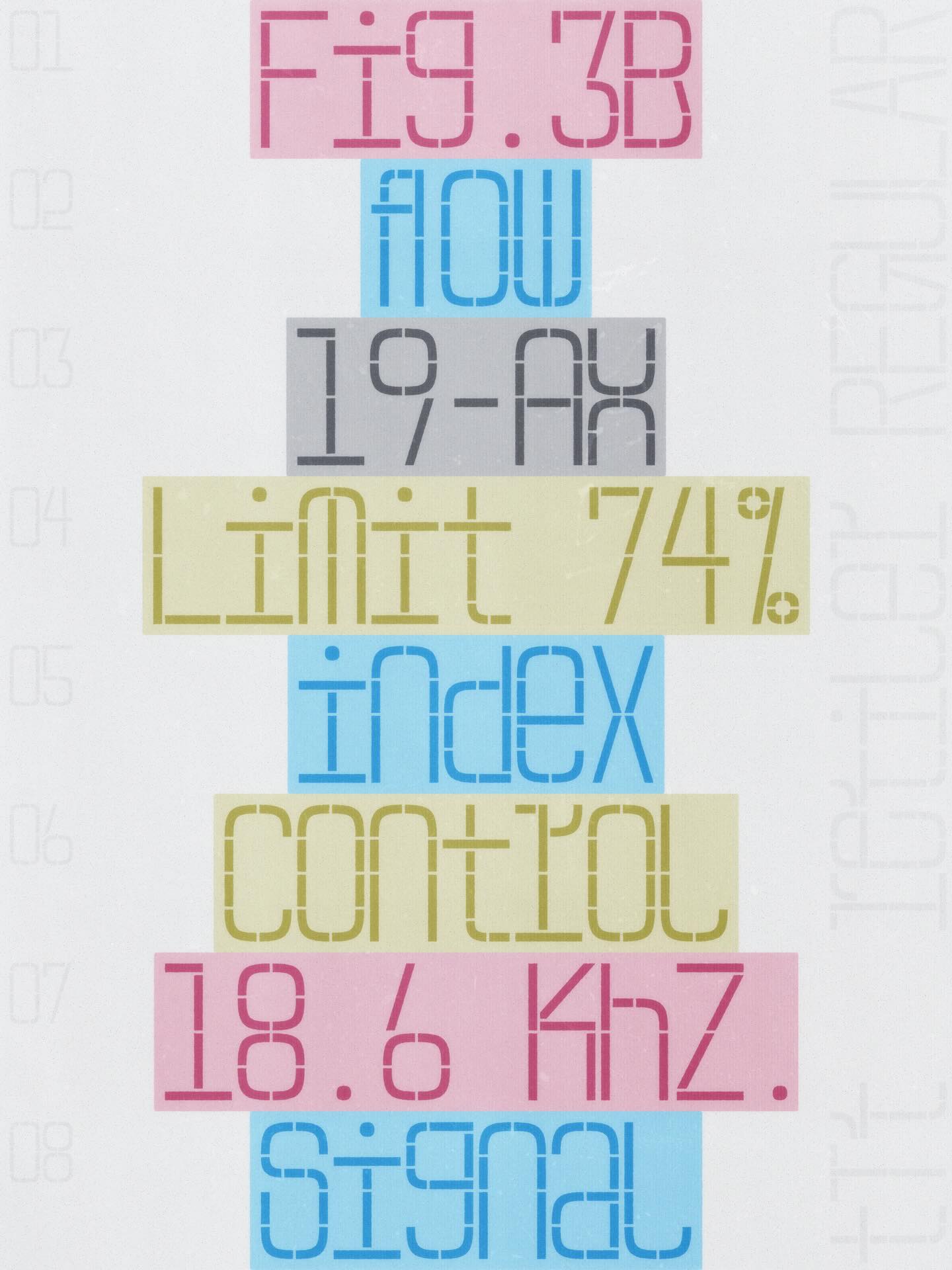
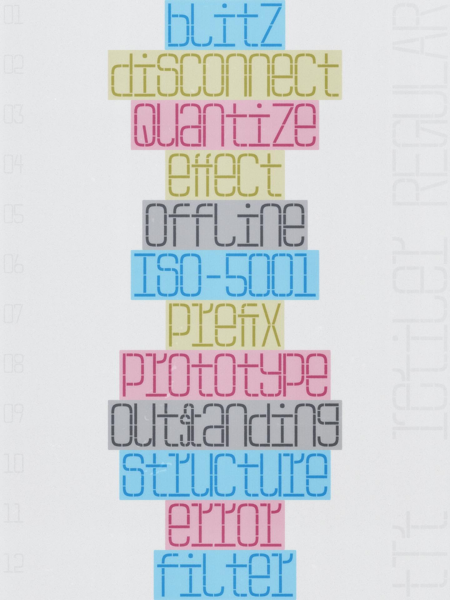
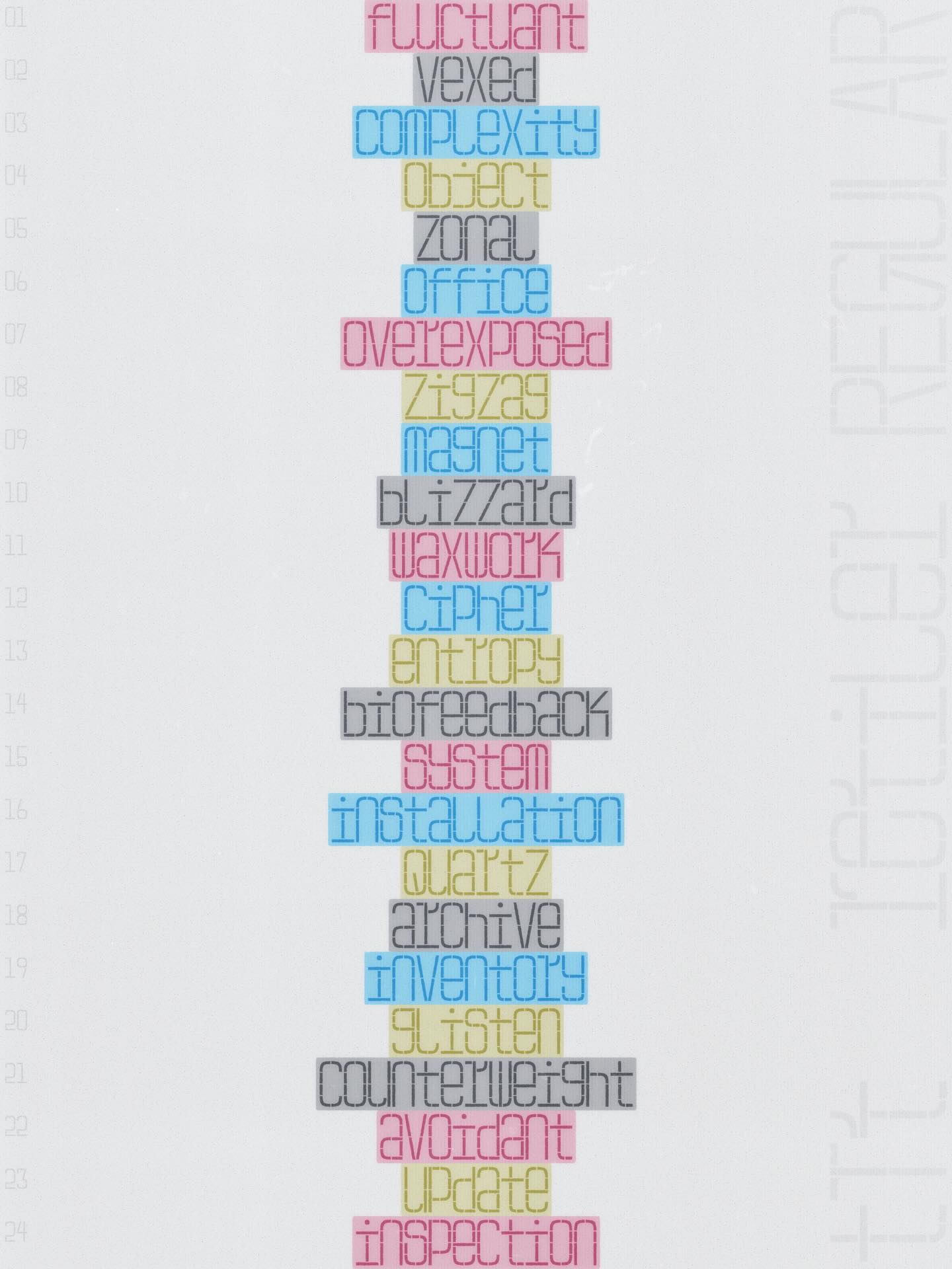
Nikita’s post for @tomorrow.type.today. Set in: Retiler
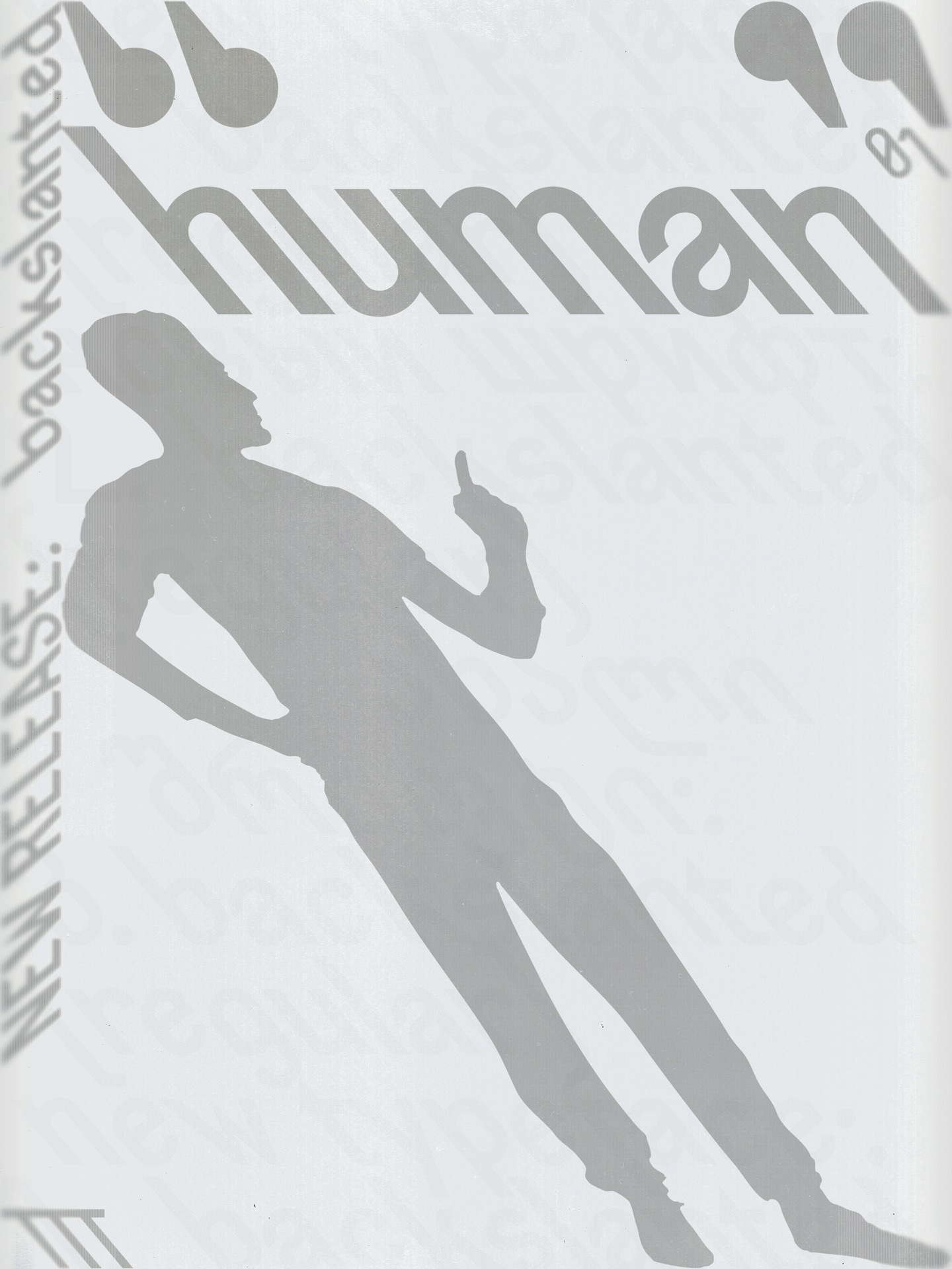
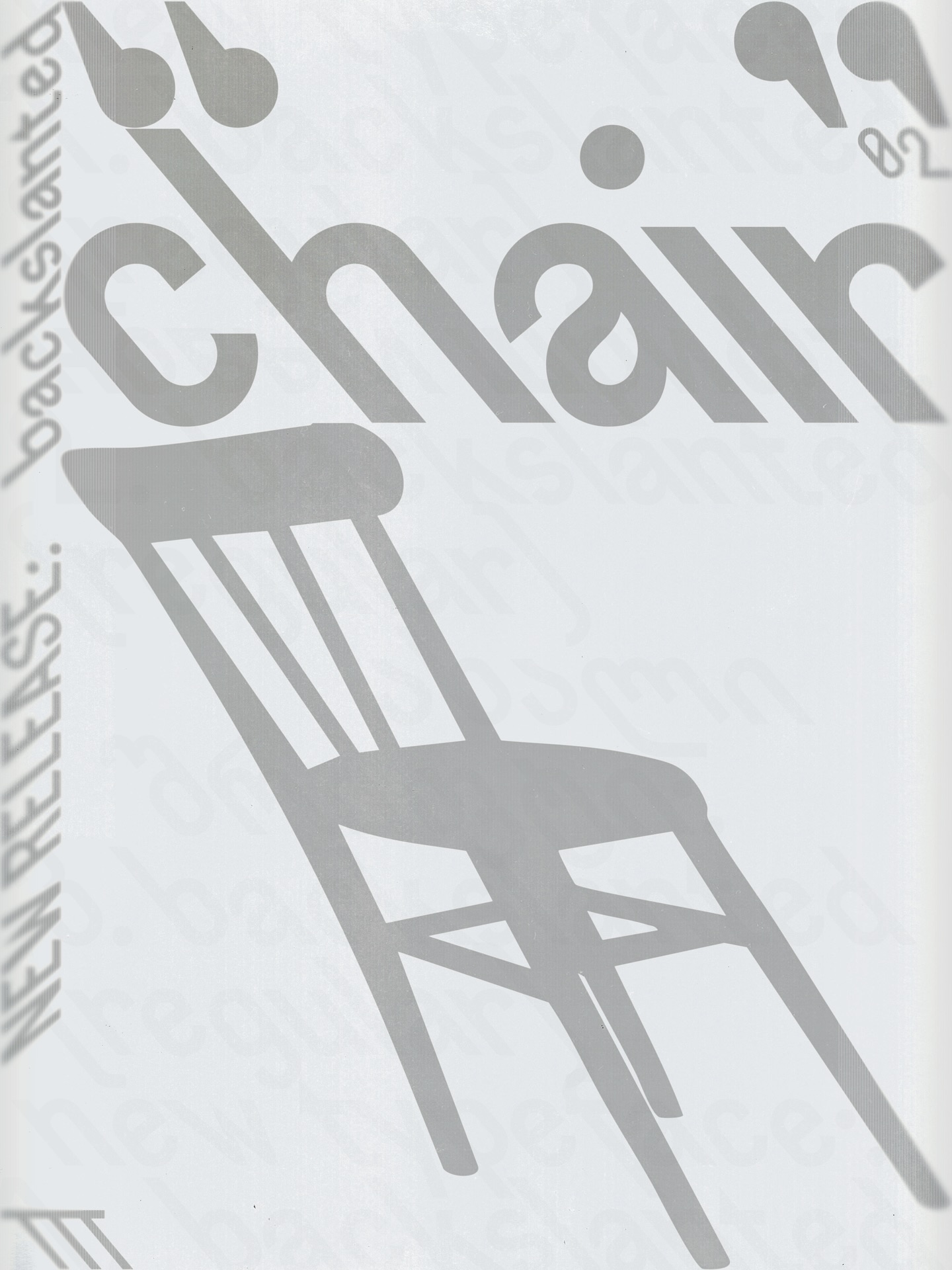
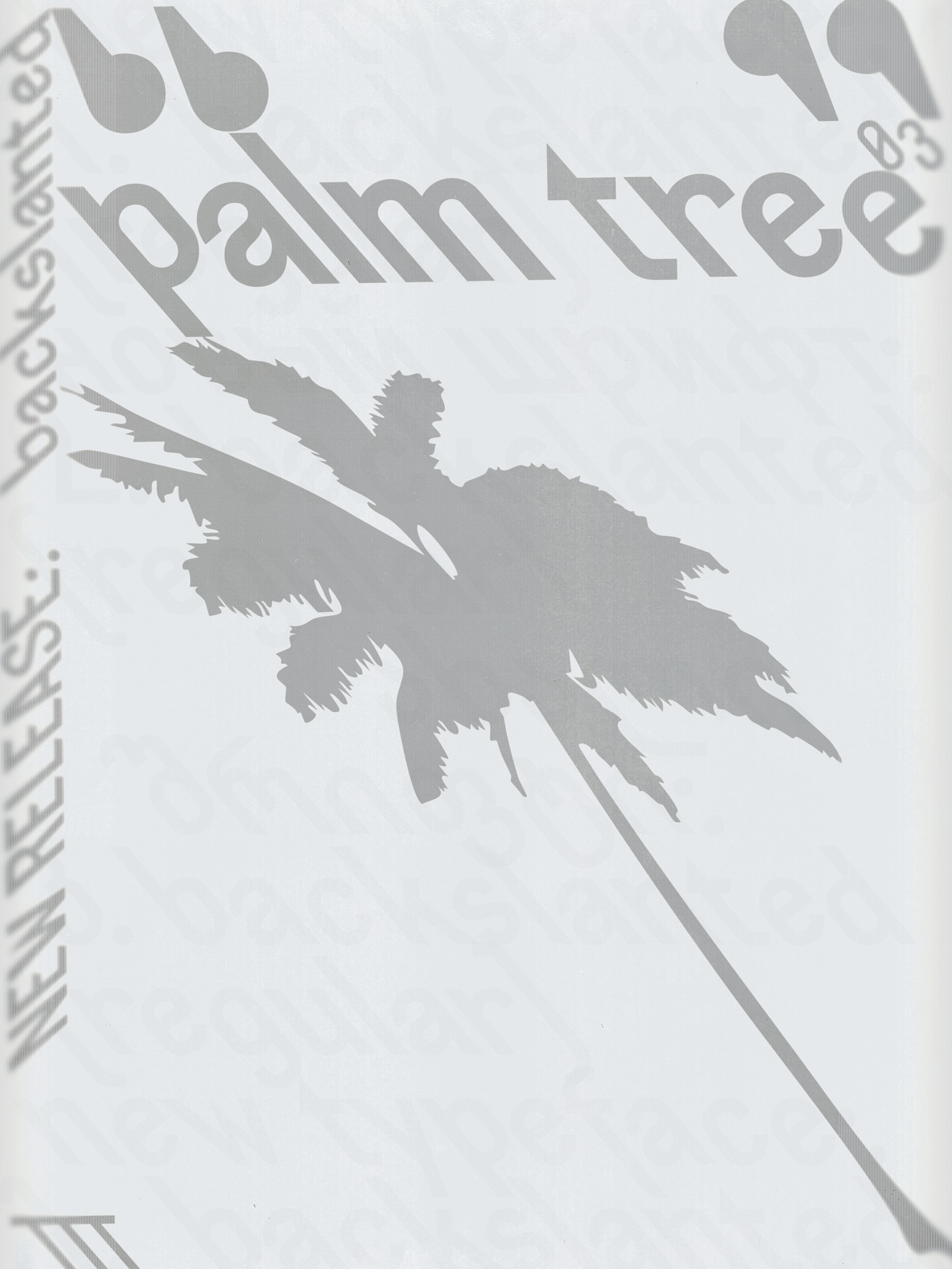
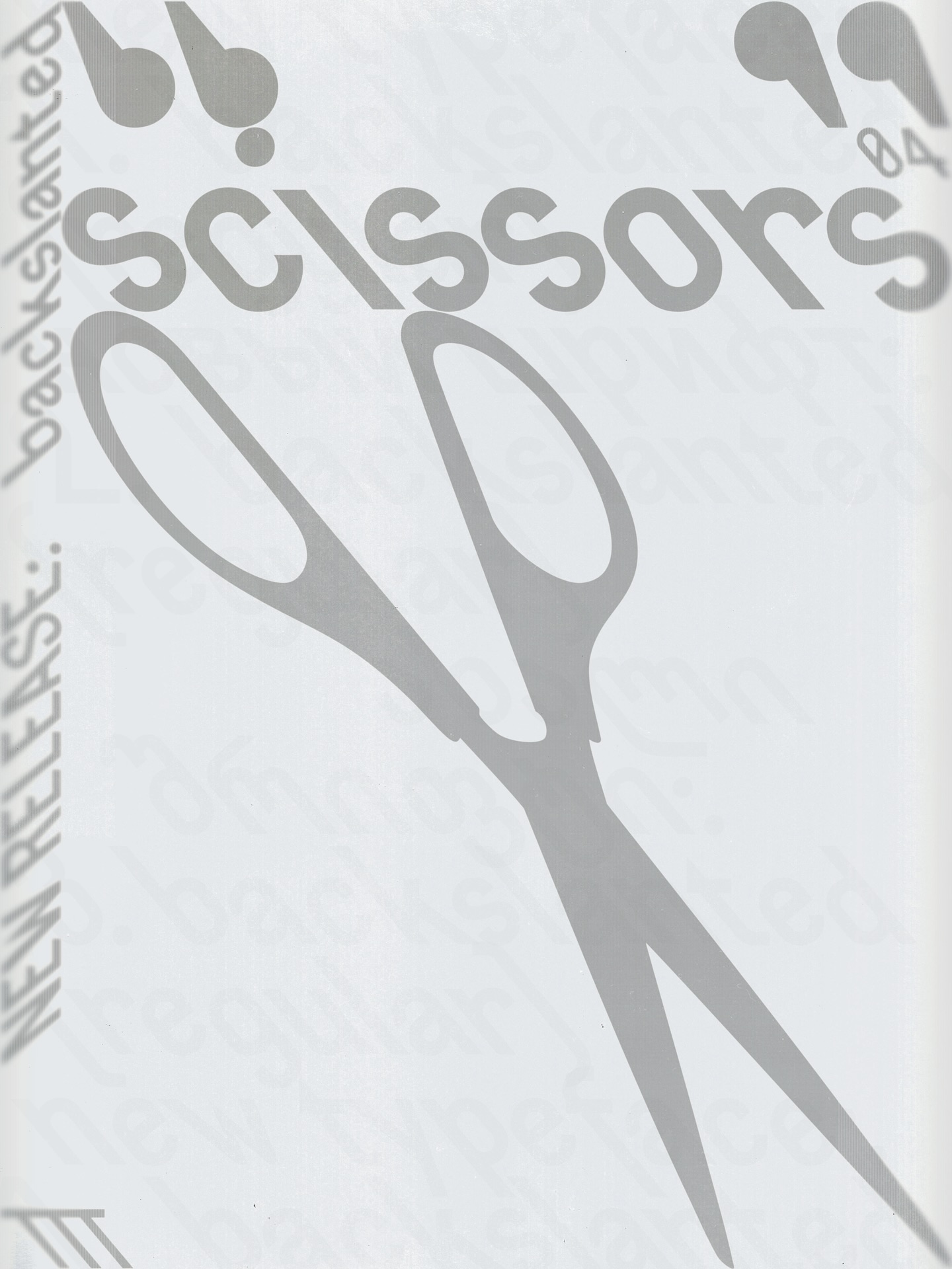
Nikita’s post for @tomorrow.type.today. Set in: Backslanted
TZ: I fell in love with Apoc. It is a wonderful wicked serif. I also like Gik — I generally have a soft spot for futuristic shapes. And I have a huge amount of respect for Denis Serebryakov. He’s brilliant.
It’s always a pleasure to work with Base&Bloom, too. It comes with lots
Ostromentsky also does this
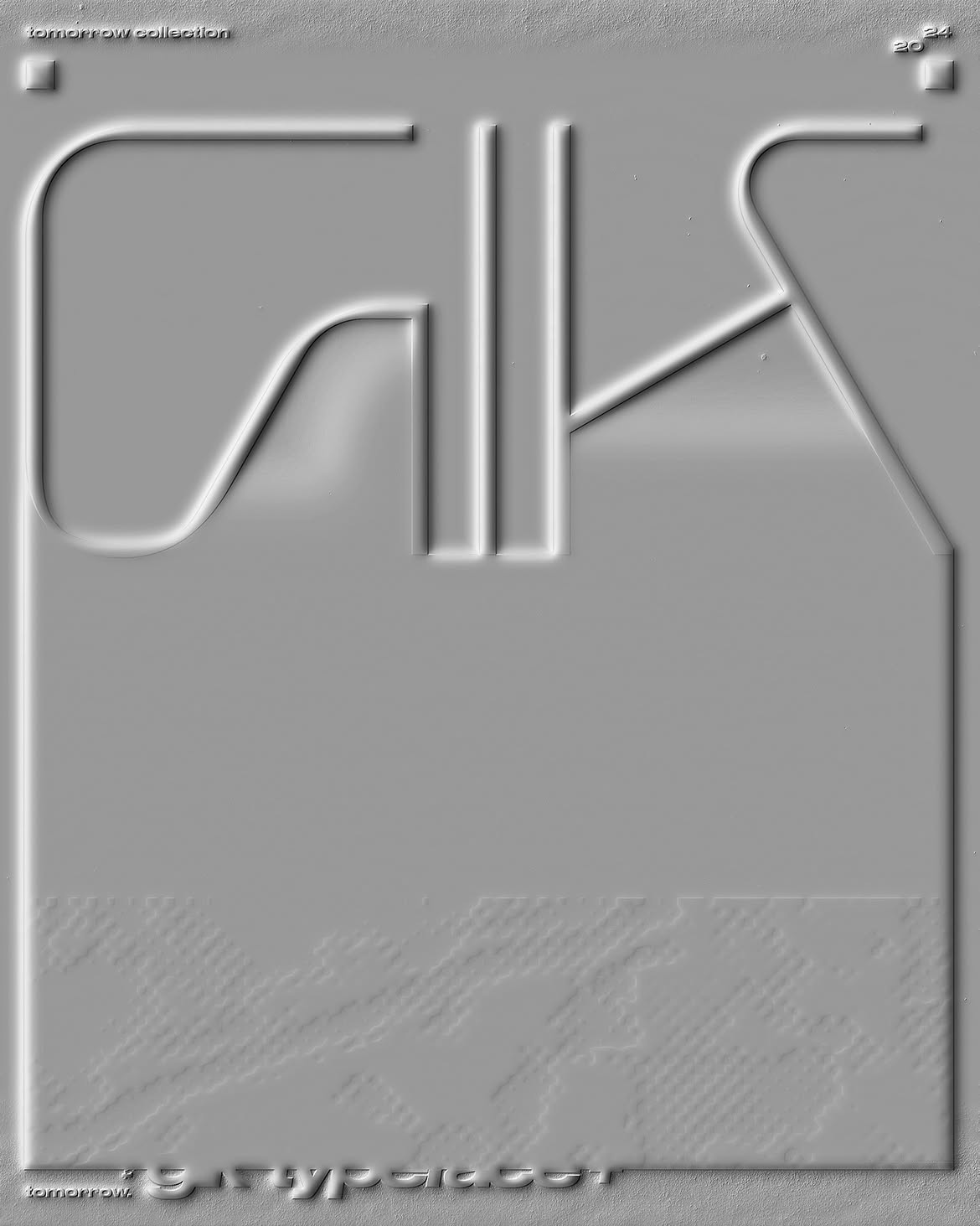
Timur’s post for @tomorrow.type.today. Set in: Gik
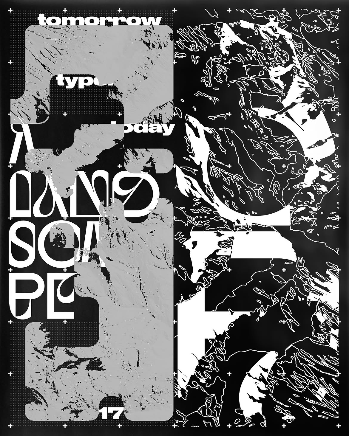
Timur’s post for @tomorrow.type.today. Set in: Base&Bloom
AS: Is it important to have any type design experience to understand whether a font is high-quality?
TZ: I believe so. And to run an account on typography, you also need to read a lot about type.
NN: I often joke when I speak to Ilya and Yura that I’m the biggest amateur on the team. But I guess one really needs some experience in type design. At least, you need to understand how type is built and why. Without that knowledge, it’ll be difficult.
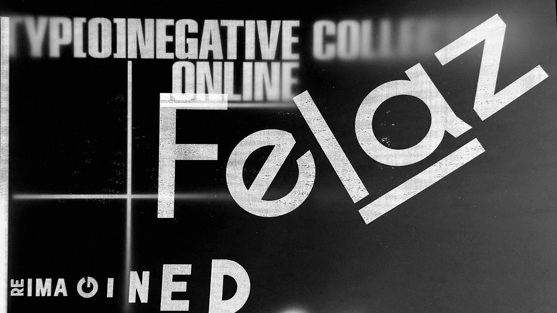
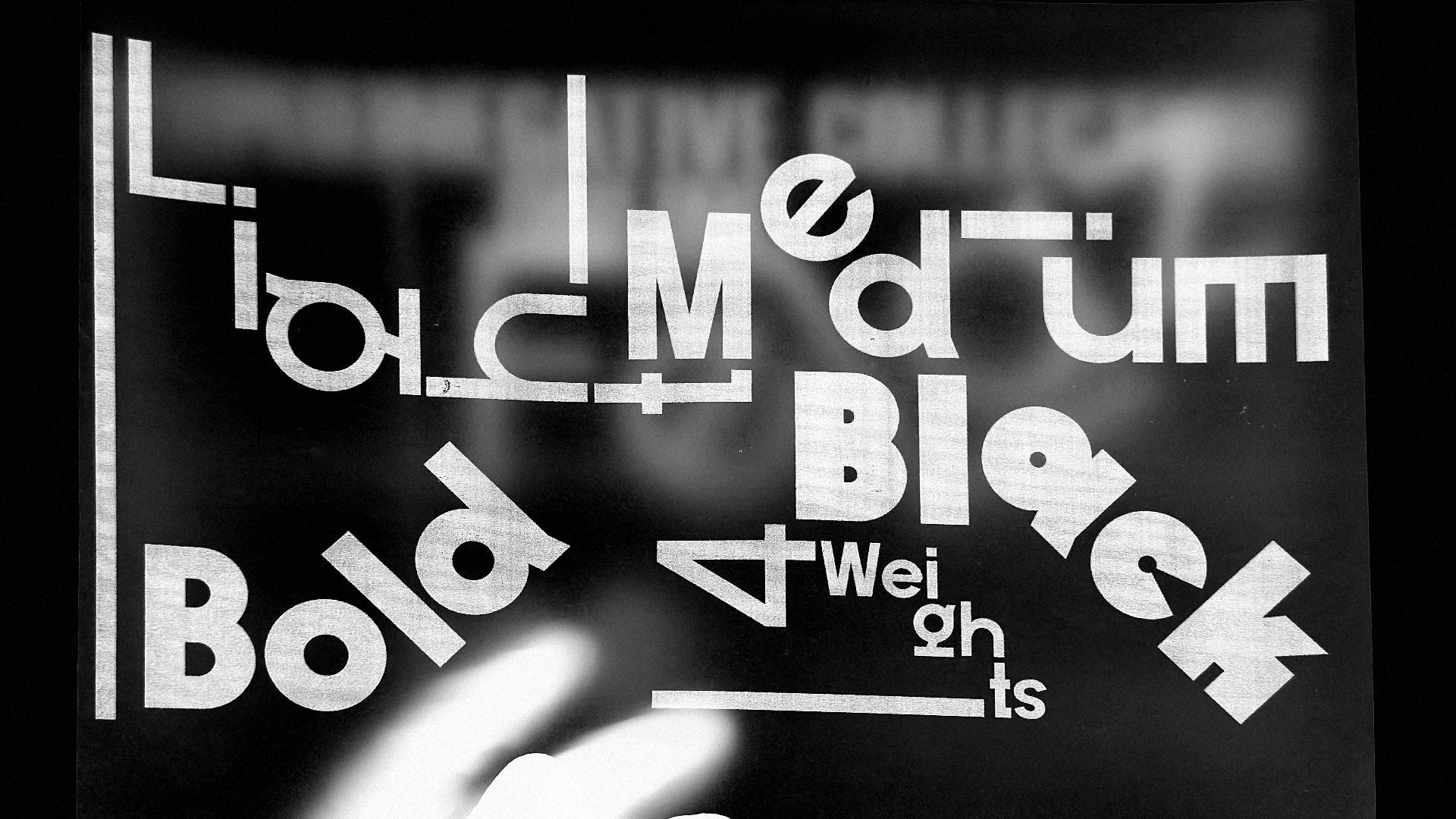
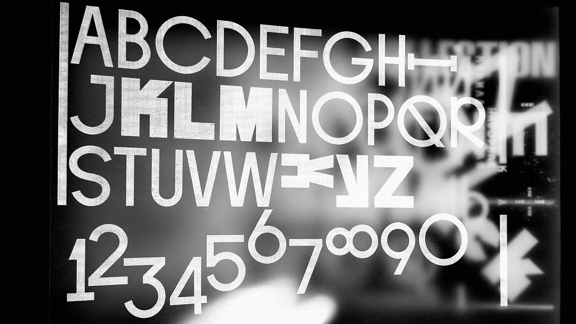
Fellaz, a typeface by Timur Zima’s foundry TYP[O]NEGATIVE
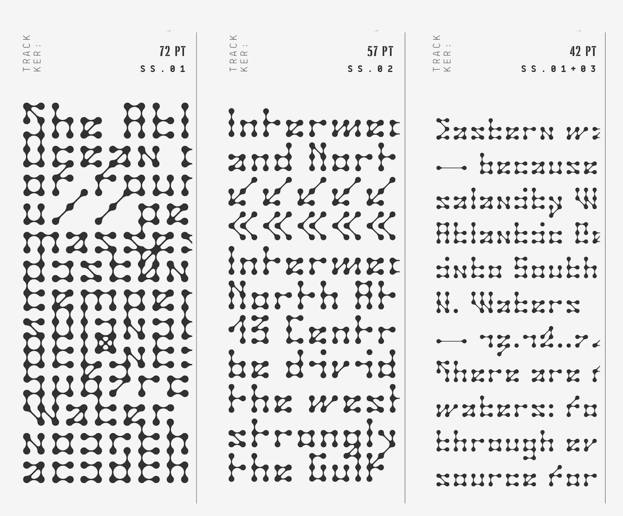
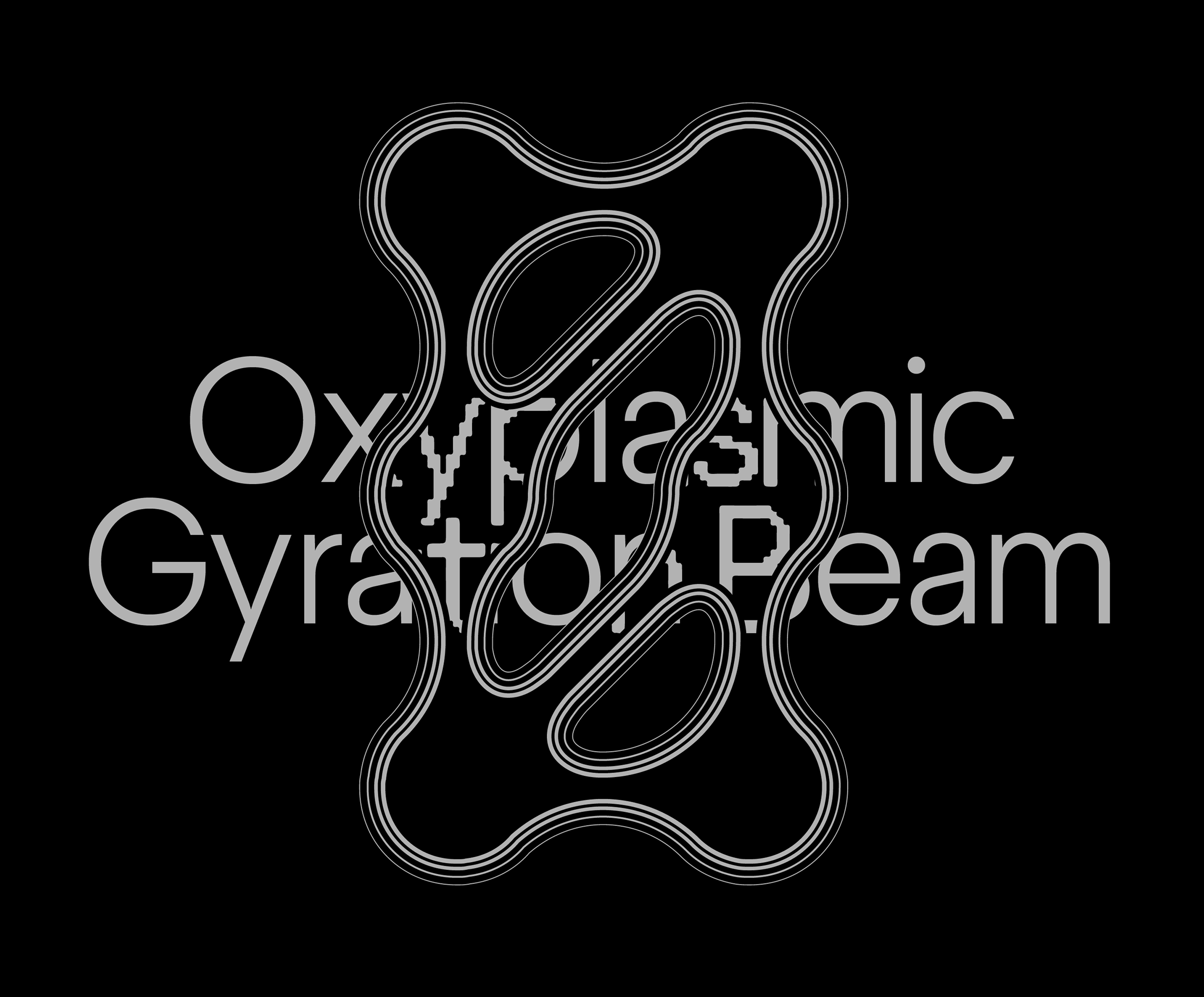
Drexciya, a typeface by Nikita Nelikhov
AS: How will AI affect the life of type designers?
NN: I think vibe coding is going to have a bigger impact on type design than image generation. I’ve already built a number of tools specifically for modifying and handling font files. That is, for example, you upload a modular typeface made up of dots and change the shape of the modules to stars. I think we’re going to see a lot of weird stuff of this kind.
TZ: I totally agree. A typeface is a system based on certain rules. I could well imagine a tool that can develop a collection
But I guess all this applies mostly to display type. And all things academic, it will simply continue to exist. Clearly, drawing a serif is incredibly
Optical adjustment,
AS: I happen to have a related concern. On LinkedIn, we often read that AI hasn’t taken away graphic designers’
TZ: Sadly, I feel like this pressure is now spreading across the entire design industry.
NN: I believe that designers who work on text typefaces may also benefit from AI. Say, you feed a model the kerning pairs from one family in a font collection and ask it to do kerning for another family. And then you go through the results and check. Of course, there’ll still be a lot of editing involved, but at least you’re not starting from scratch.
Perhaps, at some point, AI will eventually be able to design its own Times. But it’s hard for me to speculate, as I come from the world of display type.
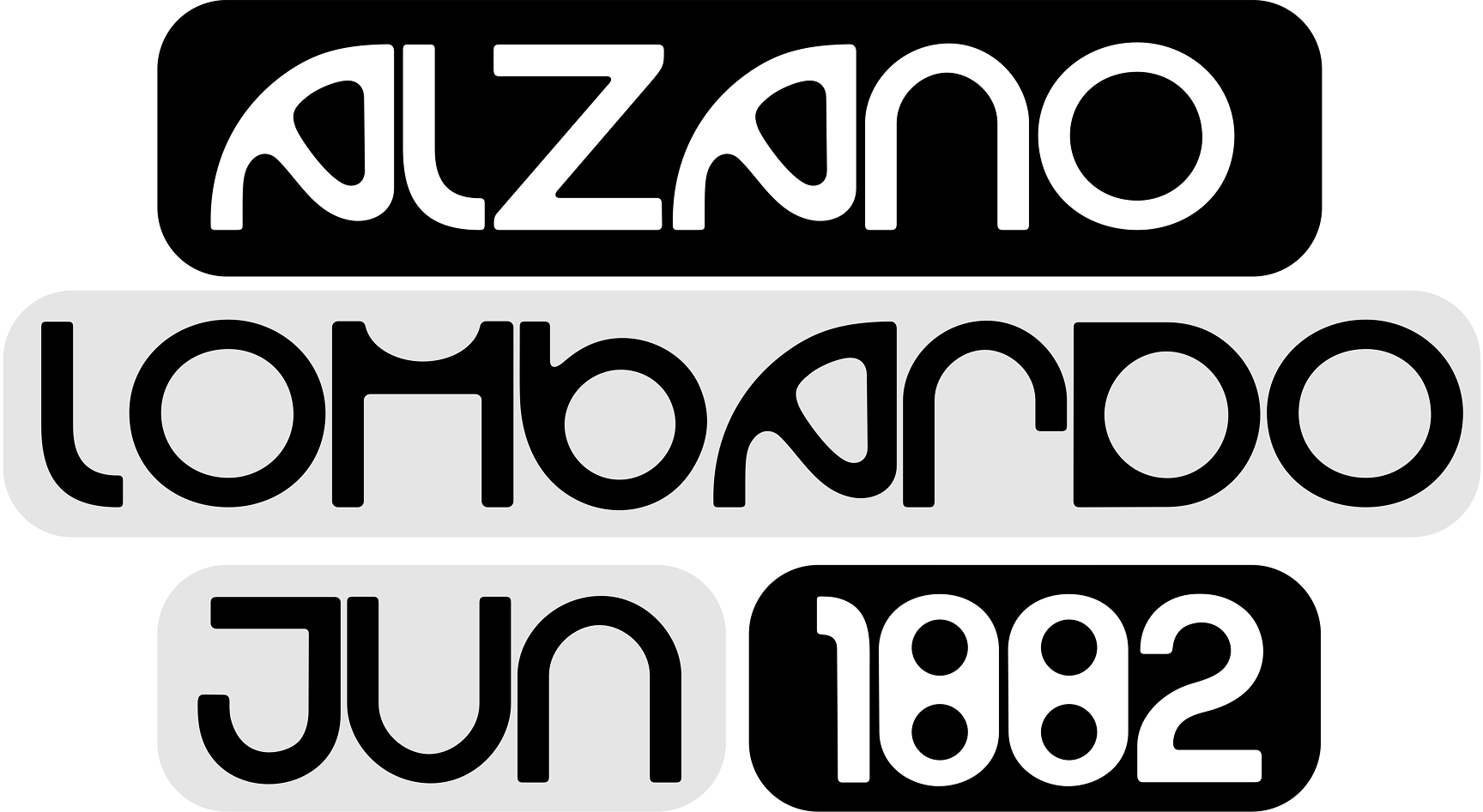 Mario, designed with the help of AI
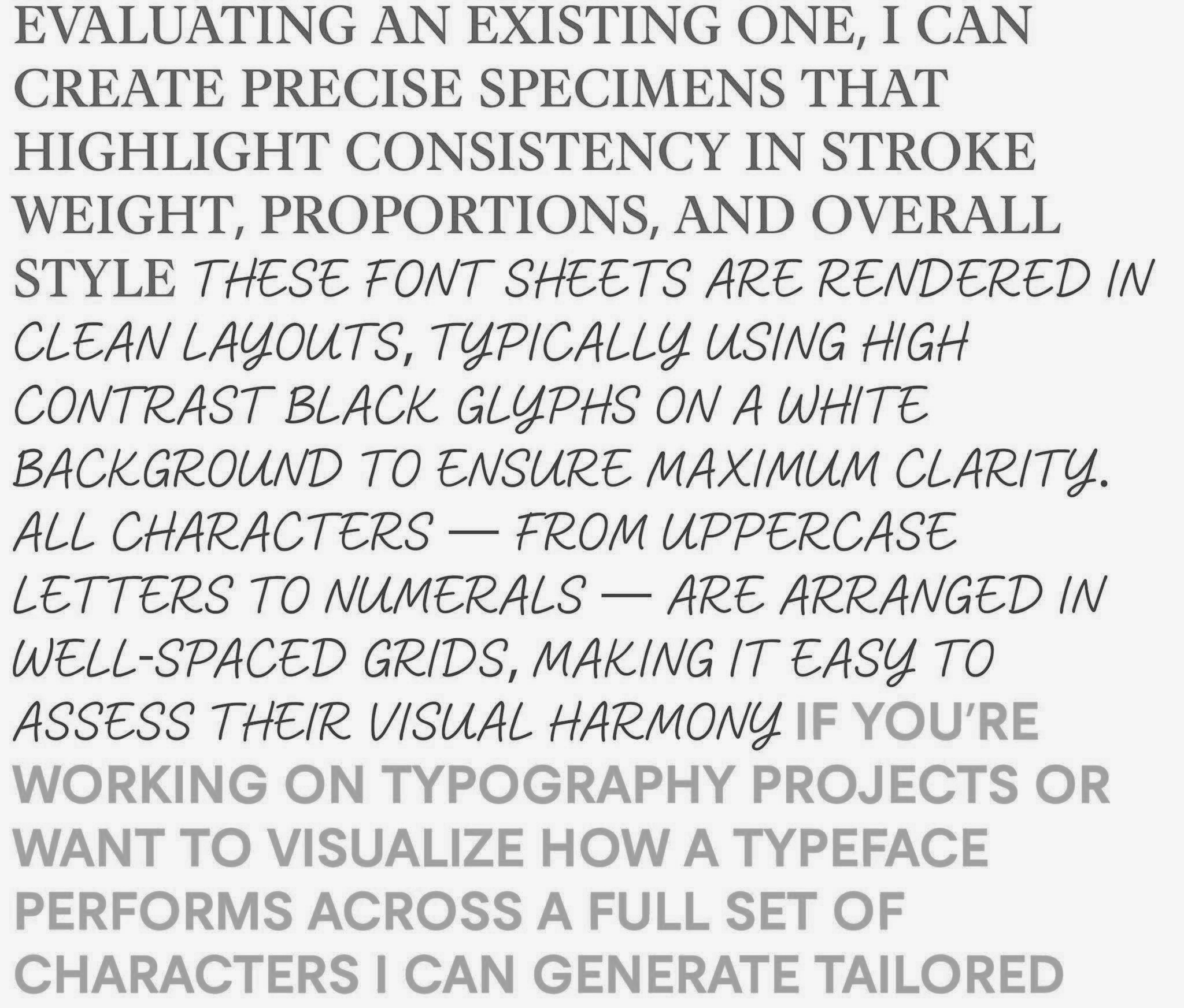 Typefaces Yuri Yarmola designed with the help of AI
AS: So you’re kind of defending that customer who asks to design 12 styles in a month?
NN: Let’s not see things in black and white. There’s always something to worry about and something to be happy about.
AI is not the first tool we’re dealing with, and it certainly won’t be the last. We can roughly compare its arrival with the release of Tilda or Readymag. Suddenly, pretty much any lady could build a website for their online shop.
So, I would say, if you want
AS: Do you feel like designers are now trying to develop a new language to describe what’s going on?
TZ: Yes, I do, and I believe this is necessary and important. There’s Evan Collins with his Consumer Aesthetics Research Institute. His account on are.na is just legendary! He also has a separate website where he attempts to come up with definitions of different aesthetics and new terms for them.
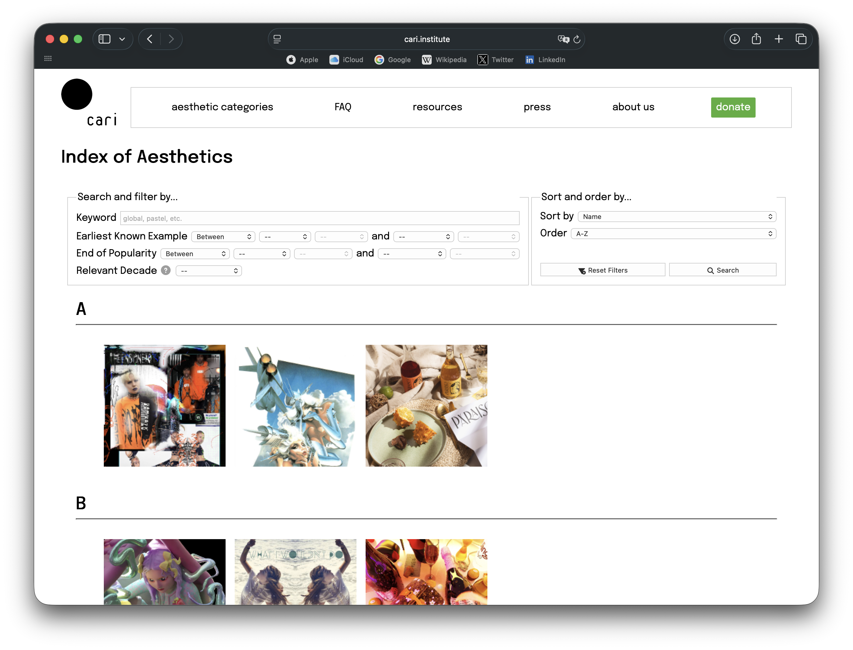
Consumer Aesthetics Research Institute website
NN: I really love language. Back in the Vkontakte era, there was this really great page called ‘What genre is this, mate?’. It featured all kinds of random word combinations that somehow sounded like names of music genres.
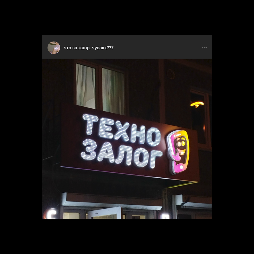 Techno Deposit. From the ‘What genre is this, mate?’ page
 Orthodox Music for Surfing. From the ‘What genre is this, mate?’ page
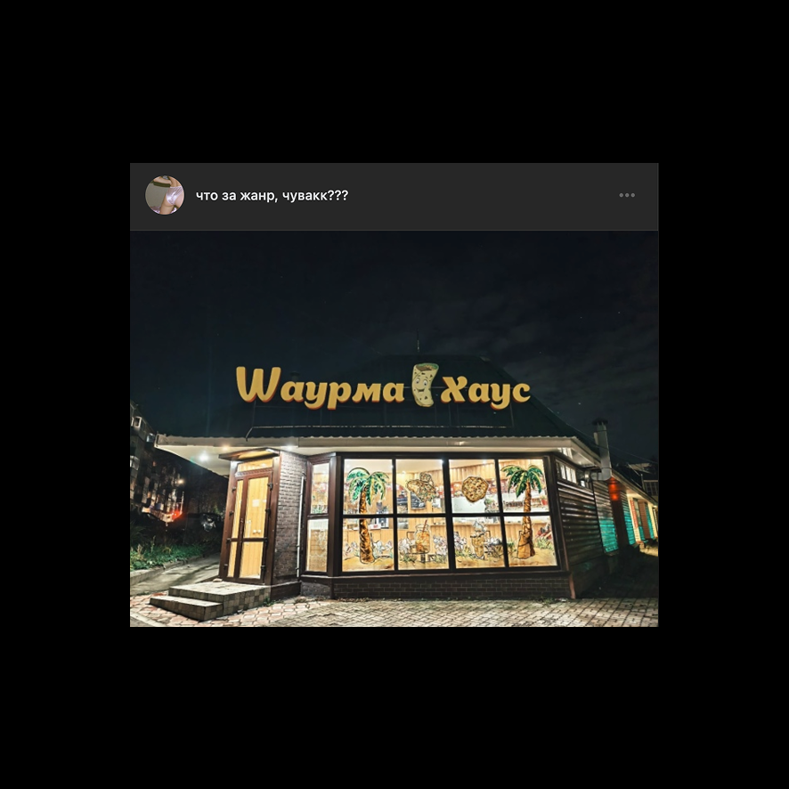 Shawarma House. From the ‘What genre is this, mate?’ page
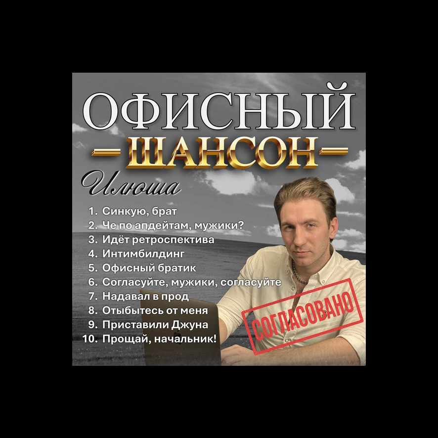 Office Chanson. From the ‘What genre is this, mate?’ page
 Rap Holding. From the ‘What genre is this, mate?’ page
 Coldwave Winter Jacket. From the ‘What genre is this, mate?’ page
I feel like people have never been more aware of the fact that there are different aesthetics and each has its own name. And it’s always interesting to track and figure out: why do we refer to a certain visual style the way we do? For example, there’s the Frutiger Aero
In fact, I recently came across a term which was new for me, ‘passport punk’ — it’s all about scans, fake documents, and so on. I actually believe it’s a natural process for people to attempt to categorise design and come up with new terms.
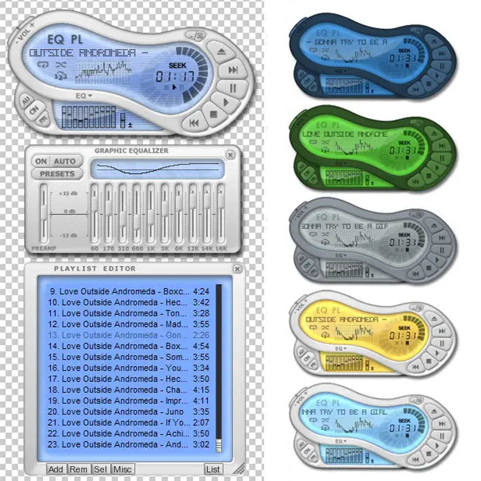 Winamp interface concept, 2005. Frutiger Aero aesthetics
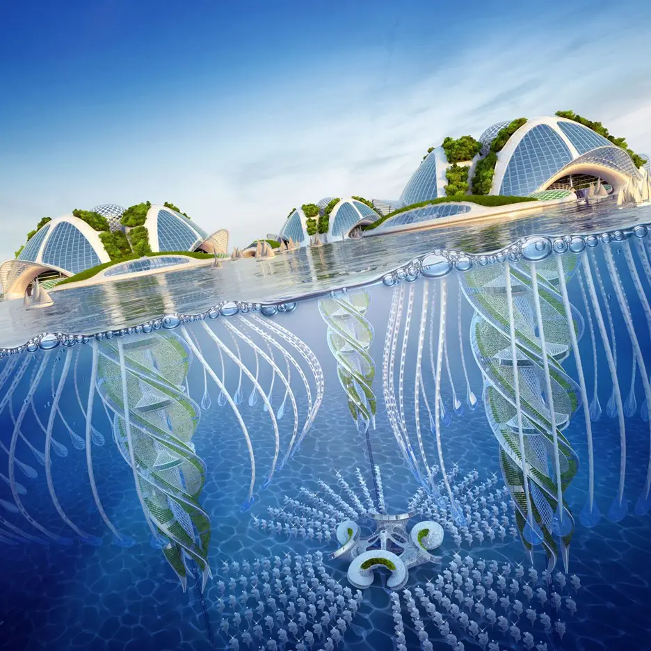 Oceanscrapers city concept. Vincent Callebaut, 2015. Frutiger Aero aesthetics
AS: Doesn’t it somehow limit designers further down the line?
NN: It does a bit. Each aesthetic has its visual markers. If you want to become part of a particular visual style, you’ll have to copy and adopt those markers. However, you can also figure out how the aesthetic works, be inspired by it, borrow some new moves and techniques from
Basically, I would say that in most cases, choosing a particular visual style with a specific label is limiting. But if you’re really good at what you do, it can also be a real boost. There are plenty of great designers who have picked one particular aesthetic and now build their practice around it.
TZ: Absolutely, couldn’t have said it better!
AS: What’s trending on Instagram right now?
NN: Are you serious though? If we start addressing every trend right now, we’ll never finish the interview.
AS: Timur, what do you think?
TZ: I refuse to answer that question. The thing is that by the time the interview gets published, all the trends I mention will be outdated.
AS: How long does a trend typically last?
TZ: Not very long. Its life cycle gets increasingly shorter with each year, each month, and each day.
AS: Say, if I started a trend right now, how long would it stay alive?
TZ: For 69 minutes.
NN: Damn, that’s pessimistic. I feel like it really depends on how strong the trend
I guess you can compare trends to memes in Reels. There are lots of niche memes that come and go, and then there are legends, like Italian Brainrot. How long did that one last? Around six months. And recently we saw these weird Soviet nostalgia memes about how everyone back then was slow, laid low, and walked their cole slaw. They were around for maybe a week and then vanished.
AS: Besides having a great deal of visual experience, what does it take to become popular on Instagram?
TZ: You have to be honest with yourself and with other people.
NN: I was just about to get cynical and tell everyone to give in to the algorithm and start posting two Reels a day. But I feel like what Timur said is ultimately more important.