
January in type, according to TypeCache
Every day, Akira Yoshino, Taro Yumiba, and Shohei Itoh notify the subscribers of TypeCache.com on new type releases. Here are the most notable typefaces of January, in their opinion.
 Aerobik, published by Lift Type. Pick by Taro Yumiba
 Elaine, published by DSType. Pick by Shohei Itoh
 Inklination, published by EMType. Pick by Taro Yumiba
 Magnet, published by Frere-Jones Type. Pick by Akira Yoshino
 Marionette, published by Nick Sherman. Pick by Akira Yoshino
 Mikro Super, published by Letters from Sweden. Pick by Taro Yumiba
 Mirta, published by Michelangelo Nigra. Pick by Taro Yumiba
 Qandus Latin, published by Type-Ø-Tones. Pick by Akira Yoshino
 Rector, published by Production Type. Pick by Shohei Itoh
 Regional, published by Sudtipos. Pick by Akira Yoshino

Give me the name
The Dinamo studio created yet another web tool — this time generating names for typefaces. Type the characters you’d like to see in it, click the button — or use the randomizer. Each word is provided with synonyms and German, French, Spanish, and Italian translations. The tool is connected to the database of already existing font names, so repeats are almost impossible.

Rezak and iMac, interview with Anya Danilova
Recently Anya Danilova, type designer and author of our Manual, became the winner of the Gerard Unger Scholarship with her typeface Rezak. In her interview to the blog of TypeTogether studio (who organized the scholarship) Anya tells about the design process of Rezak, what else should be done with, and how exactly the TypoTogether team helps.
type-together.com/interview-with-anya-danilova-2021
The first scientific history of italics
Victor Gaultney is a professor at the University of Reading and type designer of the Summer Institute of Linguistics supporting lesser-known languages and scripts all over the world. During the past few years, Gaultney has been researching italics — the font style that first appeared in 1501 as an alternative to roman types, but soon became a standard additional style (in this capacity it began ceding its ground only after introduction of screens.) Now Victor Gaultney has shared his presentation at an ATypl online conference — it is detailed (perhaps the first ever!) analysis of the italic design process: how is it different from roman style, what they have in common, and how designers solve any problems related to it.
gaultney.org/jvgtype/italics/italic-design-process/

Burger Brand
The most important news in graphic design is perhaps a new brand of Burger King that impressed not just the design community but well beyond. The usual logo with blue writing has been here for a little more than 20 years — until 1999, the chain used far more concise sign that they decided to get back to. The Jones Knowles Ritchie agency invited the Newlyn studio to redesign it — a few years ago they released the revised version of Berthold Block which Burger King used in headlines. In a new logo, the letters completely lost all angles, becoming neater and tastier. The most important, very impressive touch is a micrologo-burger with K as a patty which, paired with two buns, forms the B. New typefaces for Burger King were designed at Colophon Foundry. For display purposes they use Flame Serif (Regular and Bold) — in normal styles it is a Cooper, while in super-narrow and super-wide styles it looks somewhat psychedelic and super-yummy. For smaller typography and body text they’d utilise a sans serif typeface called Flame Sans.
newlyn.com/news/burger-king
colophon-foundry.org/custom/burgerking
jkrglobal.com/case-studies/burger-king

КIA → КИ
Another remarkable logotype is a logo of KIA car manufacturer. Concise, conjoint, futuristic, it has only one problem: Cyrillic users may read it as КИ — that is, without the last letter.
itsnicethat.com/news/kia-logo-rebrand-graphic-design-060121

How do you do, fellow agents?
The US Central Intelligence Agency has introduced its first ever graphic identity. Apparently, for CIA, graphic design seemed a way to win the confidence of millennials — to that end they use the most eternal clichés of spy movies (dark colors, moire, monowidth type), paired with not-so-fresh graphic trends (wide grotesques and a sticker logo). Judging by the reaction of social media users, the mission has failed.
typeroom.eu/cia-rebrand-controversial-heavy-type-redesign

Edge, a geometric slab serif
Typotheque released an update on a long-running project by Ermin Međedović — a sans serif called Edge Sans which was conceived in 2000 and released in 2019. Now Edge type family is also fitted with a serif, or rather slab serif typeface. Grid-based, seemingly monotonous — Edge can be classified under the category of geometric typefaces, but the nib dynamics, even if extremely robotised, are still obvious, especially on the corners. The character of Edge is changing along with weight — in super-thin styles, the typeface appears to be shimmering from an old display, while in heavier styles it becomes very tangible and almost human, asking to be used on a gym clothes or a huge poster.
typotheque.com/blog/edge_a_geometric_slab_serif_typeface

Aerobik — fat, but fit
The French foundry Lift Type released a display typeface called Aerobik. Thick but airy one-line shapes, lightness and humour, graphic novels and graffiti — this all results in a really vaporous and versatile script typeface.
lift-type.fr/shop/typography/aerobik

The hardest year, the brightest covers
In 2020 there were 52 issues of The New York Times Magazine. In a 8-minute long video, editor-in-chief Jake Silverstein and creative director Gail Bichler discuss the covers — several seconds for each, during which they show us the intermediary options and tell the most important things about the issue. A great opportunity to look at the best examples of this, soon-to-be-extinct, but still extremely important genre. More detailed, 2 min long videos about the magazine’s cover are available on a monthly basis.
nytimes.com/2021/01/16/magazine/behind-the-cover.html

Wedding and graffiti
ESH Gruppa designed a graphic identity for Feerique, a wedding planning agency that ‘is not afraid of experimenting, strives for out-of-the-box solutions and can turn a wedding into a statement.’ Our Factor A is in charge of the modern feel, while Feerique Script — sweeping, slightly careless, almost handwritten — is used to bring in extra-vividness. BTW, don’t forget to read the interview with ESH in our journal and check out the Tomorrow 2021 calendar where Gruppa is one of contributors.
eshgruppa.com/works/feerique-script
eshgruppa.com/works/feerique

Typefaces of 2020, the closest look
John Boardley, the author of IloveTypography blog, posted a list of his favourite typeface of twenty-twenty — one contributor, super-personal judgement, but a very through, illustrated presentation, lots of significant details, and comments by designers themselves.
ilovetypography.com/2021/01/12/my-favorite-fonts-of-2020/

Fast food behind enemy lines
&Walsh agency presented a new branding for Plenty green salads — inspired by the opposite end of the food industry, McDonalds. A custom humanist sans serif with a retro touch, large point sizes, minimum of details, vibrant colors, zero green — the only green element is the salad itself which can be seen through the window in the packaging. As a result, the salad looks much simpler, juicer and tastier than his neighbours on the shelves.
itsnicethat.com/news/and-walsh-plenty-rebrand-graphic-design-210121

Tomorrow and around
After a number of unsuccessful attempts to restore our Tomorrow storefront’s Instagram account (banned for unclear reasons), Timur Zima created a new one @tomorrowtypetoday (without periods). Plus, in January Timur has launched a Tomorrow Telegram channel and presented us a list of remarkable Instas posting a typography of the future — this would be our journal’s new regular column.
instagram.com/tomorrowtypetoday/
type.today/en/journal/future1
t.me/tomorrow_type_today

Your daily dose of type
Book designer and editor Evgeny Grigoriev started a Telegram channel — almost daily updated collection of concise and thoughtful typography. Just illustrated links, no comments required.
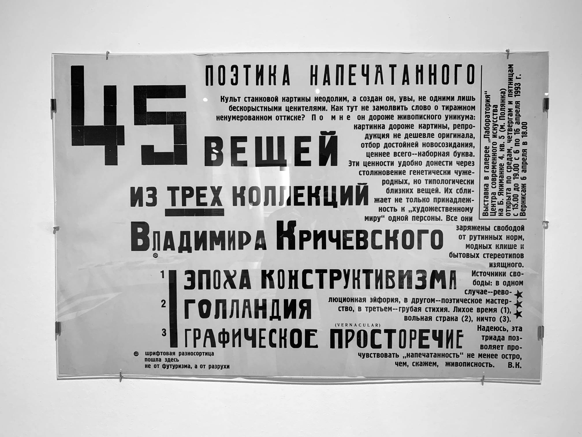
23 books by Vladimir Krichevsky
Moscow Museum of Modern Art presented an exhibition on Vladimir Krichevsky, the Russian researcher and theorist of typography and graphic design, author of dozens of articles, teacher and graphic designer. Old and new books by Krichevsky, next to the objects that inspired the author, are on display, as well as 23 audio comments by Krichevsky himself. Exhibition is open until April 11th.
mmoma.ru/exhibitions/ermolaevsky17/23_knigi_vladimira_krichevskogo/

2020.typemedia.org
We have already mentioned the graduate projects of TypeMedia 2020, but now the program has launched its own web site — with a detailed presentation of each typeface and video comments by their authors. A great way to follow the train of thought and design processes of the students of this advanced type program.

Armenian and Georgian type today
Recently type.today presented Graphik Armenian and Graphik Georgian — as we prepared those releases, we decided to find out what is going on with Armenian and Georgian type and asked designers who work with it. Please welcome their fascinating stories — must-read for anyone who mostly uses Latin (or Cyrillic) script.
type.today/en/journal/ge
type.today/en/journal/am

The new White House
Joe Biden has been inaugurated as President of the United States of America, meaning that the White House now has a new creative director. In addition to new whitehouse.gov (Trump’s golden color removed, more air added, now available for visually impaired users as well as the Spanish-speaking audience, again), the US President now boasts new typography (which inherited Mercury and Decimal typefaces by Jonathan Hoefler’s studio from Biden’s campaign), and a new icon of the White House itself — Wide Eye agency made it smaller both in volume and details and adjusted for different uses and formats.
fastcompany.com/90597227/even-the-white-house-logo-got-a-makeover-see-what-changed
In January we handed our Instagram to Facultative Works studio
Thanks for the visual research on biology and technology! In February, our Instagram is run by Ira Bykova.