
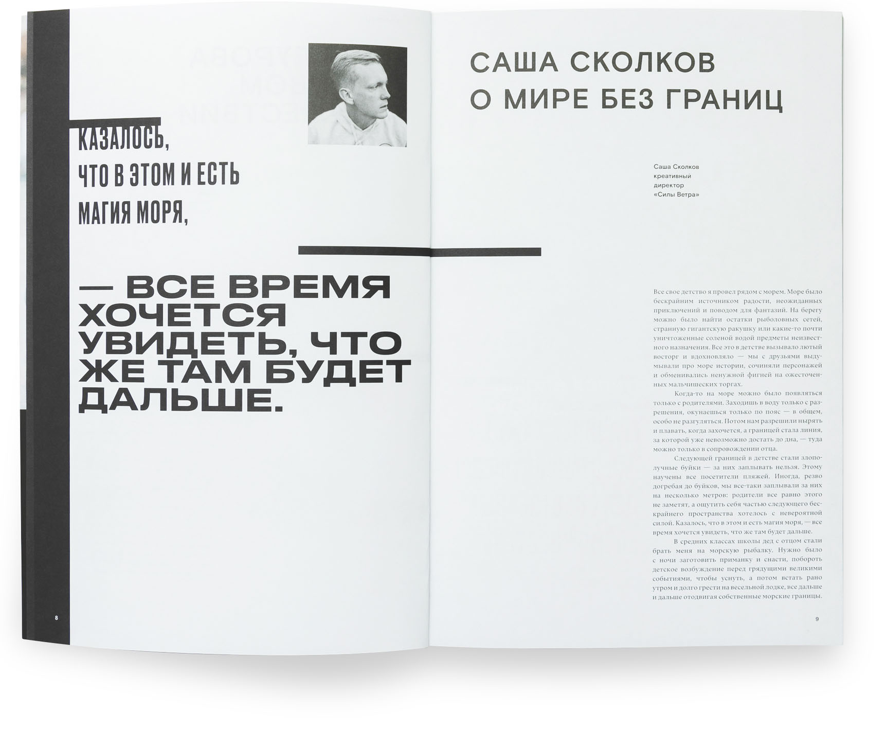
Lesha, please tell us briefly who you are and what you do.
I work in two capacities. On the one hand, I’m a CEO at W1D1 startup company which is about developing creativity — and this has to do with numbers, investors, metrics, money, accelerators, venture capital. At the same time, I do a certain amount of projects in the capacity of an art director, which is why the other part of me is about graphics, interface, style, vibe, things like that.
Could you tell us more about the startup?
W1D1 is an absolute love child, a fruit of happiness, pain, hell, and sorrow. We started up doing an app without any understanding of what we do, without even a minimum set of skills. We had to gain all the skills along the way, and it took us some time. We had different periods — at some point we nearly shut down our business, — but today I am happy with what is going on: we are very well organised, even though we still don’t really know what it is exactly that we do. It seems to be a certain companion for creative growth, a certain set of tools to help people of creative professions improve themselves. We receive good feedback from users and show good retention: a lot of people get back to our application and continue using it. Obviously, we are onto something: there’s a demand for that. All we have to do is figure out how to meet this demand, what is our audience, and how to find it. Product packaging, sales, advertising, clear targeting — those things are in fact the most important ones.


W1D1 is an app with creative tasks. Each month, a new 14-day workout is added. Subscription is $5,99 a month (twice less, if you choose the yearly plan)
Can you explain how those tools for self-development work?
Our app allows for anonymously performing certain daily tasks, along with other people. You have ten minutes during the day, or even not every day, and you have to lighten up, freshen up a little bit. It is a way (with the use of digital technology) to get back to the analogue world, to remember that there are certain, not very routine, actions. You have to follow Henri Matisse and cut out paper silhouettes. Or, for example, there is this task called ‘Sad Stuff on the Street’ that echoes a popular Tumblr account: you look for sad stuff on the street, take a picture, and post it onto the common feed. If the task is about tracking the beginning and the end of processes, you have to present two photos, representing the beginning and the end of the process: lit match and burnt match. We constantly offer some tasks that allow for fighting tunnel vision, freshen up the picture a bit, and see things around you that you have been ignoring for a long time. Because vision is a process of deduction, not addition. There is a bit too much information around us, and when you perceive it through your eyes, you deduct almost everything for being able to process what’s been left. With the use of our tasks we adjust this filter that deducts this ‘almost everything.’
Are you following scientific research in this field?
I own the book called Explaining Creativity, a summary of what psychology understood about creativity during the last 30 years. At some point, I made an abstract of that book. How much of its contents made it to our app, how do you think? Zero. Nothing useful.
It is more or less what a physicist Richard Feynman was speaking about when he said that a physicist needs this type of knowledge — that would be a philosophy of science, roughly speaking, — just like a bird needs knowledge of aerodynamics. It doesn’t. You don’t need that for flight.
I would like to be spoken to as a person who rather watches routine things than science — for example, my own breath. By the way, we will have breathing exercises in the app. We are also going to create a library of some micro videos with some micro skills, not in the form of tasks. Skills which are not about doing something, but that still help people of creative professions: art of concentration, searching references, breathing techniques. Along that, we are probably going to introduce a tool for keeping some sort of diary and taking notes, as it is very helpful. As soon as you approach the ways how creative people are trying to help each other, you constantly run across the story of keeping a diary, as a lot of things in creative processes are linked to fixating things. And I won’t be surprised if at some point in time we will turn into a place where people keep their creative diary with outside assistance, using tips and tasks.
How does developing such an application affect oneself?
One of the ways you can behave is to look at how other people solve such tasks, clearly. But for me, personally, it is still about design. We are designing changes in human life. This is a next step in design: you design a certain experience for a person on the other side to live through. I am rather interested in that than in layouts and interfaces. In fact, launching startups is a certain quite special type of work that only quite special types of people can do. At some point, I accepted the fact that I do have this skill — move on for a long time, without getting any results but also without losing enthusiasm. On this score, I was very much helped by New York’s Russian-speaking business community where you feel very supported. It is a huge support network within which people are ready to help you, give advice, make you meet people. We lived through everything: our team reduced, then it expanded again, people worked for us for free… But we never stopped moving. And it is important to understand that as long as you’re moving, your project is moving. You may have zero people, but if you’re still doing something, everything goes on.


w1d1.com/seven — a lockdown special, seven design tasks presented by seven Moscow local businesses

Posts in the @w1d1_app Instagram account
Did you leave for New York on your app’s business?
Me and my partner, Andrey, relocated there and planned to do everything from there. It was an absolutely brilliant and absolutely ridiculous decision at the same time. We are now having some idea of what we do, of certain
Was it your plan to gain experience there?
We were leaving because we didn’t want to do local things, at all. The world is totally flat, you want to do things for the whole world. And it is certainly easier to create things for the entire world being based in NY. It is the key world hub, The City.
How does this affect a work process? Let’s say, you come and say, ‘I am the guy from Russia, here’s what I do…’
And you have a million people next to you who come from all across the globe and say, ‘And I’m the guy from Bolivia, I do this thing,’ ‘I came from Nicaragua, here’s what I do,’ ‘I am the guy from Seoul…’ One of our key mentors, who helped us a lot, was this guy who created an app for teaching maths in Korea and relocated it to New York. He was many times more successful than us, and he was doing his project much longer than we did, but his experience was highly relevant to ours. The first thing you realise is that everyone failed everything. Everyone — no matter what they do — can boast five or ten failed projects. That said, you constantly run across success stories, projects that survived by mistake. And when at some point I ran out of money to pay my team, and I had to find just money, the guys I talked to, they were not saying things like, ‘man, you screwed everything up!’, but rather things like ‘in what phase you are.’ As absolutely everyone’s been there. It is a step which no one could have avoided. There’s no such thing. This is just the station #8, then you’ll arrive at the station #9. And everything can happen. And everything will happen in our case. And I have zero doubts.
Now let’s talk about your another capacity: type.
I’m afraid that at some point I will follow the example of Vladimir Krichevsky who says ‘does it really matter what to type with?’
Yes, we feel like you work with type in a certain particular manner: a typeface you use is outright embedded into the fabric of the image, and it seems that if you replace it, nothing will change at all. Is this a deliberate technique?
It is not. But I am aware that my focus has significantly changed. I went from one extreme to another, and that’s only now that I’m beginning to move towards some sort of synthesis. I’ve been doing design, creating beauty for my whole life. Right now I’m wearing a T-shirt that I made myself. I love these T-shirts very much. We worked very hard on it, very attentively thinking through everything, for correctly targeting the audience: making both a fashionista on the city streets and a coach in the gym wearing it. It all turned out just as it should have — people are wearing it, that feels nice. But it is a previous me, I guess.

A merch tee by Sila Vetra, Moscow-based yacht school, art directed by Alexei
The next me creates an app and says to himself: ‘Here, nothing’s actually important!’ I mean, we did a certain style statement in our application, for giving an idea that we’re different and that our interface is very different. It makes it easier for the user to understand that we have different rules here: here everything looks a bit different and works in a bit different way. And in order to stand out, you make a weird interface, the way Snapchat did. However, what typeface exactly this interface uses, or how exactly particularly it functions, — all those things have absolutely no importance for the user in the first stage. Currently my app uses CoFo Sans authored by Maria Doreuli, but I am certain that if I now decide to replace it by Graphik, 99% of users won’t see the difference. Nothing will change for them.

How did you choose the typeface then? You’re buying quite a lot of typefaces from type.today, with Menoe, Transgender, and some other typefaces on your landing page. If you don’t care what type there is, why are you doing that?
I’m into diversity. Yesterday I was cooking dinner and I realised that I am currently going through a phase which is defined by a certain abundance. I prefer special and rare ingredients. I want a very special lime and a very special pepper being brought to me from Nepal. And I want my fig to be red, not green. And God forbid I have the wrong type of olive oil! And here my first natural urge is to take all this and mix in one plate. It is a process of exploration. And this leads to a convincing result, as it actually tastes great. But it is not highly professional, because virtuosity arises when you leave only things that will definitely play next to each other. But I’m still experimenting. Well, I also very much like buying and using typefaces.
Describing our typefaces we often write something like ‘Fit for interfaces,’ ‘will work great in big headlines,’ ‘This typeface inherits from Renaissance ones.’ Do you consider such statements? Would you agree that typefaces have a certain embedded designated use?
You see, as a designer, I’m trying to straddle both worlds. On the one hand, I am an awfully old-school person. I am more interested in stories from The Old Testament than in what Virgil Abloh, or Balenciaga, are currently doing. Nothing is more precious to me than Venice of the 15th century! After all, you must admit that since the youngest of Bellinis was out of the game, all the art has gotten significantly worse. That is why one voice inside my head is telling me that a well-set, correctly laid out book page typed with an old serif is actually the most beautiful thing that you can imagine. No need to make any efforts reinventing the wheel — everything has already been figured out: look closely at how they did it, and then draw it nicely. But another my voice is telling me that when in the moment you have to make a certain decision, its graphic quality is not the number one priority.
My month on type.today’s Insta was weird, but it was about stories in the first place. At some point I found myself thinking that, frankly, I really don’t care what is depicted on this image. There are designers for whom the very format of statements inside one image is highly important, an end in itself. And those are able to spend much time working on it, selecting things, creating a beauty that I will never be able to create. The quality that they produce within a given graphic format is unachievable in my case. I don’t have such hands or such an eye. It’s not my thing. I’m trying to exploit my ability to look a bit at all things. I always keep in mind that there’s a story behind this interface and that image, and at the same time I keep in mind that my app shouldn’t be ugly, because I want it to bring a certain change into a person’s life. Lots of side projects that I do are linked to stories. I do things that can be not very expressive, graphically, but which are full of stories. I did this one brand of electric machines that was very embedded in physics in terms of its graphics. It wasn’t very brilliant graphically, but it worked great on engineers. And it helped the firm hire employees, as they saw some sort of geek thing in it. Such a relationship of the meaning which translates into a certain shape interests me more than a perfection of this shape. And this helps me somehow compensate for the fact that I don’t have much true artistic plastic instinct.


Charge produce bespoke electric cars, right now they offer a limited edition of 499 electric Mustangs. The logo is based on Feynman diagrams, which visualize behaviour and interaction of subatomic particles
You can make something using a certain random set of tools. You need to ride, but you only have sticks, a coil of rope, a dead cat, and a tennis ball. And you make some sort of scooter out of it, and you ride it, sort of. And only then you start to think: ‘Well, perhaps it needs to be better tightened, and the dead cat, I’ll replace it by a bearing, this will work much better.’ But I don’t always go as far as this phase. Now I’m going to do visual style for W1D1 again, as no such thing exists yet in principle . It has changed and been remade too many times. I would like to dump it all in the trash, because it doesn’t work and doesn’t live, and I will rethink it from scratch. And I clearly will engage someone who will assist me in that in terms of graphics.
You need to tell a story, you have a folder in your hands with a huge amount of great typefaces, and you pick Tarbeev’s Gauge Letterpress, imitating the print from the 16th century’s books, and Amalta by Vera Evstafieva out of it. How is that? Why?
We’ve already established that I simply choose typefaces as if they were jewelry in the jewelry shop: ‘Oh, that’s beautiful! And this one, too! And that!’
I would like to dissect a little bit your reactions, figure out your mechanism of choosing. Besides, we feel bad that these typefaces are rarely used, which is why it is twice as interesting to know why you picked those.
I believed that Amalta was so often used that I wanted to keep it to a minimum. It’s just that it is so distinctive that if you meet it twice, you decide that it’s everywhere already. As for Letterpress, I generally very much relate to serifs. Today I don’t read much, I do more sports than reading, but I am a very book person. Once it was a highly important part of my life. And my career started from book design: my first job was at a publishing house. And here you see what comes of Venice of the 15th century. That’s where everything beautiful, everything serif emerged. This is what my heart wants. At some point I even tried to build an app on serif types, but I failed, because they don’t fit there as a tool: they are more sophisticated in terms of design, and if you have many different things, you get a very finely dispersed stuff — and everything starts to fall apart. Designing an app is mostly about endless simplification and cutting-off, which in the end result in a very simple solution through black, white, and some inelaborate sans serif typeface.
Also, I quite enjoy something bizarre and irregular, like Displaсe Serif. I feel a lot of affection for the forms like that. When I’m looking at everything I’ve done on your Instagram, I see the intersection of several things. I remember wanting to use as many different typefaces as I could. I remember wanting, due to the lack of time, turning to very simple, straightforward solutions. When two words are set in Druk in large size, it is a tried technique, it can’t go wrong. And sometimes I wanted to go somewhere else… I really like that at some point I managed to apply Dusseldot which was made for Tomorrow by Ilya Bazhanov. It is an incredibly beautiful typeface, I think.
Wouldn’t you like to speak about this very difficult and at the same time very simple episode in the beginning of your month where together we decided to post the black square in a show of solidarity with Black Lives Matter, and the shit hit the fan in our comments?
It is a very odd thing. It is only on Russian social media that I saw so much hate: BLM movement has pushed some sort of button, following which Russian people decided that they definitely needed to speak out on the subject immediately. And this was the most amazing thing. I don’t mean to blame anyone here, no way. It is very difficult to get through the peripeteia of the American interracial relations without actually being there. That is a highly complicated mayhem that in no way can be seen from the outside. But I can understand people who can’t see from here how huge racial inequality in the US is. It was not until I ended up there that I started to find out something about it. Me too, I used to think that it all ended during the times of Jim Crow and Martin Luther King, — which is a super-naive belief, in fact. And everything you needed to do, if you’re within the Russian-speaking community, was just not saying anything. Like that, it is not your war to fight. And this was what the conflict was about, I think. The discrepancy between different agendas, local and global, played its role. The comments were posted by people who perceive type.today as a Russian project: ‘guys, what are getting into? We have our opinion as well.’
I think it’s great that I lived in New York, London, and Berlin, and speak English rather well, it is practically my second language. Thanks to that, I feel myself within this context. And I like it very much that type.today also positions itself this way. That is the only possible way to play this out. We work with an international agenda. I want people to do W1D1 tasks both in Cairo and in Florida. And I want to see a million times more projects from Russia operating for a global audience, as we definitely have something to say. The average level of our graphic design is stunningly high. I really want us not to feel like some weird remote land, I rather want us to feel like we’re entitled to speak for the whole world and tell it how things should be done.
In the recent years, such topics — social impact, feminism, responsible consumption — started to significantly affect the design community. Do you think there must be a limit somewhere to this sort of impact?
I really like the fact that it began making its way in Russian design, because it is very good. Those are very healthy things that make us think about something that we used to ignore. For example, there is this Russian Design Weekend which can be perceived very differently but that definitely fulfills plenty of good functions, especially in small towns. There was a moment when it had only male speakers, and it was not noticeable from the inside, until someone said, ‘Guys, don’t you think it’s weird that we have 150 men out of 150 speakers?’ There simply wasn’t such rhetoric, while it is highly important. Although, clearly, as soon as you’re trying to fix it, they’re starting to accuse you of being reverse racist. This is absolutely unavoidable and absolutely normal: those who are privileged originally are not aware of their privilege, they’re already entitled to everything, and get really pissed off when there’s suddenly an additional ‘not for you’ window.
I am the art director at Sila Vetra. When we were publishing a manual for captains, for me it was crucially important to put a woman on its cover. Because one third of captains at Sila Vetra are female. Whereas the general image is quite the opposite: a rather toxic engagement for super masculine people with clenched jaws. There’s no way a girl could imagine that she is able to manage a 50-feet yacht with ten people aboard, — even though they are perfectly good at it. And it is not even about pushing the reality somewhere, reshaping it, but rather about catching up with an already existent reality through the representation. I truly want such solutions to be included into the design process. If you ask me, I would introduce, within design, a certain profession called design-editor — the one who looks at the story, at the meaning of the project. I tend to gravitate toward something like that, actually. And then there will be a design-designer who would implement it better than me. Together, we’ll beat them. Teamwork is a saver. If there’s anything I understood during the last year of torment is that team is key. If you have a team, you can do anything. If you don’t, you can do nothing. No man is an island.

Yacht Captain. Training and practical guide for sail and power boat owners, by Vladimir Vatrunin


Latest issue of the Sila Vetra journal
Are you more for universality or rather for this fine fragmentation of specialties within the profession?
I don’t know. Currently our team is very multi-tool: our designers perform a gazillion of non-designer tasks — like, they write texts, for example. This is the way any small team operates — like a special forces squad, where everyone does everything. But as your project develops, you surely have to divide it finer. There’s no sense in keeping 50 multitasking professionals in one team. It’s better to have different professionals: both super-narrow who are the best at what they do, and multitasking ones who will bring this all together.
That is, this multifunctionality that at some point began to feel like a trend, at least in Russia, is in fact not a trend but a growing pain, developmental disease?
No, I believe it is definitely a trend, as the designer’s toolkit is expanding. But that’s not a necessity: not every designer has to be multifunctional — there’re assignments for very narrow specialists. But when we’re speaking of multifunctionality, I immediately think of adjacent fields, not only design. If you’re a designer and you have a notion of laying out and coding — and today most good designers do, — there’s no way to avoid it. I suspect that you won’t be able to join a cool startup if you can only design interfaces and don’t understand how those will be implemented after you’re done with your part of work. It is already a job description: you have to know what Git is, how commits work, and know your way around some web framework like React. Only this way you get an opportunity to truly design things. I constantly run across that sort of thing. Within the app, one design solution is drastically different from another design solution, because one follows the logic of engineering development, and the other one doesn’t. And one has to be implemented with a lot of time and effort, everyone will be really pissed off at you, while the other one can be implemented fast and well, and everyone will be pleased with you. And those two solutions can be very similar graphically. And you need to care for this level — each time, figuring a solution, you have to think of how well it fits the logic of engineering, so that it won’t be just graphics for the sake of graphics.
It must be an essential requirement when it comes to this type of design, right? It can’t even be called multifunctionality then.
Absolutely. This is how our profession expands. A friend of mine, Sergy Surganov, while working at Notion he wrote more code for the project than coders did. It’s clear why. Sure, he is a designer, but he commits more than programmers, simply by the number of commits. Anything animation, any interface, any motion within our new app were written by me. For me all this is design, too. Plus, now everyone started moving towards video, motion, all that. Those are interesting, but it’s very difficult in there. I did a lot of 3D stuff for type.today’s Instagram, but eventually it gave me plenty of trouble…
Why were you doing that?
The very same striving for redundancy: everything is so beautiful, so delicious, you have to mix it all… I was trying to avoid it, only when there was not enough time… And I never had enough time — it took me at least two hours during the day, and today that is a lot. So, I think, this my behaviour, one of a gourmand in a delicatessen shop, will end soon. I am already awfully interested in thinking about production of these or that pieces of design in terms of their cost. Because there are costs behind all that.
And this once again raises the question of whether or not humanity needs many typefaces.
Of course it does. A person needs many things. That is the most significant human feature, intrinsic, — a human being can take anything and create a whole culture around it. For example, it can take sneakers and create a huge, neverending, very rich, beautiful culture out of it. And that’s great. However, there is also an opposite movement stipulating that a person needs eight items of clothing, one table, one chair, and one computer. But those two movements will exist forever.
Let’s pretend that all the typefaces cease to exist and we have to leave only five of them. Which would you leave?
I would have left some ancient-looking, old-vibe serif — such as William, so that it has lots of various styles: slightly heavier, slightly thinner, Caption, small caps. I also would pick something monowidth, or a monowidth-wannabe: perhaps, Menoe, that I truly love with all my heart, or Atlas Typewriter. I would take something super-heavy. I’m not sure that would be Druk. Let’s admit that at some point everyone was doing Druk. It made it impossible to even look in that direction. Recently I even included this line in one brandbook, forbidding to use wide heavy serifs. But if I’m being honest, of course that would be Druk. It’s still awesome. Very powerful thing that works just to the point. You won’t miss. It can bear anything. I would also pick some super-neutral serif, you can’t go without it: Graphik is a good shot for that.


 ![el5]
Atlas Grotesk is used for body text on the website of Elgacoal (art directed by Alexei Ivanovsky). Headlines and logo are set in Activist (by Brownfox studio), Kanji, Hanzi, and Hangul were designed by Alexander Cherepanov
That’s four already, we have one vacant position — you have to pick something wild and experimental which can be transformed. And I believe that variable stuff and experiment are yet to come, it’s just that today everyone does them wrong, I think. As a typeface with variable weight, that’s an absolute crap. OK, I had eight files, now I have one hundred of them. Awesome. After all, I wasn’t happy with 50 and 70 — now I’ll have 63. Now we’re talking! Some things that nearly lose readability and even go from being a typeface to being a pattern, from typeface to pattern and back, — I really need those. Some very big, bizarre variable typeface which could offer me an opportunity to generate many different things. It needs to have lots of axes, so that when I need a solution for any sort of layout, I will simply twitch those axes, get some weird form and will use that form, multiplying it. Sort of a good tool for display texts, allowing for generating many things, which will be stored in my typeface basket, like a micro-bit of software.
Probably, in 100 years there won’t be any font files, only one giant variable open-source typeface where people will write things…
Well, I believe that we’ll see the opposite almost. It is a story about curatorship. The file you’re describing is a huge phase space where you can choose any point of a huge amount of various points. It is hard intellectual work. A huge amount of people don’t need to choose. Simply give them three points of this space, predefined, that work well and fit well. The same thing with width. I sincerely don’t get why I might need a variable weight in a typeface. Does it really change anything?
For example, you can make it the way that the line width won’t change depending on size…
OK, this is already in the category of using a cannon to kill a fly, but basically you’re right. I think that when it comes to variable typefaces there are many great things exactly where you have new forms emerging — when one form is starting to move and mutates into another form. Let there be lots of masters bend it in one way or another, and you get an opportunity to bend it. And you can choose somewhere some weird forms in the middle, crossed, fractured, all that. It’s just that you can’t draw those by hand, as they are not a product of our imagination. That is a result of one form transforming into another, and that can be super beautiful. I want more of that.
Can you describe the modern day from a typographic perspective? Does today’s typography have certain distinct features?
Typography isn’t afraid of being more complicated, as it was earlier. Let’s remember simple examples. Alfa Bank who use Styrene; Dropbox who designed a rather complex typeface for themselves; MTS who created a rather wide logo and use CSTM Xprmntl 01 for communicating with young people. Big guys are not afraid of doing something that we earlier considered as a rather experimental stuff. That’s great. I see lots of things that are not afraid of using type for defining their style and creating interfaces. In the past, we saw lots of that in little experimental apps, while now huge parts of solid corporations can be solved through not the most conventional and very typographic move. For example, there is this very popular application Co-Star, which is seemingly about astrology, but is in fact about positive affirmations. And it is a great app. Really greatly implemented. I don’t recall what it’s built on. Something monowidth, very much typewriter-style — and it works just great for it. Looks absolutely fantastic.


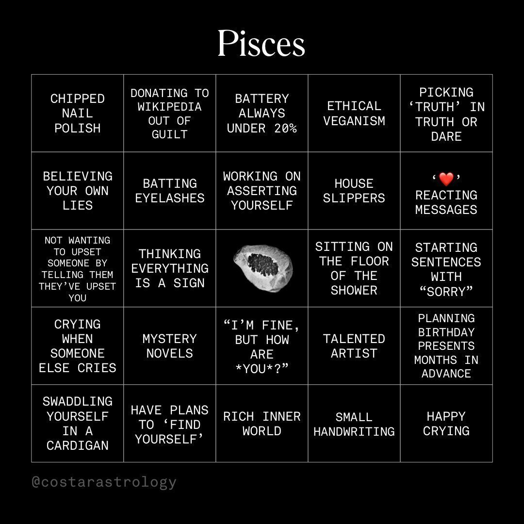
Social media content by Co–Star, set in Akkurat Mono
On the other hand, we now see a lot of examples of what I call the second wave of apps, in which I categorize W1D1, too. Usually, those are linked to an effort to affect very subtle things. And this implies, paradoxically, a certain very particular language: anything there is watercolor-like or close to that — pastel illustration, tender, blurred, aimed at reducing anxiety. The typography is very quiet — God forbid anything will stand out. It is an attempt to distinguish itself using graphics and interface and initiate a dialogue on very human things — as if you’re at the therapist’s office, ‘How are you feeling today?’ That said, many such applications, positioning themselves as an incredibly delicate, user-friendly, are in fact the most cynical capitalists who will bleed you dry in a matter of seconds by the worst patterns. That is a swindle of the highest level: they are absolutely on your side, but they will rip you off.
Also, in some apps of ‘the second wave’ there’s music —and this interests me, since we work on it, too. For example, in the Sayana app used for keeping an observations diary of your emotions, there is this easy ambient music playing, super relevant, that is there for introducing you to the neighboring space: ‘Dude, this is an entirely different thing.’ We created a formats grid through sound: different sound for each format type, like with Wagner music. That was him who came up with a directly connecting sound to image. Leitmotiv was his invention Richard Wagner did not use the word Leitmotiv, the term became associated with him after Hans von Wolzogen published his Guide Through the Music of Richard Wagner’s Ring of the Nibelung. As such, short recurring phrases had been used in European orchestral music since, at least, 17th century: if you hear a tune connected to a character, this means the character will appear soon — the music announces his appearance beforehand. There will be more and more of such things.

Sayana
What will be going on in graphic design in five years, your idea?
I believe we will see many things allowing for solving a huge amount of functions without engaging anyone — neither designers, nor engineers. We have to start a company like that. You are a startup, you go to the site ineedeverythingforstartup.com, you simply press the button and generate a landing, an interface, and a certain stylistic solution. It’s no better than others, no worse than others, but it’s yours, as was said in one good movie. It seems that the level of automation will be increasing. I don’t know what will happen to AR/VR, even though that interests me a lot. I suspect that this field is developing much slower than we were talking about it. I won’t be able to answer it until I play the new Half-Life. When I do, perhaps my opinion will be quite the opposite of that — perhaps I will say that there’s nothing more people should be doing other than that, that we can relax, sit back in our chairs, put on our goggles and do nothing besides that anymore.
OK, the honest answer is that I don’t have the slightest idea of what will be in five years. Something will change, in some way, there will be something new, something trendy. Probably, if the pendulum swings — and it does, — everything will be very simple. Because now we’ve complicated things, and an average cool Instagram account looks like a webpunk thing from five years ago — super-fancy and super-complex. And at some point, apparently, we will get to the opposite — super-simplicity. On the other hand, there’s this default style of drawn illustration and beautiful little typeface. These fine pictures drawn by some very talented illustrator like Muradov who now draws for everyone — those are dead cool illustrations. You add a custom typeface — and everything works great. Clear, quiet, like a primer. It is a language of schoolbooks. Super. Amen.
Aren’t you sick of it?
Of course I am. Really sick and tired of it, but it still works. It brings money. Meaning, it is a new norm, new standard, new language that you expect to be spoken to you in. Because it is a language about your importance, about the fact that you’re in charge. Clearly, behind this facade there is still the same aggressive capitalism that will rip you off and will squeeze every last drop of productivity from its employees. Yet it’ll look super nice.