
This April, type.today turns 10. So we decided to talk to those who have been using our typefaces all this time. In this piece, we spoke with art director Ilya Zherikov about how he chooses typefaces for her projects.
How do you choose type for your projects?
This really depends on the project itself, as if it’s a commercial one, you first need to figure out its mood,
When it comes
Do you have any favourites in our collection?
Kazimir was in fact my first love. I grew up reading books set in the Shkolnaya typeface. And Kazimir has that same Clarendon feel, this solidity to it, too. The typeface is a really reliable companion. It’s noble. Kazimir is old money. I worked with Kazimir Text at RBC — paired with Graphik, and it felt great. Even breaking news felt really calm and smooth set in those typefaces.
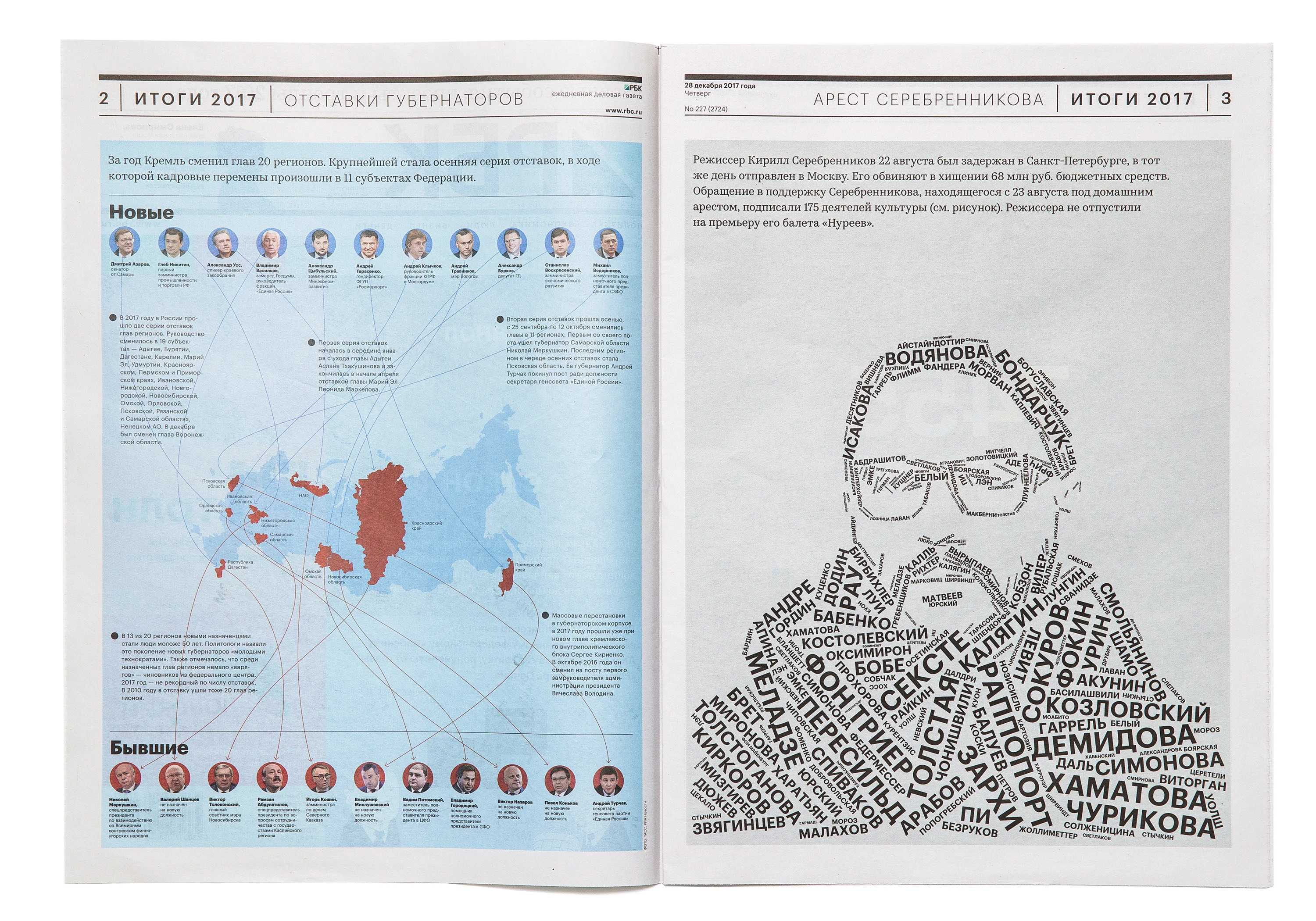
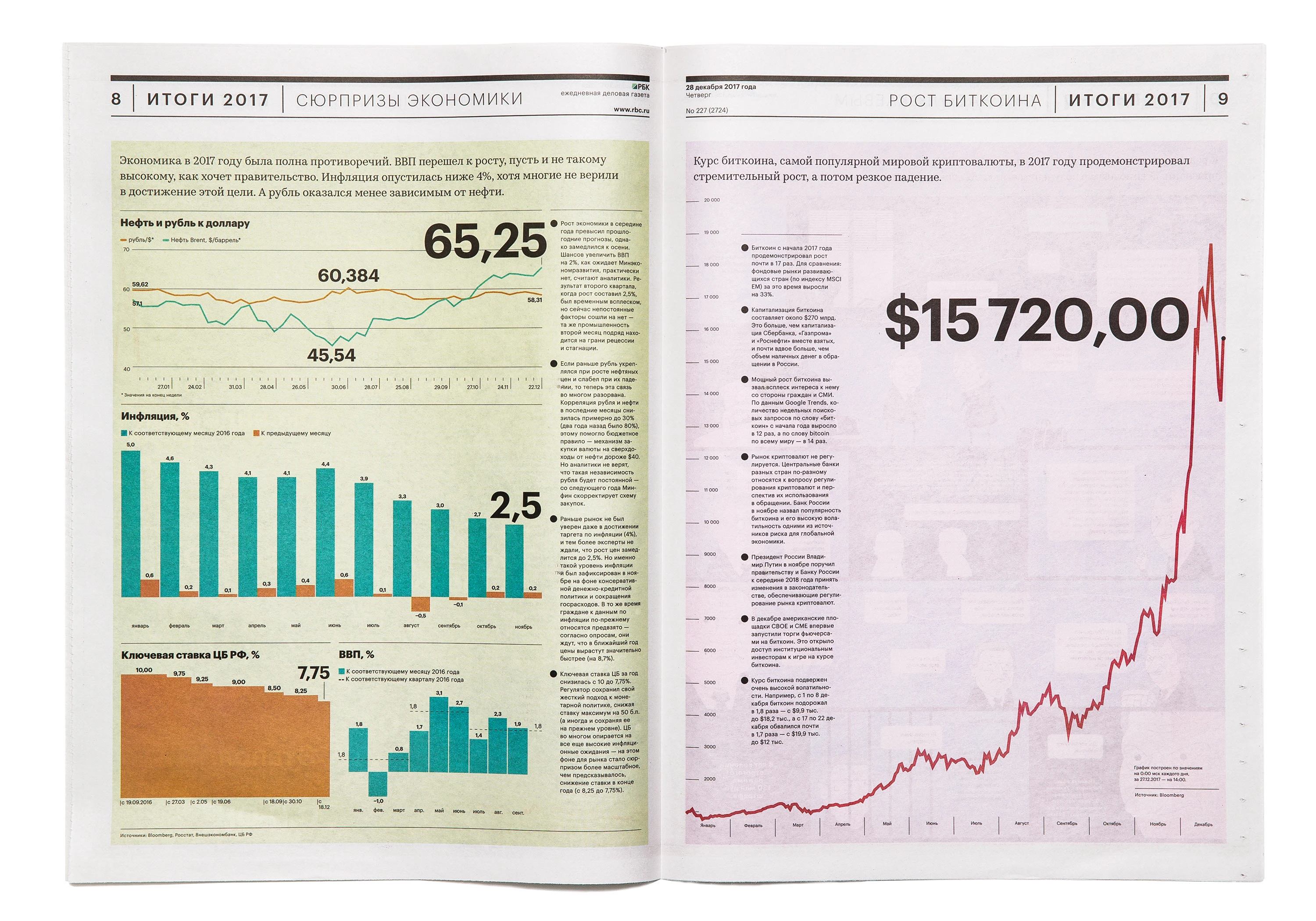
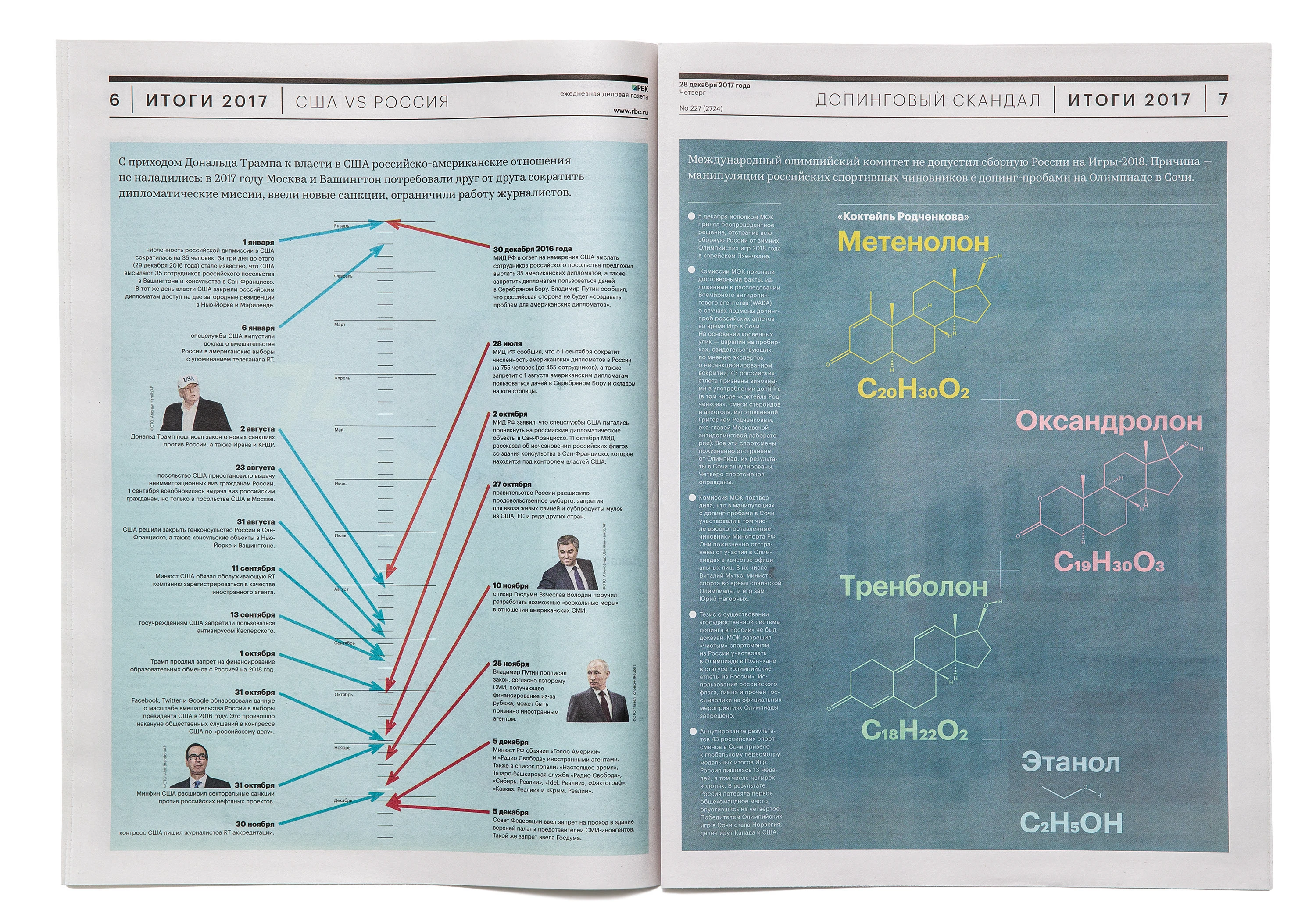
RBC Newspaper, 2017. Set in Graphik and Kazimir Text. Design: Ilya Zherikov, Damir Yanaev, Evgeny Tarasenko, Michael Skripin
Is there a typeface that you really love but haven’t been able to find the right project for?
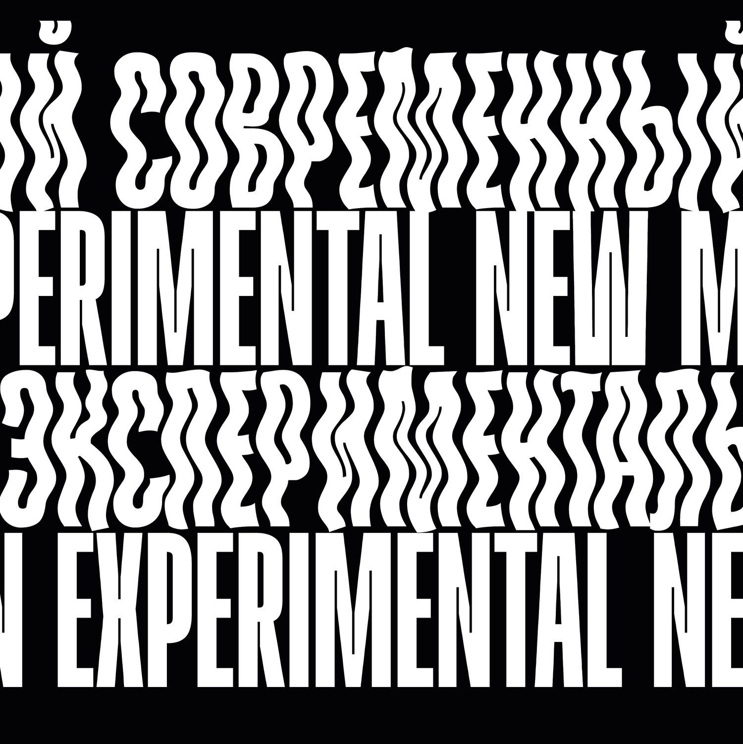
I have Denis Serebryakov’s Gik. I bought it when it was first released. I keep looking at it, trying it in different projects, but it hasn’t been the right fit so far. But I love it anyway and really want to use it one day. It has this crazy, bending-tube feel. I also have Flicker by Dasha Karpenko.
They are so super-distinctive, you can build an entire project around them without adding anything
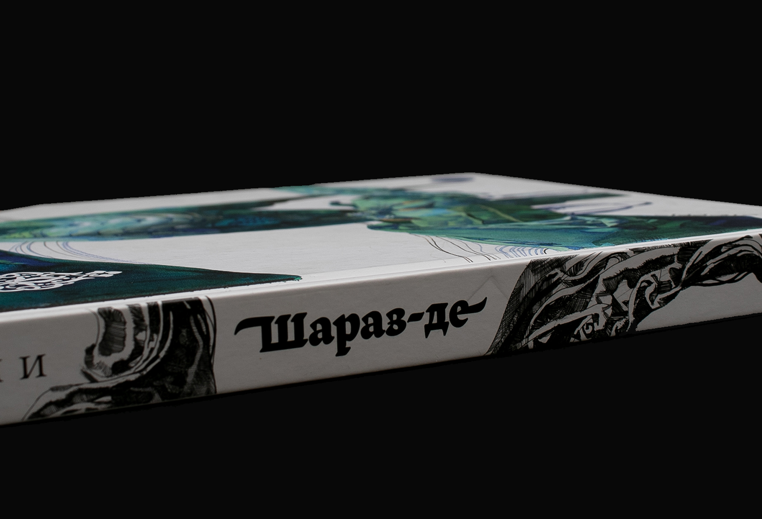
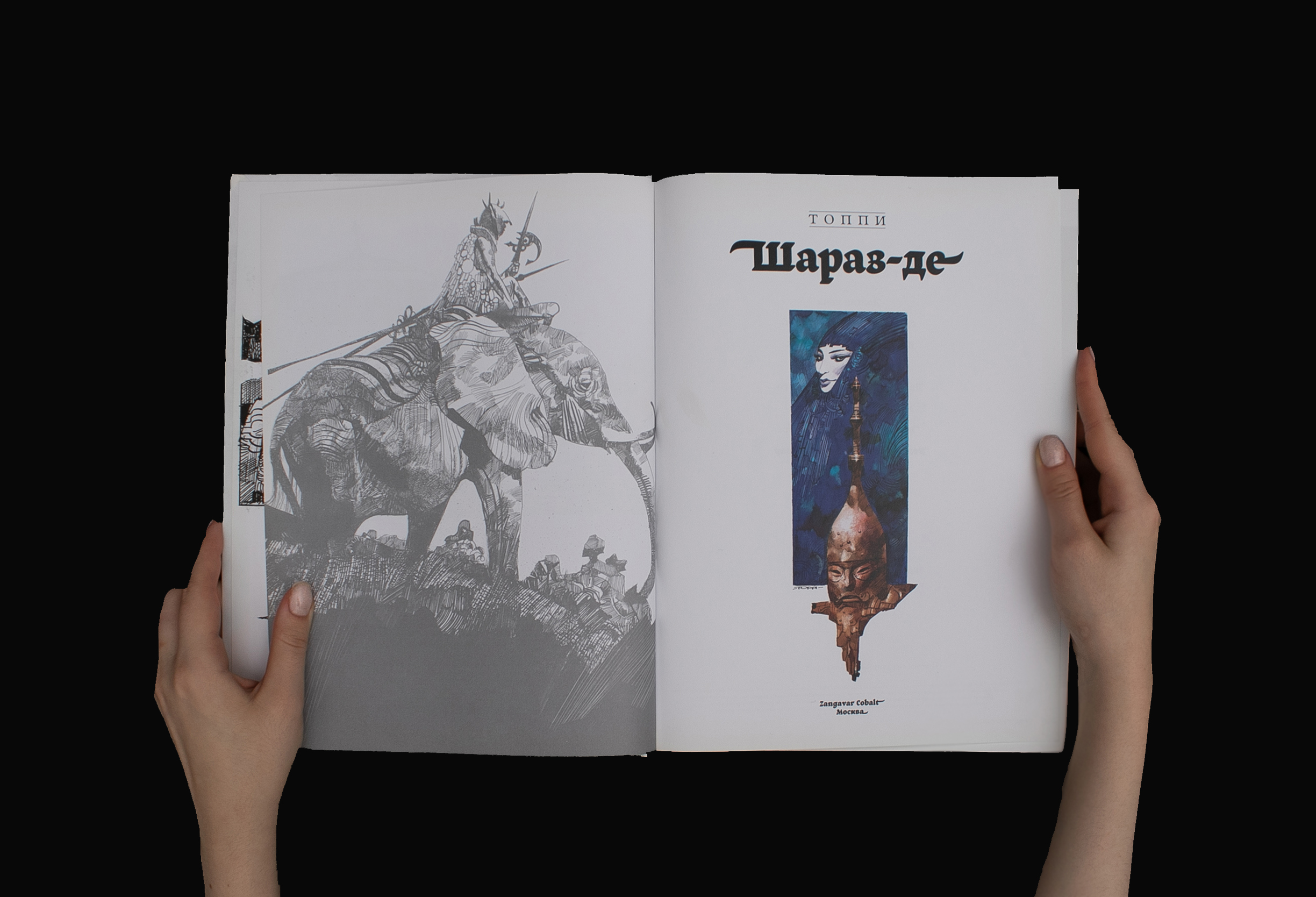
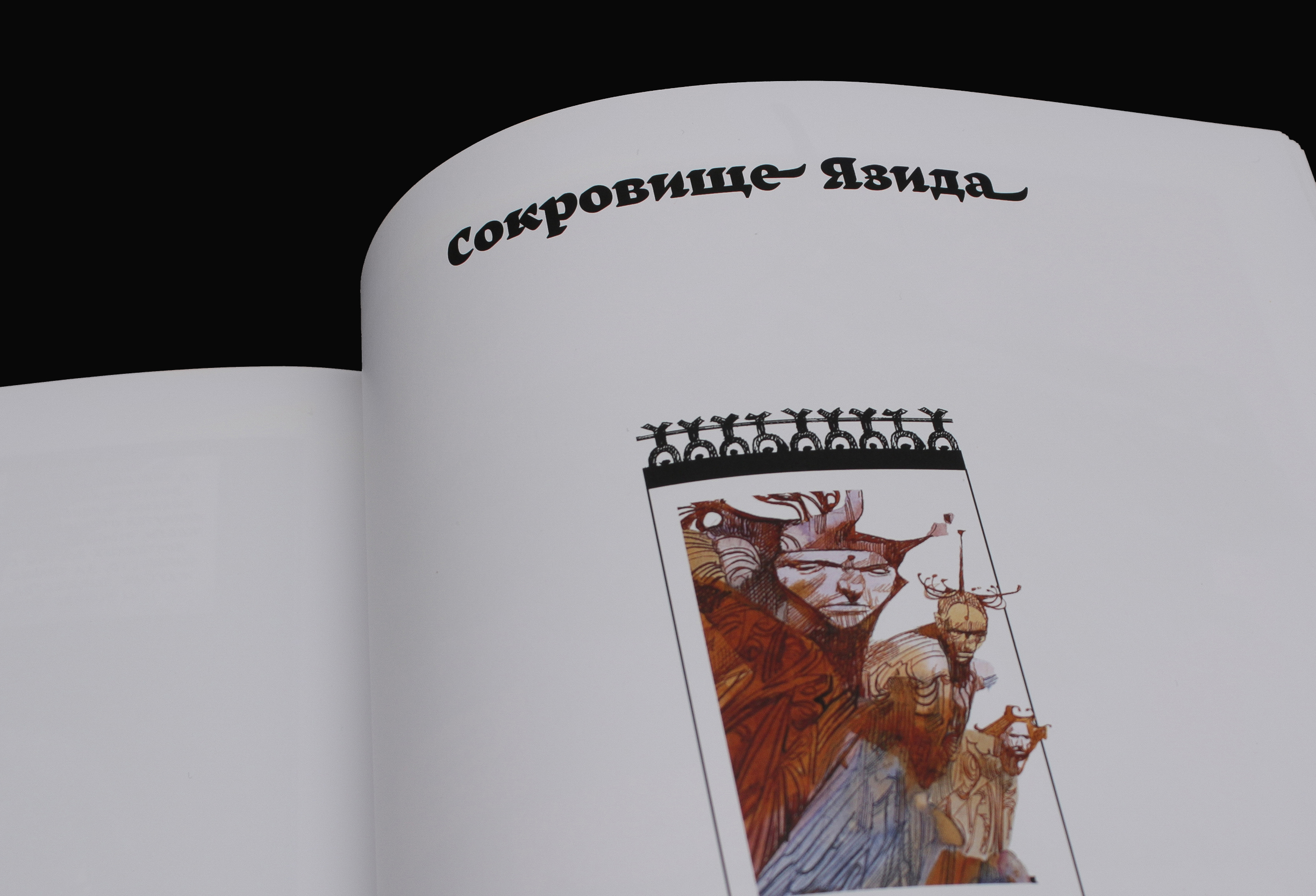
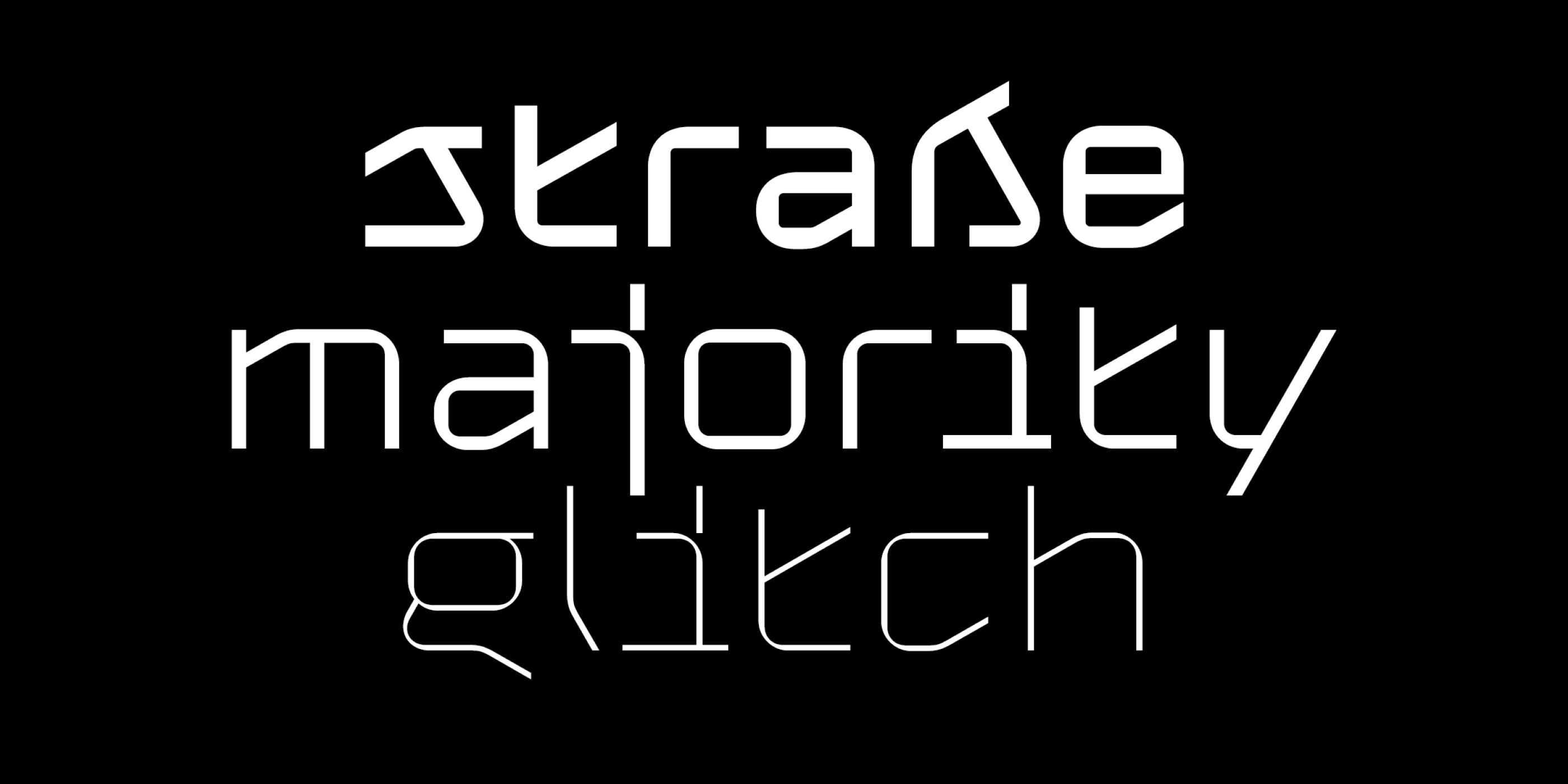
Sergio Toppi, Sharaz’de, 2015. Set in Amalta. Design: Ilya Zherikov
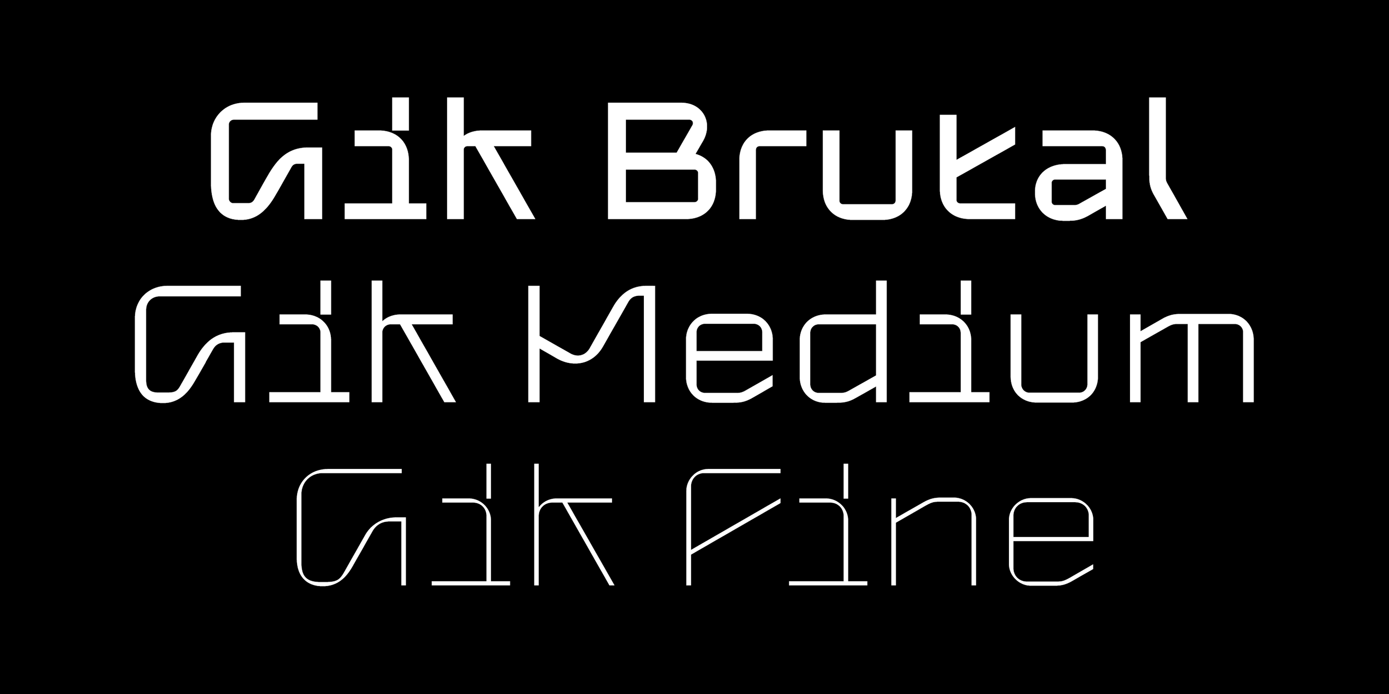
Gik by Denis Serebryakov
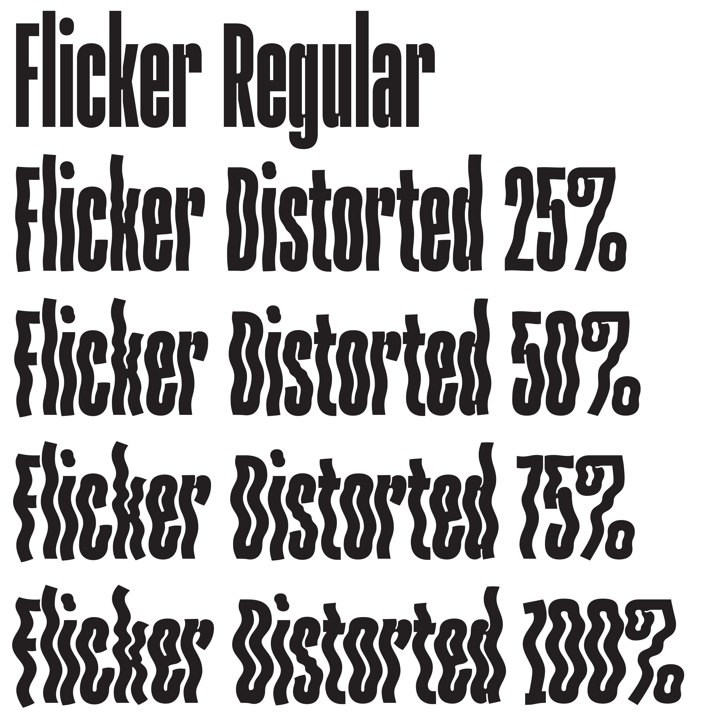
Flicker by Dasha Karpenko
How do you keep up with new type releases?
I do that on Instagram. But I follow too many things, so I miss things sometimes. That’s why I am also subscribed to newsletters: yours, Dinamo, Roma Gornitsky, Erik van Blokland, and the amazing, crazy Benoît Bodhuin.
The great thing about foundry newsletters is that type design is a slow thing. Releases don’t happen that often, and my inbox doesn’t get spammed.
How important is it to you that a release comes with a full article about the typeface?
It is important
This doesn’t make me choose a particular font, but it does affect how I feel about it and how I might use it if I do choose it. However, to an outside viewer, most likely, this relation won’t be obvious.
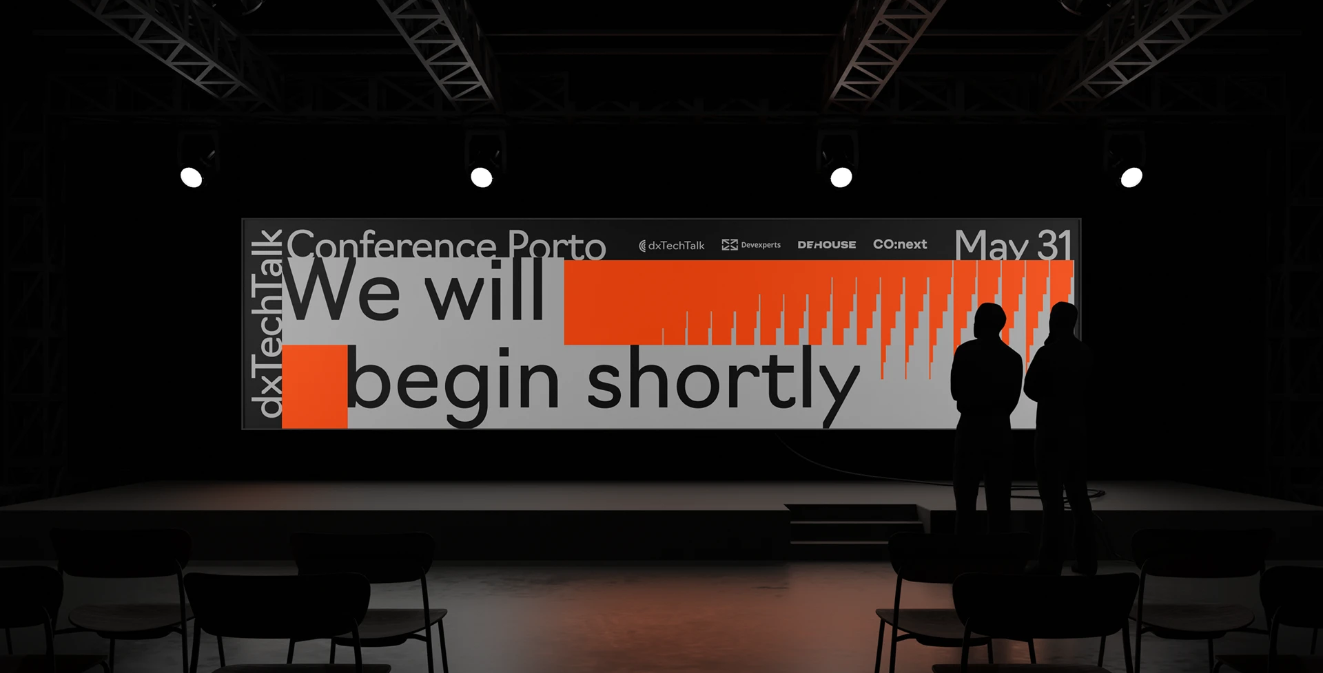
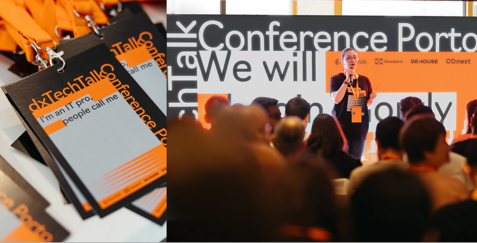
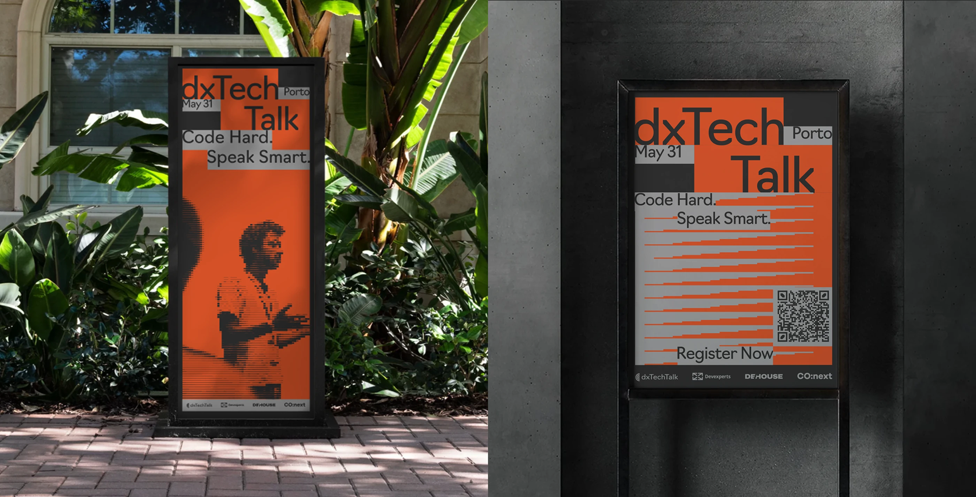
DxTT Conference, identity, 2025. Set in Navigo. Art direction: Ilya Zherikov
Is it possible to tell what message its author was trying to plant just by looking at their typeface?
A typeface is a kind of tool for emotional impact
Then there’s the connection to the cultural background. If you read books set in a similar serif back when you were a kid, there is a kind of reminiscence and you read a different text set in Kazimir, thinking about what you read as a child. Well, at least, I like to believe that’s how it works.
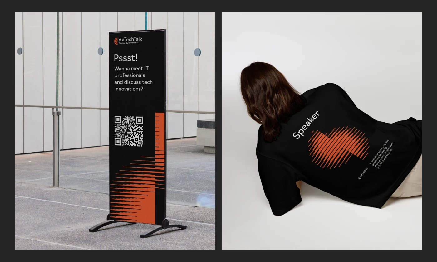
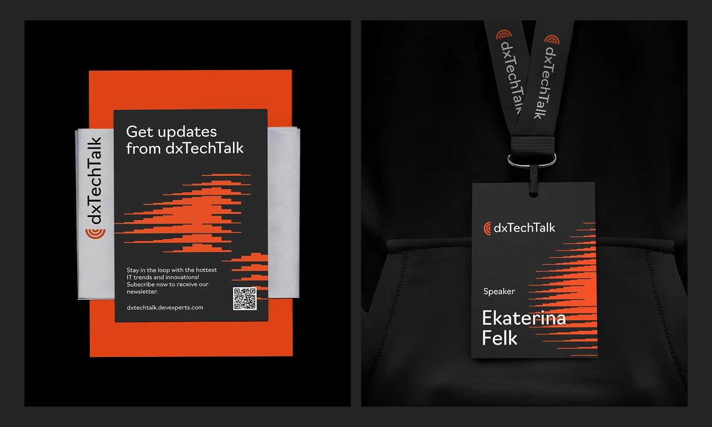
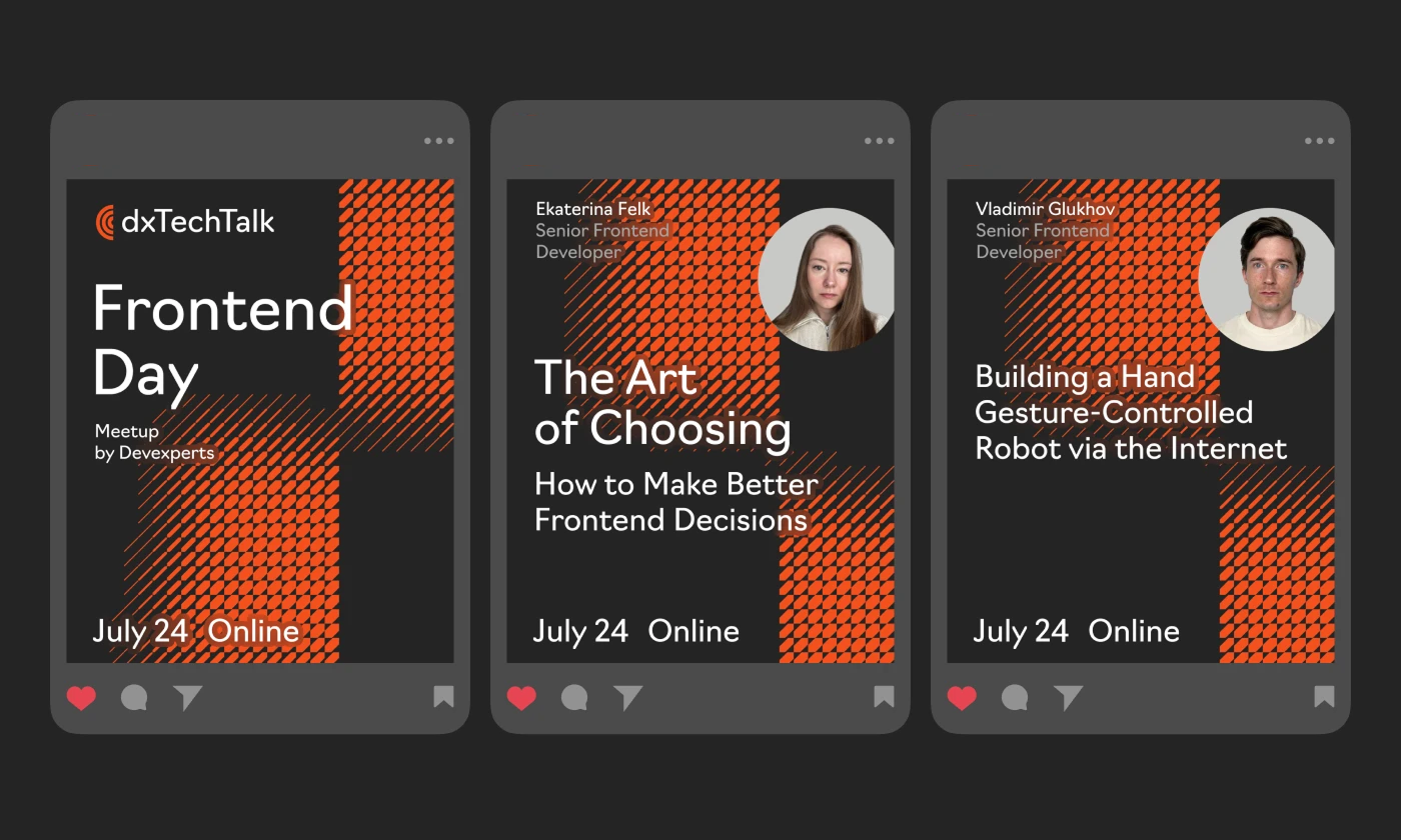
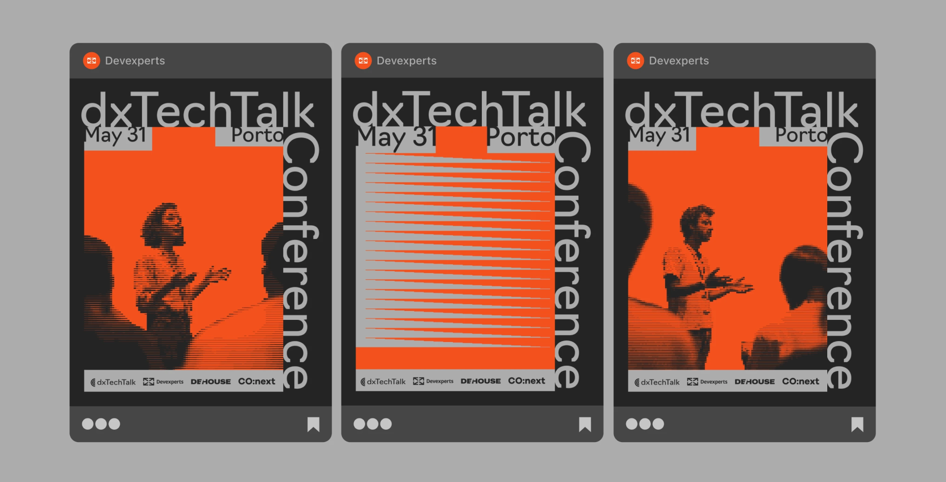
DxTechTalk, identity, 2023. Set in Navigo. Art direction: Ilya Zherikov
How should a typeface be presented to make you want to purchase it?
Actually, it’s enough for me to see the letters set at a large size, to look at how the typeface’s outlines are constructed, what kind of plasticity it has. It is also important to see a paragraph of text set in a language you
For example, you see an ABC Dinamo advertising campaign on the street. If you are not a designer, you’ll just walk by. Or, maybe you’ll look at it and think, ‘What? A font? Why? What’s going on?’ But if you’re a designer or an art director working for a large corporation who just happens to be looking for a typeface for some new brand identity, then yes, it might work.
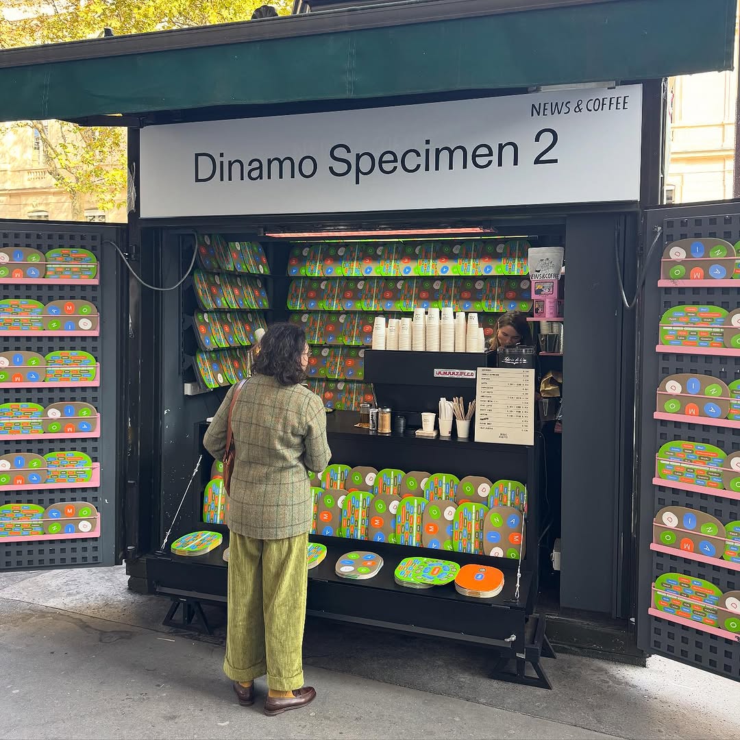
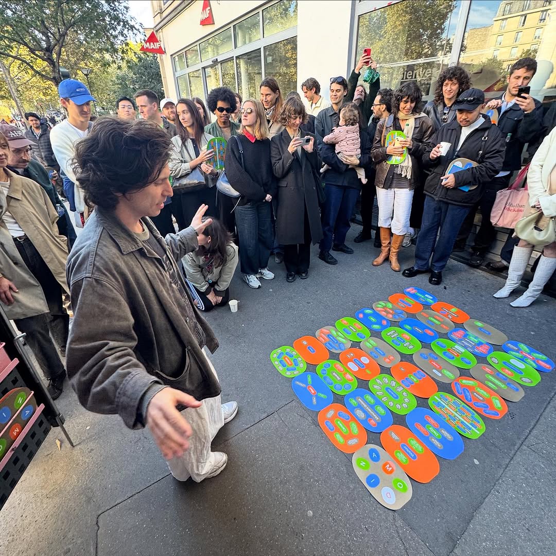
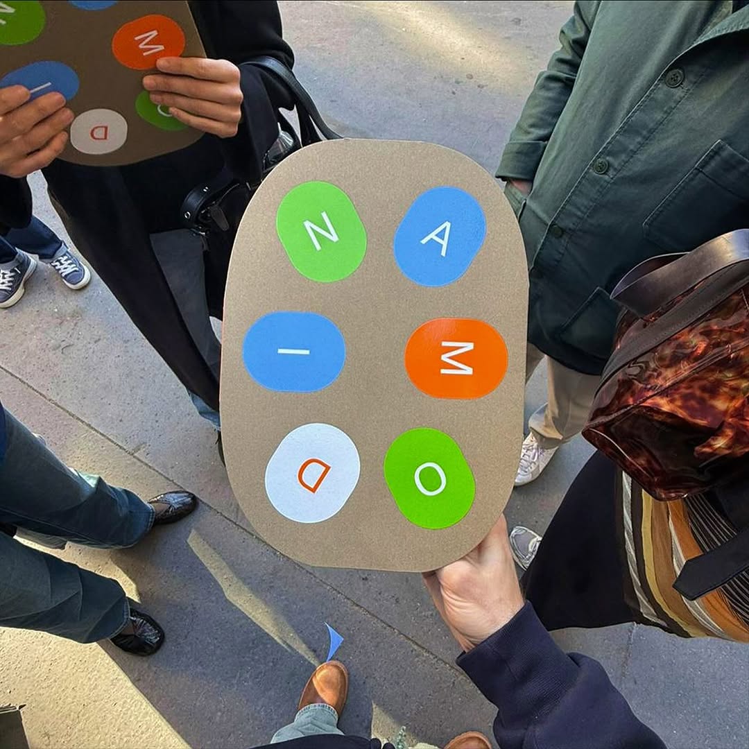
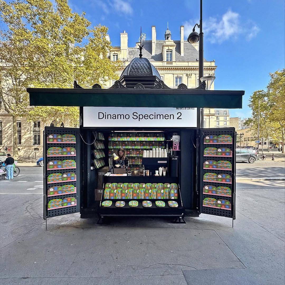
ABC Dinamo advertising campaign
What makes a typeface feel time-relevant?
I can’t define what makes a typeface time-relevant. It’s a completely esoteric field. You just look at the typeface and think, ‘Can you feel that Zeitgeist or not?’ Say, let’s take Graphik. It felt really ‘today’ ten years ago, but now I look at it and realise that it feels a bit ‘yesterday’ already. Yet it’s still great!
I also have an ageist theory: perhaps, it all comes down to the type designer’s age. I mean, when a person is young and being actively boiled in a nutritious broth of contemporary culture, they design typefaces that become part of this broth. And when a designer settles down a bit and has children, they start designing typefaces for eternity. Because ‘todayness’ is, still, to a certain extent, ephemeralness.
Was there any typographic trend that somehow frustrated you?
There is! People tend to set type too tight! And I’m not even talking about line spacing, but about letter spacing. That is, at first, people applied negative tracking, but then it became the new norm, and now all the new fonts are extremely dense. My eyes hurt.
I remember the days when you were setting a newspaper page and you had 8,000 characters, which made you reduce letter spacing. But a website can be one kilometre
Devexperts, 2022, Year recap. Set in Navigo. Design: Ilya Zherikov
Should a designer educate the customer?
In fact, educating the client is essentially selling your design expertise. You don’t say, ‘We’ll use Graphik here’, but you say, ‘We’ll use Graphik here, since it has a gigantic x-height and stays perfectly readable even at five-point type’. The customer might understand maybe half of what you said, but they will scratch their head and think, ‘Well, the guy knows what he’s talking about’. Should I explain what an x-height actually is? If they ask, I’ll explain; if they
Is there anything you wanted to say but we didn’t ask?
I’ve been recently thinking about a huge layer of typography that I know nothing about and that hardly anyone studies. It’s the typography of subtitles in Reels and TikTok videos.
Who decided that the type in them should look the way it does, and why? Clearly, the font has to be legible, but are there any other criteria involved? Does this typeface even have an emotional effect on you for the one second that you see it? Someone must have studied this! Or maybe nobody has ever researched this? Well, it feels like a legit topic for