
Experts
- Mikhail Strukov
- type designer, graduate of Ilya Ruderman’s course at BHSAD (Moscow) and Plantin Institute of Typography (Antwerp).
Works with CSTM Fonts and Samarskaya & Partners

- Yury Ostromentsky
- type designer, partner at CSTM Fonts and type.today

- Ilya Ruderman
- type designer, partner at CSTM Fonts and type.today

Disclaimer
Today, a free font doesn’t necessarily mean a bad one. Sadly, things are much worse with free Cyrillic than with Latin; but there is also some good news. Our critique and our advice do not have a monopoly on the truth — that’s just an expert review by three professionals sharing the same values. Plus, you always have to remember that there is no such thing as forbidden means and tools in design. Any bug can be turned into a feature in the hands of a daring, confident typographer, — only before taking risks, you should figure out what this bug actually is.
What is a humanist sans serif?
In short, humanist sans serifs are sans serif typefaces that somehow inherit, in one way or another, dynamics and letterforms of the broad nib.
Contents
| 1 |  |
| 2 |  |
| 3 |  |
| 4 |  |
| 5 |  |
| 6 |  |
| 7 |  |
| 8 |  |
| 9 |  |
| 10 |  |
| 11 |  |
| 12 |  |
| 13 |  |
| 14 |  |
| 15 |  |
| 16 |  |
| 17 |  |
| 18 |  |
| 19 |  |
| 20 |  |
Open Sans
Steve Matteson
As the name suggests, it’s an open-aperture sans serif. Of an obvious humanist nature, however smooth: vertical contrast axes, squarish ovals and arcs. This way its closed-counter glyphs can let more air in, which balances them against open-counter glyphs. There was no kerning, and it affects designs of certain glyphs. For example, take an uppercase J that has descended below the font baseline.

Hands-on High-quality contours. Due to the open aperture and large uppercase letters, the font is highly legible in small sizes. Note the lavish vertical and horizontal proportions — it is not some compact typeface for limited spaces.
Styles Humanist nature of the font is manifested in its italic style, too. It is relatively independent of its roman version, yet certain glyphs are replicating the upright forms — such as thus two-story g. We can find this letterform in Renaissance typefaces, so in this sense, the humanist character of the font is rather consistent.

There is a narrow version, Open Sans Condensed. Lengths of ascenders, descenders, and other vertical metrics remain unchanged with respect to regular face. It works well if you need to combine the two faces — yet you probably won’t be able to arrange a tight leading, natural for a condensed typeface.


Cyrillic Borrows from Latin in terms of its dynamic personality — sometimes, excessively. See the letterforms and the open aperture.


For example, the stroke dynamics of Лл and Дд **looks redundant, especially in the lighter styles. Besides that, **Дд has an unfortunate balance of its upper part and its baseline — the latter has too long descending strokes. In bold faces, Ии is most clearly marked by unwanted reverse contrast — and the head of Я lacks volume, significantly.

The tail of У is placed too far to its left, and the one of б — to the right (in addition to being too long here). Cyrillic breve has proper contrast, but it’s too wide. In Чч, the horizontal stroke hikes up too high at the junction point, wrongly imitating dynamics of Latin-version arcs.


Likewise, problems of the italic design arise depending on the style: as ж gains weight, it also gains balance — while ы, au contraire, gets too wide and lacks volume in its oval (same problem with upright glyphs). ц and щ in every italic style have uncomfortably short shoulders.

Open Sans Condensed has inherited all the above problems — all while having even worse traits, such as the length of descenders in its д.
Our advice
Open Sans can be used when there is no need to save space. But you better avoid using its Cyrillic, — especially in the bolder weights.
PT Sans
Alexandra Korolkova, Olga Umpeleva, Vladimir Yefimov
Makes part of the open PT Fonts family, which supports more than 70 languages using Cyrillic. PT Sans has all the distinctive features of a humanist sans serif, such as a significant calligraphic influence or dynamic ovals. That said, this is one fairy neutral and versatile font.

Hands-on High technical quality, and good legibility in small sizes. The font was originally adapted for low-resolution devices — which is helped by quite large lowercase and open aperture, as well as by very decent hinting. And there are inktraps — would work just fine in small sizes, but may seem unnecessary in headlines.

Styles The font boasts the true italic — meaning an italic style independent of roman faces in terms of glyph design, yet related to it in its character and constitution.

PT Sans Narrow and PT Sans Caption subfamilies consist only of upright faces. The first is made for dense typesetting and the latter meant for use in small sizes. Caption styles have higher and wider lowercase characters and larger inktraps, which does indeed improve legibility in small sizes and poor-quality prints.

Cyrillic Reasonable in quality, accurate in nature. However, Cyrillic italics is marked by too narrow rounded glyphs, which somehow break the rhythm, — the roman is better balanced. Insecure hybrid form of Фф. Upper stroke in б is fractured too badly in the roman styles.


Our advice
The typeface is well suited for long texts. Concise and compact, short ascenders and descenders are inducing tight leading. But keep in mind that PT Sans appears fairly light in typesetting — and shall be balanced by enough white space, both around and between the lines.
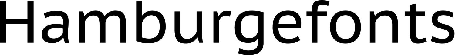
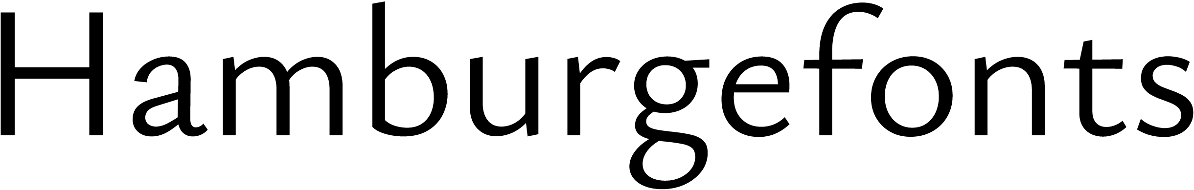
Fira Sans
Erik Spiekermann, Ralph du Carrois
Developed for Mozilla Firefox OS. The design was built upon one of Erik Spiekermann’s best sellers, FF Meta, — but Fira, which is made to fit screens and small point sizes, is wider, bolder, with taller lowercase and stricter details. It is also to Meta that Fira owes its neutral character, — which is not so much about the design, but rather a result of almost three decades of active use.

Hands-on Appropriate in quality, yet questionable from the technical point of view. Among other things, the kerning is controversial — for instance, take a look at this rge combination in the classic test word, Hamburgefonts. It looks too black, lacking air.
Styles Fira is equipped with true italics — and they also resemble italics in Meta.

There are two additional families, identical to the roman style in terms of designs and style sets: Fira Sans Condensed and Extra Condensed.


Cyrillic While working on Cyrillic, Fira Sans’ authors seemingly drew inspiration from Meta as well; Fira is very questionable in practically any glyph (and some of these questions are quite serious)

Upper stroke in the uppercase Б is too short. Lowercase б has the same problem; besides, the stroke is awkwardly fractured, and its terminal lacks weight. Лл limps on its left leg — and the leg is troubled both in terms of its form and its size. Similar issues with Дд: its left stroke unfortunately pierces the baseline by its contrasting spot. Too thick (up to the point where it makes you think of reverse contrast) diagonal in Ии is the reason this glyph looks too black.

The rationale behind diverse stroke dynamics in uppercase and lowercase Чч is unclear: none of them look good. Loose, wide, clumsy ф. The breve over Йй proceeds with reverse contrast’s theme — a solution copied from Meta, where you’d find the reverse contrast in Latin as well.
Our advice
When choosing a font, don’t forget that Fira Sans is very similar to FF Meta. It is not good or bad in itself — it’s just that Meta has been widely used for thirty years now. And stay away from Cyrillic, please, — sad to say, it is a true failure.
Ubuntu
Dalton Maag
The default font for Ubuntu OS, it is a humanist sans serif, classified as one from the so-called spurless сategory (referring to the distinctive arc—vertical joints in letters such as m and n).

Design is far from being very original: as has been repeatedly pointed out after Ubuntu release in 2010, it is quite similar to DTL Prokyon — the font released 10 years earlier. The arched letterforms are not a new idea, they date back to the art deco age — but the resemblance of Prokyon and Ubuntu is indeed remarkable.

Hands-on Ubuntu has some quality curves and kerning; both tabular and proportional figures, sets of fractions, super and subscripts, as well as sufficient amount of ligatures, punctuation marks and currency signs.
Styles Italic is independent of roman — which is what you’d expect with humanist sans serifs. In some places we can see how legibility concerns prevailed over broader graphic ideas — a and u were eventually given spurs at the bottom.

Ubuntu Condensed, the only condensed style in font, became a separate typeface. It has kept the letterforms and vertical proportions — but letter spacing was increased for the sake of keeping typeset lighter.

Cyrillic Ubuntu Cyrillic doesn’t have many arcs, that is why spurless graphics (typical for Latin) is only present in Cyrillic р and а. Other than that, the spirit of the Latin is reflected rather well; authors managed to avoid many common mistakes of cyrillization.

Лл’s left stroke looks too sweeping, especially in heavier styles. Lowercase я’s head looks a bit small, while its leg is placed too far. The tail of У has also flown far-far aways — and this detail doesn’t quite match anything in Ubuntu Latin. In lighter styles, the problems with я are getting worse; plus it’s evident that the shoulders in д, ц, щ, д, ц, щ are somehow short. As the font gains in density, the under-compensation in diagonals of its Мм becomes obvious, and we see signs of reverse contrast.

There are problems in Ukrainian typesetting: the authors haven’t looked into typical combinations of ії and її. The problem would have been solved by modifying the accents.

Our advice
Be careful while choosing styles: each has its own set of problems when it comes to Cyrillic (even though such problems are slightly offset by the distinctive personality of Ubuntu).
Source Sans 3
Paul D. Hunt
Source Sans was released by Adobe. As the typeface’ author was inspired by the work of Morris Fuller Benton (who designed Franklin Gothic and News Gothic), Source Sans has a distinctly American character. A new version is called Source Sans 3, yet the previous one, Source Sans Pro, is still available on Google Fonts.

Hands-on Source Sans has open letterforms, specific for a humanist sans, but its dynamic pattern
In smaller sizes, readability is ensured through subtle ink traps.
The font’s default figures are tabular (that are shorter than the uppercase symbols). Proportional, old style and uppercase tabular figures are also available. Source Sans comes in an extensive character set: small caps, stylistic alternates, Latin superscripts.

There’s quite a lot of currency signs, prebuilt fractions, mathematical symbols as well as icons and emojis.

The third version of Source Sans keeps the same proportion, metrics, and weight. Some changes have been introduced to its character set, accented glyphs and certain details of particular elements.

Styles Source Sans 3 has 8 weights with italics (unlike Source Sans, it contains two in-between options, Medium and Extra Bold). And then there’s a variable font of weight axis.

The typeface is equipped with true

The previous version only supported Cyrillic in its upright

Cyrillic The authors sought to emphasise the typeface’ humanist nature, but this attempt turns out rather unsuccessful. Cyrillic fails to inherit Latin’s conciseness, but acquires its own personality instead. This is very apparent in these к, б, and ф, for instance.

The alternative Кк, Жж, Фф somehow help fix the

The issues arise where you’d expect them: the left leg in these Лл and Дд is too slanted (and the slope is different for the uppercase and lowercase characters). These Дд are

The Ч’s upper part somehow lacks volume, while the upper horizontal stroke in Ъъ is too long. Яя looks too ambitious because of the way its leg acts — R is more reserved. Even though the typeface is overall characterised by large diacritics, the Cyrillic breve looks too large, with too much contrast.

The left leg’s terminal in м looks weird: this design happens when it comes to certain serif italics, yet in those this solution is supported by greater reliance on handwritten logic, higher contrast, and a different weight distribution. The descender’s shoulder in ц и щ is too short.

As weight increases, some issues arise with accents in italics (in Ukrainian, for instance).

It would seem logical to execute the crossbar in Serbian њ as a shared stroke at the same height (yet it is not the case).
Our advice
Source Sans 3 will do when you need to save space, but it’s too light, so be careful when applying tight leading. You’d better avoid using the font’s Cyrillic extension: minor improvements in the new version still do not let us consider it high-quality.
Noto Sans
Cyrillic Noto Sans has been updated in 2024. The typeface was designed by Jovana Jocić, author of Cyrillic extensions for Roslindale and Forma DJR, and she was advised by Mikhail Strukov, author of this series. Therefore we cannot objectively review this typeface, but we will address this update in detail in a separate piece.
Exo 2
Natanael Gama
Evolution of Exo font. It has been redrawn; glyph set and language support have been expanded. The author classifies it as geometric — and yet it is more of a humanist sans serif, that was given a futuristic feeling through the geometrization of letterforms.

Hands-on The font has open glyphs, — that, coupled with square-shaped form (increased counter) helps enhance legibility in small sizes. Some glyphs reveal humanist stroke dynamics (i.e., bowls in b or q), but there is no such vibe in o or s — as if they were characters from some other typeface. The font has one set of proportional figures, several ready-made fractions with full self-assembly kits of numerators and denominators, basic ligatures, and key currency signs.
Styles A true italic face — with designs independent of roman styles and distinctive bowl shapes, — stresses the humanist nature of Exo 2 and ensures nice contrast in typesetting.

Cyrillic The Cyrillic version of Exo 2 differs from Latin part in terms of personality, bringing in even more eclecticism, — it is way more soft and far less ‘technological’.


An attempt to convey the futurist feel using rounded angles in Гг, Лл или Дд produced the opposite effect: the glyphs look too decorative, or even retro-futurist. Besides, Лл and Дд have broken left strokes and poorly distributed contrast — while descenders in Дд, Цц and Щщ are too thin. Яя’s leg placed too far.

A branchy Кк and a wide Жж, even branchier: it’s a very common design for a poor sans serif cyrillization. Upper terminal in б is light-weight, and crooked. Another typical mistake is to transfer the arc dynamics of n and m into Чч: here it results in a sharp angle — and a very high-placed joint.

Our advice
Exo 2 is optimized for small sizes. However, this Cyrillic fails to reflect the character of the font; not to mention how badly it was designed — with mistakes so grave, that it is hardly worth any recommending for use.
Alegreya Sans
Juan Pablo del Peral
About Alegreya Sans is a font with calligraphic elements. The strokes vary in thickness; ovals and arcs manifest angled joints (common trait in handwritten forms). Letterforms are built upon old-style serifs which trace their ancestry back to Renaissance handwriting.

Hands-on A fairly light typeface with a small x-height. Alegreya Sans has its own distinctive personality, and is rich in details — therefore ill-suited for typesetting in small sizes. The font uses old-style proportional figures, has a number of ready-made fractions and superscripts, separate sets of numerators and denominators, basic punctuation, and minimum currency symbols.
Styles Very sharp italics, clearly inspired by Renaissance scripts, too, specific triangle shape of bowls and arcs, — very different from the roman face in its design and narrowed proportions.

Small caps were made into a separate font called Alegreya Sans SC.

Cyrillic The character of Latin was well transferred into Cyrillic. The authors managed to avoid a lot of typical mistakes; yet there are still certain problems with the letterforms.


Лл and Дд are too narrow, with poor contrast distribution. Besides, Дд feels rather unstable on its platform — it is skewed to the right. Upper stroke in б is both too long and too fractured.

Sadly, in addition to the design flaws, there are also technical issues. For example, the interpolation sometimes result in a misshapen contour.

The Italic uppercase of л has suddenly become triangular. The tail of б seems extended and overly active; too much angularity in в glyph; letter ы is unnecessarily wide. Regular slanted characters serve as italics in к and ж — pretty unexpected for a font with such a pronounced italic.

Cyrillic small caps. Latin Y acts as У — which is wrongly derived from the identical design in lower case.

Our advice
Alegreya Sans works well in large, and medium sizes. Yet, its Cyrillic should be approached with great caution (because of technical errors, at the very least); and Cyrillic small caps shall not be used under any circumstances.
Arsenal
Andrij Shevchenko
Arsenal has high contrast, attaching a somewhat classical vibe to this font’s personality (such typefaces, somewhat intermediary between serif and sans serif, are usually called contrast sans serifs). In 2011, the typeface won the Mystetsky Arsenal Design Competition in Kyiv.

Hands-on Arsenal is a compact sans serif with open apertures and narrowed proportions. The font’s humanist nature, as well as its bowl dynamics are quietened; the contrast remains its brightest feature. It’s rather light, yet concise: sometimes you get the feeling of insufficient letter spaces, as compared to the inner white, — which encourages to use Arsenal rather for headlines, than in sizeable texts. The font includes usual proportional figures, a large amount of ready-made fractions, math signs, a limited set of currency symbols.
True, rather quiet italics — with a small slant. Sometimes it might seem not sufficiently visible for highlighting a piece of text. Plus it appears very wide, as compared to roman, and is in fact less effective in typesetting when it comes to saving space.

Cyrillic Arsenal is equipped with solid, high-quality Cyrillic: it has natural looks and matches Latin in terms of character. There are also Bulgarian glyph variants.


A closer look reveals seemingly narrow Ч — and, in contrast, way too wide Ю with insufficiently compensated bowl. Лл has a very dynamic leg, with a terminal asking for additional weight. The serifless terminals are often quite problematic in contrast sans serifs.

Our advice
It would be more appropriate to deploy Arsenal for headlines and in display typesetting. And this Cyrillic is indeed very decent.
Andika
SIL (former Summer Institute of Linguistics): Victor Gaultney, Annie Olsen
Andika is a dark, wide font in just one style — a mix of regular and italic forms of an obvious humanist, handwritten nature. Designed especially for novice readers: it is believed that one-part italic letterforms are easier to perceive — and they are derived from handwriting, which is also quite handy for literacy training.

The handwritten frame is supported by stroke modulation and curved, outstanding spurs — those elements provide letters with particular features, thus making them more distinctive. They also define the reading impression: informal, in certain contexts the font might even sound childish.
Hands-on Andika has quality curves, large glyph set, and zero kerning.
Cyrillic It is hard to tell how Cyrillic is different from Latin in terms of literacy training — but, stylistically and in terms of quality, they are beyond comparison. Cyrillic is way behind.

Лл: despite all the overall dynamics, this left stroke is obviously little too much — it has flown away. Very wide Ии with reverse contrast. Also, there is a problem of widths in ы and з. Old-fashioned, clumsy Яя and Кк. The crooked tail of б, it doesn’t look particularly good.

Reverse contrast in Мм diagonals. Unduly extended descenders in Дд, Цц, Щщ and other characters.

For whatever reason, Cyrillic and Latin y differ in designs; that said, the logic is inverse to what we see in к: the Cyrillic у is more concise.

Our advice
Decent latin — but you don’t want to use this Cyrillic, especially for literacy training purposes. Eventually, those children will learn how to read — but they also risk spoiling their taste.
Istok Web
Andrey V. Panov
A serene humanist sans serif with neat structures, large and open-aperture lowercase, compact ascenders and descenders. Those are the features that normally ensure high legibility, multi-purposeness, and great potential for use.

Hands-on Upon closer inspection, the typeface reveals its technical flaws: dull, irregular contours; inconsistency in terms of contrast and stroke widths (like, they differ in the two arcs of m).
Styles Those issues get even more visible in italics (a true one, with highly pronounced dynamics, especially in counters). Weight compensation is also somewhat questionable: in italics styles, certain signs are getting too thin and they are not always compensated. Other than that, we have an obvious problem of spacing: some glyphs are stuck together (ge) — while others get holes between them (bu).

Cyrillic Not without its oddities, either. The forms chosen make it look old-fashioned; it is also different from Latin in its spirit.


Contrasting, very branchy б; з is falling to its left and has excessively dark joints, — so does this в. Left strokes of Лл appear bent inwards. Ии is very wide, reverse contrast. Same with Ыы. That breve over й is huge. Distorted, broken arc in ч.

Diagonals of Мм and Уу show reverse contrast. The bar of ъ, too long. And again, more trouble with letter spaces. ъ and я are too far from each other in the example below.

Our advice
Pick a different font! Istok Web is a font of downright poor quality, both in terms of design and from the technical point of view.
Yanone Kaffeesatz
Yanone
Kaffeesatz is a predecessor of FF Kava; the bold style was created under the impression of 1920s coffee house typography. However, the typeface doesn’t look out-of-date or historical. A vivid condensed sans serif with spurless arc structures, it is absolutely capable of finding a place for itself (even today).

Hands-on Rigid articulated rhythm, defined by verticals, is well-contrasted with soft terminals and decent bowl dynamics.
Styles Kaffeesatz has four weights, uses only old-style numerals, is equipped with several fractions, minimum of currency signs and ligatures. Well, it covers all the basic typographic needs.

Cyrillic The alphabet (also features Bulgarian and Serbian alternates) looks pretty natural; a nice choice of letterforms. Here, it even seems all right to have this Кк with those soft branches — works well within the context of narrow proportions and regular vertical rhythm.

Not all signs are graphically perfect. For example, you’d want to add volume to the bowl in Я, or might reckon that Д shall take a firmer stand on its platform… Anyway, the strong personality of this font makes up for its flaws and weaknesses.

Our advice
Yanone Kaffeesatz is a vibrant, high-quality font, best used as intended — that is, for display typography.
M Plus 1p
Coji Morishita
Combination of multiple scripts within one ambitious project. M+ Fonts brings together Japanese Kana, Latin and Cyrillic; the author describes the design of two latter scripts as “sophisticated” and “relaxed” at the same time.

Hands-on Neutral and quiet humanist sans serif with large lowercases and open, easily readable glyphs. The typeface looks light and spacious, — yet despite being all-purpose, it won’t work in dense typesetting and tight leadings.
Styles Google Fonts also distributes an additional family called M Plus 1p Rounded (with rounded terminals), more concise as compared to the main version.

Fitted with seven weights, ranging from Thin to Black. Each style has a set of usual tabular figures, as well as minimum fractions, ligatures and currency symbols.
Cyrillic Cannot be described as high-quality or stylistically relevant to Latin, it has more rigid and geometrical looks. Unnatural б is standing out due to its upper stroke, bent at a straight angle. У has been complemented by a crooked terminal, narrow in the end — and flown away to its left (latin y has different design). The narrow ф might have worked way better, if it had a simpler form.

З is falling to the right (with lowercase з being excessively wide); the bowl in я is of weird proportions — wide, but vertically condensed. There are problems with left strokes in л and д: both are drastically fractured at the bottom — while the characters themselves are way too wide. As for kerning, it leaves much to be desired — just look at this hole in уд.

Uppercase Д, au contraire, is narrow. Broken-shaped arc in Ч has gotten too low. And Я, once again, lacks volume in the upper part.

Our advice
A smart font for flexible typesetting — and for the joint use of Japanese and Latin — not Cyrillic script, though. In M Plus 1p, it is of poor quality.
Ruda
Mariela Monsalve, Angelina Sanchez
This typeface was originally developed for the use on product labels — probably, this can explain its set of properties, openness and large lowercase signs, they all work for legibility. The glyphs have humanist forms, but the contrast isn’t fully consistent with the logic of the tool: it’s built and formed around the square inner white in arcs and bowls.

Hands-on A light typeface with narrowed metrics and large letter spaces. The glyphs are fairly narrow — with bowls in lowercase looking particularly narrow (especially true for o). Very tall lowercase letters — hardly different from uppercase glyphs.
Styles Six upright styles, from Normal to Black, plus a variable font with weight axis. As the font gains in weight, the inner white remains spacious, while the letter spacing decreases, — in black styles, the balance of inner and outer white is nothing like that in medium styles.

Cyrillic Cyrillic version is generally relevant to Latin, both structurally and in terms of character; yet there are some problems in details and execution — thus it cannot be described as high-quality.

As it is the case with Latin, we see oddities in proportions: several round glyphs look narrow against those built on verticals (но). An unfortunate б, the tail is clearly too short; the bowl form appears somewhat illogical next to р, where the bowl is stiffly linked to the vertical. Ascending diagonals in к, и, у are very heavy, creating unwanted reverse contrast.

Same issue with diagonals can be seen in м. Too wide ы, with its thin right stroke bent (for some reason). Failed л and д: both characters have too thick, broken at the foot, left strokes. Д also has a problem with its platform, short descenders do not match the same elements in ц and щ, neither in form nor in size and shoulder width (too short, in case of the latter two). Add clear problems with letter spacing (a hole in цы, for instance)

Б — upper stroke is too short. Reverse contrast in the breve over Йй. Trouble with Д, Щ and И are the same as in lowercase. Letter spaces in the whole word look very random.

Yet another mistake in Ы — very thin stroke on the right. Л inherited the flaws of its lowercase. Wide Ж with thick ascending diagonals — similar issues with those also manifested in И, М and А.
Our advice
Ruda is a typeface with an interesting approach to letterforms and a powerful Latin version. — However, this Cyrillic is too messed up to be used.
Commissioner
Kostas Bartsokas
Commissioner is a humanist sans serif with an approach to proportion and letterforms which makes you think of the Renaissance one. At the same time, Commissioner takes advantage of all the possibilities offered by variable font technology which helps it both reveal its personality and become more versatile.

Hands-on Commissioner has open glyphs, sharp arc joints and distinctive designs (g) — typical features of a humanist, old style typeface. There’s a pronounced difference in widths between straight and curved characters, low yet noticeable contrast, stroke weight compensation in the
The Flair axis makes a typeface more sophisticated; it gets entasis and its stroke endings gain

The Volume axis changes the way the strokes get thicker, making the shape more geometrical, angular.

Commissioner supports Latin, Cyrillic, and Greek. The typeface has a wide range
There’s one set of proportional figures, subscripts and superscripts, sets of numerators and denominators, a basic minimum of prebuilt fractions, plenty of currency signs.
Styles Commissioner comes in 9 weights ranging from Thin to Black.

The downloadable file also contains italics, but Google Fonts features only the upright styles.
Cyrillic The quality of Cyrillic support is quite high: systematic solutions, designs that look natural. It is in line with Latin in terms of its personality.

In larger weights, the diagonal cut of the left vertical stroke in the lowercase gets more articulated. In Latin, it’s an echo of triangular serifs that makes you think of the typeface’ humanist roots, while when it comes to Cyrillic, it’s a mostly decorative, irrational solution: these diagonal cuts exist even in those places where there were no serifs historically.

The crossbars in Serbian Њњ sit on different

An issue of tight accents in її, typical for Ukrainian, was smartly solved through a ligature. The typeface would benefit even more from unifying the sizes and position of the tittles in і and ї.
Our advice
Commissioner is a typeface with a clear concept, quality implementation, and appropriate use of modern technology. Cyrillic is decent, it can well be used.
Finlandica
Helsinki Type Studio, Niklas Ekholm, Juho Hiilivirta, Jaakko Suomalainen
Finlandica is the official typeface of Finland. As conceived by the author, the typeface’ design embodies an important virtue in Finnish

Finlandica’s personality is all about its ink traps, a particular shape of the spur (in some places), certain geometrical details (such as in t) — the very same technical solutions ensure readability and legibility in smaller sizes. Loose letter spacing makes the typeface suitable for small
It is a concise nearly monospaced typeface, sometimes looking much like a geometric sans, but open aperture, designs of certain characters (this lowercase а has an almost Renaissance vibe), and true italics suggest Finlandica’s old style nature.

There’s default proportional figures as well as a set of tabular ones; several prebuilt fractions, sets of numerators and denominators, superscripts.
The typeface comes in an extensive character set in both Latin and Cyrillic. Finlandica supports most Cyrillic-based languages, yet you won’t be able to use the font for typesetting text in Abkhaz, Chukchi or Khanty.
Styles ВFinlandica has 4 weights with italics.

The typeface is also available as a variable font of weight axis.
Cyrillic Cyrillic Finlandica has fairly familiar letterforms, matching the personality of their Latin counterparts.

This б’s tail looks too snaky and its ending is too light. Even though the ф’s ink traps seem extravagant, they still do their job, lifting the burden of weight from the joints.

The leg in Лл is crumpled, of a complicated shape, and its weight distribution could use some improvement. The diagonal strokes in к get thicker as they approach the stem, making the joints look heavier than they should.

The crossbar in Юю looks too wide for a concise typeface like this, while the Ъъ’s ear is the opposite of that, too short.

The italic ж might use some more width, it looks squeezed, while this ф has a really complicated

Then there’s typical problems with Ukrainian diacritics in heavier weights.
Our advice
Finlandica is a typeface of a bright personality, optimised for setting in small sizes. Its Cyrillic is not ideal, though generally usable.
Carlito
Łukasz Dziedzic
The typeface grew out of another project by Łukasz Dziedzic, Lato. Carlito has the same graphics and structures, but its proportions are different. It is metric-compatible with Calibri and can well be used as an alternative to it.

Hands-on Carlito’s x-height is larger compared to Calibri, and the counter space here is also bigger. The authors had to sacrifice white space between letters to preserve the metrics compatibility, which makes text look a bit tight and less balanced than it is the case with Calibri. The angles are
The font uses default tabular figures, but there’s a set of proportional ones and two corresponding sets of old style figures. It contains lots of prebuilt fractions, numerators and denominators, superscripts and subscripts, circled numbers, mathematical symbols, a good deal of ligatures.
The typeface has a wide range of characters. It supports most Cyrillic-based languages, yet you won’t be able to set text in Abkhaz, Evenki or Nanai.
Styles Carlito — same as Calibri — comes in two weights, Regular and Bold with italics.
Cyrillic Cyrillic is in many ways similar to Calibri in terms of designs and personality.

ПThe straight diagonal strokes of Carlito’s К look more neat than Calibri’s curved branches.

However, the Cyrillic design is different from the Latin K — though there’s no rationale behind the decision to make these two designs different.

The uppercase characters sit mostly close to each other, but there’s still a number of holes, such as in БЛ. The bowls in Б and Ы are small and tight. The Лл’s legs are too thick. In Чч (which is quite narrow), there’s an unusually straight segment at the joint between the stem and the arc.

The lowercase к is also different from its Latin counterpart as its leg and arm are softer; the leg in Яя is softer than the one we see in R, too. These glyphs could also benefit from more volume in their upper part. The crossbar in ю is a bit too wide.

The л’s leg is too dynamic, too sprawling.

The Ukrainian typeset text

The bowl of Serbian Ђ lacks volume and its shape is also questionable as it is more common to see this element similar to the shape of the arc in Ч. The left and the right parts of Њ lack balance: the former is much wider.
Our adviceт
Carlito is seeking to be an alternative to a popular font, yet it is suitable as its replacement only when it comes to Latin, and rather in larger sizes. Cyrillic is not perfect and it is probably not worth opting for it instead of Calibri.
Ysabeau
Christian Thalmann
Initially called Eau de Garamond, the typeface combines Garamond legacy with a clear-cut nature of a sans serif. It is intended to be used as a self-sufficient body text typeface (in books, for example) as well as paired with Cormorant Garamond by the same author, or with EB Garamond.
Hands-on You can see the influence of Renaissance prototypes both in the designs of glyphs and the parameters of the font. High contrast proportions, generous letter spacing, correspondingly long ascenders/descenders which require loose leading. However, the typeface’ x height is not large, which, coupled with the significant amount of details, hardly implies the use of Ysabeau in small sizes.
Ysabeau manifests a really pronounced contrast for a sans

Default old style proportional figures, but there’s also regular ones, both equipped with tabular versions, a number of fractions, numerators and denominators, superscripts, mathematical symbols. The typeface has small caps, quite a lot of currency signs, icons and arrows. It comes in an extensive character set, supporting most Cyrillic languages.
Styles Ysabeau has 11 weights with italics.

There are several separate families. Ysabeau SC (small caps).

Ysabeau Infant with simplified, one-storey glyphs.

Ysabeau Office, в котором иначе работают стилистические альтернативы.

Ysabeau Office, with a different way of how stylistic sets

Cyrillic Cyrillic glyphs look mostly natural, there’s no feeling of inconsistency with the Latin set.


The leg’s shape in the uppercase Л

Cyrillic italics also feels like a relic from the Renaissance. It is independent from the roman face, with a different shape and different glyph structures.
Cyrillic for Ukrainian and Tadjik is implemented properly.


Our advice
When dealing with Ysabeau, you need to remember that it is a sans with a historical vibe and echoes of the old style serif type. Ysabeau Cyrillic support can well be used, yet with some
Lunasima
The DocRepair Project, Google
The typeface can be used to replace Lucida Grande in Office Open XML documents with minimal impact on the layout. Lunasima graphics is based on Noto Sans though.

Hands-on The same characteristics are true for Lunasima as for Noto Sans: it is a calm humanist sans with open aperture and squared letterforms. They make typeset text lighter due to increased counters and introduce certain severity and technological character at the same time.
The glyphs are quite wide and the x height is fairly large, which ensures legibility and readability in smaller sizes.
There’s one set of regular tabular figures, lots of prebuilt fractions, Roman numerals, superscripts and subscripts, mathematical symbols.
The font supports Latin, Hebrew, Greek, Cyrillic, with a quite extensive character set in the latter, but you won’t be able to set text in Abkhaz, Chukchi, Ingush, Khanty or Kabardian.
Styles Lunasima comes in just two roman faces, Regular and Bold.

Cyrillic Lunasima graphics repeat Noto Sans before its Cyrillic was redesigned: there are the same mistakes as there were in the

At the same time, basic

A sweeping diagonal stroke in Дд is way more dynamic than Latin implies. The length of the right descender does not match the same element in Цц and Щщ. The bowl in б is overcompensated, small and irregular, and its upper stroke is too long and looks even more broken. The ы’s bowl lacks volume (the same is true for ь and ъ). This Чч is too narrow, with its curved stroke going up too drastically before joining the stem.

The У’s tail’s gone too far, the л’s leg is too fat, the mutual arrangement of Ул raises questions about the quality of this kerning job. The roles in Я are poorly assigned among its various elements: the bowl lacks volume, while the leg, on the contrary, is too ambitiously outstretched. As weight increases, the flaws of these Ыы get worse.

There are problems with accented glyphs in Ukrainian.

The bowl’s shape in Serbian ЂЋ
Our advice
Lunasima is capable of doing its job in Latin, but not
Bellota Text
Kemie Guaida
The Bellota family is based on the typeface called Snippet by Gesine Todt. Despite what its name suggests, Bellote Text is a decorative typeface. Yet it is calmer if compared to Bellota face, which contains a larger amount of ornamented elements and swashes.

Hands-on The typeface is light, with wide glyphs and moderate amount of white space between letters, which means it is intended for larger sizes, as it was stated. There’s no contrast, but one can feel the dynamics, specific to writing with a flat tool, in these letterforms: the asymmetric bowls joining the stems in a rough manner, same is true for the arcs.
Technical quality is not the highest: there are numerous discrepancies in thickness, parallels, dimensions (by several units), and unnecessary points on the contours. For instance, both the x height and the cap height are varying throughout the text: some glyphs are higher than the indicated metrics, some are
Bellota Text and Bellota have identical parameters, metrics and even character
The font features regular proportional figures, prebuilt fractions, numerators and denominators, mathematical symbols, the most common currency signs.
An extensive character set for Latin, a minimal Cyrillic support. The typeface supports Russian, but there’s not enough glyphs to set text in Ukrainian or Belarusian.
Styles Bellota Text comes in three weights with italics.

The same range of styles in Bellota.

Cyrillic Cyrillic attempts to match Latin in terms of its personality, but it doesn’t always embrace the logic of writing by hand.

The solutions shared by Cyrillic and

КThe design of Kк is different from Latin: these branches with barely articulated bends just look crooked.

There’s an г which is too wide and slight reverse contrast in the diagonal strokes in м. The arc in Чч is somewhat angular. There’s an unfortunate, overly dark, joint between the leg and the bowl. Two parts of ы sit too close to each other (while it’s the other way around in the uppercase glyph, they sit too far).

The bowls in з are flattened and stuck together, the contours are crumpled, strokes’ thickness gone wrong.

The joint between two bowls in в is too dark. The Дд‘s left shoulder is too short and and the diagonal stroke is too slanted. The leg’s shape of this л is inappropriate, its contour looks crumpled.

The logic of Cyrillic italics is different from the Latin
Our advice
Bellota Text is a part of an ornamented family with an expressive personality. Yet Cyrillic support is of poor quality, so we do not recommend using it.