
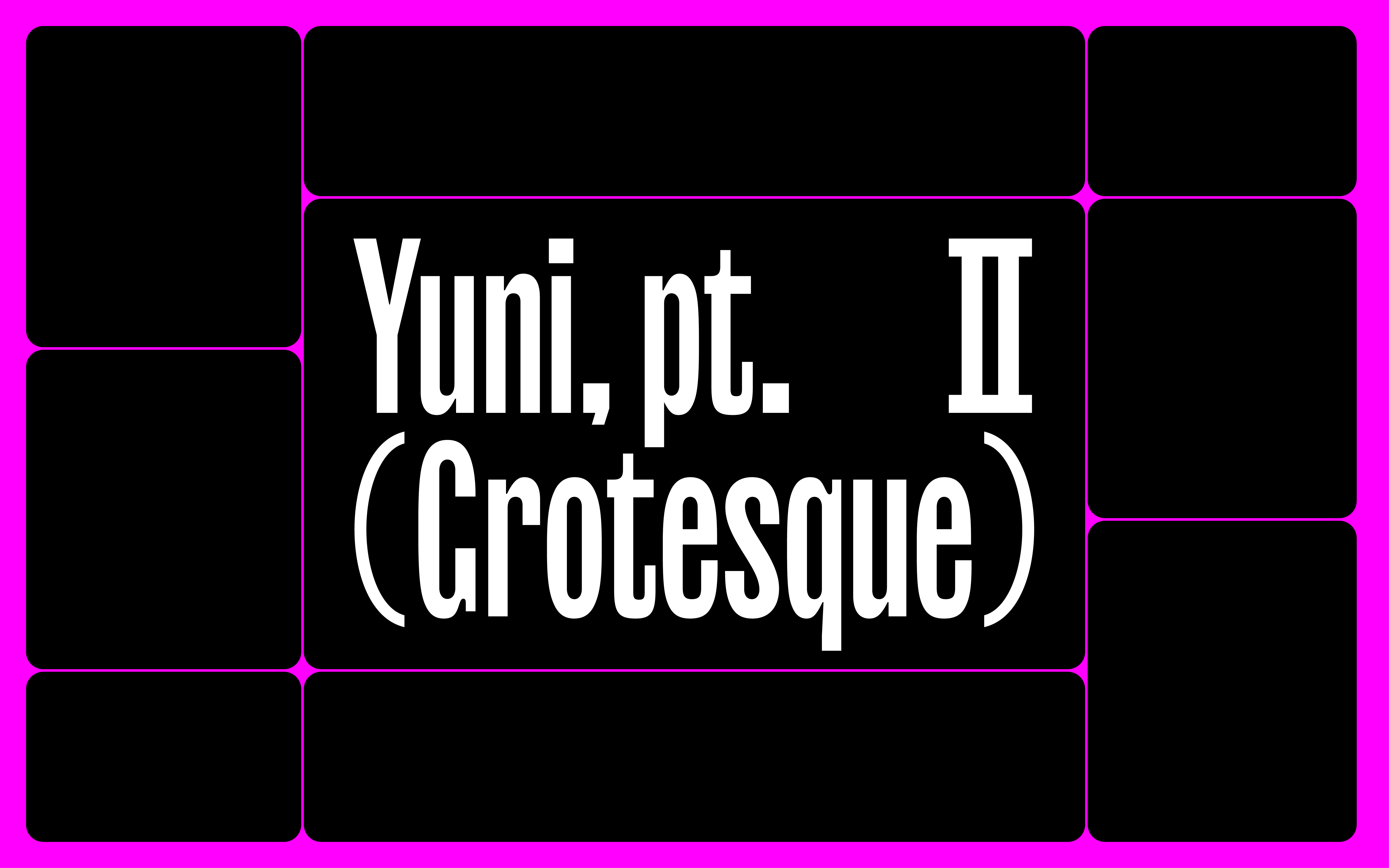
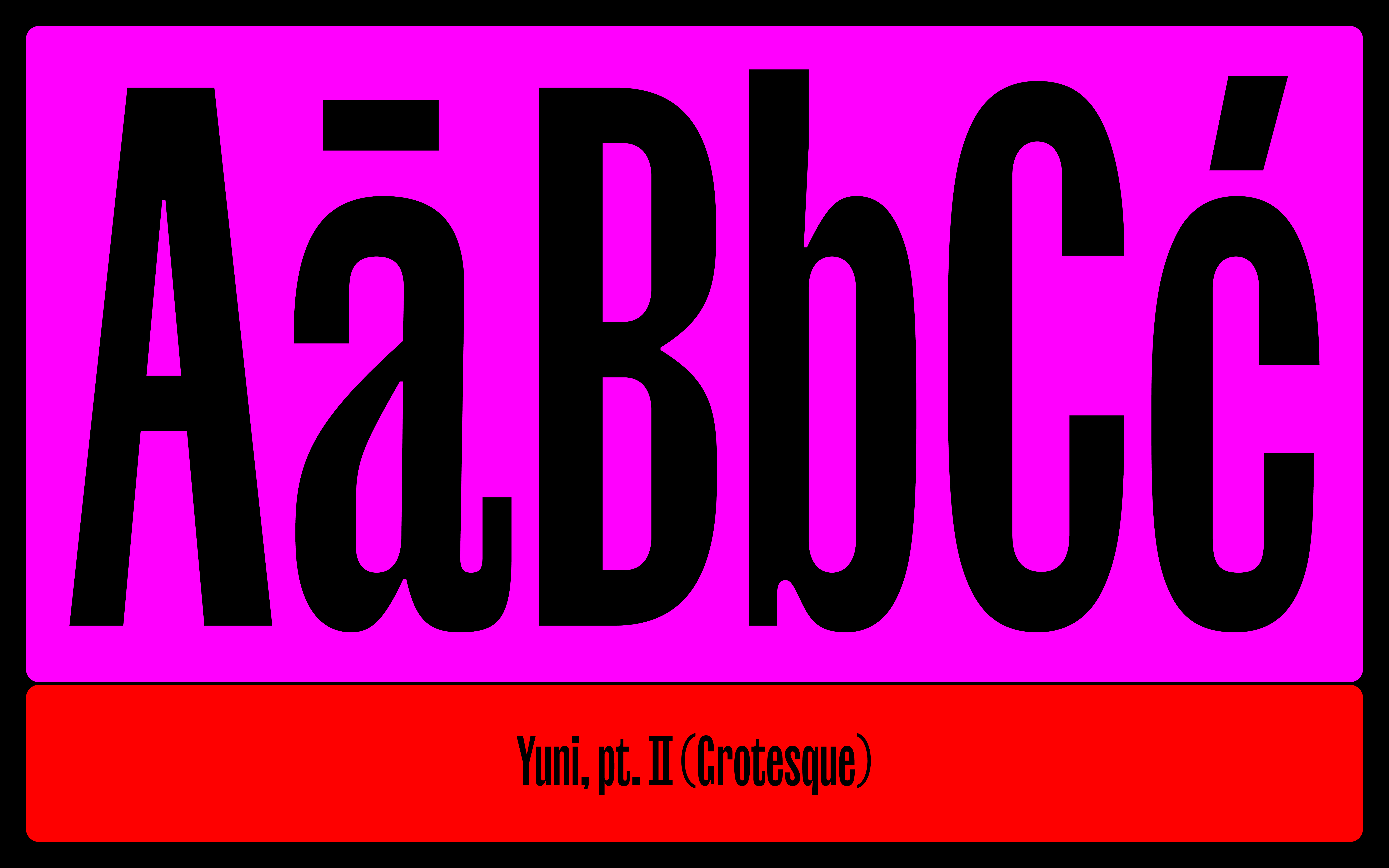
Yuni Grotesque is not just a compressed sans or a dismembered sibling of Yuni
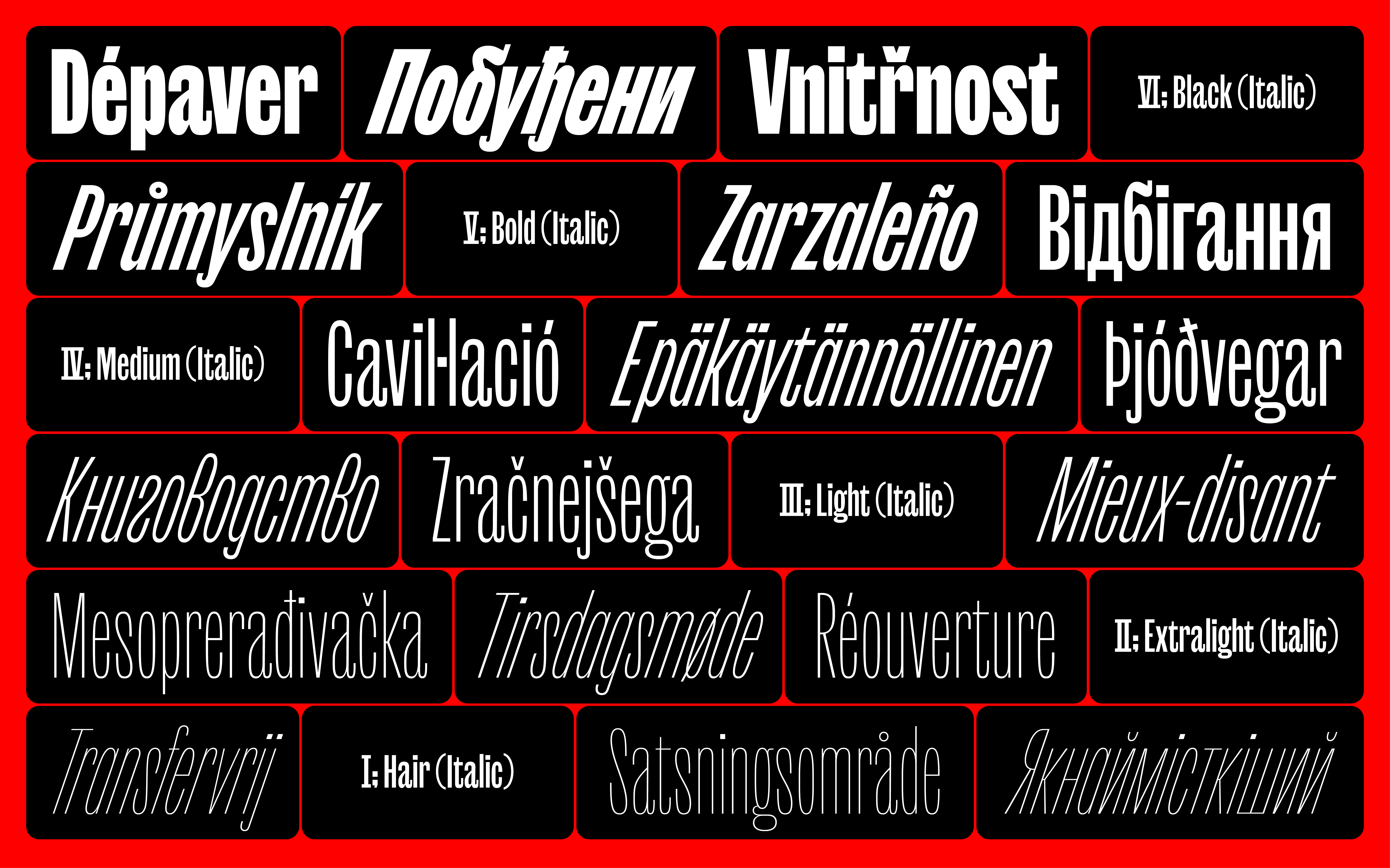
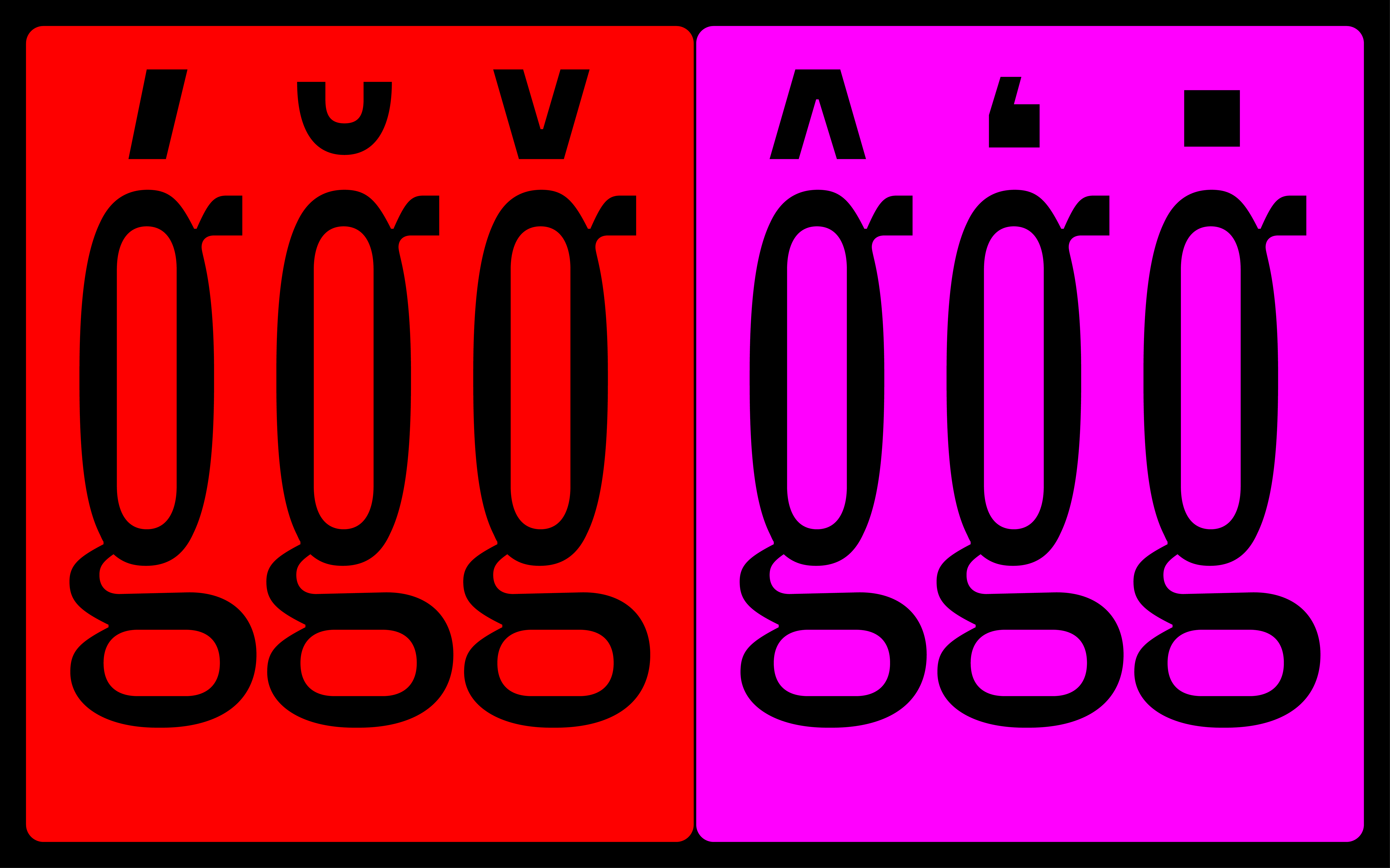
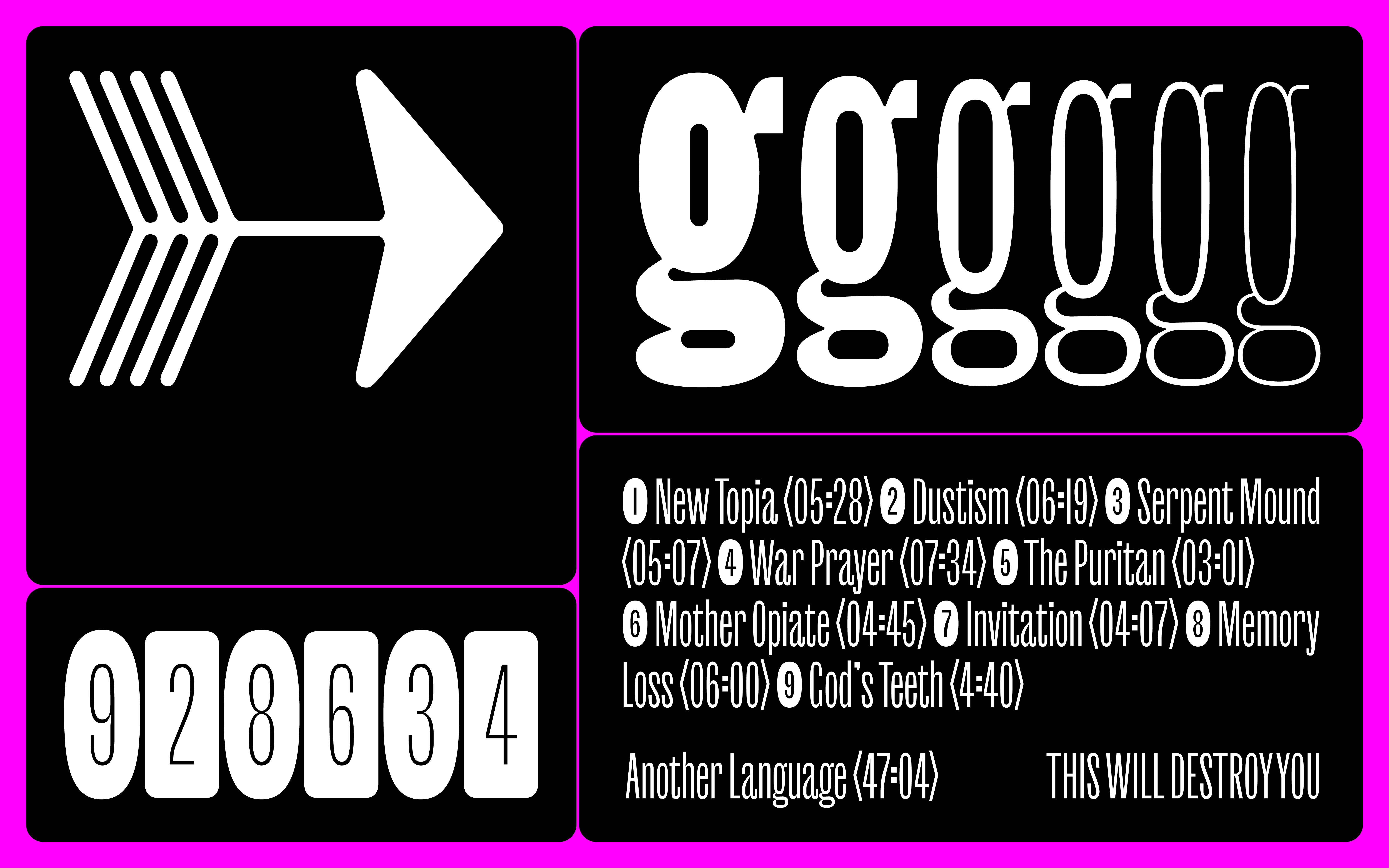
Yuni Grotesque’s curves are playful and highly suggestive. While weight transforms counters into almost-circular rounds, outer curves take a flatter approach. Bringing these two approaches together results in a blend, a beautiful bouquet of high-functioning foolishness. Separated from its serifed sibling — which played with the distribution of serifs, balls, historical references, and the same
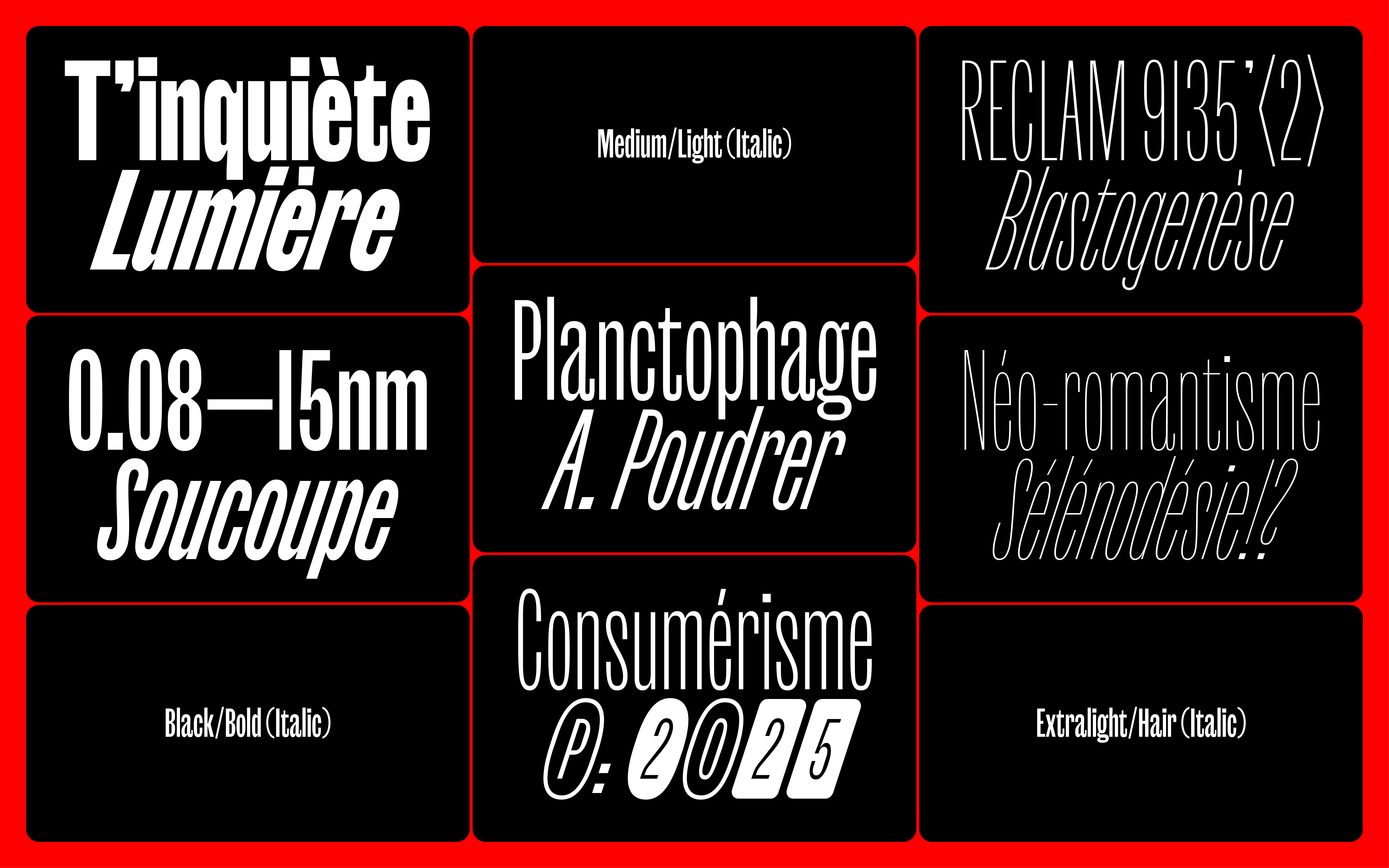
In six finely curated steps, its weight range covers everything you need, from a flimsy Hair or an advantageous Medium, all the way to a thick and sturdy Black.
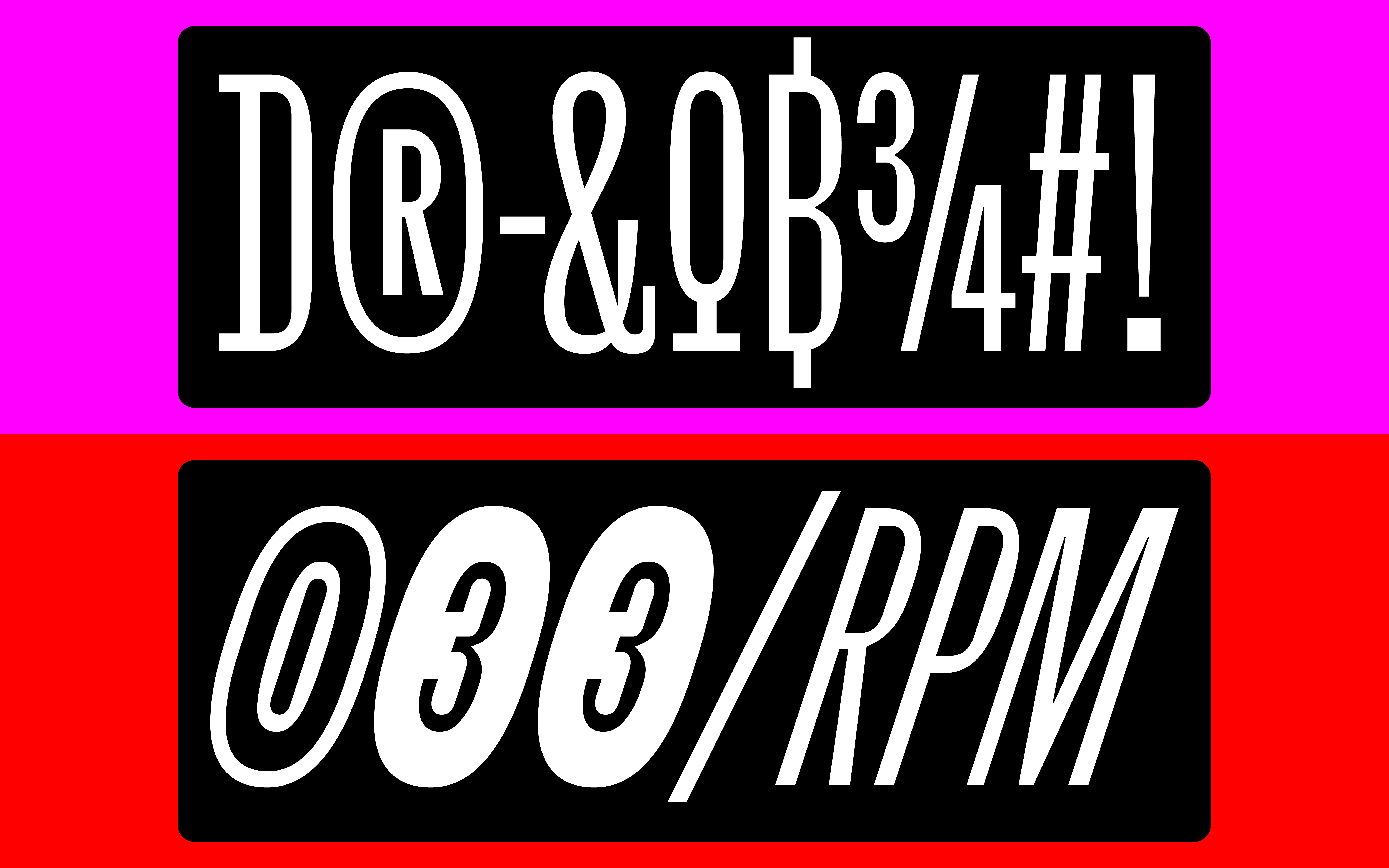
Additionally, Yuni parades speed and confidence with Italic styles heavily sloped at an expressive 18° angle. This compressed powerhouse of 12 styles plays for keeps and is best suited for everything grand and mighty: intricate branding, sophisticated layouts, oversized movie titles, or inflatable event signage you can see from
Get Yuni Grotesque
from $60 on type.today
Get Yuni Grotesque
from $60 on type.today
The author of Yuni, Philipp Neumeyer, was born and raised in the flat heart of Northern Germany. He graduated from the Muthesius Academy of Fine Arts and Design in Kiel before completing the postgraduate TypeMedia course at the Koninklijke Academie van Beeldende Kunsten in The Hague. After some back and forth between Berlin and Copenhagen, and working for LucasFonts and Playtype, Philipp settled in Berlin, where he creates custom and retail typefaces as Rüdiger.