
Vlad, please, tell us about yourself.
I come from Ukraine, from Chernihiv, now I am studying Media Arts in Warsaw. That sounds not very obvious, but it is actually a mix
Why did you choose Warsaw and this faculty, exactly?
It was rather spontaneous. I was doing mainly music and had no idea that one day I would be dealing with something visual. I only knew that I wanted to study something creative. I couldn’t find interesting options in Ukraine, so I began considering
Polish and Japanese, what an interesting combination…
The Academy was founded together with some Japanese financial donors. Other than a couple of disciplines and rare events, there is nothing specifically Japanese there. But it sounds posh, and perhaps attracts some of the students.
 Polish-Japanese Academy new identity prototype
 Zine about the Chernobyl disaster
Will you try to stay abroad after graduation, or will you get back to Chernihiv, or will you come to Kiyv, probably?
If we’re talking the nearest future, I definitely don’t want to come back. That’s great that design field in Ukraine is starting
And how this atelier is called?
Kwiaciarnia Grafiki — if literally translated from Polish, ‘Flower Shop of Graphics’. The guys who started it are obsessed with flowers and plant theme. Our shop is just like a flower shop: we sell multicoloured and not only multicoloured artifacts instead of flowers. This concept has also impacted my choice of topic for type.today’s Instagram.
Do you produce your own works, or you just work as a printer?
I began printing my own works, but not yet for sale, just for myself. We agreed right away that when I have time, I can come and use supplies, paints, paper and our working area to print different things, just experimenting. At first I made a few posters and postcards, but then I did more things. We decided to arrange a small exhibition soon to show the results of my practice.


What opportunities does Poland offer to a foreign designer? Is it possible to integrate into the local design environment and start getting commissions?
Like everywhere else, it does not always depend on how great things you produce are. It is mostly dependent on whom you
There’s little we know about Polish design today. Could you tell us what is happening there?
When we speak of Polish design, we immediately think of the School of Posters of the second half of the 20th century. And most Polish graphic designers are proud to be Polish. I believe that designers in general are rather narcissistic people, because we just love to exaggerate the importance of what we do. And in Poland there is this patriotic element, pride for the fact that perhaps you are a distant, but still successor of that renowned school.
 Witold Janowsi, poster for the 10th International Book Fair in Warsaw, 1965
 Jan Lenica, poster for Alban Berg Wozzeck theatre play, 1964
 Henryk Tomaszewski, poster for British Industrial Design Exhibition, 1963
Is there something left from this school’s heritage?
There is, and today Polish designers, like many of us now, are reflecting on their visual identity. What makes Polish design Polish? What differs it from German or Swiss design? Many designers here are clinging onto the cultural remains of the old Polish design, doing something in this aesthetics. That is a bit sad spectacle, because one can see that all this culture is slowly dying, and nothing new, interesting is appearing, and the things that appear are rather an imitation of what there was once.
Why is this happening?
Classic Polish academies of art are quite conservative schools, where there is still in place a system of workshops attached to certain teachers. And there, old school masters are teaching the trade the way they see it, which is in most cases poorly adapted to contemporary realities. Graduates of such workshops, young artists and designers, often come out and begin doing nearly the same thing. Instead of adopting certain visual techniques or spirit, they perceive previously created artworks as a litteral guideline on what to do. Perhaps, they lack a wider perspective. These attempts to preserve something specifically Polish look not very advantageous even next to simple copying certain trendy Western specimen. On the other hand, the reputation of Polish graphic design is still alive, they have plenty of great contests, conferences and art shows, some of which are with great history and traditions. Interesting things sometimes happen there, the guys communicate with each other and create cool stuff.
 Warsaw International Poster Biennale
 Kroje, conference on typography
 Polish Graphic Design Talks
Could you give us names that you like?
That’s Jan Bajtlik, for instance, who taught us. He graduated from an arts academy as a classic poster designer, and today works in Paris for Hermès fashion house, creates prints, makes various sorts of accessories. Then there is Edgar Bąk who does typography; he owns a studio where he does different kinds of cultural projects, mostly focused on typefaces and lettering. There is a rather young studio Laïc that collects experimental fonts at their store. I enjoy not everything there, but that is one of the freshest studios, and they have already won many awards. There is also a pretty powerful community of poster designers: Krzysztof Iwanski, Jakub Jezierski, Jan Bajtlik, Marcin Władyka.
 Iskry by Laïc
 Figiel by Laïc
 Nieuk by Laïc
 Poster by Krzysztof Iwanski
 Poster by Jakub Jezierski
 Poster by Marcin Władyka
What typefaces do you utilise in your work? Do you have any favourites?
I don’t have any clear preferences in terms of types of fonts or among type foundries, I just look for typefaces that would work for specific stories. However, I noticed that lately I began using Cyrillic

 Paneli Typeface
Yes, that is the most recent of them. We designed it together with Alexey Pushkarev, for a specific

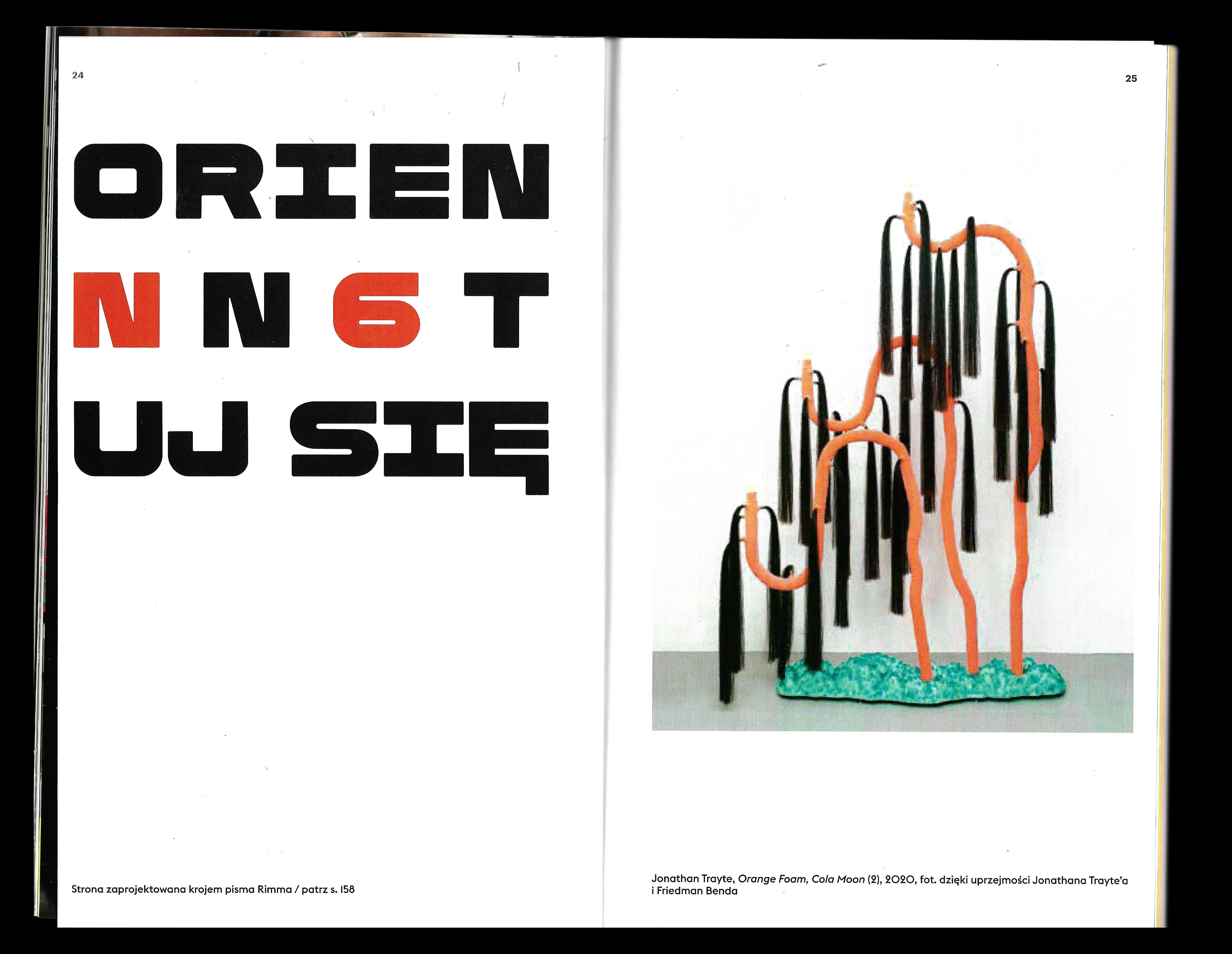 Rimma featured by NN6T Magazine
Your Instagram profile provides the link to ‘Samoorganisatsia’ (Self-organisation). What is that?
That is a community which I have been a member of for about a year now. A group of designers that includes dozens of guys from Russia, Ukraine and other post-Soviet countries. We do different stories linked to posters, typography and identities, in order to promote our vision, without focus on sales and financial success. That is, this is not a studio. We have no art director or a person who organises and controls everyone. Everybody is free to suggest their idea, while the rest pick it up and help with implementation.
Are those commercial projects or pure art?
Mainly art, though we sometimes get commercial stories
Several dozens of people are on one work?
In the case with posters, we release several posters observing certain specified criteria, so that it would look like
36 posters by ‘Samoorganisatsia’ community members
Another one of your links is the link to the project called 33 Days of Cyrillic.
That is an alternative for 36 Days of Type — with the exact same concept: every day artists, illustrators and designers draw one letter. Simply in the alphabetical order. Sometimes they don’t even draw but photograph, for example, various objects in the city which then form the letters. It is open for everyone who is willing to participate. I took part in 36 Days of Type, and then it was pretty difficult for me to complete all the


33 Days of Cyrillic is the same sort of event, but Cyrillic. That was fun, because I like designing Cyrillic symbols.
So, you are a that kind of person who’s willing to get involved in such daily tasks lasting for a month, arent’t you?
Yes, I am a kind of person who easily jumps on things like that, and then in the process starts to regret that he did it, because my head is gradually emptying out, I run out of ideas, yet I need to do something. But if you manage to do that, you eventually feel hugely satisfied, ‘Yes, I did it!’ Though, I often get involved in too many projects. Everytime I am telling myself that I need to take on less things, but then I take on a bunch of and I have a lot on my plate.
Well, now is a perfect time to talk about our Instagram. Could you please tell us more about the concept, besides the fact that it was related to you working at your atelier. Why dead plants, exactly?
It took me a long time to come up with the topic, I tried hard on it. It is way easier for me to do something when I come up with a certain legend for what I do. Yes, it turned out so botanic, perhaps, because of the atelier, where everything just screams
…Won’t be green anymore..
That’s sad! I googled to find lists of plants declared extinct, and decided to take on this subject. Then I came up with an idea to do it all in motion design, because I enjoy when something is moving, and there was not much animation during previous months. That was only later that I realised that it was not easy to implement on a daily
Your month on our Instagram was different in terms of styles and language from your works on your Instagram and Behance. Was it intentional?
It was, I wanted to step away from what I normally do. And so I tried certain alternative things that I always wanted to embark on. Eventually, it all turned out not very integral, because I failed to hold on to a single visual style, though I normally tend to put a lot of emphasis on it. But at least this provided me with an opportunity to express myself and release some ideas without looking back at the overall style of the feed. Even if I didn’t like something at the end, that’s nice that I
Has your attitude towards our collection changed in the process of work? Have you discovered new typefaces?
I’ve discovered lots of things. For some reason I thought that the collection was smaller than it really is. Earlier I simply browsed the website, and I got the impression that it was all very quiet and reserved, no display type (which I like), and there were not many typefaces in general. When I received the whole package and began looking at what there
I really liked sans serifs — even though most of them are fairly similar, it was really interesting to reveal various little differences in personality: Factor A is really cool, I liked using Signal for making up simple stuff, enjoyed the monospaced Menoe Grotesque… If we’re talking serifs, Kazimir is extremely elegant, especially when it comes to its thinner styles. I figured that it resonates quite well with botanical themes. Spectral is beautiful. Dala Floda is great, lots of contrast.
Was there something you didn’t like?
No, I can’t tell you there was. There is no such thing as bad fonts, you just have to know how to use them. So I really liked working with this library. Actually, I have never worked on such terms where you are given full access to everything and you can do whatever you like. I liked this
So, it turned out to be your training on choosing type?
You could put it that way. Or, perhaps, a type tasting.
Vlad Boyko
#typetoday042021
behance.net/vladboyko2a302
instagram.com/lad_boo/