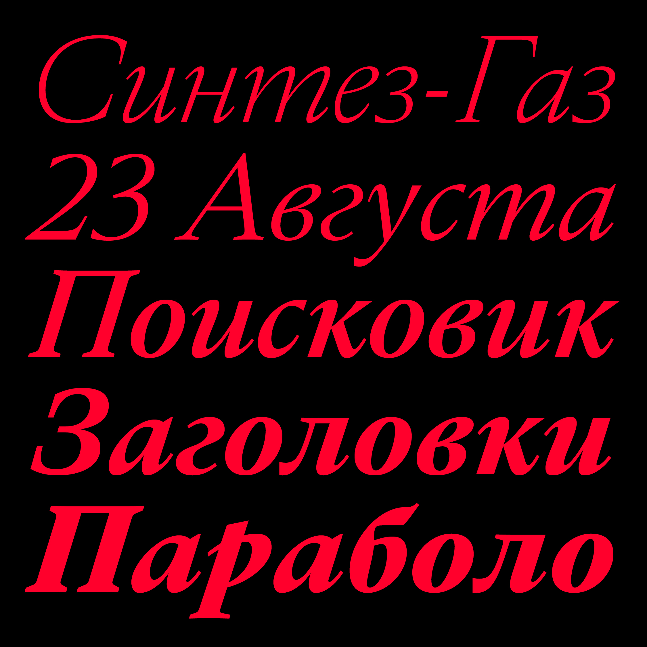
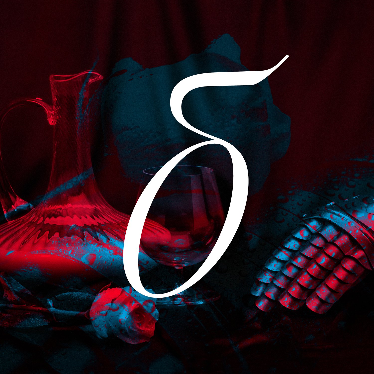
Crisp and serrated, Tesseract is a study in modernity and restraint. As Tesseract plunged into classical references, it earned its contemporaneity through whetted endings and constrained curves, lending a focused aspect to texts and titles. With optical sizes for text and a display, Tesseract shimmers across media. The Display size plays the wide aperture and x-height card, with chiseled terminals and see-through counterspace. The Text size is quieter, with a firm and sturdy structure for immersive reading. The matching italics dance a vibrant staccato and complete the family. The crucible for Tesseract is made of many; and not unlike Walt Whitman’s multitudes, it contains paradoxes. Where round turns give affability and amplitude to the design, abrupt endings and spiky details grant some grave austerity to an otherwise delicate design. For adventurous users, Tesseract contains multiple dimensions. Dive in.
Based in Paris and Shanghai, Production Type is a digital type design agency. Several typefaces by PT are already in our store, for example, Stratos. This font is well-known in a Russian context due to the stellar designs for a vibrant contemporary theatre Gogol-Center and an English-teaching school Skyeng. Both project’s design DNA relies on Stratos.
Tesseract is created by Jean-Baptiste Levée, the founder of Production Type. He has designed over a hundred typefaces (Spectral and Proto Grotesque among those) for industry, moving pictures, fashion and media. He is a Vice-President at ATypI (Association Typographique Internationale) and a design expert advisor for the French Public Investment Bank (BPI).
Tesseract is co-created by Marion Sendral, who co-developed Kessler, WNBA Typeface, and, for instance, Signal which is featured in our store. She holds an MA degree in typeface design from École Estienne.
Check out Tesseract in our store.


Check out Tesseract in our store.
