
Adelina Shaidullina: First of all, do you have templates for your email typography, or do you design it from scratch each time?
Felix Pfäffli: It’s a signature, so it’s already pre-organised, but we have various forms of it. We came up with it maybe 10 years ago. Whenever I exchange emails with someone for the first time, they tend to like it.

Studio Feixen email signature
AS: I definitely did! Is the studio now just the two of you, or do you have some professionals you collaborate with from time to time?
FP: Just the two of us, actually.
Robin Eberwein: For kerning, we always work with Igino Marini, the Italian master. We tried to do the kerning for our first font ourselves, but it was too much for just two people.
FP: The studio has changed in size over time, and our practice has with it. For a while, we were around four people and worked more like a classic graphic design studio, having clients over longer periods. At one point, I worked with Raphael Leutenegger, who was in the studio for about seven years. When he decided to move on, I didn’t want to keep the same structure because we had a very unique practice which was not possible to replace.
Nowadays, the studio is all about collaboration. And the foundry is what Robin and I handle.
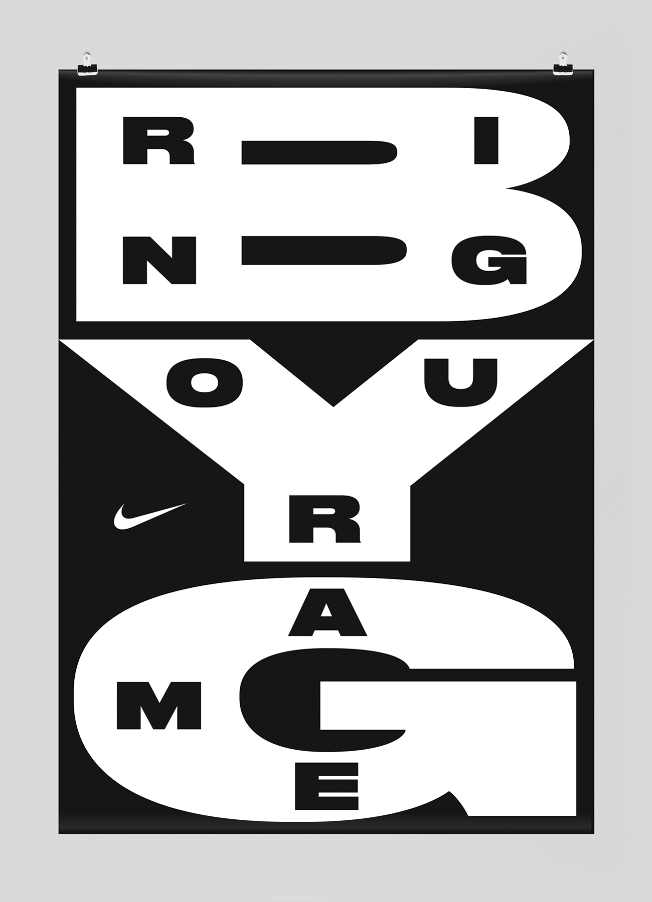


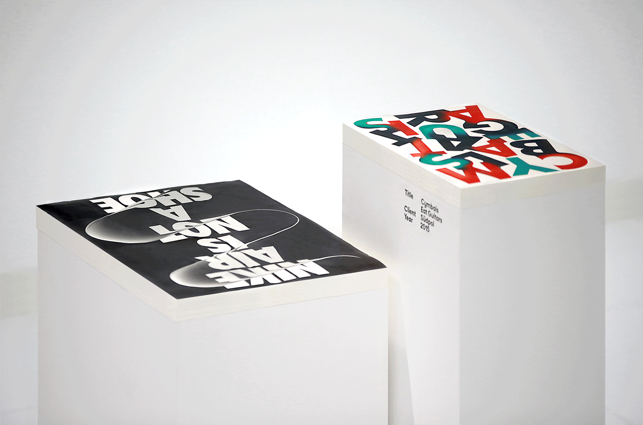
Posters designed by Studio Feixen for Nike, 2016. Images: Studio Feixen
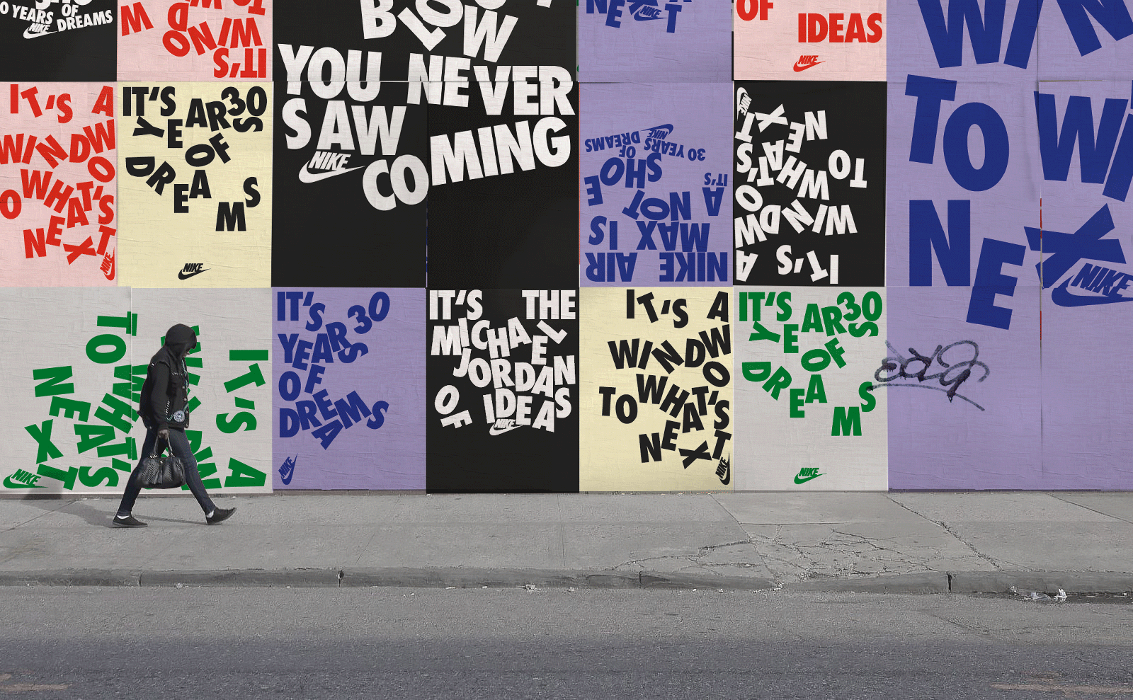


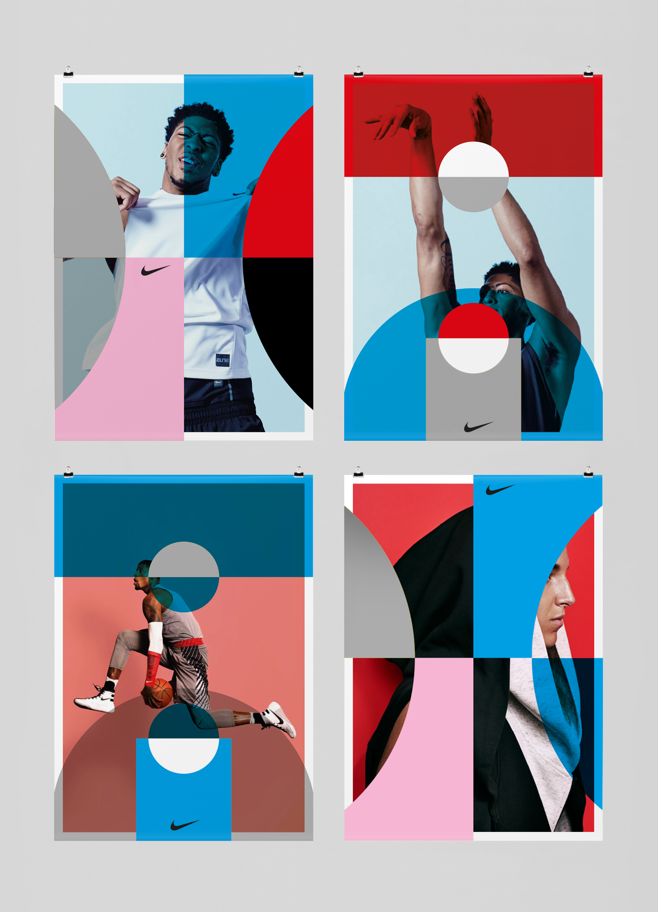
Posters designed by Studio Feixen for Air Max Day, 2018. Images: Studio Feixen
AS: Why did you decide to start a foundry?
FP: It just happened. It really started with Robin. I had some experience designing


Südpol Theater Book designed by Studio Feixen, 2015. Images: Studio Feixen
First, we decided to make a test and publish our first font. And two months later, I called Robin and said, ‘Let’s do this seriously.’ And we started the foundry.
AS: Was one of your goals as a foundry to challenge the stereotype that type designers are often bad graphic designers?
FP: We have our interests, which of course come from graphic design, because we both first had a graphic design practice and think like graphic designers. But I think we also share a very technical interest. We’re interested in technology and what you can do today. We both animate a lot, and we both sometimes code a bit.
For the first two years, we were just learning a lot. We wanted to challenge what is possible, and we had a steep learning curve, I would say. Now we just try to fill the gaps we think are there.
AS: The gaps in your knowledge or in the font market?
FP: That’s a good question! Our processes are not that straightforward. We didn’t start a foundry because we wanted to, but because it felt good and fun, and we loved working together.
RE: And that’s also how we start fonts. We never begin with a set goal. Sometimes we realise that, as graphic designers, we would like to use a certain kind of font and it’s not there yet, so we design it.
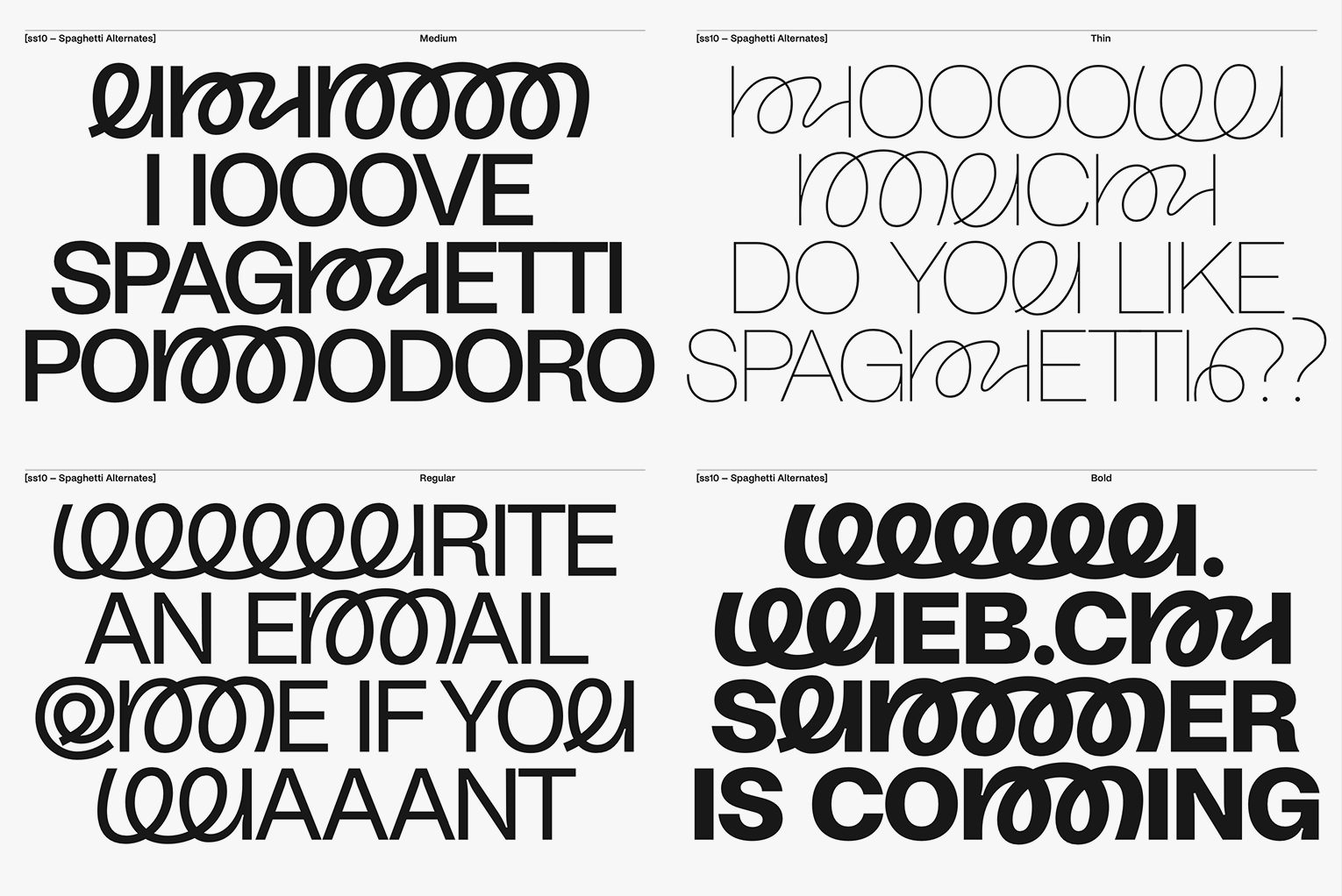
FP: For example, in the beginning, Ease was just a challenge for us. We thought, is it even possible? How do we do it technically? And then over four months, we were just solving tiny problems: where to put these two dots and how to grow it out without having problems. Because Ease has angled roundings, which are very complicated.
Mostly, we start fonts like that. We have ten ideas, we follow them and see if there’s a route that interests us. The second important thing is that a project has to be a big enough technical challenge.


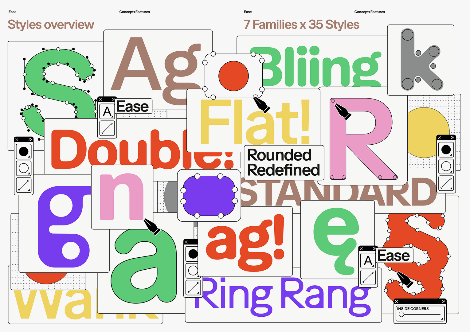


Ease by Studio Feixen, 2023. Images: Studio Feixen
AS: And what’s the story behind MOV?
FP: You mentioned the
RE: But it definitely was for our fun.
FP: As type designers, you often have a huge project that you work on for one or two years until it’s finished. And we said, ‘Why don’t we also have one project that isn’t a huge load and can be divided into smaller ones?’
So the idea was to have a very rigid grid, but within this grid, we allowed ourselves to have a totally different concept for each letter. Each letter becomes a very small project of maybe an hour. You can do that whenever you


MOV by Studio Feixen, 2025. Images: Studio Feixen
RE: And at some point, we totally lost ourselves in this process. We created thousands of letters.
FP: It was a great coincidence because I’d just had a child a year ago, and I had a lot of very short moments when the baby would sleep, and I could quickly design a letter.
AS: Have you thought of a perfect use case for this typeface?
FP: We talked a lot about how a children’s TV channel would be perfect.
AS: My son, who is almost three, was hanging out on the MOV landing page for half an hour. It was like a cartoon to him.
FP: Oh, I think that’s the biggest compliment I’ve ever got. So I guess three-year-olds are our target group then.
AS: Do you also create custom fonts?
FP: We do it, but normally starting from our existing fonts. Very often, customers come and say, ‘You made this font, and it has this option in stylistic
AS: Do you have a lot of ideas you’ve started but then put aside?
RE: We have a lot of these!
PF: The problem with ideas is that when designing a typeface, we follow a lot of leads at the same time, and neither of us is the best at narrowing them down. Narrowing down is the hardest part for us.
We follow ideas because we believe in them, and the numerous stylistic sets you see in our typefaces are just leftovers of even more ideas that might have been there.
RE: We think of a typeface as a tool where you can choose from a number of options and customise it for your needs. We’re always aiming to create a tool that might satisfy all the needs of a customer, so we’re not only designing the alphabet but also creating a lot of features.
FP: We often see a typeface as a tool that allows you to adjust the voice. I did a lot of magazine work, and I know that sometimes you want one piece of text to look more playful and another more serious. I always imagined that if I were to do a magazine with Studio Sans, it would be very easy because I could set the tone on a very subtle level.
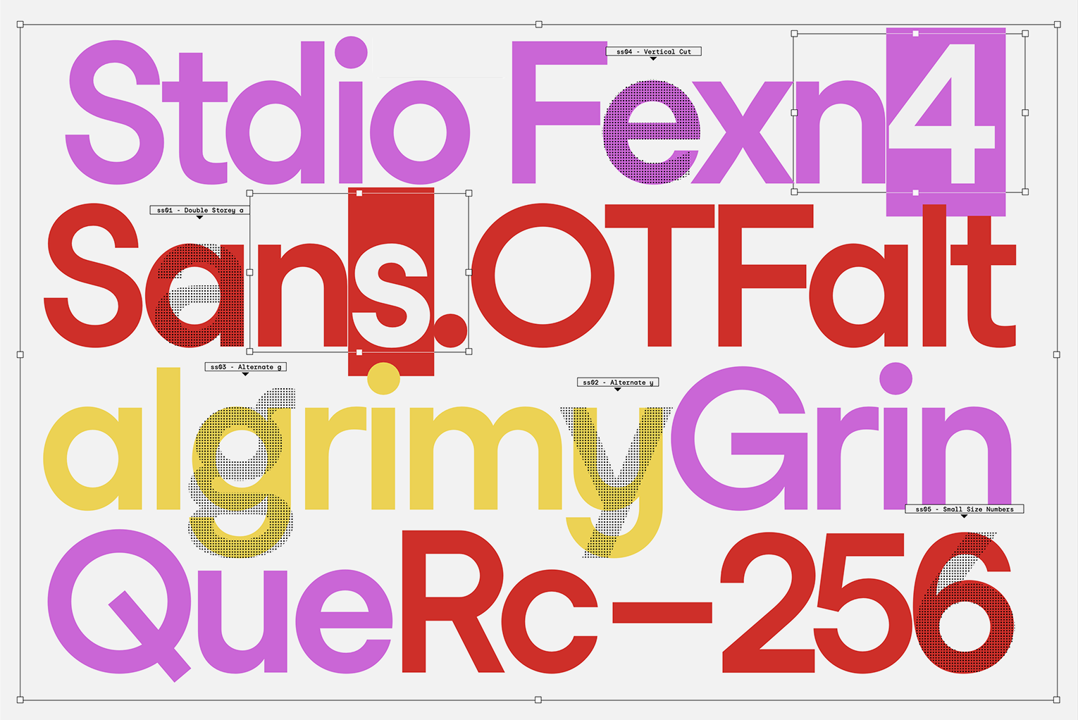

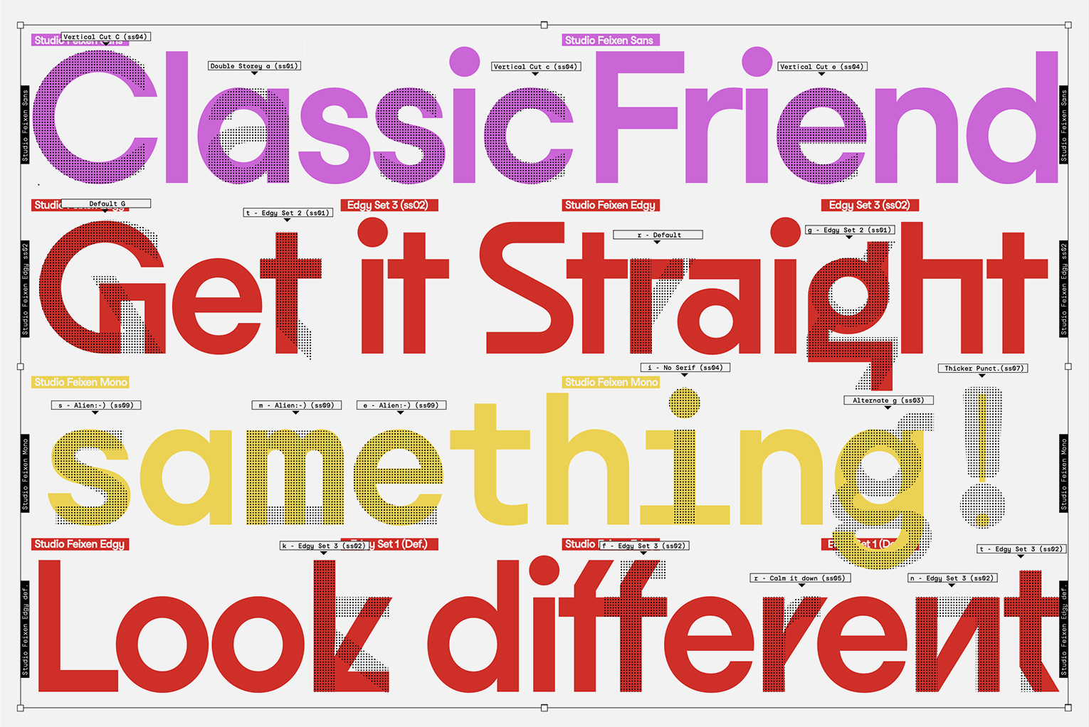


Studio Feixen Sans 2.0, 2022. Images: Studio Feixen
It’s the same with Ease. The character depends on how and where you round it. From a graphic designer’s perspective, it’s really cool: you can make it very technical for a title and then get another character for the text.
AS: Did you think that starting at a time when variable fonts already existed influenced your typefaces?
FP: Definitely. We started with variable fonts. We had a font that only had three styles, and Robin turned it into a variable one.
RE: My bachelor thesis was based on that. When we started working together, I was already into variable fonts, exploring these new technologies. And since most of a foundry’s communication now happens on screen, it makes sense that everything moves.
FP: Maybe these projects are also about
AS: Noi Grotesk supports Cyrillic. Did you consult a native speaker of a language using the Cyrillic script while working on it?
FP: There was a customer who wanted us to expand the family, and they had native speakers in the company. We worked with them. We also did research ourselves, researched every letter, the history of each letter, where it comes from, and why it looks the way it does.
For us, it was the first step into an alphabet we didn’t know. At some point, we realised you can look at two very established typefaces and see that their authors have different concepts of how to design the same letter. And also that the form of the letter might also depend on the country it comes from.
When we were really deep into the subject, we decided we had to make a statement
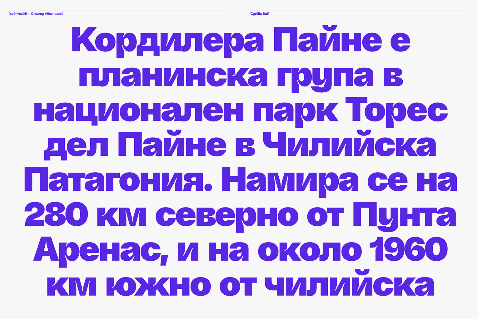
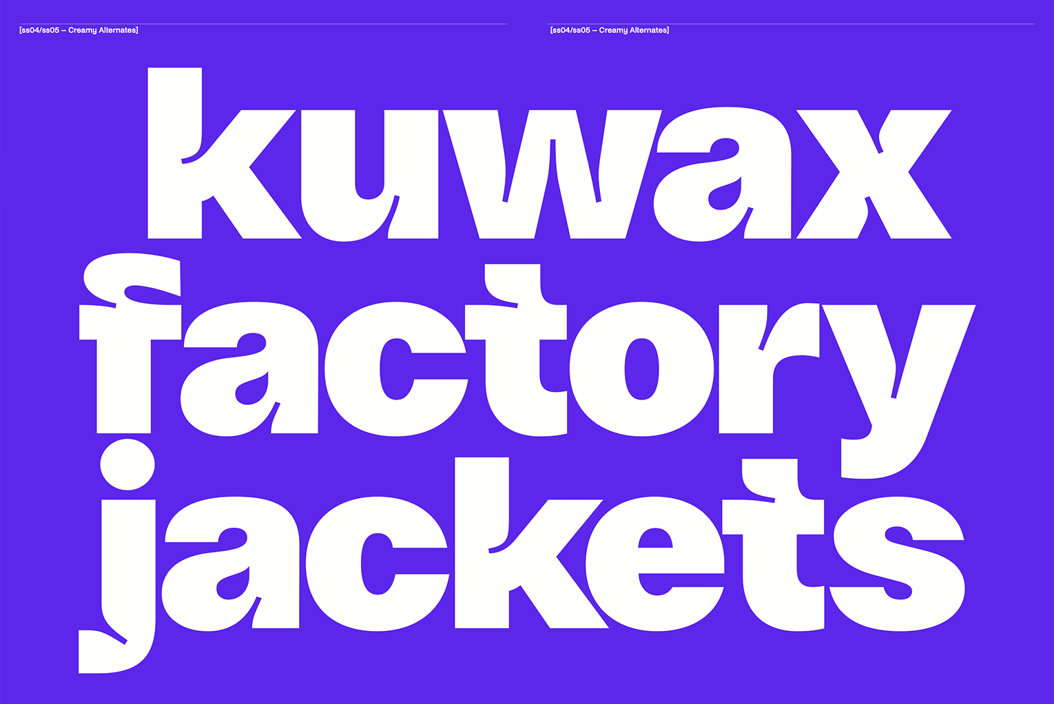

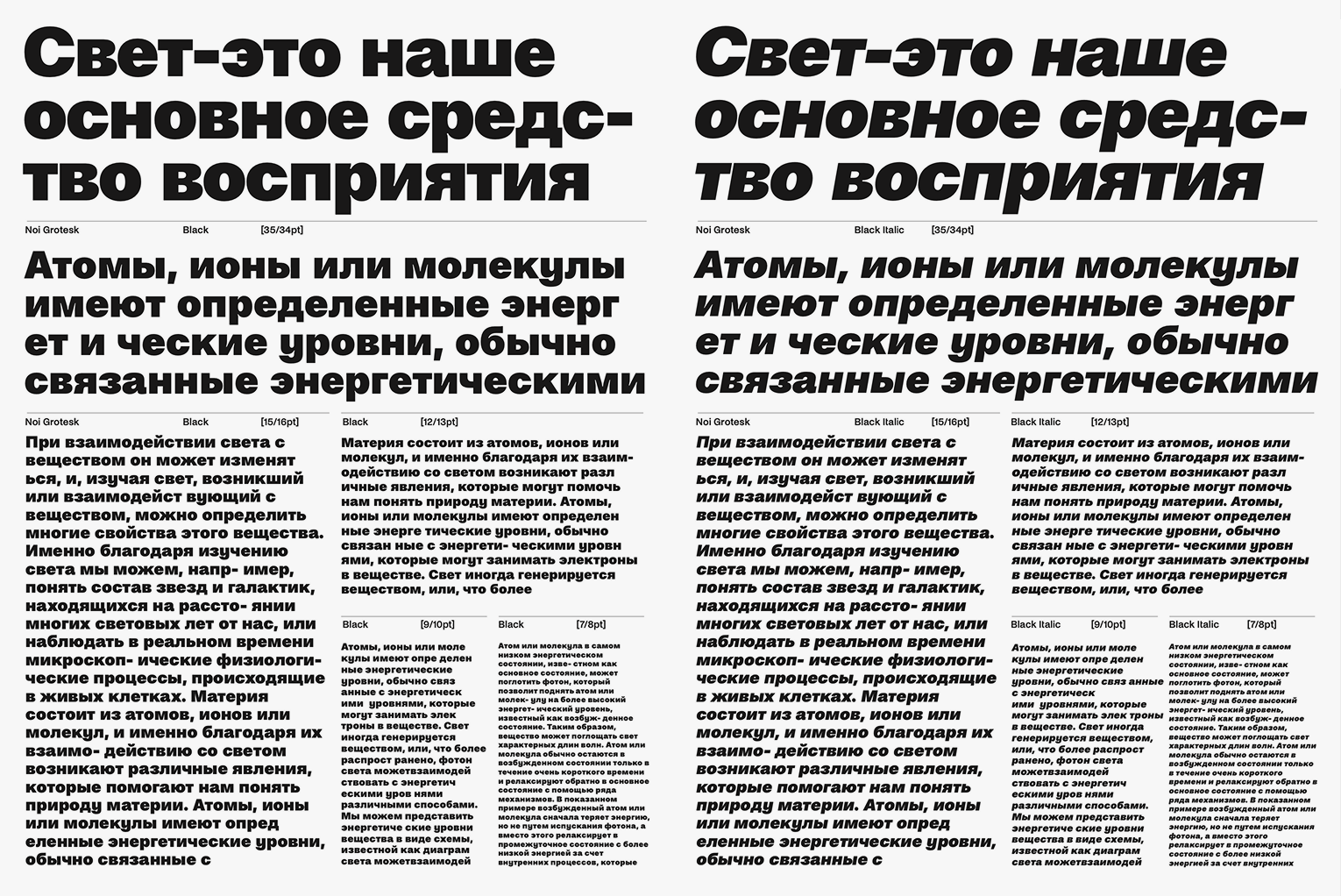
Noi Grotesk by Studio Feixen, 2021. Images: Studio Feixen
AS: Are you planning to expand the script support of your other typefaces?
FP: If someone is interested, we would think about it. Of course, we would never do it if there’s no specific need.
But even if the need were there, we would still have to consider it. In the end, we are two people and have to decide if it makes sense for us and if the task is interesting enough. It’s also about time. The crazy thing about type design is that a single decision might lead to two years of work.
AS: How do you approach the font pages? Do you design them while the typeface is still in progress, or do you sometimes start before the font is ready?
FP: When working on a font, we already know its identity. So we start thinking about what the page can look like during the design process. While we design, we sketch and talk about it.
Sometimes we make sketches and just send them to each other, because that also leads to new ideas. It’s interconnected because these pages communicate the potential usage of the font in the end.
AS: You live in different cities. How often do you meet in person, and does a contemporary studio need to meet in person?
FP: Well, it’s been a while since we actually met. We meet whenever there’s an occasion. In summer, I’m usually in the Italian part of Switzerland, where Robin lives, so we meet more easily. Or Robin just opened an exhibition in Zurich at the Museum of Design, and of course, I went there.


Installation by Federica Tobler and Robin Eberwein at the Junge Grafik exhibition. Images: Studio 11/1
RE: We meet when we need to print and look at the details. The final phase is always a good time to meet. The starting phase, when we try out a lot and make new sketches, is also a good moment.
FP: I think you need to meet in real life. You can’t do everything online. You can do a lot online, but the human connection is important. It’s important to have a good relationship, meet, celebrate, and just have a coffee together. It’s also part of the work somehow.
The nice thing is that when we do meet, we always eat very well and celebrate it. If we met on a daily basis, we might celebrate a little less.
AS: I would say that it’s pretty much the same with us.
FP: In type design, it also makes sense because you have a lot of silent time where you have to be very concentrated. Maybe it’s even good to have that time and not be distracted. I think this way of working is just perfect for us. Robin and I talk at least once
AS: Do you also think that creating personal passion projects is important for a studio or a creative worker?
FP: Definitely. I really try to make everything we do somehow personally driven. We’ve just had such good experiences working like that. If you create something of yourself, you get the best kind of energy you can get, and I have many reasons why we work like that.
We constantly create projects that make
Everything we’ve ever created has led to another thing. That also gives us a lot of confidence in doing this useless stuff.


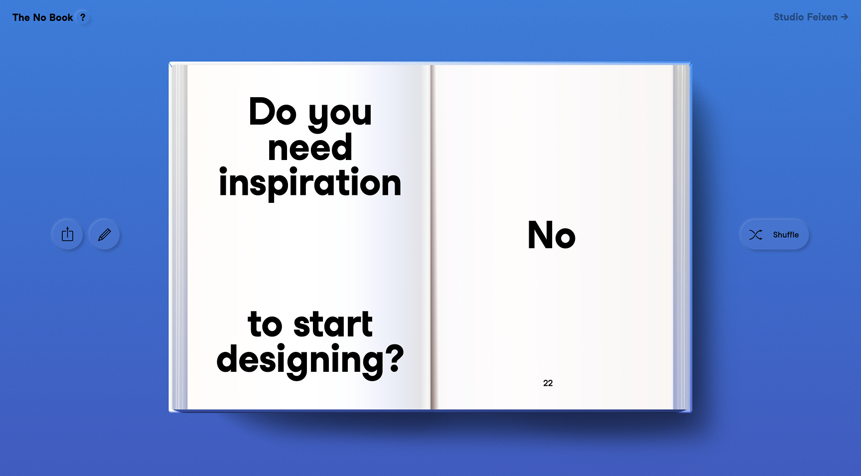
The No Book by Studio Feixen, set in Studio Feixen Sans. Everyone can contribute a question to which the answer is “no.”
AS: So it’s also a part of your PR strategy!
FP: Totally. When we started, we talked about that a lot. Back then, we had one day, always Friday, when the studio was closed, but we would be in the studio, and everybody could do whatever they wanted.
That was a good practice
AS: Why did you stop having Friday as a research day?
FP: Because we don’t need this structure anymore. I spend much more time working on visions and ideas than on simple client work where somebody says, ‘We need that and that.’
Type design is, by nature, a little like that. You invest two years creating something without anybody asking for it. For that, you need a special kind of muscle within yourself that makes it easy to invest your time in such things. And it has worked really well for us so far.
AS: Before the interview, I googled Feixen. The first page was just your work and interviews, and the Duden article was only the second. Is it a coincidence or an SEO strategy?
FP: The easiest answer is that Feixen is a very old word. It’s not used much anymore. Maybe in Germany people still use it, but not in Switzerland. Feixen means to make a strange face or laugh at somebody a little in a bad way. And that’s also what we do to a certain extent. We like to do projects that are a bit strange or that you don’t get at first glance.
It’s also a German word, while our studio works internationally, so we have a much bigger audience than the German-speaking world.
But our strategy is simply beautiful stories that just happen. People talk about us if you make an exhibition out of cakes. It’s a good story that reaches people. How Robin and I met and started working together is also a beautiful story. And I think we are good at telling these stories.
Cake exhibition by Feixen in Hangzhou, China, 2020. Images: Studio Feixen
AS: Can you describe your relationship with Swiss design?
FP: If you’re from abroad, you read about Swiss design all the time. The story of Frutiger and his typefaces is in every history book about graphic design. And we were taught by designers who had a direct connection to these people. We’re not far from this story, but there’s already one generation in between. My teacher worked with Frutiger, and there are many connections like that.
We live in a world where the train station is organised like in these books. It’s often the best-case scenario of how to treat typography and work with symbols. But this is all around us, so we’re not thinking Swiss design is sacred. It’s much more like your uncle telling you how you should do things. And then you say, ‘Whatever, uncle. I’m going to do it a little differently.’ I think that’s the relationship, and it’s a very important one.

Draft of a sans-serif made by Adrian Frutiger, 1950. Image: Anna-Lena Würth, ANRT
At the same time, there were other directions. Niklaus Troxler, for example, was a very big influence on us. The language of Troxler is completely different. It’s chaos, it’s music, and it’s all very typography-led. He founded his own jazz festival and just made the posters
It’s a strange and interesting mixture here. On the one hand, there’s perfectionism, which we have in our DNA anyway, and then there’s this freedom of thinking.


Posters by Niklaus Troxler, 2003–2004. Images: Niklaus Troxler

Posters by Erich Brechbühl, 2022. Images: Erich Brechbühl
AS: You said that your favourite projects are those that start with a blank canvas…
FP: Of course, if I work with clients, that would be the coolest case, which almost never happens. But in reality, I think nowadays I like it most if a project starts with a connection. You meet somebody, discuss the idea, and it starts growing from that moment. For me, the coolest thing is when you’re somewhere talking to a stranger, and suddenly they come up with an idea, and you say, ‘That’s very interesting. Let’s do that!’ And then it suddenly becomes a beautiful project.
AS: Can you name two non-Swiss designers who inspired you, no matter the field?
FP: It’s super difficult. One designer who is very inspiring for me is Zach Lieberman. He makes generative designs, and I like that he often makes a connection between the human and


Artwork by Zach Lieberman. Images: Zach Lieberman
RE: I would say Connor Campbell, who is part of Daisy Chain. They tell a lot of stories about what graphic design can be, but these stories don’t look realistic. It’s like they have their own world, and I find this approach really fascinating.
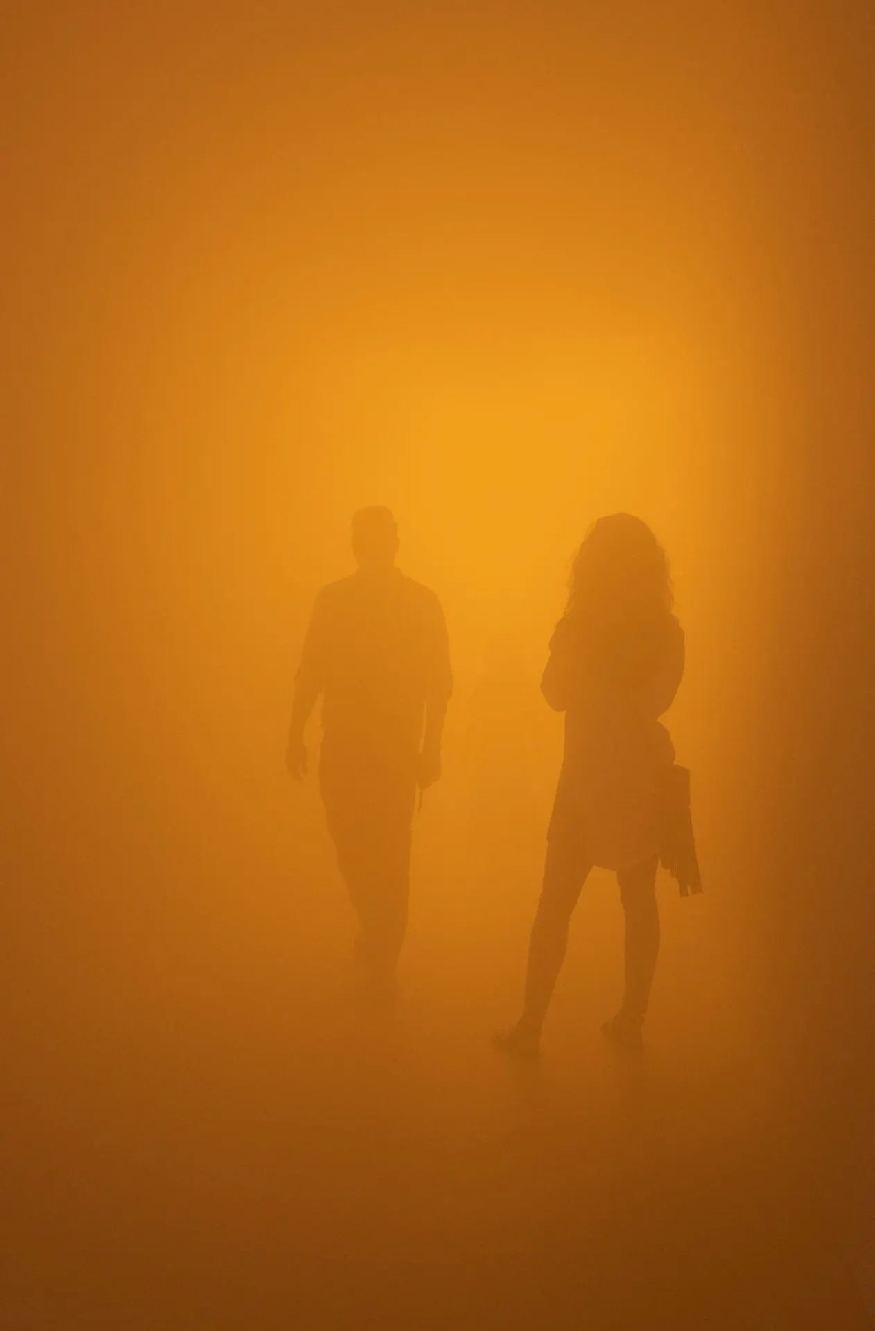
FP: The next person I would choose is the artist Olafur Eliasson. It’s a bit kitsch, but I like it. Many years ago, in Berlin, I saw his work where he filled an art space with fog and then installed all kinds of coloured lamps on top. I was just so blown away by the experience. It was incredibly inspiring. I like his work a lot. Olafur is particularly interesting because he is open about his practice. You always see his sketches and ideas, from him or his team, which is always inspiring.
I really try to consume as much art as possible. It’s a big inspiration for everything we do. Even though we don’t work in the art space, I think it’s perhaps the best way to get inspired.

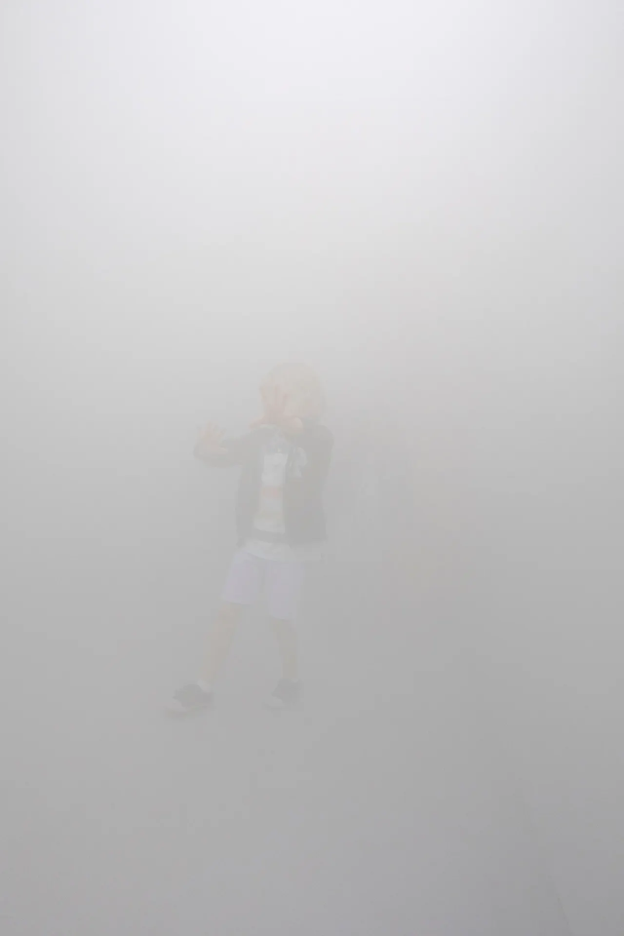
The blind passenger by Olafur Eliasson, 2010. Photography: Anders Sune Berg. Images: Olafur Eliasson
RE: I will also choose Nils Moorman, the furniture designer. I think he’s really cool. When I saw his work for the first time, I thought, ‘Wow, it’s like a poster!’ I found the connection to graphic design, and it made me start thinking about design more generally, not in terms of separate fields. For me, it was a big step.
 Bookinist, a movable chair for reading by Nils Moorman. Image: Nils Moorman
FP: Moorman is a genius. I think both Robin and I have enough Moorman furniture to make him successful.
AS: Can I ask you to name a type designer who is important to you?
FP: I would make it really simple. I was in the scouts with Noël Leu, the cofounder of Grilli Type, and we did a lot together. We travelled to Russia together, teached and gave lectures in Japan, China and South Korea, in all kinds of spaces around the world.
He started the type foundry much earlier. When I think about a type designer, of course, he comes to mind. He’s a great friend and a very interesting person.


GT Walsheim by Noël Leu, 2017. Images: Grilli Type
RE: For me, it’s really difficult. I like Radim Peško’s work. It’s precise, connected to Swiss tradition somehow, but also really experimental. For me, it’s the perfect mix of experimentation and classics.
Dear Sir Madam by Radim Peško, 2023. Image: RP Fonts
AS: You now have a type foundry. Which field of design are you planning to approach
FP: We’re already in furniture! Two years ago, we made a crocodile chair, and our next one will be an elephant chair.
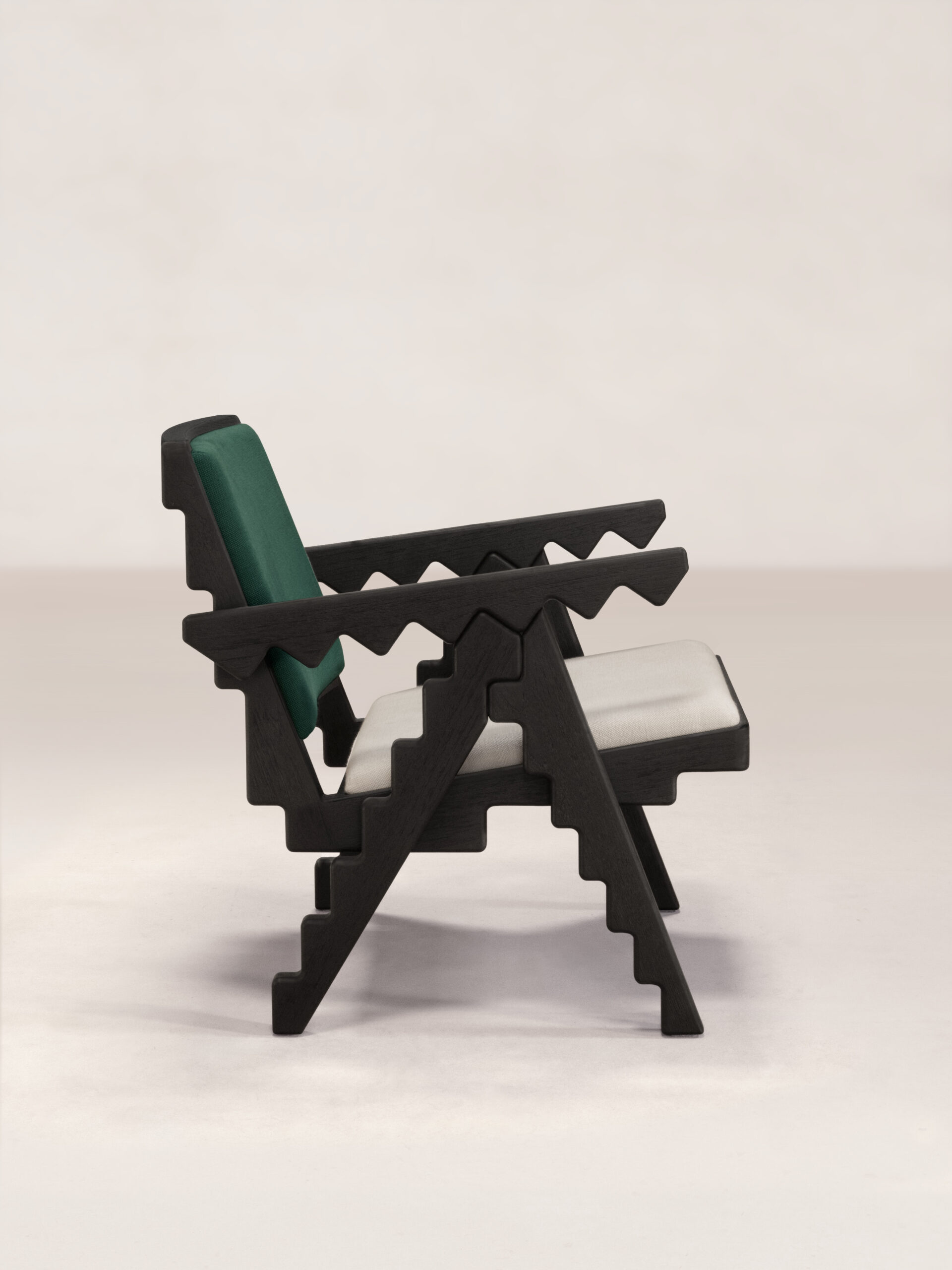


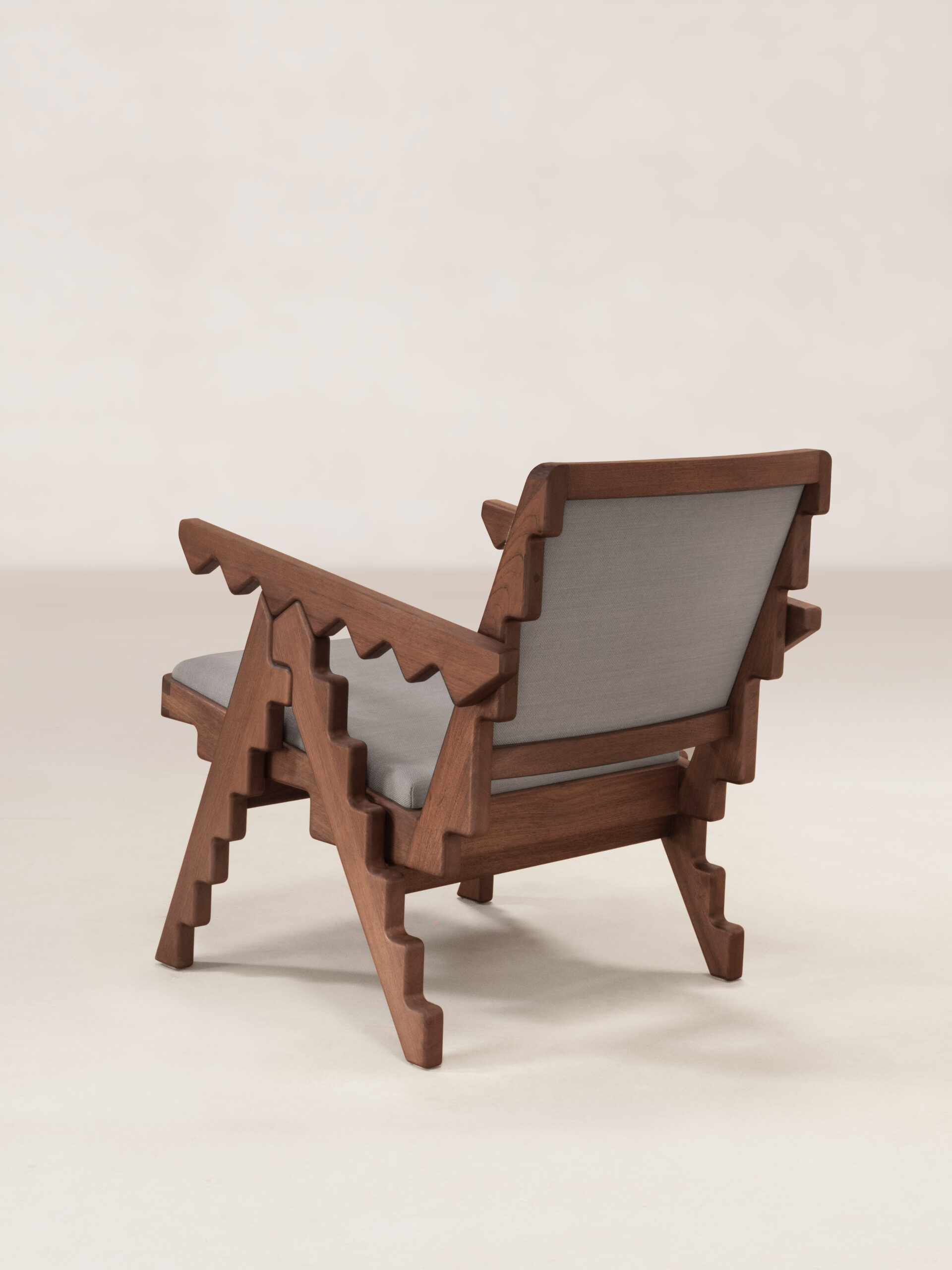
Crocodile chair, 2024. Images: Studio Feixen
I’m now working with a coder on a drawing application, so our next field is software, I would say. Another long-term project is a platform to learn motion graphics. We are working on a publication that will form a foundation for education in motion graphics. I also teach it, but there’s no real base to work from, so we decided to fill the gap. I think that’s perhaps the most important next step for us.