Typefaces of the Month, Matthijs Sluiter’s Picks
Fonts In Use editor and Type Specimens curator Matthijs Sluiter has selected the most notable typeface
Releases
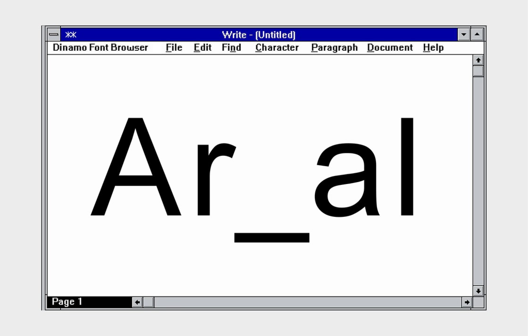 Areal, ABC Dinamo
 Casino, HAL Typefaces
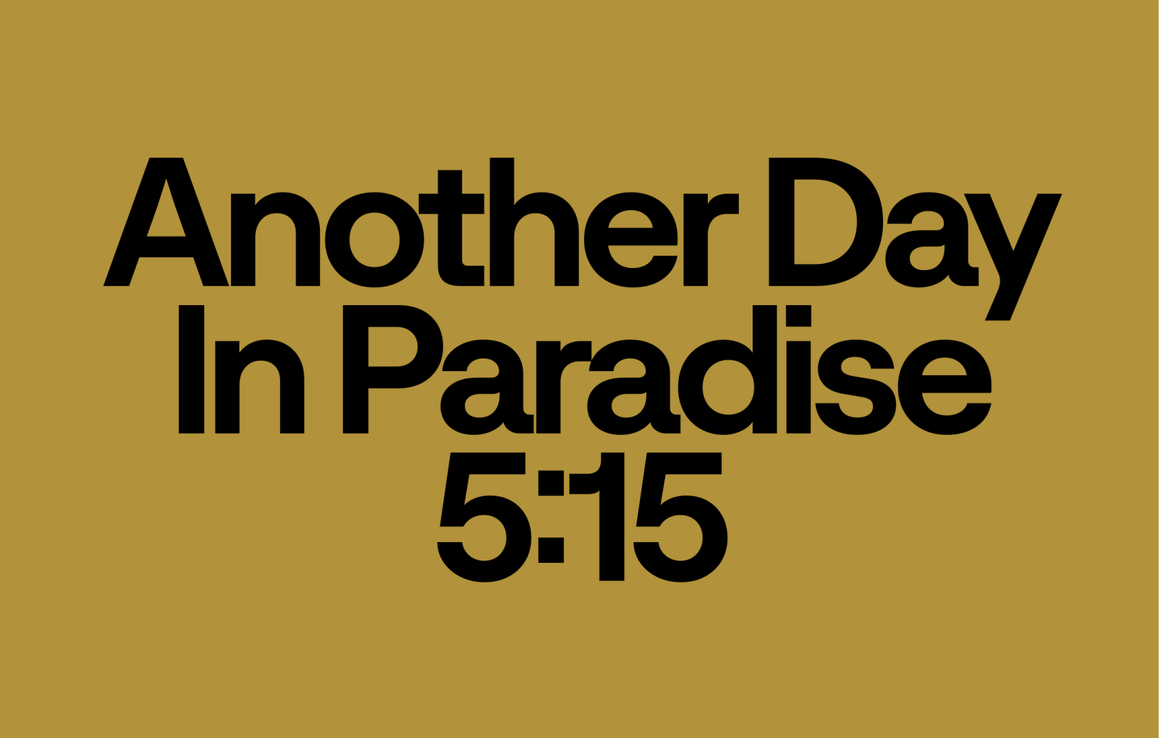 Cassette, Martin Vacha
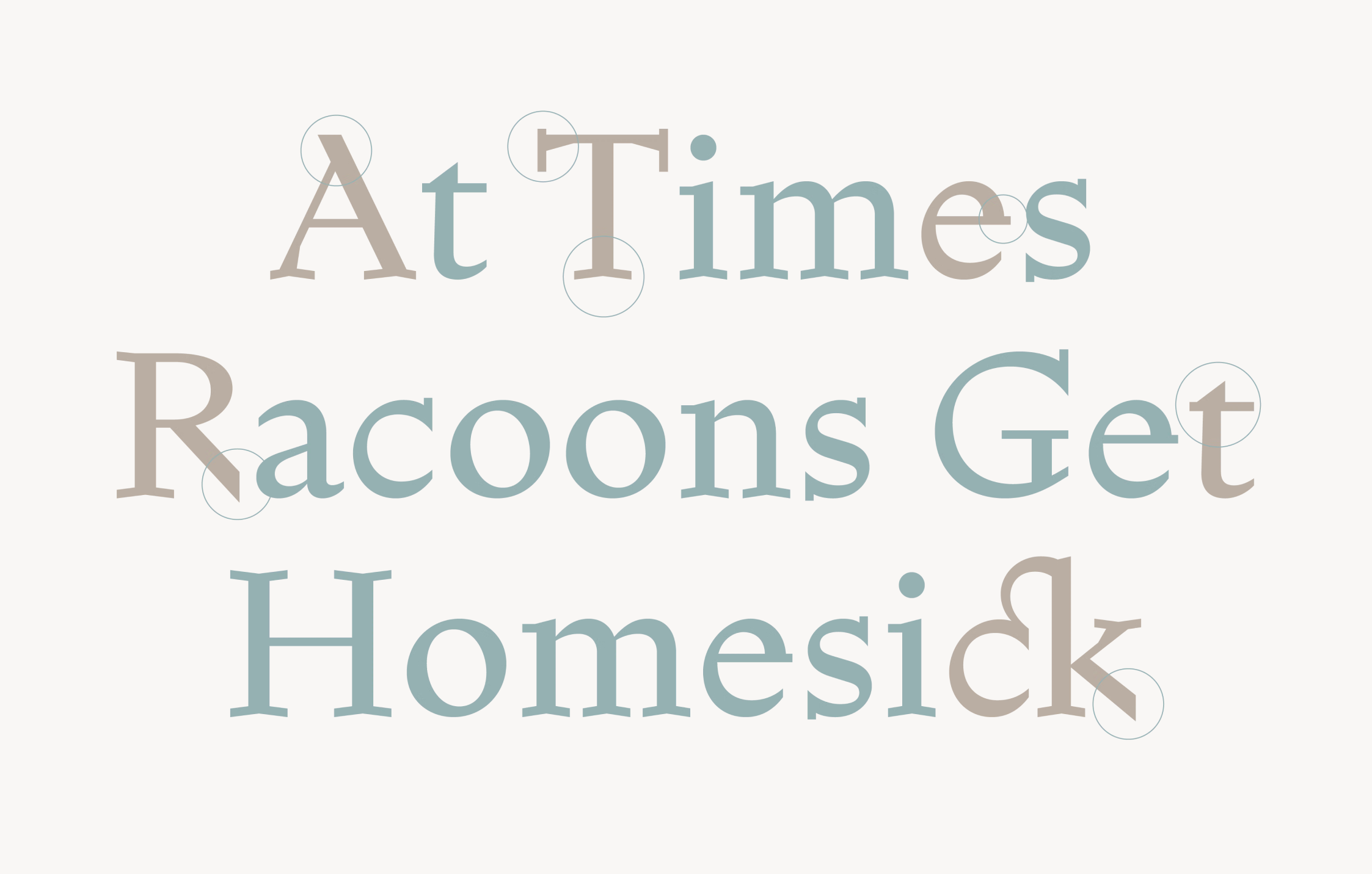
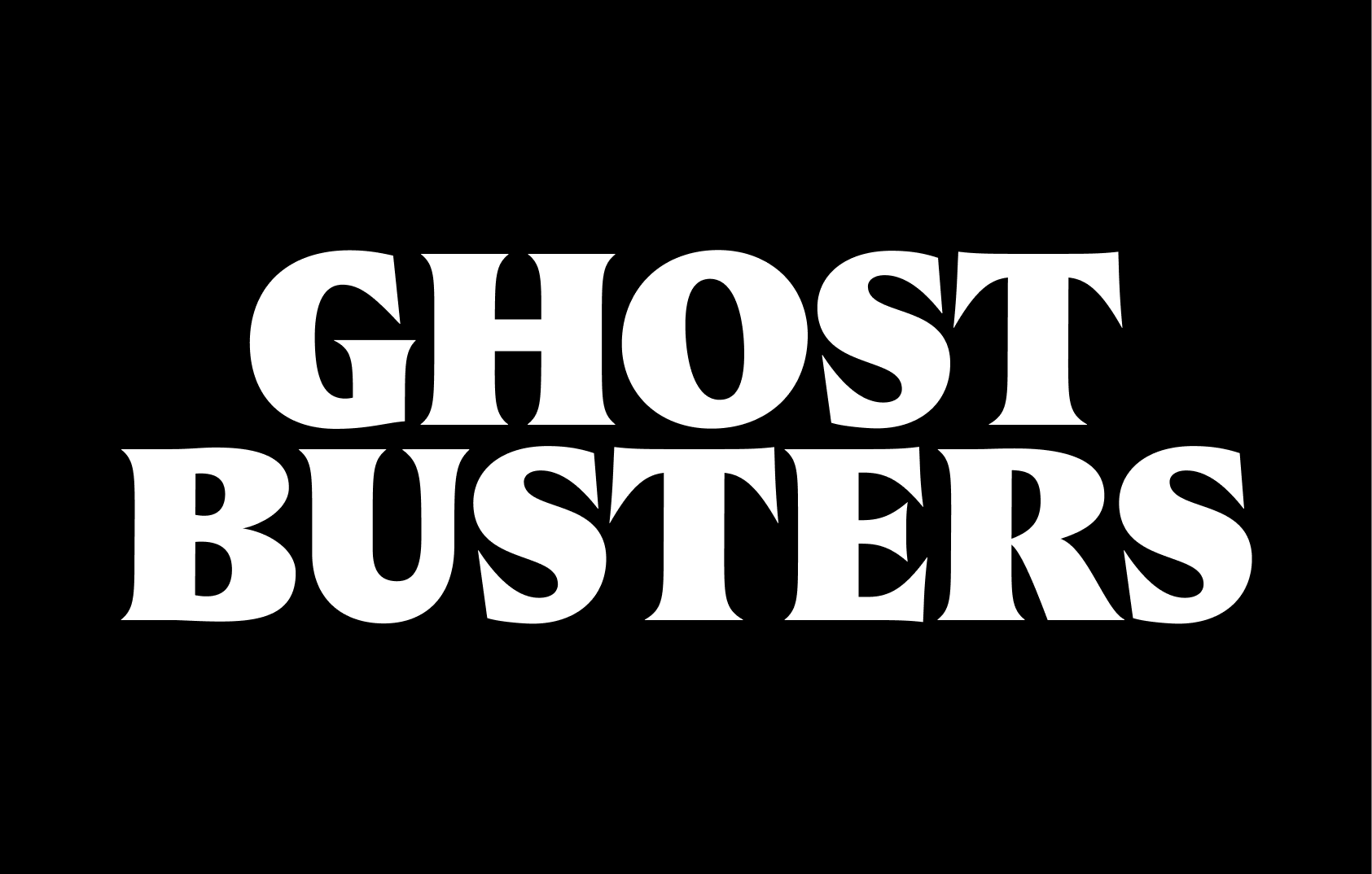 Castillon, Malou Verlomme
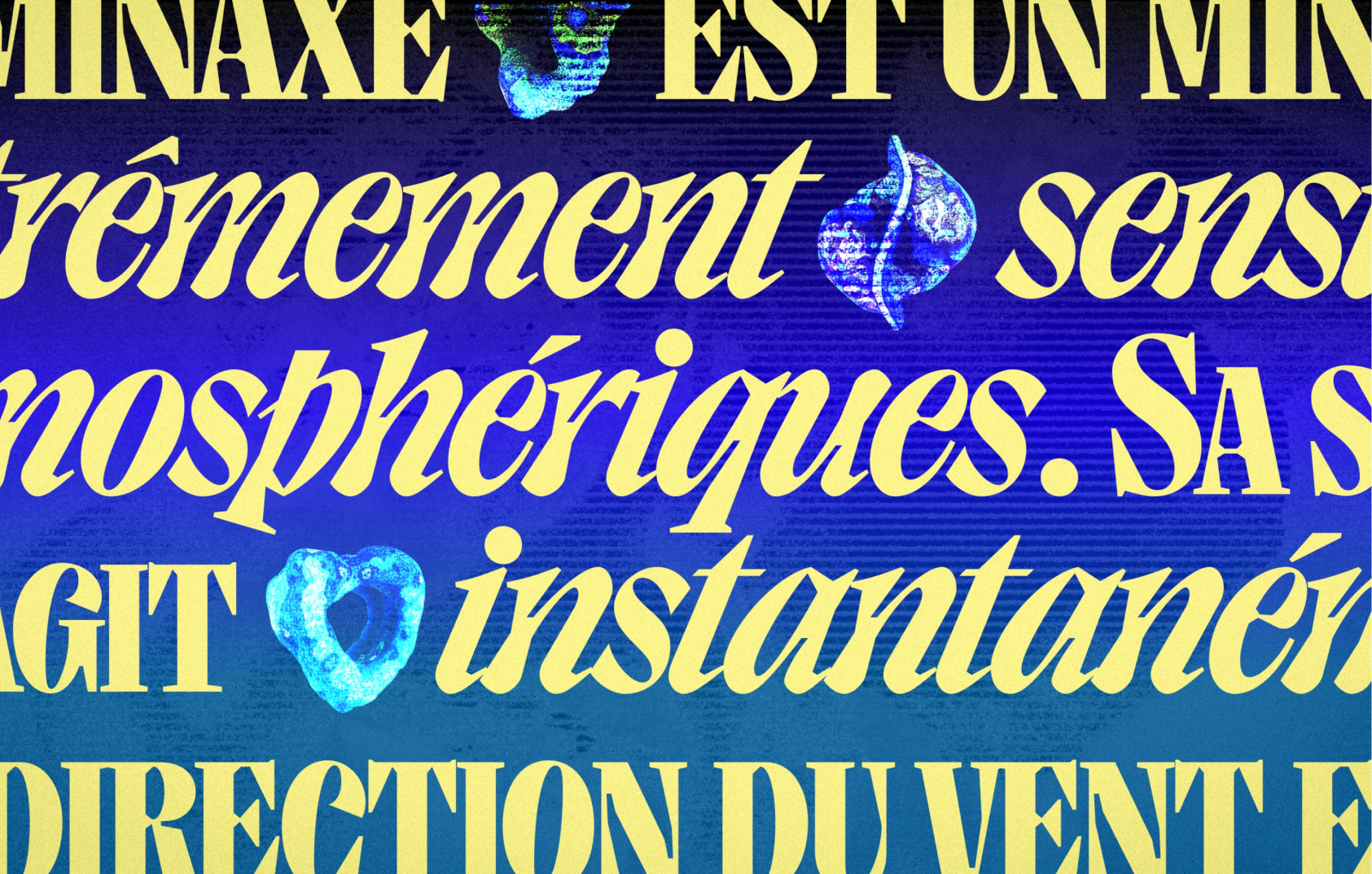 GRX, Bouk Ra
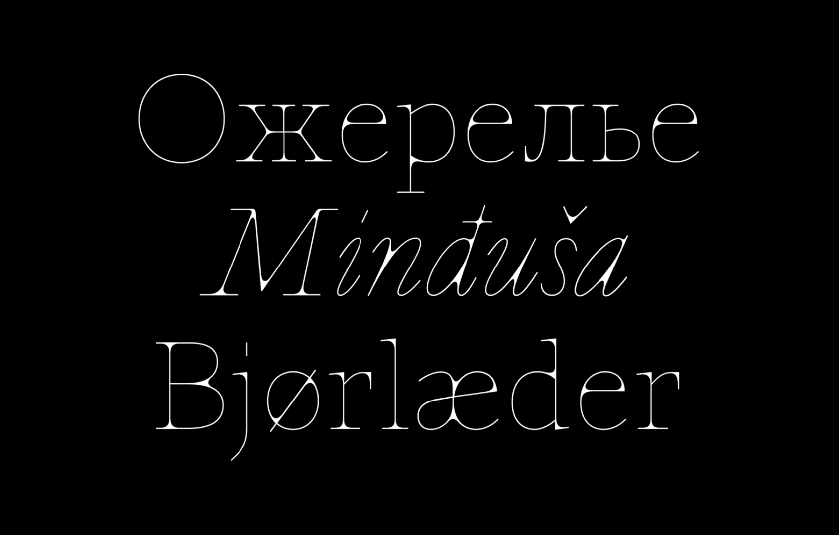 Epure, Anna Khorash
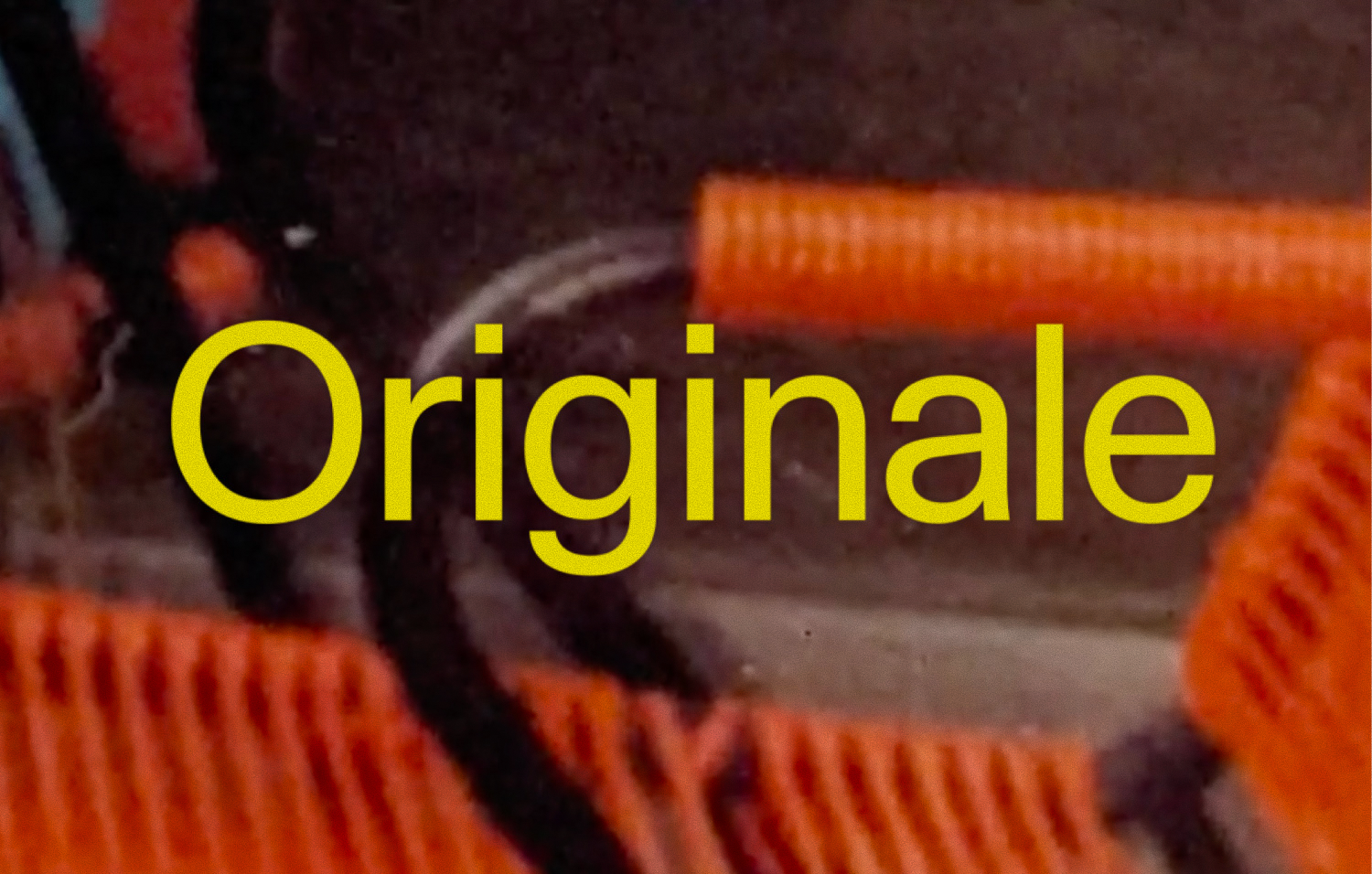 Originale, Robert Janes
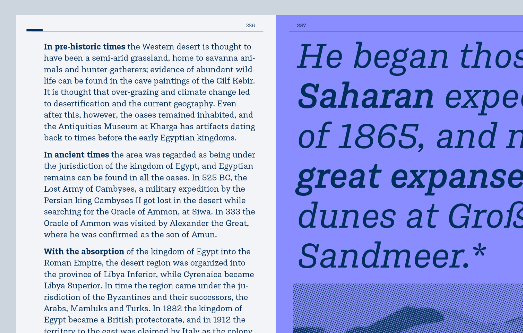 Qantara, Jacques LeBailly
Updates and family extensions
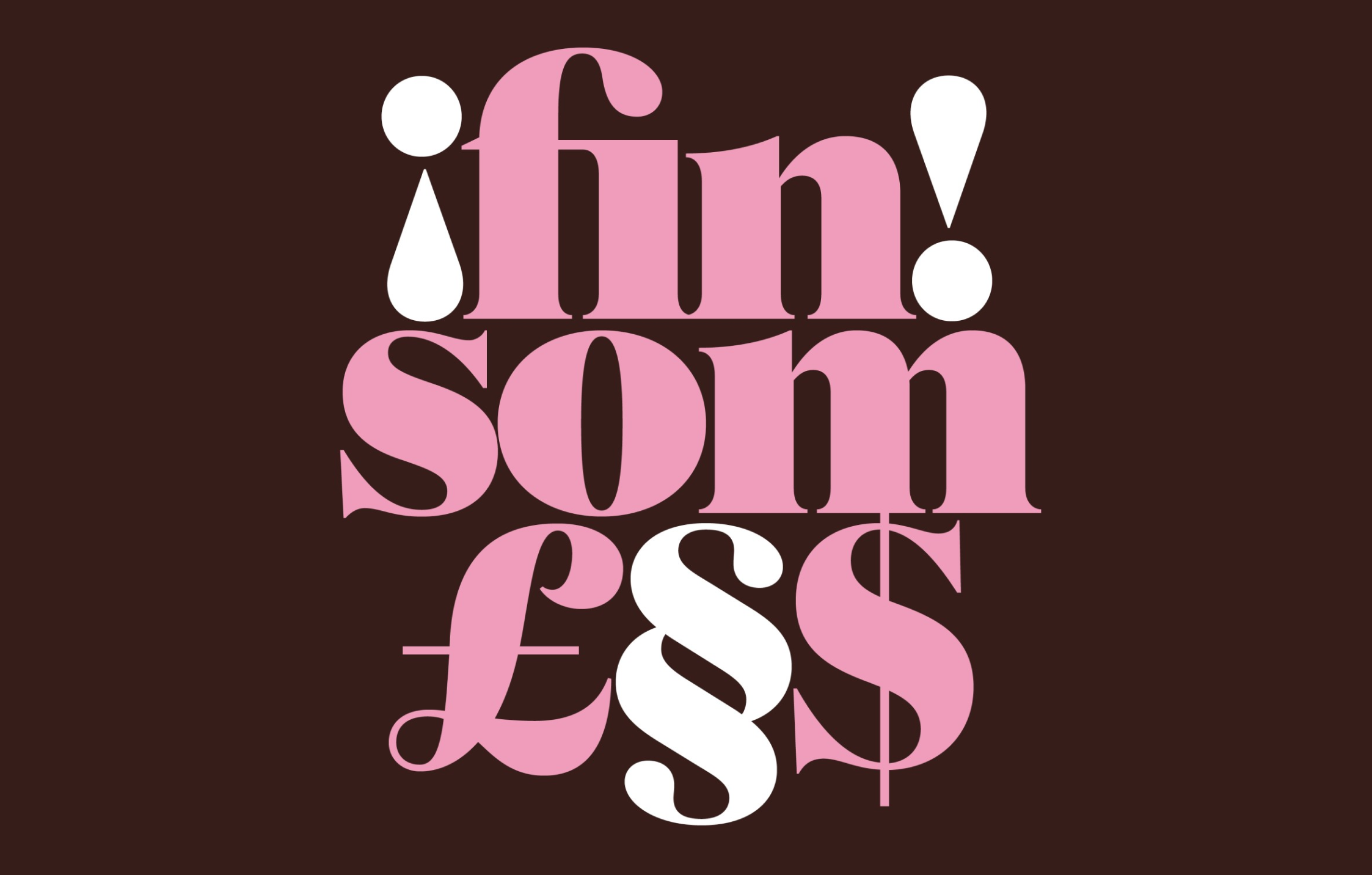 Hanae by Flavia Zimbardi and Ayaka B. Ito was extended to count eight weights
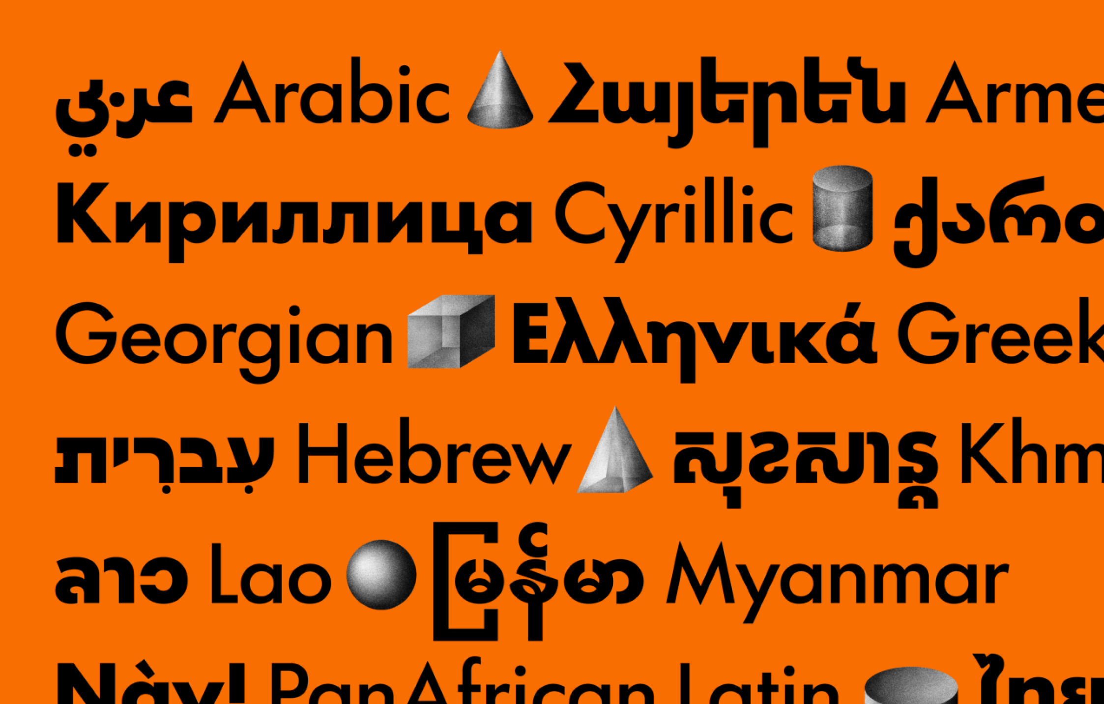 TypeTogether announced more scripts for their Futura 100
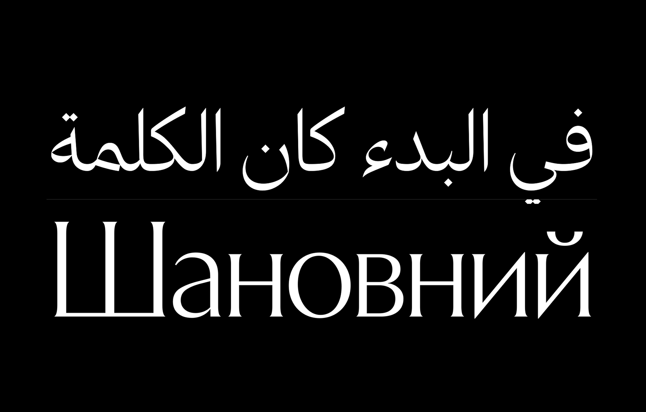 Letters From Sweden redrew and extended Exemplar. The final version supports Latin, Cyrillic, Greek and Arabic
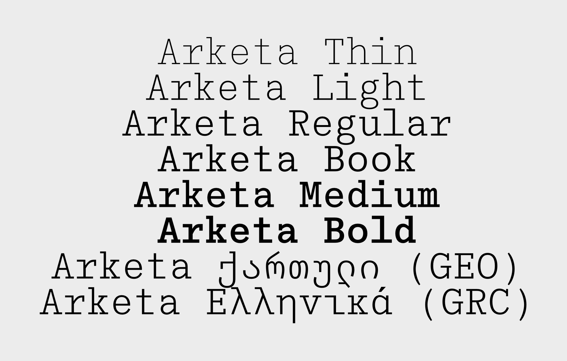 Outline Online extended the script support for a href=”https://www.outline-online.com/product/arketa” target=”_blank”>Arketa</a> with Greek and Georgian<
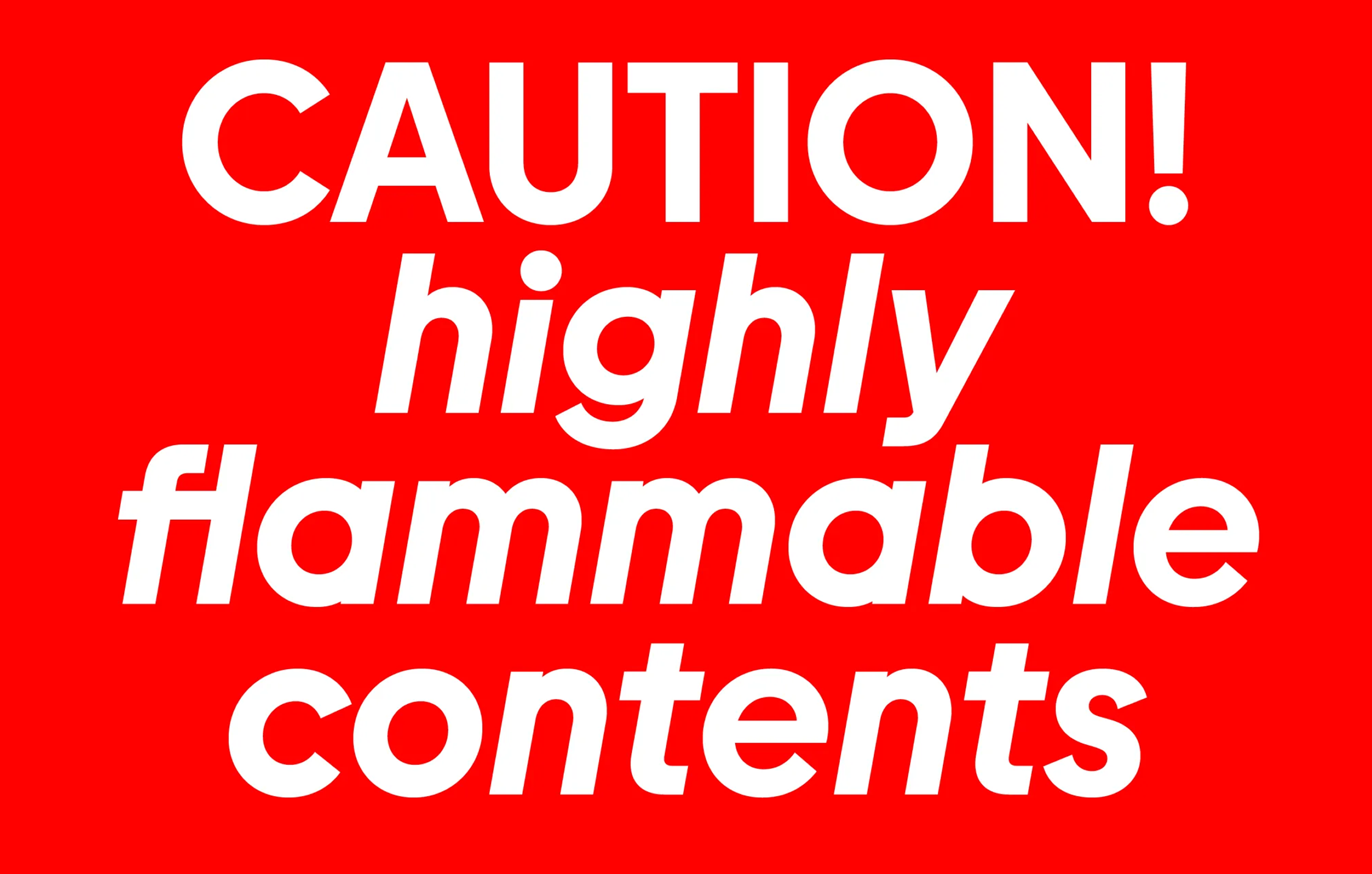 Burns from Type.Weltkern was updated with italics for all weights, plus two rotalics
On building a system
creativeboom.com/inspiration/darius-ou-on-building-type-systems-from-sci-fi-linguistics-and-g-code
Creative Boom interviewed Darius Ou, a designer who perceives typography, lettering, type design, and book design from the perspective of a 3D printing
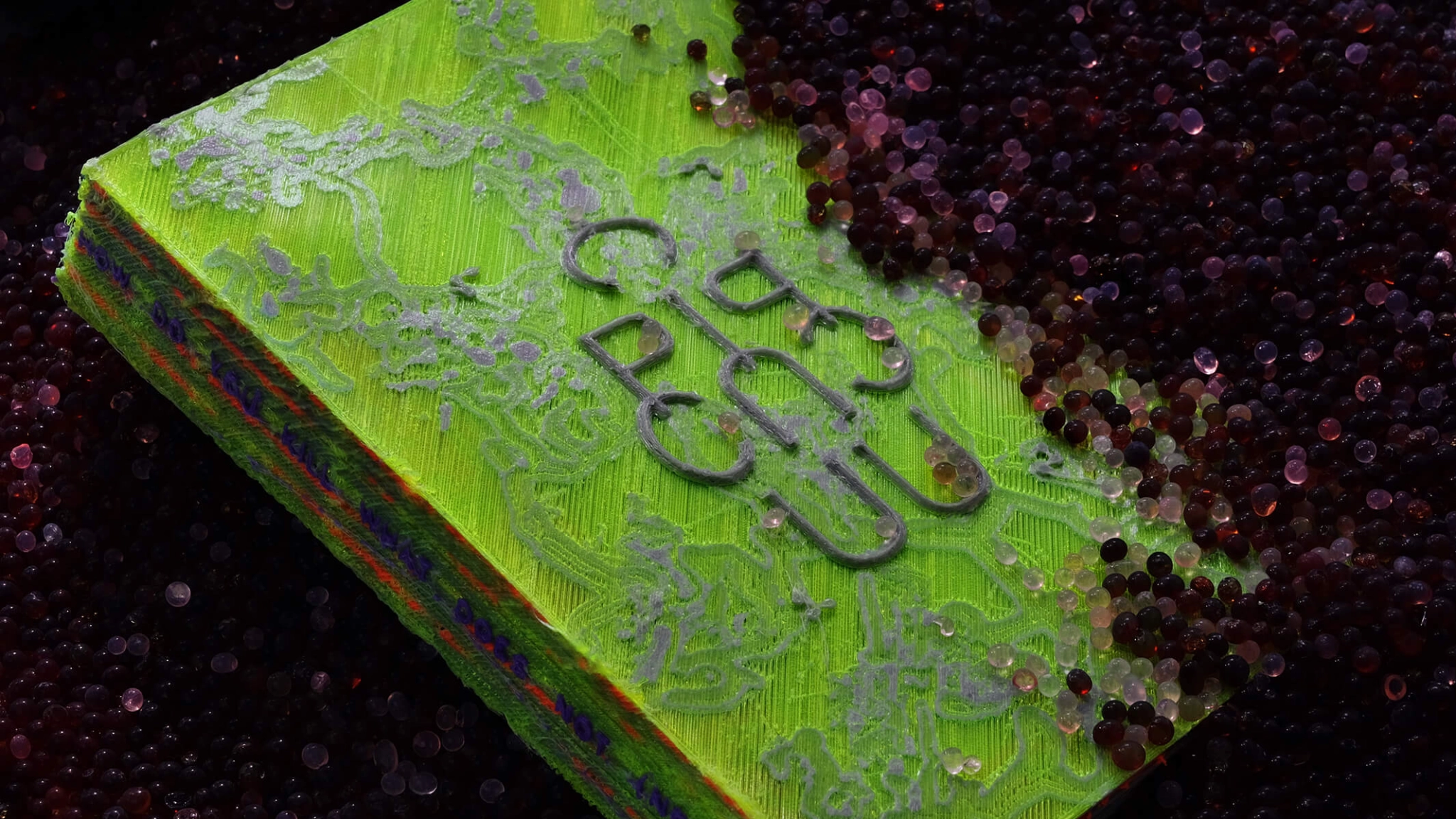 3D printed book by кDarius Ou
Google Fonts → Google Pics
typedrawers.com/discussion/5682/google-pics/p1
Yet another AI debate on TypeDrawers: Google Fonts lead operations manager Dave Crossland tested Google Pics and asked his fellow type designers their opinion about the postcard lettering it generated. As one may have expected, type designers responded that AI’s output was mediocre, but were wildly interested in how Dave himself felt about
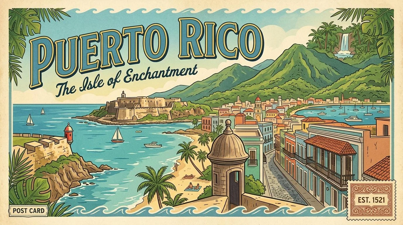 Postcard Dave Crossland generated with Google Pics
New foundry: Lovercase Typefaces
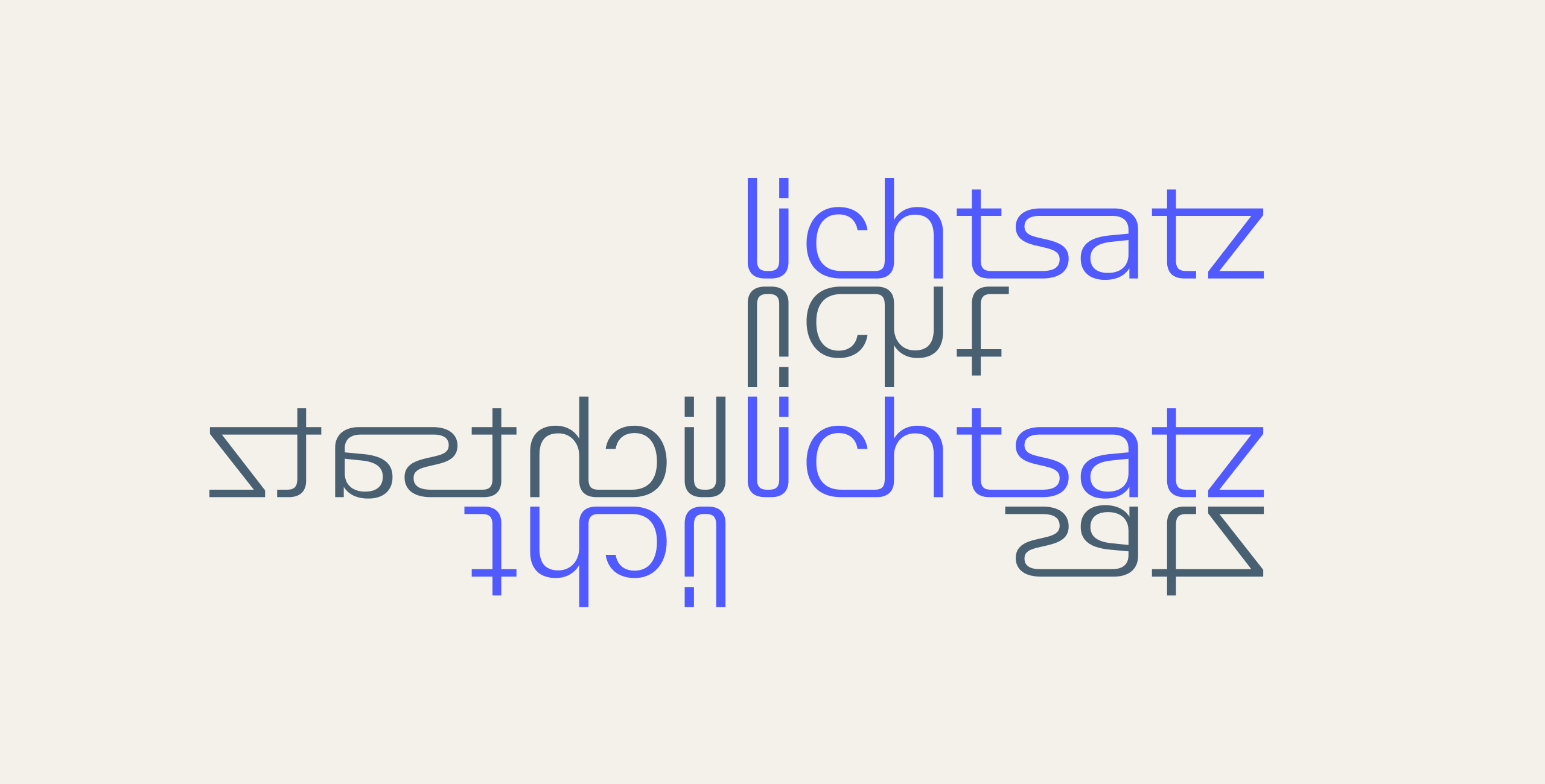
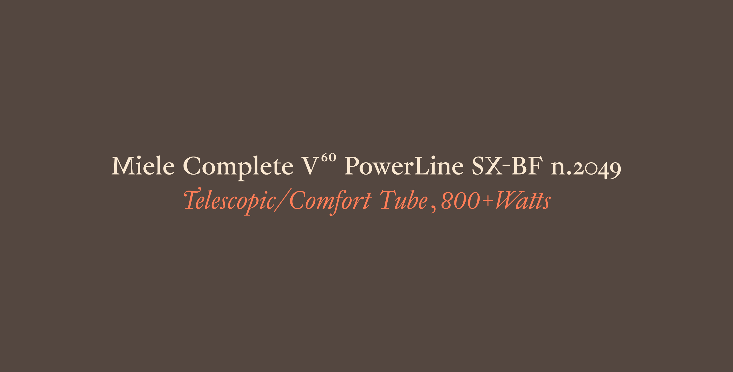
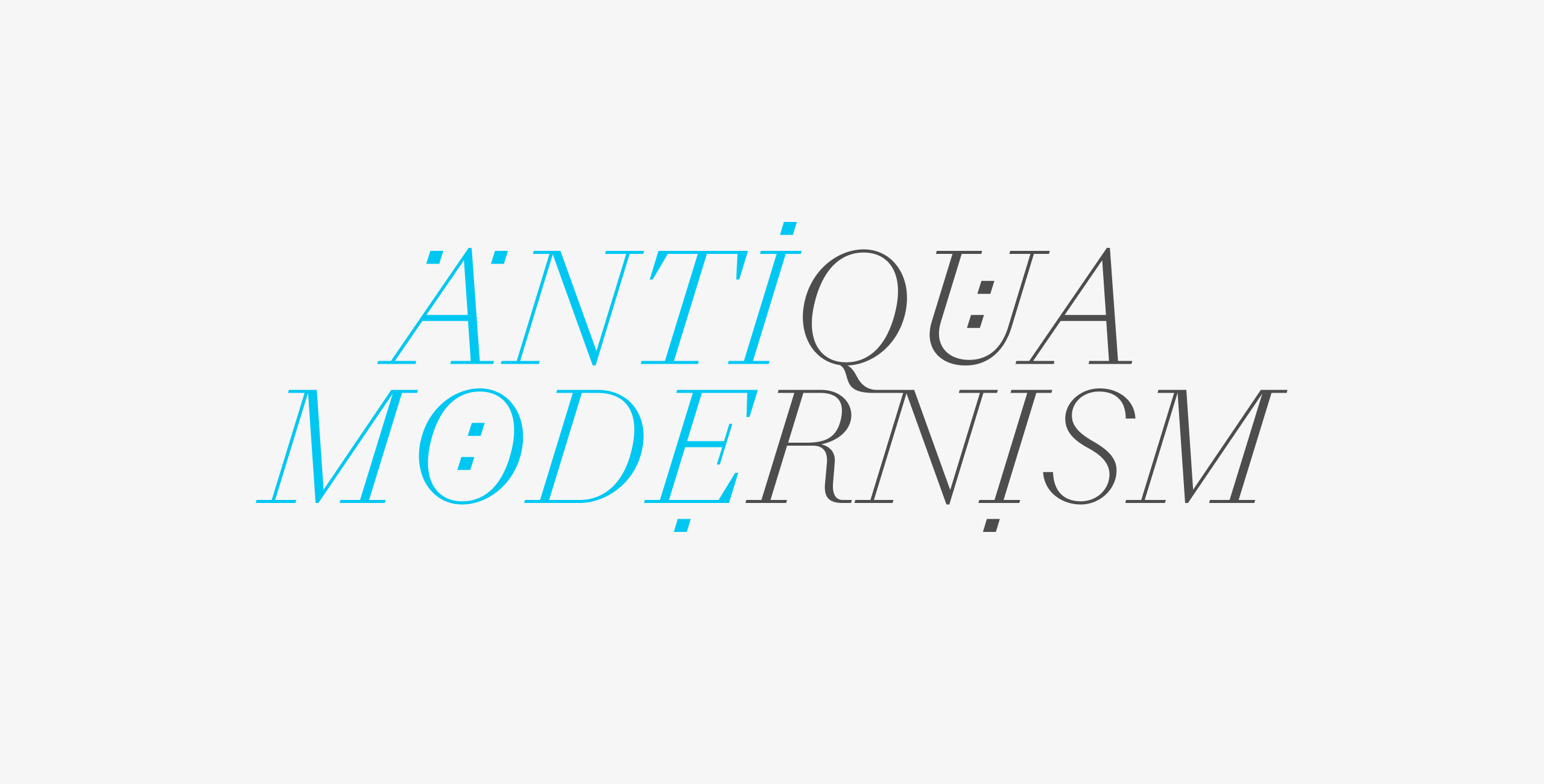
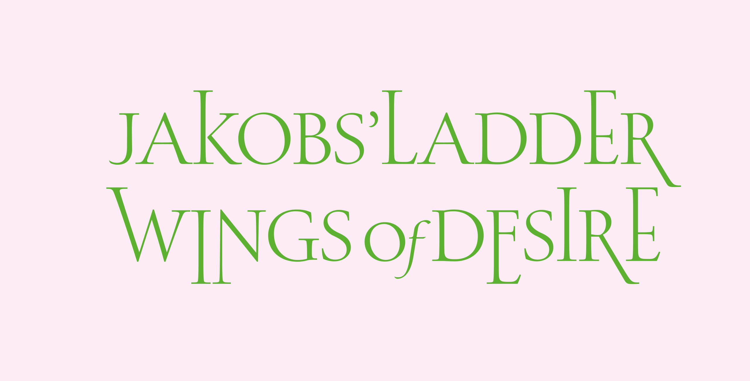
Type designer Arnaud Chemin has launched a type design studio. As of now, the newly established foundry’s collection features four faces: Emperia, which reimagines serif type as a genre; the rational-modernist Rigora; the Baroque-style Alegoria; and Elegancia, an attempt to translate 18th-century French typographic moves into a modern approach to type.
 Rigora
 Alegoria
 Elegancia
 Emperia
Small Performances: revival
baskervillepunches.org/baskerville-punch-a-revival-of-baskervilles-type
Small Performances — an interdisciplinary project seeking to fill gaps in the history of printing by studying punches from John Baskerville’s
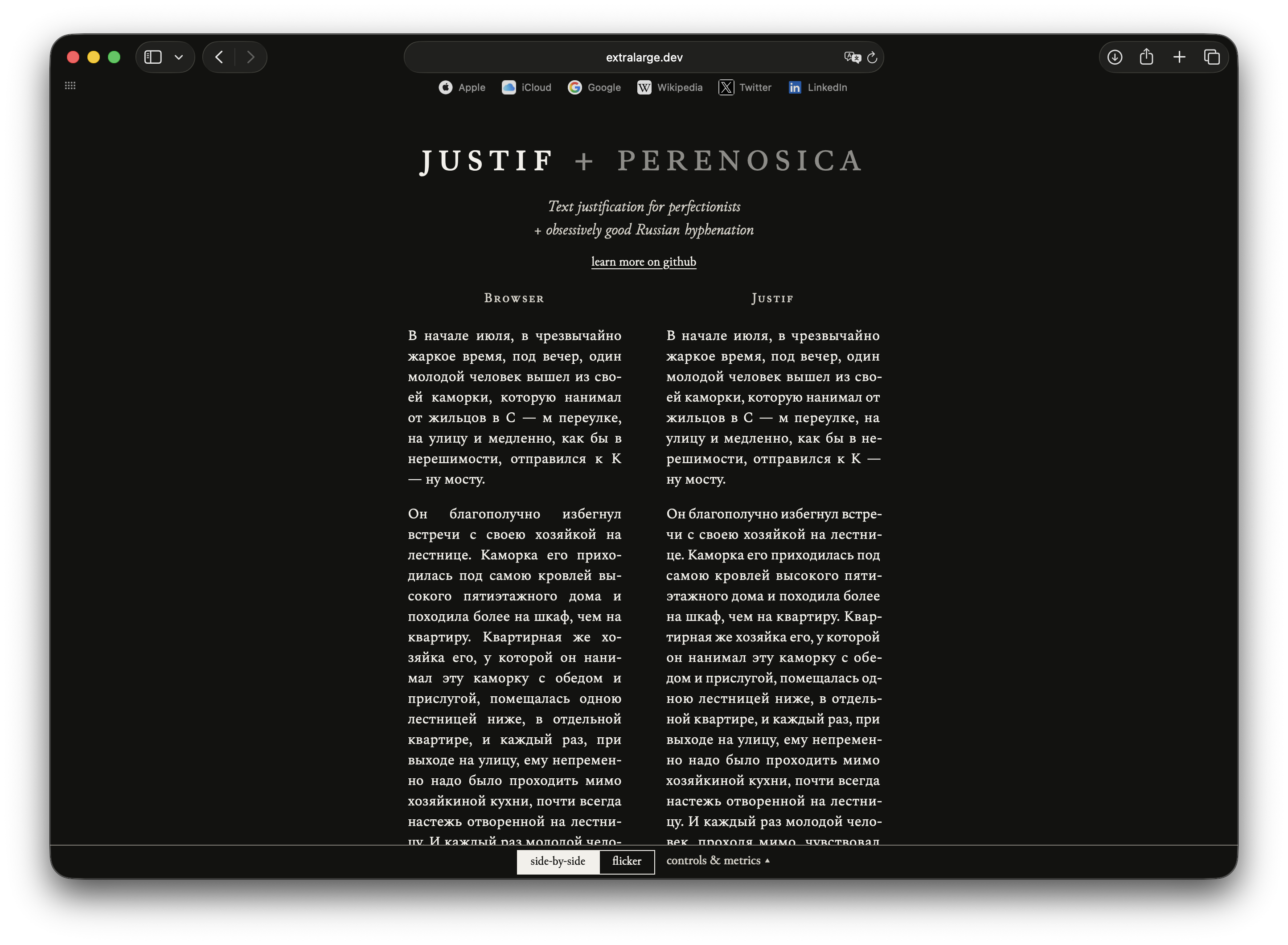
Just if…
extralarge.dev/perenosica/playground/index.html
Designer and art director Maxim Balabin wrote a piece of software that enables more even spacing for fully justified Russian-language text on the web, using hyphenation and microtypography for text blocks not to end up looking riddled with gaps.
How do we process characters?
fluxus-editions.fr/gla11-dyso.php
David Březina and Mary Dyson, researchers associated with the journal Design Regression, keep figuring out the best ways to address legibility issues. In a new article, they reflect on what exactly is going on in our brain when we try to process and recognise a character.
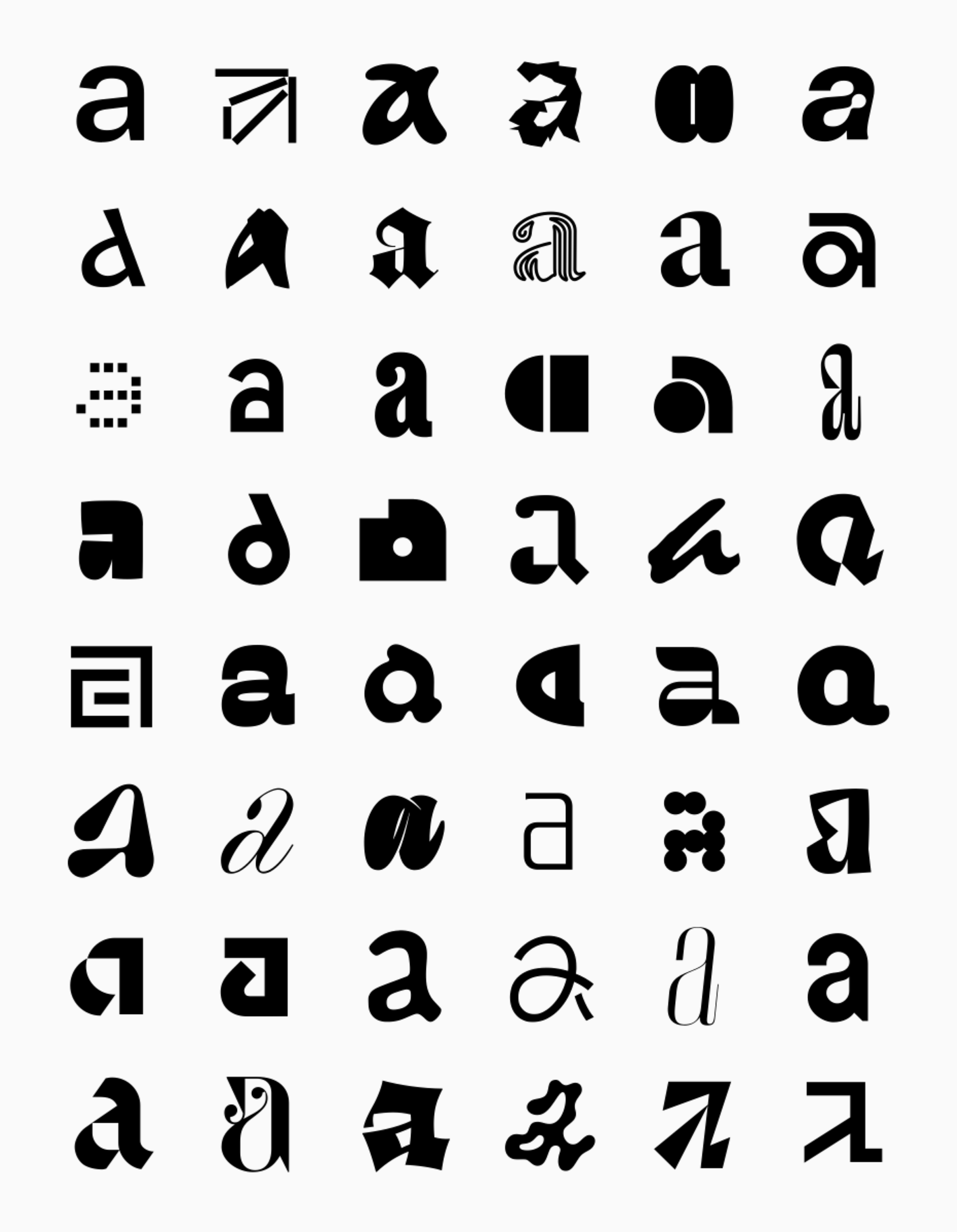 An inclusive collection of shapes for the letter a put together by David Březina
Claude Garamond Jean Jannon, Paul Beaujon Beatrice Warde
heavyweight-type.com/bulletin/beaujon-the-typographic-record-after-beatrice-warde
In August, designer Connor Davenport released Beaujon, the result of a decade spent reflecting on and reinterpreting Garamond revivals. The release date was meant to mark 100 years since the publication of Beatrice
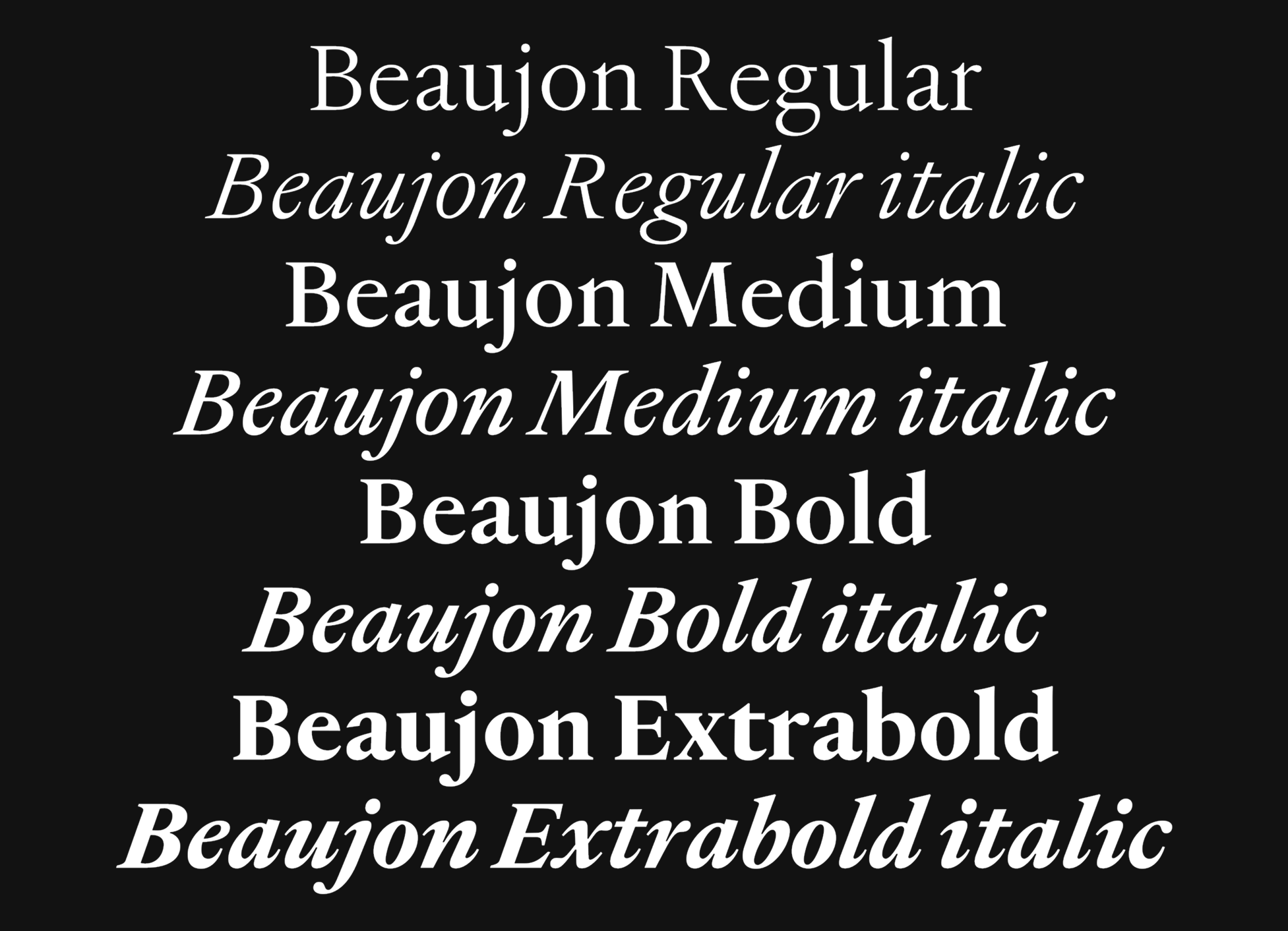 Beaujon by Connor Davenport
Constellations
fontstand.com/news/essays/constellations
A year ago, Paweł Schulz started volunteering at the TYPA Printing and Paper Art Centre in Tartu. He intended to explore the collection and revive several typefaces, but eventually realised that there were more important and urgent things to address, such as cataloguing all physical type preserved across the Baltic region. That’s precisely the goal of Paweł’s project called Canstellations. You can find out more about the project on Fontstand News.
By the way, the dates of the next Fontstand conference are also available on their
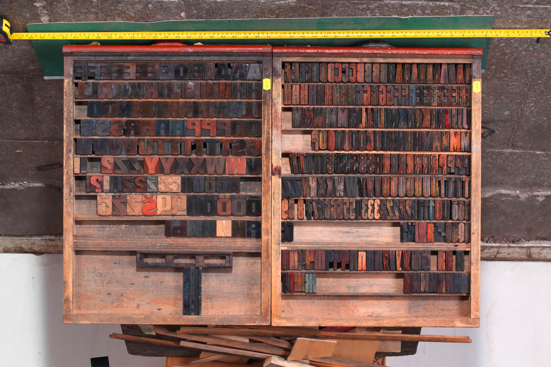 One of the wood type drawers from TYPA’s collection. Photo: Silver Gutmann
TypeParisMenorca
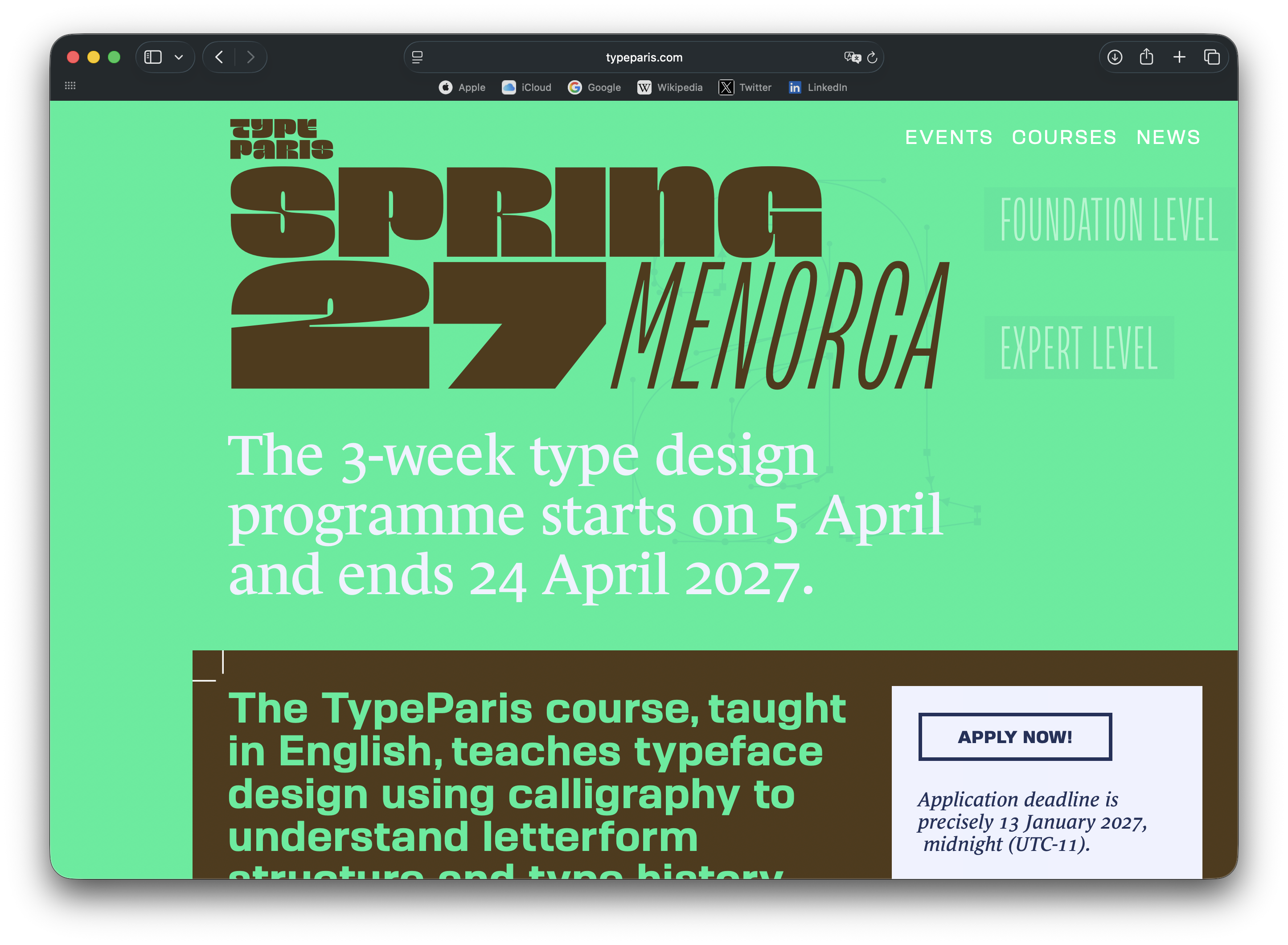
In 2027, the TypeParis type design programme will take place in Menorca, not Paris. The list of instructors includes George Seifert and Rainer Erich Scheichelbauer, who launched Glyphs; Jovana Jocić, who designed Cyrillic for Forma DJR; and type designer Jean François Porchez.
TypeParis state on their website that the programme seeks to provide equal opportunities for participants from various countries, yet the school doesn’t offer letters of recommendation for visa applications.
Affinity update
affinity.studio/blog/affinity-update-september-2026
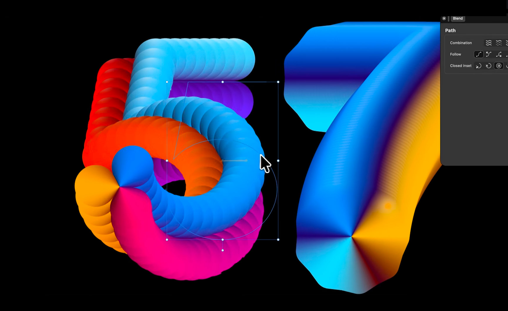
The graphics software Affinity has been updated. The editor now allows you to import scripts from Claude and to open .indd files; the Blend feature has also finally been added to the tool.
 Blend tool in Affinity
A musical show about Doves Press
99percentinvisible.org/episode/683-doves-type/
The 99% Invisible podcast is once again addressing typography. Episode 683 features a musical show based on the story of the London-based publisher Doves Press. If you’ve never heard of how one madman threw his type into the Thames, and another madman fished them out a century later to create a revival, you will certainly enjoy this story presented by author Helen Saltzman.
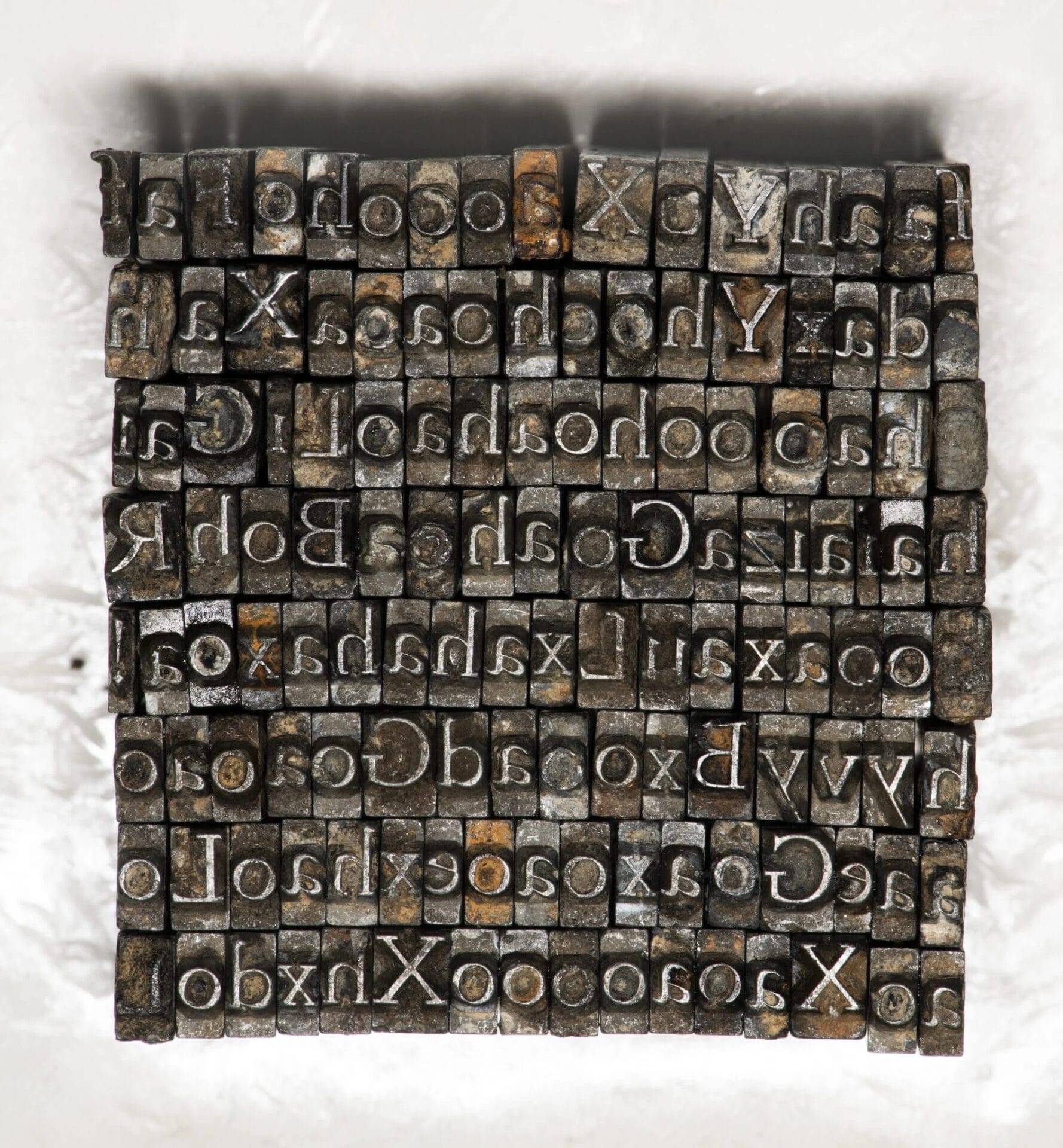 Type fished from the Thames
Unicode 18.0
blog.unicode.org/2026/09/announcing-unicode-standard-version-180.html
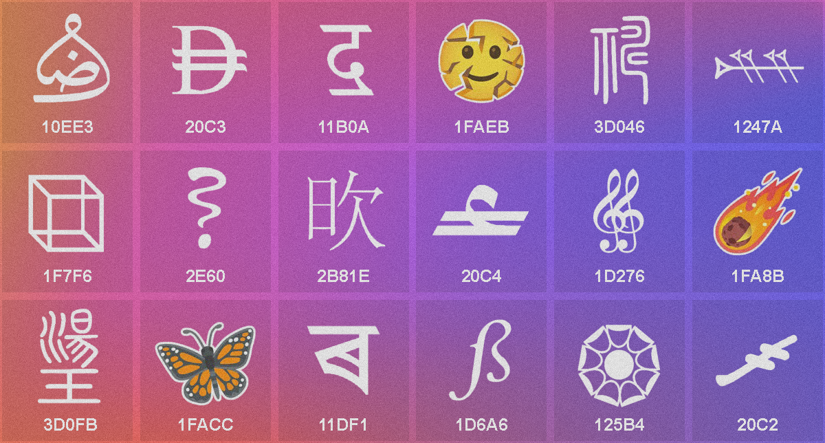
A new version of the Unicode standard is now available. Version 18.0 introduces currency symbols for the Maldivian rufiyaa, UAE dirham, and Omani rial; three Armenian dialect characters; the Meteor emoji, and the Cracking Face emoji.
Typical HQ
A new extension that helps identify the typeface used on a website has been released. Typical analyzes not only the site’s CSS but also the font
The History of Iranian Graphic Design
a-g-i.org/design/book-the-history-of-iranian-graphic-design-2026
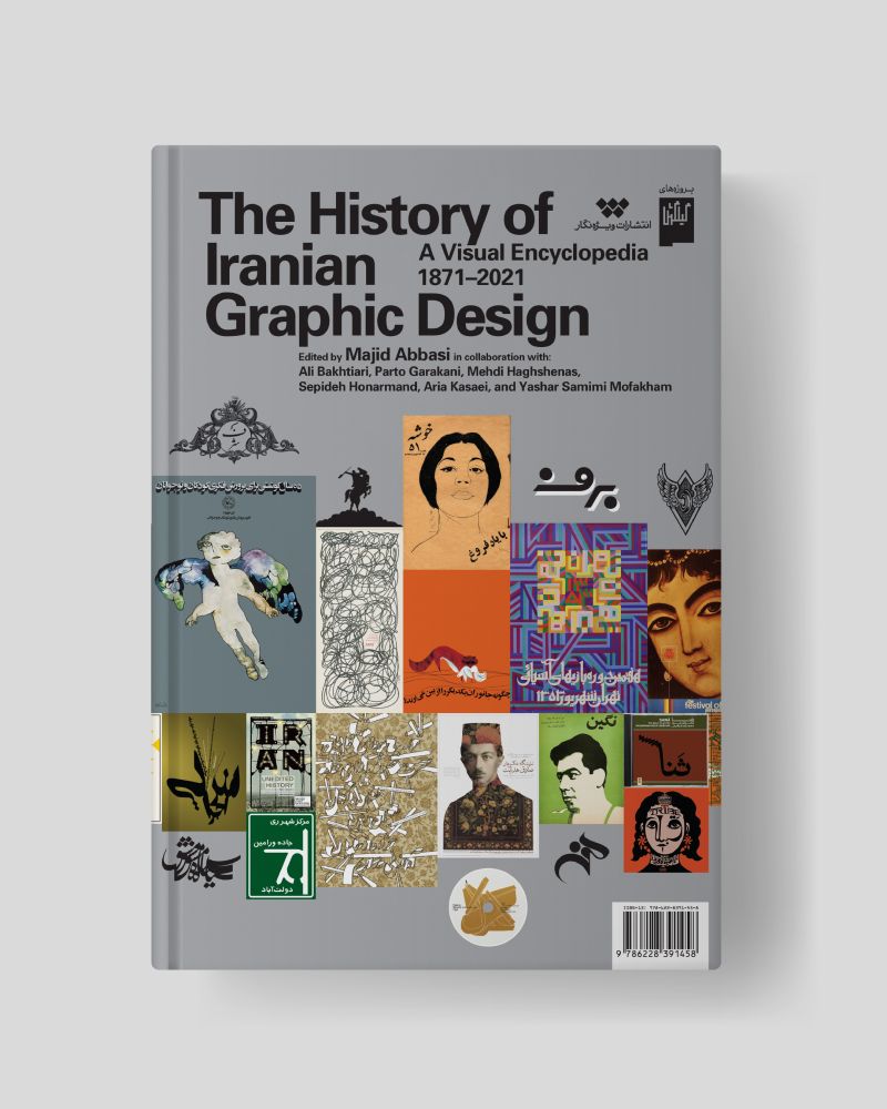
Iran is often associated with dictatorship and human rights violations. That is why designers who’ve been able to escape often feel insecure about preserving, showcasing, and promoting their typographic heritage. But that’s precisely the objective of a book released in September by designer
CJ Type — 10
typo.social/@cjtype@mastodon.social/117290850492881366
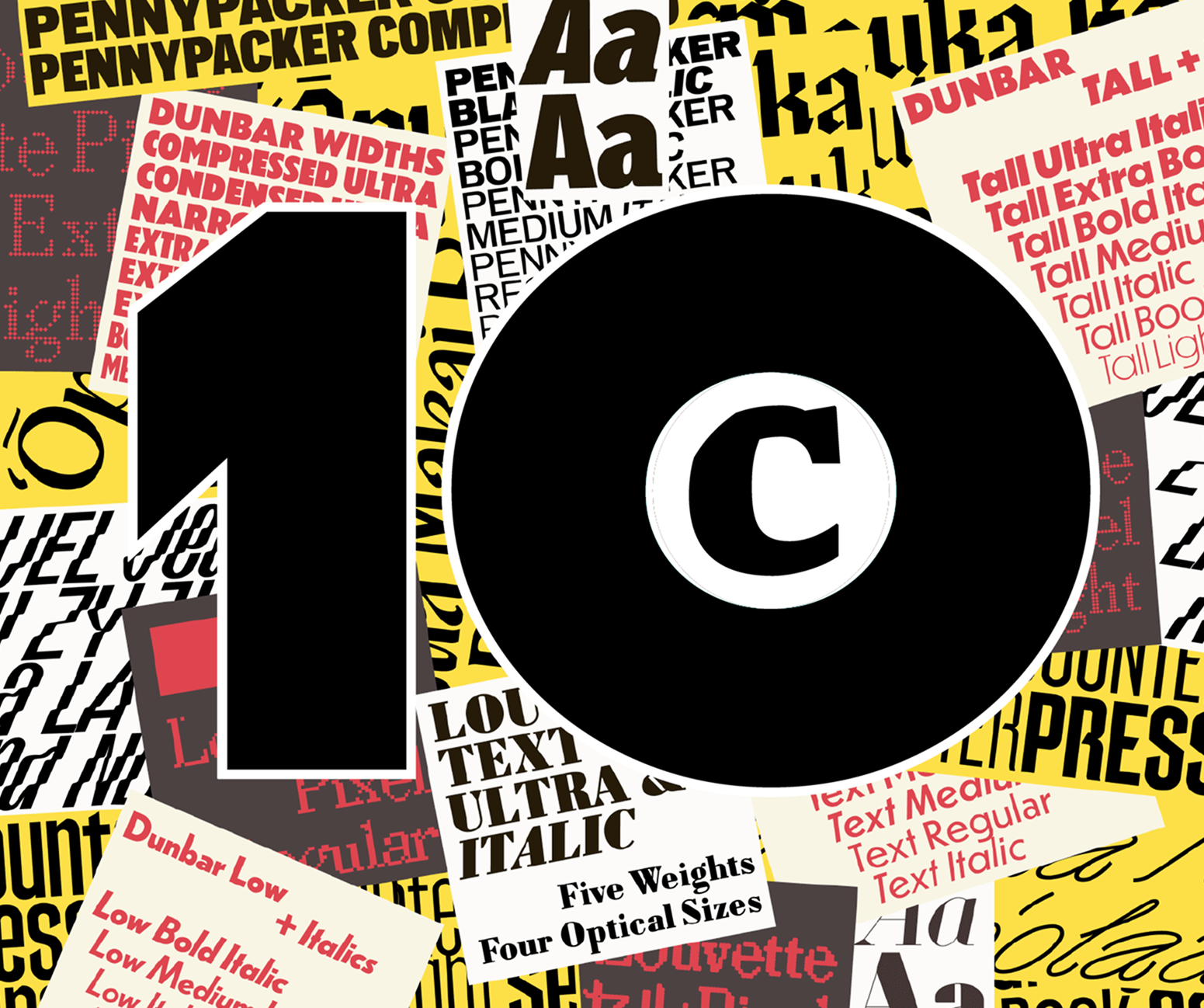
CJ Dunn’s foundry is celebrating 10 years in October. To mark the occasion, he opens an exhibition in Tokyo in October, which will then travel
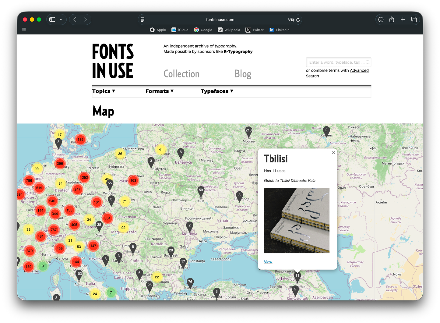
A map of Fonts In Use
Whenever we upload a project to Fonts In Use, we fill in the Artwork Location
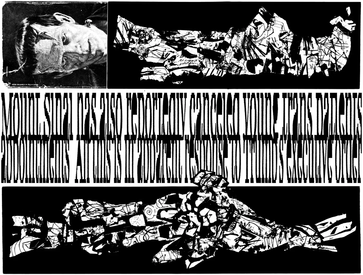
Intrusive Thots
itsnicethat.com/articles/bea-korsch-intrusive-thots-art-project-240926
It’s Nice That has published a review of the comic zine Intrusive Thots, in which designer Bea Korsch reflects on her experience while getting treatment at a psychiatric day clinic. For those reluctant to engage in such a complex and personal story, our editorial team suggests viewing the comic as nothing but a collection of stunning typographic pages.
Individuum. The end
Book publisher Individuum shuts down. Despite its acquisition by a monopoly in the market as well as all the censorship restrictions currently in place in Russia, the publishing house kept producing bold, time-relevant, important books for quite some time.
Thanks to its art director Maxim Balabin, typefaces from our library were often featured on the covers of the books issued by the publisher.
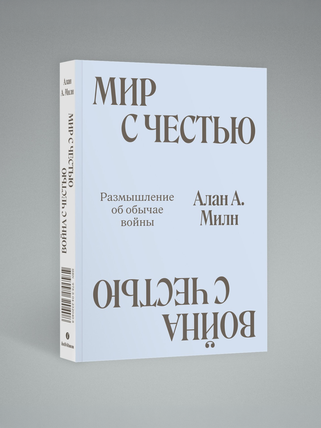 ‘Peace with Honour. War with Honour’, A. A. Milne. Set in Roslindale
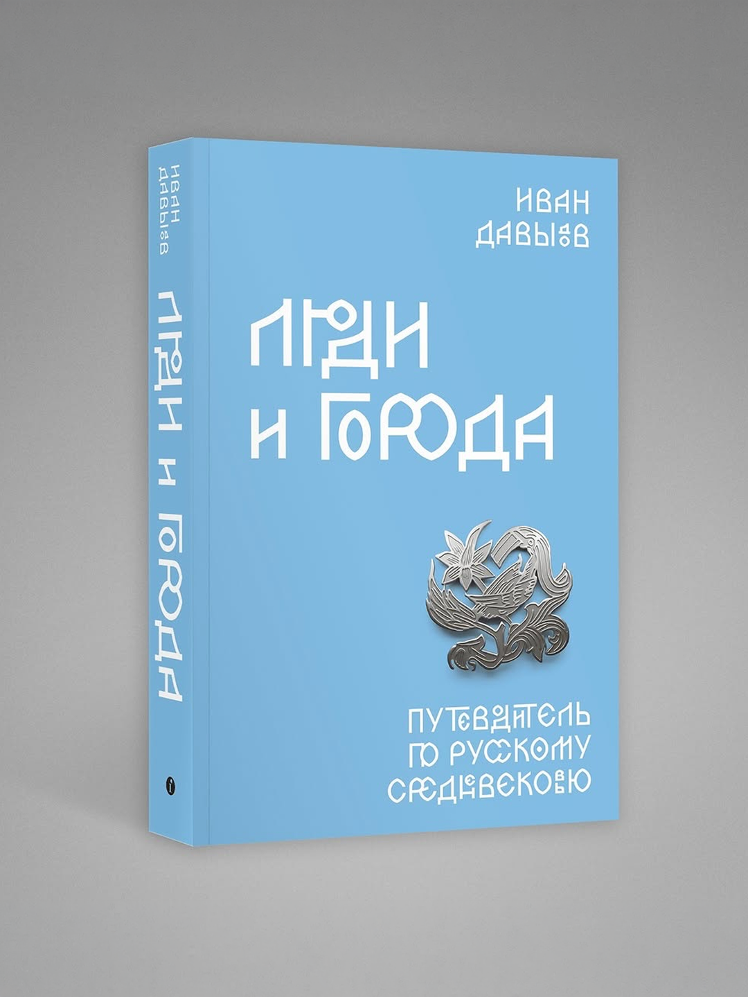 ‘People and Cities’, Ivan Davydov. Set in Zhivov
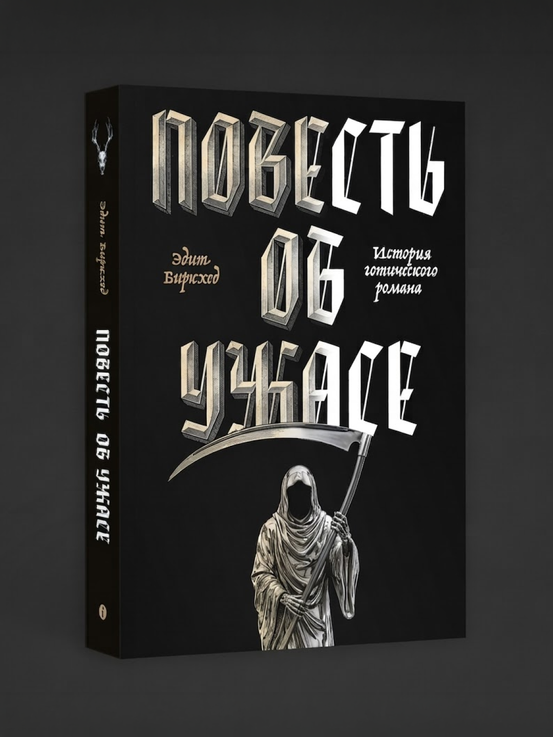 ‘The Tale of Terror’, Edith Birkhead. Set in HealthGoth
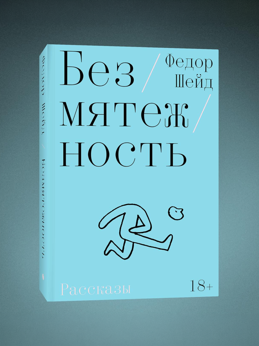 ‘Serenity’, Fyodor Sheid. Set in Qommodore
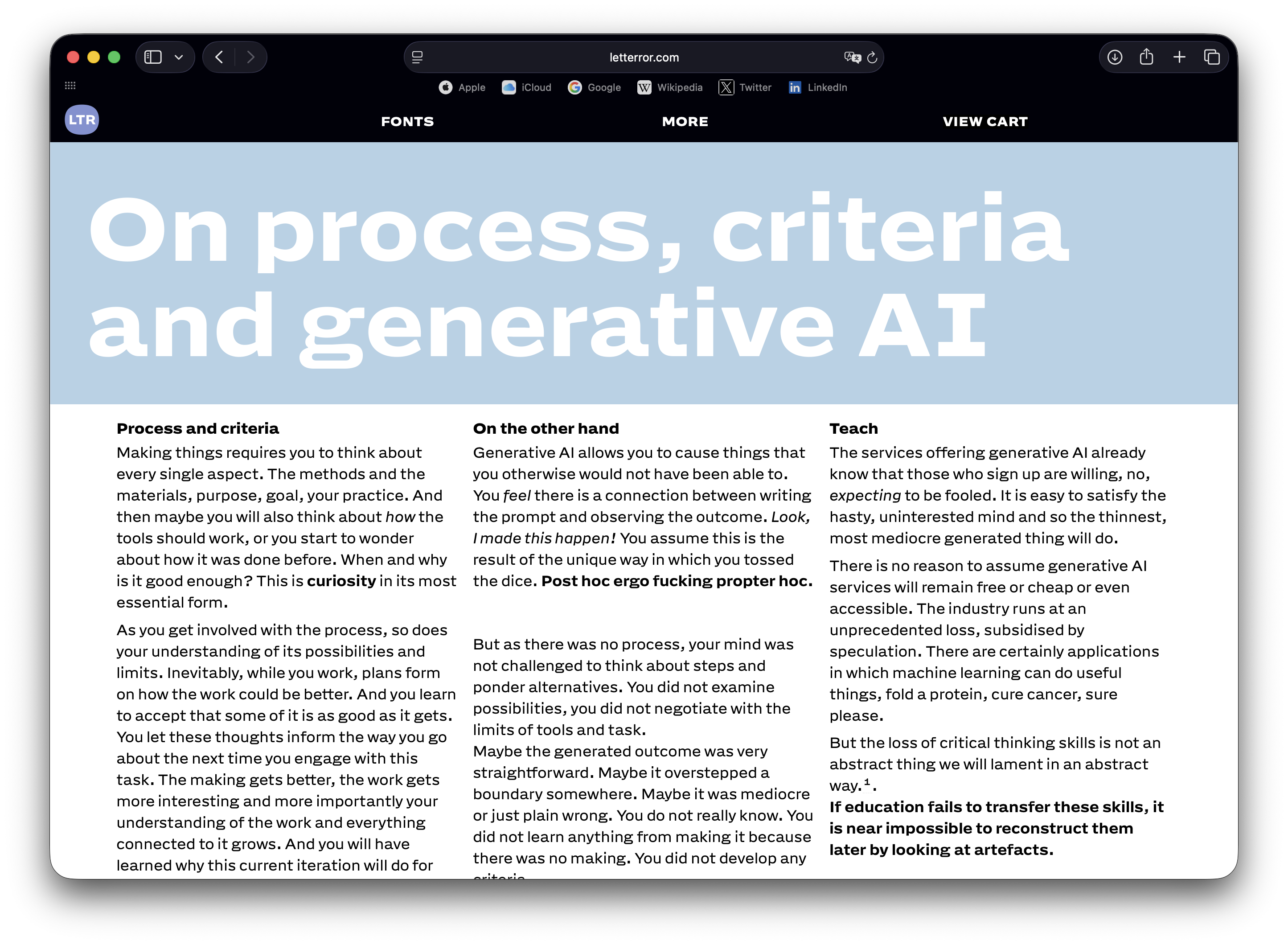
Erik van Blokland against AI (well, not entirely)
Type designer and educator Erik van Blokland addressed why we should be more careful with vibe coding. Long story short: thanks to generative AI, we started creating things we wouldn’t otherwise be capable
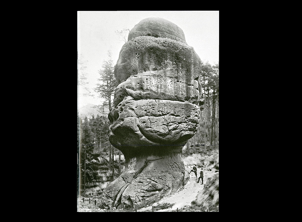
Footnotes #6
lapolice.ch/publications/footnotes-f/
The sixth issue of the Footnotes bulletin is out. It includes, among other things, articles on Venetian hand-painted signs (Nizioleti) and an analysis of typewriter typefaces in Switzerland for legal and investigative purposes.
The amazing adventures of the first Georgian typeface
bulac.fr/le-mysterieux-parcours-de-la-premiere-fonte-de-caracteres-georgiens-du-xviie-au-xixe-siecle
A year and a half ago, type designers Anya Danilova and Yury Ostromentsky came up with an idea for a research project focused on the first Georgian metal typeface. They initially planned to quickly gather material and start working on their own typeface, reinterpreting the first Georgian face within today’s context. However, their preliminary research has grown into an independent project of a complicated
On November 10, Anya Danilova, Yury Ostromentsky, and our editor Adellina Shaidullina will open an exhibition about this research at the Bibliothèque universitaire des langues et civilisations in Paris (BULAC). On the exhibition opening day, BULAC will also host a discussion on Georgian script studies. Besides Anya, the list of speakers includes Mariam Shengelia, who’s curating the Georgian collection of the library, and type designer Ana Sanikidze.
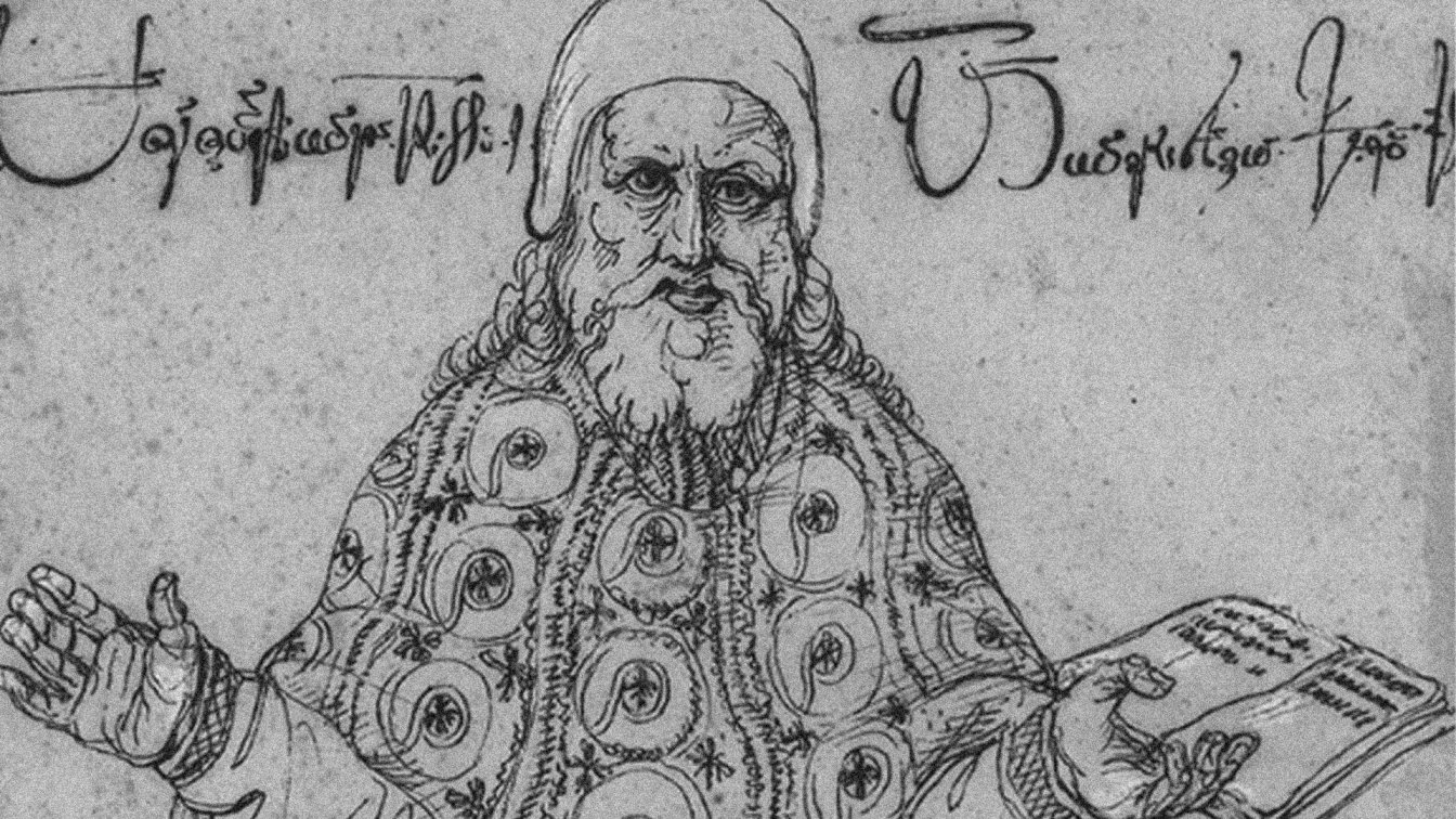 Niceforo Irbach, a Georgian monk and ambassador, with whose assistance the first books in Georgian were printed