
IR: What was your first reaction when we suggested that you take part in this experiment?
AL: The very first reaction was that it was amazing that this contact even happened. Then there were a thousand questions: how, what, how come, why? Remember how we started: at first we got off on the wrong foot, but gradually felt our way to some kind of answers.
VA: I’d add that I had a panic attack — in the positive sense: we had been noticed by some very cool guys, who I know everything about. It was very nice, and unexpected, on the one hand, but on the other — real fear, real responsibility, and a challenge.
IR: Initially, we were talking about various concepts, but in the end we decided on complete freedom, on something that couldn’t be less like a concept. Can you tell us what you did on our Instagram? What was going on?
AL: The thought kept coming to Vlad and me: this isn’t following the brief at all. In the end, we agreed that it’d simply be fun. If you start to think too long about an assignment, one picture can turn into a whole project. You have to carefully think everything though, and waste a lot of time — which you don’t have, because you have to deliver fast. But we also took some time before the project, just to have something to start with, to get used to things. To see what you’ve done, what we do, and somehow bring them together. I thought that the processes would go completely differently. I’m not sure how it came out; looking at it from outside you can see it better.


IR: That is, for you it was more of an improvisation — how to manage to get a picture out in the next hour, since it was already time to release something? I’m interested: what went on in the conceptual sense? In some of the pictures there is an idea visible, a direction. But not all of them were developed the next day or in several days.
VA: After a week, we understood that a person on the outside looking in does not see a unified picture in Instagram, they simply have a feed, and perhaps two of our pictures per day jump out at them. They don’t have the ability to catch the logic of what’s going on. This understanding tied our hands. It seems as if nobody here needs a concept — and people will react with likes to things that could be thought up in five minutes. One picture that got 400 likes was done in 10 minutes. Simply an idea appeared, bam! and that’s it. And when you sit down and get together some kind of complex interface thing, everyone’s like: “Well, yeah, that’s an interface.”
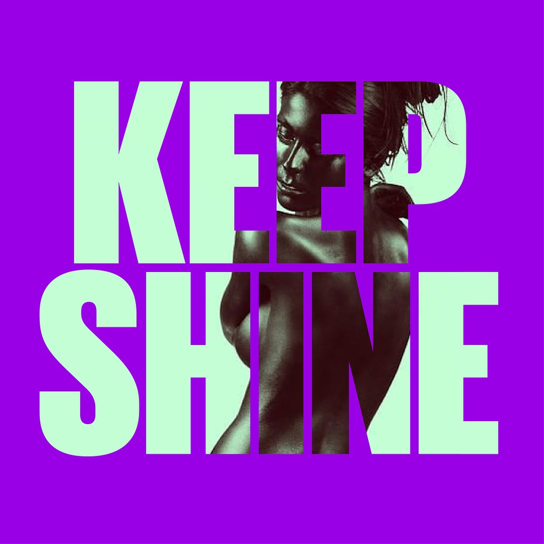
IR: Each of you, name one picture that really hit the mark — one that said everything you wanted to.
VA: I’ll tell you mine. It was at the end, when it’d become clear that things would be ending soon and you could be a full-on prankster — off you go, on a tear. I made a girl who had all these fonts tattooed on her face.
AL: This picture is a lot like you, Vlad. I think that my pictures were underrated.
IR: Maybe. Instagram’s a funny thing. If you’re saying you didn’t get many likes, then don’t worry about it. They were definitely awesome pictures. I don’t know who of you did what, but there were really beautiful pictures that for some reason only got 60–70 likes.
VA: But then Utilities raked them in.
IR: Utilities was cool.
AL: Yeah, that and the yellow façade with the logo “Сoming soon”.


IR: Were there a lot of outtakes? Sketches, attempts, don’t like it any more, not going to post it?
AL: Yeah, there was some of that. If you’re spinning your wheels in the first 15–20 minutes, you’re better off chucking it and starting again with something new.
VA: I also took like three tries with some of the pictures — an interesting idea, but maybe it just didn’t look good, and so there’s nothing to discuss.
IR: Did it take a lot of time? Was the responsibility a real burden, did it interfere with your life?
AL: It’s a kind of discipline. When the pictures prepared ahead of time run out, and you know that every day, either in the morning or in the evening, you have to…
IR: Sit down and create.
VA: Yeah, I agree. But it’s not like “you have to lay out the brand book” but more like “now you’re going to sit down and cut loose.” Maybe it won’t come on the first try, but you know that it’s going to be cool. And you get feedback as soon as you post — you understand whether the picture worked or not.
AL: It’s awesome when you’re busy with some routine project, and to relax a bit, you start to mess around with a picture for type.today. If you end up with something halfway decent, you like it, you feel a particular emotional satisfaction — and then the routine work flows out like singing a song.
IR: As for the collection of typefaces, were there any standout moments? A face that gave you real pleasure, or ones that were a pain to work with?
VA: I really liked working with Menoe Grotesque; I really liked Stratos. They were my go-to typefaces.
AL: There are fonts with a very strong character. Even for me, there are those that have already gotten kind of stale, and it’s hard to pull something out of them that is emotionally different from the previous picture. There are favorites, too. I liked the story with the huge number of ligatures in Big City Grotesque; it was always interesting to work with it.
VA: For me, I discovered the possibilities of Amalta — that it’s not some kind of elegant European font, but a real gangsta kind of deal.
IR: Thanks, that’s exactly the kind of impressions I wanted to hear about.
