- Olya Kovaleva
- Pioner cinema art director

When we, with a team of designers, came to Pioner, the cinema had a concise, yet rather sluggish style that had hardly changed during 10 years of Pioner’s
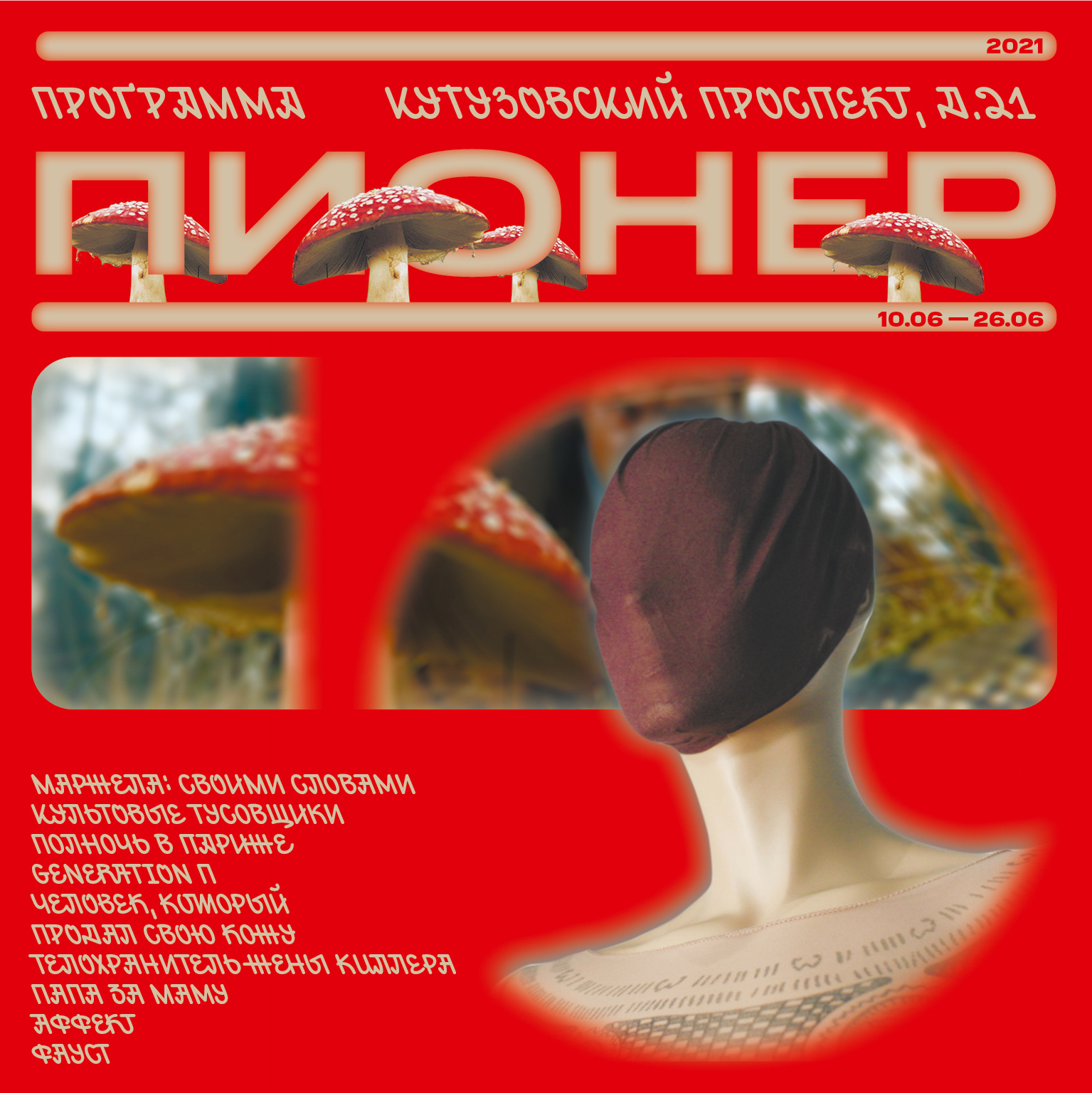
While reflecting on the rebranding, we were looking for typefaces that would demonstrate that Pioner cared about its history, but was willing to change. In order to keep connection to the previous style, we decided not to move far away from Pragmatica and chose Normalidad. It doesn’t really look similar to Pragmatica, but also is a clear monumental grotesque.
We took a slightly weird Windward to pair Normalidad. When we showed a new type solution to our colleagues at the cinema, they fell in love with Windward at first sight. Within the team, we call it ‘idiotic’, but in a good sense. Meaning, it is our favourite, somewhat ugly, with a bizarre slant, but works great in contrast to Normalidad.


Plus, I’ve never seen someone use Windward for an identity, and what our new style had to remind of was exactly that Pioner was a place of unique cinematographic events, that we offered something that no one else in Moscow had to offer.
On our fests and special events, we show movies that have already become classics in the past century. They often have lettering in their posters and credits, and Windward seems like a reference to those. I also read somewhere that this typeface was based on Comic Sans and graffiti, and to do something good using Comic Sans is a dream of any designer.
For now we are using these two typefaces on social media, for printed cards and tickets, then we are planning to make merchandise, and later we are going to re-make the website. But it is a long story, we have not even purchased the web license.


I am still not quite sure that half of the design community won’t pelt me with rotten tomatoes, because probably these two typefaces really cannot coexist with each other. But it is definitely love, a certain love by contrast. I considered other ‘idiotic’ fonts, but they still were rather
We asked the guys who are in charge of Pioner’s social media, what has changed since the moment of rebranding. Today people more often click on the ad, look at the pages of the cinema, they like it more. We are trying to communicate with the audience and we gather our


Windward is an attempt of Denis Bashev to combine the graphic idea of Comic Sans with the dynamics of street art tags, turned into a full-fledged mass typeface supporting more than 30 languages, implemented with the help of the type designer Mikhail Strukov.
Normalidad is a mechanistic semi-open sans serif by CSTM Fonts coming in the palette of widths from Compact to UltraExtended and the range of weights from Thin to Black. Type.today’s store provides a convenient, flexible offer for it: you either can buy one or several of 30 static