Typefaces of the Month, Matthijs Sluiter’s Picks
Fonts In Use editor and Type Specimens curator Matthijs Sluiter has selected the most notable typeface
Releases
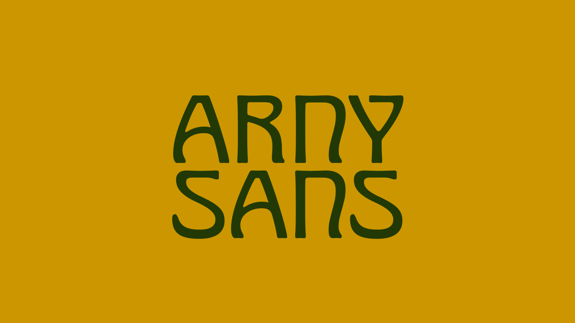 Arny, Herzberg Design Co
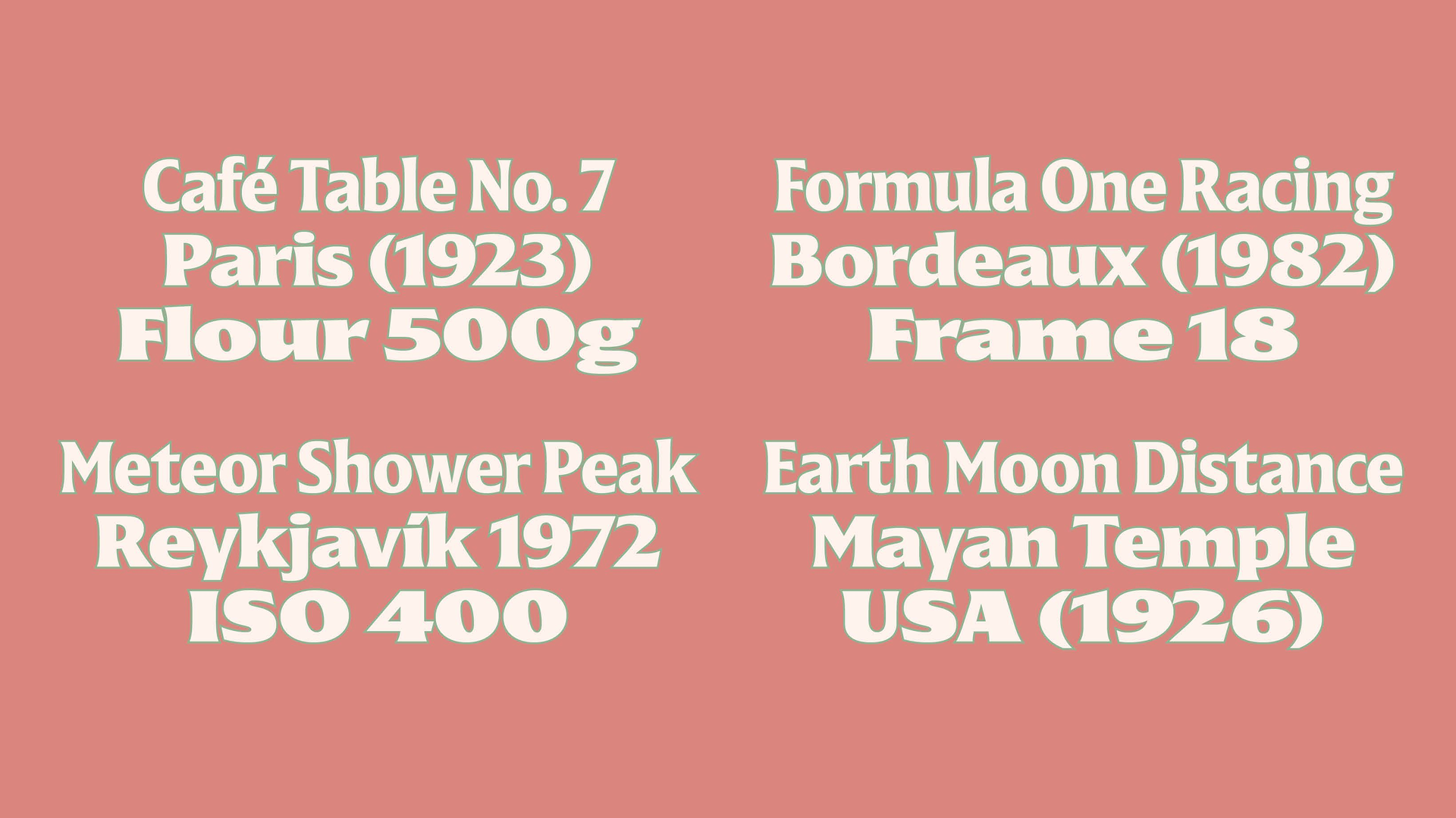 JT Disway, Pauline Fourest
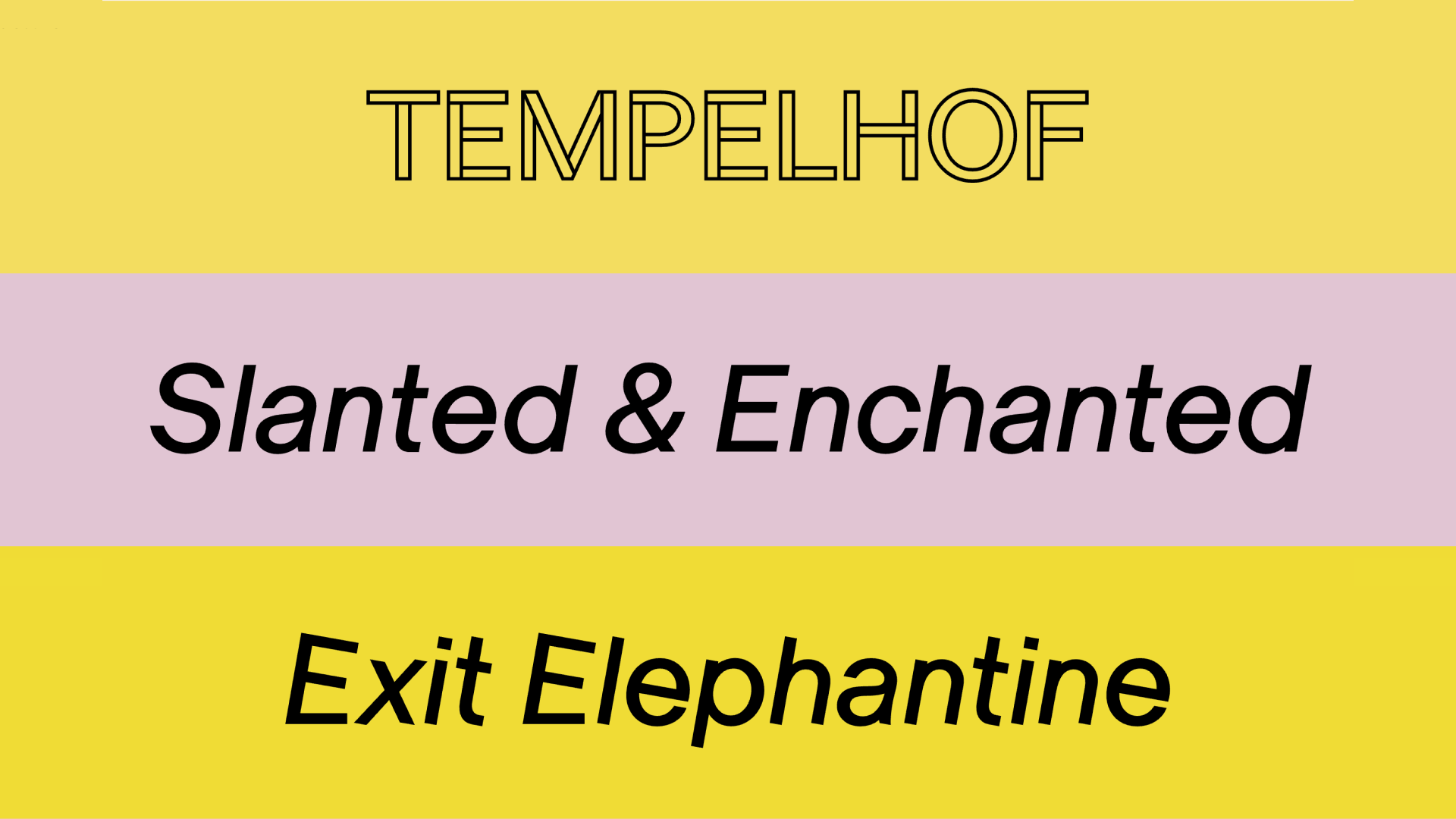 Eero, Monokrom
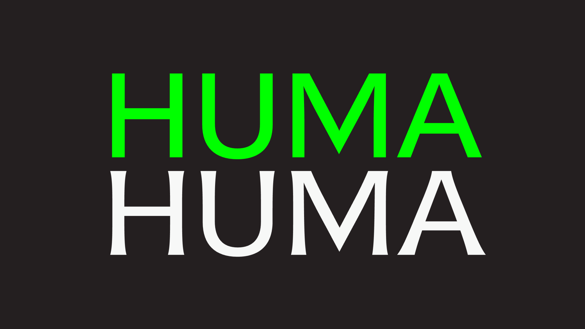 Huma, Maxitype
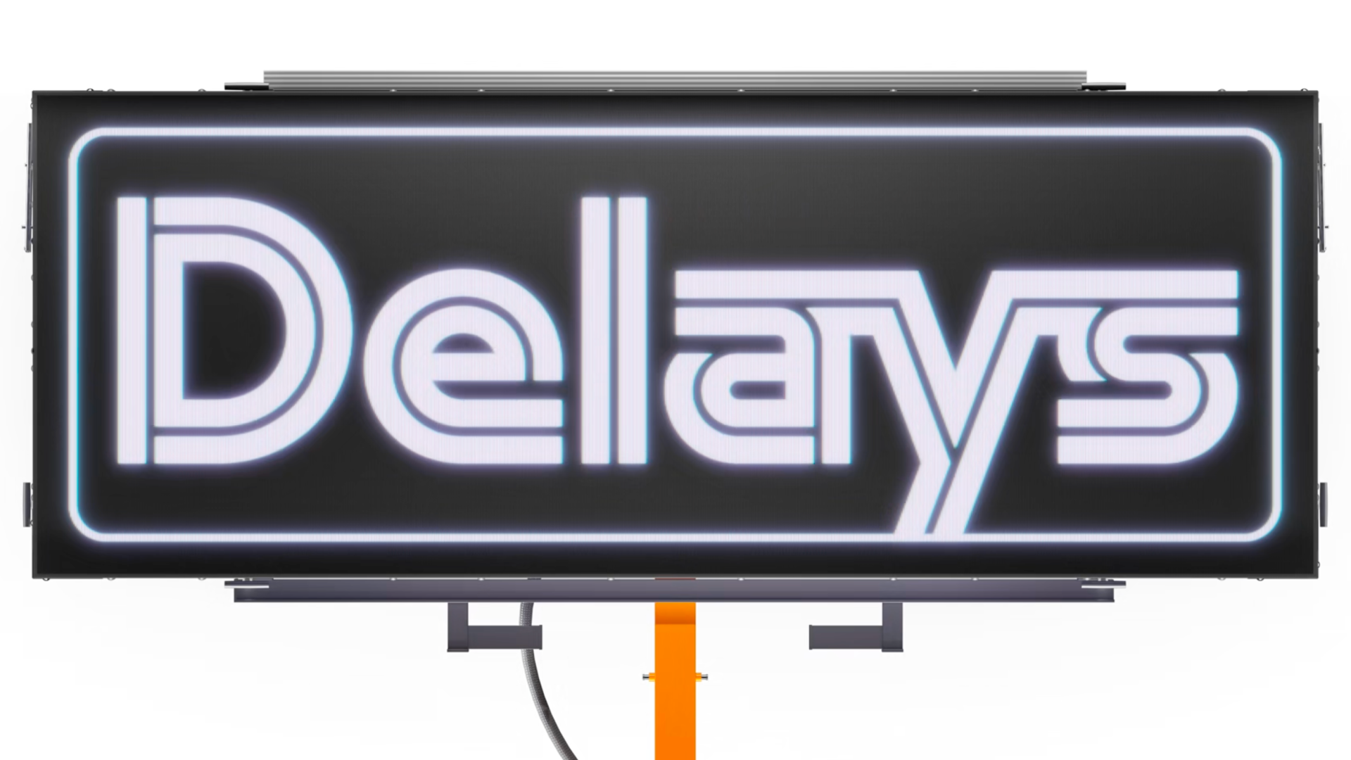 Logistik, AllCaps Type
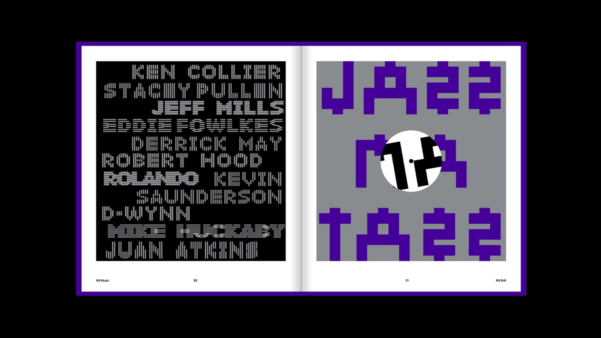 MXTP Vol. 2, Maxitype
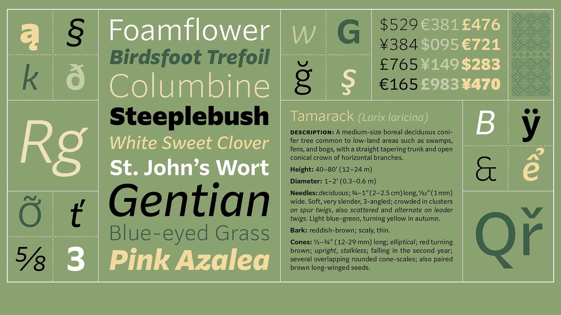 Parling, Kent Lew
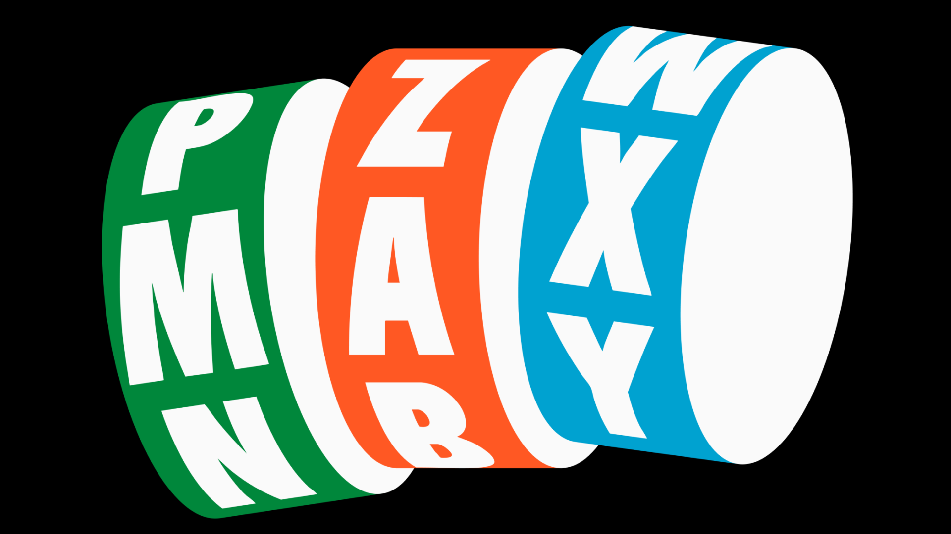 Rosco Jr, TypeMates
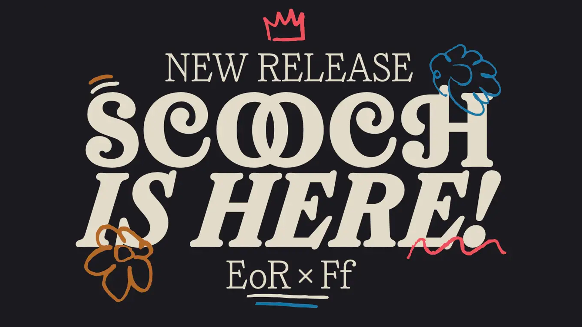 Scooch, East of Rome
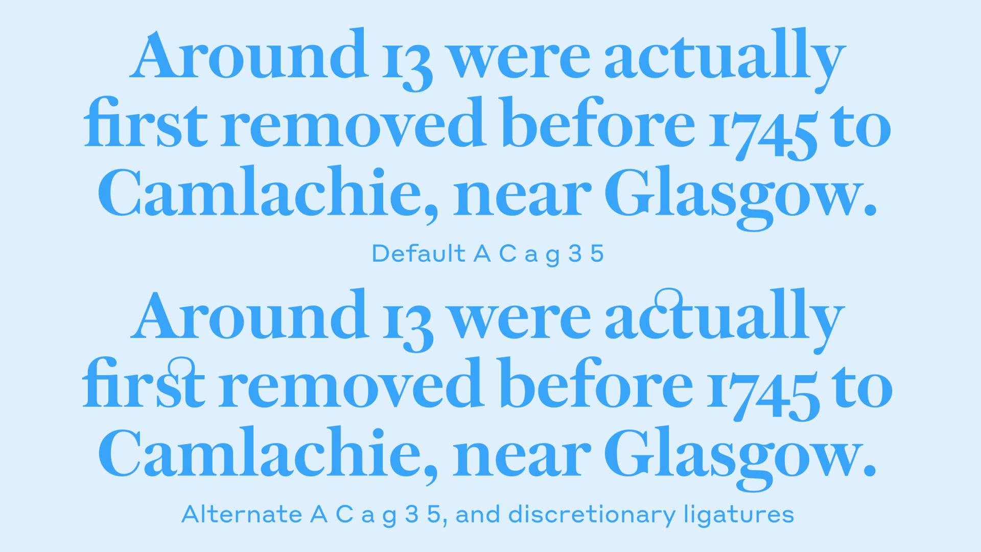 Spectator, Commercial Type
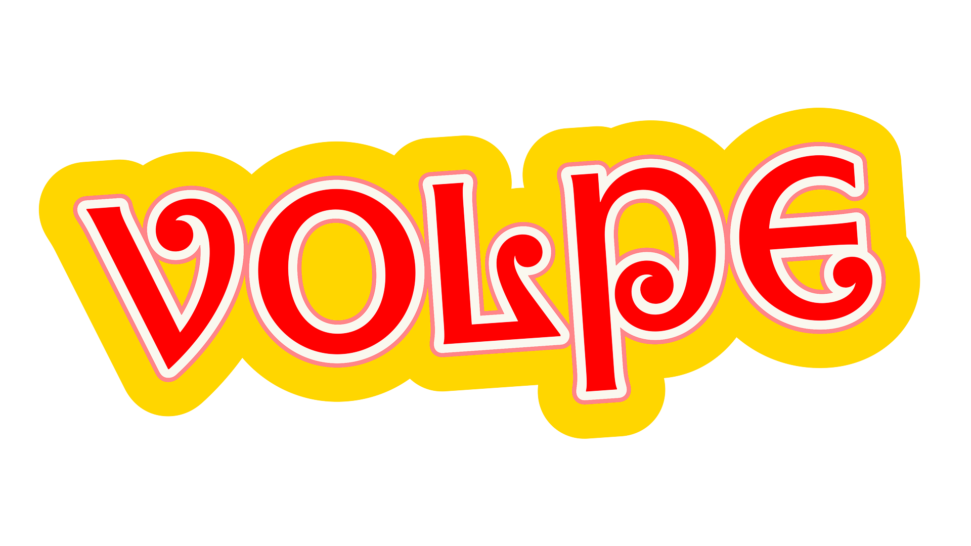 Volpe, Mark van Leeuwen
Updates and family extensions
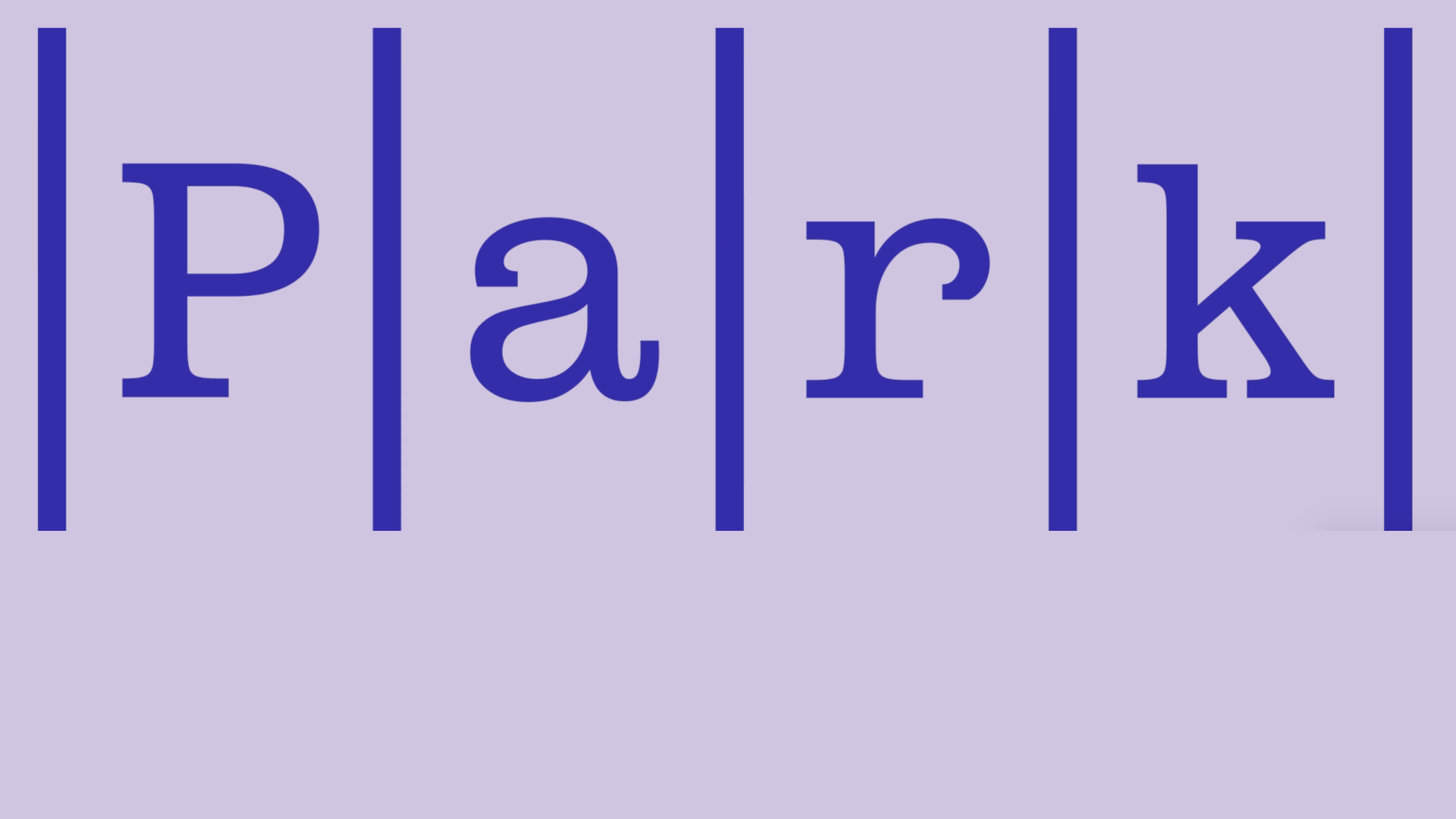 Park Mono is a new companion to Extraset’s Park family
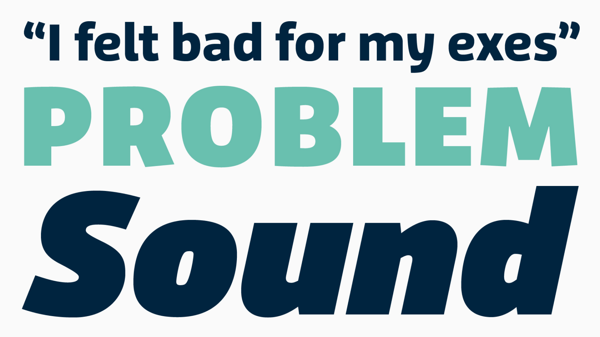 Edgar Walthert’s Agile was remastered and rereleased by Retype Foundry
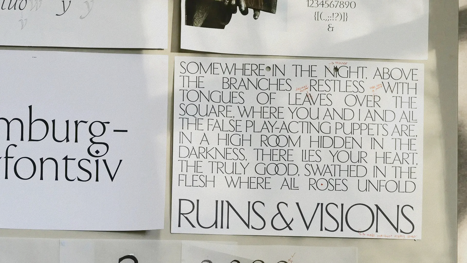 Sharp Type added six new weights to Ceraph, designed by Emma Piercy
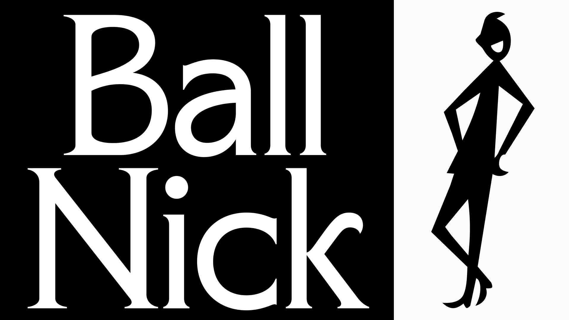 Eliott Grunewald (Ornamental & Title Type) added lowercase, small caps and extended language
support to Phlegm
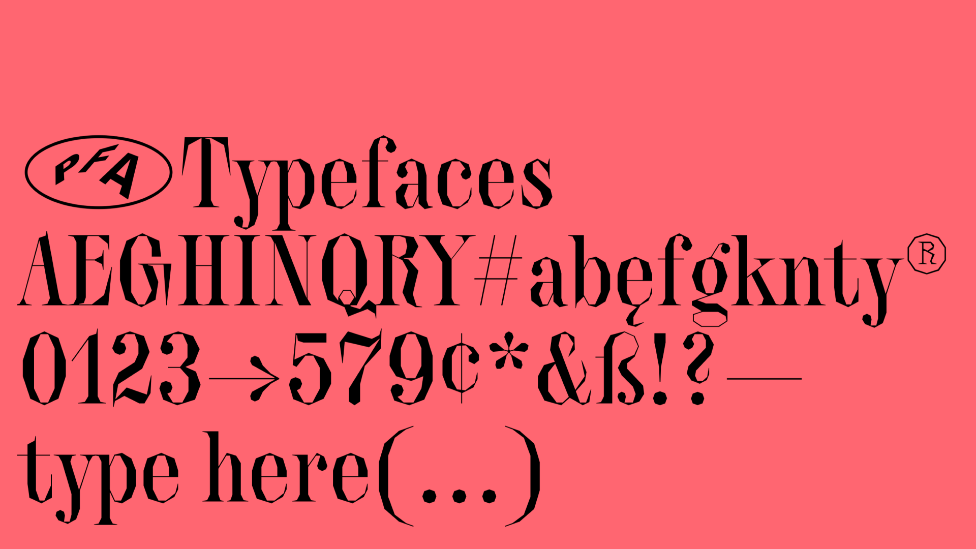 PFA Typefaces updated their Quartier. It now spans two optical sizes and features swash capitals
Type archives: how and to what end?
cjtype.com/dunbar-design-repository/articles/archiving-the-future
СJ Type blog published a conversation between typography researchers Dan Reynolds and Ferdinand Ulrich and CJ Dunn. They talk about why type designers (and any other kinds of designers) should visit archives and how to document and archive their own type design work properly.
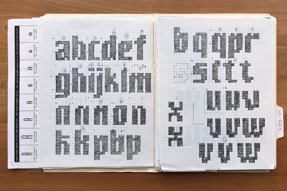 Preliminary sketches by Rudy VanderLans, details of which were incorporated into Zuzana Licko’s early bitmap fonts. From the collection of Letterform Archive. Photographed by Ferdinand Ulrich
Whose fonts is it anyway?
blog.agyei.design/whose-font-is-it-anyway
Inspired by the generosity of ABC Dinamo who released their new typeface, Areal, free to everyone, designer Agyei Archer set out to explore how ownership works in the type design world. Eventually, he arrived at an unsatisfying, sobering conclusion: a designer can only say they truly own a typeface if they actually can prove
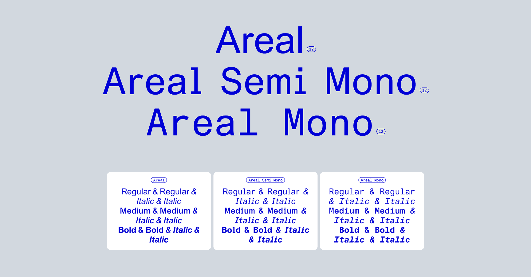 Areal by ABC Dinamo
Jacques Le Bailly → Le Bailly Fonts
Type designer Jacques Le Bailly has launched his own foundry. As of now, Le Bailly Fonts features four typefaces: friendly unicase Guidon, slab serif Bouquin, an (almost) script color font Foxy, and Gabarit, a sans serif with a playful attitude.
Integrating various writing systems across India’s metro network
designregression.com/case%20study/multilingual-directional-signage-in-indian-metros
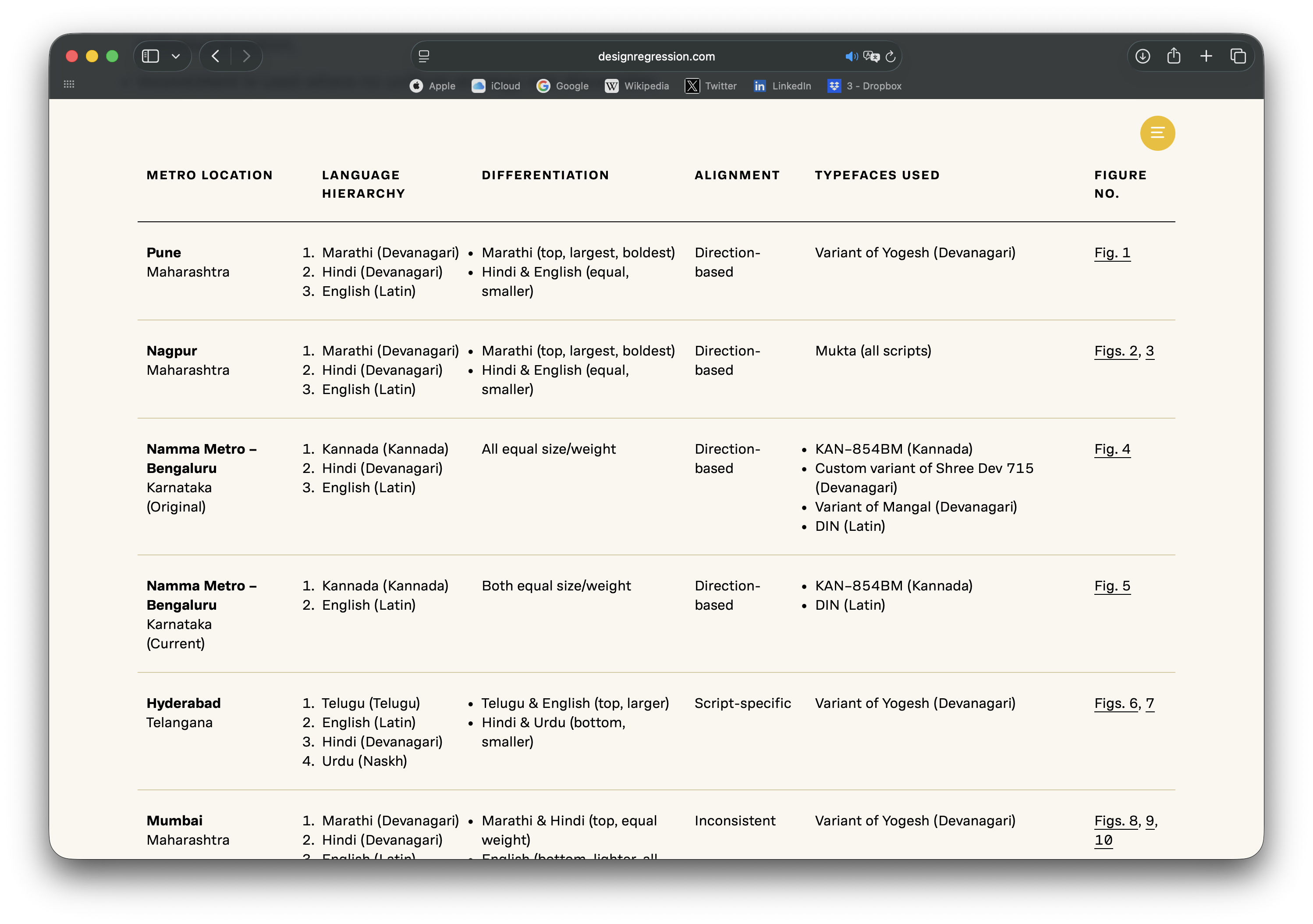
A new piece in the Design Regression journal: a study by designer Ritik Shah on challenges of integration and prioritisation of different scripts and languages in wayfinding signage within the metro systems in nine Indian cities. It would be hard to find a better example of a discussion on typographic harmonisation, as Ritik Shah’s case study includes seven writing systems and eight languages.
Dalton Maag turns 35
daltonmaag.com/resources/blog/2026-10-07-35-years-of-type-part-2.html
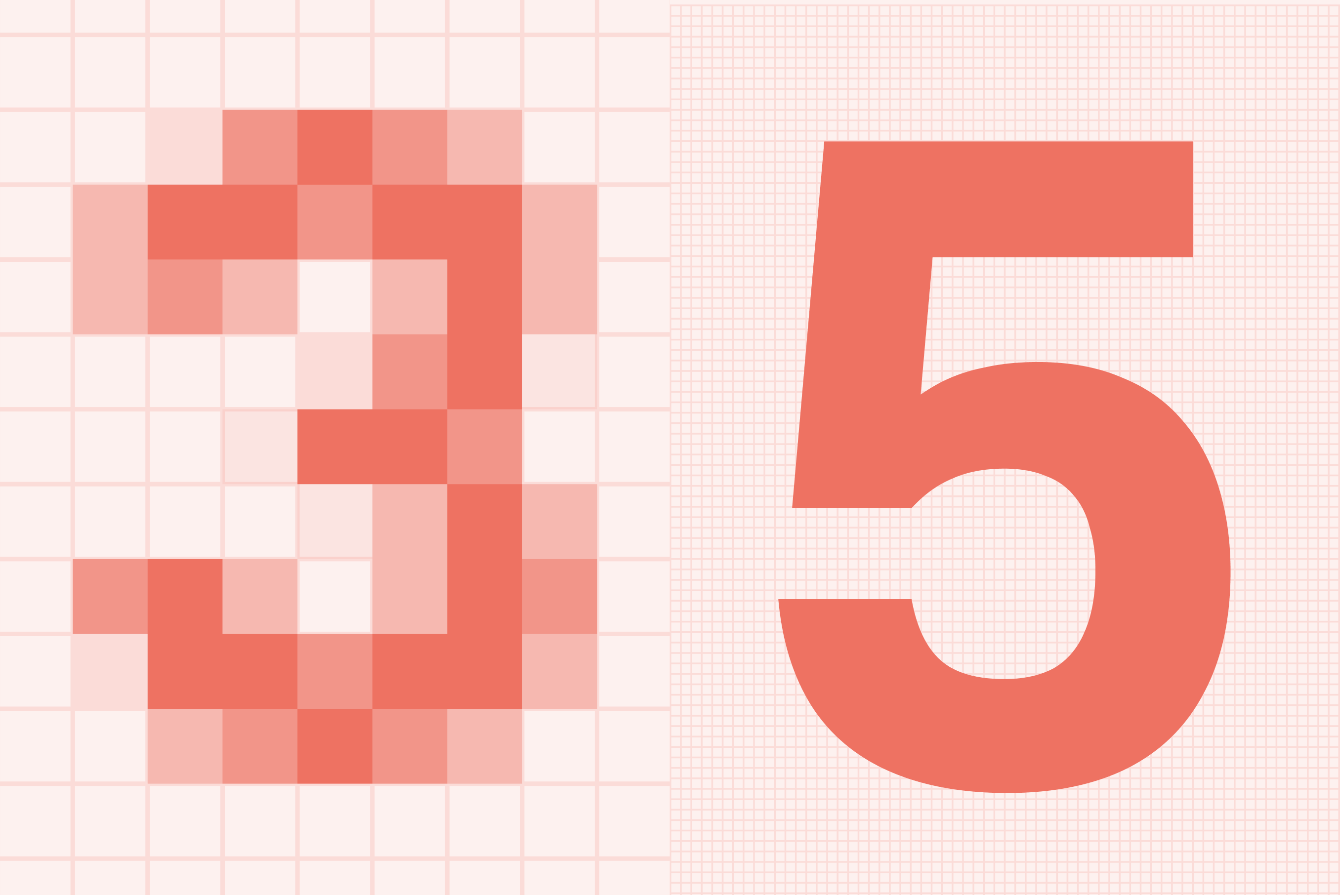
The end of September marked 35 years of Dalton Maag. To celebrate the anniversary, the foundry launched a series of articles looking back at the milestone events that shaped the industry.
Arsenal×David Rudnick
It’s Nice That sat down with type designer David Rudnick and Johnnie Campbell, Arsenal Creative Studio lead. The designers address what football clubs and pop celebrities have in common, agree that it’s a challenge to create a typeface that is both wild and
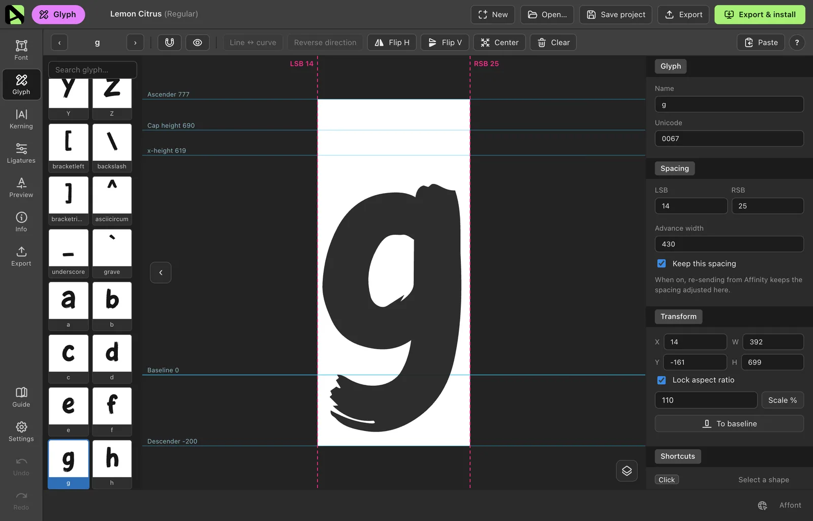
Draw your letters in Affinity
Welcome a tool that lets you design fonts directly within Affinity. Priced at $24, Affinity won’t replace a font editor, but will definitely make any design process involving lettering much easier.
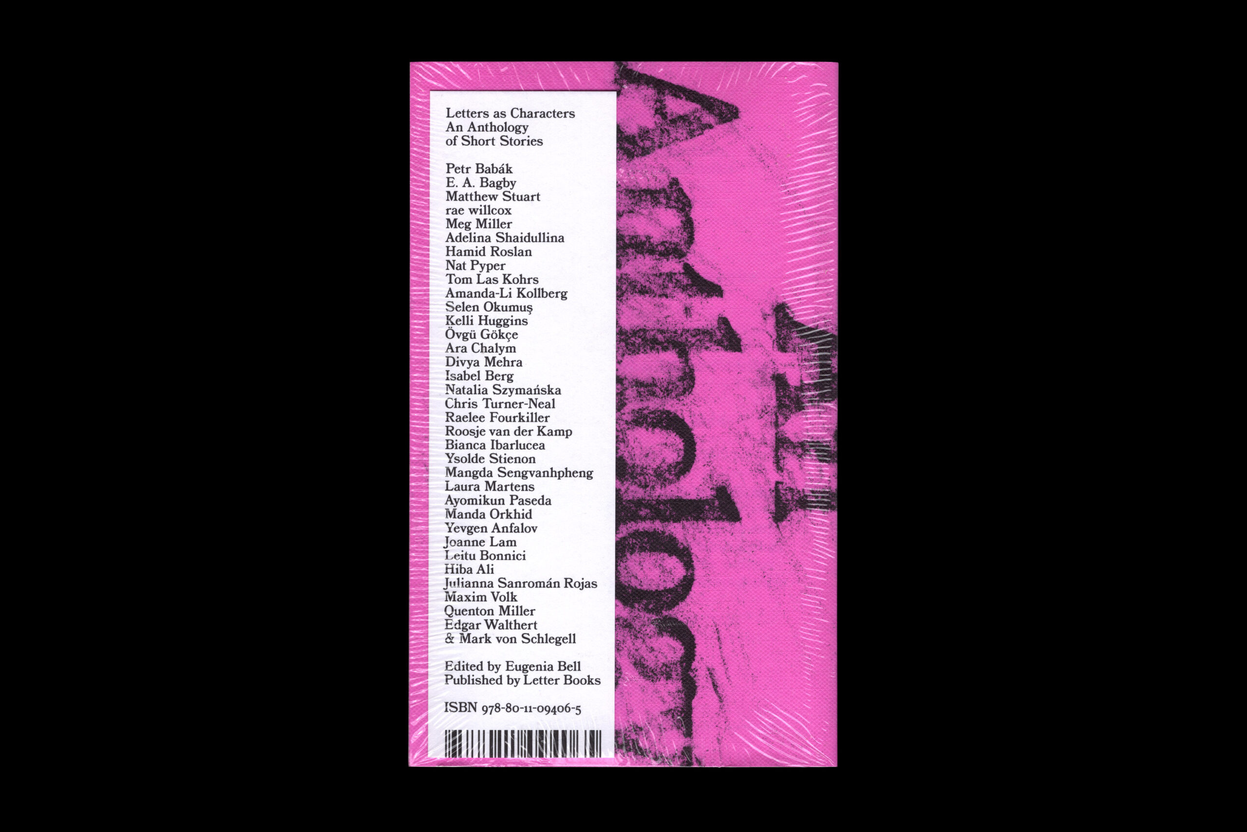
Letters as characters
cara-nyc.org/program/events/letters-as-characters
The Letter Books publisher has released a collection of short stories about… letters. The publication includes pieces by type designers Edgar Walthert and Yevgeniy Anfalov, as well as a story by type.today editor Adelina Shaidullina.
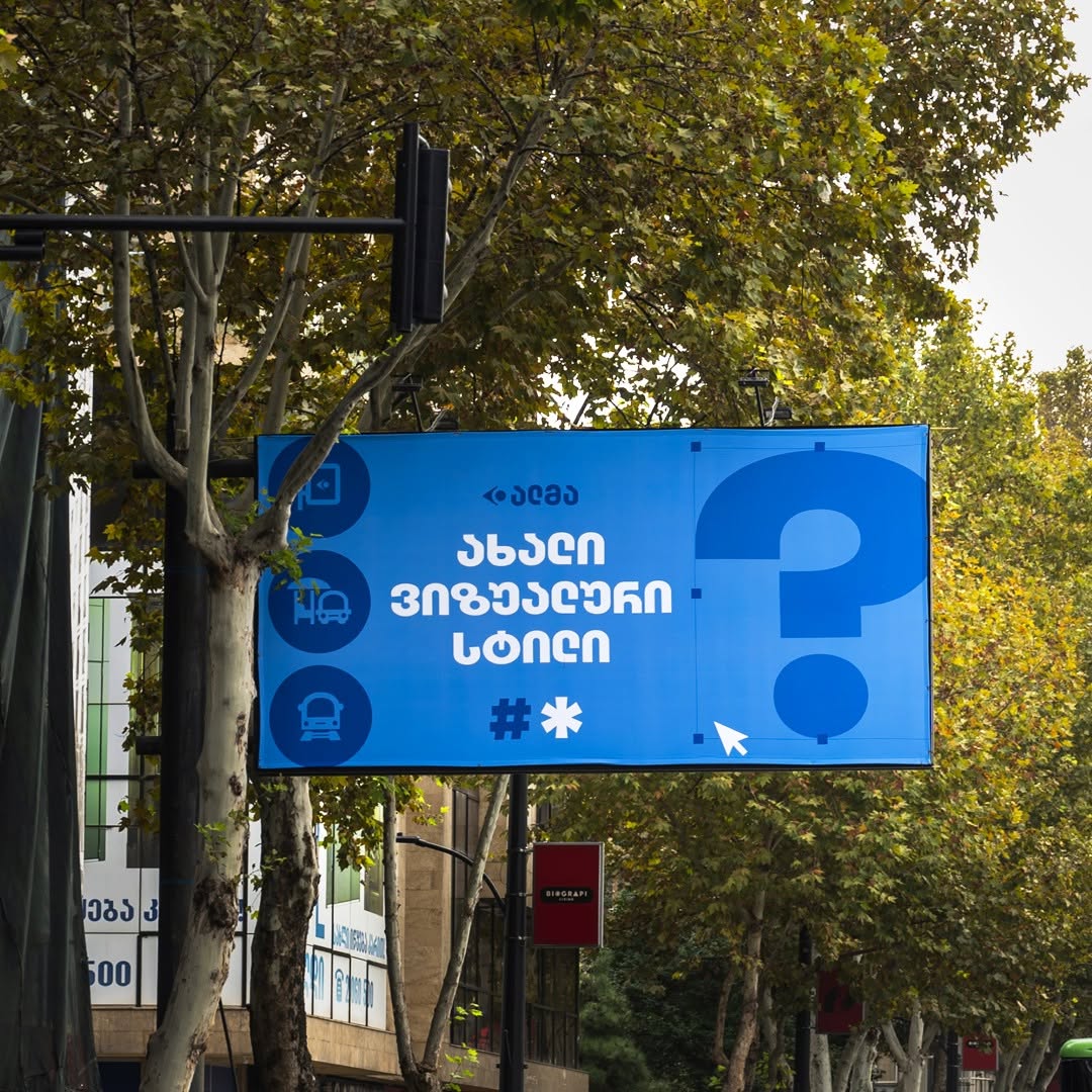
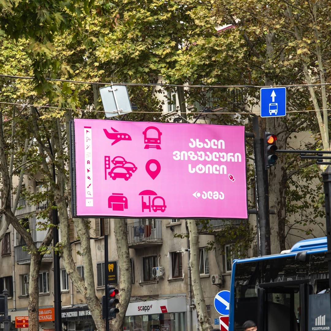
Identity > Logo
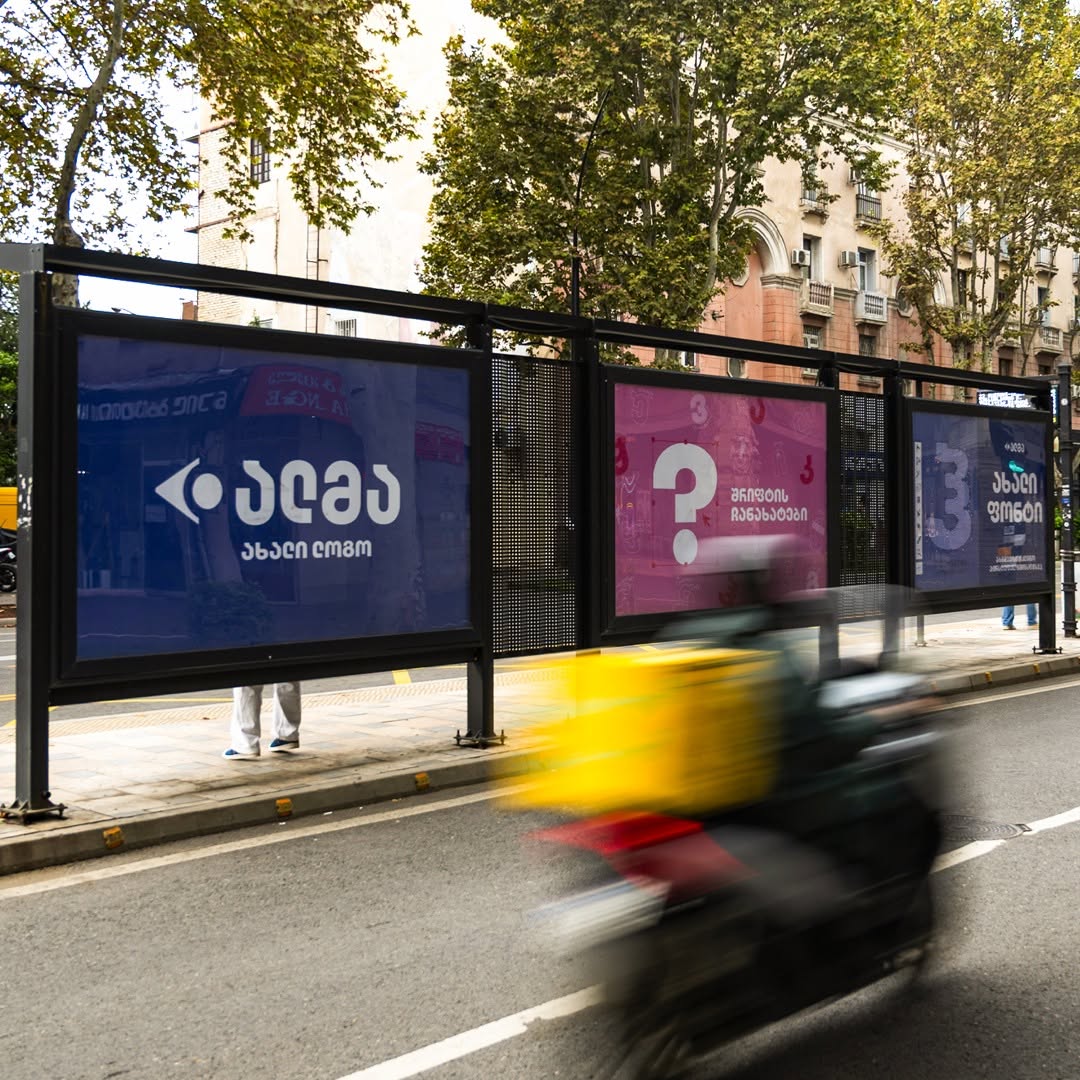
The Georgian company Alma, which handles most of the country’s outdoor advertising, has updated their brand identity, with the most interesting thing about it being its approach to storytelling. The company chose to lead its rebranding narrative with the typeface, putting up posters in the metro and at bus stops that resemble the promo visuals type designers create when releasing a new font. On social media, Alma posted the same images accompanied by the slogan ‘Identity is more than just a new logo’.
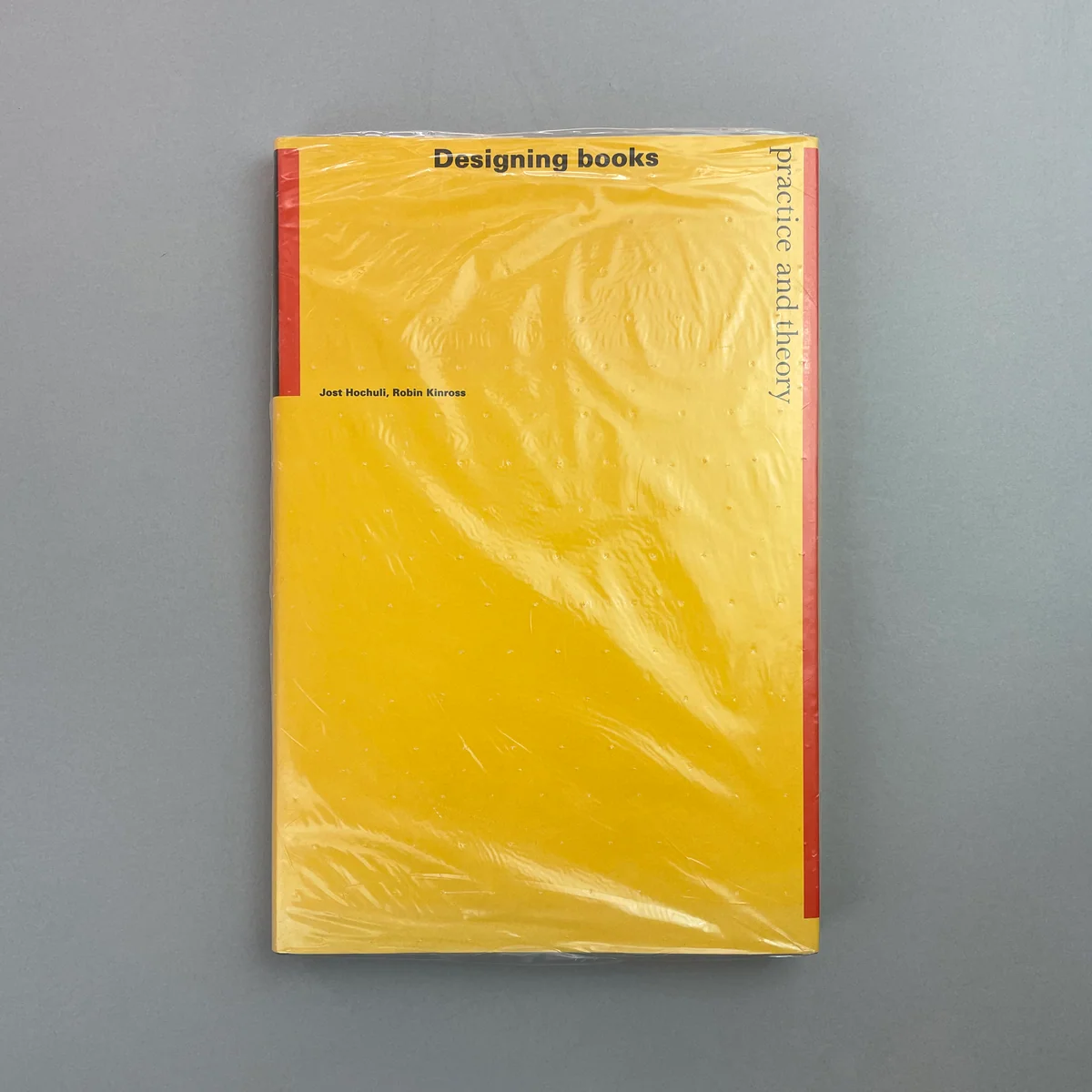
R.I.P. Jost Hochuli, 1933–2026
Swiss designer, typographer, and author of Detail in Typography, Designing Books: Practice and Theory passed away on October 18.
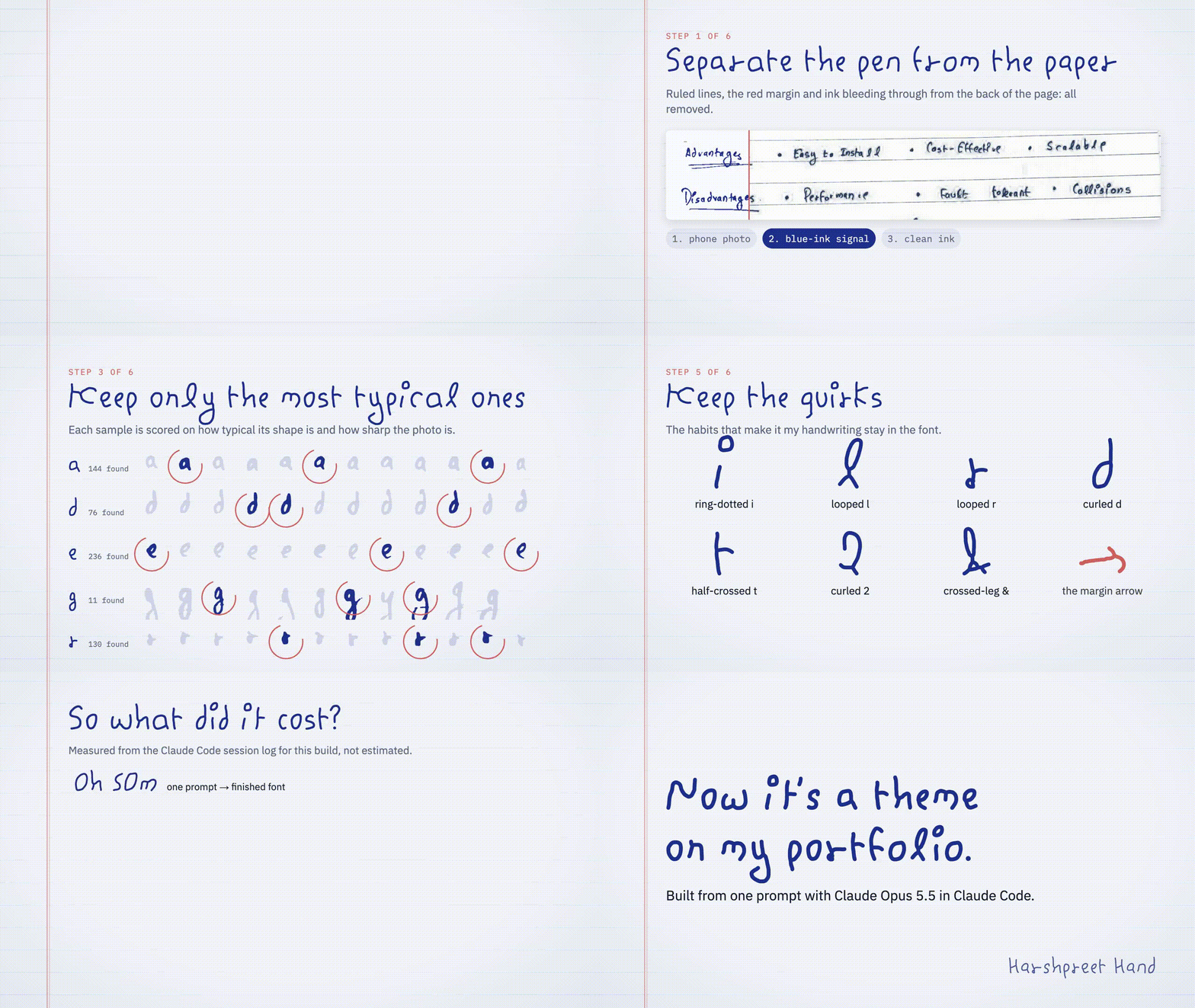
Claude as a type designer
x.com/claudeai/status/2111177838208377213?s=46
The official Claude account on X posted six projects made by AI that caught their attention. One of these is a font based on 120 scanned handwritten pages. We wouldn’t comment on the typeface itself, or the way Claude processes
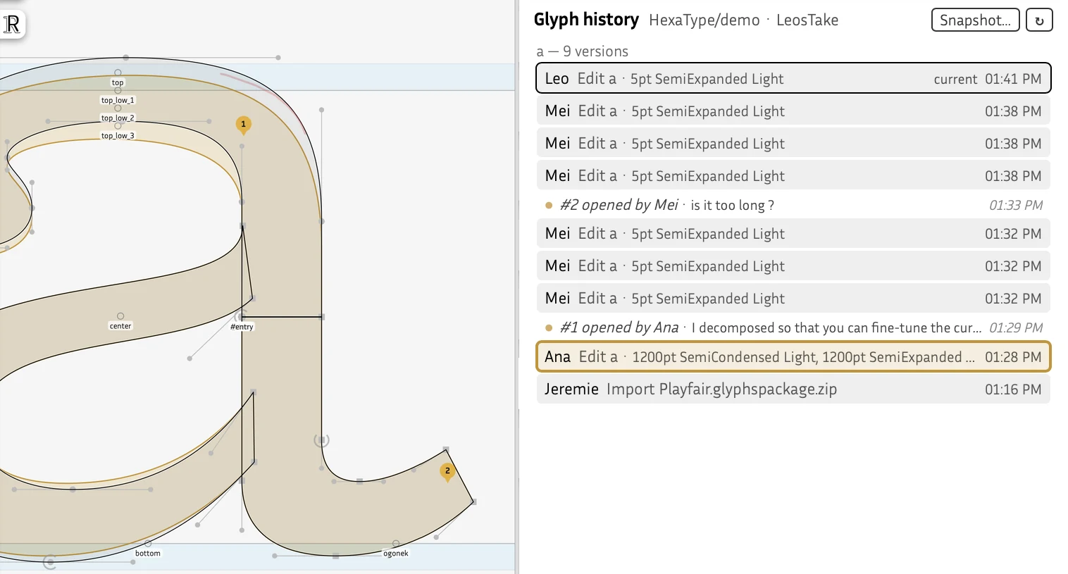
Fontra Hive
Fontra Five, a version of the font editor for collaboration, is out. It runs in your browser and allows multiple users to work on the same font. Fontra Hive is available for free for one project, but you’ll need to buy a subscription to create more than one typeface in a team. It costs €9 per month for an independent designer (working with their clients) and €20 for studios or foundries. Fontra itself is still free, and apparently the tool’s developers intend to keep it like that.
Sh → Ş, Ch → Ç
gazeta.uz/ru/2026/10/21/uzbek-alphabet
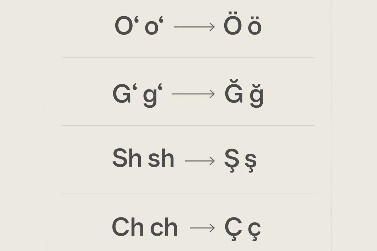
On October 21, the Day of the Uzbek language, the president of Uzbekistan signed a decree on ‘improving the Latin-based alphabet’. Moving forward, the letters Şş and Çç are to be used instead of the digraphs Sh sh and Ch ch, while Oo and Gg featuring the okina will be replaced by Ğğ and Öö. You can find more on the typographic challenges associated with the okina in our piece on writing systems used in this country.
When will you automate kerning (it’s about time)?
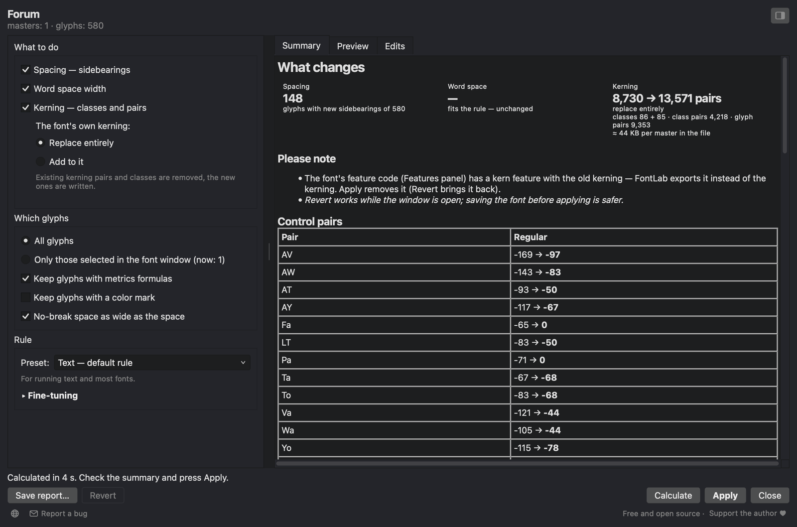
Graphic designer Sasha Pavlenko has written a script for Fontlab, Autokerner. As the name suggests, the tool is meant to automate kerning (and, to some extent, handling sidebearings and word spacing as well). In the comments on TypeDrawers, type designers argue
Granshan Bloom new deadline
granshan.com/insights/a-letter-from-the-president-october-2026
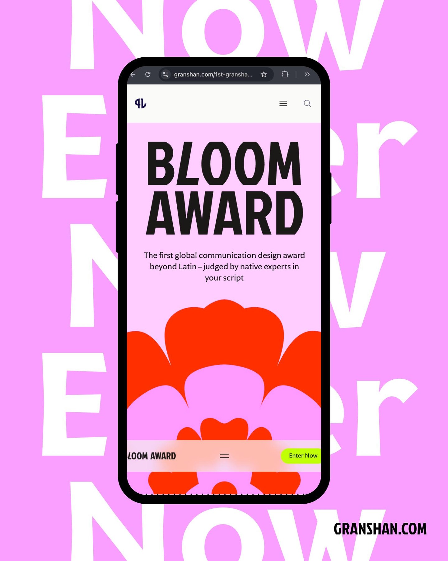
The Granshan Bloom
TDC73
tdc.org/news/global-tdc73-competition-kicks-off
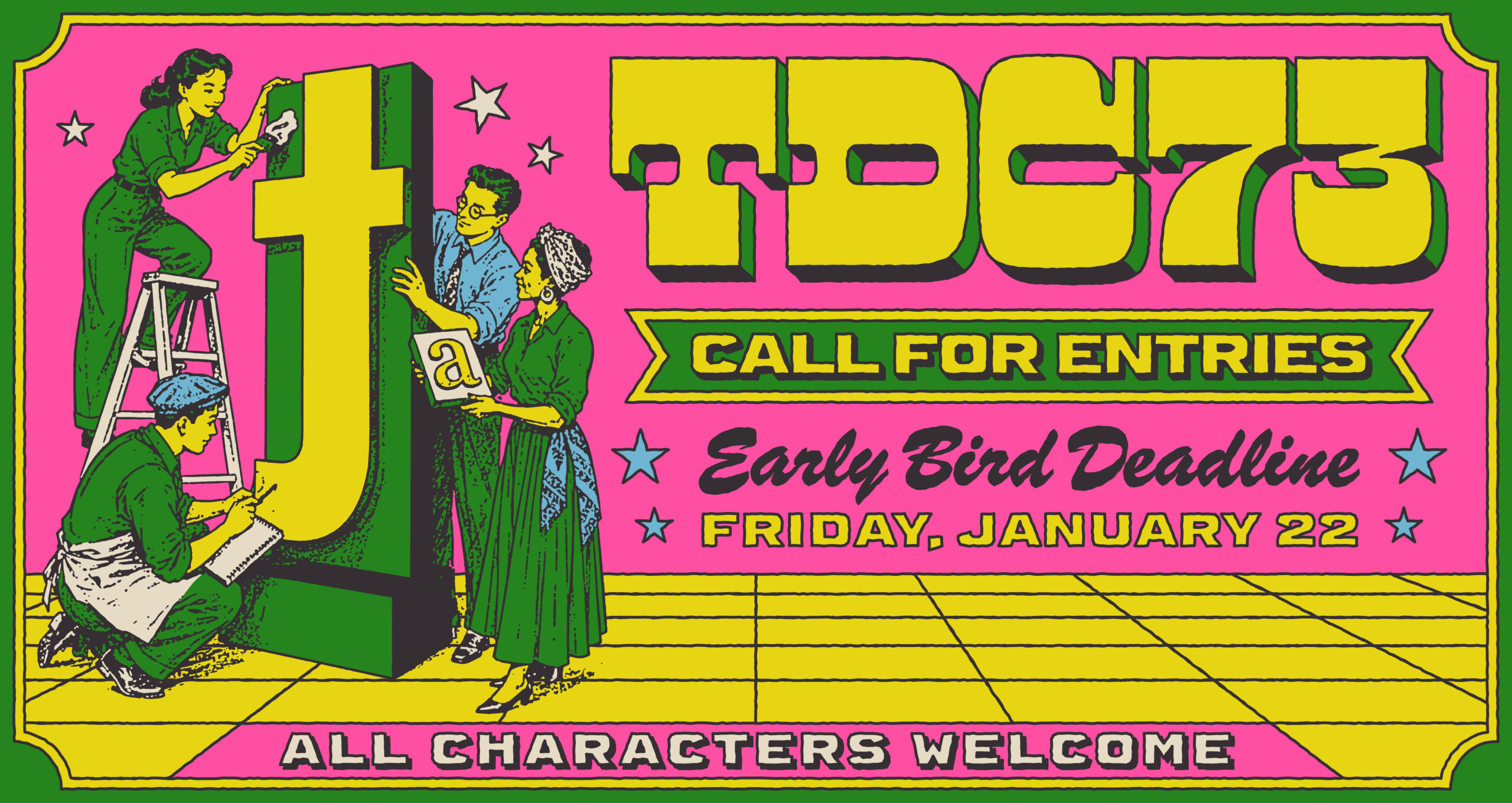
The Type Directors Club competition is on. Entries in one of its
How a font page is actually supposed to look like?
typo.social/@typographica/117508530265383821
Letterform Archive’s curator and co-founder of Fonts In Use Stephen Coles expressed his frustration with the fact that designers now tend to neglect the description of the typeface, often placing it at the very bottom of the
The comments under his post evolved into a broader discussion about the design of a typeface page. Typographers and type designers tried to determine whether a glyph set should be arranged as a table, whether people actually download PDF specimens, and how best to send a message to the audience that a type shop is a place to purchase fonts and not just to look at them.
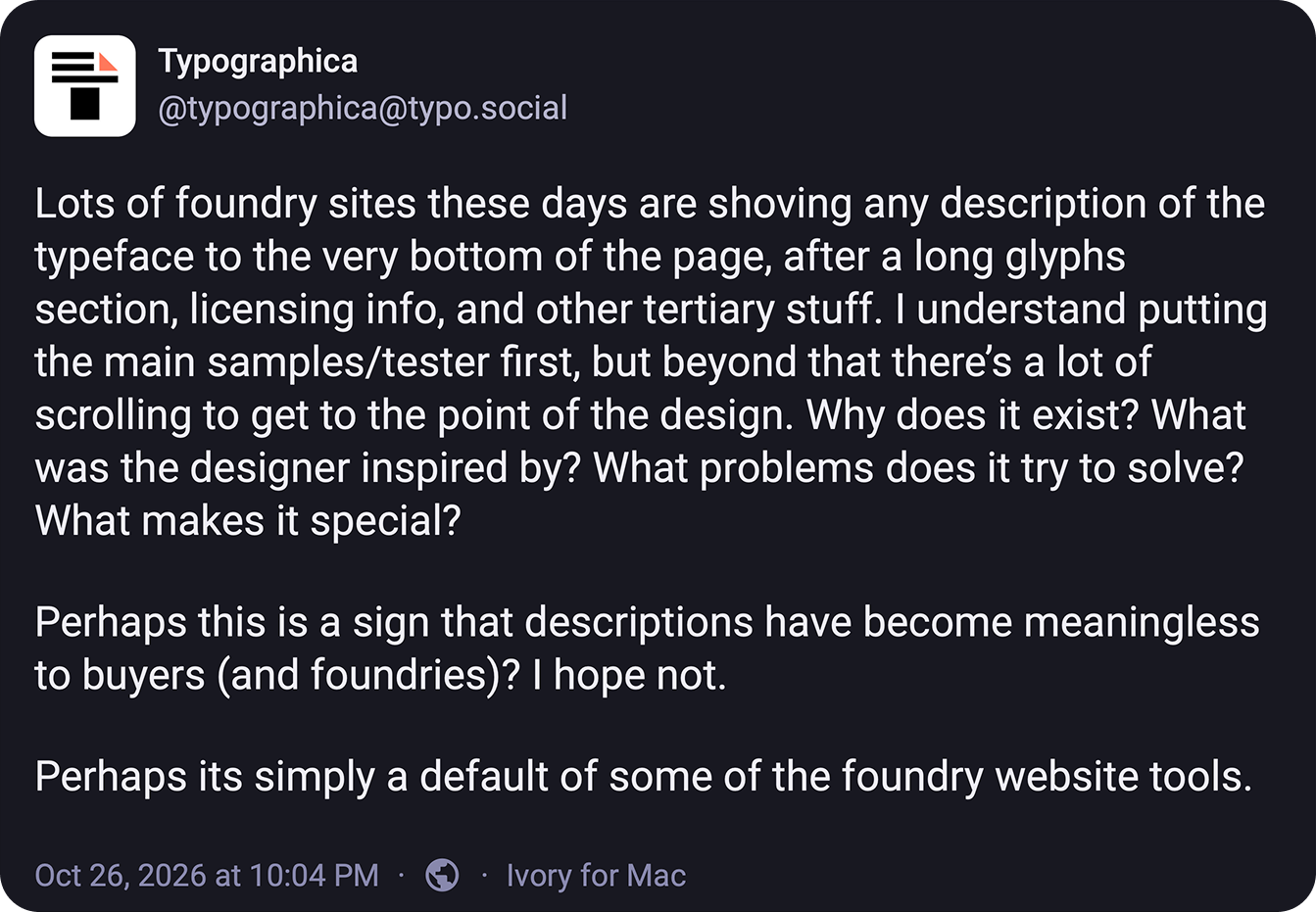
Ukraine’s new official typeface
thebridgemedia.com.ua/en/from-narbut-to-modern-design-ukraine-unveils-national-font-zakon
Zakon, a collection of serif typefaces, has been unveiled in Kyiv. The font will be used across state communications such as official documents and visual branding of government institutions. The collection includes three families: Zakon Text for long documents, Zakon Dekor for certificates of merit and award certificates, and Zakon Letterpress to be used for laws passed by the Verkhovna Rada (Ukraine’s parliament). Each family comes in two
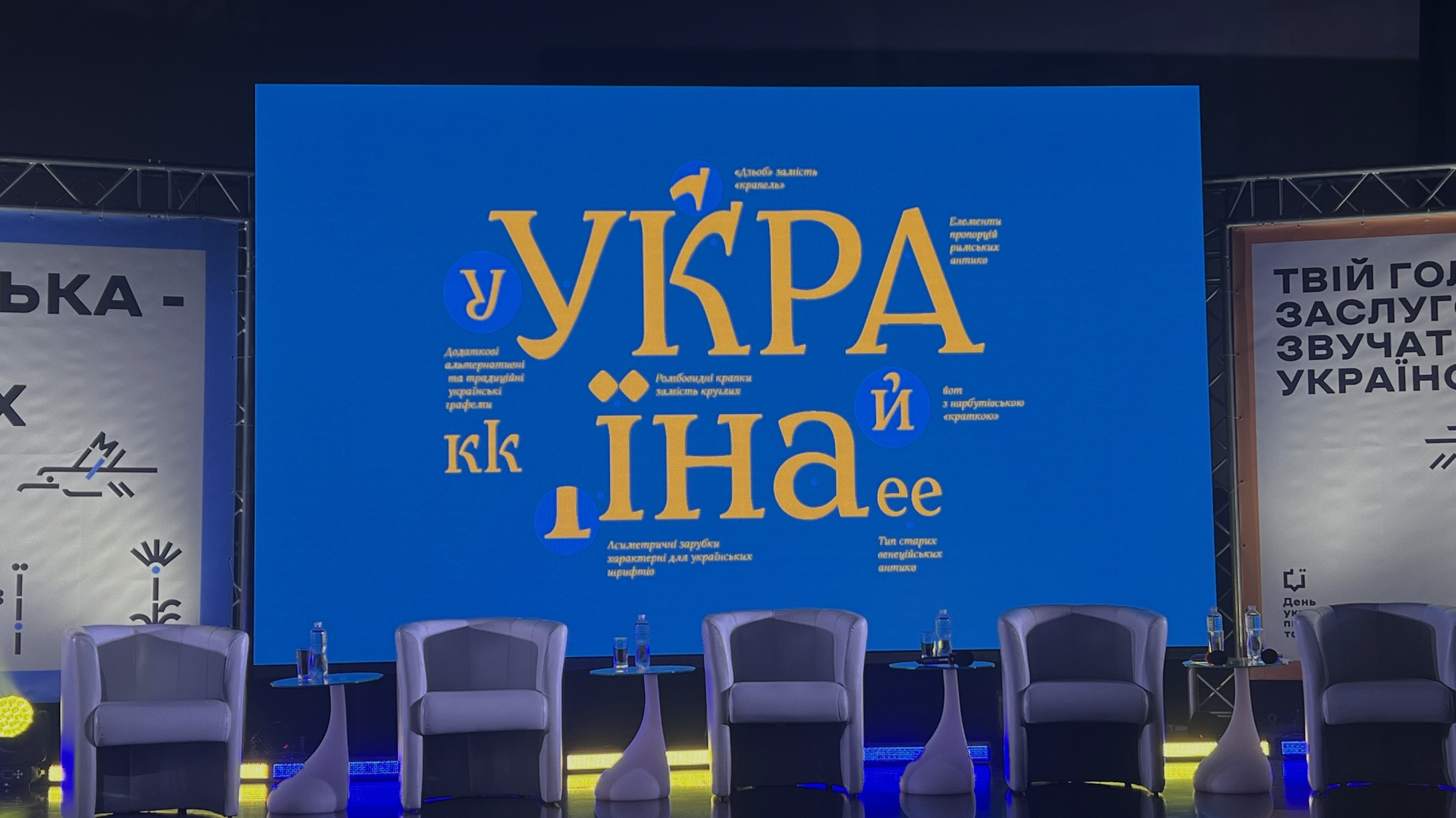
Kent Lew → KL Type
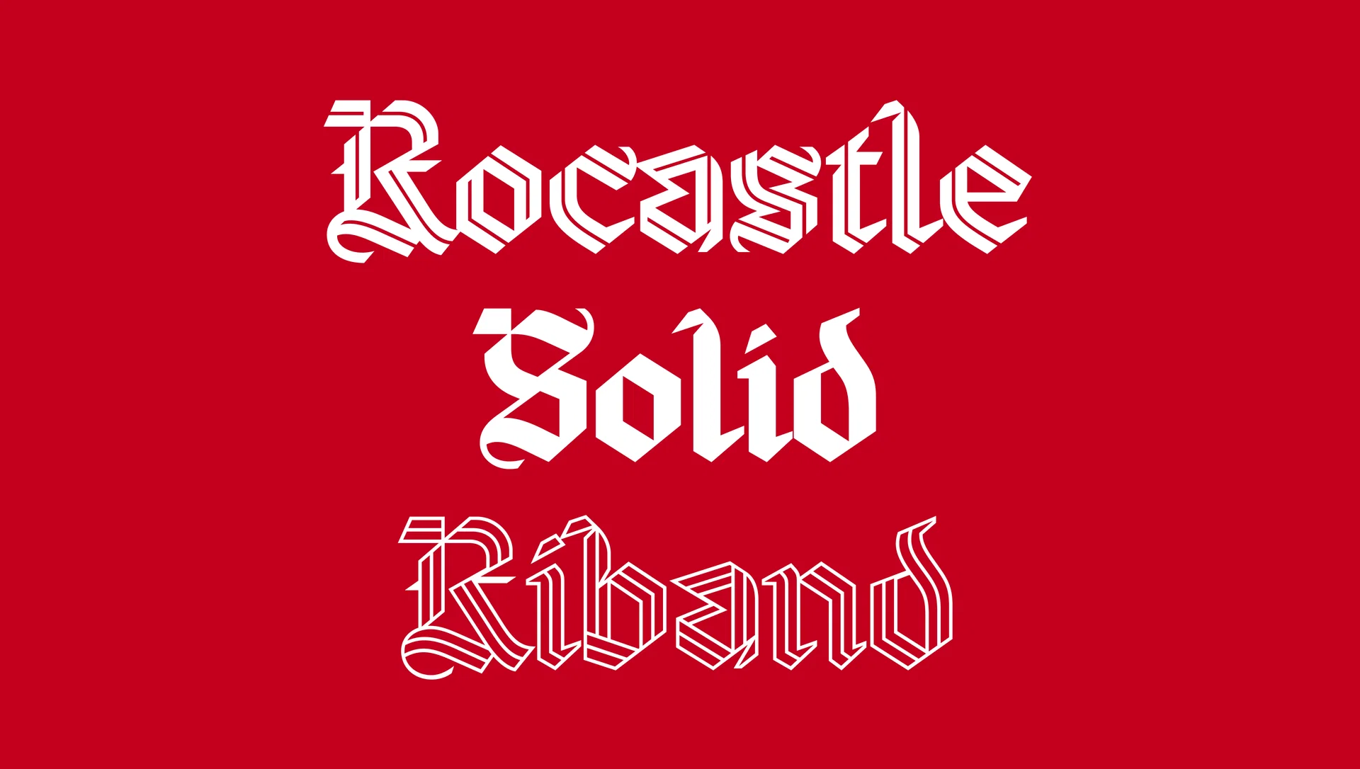
Kent Lew — a type designer who developed typefaces for Time magazine on two occasions, in 2015 and
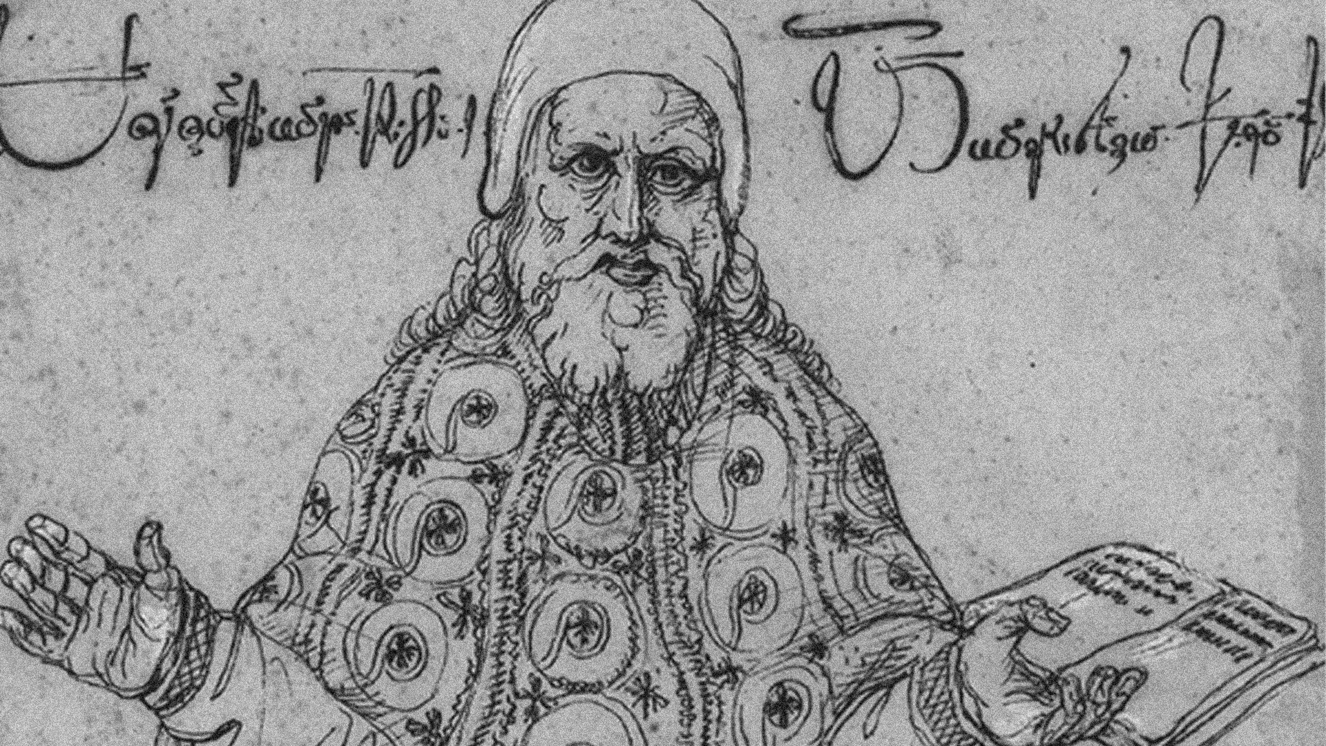
Doug Wilson published a piece about how he contributed to the foundry launch as a type consultant.
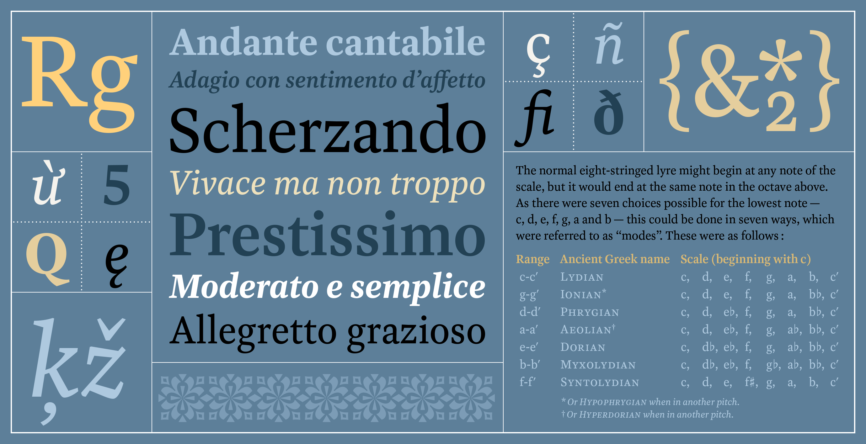 Haffner Text
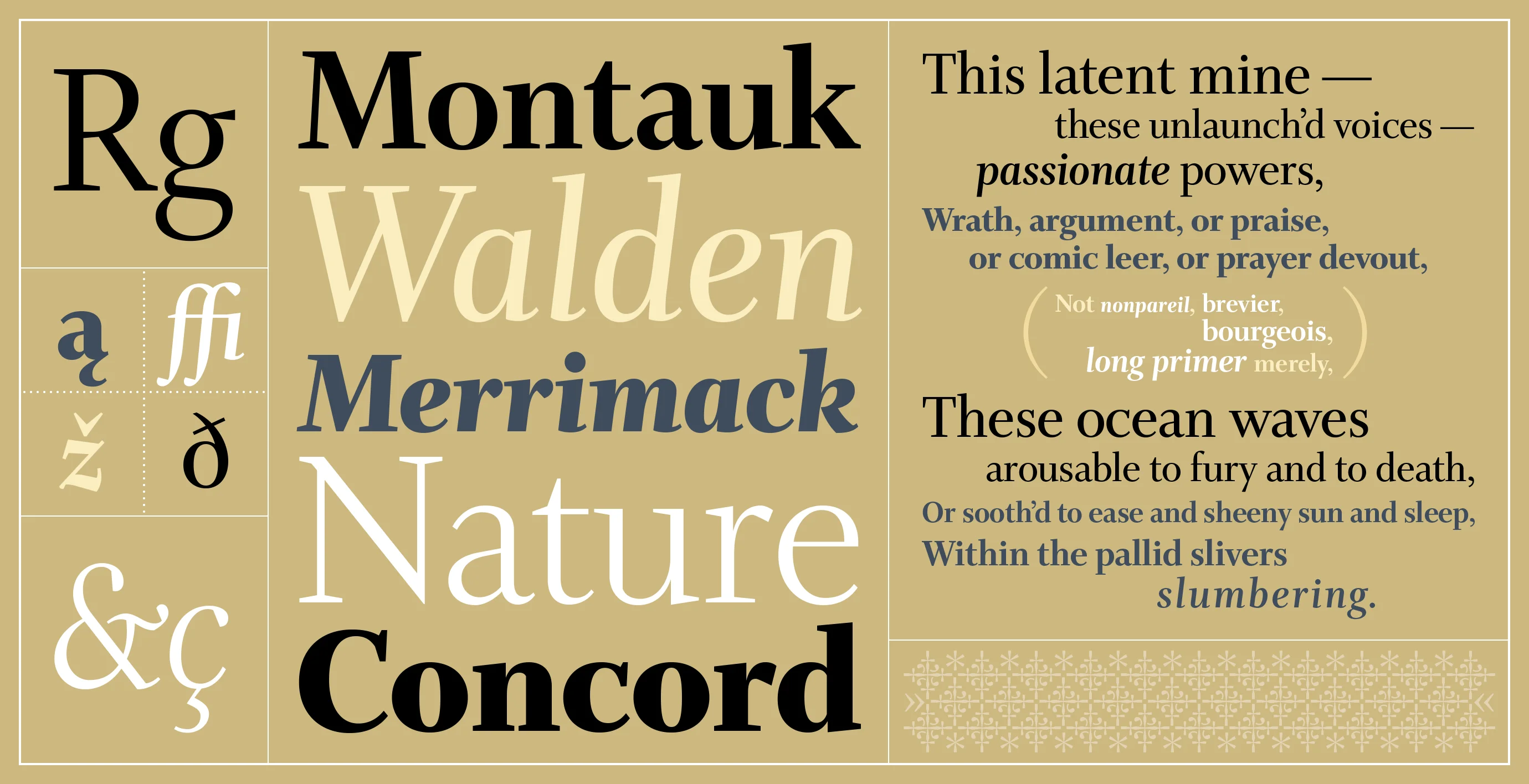 Whitman Display
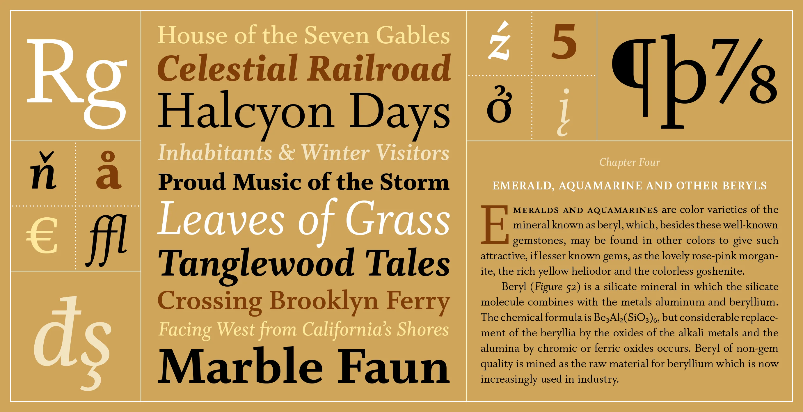 Whitman Text
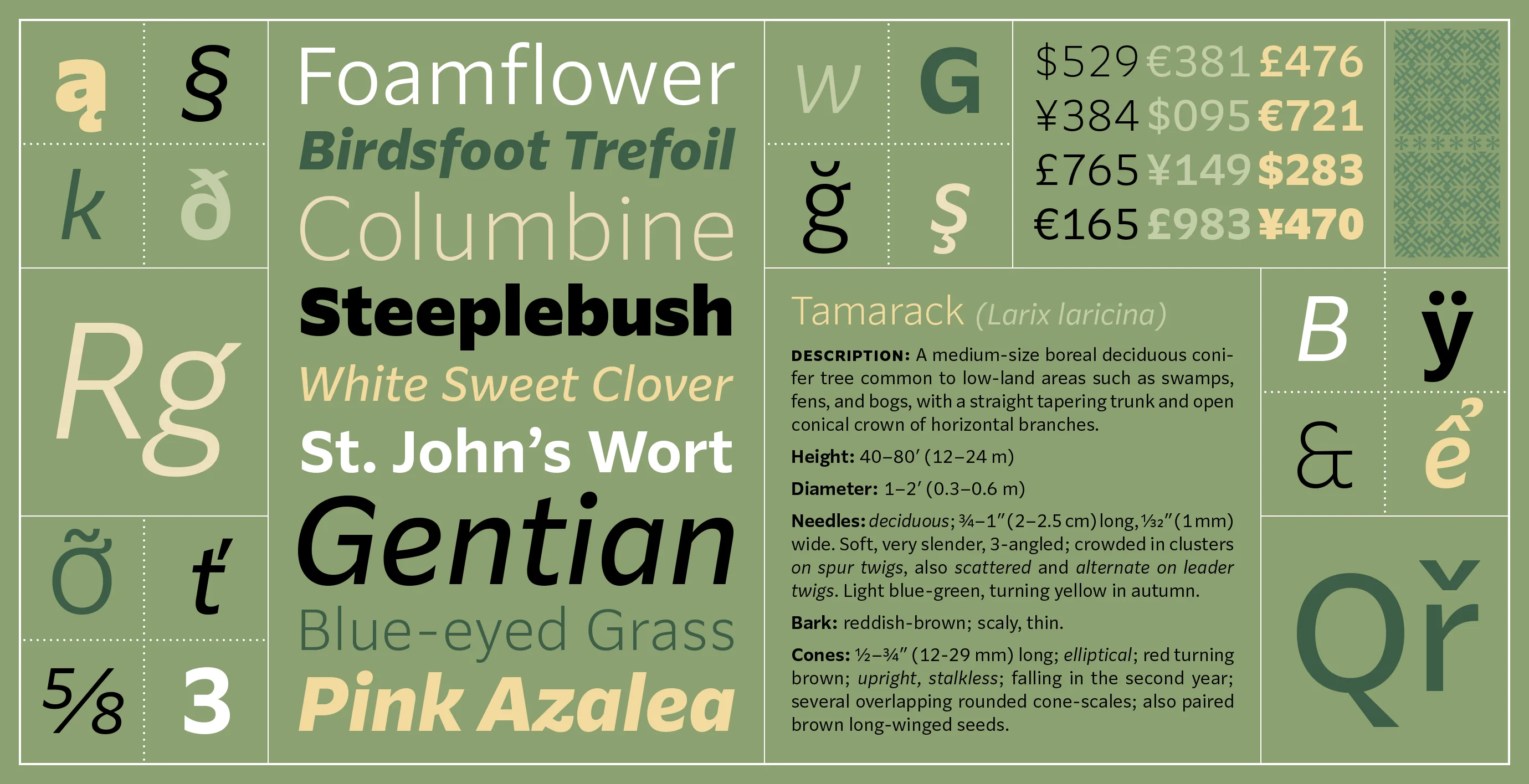 Parling
Justification is a spectrum
typo.social/@klim/117514663121038268
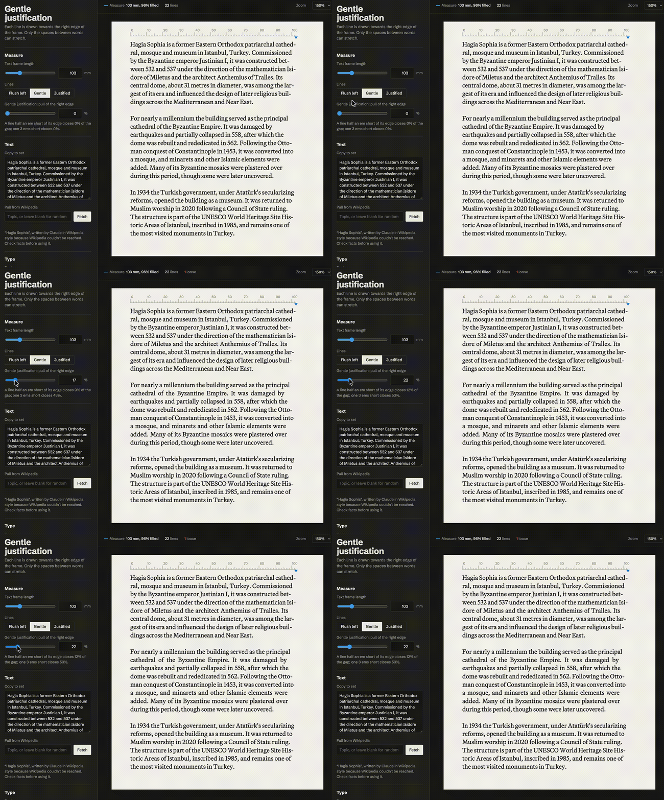
Type designer and founder of Klim Type Foundry Chris Sowersby came to realise that text justification is a spectrum and developed a tool for ‘gentle justification’ through controlling word spacing. Many commented by sharing their justification-related research and experiments.
October on type.today
In October, we released a new episode of our Cyrillics on Google Fonts series and announced the results of an open call featuring the Crimp typeface developed by Font Club Belgica.
We also owe you an apology. The exhibition dedicated to the first Georgian metal typeface, which we invited you to attend on 10 November, has been postponed. However, on that day, we will still be presenting Niceforo, a contemporary reinterpretation of the first Georgian typeface, along with a book documenting the nearly two years of preparatory research behind it. The presentation will take place at the studio of our colleagues at Production Type, who have generously agreed to help us by hosting the event. You can register to attend via the link.