Adelina Shaidullina: You are a type designer and
Morgane Vantorre: I can’t choose one because they are very much linked, but I consider myself first a type designer and then a calligrapher. Calligraphy is a tool for me in my type design work, so it’s both,
AS: What’s your favourite calligraphy project you’ve done?
MV: I have one in mind, it’s for a luxury brand, and I signed an NDA. Friends do sometimes ask me for calligraphy for their wedding or other important occasions. Otherwise, I never miss an opportunity to create calligraphic cards, for example, for my loved ones’ birthdays. I really enjoy
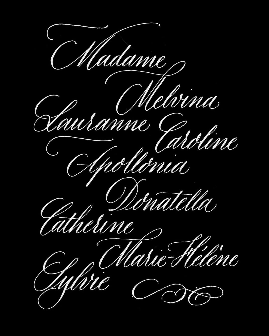
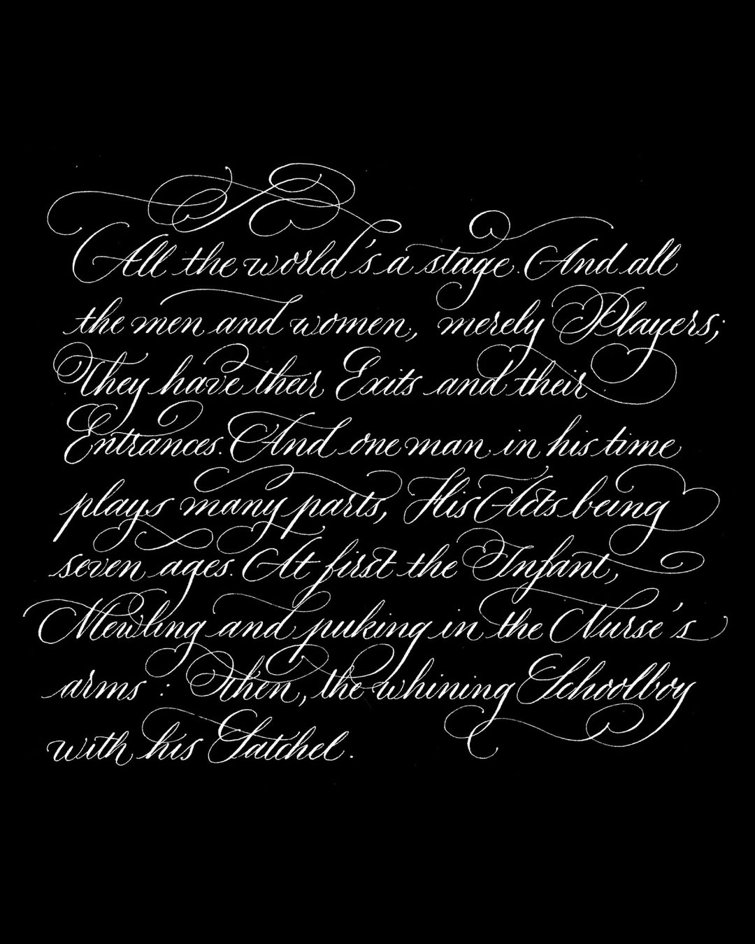
Calligraphy by Morgane Vantorre
AS: Is it harder working with clients who come to you for type design, or with those who come for calligraphy?
MV: I would say it’s harder to work with people who commission a type design project. With calligraphy, clients usually don’t ask for anything very
AS: How did you come up with the idea of involving your mother in your projects?
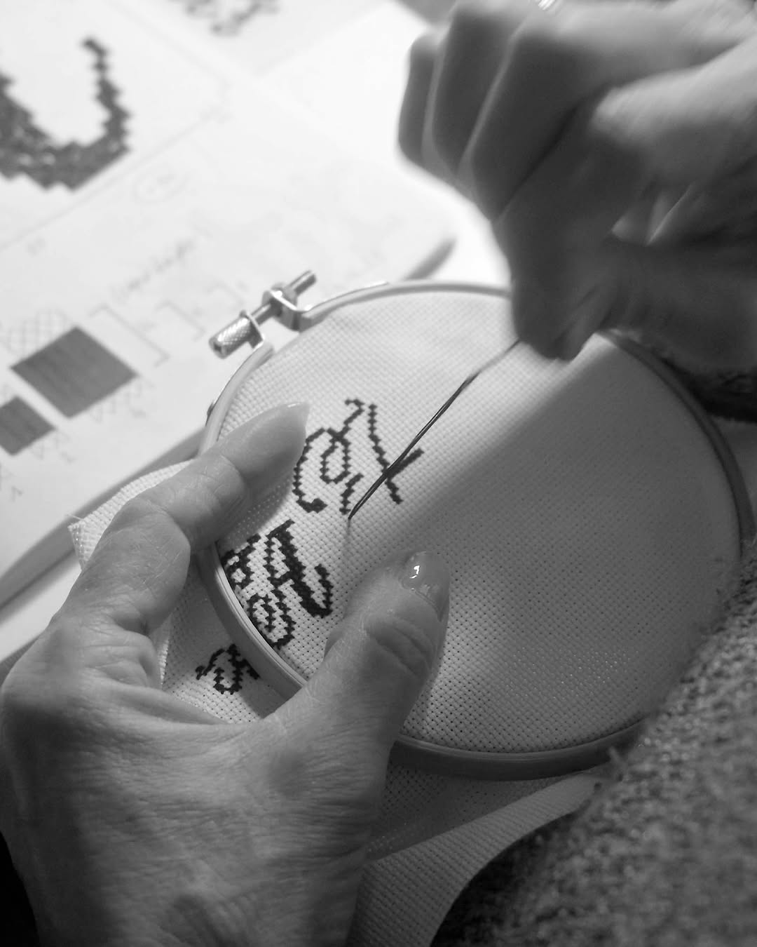
MV: My mother, Maryline Foucault, has always been a craftsperson. She has made many things by hand, such as miniatures out of Fimo clay or scrapbooking before. She started embroidering during COVID. It felt like meditation for her. And embroidery is not just about
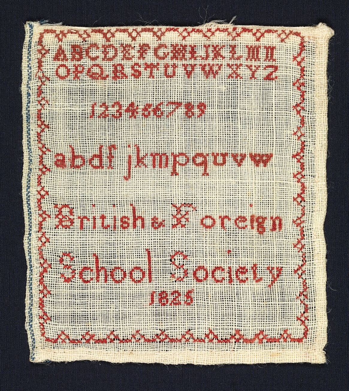 Embroidery made at the British and Foreign School Society, 1825. Image: Metropolitan Museum of Art
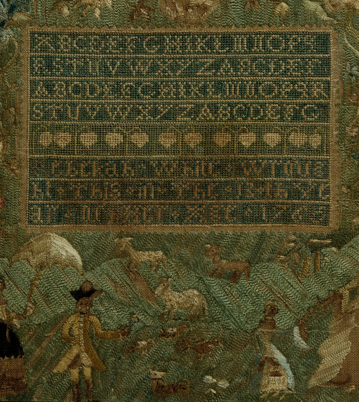 Embroidery by Mary Austin, 1784. Image: Metropolitan Museum of Art
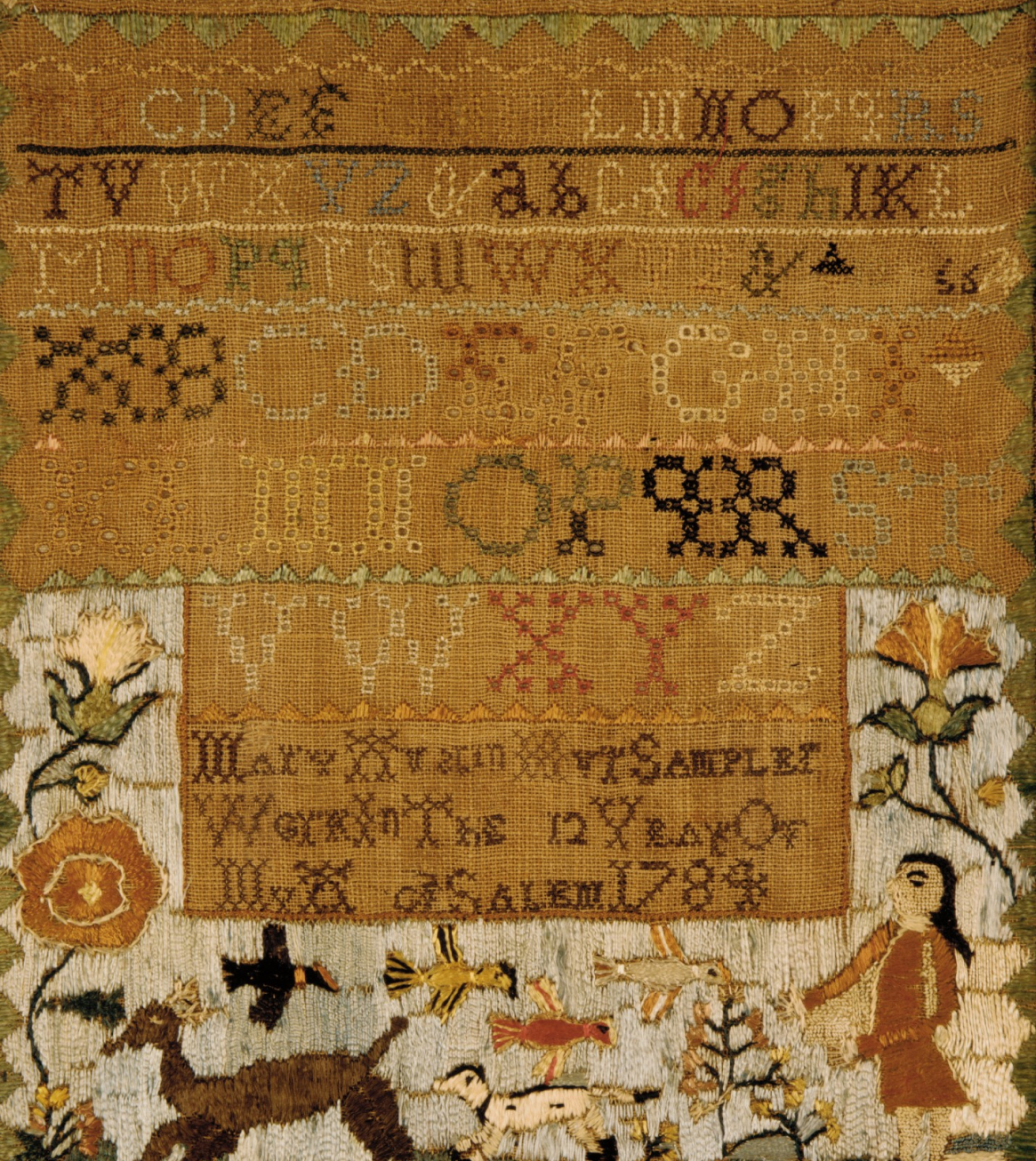 Embroidery by Rebekah White, 1766. Image: Metropolitan Museum of Art
AS: Is it hard for you, as a perfectionist, to work with embroidery, since it can’t be edited once it’s finished?
MV: No, since I’m not the one doing the embroidery. But my mother usually gets quite upset when she realises she has missed a stitch. She then has to remove the thread and redo it. It’s tricky.
For me, though, designing for embroidery purposes feels almost like
AS: Did you teach your mother the basics of type design?
MV: Not directly, but it’s been five or six years now that we’ve been collaborating. She is sharpening her eye more and more. She can sometimes recognise when kerning
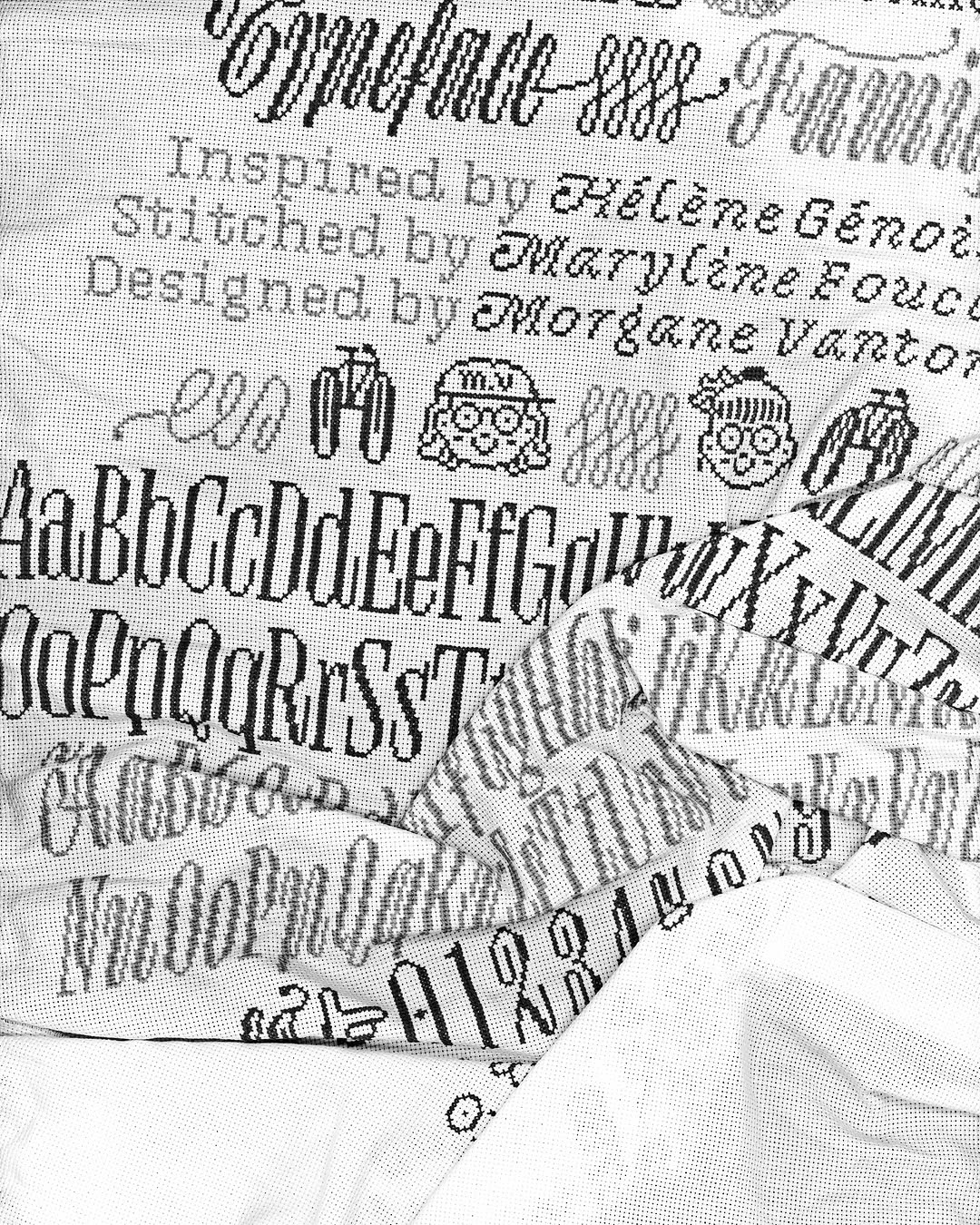
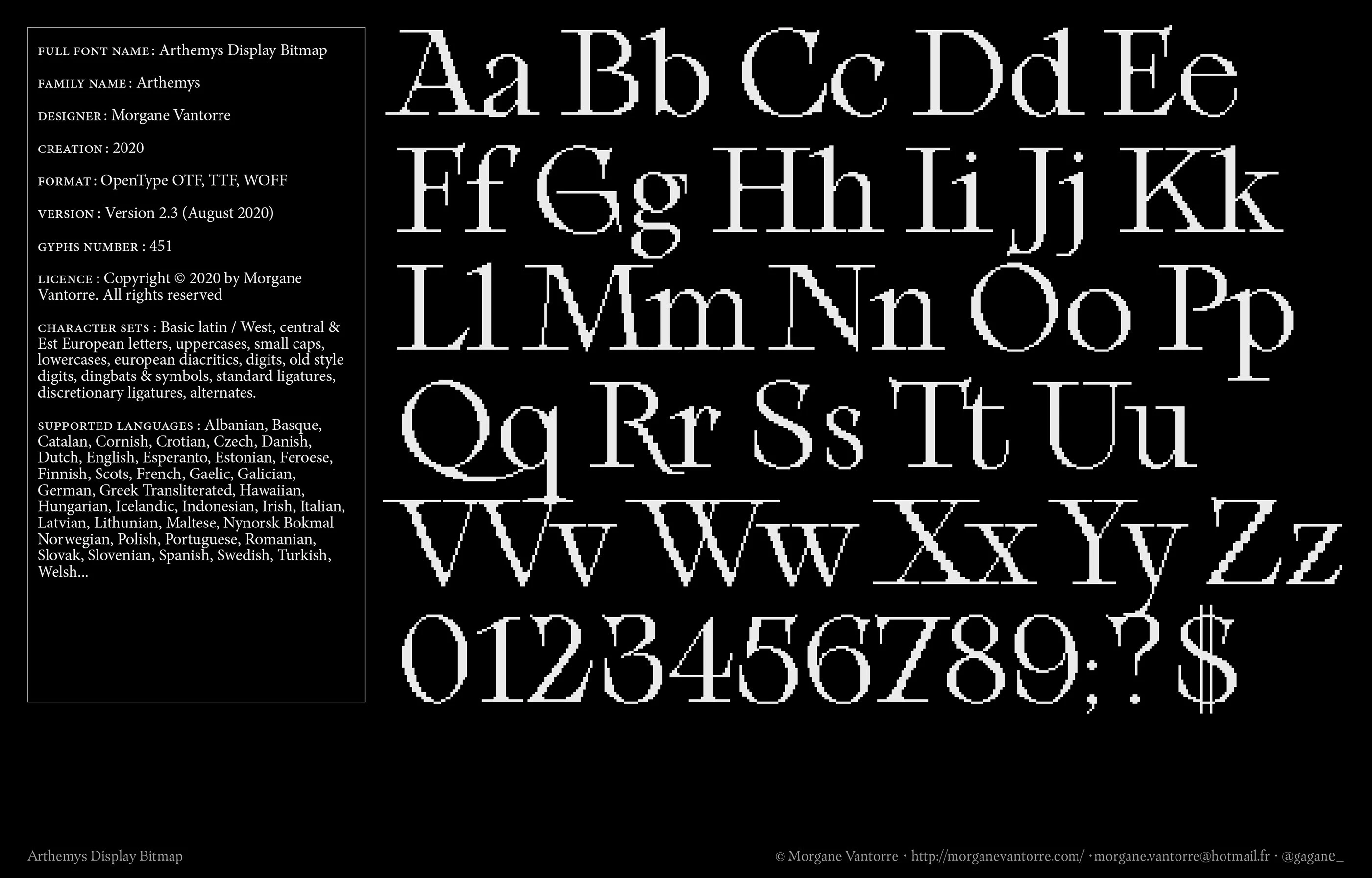
For TypeMedia, I designed a full typeface intended for both pixel and embroidery use, and she would sometimes send me feedback on my designs.
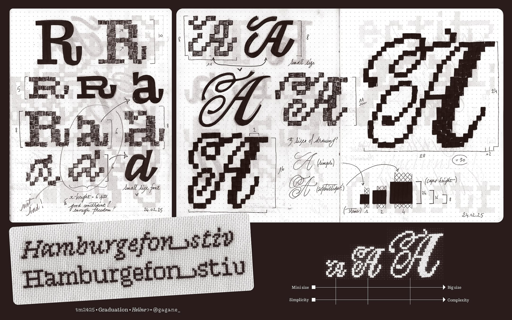
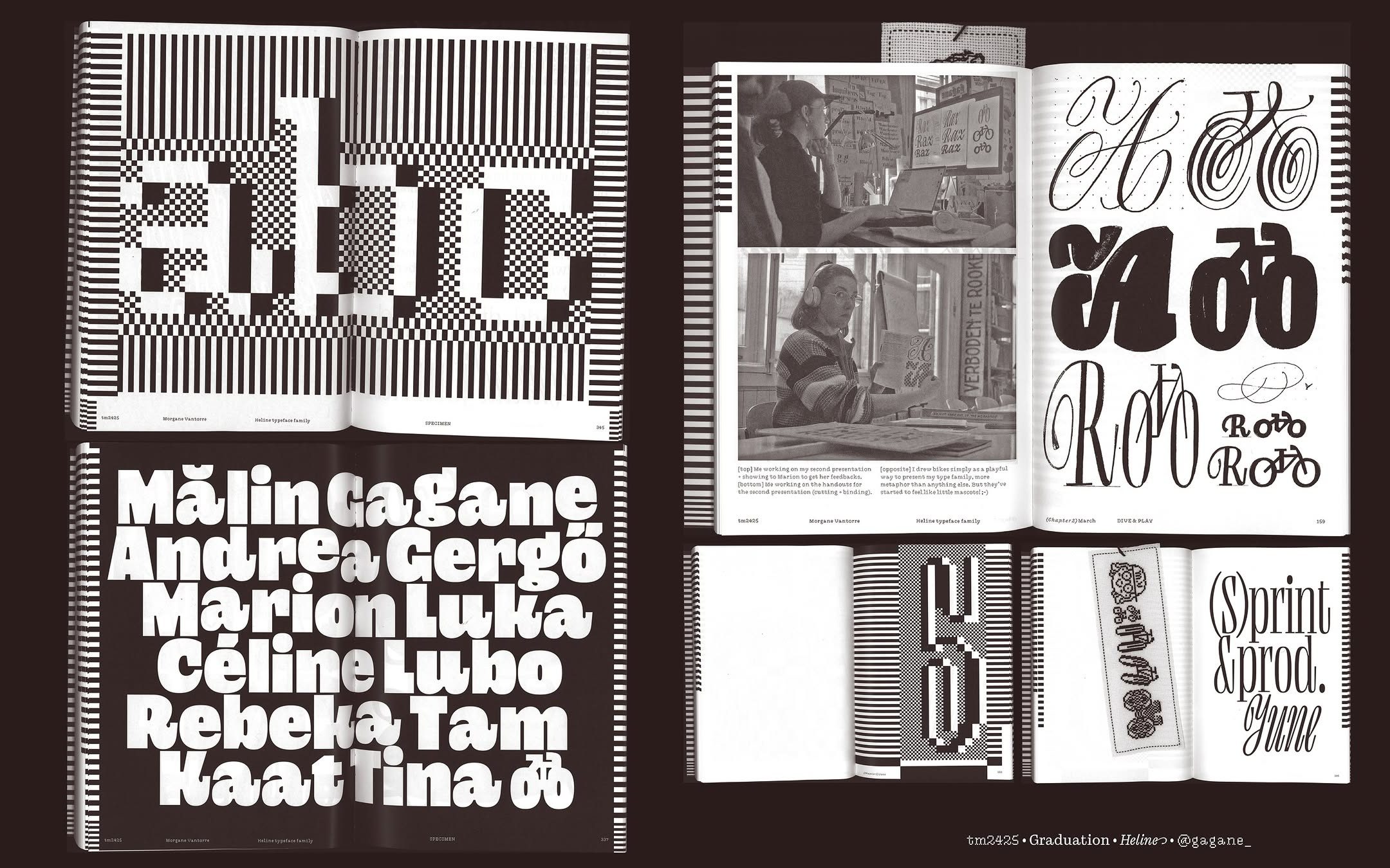
Heline (Morgane’s TypeMedia graduation project) process journal
AS: Isn’t it hard to work with your mother on commercial projects?
MV: Not at all. The hardest part is estimating the time, because it takes a lot of it and can’t be done to a very tight deadline.
For instance, we did a very large project last year. It was when I was in the Hague at TypeMedia, so we did it together remotely. Hyundai department store in Seoul asked us to create three different embroidered compositions in one month. I had to design them before passing them on to my mother, and she put a lot of time into it. By the end, her eyes were all
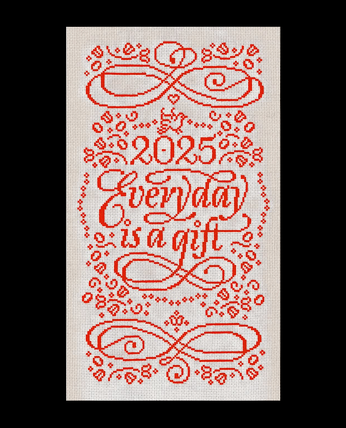
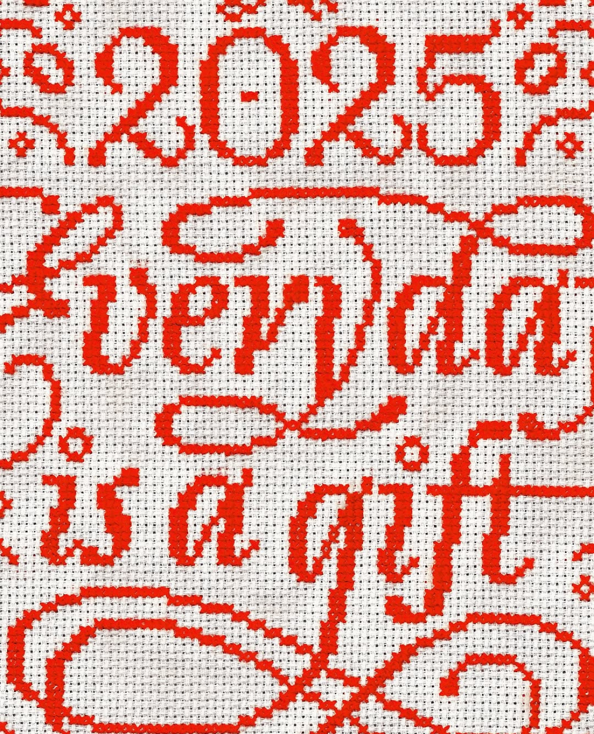
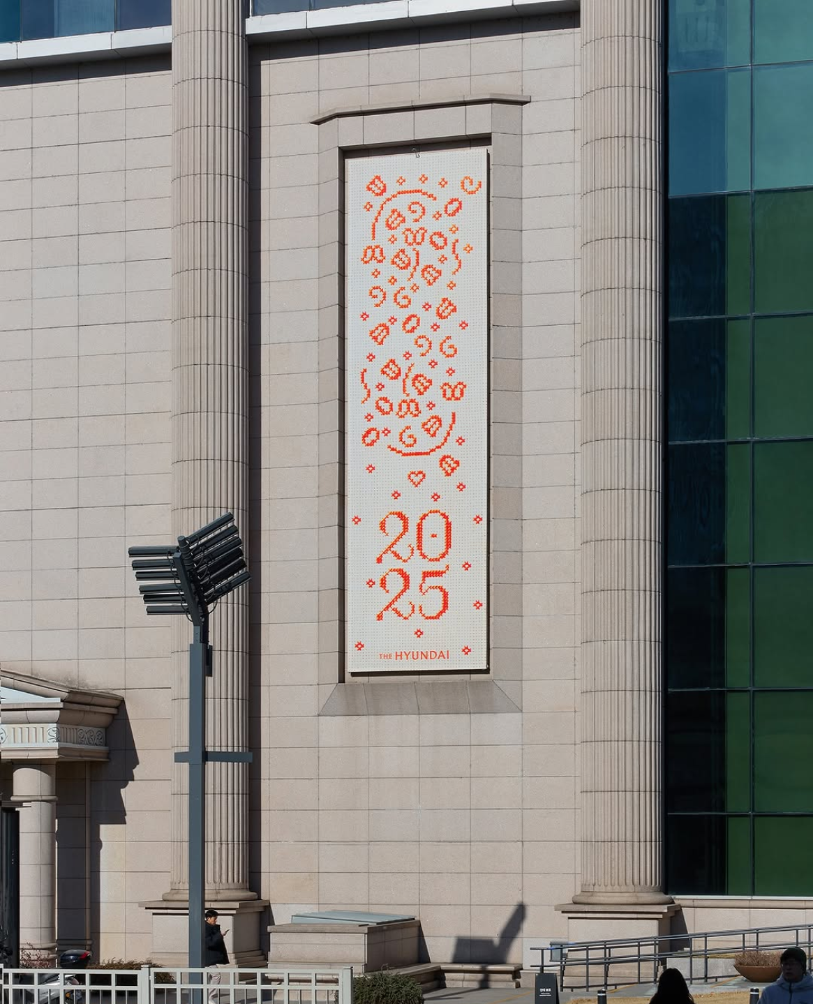
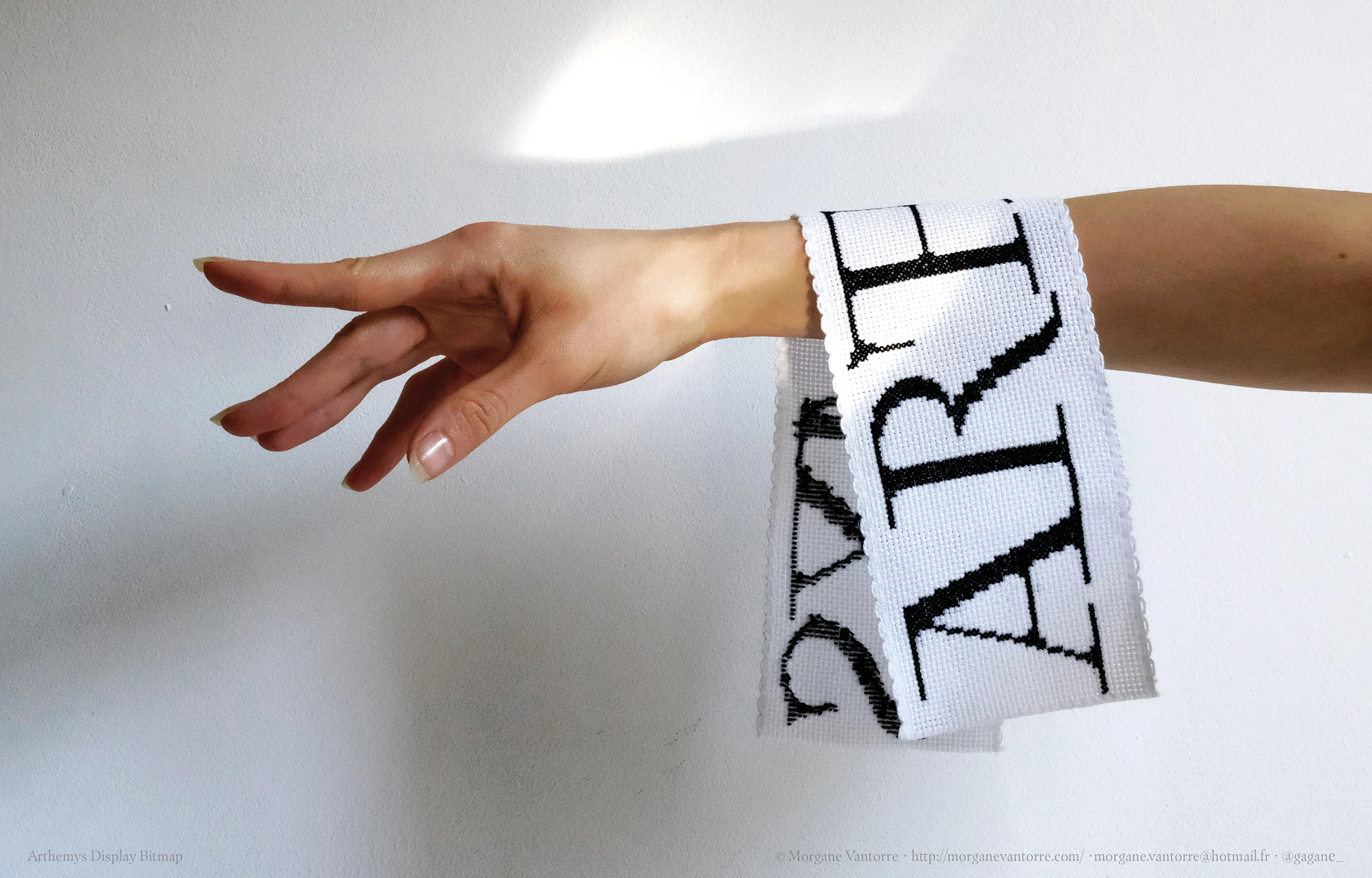
‘Everyday is a gift’ Hyundai campaign. Typeface, graphic artwork: Morgane Vantorre. Embroidery: Maryline Foucault
AS: How long does it normally take to embroider a phrase like that without harming one’s eyes?
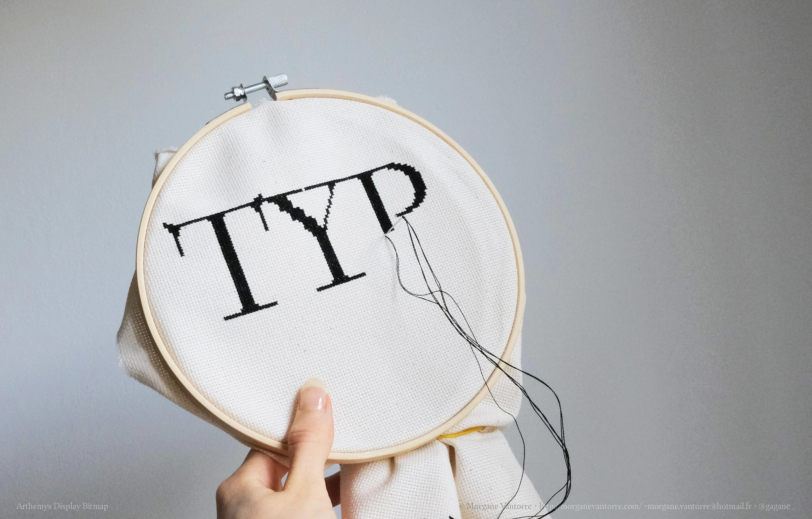
MV: I only have one example where I know the exact timing. The poster my mum embroidered for my diploma project took her 100 hours and 1 minute to finish. I also filmed her and made a short documentary about it.
By the way, I was filming everything throughout my year at Type and Media, from beginning to end. I have a lot of footage, and I want to sort through it all and turn it into
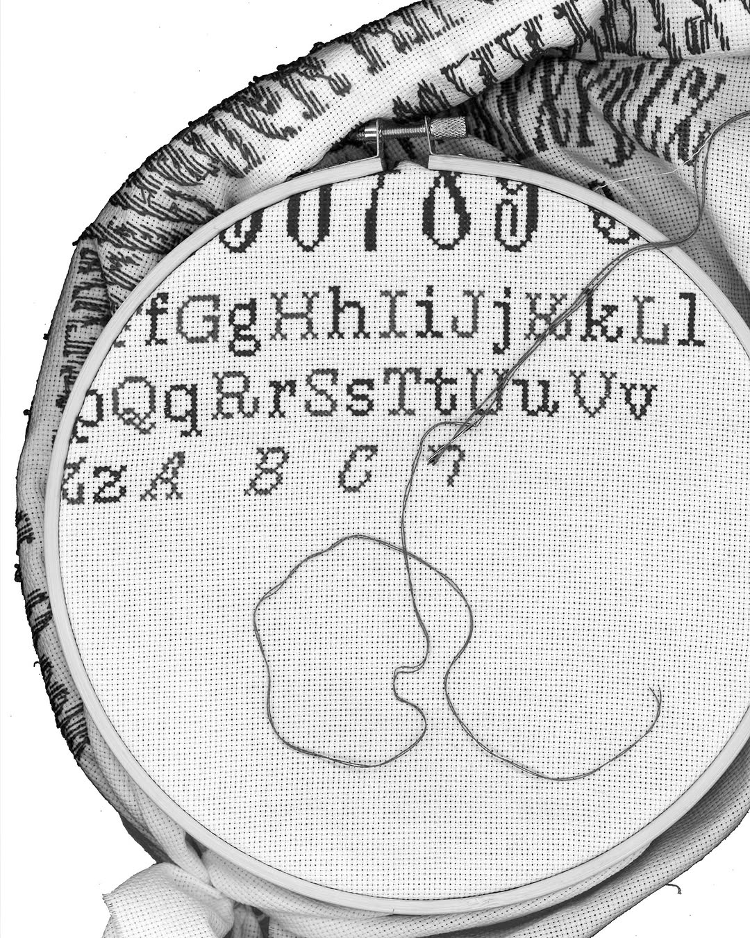
Heline embroidered poster (process)
AS: From year to year, the requirements for the level of final presentations at TypeMedia are getting higher, and so is the pressure on incoming students. What do you think about it?
MV: We are not required to do this much! We are just perfectionists who want to innovate. We have just one year to do what we want without commercial pressure. And KABK is a great school because you have a lot of workshops where you can try a lot of things. It’s also completely normal to be inspired by what the year before you did.
Besides that, our generation really wants to go beyond screens and do something with their
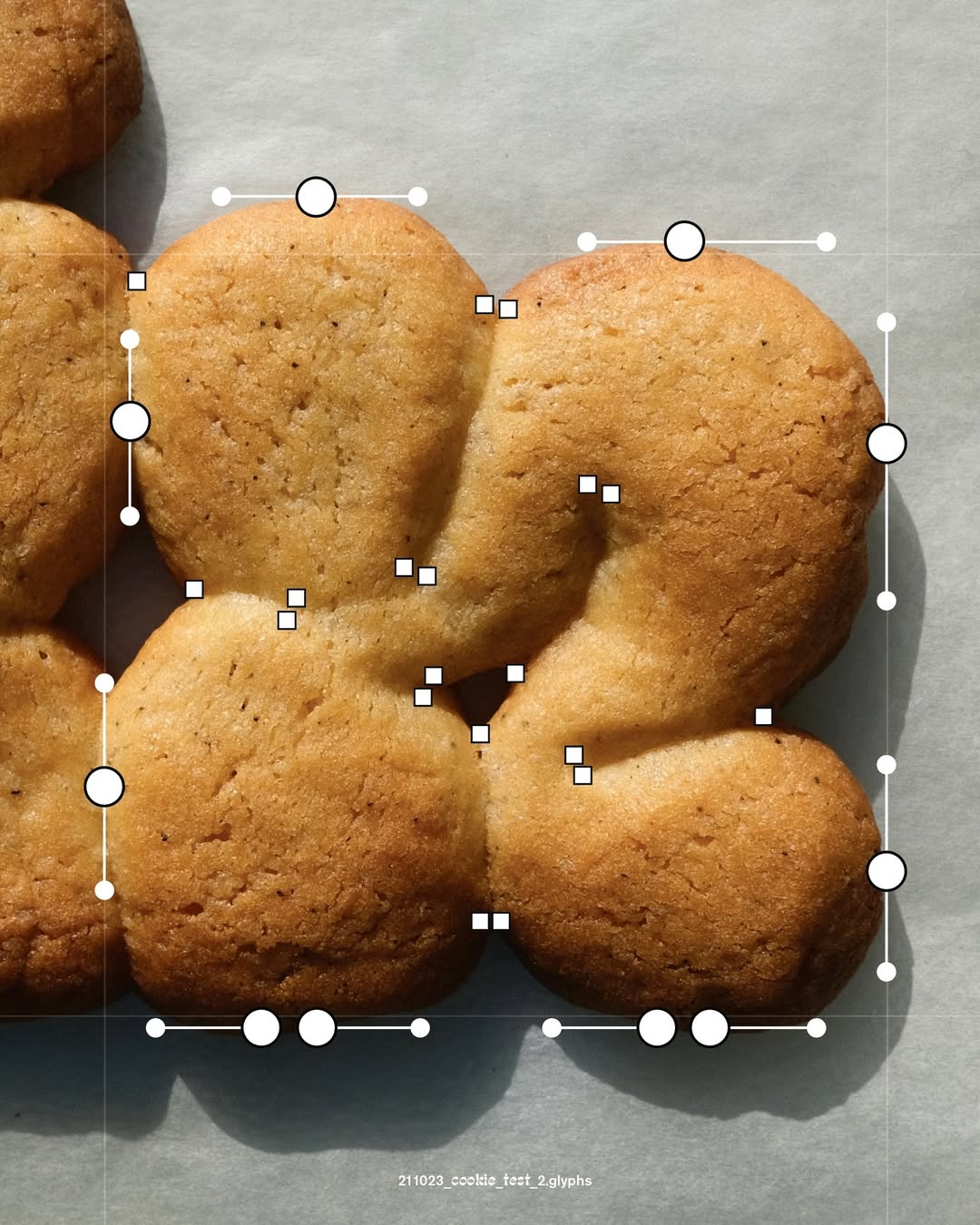
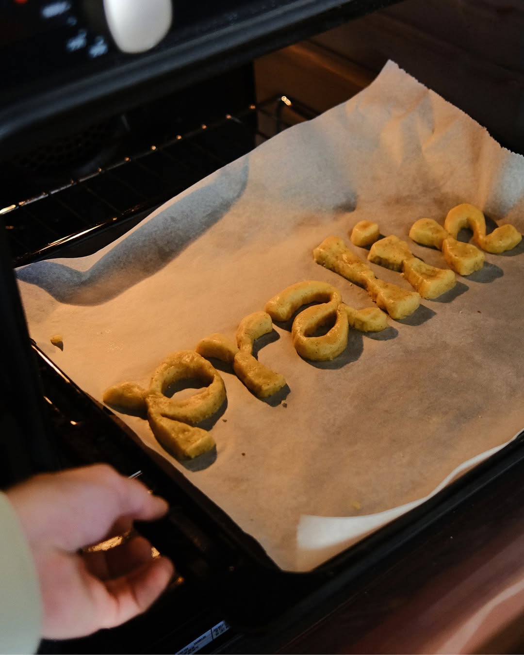
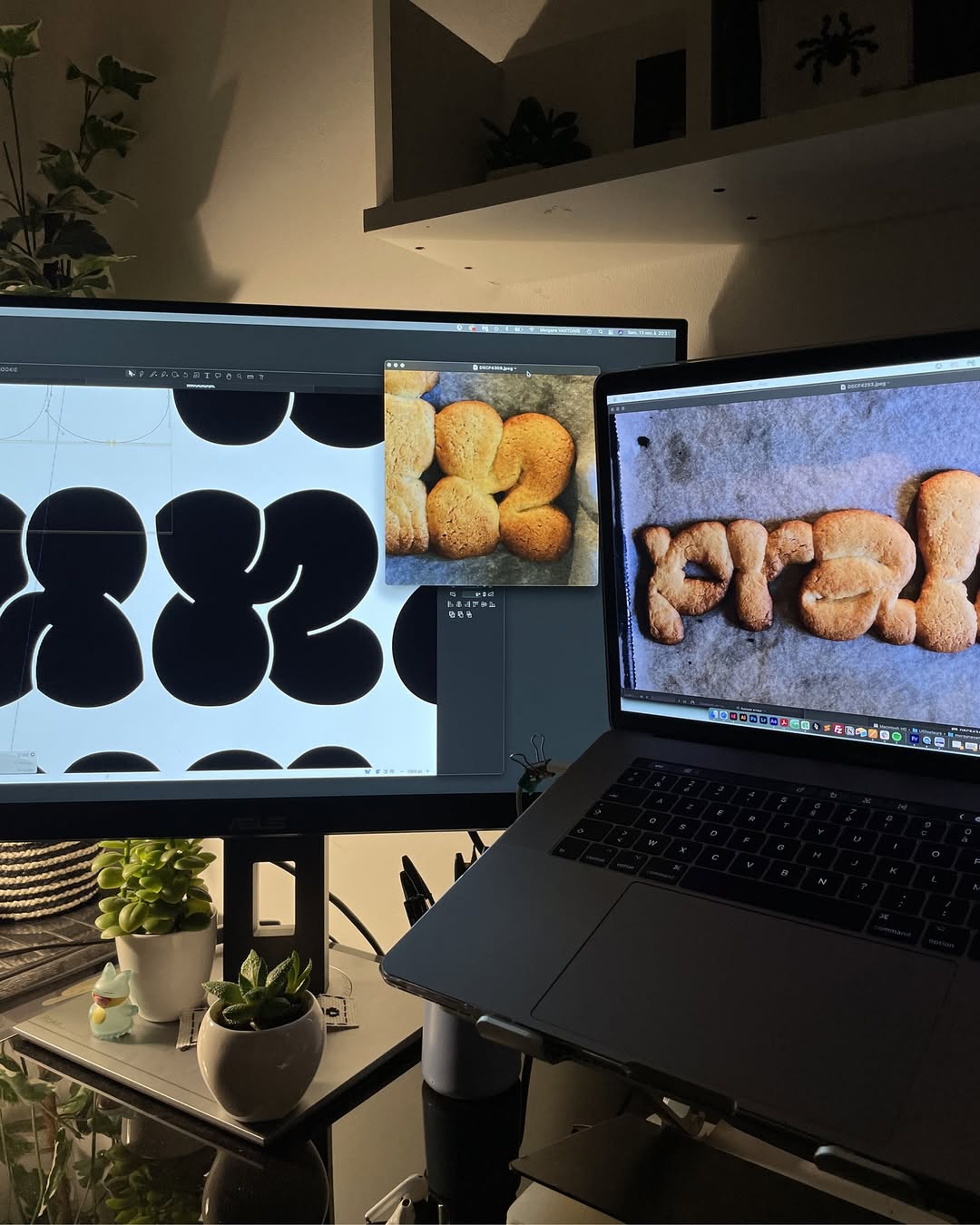
Type made with cookie dough
AS: So you believe analogue practices are essential for type designers?
MV: I don’t think every type designer needs to do stone carving for instance, or be excellent calligraphers. but I do think it’s important to understand how
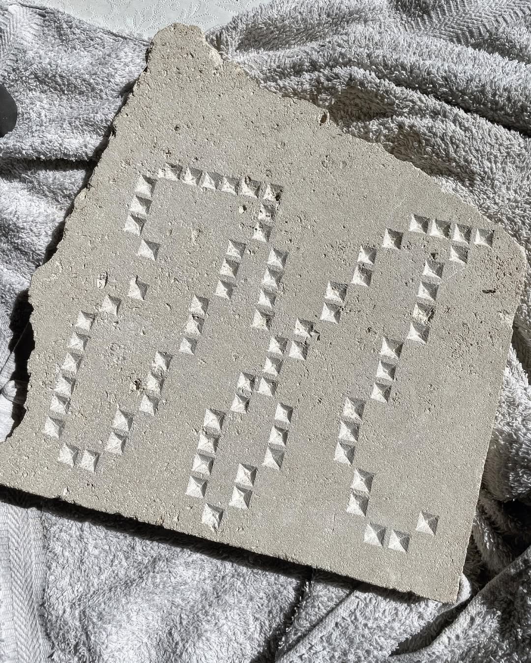
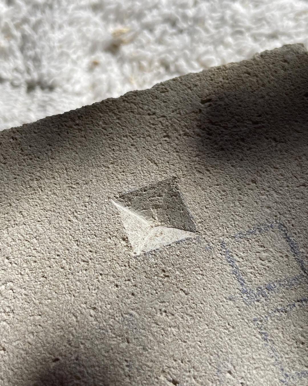
Pixels carved in stone by Morgane Vantorre
AS: What’s your approach to social media? Your posts look very planned and carefully prepared.
MV: I’m quieter on social media now than I used to be, because I don’t have the time and I no longer pay the same attention to it. I do enjoy sharing things, but I never post
AS: You designed the typeface for Notre-Dame, which is such a significant landmark. How does it feel knowing that tourists from all over the world queue there every day?
MV: I still don’t quite know how I feel. Paradoxically, I’ve never visited Notre-Dame since the
AS: As for the research, did the Notre Dame team show you any references? What was the brief?
MV: When I arrived, they already had some shapes, and I started from there. It was supposed to be a very quick project, but it ended up taking two or three years, so I had time to go back and
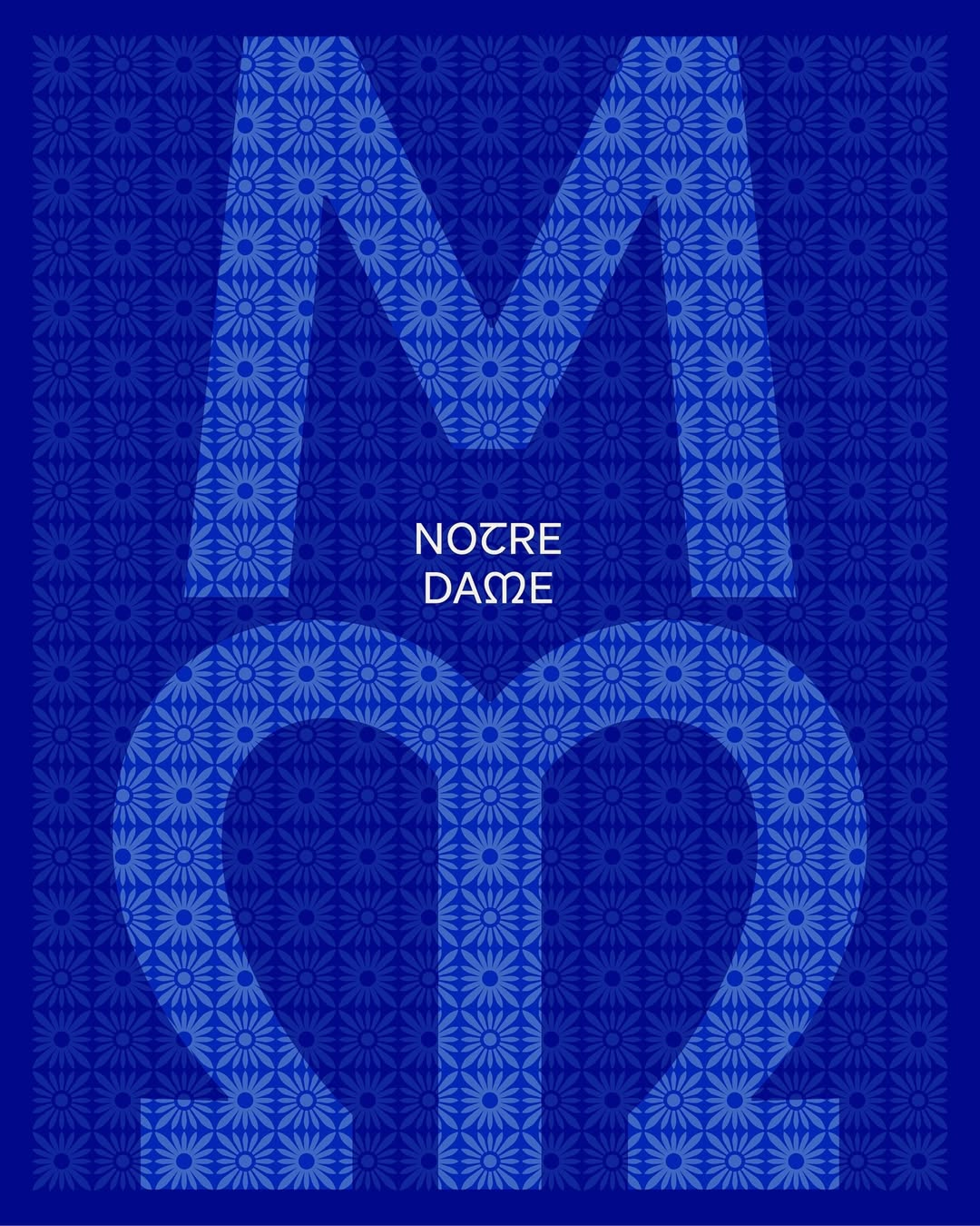
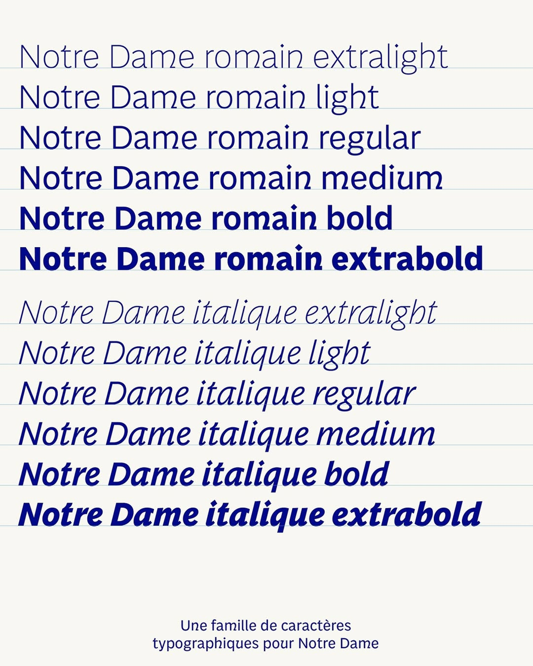
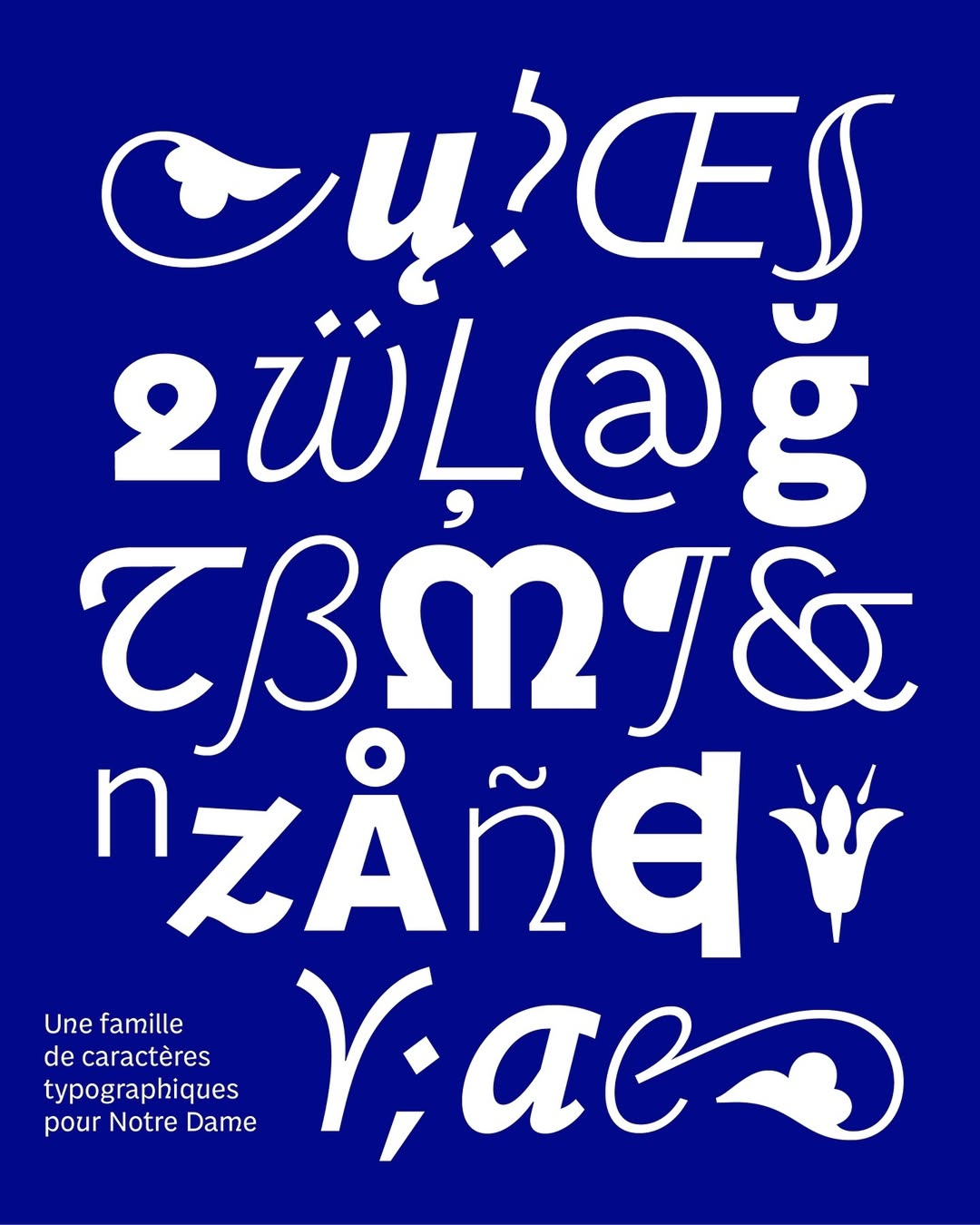
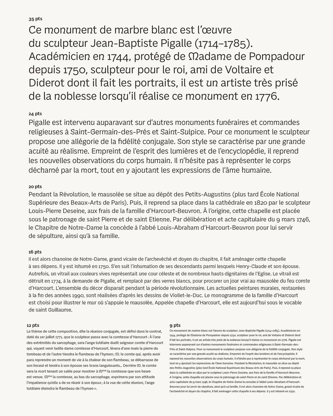
Notre Dame bespoke typeface
AS: Isn’t it lonely being a typeface designer?
MV: I would say that I generally need to be in my own bubble when I work. So I’m not afraid of working alone. On the contrary, it helps me stay focused and work in a thoughtful way. But thanks to Type Media, I had the opportunity to work with other designers around me, and I sometimes miss that a little. It’s always stimulating to be surrounded by people! But I’m used to seeing people here in Paris. I often work in cafés, with my boyfriend, I attend conferences, I teach… So I’m not always alone in front of a screen. I think I’ve found my balance.
AS: You teach at École de Création Visuelle (ECV Paris), and your email signature says you’re a passionate teacher. Can you share the three most common questions your students ask you?
MV: What’s the difference between spacing and kerning! They mostly ask about technical
AS: Don’t you get bored answering the same questions year after year?
MV: At first, I was afraid of that, but now I’m not at all. I’ve only been teaching for three years, but already I can see that every year I have different students, with different personalities and different projects. And the assignment I usually give them is to create their own typeface, without any restrictions. I give them carte blanche to find their own inspiration. The master’s degree I teach is focused on typeface design combined with art direction. So every year is a surprise, and I love it.
 ![43]
![43]
Artemys Display Bitmap by Morgane Vantorre. Embroidery: Maryline Foucault
AS: What three pieces of advice would you give to your students who will mostly be working in type design?
MV: First, I believe it’s important to understand what story you want to share with your project, because you need to find a message and/or an emotion to keep in mind while making decisions. Creating shapes without context might work out, too, but having a story helps and makes the project deeper.
Then, I think one quality that type designers need to have is to be organised in their work. It’s so easy to waste time unnecessarily by focusing on a detail, such as a simple serif that you keep redoing over and over again, when it’s better not to lose sight of the project as a whole. Also, there are a lot of repetitive tasks in type design that can be automated (the use of components, for example, for the famous serif mentioned above). Having knowledge of scripting is really useful for this, to save time and increase precision. I am still learning the Python language for this purpose.
I always tell my students to put the date on their files and physical proofs. It’s linked to the second piece of advice in a way, but it really helps track the evolution of the project.
And there’s also a fourth piece
AS: Do you believe it’s important that people who use a typeface understand the story behind it?
MV: No, I don’t think it’s necessary. When you release a font, you don’t expect people to use it in exactly the same context you had in mind. The story is for
AS: As you love secondhand bookshops, could you recommend one in Paris?
MV: You can usually find great books at flea markets. But there’s a wonderful shop near
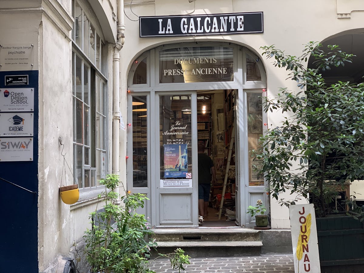
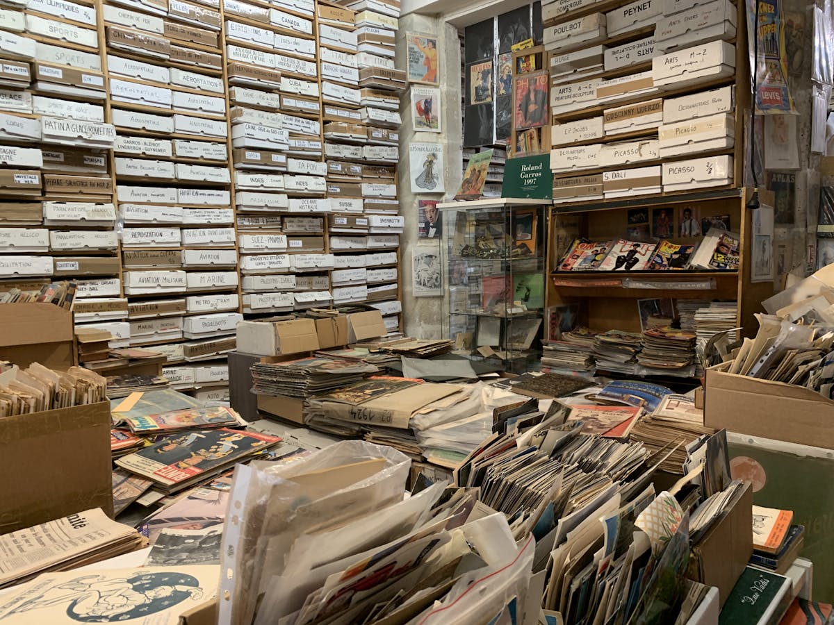
La Galcante, Paris. Images: Niche Museums
Morgane Vantorre
@gagane_
morgane.vantorre@hotmail.fr